Why build your YouTube backdrop in 3D
Real-world streamer setups get expensive and permanent fast. A 3D backdrop costs nothing once Blender is open, can be redecorated in minutes, and allows tricks no physical set can match: animated lights, falling balls, neon logos.
The case against permanent shelves and bought neon signs
I started this build for the same reason most people end up here: my real-world office background was dull, and the usual guides for fixing it didn't appeal. Every tutorial I found was about which shelves to assemble, which lights to buy, which posters to hang. All of it felt permanent. All of it was something I'd be bored of within a year.
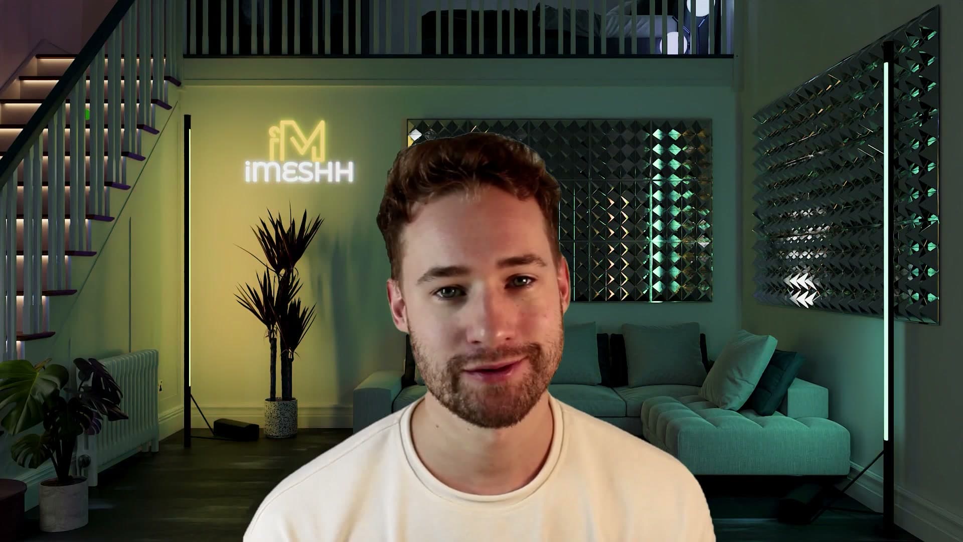
The maths gets worse the more you try to personalise. A logo in the corner means commissioning a 3D print. Making that logo glow means tracking down a neon-sign specialist. Each addition compounds the cost and locks in a shape you can't change on a Tuesday afternoon when you fancy a redecorate.
The 3D answer collapses all of that. Build the room once in Blender and every element afterwards (colour palette, furniture, lighting, brand mark) is a click away. I'm a 3D artist; there's no reason to be limited by what's on the high street.
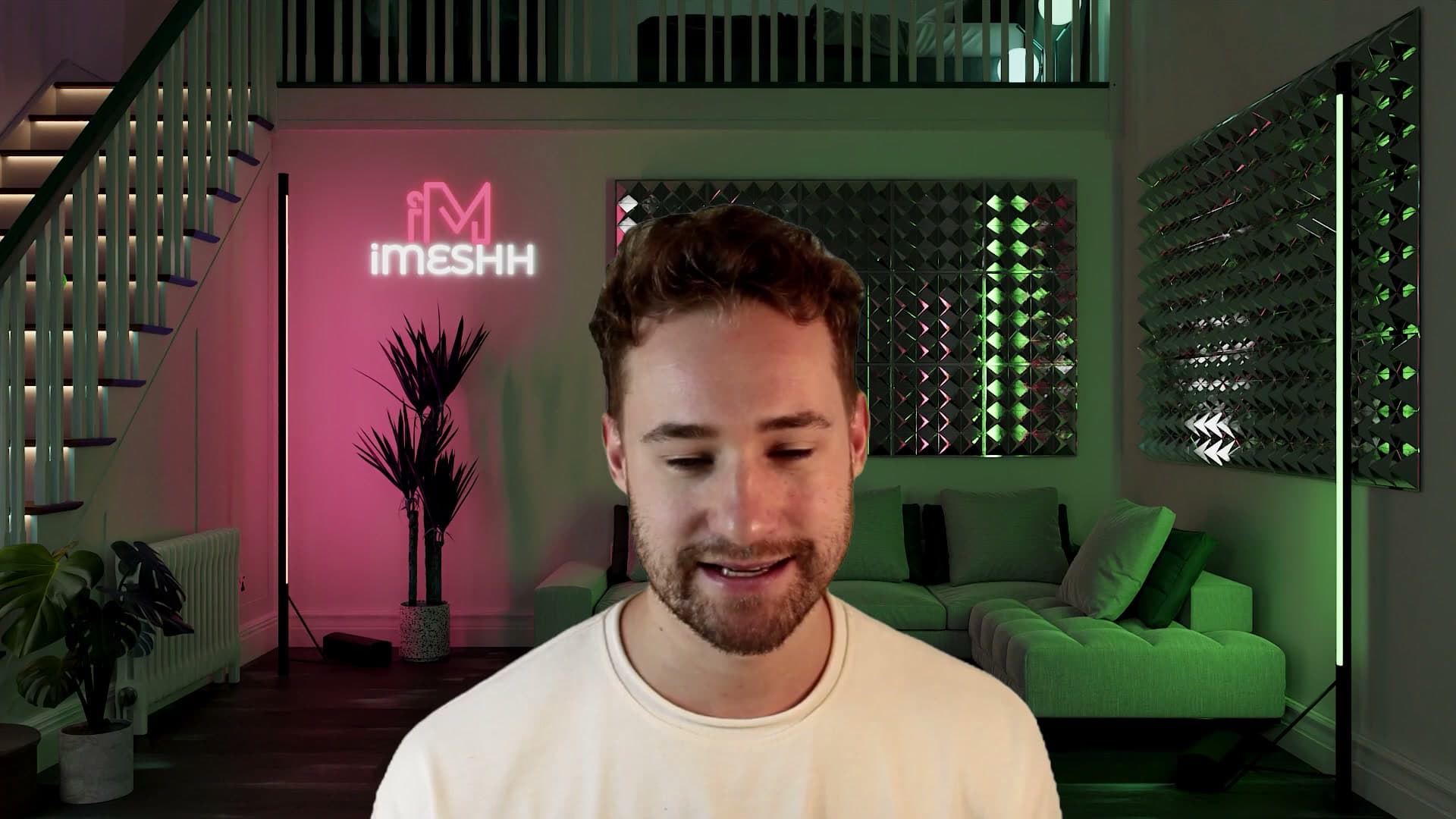
The bigger payoff is animation. A 3D backdrop loops. Lights can shift colour across a frame range without anyone touching a switch. Rigid-body physics can drop balls bouncing down a staircase behind you while you talk to camera. You can make it rain inside the room or flip the chairs upside down mid-shot. None of it is reproducible in a physical set, and all of it comes for free once the room exists in Blender.
What you need: Blender basics and iMeshh assets
The tutorial assumes you can already navigate Blender's viewport, find the common modelling tools, and read the modifier stack. If you've never opened Blender before, I'd point you at Blender Guru's beginner series as the on-ramp. A couple of hours with those videos and you'll be at the level you need to follow along here.
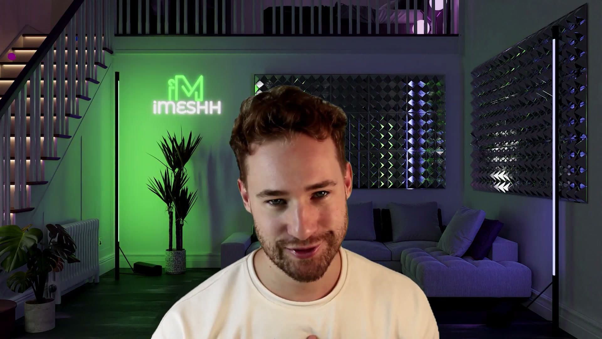
The furniture, plants and decor come from the iMeshh library, which is what makes this an hour-long build rather than a week-long one. You append finished assets instead of modelling each piece from scratch. There are some free assets on the site if you want to try the workflow first, and Blender itself costs nothing, so a budget version of the build is genuinely doable.
Setting up the camera and a cutout of yourself
Before any walls go in, anchor the scene with a virtual camera matched to your real DSLR and a photo of you as a transparent plane. Parent the cutout to the camera so they always move together. That way you'll never decorate behind your own head.
Wiping the default scene clean
Open Blender and you'll be looking at the usual starter trio: a cube, a light and a camera. Wipe them all out so you have a fresh stage to build on. Hover over the 3D viewport, press A to select everything, then press X and confirm with Delete.
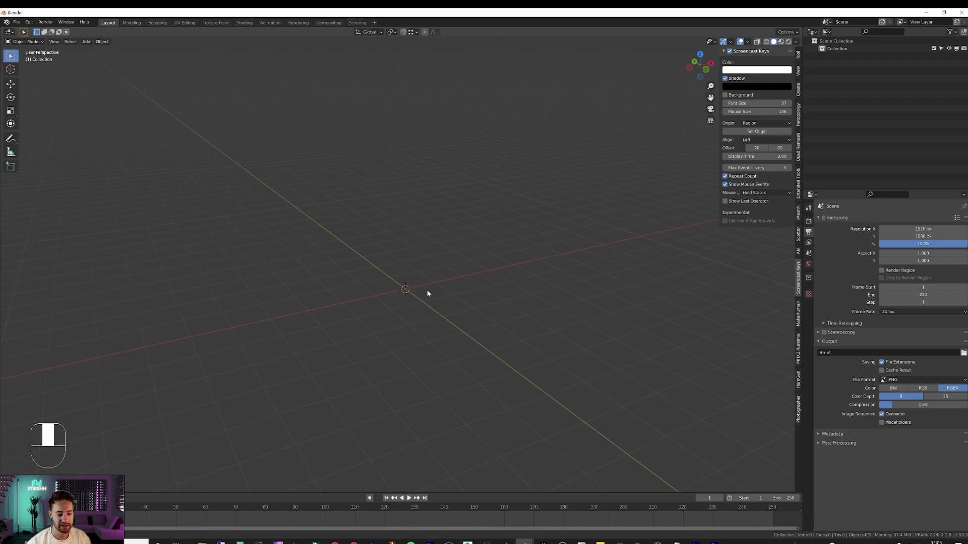
You should now be staring at an empty scene. Everything you add from this point is yours.
Importing your photo as a plane
The first thing to drop in is a cutout of yourself. Anchoring the scene to your own silhouette stops you from spending an hour decorating a corner only to discover later that your head is covering it on camera.
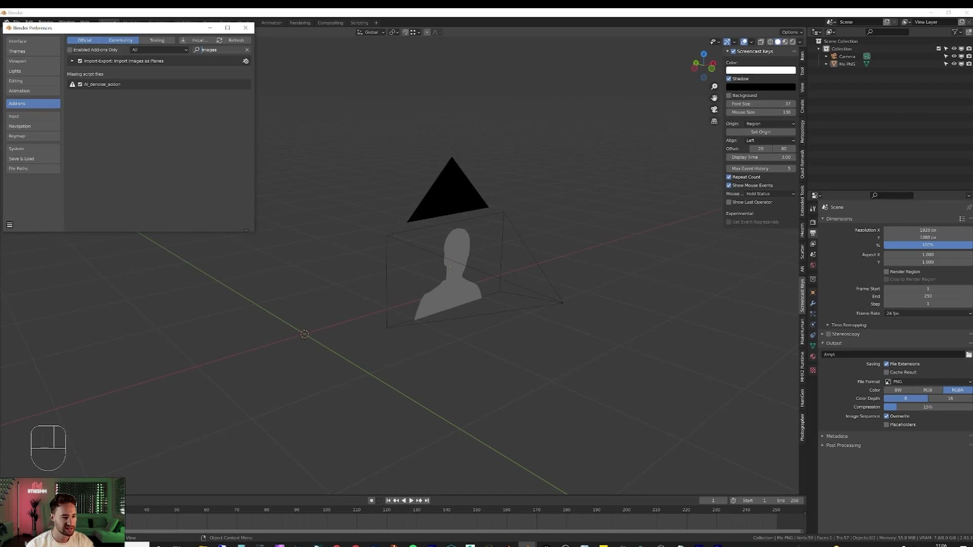
Before you can drag a PNG straight into the viewport as geometry, switch on Blender's bundled add-on. Go to Edit > Preferences > Add-ons, type images into the search box, and tick Import Images as Planes. It ships with Blender, so there's nothing to download.
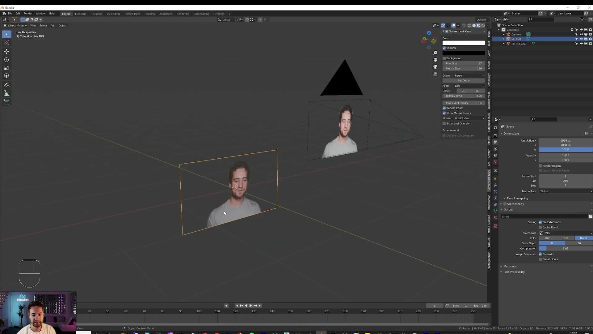
Close preferences and head back to the viewport. Press Shift+A, choose Image > Images as Planes, and pick a PNG of yourself. You should now have a textured plane of you sitting at the world origin. If you flip into rendered preview, you'll see yourself looking back.
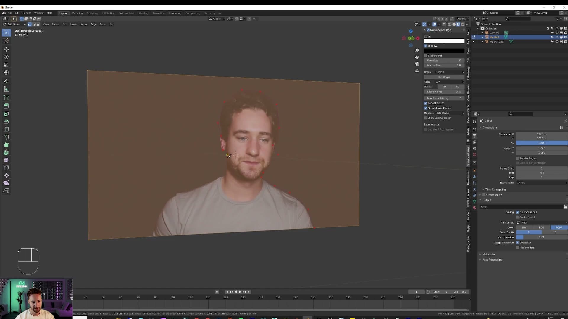
To make the cutout in the first place, take a photo of yourself in front of the camera you plan to film with, then open it in Photoshop and erase the background. If you don't have Photoshop, you can cut the silhouette out inside Blender instead: select the plane, press Tab to enter edit mode, press K for the Knife tool, and trace around your outline. Press Enter to confirm the cut, switch to face select with 3, click the background face, press X and delete it. Tab back to object mode and you're left with a clean cutout that works just as well as a Photoshopped one.
Adding the camera and matching focal length
With your stand-in placed, drop in the camera that will see it. Press Shift+A and add a Camera.
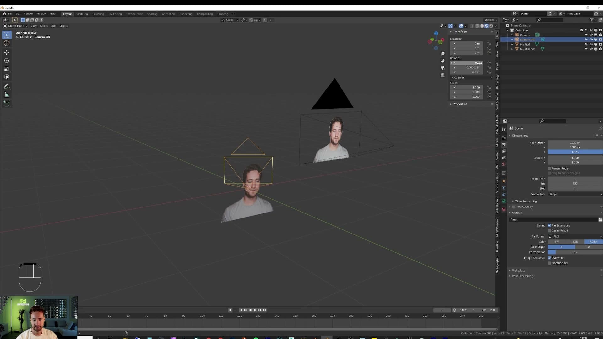
Open the N-panel Item tab and set the rotation to X 90°, Y 0°, Z 0° so the camera looks out horizontally instead of straight down at the floor. Then switch to the camera's Object Data properties and check the Focal Length. Match it to the lens on the real camera you'll be filming with. Somewhere around 24mm to 30mm gives a natural-looking room shot.
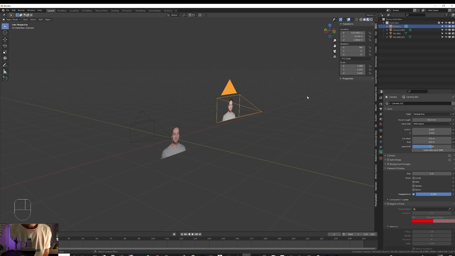
The focal length is worth getting roughly right. If you pick a long telephoto value in Blender but film yourself in real life on a wide lens, the perspective of the 3D background won't match the perspective of you sitting in front of it, and the composite will look off as soon as anyone glances at it.
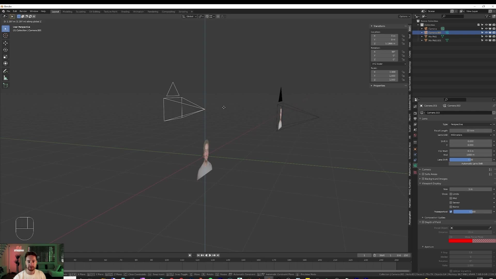
Now lift the camera to roughly the height it will sit at in real life. Press G, then Z, type 1.2 and press Enter to nudge it up 1.2 metres. You can also type the height directly into the Z field under Item. Measure where your real camera sits in your room and copy that value across, then tilt the rotation up or down a touch if the real camera is angled rather than perfectly level.
Parenting the cutout so it follows the camera
To keep your cutout glued to whatever the camera is looking at, copy the camera's transform onto the plane first, then parent the two objects together.
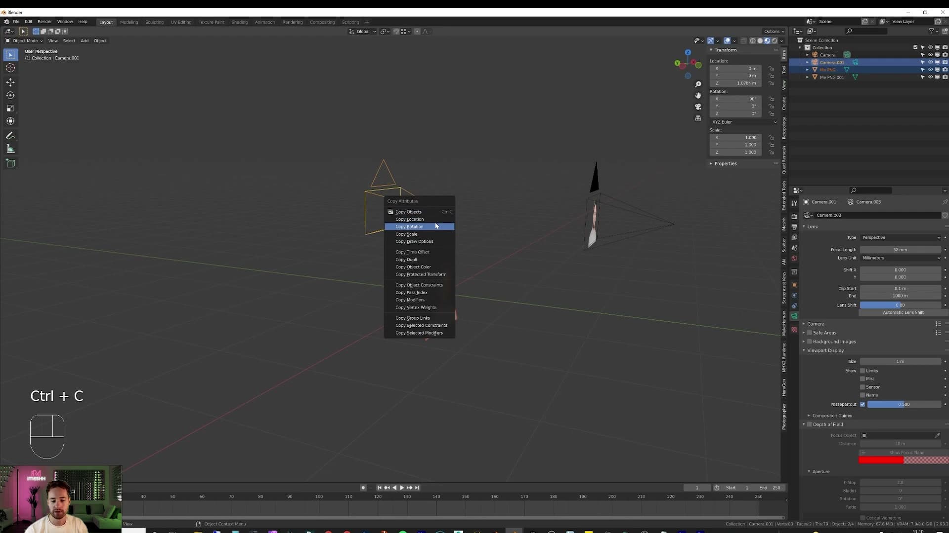
Blender ships with a handy add-on for the first half. Open Edit > Preferences, search for copy, and enable Copy Attributes Menu. This adds a Ctrl+C shortcut that lets you copy the location, rotation or scale from one object onto another in a single click. Much faster than retyping numbers by hand.
Click your cutout plane, then Shift-click the camera so the camera is the active selection. Press Ctrl+C and pick whichever transform you want copied across. Rotation is the one you definitely need so the plane faces the camera dead-on. With the plane selected again, press G then Y (or X, depending on which way the camera now faces) and slide it forward to roughly where you'll be sitting in the room.
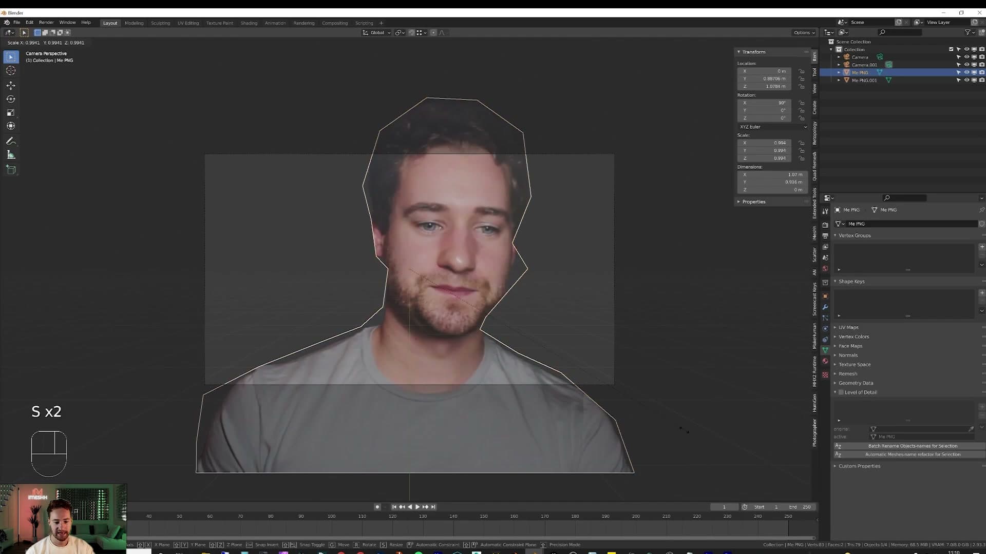
Select the camera and press Ctrl+0 to look through it, then press S to scale the cutout up or down until you're framed the way you want to be.
Last step: lock the two together. Click the cutout, Shift-click the camera so the camera is the active object, and press Ctrl+P to parent the plane to it. From now on, whenever you move or rotate the camera, your stand-in comes along for the ride. Every prop and wall you add gets placed around where your head actually ends up, not around an empty patch of floor.
Blocking out the loft room shell
A cube, a few extrusions, and a split viewport is all it takes to mock up the room. Working rough lets you mould the space around the camera frame instead of building a 'scientifically correct' room you'll never see most of.
From a single cube to four walls
The room starts as a single cube. Add > Mesh > Cube, then move it so the base sits at floor level. From there, that one cube becomes the entire space. No separate floor mesh, no separate ceiling, no separate walls.
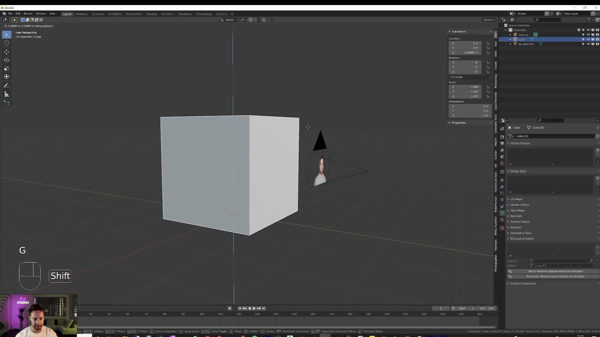
Drop into edit mode and push the geometry outward by eye. Pull the ceiling face up to give the room some height, then nudge the side walls out to roughly the dimensions you want. I don't measure anything at this stage. Pull each face until the proportions feel right and move on.
This isn't meant to be scientifically correct. It's a scene to play with and mould as you go. The camera frame will hide most of the room behind your cutout anyway, so spending time getting wall-to-wall dimensions exact is effort the viewer will never see.
Splitting the viewport for a live camera preview
With the room blocked out, switch to wireframe by pressing Z and choosing wireframe view. That lets you see through the walls while you work. Step out of edit mode, click on the camera in the viewport, then press Ctrl+0 to look through it. You're now seeing the scene from the angle your eventual audience will.
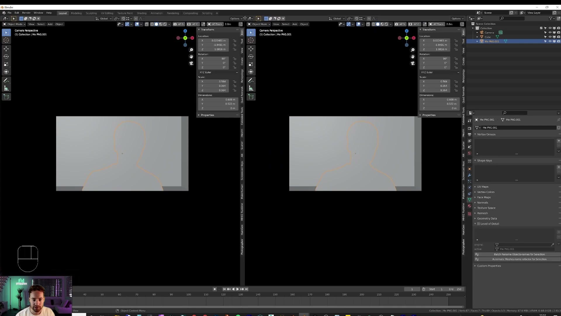
To keep that camera view permanently open while you carry on building, split the viewport. Hover the cursor right into the corner of the viewport until a small crosshair appears on the edge, then click, hold, and drag inward. Blender opens a second panel running alongside the first.
Collapsing a panel uses the same corner in reverse. Click in the corner of the panel you want to remove, drag toward the panel you want to keep, and an arrow appears showing which side will absorb which. Release and the two panels merge back into one.
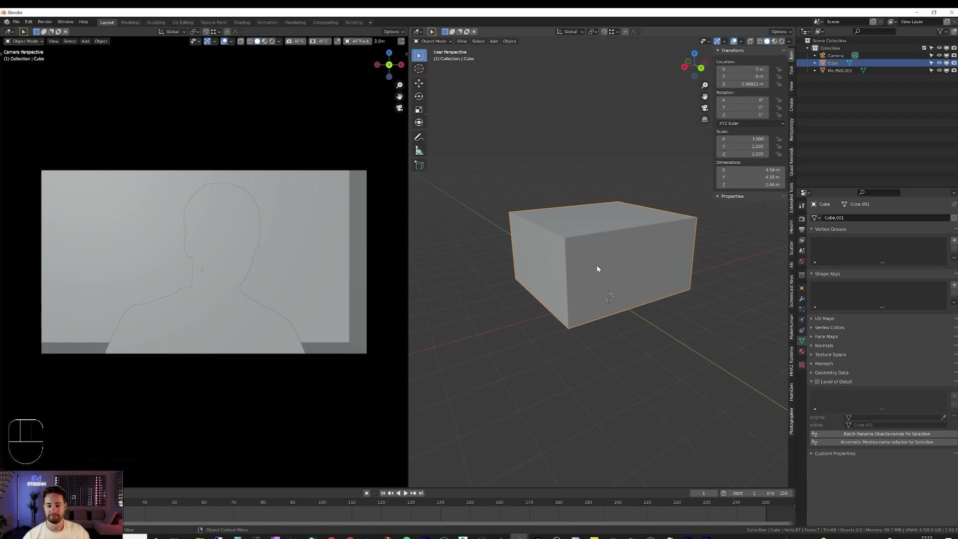
From here, lock one panel to the camera and leave the other free to navigate. Every move you make in the free view updates the framed shot in real time, which removes the constant flipping between perspectives that otherwise slows composition work down to a crawl.
Extruding the room upward into a loft
With the split in place, you should now see a basic loft volume sitting in the camera view: tall ceilings from the upward push, walls roughly where you want them, and your cutout still anchored in frame. I call it a basic room at this point and that's enough blocking. The next decision is scale. The fastest way to lock scale in is to drop something you've sat on a thousand times into the scene and see how it reads against the walls.
Anchoring the room with a sofa
A sofa is a high-recognition, human-scaled object. Drop it in early to dial the room's proportions before you commit to anything else. iMeshh's exclusive library or the free packs both work.
Appending the sofa from a blend file
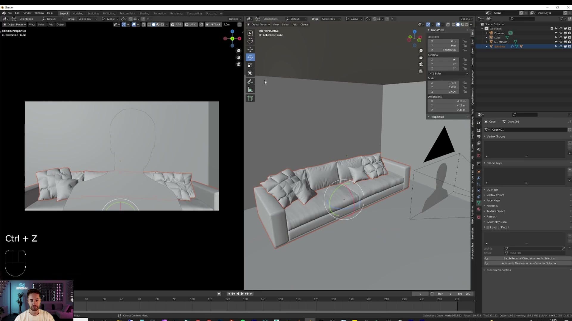
With the room blocked out and your cutout parented to the camera, the next job is to drop in something human-scaled so you can read the proportions. A sofa is the perfect anchor. Everyone knows roughly how big a sofa is, so the moment one lands in the scene the wall heights, sofa-to-camera distance and overall room volume all become easier to judge.
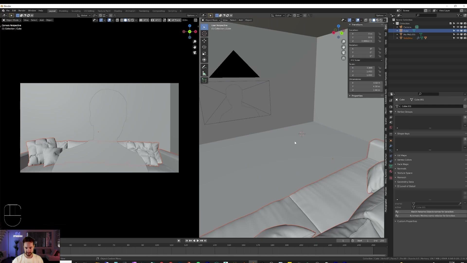
If you have an iMeshh exclusive subscription, head to the shop, find a sofa you like and download the blend file. If you don't, the free packs cover the same ground. At least one of them contains a sofa, and the same packs include the wood floors used later in this build, so they're worth grabbing either way.
Once the blend file is on disk, bring the sofa into your scene with File > Append. Click into the downloaded blend file, then open the Object folder inside it. Select the sofa object (and any matching parts that belong with it) and hit Append. The sofa drops into your scene at the origin, ready to slide into place.
Push it back against the rear wall using G to grab and the standard axis locks. If you'd rather not lean on shortcuts, click the move gizmo in the header and drag the handles manually. Rotate with R to face it the way you want.
Tweaking the back wall around the sofa
With the sofa anchored against the back wall, you'll usually find the room reads as too tight. The sofa feels jammed against the camera. That's the value of dropping a known-scale object in early: it tells you the room itself needs to grow before you commit to anything else.
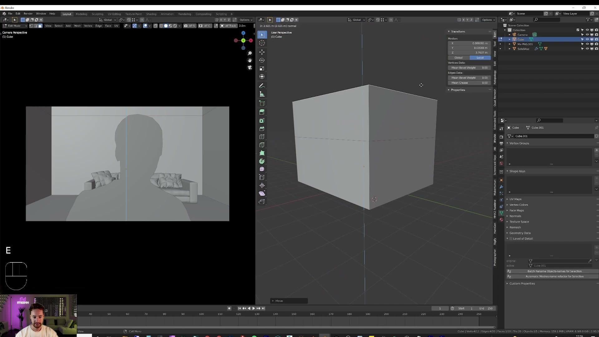
Select the room cube and hit Tab to drop into Edit mode. Pick the back face and push it outwards until the sofa has breathing room behind the camera position. There's no magic number here; eyeball it until the framing feels right.
Once the floorplan reads correctly, build the room upwards into a loft. Select the top face of the cube and press E to extrude, dragging upwards to give the room its initial wall height. Then select the new top face and press E again to push it up a second time. That stepped extrude is what gives the space its double-height loft silhouette rather than a flat-roofed box.
Drop back into Object mode and check the sofa is actually sitting on the floor. After resizing the room it's easy to leave the sofa floating a few centimetres above the floor without noticing. Nudge it down on the Z axis until the feet are just touching.
Bringing in stairs and railings
The iMeshh Asset Manager turns asset drops into a one-click affair. Append a stair model, stretch it to the wall, then Shift+D the railing supports along the X axis to fill the mezzanine edge.
Dropping stairs in with the Asset Manager
With the room blocked in, it's time to bring in furniture. The iMeshh Asset Manager makes this almost trivial, provided you've pointed it at a folder that matches the structure spelled out in the plug-in settings. Once the categories load, you can browse the library straight from inside Blender without ever opening a file dialog.
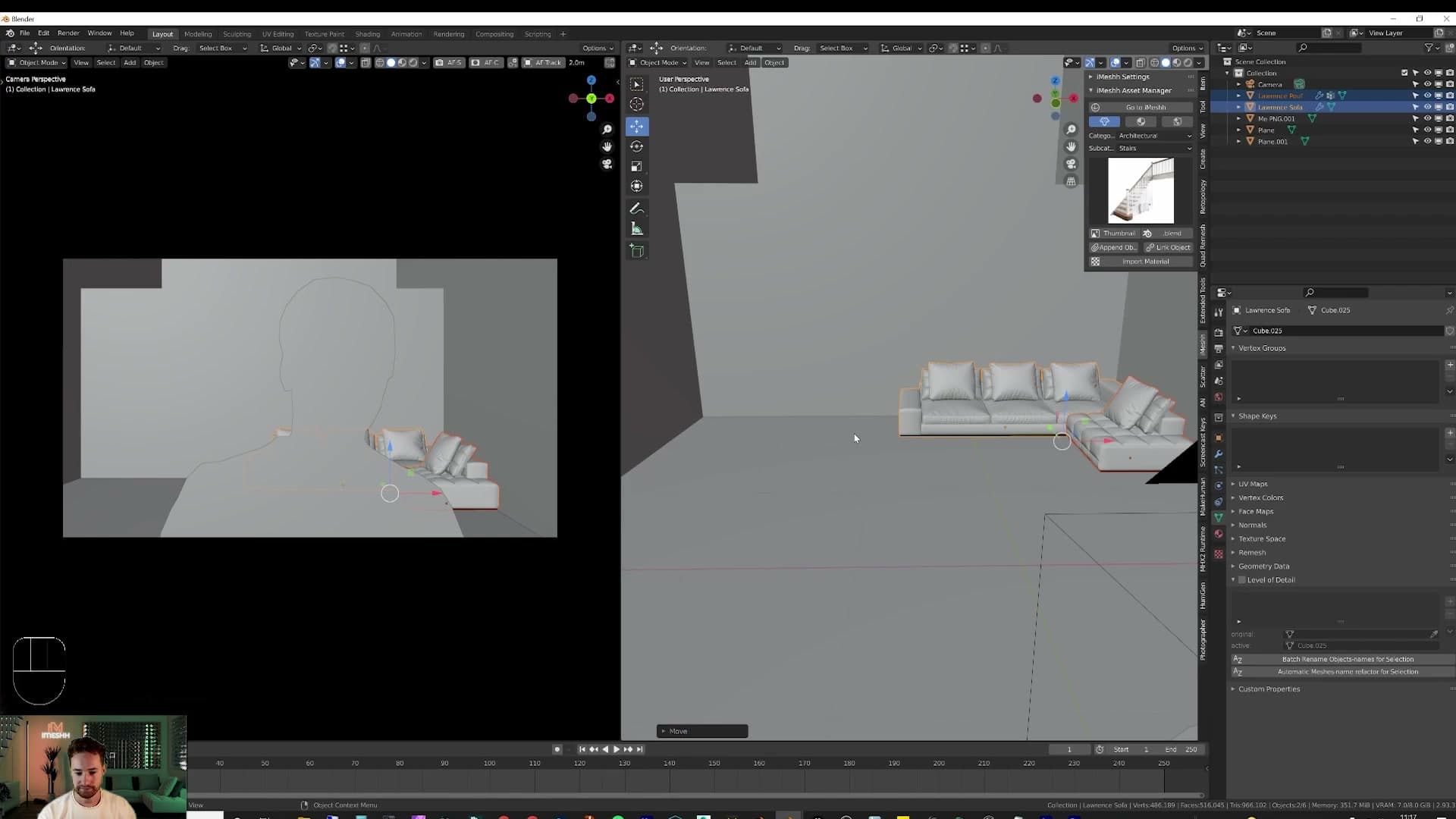
Head to Architectural > Stairs and pick a model that suits the loft. Before you append, hover the 3D view in roughly the spot you want the stairs to land and press Shift+Right-click. That drops a 3D cursor at the click point. Hit Append and the staircase is added to the scene at that cursor, so you don't have to hunt for it at the world origin afterwards.
Stretching the staircase and adding railings
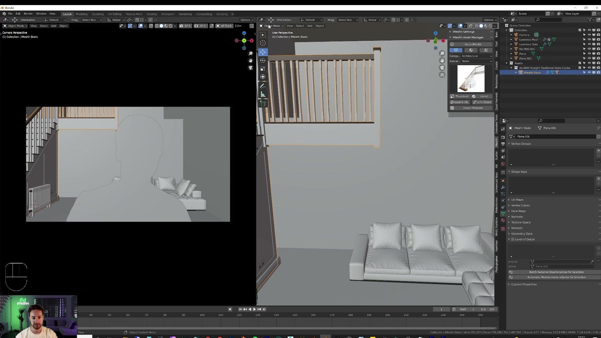
The default staircase probably doesn't reach exactly where you need it to. Editing it is straightforward: tab into Edit Mode, switch the viewport to wireframe, and press 1 to drop into vertex mode. Box-select the run of vertices on the far end of the stairs.
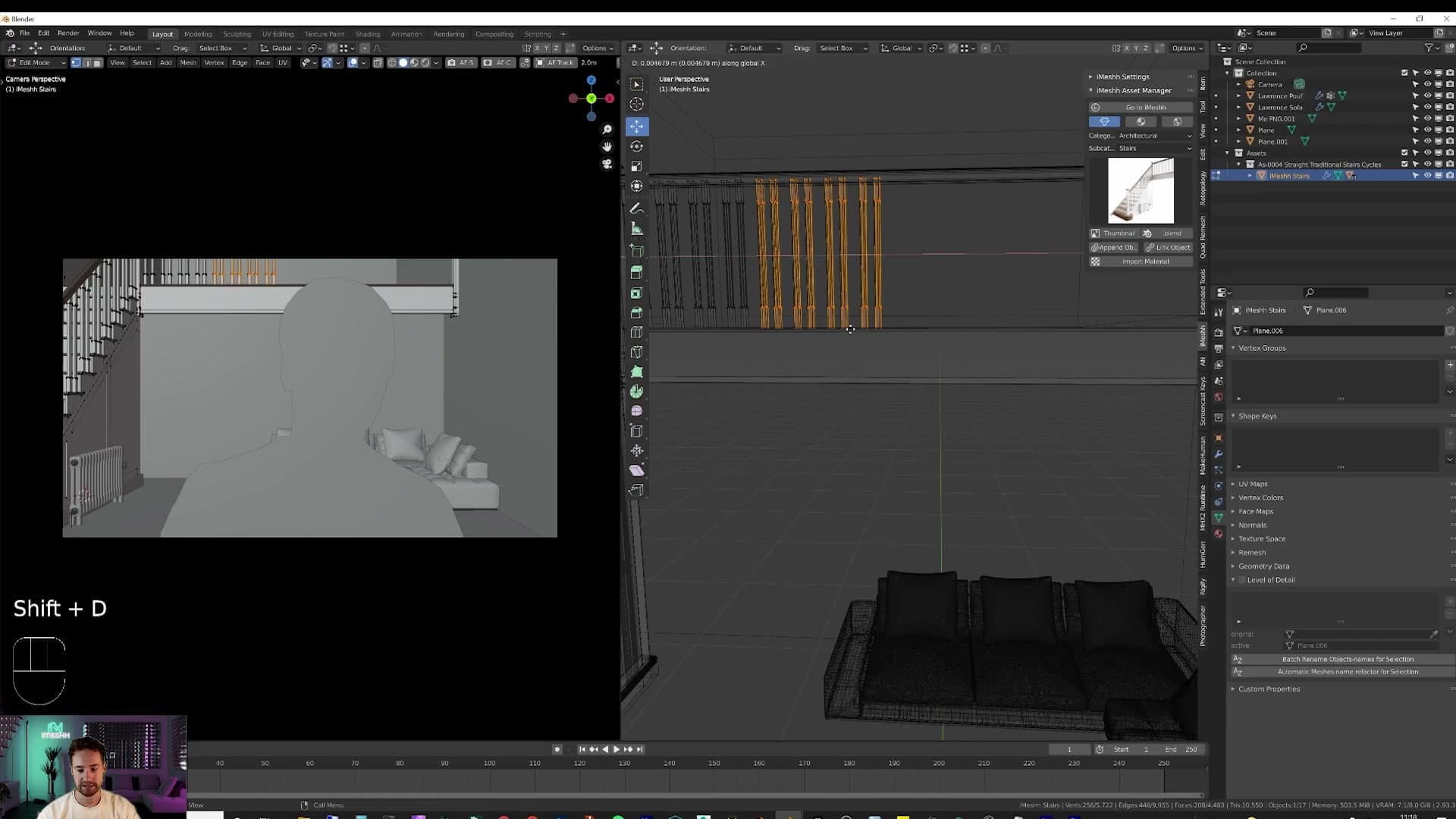
With those vertices selected, press G followed by X to constrain the move to the X axis and slide the end of the staircase all the way to the wall. The geometry between stretches with it, so the steps and supports lengthen cleanly without you having to remodel anything.
Once the stairs reach the wall, the mezzanine edge still needs filling out with railing posts. Select an existing railing in Object Mode, press Shift+D to duplicate it, then tap X to lock the duplicate to the X axis. Slide it along until it sits where you want, and repeat Shift+D, X as many times as needed to march the railings the full length of the edge.
Lighting the scene with shaders and area lights
Lighting is what sells a 3D backdrop. Recolour the lamp's emission shader for the source's tint, then hide an Area light beside it to do the heavy lifting. Emission shaders alone are noisy and slow.
Recolouring a floor lamp with the emission shader
With the room roughed out, head into the iMeshh asset library, drop into the lighting category, and then into floor lights. For this scene I went with a Flos-style floor lamp, the kind that's expensive enough in real life to make 3D a more attractive option. Shift-click the asset and hit Append; the lamp will drop in exactly where you placed the 3D cursor, so you can rotate it around to a flattering angle before you commit to a position.
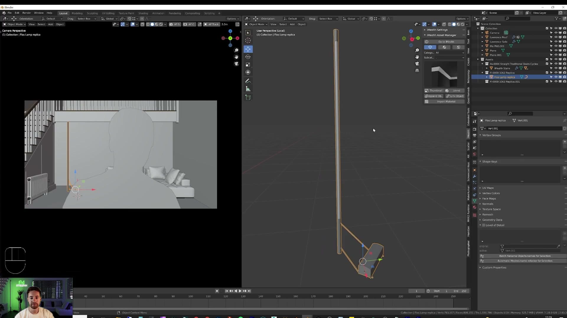
By default the bulb on most library lamps ships pure white, which is technically accurate but rarely the look you want for a stylised set. To recolour it, open the Material Properties panel and look at the material slot list. There are usually two materials on a lamp like this: a black housing and a separate emission shader for the bulb itself. Click into the emission slot.
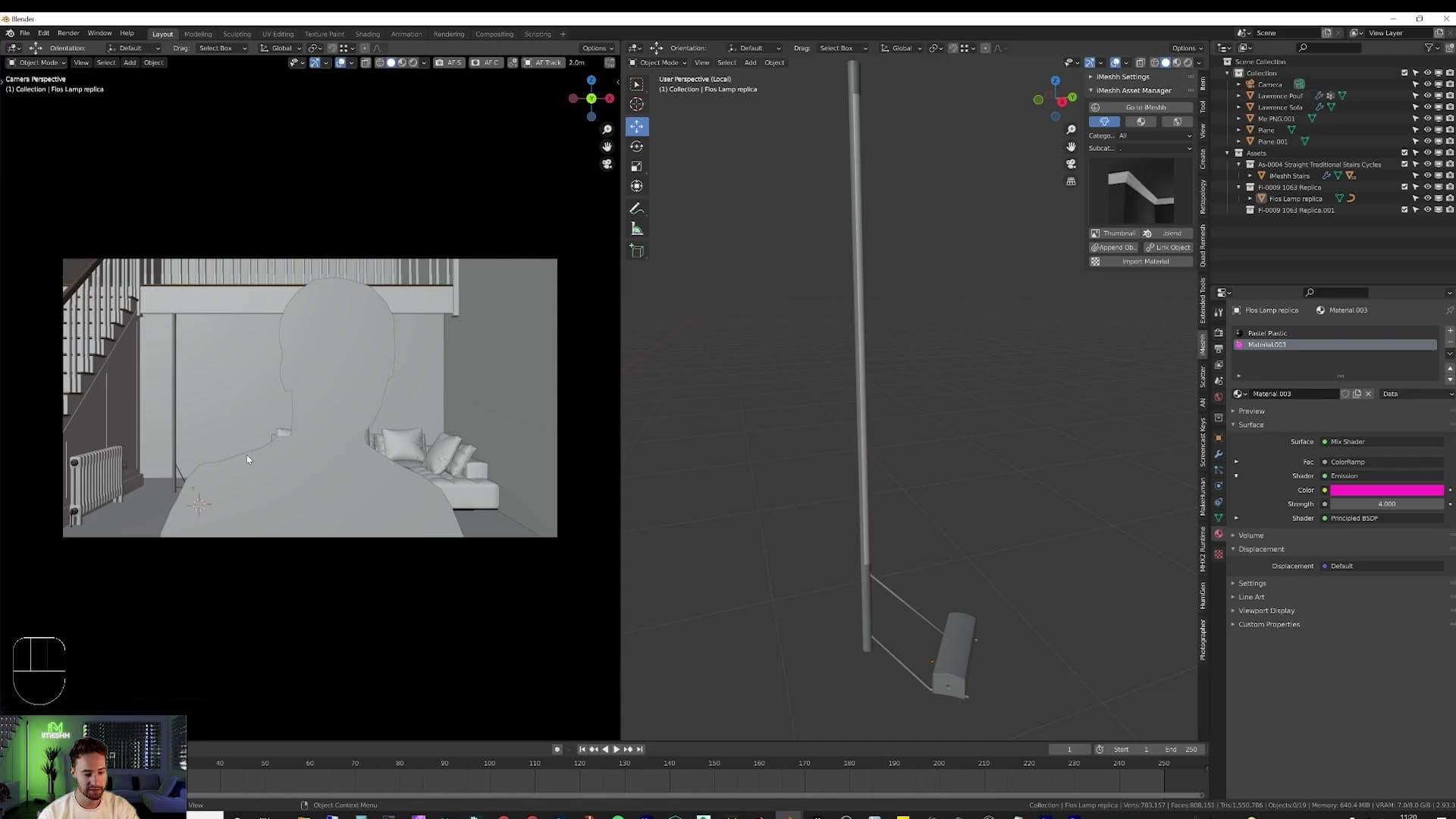
Switch one of your panels to the Shader Editor and find the colour swatch on the Emission node. Click it and pick whatever tint you want the lamp to throw into the room. In this scene I'm going with a deep purple. The colour-picker dropdown is the quickest way to dial it in without fighting an HSV wheel. To make the bulb glow harder, bump the Strength value; 4 is a sensible starting point for a stylised set.
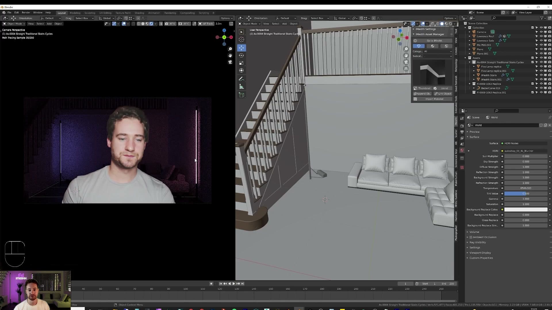
Drop back into the 3D viewport, press Z, and switch to Rendered preview. The room picks up the lamp's tint straight away. The walls catch the cast and the scene starts to feel like a deliberate set rather than an empty grey box. That's the visual character working. The rest of this module is about pushing the actual brightness without choking the render with noise.
Adding hidden area lights for efficient brightness
You'll notice quickly that emission shaders alone don't push much light around the scene. You can crank the strength higher and higher, but emission-only lighting is one of the noisiest things you can ask Cycles to render. Every photon has to bounce off a tiny lamp surface, so you pay for the look in render time and grain. The trick is to keep the emission shader for its visual character, and add a second, invisible light source to do the heavy room-lighting work.
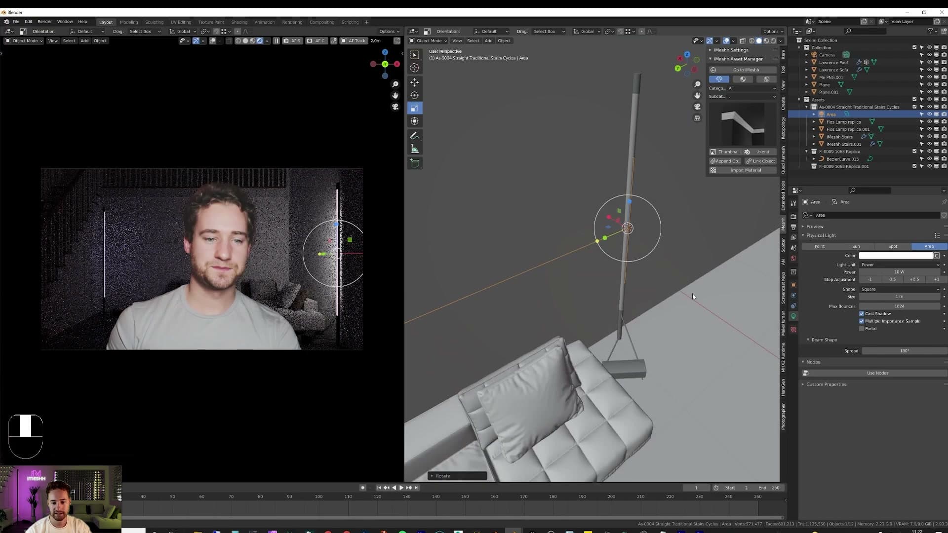
Move close to the lamp, press Shift+A and add a Light > Area. Scale it with S (or S then X to constrain to a single axis) until it sits roughly the size of the lamp shade. Rotate it onto the right plane: R, X, 90 on the numpad to lay it flat, then a little extra R to angle it the way the lamp is throwing light. Nudge it into position so it reads visually as if the lamp itself were the source.
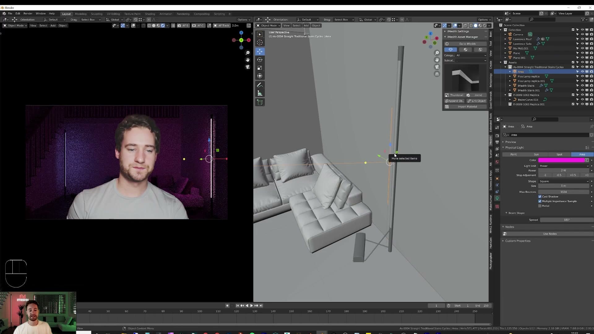
Match the area light's colour to the emission tint of the bulb (a pinkish-purple in this case) and drop the strength right down. 2 is usually enough. Area lights are a vastly more efficient way to push photons around than emission shaders, so a low number goes a long way. Repeat the trick on the second floor lamp. You now have the visual character of the emissive bulb and the room-filling power of a dedicated area light at the same time.
Stair lights duplicated with Alt+D
The staircase needs its own lighting story. The workflow is the same as the floor lamps: Shift+A > Light > Area, then scale and shape the new light to sit under a single tread. Press S then Y to flatten it along the depth of the step. Drop the strength right down to around 1 or 2. These are accent lights, not key lights. Tint the colour orange to contrast against the cooler pinks above.
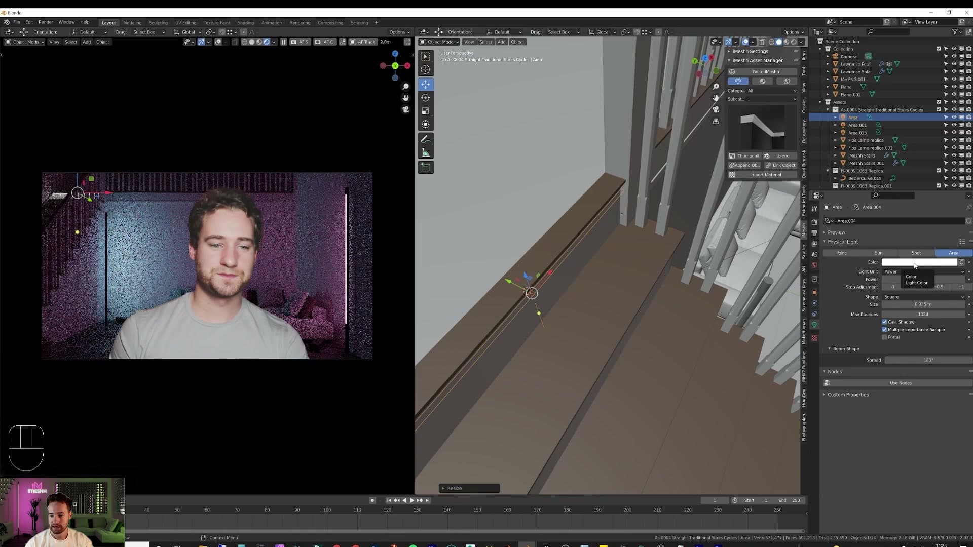
Press 3 on the numpad to switch to the side view so you can see the staircase in profile. Now you need to copy that light down each step. Do not use Shift+D. That creates a fully independent copy, which means every later edit only updates the one light you're editing. Use Alt+D instead. Alt+D makes a linked duplicate that shares its object data with the original, so when you push the strength from 1 to 100 on one light, every linked copy updates with it.
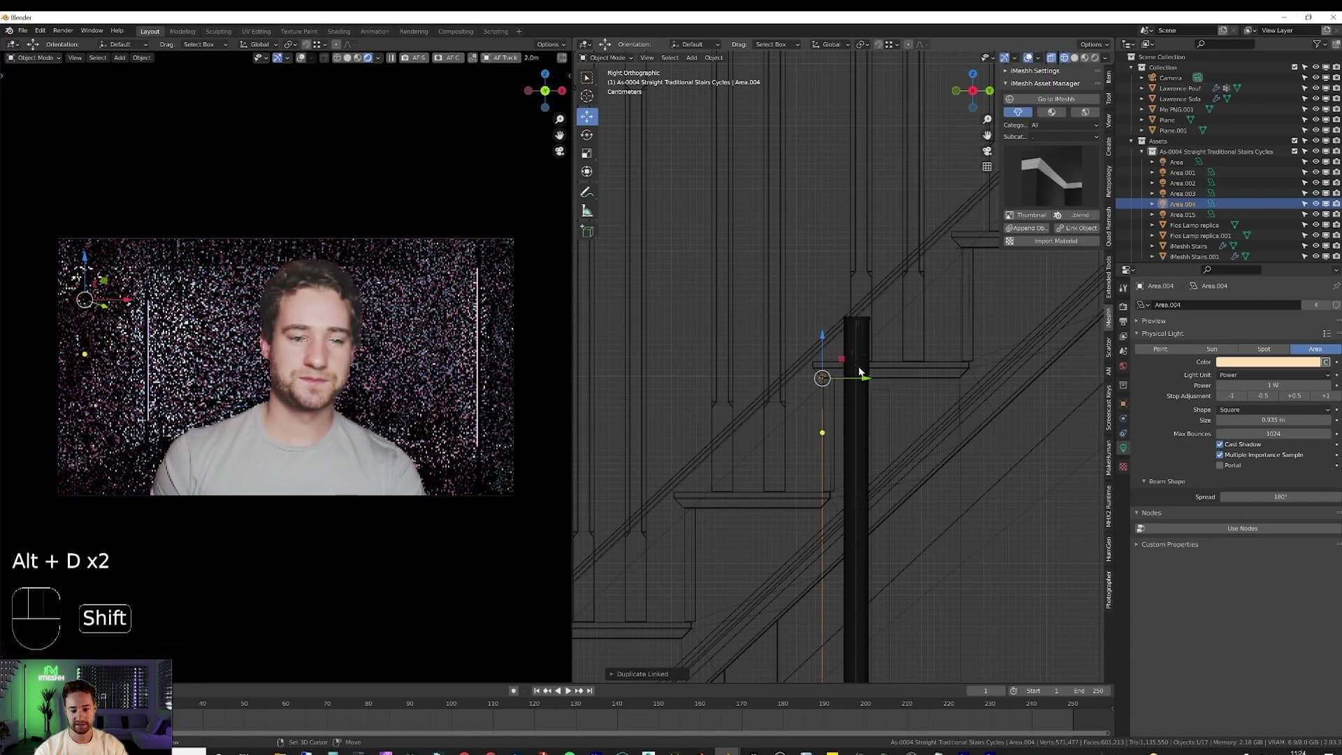
Drop the duplicate onto the next tread, press Alt+D again, drop that one onto the step below, and keep cascading until you've lit every stair. The instant feedback loop makes balancing tone and strength painless. Nudge one light and the whole staircase responds together.
Hanging pendant lights upstairs
The mezzanine still felt dim, so head upstairs and place the 3D cursor (Shift + right-click) where you want each pendant to hang. Back in the asset library's lighting folder, pick out four pendant lights. Ceiling pendants of this shape are popular in real-world interiors right now and they translate well to a stylised set. Append them in one at a time. Four lamps drop into place across the upstairs ceiling and the upper room stops feeling like dead screen.
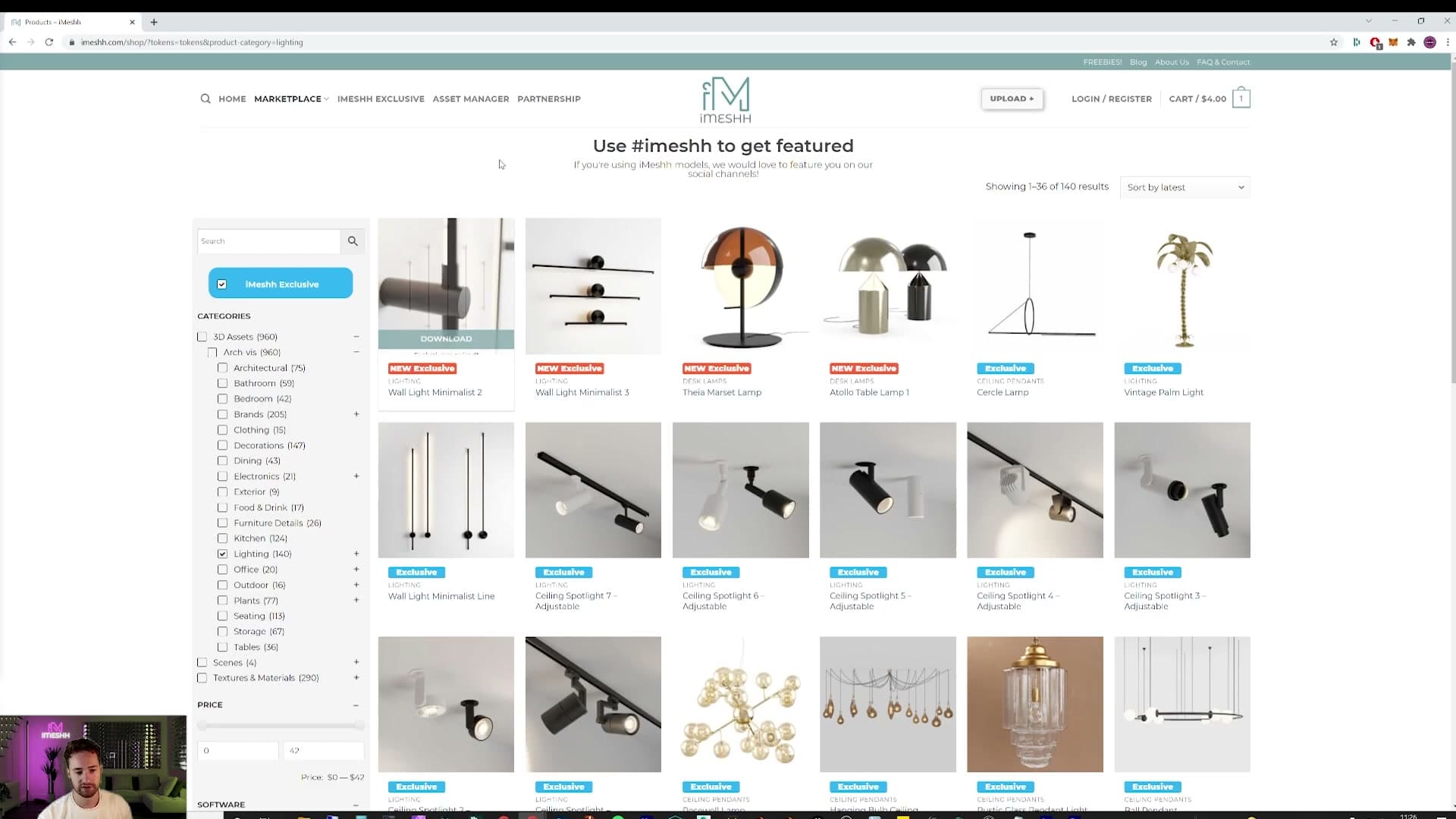
If your asset manager doesn't have a lighting category yet, the wider iMeshh library has a much broader range you can download: pendants, floor lamps, and one customer-requested palm-tree lamp if you want to get adventurous. With the upstairs lit, the scene's volumes are reading properly and there's enough light variety to start dressing the rest of the room.
Plants and homely accessories
A single yucca casts the kind of leaf shadow that makes a flat wall look lived-in. Use Ctrl+B in the viewport to crop your render preview to the area you actually care about.
Placing a yucca to throw leaf shadows
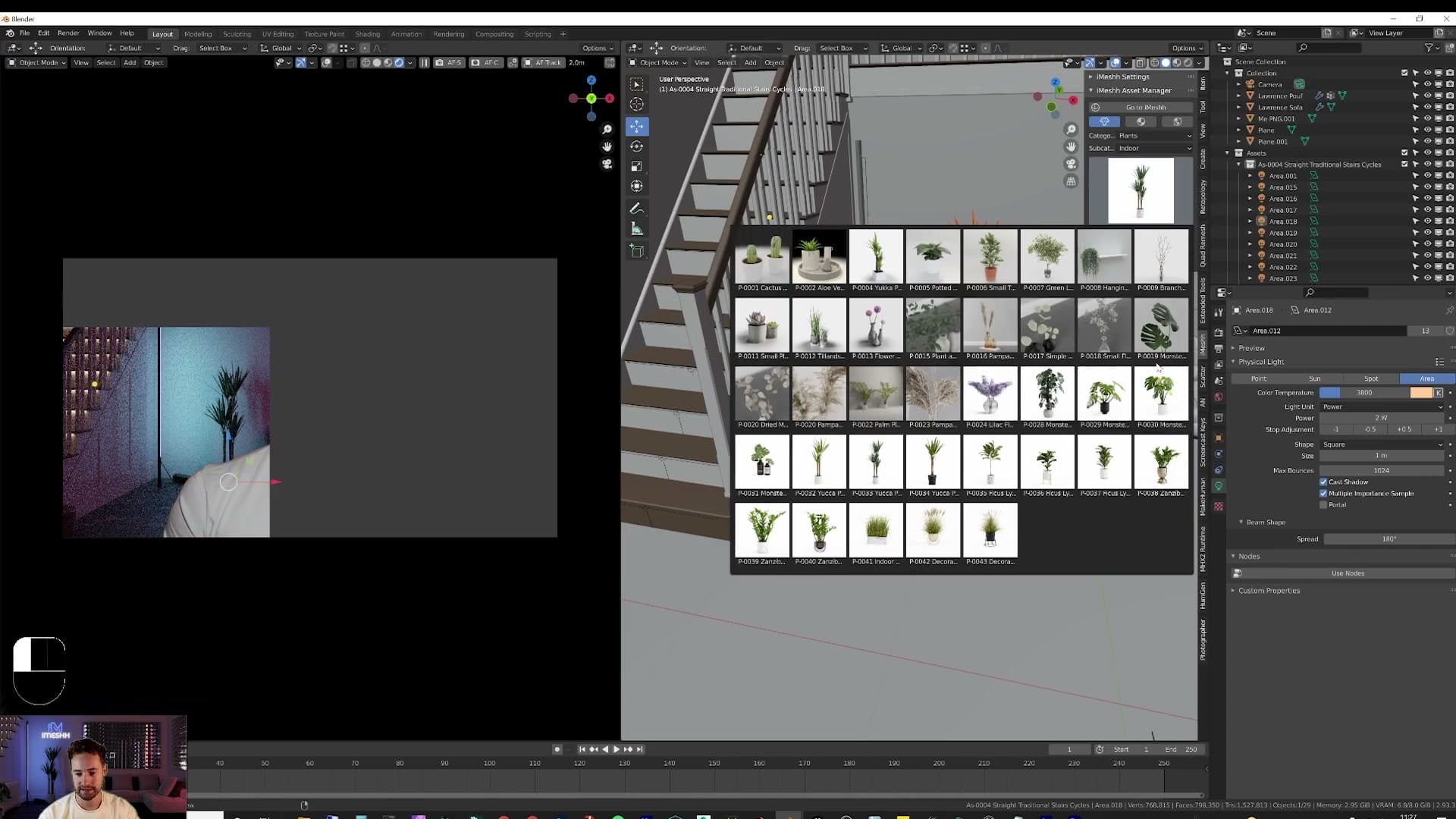
The yucca is one of iMeshh's newer plant assets and my favourite of the bunch. The new plant set took a long time to make and this one in particular turned out well. Append it from the library and slide it across so it sits against the back wall, just off to the side of the sofa.
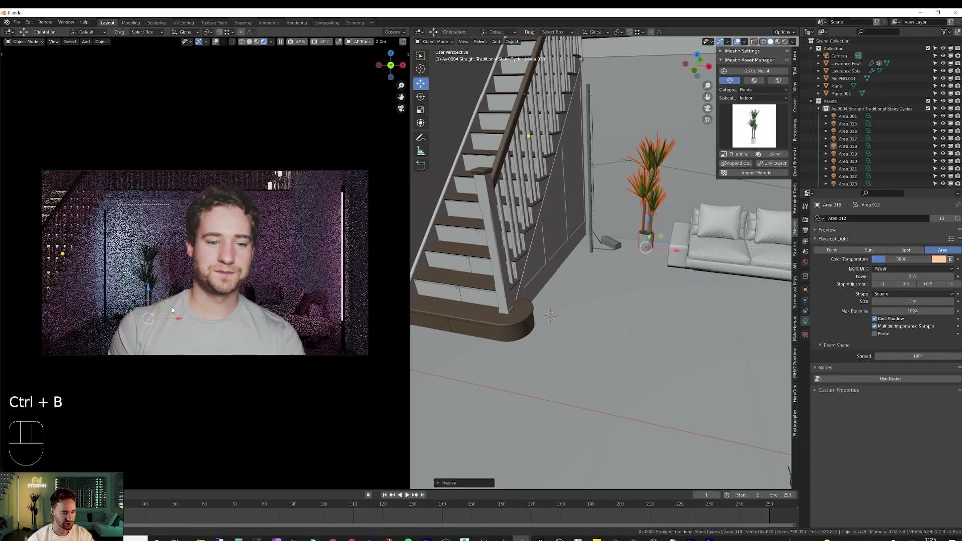
With the plant in place, hover into the viewport and press Ctrl+B, then click and drag a rectangle over the wall behind the yucca. Cycles confines its render preview to the box you've drawn, so you get a fast look at how the leaves are throwing shadow without paying the cost of a full-frame refresh.
That shadow is doing real work. The back wall is otherwise a flat colour, and as the backdrop gradient melds from one tone into the next, the leaf shadow shifts with it. A subtle, living break-up of what would otherwise be an empty surface.
Repeat the workflow to balance the composition. Append a second plant, drop it elsewhere in frame, and you've gone from a staged-looking back wall to something that reads as a real, decorated corner of a room.
Modelling a corrugated metal feature wall
A flattened cube, vertex snapping, a couple of Array modifiers and a bevel give you a corrugated metal panel that tiles across the whole back wall. Unwrap once, apply iMeshh's marked chrome material, and it reads as a high-end set piece.
Collapsing a cube into a single corrugation segment
I spotted the corrugated metal wall idea in another build video, except in that one they had to actually buy the panel. My immediate reaction: the same look takes about five seconds to fake in 3D. The trick lives or dies on a single ridge segment you model once and then tile.
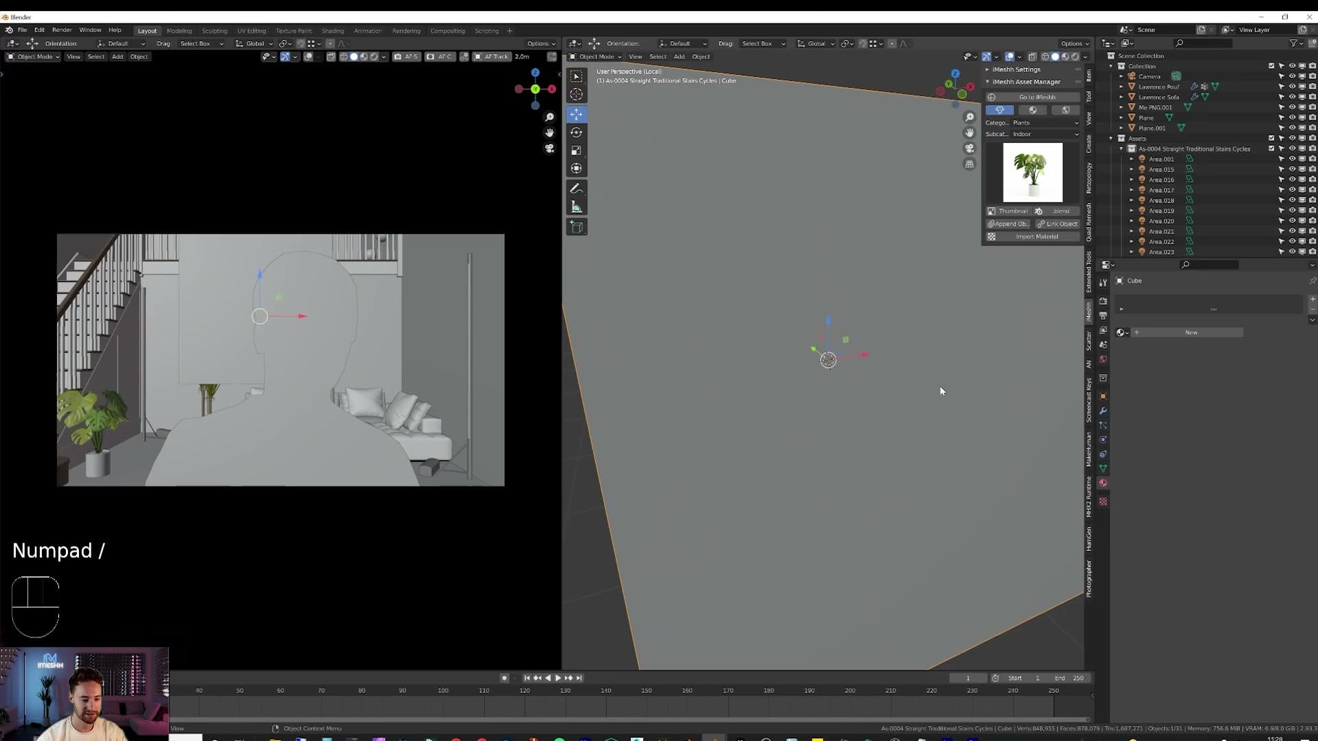
Before you start, switch the viewport back to solid view if you've been working in rendered preview. The rendered shading eats GPU resources while you work and slows everything down. Then add a cube with Shift+A > Mesh > Cube, and jump into local view by tapping / on the numpad so the rest of the scene falls away while you build.
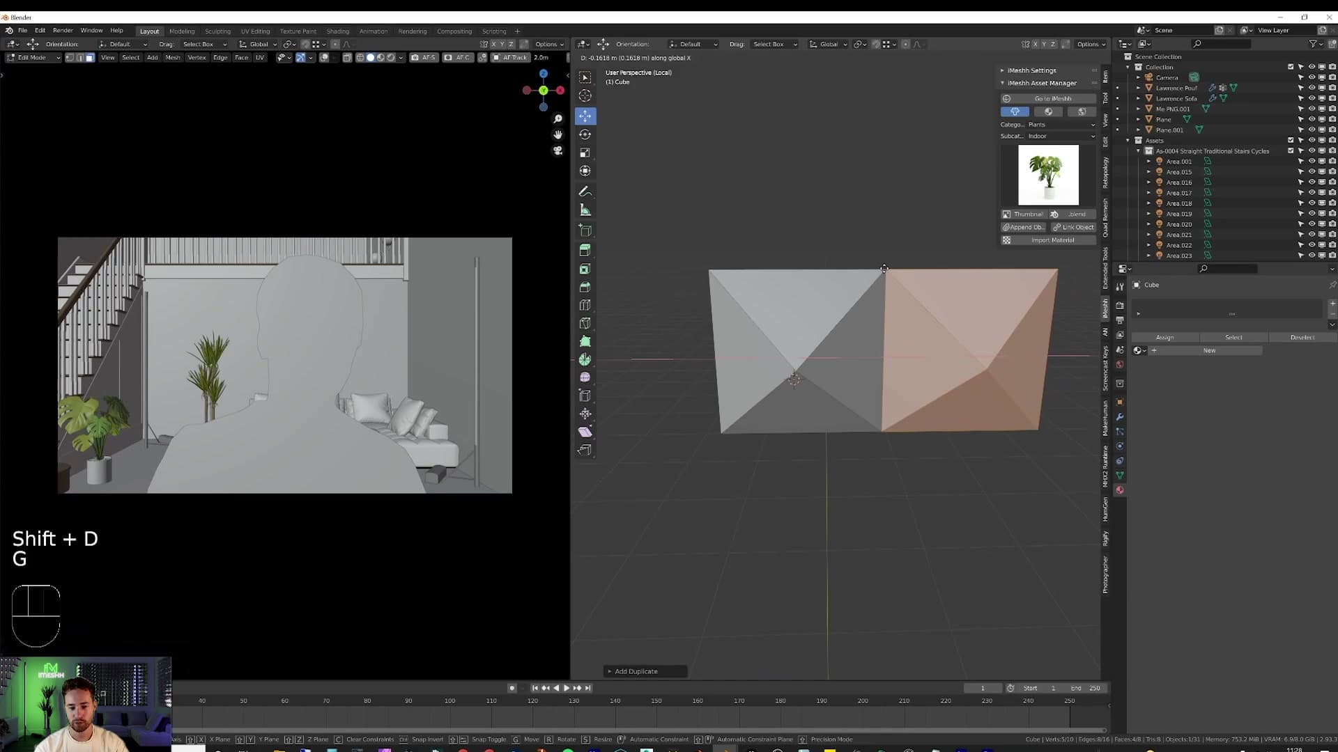
Tab into edit mode, press 1 for vertex select, and grab all eight vertices. Hit M and choose Merge at Centre. The cube collapses to a single point, which you then pull into the rough profile of one corrugation ridge. Finally, delete the back face. The panel will sit flat against the wall, so nothing behind it ever gets seen.
Snapping verts to build the corrugation wave
With the back face gone you've got a half-open ridge that needs to be duplicated and stitched into a wave. Open the snapping menu in the viewport header, switch snapping on, and set the snap target to Vertex so any duplicated edge locks onto an existing corner instead of floating off by a fraction.
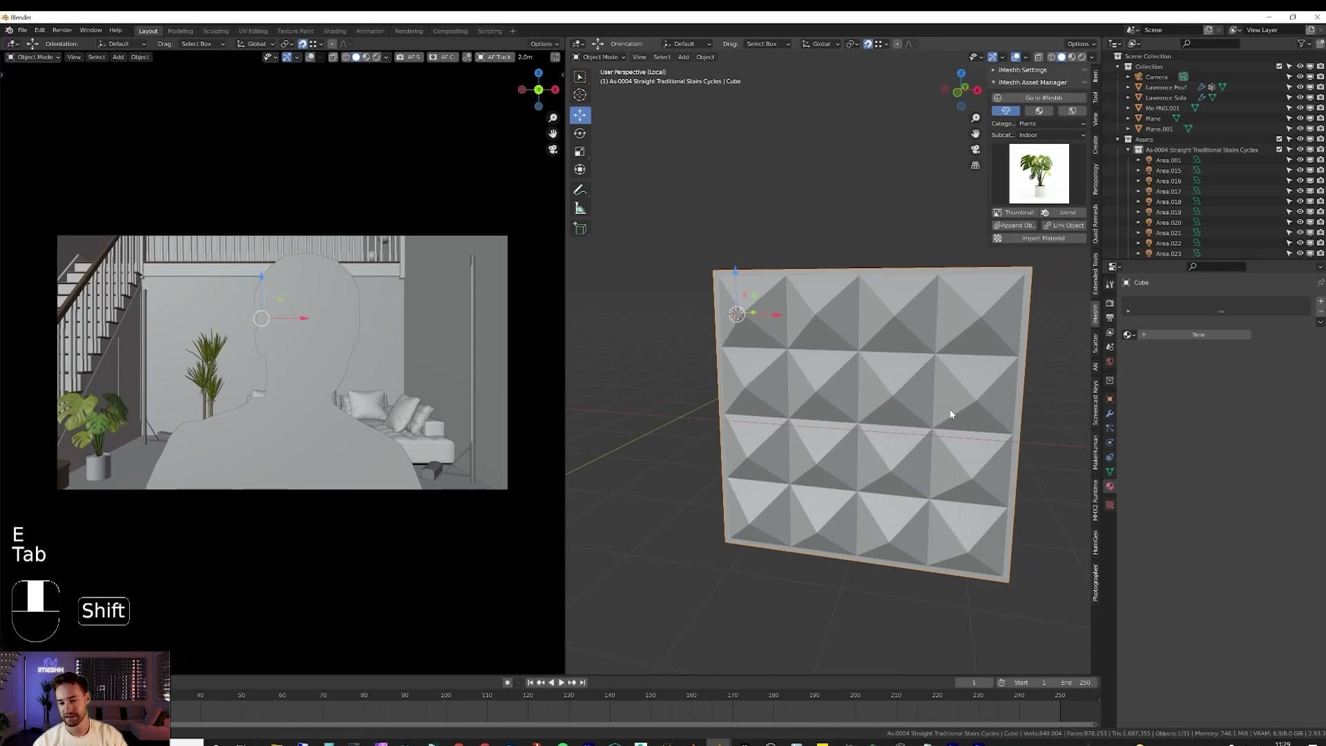
Press G to grab the ridge edge and slide it towards the corner you want to start from. Blender pulls it onto the nearest vertex as you get close. With everything selected via A, hit Shift+D to duplicate, drag the copy across, and let it snap onto the next corner. Press A again, Shift+D, constrain the move to Z, and snap the next pair into place. Repeat until you have one full wave shape.
Because every duplicate landed exactly on top of an existing vertex, the mesh is now full of overlapping points. Select all and run Mesh > Merge by Distance (or press M and pick it from the menu). That welds the doubled vertices into a single continuous strip.
To give the segment a connecting flange on the outside, hold Alt and click the outer edge loop, then press E to extrude and S to scale the extrusion in. That leaves a flat lip the next tile can butt against cleanly.
Tiling the panel with Array modifiers
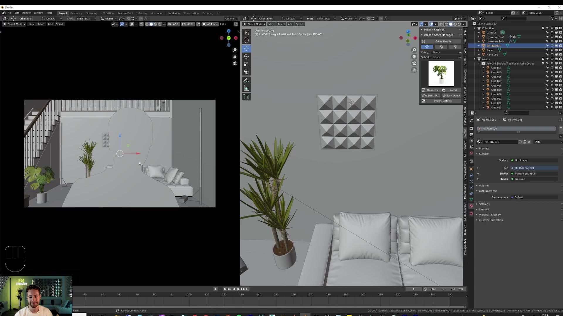
Modifiers do the rest of the work. Drop out of edit mode, open the modifier properties panel, and add an Array. The default settings already repeat the segment along X, so the moment you add it you can see the wave running across the wall. Bump the count up until it covers the width you want.
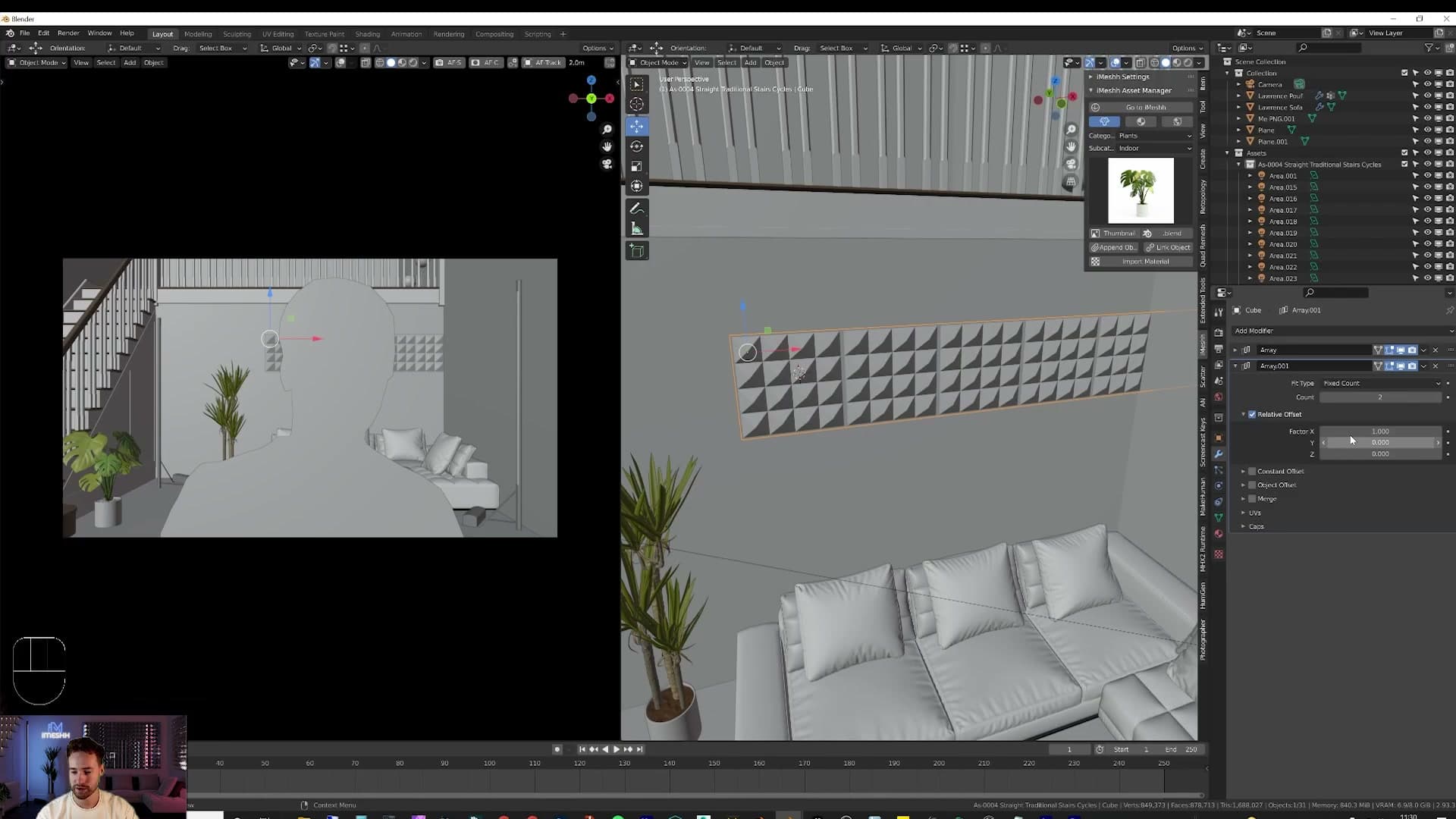
Now stack a second Array on top. Zero out its X factor and set the other axis to -1 so the panel tiles downward instead of sideways. Between the two modifiers the whole corrugated wall builds itself in a couple of clicks. Keep dialling the counts until it fills the visible part of the back wall behind the camera.
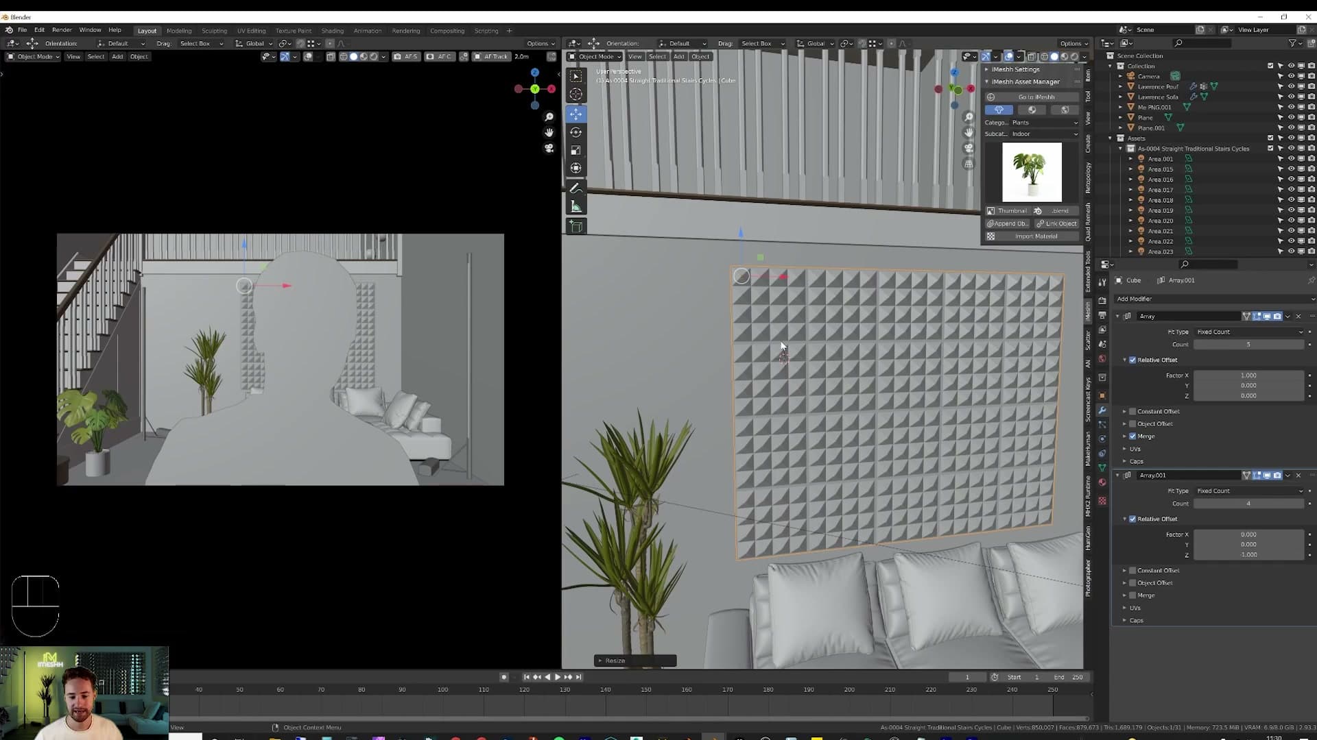
Unwrapping and applying the chrome material
Before you can drop a texture on it the panel needs unwrapping. Tab back into edit mode, press A to select everything, then U > Unwrap. Open the UV editor and you'll see Blender has flattened the geometry into a clean projection. That's all it needs to know how to lay a material across the ridges without smearing.
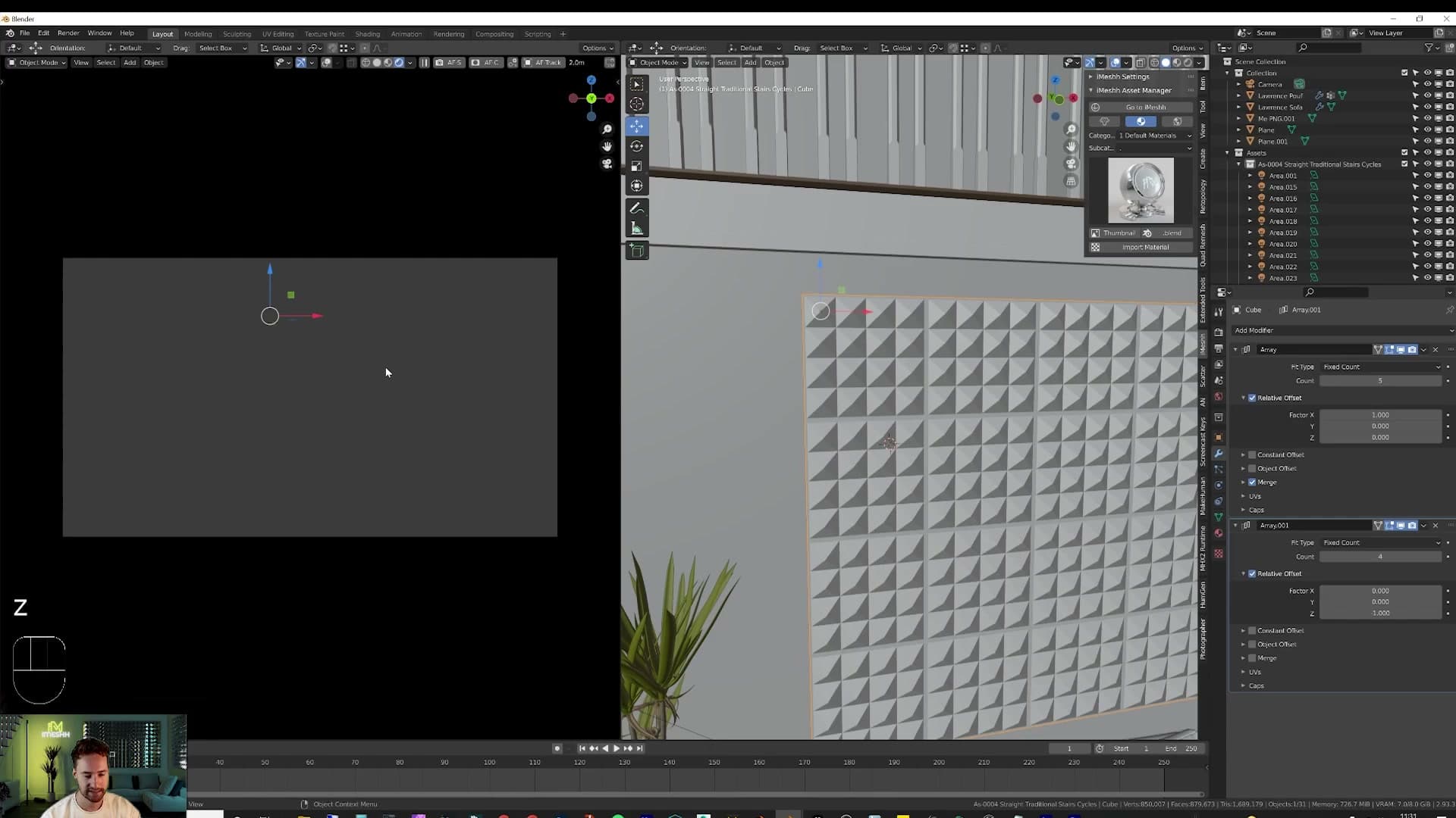
For the surface, the iMeshh free Default Material Pack ships a material called Metal Chrome Marked. From the iMeshh Asset Manager, browse to Materials > Default Materials, select Metal Chrome Marked, and click Import Material.
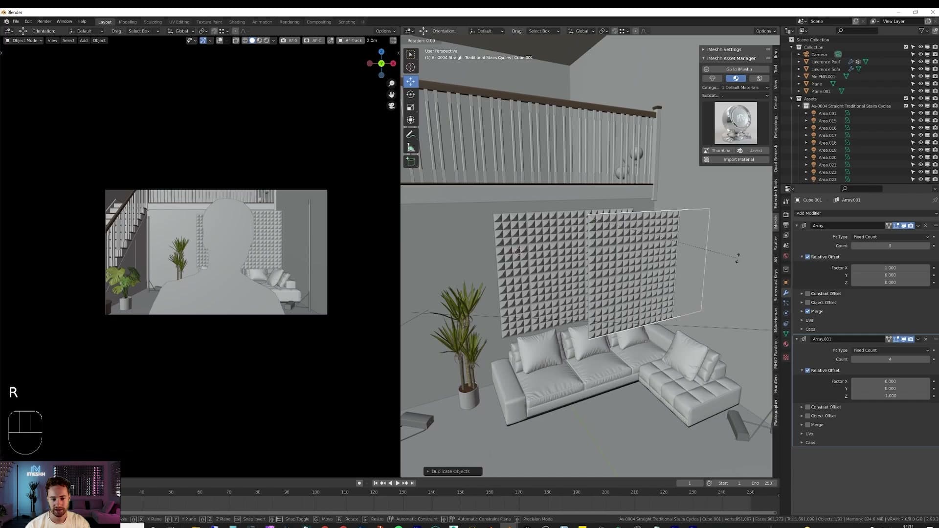
Switch the viewport into rendered preview and the wall picks up a worn chrome finish straight away. Slightly battered around the edges, which sells it as a real industrial panel rather than a perfect CG surface.
Bevelling edges and rotating the panel into place
Once you're happy with one corrugated section, Shift+D duplicates it, slide it into position, then R Z -90 rotates a copy ninety degrees on the Z axis so the panel runs along the adjoining wall. Move it up into place against the back wall and repeat as needed to wrap the rest of the set.
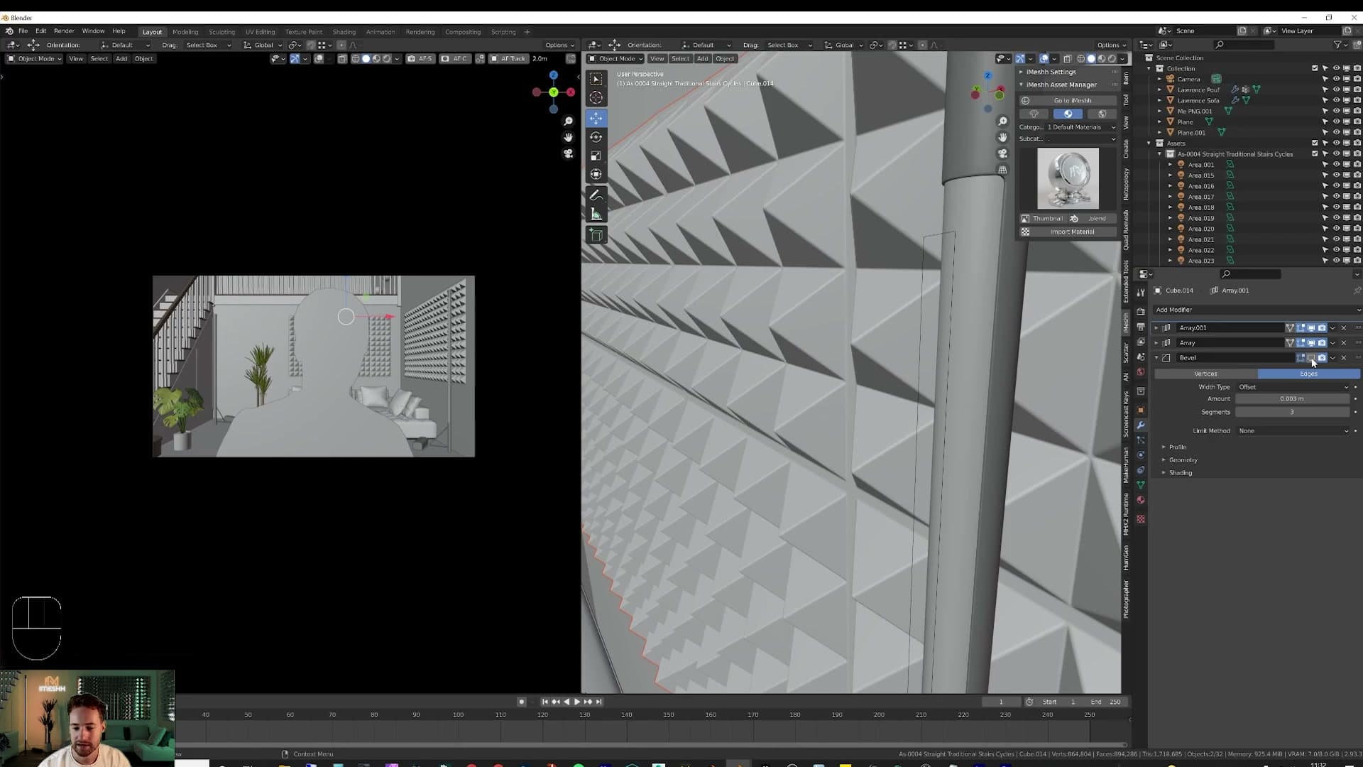
As a final pass, add a Bevel modifier on top of the two Arrays and set its Limit Method to None. That tells Bevel to round every edge in the mesh, not just the angled ones, and it gives the corrugation a tiny soft chamfer that reads as real-world sheet metal under light. Skip the bevel and the edges stay razor-sharp. Fine if you want a dangerously crisp prop, but most real panels have a slight roll to them.
Bedroom, floor texture and SVG logo
Fill the loft with a bed and storage unit so the upstairs reads as lived-in. Drop an iMeshh wood floor onto the unwrapped ground, then import an SVG of your logo, extrude it, and turn it into an emissive sign you can recolour any time.
Adding a bed and storage unit upstairs
The loft has a mezzanine floor but nothing sitting on it, so the upstairs reads as empty whenever the camera tilts up. Append a bed from the iMeshh exclusive library, rotate it with R Z -90 so it faces the right way, and slide it into place against the back wall.
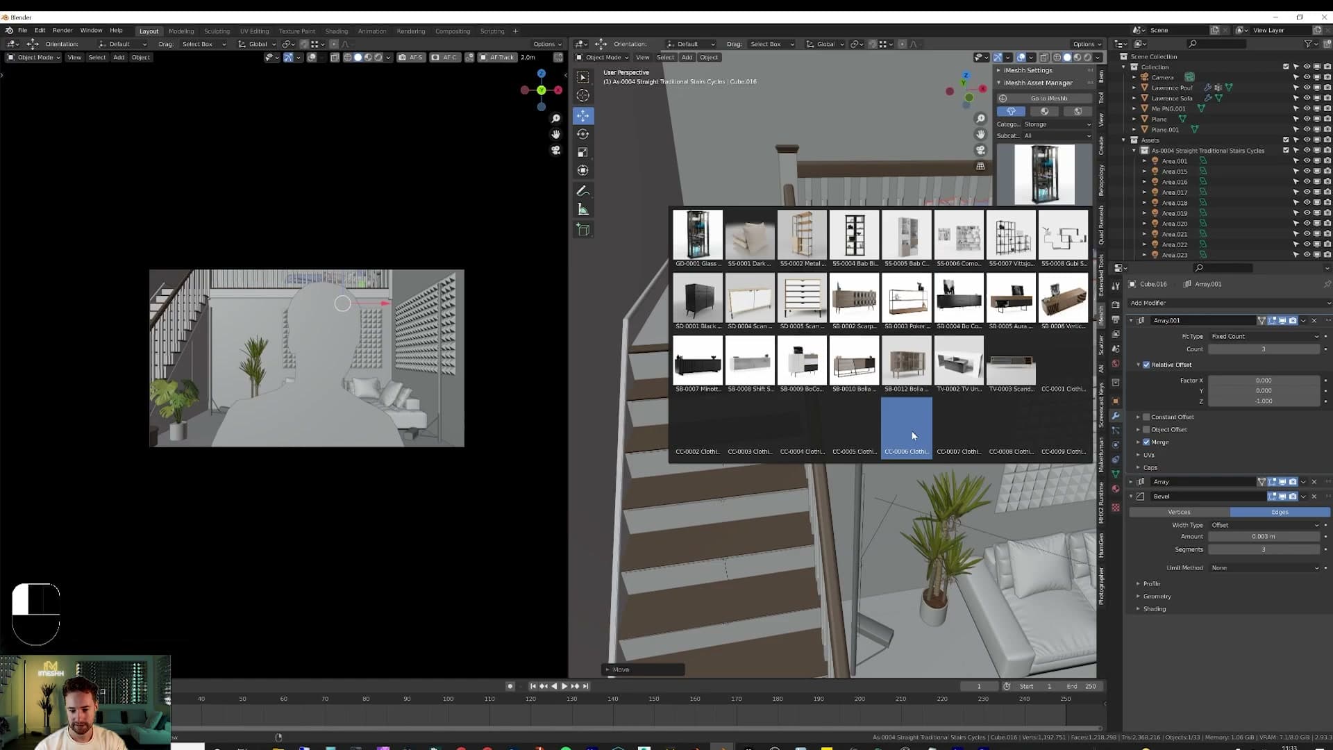
Append a storage unit next to it using the same File > Append workflow. Without it the wall behind the bed is just a blank white expanse; the unit breaks up that surface and gives the camera something to land on when it pans across the loft.
Applying a high-resolution iMeshh wood floor
Before the floor can take a texture cleanly, it needs a UV unwrap. Select the floor mesh, press Tab to enter edit mode, hit A to select all of the geometry, then U and unwrap.
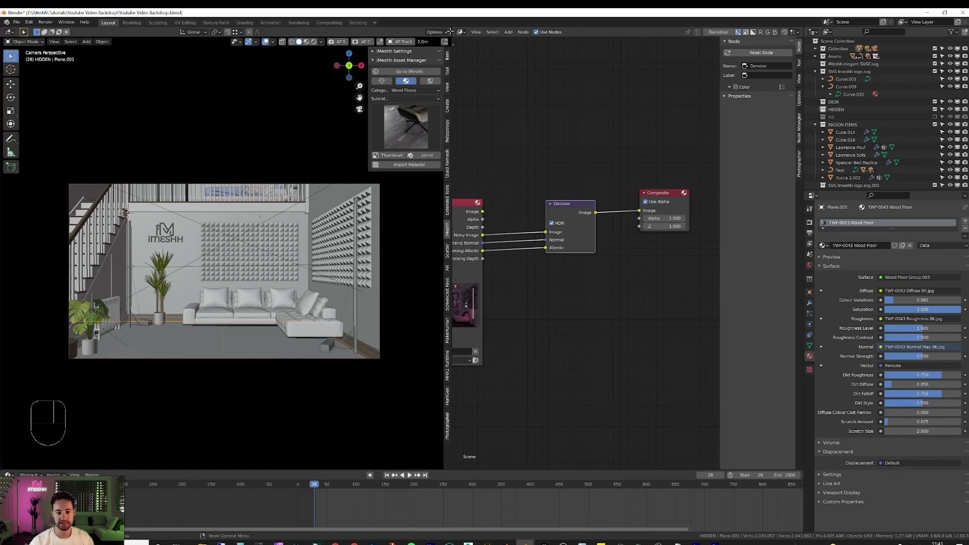
Drop in a wood floor from the iMeshh library. These textures go up to 16K, so there is plenty of detail to play with even when the camera sits close to the boards. Find the wood you like in the browser, click Import Material, and the shader is wired into the floor automatically.
Open the shader editor to fine-tune the look. The material exposes sliders for contrast, shininess, normal strength, dirt amount and dirt style. Dial each one until the boards match the mood of the room, clean and polished or aged and grimy.
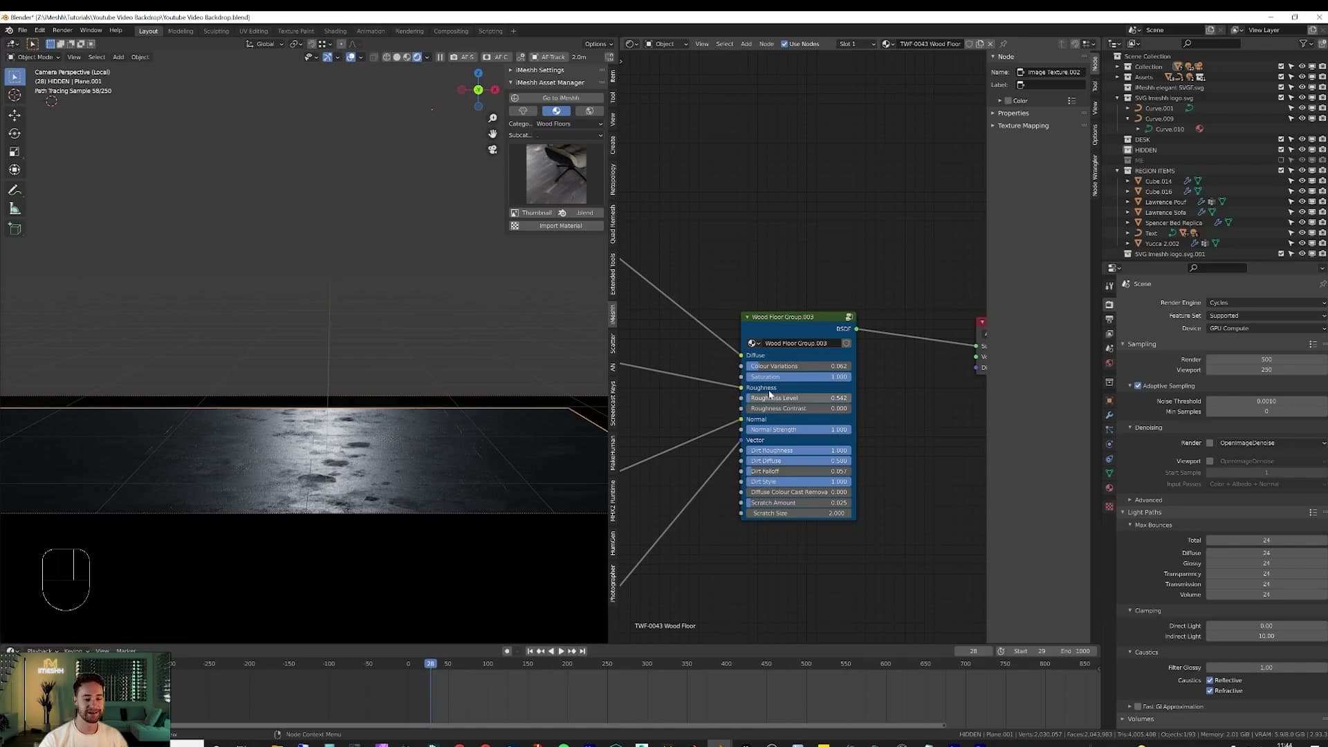
Switch the viewport to rendered preview while you tweak so you can see the result live.
Importing and joining your SVG logo
A logo on the wall is the quickest way to make the set feel like yours. If you have an SVG of your mark, you don't need to model anything: go to File > Import > SVG, double-click the file, and Blender drops the curves roughly into world centre.
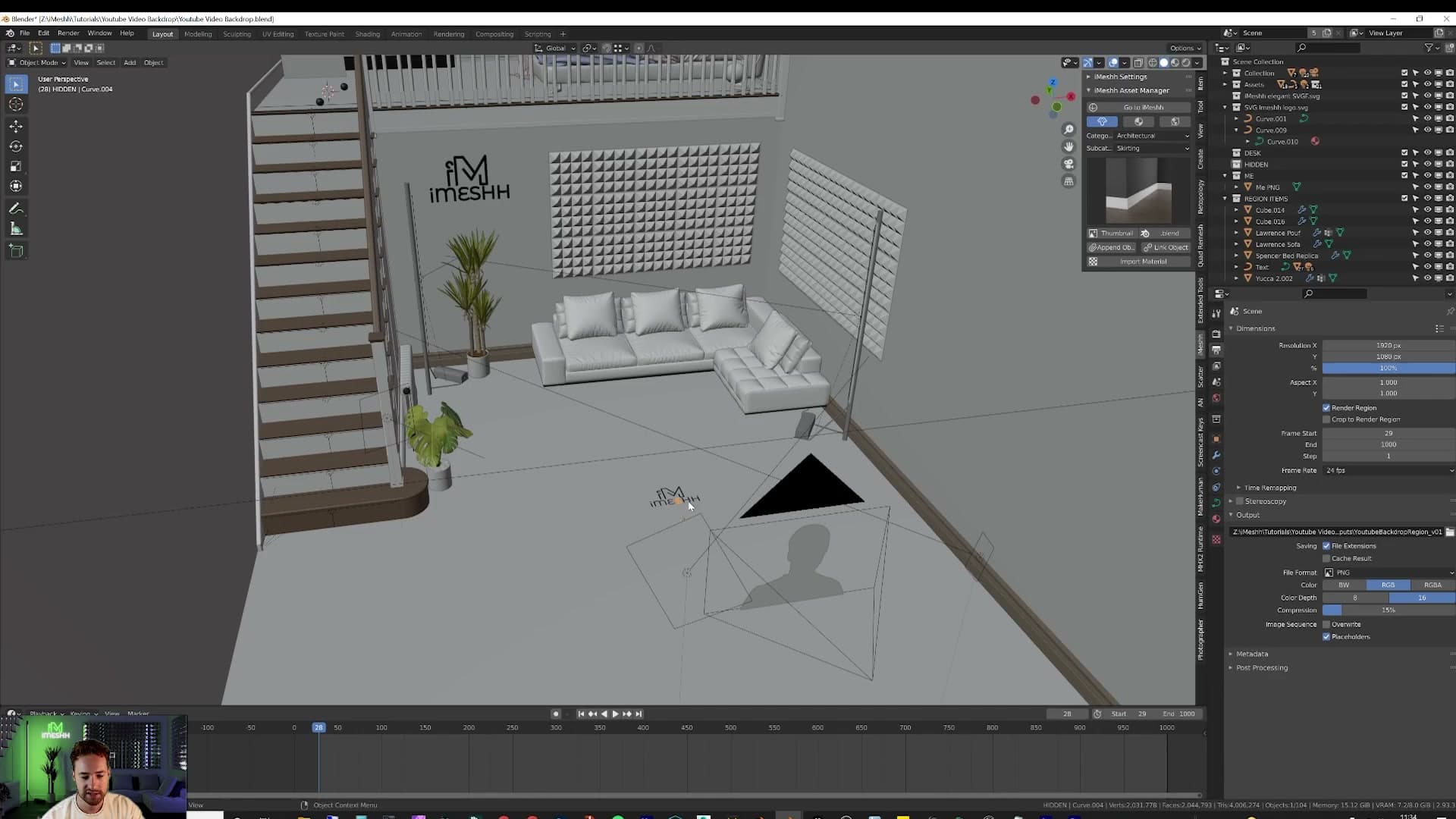
SVGs arrive as one separate curve object per shape, so a logo with multiple letters or pieces lands as a pile of independent objects. Box-select with B to grab the parts that belong to a single piece, hold Shift to drop anything you didn't mean to catch, and press Ctrl+J to join them into one object.
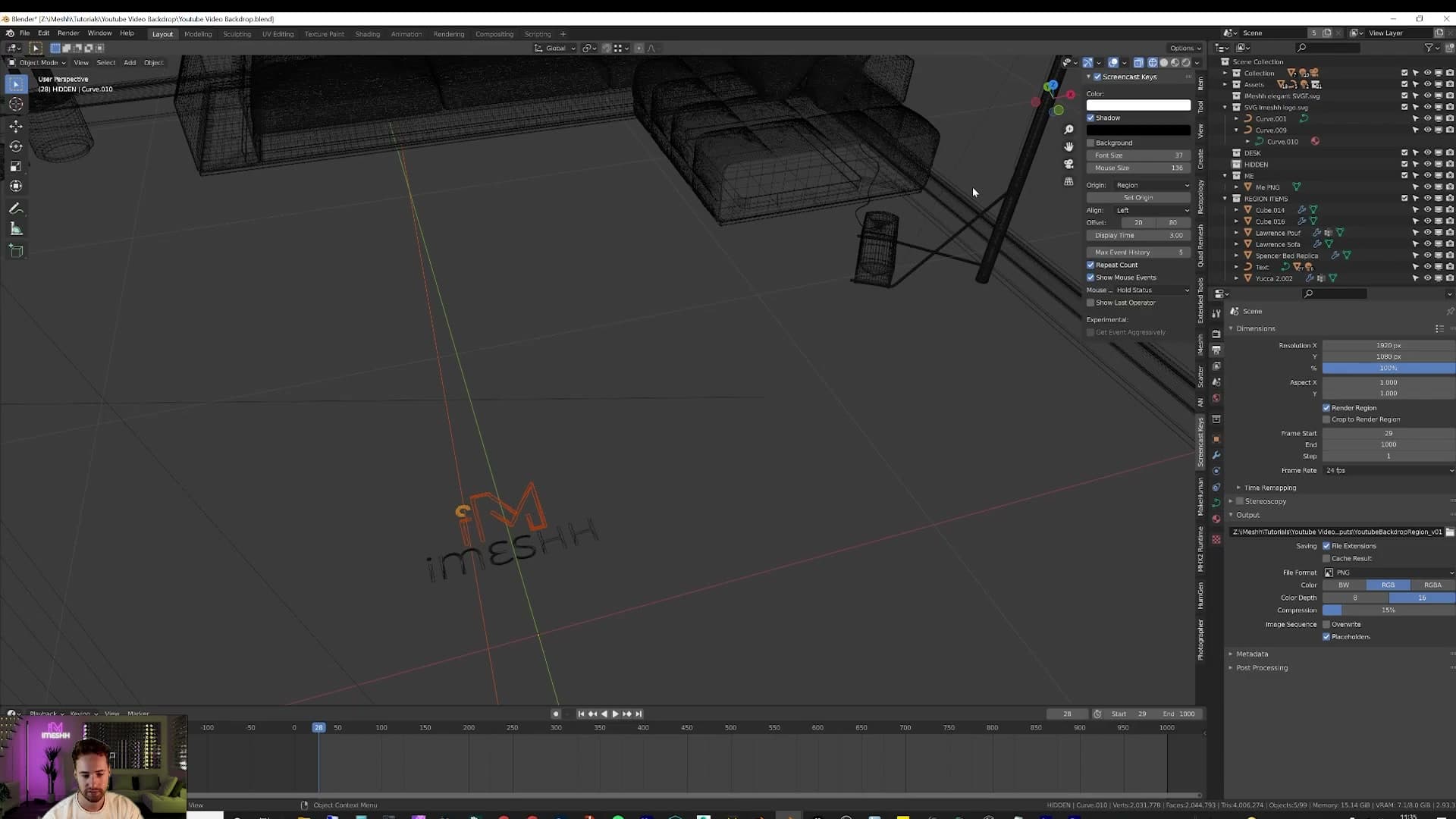
Repeat for any second piece so each shape you want to colour or move independently is its own object. Isolate the result with numpad / to enter local mode while you work. That hides the rest of the scene from the viewport so you can focus on the curves.
Extruding and lighting up the logo
SVG curves are flat by default. Open the green curve properties tab, find Geometry > Extrude, and drag the value up to give the logo real depth. Hold Shift while dragging for finer control so the thickness lands exactly where you want it.
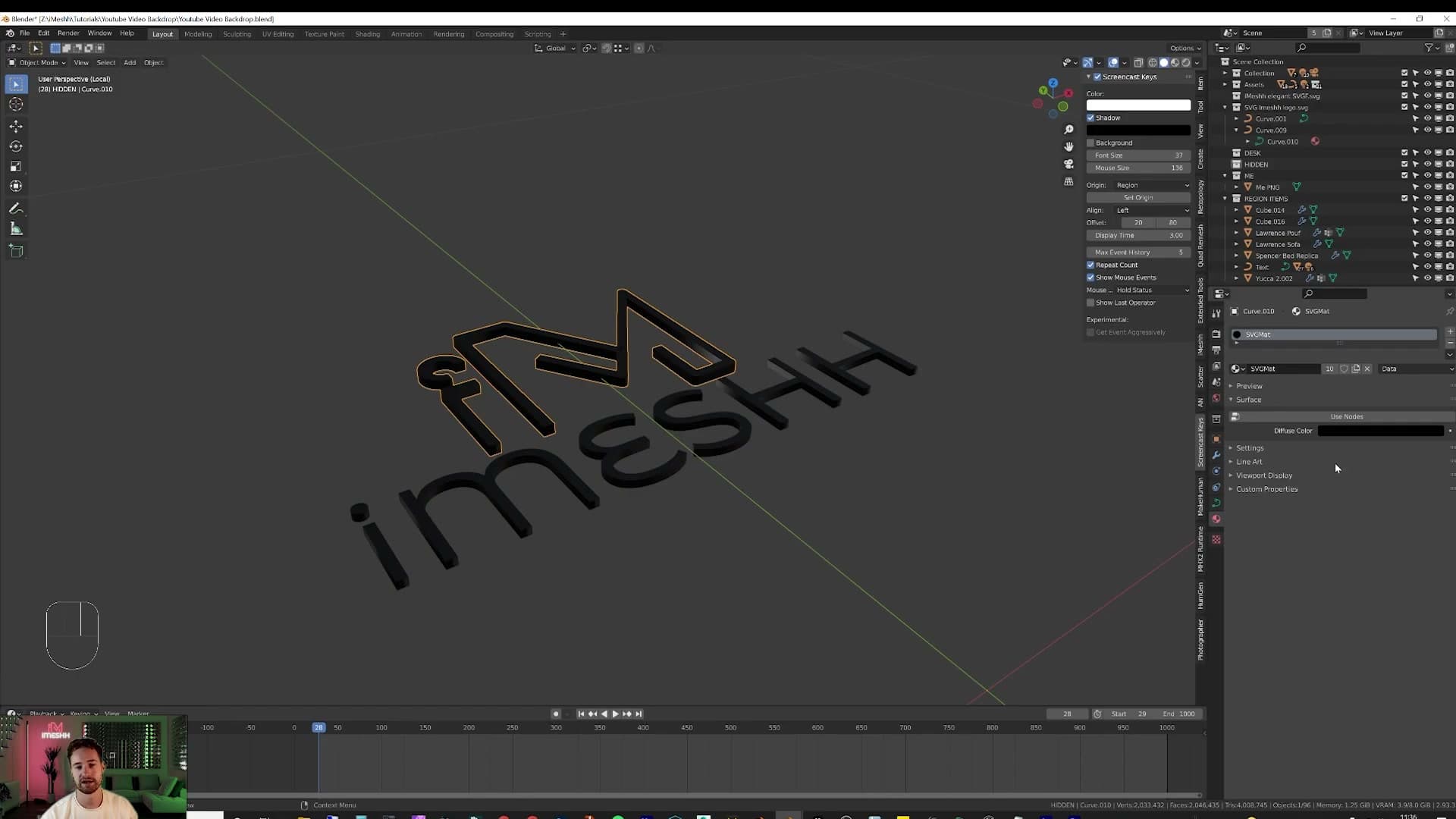
Switch to the material tab to make it glow. Click Use Nodes, then swap the default Principled BSDF for an Emission shader and choose the colour you want it to throw. Your brand colours pasted into the hex field work well here.
If the SVG came in as multiple objects, the second piece will already share the imported svg-mat material, so editing the colour on one changes the other. Click the New Material button next to the material slot to fork an independent copy, then recolour that one on its own.
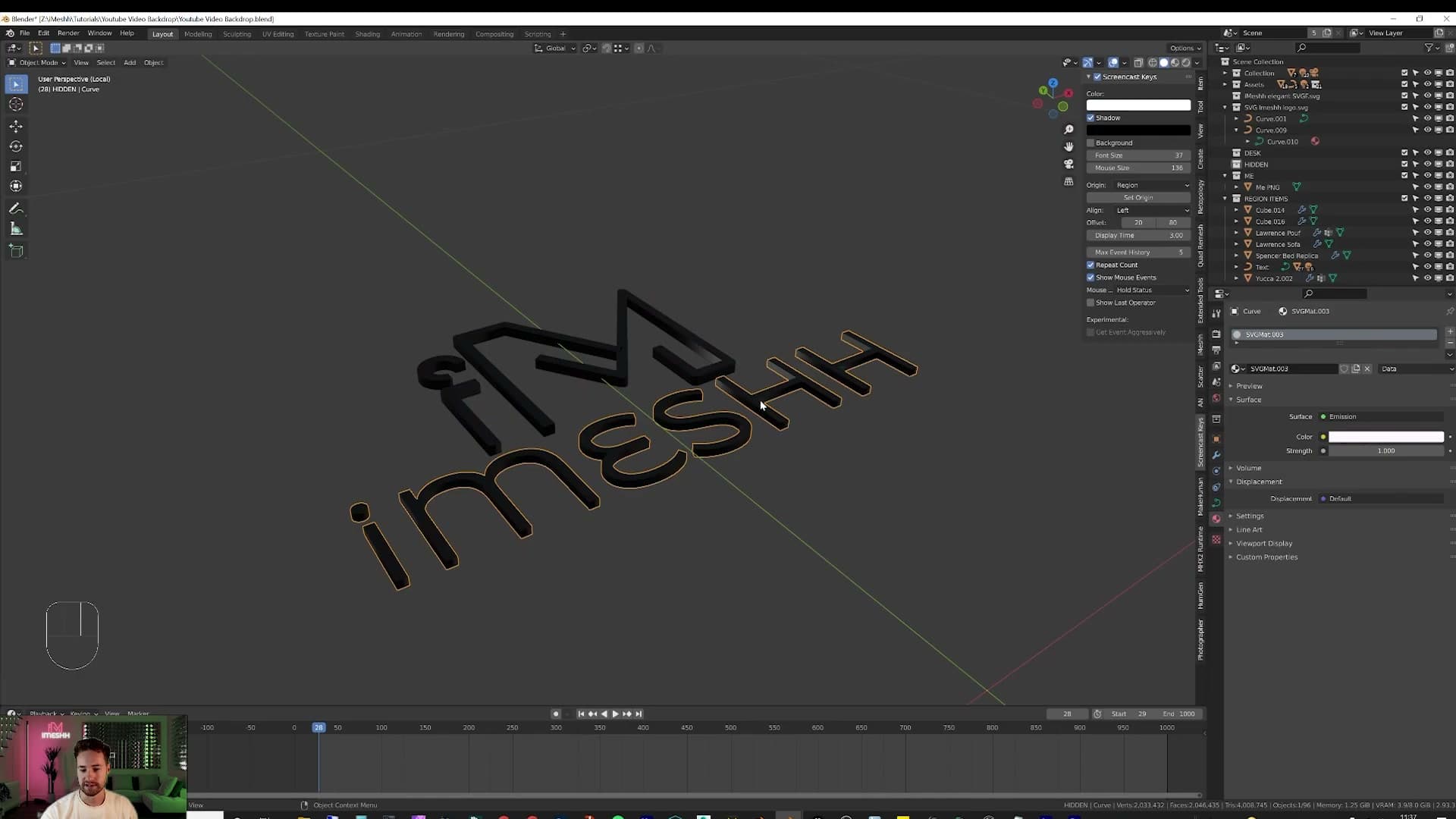
With each piece coloured, shift-select them both, press R X 90 to stand them upright against the wall, then scale and position to taste. You can finish with a small bevel on the curve itself to soften the edges.
Render settings, output and compositor denoise
Set the output to 1920x1080 (or 200% for 4K), pick PNG 16-bit for headroom, and enable Simplify if your GPU runs out of VRAM. Drop a Denoise node in the compositor and 500 samples becomes magazine-clean.
Output resolution and PNG vs TIFF
Once the scene is dressed and lit, open Output Properties. Set the resolution to 1920x1080, the standard YouTube frame. If your webcam or DSLR captures in 4K, leave the dimensions at 1080p but push the Resolution % field to 200%; Blender will then render the backdrop at 3840x2160. For most setups 100% is fine, since the backdrop only ever sits behind a 1080p feed.
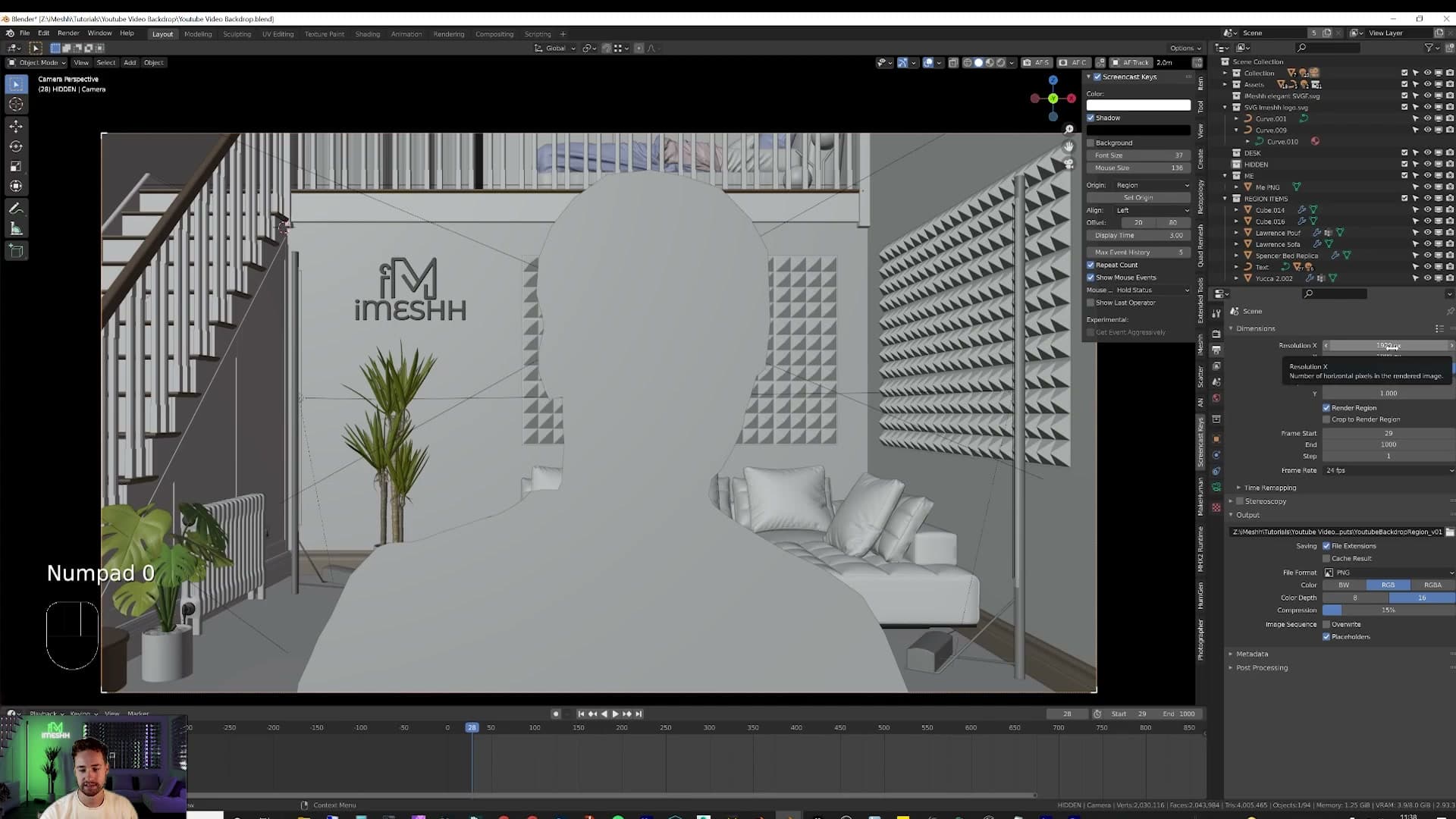
Be careful about changing the aspect ratio after you have framed the shot. If you stretch the output wider or taller, your photo cutout may end up clipped or floating off-frame. Press G then Z on the cutout plane and nudge yourself back into the composition before you commit to the new dimensions.
If you intend to render an animation, set an output path on the same panel so Blender knows where to write the frames. For the file format, choose PNG at RGB and a colour depth of 16-bit. The extra bit depth gives you headroom to push the lighting in post without colours clipping or banding.
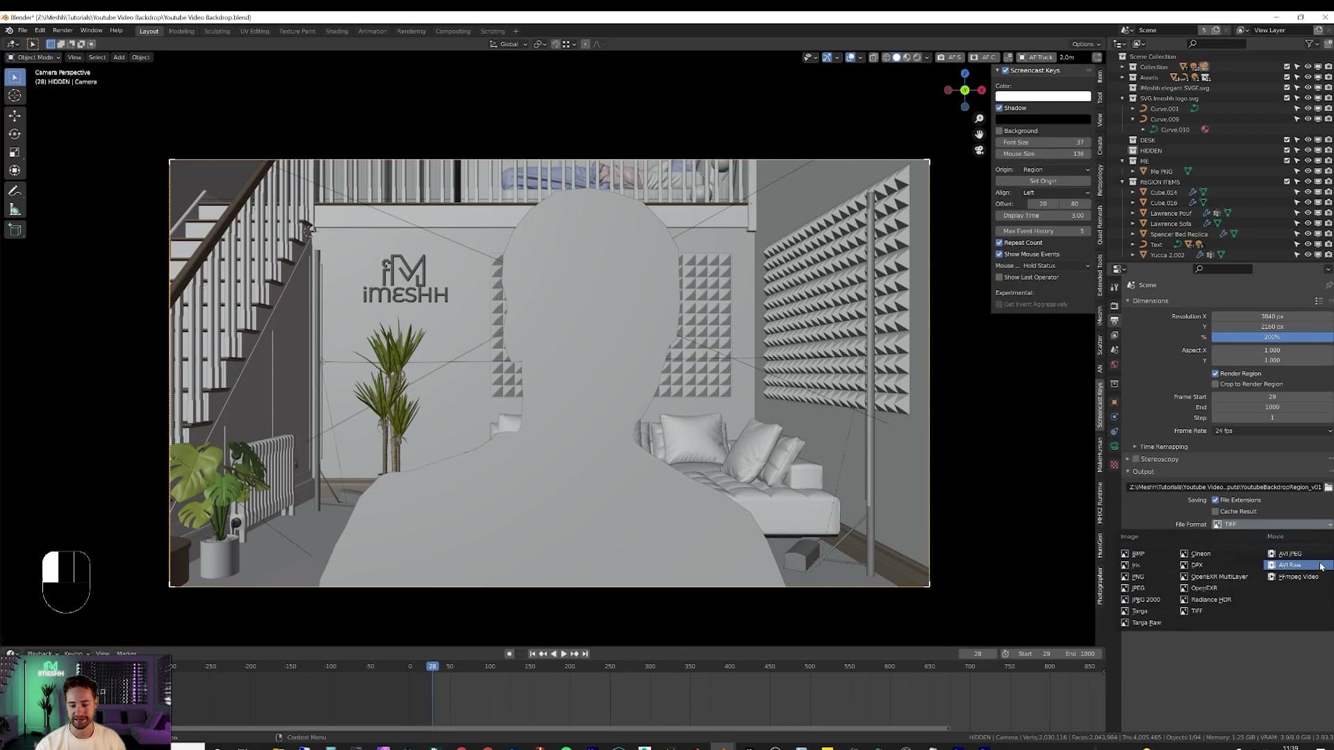
TIFF at 16-bit (or higher) is an option if you are still clipping when you grade hard, but TIFF animations chew through gigabytes of disk space per shot. PNG strikes the sensible balance for a backdrop that mostly needs to look clean rather than survive heavy regrading.
GPU render settings and Simplify
Under Render Properties, set the render device to GPU Compute. Cycles will hand the heavy lifting to your graphics card, which is dramatically faster than CPU for a scene this dense with glass, emissive materials and furniture.
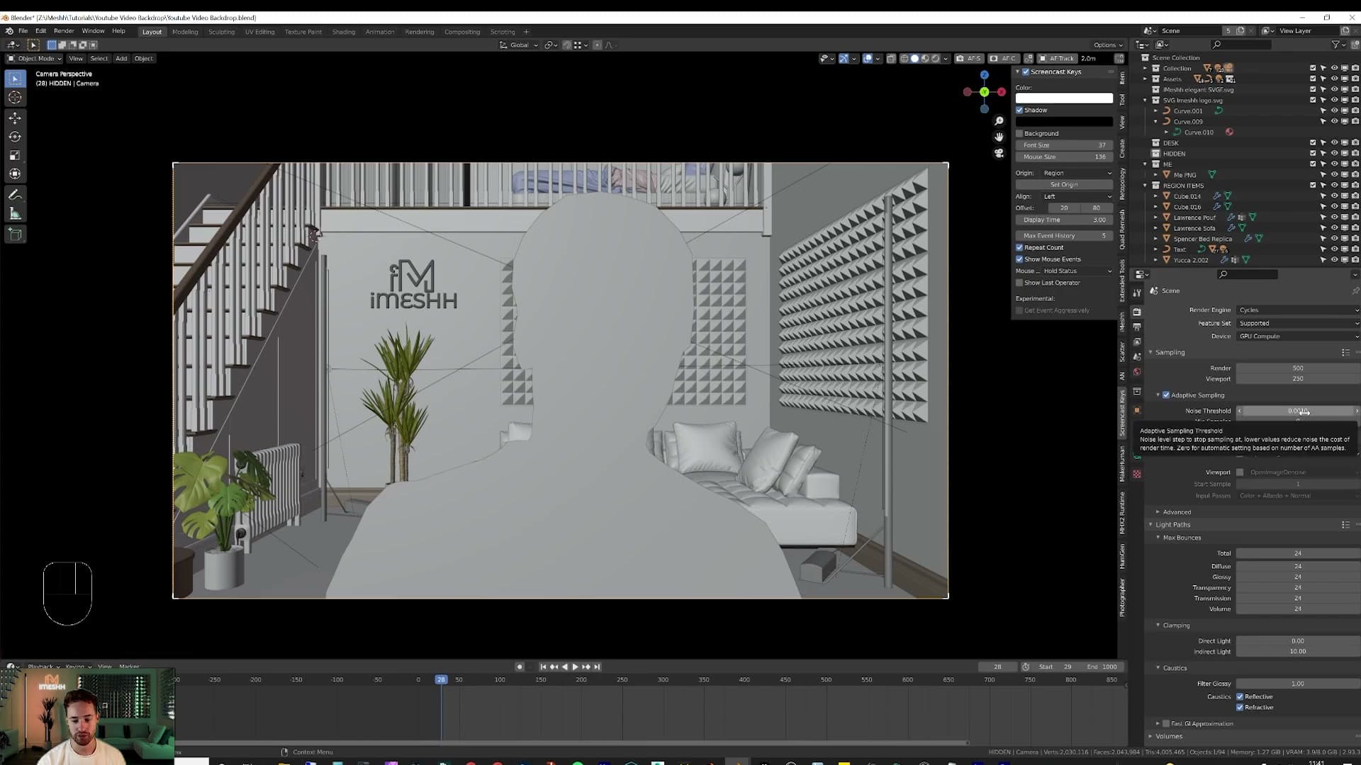
If your GPU is short on VRAM (my example is an 8 GB card), turn on Simplify further down the same panel. Under the Render sub-section, set Texture Limit to 2K. Asset Manager packs often ship 4K and 8K maps, which chew through VRAM very quickly; capping textures at 2K trims the memory footprint without a visible quality loss for a backdrop sitting behind a webcam feed.
From there, lower the remaining Simplify caps until your card can comfortably hold the whole scene. The goal is not a specific number. Bring the render down to something your hardware can actually finish. If it still drags on, drop these values lower again.
For sampling, set Adaptive Sampling's noise threshold to 0.001 and Max Samples to 500 per frame. That is an aggressive combination. Cycles will keep hammering the noisy patches until they clean up. Pull the threshold back towards Blender's default of 0.01 if you need to shave time off an animation render.
Wiring the compositor Denoise node
500 samples on its own will still leave visible noise in the shadows and reflections. The fix lives in the compositor. Switch to the Compositing workspace and tick Use Nodes if it is not already on.
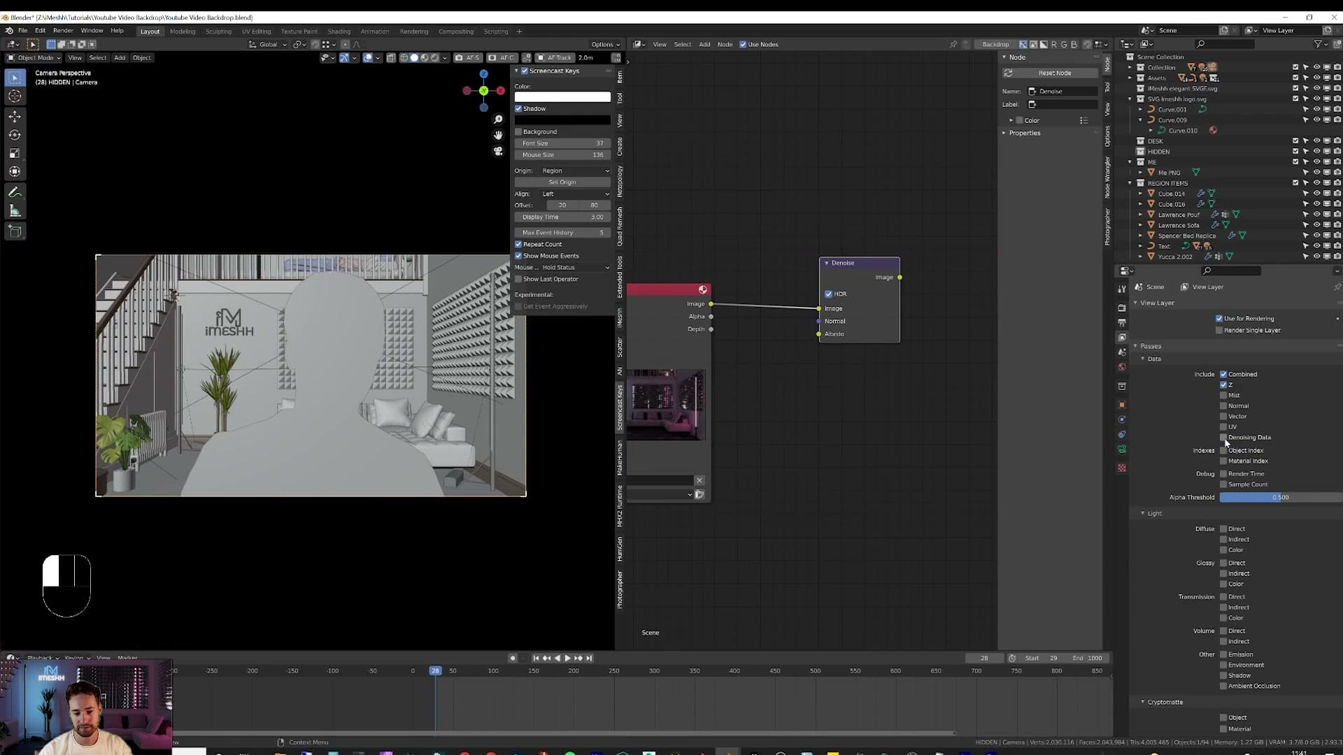
Over in View Layer Properties, scroll to Passes and enable Denoising Data. That tells Blender to output two extra passes (Normal and Albedo) alongside the noisy image. The denoiser uses both to keep edges and texture detail crisp instead of smearing them.
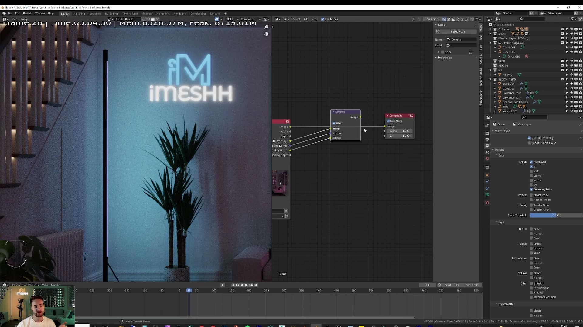
Back in the compositor, add a Denoise node from Add > Filter > Denoise. Wire the Render Layers Image output into the Denoise node's Image input, then plug Denoising Normal into Normal and Denoising Albedo into Albedo. Run the Denoise output straight into the Composite node and the chain is finished.
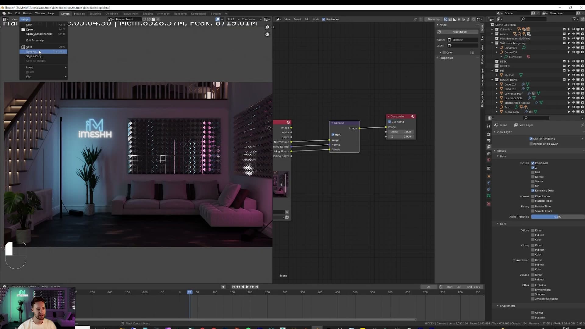
Hit F12 to render, then go to Image > Save As and drop the final still wherever you need it. The result is dramatic. The same 500-sample render that looked grainy a moment ago comes out magazine-clean once the denoiser has had a pass over it.
Physics simulation: coloured balls down the stairs
Duplicate the stairs as an invisible collider, drop a rigid-body sphere through a particle system capped at 50, and randomise per-ball colour with Object Info plugged into a Color Ramp. The result is a free animated focal point for the loop.
Creating the rigid-body sphere
With the loft built, the lighting locked in and the camera framed, the scene already works as a still. Adding a small piece of physics is a cheap way to turn it into a loop. The idea is simple: tip a stream of coloured balls down the stairs, let Cycles do the bouncing, and the room suddenly has motion without any keyframes.
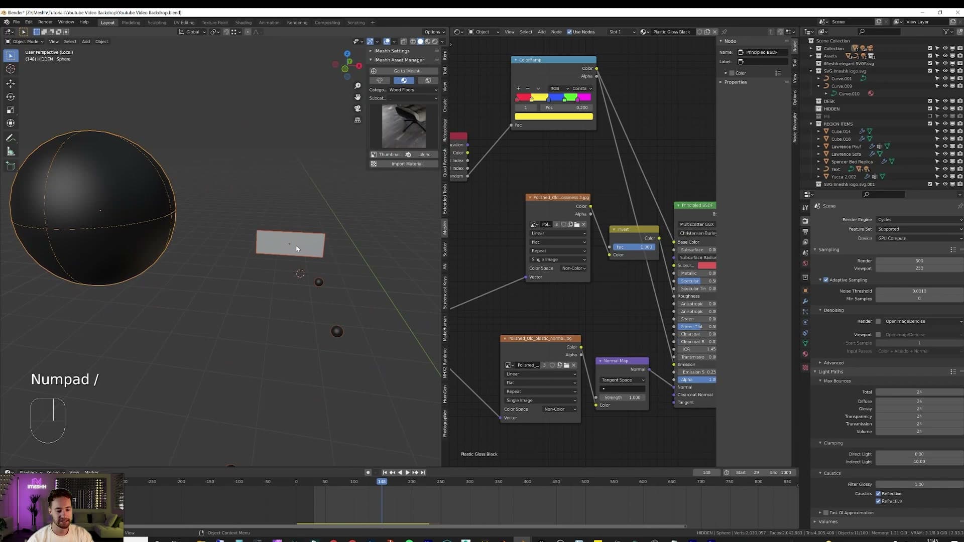
Start with a single ball. Add a UV sphere where you want the balls to drop from, right-click it and choose Shade Smooth so it renders as a clean ball rather than a faceted polyhedron.
With the sphere still selected, head into the Physics properties tab and add a Rigid Body. Leave it on the default Active type (that's what tells Blender this object should fall and react to collisions) and change the Collision Shape to Sphere. Sphere collision is both faster and more accurate for a ball than the default Convex Hull.
Emitting the sphere from a particle system
One rigid-body sphere bouncing once isn't much of a loop. To get a steady stream of balls you emit copies of it from a particle system, using a small plane as the emitter.
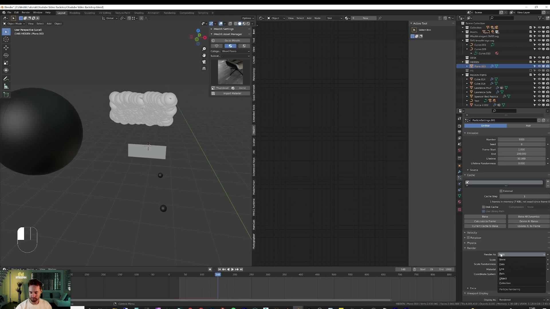
Add a plane somewhere above the top of the stairs, scale it down and move it into position. This is the invisible spawner; nothing about it needs to look pretty because it won't be visible in the final render. With that plane selected, open the Particle Properties tab and add a new particle system. Under the Render section, set Render As to Object and pick your sphere as the instance object. Hit play and you'll see Blender immediately fire a wall of spheres out, far too many all at once.
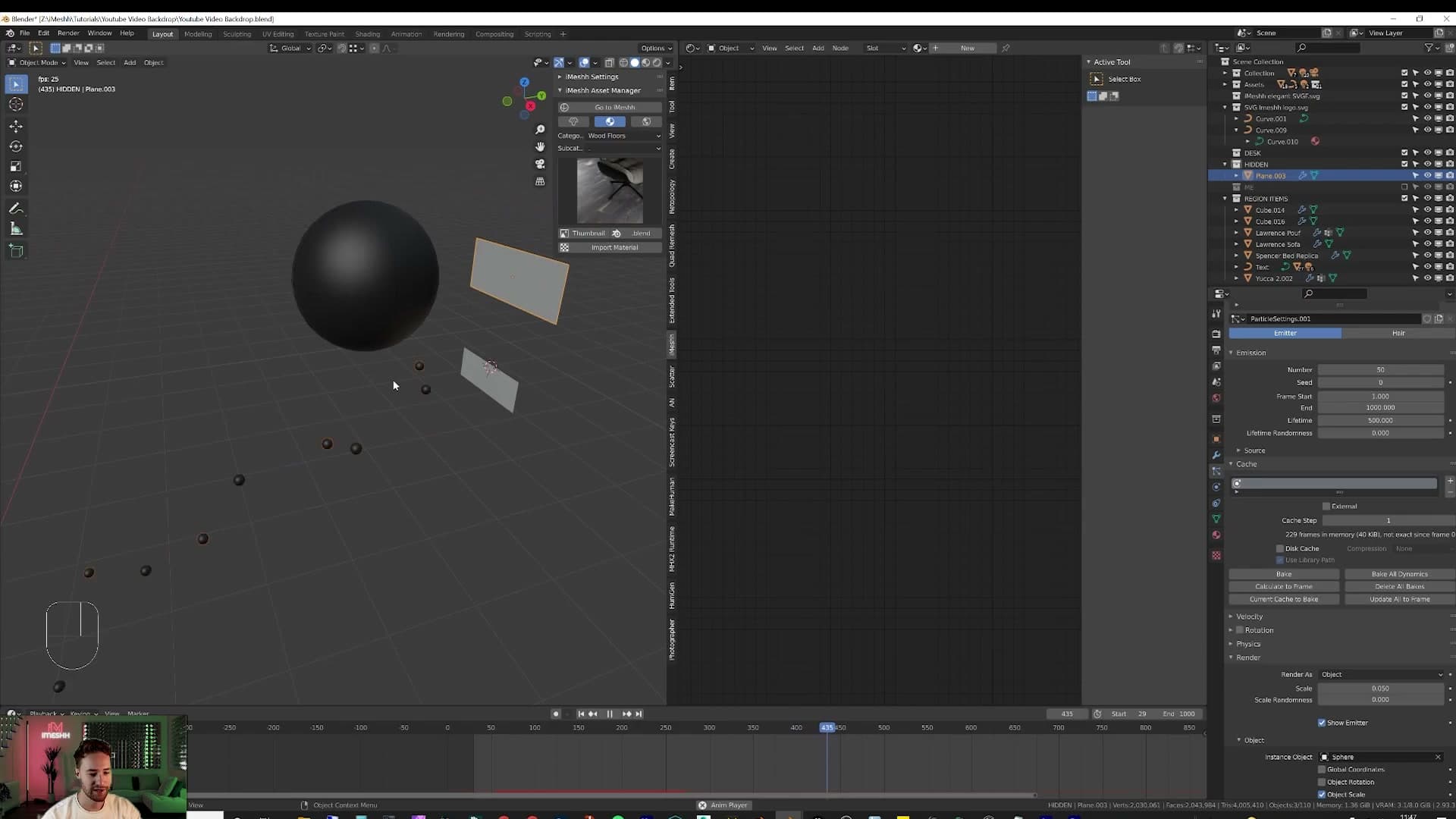
Three settings tame that. Set Number to 50 so the system only ever emits fifty balls in total. Stretch the emission window across the timeline by setting Frame End to 1000 so the balls trickle out rather than blast out in a single frame. Finally, raise Lifetime to 500 frames. That's long enough for each ball to roll off the stairs and out of frame before the simulation deletes it. If you leave Lifetime at the default the balls vanish mid-bounce.
Duplicating stairs as an invisible collider
The balls need something to bounce on, but you don't want to make the actual stair geometry a rigid body. Turning your hero stairs into a physics object risks breaking the modifier stack and limits how you can tweak the look. The trick is to duplicate the stair faces, hide the duplicate from view, and let the duplicate do the colliding.
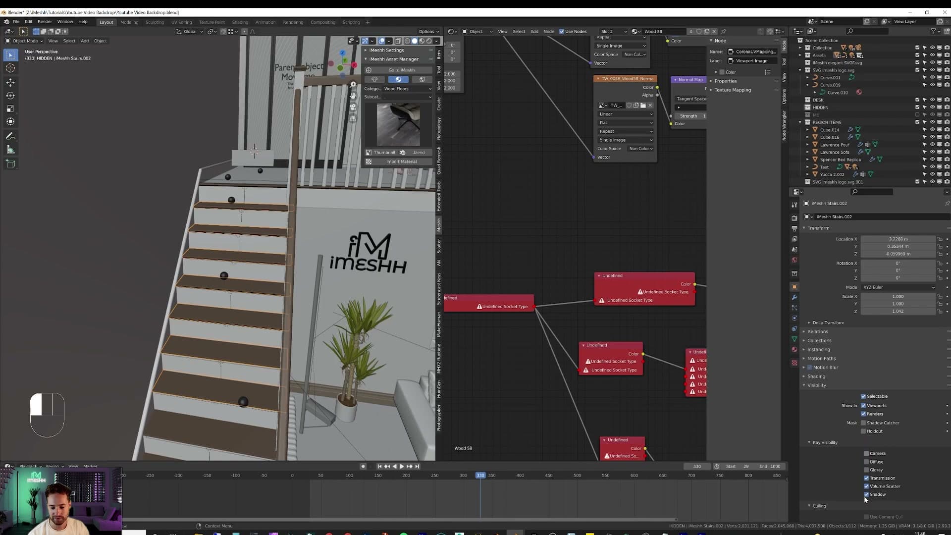
Tab into edit mode on the stairs and select the stair faces you want the balls to hit. Press Shift+D to duplicate, Enter to drop them in place, then P to separate the duplicated faces into their own object. You now have an invisible twin sitting on top of the original stairs.
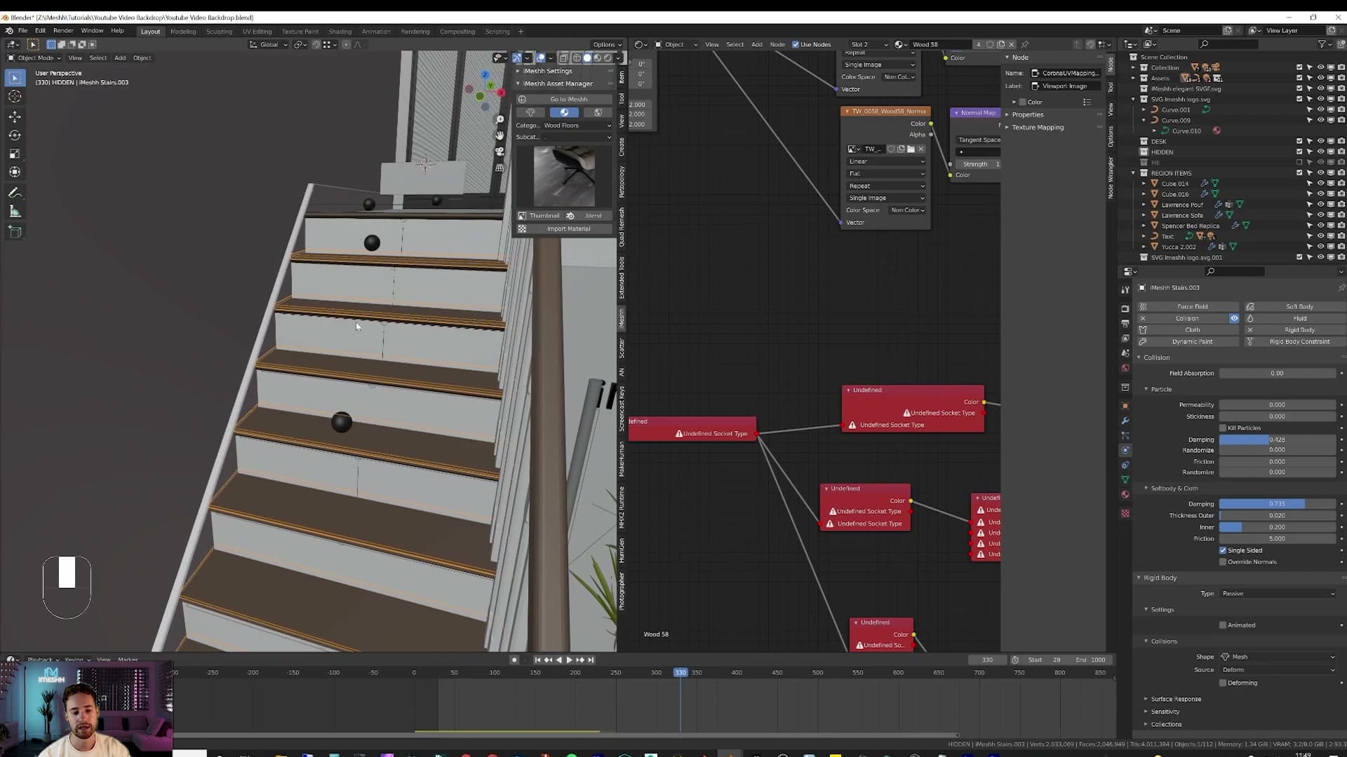
Select that new object and head to the Object Properties panel. Under Visibility, turn off the camera, viewport and ray visibility flags so it won't show up in renders or get in your way as you work. Then set its Display As to Wire. That way you can still see it in the viewport to position it, but it's clearly marked as a helper object.
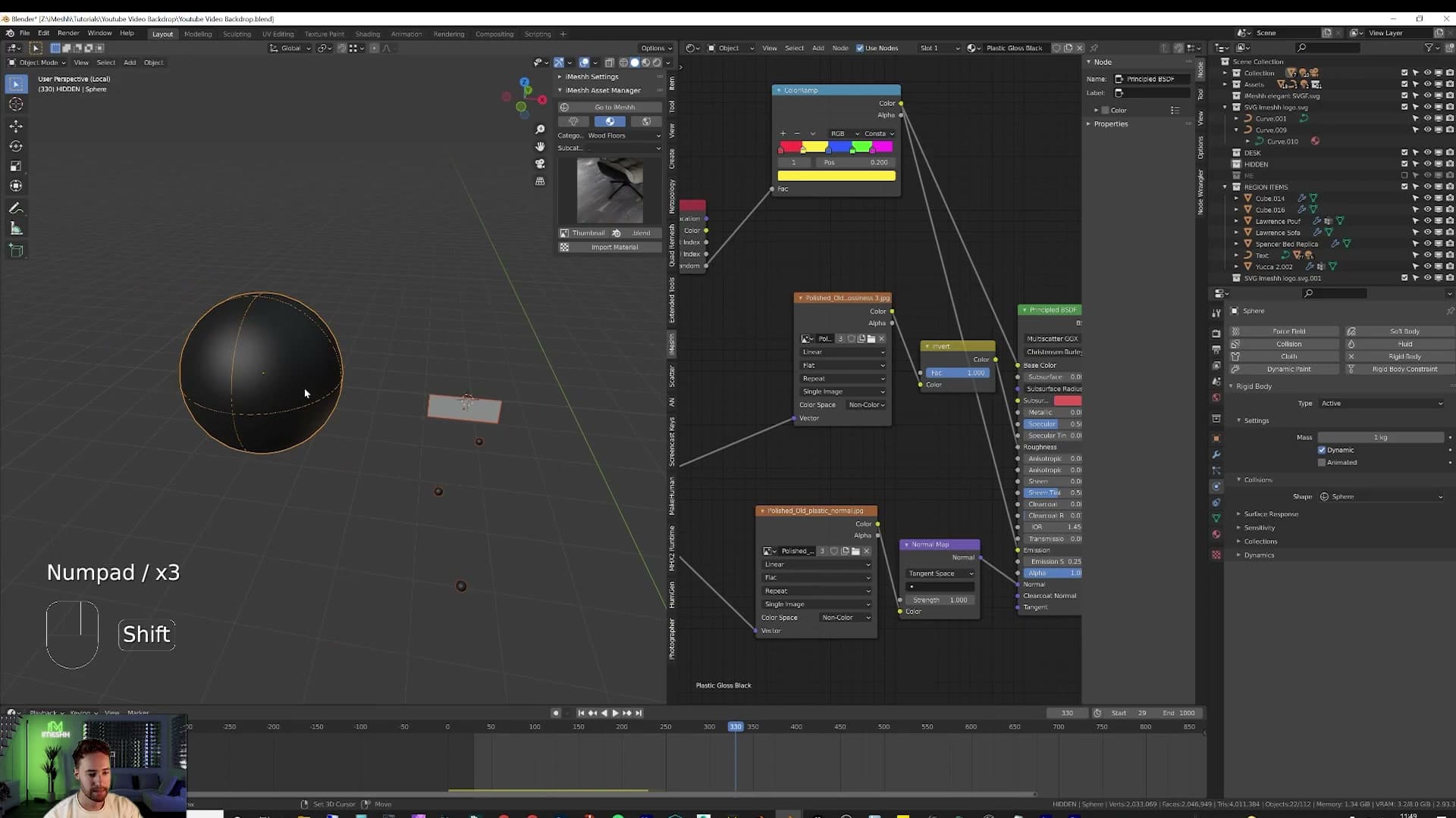
Now give it physics. Add a Rigid Body, set the type to Passive so it stays put under the falling balls, and leave the collision shape on Mesh so it follows the stair profile exactly. Out of the box the balls will rocket off the steps like they're made of rubber, so add some translational and rotational damping on the spheres until they roll down the stairs at a pleasing pace rather than launching into orbit.
One small gotcha: if you find balls clipping through the steps and falling out of the bottom of the staircase, nudge the invisible collider up by a few millimetres. The collision-margin setting can fix this more elegantly, but moving the helper geometry up a touch is the fastest fix and what worked for this scene.
Randomising per-ball colour with Object Info
Fifty identical white balls down the stairs looks fine. Fifty balls in every colour of the rainbow looks fun, and that's what sells the loop as a hero shot. You get there by combining a plastic material from the iMeshh default materials pack with the Object Info node, which is Blender's built-in way of giving every instance of an object its own randomised input.
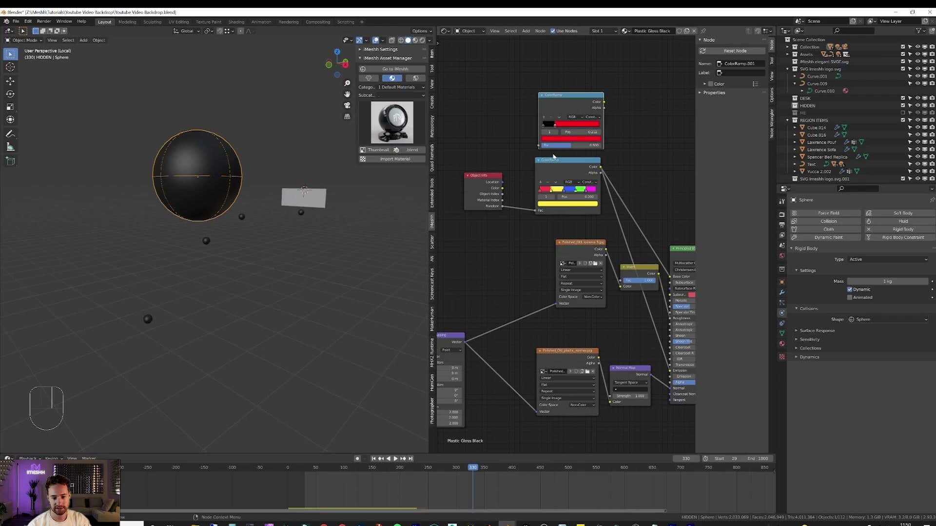
Start with the base material. Select the sphere and, with the iMeshh add-on open, go into the default materials and pick a plastic shader. Anything with a slightly imperfect, lightly textured surface so the balls don't read as flat CG circles. Click Import Material to bring it onto the sphere. Switch to render preview and you'll see the texture come through. While you're here, this is also the moment to scale the sphere if it's too big or too small. The particle system inherits the scale, so resizing the source ball resizes every emitted copy.
Now open the shader editor and add an Object Info node. The Random output spits out a different number between 0 and 1 for every object instance, which is exactly the signal you need to drive per-ball colour. Press Shift+A and add a Color Ramp, then set its interpolation mode to Constant. That's what gives you hard-edged colour bands rather than gradients blending between balls.
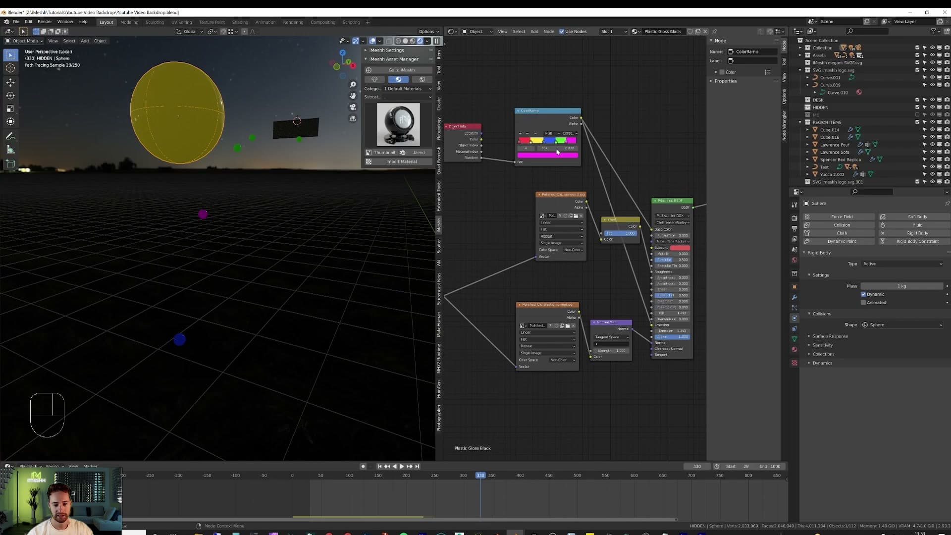
Add as many colour stops as you want distinct ball colours, clicking the + button to insert each one and picking a colour for each stop. Keep the saturation a notch or two below full. Fully saturated primaries almost never exist on real plastic objects, and dialling them back is what separates “CG” from “photographed”. Plug the Color Ramp's colour output into the material's Base Color.
The position of each stop on the ramp controls how often that colour appears. Drag a stop wider and more of your balls will land on that colour; squash it narrow and it becomes rare. Tune this until the distribution feels right for your scene.
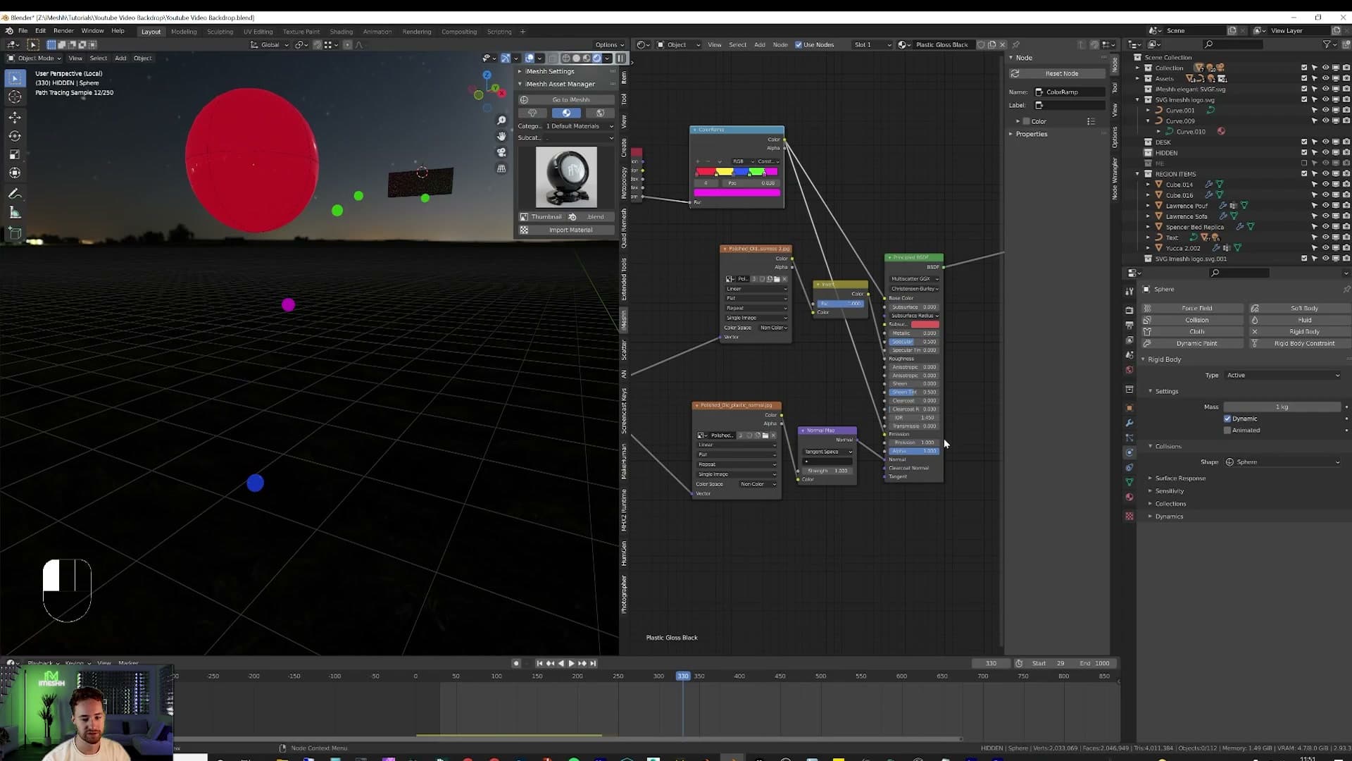
Finally, run the same Color Ramp output into the shader's Emission input and set Emission Strength to 0.25. Low enough that the balls don't glow like Christmas lights, high enough that each one casts a faint coloured kick on the steps around it as it tumbles. A small touch that ties the physics into the scene's lighting.
Animating lights and finishing the loop
Keyframe a light's colour at frames 0, 500 and 1000 to get a slow blend that loops behind you. Hide your reference cutout in its own collection before the final render. You've got a backdrop that reinvents itself every video.
Keyframing light colour across the timeline
The final touch is to get the lights themselves shifting colour over the course of the animation, so the backdrop never sits in exactly the same mood for two videos in a row. You drive this by keyframing the light's colour input directly on the timeline.
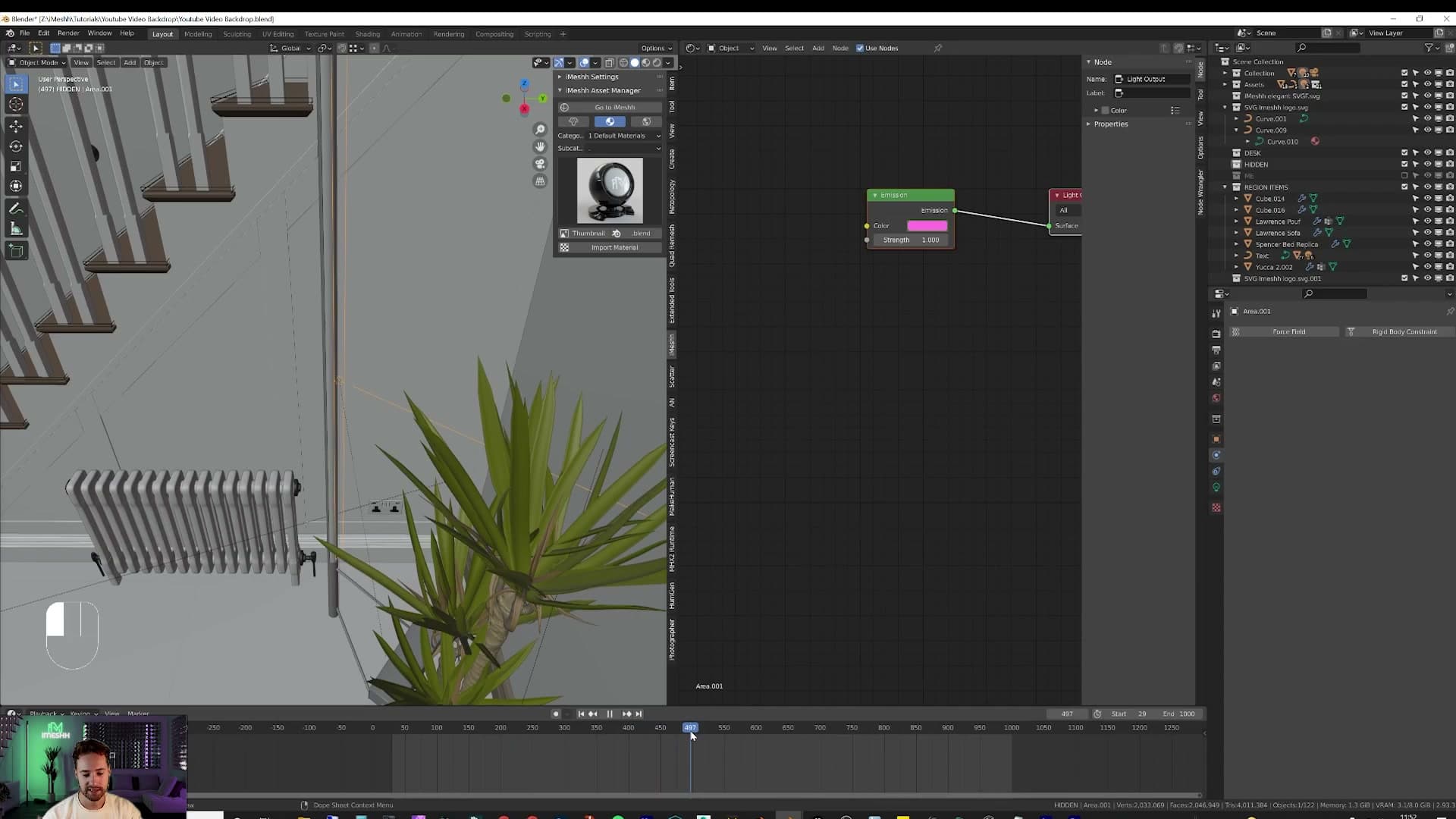
Select one of the lights and set its colour to your starting hue. Blue works well as an opener. Hover over the colour swatch in the Light Data properties and press I to insert a keyframe at the current frame.
Scrub the playhead to frame 500, choose a different colour, and press I again. Then jump to frame 1000, change the colour one more time (red, for example, as a contrast to the blue you opened on) and press I to drop the third keyframe.
Blender interpolates between the three values, so the light eases slowly from one colour into the next as the animation plays back. Repeat the process on any other lights you want to cycle and the whole backdrop drifts through colour behind you while you talk.
Final render and closing thoughts
From here, all that's left is to hit render and let the animation bake out frame by frame. That's how the finished piece you've been seeing throughout the video was put together.
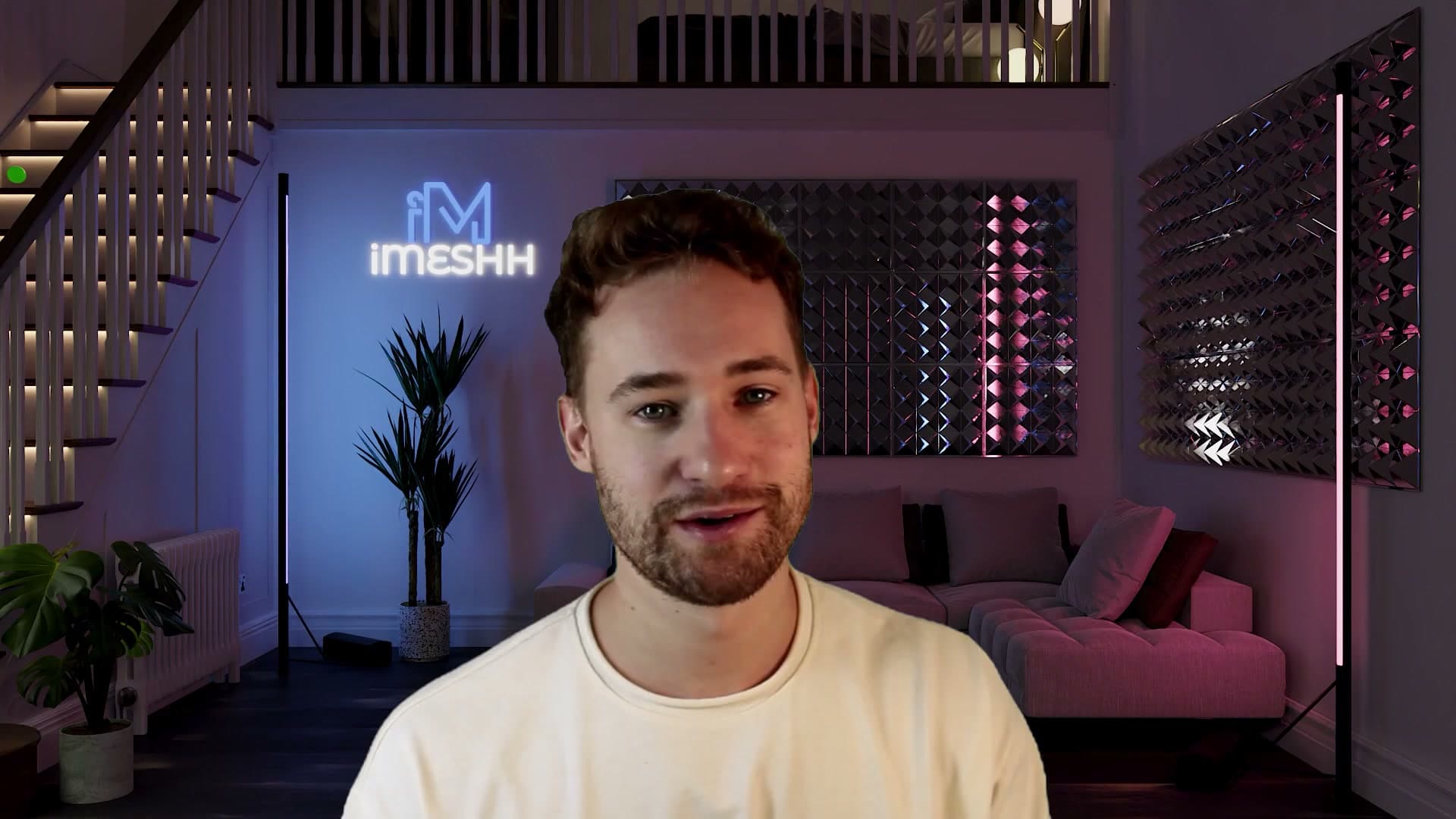
The real payoff of building a backdrop in 3D is that nothing about it is ever locked in. You can start with a single still image. That alone is enough of a backdrop to show off to new subscribers. Then, as you find the time, set up the animation and render the whole sequence. If down the line you decide a light should be a different object, or that one panel should be emitting a different colour, you go in and change it. The scene grows with you.
Towards the end of this build you've seen how far you can push it, with simulations, animated lights and bouncing balls, but the same file works just as well as a quiet still. Take it as far as you have appetite for.
That's it for this one. If the tutorial was useful, a like and a subscribe genuinely helps. The last video was one of the channel's most popular yet and gave the biggest jump in subscribers since iMeshh started, so it makes a real difference. Any questions, drop them in and ask. The best way to support what we do is to check out iMeshh itself. Thanks for watching.
Tools and credits
Everything mentioned in this tutorial, with links.
- Blender the renderer this entire build runs in.
- iMeshh studio platform (project management, client review, asset library, invoicing). The asset library used in this tutorial is included with every iMeshh Pro plan.
- Poly Haven free CC0 textures and HDRIs.
Pillar guide: Scene Builds hub