Why this exterior masterclass exists, and the toolset
Kris explains why iMeshh has avoided exterior tutorials until now, and lays out the Blender 4.0 + Photoshop + iMeshh asset library stack the build relies on.
Why exteriors are harder to teach than interiors
iMeshh's tutorial back-catalogue is overwhelmingly interiors, and they have consistently been well received. A handful of viewers have asked for the opposite: a proper exterior. Until now the only exterior on the channel was a pre-built cabin in the woods. Fine as a one-off, but not much use as a commercial reference. This masterclass starts where commercial briefs usually start, with a set of architect's floor plans, and works through to a finished, post-processed render.
The reason exteriors have stayed off the channel for so long is scope. An interior reduces to a familiar shell (four walls, a floor, maybe a balcony or a glimpse of garden) and the variable is mostly the design language on top of that shell. Exteriors don't reduce that way. The brief might be a city skyscraper, an apartment block, a prefab unit, a country cottage or a terraced street, and each setting demands a different toolkit. There is no single right place to start.
Rather than keep deferring, the choice here was to pick a modern detached house in a style that is currently in demand. It is distinctive enough to anchor a portfolio piece, and broad enough that most of the techniques you will pick up transfer cleanly to other exterior briefs.
The masterclass covers the whole pipeline end to end: tracing the architect's plans into clean geometry, modelling the building, dressing the surrounding environment, adding sky and clouds, lighting the scene, and finishing the image in post. It runs roughly two and a half to three hours, which is short for the amount of ground it covers, so a handful of steps are condensed. The expectation is that you already have a basic working knowledge of Blender. Keystrokes are visible on screen, but the focus is on the why behind each decision, not first-principles Blender training.
Blender 4.0, Photoshop and the iMeshh library
The build runs on Blender 4.0. At the time of recording, 4.0 had not yet shipped officially. 3.6 was still the stable release, but I recorded on the pre-release to future-proof the masterclass. Several core systems were being reworked for 4.0, most notably the Principled BSDF, so committing to the new version meant the project would still make sense once viewers caught up.
Post-processing is done in Photoshop. If you don't already have a Creative Cloud subscription, Photoshop is available on a free trial or a single-month purchase, and Affinity Photo handles most of the same operations at a much lower cost. Whichever you pick, plan to do some post. Skipping it leaves a lot of quality on the table on an exterior render.
The third tool is the iMeshh asset library. Exterior renders are asset-hungry: foliage, ground textures, decorative dressing. Rather than pulling pieces from several different marketplaces, this masterclass sources everything from the iMeshh catalogue. That keeps the workflow consistent and means you can reproduce the scene without hunting down individual props from a dozen vendors. Pricing and trial options for the library are summarised further down the page.
Importing and aligning the architect's floor plans
Convert the architect's DWG to DXF, enable the DXF importer, snap each floor onto the same plane, and settle on the modelling strategy. Four stacked storeys, each built as a separate part.
DWG to DXF and overlaying each floor with snapping
The architect will almost always hand over a DWG file, and Blender can't read DWG natively. Run the file through any of the online DWG-to-DXF converters first, then open Blender, head to Edit > Preferences > Add-ons, search for DXF and enable the importer that ships disabled by default. Save your preferences and you can now File > Import the DXF.
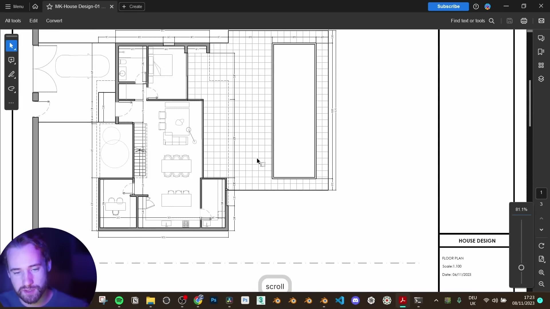
Out of the box the import drops every drawing flat onto a single plane. Top floor, ground floor, the front, rear and both side elevations all land next to each other. Work through the pieces, separate and join them per storey, then stack each plan directly above the one below so the floors share the same X and Y position.
To get the alignment pixel-perfect, lean on snapping. Toggle snapping with Shift+Tab and set the snap base to Active so Blender pins the moving object by its active vertex rather than its origin. Drop the floor you want to move into edit mode, deselect everything, click the corner you want to anchor, then drag it across. That corner locks onto the matching corner of the reference floor.
Once the plans line up in the top view, double-check that each one is also sitting on the correct plane vertically. The exercise file ships with the four storeys already stacked and grounded, so if you'd rather skip the import entirely you can pick up from that prepared state.
Reading the PDF symbols and choosing a four-part strategy
Keep both files open as you trace. The DXF gives you clean line work inside Blender, but the architect's PDF carries extra annotation that the DXF strips out. Those extra marks decide which lines you actually extrude.
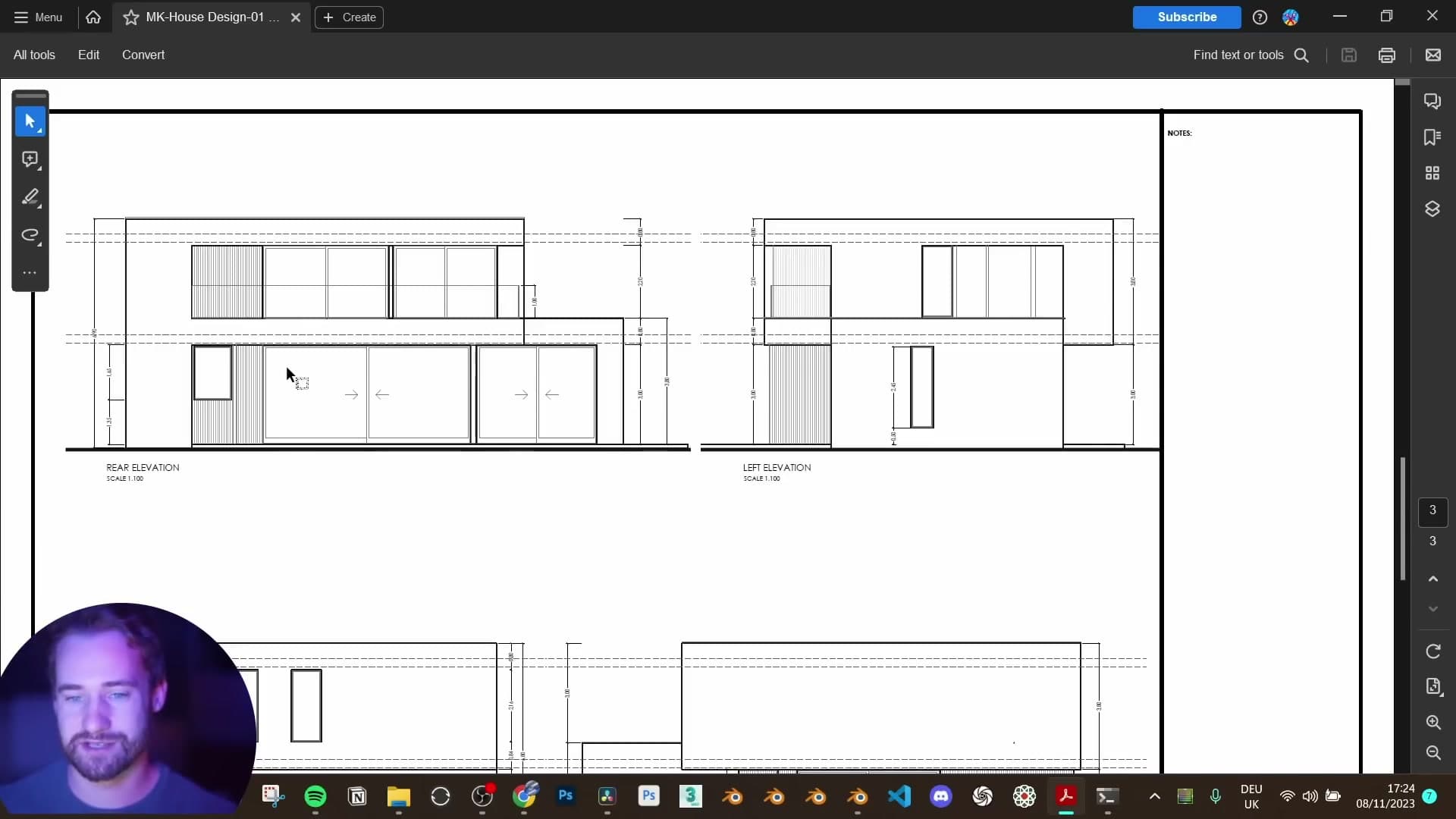
Two patterns to watch for. Checkered lines indicate the wall on the storey above, drawn over the current floor for reference only. Solid black lines are the walls belonging to the floor you're modelling right now. Flick between the PDF and Blender constantly so you don't accidentally extrude geometry that belongs upstairs.
Before you draw a single vertex, decide how the model is going to be broken down. Rather than tracing the whole house as one continuous shell, split it into four separate parts: the ground floor, the section sitting on top of it, the next floor up, and the top storey. Each part is modelled in isolation and the pieces are joined at the end.
This is deliberate. Intricate transitions (a wall that rises, steps left, then makes room for a window) get messy fast if you try to solve them as a single mesh. Treating every storey as its own object keeps the geometry simple and, in my experience, scales much better to larger buildings. It's not the most common archviz workflow, but it's worth giving a shot before you fall back to your usual approach.
To prep for the first extrusion, hide the top floor in the outliner so it's out of the way, then jump back into Edit > Preferences > Add-ons and enable Extra Objects. Save preferences. That add-on gives you the single-vertex primitive you'll use in the next module to trace the outline of the ground floor.
Modelling the four-part building shell
Build the exterior shell as four independent parts (ground floor, overhang, third level and top cap) using single-vertex extrudes traced over the plans. Disconnected vertices are deliberate, and Box UV unwrap will hide the seams later.
Tracing the ground-floor exterior with single-vert extrudes
With the floor plans imported and locked off, the only line that matters for the ground-floor shell is the grey exterior outline. Everything else (dimensions, fixtures, the dotted line marking the wall above) you can ignore for now. Drop a single vertex on a corner, then press E to extrude it along the wall, snapping from window to window, door to door, all the way around the building.
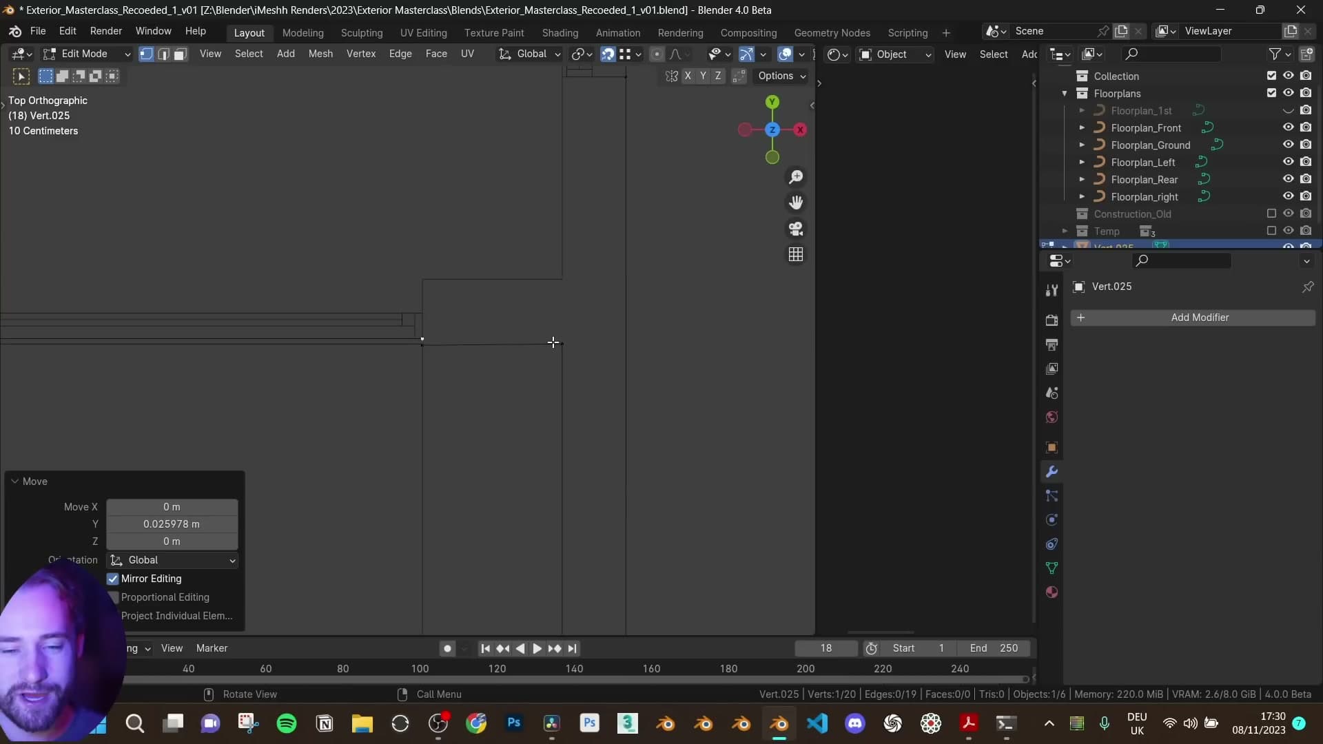
Add an extra vertex at the edge of every window opening and every door section as you go. You won't use them immediately, but they save you from re-cutting the wall later when you place the glazing. Skip the front-left window entirely. The architect's lines don't quite align there and the window itself isn't wanted in the final design.
There's a tiny ledge of 0.005 m on one wall. Lift the vertex slightly off the floor line so you can see where the window should start, then carry on. Watch the snapping carefully throughout. Architect drawings often have small misalignments, so verify each vertex lands on the correct endpoint rather than a phantom intersection one pixel away.
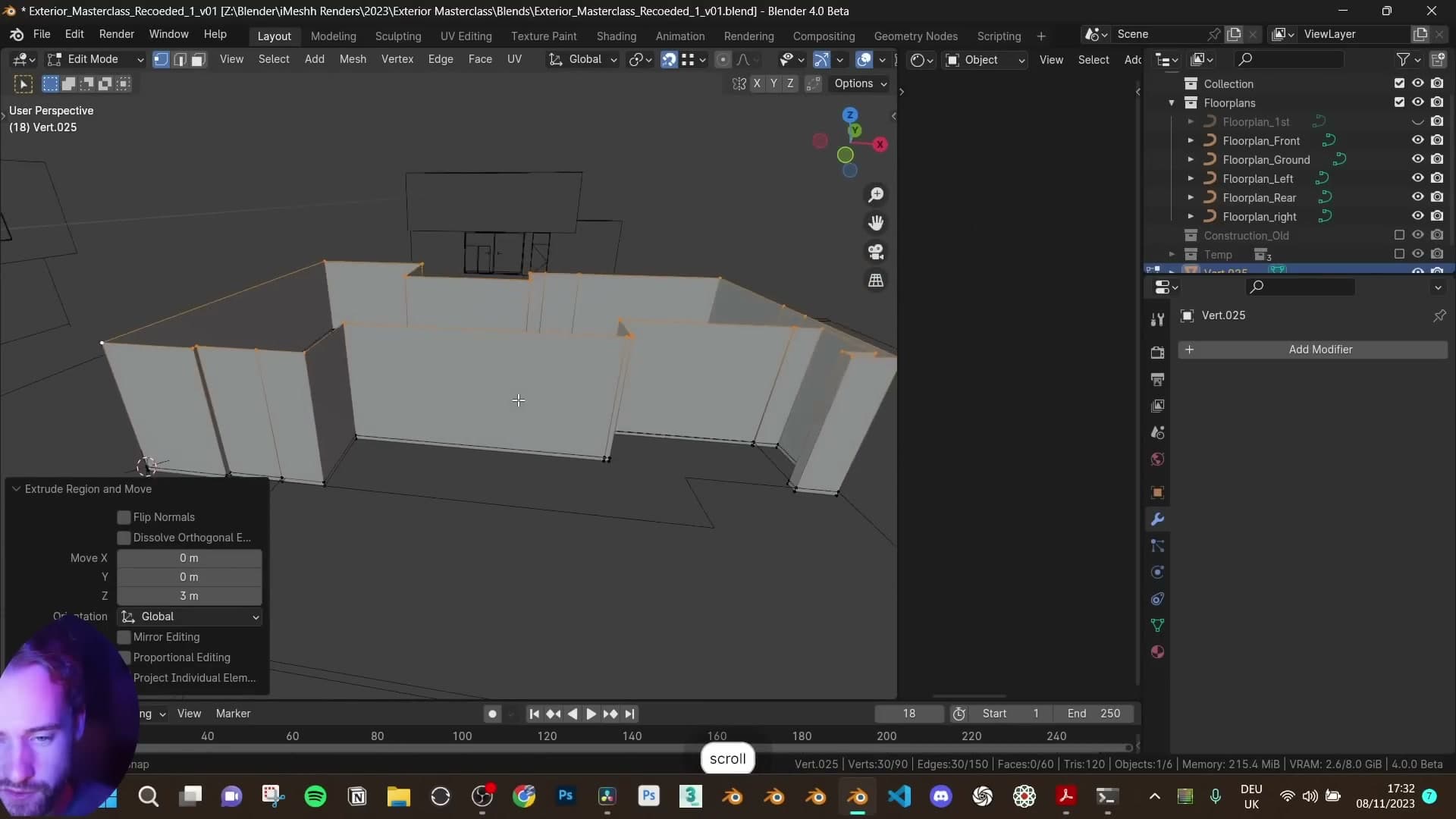
Once the loop is closed, drop into front view, select everything and pull the trace down a touch so it sits where the building meets the ground. Press E to extrude on the Z axis up to the first ledge. Check the elevation drawing in the corner of the plan. The ground floor is 3 m tall, and that's what you want here.
Duplicating and trimming the overhanging second-floor band
The second floor is a band that sits on the ground-floor walls and overhangs them in places. Rather than trace it from scratch, duplicate the ground-floor outline, separate it into its own object and edit the copy to follow the dotted overhang lines on the plan.
Work around the new outline: delete the vertices that no longer apply, then drag the remaining ones out to meet the dotted contour. Where the overhang runs straight across a stretch the ground floor stepped through, simplify by removing intermediate vertices and connecting the corners directly.
Flatten the edited loop onto a single plane with S Z 0, snap it to the top of the ground floor, then extrude on Z by 0.8 m. The elevation drawing confirms that band height. The overhang section is exactly 0.8 m tall.
Tracing the third-floor walls
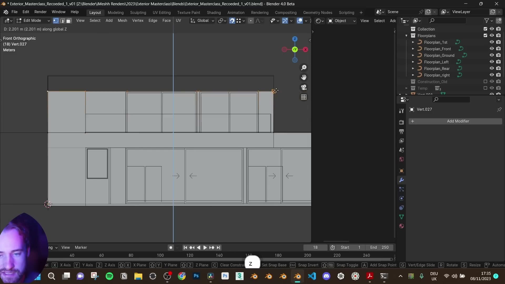
The third floor sits on the overhang and follows its own grey contour. Isolate the section you're working on (local view keeps the rest of the geometry out of the way), then trace the third-floor outline the same way you traced the ground floor: a single vertex extruded around the perimeter.
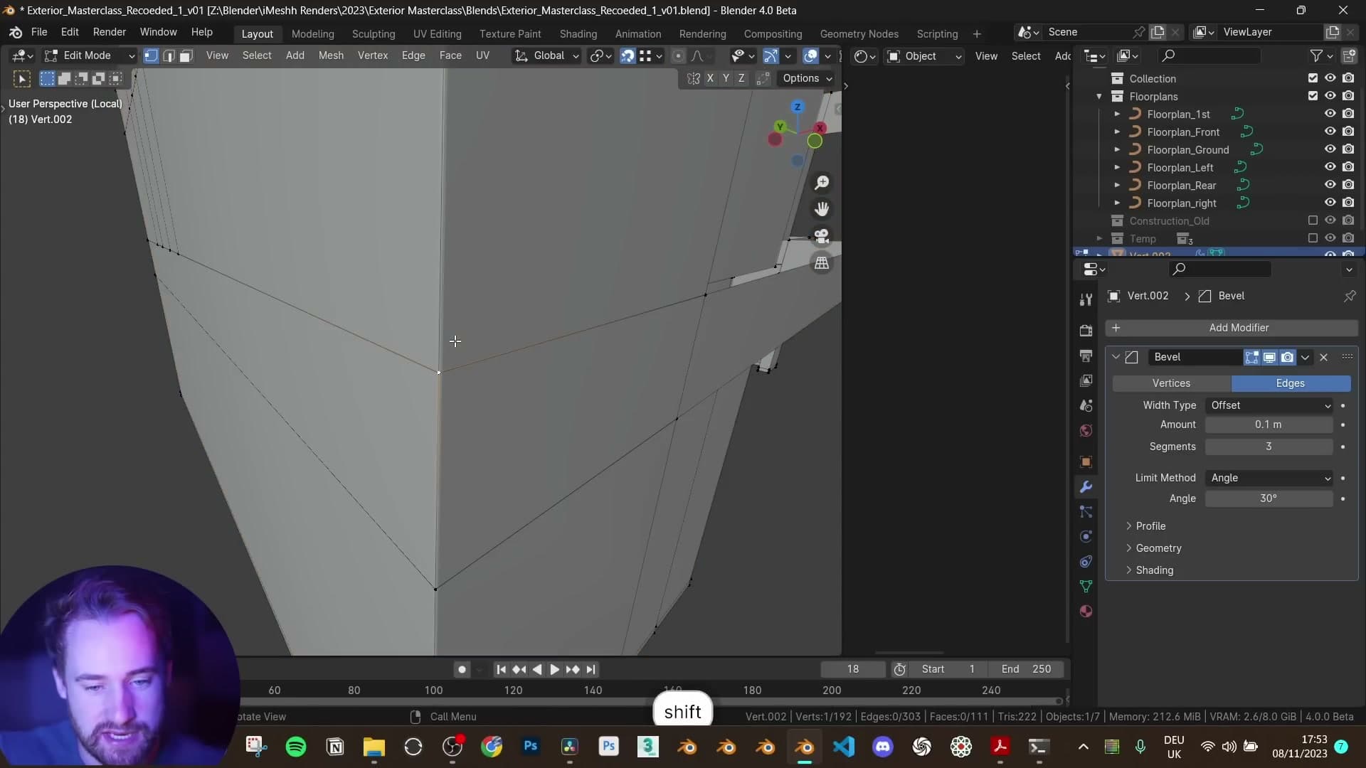
Some segments of the plan show white areas that refer to the band below. Ignore those for the wall trace. You'll come back later to add small insets if any of them remain visible. Concentrate on the grey line, snap to each window edge, and drop the same per-opening vertices you added on the ground floor.
When the loop is closed, switch to front view and extrude on Z. The readout will show something like 2.201 m because of a minor snapping wobble, so type the height explicitly. This storey is 2.2 m from the top of the overhang to the top of the third-floor walls, which matches the elevation drawing exactly.
The top cap and why Box UV unwrap saves the disconnected mesh
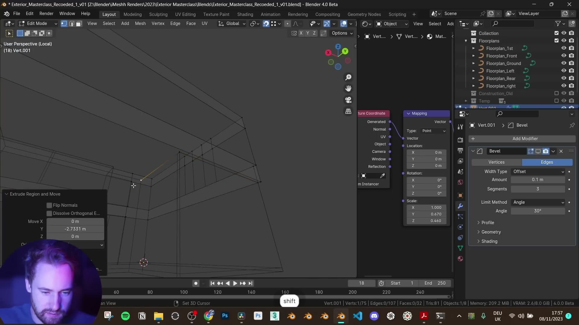
The last shell piece is the top cap. Duplicate the third-floor outline, separate it, and check the plan: the only deviation from a flat rectangle is a cutout on the back wall. Delete the vertices that fall inside the cutout, extrude the remaining edges out to the new contour and bridge them so the loop is closed.
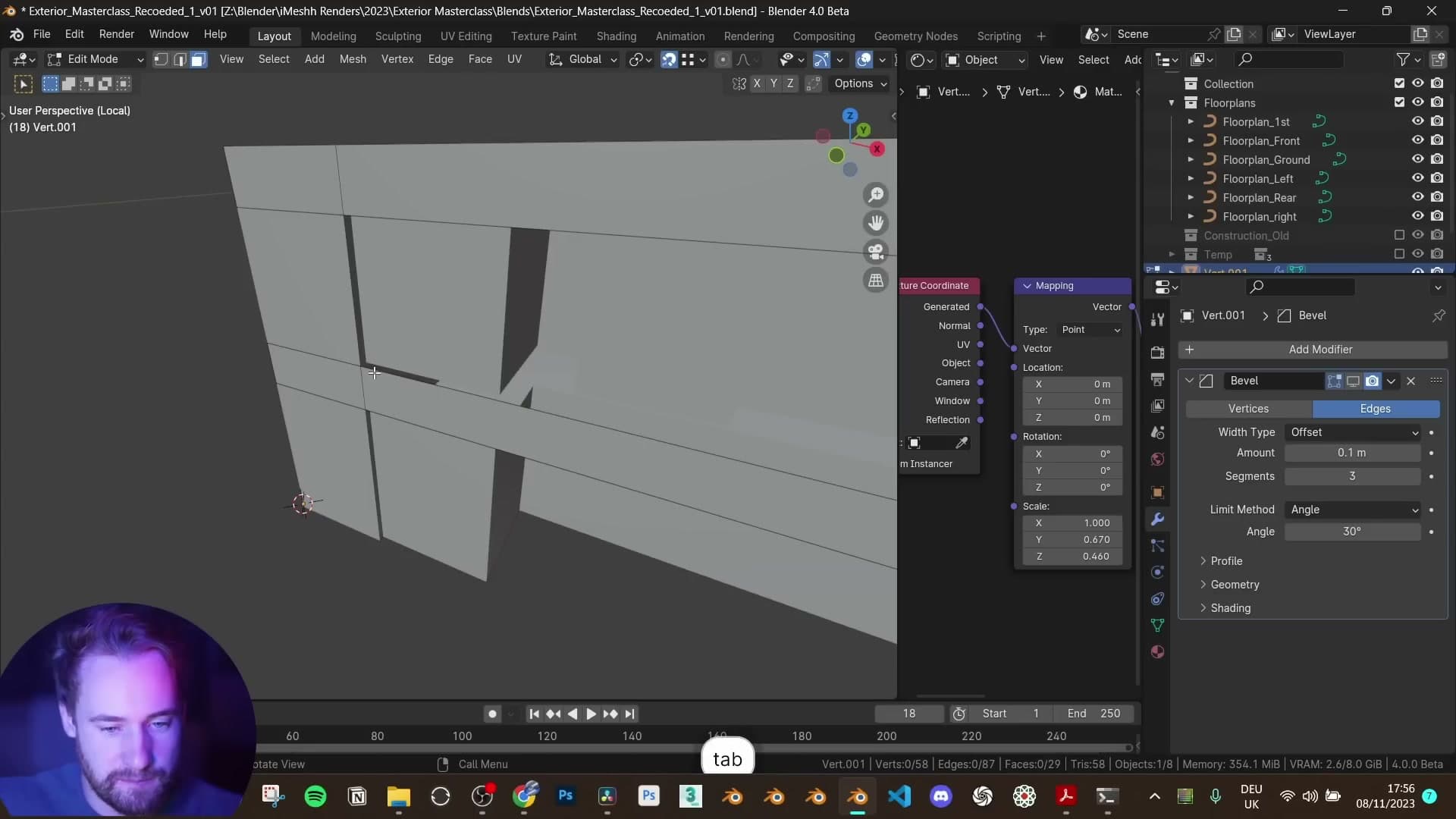
Extrude on Z by 0.8 m to give the cap its height. You can press F to fill the top face, but leaving it open for now lets you see inside the building while you work on the interior floors and ceilings in the next pass.
At this point you'll notice the four shells aren't joined to each other. That's deliberate. The vertices overlap perfectly where the storeys meet, so a bevel or any other modifier later on will read continuously across the seam. You won't see that the geometry is disconnected. Run Shift+N on each piece to recalculate normals outwards so shading stays consistent.
The obvious question is how you unwrap a building made of disconnected meshes full of n-gons. The answer comes from 3D Studio Max, where Box UV unwrap is the archviz standard. In Blender you replicate it on the material itself. Set the Image Texture node's Vector input to Generated coordinates, and switch Projection from Flat to Box. Blender then projects the texture from a virtual cube around the object, and because every shell vertex overlaps cleanly with its neighbour, the tile flows over the seams as if the geometry were one continuous piece.
N-gons are part of the same trade-off. They'd be a problem in a game engine or on geometry that bends and deforms, but for a static archviz shell that won't twist or animate, n-gons render exactly the same as quads. Hard-surface modellers rely on them all the time. The rule that meshes must be all quads is a misconception worth dropping for this kind of work.
Interior structure on the ground floor
Fill in floors and ceilings, then trace the interior walls following the plan, snapping a vertex at every door and window jamb. Bridge faces create the door openings. Loop cuts and extrusions punch out the windows.
Filling the centre floor and ceiling slabs
After hollowing out the exterior shell, the centre of the ground floor is still open. The overhanging upper mass roofs a void where a floor face should sit. Drop into vertex mode with 1 and snap a new vertex onto the inside corner where the overhang meets the wall.
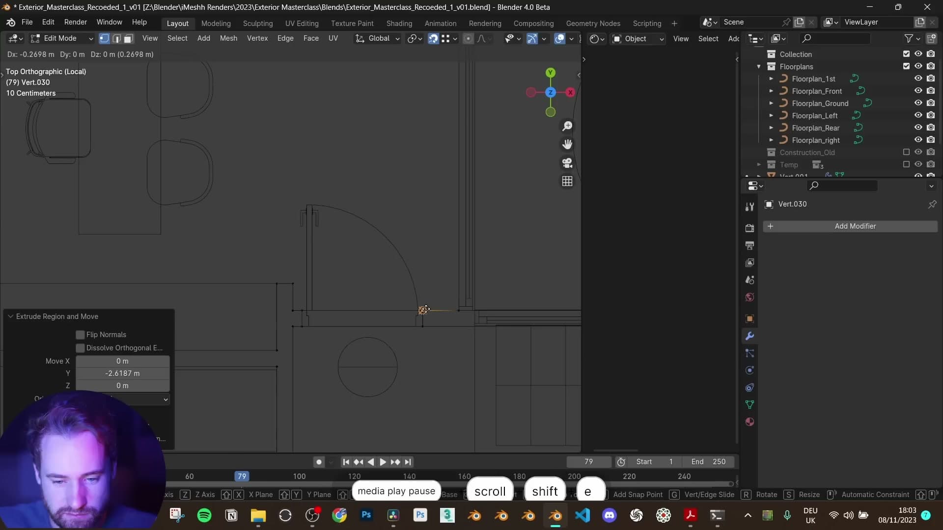
Trace the loop right around the open centre, snapping into each corner of the plan as you go. With the closed loop selected, hit F to fill it. Edge-loop fill closes the n-gon in one operation, sealing the floor between the overhang and the ground-floor outline. The ceiling slab gets the same treatment later. Select the top ring of the interior walls and press F to close it off.
Tracing the interior walls room by room
Drop a fresh single-vertex object inside the building and start tracing the interior partitions room by room. Snap onto a corner of the first room, then extrude with E along each wall, snapping into the corner of every door jamb and window opening as you pass.
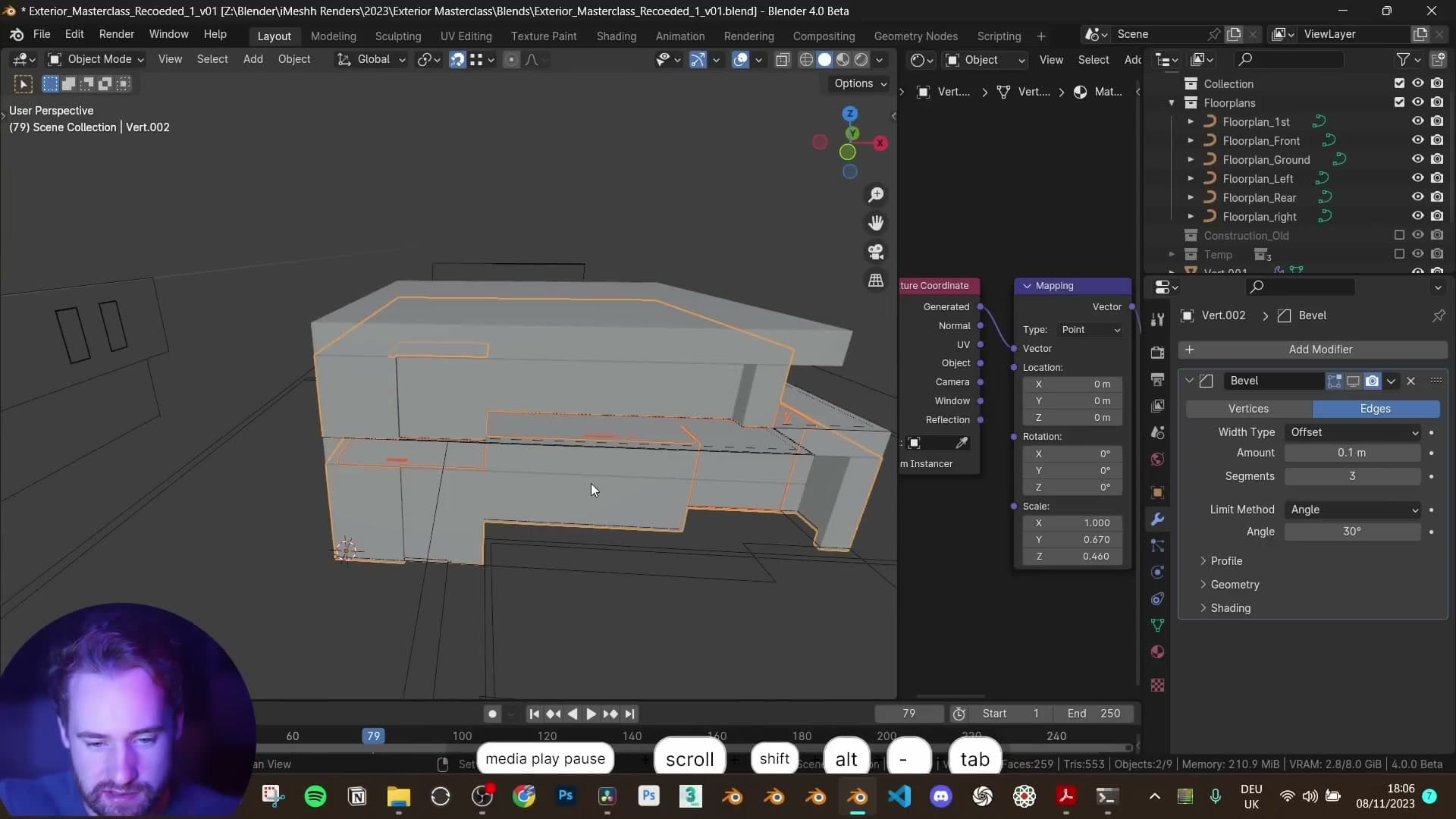
Leaving a vertex at the edge of each door and the edge of each window is the part that pays off later. Those verts give you the loops you'll need to bridge the door openings and extrude the window cutouts without coming back to fix anything. Disconnected segments between rooms are fine too. Duplicate the last vertex with Shift+D and start fresh on the next room.
Skip any window the architect drew that you don't want in the final shot. I learned this the hard way on this build. One through-and-through window let the camera see straight through the house in the final render, which spoiled the look. If a feature wall opening doesn't read well in the shot, simply don't trace around it.
Once the full interior outline is traced and any double points are merged, work out the ceiling height from the plan. The dotted line on this set of drawings sits 3.05 m above the floor, read as the underside of the upper slab. Select every interior vertex and run E, Z, 3.05 to lift the partitions into walls.
Door openings with Bridge Edge Loops
This set of plans has no section drawing, so the door heights have to be guessed. A section is a vertical slice through the building that tells you exactly how high doors and windows should sit. Invaluable when it's supplied, but missing here. It's worth asking your architect for one on real projects. For a tutorial the interior won't be visible anyway, so an eyeballed two-metre opening is fine.
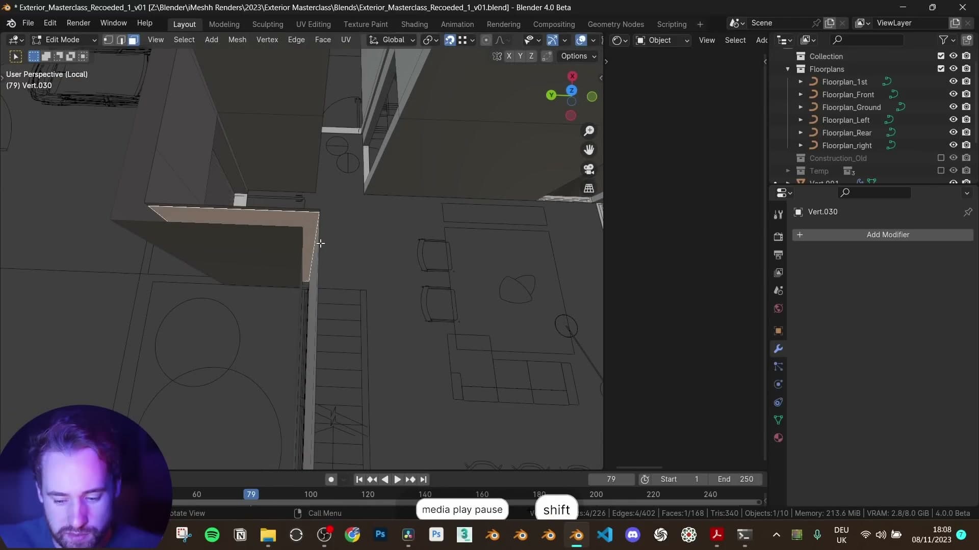
To open a doorway, select the two vertical edges that flank it (one on each jamb) and run Bridge Edge Loops from the Edge menu. Bridge Faces stitches the gap into a clean rectangular opening between the jambs in a single step. Repeat for every interior door.
Loop cuts and extrudes to punch out the windows
Windows take a bit more setup than doors. Each one starts at a specific height off the floor and reaches a specific head height. Both are read off the elevation drawings. The south-facing windows on this build sit 0.5 m off the ground and stand 2.45 m tall.
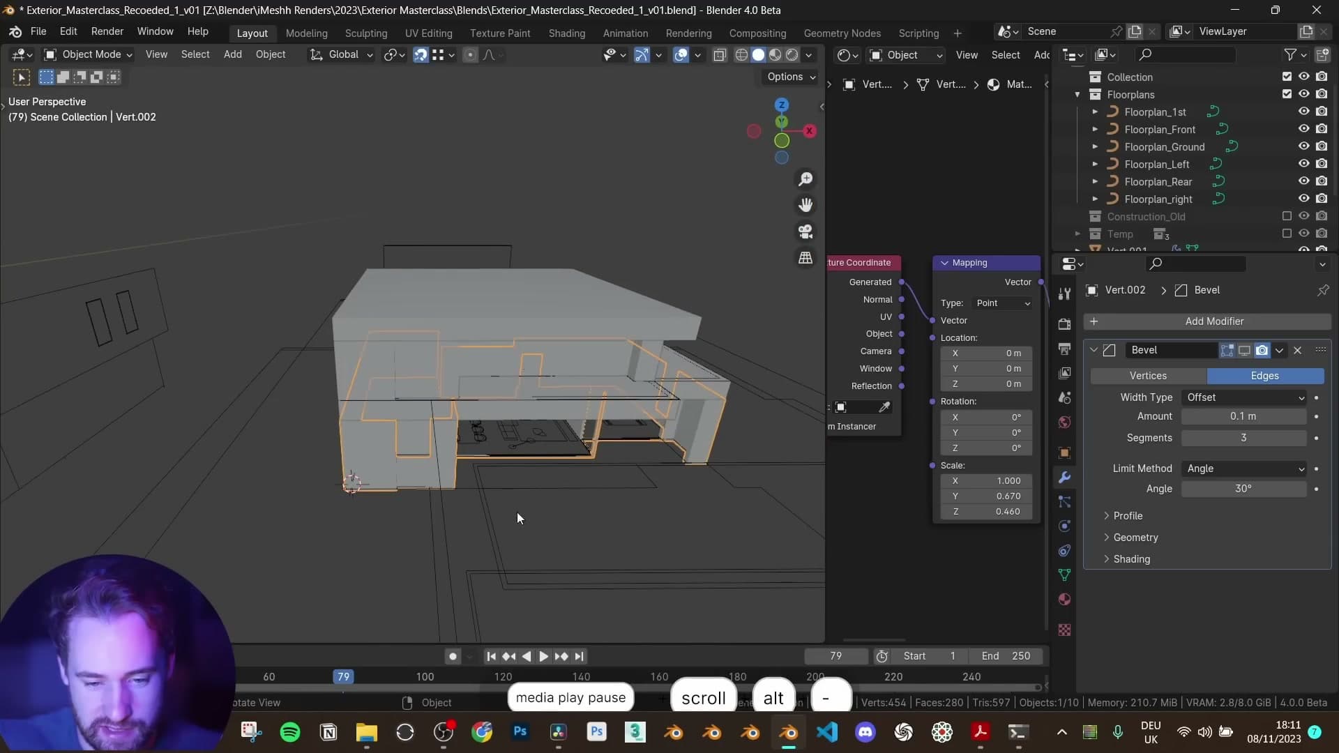
Work one window at a time. Add a horizontal loop cut across the wall with Ctrl+R, flatten it with S, Z, 0, then lift it to sill height using G, Z, 0.5. Add a second loop cut for the head, flatten it the same way, and lift it by the window's height: G, Z, 2.45. Select the resulting face and extrude (E) outwards until it pushes through the exterior shell.
The extrusion poking out the other side looks deliberately glitchy, and that's the point. The interior wall and the exterior shell need to overlap so the cleanup pass that punches the openings through both layers later has something solid to cut against.
Different windows around the building have different sill and head heights. There's a side window starting at 1.35 m with a head at 1.65 m, for example. The pattern stays the same regardless: two loop cuts, flatten each with S, Z, 0, lift each to its target height with G, Z, then extrude outwards into the exterior shell.
Once every window is cut and extruded outwards, close the top of the interior walls to form the ceiling face. Select the top edge loop and press F. Bump the centre face roughly five centimetres higher than the surrounding walls so the ceiling sits proud of the wall heads, then nudge any rogue wall edges up or down so each window head lands exactly where the elevation says it should.
Interior structure on the upper floor
Repeat the trace-extrude-cut workflow on the upper floor, taking heights from the elevation drawings. The balcony floor drops 15 cm to fake an inset.
Tracing the upper-floor walls and balcony
The upper-floor shell follows exactly the same recipe as the ground floor: drop a single vertex on a corner, then snap-extrude your way around every room, door reveal and window opening before extruding upwards.
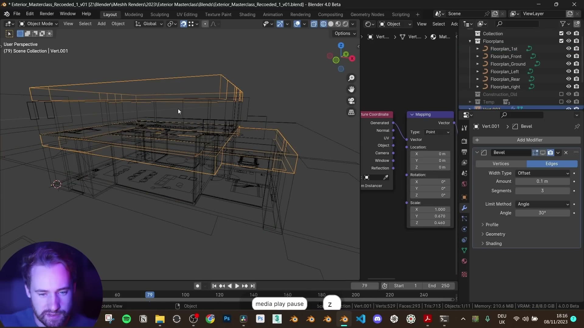
Add a mesh single vertex via Add > Mesh > Single Vert, snap it to the first corner of the upper-floor outline, and trace from corner to corner around each bedroom. Stop and place a vertex at every door jamb and every window so the vertical edges you need for cutouts are already baked into the mesh. That's the same trick that paid off downstairs.
A couple of plan-specific calls on this storey. The larger bedroom only has one small window. What might look like a second opening is actually panelling, so leave it as continuous wall. The stair void stays empty too. The interior will never appear on camera, so there is no point tracing the steps. Near the centre of the plan a small light well opens up to a hole in the roof above. The hole and the window onto it are never seen, so close the trace off and move on. Where the plan shows an internal step, drop a vertex on the floor anyway so you have something to snap to later.
Once the perimeter is closed, the balcony needs its own treatment. The architect confirmed that the dimension lines on this drawing mark the top of the ground-floor slab and the bottom of the upper slab. The balcony floor itself therefore sits below that level. Select the balcony loop in front view and drop it down 15 cm with G, Z, -0.15 to fake the inset. With a railing on top, that single offset reads as a proper recessed balcony from any exterior angle.
Reading 2.8 m ceiling height from the elevation drawing
With the perimeter traced flat, the upper floor needs a height. Reading off the elevation, this storey runs 2.8 m from floor to ceiling, so select the whole loop in edit mode and extrude straight up with E, Z, 2.8. That single number puts the underside of the roof exactly where the architect's section line says it should sit.
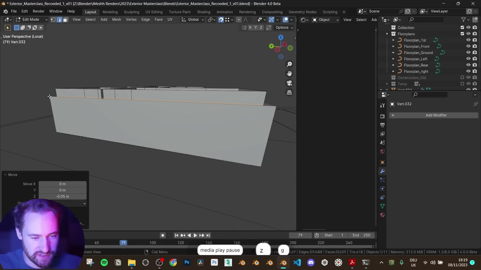
There is a small internal step inside the floor that you could model in if you wanted, but it does not change the exterior silhouette and will not read on camera, so leave it. If you notice a wall you forgot to close off (there is an easy-to-miss inner wall on this storey), drop back into edit mode, extrude the missing edges across and fill the resulting face so the shell stays watertight.
Upper-floor doors and window cutouts
Doors and windows on the upper floor get the same cutting treatment as the ground floor. Bring a copy of the floor plan up to this level so you can read it in 3D, then start opening up the wall.
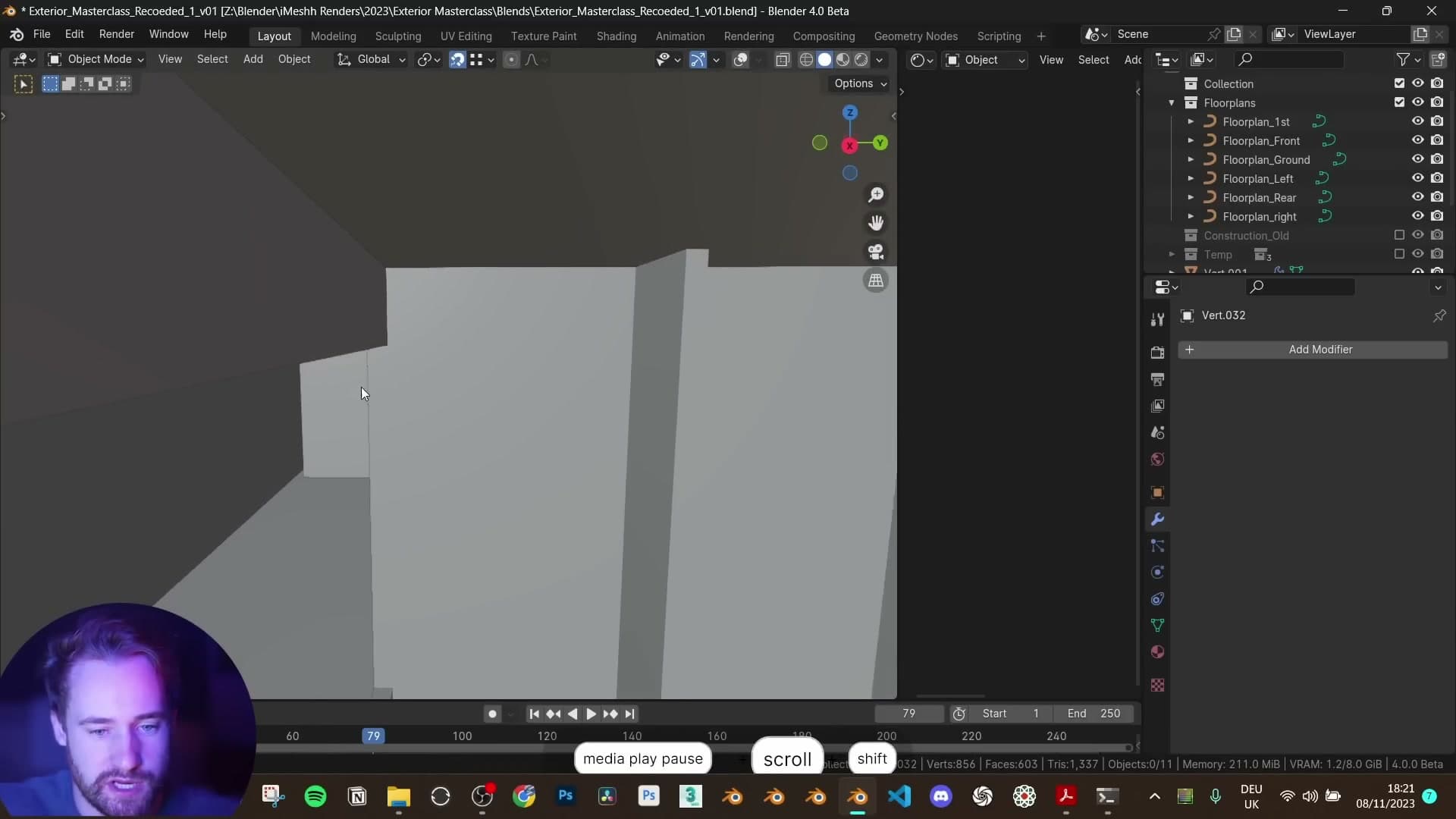
Door heads sit at 2 m above the floor. Select the bottom pair of vertices either side of each door opening and raise them with G, Z, 2, then flatten the resulting loop with S, Z, 0 so every door head is dead level. Bridge the opening across with Bridge Edge Loops, and use Shift+R to repeat the bridge action for the next door. Blender remembers the last operation, so each subsequent door is a single keystroke.
For the windows, all the openings on this storey share the same head height. The band where the elevation section reads 0.8 m tall. Rather than slicing each window individually, drop two loop cuts horizontally across the upper wall and slide the lower one down so its level matches that band. The taller floor-to-ceiling glazing reaches all the way to the floor, so snap its sill loop right to the bottom of the wall.
With the loops in place, push the window panels outwards a touch so they have a face you can grab, select the inside and outside faces of each opening, and delete them. That leaves clean rectangular holes punched all the way through the wall. Same outcome as the vertex-by-vertex method downstairs, just driven by loop cuts instead.
Joining the shell and adding a clamped Bevel modifier
Before adding the bevel, close the top of the upper floor off with a roof face and a floor plane, then sweep around looking for stray gaps. If two pieces refuse to meet up, the cause is almost always a pair of vertices sitting at slightly different Z values. Select the offending loop, run S, Z, 0 to flatten them, and snap them onto the matching edge.
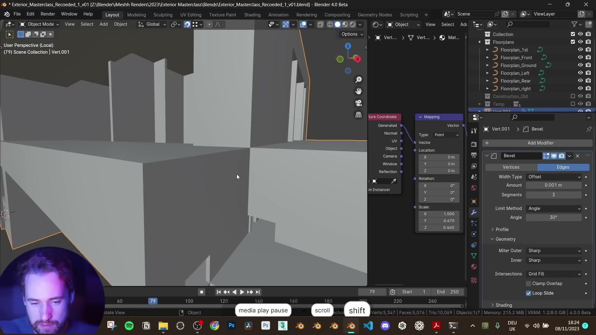
With everything closed, select the upper-floor mesh and the ground-floor mesh together and join them with Ctrl+J, then add a Bevel modifier to the combined shell. At first the result may look broken. Blender struggles to bevel the n-gons that this trace-extrude workflow generates, and it can spit out triangulated artefacts wherever overlapping edges meet.
The fix is two clicks. Turn Clamp Overlap off on the modifier and crank the width right down to something like 0.001 or 0.01. At that scale the bevel reads as a soft micro-chamfer on every edge, the artefacts vanish, and the disconnected vertices from the trace-extrude workflow disappear entirely under the rounding.
Finish the shading by right-clicking the joined object and choosing Shade Auto Smooth, then enable Harden Normals on the bevel modifier so the chamfered edges keep a crisp shading break. Last step: drop into edit mode, select all and recalculate normals with Shift+N. Some interior faces will end up pointing the wrong way after the join. Flip the inward-facing walls so the inside of the shell points inwards, and the face-orientation overlay should come out clean.
Outdoor floor, pool cutout and iMeshh windows
Build the outdoor patio and pool surround from the existing geometry, boolean the pool footprint out, then append iMeshh window assets and scale them per opening.
Patio floor and a boolean pool cutout
With the walls finally accepting the plaster shader cleanly, there is one piece of geometry left to lay down before the windows go in. That's the outdoor floor that wraps around the back of the house and forms the surround for the pool. Add a fresh vertex on the floor plane and trace around the patio outline in the same way you traced the storeys: a single vertex extruded point-to-point around the perimeter. The whole patio and pool surround sits on one connected mesh, so keep extruding as you work your way around the section.
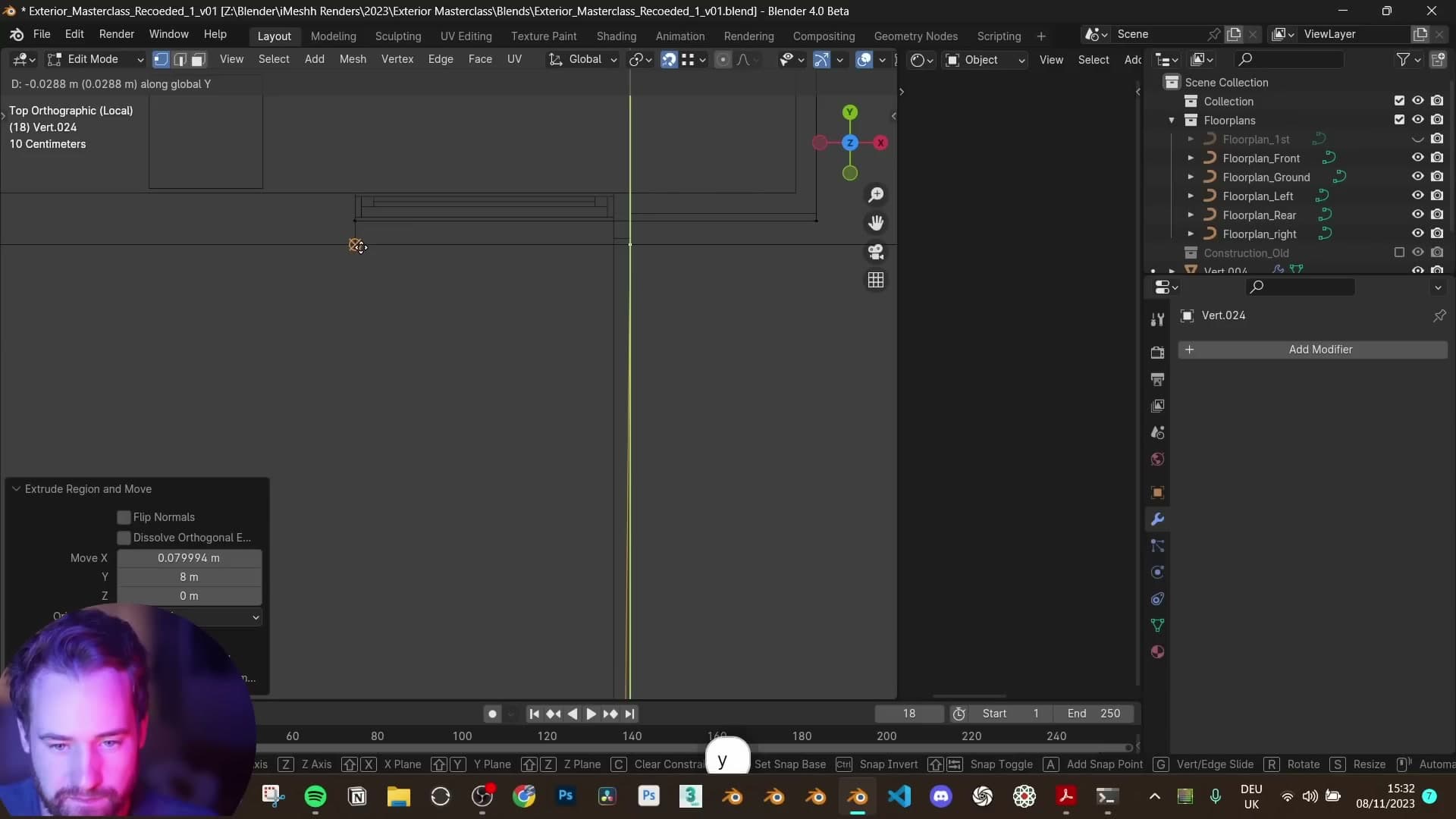
When you reach the pool itself, treat the inner rectangle as the cutout and the surrounding ring as the frame. Trace the inner pool footprint as part of the same outline, then extrude the centre piece outwards so it forms a separate filled face sitting inside the patio. You now have two overlapping faces: the patio and the pool insert.
Rather than cleaning that overlap up manually, drop a Boolean modifier on the patio mesh, set it to Intersect, and target the pool insert. The intersection mode subtracts the pool footprint from the patio and leaves you with a clean rectangular hole exactly where the water will sit.
Appending and scaling iMeshh sliding windows
With the patio in place, append the windows from the iMeshh library. Open the asset browser, go to Architectural → Windows, and pick the sliding patio window. The window is built as two pieces (frame and sash), so make sure you select both objects when you drag the asset into the scene. Any window in your library will do for this build. Because they sit a fair distance from the camera, the level of detail does not need to be especially high.
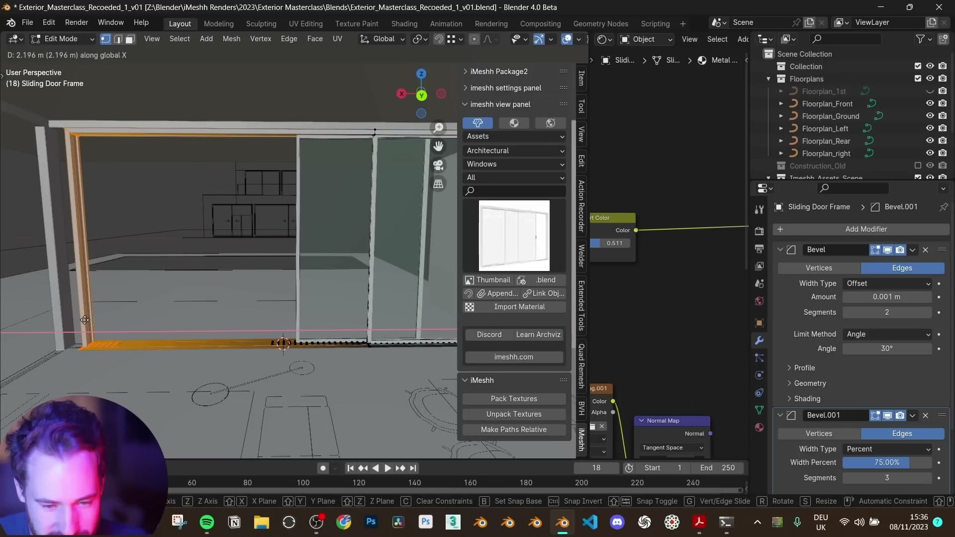
The asset will land at its default size, which is smaller than your opening. Tab into edit mode, select the top row of vertices, and drag them up until the frame slightly overlaps the top of the opening. Drop the bottom edge onto the little lip on the wall. That lip marks where the interior floor meets the window, so it makes a natural sill. If the frame ends up a touch too thick front-to-back, press Shift+Right Click to drop the 3D cursor onto the wall face, set the pivot to the cursor, then scale on the Y axis so the frame no longer pokes through the inside of the wall.
Each window along the same elevation should share the same width, so drop one window in, duplicate it with Shift+D, and snap the copy across to the next opening. To check whether a window is centred in its opening, temporarily hide its neighbour and eyeball the gap at each side. Slide a sash slightly open on one or two windows for visual variety. It sells the idea that the building is lived in rather than a CAD export.
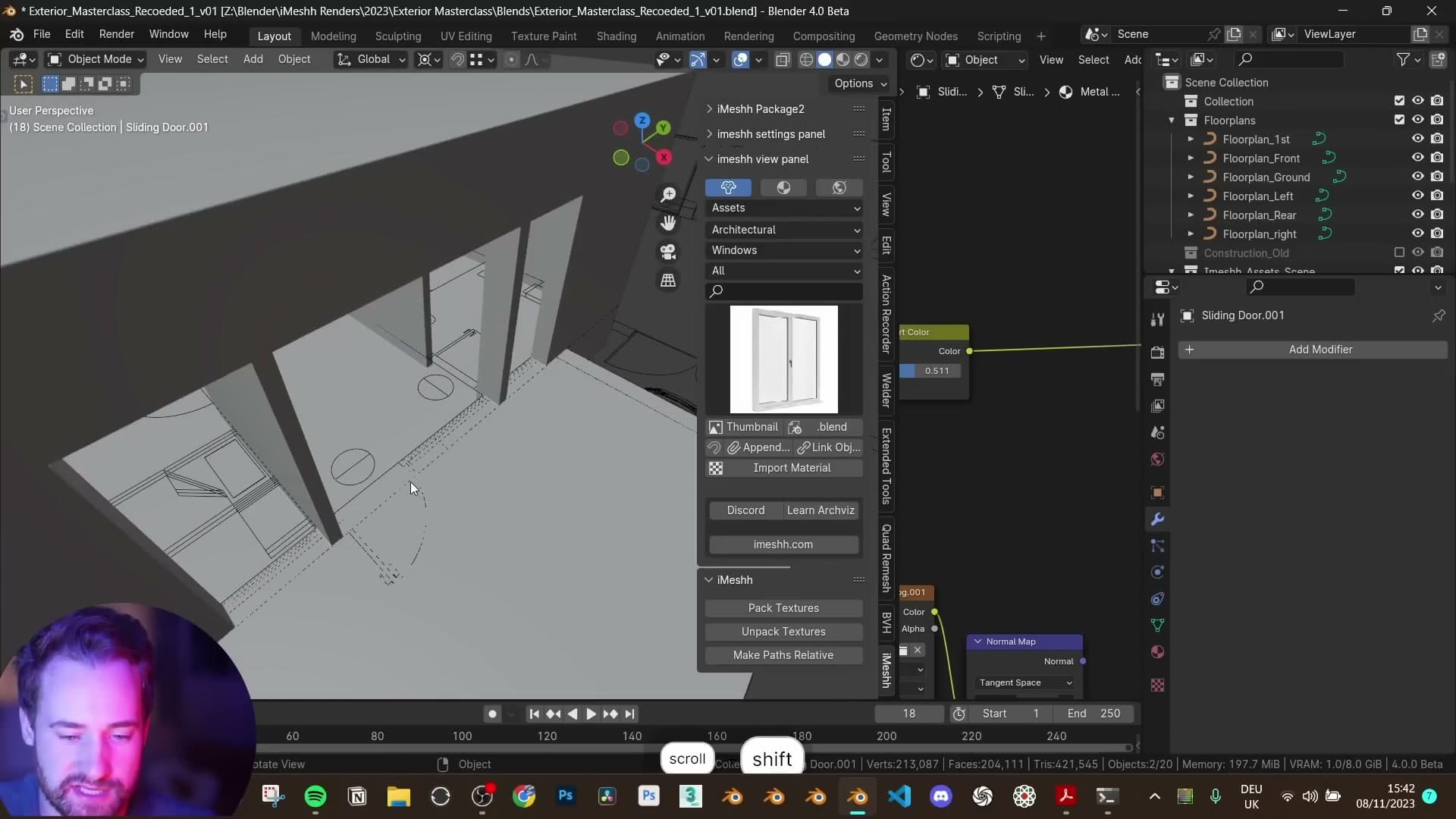
For the upper-floor windows that combine a sliding section with a hinged door, append the door-window variant and drop it into the opening. Rotate it Z -90 to face the right direction; if the swing ends up mirrored, apply Object → Mirror → Y to flip the hinge to the correct side. The wheel runners along the bottom of each sliding asset will sometimes overlap the patio mesh. Delete them if they are visible; otherwise leave them tucked behind the wall and move on.
For openings that take a single fixed pane rather than a pair, duplicate one of the sliders, add a Mirror modifier, and bisect the duplicate on the X axis. Flip the kept half and you have a single-pane variant built from the same asset, which keeps the window styling consistent across the elevation.
Front and balcony doors from the iMeshh library
Finish the openings with doors from the same library. Open Architectural → Doors, pick a door asset, and drop it over the front entry. The default size is close to the opening. Nudge the top vertices up so the frame is a touch taller than the wall cutout, and accept the slight overlap; it will be hidden by the bevel.
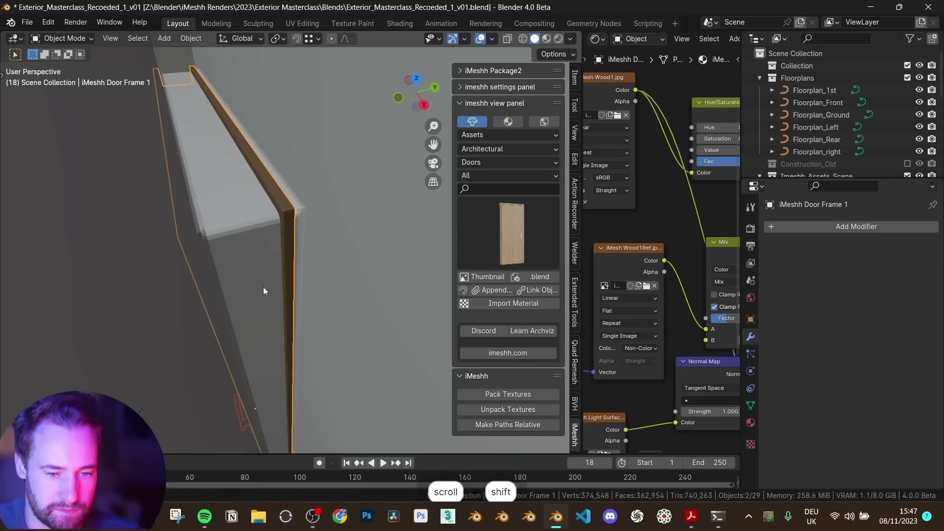
Duplicate the same asset for the upstairs balcony openings. The architect's drawings may give different widths for the upper and lower doors, so trust the plan rather than forcing them to match. Before you commit, check the hinge direction against the floor plan. Getting the swing right matters when the door is visible from the camera, and it is a detail clients tend to notice.
Ground mesh, Sun Positioner and Nishita sky
Convert the floor plan outline into a ground mesh, run it through Quad Remesh, then drive the lighting with the Sun Positioner add-on. Real London GPS coordinates and a Nishita sky texture do the rest.
Building the ground plane from the plan outline
Start with the plan outline you traced earlier. The detail is already there in the architect's drawings. With every outline edge of the ground-floor section selected, press F to fill the whole footprint into a single ground plane.
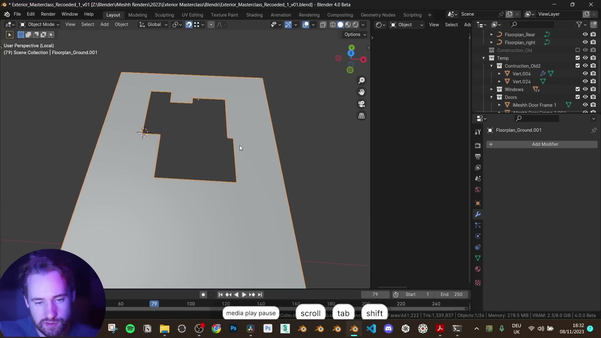
To carve out the building footprint and the swimming pool, duplicate the piece in place. The duplicate becomes your boolean cutter. Strip out any internal edges that don't belong to the outer perimeter, then trace right around the ground-floor outline of the building. Stay on the ground-floor wall line specifically; the upper storeys overhang in places and aren't relevant for this cut.
Flatten the cutter onto the ground plane with S, Z, 0, press F to fill it, then extrude it downwards so it has thickness for the boolean to bite into. Join the cutter into the ground mesh, then run a boolean from the F3 search. The building footprint and pool drop out as clean cutouts.
You're left with the patches you'll need for the next stage: one shape for the decking around the pool, one for the grass, and a clean hole where the building sits.
Quad Remesh for clean displacement-ready quads
This ground mesh is going to be displaced later for terrain variation, and displacement on n-gons or long triangles warps in ugly ways. You want quads across the whole surface.
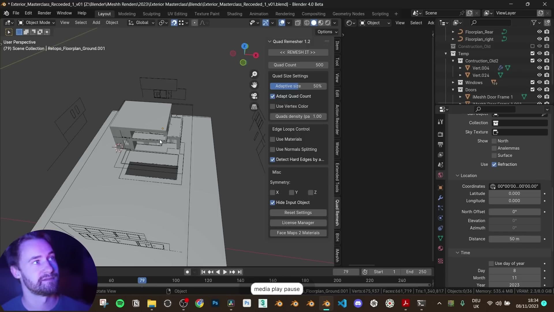
One route is to add edge loops by hand until everything is quads. That's straightforward for a flat plane like this. The faster route is to push it through a quad remesher add-on: set the resolution to 500 and run it, and the surface comes back as an evenly spaced quad grid ready for displacement. I'd recommend the add-on. It produces a clean displacement-ready mesh out of any awkward archviz outline in a single click.
Enabling Sun Position and pasting GPS coordinates
Lighting is one of the most important parts of an archviz render, and Blender ships a built-in tool that hardly anyone reaches for. Open Edit > Preferences, search for Sun Position, tick the add-on on, and save preferences.
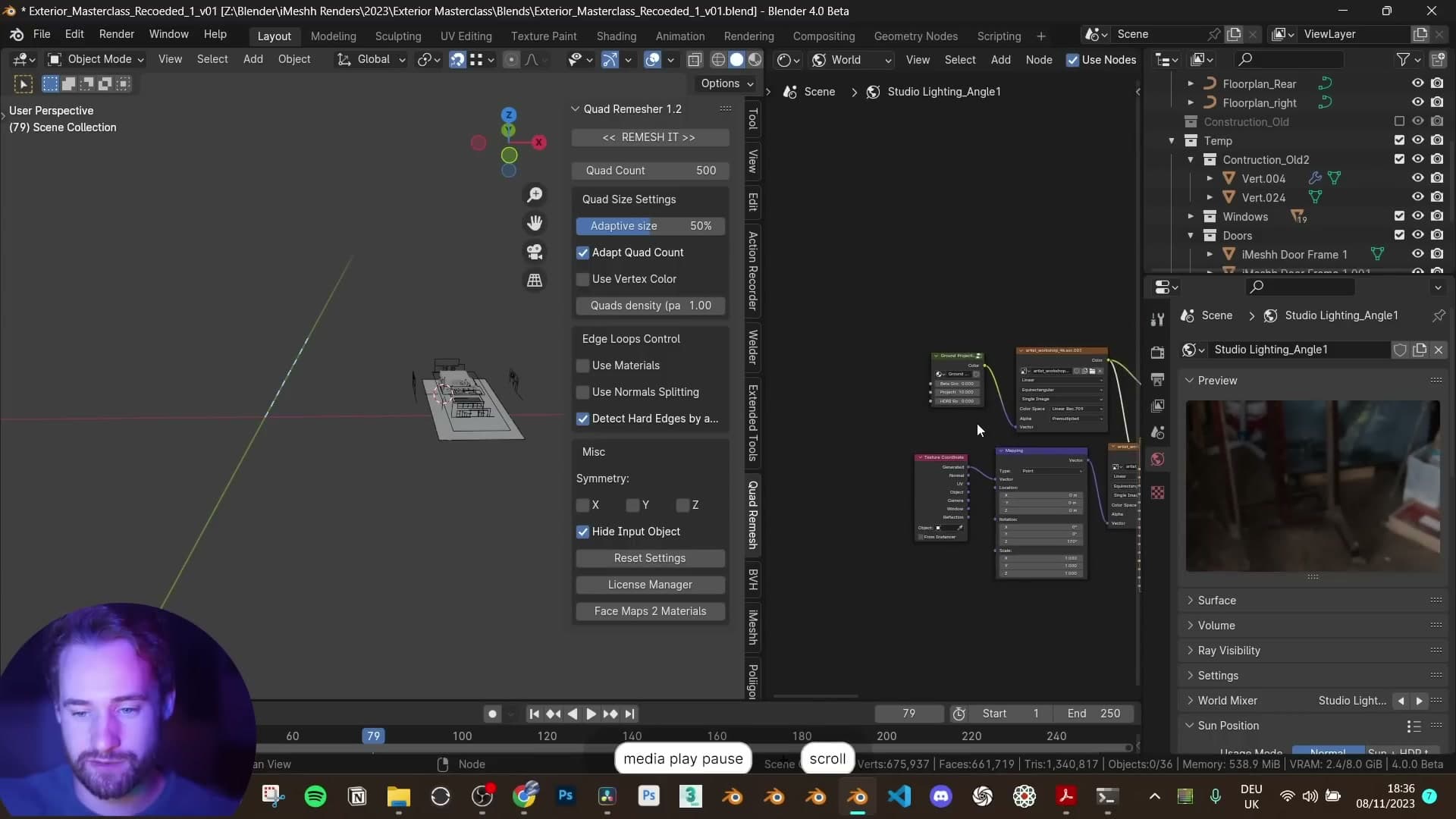
In the World tab, scroll down to the new Sun Position panel. Type the city you're building for into the location search (London, in this case), then copy the GPS coordinates it returns and paste them straight back into the panel. The sun's path is now physically accurate for that location and date.
Add a sun lamp and select it as the sun object in the panel. As you scrub the time of day, the lamp rotates around the scene exactly as the real sun would on that date, altitude, azimuth and all.
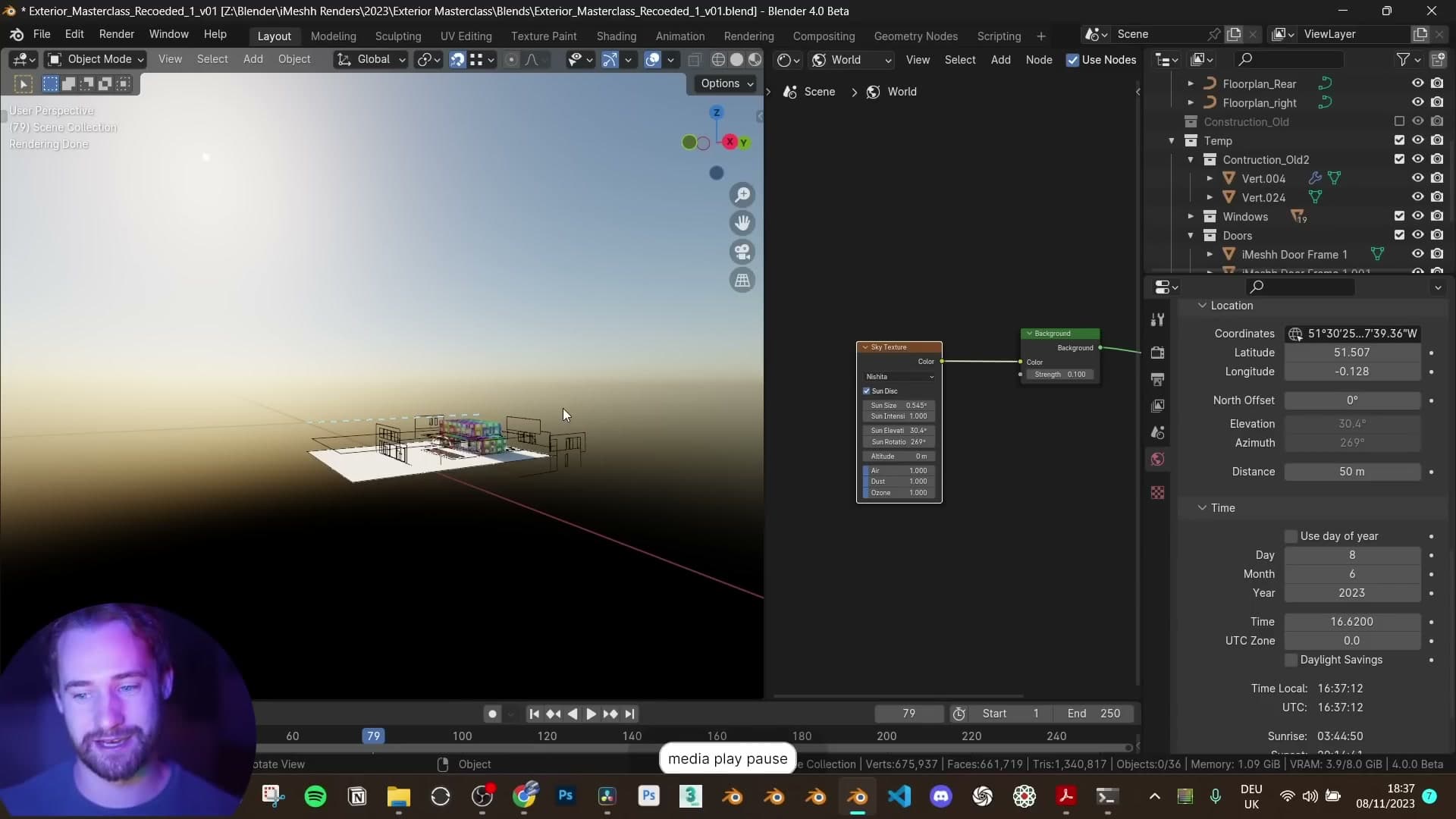
Now set the North orientation to match the north arrow on the architect's floor plan. This is the part most people skip. If the plans show a south-facing house and you render the sun crossing the north side, the client will spot it immediately. South-facing rooms get sunshine all day; north-facing rooms barely see it. Getting north right is non-negotiable for any client-facing shot.
Nishita sky texture driven by time of day
With the sun positioner driving direction, give it a sky to live in. In the World tab, clear out the default nodes and create a fresh world. Add a Sky Texture, plug it into the Background input, and switch the type to Nishita.
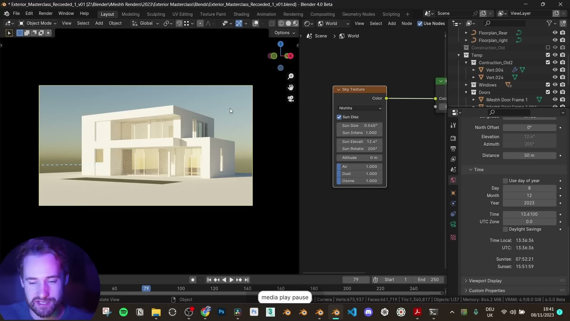
Drop the viewport into rendered preview and turn the sky strength down to around 0.1 so you can see exactly where the sun sits in the sky. As you scrub the time of day, the sky's colour gradient and the sun's altitude shift together. At 6 PM in October the sun is dipping into a low orange sunset. Bump the date to April, May or June and 4 PM still has the sun high overhead, with the actual sunset pushing out to around 8 PM.
For the hero frame, pick a late-afternoon slot. The shadows fall long and warm across the facade, which suits a south-facing exterior like this one. On a real commission you would anchor the time to a meaningful moment for the site; for a portfolio piece, dial in whatever evening light reads best on the building.
Camera composition and time-of-day choice
Set up a 1920x1080 camera, shift it vertically to keep architectural verticals at 90°, then pick a late-afternoon angle that puts one facade in sun and another in shadow.
Vertical shift and 90° corrections
Before lighting becomes a composition decision, the camera itself needs framing and a vertical correction.

Set the output resolution to 1920×1080 so the render comes out landscape. Then, with the camera selected, open its Object Data properties and apply a small value to the camera's Y shift. The goal is for the building's vertical edges to read as a true 90° rather than fanning inwards or outwards in the viewport.
Picking a sun angle that splits sun and shadow facades
The composition principle I keep coming back to is shadow contrast. Aim for one facade in sun and the other in shadow so the building reads as a three-dimensional form rather than a flat elevation. A common mistake I see beginners make is to point the sun straight at the building so every face is lit. The result is technically correct but visually boring.
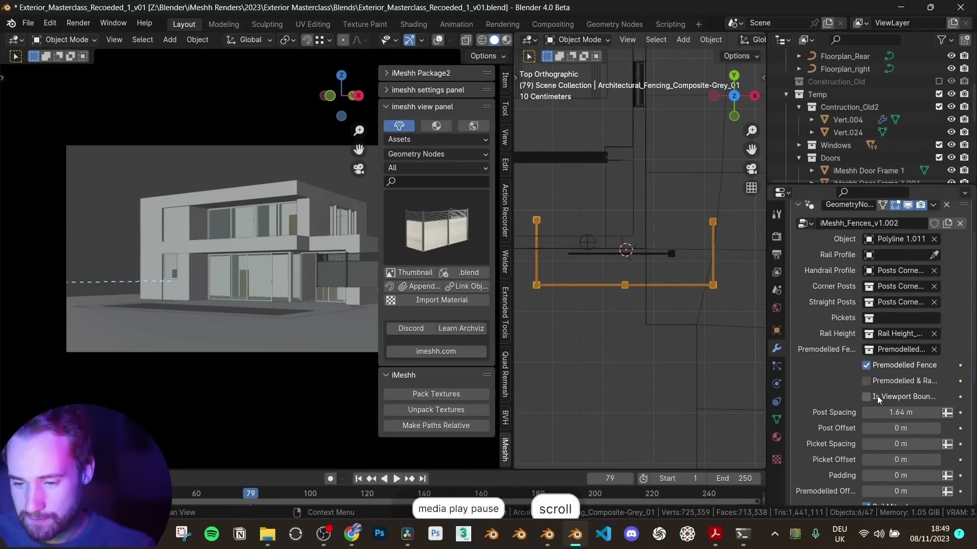
Two other angles to avoid for the main hero render: the sun directly head-on (which flattens the building the same way), and the sun directly behind the building, which can be artistic for a silhouette but throws the entire visible face into shadow so you cannot really see what you have modelled. For most cases, late afternoon is the safer choice. Long raking shadows, the main face lit, and the secondary faces dropped into shade for contrast.
From there it is just a matter of tweaking the sky. Pull the blue tint down a touch if the shadows feel too cold. If the shadows feel too hard, raise the sun's disc size to soften their edges. I settle around 0.15 for a slightly softer look.
One thing worth knowing about the Sun Positioner setup is that the sun's own strength and the overall background brightness are independent sliders. The background node drives the environmental fill, and the sun strength drives only the direct disc. Drop the sun to zero and you are left with a pure environmental light. Push it up and you punch the shadows back in without changing the rest of the sky. I like to dial the sun down a touch and then lift everything else slightly, balancing the contrast without crushing the shadows.
Fences, trees and the reflection trick
Drop the iMeshh modern fence onto a curve, scatter foreground trees as collection instances, randomise leaf hue from Object Info, and place hidden trees just to feed the window reflections.
iMeshh modern fence on a Bézier curve
The iMeshh modern fence runs around the rear of the property along a Bézier curve.
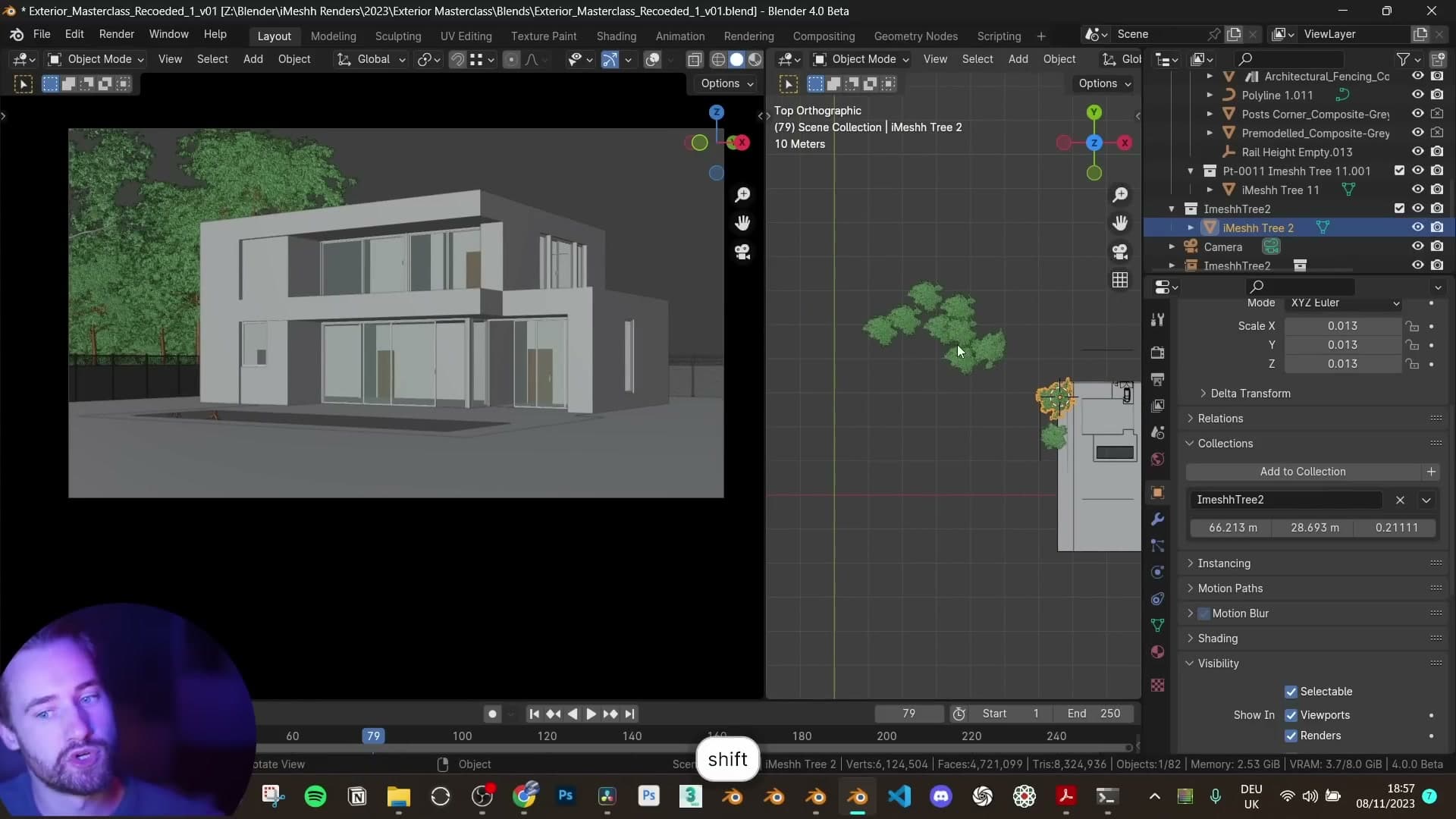
Before you start dropping in instances (whether of the fence or the trees that come next), set the collection's origin to a sensible anchor. Snap the 3D cursor to your reference point with Shift+S > Cursor to Selected, then in the source collection's properties set its offset so the collection origin sits at the cursor. Each new instance now starts at that anchor and scales outward from it.
With the origin sorted you can populate as many copies as the scene needs. Blender generally keeps up rendering collection instances without complaint. It does start to slow down once the count gets very high, but for an exterior of this scale it stays comfortable.
Trees added as collection instances for low VRAM
Bring the iMeshh tree collection into the scene and start populating the garden. Duplicate the same tree out from your anchor and, on each copy, rotate and scale it so the same mesh doesn't visibly repeat. The aim is a meadow-style spread of mixed trees around the property, not a regimented row.
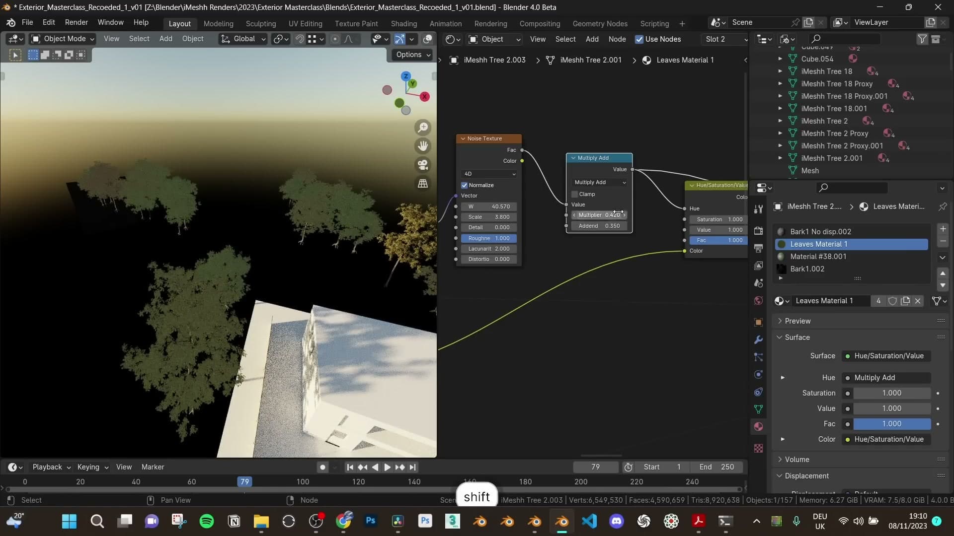
Because every placement is a collection instance pointing back to the same source mesh rather than a unique copy, the scene stays light enough for Blender to keep up. It will start to slow down once the count climbs very high. For an exterior of this scale, though, you can comfortably scatter what you need without paying the cost of full duplicates.
Randomizing leaf hue with Object Info → Noise → Hue
The trick is to give every tree the same leaves material. That way one shader edit varies every instance. Then drive the variation from each tree's identity. Add an Object Info node and feed its Random output into a Noise Texture set to 4D. The 4D mode exposes a W input you can twist later to reshuffle which tree ends up which hue.
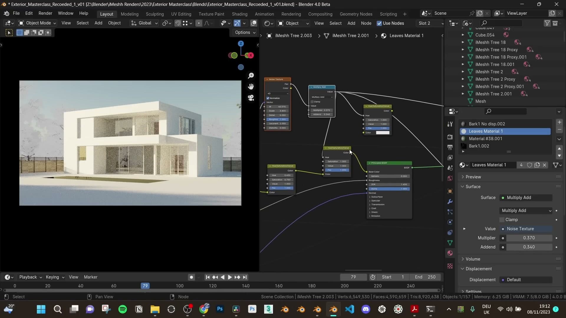
That noise still needs to be tamed before it reaches a colour input. Pipe it into a Multiply Add node. The Multiply value controls how far each tree's hue can wander from the original. A small value gives a subtle leaf-to-leaf shift. A larger one pushes some trees firmly toward yellow or red. If you want the foliage to stay greener overall, drop the multiplier closer to zero. For more autumnal variance, raise it.
The maths is straightforward once you remember that a Hue Saturation Value node treats 0.5 on its Hue input as neutral. Multiplying the noise by zero and adding 0.5 produces no change at all. A small Multiply value nudges each tree just above or below 0.5, which is exactly the gentle hue jitter you're after.
Wire it into the existing shader by inserting a Hue Saturation Value node just before the Base Color input. Plug the original leaf colour into the new node's colour input, feed your noise-and-maths chain into its Hue input, then route the node's output into Base Color. Repeat the same insertion on the Translucent colour socket. The back-lit side of the leaves has its own colour input, so copying the jitter there keeps both faces of each leaf in agreement.
Sinking background trees and seeding window reflections
Once the front-row trees are placed, fill the deep background by sinking trees into the ground. Drop each background tree's Z position so a good chunk of the mesh disappears below the surface. At distance you won't see the buried half, and the visible top reads as a hedge or low bush. It's a much cheaper way to fill a back garden than placing line after line of trees marching further and further into the distance, which is the trap a lot of archviz scenes fall into.
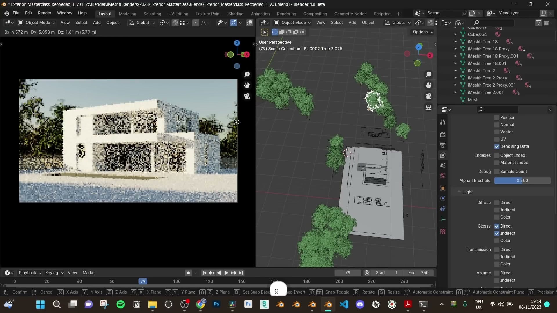
Behind those, drop in a couple of planes coloured pure black to cut off the very back of the view. The eye reads the dark wall as more forest depth rather than as a hard horizon, and the foreground trees stop looking like they're floating in a void of sky.
Now for the trees that earn their keep most: reflection trees. Without them, the glazing on the facade just shows blank sky and the windows look boring. Place a couple of trees just out of frame but high enough that they register in the window reflections. Expect a little back-and-forth to find the right spot. Slide them around until you see foliage land in the glass, and repeat on any other facade with prominent windows.
While you're at it, jump to the View Layer properties and enable the Glossy Direct and Glossy Indirect passes. You'll lean on those later to push the window reflections in post.
Finally, do your viewport a favour. Collect the deep-background and reflection-only trees into a separate Trees Background collection and hide it from the viewport via the View Layer. The camera-visible trees stay live for framing. The cheap-seats trees come back on at render time.
iMeshh grass with camera culling
Drop in an iMeshh lawn, embed a Camera Culling and Delete Geometry switch into the geometry-nodes graph so off-screen blades vanish, then fix the Blender 4.0 displacement offset.
Joining the iMeshh lawn onto the ground mesh
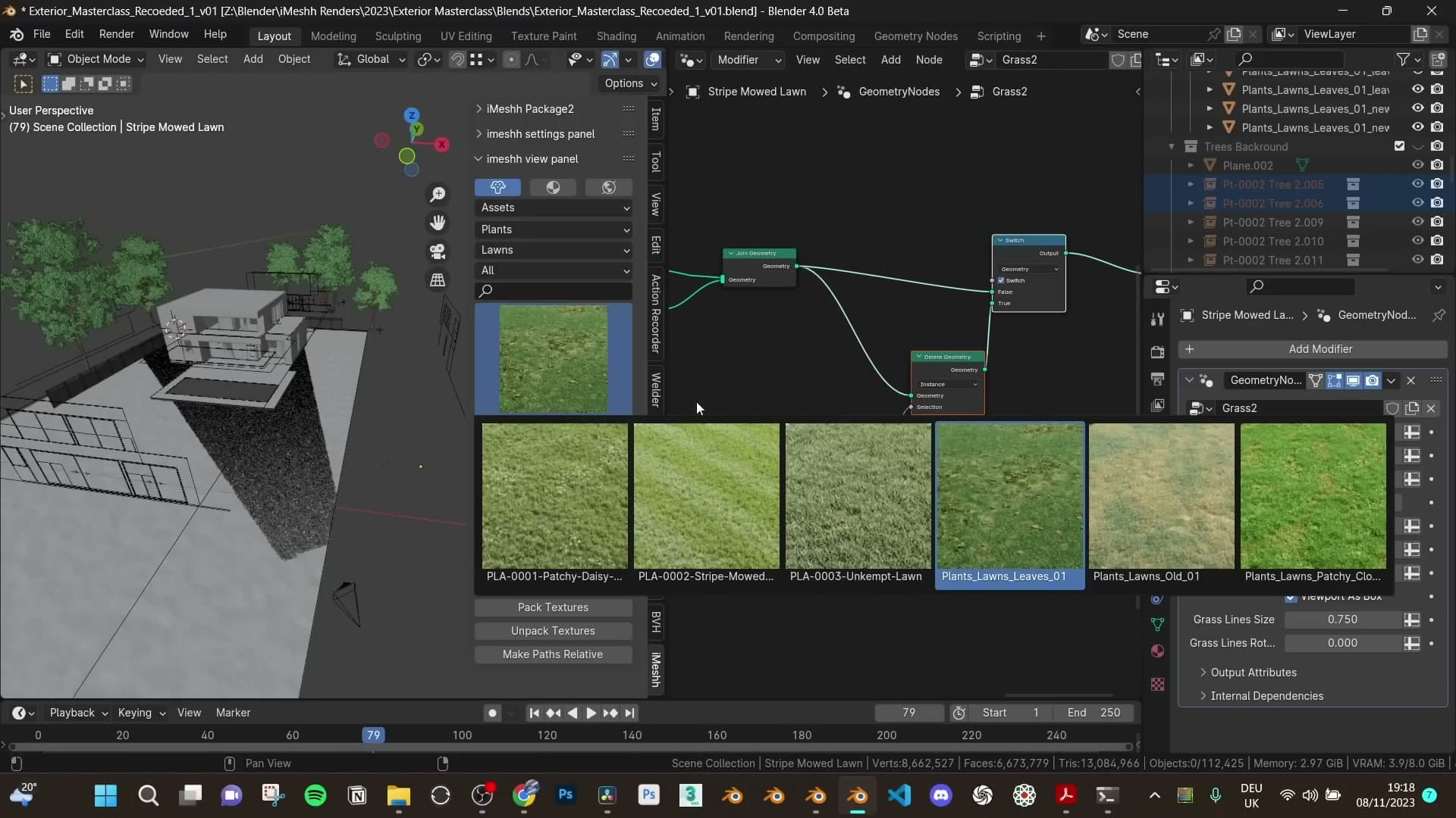
Select the ground plane, open the iMeshh asset browser and head into Plants. The library ships several lawn options; in this scene you want the mode-lawn look, so append that one and drag it into the viewport next to the ground.
Before you join the two objects, set the lawn up so it doesn't grind your viewport to a halt. Turn off the leaves for now, drop the grass density to 250, and switch the viewport display to Box so each blade renders as a bounding cube rather than full geometry.
With the lawn parented onto the ground in spirit, select the lawn first, shift-select the ground, and press Ctrl+J to join them into a single object. Switch the viewport display back from Box to its default and give Blender a moment. You'll see an explosion of grass spread across the entire ground mesh.
Camera culling baked into the grass geometry-nodes graph
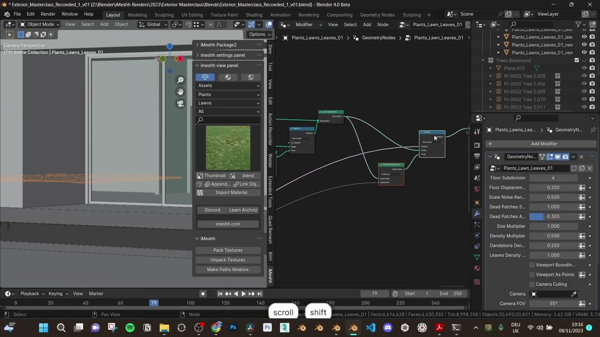
iMeshh's newer lawns come with a camera-culling block already wired into their geometry-nodes graph, and you can lift that block straight into any older setup. The payoff is huge. Anything outside the camera frustum is stripped from the mesh, so your viewport stops trying to draw millions of blades you'll never see.
Append one of the newer iMeshh grasses into the scene, jump into its geometry-nodes graph, and locate the three nodes that do the work: Camera Culling, Delete Geometry, and a Switch. Select all three and press Ctrl+C.
Open the geometry-nodes graph on your original lawn and press Ctrl+V. Wire the original geometry into the Delete Geometry input. Anything the camera can't see will be removed downstream. Plug the final node of your existing graph into the false input of the Switch and the culled output into the true input, then run the Switch into the Group Output. With the toggle off, the graph behaves exactly as before; flip it on and only the on-screen blades survive into the final mesh.
One small gotcha: the Camera Culling node needs to know which camera to use. Pick your scene camera from the dropdown (it's called Camera by default) and the viewport should immediately reveal the culled region. Three nodes, a switchable performance win, and a setup you'll reach for on virtually every geometry-nodes scatter from here on.
Disabling the displacement offset for Blender 4.0
Jump into the camera preview, confirm the field of view still matches what you had, and turn off the lawn's Box viewport display so you can see the actual blades. The grass should already look lush; if the stripes from the lawn pattern aren't reading, push the Size input (lower values increase scale here) until the patches are obvious. Once you've found a value you like, dial the viewport density back down (around 500 works) so you can keep working without lag.
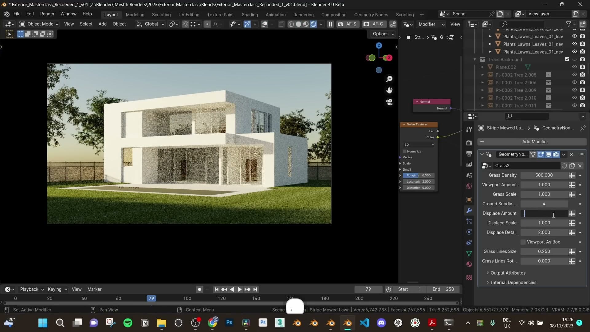
Reduce the subdivision on the ground mesh while you're here. That subdivision is feeding the displacement, and if you've already cut a lot of faces into the patio area you don't need much more on top.
If you push the displacement now in Blender 4.0, you'll hit a regression: instead of lifting the grass off the ground, increasing the displacement value drives the whole object downwards. This didn't happen in 3.x. The fix lives at the very start of the lawn's geometry-nodes graph. Find the first node in the chain and disable it. With that bypassed, the displacement reads from zero again and behaves the way it always did.
From there it's a tuning pass. Start with a tiny amount, then bump it up: 0.1 is too much, 0.05 reads cleanly, and 0.075 sits halfway between the two with just enough variation to make the ground feel natural. The patio piece is thick enough that any blades poking through the edges won't be visible in the final frame.
Interior dressing: wood floors, kitchen and sofa
Use the iMeshh floor generator for plank flooring, then drop in a pre-dressed kitchen, sofa, dining set and wall art. Lamps get 3800 K blackbody emission for warm evening light.
Procedural decking and laminate with the iMeshh floor generator
Before laying any flooring, do a bit of housekeeping. The foreground trees were cutting too much shade onto the patio, so move that group back a few metres to let more of the lush grass read through. While you're there, hide the floor-plan reference, drop the grass scatter from viewport display, and shift the heavy foreground tree group into its own Trees Foreground collection so you can toggle it off while you dress the interior. The scene will be noticeably more responsive.
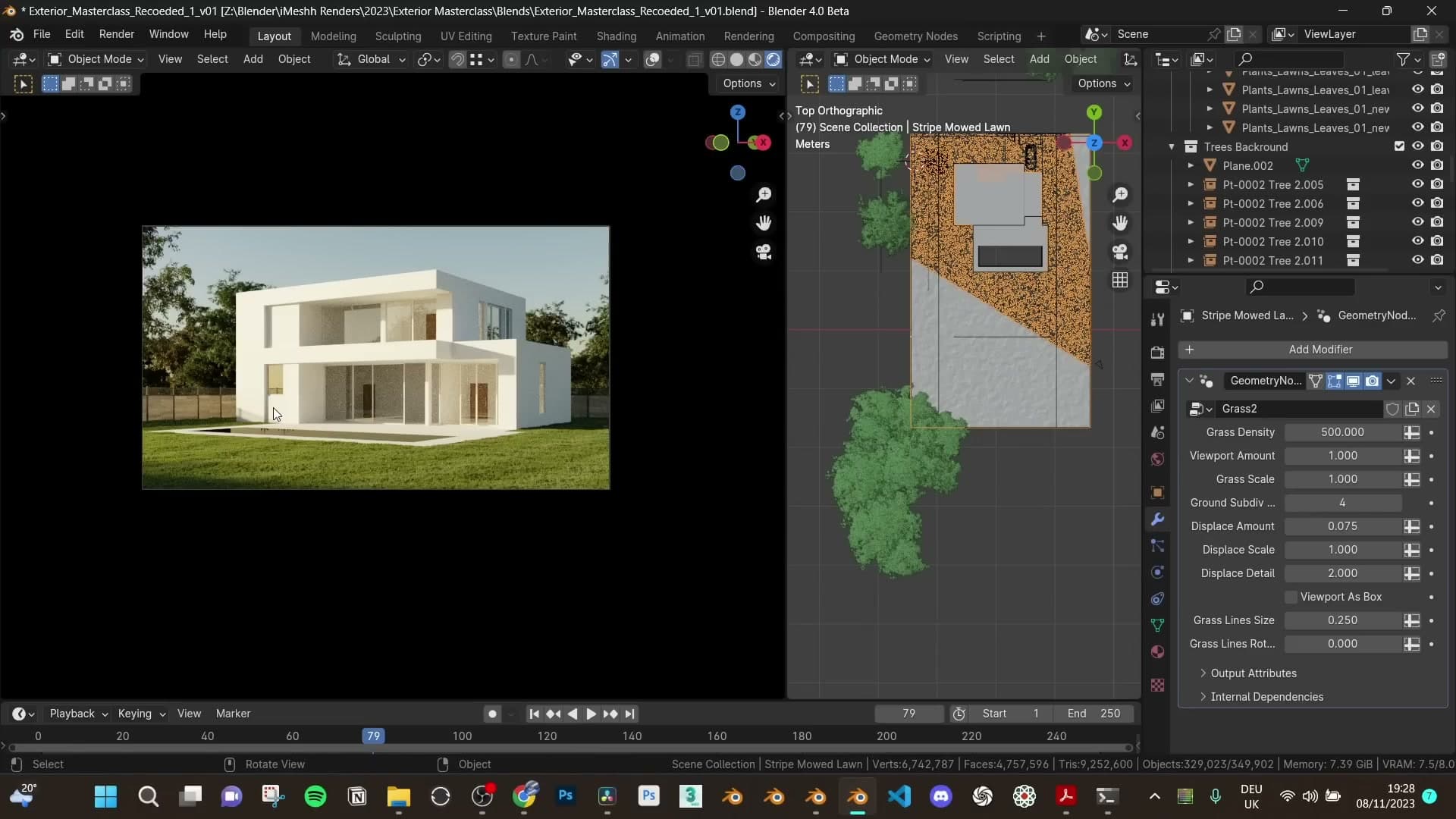
Now drop in some decking using the iMeshh wood floor generator. From the asset browser, add one of the wood floors at 1K. That's plenty for this project, because each plank carries its own texture and from camera distance you'll never see the resolution drop. Reserve 2K or 4K for shots where the camera will be parked right on the timber.
Tweak the generator into convincing decking. Increase the grout so the individual planks read clearly, turn off the viewport bevel to keep things snappy, and push the plank height up a touch. Set the plank length to 2 m and the width to 0.25 m for nice long boards. Real decking is usually laid with the row offset at zero (every board lined up), but a 50% offset reads just as well. Either is plausible exterior decking.
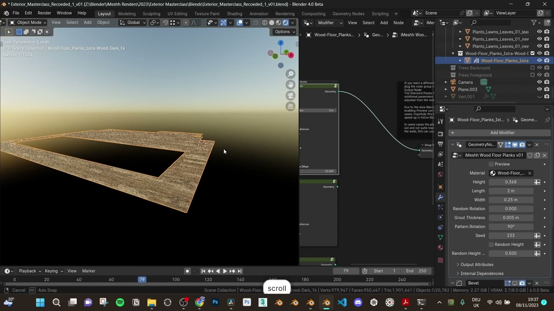
Once the generator looks right, join it onto your existing floor plane. Select the generator plank, shift-select the decking plane, press Ctrl+J to join, then drop into edit mode and delete the original generator mesh. Rotate the joined floor by 90° if the plank direction needs flipping, then hit render preview and you should already see crisp individual planks under the patio.
The interior floor gets the same treatment but as laminate. Select one face of the interior floor and press Shift+G > Coplanar to grab the entire floor in one go, then P > Selection to separate it into its own object. Drop in a different iMeshh wood floor at 1K, join it onto the separated floor with Ctrl+J, and delete the original generator mesh. For a laminate look, turn the bevel off completely and set the plank dimensions to roughly 0.25 m wide. Repeat the same steps for the second interior floor.
Dropping in the kitchen, sofa and dining table
With the floors down, dress the interior with iMeshh's pre-built sets. From the asset browser, open Kitchens → Full kitchens and drag one into the scene. Place it roughly where you want it, then drop into edit mode and delete the cabinets and worktop sections that hang outside the building shell. There's no point rendering geometry the camera can't see.
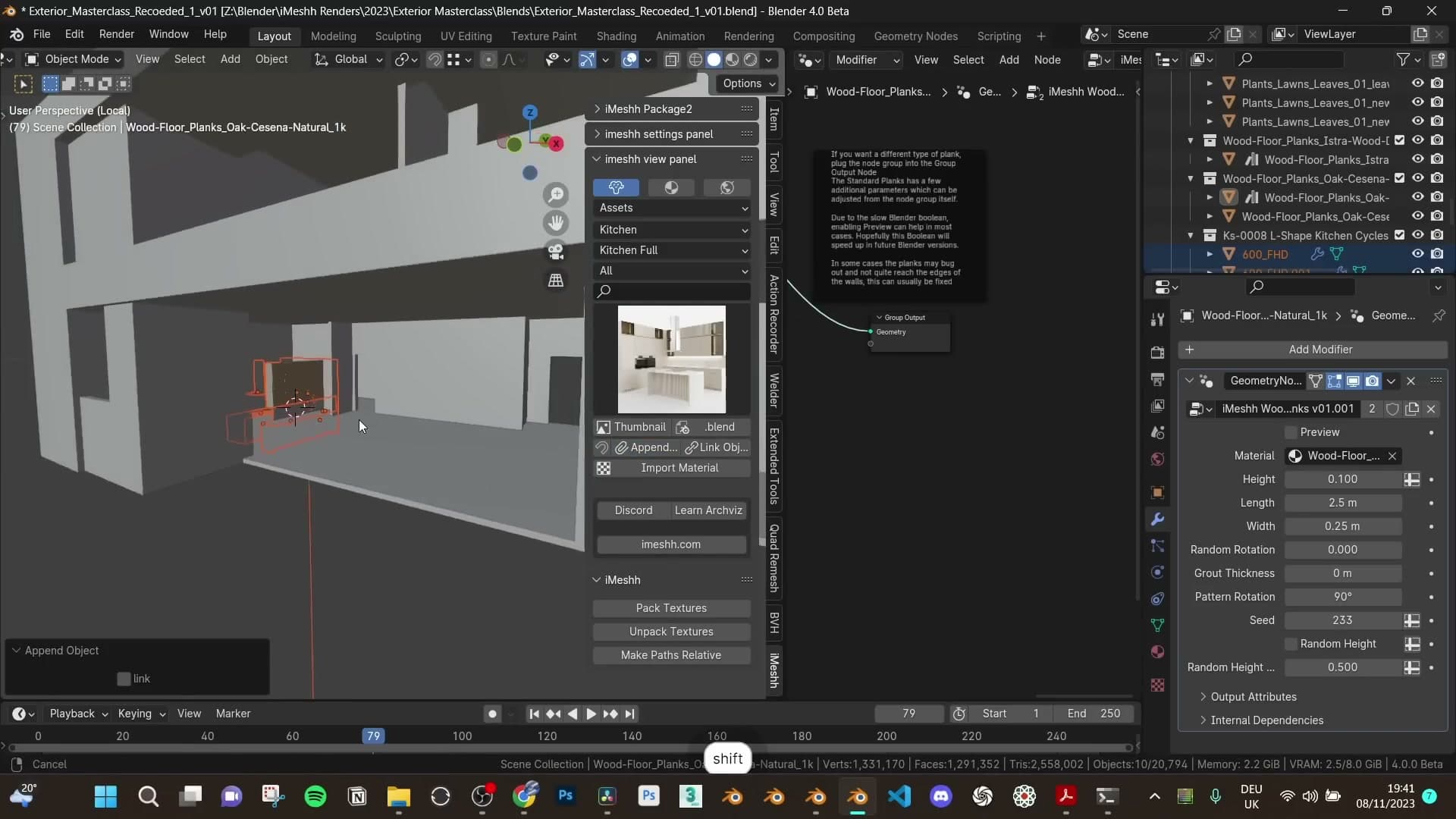
Next, a sofa. Open Seating > Sofas and pick a basic one. From camera distance you only need it to read as a sofa silhouette. The dropped asset should already sit on the floor. If the asset thumbnails feel cramped, bump the thumbnail scale to about 6 in Preferences so you can scan the options at a glance.
Finish the living-area pass with a dining set. Under Tables → Dining tables, choose one that ships pre-dressed with chairs around it so you don't have to scatter them manually. Drop it in, check it's sitting on the floor, then shove it back towards the rear wall so it composes nicely against the windows from the hero camera.
Framed art, lamps and 3800 K blackbody emission
Most iMeshh kitchens ship with a pendant lamp. With the bulb selected, open the light's data properties, tick Use Nodes, and change the Colour input from flat white to Blackbody. Set the temperature to 3800 K for a warm tungsten glow. Much more believable for an evening interior than the default neutral white.
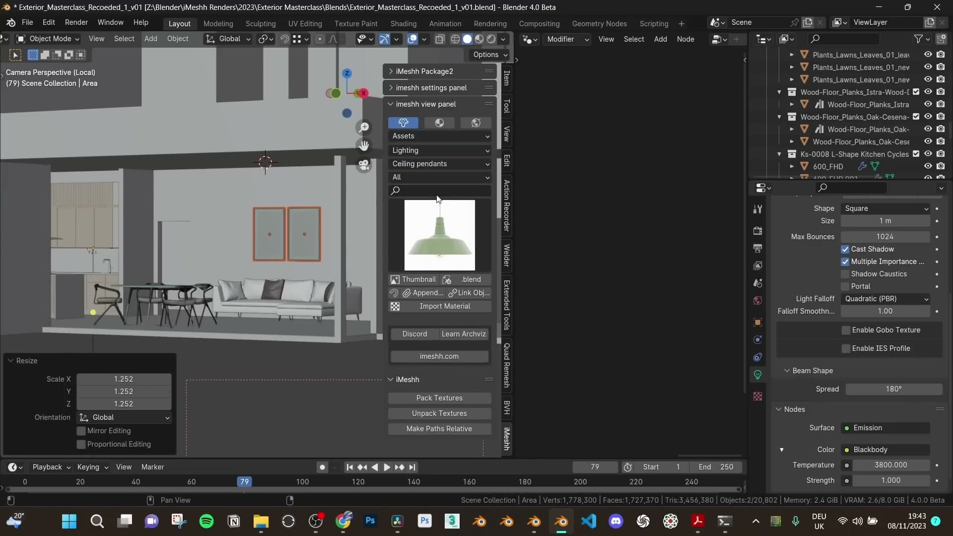
Now fill the back wall behind the dining table. The camera was looking at a big empty plane, so open Decorations → Frames and drag a framed piece onto that wall. Hop into camera view to check it's reading at the right scale. A single well-placed frame is enough to break up the dead space.
Add a second lamp near the sofa. From Decorations, pick one of the lamp assets, position it next to the sofa and rotate it so it composes nicely from the camera angle. Newer iMeshh lamps already come with the Blackbody node preset, but older assets don't, so repeat the Use Nodes → Colour → Blackbody step at 3800 K, and push the strength up to around 20 so the bulb actually contributes to the scene.
There's a longstanding debate about whether an exterior render should show interior lights on while the sun is still up. The pragmatic answer is yes. Plenty of people flick lights on as the afternoon tips into evening, and a warm interior glow against a cooler exterior sun adds real life to the shot. Keep the interior bulbs restrained though. You don't want them blowing out the windows while the sun is still doing the heavy lifting outside.
Curtains, glass railings and wood paneling
Half-curtains in every visible window, the iMeshh glass railing geometry-nodes setup on a Bezier, and a custom wood-slat panel built off a copied curve.
Alt+D linked curtains in every visible window
With the bones of the interior in place, the single most useful prop to drop into every visible opening is a set of curtains. Append a curtain asset from the iMeshh library, jump into local view, and strip it down to the bare minimum: because the camera never sees inside the building, you can delete one entire side of the curtain set so only the half facing the glass survives.
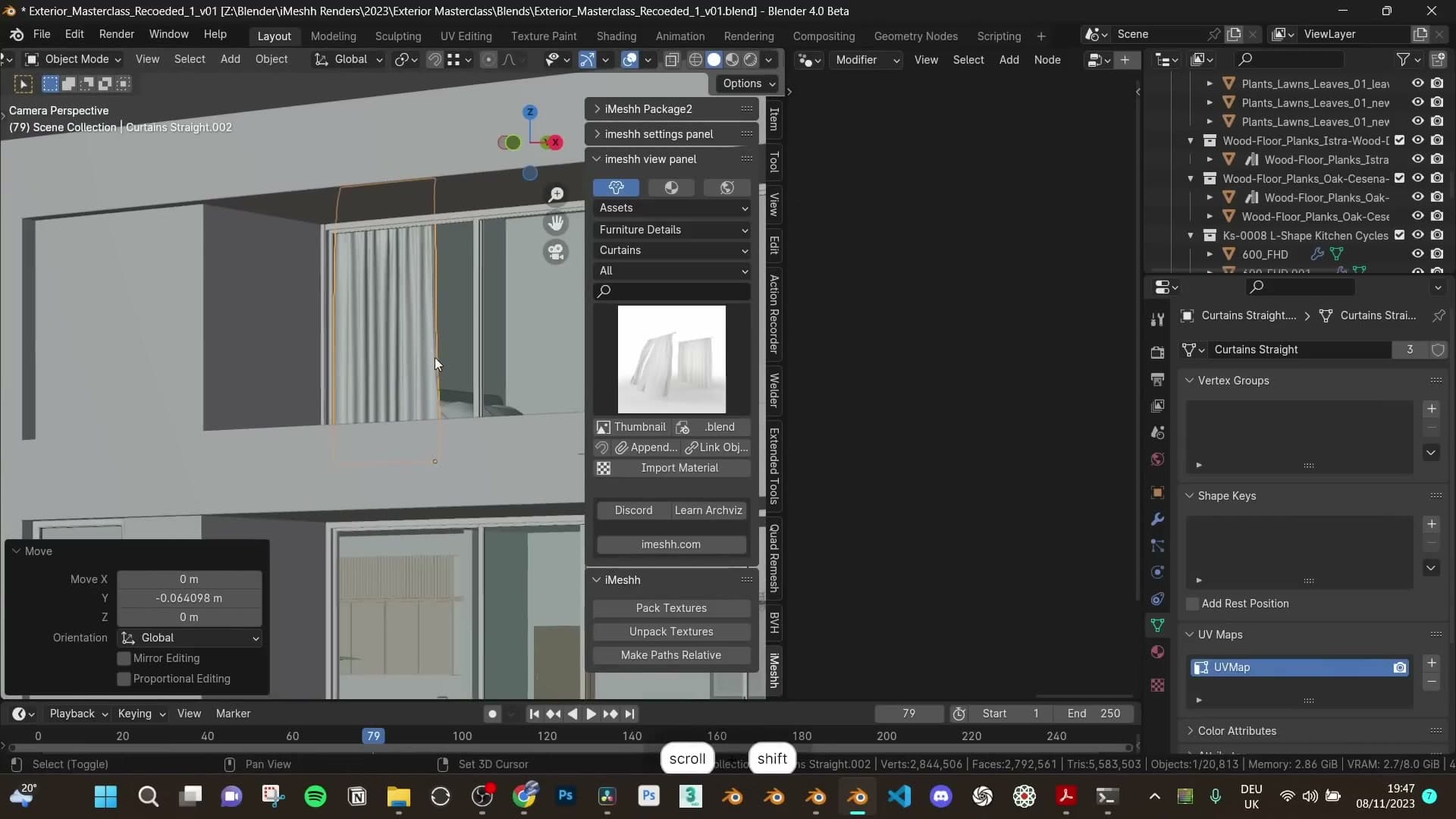
Position the first curtain by rotating it to face the window, sliding it up against the glass, and scaling it on a single axis to match the opening. Curtains forgive non-uniform scaling far better than almost any other asset. Most objects look obviously stretched when you tug them along one axis, but fabric folds disguise it. Use that to your advantage and shape each curtain to its window rather than dropping in identical copies.
Now propagate the curtain to every other visible window with Alt+D, not Shift+D. Alt+D creates a linked duplicate that shares the original mesh data instead of cloning the whole geometry. That's vital for a high-poly fabric asset you are about to place a dozen times. Move each linked copy into its window, nudge it on the Y axis or stretch it a little so the silhouettes vary, and the scene reads as multiple individual curtains rather than the same one pasted around.
Repeat the same Alt+D pattern on the ground floor. Curtain rails are not modelled here because the camera never sees them, so do not waste polygons on hardware the render will never show. For the open window in particular, you could swap the linked instance for a separate blowing-curtain asset to sell the breeze, although a static curtain reads fine if you would rather keep the setup quick.
Once the trees cast their foreground shadows into the scene, drop into a preview render and check the hems. Any curtain that floats off the floor will catch the eye. Slide the offenders down on Z until they just kiss the ground.
Glass railing geometry nodes on a balcony curve
The upstairs terrace needs a railing, and the iMeshh library ships a glass-railing geometry-nodes setup that runs along any curve you feed it. Append the glass railing asset from the geometry-nodes category. It arrives with a couple of helper pieces alongside the curve. Drag those out of the way for now, although in a production scene you would tuck them into a hidden collection rather than leaving them loose.
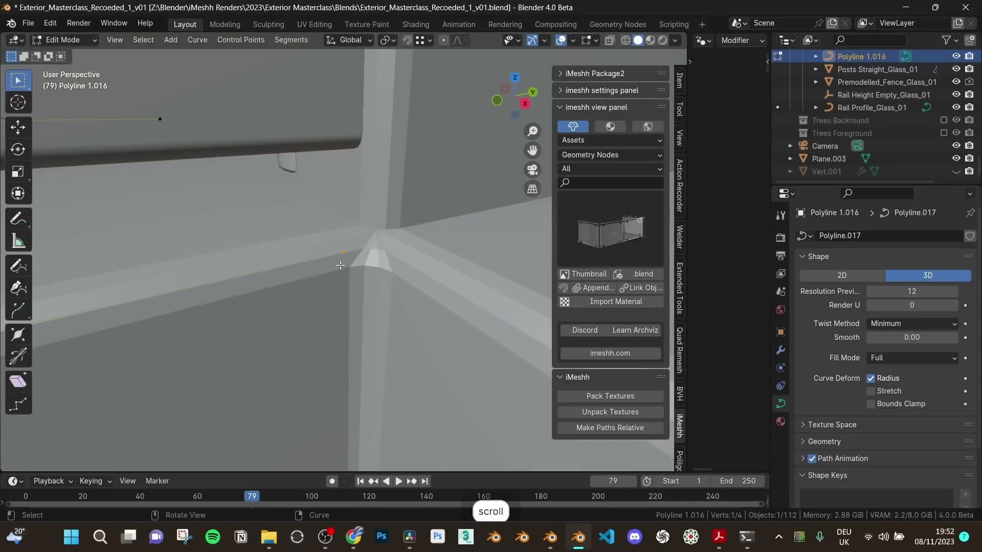
Select the railing curve and shape it to the balcony edge by moving its control points: bring the curve up to the correct height, slide it inward to align with the floor edge, and pull it across so it spans the opening. Because the railing is generated from the curve, you can fit any balcony geometry without re-modelling. Every move you make on the curve immediately re-instances the glass panels and posts along it.
Delete any segment of the curve that overshoots the balcony and add a fresh section where you need more length. The result is a continuous glass railing that hugs the terrace edge and lets the white wall behind it read cleanly through the panels.
Wood-slat cladding on the facade band
The final exterior detail is a band of wood slats that sits under the upper window. Append the wood-slats asset from the iMeshh architectural decorative geometry-nodes category. Like the railing, it generates the slat array from a curve, so all the editing happens on the underlying spline.
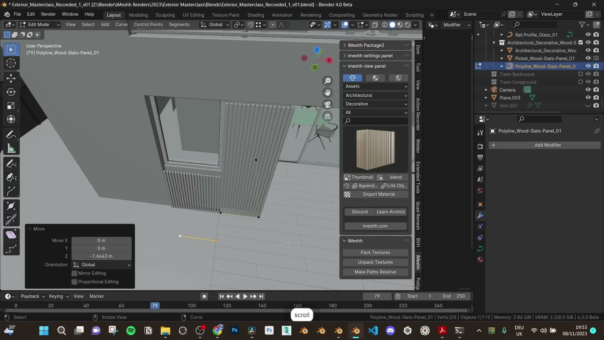
If the source object has a bevel modifier still active from an earlier step it can choke the geometry-nodes preview, so select the original and switch its bevel off before you start moving things around. With that out of the way, drop into edit mode on the curve and slide the existing segment across so it lines up with the upper window. Delete any spare point that is not contributing.
Build out the rest of the band by duplicating curve segments rather than rebuilding from scratch. Shift+D is safe to use here even though Alt+D was the rule for the curtains, because the wood-slats setup uses collection instances internally, so each duplicated curve still references the same instance source rather than baking a new copy of the slat geometry.
Position each duplicated segment under its window, pull it down so it sits just below the sill, and tuck it slightly inwards from the wall plane so the slats read as cladding rather than a flush graphic. Once the ground-floor band reads correctly, Shift+D the whole arrangement upstairs and repeat the placement under the matching upper window.
Patio and balcony furniture
Umbrella, deck chairs, coffee table with wine bottles, outdoor dining set with subdivision stripped for a cleaner silhouette, plus balcony lounge chairs and potted plants.
Umbrella, deck chairs and the wine-bottle coffee table
With the asset library doing the heavy lifting, dressing the patio comes together quickly. The area out front is sizable, so start with a parasol from the library. Flip to camera view occasionally to gauge how the scale reads from the final angle, then bring in a couple of deck chairs to sit either side of it.
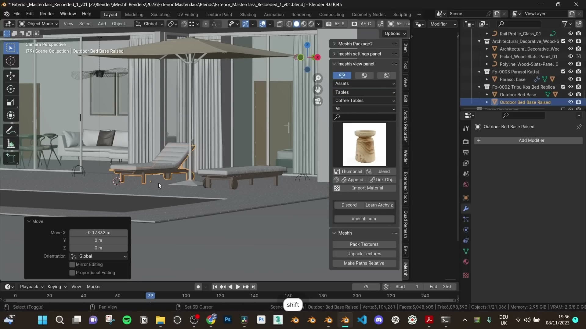
Most of these older library pieces ship with subdivision and bevel modifiers enabled. From this distance you'll never see the extra geometry, so disable both on every patio prop as you place it and apply Shade Auto Smooth instead. The silhouette stays clean and the viewport stays responsive.
To anchor the deck chairs, drop in a wooden coffee table from the library, something that picks up the wooden aesthetic already running through the cladding and decking. Strip its subdivision modifier for the same reason as the chairs.
Dress the table with a couple of bottles from the library's Food and Drink > Drinks category. Two bottles of wine reads as more lived-in than one. If in doubt, bring two.
Outdoor dining set, balcony chairs and potted plants
Move along the patio and start a proper outdoor dining area. Pick a chair built for the outdoors, ideally one with wire or woven string seats rather than padded cushions, since fabric pads sat outside tend to go mouldy. The library has several options that read this way; choose one that fits the rest of the patio.
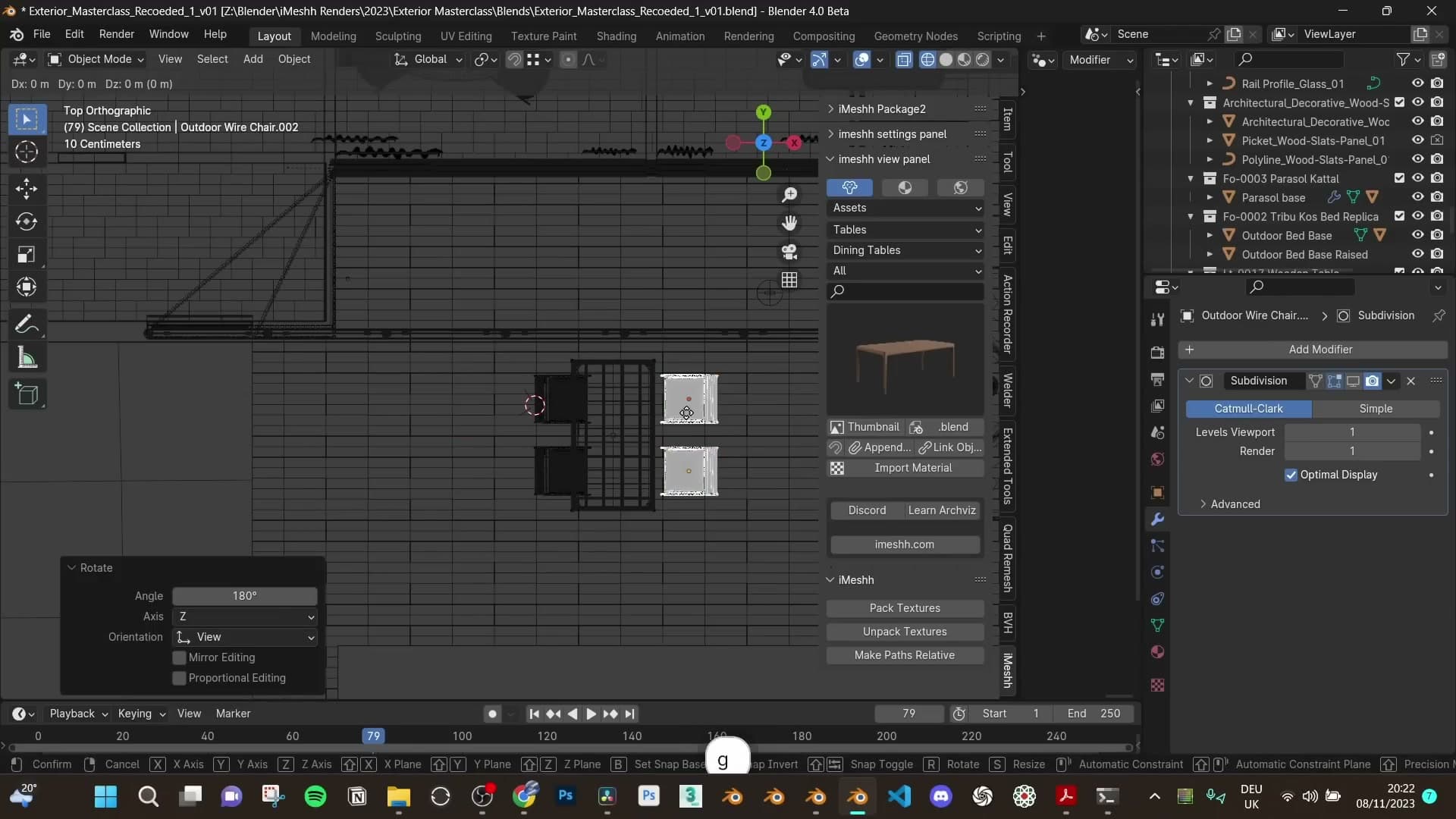
Add a matching dining table and rotate it 90° so the long edge runs the way you want, then drop the first chair into position alongside it. Hold Alt+D to make a linked duplicate, rotate it 180° to face across the table, then linked-duplicate again with Alt+D and rotate the new copy 90° to fill a side seat. Linked duplicates mean any later mesh tweak propagates to every chair automatically.
Once all the legs are in, the arrangement can start to feel cluttered. If yours does, remove the chairs you don't need and rotate the survivors a few degrees off-axis so the set looks lived-in rather than staged. A perfectly aligned four-piece reads as showroom; a slightly skewed pair reads as someone got up mid-meal.
The upper balcony gets a lighter pass since it sits further from camera. From Seating → Lounge Chairs, drop in an outdoor bucket chair and slide it closer to the window so the shape reads against the glass from below. Linked-duplicate it with Alt+D and rotate the copy to suggest a small seating nook up on the terrace.
Pool, advanced glass shader and Cycles caustics
Build the pool well from the patio cutout, displace the water surface, apply the iMeshh advanced glass shader with absorption for depth-driven blue, and switch Cycles caustics on for the world and pool.
Pool well geometry and displaced water plane
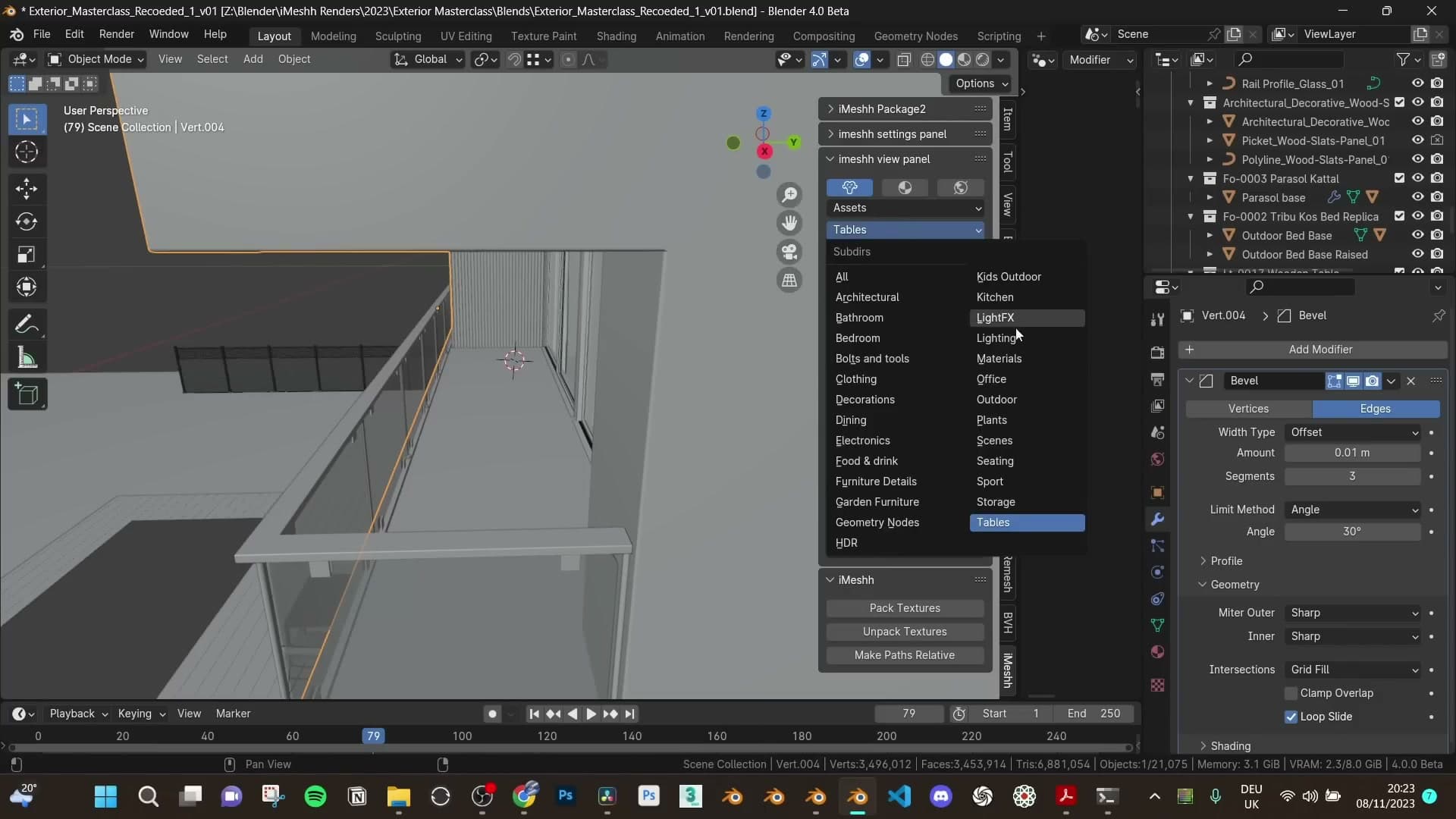
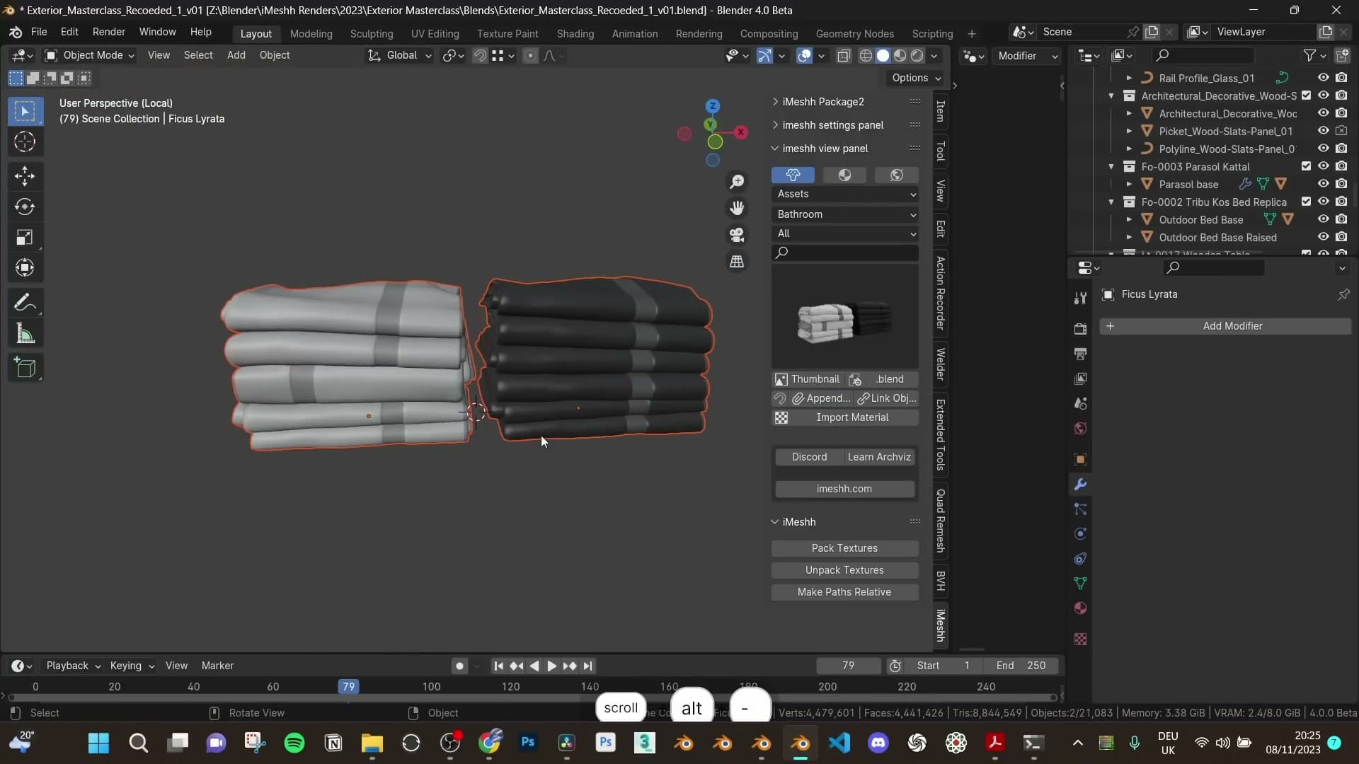
Before the pool itself goes in, dress the upper terrace so it feels lived in. Pull a couple of potted plants out of the iMeshh library for the deck, drop a folded towel near the pool edge and add a duffel bag to imply someone has just walked out for a morning swim. On every one of these decorative pieces, switch the Subdivision Surface modifier off in the viewport. At this camera distance the extra geometry buys you nothing and only slows the scene down.
To build the pool itself, isolate the patio shape in local view, select the inner loop of edges that already defines the pool cutout, then press Shift+D to duplicate, Enter to drop it in place, and P > Selection to separate the loop into its own object. The new mesh inherits the patio's geometry-nodes modifier, so delete that off its stack. You want a clean curve to work from.
Scale the loop outwards to define the pool footprint. There is a way to push every edge out by the same distance uniformly, but if the shortcut escapes you in the moment just eyeball it. Lift the loop up to deck height, extrude it down to form the well, press I to inset the bottom face, then extrude the inset down again to give the pool its depth.
The water surface is built from the same rim. Duplicate the top edge loop with Shift+D, raise it on the Z axis to sit just under the deck lip, and press P to separate it into its own mesh. Cut the plane into rough squares, then run W → Subdivide a few times so there is enough geometry to deform.
Add a Subdivision Surface modifier set to Simple to multiply that resolution further, then stack a Displace modifier on top. Click New on the texture slot, press U to unwrap the plane so the Displace has UV coordinates to drive it, and switch the Displace modifier's coordinates dropdown to UV. Change the texture type to Clouds, scale the cloud size down (either from the texture properties or by rescaling the UVs in the UV editor) until the surface picks up a soft, irregular ripple, and finish with Shade Smooth.
iMeshh advanced glass with depth-driven absorption
With the water plane selected, bring in the iMeshh Advanced Glass shader from the library and click Import Material. Open the Shader Editor and flip the viewport to Rendered. Out of the box the water reads as clear glass, flat and lifeless. That's the starting point you tune from.
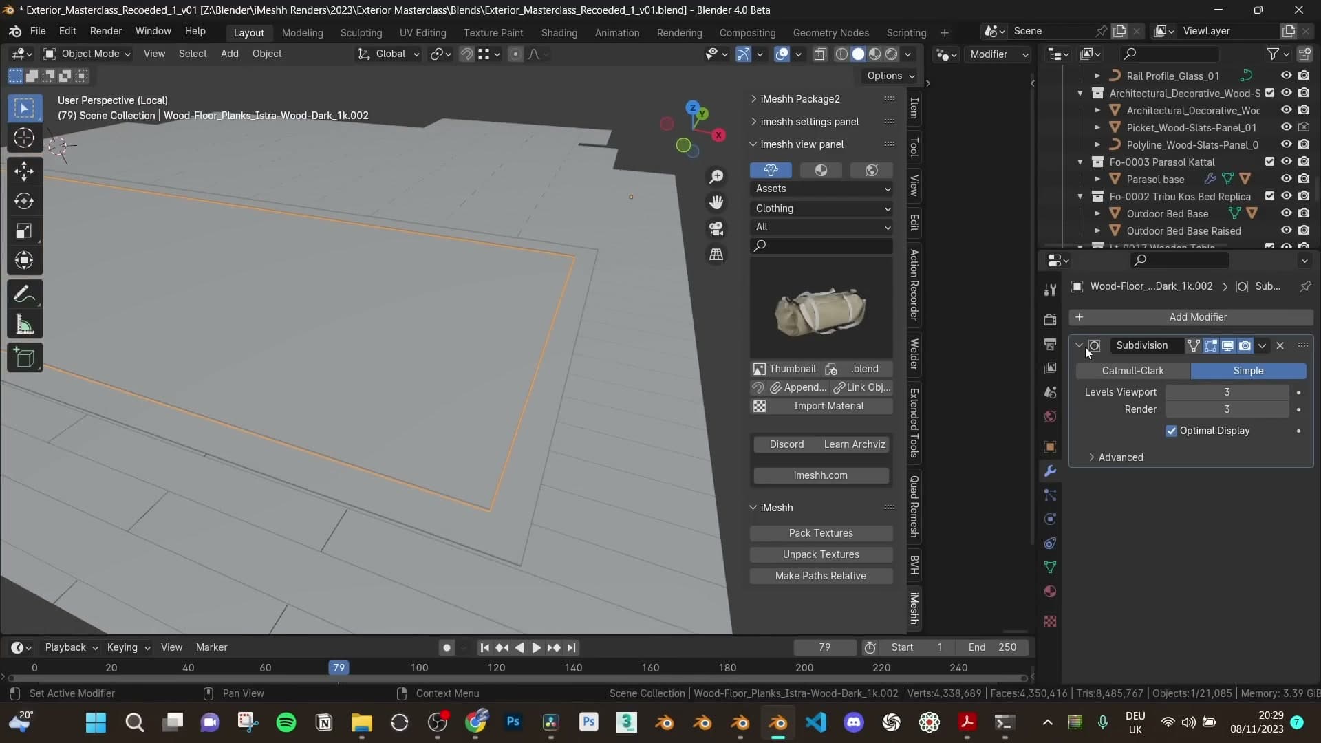
If the surface looks more like polished metal than transparent liquid, the face normals are pointing the wrong way. Select both the water plane and the pool well, jump into Edit Mode, and press Shift+N to recalculate normals outwards. The shader will immediately start reading as water rather than chrome.
The Advanced Glass shader exposes a plaster slot intended for tinting the underwater surface later; for now strip that to white so you can dial in the water tint cleanly. Push the colour towards blue, then turn the Absorption amount up to around 5 and set the absorption colour to the blue you want the depths to take.
Absorption is depth-driven. Light travelling a longer path through the volume picks up more of the absorption colour, so deep water naturally reads darker than shallow. To prove the effect, build a quick set of steps inside the well. Select the bottom edge, Shift+D to duplicate, extrude outwards and upwards a couple of times so you have two or three rough treads. In Rendered preview the top step sits in a pale blue, each step below it deepens, and the floor of the pool saturates to the absorption colour you chose.
Toggling shadow caustics and the flamingo decoration
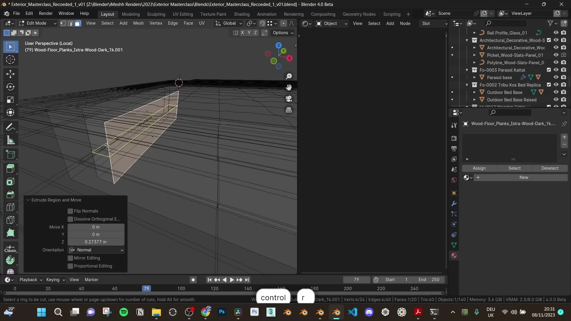
Cycles can render shadow caustics: the bright, wavy patterns that sunlight makes when it refracts through water and lands on the pool floor and walls. It is opt-in because it is expensive, and turning it on is a per-object switch. Select the water surface, open Object Properties, scroll down to the Shading panel, and tick Cast Shadow Caustics. Then click on the pool well itself and tick Receive Shadow Caustics on it.
The matching global toggle lives on the world / render side. Flip that on so Cycles actually evaluates the caustic paths during rendering, and the refracted sunlight will start dancing across the inside of the pool.
Procedural volumetric clouds
Push the clip distance to 100,000 m, build a giant bounds-display cube, and drive a Volume Scatter with a 4D noise and Color Ramp to produce convincing clouds for almost no render cost.
Setting clip distances and the cloud bounds cube
Clouds, in real life, sit a long way from camera. Kilometres above the scene, not metres. Before you can model that distance into Blender, you need to extend the clip distances so the renderer doesn't simply cull the box you're about to build.
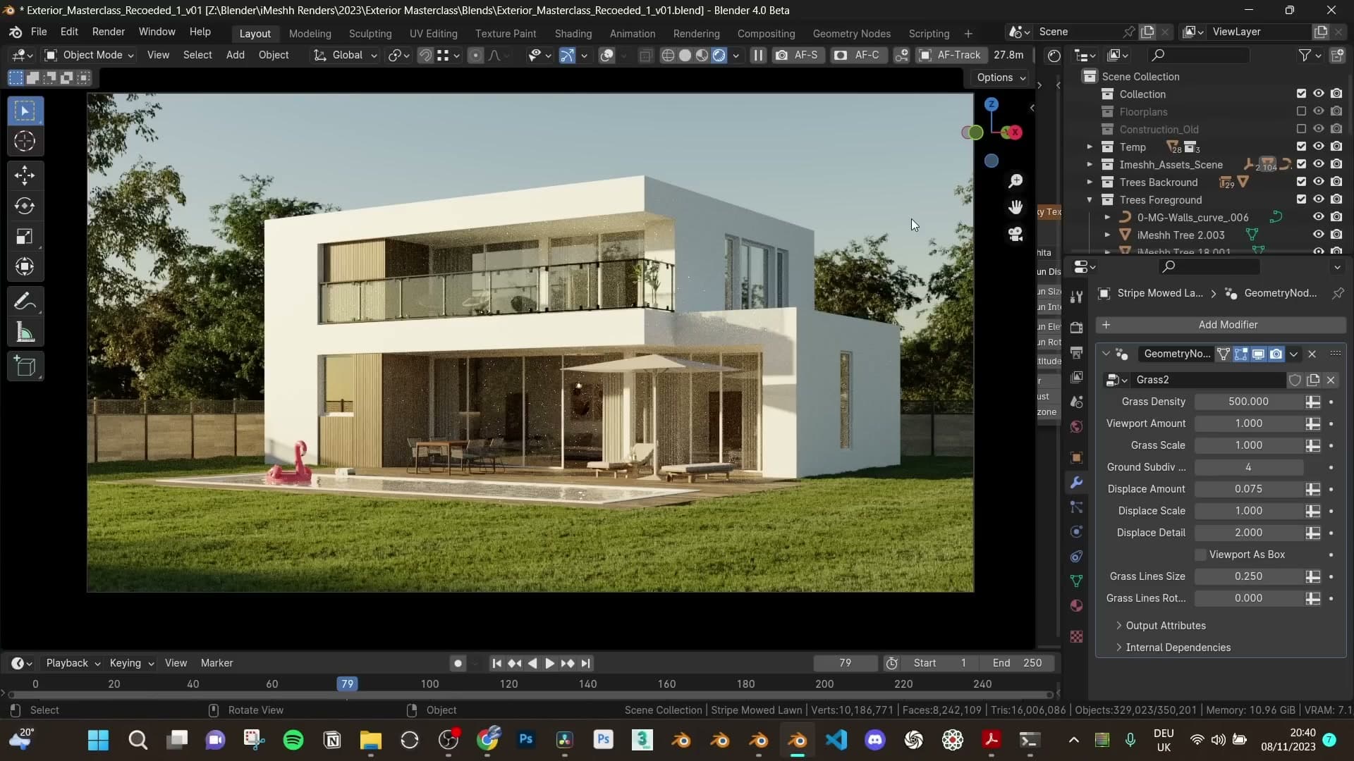
Open the viewport sidebar with N and push the View tab's End clip distance out to 100,000 m. Do the same on the camera: in the camera's Object Data properties, scroll to the Lens section and set Clip End to 100,000 m so the camera itself will actually see the sky volume.
Add a mesh cube with Shift+A → Mesh → Cube and reshape it into a thin slab of atmosphere. Lift it about 3,000 m into the air, scale it to roughly 50,000 m across in both X and Y, and keep its thickness around 2,000 m in Z. This is the bounding volume. Clouds will only exist inside it.
Open the Object properties and change Viewport Display → Display As to Bounds. Without this, the giant cube fills your viewport and blocks every working angle; with Bounds on, you only ever see a wireframe outline that you can ignore while you carry on with the rest of the scene.
Volume Scatter density 0.006 driven by 4D noise
Create a new material on the cloud cube and call it clouds. The whole shader is five nodes. Add a Volume Scatter node and plug its output into the Volume input of the Material Output. Leave Surface unconnected. Set the Density to 0.006. That on its own is a uniform fog filling the box. You now need to break it up so the volume only scatters light where you actually want a cloud to be.
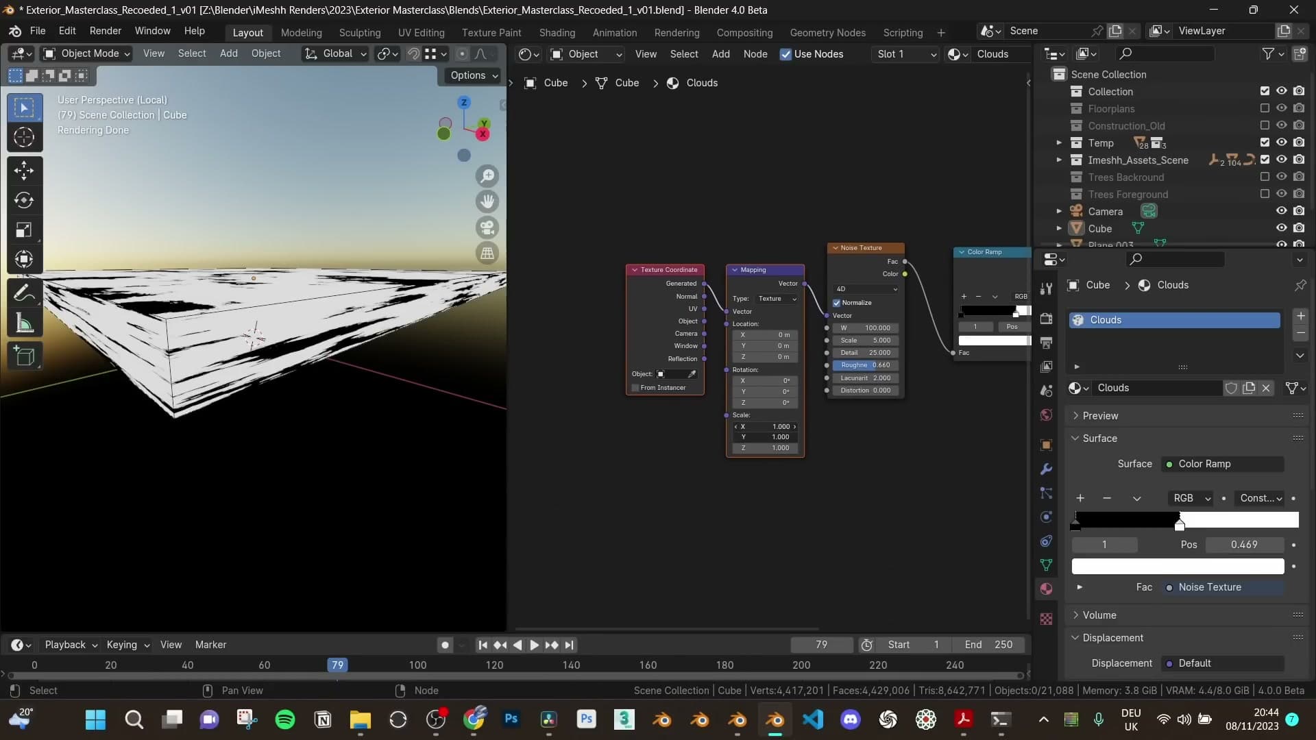
Add a Noise Texture and switch its dimensions to 4D. The W slider gives you a fourth axis to scrub for new variations without changing the scale of the pattern. Set W to around 100, Detail to 25, and Roughness to 0.66.
Feed the noise Factor output into a Color Ramp and change its interpolation from Linear to Constant. Drag the black handle close to the white handle so that everything below the threshold becomes pure black (empty sky) and everything above it becomes pure white (cloud). That hard cutoff gives the volume defined edges instead of a uniform haze. Plug the Color Ramp's output into the Volume Scatter's Density socket.
Press Ctrl+T on the noise node to drop in a Texture Coordinate + Mapping pair, then set Mapping → Type to Texture and the Texture Coordinate output to Object. Push the Mapping's Scale to 25,000 so the noise pattern is large enough to read as continents of cloud rather than salt-and-pepper grain.
Tuning the seed and mapping scale for classic clouds
Switch back to the main scene, look through the camera, and frame the building against the sky. From here, every change happens on the Noise Texture. The cube and the shader are done.
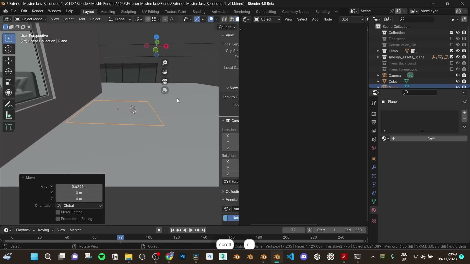
Every nudge to the W value rerolls the cloud distribution completely, so drag it slowly while watching the camera. When you land on a shape you like (ideally mostly blue sky punctuated by one or two well-formed puffs over the building) jot the W value down in a text note before you keep scrubbing. It's the only safety net you have if you shuffle past a good one.
If the clouds feel too small, increase the Mapping Scale; if they're reading as a single soft mass instead of distinct shapes, push the Color Ramp handles further apart. The classic cumulus look is what you're aiming for: fluffy, defined, and obviously a cloud at a glance.
Because the density sits at 0.006, render times barely move when you turn the cube on. Pair this volume with a Nishita sky texture pushed to a sunset elevation and the under-lit edges of each cloud catch the warm sun for free. The entire effect costs almost nothing and replaces the flat gradient Nishita gives you on its own.
Plants scattered with geometry nodes
A bare plane plus Mesh to Points, Instance on Points and Pick Instance gives you randomised plant scatter from an iMeshh collection. Random Value nodes drive scale and Z rotation, and a second scatter places hedges along the fence.
Mesh to Points with collection-instance pick
Drop a couple of plant assets from the iMeshh library into the scene (two contrasting bushes work well) and check that they sit at roughly the same height so the scatter reads as one planting bed. Select them all, apply scale, and move them into a fresh collection called Outdoor Bushes. That collection is what the geometry-nodes graph is going to sample from, so anything you drop into it later will automatically join the scatter.
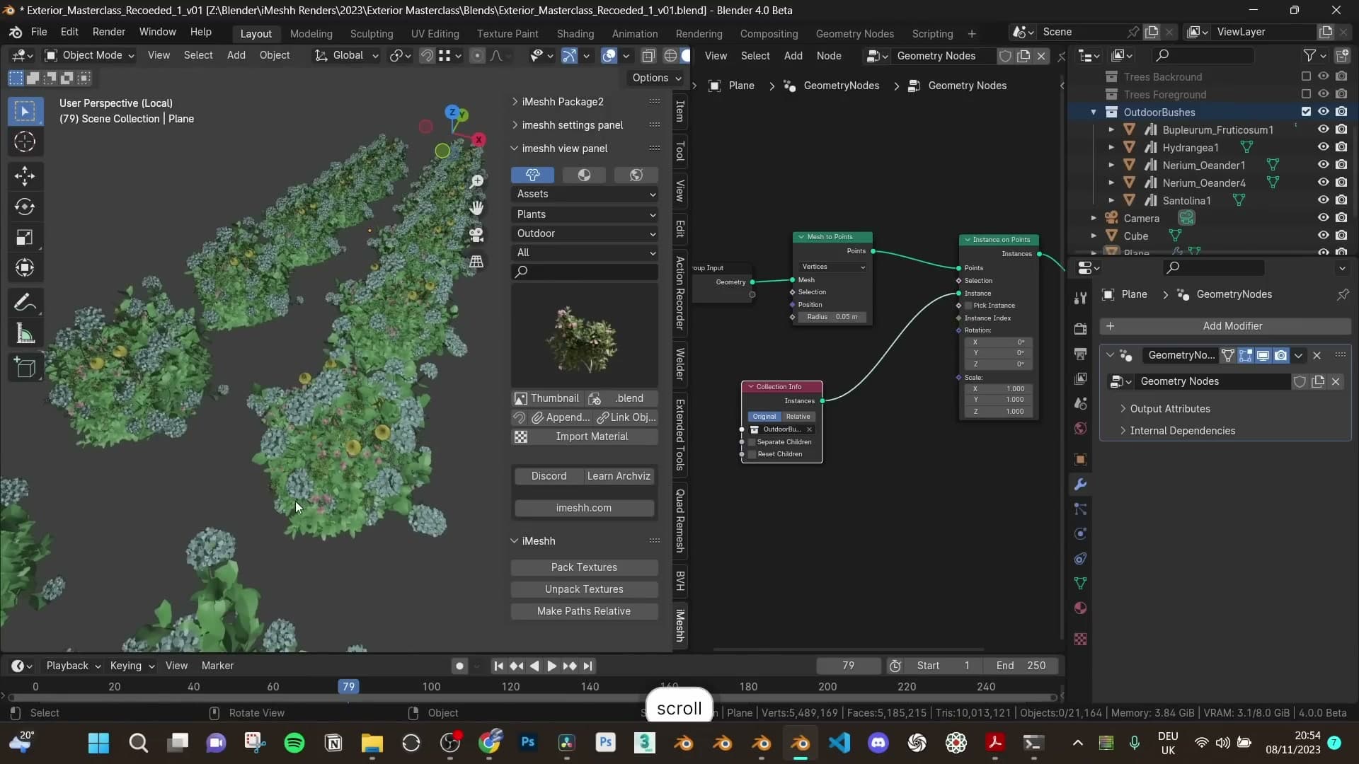
Back on the empty plane that will be your scatter surface, open the Geometry Nodes editor and click New to start a graph. Add a Mesh to Points node so every vertex on the plane becomes an instance anchor, then feed that into an Instance on Points node.
Drop the Outdoor Bushes collection into the Instances socket. Out of the box, that piles the entire collection on top of every point. Every bush stacked on every vertex. Toggle Separate Children and then Pick Instance to flip the behaviour. Now each point gets one plant, but the picker walks through the collection in a fixed order (bush A, bush B, bush A, bush B...), which still reads as a pattern.
To break the cycle, add a Random Value node set to Integer, with a min of 0 and a max equal to the last index in your collection (for example 4 if you have five bushes). Plug that into the Pick Instance index socket. If the resulting mix looks lumpy, nudge the Seed value until the distribution feels natural.
Random Value nodes for scale and Z rotation
Before randomising, it's worth knowing about an alternative entry node: Distribute Points on Faces. Set to Poisson Disk mode with a minimum distance of around 0.5 m, it scatters across the surface area rather than per-vertex, and the minimum-distance setting stops plants overlapping. For this scene the original Mesh to Points setup stays in place. Distribute Points is the better starting point any time you want denser, more organic ground cover.
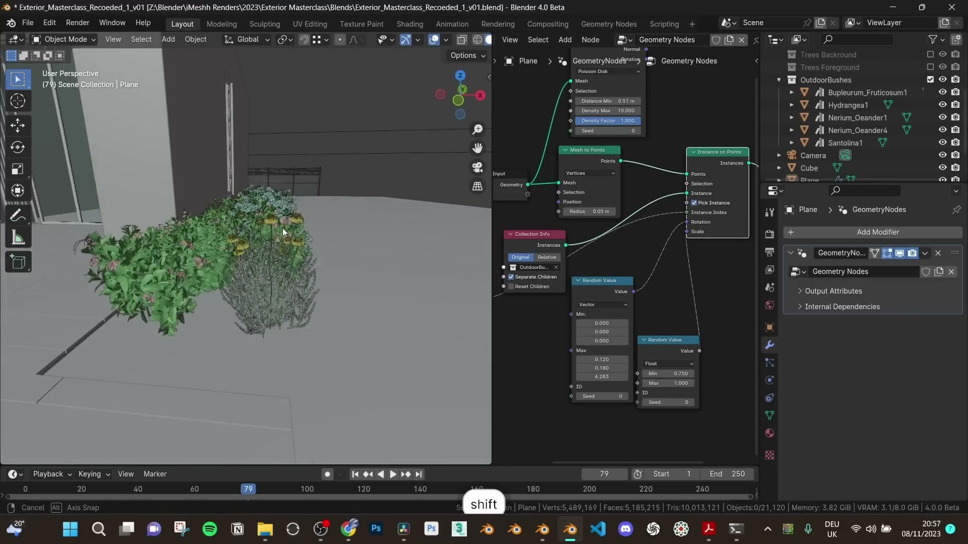
With the scatter looking too uniform, drop a Random Value node between Instance on Points and its Scale input. Set the minimum to 0.75 and the maximum to 1. That gives every plant up to 25 % size variation without shrinking any of them so much that they look sickly.
For rotation, add a second Random Value node and switch its type to Vector. You only want spin on the Z axis, so set the X and Y components to zero on both the min and the max. Into the max Z, type 360° expressed in radians, then leave the min Z at zero. Plug the output into the Rotation socket and every instance now faces a different direction while staying perfectly upright.
If you want a touch of extra naturalism, you can also dial small non-zero values into the X and Y components to tilt instances slightly off vertical, but for a tidy bushy bed it isn't strictly necessary.
Hedges scattered along the back fence line
The back fence line gets the same treatment with a different planting brief. Duplicate the scatter plane and reuse the geometry-nodes graph already built. There's no need to start over. From the iMeshh library, pick a low scruffy hedge variant or two and drop them into the Outdoor Bushes collection so the existing Pick Instance picker automatically samples them as well.
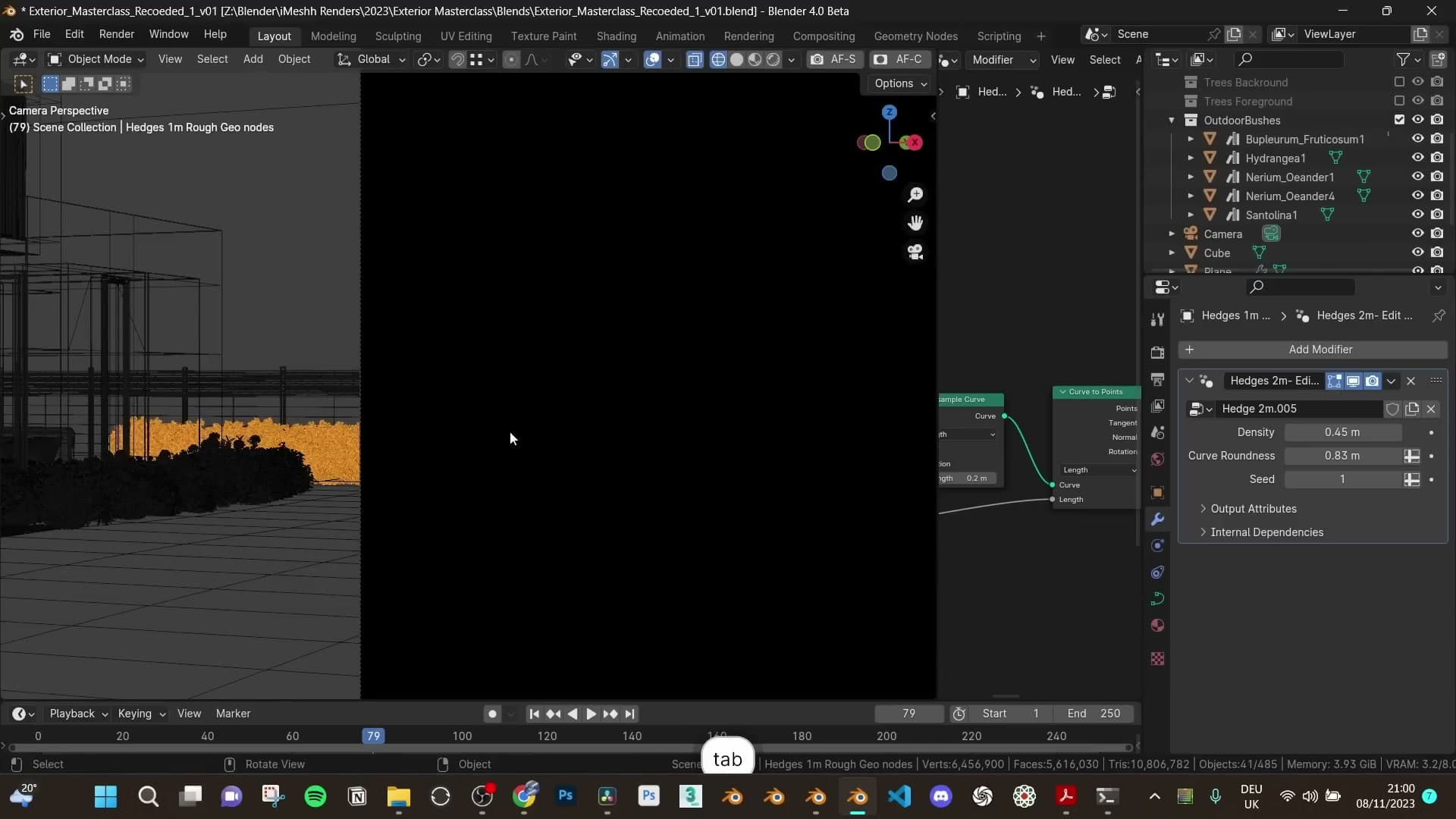
In top view, move the duplicate plane up against the fence, enter edit mode and delete any vertices that fall outside the strip you actually want hedged. Switch to render view to confirm the hedge reads correctly against the boundary. At this scale you want enough plants to fully obscure the fence panels without looking like a topiary wall.
Finally, the fence itself needs to run the full width of the plot. Duplicate the fence asset along the same back edge so it covers the gap, then move the original master plants out of the camera's line of sight. Those are the source objects feeding the graph, and you don't want them appearing in shot. Everything pulled in here, fence included, comes from the iMeshh library.
Building edging and the plaster material
Build a custom curve profile for the metal edging, then construct a plaster material with Box-unwrapped iMeshh tiles, ambient occlusion edge wear and a dirt-drip overlay.
Custom curve profile for metal edging
The decorative band that wraps the facade is built by sweeping a custom profile around a curve traced from the building's edge. Start on the strip you've already isolated, hit X and delete only the face so you're left with the outline, then convert that selection to a curve. That curve becomes the rail; the profile is what you'll author next.
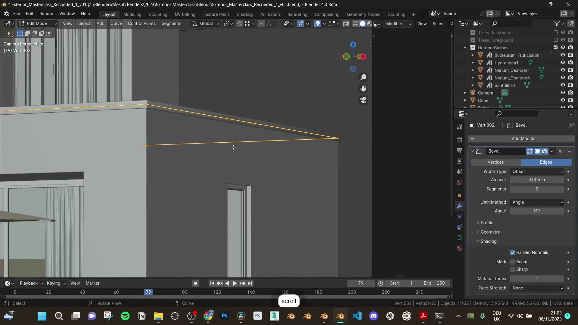
Add a mesh cube, scale it in and apply the scale, then rotate it into position and model a simple cross-section by deleting the edges you don't want. Once you have the silhouette, convert this object to a curve as well. Park it somewhere inside the building so it won't be visible in any shot. You could move it to a separate layer for tidiness, but it's fine to leave for now.
Select the rail curve, open its Geometry panel, and under Bevel set Object to the profile curve you just made. If the result looks inside-out, the profile is sitting backwards in the rail. Jump into the profile and rotate it 180° to flip it the right way around.
Add a Bevel modifier to soften the corners, then apply Shade Auto Smooth and set the shading to hard normals so the edges read crisply. If the band comes out oversized, enter edit mode on the profile, select all and use Alt+S to scale it down along its normal until it sits snug against the wall.
If you notice the edging clipping into the brickwork, go back into the original profile, enter edit mode and nudge it on the X axis until it clears. Any segment that's still facing the wrong way can be fixed by selecting it and pressing Ctrl+T, then rotating 180° so every length of the band points outward correctly.
Oxidized metal with Box projection on Generated
With the edging in place, give it a metal finish from the iMeshh library. Browse into the Metals category and pick an oxidised metal. It gives the band a slightly weathered, lived-in look without leaning rusty.
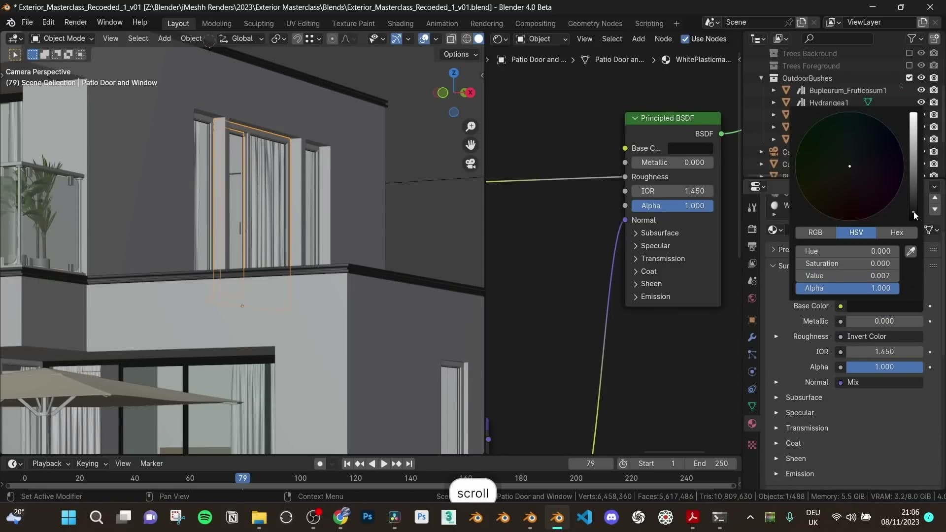
Because the edging is still a curve, a traditional UV unwrap isn't available. Instead, open each image texture node in the material and change the Projection from Flat to Box, then plug a Texture Coordinate node's Generated output into the vector input. Repeat for every image texture in the shader. Preview the result in the camera view to confirm the tiles flow neatly across the profile.
Out of the box the oxidised material reads a touch too grimy for a modern build. Bring in a Mix Color node and blend the texture with a solid colour. Pushing the slider towards the solid input cleans it up; pushing it the other way keeps more of the patina. Aim for roughly the middle.
For the roughness branch, the mix colour you choose actually controls how matte the metal reads: a value of 1 is fully rough, a value of 0 is fully glossy. Setting the blend colour closer to white pushes the surface towards a rougher finish, which suits an aged metal. Drop the base colour a shade darker overall to ground the band against the lighter facade.
While you're cleaning up materials, set the Viewport Display colour under the material to black so the edging reads clearly in the workbench. Then switch the window frame plastic to a near-black. Don't go fully #000000, because nothing in the real world short of Vantablack is truly black. Apply the same treatment to any window types that use a slightly different base colour so the whole window package stays consistent.
Plaster with Ambient Occlusion edge wear
The walls themselves get the iMeshh plaster, a workhorse material that's free in the library and versatile enough to drop onto almost any architectural surface. Drag in the 4K variant and rename it to plaster so it's easy to find later.
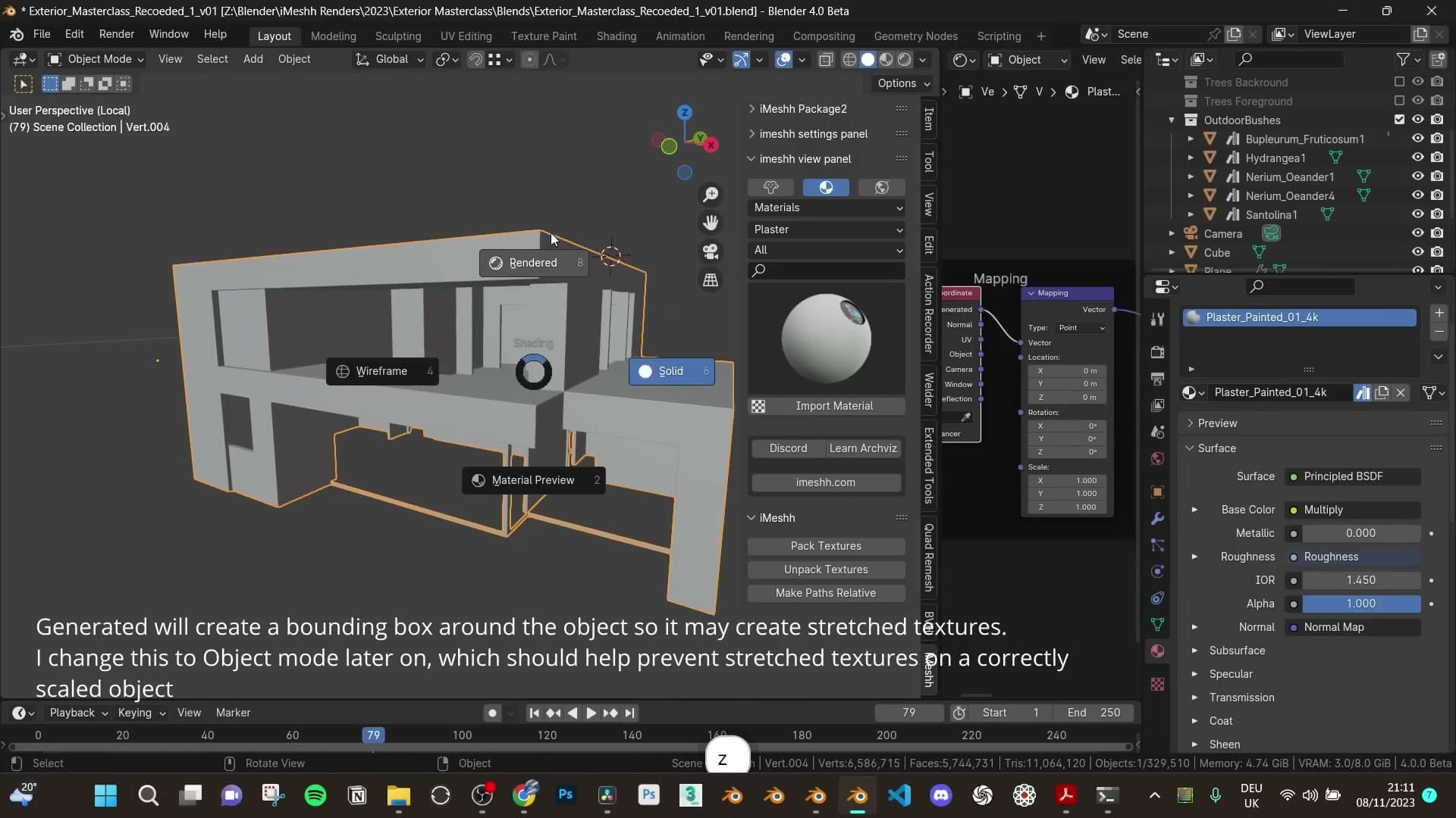
Plaster is authored at roughly 1.5 to 2 metres scale depending on how pronounced you want the bumps. Because the walls are full of disconnected n-gons, take the same Box-projection route as the metal. Switch every image texture's projection to Box and feed the Generated coordinate in. You might worry that the joins won't align across the building's edges, but the texture is subtle enough that it's effectively invisible. Tweak the scale to around 0.75 if you want slightly larger bumps.
To stop the walls reading as a flat, clean panel, add some edge wear driven by ambient occlusion. Drop in an Ambient Occlusion node and bring in a separate mask texture. A leather grunge map works well here. Plug the texture's vector through a Box-projected, Generated coordinate set so it tiles cleanly, and feed it into the AO node's distance input.
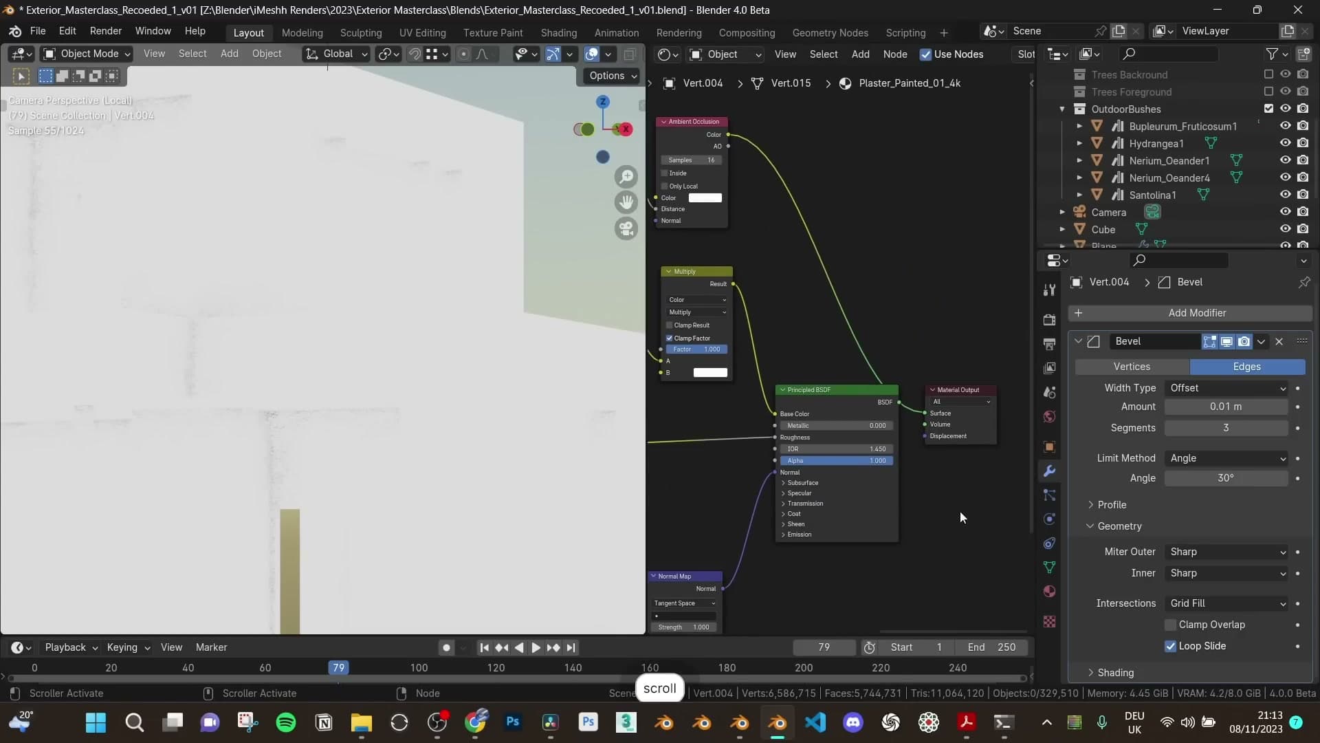
The AO output reads white where the surface is open and black where it tucks into corners and edges. You want the dark areas to darken your base colour, so combine the two with a Mix Color node set to Multiply. The original albedo on top, the AO mask multiplied in below. Drop the result back into the Base Color.
Heads up: the whole building shares this material, so the interior surfaces will inherit the edge wear too. You won't see it from outside, but if you're shipping the project for a client, swap the interior walls to a clean plaster variant so the inside doesn't look prematurely aged.
Dirt-drip overlay tuned with a Color Ramp
The last pass on the plaster is a set of subtle vertical streaks, the kind of water-borne dirt that runs down a facade over time. Bring in a streak texture (the one shown is sourced from CC0 Textures) and plug it into the shader using its own Box-projected, Generated coordinate so you can scale it independently of the plaster and the AO mask.
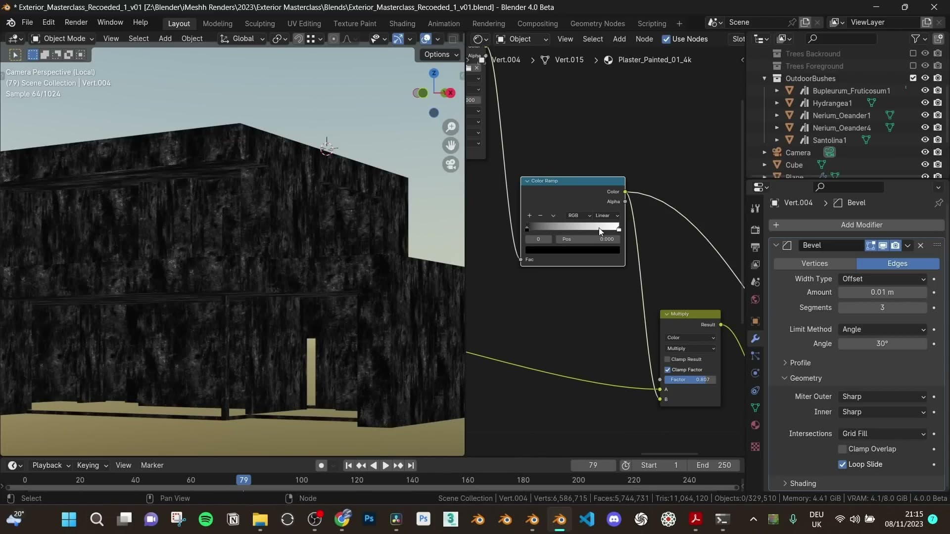
Rather than feeding the drips into the ambient occlusion, multiply them straight against the whole material's base colour. Duplicate the existing Multiply node with Shift+D, drop it inline, and run the drip texture through it.
Straight in, the streaks read way too heavy and the building starts to look derelict. Tame them with a Color Ramp on the drip texture's output. You may need to flip the stops so the originally-black areas come through as white and vice versa, depending on which way the mask is authored. Pull the ramp sliders in until only the strongest streaks survive.
It's tempting to leave the dirt cranked up for the dramatic look, but a brand-new building reads as exactly that. Brand new. Most clients won't thank you for ageing it. Dial the drips back to just a smidge, enough to break up the evenness without screaming "old building." On the bright front facade you'll barely register them at all. They mostly do their work on the shaded side walls.
With the plaster, AO and drip overlay all driving the same surface, the walls are done. The next step is to push this exact material onto every other building element that should share it. You'll do that with the Copy Attributes add-on in the following section.
Cycles render settings, AGX and passes
Copy the plaster material to the band with Copy Attributes, set 250 samples at 200%, max texture size 2K and AGX Punchy colour management, then enable Mist and Crypto Matte passes for compositing.
Wood paneling material via Copy Attributes
With the plaster dialled in, the fastest way to dress the wood band underneath is to copy the entire shader graph across rather than rebuild it. Enable the built-in Copy Attributes add-on under Preferences, select the band, shift-select a wall that already has the plaster on it, and press Ctrl+C to pick Copy Material. The whole node tree transfers in one step.
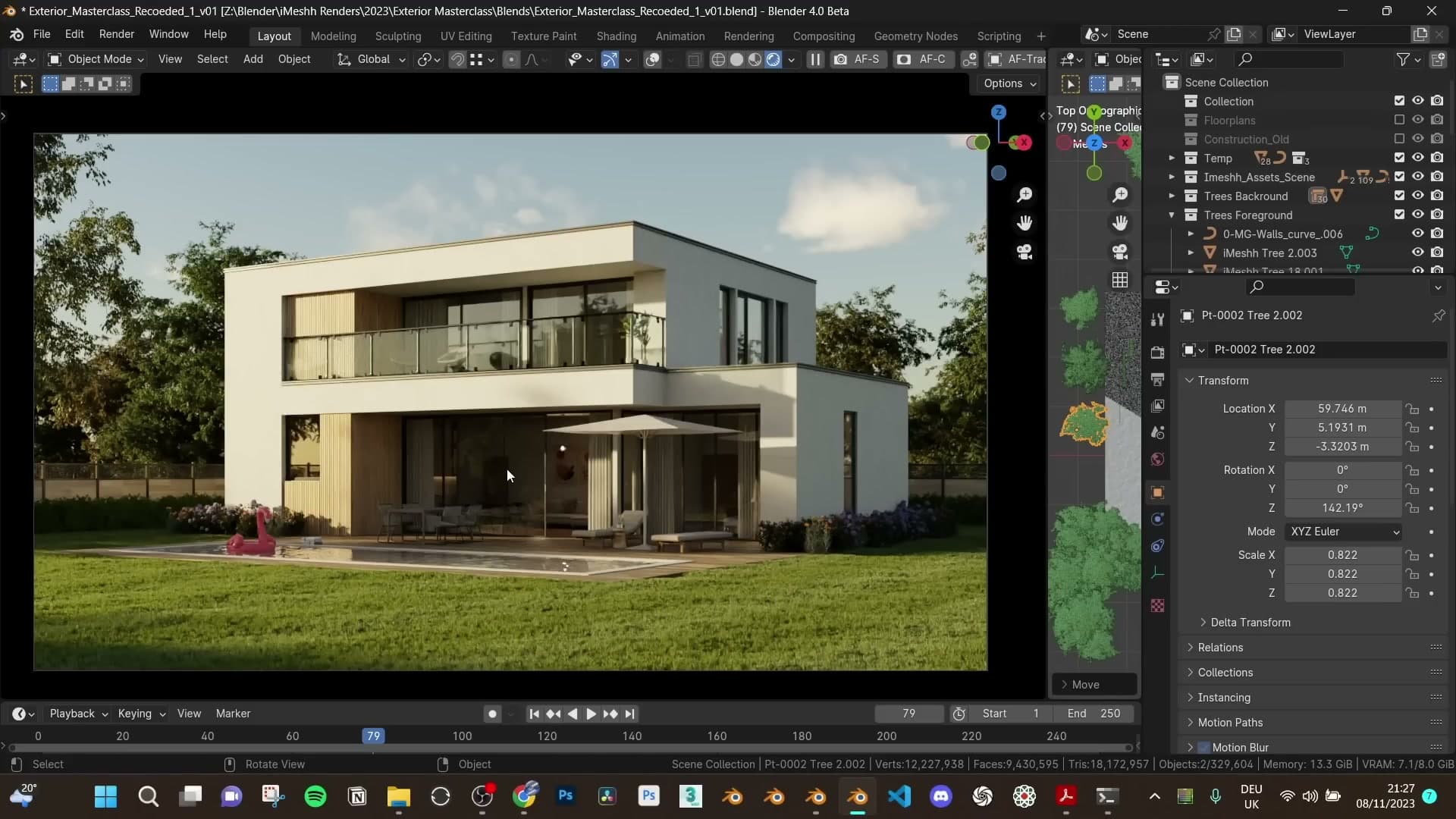
The first attempt comes out stretched because the band's image textures are reading off a UV map that does not exist on this object. Open the Image Texture node, switch Projection from Flat to Box, and set the Texture Coordinate to Object. The tiles immediately flow across the geometry without a manual unwrap.
For the timber section above the band you want something lighter and more characterful than the dark plank used on the lower walls. Drop in a fresh wood texture from the library, copy that material across with the same Ctrl+C workflow, then swap the colour map in the shader so it points at the new image instead of the old plank. Route it through the existing Object Info > Hue/Saturation chain so each plank picks up a slightly different colour.
First pass shifts the hue way too far. You end up with planks reading green and red rather than a unified timber. Pull the Hue/Saturation node down so the variation is subtle, just enough to break up obvious repetition without painting a rainbow across the wall.
Samples, Simplify and AGX Punchy color management
Open the Render Properties tab and set Samples to 250 for the final frame. In the Output Properties, push the Resolution Percentage to 200%. Render the base resolution and supersample on the way out, which cleans up edges and hides the worst of any remaining noise.
Leave Denoise turned off at the render stage; you will handle denoising in post on the individual passes. Under Light Paths, keep all four bounce values at 32 so reflections and refractions can travel deep through the glass and pool, and set Clamping to 0 so no incoming light gets clipped before it reaches the camera.
VRAM is the binding constraint at this scene density, so enable Simplify and zero out the maximum subdivision for both viewport and render. The camera is far enough from every surface that missing subdivisions go unnoticed. For the same reason, set Max Texture Size to 2048. Most textures will never resolve past 2K at this framing, and the saving is significant.
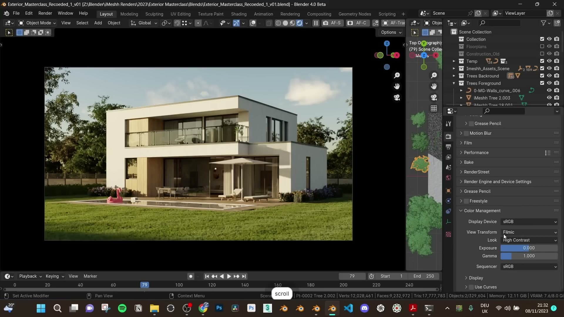
Drop down to Color Management and switch the View Transform from Filmic to AGX, then pick the Punchy look from the dropdown. AGX handles bright sun and saturated colour far more gracefully than Filmic, but the initial switch reads darker than you expect. Bring the Exposure up to compensate and pull Contrast back to around 0.5 so the image reads natural rather than crushed.
Finally, in Output Properties, set the file format to TIFF at 16-bit colour depth. Every pass you save out from here will hold its full dynamic range for Photoshop, which matters when you start pushing exposure and lifting shadows in Camera Raw.
Mist distance and Crypto Matte passes
Open the View Layer Properties tab and tick the passes you will need in compositing. Turn on Mist for atmospheric falloff, Object Index and Material Index as quick numeric masks, Glossy Direct and Glossy Indirect to pop the window reflections in post, and Emission Direct so the glass and any light-emitting surfaces can be boosted separately.
Under Cryptomatte, enable Crypto Matte Object. Crypto Matte usually replaces the older Object Index pass entirely. You pick objects by clicking them in Photoshop rather than assigning pass index numbers by hand. Enabling both costs almost nothing at render time, so keep them on as a safety net.
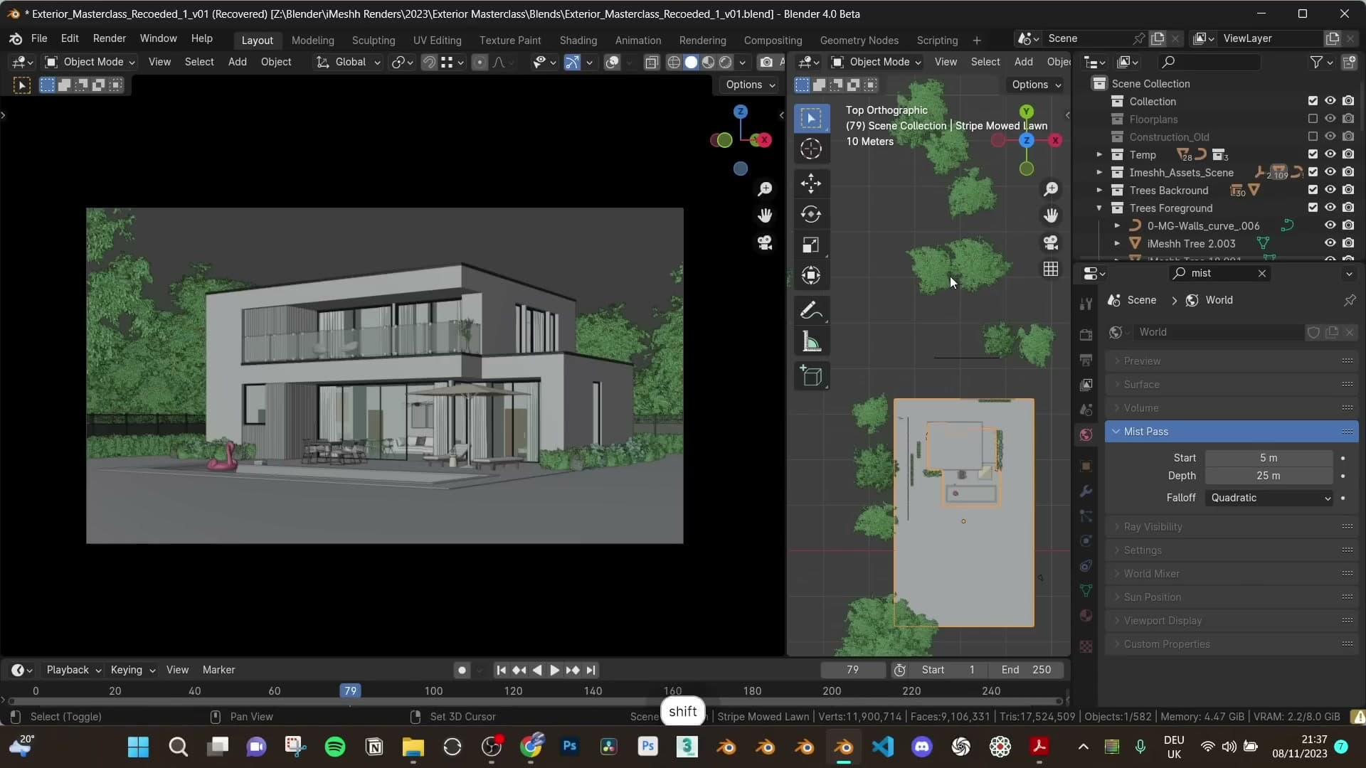
With Mist enabled at the View Layer, jump over to the World tab and search for "mist" to expose the Mist Pass settings. The depth needs to span the whole scene, so press T in the viewport to bring up the toolbar, pick the Measure tool, and click-drag from the camera to the back of the garden to gauge the scene's extent. Roughly 114 metres in this build.
Round up generously: set Depth to 150 m so the mist ramp comfortably covers everything in shot, and set Start to 1 m so the falloff begins right in front of the camera. You will blend this in selectively during post-processing rather than baking it into the beauty render.
Photoshop post-processing the TIFF passes
Open the beauty pass as a Smart Object, apply Camera Raw curves, basic, calibration and colour mixer tweaks, then layer the Mist, Crypto Matte sky, pool and glossy masks for the final look.
Camera Raw curves, basic and detail
Drop the beauty pass TIFF into Photoshop, right-click the layer and choose Convert to Smart Object. Then apply Filter > Camera Raw Filter. Routing Camera Raw through a Smart Object keeps every adjustment non-destructive. You can dive back in later and re-tweak any setting without flattening the work.
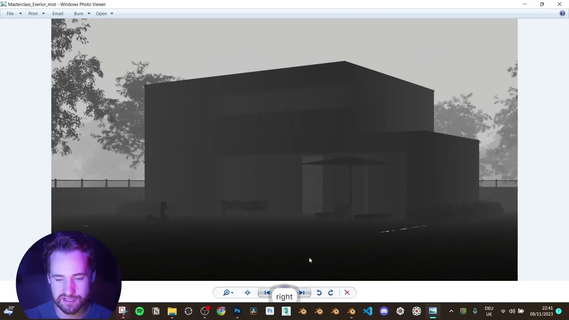
Start in the Curves panel. Lift the shadow point ever so slightly to brighten the deeper tones, then drag the upper midpoint up to follow it so the image doesn't tip into flatness. Raise the black point a smidge as well. That milks the blacks for a subtle film toe rather than crushing them to pure black. Bring some contrast back in afterwards using the Point Curve so you keep fine control over specific tonal areas.
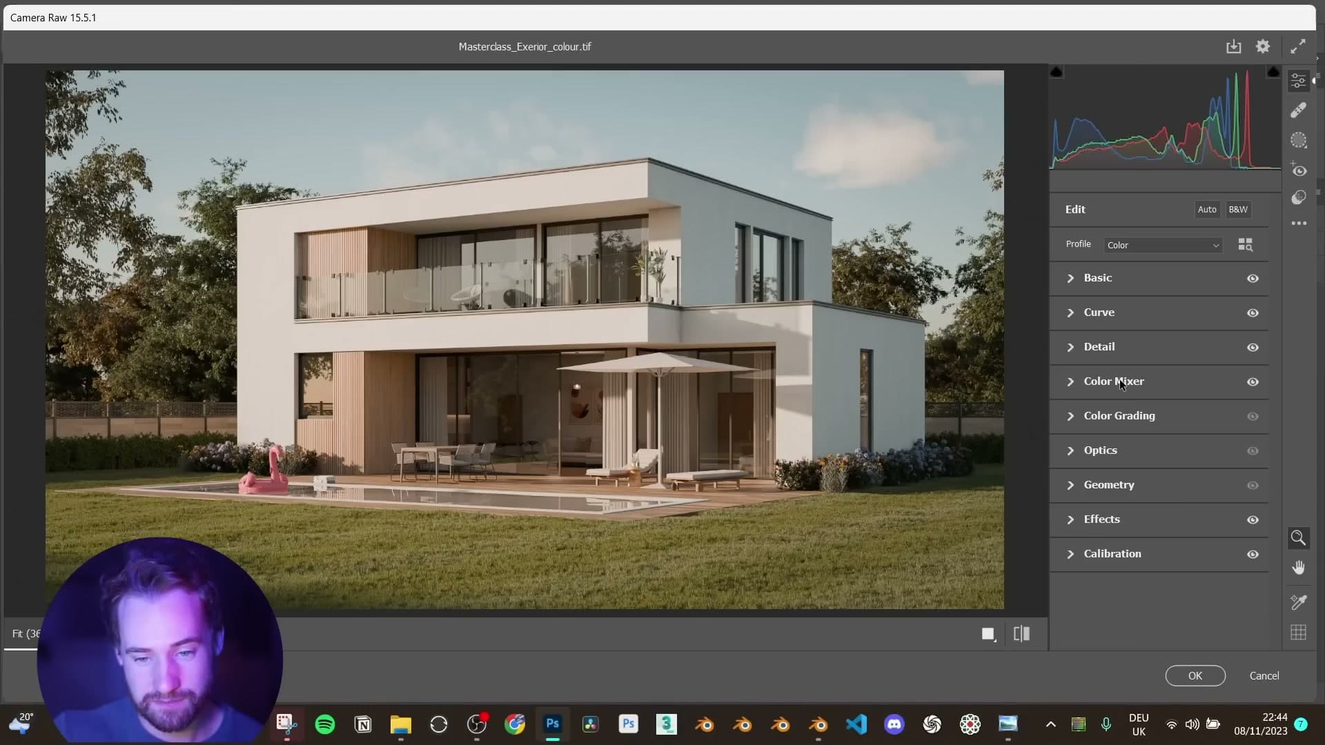
Move to the Basic tab. Pull temperature down by -2 to cool the warm late-afternoon cast, then increase brightness and immediately reduce highlights so the sky and bright plaster don't blow out. Decrease vibrance a touch (vibrance flattens the dynamic range of the colours rather than killing them outright) then nudge saturation up a hair so the muted tones still read.
Detail is next. Add a modest amount of sharpening. You'll see it bite cleanly on hard edges like the window frames and door reveals without smearing the plaster or the foliage behind.
Finally jump to Effects. Add a small amount of film grain for a natural photographic feel, then dial in a subtle vignette so the corners darken and the viewer's eye is pulled towards the centre of the frame.
Calibration tab and color-mixer correction
The Calibration tab is where the whole image's mood shifts in a single move. Pushing the primary sliders around rearranges the relationships between colours rather than just tinting them. Drop the shadow tint towards blue, lift the highlight tint to orange, and you land in the orange-teal cinematic split that shows up in so many films.
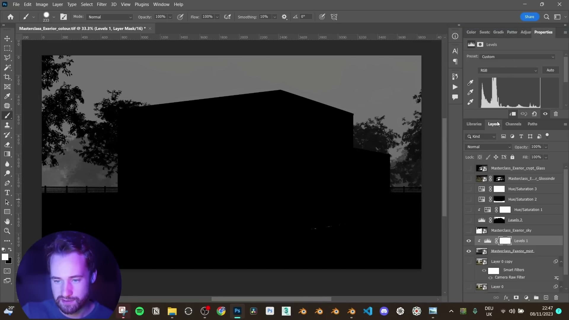
Don't worry about the technical theory of what Calibration is doing under the hood. Play with the sliders until something clicks. You can spend all day in this tab and keep finding looks you didn't know your render could wear, and it'll often push the image in a direction you weren't expecting.
Once Calibration has redistributed the colours, drop into the Color Mixer to rein individual hues back in. If Calibration pulled your yellows too far towards green, target the yellow channel here and walk it back. Tweak each colour ever so slightly. Don't go heavy. The aim is steering, not repainting.
There are plenty of Camera Raw preset packs floating around online. A quick search turns up free ones. They're worth grabbing even just as a starting point to push you somewhere unexpected before you start dialling your own settings in by hand.
Mist mask plus a sky Crypto Matte boost
Drop the Mist pass on top of the beauty render and set its opacity to around 87%. Alt-click the layer's eye icon to solo it and see exactly what the mist contributes. The atmospheric haze pulls the distant trees back and gives the image a believable depth that's hard to coax out of a single Cycles render.
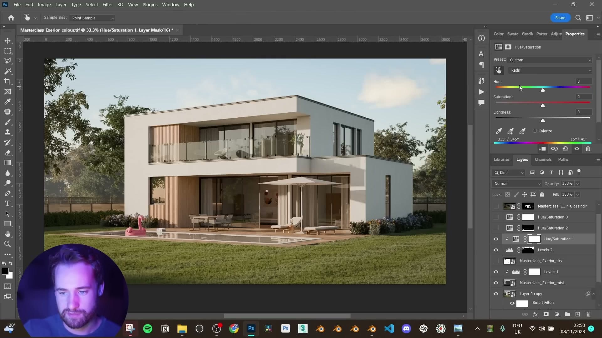
Above the Mist layer add a Levels adjustment. Dragging the input sliders inwards is how you control where the haze starts and stops. Pull one way and the mist creeps forward towards the camera. Push the other way and it sits only on the far trees. Pull towards warm and pollen-heavy afternoon; push towards crisp evening. Judge it by what reads as natural for the scene.
The sky needs a lift after Calibration darkened it, but no dedicated alpha pass was saved out, so the workaround is a Crypto Matte mask. Select everything that isn't sky, then paint the remaining gaps in with the brush (B) so the negative space is left as the sky shape.
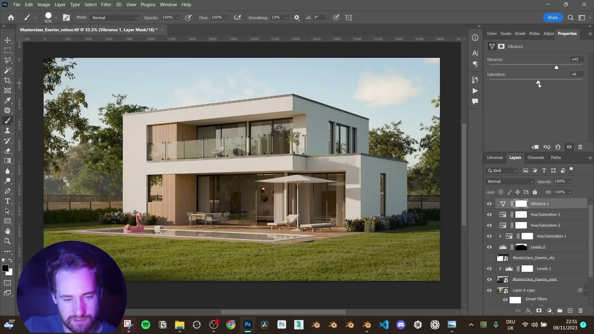
To paste a saved mask onto an adjustment layer: Ctrl-click the source mask thumbnail to load its selection, Ctrl+C to copy, then alt-click into the destination adjustment-layer mask and Ctrl+V. If the result comes in inverted, Ctrl+I flips it. With the mask in place, a Levels adjustment brightens the sky and a Hue/Saturation pumps the cloud saturation. Pulling the reds down inside that Hue/Saturation stops the clouds drifting towards magenta.
While you're working with selective Hue/Saturation, run one over the timber trim too. Click the targeted-adjustment hand and drag on the wood. Photoshop identifies the dominant channel (often reds even though the wood reads as a warm yellow) and you can shift the hue or desaturate it subtly without disturbing anything else in the frame.
Pool, glass tweaks and overnight final review
For the pool, load the pool Crypto Matte with the Magic Wand (W) and turn Contiguous on so you grab only the water surface. With the selection live, add a Solid Color fill layer and pick a deep blue. Set the layer's blend mode to Color and drop the opacity right down. You want a tint, not a paint job.
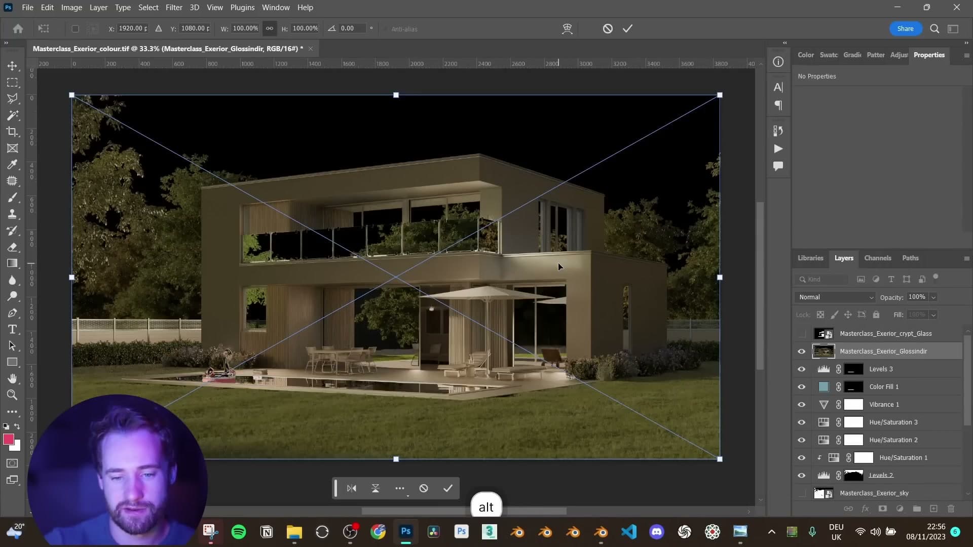
Alt-drag that pool mask onto a new Levels adjustment to control the value of the water as well. Darker reads better here than lighter. The deeper, more saturated blue gives the pool more weight against the warm stone and timber that surround it.
The same mask-copying trick applies to the glass. Drop the glass Crypto Matte onto the glossy-reflections pass to control where its contribution lands. I tried Screen blend mode for brighter glints and ended up preferring the glass darker. The moodier read fitted the late-afternoon look better than punching the reflections up.

At this point, stop. My explicit recommendation is to save the file, walk away, and look at it again the next morning with fresh eyes. After hours staring at the same image there's almost always one slider you'll want to nudge once the colour fatigue has worn off. Coming back to it the following day was enough to confirm the grade was where it needed to be. No further changes.
That wraps the build. A modern south-facing house carried from the architect's DXF plans through trace, light, scatter, render and post, finished here in Photoshop with masked grades stacked on top of the AGX-graded beauty pass.
Tools and credits
Everything mentioned in this tutorial, with links.
- Blender: the renderer this entire build runs in.
- iMeshh: studio platform (project management, client review, asset library, invoicing). The asset library used in this tutorial is included with every iMeshh Pro plan.
- Poly Haven: free CC0 textures and HDRIs.
Pillar guide: Masterclasses hub