Mood board and reference with PureRef
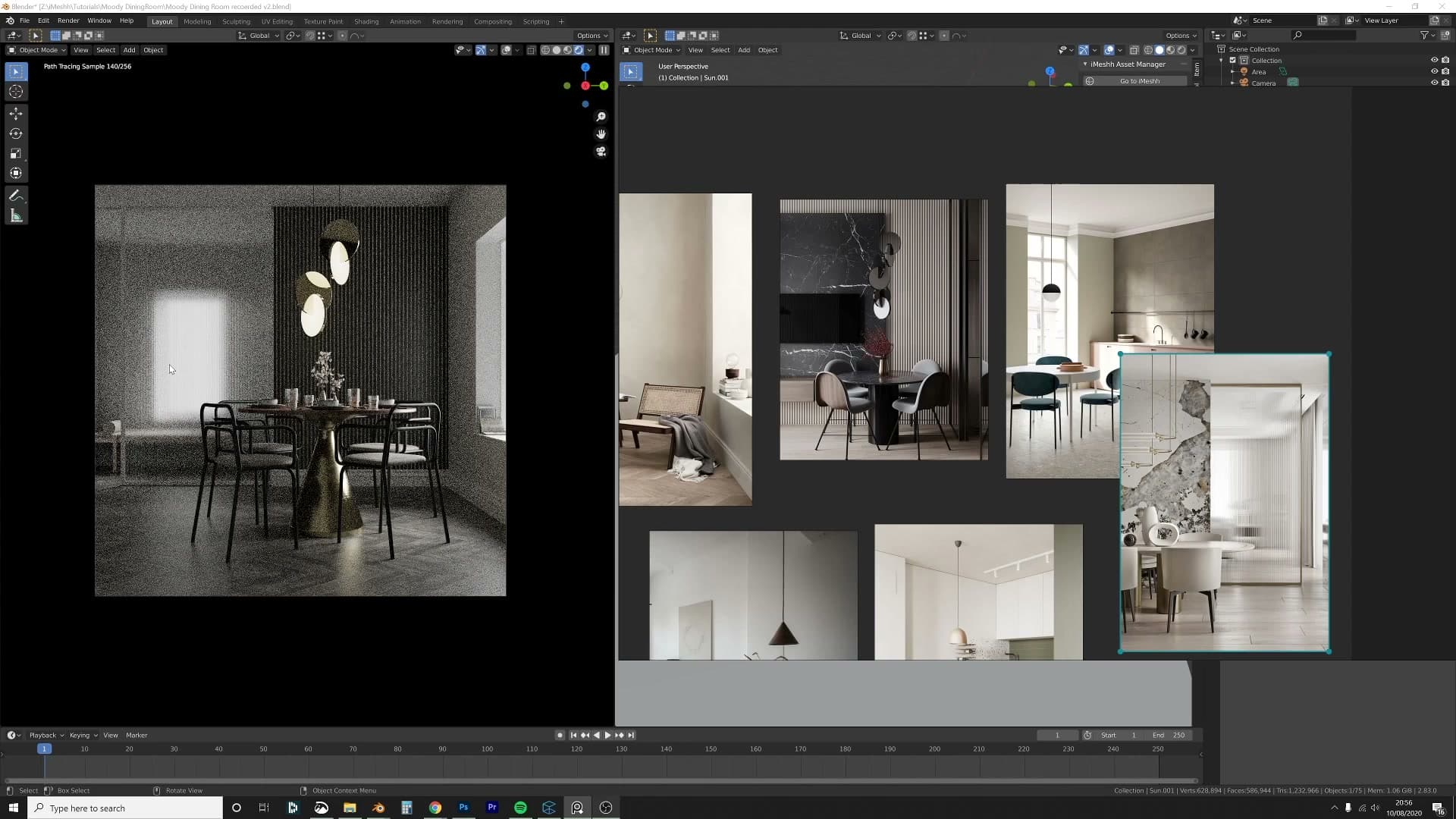
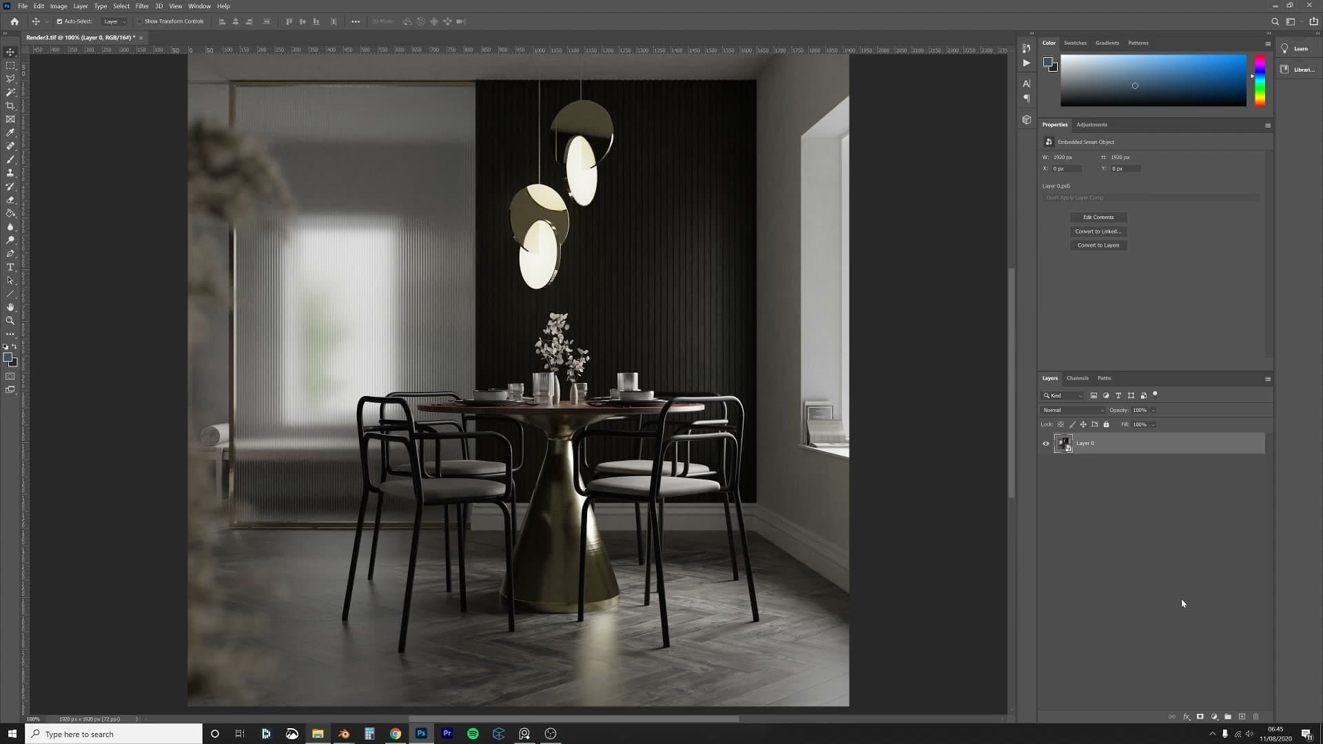
Every professional archviz image starts on a mood board. Set up PureRef, gather reference images, and pick the lighting feel (soft, almost no direct sun, deep shadows on the chair legs) that the rest of the scene will chase.
Why pros always use PureRef mood boards
Before a single vertex hits the viewport, the scene starts on a mood board. The tool of choice is PureRef, a tiny dedicated reference-board program you can grab from a quick Google search. It's free to download; the developers ask for a donation, but you can put zero in the box and still walk away with the full app.
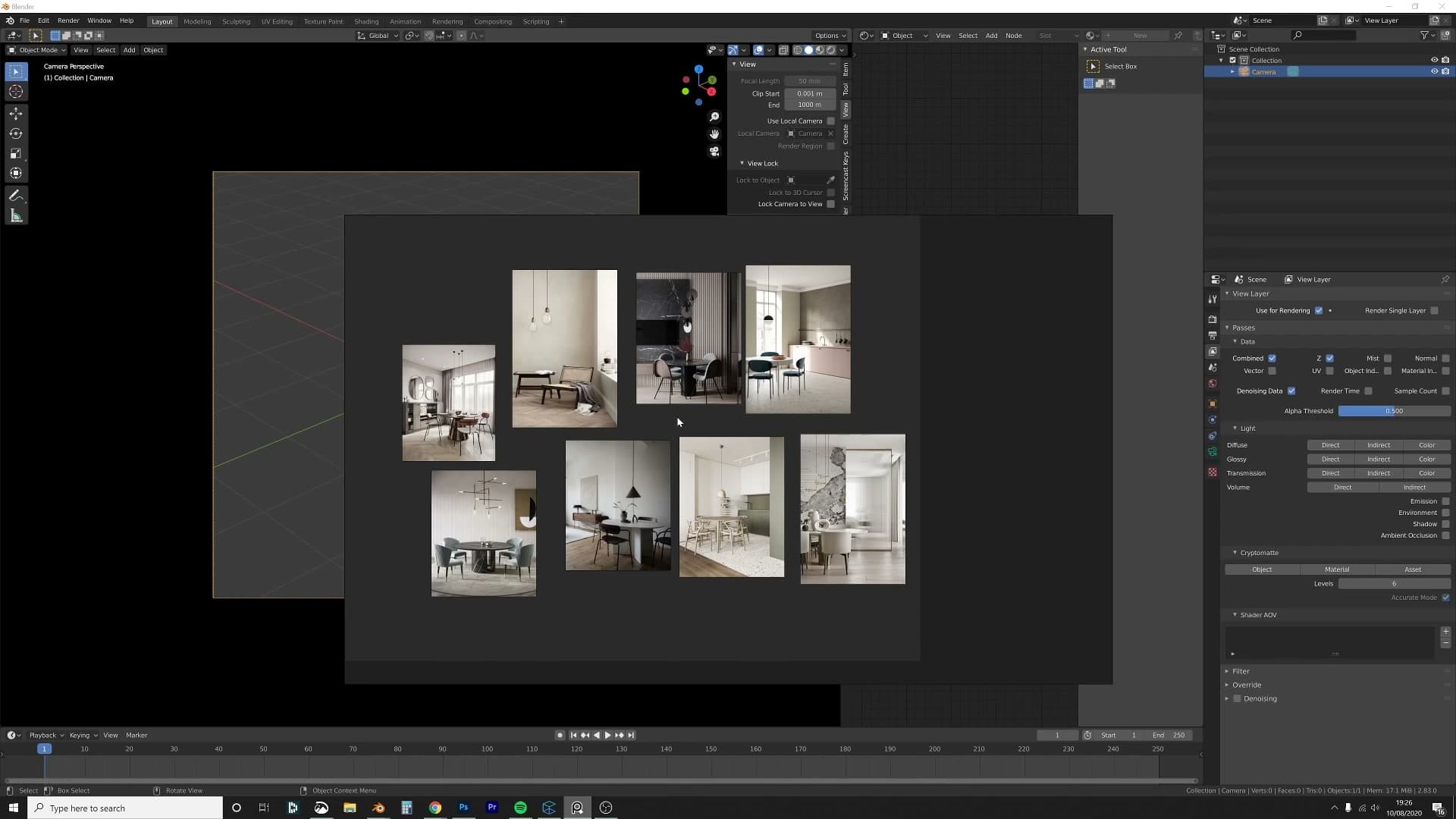
Using it is deliberately simple. Find any image you like online, copy it, and paste it onto the PureRef canvas with Ctrl+V. You can drag images around, group them, scale them, and save the whole canvas as a single file you can reopen later. That's really all there is to the program, and that's the point. Nothing gets in the way of just looking at pictures and arranging them until a direction emerges.
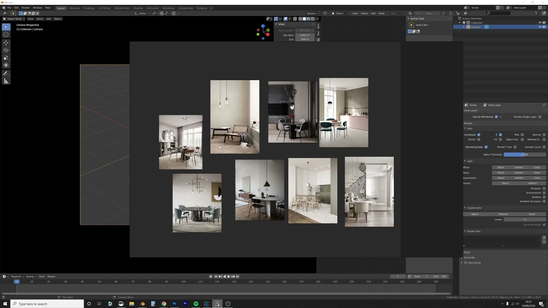
Mood boards are not optional polish; they are how professionals work. You will almost never produce a really strong image without one, because you need to be inspired before you start building. Lock in a lighting mood, a colour palette, the overall feel, rather than hoping it materialises while you model. If you're going to make any kind of finished render, build the board first.
Picking the dining-room lighting direction
The brief for this scene is a dining room: roughly four chairs around a table, a couple of lamps, and a setting that feels considered rather than staged. With that in mind, the board gets seeded with anything that fits: dining-room interiors, lamps, and panelled-glass shots that could double as a backdrop.
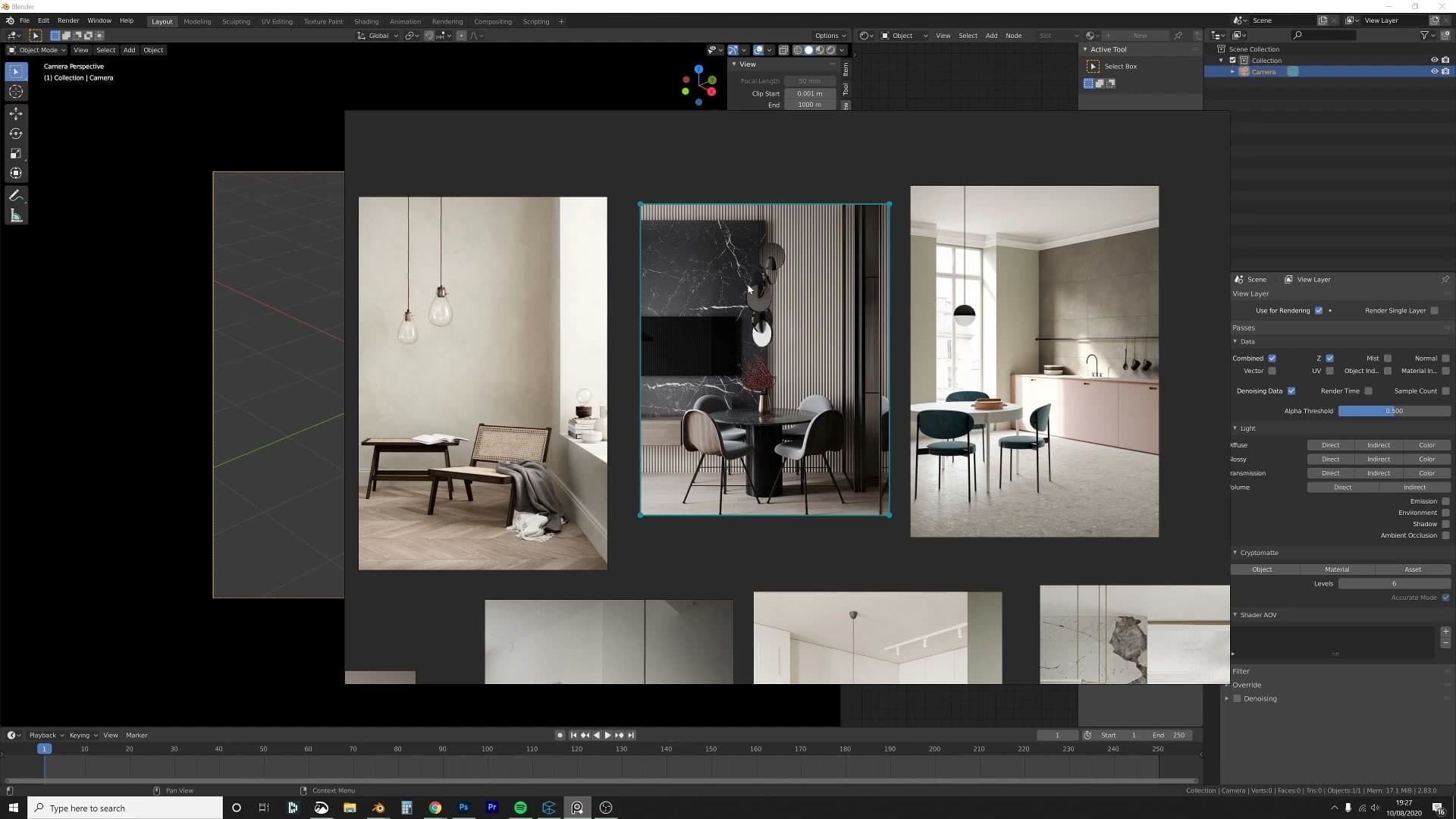
One reference in particular sets the direction. It has light filtering through a panel of glass with the suggestion of something on the other side (not a clear view, just a hint) and that's the effect to chase. Alongside it sit a set of pendant lamps by Lee Broom, which look so good they go straight onto the must-include list, plus more of those frosted-glass panels that will eventually inform the window treatment.
The lighting feel across the board is consistent and worth naming: a soft, ambient light with almost no direct sun. Only one reference actually has sunbeams in it; every other shot reads as overcast, with quiet, deep shadows pooling underneath the chair legs. That's the target: controlled softness, low contrast in the highlights, real density in the shadows.
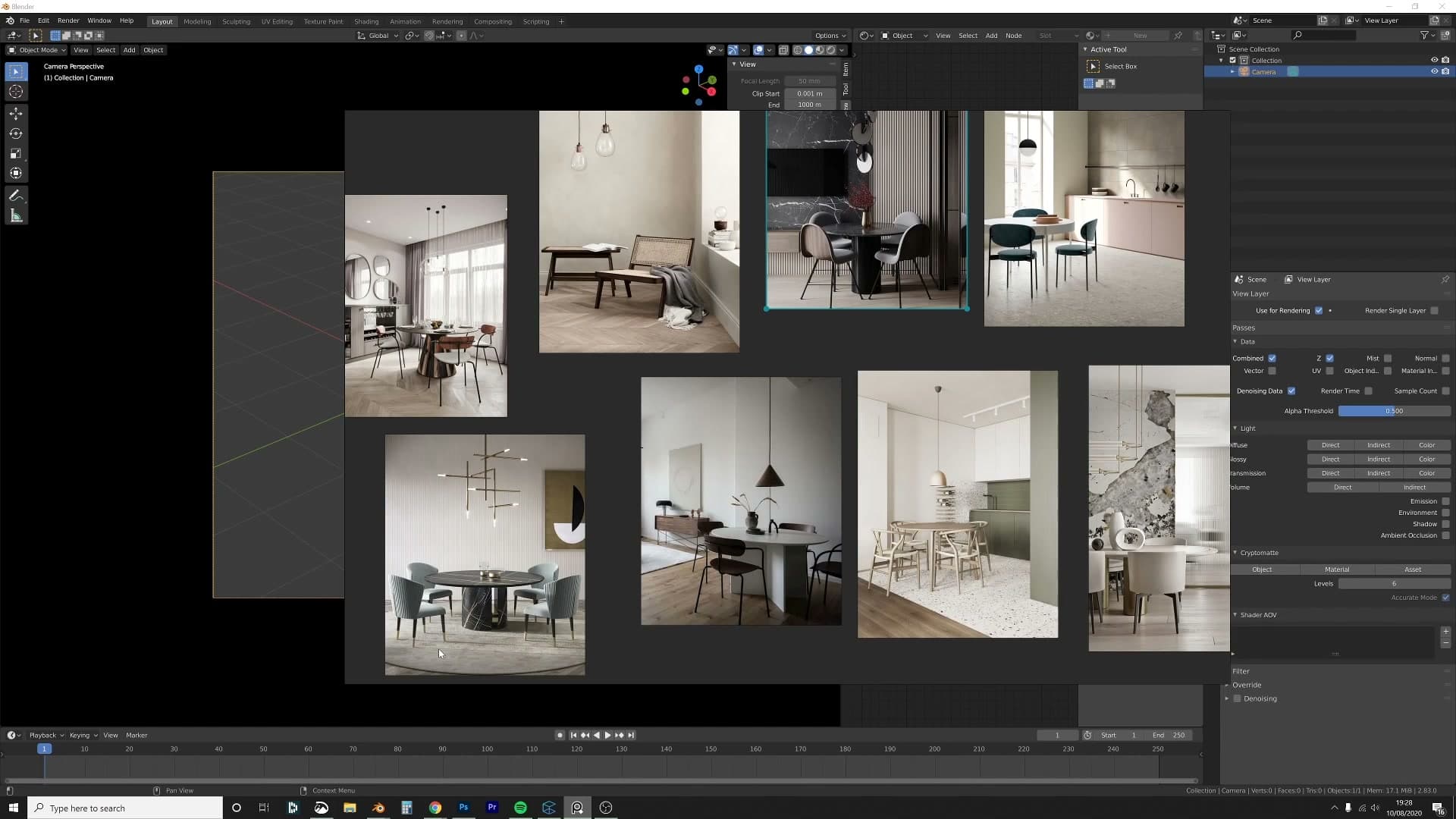
How that look is going to be built is genuinely unusual, and the technique gets unpacked in a later module. For now, the principle to hold onto is my own: if the image looks good, it doesn't really matter what lighting setup got you there. Pick the feel first; the rigging is a means to that end.
Block out the room and frame the camera
Build the room box, add a camera with Shift+F walk navigation, set a low field of view for that semi-orthographic archviz feel, and use camera clipping to push the camera through the wall without breaking the shot.
Building the room box in edit mode
Before any lighting or shaders, you need a box to light. Grab a default cube, lift it just above the floor, then drop into edit mode and pull the top up to roughly 2.5 m. That's a comfortable ceiling height that reads as real architecture rather than a doll's house.
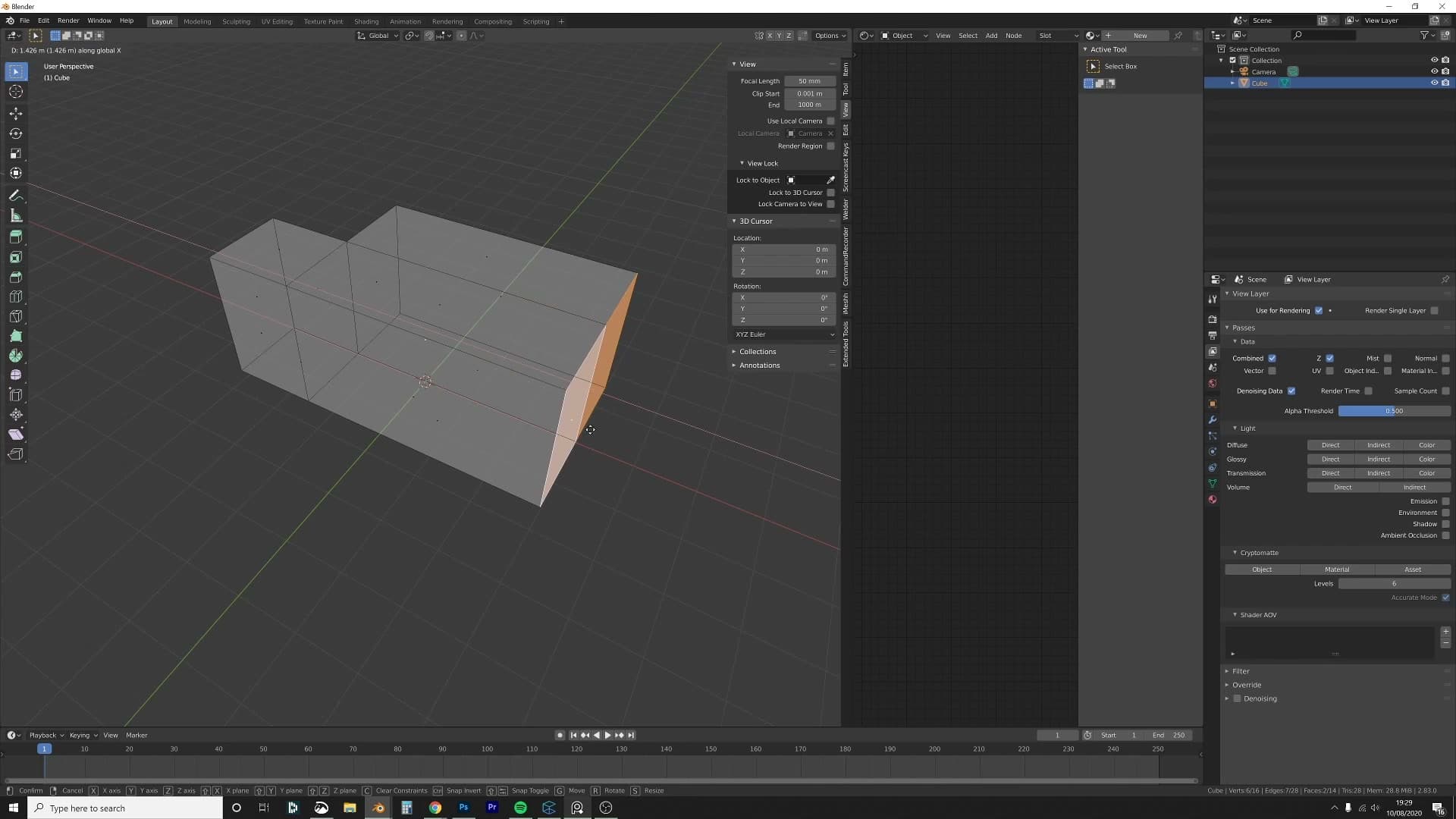
From there, stretch the side faces out until the footprint feels like an interesting room. There is no floor plan driving this; I am making it up as I go, loosely matching a layout I have built before so the proportions stay believable. The point at this stage is purely to block out volume. Windows, recesses and wall thickness all come later.
Keep the geometry deliberately rough. A clean rectangular shell is enough to start framing shots against; you will be cutting loops, recessing walls and pushing the back wall around once the camera tells you what the room actually needs.
Camera, FOV and Shift+F walk navigation
With the box standing, add a camera so you can start composing through the lens rather than guessing in the viewport. Tap Numpad 0 to jump into the camera view.
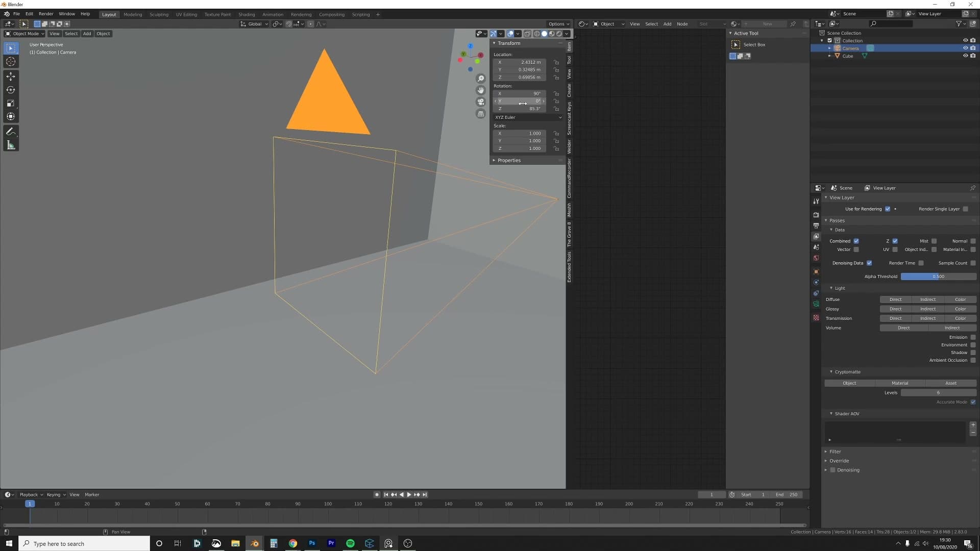
I fly the camera around with Shift+F, a custom binding that restores the old Blender 2.79 walk-navigation shortcut. To set it up yourself, open View > Navigation > Walk Navigation, right-click the menu entry, choose Assign Shortcut and press Shift+F. Once you are in walk mode, the WASD keys drive the camera through the scene like a first-person game.
As you fly around, keep the camera close to perfectly upright. A reliable archviz rule of thumb is to shoot at 90 degrees: vertical walls stay vertical, horizontals stay horizontal, and the image immediately reads as professional. Real architectural photographers do the same thing with tilt-shift lenses; even a small lean makes a render feel amateurish. You can break the rule deliberately later, but start straight.
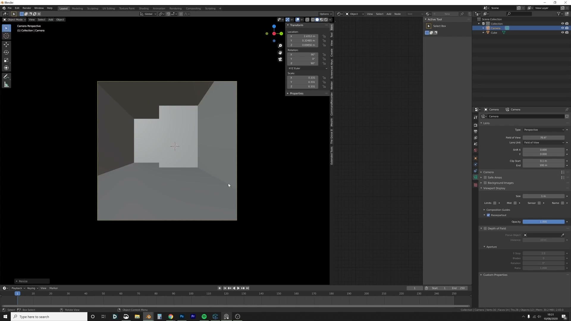
Next, change the camera lens from focal-length millimetres to Field of View degrees. It is easier to reason about how much of the room you will catch in frame. Around 70° is wide enough for estate-agent shots where the client wants the room to look as large as possible, but it is usually too aggressive for artistic work. For this scene I go much lower, which flattens the perspective and gives a semi-orthographic feel. Perspective lines almost stop converging, everything reads parallel, and the result has the editorial flatness of a magazine photograph.
Pushing the camera through the wall with clipping
Once the camera is roughly framed, you will almost certainly want to pull it back further than the room itself allows. The trick is to push the camera straight through the wall and rely on Blender's near-clip plane to hide the geometry between you and the scene.
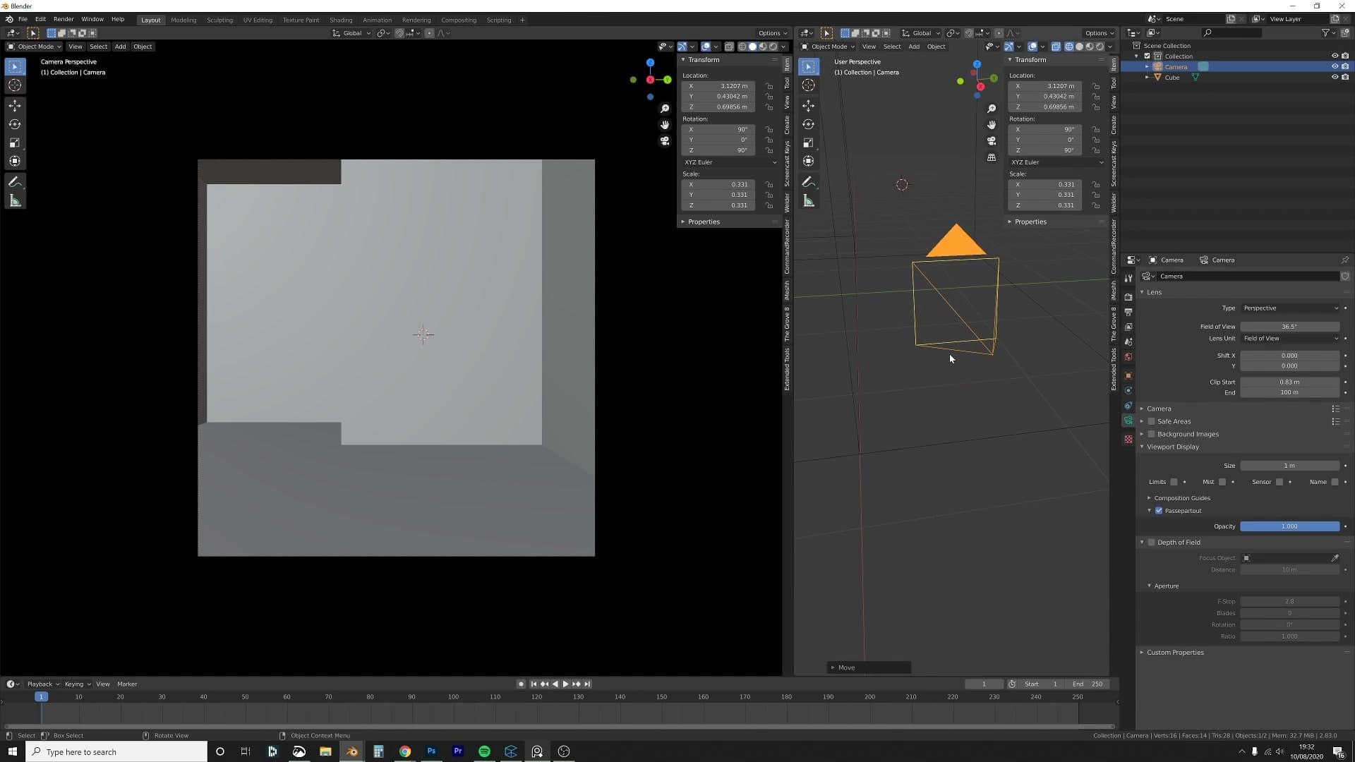
Hold Shift while dragging the camera back along its local axis. The Shift modifier slows the translation so you can ease it through the wall a few centimetres at a time, until the wall behind the lens disappears and the framing opens up. Slide it sideways too if you need to recompose.
There is a limit to how far this trick stretches.
First window cut and back-wall recess
With the camera roughly placed, start carving openings into the shell. Add a horizontal loop cut with Ctrl+R, then use Ctrl+B to bevel a rough rectangle out of the wall. A quick-and-dirty window aperture: no detail yet, just a hole the size you want light to come through.
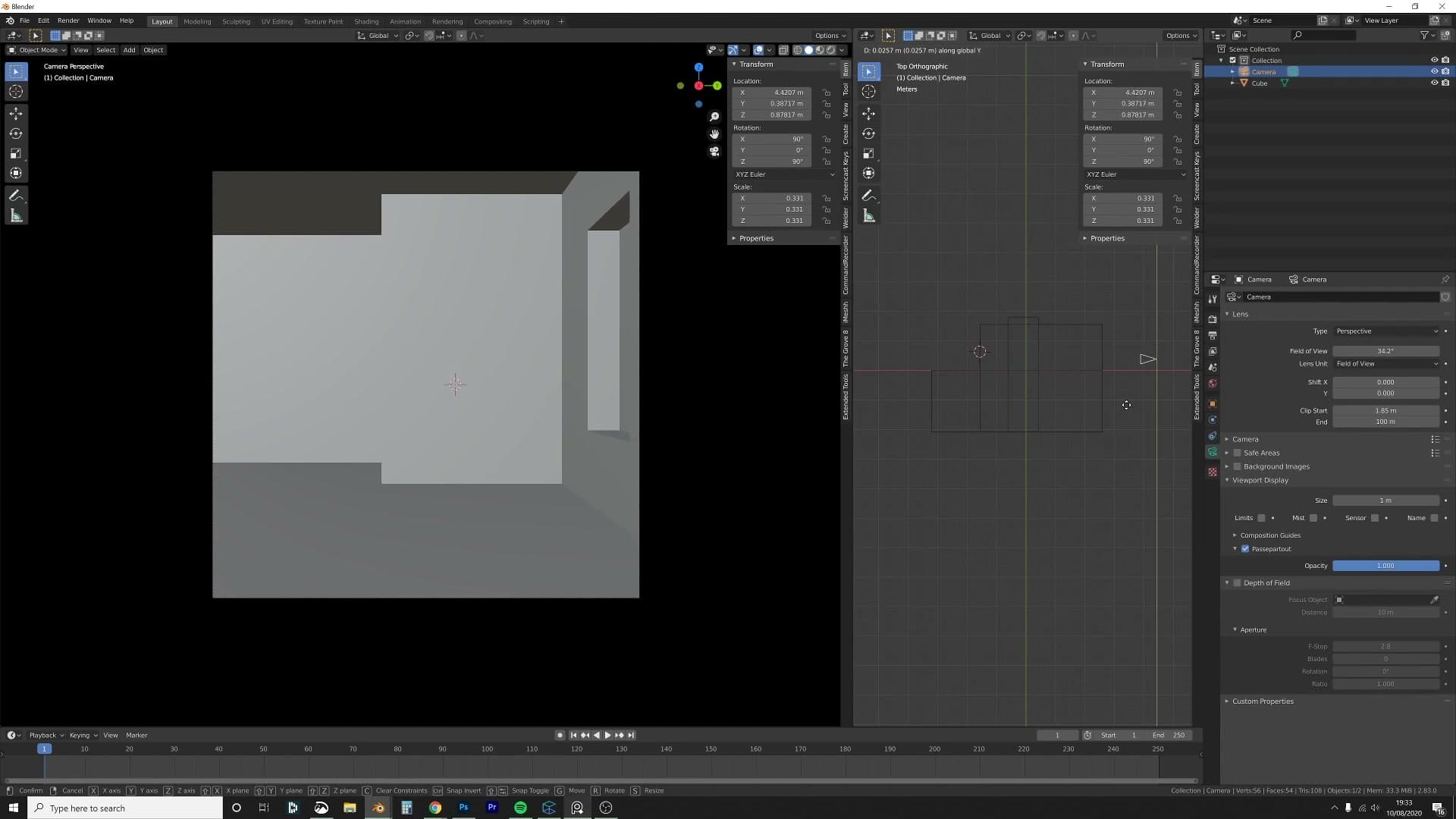
Slide and resize the opening until it sits where the composition needs it. I shift and shorten this first window a couple of times, looking for something close to the layout I built previously.
Finally, push the back wall further away from the camera. Opening up the rear of the room instantly makes the whole space feel larger, and it crops the window edge out of frame so you do not have to commit to modelling anything beyond it. That matters: the moment a window's far edge is visible in shot, you have to think about what lies outside (sky, neighbouring buildings, parallax) and that is a problem you can sidestep entirely by simply not showing it.
Skirting boards from a curve with Asset Manager
Duplicate the base wall edges, separate them, convert to a curve, then attach a skirting profile from the iMeshh Asset Manager. Includes the exact folder structure the Asset Manager expects.
Selecting wall-base edges and converting to a curve
With the walls and floor in place, the next layer is skirting. Rather than modelling a profile in place and trying to bend it round the room, you can lift the bottom edges of the walls themselves, turn them into a curve and let a skirting profile follow that curve automatically.
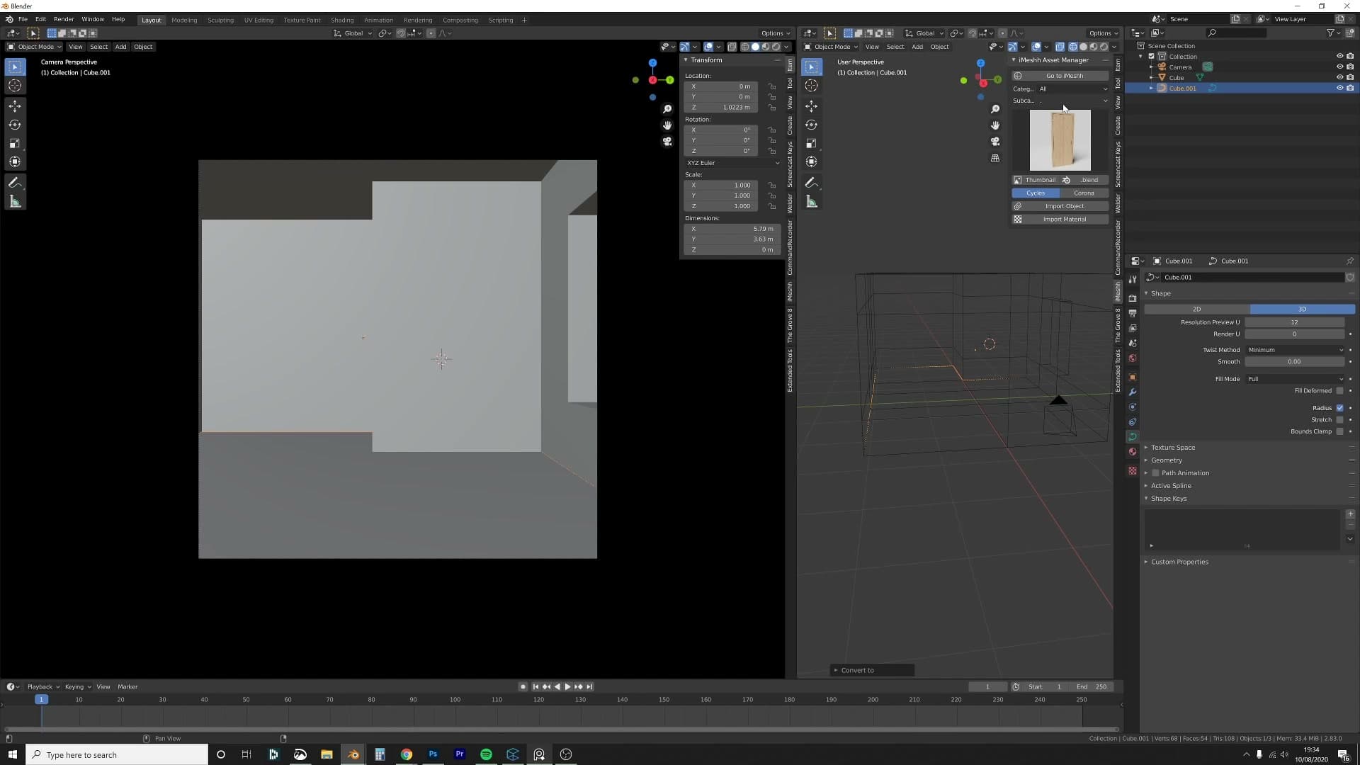
Drop into edit mode on the wall mesh and switch to edge select. Hover over the bottom edge of one wall and press Shift+Alt+Click to grab the entire edge loop that runs along the floor. Repeat for every wall section until the full perimeter of the room is selected.
Now duplicate and separate that selection so it lives as its own object. Press Shift+D to duplicate the edges, then immediately P → Selection to break the duplicates out into a new object. Tab back into object mode, select the new edge object on its own, then press F3 and search for Convert to Curve. The edges become a single closed curve that traces the wall base. That is exactly what a skirting profile needs to ride along.
The iMeshh Asset Manager folder structure
For the skirting profile itself you can use the iMeshh Asset Manager. Search Google for "iMeshh Asset Manager" and download it from there. It's a side project currently on the back burner while the team focuses on the marketplace and the iMeshh exclusive library, so a handful of categories can be buggy, but for the most part it works and you'll use it throughout the rest of this build.
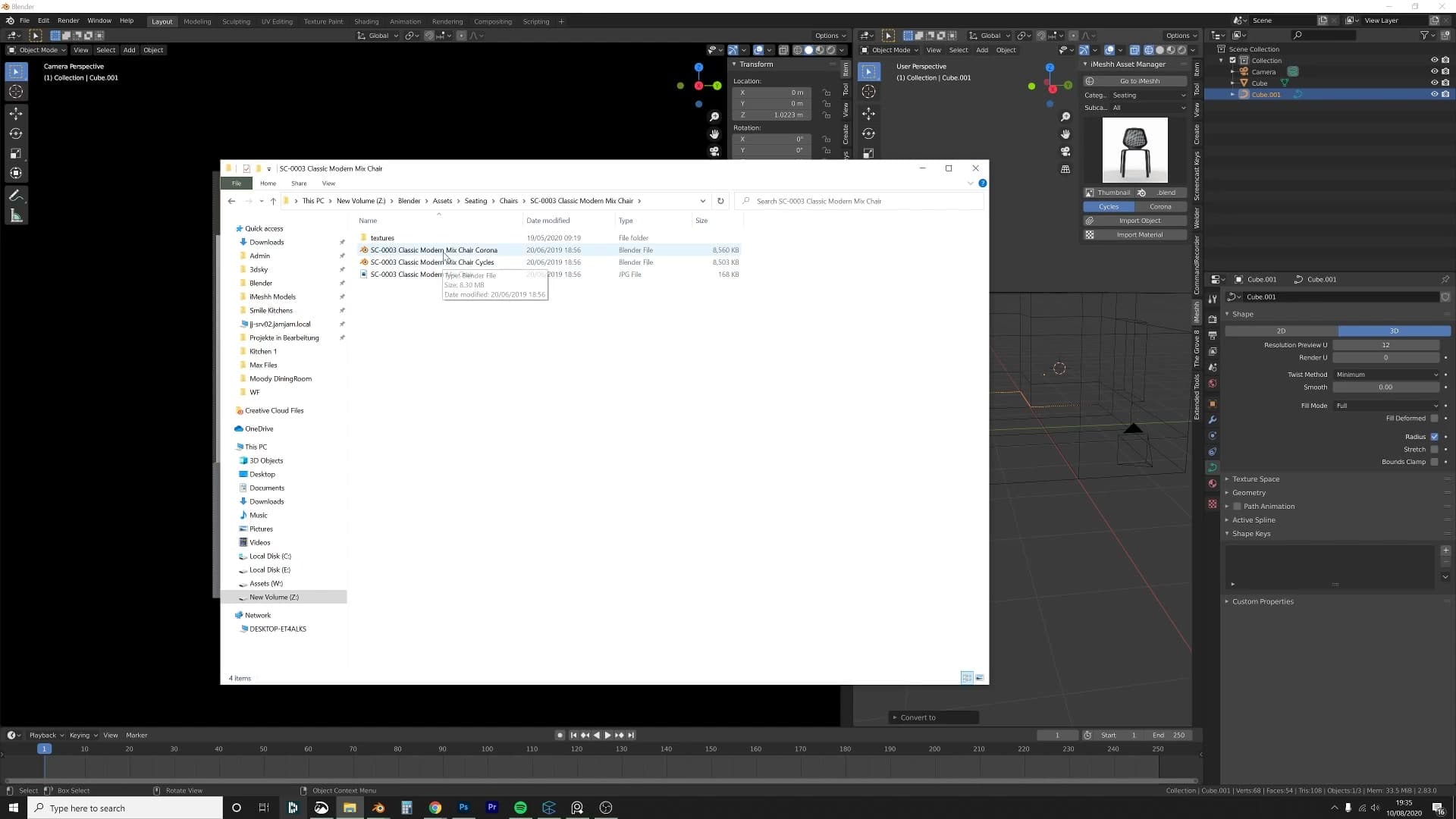
The one thing the Asset Manager is strict about is its folder structure. If you don't lay your library out the way it expects, it will not show your assets. The pattern is three levels deep:
First, a top-level main category folder (Architectural, Furniture, Lighting and so on). Second, a subcategory folder inside that (under Furniture you might have Chairs, Sofas, Tables). Third, a folder per product inside the subcategory. One chair gets its own folder, the next chair gets its own folder, and so on.
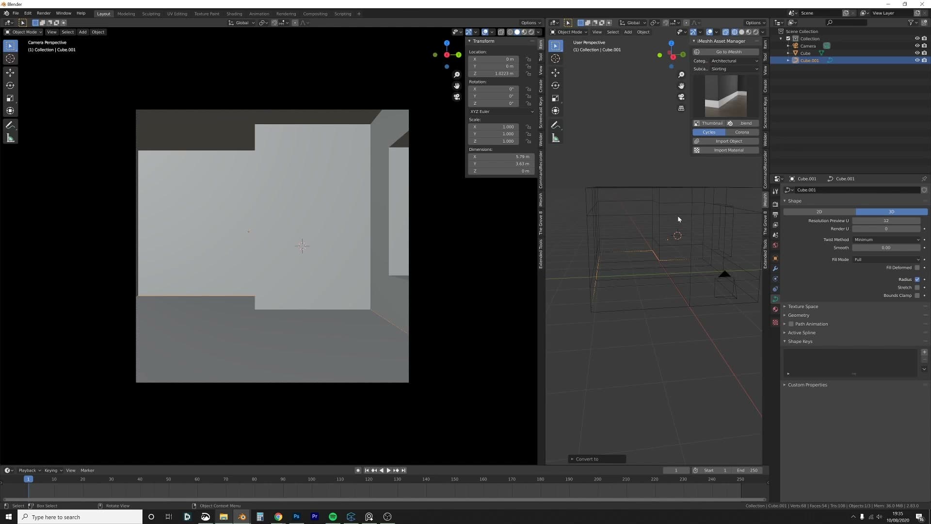
Inside each product folder you drop the .blend file alongside a preview image. The Asset Manager pairs them automatically by sitting in the same folder, so the thumbnail you see in the browser is just the image you saved next to the blend. Lay everything out like that and the manager will pick the library up; deviate from it and assets simply won't appear.
Attaching a skirting profile to the curve
Open the Asset Manager and navigate to Architectural → Skirting, then click a profile you like to bring it into the scene. Each asset usually comes in as several variants grouped together, so select them all, jump into local view to isolate them and pick the one profile you want to use.
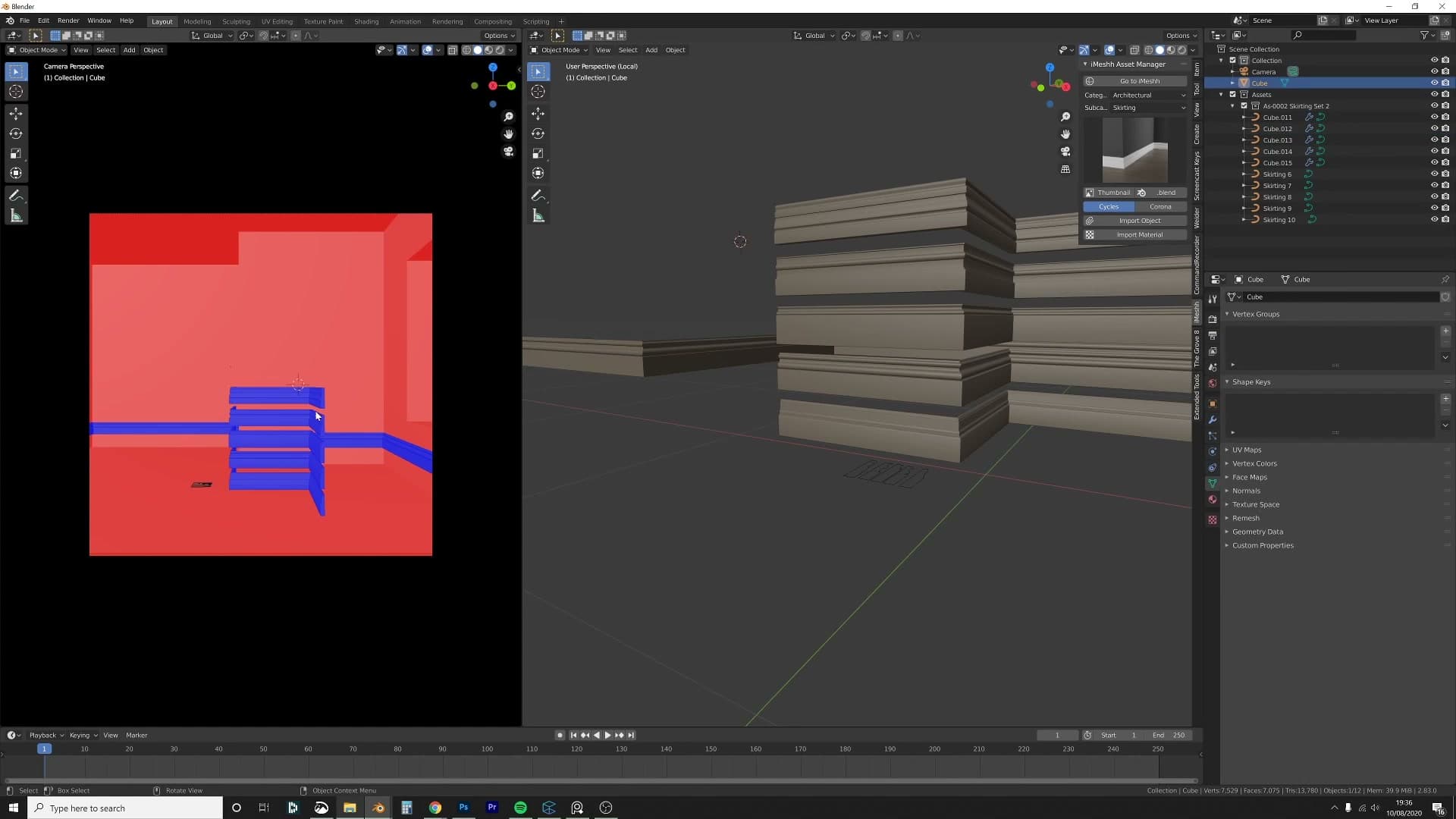
Before attaching anything, check the curve's normals. Select the curve, enable Face Orientation in the viewport overlays and see which way the loop is facing. If the inside of the room reads as the wrong colour, drop into edit mode, press A to select everything and then Shift+N to recalculate. If that alone doesn't flip the orientation, use the operator panel's Inside Out option to invert it. The skirting will follow the curve direction, so getting this right now saves having a profile pointing into the wall.
With the profile chosen and the curve oriented correctly, attach the skirting to the curve so it sweeps around the room. You'll usually end up with extra geometry left over from the original asset group: leftover variants, back-of-profile pieces and so on. Rather than deleting them outright, move them out of the way. Select what you don't need, press M → New Collection and name it something like trash or rubbish, depending where you're from. Hide that collection in the outliner and in the render so it stays out of the scene without being gone for good.
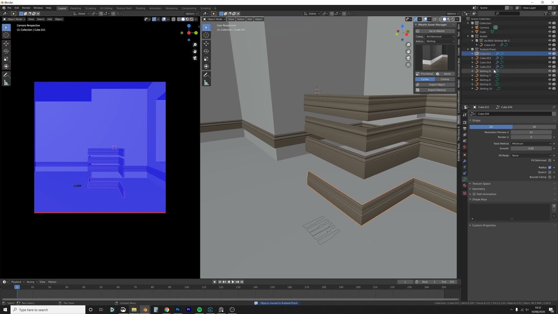
It's worth keeping a trash collection in every project as a matter of habit. Anything you might want back later but don't want cluttering the scene goes in there: press M, move it across, hide it, forget about it. With the skirting now riding the wall-base curve and the spare bits tucked away, you're ready to drop in the floor.
Archipack floor with vertex snapping
Generate Archipack's thumbnails, drop in a parametric floor, and use vertex snapping to drag its corners directly to the wall corners. Then Smart UV Project just the upward faces so the planks all run the same way.
Generating Archipack's thumbnails
Open Mesh › Archipack › Floor for the first time and you will almost certainly see a wall of blank tiles where the preset previews should be. Blender has not built the thumbnails yet, and without them you are picking floor styles by name alone.
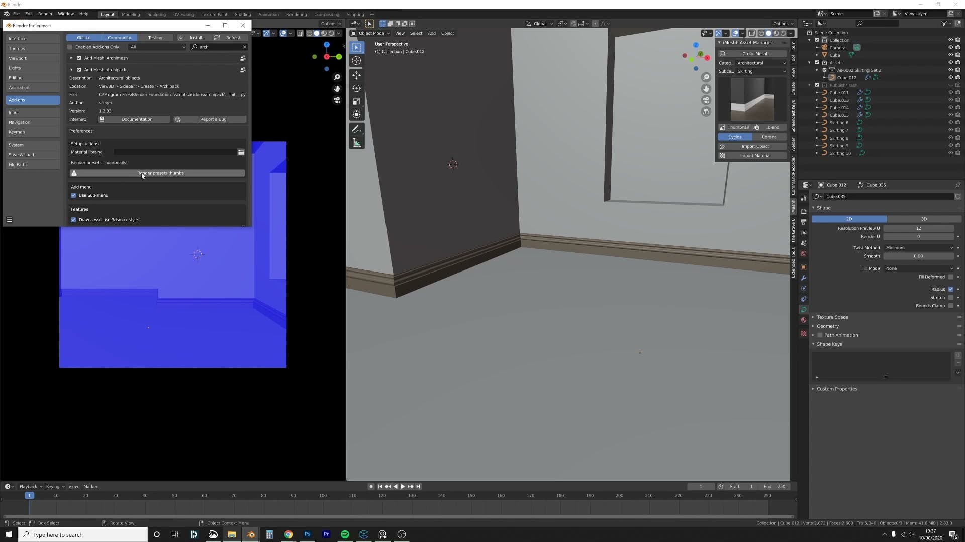
To generate them, go to Edit › Preferences › Add-ons, type Archipack into the search box, expand the add-on panel and click the thumbnail generation button. Blender then renders a preview of every Archipack preset in turn.
Set it running and walk away. It takes roughly 10-15 minutes on a typical machine because it is rendering every preset in the library, but it is a one-time cost. Once it is done, the visual picker is unlocked for every project from then on.
Snapping floor corners to the walls
With the thumbnails generated, head back into Mesh › Archipack › Floor and pick a preset you like the look of. Archipack drops the parametric floor into the scene, but it sits flush with whatever you already have built, so you cannot see the room layout underneath. Switch the viewport shading to Wireframe so the wall corners show through.
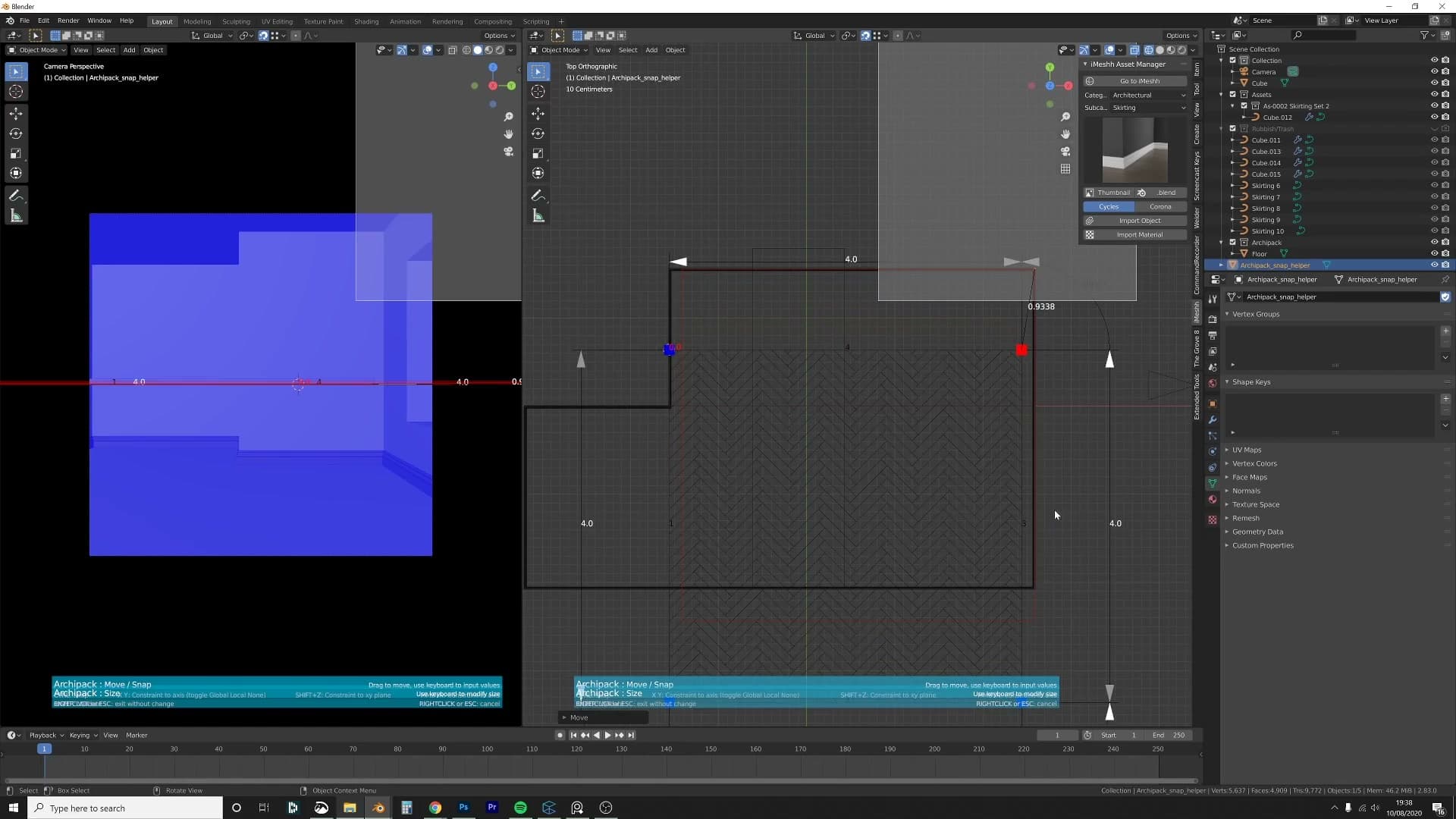
Now reshape the floor to match the room footprint by dragging each of its corner handles onto a wall vertex:
1. Press Shift+Tab to toggle snapping on, and set Snap To to Vertex.
2. Click one of the floor's corner handles.
3. Drag it to the matching wall corner. The vertex snap pulls it cleanly into place.
4. Repeat for the remaining corners. The footprint does not need to be pixel-perfect; it only has to cover the whole room because nothing outside the walls will ever be in shot.
5. Right-click to finish.
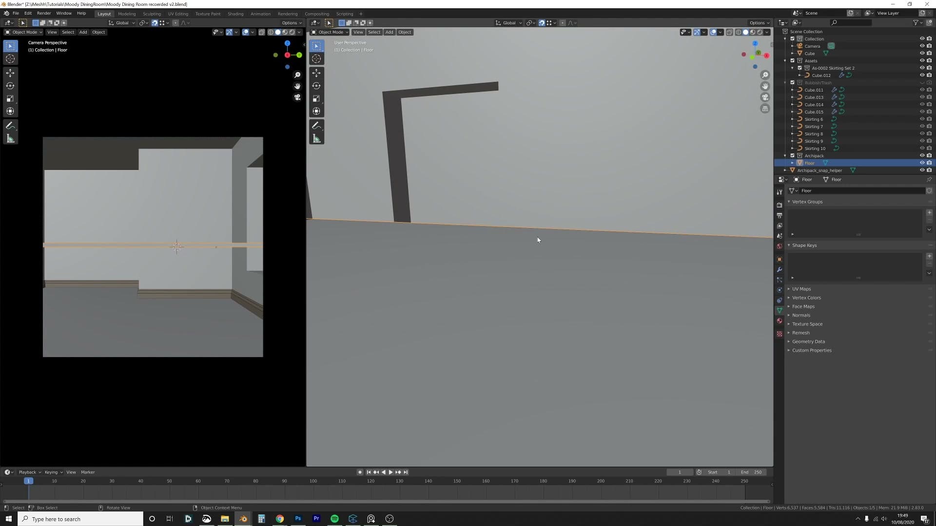
Drop the floor down on the Z axis until it sits flush with the ground plane (or a hair above it) so the wood reads as resting on the slab rather than embedded in it. Then add a Bevel modifier and set the width to 0.0005 m. That sliver of bevel catches a thin highlight along the upper edge of every plank and stops them looking like razor-thin cardboard.
Smart UV Project on upward-facing faces only
Archipack's default unwrap is a little unusual. Instead of laying the planks out in a strip, it stretches each plank's top face to fill the entire UV square. That sounds wrong until you realise why it exists: with every face occupying the same UV space, you can assign a different wood material to each plank and get a mixed-timber floor for free. It is a clever default, but it is not what you want here. You want one wood texture running uniformly across every plank.
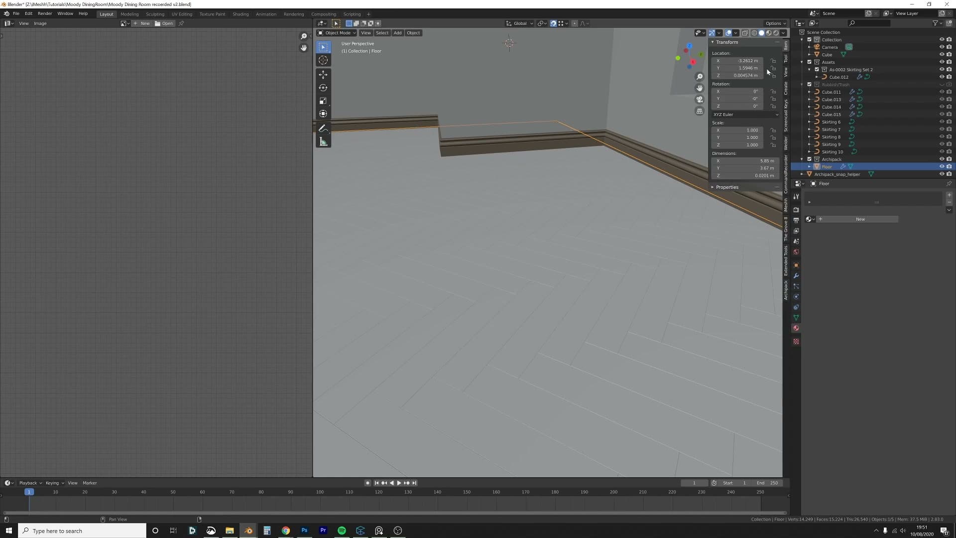
Start by clearing the materials Archipack assigned to each plank so you can re-unwrap cleanly. Then you only want to operate on the upward-facing top faces, not the plank edges or undersides:
1. Select a single top face of the floor.
2. Press Shift+G and choose Normal from the Select Similar menu. Every face whose normal points up is now selected.
3. Press U and choose Smart UV Project. Blender re-unwraps the top of the floor so the planks all line up along the same axis.
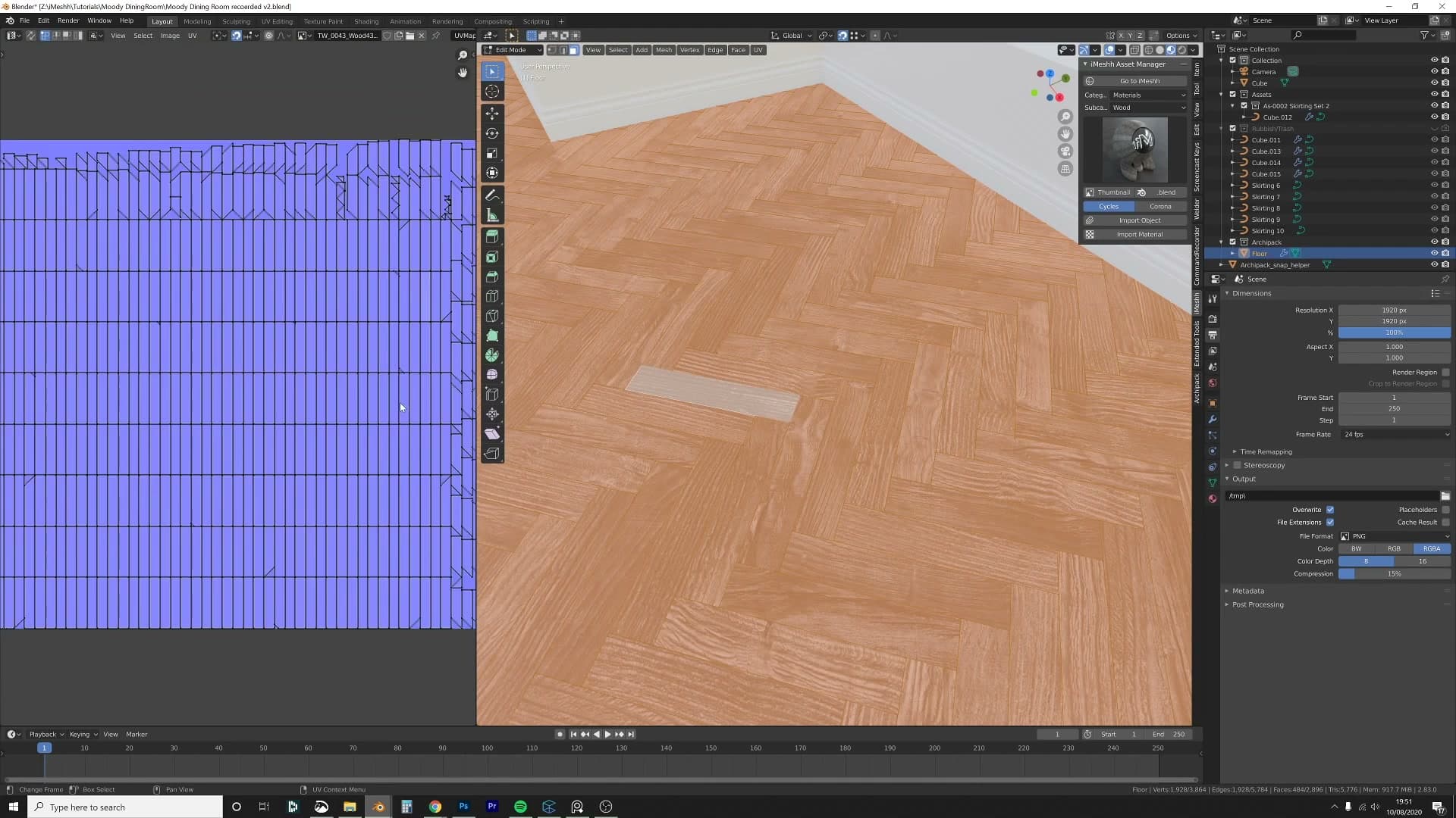
Open the N panel, add a wood material and pick whichever wood you like. The tutorial uses Wood 43 from the iMeshh library, but any plank-style timber works. Switch the viewport to Material Preview and the grain should now run in the same direction across the whole floor.
If the planks look too small for the room (lots of tightly packed boards rather than a few generous ones), bump the UV scale up. With the upward faces still selected, press S and type 3 in the UV editor. The planks scale up threefold and the floor reads as a real timber surface rather than a tiled texture.
Wood floor and stucco wall materials
Build the wood material with a colour ramp controlling roughness, then load the iMeshh stucco maps with normal and inverted glossiness. Use the UV Squares add-on to straighten the wall unwrap so plaster wraps cleanly into the corners.
Wood material with a roughness colour ramp
First, make sure the Node Wrangler add-on is enabled. Open Preferences, hit Add-ons, search for "Node Wrangler" and tick it on. Once it's active you can hold Shift+Ctrl and click any node in the shader graph to preview that channel directly in the viewport. That is by far the fastest way to audit what each map in a PBR set is actually contributing.
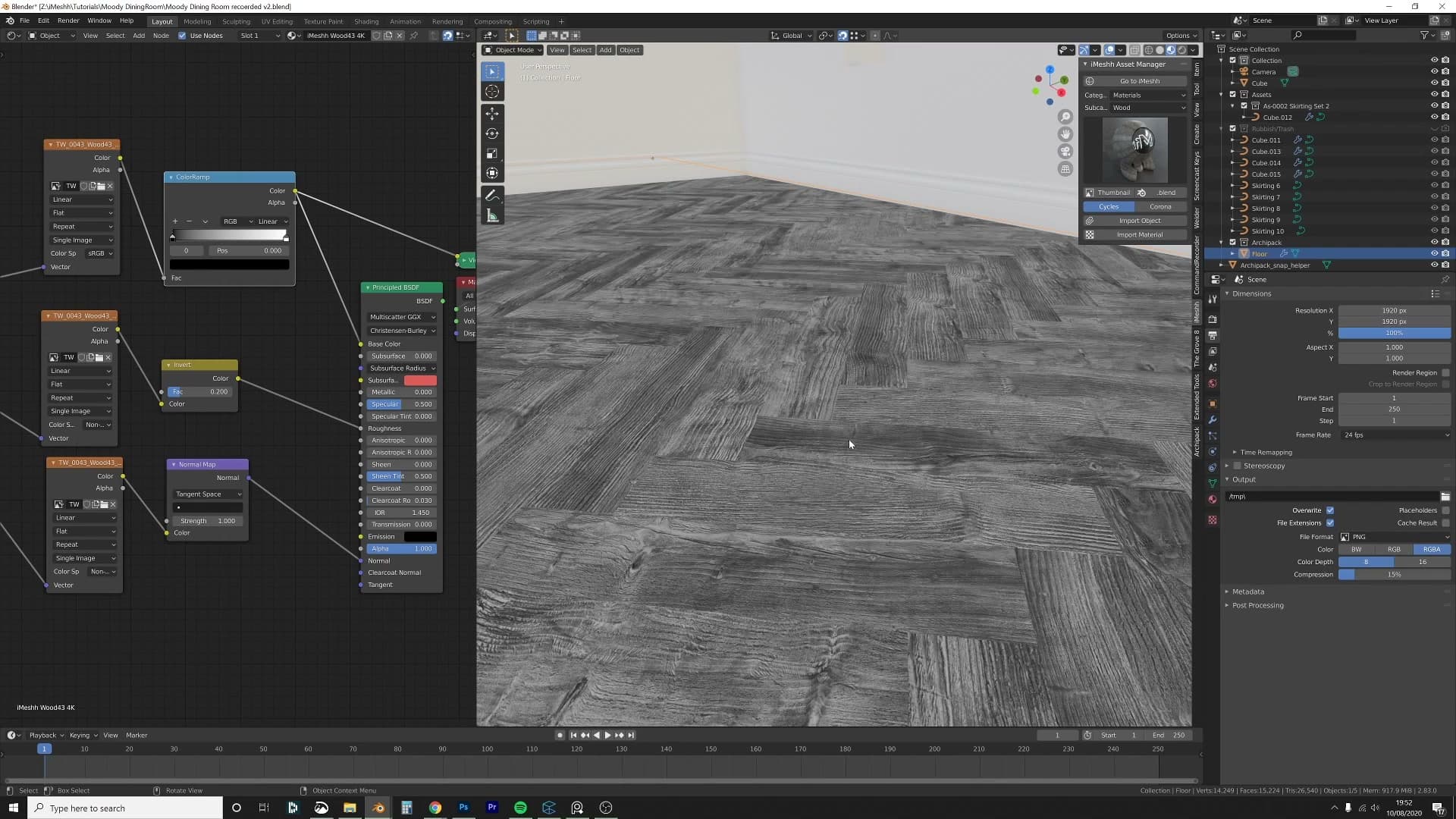
The wood material from the iMeshh library reads fine out of the box, but a touch of roughness shaping makes it more believable. Add a Color Ramp node and slot it between the wood image texture and the Principled BSDF's Roughness input.
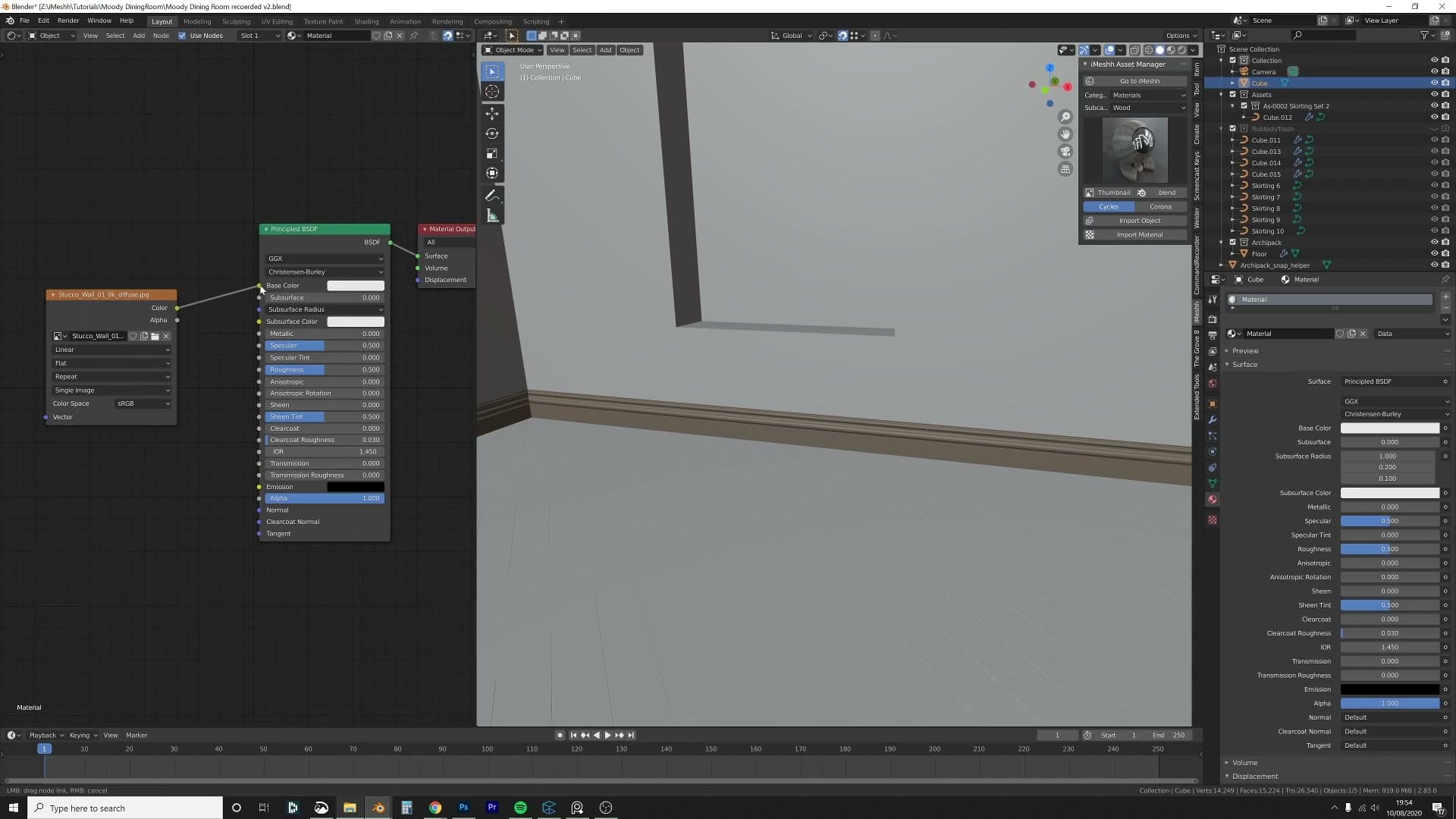
Remember the convention: in a roughness map, white is rough and black is glossy. Drag the black handle of the ramp upward toward the lighter end. That lifts the darkest values out of fully glossy territory, knocking back the overall shine so the floor stops looking lacquered. The lighter grain stays matt, the dark grain picks up a subtle gloss, and the floor ends up with the kind of variation real timber has, without any one area going full mirror.
Loading the iMeshh Plaster 01 maps
For the walls, I reach for an 8K stucco material called Plaster 01 from the iMeshh marketplace. Search "Stucco" on iMeshh to surface it.
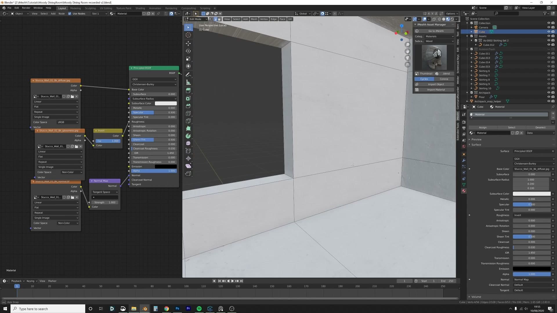
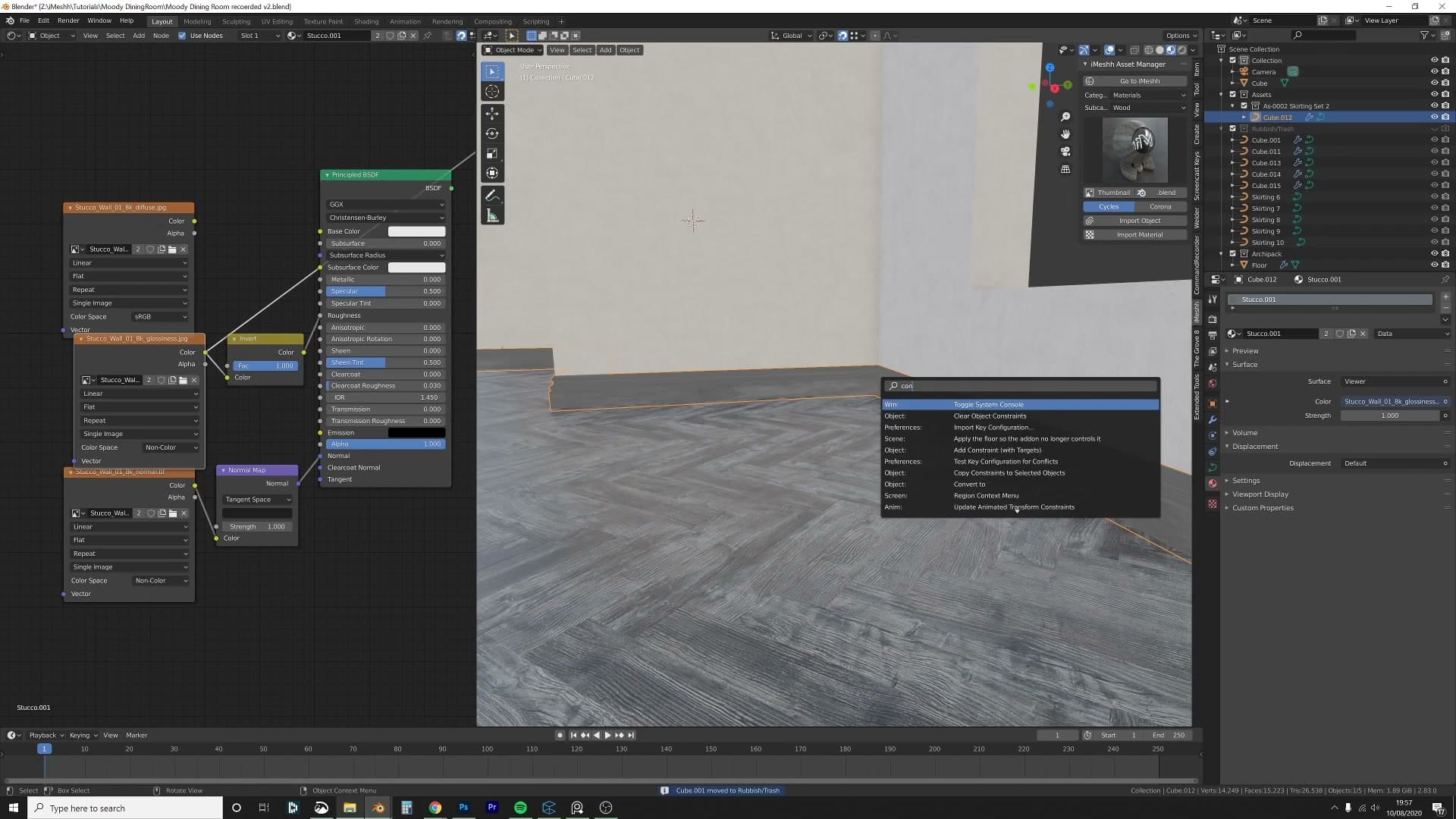
Create a new material on the wall mesh and wire up three maps from the texture set. The diffuse goes straight into the Principled BSDF's Base Color. The normal map texture needs its colour space set to Non-Color, then routed through a Normal Map node before plugging into the BSDF's Normal input.
The third map is glossiness, not roughness. Roughness is the inverse of glossiness. Set the glossiness texture to Non-Color, run it through an Invert node, then connect that into the BSDF's Roughness input. Without the invert, your bright highlights would land where the texture intends matt patches, and vice versa.
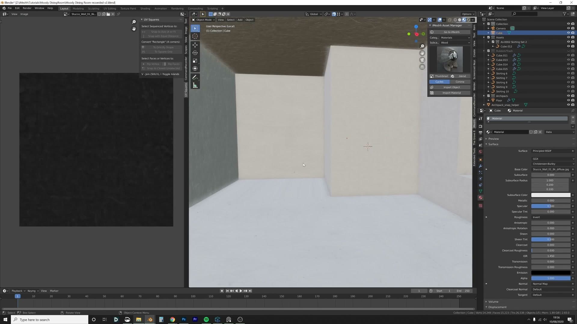
Solo the wall in the outliner and switch the viewport to Material Preview to check the result. Even before any lighting is set up, the 8K stucco already reads as architectural plaster rather than a flat painted surface.
UV Squares add-on for straight wall unwraps
The default unwrap leaves the wall UVs visibly skewed, which would make the plaster texture crawl diagonally across each corner. Fix that by marking seams along the vertical wall corners first. Select each corner edge and use Mesh > Mark Seam.
In face select mode (press 3), grab only the wall faces the camera will actually see. Box-select with B if that's faster. The walls behind the camera don't need clean UVs and can stay as they are.
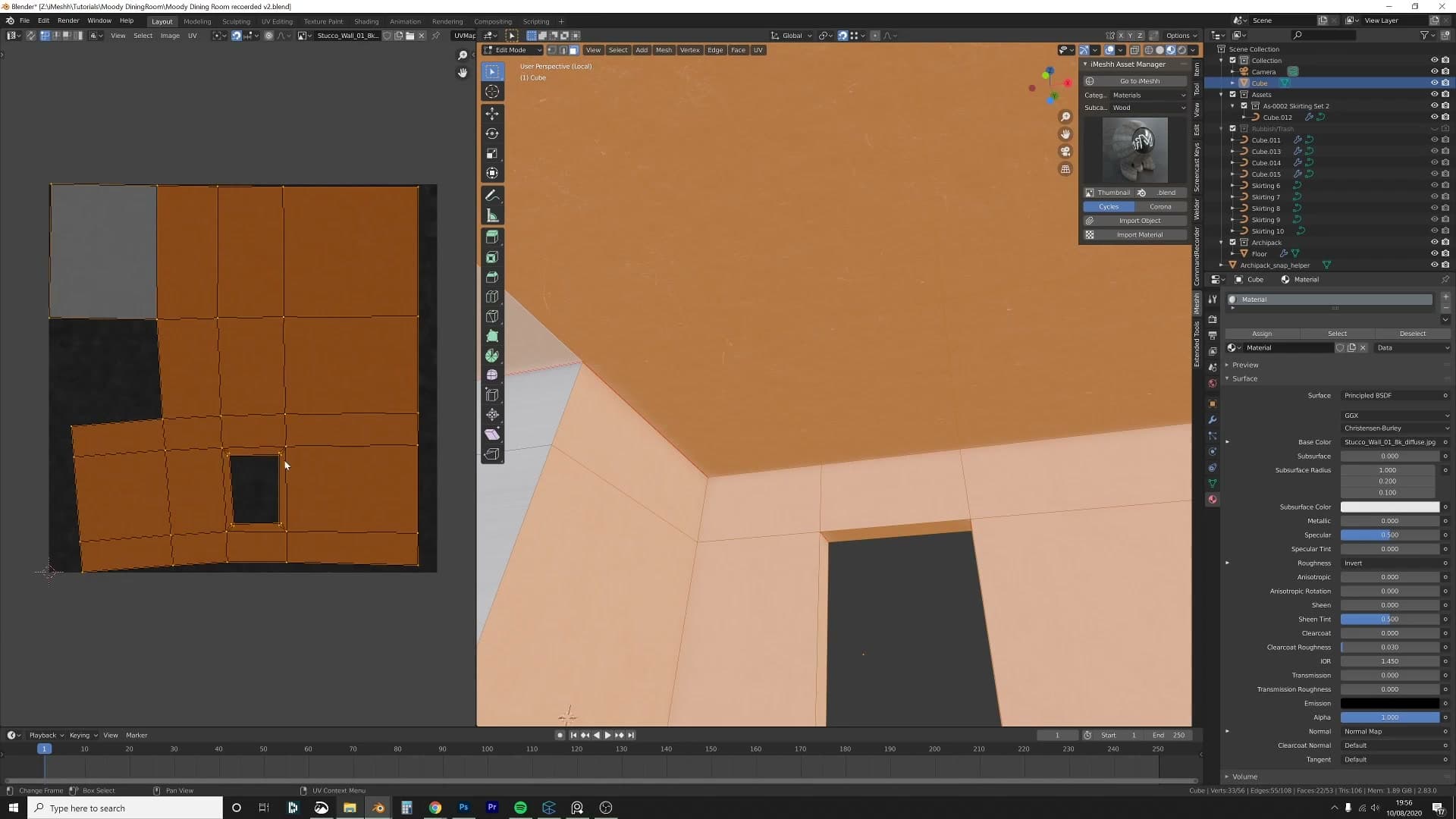
With the visible faces selected, press U and choose Unwrap. In the operator panel, switch the method to Conformal. It produces cleaner rectangular results than the default Angle Based for boxy interior geometry. Open the UV editor and you'll see the unwrap is technically correct but distinctly wonky.
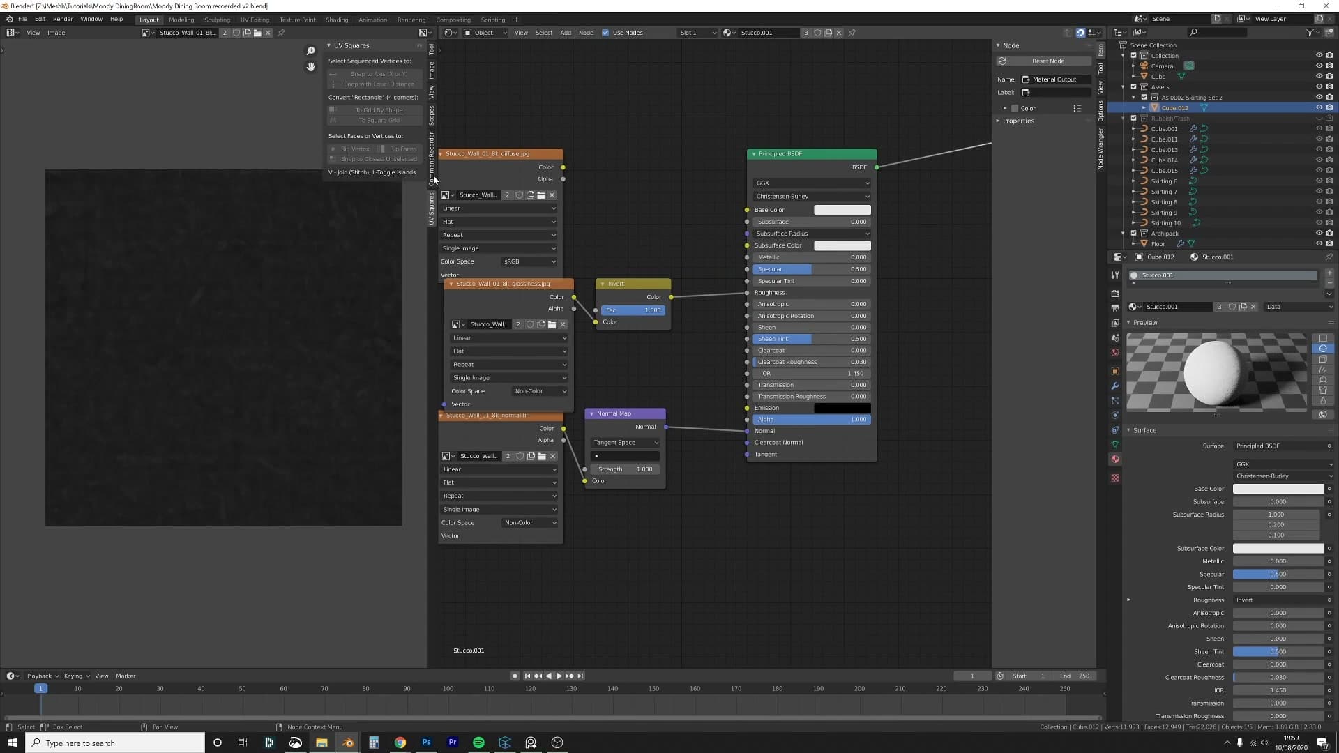
This is where the UV Squares add-on does its work. Select all the UVs (A), press N to open the side panel, find the UV Squares tab and run To Grid by Shape. Every face snaps into a clean rectangular grid in a single click. Now the plaster texture wraps continuously from one wall straight into the next without any seam wobble at the corners.
Scale the unwrapped islands down a notch if the texel density looks too coarse for the room. You can leave the floor unwrapped (the wood plank covers it entirely) and you can ignore any walls the camera will never see.
Glossy stucco variant for the accent wall
For the accent wall behind the camera, I want the same plaster surface in a glossier off-white finish. Duplicate the existing stucco material in the material slot so the original keeps its matt look, then rename the copy something like Stucco Glossy.
In the shader editor, unplug the diffuse image from the Principled BSDF's Base Color input. With no diffuse map driving it, the base colour falls back to the default off-white, which is exactly what you want for a brighter accent wall that should pop a little against the warmer main plaster.
The accent wall in this scene started life as a curve, so it needs converting before you can unwrap it cleanly. Disable the curve's bevel first, select the object, press F3 and run Convert To > Mesh. Drop into edit mode, flip to wireframe so you can see through the geometry, and select only the front faces. The back faces will never be visible and don't need UV space. Press U to unwrap.
Finally, dial the roughness down. Around 0.1 hits the sweet spot. Reusing the original glossiness map as the roughness source keeps a subtle bit of surface variation rather than going to a perfectly flat value, so the wall reads as a glossier render of real plaster rather than a sheet of plastic.
Window seals, frames and why archviz uses asset libraries
Walls need thickness so the window sits recessed inside the frame. Build a quick window seal with a single bevel pass, mirror it across openings, and then a short aside on why every archviz studio uses asset libraries instead of modelling every chair from scratch.
Why walls need 20-25 cm thickness
Before you drop any windows in, give the walls some real thickness. The mistake you see constantly in beginner archviz is paper-thin walls. The moment you add a window, it sits dead flush with the wall surface and the room loses all of its architectural credibility.
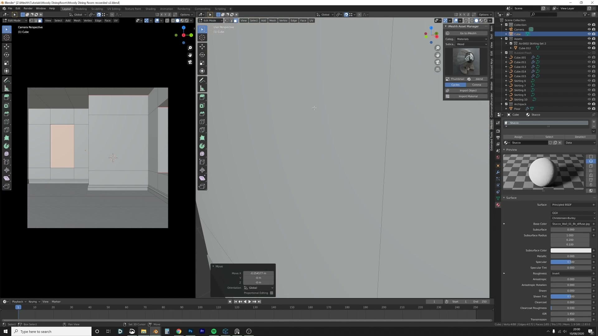
Real walls are roughly 20-25 cm thick, so solidify yours to something in that range. Once the wall has depth, you can drop the window in a few centimetres back from the outside face, which gives you a visible band of frame and reveal. That is exactly what your eye expects from a real building.
Building the window seal with a single bevel
Now build a window seal. It's the quickest one in the world but with just enough detail to add a beat of interest under the window. Duplicate a chunk of wall geometry with Shift+D, hit P to separate it into its own object, then position it where the seal needs to live.
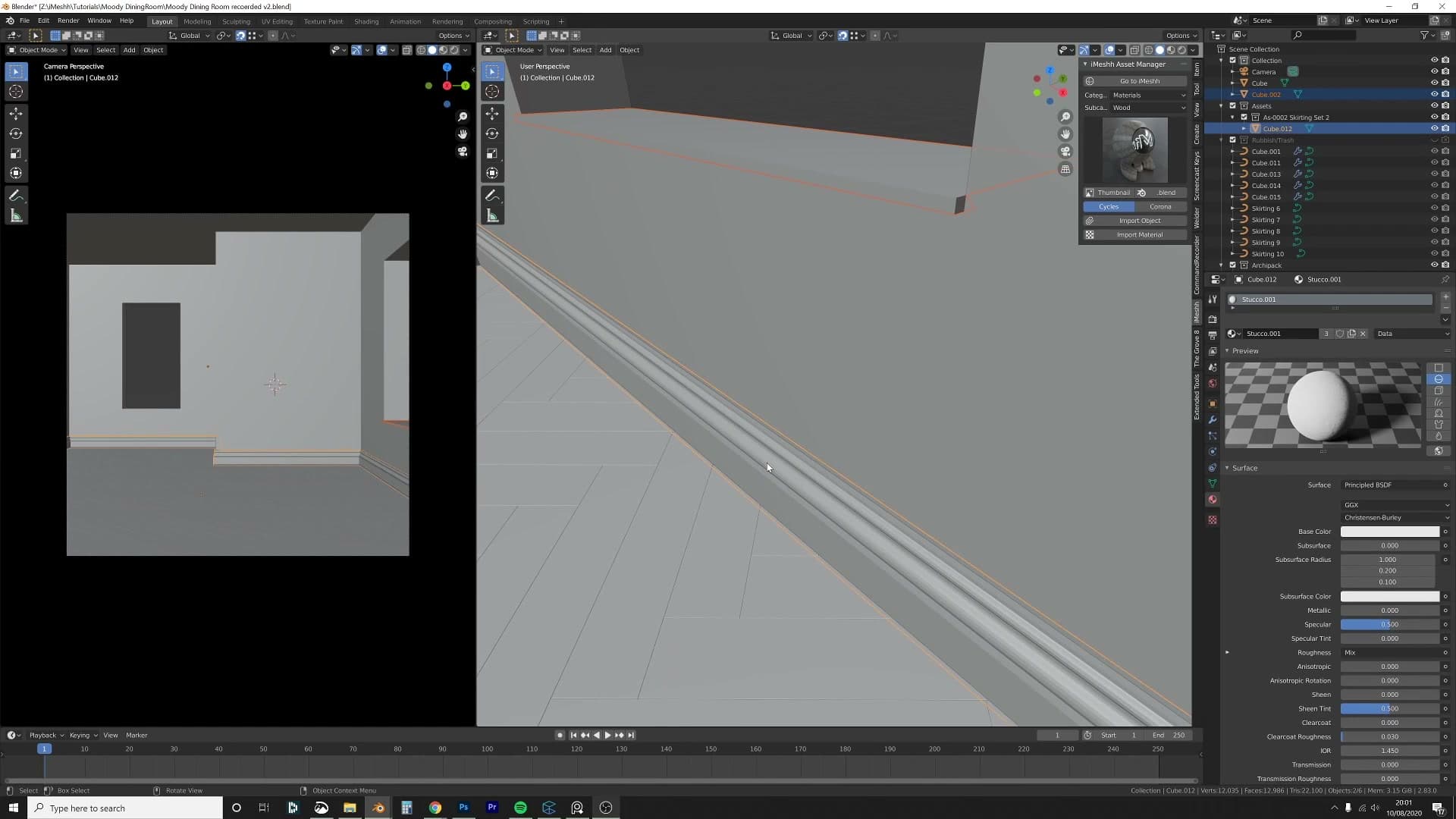
Select the top faces and give them a quick unwrap. You'll never actually see that edge in the final shot, so don't agonise over it. This is one of those archviz moments where spending time on something the camera won't catch is wasted effort.
Add a Bevel modifier and dial the width right down. Try 0.001, push it up to 0.0025 with a couple of extra segments, and that's the catch-light edge sorted. Switch the object to smooth shading, then jump into edit mode and add an extra loop with Ctrl+B across the length of the seal to keep the bevel shading nice and tight along the long axis.
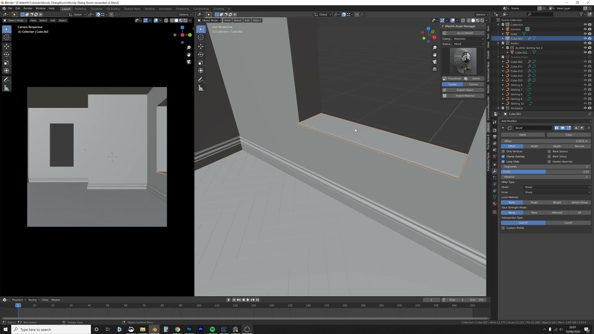
Position the finished seal so it sits in the window opening with a small, deliberate overlap onto the wall face. That little proud lip is something real window frames often do, and it reads as another quiet architectural giveaway.
Mirroring the seal across openings
Rather than rebuild the seal at every opening, clone the one you've just made. Duplicate it, then set the origin to the centre of mass so it pivots from the middle when you rotate.
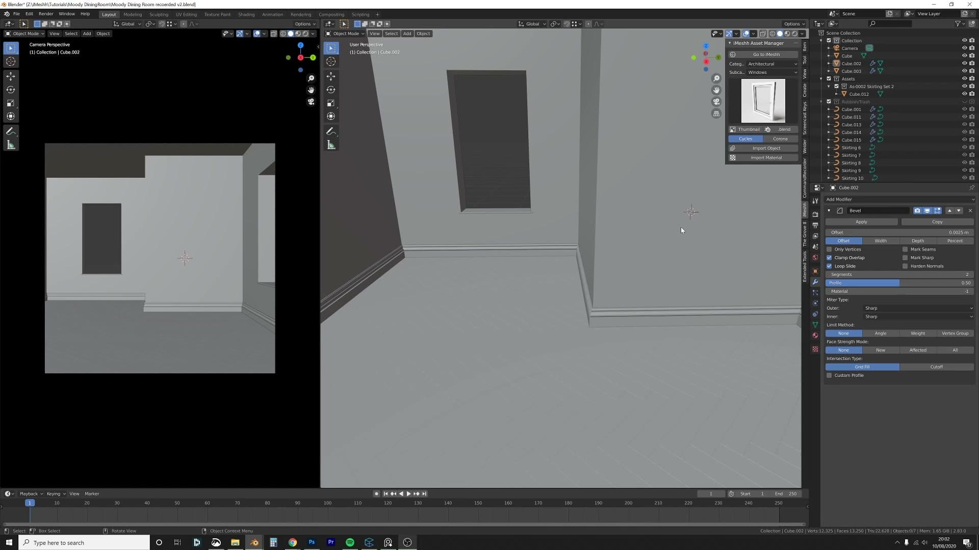
Move the duplicate over to the next window, hit R and type -90 to rotate it into place, and check the fit. Repeat for any other openings, keeping the same small overlap onto the wall face so the detail stays consistent across the whole room.
Why every archviz studio uses asset libraries
Quick aside before the windows go in, because this comes up constantly in comments. From here on the room gets built largely from asset libraries, and there's a persistent belief that if you don't model every object yourself, you're somehow cheating. That isn't how the industry actually works.
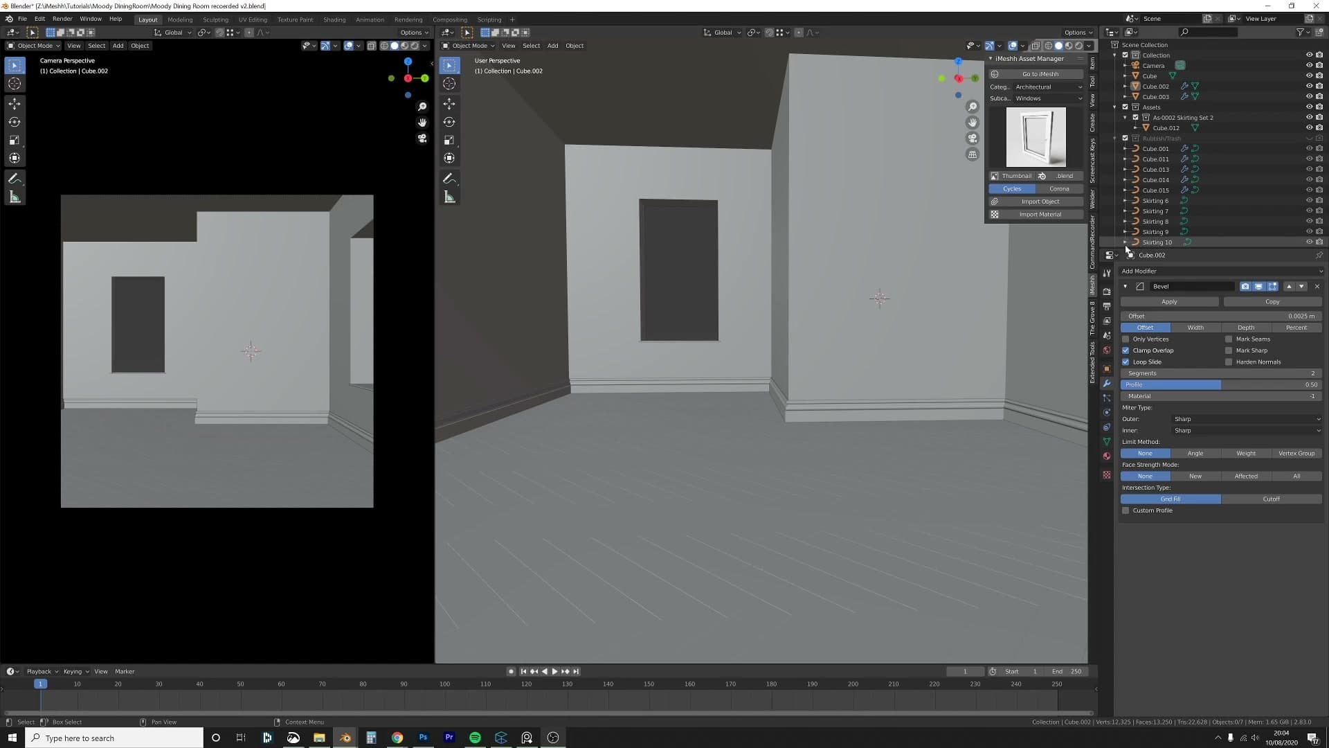
Walk into any studio doing architectural visualisation and you'll find the same thing: they all use assets. Time is money, and no commercial archviz pipeline has the hours to model every chair, lamp and curtain rod from scratch on every project. Assets are the default; bespoke modelling is the exception.
Knowing how to build furniture is still a skill worth having. Interior designers will request pieces that don't exist as 3D models, and being able to make a window or a chair from scratch keeps you unblocked. But once you've modelled, say, a window properly once, there's no reason to remodel it the next hundred times. That's exactly what a library is for, whether it's something you've built up yourself or pulled from a third-party collection.
The cleanest way to think about it is the photographer analogy. When an interior photographer takes a beautiful shot, nobody complains that they didn't build the sofa or carve the chair. That isn't the art. The art in archviz is the lighting, the composition, the colour. You are essentially a photographer in the 3D world, and your job is to make a beautiful image, not to prove you can model every prop in it.
Windows and the Blender-glass shadow bug
Import window assets, strip out everything that won't be on camera to save render time, then fix Blender's biggest archviz annoyance: that the default Glass BSDF blocks sunlight by default. The fix is a Light Path + Transparent BSDF mix.
Importing windows and deleting unseen parts
Once the window asset is sitting in the opening, slide it so it overlaps the frame just slightly. That hairline overlap stops any visible gap between the wall and the frame where the camera could catch daylight slipping past.
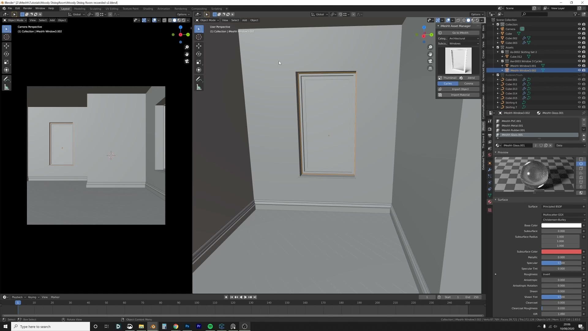
For an opening that the camera won't see in the final shot, strip the asset right back. Select only the pieces you actually want visible from inside the room, press Ctrl+I to invert the selection, then delete the rest. The point isn't to render a full window over there. It's just to suggest there's one in that direction, letting a bit of light into the room without spending polygons on a dark corner of the frame.
Before you start deleting, duplicate the original asset off to one side. You'll want a clean copy ready to drop into the on-camera openings where the full window detail does need to read.
Why Blender glass blocks sunlight
With the windows in place, there's a problem worth confronting head-on: Blender's default glass blocks direct sunlight. Add a sun lamp outside the wall and aim it through the opening and the result isn't what you'd expect.
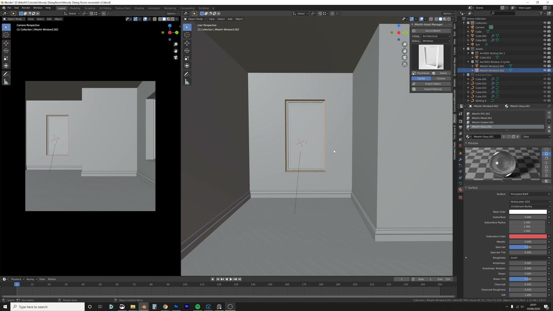
To see it clearly, drop the glass out of the window first and hit render preview. Sunlight floods straight in through the empty frame, exactly as you'd want. Now slide the glass pane back into place. The sun is gone. The shaft of light that should be lying across the floor has vanished, and the room is back to flat ambient.
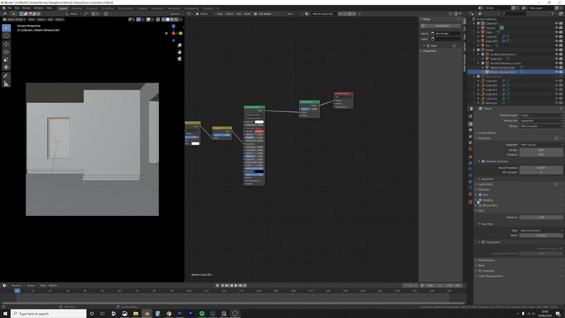
For architectural windows you don't really want full refraction anyway. What sells a glass pane in archviz is the reflection, not the bending of light behind it. Other renderers ship a dedicated thin-glass shader for exactly this case; in Blender you build the equivalent yourself, and the node graph is shorter than it sounds.
Light Path + Transparent BSDF fix
Open the Shader Editor with the window glass selected and switch the viewport to render preview, so you can watch the fix land in real time.
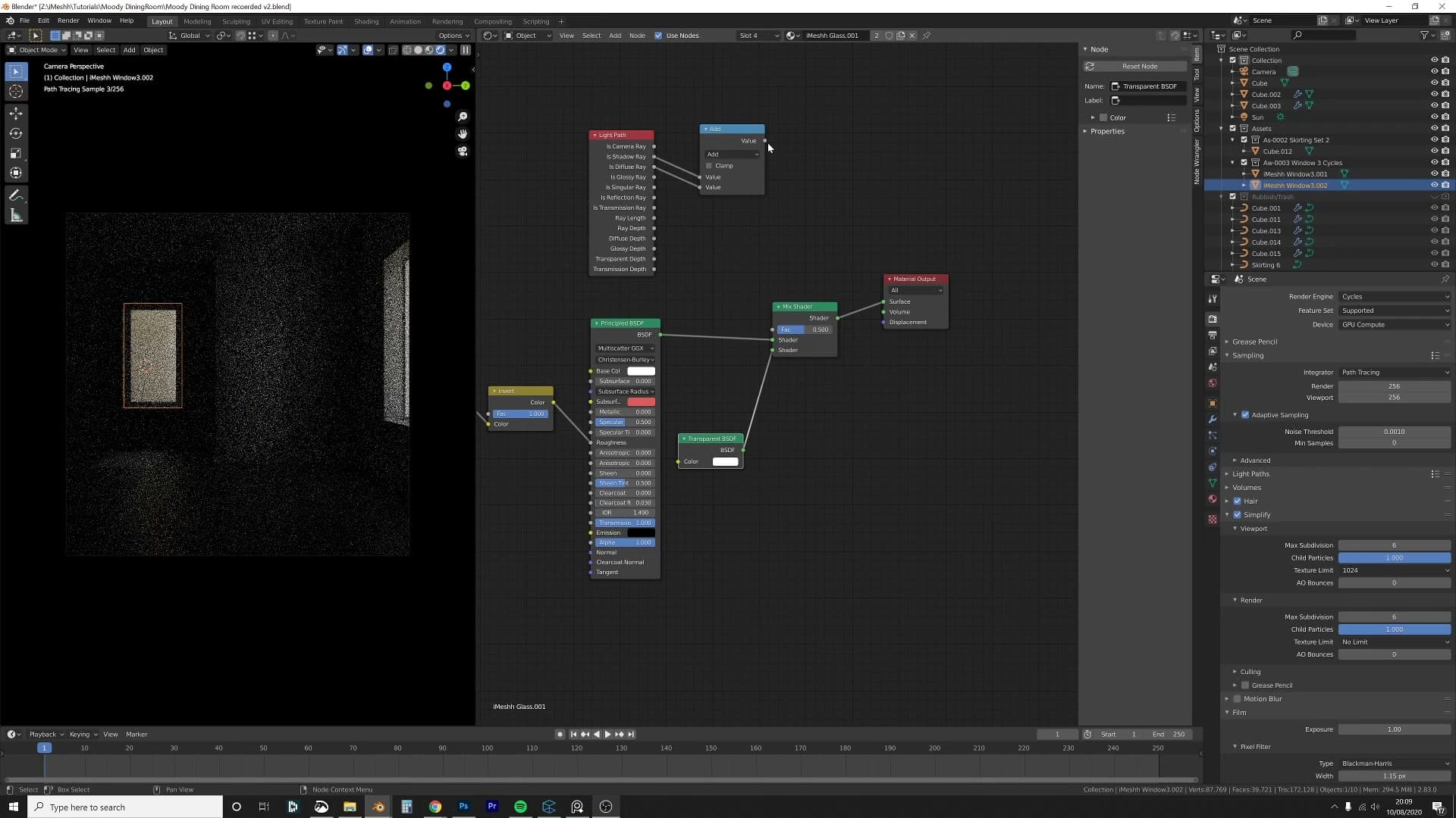
Add a Mix Shader, a Light Path node, a Math node and a Transparent BSDF. Set the Math node's operation to Add, then plug Is Shadow Ray into its first input and Is Diffuse Ray into its second. The Math output becomes the Mix Shader's factor.
Wire your original glass shader into the Mix Shader's first slot and the Transparent BSDF into the second. The rule the graph encodes is simple: any ray that's a shadow ray or a diffuse ray treats the glass as transparent and passes straight through. Everything else (camera rays, glossy rays) still hits the glass as glass.
Render preview should now show sunlight back on the floor, the pane still reflecting cleanly, and no spurious shadow being cast onto the room interior. That is exactly right for an architectural window anyway.
Wobbly fluted privacy glass with the Array modifier
The hero detail: a fluted privacy-glass screen built from a plane, a sphere-projected face, an Array modifier and a Solidify pass. The kind of glass that diffuses light beautifully without showing what's behind it.
Recessed window frame with extrude Alt+S
The reference shot you've been working from has a small fluted privacy-glass panel built into a slim sliding-door frame. This is the kind of glass that diffuses sunlight into soft vertical bands without revealing what's behind it. That's the detail you're about to build, and it starts with the frame itself.
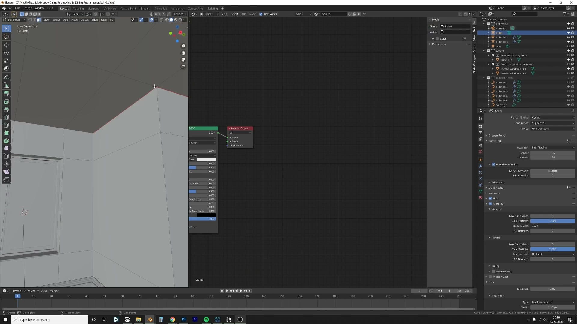
Before the frame goes in, drop a slim lintel into the wall above the opening. Add a horizontal loop cut across the wall, slide it where you want the trim to sit, switch to face mode (3) and push the new strip upward. Duplicate the edges of that strip downward and separate the result into its own object so you can keep working on it without disturbing the wall. A couple of extra loop cuts and a light bevel on the visible edges shape it into a small architectural moulding. Viewers only see a slice of it through the camera, so don't over-invest.
For the frame, switch to front view and add a cube. Scale it to fill the window opening, then apply the scale with Ctrl+A → Scale before doing anything else (an unapplied scale ruins every modifier downstream). Tab into edit mode and push the depth in until the cube is as thin as you want the frame to read. Select the two large faces (front and back), press I to inset, then F3 → Bridge Edge Loops to cut the centre out. That's a window frame in three operations.
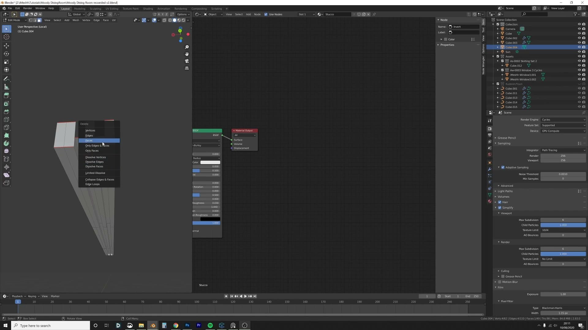
The last step is the recessed channel that holds the glass. Add a horizontal loop cut around the inside of the frame, press Ctrl+B to bevel it into a thin parallel pair (giving you a slim strip face), then with the strip still selected press E to extrude and immediately Alt+S to push the new face inward along its normals. The first attempt may scale uniformly instead of along the surface. If so, constrain the move to the Y-axis. You now have a recessed slot inside the frame, exactly where the wobbly glass will sit.
Plane with a sphere face for the flute
Fluted glass is just one ridge repeated dozens of times. Build one ridge cleanly and the Array modifier handles the rest, so the whole task here is making a single convincing flute on a single plane.
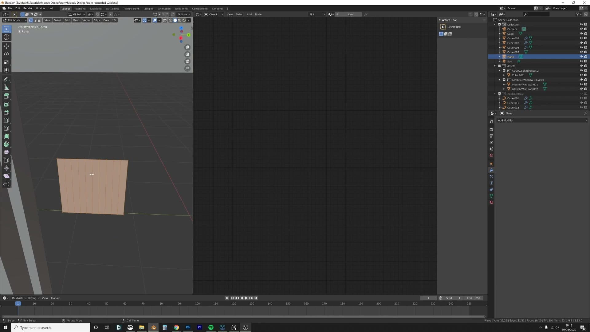
Add a plane (Shift+A → Plane) and scale it down to roughly the height of the window opening. Tab into edit mode, then press Ctrl+R and scroll the mouse wheel to drop in about nine evenly-spaced vertical loop cuts. You're carving the plane into thin strips so that one of them (the middle strip) can bulge outward into a curved ridge.
Select the centre face. Run Mesh → Transform → To Sphere (shortcut Shift+Alt+S) and scroll the middle mouse wheel to roll the factor up. The flat face inflates into a smooth half-cylinder ridge. That single ridge is the flute. If it feels too tall, scale it down on the X-axis to narrow it.
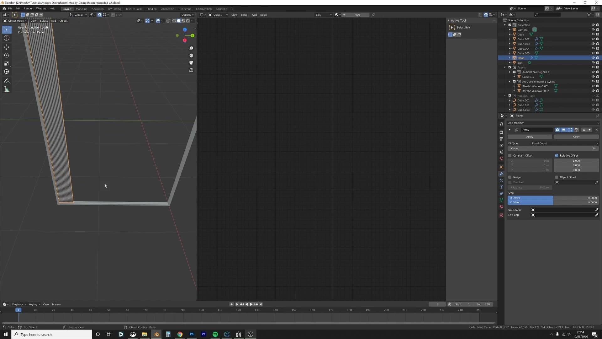
Position the plane against the recessed channel you carved inside the frame. G → X slides it horizontally; press Shift+Tab to enable snapping if you want it to lock cleanly to the slot. One flute in place, ready to be multiplied.
Array + Solidify for wobbly glass thickness
With the flute built, two modifiers do the rest of the work. Add an Array modifier and push the count up. Blender copies the flute horizontally until the chain spans the full window width. The wobble effect appears immediately: a clean repeat of curved ridges across the panel.
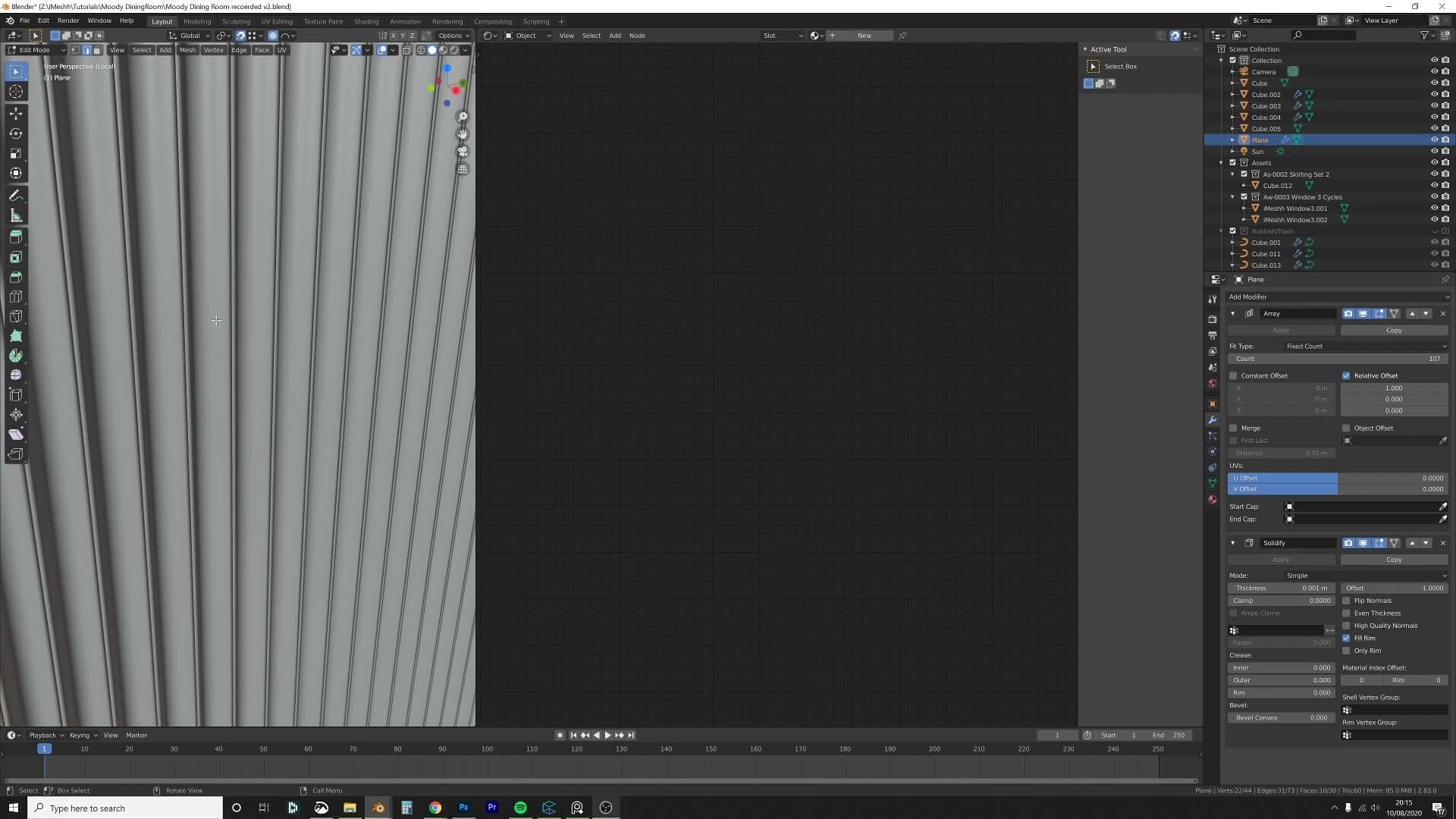
Real glass has thickness, so stack a Solidify modifier on top of the array. Before it behaves predictably, press Ctrl+A → Scale to apply the plane's scale (otherwise Solidify reads the thickness value relative to the wrong base and comes out wildly off). Dial the thickness down to something subtle. The panel should read as glass, not as a slab.
Shade the panel smooth. You'll almost certainly see a soft gradient running across the surface. This is a common Blender smooth-shading artefact on flat geometry where edge loops are too far from the corners. The fix is one extra loop: press Ctrl+R to add a horizontal loop cut near the top, then Ctrl+B to bevel it slightly. The gradient snaps back to a clean flat surface as soon as the corner tightens.
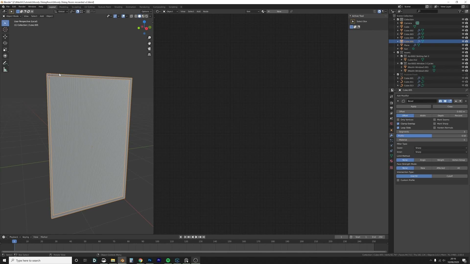
Tick the Array modifier's Merge option so neighbouring flutes weld together cleanly, then add a tiny bevel (around 0.0002) to soften the front edges. Finish with a quick UV unwrap; this glass won't get heavy texture work, but unwrapping now means a roughness map or normal map can hook on later. Roughness tends to read more obviously than normals at middle and far distances, while normal maps come into their own up close. For a surface like this, add at least one of the two.
Bottom runner wheel detail
A nice piece of architectural sleight-of-hand: even though the camera will never see the top or bottom of this panel directly, viewers subconsciously expect a fluted door like this to slide on a runner. Suggesting one (just a hint of mechanical hardware at the base) sells the architecture. The wheel itself can be crude.
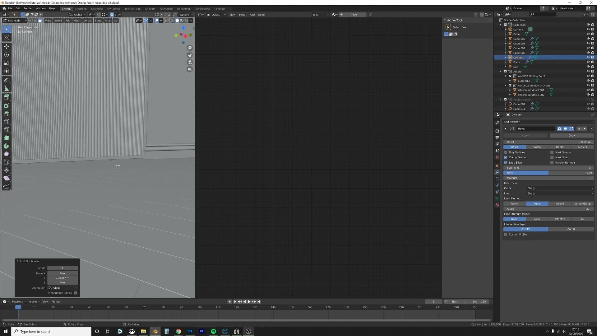
Hold Shift+Right-click near the base of the frame to drop the 3D cursor there, then add a cylinder. Rotate it 90° on the X-axis so it lies on its side like a tiny runner wheel, then scale it down so it tucks neatly inside the frame's underside. It's fine if part of it pokes through. That section will be hidden inside the wall.
In edit mode on the front cap, run an I → E → I → E pattern (inset, extrude, inset, extrude) to carve a couple of concentric rings into the wheel face. It only needs to read as "something mechanical" from across the room.
Apply the scale with Ctrl+A → Scale (without this, the bevel and smooth-shading steps misbehave), then shade smooth, enable Shade Auto Smooth and pull the angle a touch lower than default so the rings stay crisp while the cylinder body softens. A small bevel on the visible edges finishes it.
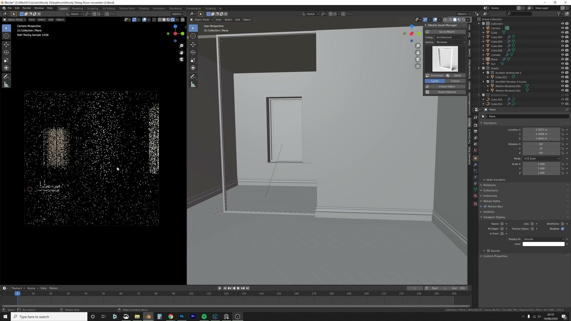
Duplicate the wheel along the Y-axis with Shift+D, drop it further along the runner, then press Shift+R to repeat that duplicate-and-move action. Two or three taps seeds the whole base with evenly-spaced wheels.
Finally, push the entire assembly (frame, glass and runner) slightly into the wall so the top edge disappears behind the plaster. Viewers will assume there's a track and a header hidden up there; you never have to model any of it. Copy the existing iMeshh Glass material across to the wobbly panel, then switch its Object Properties → Viewport Display to Bounds so you can see through the geometry while you carry on working. A quick test render confirms the effect: the flutes catch the sunlight and scatter it into soft vertical bands across the room. Privacy glass behaving exactly like privacy glass.
Accent back wall and ceiling runners
Slat-style ceiling runners built with a single cube and an Array modifier. Apply the array before unwrapping so each slat shares one UV island, then desaturate the wood with a Hue/Saturation node so it sits behind the foreground without competing.
Cube + Array modifier for the slat runners
Time to add the slat runners that sit across the ceiling. The build is the same simple workflow as the other trim pieces: start with Add > Mesh > Cube and press numpad . to zoom the viewport onto it.
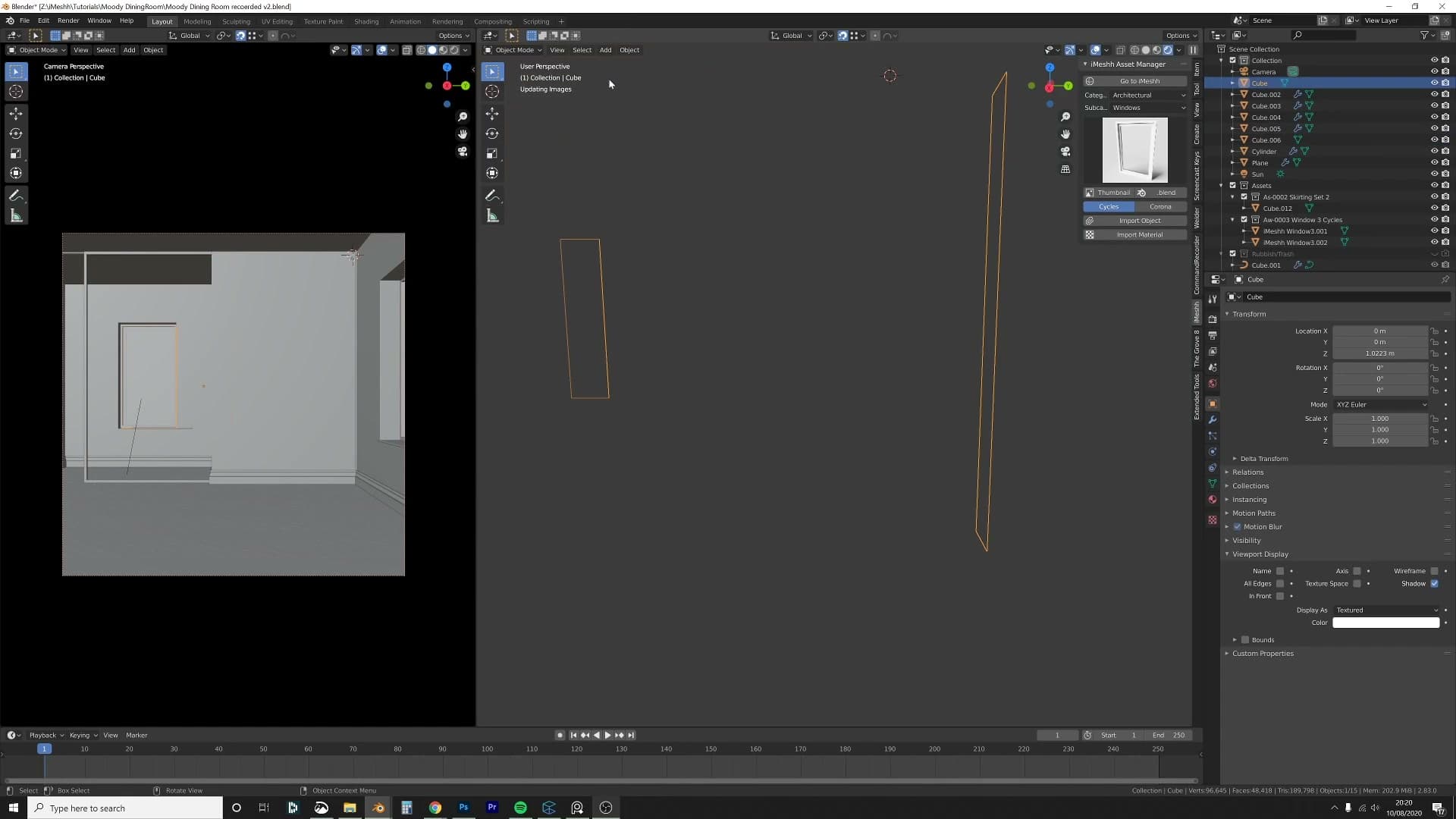
Before scaling it down, mark seams on the faces you'll actually see and unwrap that subset. There's no point unwrapping the hidden faces. Turn snapping on with Shift+Tab, snap the cube up against the underside of the ceiling, then scale it down into a thin slat profile and nudge it closer to the wall.
Add an Array modifier and bump the count up until the copies march all the way across the ceiling. That single cube + array combo is the entire runner.
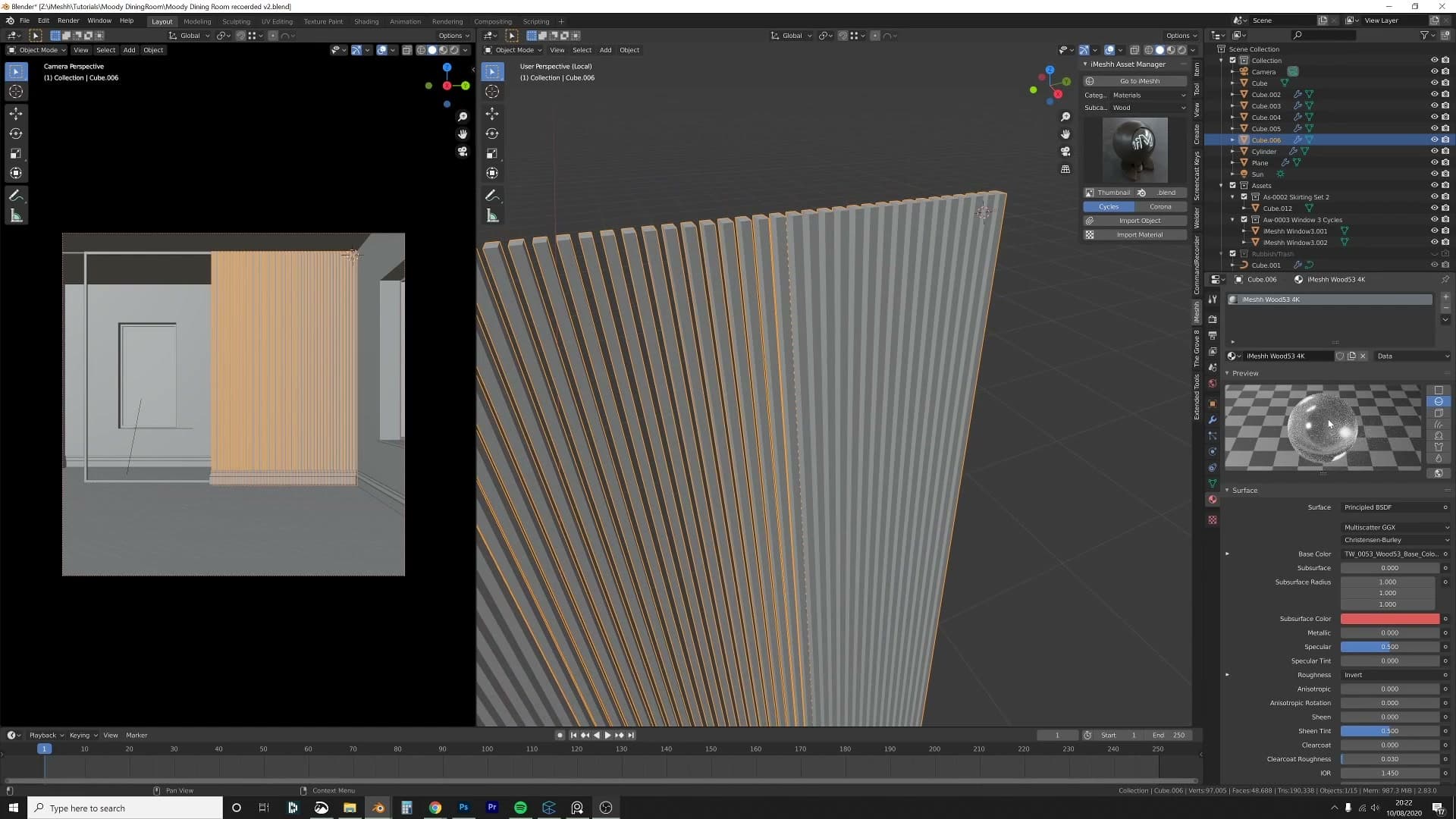
The slats clash with the front-wall skirting once they reach the edge. Drop into edit mode on the skirting, select the faces that overhang, turn snapping off, and slide them inward along the X axis so the runners pass cleanly.
Applying the array before unwrap
Apply a wood material to the slat. I use Wood 53 from the iMeshh library, a dark plank texture. Switch to material preview and you'll see the wood looking scrambled across the runners because the original cube was never properly unwrapped.
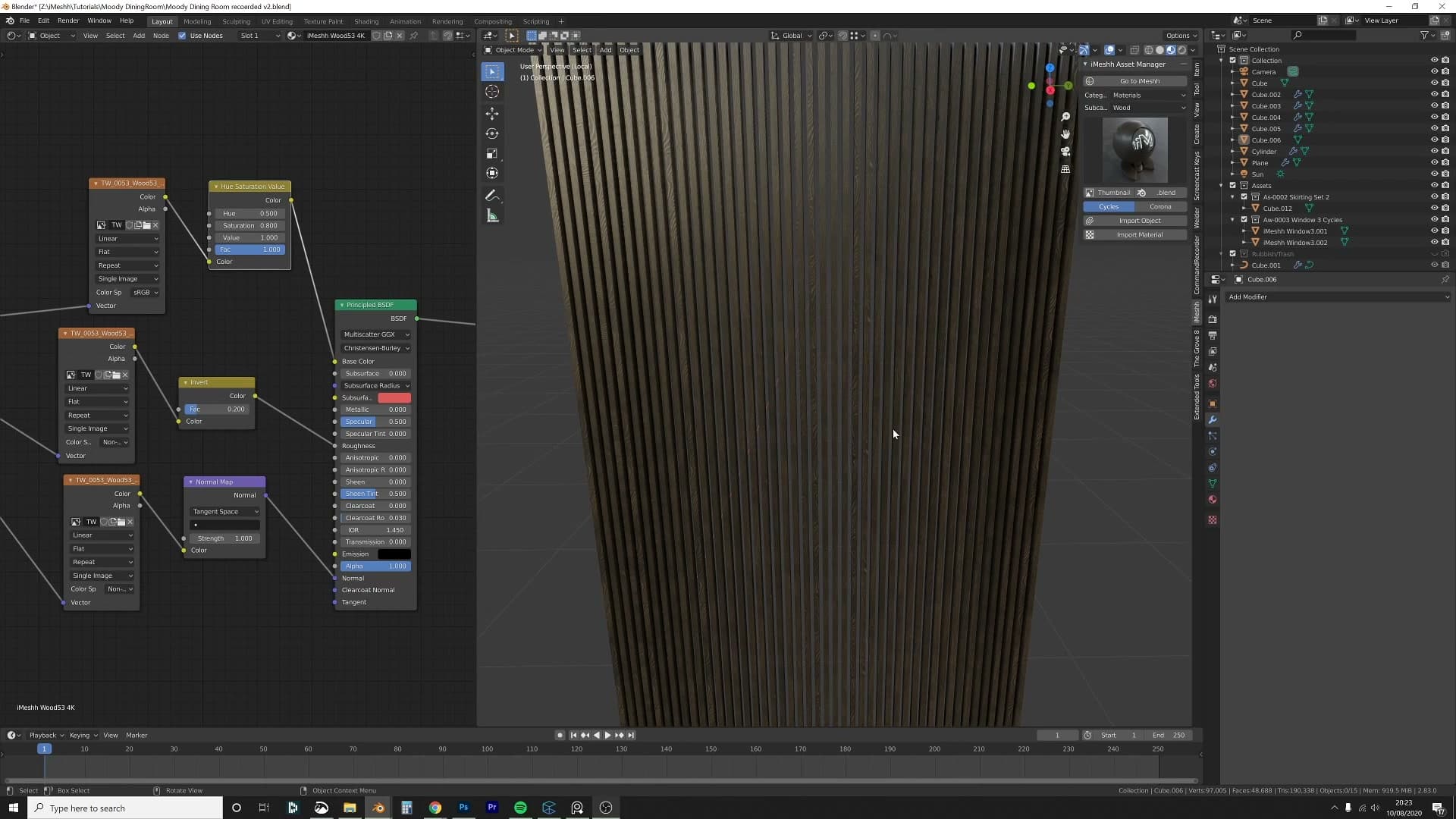
Here's the catch with arrayed geometry: while the Array modifier is still live, every copy shares one source mesh and therefore one set of UVs. If you unwrap now, every slat ends up wearing the exact same island, which is fine for some materials but usually leaves the wood grain looking obviously repeated. To give each slat room for variation you have to apply the array first.
Apply the Array modifier, press U and unwrap the whole object. Open the UV editor and you'll likely see half the islands rotated 90° to the others. That's a sign you forgot to apply the cube's scale before unwrapping.
Apply scale, unwrap again, and the islands come out consistent. Rotate them so the wood grain runs vertically down the length of each slat, then scale the UVs up roughly 5× so the grain detail reads at runner size rather than as a single muddy stretch.
Desaturating wood with a Hue/Saturation node
The wood comes in a touch warmer than the rest of the room wants. Open the shader editor, drop in a Hue/Saturation node between the texture and the output, and pull Saturation down to around 0.8. That's just enough to cool the slats so they sit behind the dining-table palette without fighting it.
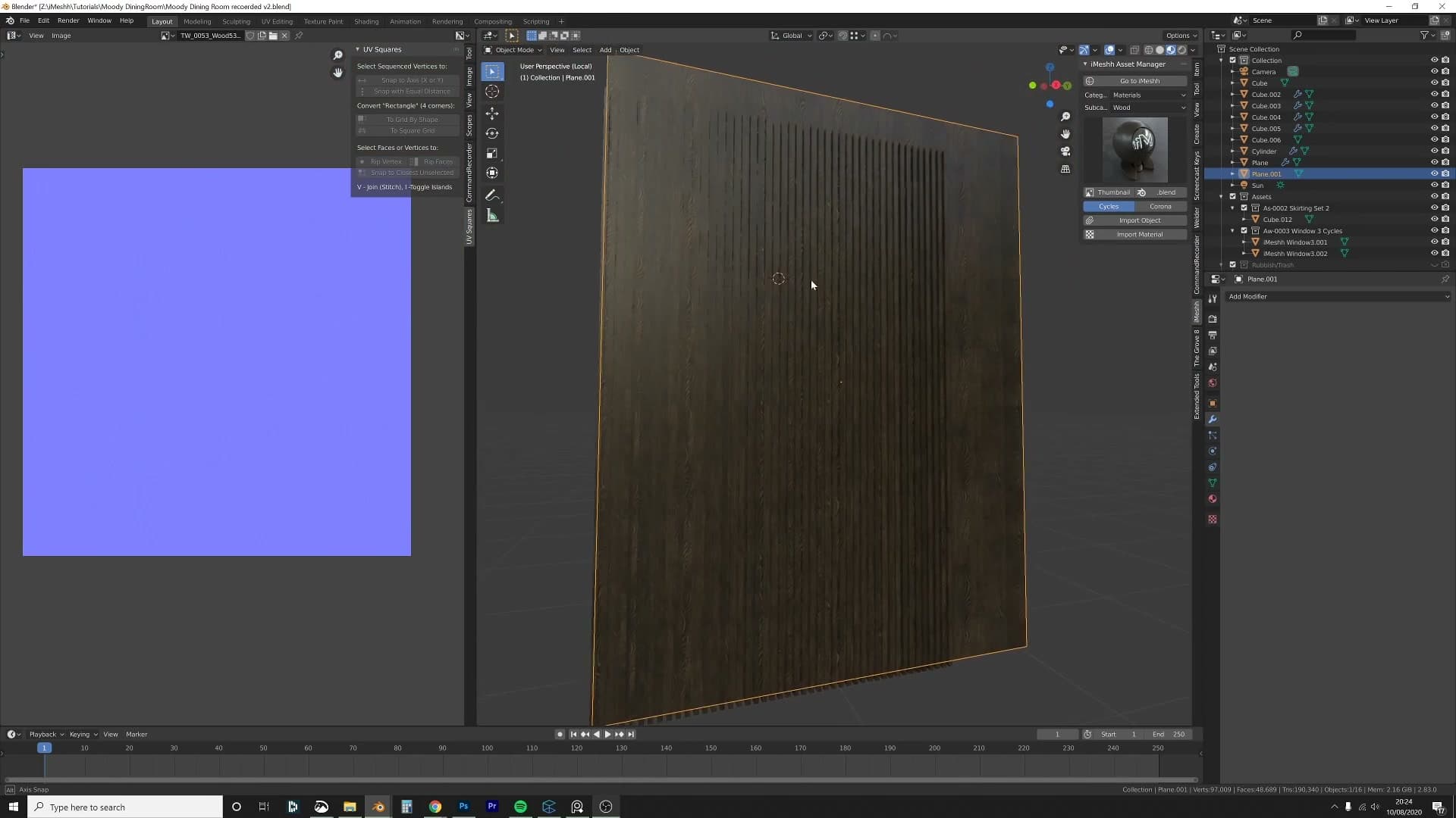
While you're still on the wood, build the back wall that closes off the scene behind the runners. Add a plane, apply its scale, unwrap it, and assign the same wood material. An earlier version of this scene used a stripey light/dark/light pattern across the back which didn't read well, so this time the whole back wall goes one consistent dark tone.
If the texture lands rotated, drop into the UV editor and rotate the island 90°. The back wall barely shows in the final frame, so a perfectly tuned tile isn't critical here.
One last tidy: the plaster normal map is reading a little strong now that the dark wood is sitting next to it. Bring its Strength input down so the two surfaces sit together calmly, and the room is ready for assets.
Lee Broom-style lamps, table and dining chairs
Place hero lighting and seating: emission-globe pendants with a spherical-mapped colour ramp, the dining table, and four chairs duplicated around it using Alt+D for linked-data instancing.
Lee Broom-style emission globe lamps
The pendants hanging over the table are nods to Lee Broom's globe lighting. You can build one from scratch in a couple of minutes, but I already had a pair in another project, so they're pasted in here rather than remade on camera.
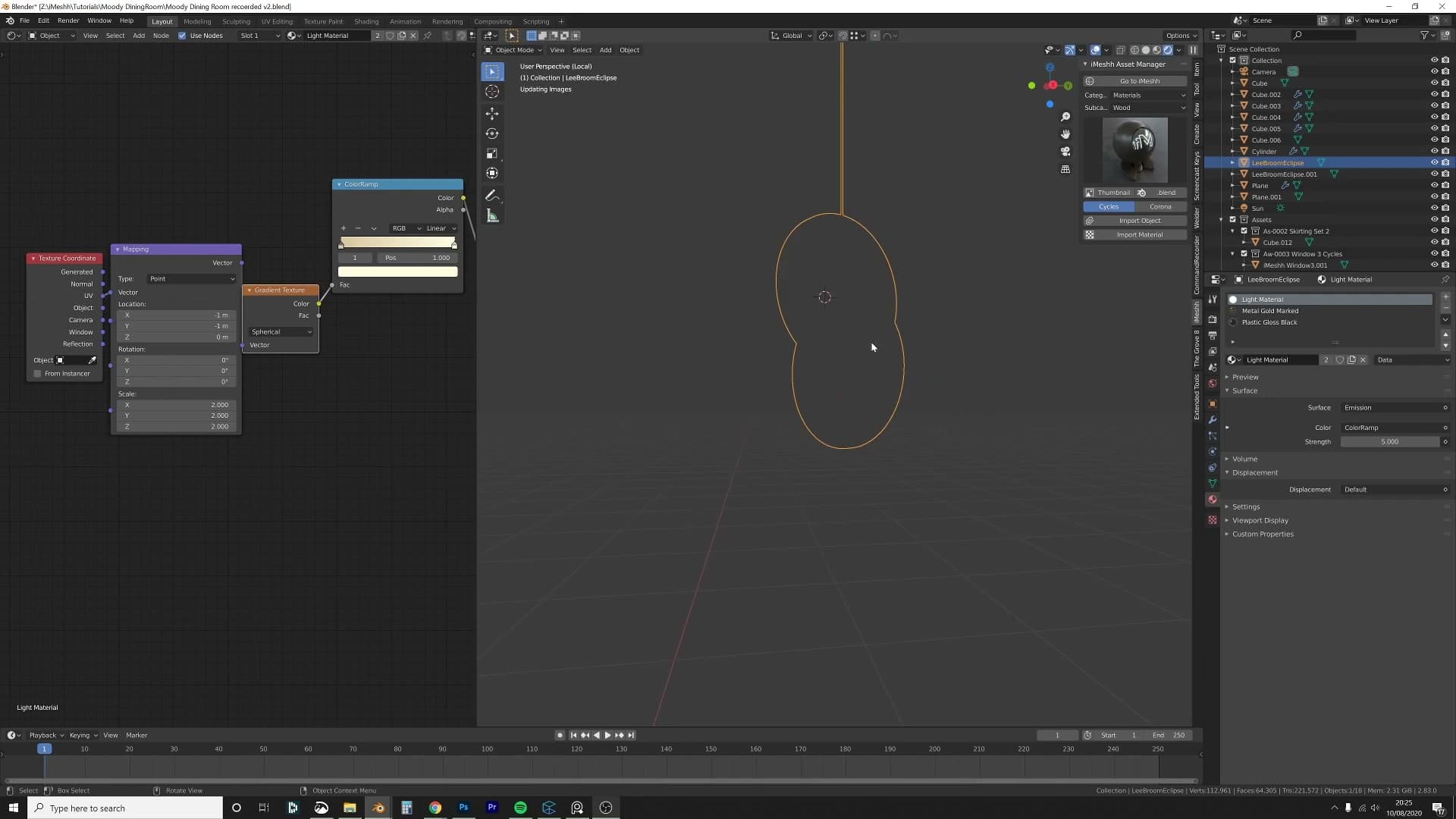
The glow comes from a simple emission setup wired through a colour ramp. Add a light material to the glass sphere, then in the UV editor unwrap it so the generated gradient circle fills the whole UV island. In the Image Texture node, switch Vector from UV to Generated and set the Projection to Sphere so the gradient wraps around the globe instead of stretching across it.
Out of the box the gradient sits oddly off-centre and you can't see anything in the rendered viewport. The fix is to add a Mapping node before the texture and push the Location X and Y to -1, -1. That offsets the projection so the bright disc lands dead-centre on the front of the bulb.
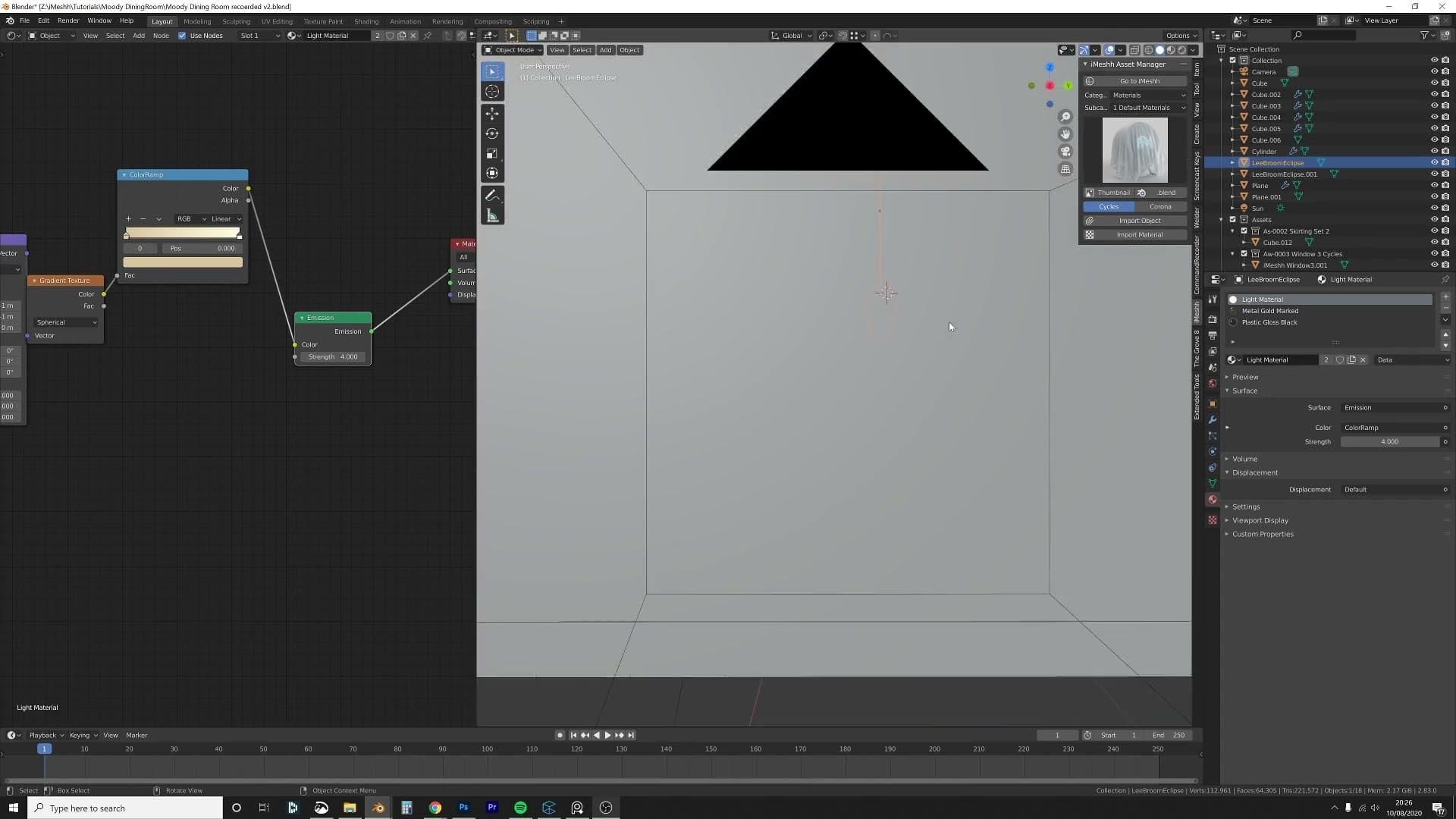
The brass cup around the globe uses one of iMeshh's free shop materials. Gold Metal Marked, found under the Free Materials category on the left of the storefront, is slightly rough, which I flag as a concern, but at this distance it reads fine in the final render.
Drop a ColorRamp into the emission chain to tint the gradient, and crank the Emission Strength up to around 4 so the falloff is actually visible inside the glass. With that done, position one pendant over each end of the table.
Importing the dining table
From this point on every prop is pulled from the iMeshh library through the Asset Manager. The subscription bundles the full catalogue plus the new releases that drop each month (see the pricing section below for current tiers), and the rest of the scene is built entirely from those assets so you can follow along if you're subscribed.
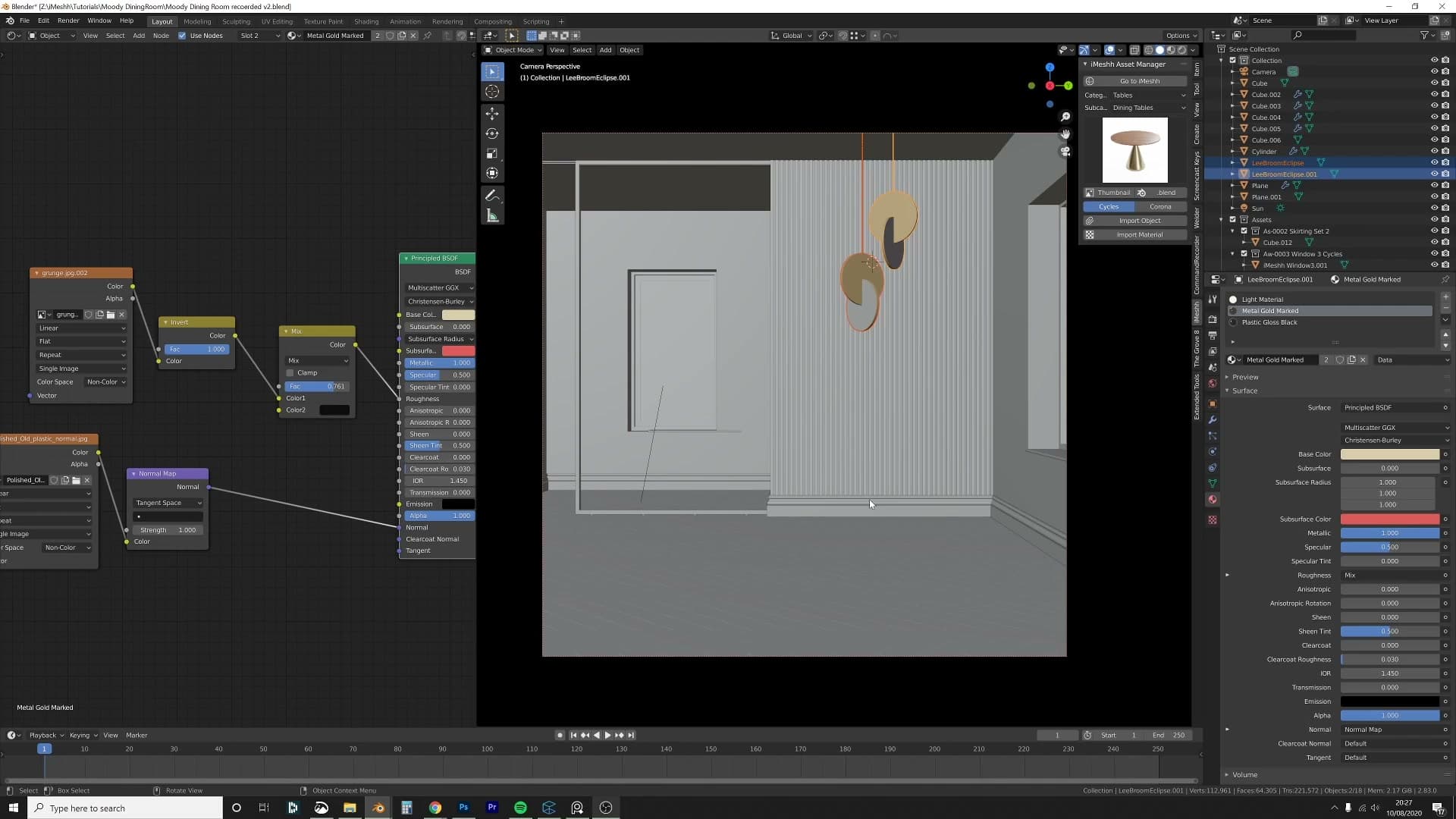
Open the Asset Manager, find a dining table you like, and import it into the scene. Slide it under the pendants and centre it on the rug.
Looking at the result, the wood top is reading a touch too saturated against the brass and the muted walls. Drop into the table's material, find the wood top's colour input, and pull Saturation down to roughly 0.8. That's enough to stop the wood competing with the lamps without making it look grey. Save the file before you go any further.
Alt+D chairs rotated around the table
Open the Asset Manager again and bring in a chair. I had one preselected from the iMeshh chair category. Drop it next to the table and snap it to the floor.
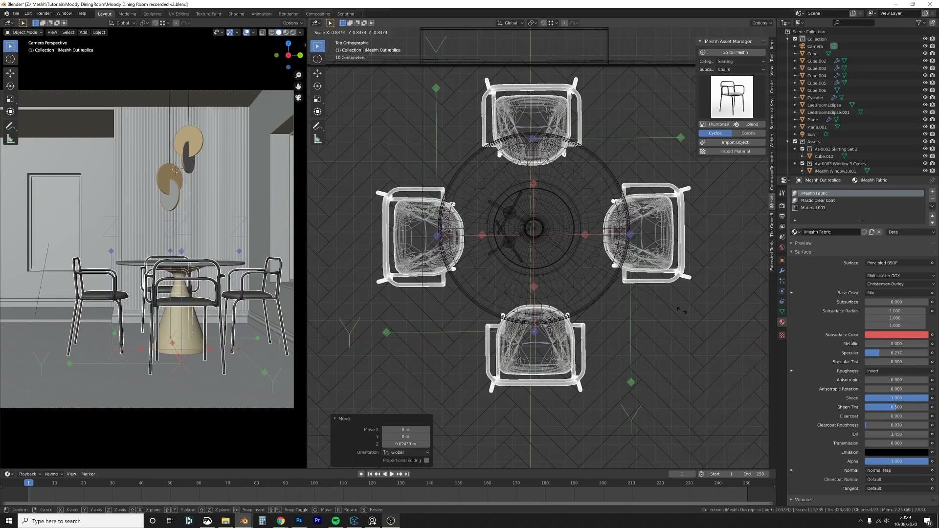
Now the trick that keeps render times sane when you need multiples of the same prop. With the chair selected press Alt+D instead of Shift+D. The visible difference is that the new chair has the same name with a .001 suffix. The invisible difference is that both chairs share a single mesh data-block. At render time Cycles only has to evaluate that geometry once for every instance pointing at it, which roughly halves the memory the chairs cost on disk and in VRAM.
Select both chairs, hit Alt+D again, then R 90 straight after the duplicate to spin the new pair through ninety degrees. You now have four chairs arranged around the table, all sharing one mesh.

Drop into front view to check the spacing. The chairs end up sitting a little far from the table, so you want to pull them inward in unison without spinning them around the scene centre. Open the Pivot Point menu (the dot icon next to the transform-orientation dropdown, or press .) and switch it to Individual Origins. Now scaling the selection brings each chair toward its own origin and they all slide tidily closer to the table rather than collapsing into one another.
Set the pivot back to its default once you're done so the next rotate or scale doesn't surprise you.
Dinnerware, books and foreground pampas
Drop in a full dinnerware set, unparent decorations with Alt+P, scatter books on the window seal, then add a pampas-grass plant in the extreme foreground to layer the composition into background, mid-ground and foreground.
Dinnerware set with Alt+P unparent
With the chairs in place, drop in a full dinnerware set from the iMeshh Asset Manager. Open Dining and then Dinnerware. These are previews of sets that ship as complete arrangements rather than loose pieces, so you don't have to hunt for plates, glasses and cutlery one at a time.
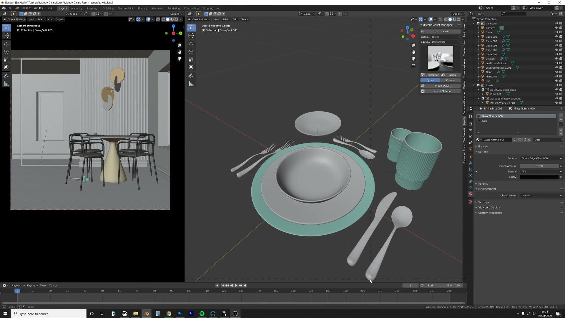
Click Import Object on the set you like, then nudge the whole arrangement onto the table. Every piece is parented to a single handle, so one Grab moves the entire setting (plates, glasses, cutlery, candle holders) as a single block.
A few pieces in the imported set might not be the ones you want. To swap or delete individual items without losing the layout, select them and press Alt+P, then choose Clear and Keep Transformation. Each piece holds its current position but is now independent, so you can delete the wrong cups, slide a plate sideways or hide a setting that's blocking the camera.
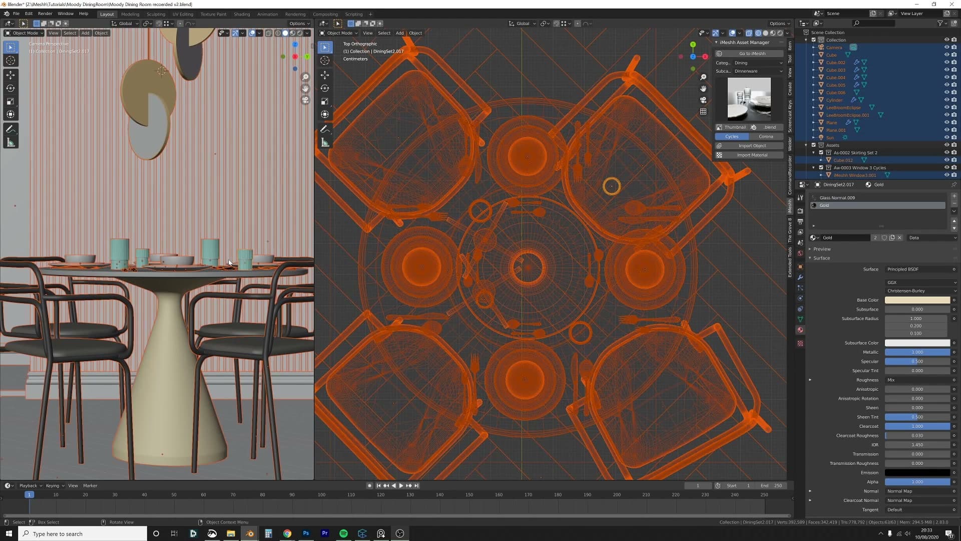
Cover the rest of the table with linked duplicates so memory stays light. Select the whole set, press Alt+D and rotate 180° to mirror it on the opposite side, then Alt+D again at 90° for the remaining two sides. Four copies meeting in the middle will overlap. Delete the duplicate cups and swap a plate or two between settings so the arrangement reads as a hosted dinner rather than a perfect rotation.
Plant on table, books on the window seal
Open Plants in the library and bring a small dark plant down onto the table. Scale it to a sensible size for the centrepiece, small enough that the dinnerware still dominates.
A second plant in the same spot would normally read as obvious copy-paste. Instead, press Alt+D, then Y to constrain the linked duplicate along the table's long axis, rotate it freely and scale it down a touch. The silhouette differs just enough that the eye doesn't recognise the same model twice.
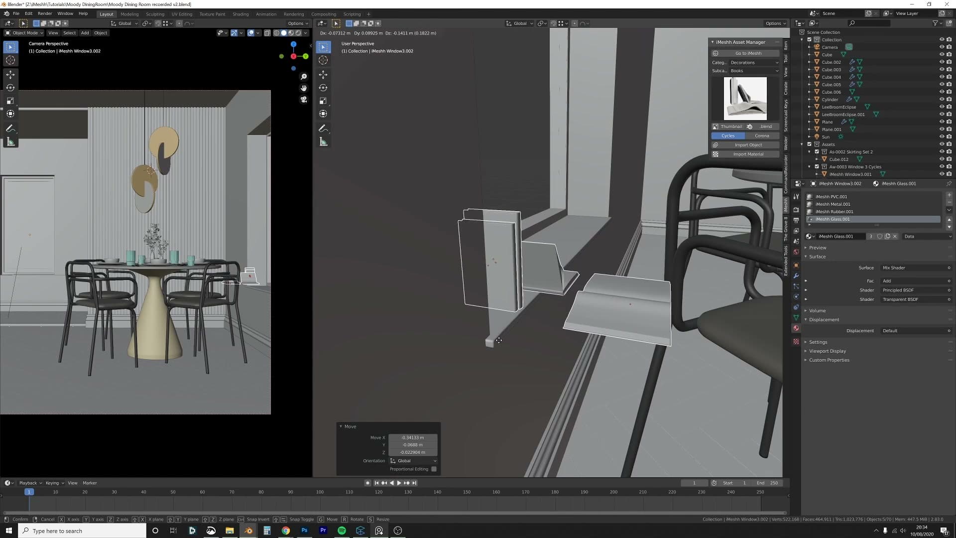
Books on the window seal come next. The reference image had stacks of books resting on a deep window frame, and that single detail is part of what gave the original photograph its lived-in feel.
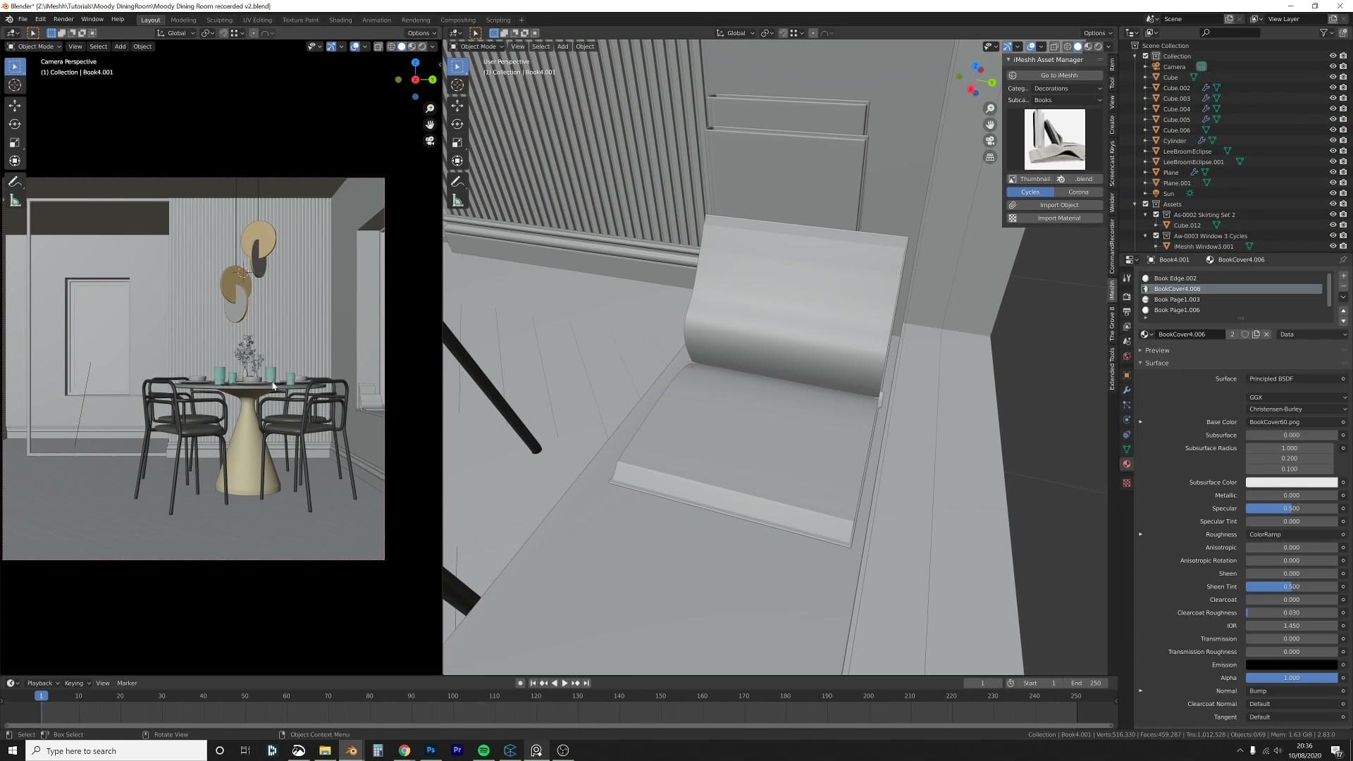
Open Decorations and import a book. The iMeshh books and magazines are deliberately not perfect rectangles. The magazines have a slight bend in the cover, the books carry small irregularities in the spines, so a stack of them reads as paper rather than a row of cardboard boxes. Spend enough time with the covers and you may also spot a few hidden jokes printed on the spines.
Stagger three or four books along the seal. Because the room is going to render dark, deliberately push the darker book to the front and keep the lighter spines toward the back. That way the foreground silhouette stays grounded and your eye doesn't snag on a bright spine cutting across the shot.
Daybed as a back-room silhouette
With the front of the scene populated, drop a daybed (an unreleased iMeshh preview) into the back portion of the room. Rotate it 90° so it sits along the back wall and nudge it up so the legs land cleanly on the floor. The piece is leather with a contrasting wood frame: a clean silhouette that still reads as "another room" once the fluted glass goes in front of it.
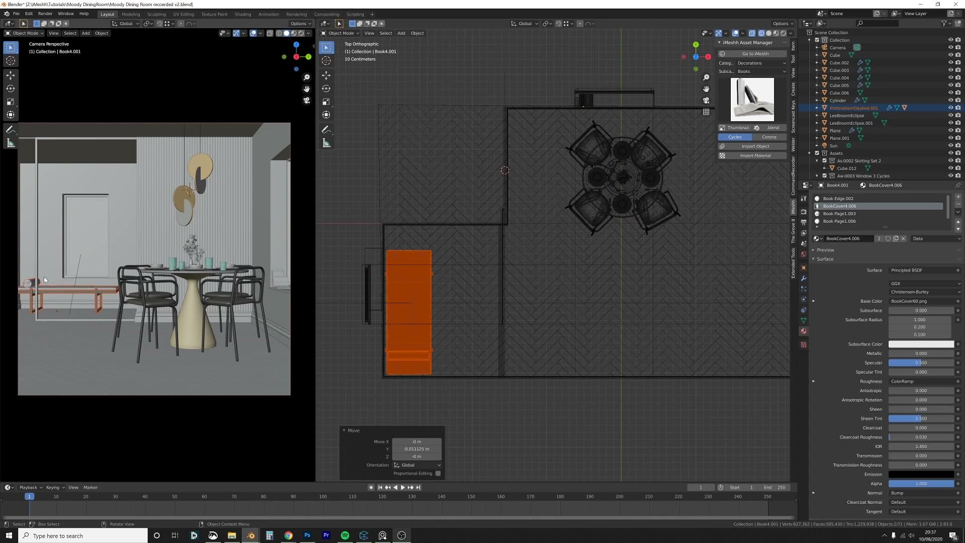
The daybed is doing a deliberate compositional job. Good interior shots usually break depth into three layers: background, mid-ground and foreground. The daybed is your background (something the viewer half-sees through the fluted glass), the dining table and chairs are your mid-ground, and the foreground is the empty patch closest to camera that gets filled next with something soft and blurry.
Before moving on, soften the wall corners with a quick Bevel modifier ("otherwise you'll cut your fingers just touching the wall"). Add Bevel to the wall, pull the width right down and leave the segment count at 2. The corner now catches a thin highlight rather than reading as a paper-thin cut, and the wall's normal map handles the rest of the surface variation.
Studio sunlight: the sun-as-softbox technique
The unusual choice at the heart of this render: a single Blender sun, treated like a studio strobe through a softbox. Use an off-camera bounce-card plane to spread the sun's light across the ceiling and you get studio control without the parallax error of area lights.
Sun vs. area light: the parallax problem
With the room blocked out and the camera locked, it is time to light the scene. The technique here is deliberately unusual: a single Blender sun lamp, and nothing else. No HDRI, no area lights, no portals. I borrowed the approach from years of V-Ray studio work, where the goal is to emulate a photographer's setup. Total control over how every shadow falls, with none of the daily lottery of "is the weather going to be good outside today?".
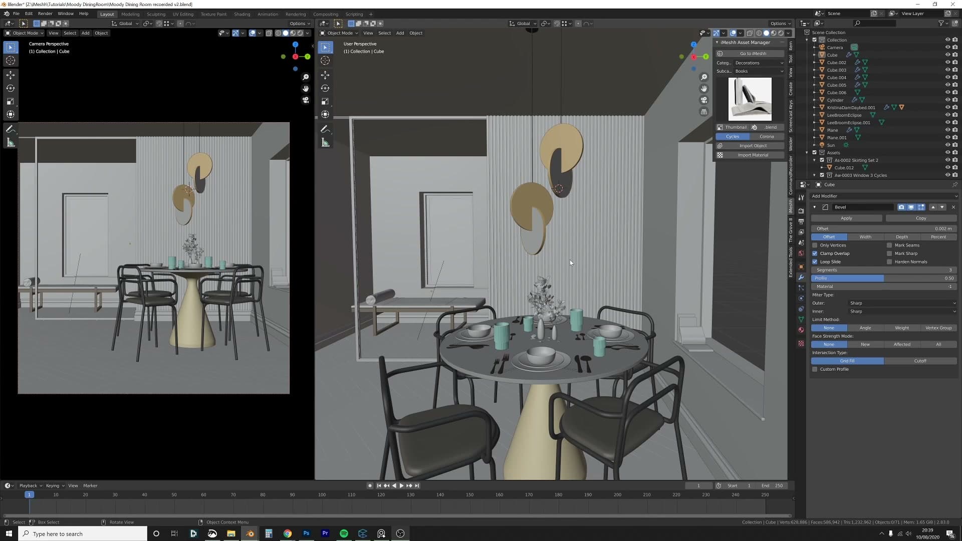
Area lights and HDRIs are both valid alternatives. An overcast HDRI in particular is nature's softbox and will rarely steer you wrong for an interior. But every option here has a quirk, and the quirk with an area light is what makes a sun the more useful tool for this scene.
An area light radiates outward from a finite rectangle. Place it close to two objects in the room and the light leaves the panel at different angles for each one. Shadows splay outward, parallel lines stop being parallel, and you get what is loosely a parallax error. A sun lamp does not have that problem. In Blender it is treated as infinitely far away, so every ray that reaches the scene is parallel. That is a light source you cannot rent in a real studio, and it is exactly what gives this render its long, deep, parallel shadow lines.
First sunlight preview through the wall
Drop a Sun lamp into the scene from the Add menu and rotate it so it points through the window from outside. Before previewing, bring in a couple of placeholder objects (a chair or two from the iMeshh library is enough) so there is geometry for the light to actually bounce off and read against.
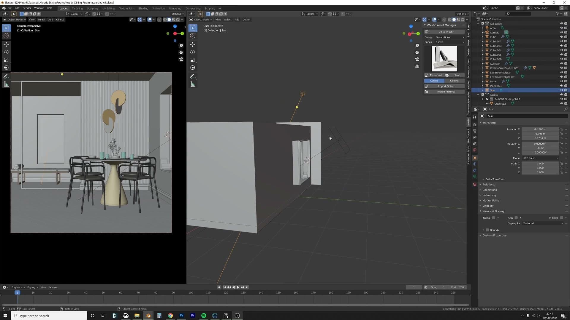
Switch to a rendered viewport and the sun already does most of the work. To see what the sun alone is contributing, disconnect the environment input on the World shader so the scene is lit purely by the lamp. The shadow lines are immediately the deep, parallel diagonals the reference images are built around. The cast shadow from the window frame stretches all the way across the floor without spreading or fanning out.
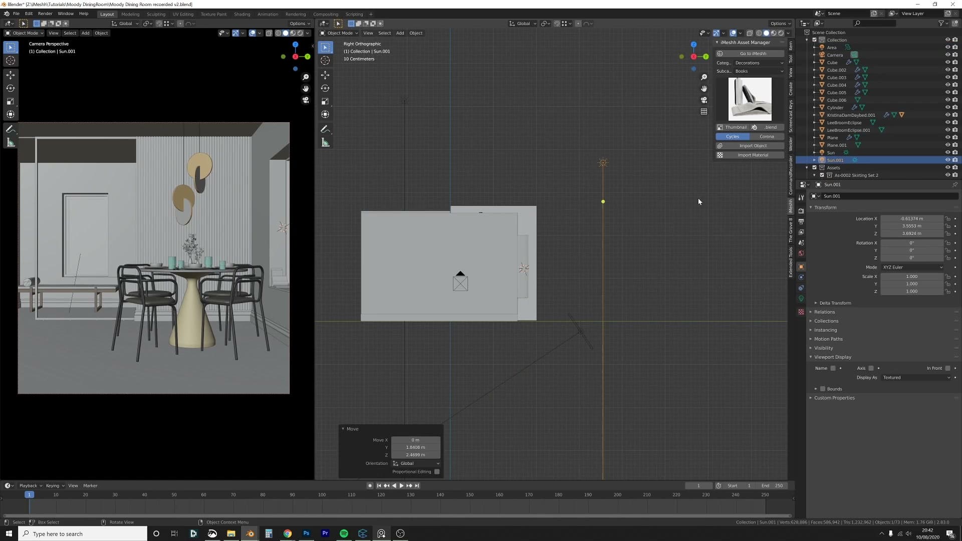
Rotate the sun further and you get a second light source for free. I sweep it round so the same lamp also clips through the back wall, with a small amount falling through the rear window. Because a sun is just a direction, not a position, one lamp can play both "main window" and "back window" with a single rotation. No second light required.
Bounce-card plane to lift the ceiling
On its own the sun gives strong floor light but a fairly dead ceiling. In a real photo studio you would solve that by placing a large bounce card (typically a sheet of mid-grey or white card) just out of frame, so the strobe hits the card and the card lifts the ceiling. The same trick works inside Blender.
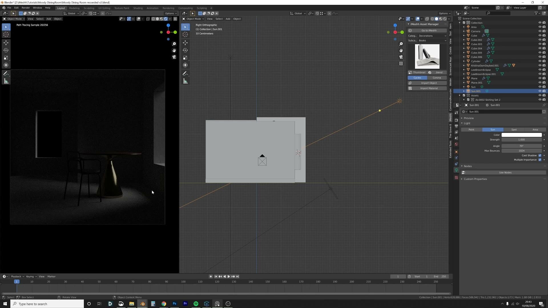
Add a Plane, scale it up generously and position it just outside the camera frame on the wall side. Give it a brand-new material set to a mid-grey base colour, with Specular at 0 and Roughness at 1.0 so it behaves like matte card and not a mirror. Make sure local view is off (or that the plane is included in your local selection) or the bounce simply will not appear in the preview and it looks as though nothing has changed.
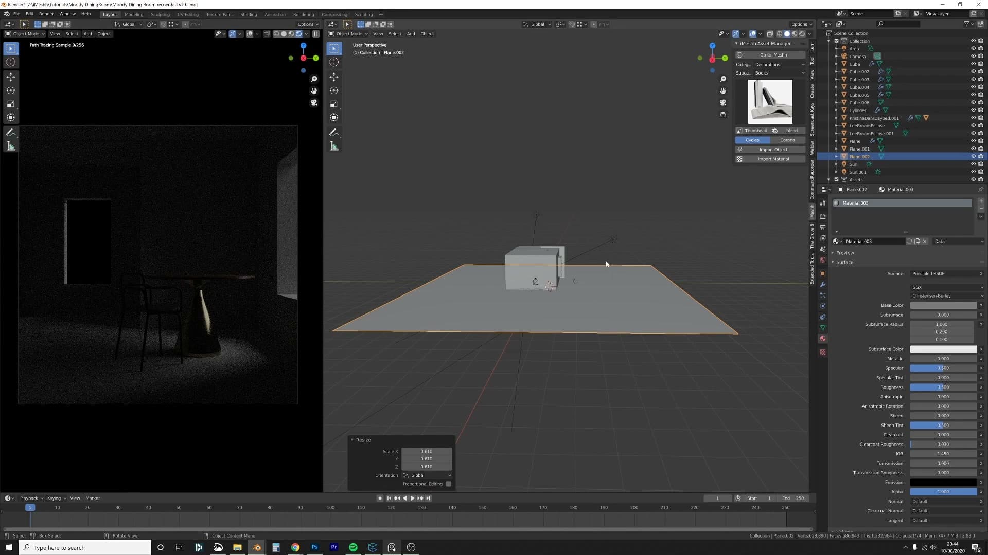
With the bounce card in place the ceiling reads with a soft, even gradient instead of a flat shadow. Slide the plane out of the way and the ceiling drops back into darkness; slide it back in and the room lifts again. That is the entire studio trick: the sun is your strobe and the grey plane is your softbox.
Pushing sun strength for moody contrast
Once the bounce card is doing its job, the last thing the sun needs is more punch. Select the sun and push its Strength up. I land on roughly 10, which is high for a Cycles sun but reads correctly once the bounce card is mediating the highlights.
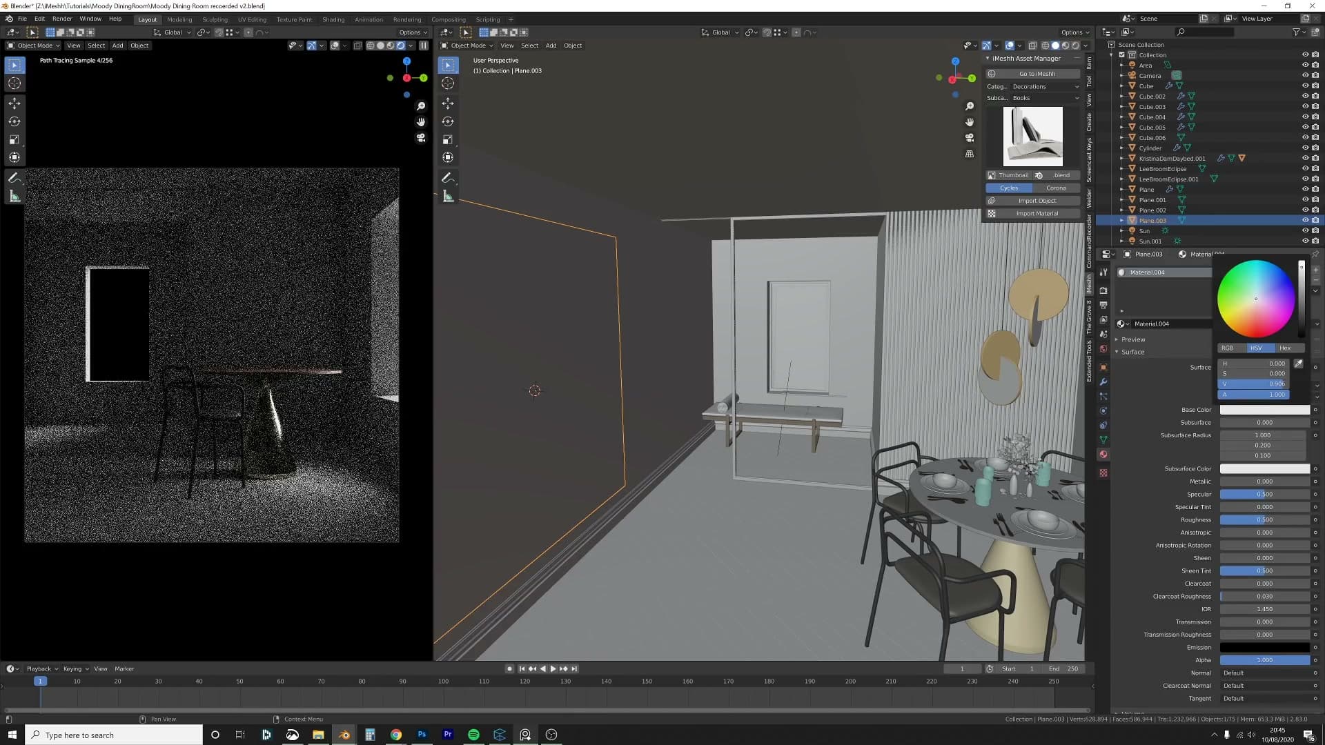
The room snaps into the contrast register of the mood-board references: bright, hard light hitting the floor through the window, a softly lifted ceiling from the bounce, and deep shadow pooling in the corners the sun cannot reach. The whole scene starts to feel like a photographed interior rather than a CGI one, which is the entire point of treating a 3D sun as a studio strobe.
Black backdrop and reflection control
Photographers hang a black sheet behind the subject to soak up bounce light. Replicate it as a plane mixed through Is Glossy Ray so it only appears in reflections. The room gets the contrast without the plane darkening any actual surface.
Comparison without the black backdrop
Before reaching for any nodes, compare the current render to the reference shot. In your version, the back edge of the chair reads lighter than the wall behind it. Bounce light from the white plaster is spilling back onto the chair frame and softening what should be a clean silhouette. The room feels brighter and flatter at the back as a result, which is the opposite of the moody contrast you want.
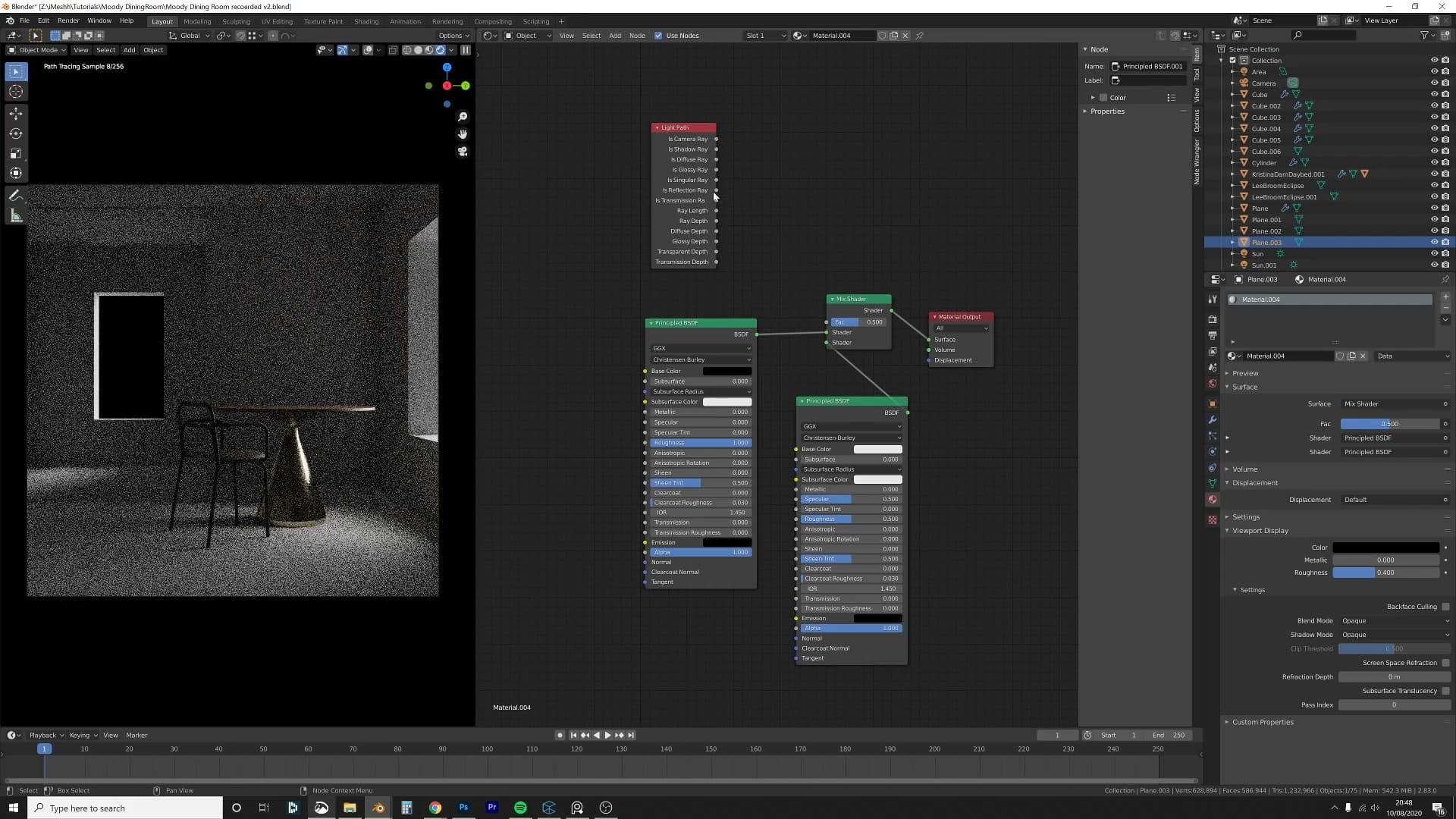
The reference photographers solved this on set by hanging a black sheet behind the subject. The sheet sat just out of frame and soaked up the bounce light before it could return to the chair, crushing the back edge into a clean dark line. You can replicate that idea inside Cycles, but you can't simply drop a black plane into the scene. It would render as an obvious black panel in shot. The next sub-lesson builds a version of the backdrop that only the reflections can see.
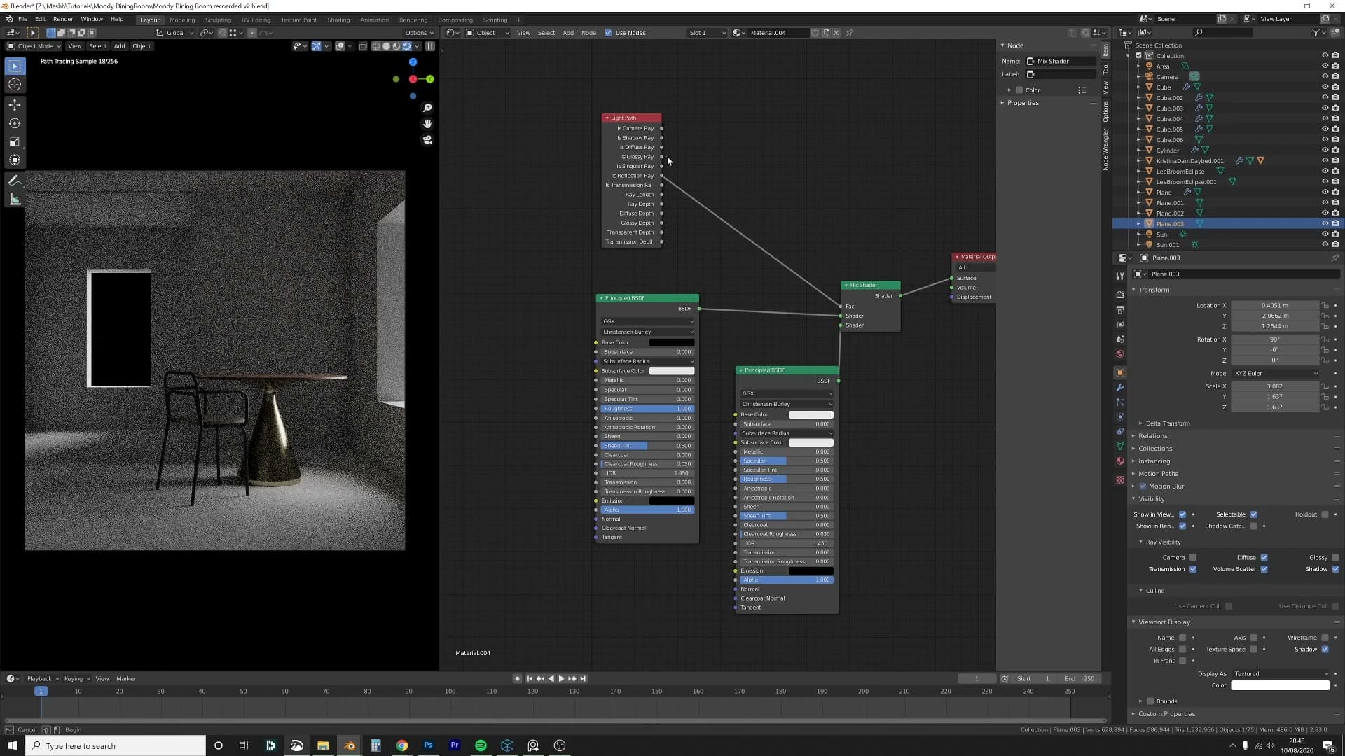
Light Path mix for glossy-only black
Bring the black plane back into the scene and position it behind the camera, roughly where a photographer would hang their flag. Set its Viewport Display colour to black so you can place it by eye in the viewport, then select it and open the Shader Editor.
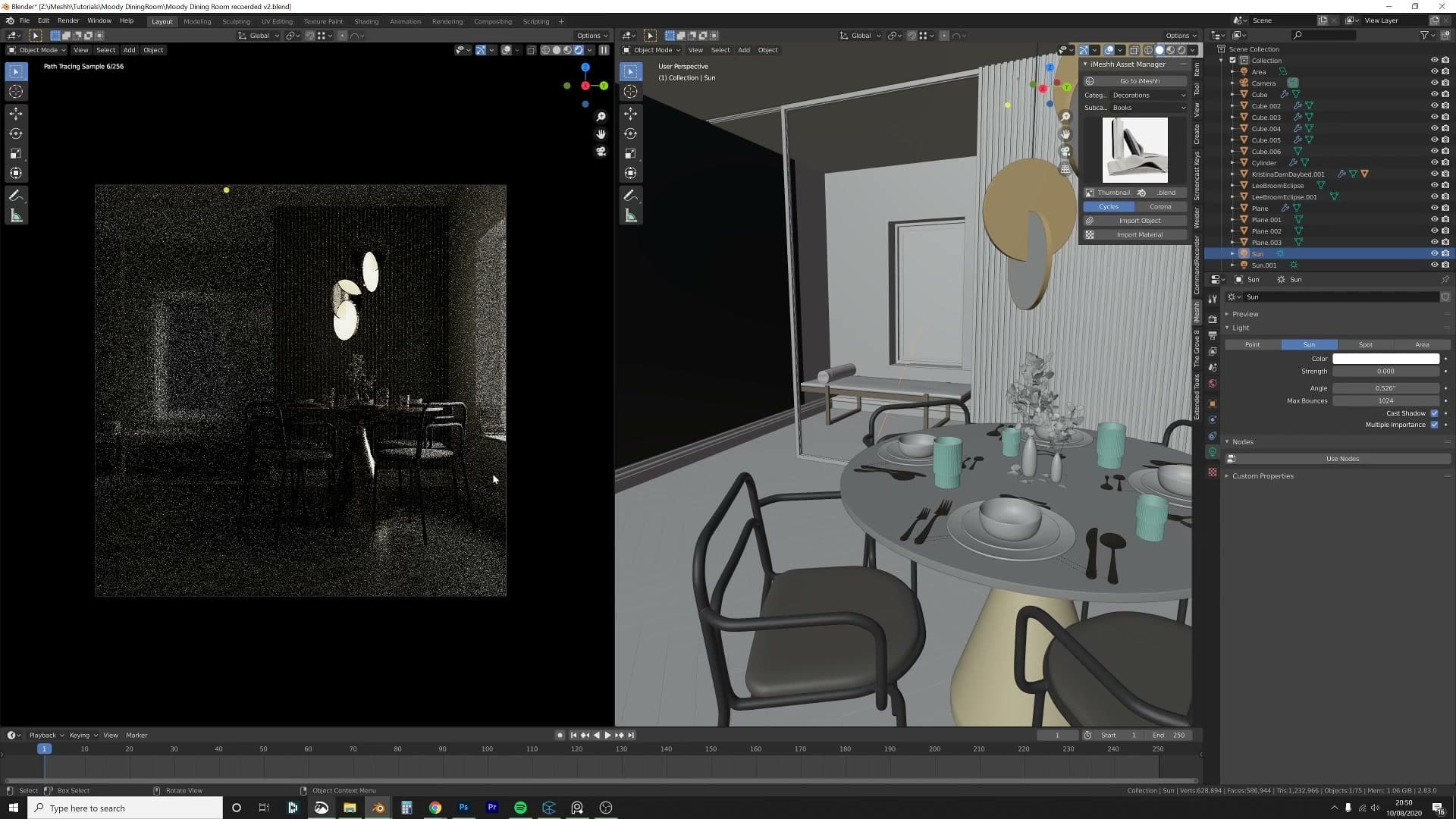
Build the following node graph on the plane:
1. Add a Mix Shader.
2. Plug a Principled BSDF set to white into the first shader input. This matches the wall colour, so whenever the plane is seen through diffuse rays it blends into the room.
3. Plug a black shader (a second Principled BSDF with base colour #000000) into the second shader input. This is the version of the plane you want reflections to see.
4. Add a Light Path node and route Is Glossy Ray into the Mix factor.
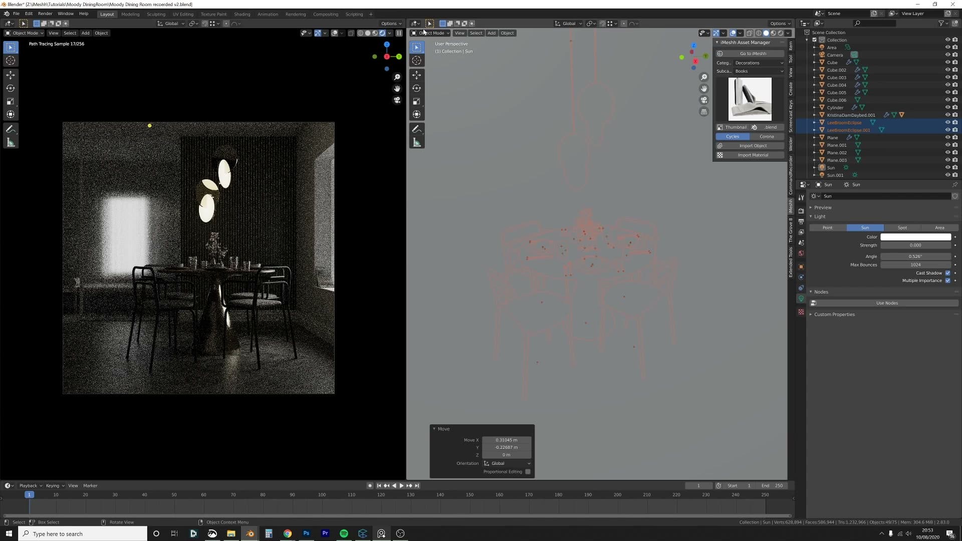
With that wired up, glossy/reflection rays pick up the black side of the mix while diffuse rays see the white wall colour. Every polished surface that points back towards the camera (the chair frame, the table top, the lacquered wood) now sees a dark backdrop behind the lens and renders that darkness into its reflections, exactly as the photographer's sheet would have done.
Finally, lock down where the plane is allowed to appear at all. Open the Object Properties panel, expand Visibility → Ray Visibility, switch Camera off and leave Glossy on. The plane now exists only as something for reflections to land on. It never shows up directly in the rendered image, and it doesn't cast a shadow into the room. The scene picks up the contrast of a studio backdrop without darkening a single material that's actually in shot.
Faking light through the windows without an HDRI
With no environment HDRI and the windows looking dead, drive their brightness independently: a bright background emission gated by Is Transmission Ray. Windows blow out to 'sky' while the rest of the room stays untouched.
Is Transmission Ray for window-only brightness
With no environment HDRI driving the world, the windows have nothing bright to look at. They read as flat dead rectangles. An HDRI wouldn't change how the sunlight behaves anyway, so the trick is to drive the window brightness on its own and leave every wall, reflection and shadow elsewhere in the room exactly as it is.
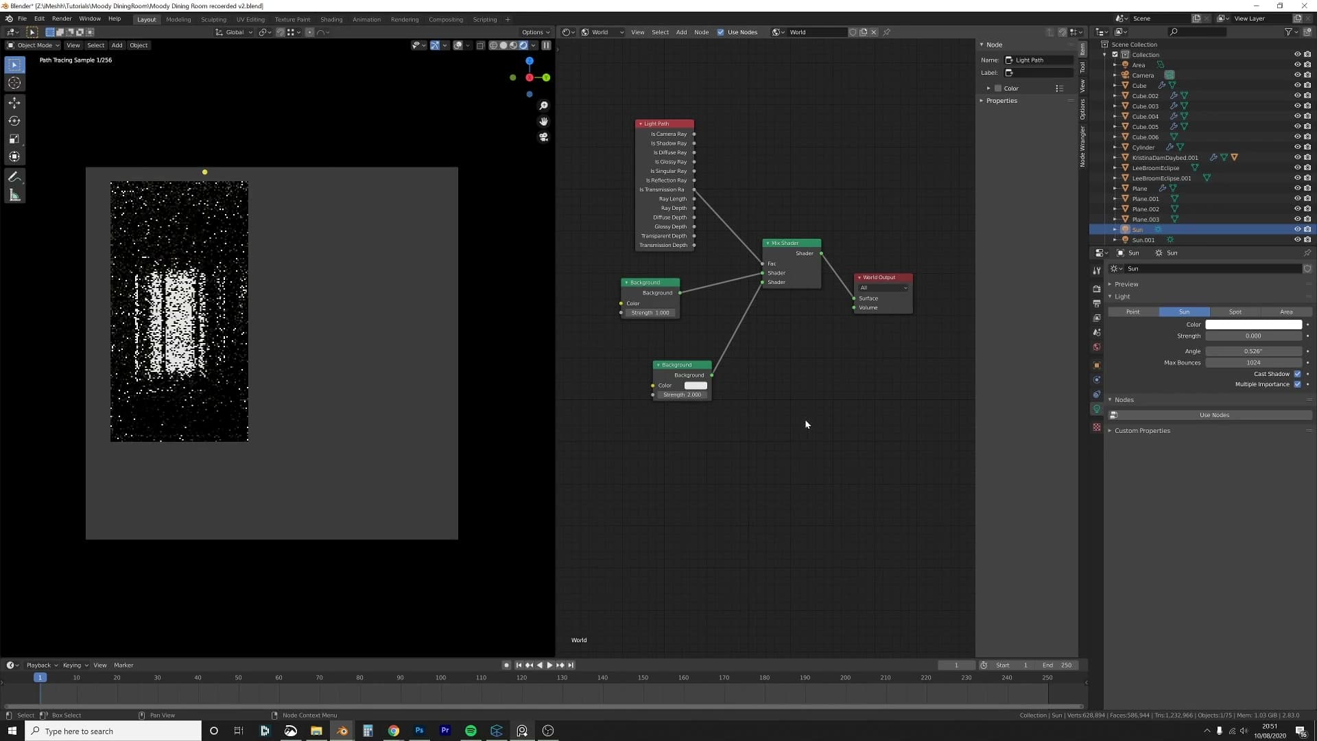
In the world shader you mix a brightened emission alongside the normal background and gate it through a Light Path node so only rays that have passed through glass ever see the boost. The walls, floor and ceiling never receive the brighter colour because no transmission ray reaches them; only the windows pick it up, and only as the camera looks through the glass.
Dial the brightness up until it lands. I push the world strength to around 30 and the windows snap into real-daylight territory while the room still holds its moody contrast. Don't go further than that. In an earlier version of this render the windows blew out so far that the soft shadows spilling onto the floor disappeared into the white, and the whole sun-through-window read was lost.
Square aspect for crop-after-the-fact freedom
Render this shot, and ideally every shot you make, at a square aspect. I do it by habit on every job: a 1:1 frame gives you crop room in every direction afterwards, which is worth far more than a few extra pixels saved on the render.
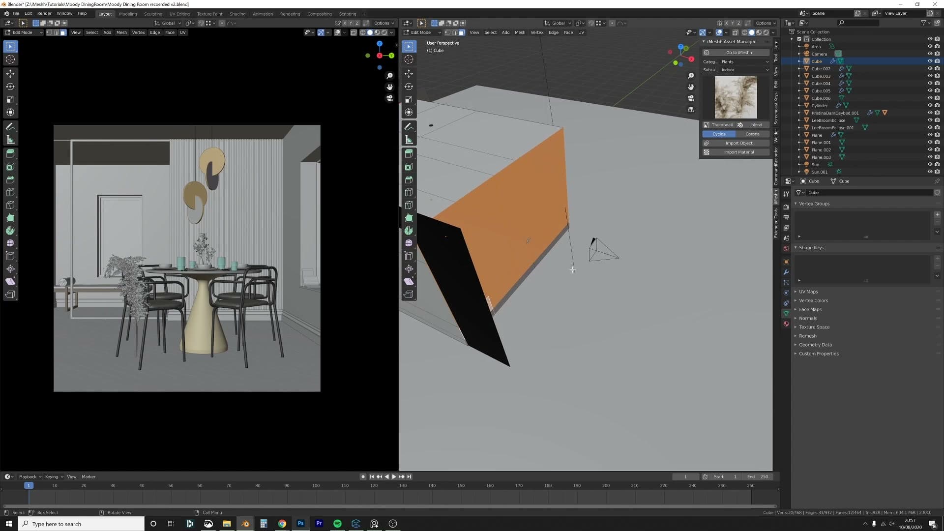
Tight-crop the render to its final aspect now and you're locked in. Decide afterwards that the pendant should have a bit more breathing room and there's no way back. You can only crop tighter, not looser. Render square and you can pull a 4:5 portrait, a 16:9 landscape, a 9:16 reel and a 1:1 feed post out of the same file without re-rendering.
Back-window plant silhouette
Drop a plant behind the back window. Without one, the bright sky reading off the side glass comes through as a flat white panel. Believable as overexposure but visually inert. A leafy silhouette breaks the rectangle up and gives the eye something to read through the glass.
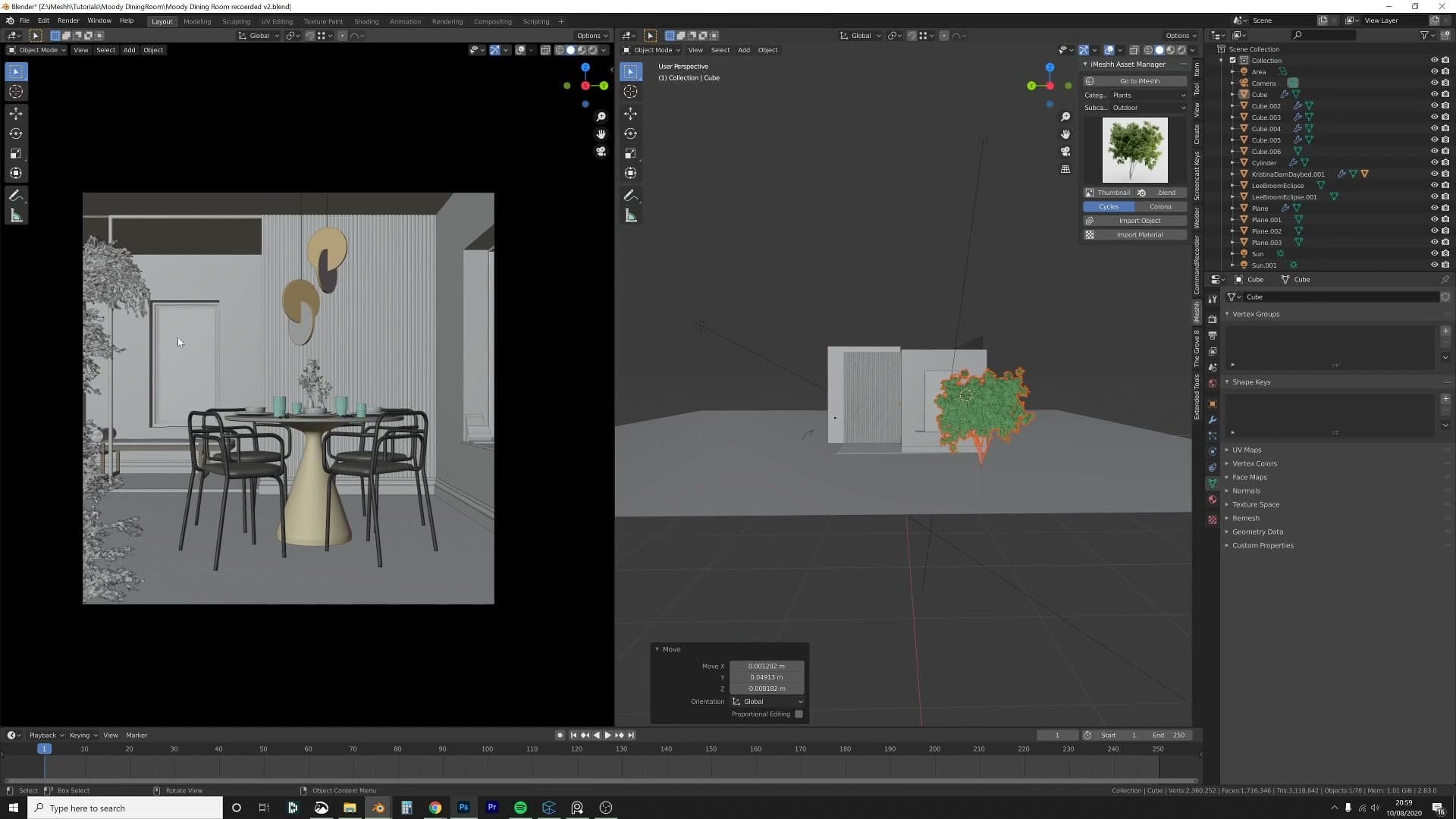
Pull an outdoor plant in from the library and position it just outside the rear window. The first placement comes in too green for the rest of the scene. The saturation fights the muted wood, stone and gold palette of the interior, so I push the plant further back and rotate it down so less of it actually sits inside the shot.
The principle here is restraint. I want the colour palette even all the way across the frame, with no single hue pulling focus away from the lighting story. A green burst against the back window does the job of breaking up the white sky without becoming a competing focal point of its own.
Spotlights, glass tint and final hero details
Two more photographer's tricks: desaturate the glass transmission so the wine glasses don't pick up the orange table, then add hidden spotlights: one keying the foreground pampas, one lifting the dark chair against the back wall.
Desaturating glass transmission
The wine glasses on the table are picking up too much of the orange table tone through their transmission. They read as tinted rather than clear glass. The fix is to desaturate whatever passes through them without touching the table's own colour on reflections.
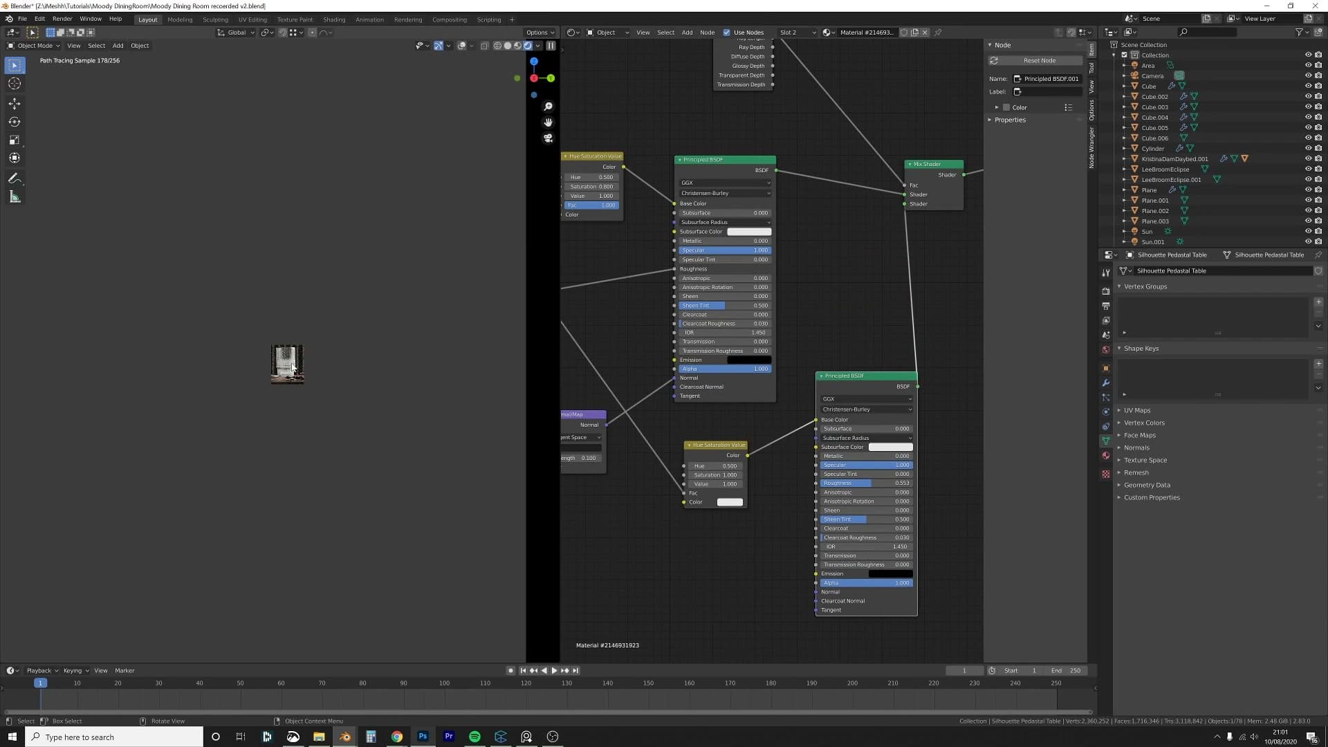
Add a Hue/Saturation node into the transmission path of the table shader and drop the saturation down. After a bit of trial and error, 0.4 is the sweet spot. The glasses still pick up a hint of warmth from the table, but they no longer look like they've been dipped in orange juice.
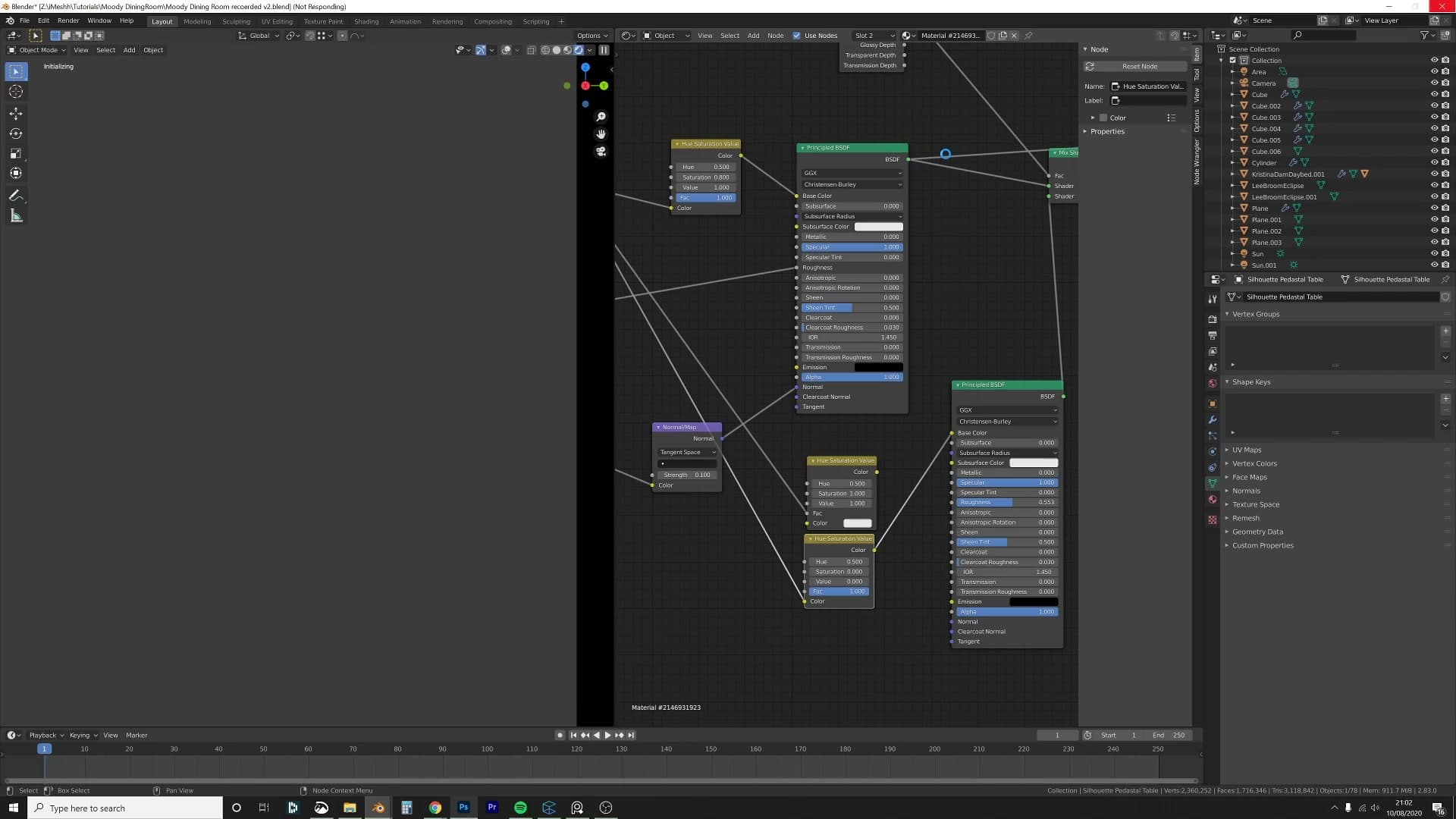
The key is that this only affects what's read through the glass. The table itself keeps its full saturation when seen directly or in glossy reflections. Only the transmission ray sees the desaturated version.
Hero spotlight on the pampas grass
Step back from the render and the foreground pampas grass is sitting in shadow. A black blob in front of the camera that should be the first thing you see. This is the next studio trick: if a part of the scene needs to be lit, put a light directly on it. That's literally what photographers do on set, and there's no reason 3D should be any different.
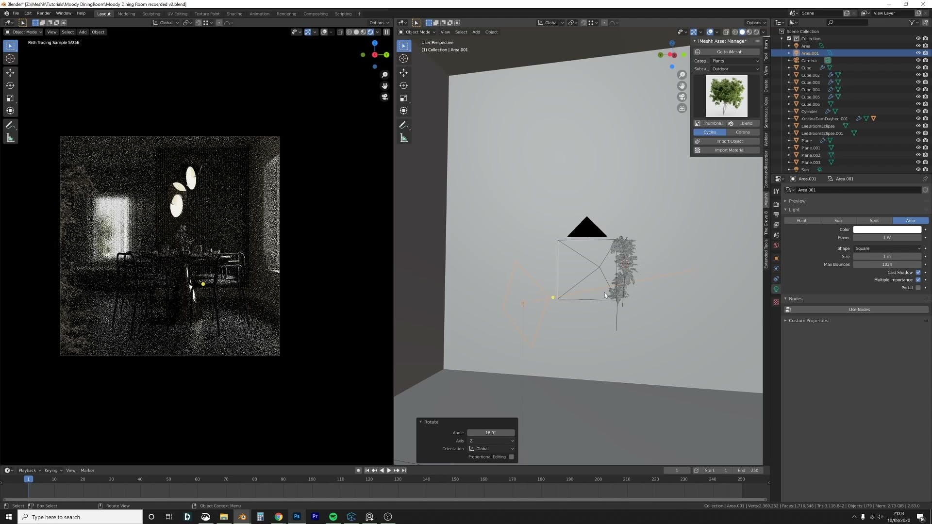
Drop a spot light just outside the frame and aim it at the pampas. Because the plant is right at the foreground, the light's cone won't reach anything else important in the room. It lifts the grass without spilling onto the table, the chairs or the back wall. Nudge the position until the pampas reads as if it's catching a window glow from camera-left.
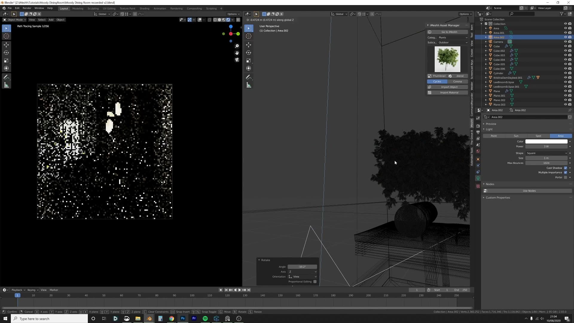
If the first placement looks like it's coming from the wrong direction, move it. The viewer is reading the image as a photograph, so the spotlight needs to feel like an existing light in the room, not an obvious stage light pointed at the hero.
Second key on the dark chair
The dark chair on the far side of the table is the next thing fighting to read. It's sitting right next to the black backdrop and the two are merging into one shape. Duplicate the pampas spotlight with Shift+D, move it across, and aim the copy at the chair.
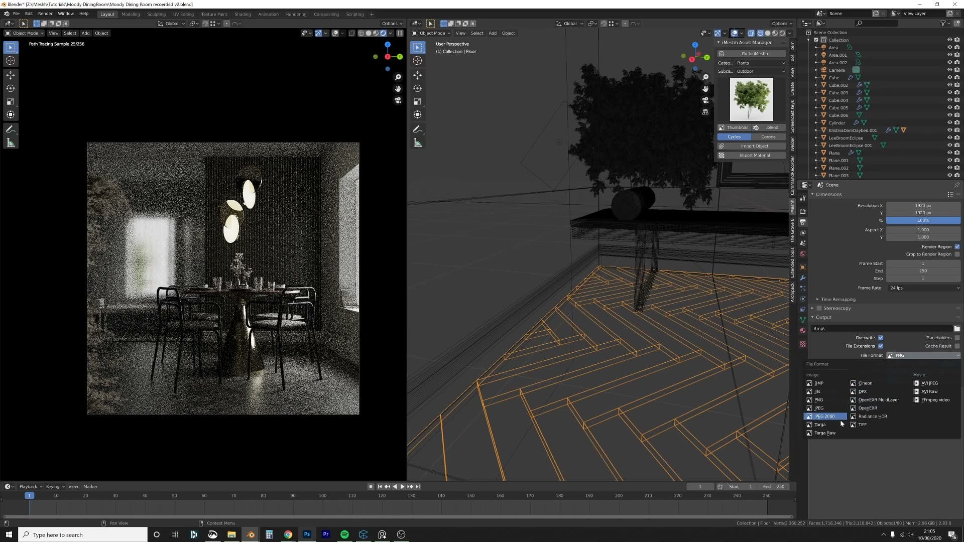
Straight out of the box the duplicated light is far too bright. It was sized for a foreground hero, not a background fill. Drop the strength down to around 1, or even 0.25, until you've got just a faint highlight catching the chair's silhouette. You're separating it from the wall, not lighting it as a second hero.
The viewer doesn't need to know there isn't a door or window over there. They just need a reason for that chair to be visible. A quiet rim of light is enough.
Render settings: Filmic, DOF and 16-bit TIFF
Pixel filter at 0.15 for crisp edges, Filmic with medium-high contrast for room to grade later, 16-bit TIFF output so Photoshop has full headroom, depth of field focused on the table, and adaptive sampling at 0.001 to spend samples where they matter.
Filmic, pixel filter and TIFF output
Open Render Properties and set the View Transform to Filmic with a Medium High Contrast look. Filmic keeps the highlights from clipping when sunlight bursts through the window, and medium-high contrast bakes in enough punch to read on screen without crushing the shadows you'll want to lift in post.
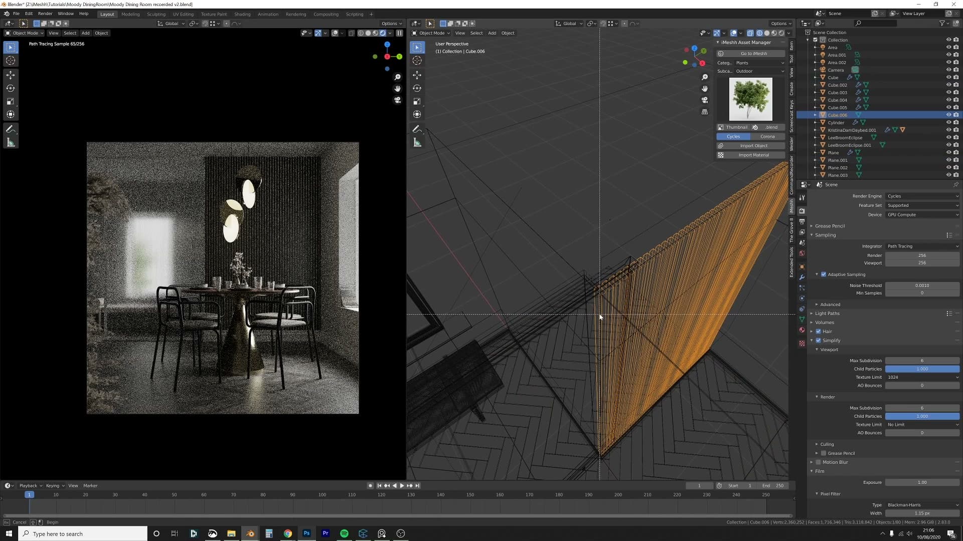
Drop the Pixel Filter width down to 0.15. Blender's default sits much higher and softens every edge in the frame; pulling it this low keeps frame mouldings, table edges and the chair wires crisp instead of muddy. I caution against going too much lower than that: under 0.15 starts to bring back aliasing.
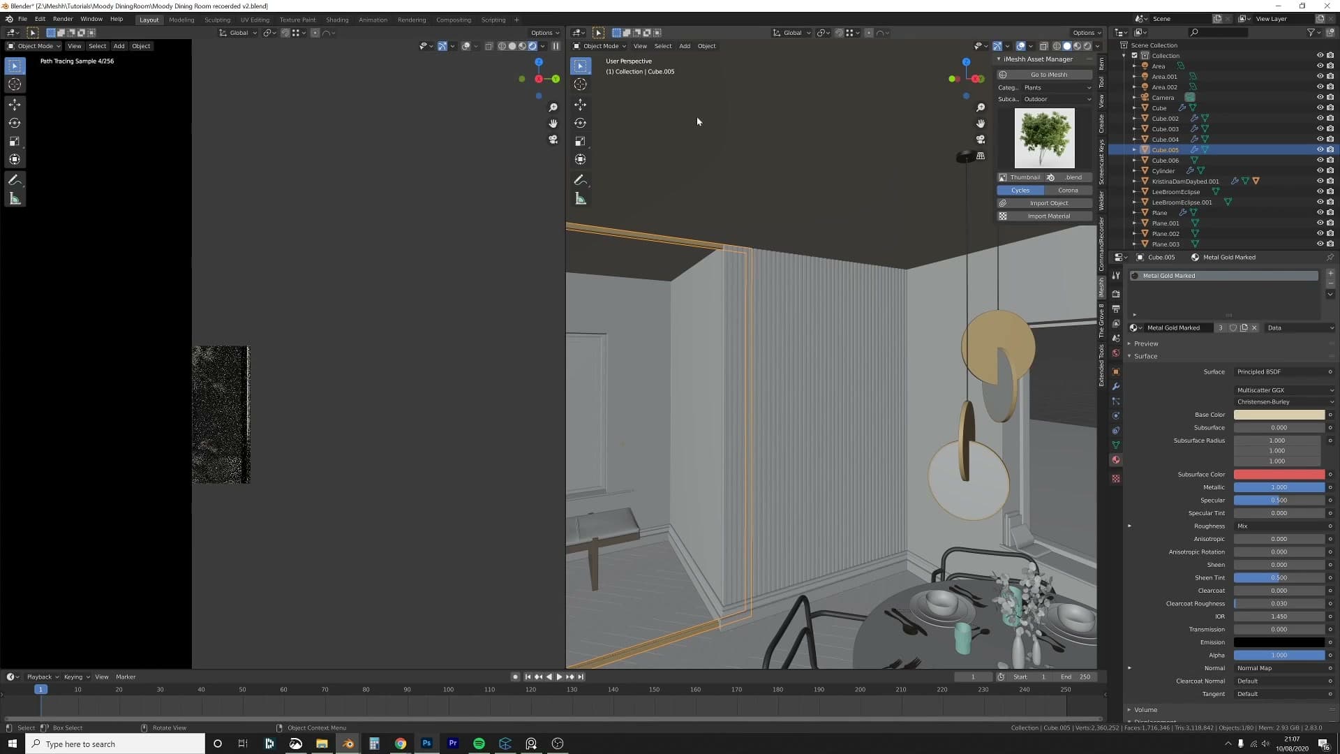
Under Output Properties, set the file format to TIFF, the colour depth to 16-bit, and the colour to RGBA so the alpha is preserved. These three switches are the whole archviz output template.
The reason for 16-bit isn't file size, it's headroom. An 8-bit JPEG out of Blender gives Camera Raw almost nothing to push: curves band, shadows posterise, the highlight roll-off shatters. A 16-bit TIFF carries enough data per channel that you can drag the curve hard and still get clean transitions, which is exactly what the Photoshop pass in the next module needs.
Depth of field focused on the table
Select the camera, head to Object Data Properties and tick Depth of Field. Under Focus Object, pick the dining table. That locks the plane of focus to the table no matter where you nudge the camera afterwards.
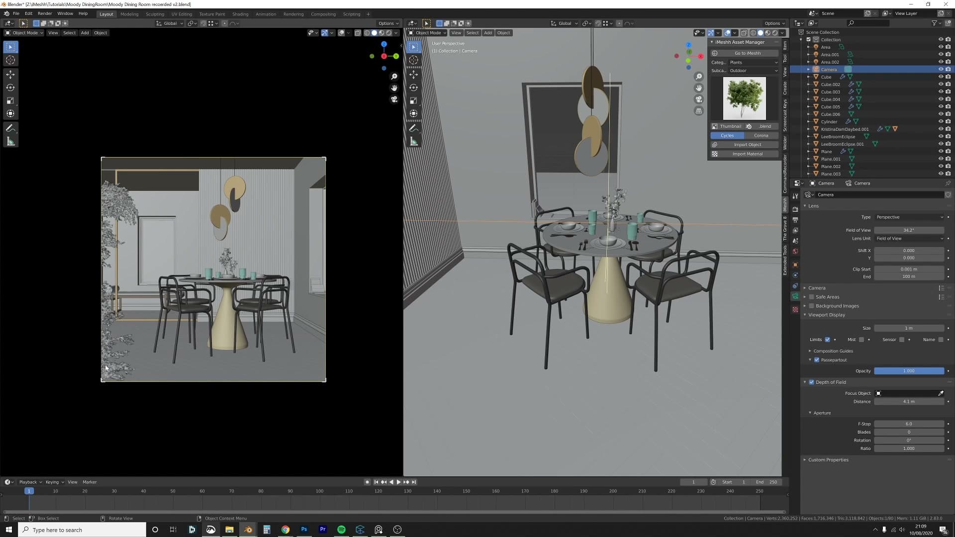
Set the F-Stop to about 6. That's enough to soften the foreground pampas and push the daybed at the back of the room out of sharp focus, without going so shallow that the table itself stops reading. I tick Limits on briefly to confirm the focus point is hitting the front edge of the table, then switch it back off.
Adaptive sampling threshold and minimum samples
Back in Render Properties, open the Sampling panel and turn on Adaptive Sampling. My usual Noise Threshold is 0.001, which is what's used here. Blender's own recommendation is much lower at 0.0001, and 0.0003 is a reasonable middle ground if you want to push for cleaner output and don't mind the render time.
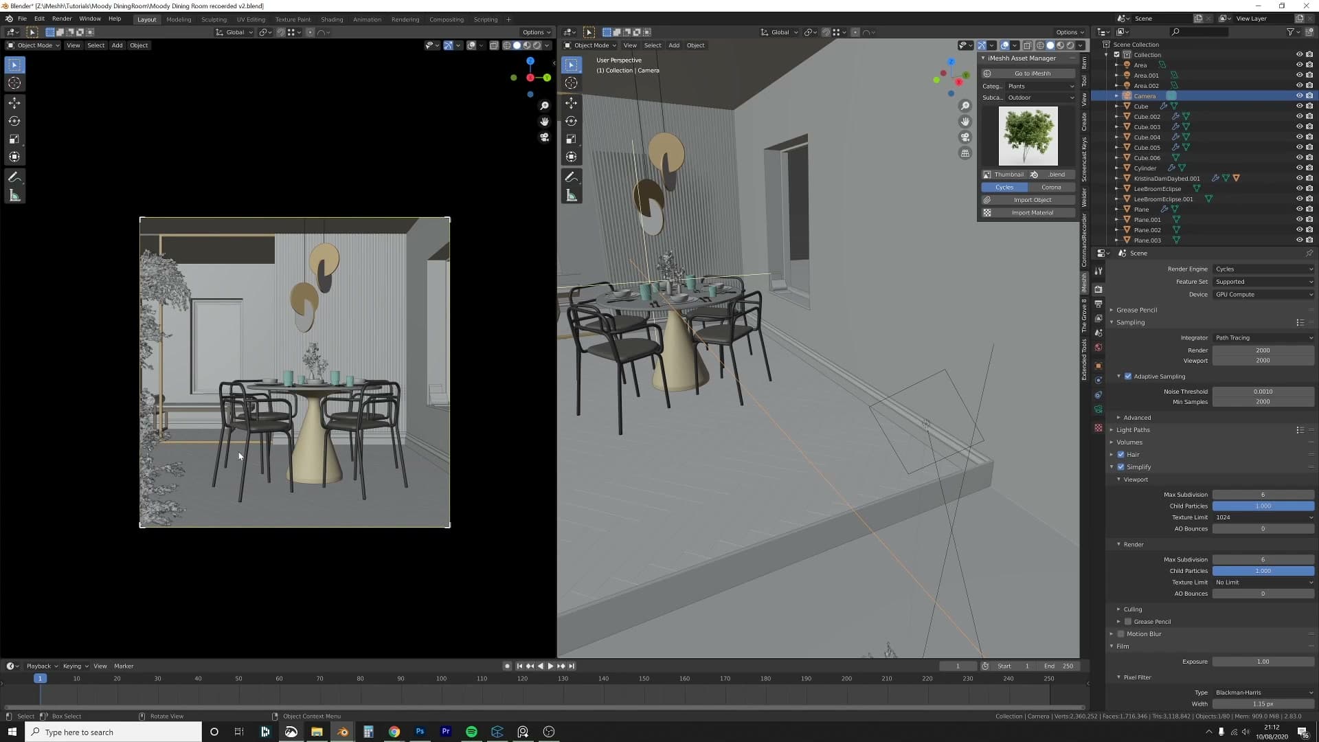
Adaptive sampling is the reason a Cycles render can finish in a sensible amount of time. Instead of throwing the same sample count at every pixel, it watches each one and stops sampling early once the noise drops below the threshold. A flat white wall converges in seconds; a fluted-glass reflection might need every sample you'll give it. On a scene like this you can claw back 30-40% of render time when it behaves itself.
Set Min Samples to 2000 and the Max Samples to 2000 as well. Adaptive was misbehaving on this scene the previous session, so I fell back to a fixed budget of around 1500-2000 samples, which took roughly 45 minutes on my machine, or overnight in the final pass.
Leave the Denoise checkbox in the render settings turned off. That option denoises destructively as Cycles renders, so you can't dial it back later. Instead, head to Render Passes and switch on Denoising Data. That gives you the albedo and normal passes the denoiser needs.
Open the Compositing workspace, add a Denoise node and wire the noisy image plus the denoising-data passes into it. Then drop a Mix node between the noisy image and the denoised result, with the factor at around 0.5. That gives you a slider for how soft you want the final image. Full denoise tends to over-smooth edges; half-and-half keeps a bit of texture in the surfaces.
Compositor denoise with a Mix slider
Render with denoising data enabled, hook it into the compositor's Denoise node, then mix that node against the raw render with a Mix node. You can dial denoise strength per shot without re-rendering.
Denoise data passes wired into the Denoise node
Before you touch the compositor, the render itself has to write out the extra data the denoiser needs. In the Render Properties panel under Passes, enable Denoising Data so Cycles outputs a clean Normal pass and an Albedo pass alongside the noisy image.
Switch to the Compositor and drop in a Denoise node. Route the Render Layers Image output into the Denoise node's Image input, Denoising Normal into the Normal input, and Denoising Albedo into the Albedo input. With all three sockets wired up, the denoiser has the surface information it needs to flatten noise without smearing fine detail.
Mix node for adjustable denoise
A fully denoised pass can look a bit plasticky. Edges round off and micro-texture flattens out. To stay in control, add a Mix node after the Denoise node, feed the raw Render Layers image into the first colour socket, and feed the denoised output into the second.
The Factor slider then becomes your denoise dial. Sit it around 0.5 and you get most of the grain reduction with enough surface texture surviving to keep edges feeling photographed rather than rendered. Because the mix lives in the compositor, you can rebalance per shot without re-rendering, which is useful when a tighter close-up wants a different amount of denoise than the wide.
Photoshop post: Camera Raw, curves and dodging
Open the TIFF as a Smart Object, push contrast in the Camera Raw curve, add sharpening with a touch of noise reduction, apply a profile colour lookup, then dodge highlights onto the hero plant with a brush at boosted exposure.
Camera Raw curves and tone
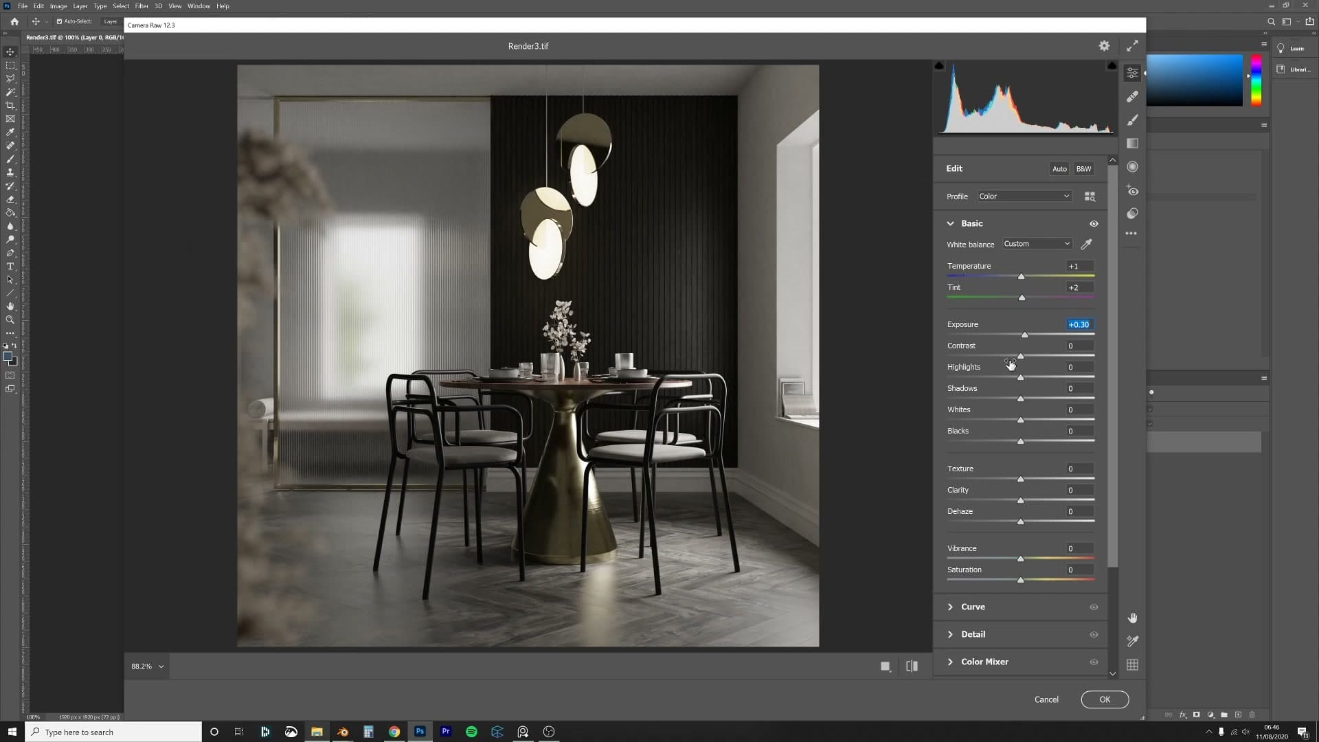
Bring the TIFF into Photoshop and open Camera Raw. Because you saved 16-bit, the tone controls have real headroom. Pull the whites down a touch and ease the highlights back so the brightest patches stop shouting, then nudge overall brightness slightly darker. Toggle the before/after and the render already starts to pop.
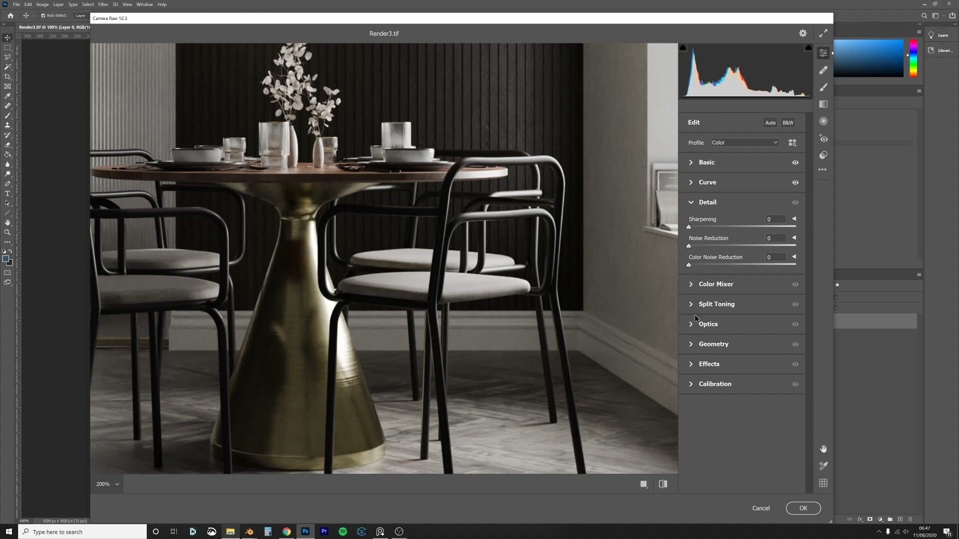
The goal at this stage is just to set the broad tonal range. Contrast comes from pushing the curve, not from cranking saturation, so resist the urge to chase colour until the luminance reads right. Zoom in so you can judge edges before moving on to the detail panel.
Sharpening, noise reduction and film grain
Open the Detail panel and add a small amount of sharpening. The trap here is overdoing it. Push the slider too far and edges turn crunchy and ringed, which immediately reads as a render rather than a photograph. A gentle pass is enough to crisp up the wood edges and the chair frames.
Sharpening tends to amplify whatever noise is already in the image, so balance it with a touch of noise reduction. You're not trying to scrub the noise out, just soften the worst of the dancing pixels the sharpening exposed.
Now drop into the Effects panel and add a small amount of film grain. Most real photographs carry a tiny bit of grain, and CG without any grain at all reads as plastic. You want just enough that the image feels captured rather than computed.
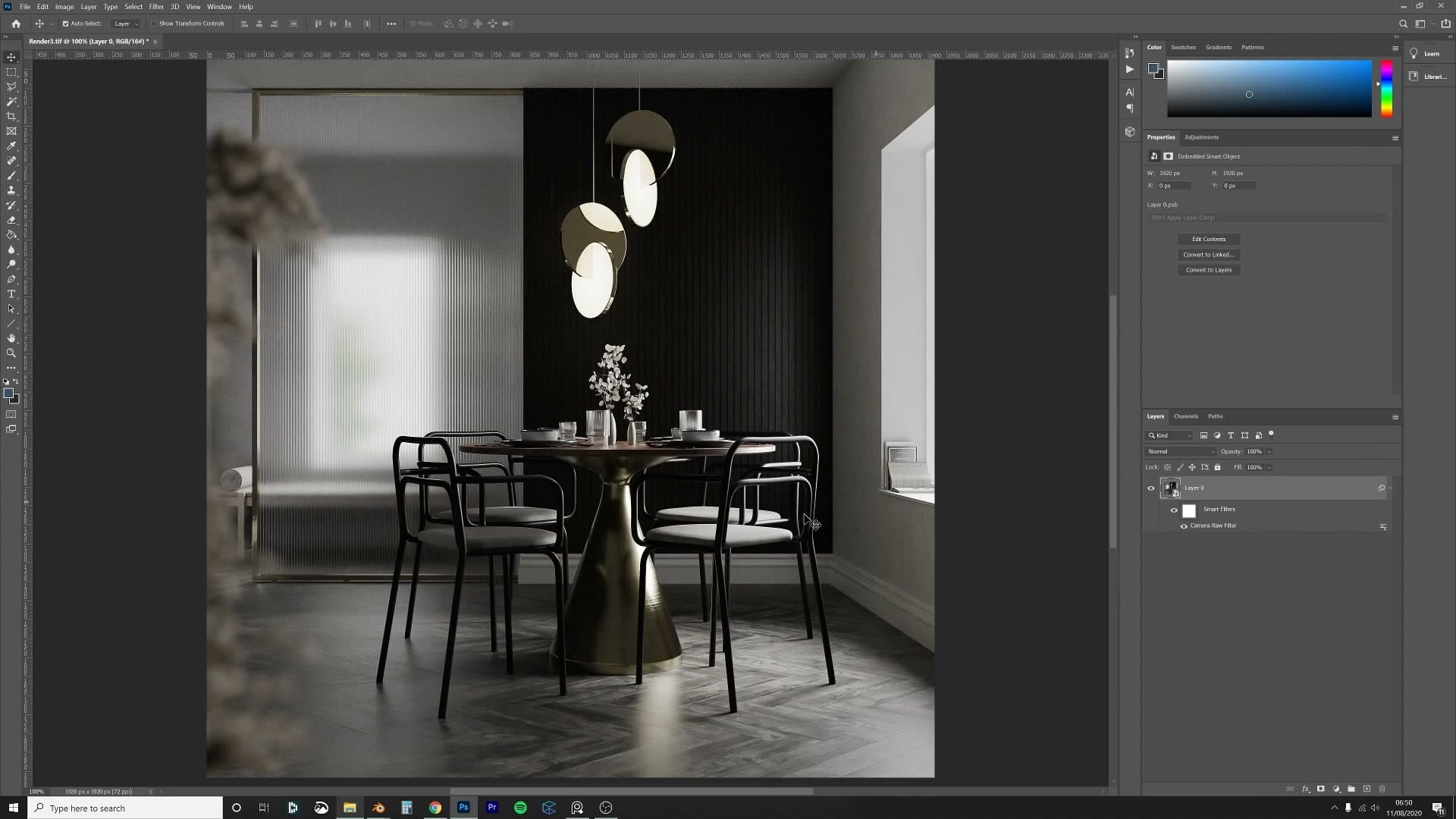
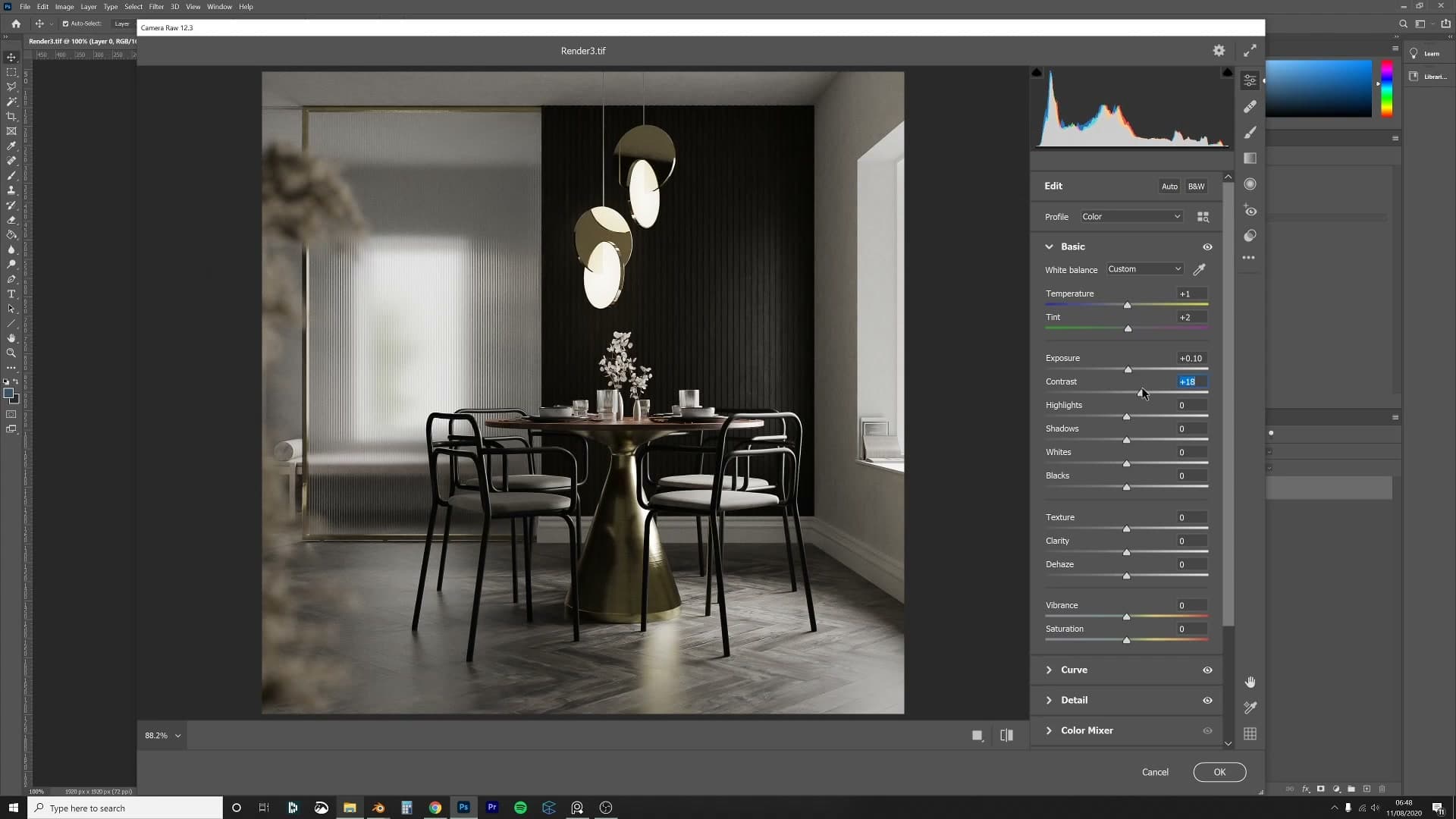
Finish the tonal pass with a small contrast bump and a slight vibrance reduction. Vibrance is worth knowing apart from saturation: saturation hits every colour equally, so dragging it to zero gives full black-and-white. Vibrance is gentler: it pulls already-saturated colours back toward the rest of the image, so very bright objects stop dominating. In a low-colour scene like this one the effect is subtle, but it keeps the palette from feeling cartoonish.
Profile colour lookups
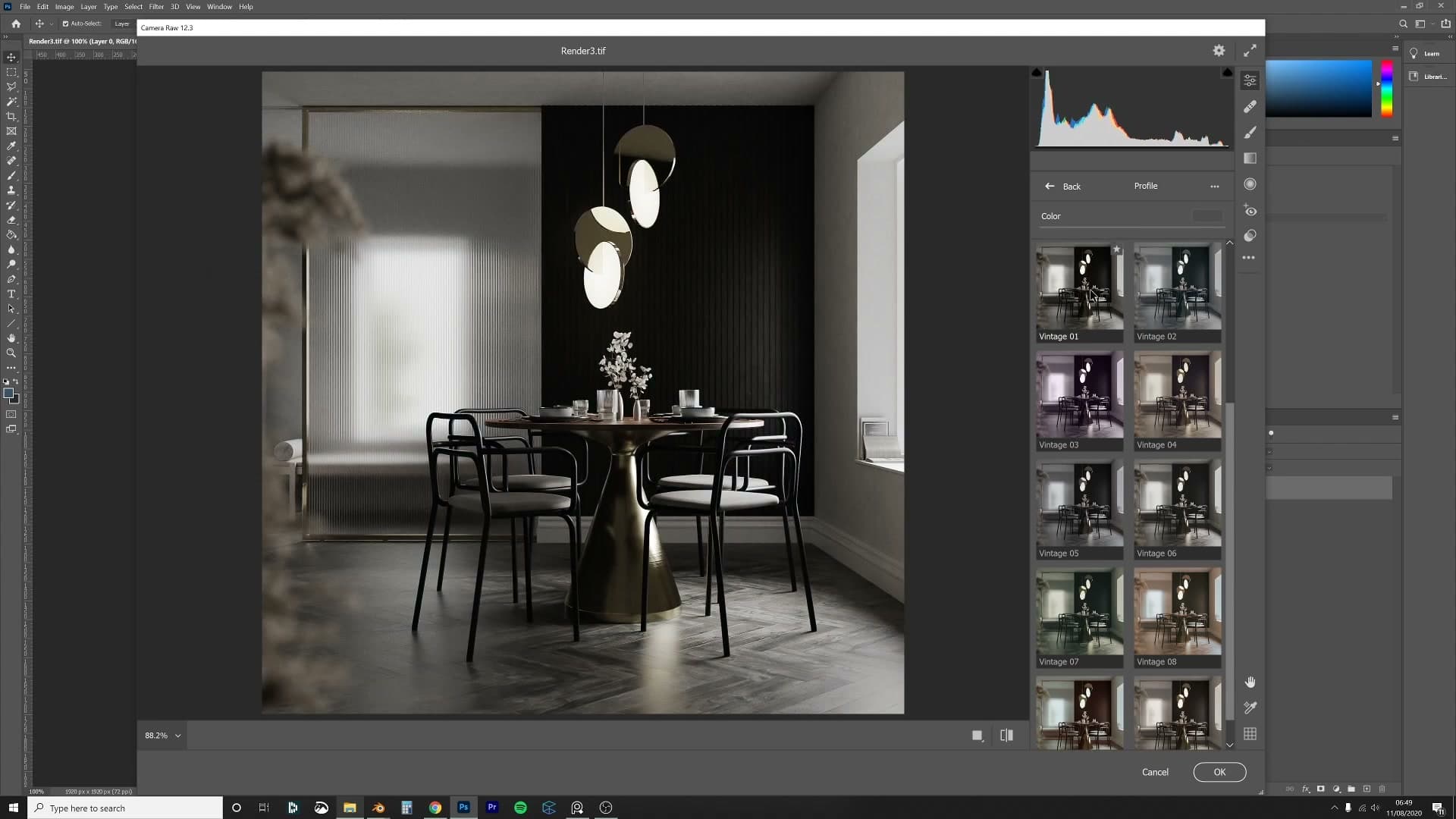
Click Profiles at the top of Camera Raw to pick a colour lookup. These behave like LUTs: each one bends the colour response in a particular direction, and most carry some kind of warm or cool bias. Hover through the list and pick whichever one suits the scene; if the strongest version skews everything yellow, drag the amount slider down to dial the effect back.
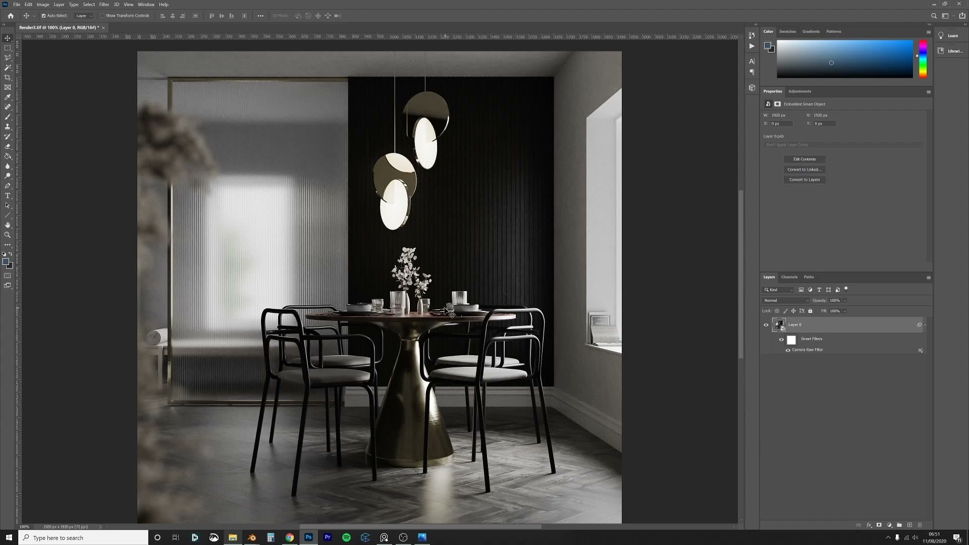
If a profile is mostly what you want but pushes one channel too far, head into the HSL/colour mixer and pull that hue down on its own. Turning the yellows and oranges down a notch after applying a warm profile lets you keep the colour character without the white pages of a book starting to read cream.
Dodging hero highlights with the brush
Switch to the Brush tool inside Camera Raw and bump the exposure slider up to around +1. Paint directly onto the parts of the image you want to push. The hero pampas in the foreground is the obvious target, since a brighter highlight there draws the eye straight to it. Keep the brush soft and the strokes loose; you're suggesting that more light is falling on that object, not stamping a hotspot onto it.
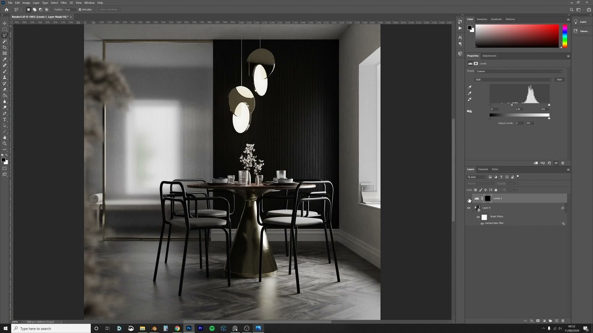
While you're cleaning up, also fix anything that's reading the wrong tone. The open book in this scene was sitting grey when book pages should read close to white, so add a Levels adjustment and bring the white point in until the page reads correctly. Avoid the Brightness/Contrast adjustment for this. It scales everything flatly and tends to wash colours out, whereas Levels gives you per-channel control and respects the overall colour balance much better.
Final vignette and the finished image
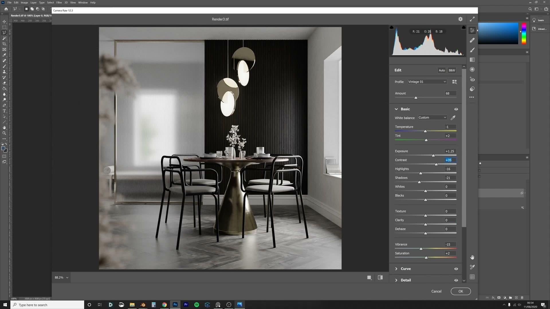
Finish with a vignette from the Effects panel. Drag the amount into the negatives to darken the corners. A subtle vignette is one of those photographic tells that makes 3D feel like it came out of a camera; it focuses attention on the centre of the frame and adds a touch of mood without changing the lighting in the scene itself.
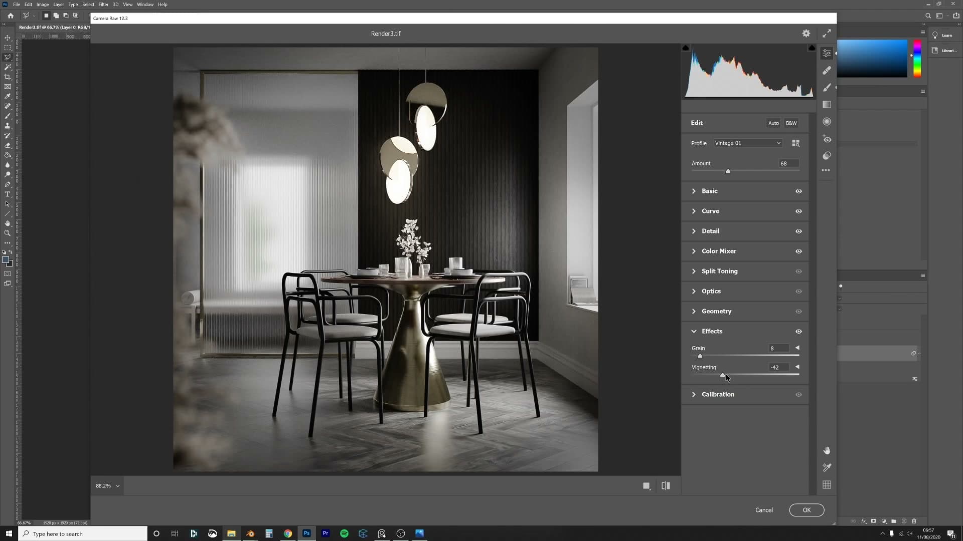
Take one more pass with the brush at boosted exposure to lift any other spots that still feel flat. Small highlights around the room that pull the eye through the composition. Because Camera Raw is still living on the Smart Object, every one of these moves stays editable: you can pop the filter back open tomorrow and refine the curve, the dodge or the vignette without re-exporting from Blender.
And that's the render. The lighting was set up in Blender to behave like a studio shoot (sun-as-softbox, black backdrop in reflections, blown-out windows) and the post is just there to polish what was already photographed in 3D. Thanks for following along.
Tools and credits
Everything mentioned in this tutorial, with links.
- Blender: the renderer this entire build runs in.
- iMeshh: studio platform (project management, client review, asset library, invoicing). The asset library used in this tutorial is included with every iMeshh Pro plan.
- Poly Haven: free CC0 textures and HDRIs.
Pillar guide: Masterclasses hub