Why a brighter, client-friendly interior
Why this second archviz tutorial swaps the moody mood-board for a brighter, more client-friendly render, and why an archviz artist's job is really cinematography, not modelling, so you should source furniture rather than build it from scratch.
Rethinking the mood from tutorial #1
The first archviz tutorial in this series ended up in a darker, moodier place than the original mood board suggested. The final image still works as an image, but it strayed a long way from the brief, and that's the part worth correcting this time around.
If you're producing archviz for a paying client, expect them to ask for the render to be brighter. A moody hero shot reads well on a portfolio; a moody living room rarely reads well on a client's approval call. So this second tutorial deliberately aims for a brighter, lighter, more client-friendly result, the kind of render an interior designer can hand straight to a homeowner without notes coming back.
The walkthrough is broken into sections in roughly the order you'd tackle them on a real job: cameras first, then lighting, then composition and colour palettes, then the materials and decor that sit inside that framework.
Archviz is cameramanship, not modelling
Before touching anything in the viewport, it's worth being clear about what archviz actually is as a discipline. Your job on an archviz shot is essentially that of a cameraman or camerawoman: you fill a scene with nice furniture, light it correctly, and photograph it correctly. The same way an interior photographer turns up to a finished room with a camera, you turn up to a finished 3D set with Blender.
Your job isn't to build the furniture. Modelling a great sofa and producing a great archviz still are two different crafts, and getting genuinely good at both takes a very long time. If you're trying to break into archviz, the faster route is to source models (find free resources online, or buy cheap ones) and spend your hours on lighting, framing and post instead.
From the point in this tutorial where the room starts being dressed, iMeshh models are used to fill it. The reasoning behind each pick (why this particular sofa, why this coffee table) is called out as it happens, so if you're working from a free library or another marketplace you can match the criteria (silhouette, palette, scale) rather than the exact product. If you already have an iMeshh subscription, you can drop in the exact assets shown.
Building the room shell
Three approaches to building interior walls: Archipack's wall generator, tracing single-vert curves over a floor plan, or just sculpting a cube. We go with the cube method, set a sensible 2.84m ceiling height, cut windows with extrude-and-delete, then limit-dissolve to clean up loop cuts.
Archipack, single-vert tracing, or a humble cube
Before you can light or dress a room, you need walls, and there are three reasonable ways to build them in Blender. I walk through all three before committing, so you can pick whichever feels right for the kind of project you're working on.
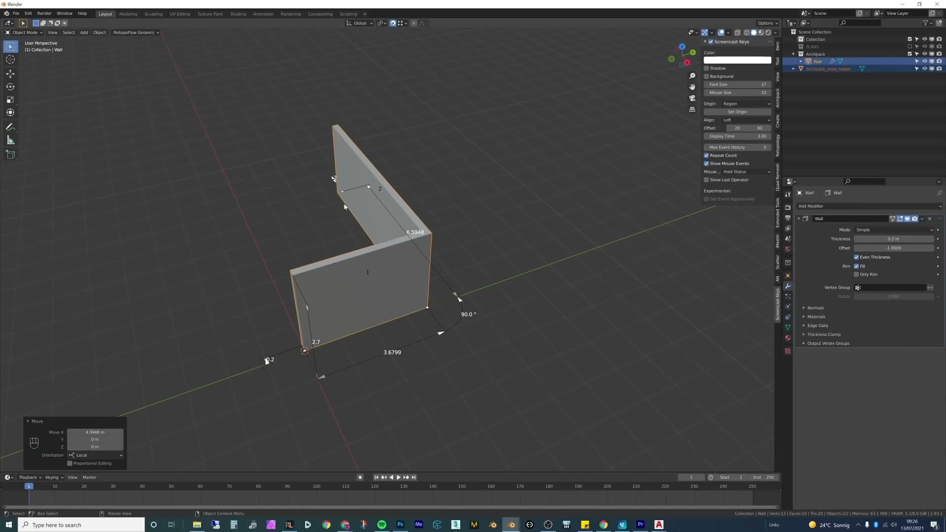
The first option is the Archipack wall generator. Add a wall, dial in a length, add another wall, dial in more length, and keep clicking your way around the floor plan. Archipack also ships ceiling and floor generators that pair with it, so you can build an entire shell from one add-on. It's a perfectly valid route. I just don't use it here. If it suits you, there are plenty of dedicated Archipack tutorials online to follow.
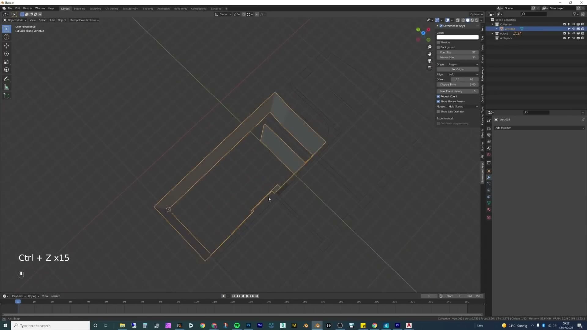
The second option only works if you're lucky enough to have plans. Drop the plan in as a backdrop, snap the 3D cursor to where you want to start (Shift+S ▸ Cursor to Selected), then Add ▸ Mesh ▸ Single Vert. Turn on snapping set to Vertex, press E to extrude that vertex along each wall on the plan, and you'll trace the whole floor outline in under a minute. Because Blender treats this as a curve at first, you can press F3 and run Convert to Mesh, then select everything and extrude on Z to lift the walls up to ceiling height in one move.
The third option (and the one the rest of this tutorial uses) is the humble cube. No plans, no add-on, just a primitive you push around until the room feels right. It's the most flexible of the three because you're designing as you go rather than committing to a measured plan up front, and that's exactly the workflow I want for this particular scene since it's my own room.
Cutting windows by extrude or Boolean
Once the wall shell exists, you need openings for the windows and doors. Archipack handles this for you with a Boolean-driven cutter, but if you're not on Archipack there are two reliable approaches, and both rely on Blender's edge length overlay so you can place cuts to a real measurement rather than eyeballing them.
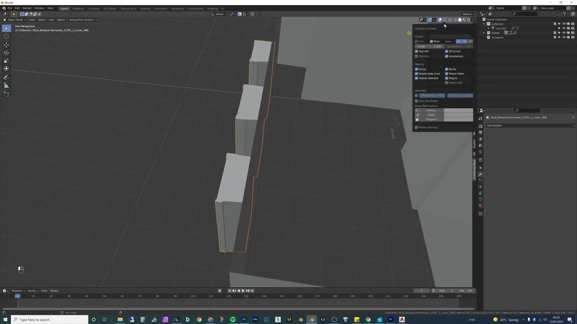
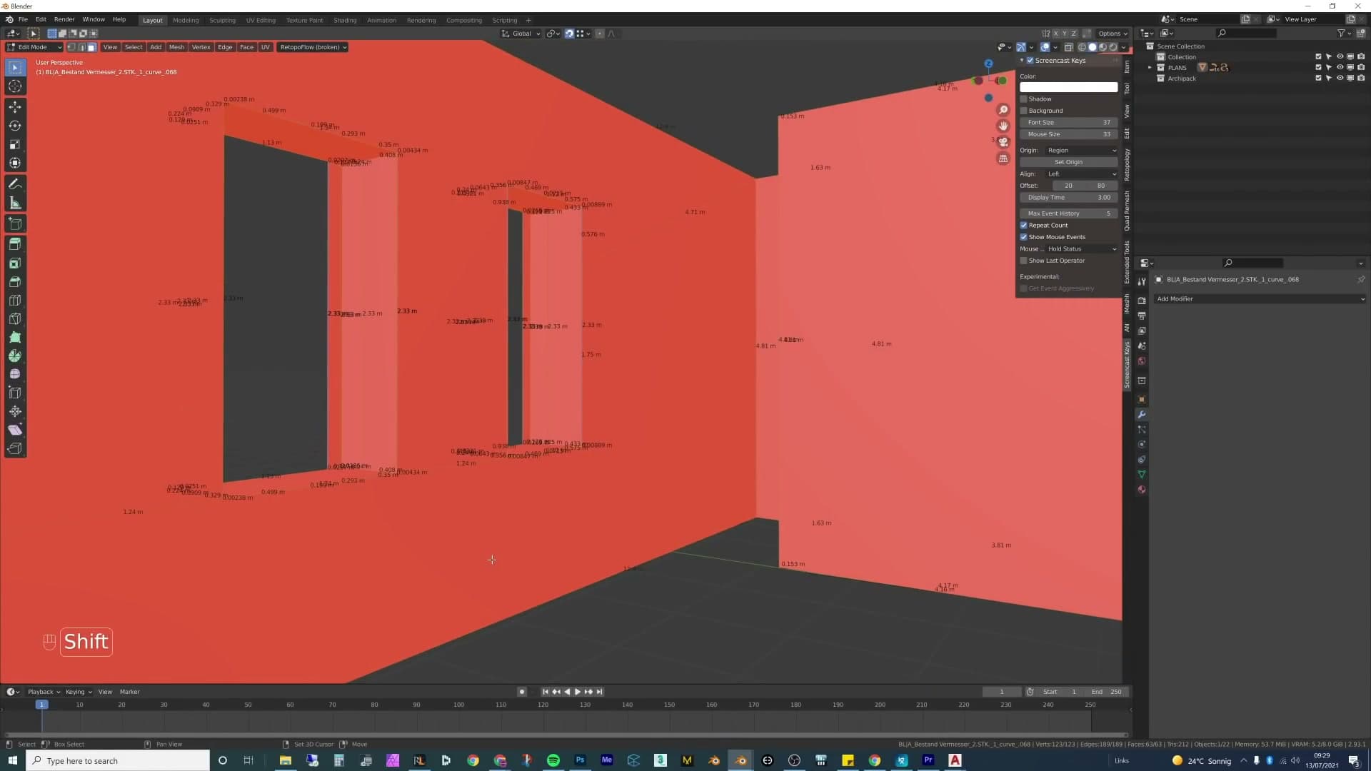
Turn the overlay on first. In edit mode, open the overlays dropdown in the header and tick Edge Length. Now every edge you hover over reports its length live as you place cuts. The first method is the simplest:
1. Add two horizontal loop cuts on the wall to bracket the window's vertical position. 2. Add two vertical loop cuts to bracket its horizontal position. 3. Slide each cut until the readout matches the window's real-world dimensions. 4. Select the face inside the four cuts, press E to extrude, then X to delete the face that's left behind.
The second method is the Boolean route. If you traced a floor plan in the previous sub-lesson, the openings on the plan are already the right shape. Separate those edge loops out as their own object, raise them to the correct sill height, convert them to a mesh, run Merge by Distance, then press F to fill a face. Extrude that face on the wall's normal so the cutter pokes all the way through. Back on the wall object, add a Boolean modifier set to Difference (Fast solver is enough for clean geometry), pick the cutter as the object, and the opening appears. Drop into edit mode on both the wall and the cutter, delete the redundant faces, and you've got a clean window aperture cut to plan.
The cube method and a 2.84m ceiling
For this tutorial I go with the simplest option of all: start with a default cube and shape it into a room. There are no plans to honour, so the room can grow as the build progresses, which is useful when you're decorating to your own taste rather than matching a client brief.
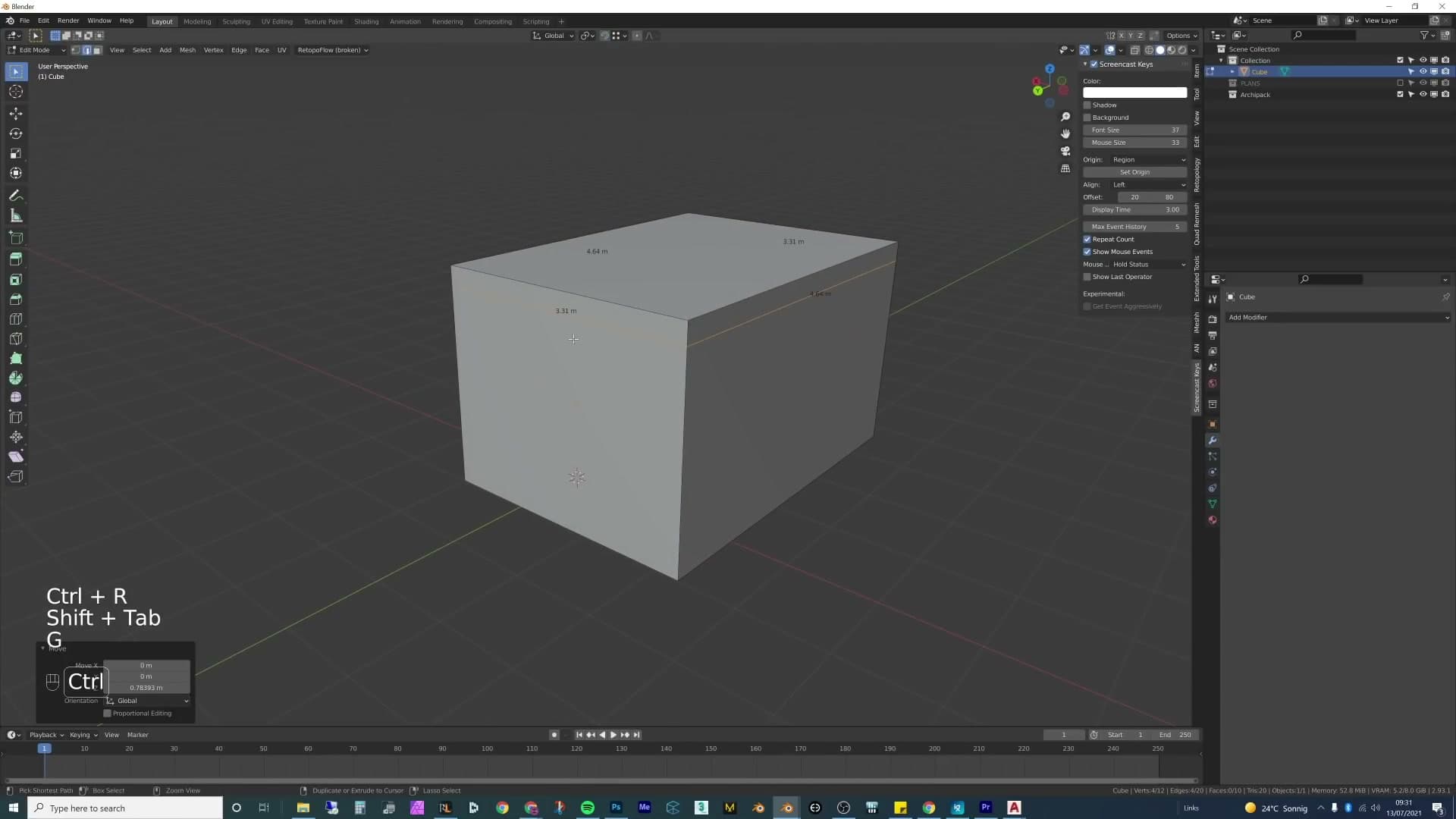
The one number worth getting right up front is the ceiling height. I set it to 2.84 m, and warn that this is the most common thing people get wrong in beginner archviz scenes. A typical adult is around 1.7 m tall, so a 1.7 m ceiling would have everyone walking around with their head pressed against it. If the room has the space for it, aim for somewhere between 2.8 m and 3 m. Low-ceilinged rooms are fine when they're deliberate; they're a problem when they're an accident.
With the cube extruded out to the room's footprint, openings get cut the same way as in the previous sub-lesson: add the loop cuts you need, select the face inside them, press E to extrude and then X to delete. I prefer this approach for personal projects because each loop cut becomes a future handle: you can grab any face and slide it around to refine the room's shape as you go.
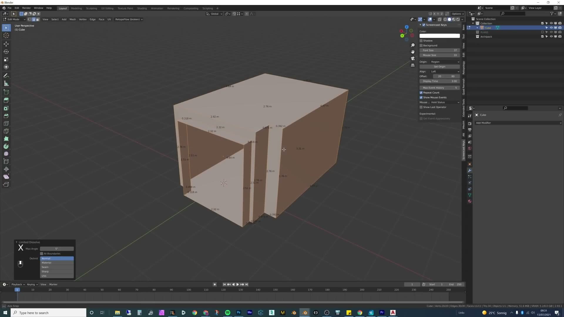
Once the layout is locked in, there's one cleanup step worth doing. Select everything in edit mode with A, press X, and choose Limit Dissolve. Blender removes every loop cut that no longer separates a distinct face, leaving the windows and openings intact but collapsing the redundant subdivisions in between. You can now grab any single face and move it freely without dragging a column of stray vertices with it.
Finally, switch the viewport overlay to Face Orientation and walk around the room. The inside faces of the walls should all read blue (correct normals) when viewed from inside. If anything is red, select those faces and run Mesh ▸ Normals ▸ Recalculate Outside (or Inside). Getting this right now saves a lot of confused-looking shading later.
Separating the floor and hiding the curtain rail
With the basic shell finished, I add one extra detail before moving on: a thin lip extruded above each window, tucked against the ceiling. This is where the curtain rail will eventually live, and hiding it behind a small bulkhead keeps the rail itself out of the camera's eyeline. It's a small architectural cue that reads as expensive in the final render.
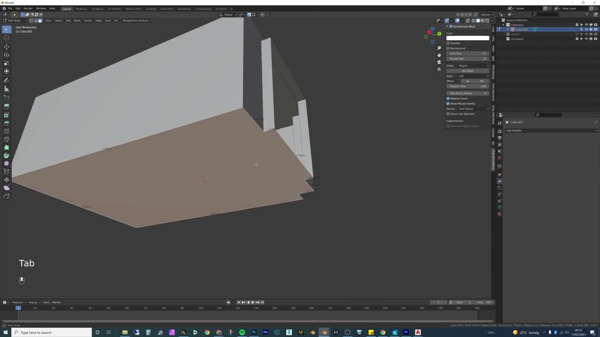
Now is also the right time to separate the floor from the wall mesh. You can leave it as a single object, but pulling the floor out into its own object makes the rest of the build easier. It gets its own material slot, its own UVs, and it's trivial to hide while you're sculpting the walls. Select the floor face in edit mode, press P and choose Selection.
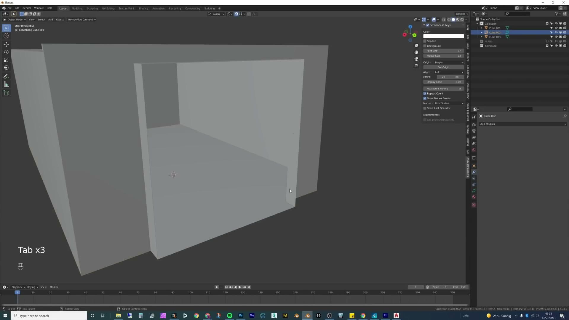
Separating the floor unlocks one more shortcut. Duplicate the new floor object, press F3 and run Convert to Curve, and you've got an exact outline of the room's footprint as a curve, perfect for driving a skirting board later. Pair that curve with a small profile shape in the curve's Bevel ▸ Object slot and you'll get skirting that follows every wall automatically, no matter how irregular the room turns out to be. Delete the duplicate for now and come back to it when the skirting board step rolls round.
Daylight lighting with HDRI and portal
Why a soft, almost-cloudy white sky reads as the most realistic and most studio-familiar archviz light, and how to get there fast with a Poly Haven HDRI. We compare 2K vs 8K (the lighting is identical; only reflections benefit from higher res) and snap an area light into each window as a portal to cut Cycles noise.
Sun lamp vs Nishita sky vs HDRI
There's no fixed order for an archviz build. You can block out furniture first, set the camera first, or jump straight into lighting. I always start with lighting, partly because it sets the route the rest of the scene goes down, and partly because rough preview renders along the way are the easiest way to check that the model colours are reading together.
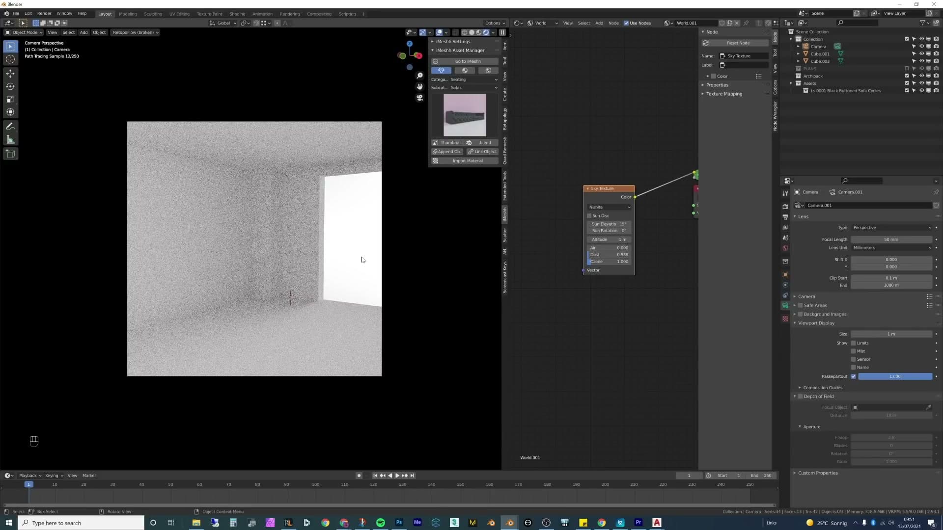
The simplest daylight option is a plain Sun lamp. Add a Sun light and increase its angle. Push it up to something like 10° and the shadows soften considerably. Lower the angle and the sun becomes more direct, which is the route to take if you want crisp, hard shadows in the room. This is the same method covered in the previous archviz tutorial, so go back to that one if a literal sun is the look you want.
Blender now also has a Sky Texture with a Nishita sun and sky model wired into the World shader. It's a more procedural daylight option, but the trade-off is that you lose direct control over where the sun lands. Drop one in and you can end up with a giant sun parked somewhere awkward in the sky. A Sun lamp lets you point the light by hand, which is why I still prefer it when a literal sun is needed.
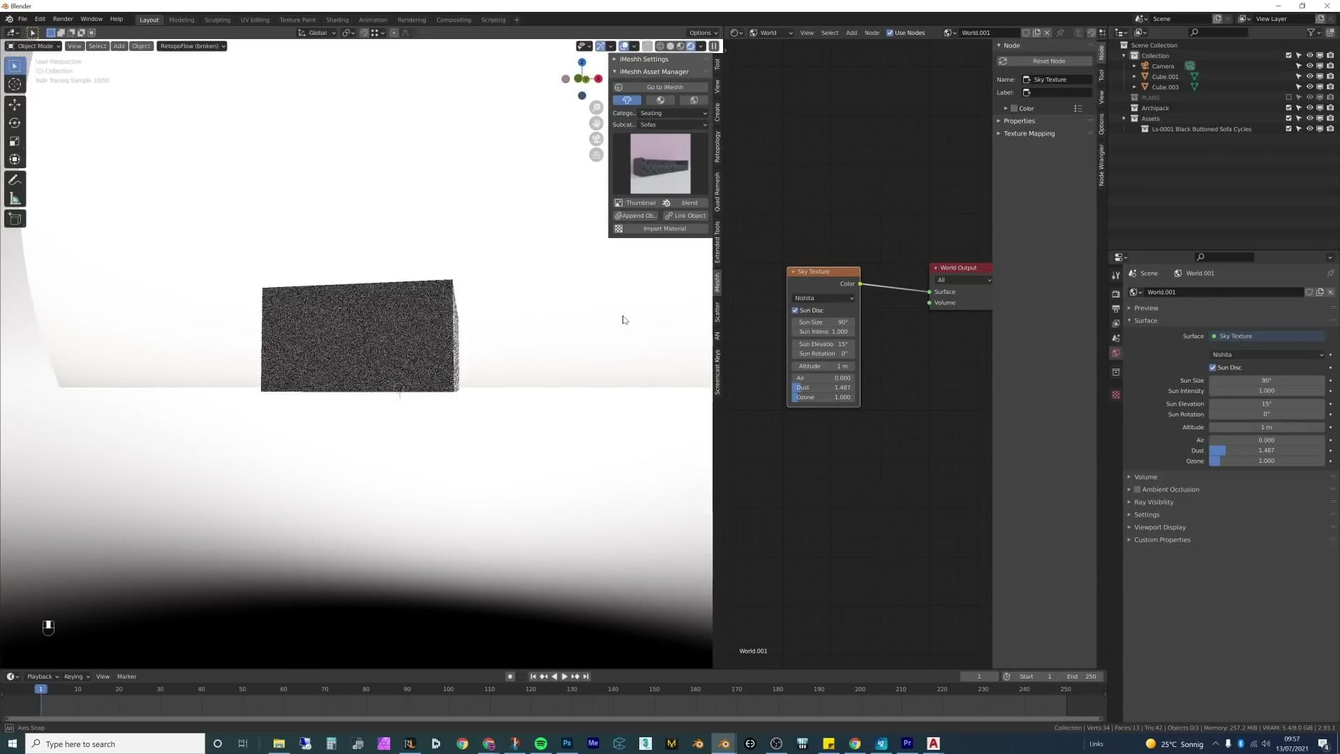
You can also stack the two: turn the sky portion white, dial the sun strength down, then layer in a separate Sun lamp for the stronger shadows. It works, but for this build I'm going somewhere simpler, a flat white HDRI, so the next two sub-lessons unpack why and how.
Why a flat white daylight reads as realistic
The reason for a flat white sky over a literal sun is realism. Most of the references I pull for archviz share the same trait: a clean, even, almost-cloudy daylight rather than a directional beam. You can absolutely add a Sun lamp on top later, but starting from a clean white base makes it much easier to land a believable image.
Real life backs this up. A genuinely cloudy day turns the entire sky into one huge softbox, and everyone has an instinctive sense of what that looks like: soft shadows, no hot spots, even fill across every surface. If you live somewhere like England, a white sky is honestly more common than a sunny one, and the brain reads it as familiar before it even processes the image as a render.
Studio photography lands in the same place. When a brand like IKEA shoots its furniture, the set is usually a controlled warehouse with lights that mimic an overcast skylight. People see that lighting on professional product imagery constantly, so a clean white daylight in a render quietly aligns with what they already expect from a polished shot. It's also genuinely easier to control than juggling a sun, a sky tint and bounce light all at once.
2K vs 8K HDRI: load time vs reflection quality
Instead of fighting the sky-texture settings, the fastest route to a clean white daylight is an HDRI. I keep a library of free HDRIs from Poly Haven and drop in Waterbuck Trail at 2K. Plug it into the world environment and the room is already lit.
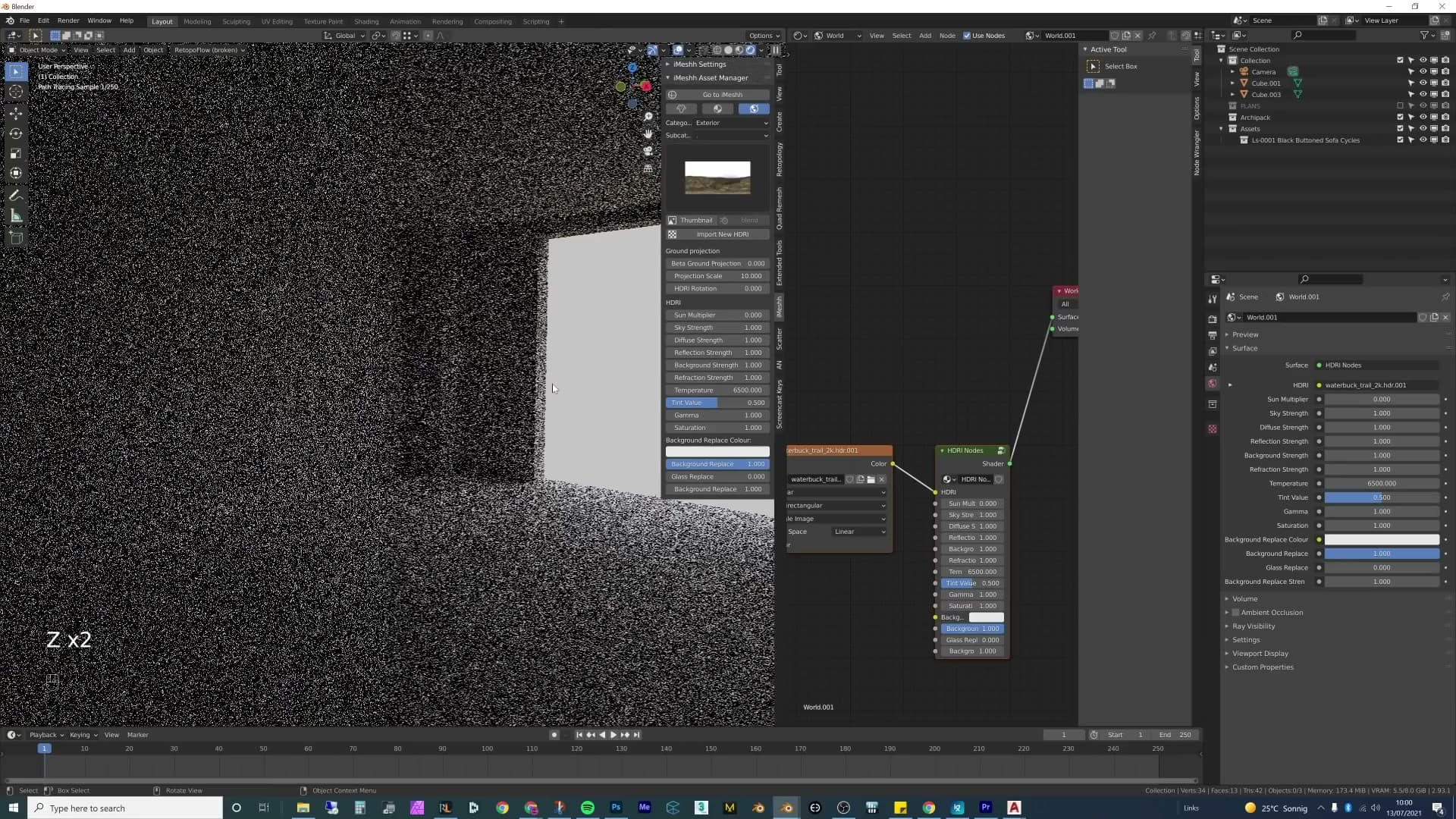
Don't get pulled into thinking 8K is more realistic. It isn't. Swap the same HDRI from 2K to 8K and the lighting in the room is essentially identical; the only difference is how long the viewport takes to load when you toggle between solid and rendered shading. A 2K file pops in instantly, an 8K file makes you wait every time.
The only two reasons to reach for a higher-resolution HDRI are when the camera looks straight out of the window and you can see the landscape sharply, or when a strongly reflective surface in the scene is going to mirror the HDRI back into the shot. Neither is the case here, so 2K stays.
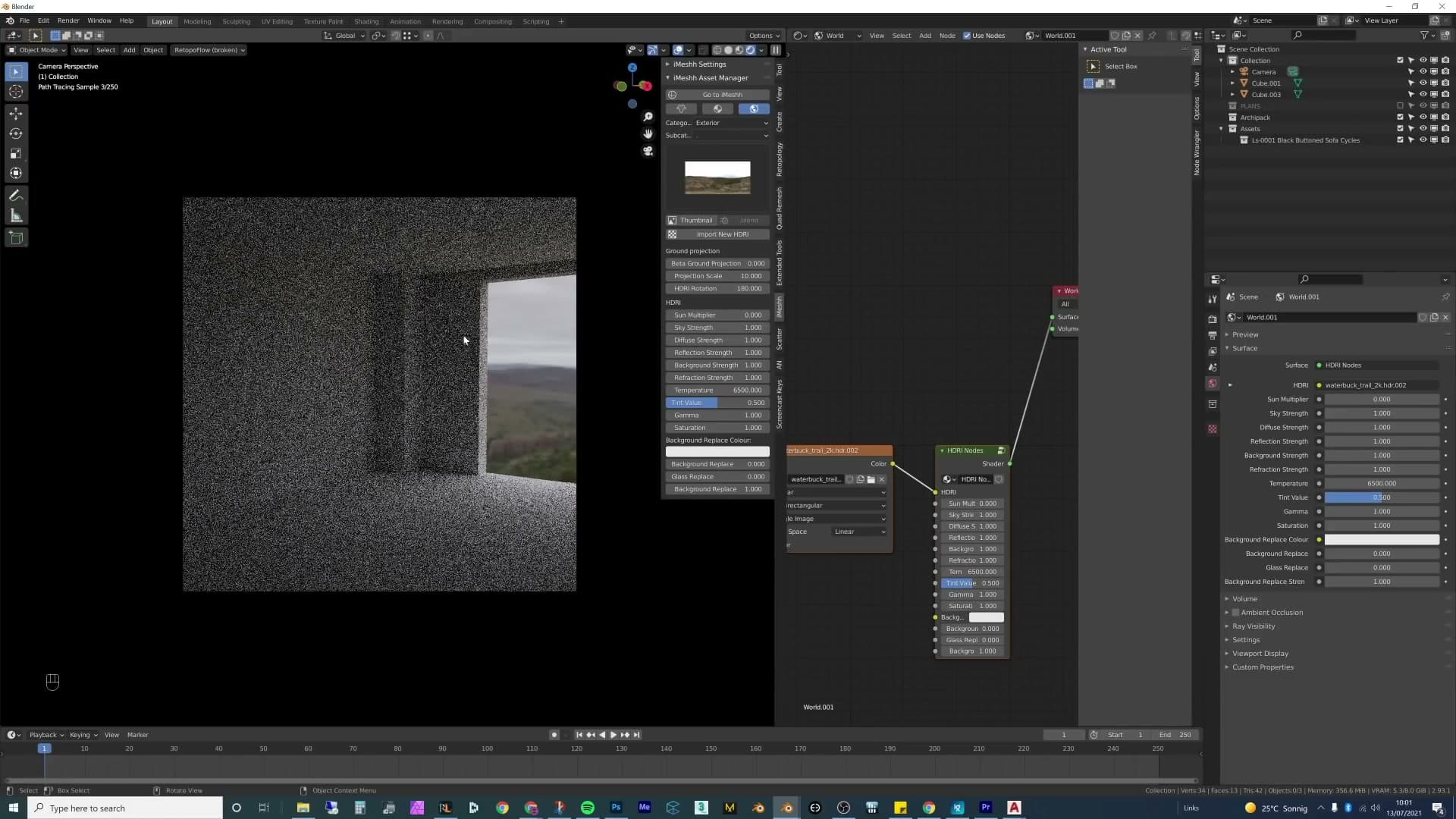
Two small tweaks finish the setup. Rotate the HDRI by roughly 180° so a bit of landscape sits behind the window rather than the ugly side of the panorama, then bump the world strength up to around 5 to brighten the interior while still using the HDRI for the colour of the light.
Adding a window portal light
An HDRI lighting the room through the windows is fast to set up but slow to clean up in Cycles. Light samples have to find their way in through a relatively narrow opening, which produces noise. A portal light tells Cycles where the light is coming in, so the renderer can sample it directly. The steps:
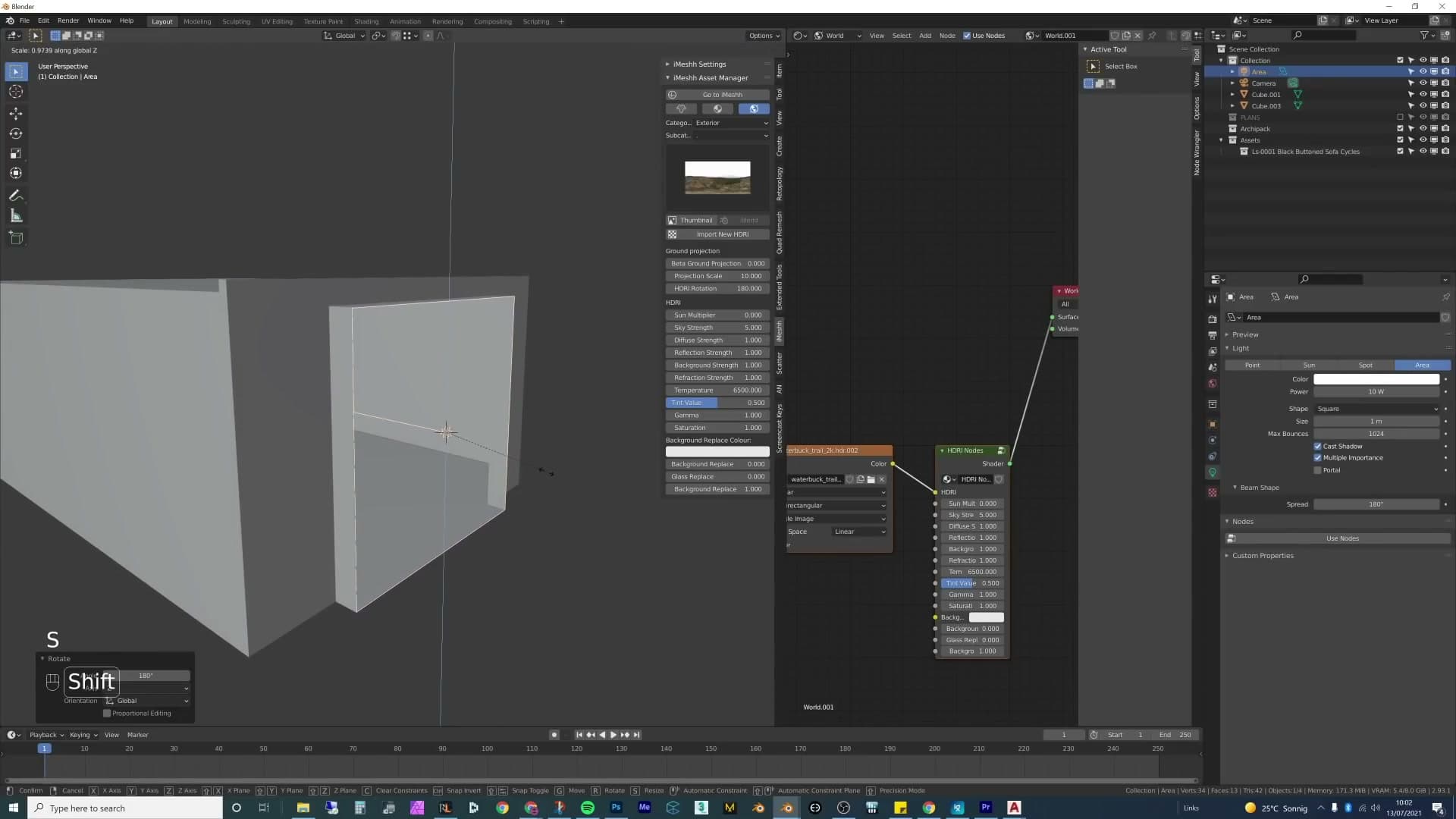
1. Drop into edit mode on the wall mesh and select the face that fills the window opening. Press Shift+S and choose Cursor to Selected so the 3D cursor snaps to the middle of that window. 2. Back in object mode, add an Area light. Rotate it so the emitting side faces into the room, then scale it on the appropriate axis (S then Z, for example) until it sits snugly inside the window opening. 3. In the light's properties, tick the Portal checkbox. Renders through this window will now clean up significantly faster.
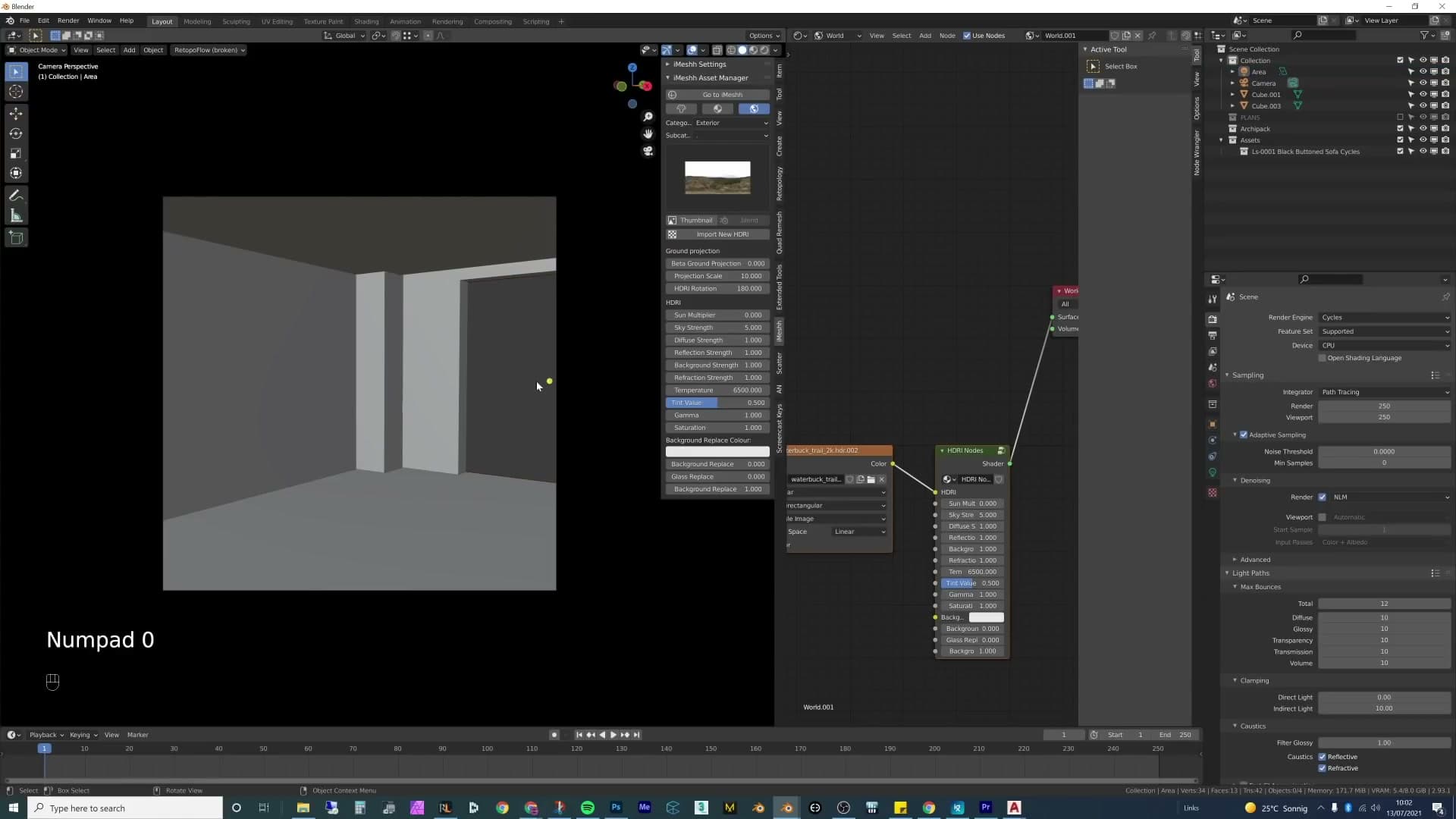
One annoyance: portal lights show up in the viewport as huge wireframe rectangles, which clutters the scene. In Eevee, open the light's properties, enable Custom Distance and set it to 0.5. The visual representation shrinks down to something manageable. Switch back to Cycles and the portal still works without that giant outline dominating the viewport.
Repeat the snap-and-scale step for every window in the room. Once each opening has its own portal, Cycles will resolve noise around the window-lit areas much more quickly than with the HDRI alone.
Wall and floor materials
A pale iMeshh wood floor tuned for dirt fall-off and roughness contrast, then an Alex Bowen stucco wall built from diffuse, glossiness and normal maps. We compare Smart UV vs box projection vs hand-stitched continuity, then add bevels with supporting edges and Shade Smooth for clean highlights.
iMeshh wood floor with dirt and roughness controls
Materials for the walls and floor go in before any furniture, because the moment a wood floor lands in the scene the colour bounce off the walls completely changes how the room reads. Get the largest surfaces tuned first and every smaller asset slots in against a believable backdrop.
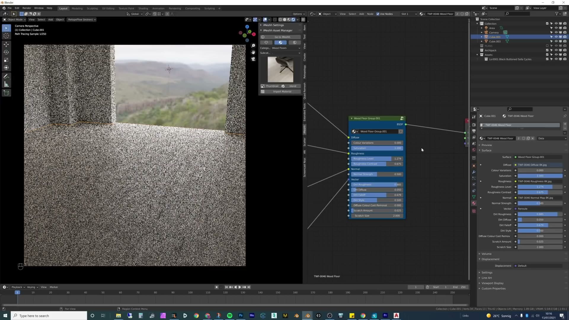
Load the iMeshh wood floor and brace for a sluggish viewport. The texture set is 8K, and Blender insists on regenerating the material preview every time you nudge a slider, even when the preview panel isn't visible. If the viewport stalls or crashes during a tweak, switch to another editor tab so the preview stops updating, drop into Render Properties ▸ Simplify, or swap to a 4K version of the floor. The iMeshh library ships an 8K version and a 16K version for close-up shots, and the textures tile at roughly four-and-a-half to five metres so a normal-sized room fills without obvious repetition.
Tune the dirt level before anything else. Roughness hides the dirt patches, so pull roughness all the way down and drop the roughness-contrast slider too. What remains on screen is pure dirt, and you can dial it until the wear pattern looks right. Leave dirt fall-off on its default behaviour: the lower a point sits relative to the floor, the dirtier it reads, so the dirt naturally pools at the edges of the room rather than smearing across the centre.
With dirt set, bring the floor roughness back in and push the roughness-contrast slider up a touch. The extra contrast in the roughness pass makes the grain stand out more strongly under the daylight, and the wood reads as a real timber rather than a flat tinted plane.
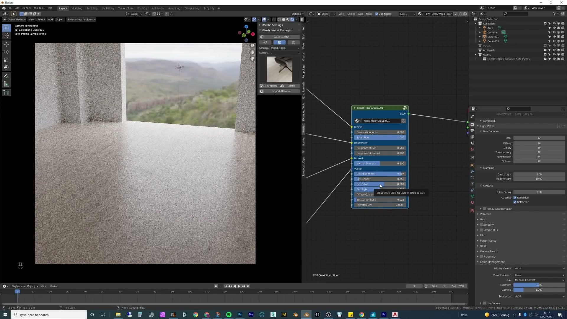
Pick a pale board on purpose. The reference shots driving this scene are bright and airy, so a dark oak would fight the lighting and a bleached white would feel too clinical. The pale-but-warm option sits between the two and supports the palette the rest of the room will lean into.
Stucco wall: diffuse, glossiness and normal
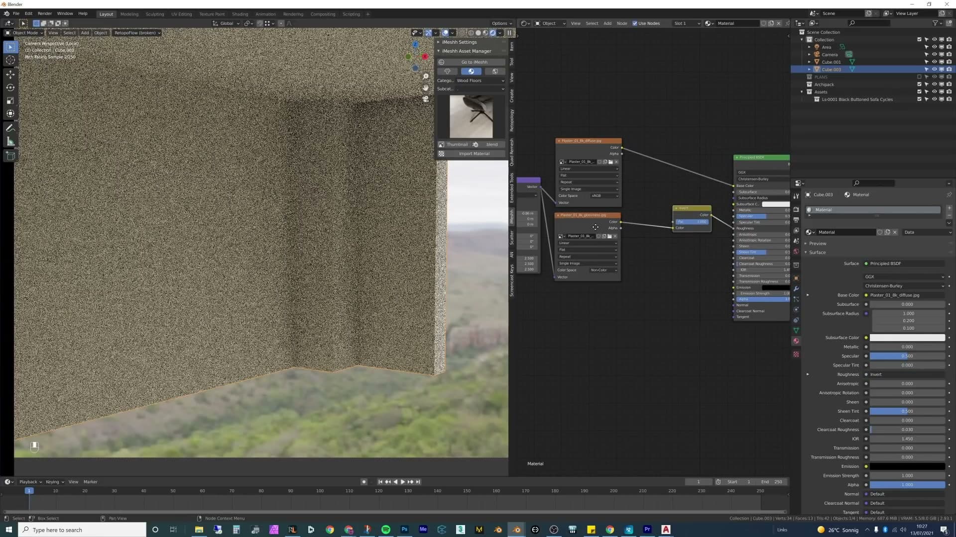
For the walls, the texture of choice is a stucco pack by Alex Bowen. He's released a free version that looks great, plus a paid version that's worth the spend if you want a top-tier interior plaster. The pack is sold as an outdoor stucco, but applied lightly to an interior wall it still reads as a believable painted plaster.
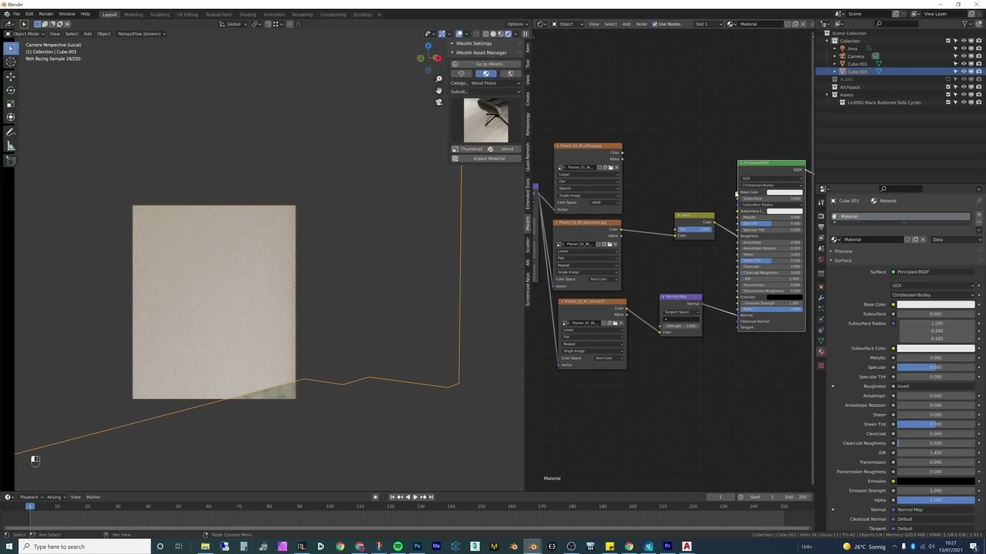
Build the shader with three maps. Drop the diffuse texture into the base colour. Add a second image texture for the glossiness map, set it to Non-Color data, and run it through an Invert node before feeding it into roughness. The map describes glossiness, so the inversion is what turns it into the roughness signal Cycles expects.
The normal map does most of the heavy lifting on a painted wall, because there's almost no other surface detail to read. Plug a third image texture in as the normal map. The default strength is far too aggressive for an interior, so drop it to 0.1 so the surface only suggests the texture of brushed-on plaster rather than shouting a chunky exterior stucco.
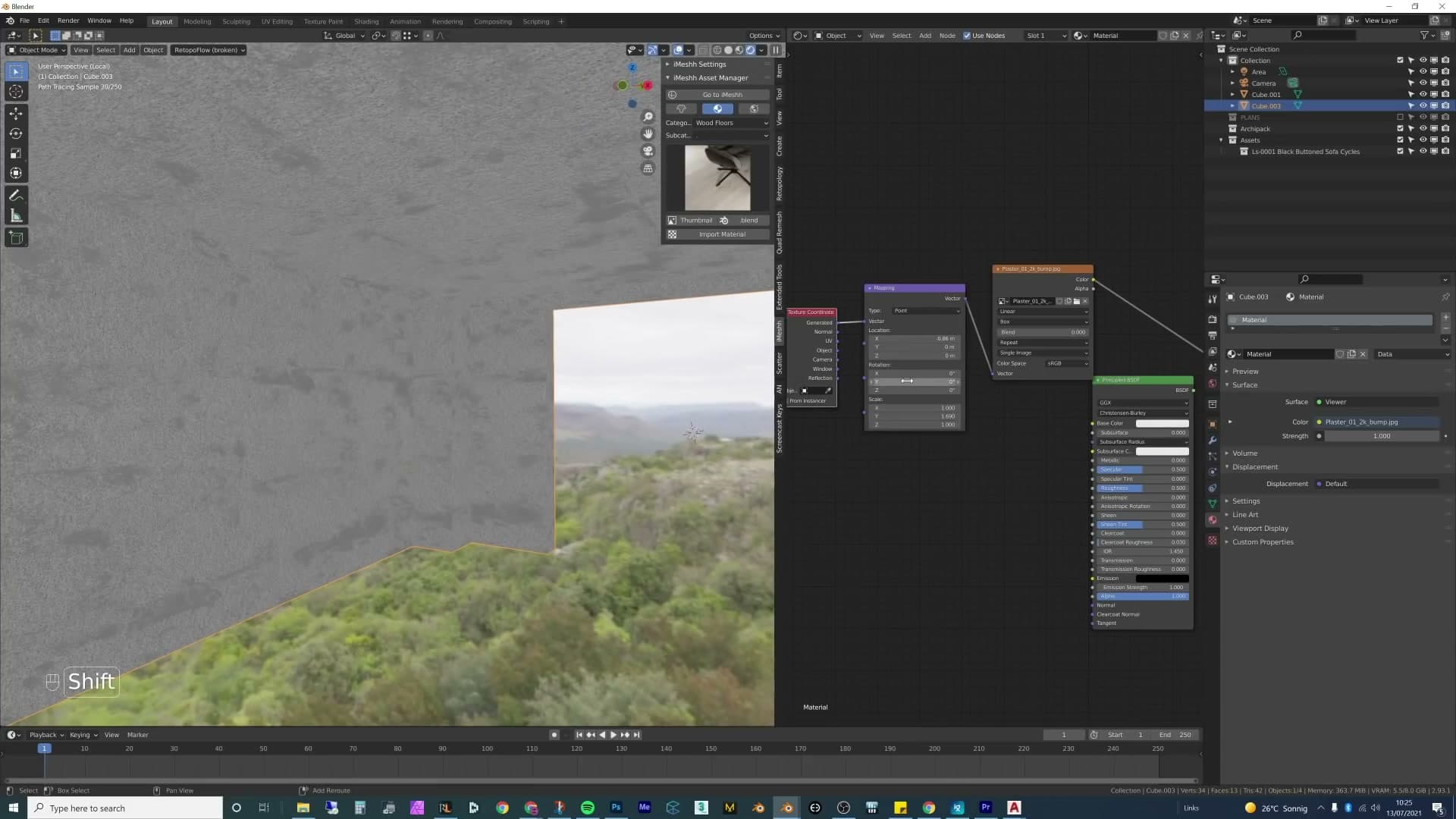
Temporarily detach the diffuse and look at a plain white wall while you set the bump level. That isolates the contribution of the normal map and makes it obvious whether the bump is reading too strongly. A quick render preview close-up confirms the wall holds a soft, subtle texture under the daylight rather than a heavy outdoor finish.
Smart UV vs box projection vs hand-stitched continuity
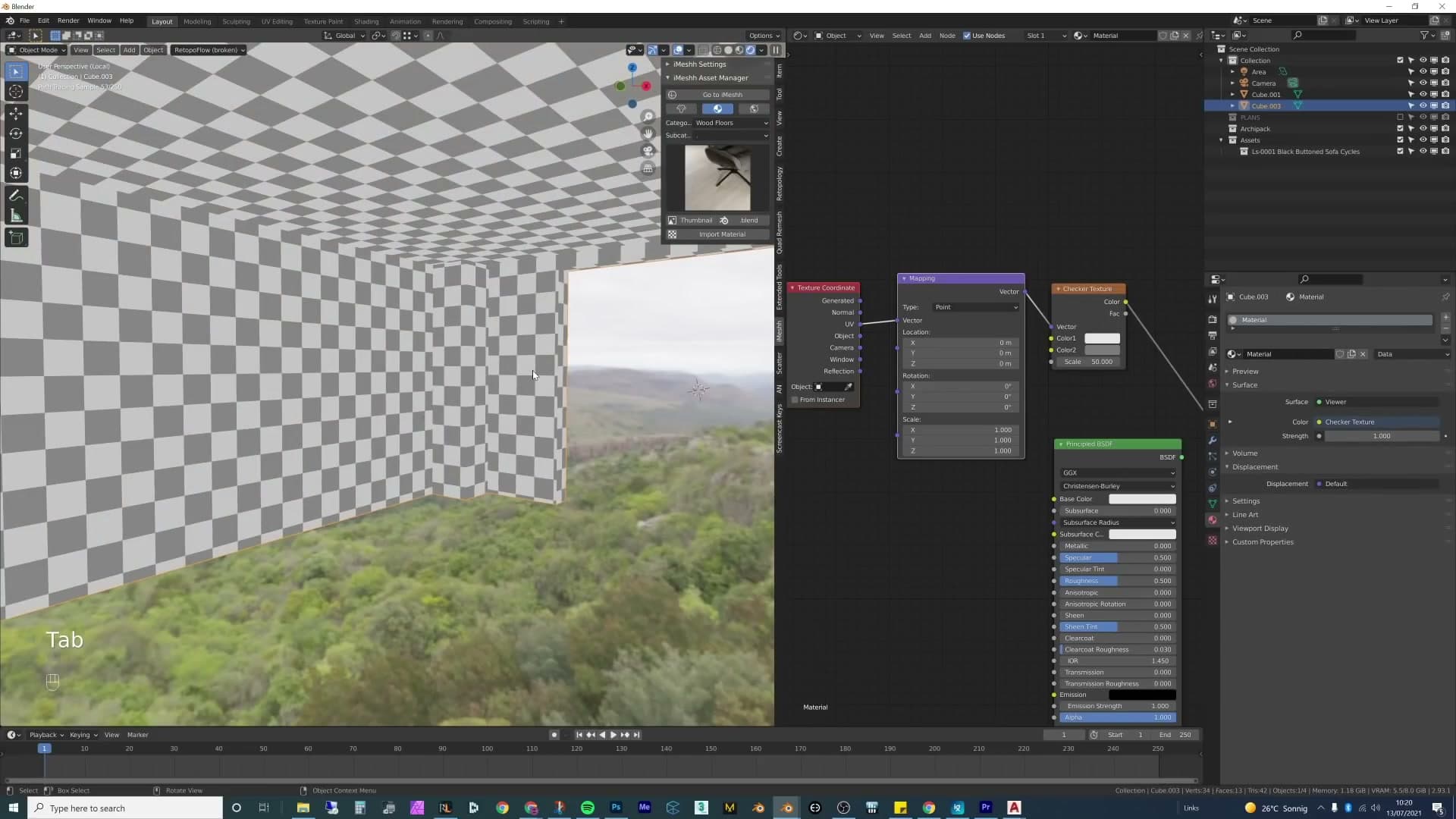
Before the stucco lands properly, the walls need UVs. There are three reasonable ways to do it, and which one matters depends on how subtle the texture is. Drop a checker texture onto the wall material first. The messy default UVs make the problem obvious, and the checker is the cleanest way to judge what each method actually produces.
The first option is hand-stitched continuity. Select the wall faces, unwrap them, then nudge the islands so the checker pattern runs cleanly from one wall to the next around the room. This is the approach taken in the previous archviz tutorial and the one some commenters argued was wrong, but on a stucco wall the texture is so subtle that even a perfectly continuous unwrap is invisible to the viewer.
The second option is box projection, the Blender equivalent of 3ds Max's box UV unwrap. Skip the UV editor entirely. In the shader, set the image texture's Vector input to a Texture Coordinate node's Generated output, then switch the image's projection to Box. Tweak the scale and offset until the pattern sits where you want it. This works fine and avoids the unwrap step altogether.
The third option is the brute-force one: select everything, hit U ▸ Smart UV Project, and accept the defaults. Continuity around corners disappears, but every face ends up at the correct relative scale, and on a subtle plaster nobody will spot the seams. For the sake of speed in this tutorial, that's the route the scene actually ships with.
Bevels with supporting edges for clean shading
Sharp 90° corners look fake under any kind of soft daylight, so the walls need a bevel. The straightforward approach is to add a single Bevel modifier, drop a Shade Smooth on top, and call it done, but that produces visible shading artifacts at the bevelled corners. The official fix is to enable Harden Normals on the modifier, which cleans the artifacts up immediately.
The alternative is a two-bevel stack, which is overkill for a wall this simple but produces the cleanest highlight along an edge. Add a first Bevel modifier and set its Profile to 1. With Profile 1 it doesn't really round the edge; it acts as a pair of supporting loops sitting right against the corner.
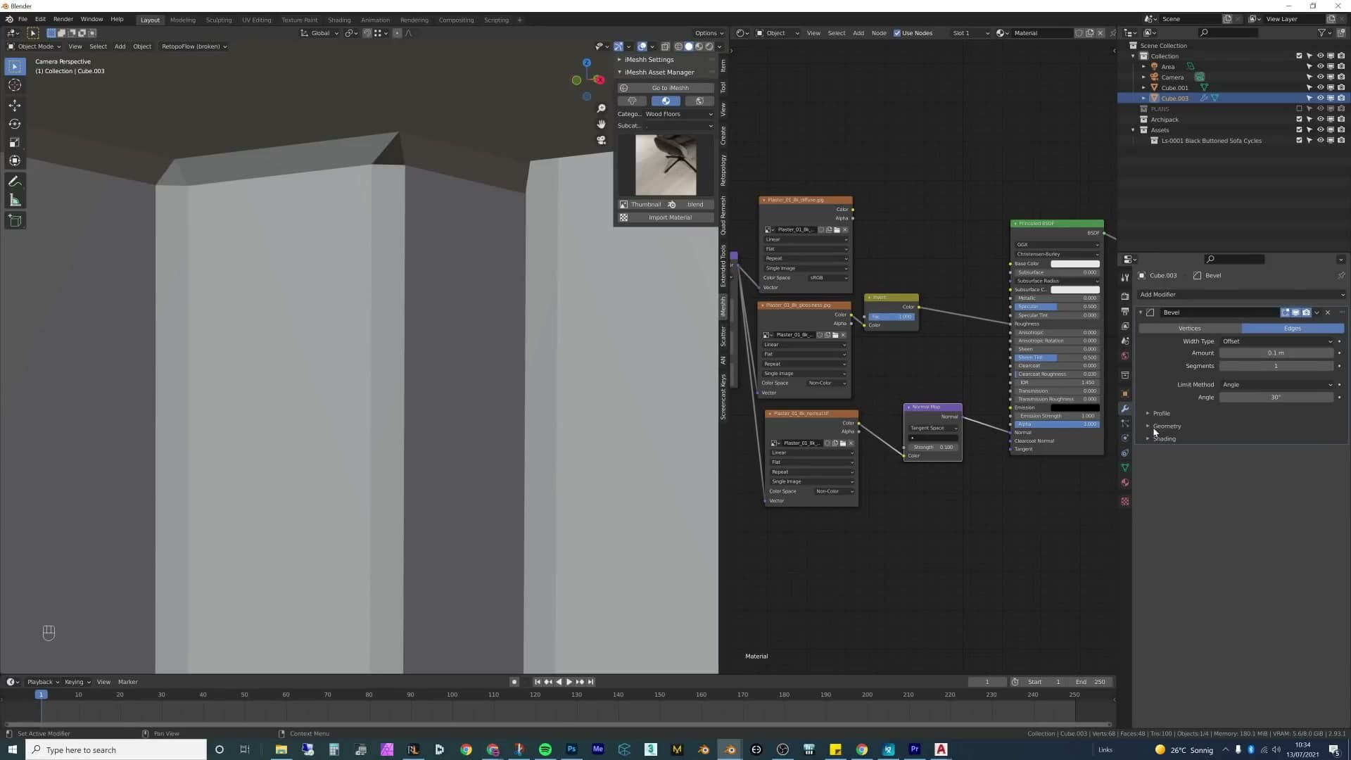
Add a second Bevel modifier on top of the first. This one does the actual rounding, sitting between the two supports created by the first modifier. Switch its width type to Percent for the outer pass so the bevel scales sensibly with the geometry, and keep the inner bevel small; around 0.004 is enough.
Apply Shade Smooth last. The two-bevel stack gives the shader a clean strip of geometry to interpolate across, so the highlight running down each wall corner is smooth and continuous rather than broken by the artifacts a single bevel would have left.

Camera setup: 90°, f/5.6 and frame size
Why nearly every professional archviz still locks vertical lines to 90°. Anything else makes the room feel like it's falling. We pick f/5.6 because that's the aperture range real DSLRs use most, and we square up an image resolution that crops well to whatever the client asks for.
Locking vertical lines to 90 degrees
With the walls and floor in place, set up the camera before you start blocking in furniture. You only need one shot for this scene, so it's faster to lock down the composition first and then build assets into the frame than to model the whole room and try to compose around it afterwards.
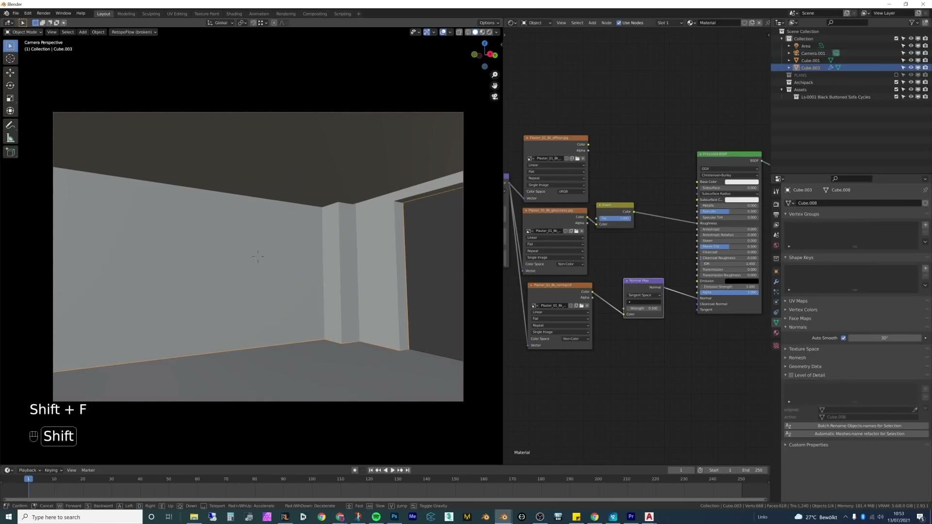
Look at the camera view and you'll spot something off: the vertical edges of the walls aren't running straight up and down. They're leaning inwards, as though the room is gently tipping away from you. That happens because the camera itself is tilted slightly on its X axis. After the first archviz tutorial someone commented that locking everything to 90° isn't very creative, and that's fair criticism, but study any professional interior render and you'll find that around 99% of them keep their verticals perfectly parallel. That's not an accident.
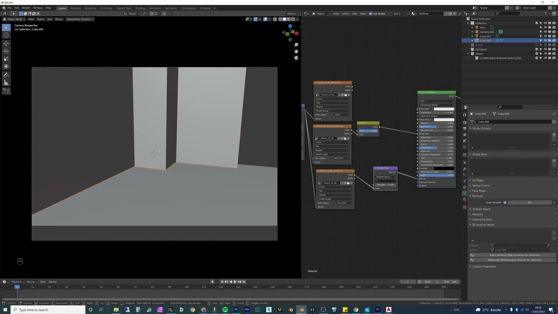
There is room for creative camera work (a top-down shot, a low close-up sat near the floor, or a tight crop on a tabletop can all work nicely) but for a full room shot you almost always want the camera dead level. As soon as the verticals start to lean, the room feels wonky. It can be extremely subtle, sometimes just a degree or two off, but the eye still reads it as wrong. Set the camera's X rotation to 90° and the room snaps back to feeling solid.
Why f/5.6 reads as a real photograph
With the camera squared up, open its depth-of-field properties and set the f-stop. We're using f/5.6. The focal distance (what the lens is actually focused on) comes later once the furniture is in the shot, so leave that one alone for now.
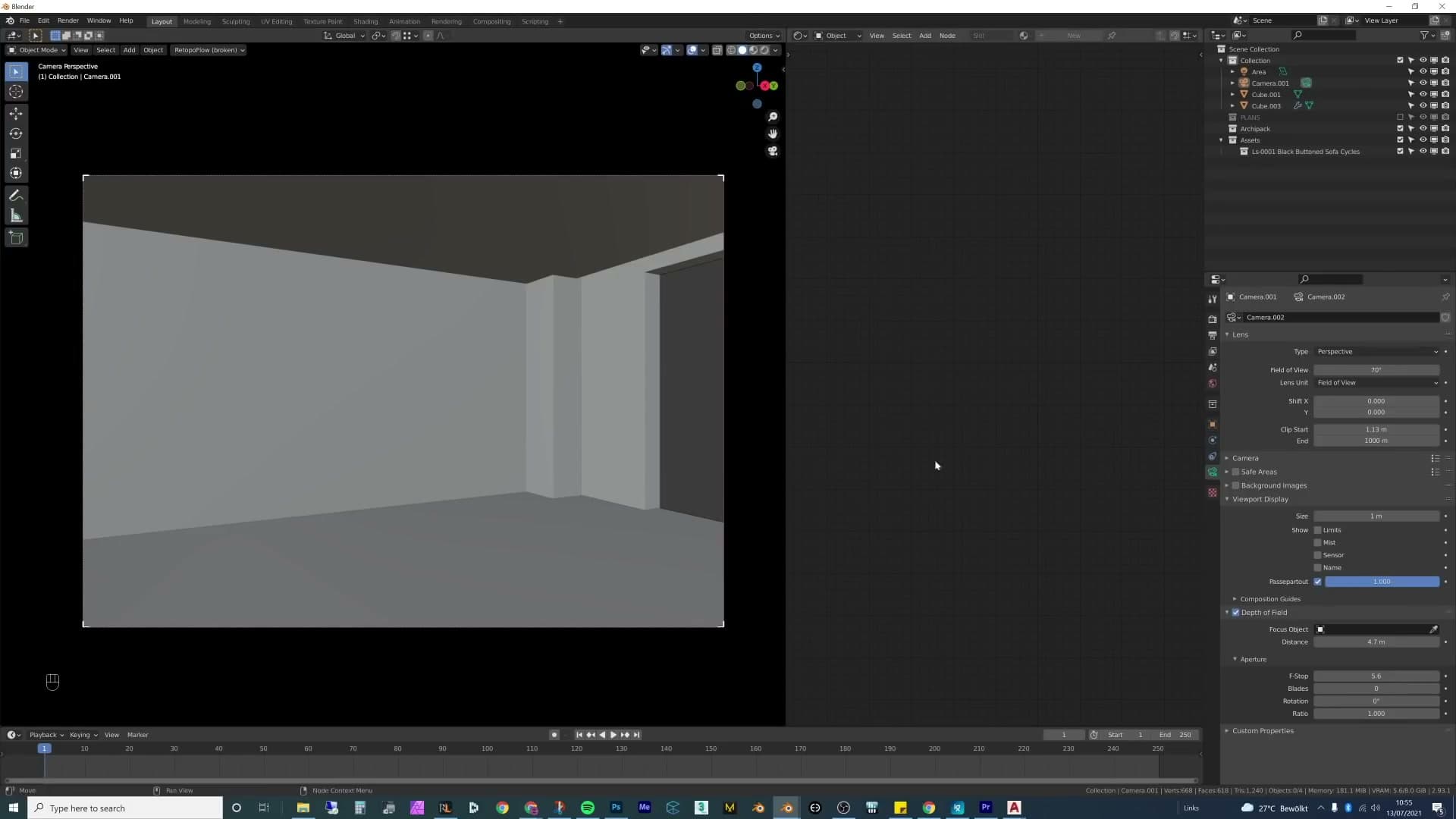
Why f/5.6 specifically? Most professional DSLR kit lenses sit in the f/3.5 to f/5.6 range, so it's an aperture that working photographers shoot at constantly. Pick a number from that bracket and the image starts to read as a photograph rather than a render: anything in front of the focal plane blurs out, your subject stays sharp, and anything further back falls off gently. There isn't a precise technical reason it looks more real. The familiarity of the aperture just seems to trick the eye into accepting the image as something a real camera captured.
Resolution and aspect ratio for archviz
The last camera decision is the render resolution and aspect ratio, and the right answer depends entirely on where the image is going to live. If a client wants it for social media, you're probably looking at a square or a taller portrait crop. If it's going on a website hero, you might need something wider. Work the destination back into the camera before you go any further.
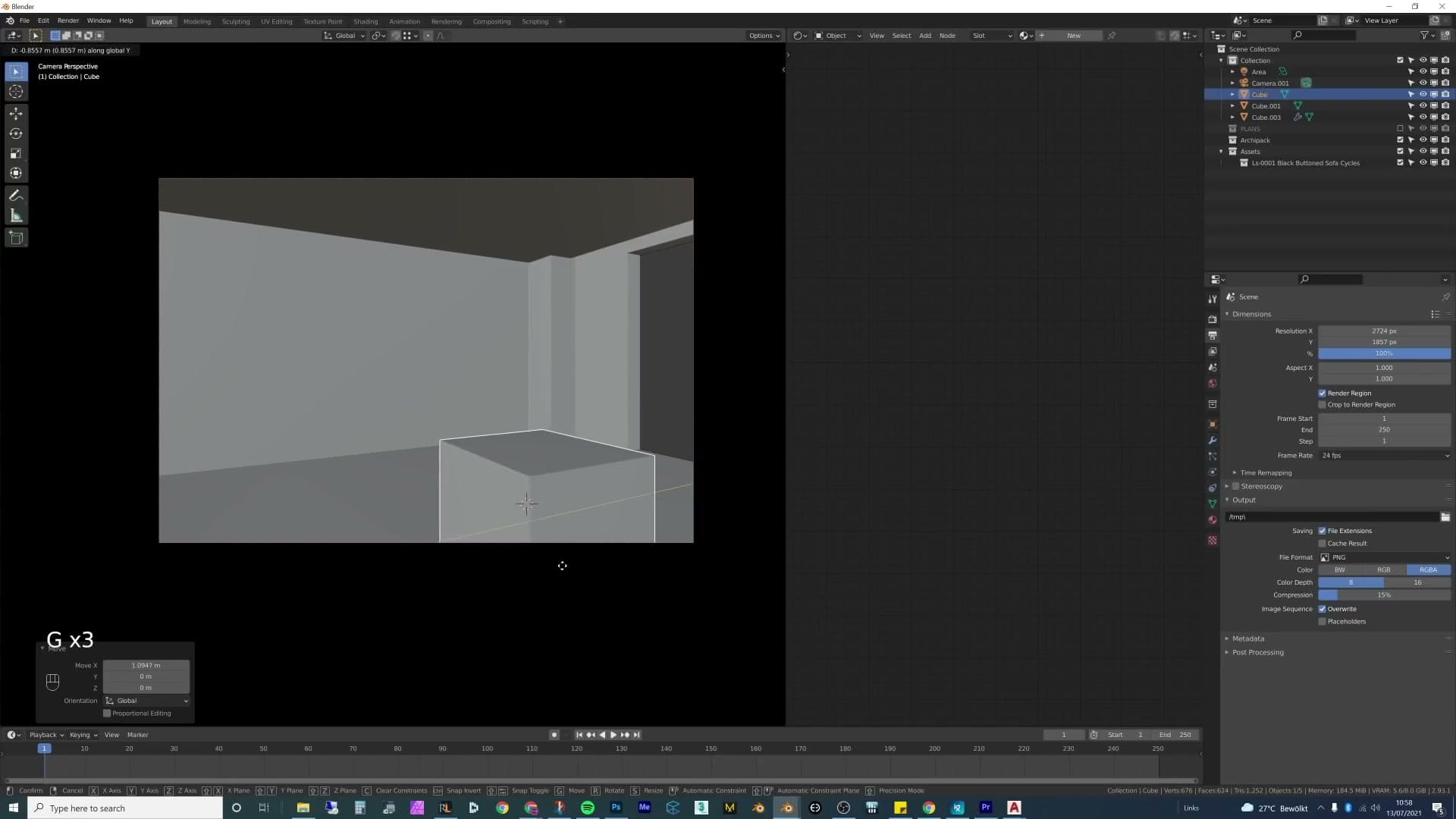
A trick from the first archviz tutorial is to render everything as a large square frame and then crop into it in post. That gives you the most flexibility: pull a wide hero from one part of the frame, a portrait social crop from another, all from a single render. The downside is composition: if you build the shot inside a square but the final delivery is a 16:9 banner, the framing you spent ages perfecting won't translate. A chair that sat beautifully against the edge of your square will look completely wrong once the image is cropped down.
A safer approach is to compose inside the aspect ratio you actually expect to deliver and then render at that ratio. The exact frame size doesn't matter much. Pick something that looks right to your eye and the image will work. If you want a familiar look, match the proportions of a real camera: a Canon DSLR shoots roughly 3:2, and most modern smartphones (I'm reading off my Pixel) use similar dimensions. People recognise those proportions even if they couldn't name them, and an image that fits a familiar frame reads more easily as a photograph than one stretched into an unusual shape.
Pulling a palette from a reference
Drop a Pinterest interior into a palette generator, screenshot the swatches, and bring them into Blender as an in-scene reference image. If a colour you wanted is missing, sample it manually with Photoshop's Blur ▸ Average filter on a marquee selection.
Extracting a palette from a Pinterest reference
A colour palette is the set of tones that work together to make a scene feel like one image rather than a pile of unrelated assets. Pick those colours up front and every fabric, wood and piece of trim you add later pulls in the same direction. Drop a bright blue wall into a room built around warm whites and stripped pine and the whole render fights itself.
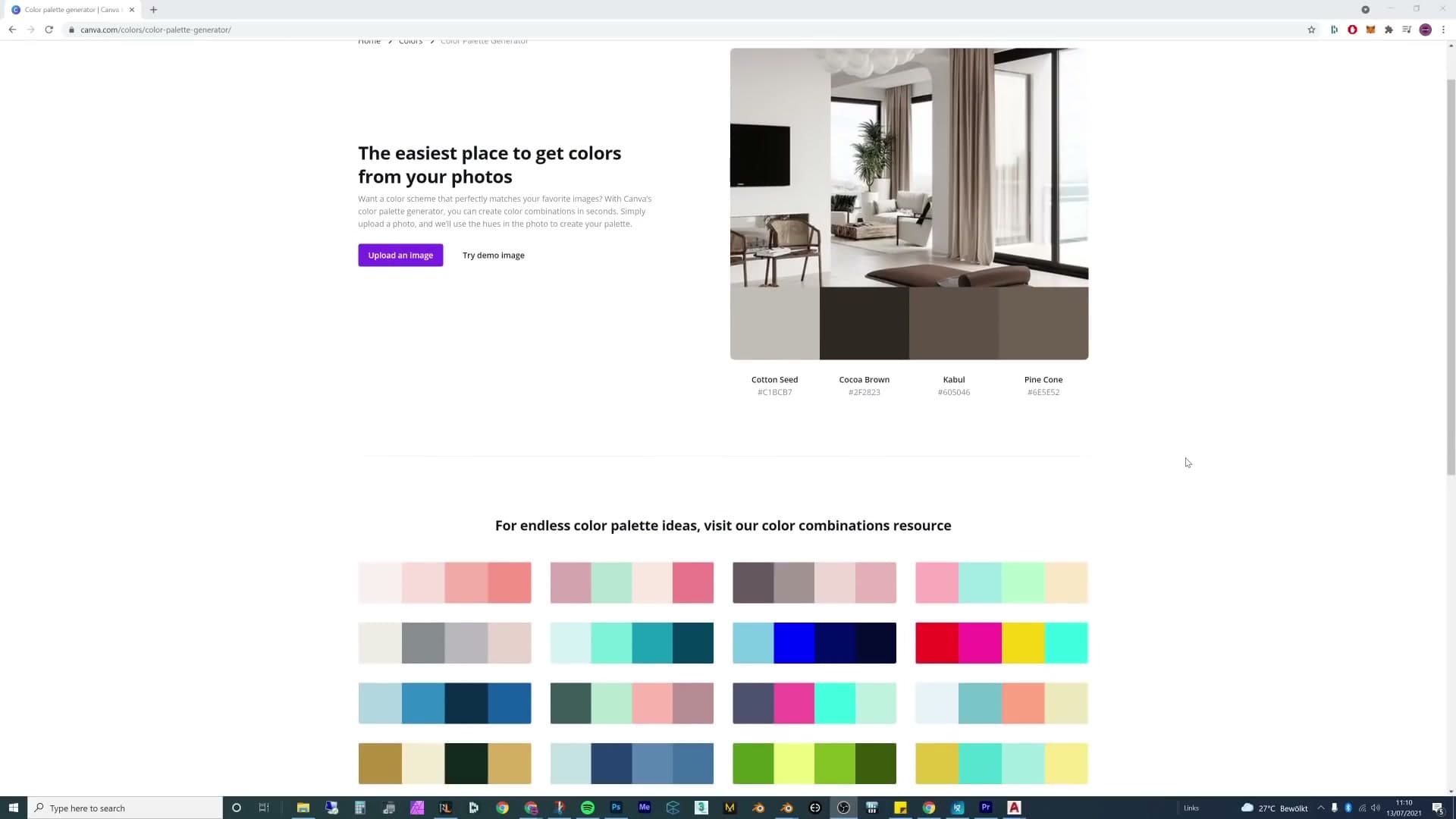
Pick one interior shot you like. Pinterest is the easiest place to scrape references. Drop it into an online palette generator that pulls the dominant colours out of any uploaded image. It returns a strip of swatches sampled directly from the photo, which is your starting palette for the room.
The generator is not always perfect. Sometimes a colour reads as dominant to your eye but the algorithm undersells it. A tone that is clearly leading the image only appears as a thin band, or does not show up at all. That is fine. Screenshot the strip anyway and save it; you will patch in the missing colours by hand in the next step. The white walls and the light wood floor already sit happily inside this palette, so future decisions are really just about choosing furniture and props that do not break it.
Sampling missing tones with Blur ▸ Average
When the generator skips a tone you actually wanted, sample it manually. Open the reference image in Photoshop (Affinity Photo has the same filter if you would rather work there) and use the marquee tool to draw a selection around the patch whose colour you want, such as a slice of curtain or a clump of foliage. Then run Filter ▸ Blur ▸ Average. The selection collapses to a single solid swatch: the mean colour of every pixel inside the marquee.
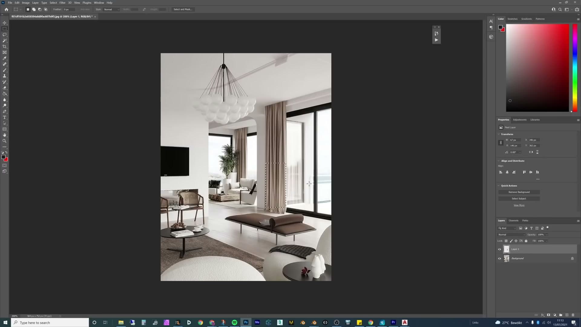
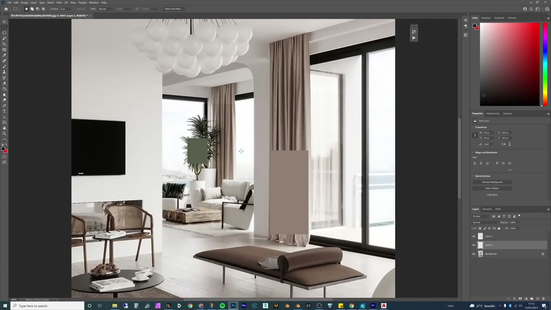
That swatch is the colour you were after. Repeat the trick for any other tones the generator missed. In the walkthrough I pulled an averaged curtain colour and a green sampled from the foliage I planned to use for plants later. Drag the new swatches onto the bottom of the palette strip so they sit alongside the generated ones, then save the file. You now have a single image containing every colour the room is allowed to use.
Pinning the palette inside Blender
Bring the saved palette image back into Blender and drop it into the corner of the viewport as an in-scene reference. The point is to keep it visible the whole time you build the room: every time you add a sofa, test a fabric, or tweak a wood, the palette is right there to glance at. I also assign the palette object a viewport colour of its own so it is easy to pick out from the rest of the geometry while orbiting.
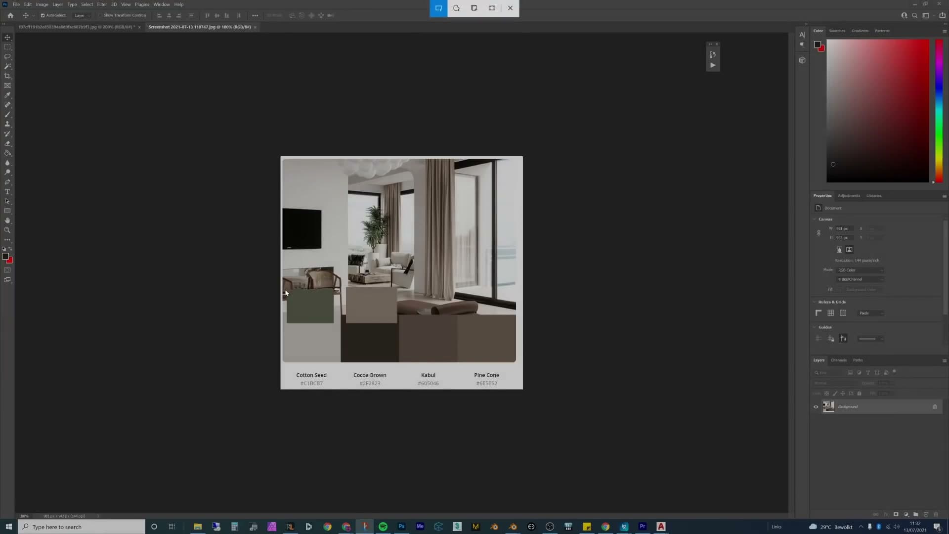
If you want to push the palette further, eyedropper any swatch to read its hex value, paste that code back into the palette tool, and it will surface complementary colours, purples and a cooler blue against the warm tones in the demo. That gives you a way to introduce accent colours that still belong to the same family rather than guessing at them.
The discipline this enforces is what matters. With the strip pinned in the corner of the viewport, you stop reaching for arbitrary colours and start asking whether each new asset earns its place in the palette. The walls and floor are already inside it; everything that lands on top now has to agree.
Adding the sofa and kitchen
Sofa first (it's the focal piece in most living rooms), then an iMeshh kitchen run made to real cabinet dimensions. Recolour the kitchen woods with a mix-RGB Colour node so they sit inside the palette instead of fighting it.
Sofa first, then recolouring to the palette
A sofa is the focal piece of most living rooms, so build the room around it first. Drop a sofa from the iMeshh library against the back wall and slide it roughly into position. I pick one I've already covered in a separate YouTube making-of, so you can model it from scratch if you want a fabric that matches the palette out of the gate.
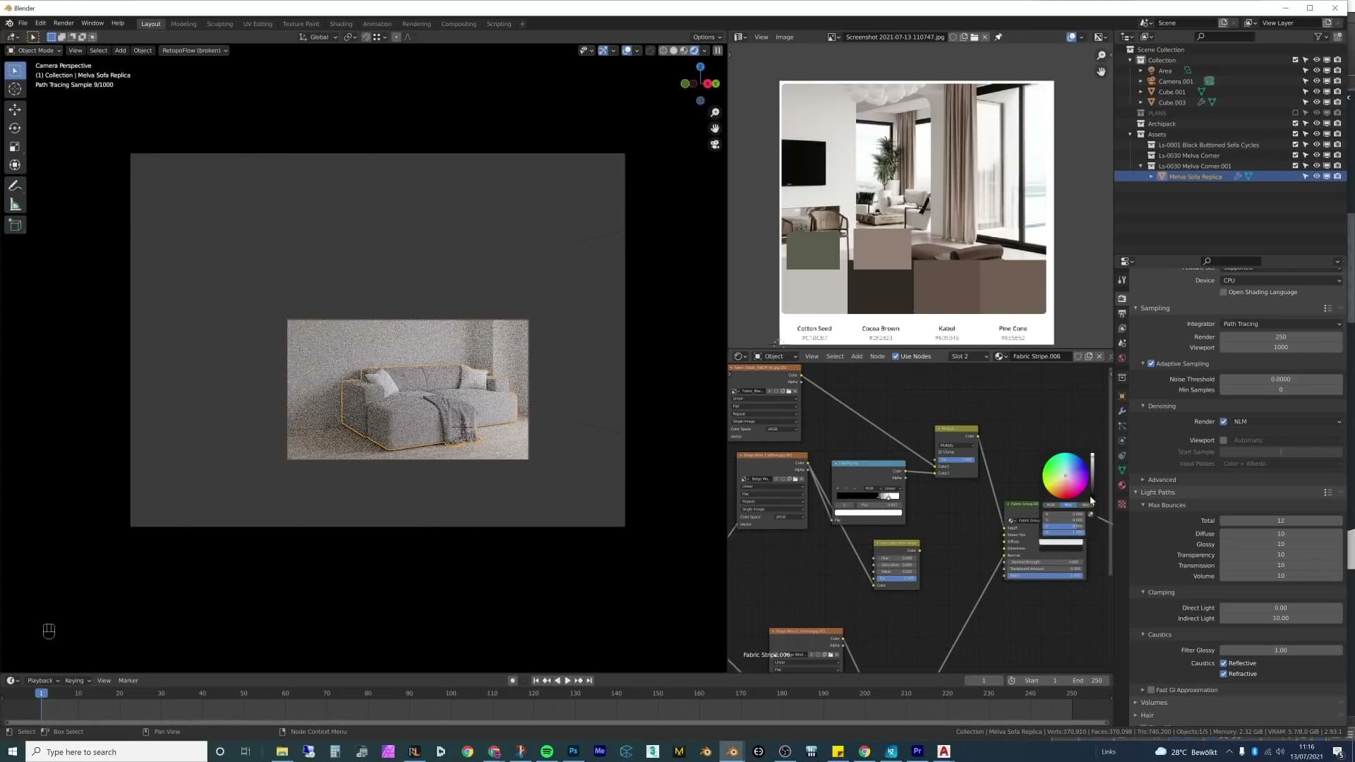
Once the sofa is in place, check it against the palette before you reach into the shader. The default fabric is already close to one of the swatches, so a small nudge is enough. Plug a palette colour into the diffuse at around 0.5 and the seat shifts the rest of the way toward the tone you're after. The brighter back wall does most of the contrast work anyway.
The blanket and the striped trim need a heavier hand. Select the blanket fabric (it's named fabric stripe 005) and add a Mix RGB node in the shader. Set the blend mode to Color, pick the palette swatch you want the fabric to lean toward, and push the factor to 1.0. The Color blend mode remaps the hue without flattening the stripe pattern, so the weave keeps its detail but stops fighting the rest of the room.
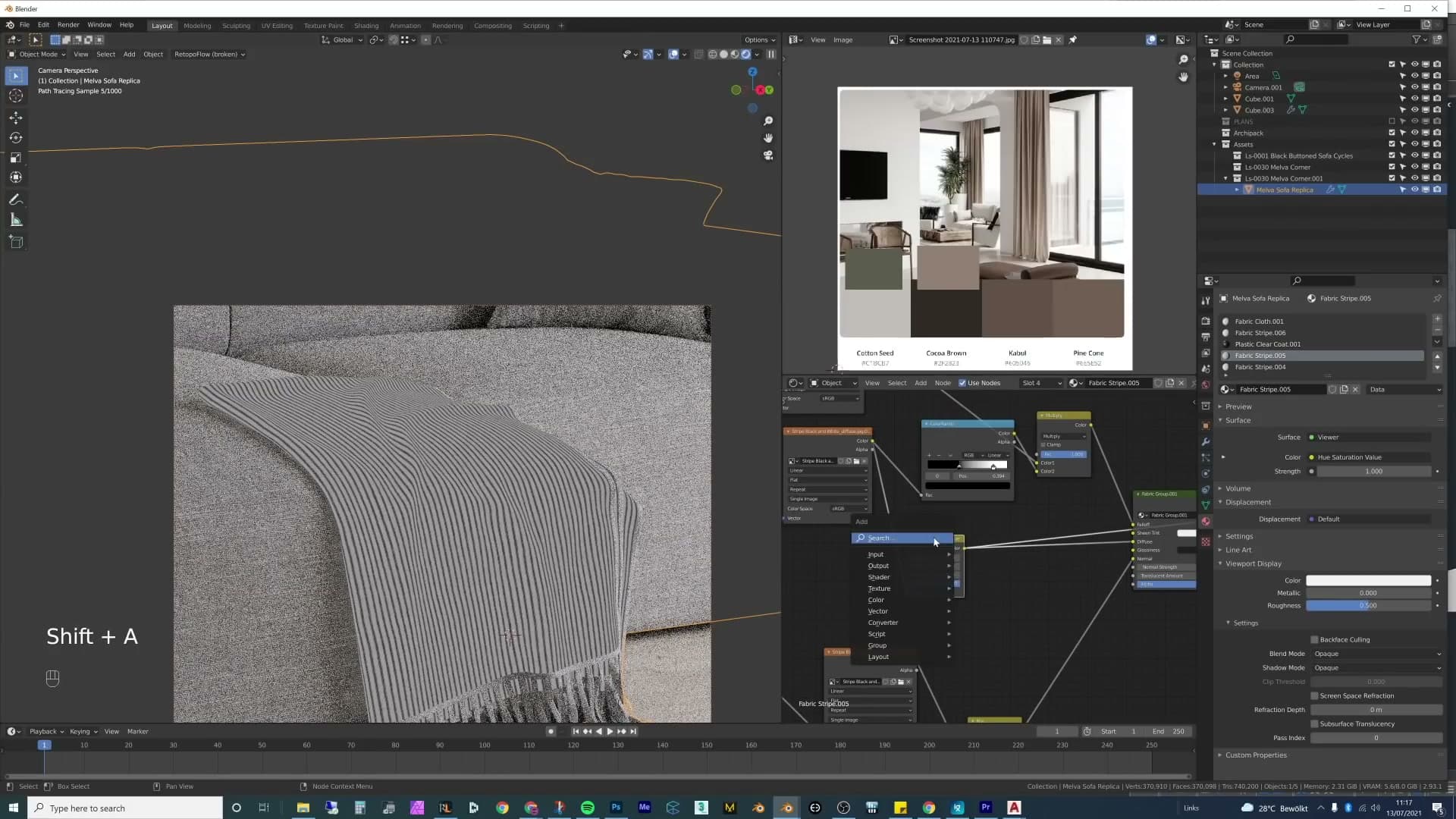
Repeat the same node trick on any other striped element the asset ships with. This is the whole recolour pattern for the rest of the build: drop in an iMeshh asset, find the fabric texture in its shader, slot a Mix RGB set to Color in front of it, and pick the palette swatch it should lean toward.
Dropping in a kitchen and toning down the wood
After the sofa, the next major piece is the kitchen. The iMeshh library ships ready-made kitchen runs assembled by the studio's resident kitchen specialist (twelve years' experience), so every cabinet is built to real spec dimensions rather than guessed ones.
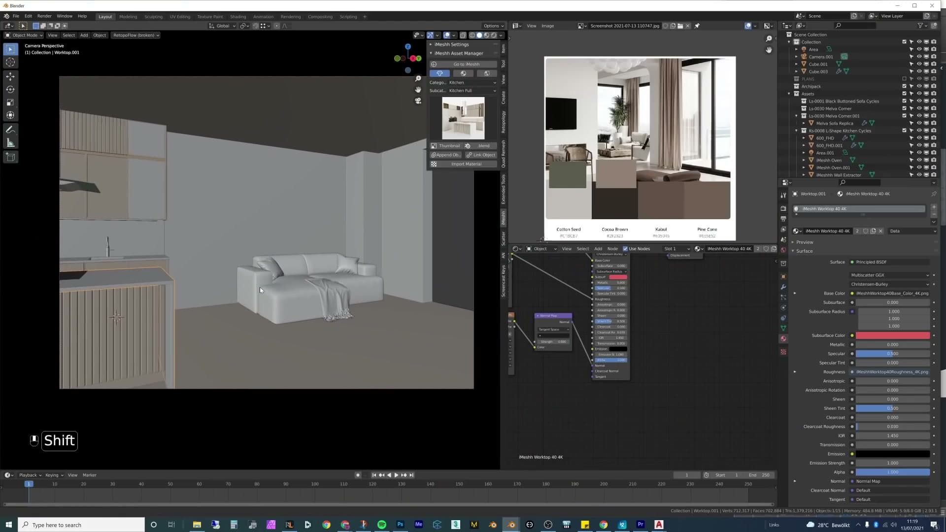
If you'd rather model your own, kitchen plans are easy to find online. A quick Google for cabinet layouts will turn up standard dimensions you can copy. The sizes vary slightly between the US and the UK, so pick the spec that matches the room you're building.
Drop the kitchen run against the side wall. The default colour palette is already close to the warm-neutral target you've been chasing, but the cabinet wood is the problem. It's a saturated orange, and there's no orange anywhere in the reference palette. Left alone, it would pull every other surface around it off-key.
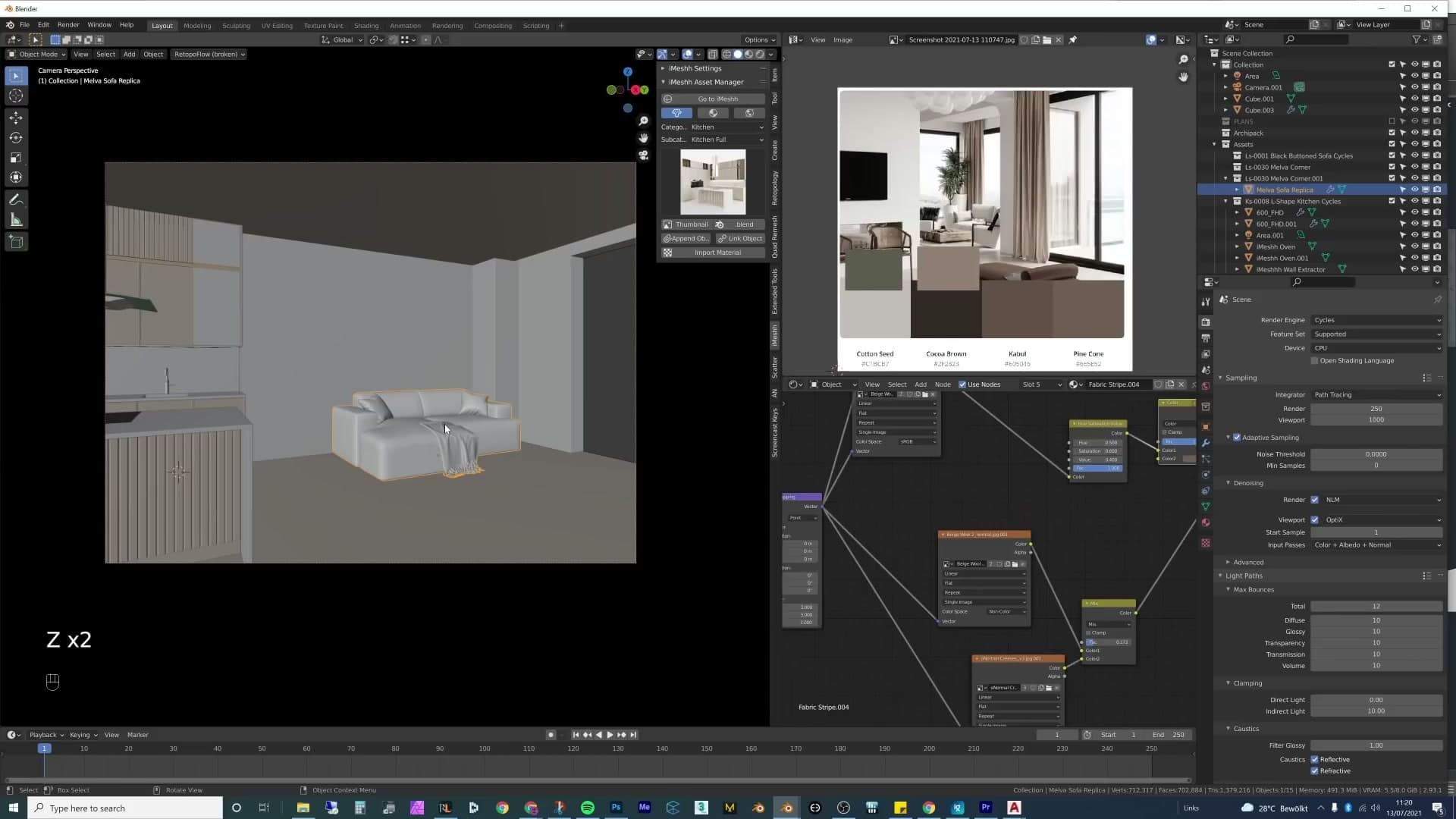
Fix it in the shader. Detach the wood texture's colour input so you can drive the diffuse with a palette swatch instead. A dark swatch reads too heavy. Plain white works, but the cleaner answer is to pick a hue close to the palette, then drop the saturation and lift the brightness until the cabinet front reads as a calm, lighter wood, same hue family as the orange, just with the volume turned down.
Plant focal point and wall sconces
A tall plant in the gap beside the sofa picks up the palette's green and breaks the kitchen line. Above the sofa, two wall sconces are linked with Ctrl+L ▸ Object Data so they always share brightness, and the bulb colour is warmed slightly to add atmosphere.
Choosing a plant that ties to the palette
There's a noticeable gap between the back of the sofa and the start of the kitchen, and an empty patch of floor reads as a missed opportunity. You have options here (a cabinet, a small unit, a picture frame, or even a side coffee table would all work) but a tall plant fits the brief best, because it adds height in a spot where every other object is low and horizontal.
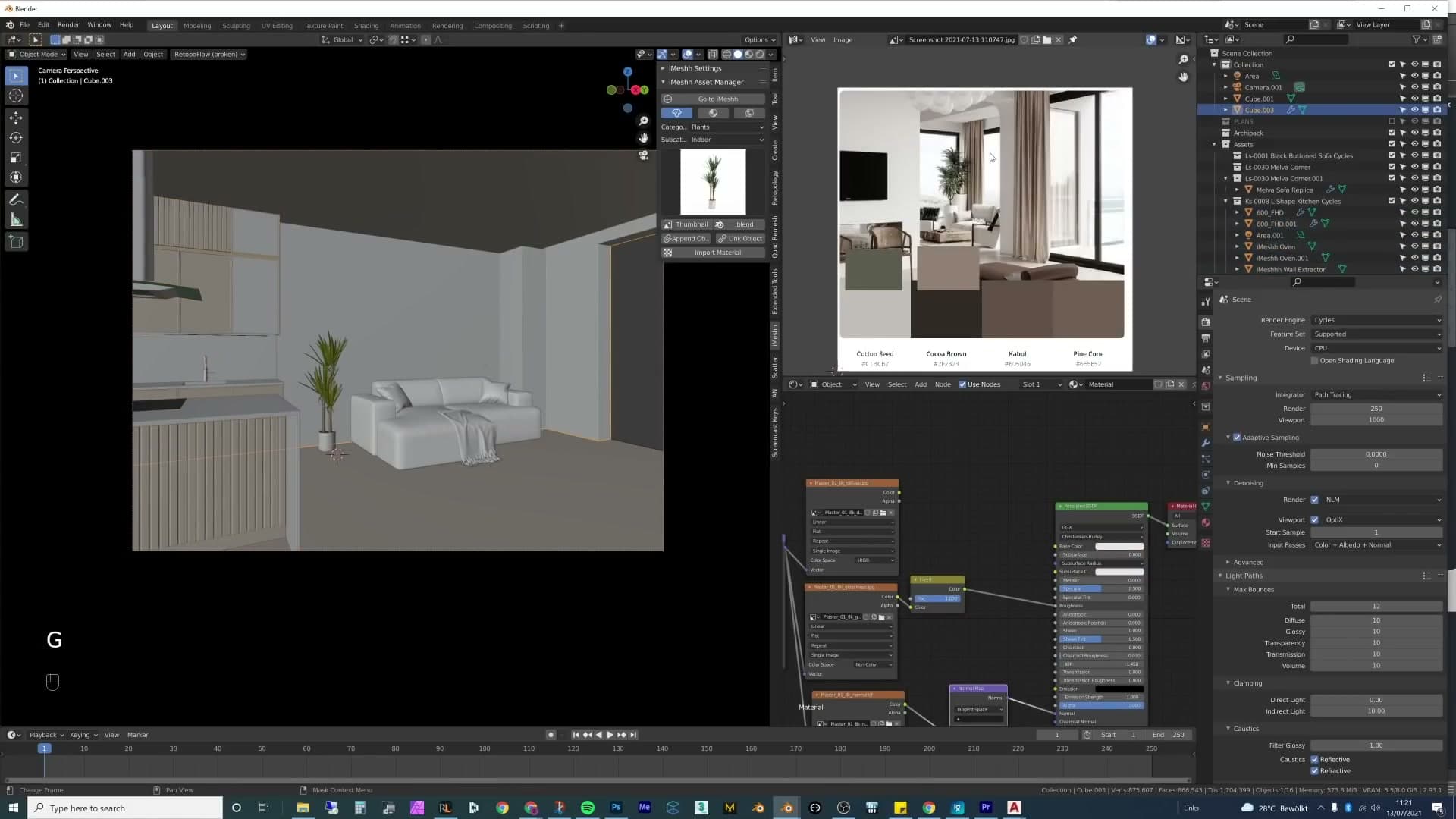
Pull a plant from your library into the gap. Before you commit, slide the sofa over a touch and shift the kitchen collection across too so the plant has somewhere to sit without crowding either neighbour. Nudge the camera over to match the new composition.
This particular plant has three separate stems, so make sure all three are visible from the camera angle rather than hidden behind the sofa, and check that the base is resting on the floor and not floating. Step back to the camera view and read the colour: if the green looks a touch too blue against the palette, you can usually live with it. In this scene the existing tone sits close enough to the reference that no recolouring is needed.
There's still slightly too much dead space on the kitchen side, so select the kitchen collection and push it further across again. Seeing a bit more kitchen in frame is fine. The kitchen reads well on its own, and the room now feels filled without being cluttered. Re-centre the sofa on the wall behind it so the camera doesn't read as lopsided.
Linked wall sconces above the sofa
The wall above the sofa is a large, empty white expanse, and an empty wall above seating is the most common weak spot in an interior render. You could fill it with picture frames, you could cut a window into the wall to reveal a view, but the cleanest solution is a pair of wall sconces, which add light, decoration, and warmth in one move.
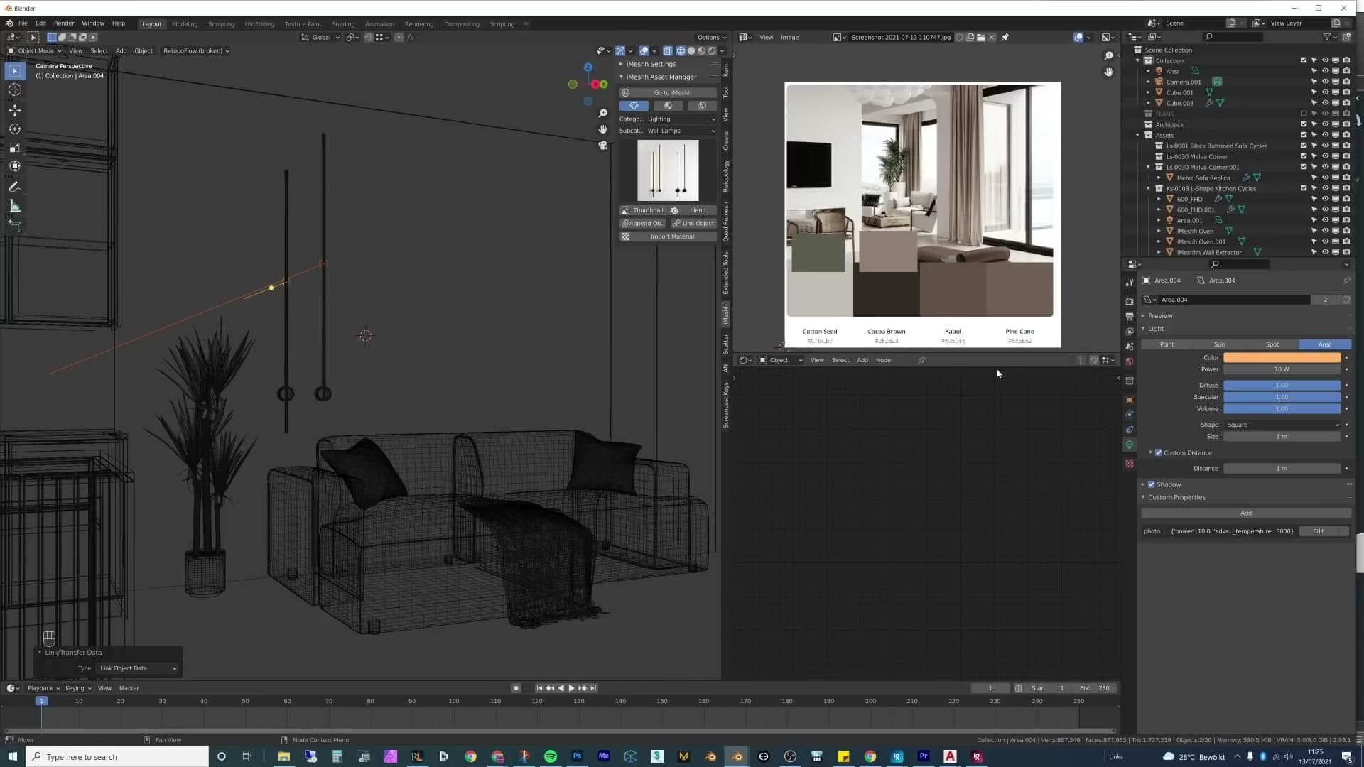
Drop two wall lights from your library into the scene above the sofa. Rotate the pair 90° so they sit horizontally against the wall, scale them down to roughly one metre so they read at the right size for the sofa beneath, and position them symmetrically above the cushions. Rotate one of the two sconces a further 90° relative to the other. A small bit of variation between the pair stops the wall feeling too matched.
To keep both lights at the same brightness no matter how often you tweak one, select both sconces and press Ctrl+L ▸ Link Object Data. From now on, changing the wattage on one updates the other automatically, which is useful because you'll almost certainly fiddle with the strength a few more times before render.
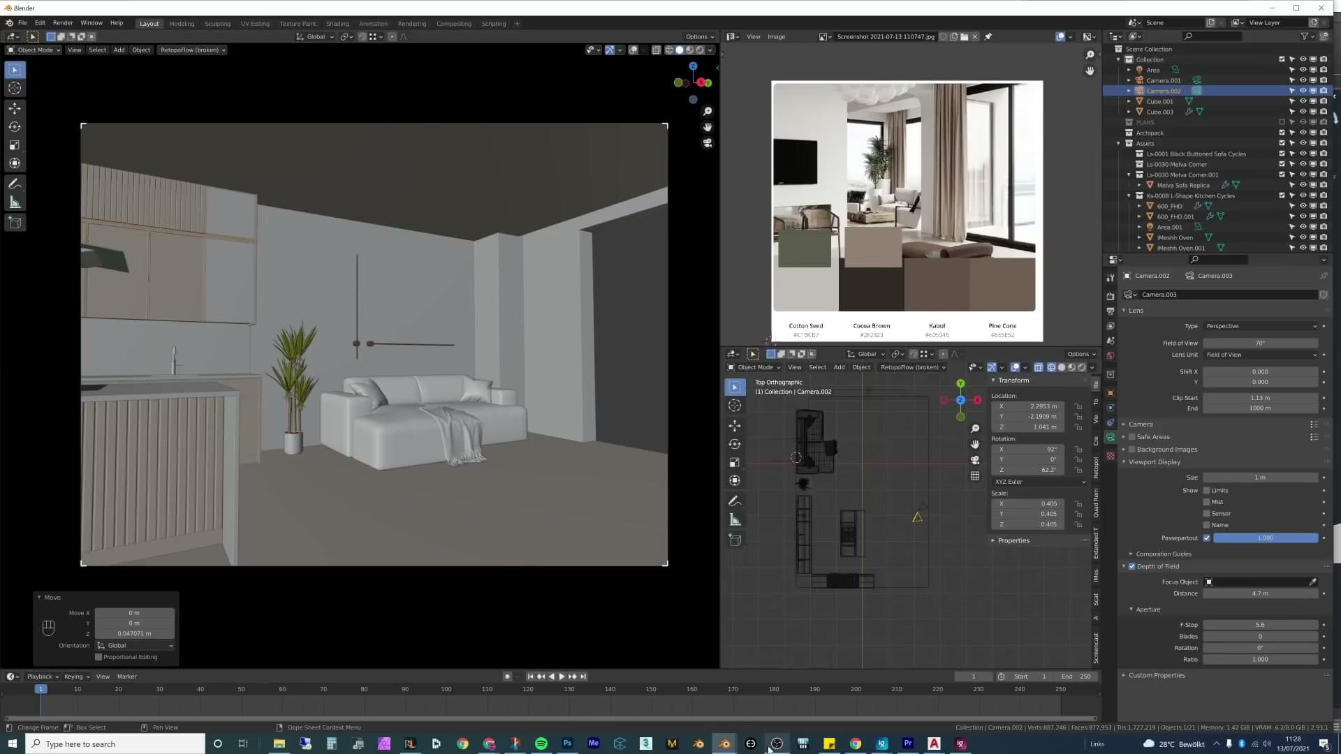
The bulb colour from the asset is leaning quite orange. Rather than fight it, push the colour towards the palette: drop the saturation a little so it isn't a glaring orange, and nudge the hue slightly warmer and redder so it picks up the reddish tones already living in the palette. The result is a softer, more atmospheric glow that ties into the rest of the room.
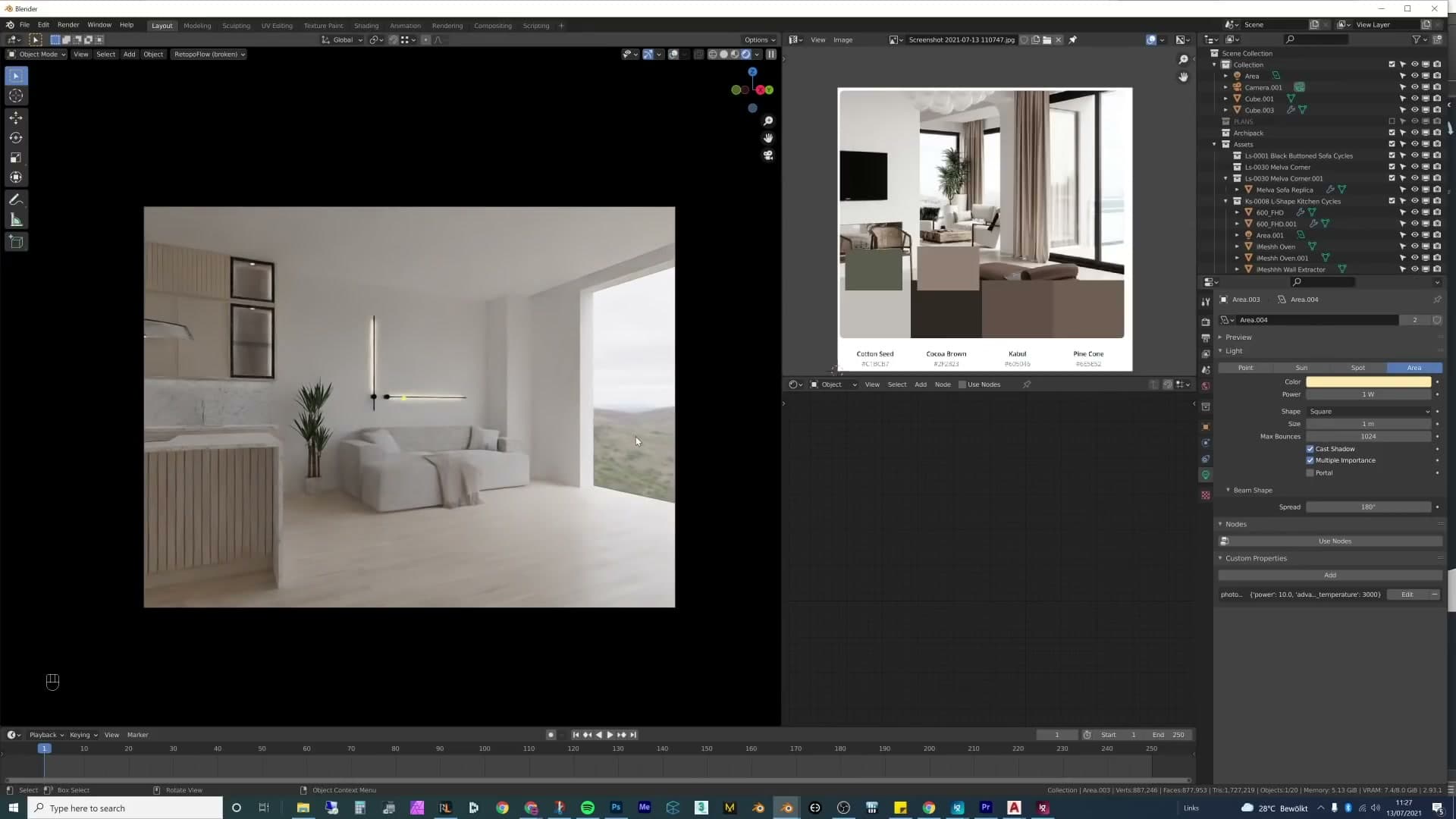
With the sconces in, the camera now feels a little far away. Add a second camera positioned slightly closer, and nudge it up and over so the lens looks down marginally on the kitchen units rather than straight at them. Earlier the kitchen line and the sofa back were almost stacked on top of each other, which hid the gap the plant lives in. Lifting the camera gives you more context across the whole space and lets the plant breathe in its slot.
Dining table instead of a TV
Skip the TV. It kills the scene and forces a boring lounge-chair pairing on the opposite wall. A table and two chairs behind the camera suggest activity outside the frame and keep the space feeling lived-in instead of staged.
Adding a table instead of a television
The obvious question at this point is: where does the TV go? The honest answer is that it doesn't. Not every home has a screen on the wall, and dropping one into this room kills the scene. The moment a TV lands on the empty wall opposite the sofa, the only thing that can sit in front of it is a pair of lounge chairs, and lounge chairs in this composition are boring. There is already a second seating area further back, so two more chairs facing the same direction make the foreground feel dead.
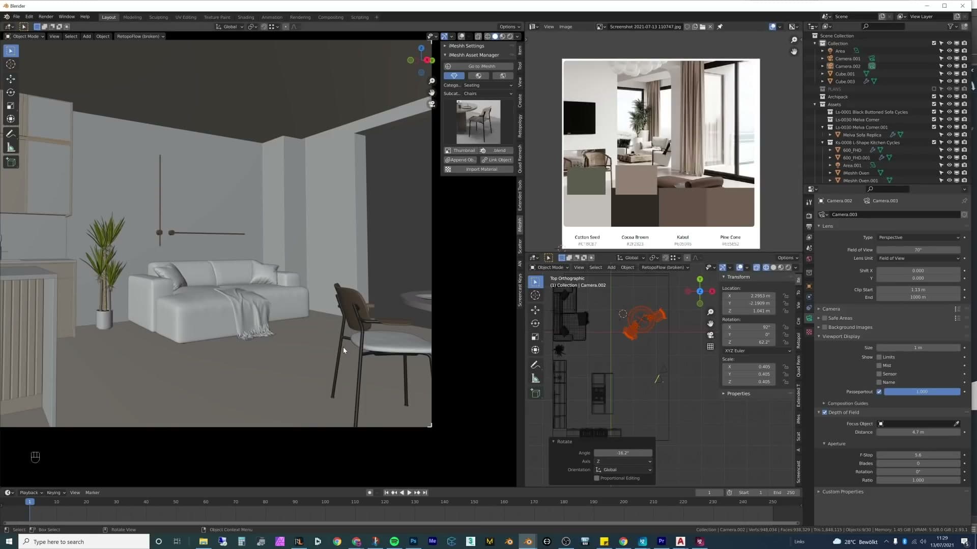
A small dining table in that same spot does something the chairs can't: it implies activity off-camera. Two chairs pulled up to a table behind the viewer suggests someone has just got up, that the room is being used, that there is a story continuing outside the frame. It pulls the eye through the image instead of stopping it at the sofa.
Spinning the sofa around to face a TV on the back wall isn't a fix either. There is nothing uglier in an archviz shot than the back of a sofa. Keeping the sofa facing the camera with a table in front of it reads as an open, inviting, people-shaped space rather than a screen-shaped one.
To set it up, drop a single chair into the scene and rotate it slightly so the second armrest is visible from the camera. A chair shot dead-on from behind reads as a slab. Then duplicate the chair and bring the copy round to the other side of the table. Even if the second chair is barely visible in the final frame, having both there sells the idea that the table is in use.
Recolouring chairs and mugs to fit
Before touching the materials, nudge the mugs on the table so the lip of one of them just clips into frame. That tiny peek of a cup is the cheapest storytelling trick in the scene. It tells you someone has been sitting there.
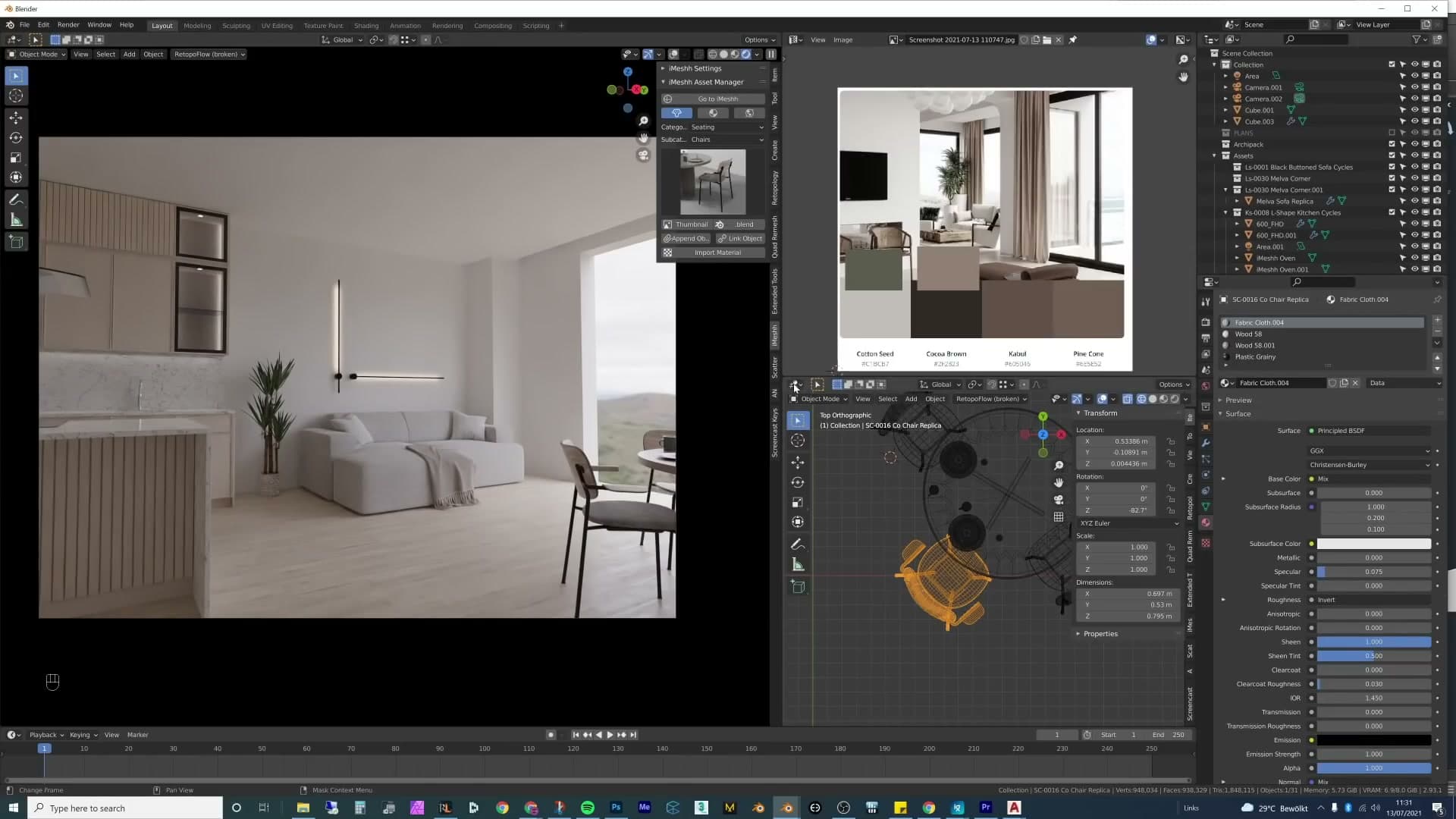
The chairs are a good starting point because the upholstery is already close to the palette greens established earlier. The cloth on the second chair, though, leans noticeably blue, and so does one of the mugs. Both need to be pulled back toward the palette so the foreground props stop fighting the sofa and the kitchen behind it.
The fix is the same mix-RGB Colour node trick used elsewhere in the build: drop a Mix RGB node into the fabric and mug shaders, set the blend mode to Colour, and feed in a palette swatch with the factor pushed to 1.0. The texture detail underneath is preserved; only the hue shifts. Lift the swatch slightly brighter on the mug so it doesn't go muddy under the warm interior light.
Repeat the same node setup on the remaining chair and on the second mug, varying the swatch a little between them. A bit of variation across the props keeps everything inside the palette without making the table look like a matching set bought from a catalogue.
Windows and curtains
Strip the glass to a single plane, set ray visibility to Camera and Transmission only, and pump up a Principled shader with white base, zero roughness, full transmission. Then drop in a sheer curtain hanging just above the floor, and limit its ray visibility to Camera only so it doesn't paint the room in noise.
Modelling a window with transmission-only glass
With the lighting reading nicely, the next job is to break up the dead patch of wall by adding a window. I drop in a simple window asset from the library, but flag up front that this particular model predates Blender 2.9's newer window technique, so the glass needs reworking by hand before it will behave in Cycles.
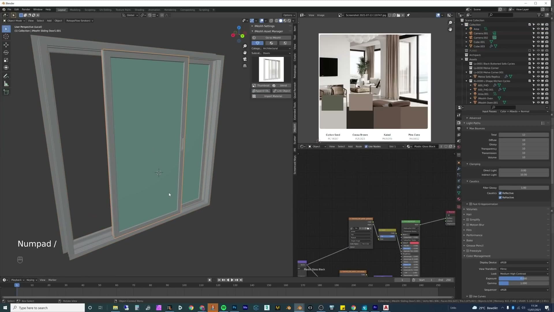
Enter the window asset in edit mode, click on each piece of glass (including any hidden inside the frame) and press P to separate them into their own meshes. With the glass pieces now standalone objects, head to Object Properties → Visibility → Ray Visibility and untick everything except Camera and Transmission. That way Cycles still sees the glass through the lens, but the panes stop dumping diffuse and shadow bounces into the room.
For the shader itself, a plain Principled BSDF is all you need. Push the base colour to pure white, drop roughness to 0, and turn transmission up to 1. Blender's stock glass is, honestly, "a little bit funny". This minimal setup keeps it predictable. While you're inside the mesh, delete any duplicated glass planes the asset shipped with; you only want the single pane closest to the camera-facing side of the frame.
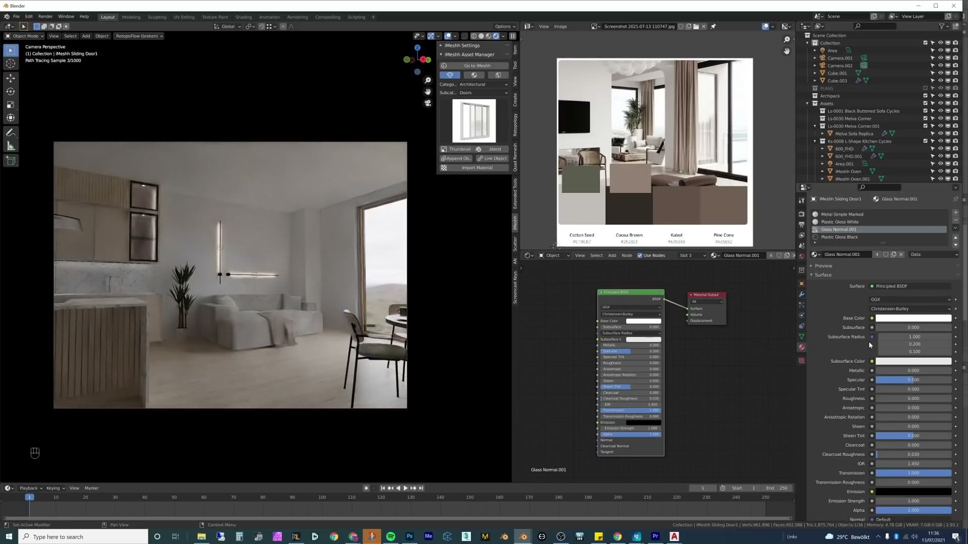
To resize the window without bloating the frame, scale the outer geometry to roughly the right size first, then jump into edit mode and slide the inner loop-cut edges up to take up the slack. Scaling the whole object would thicken the frame; raising the inner edges keeps the profile consistent. Nudge the frame material a touch whiter so it ties into the wall trim.
Sizing the second window to match
The second window has to read at the same size as the first, otherwise the room feels lopsided. Grab the duplicate, rescale it until the frame matches the original, and slide it across to the side wall so the camera catches another edge in the shot. That second edge does a lot to suggest depth beyond the main view.
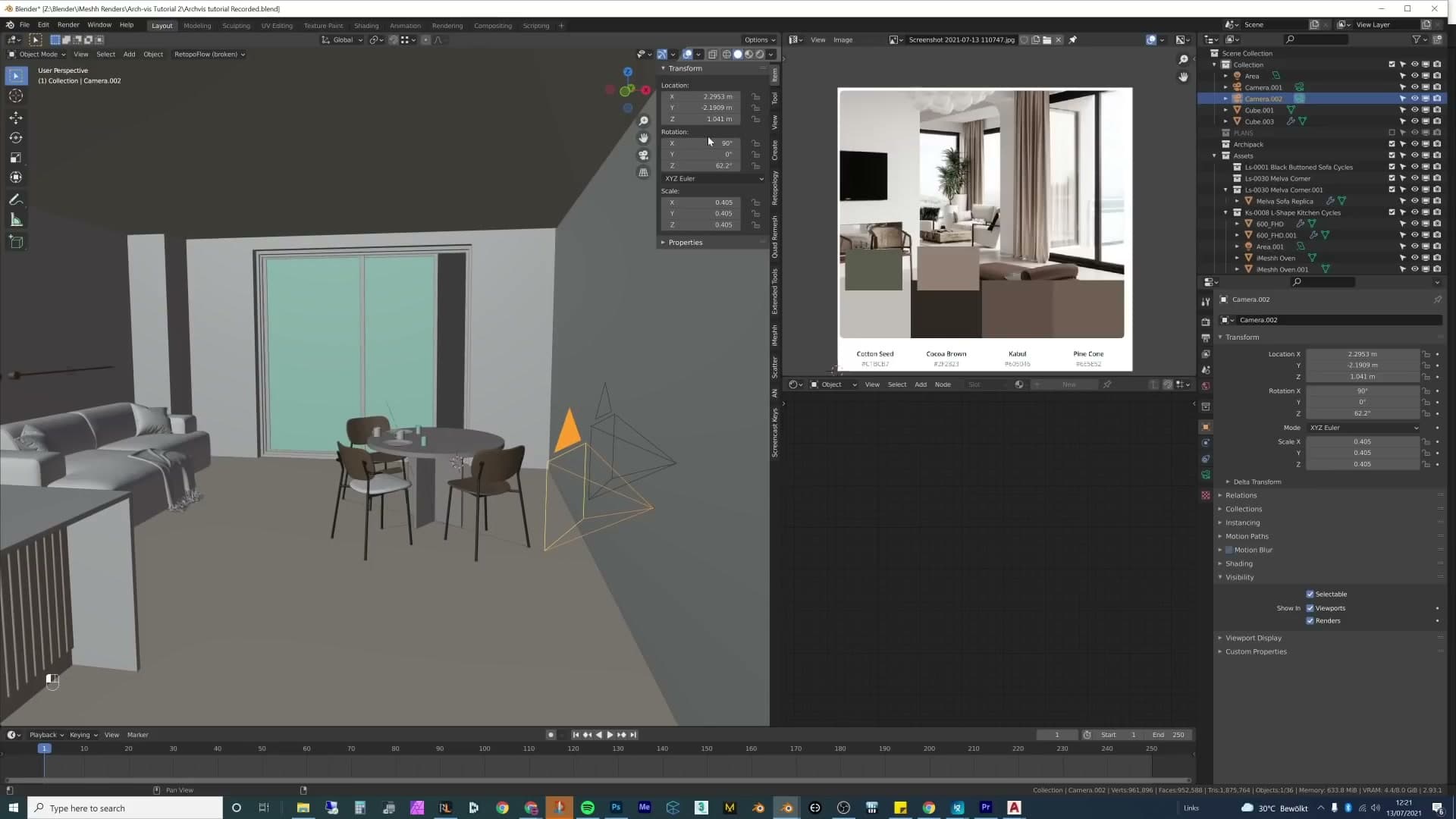
Check the camera before moving on. It's easy to knock it off-axis while nudging things around, so open the camera's transform panel and set the relevant rotation back to 90° to keep the verticals true.
Sheer curtain limited to camera visibility
A sheer curtain softens the window edge and fills the empty wall to one side. Drop one in from the library. If you'd rather build your own from scratch, I have a separate walkthrough that covers making a quick curtain. The asset ships as a pair so it can double as a blowing curtain in an open-door corner, so delete the side you don't need for this shot.
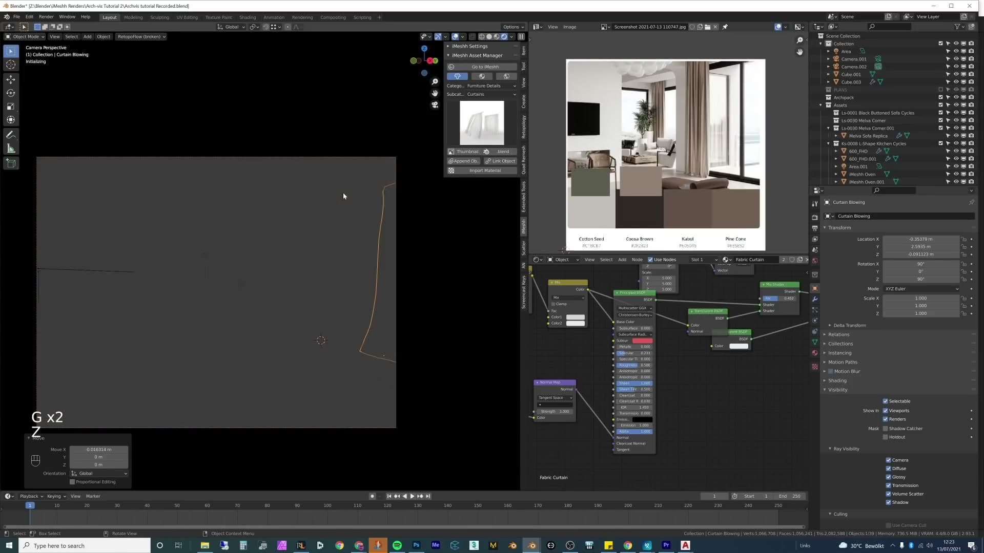
Hang the curtain so it just grazes the floor (that small graze sells the fabric weight) and scale it up so the top hides behind the curtain-rail lip. If the panel clips through the wall, scale it in slightly until it sits clean. Fabrics tolerate aggressive scaling without looking wrong, so don't be precious about exact dimensions.
Fire off a render preview and you'll see the curtains dumping a lot of noise into the room. A sheer is meant to let almost all of the daylight through, but Cycles still treats it as something the light has to fight past, and you end up with grain across the whole scene. Open Object Properties → Visibility → Ray Visibility on the curtain and untick everything except Camera. The curtain still shows up in the final image, but light passes straight through it instead of bouncing off it.
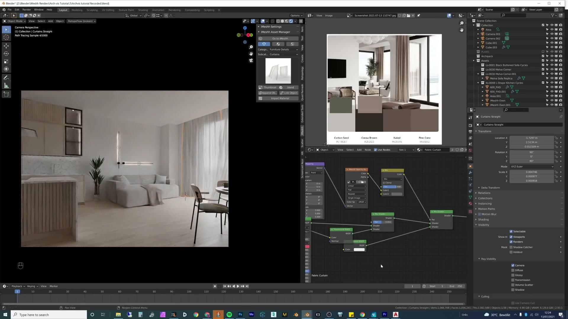
To keep both panels behaving identically, select them together and apply the same ray-visibility settings across the pair. The room reads cleaner immediately. You can always come back during the final render and dial the curtain shadows back in a little if you want a softer light cut, but for the working preview, camera-only is the cheap fix.
Coffee table and a better glass shader
Blender's default glass shader is flat. It loses caustics and softens highlights. We append a third-party Principled glass node group that handles caustics properly, then mirror the sofa to give the camera-side coffee table room to breathe.
Recolouring the coffee table
With the rear of the scene resolved, the foreground feels empty, so the next job is to drop a coffee table into the space between the sofa and the camera. Pull one out of the asset library. The one I grab here is a glass-topped table with a red-and-green tinted frame.
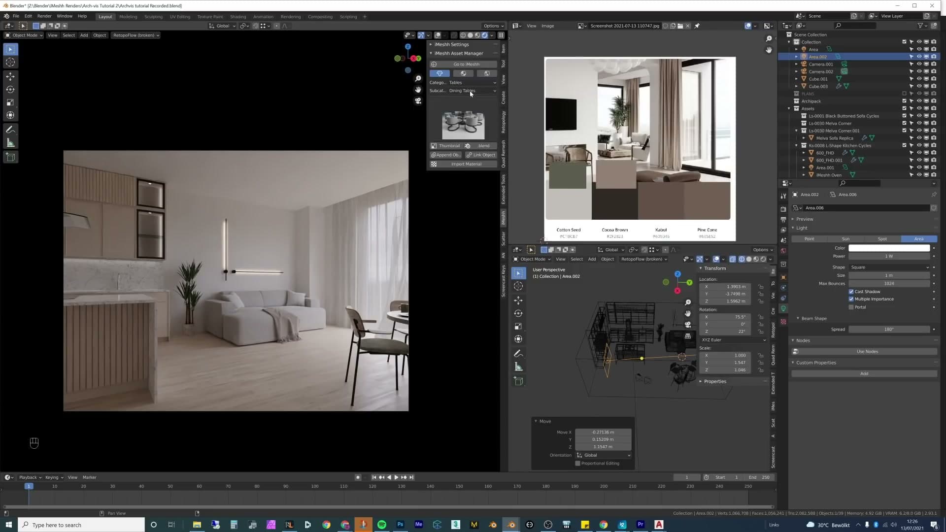
Those factory colours look lovely on their own, but they fight the palette you've built for the room. You'll recolour the frame to something that sits inside the scheme, with the usual caveat that some of these factory finishes do a lot of work. Pushing them too far toward a flat brand colour can flatten the asset out. Aim to nudge the frame into the palette rather than rebuild it from scratch.
Replacing Blender glass with a caustic shader
Blender's stock glass shader is fine in mild lighting. Drop the coffee table into a scene like this one and the top will read as glass and you probably won't notice anything wrong. The problem shows up the moment you put a spotlight or any strong light source over it. The shader can't produce caustics, the shadow underneath goes hard and inky, and the table starts to look like a flat black panel instead of a sheet of glass.
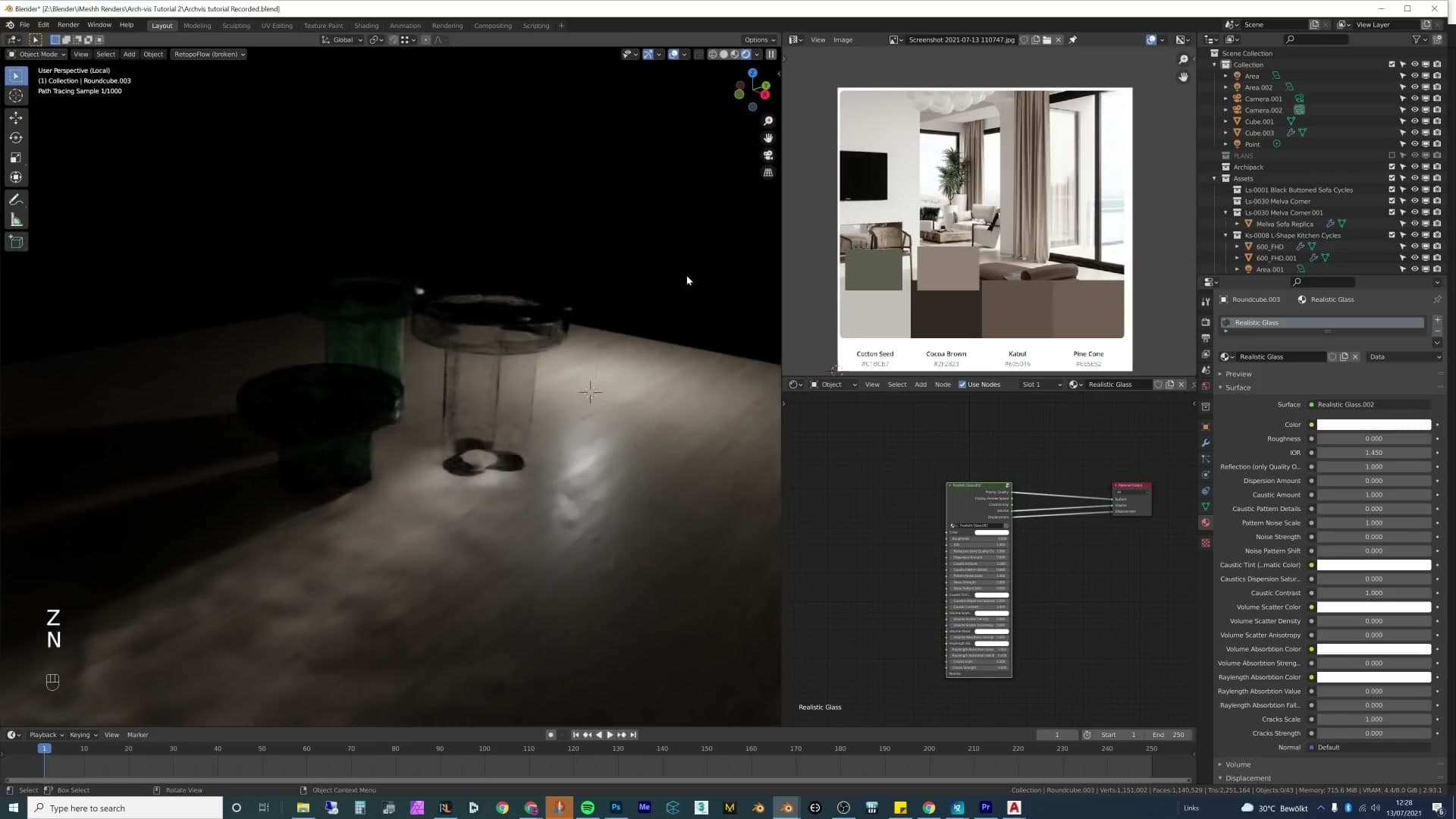
The fix is to skip Blender's built-in glass entirely and append a purpose-built glass node group that someone else has already spent a long time tuning. Head to Blender Market, pick up a dedicated glass shader add-on, and append the node group into your file.
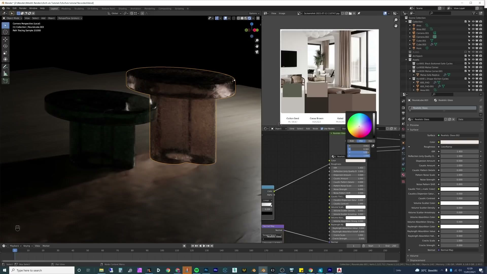
Assign that node group to the glass material on the table top. You'll see the shadow soften immediately. Light transmits through the glass the way it should, and the caustics finally land on the floor under the table instead of being clipped. I also keep a glossy and a normal map from my earlier test and feed those into the same shader, so the top picks up the right surface highlights on top of the corrected transmission.
How much you actually see of all this in the final frame depends on how dark you've left the glass. Heavily tinted glass swallows most of the difference, but as soon as you push the tint clearer (which is what you'll want here, since the table should read as bright and inviting) the caustics and softer shadows do a lot of the heavy lifting. Make the same swap on any other glass material in the scene so the look stays consistent.
Mirroring the sofa to open the foreground
Plonk the coffee table down and the first thing you'll notice is that it's sitting too far from the sofa. The composition wants the sofa and table to relate to each other, and right now the camera-side foreground is wide open while the sofa is shoved into the far corner.
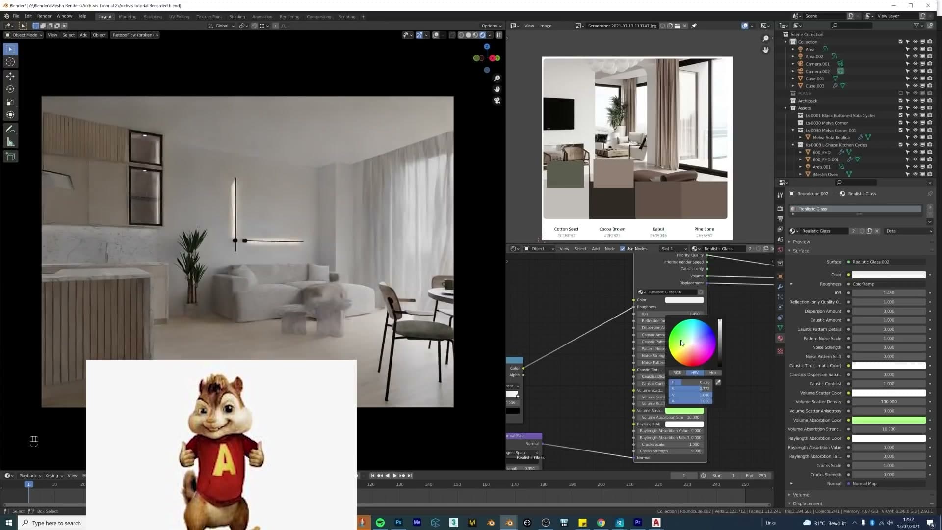
Rather than nudge the table closer, the cleaner fix is to flip the sofa to the other side of the room. Select it and run Object ▸ Mirror ▸ X. If the first axis is wrong (it's easy to pick the wrong one with no visual preview), undo and try the other. Once the sofa lands on the opposite side, rotate it 180° so it's facing back into the room, then pull it a touch further from the wall to give it room to breathe.
With the sofa on the new side, there's more space near the camera and the coffee table sits in front of it the way it should. The whole foreground reads as more inviting, and the composition now has a clear path from the camera through the table to the sofa beyond it.
Ceiling spotlights with aim constraints
iMeshh spotlights spaced evenly along the ceiling, each one using a Track To constraint so the head pivots to wherever you drop the target. Keep brightness low. You don't need them to actually light the scene; you just want the little ceiling glares for that lived-in feel.
Spacing iMeshh spotlights across the ceiling
Drop the iMeshh spotlight into the scene and slide it up under the ceiling, then nudge the scale down a touch so the housing reads as a real recessed fitting rather than a chunky prop. Once the first one feels right, hold Alt+D to make a linked duplicate and shuffle the copies along the ceiling line. Linked duplicates share data, so if you tweak the housing later every copy updates with it.
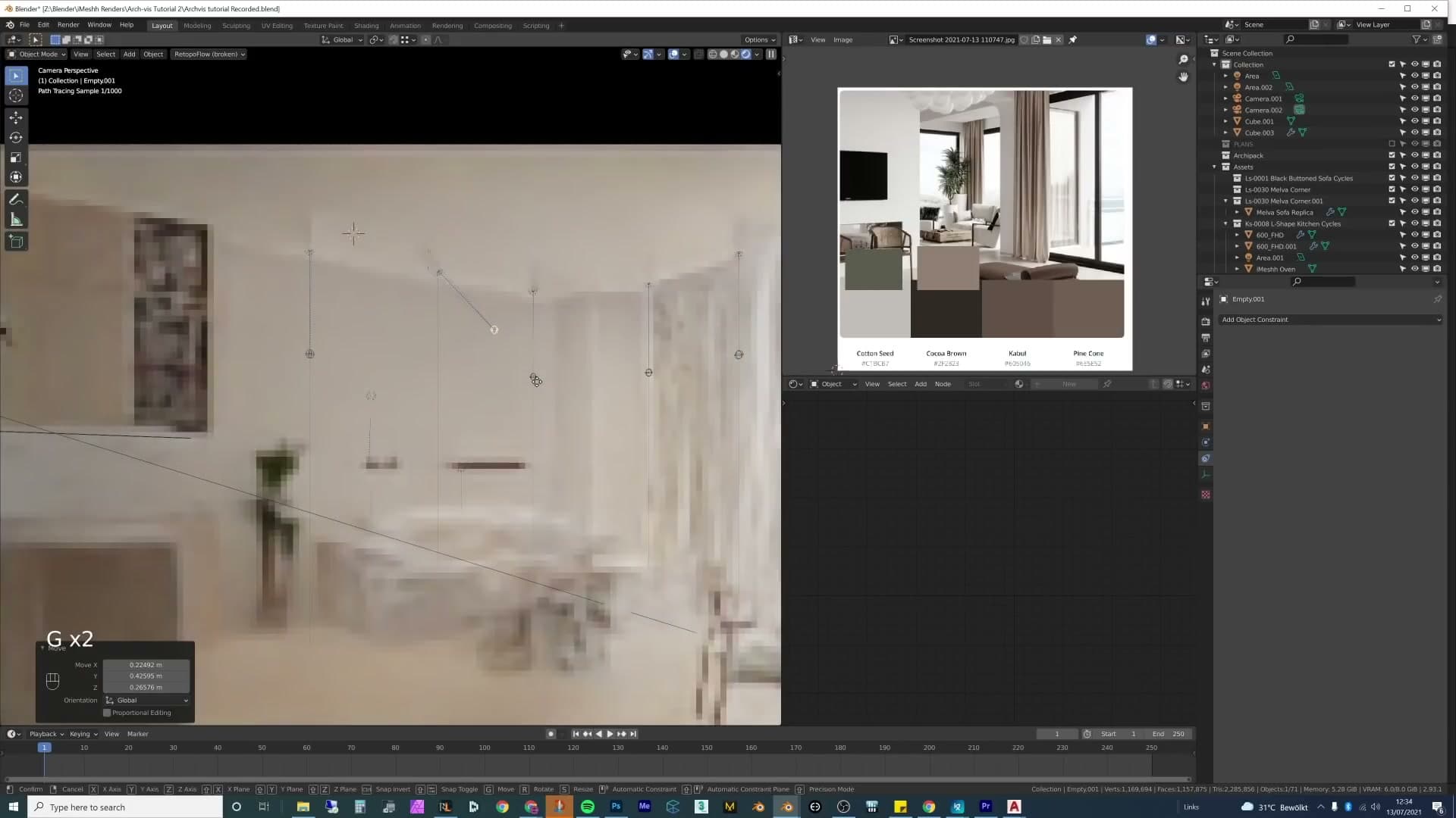
Eyeballing the gap is fine, but if the run looks a little crooked drag each light one at a time toward the centre line between the wall sconces until the spacing reads as evenly stepped. My rule of thumb is to pull stray fittings inward rather than out. A slightly tighter row across the middle of the ceiling looks more deliberate than a sparse one drifting toward the walls.
Aim constraints and a low-watt finish
Each iMeshh spotlight ships with a Track To constraint already wired up, so the head can pivot toward a small target object instead of being locked straight down. Select the spotlight, open the constraint panel and switch it on. The head snaps to face the target, and from there you can drag the target wherever you want the cone to land. My reason for designing them this way is exactly the frustration most readers will recognise: downloaded spotlights are usually static, so angling one means diving into edit mode, moving the geometry, then nudging the light back into place. With a constraint, you just move the target.
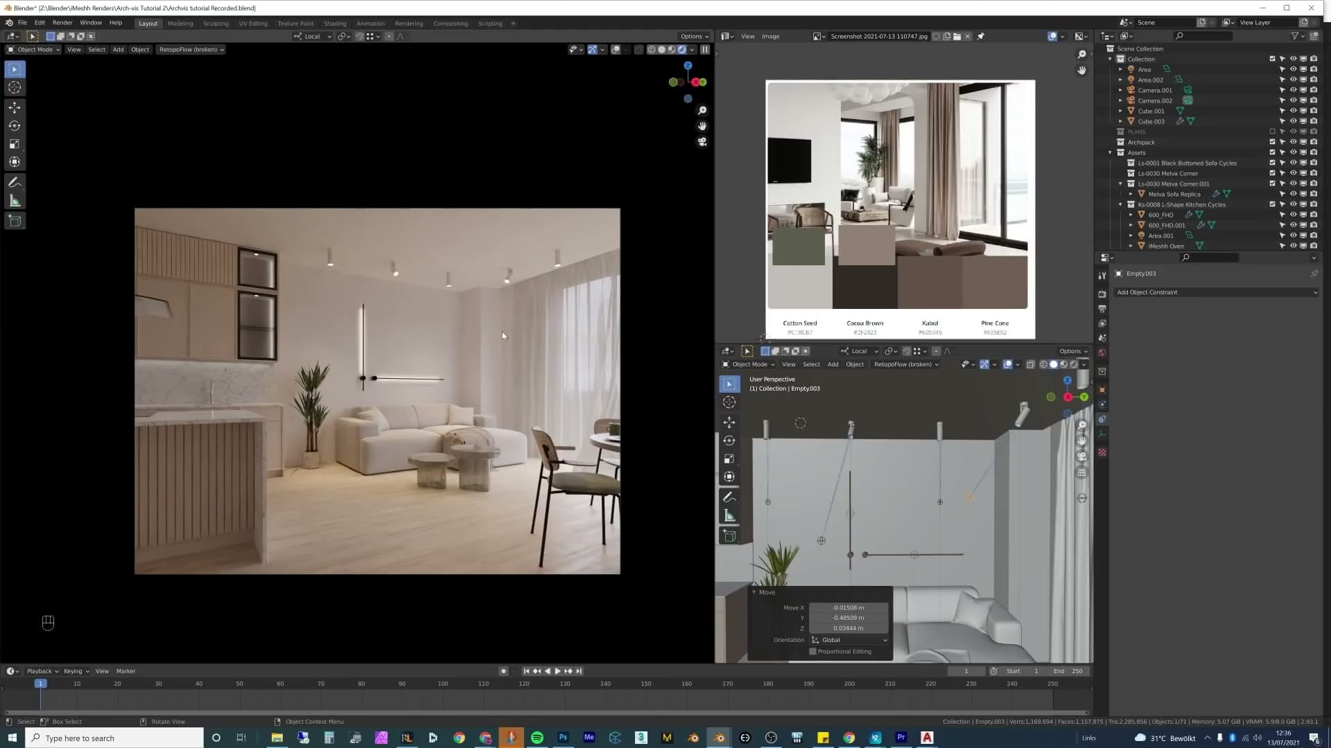
Walk through each spotlight in turn and pull its target a little closer to the surface you want to highlight: a worktop, a kitchen island, the back of a chair. The cone tightens up as the target gets closer and you start to see a soft pool of light landing on the object below.
There's a long-running debate in archviz forums that ceiling lights shouldn't be switched on in daytime renders. I push back on this. Plenty of real rooms have a lamp left on at noon, and more importantly, the little glare stars you get from visible spotlights are one of the cheapest ways to make a render feel lived-in. The trick is that these lights shouldn't actually be doing any lighting work. The HDRI through the windows is carrying the room; the spotlights are just there for the highlight on the housing.
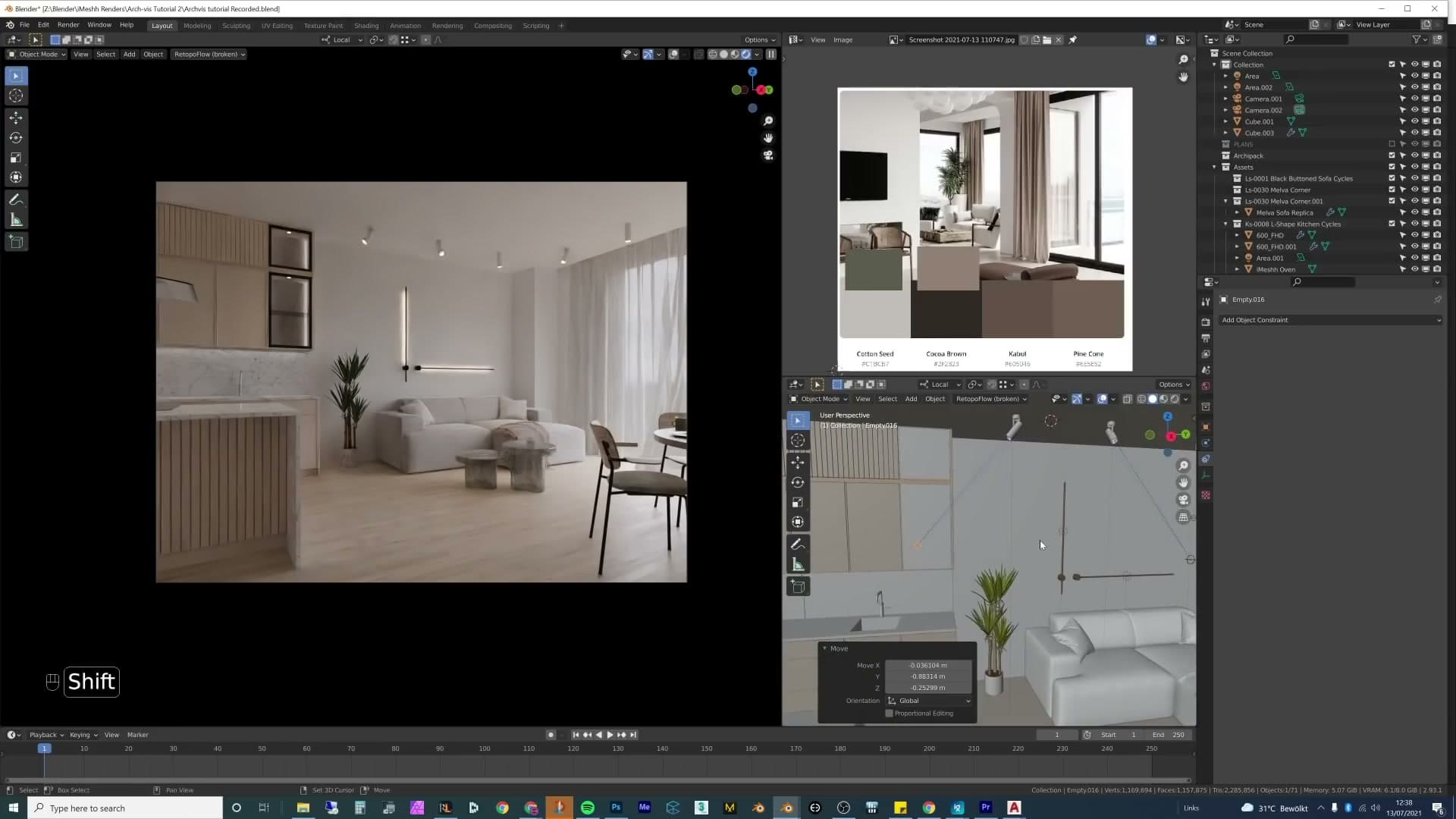
Knock the strength right down. Somewhere around 2 watts is plenty. At that level the ceiling glare reads clearly but the spotlights barely register against the daylight, which is exactly what you want. Once they're dimmed you can rotate the targets one more time to point a couple of fittings toward the kitchen so the cones break up the back wall.
Accessories and a custom skirting board
A long accessory pass (magazines, glassware in the cabinet, kitchen styling, a background tree) turns an empty model home into somewhere lived-in. Then a skirting board is built by duplicating the floor curve, deleting one segment, and merging in a custom bevel profile so it hugs every wall automatically.
Dressing the kitchen, cabinet and shelves
Even after the furniture pass, the room reads as a show-home that nobody actually lives in, fully fitted but cold. The fix is an accessory pass: stools and magazines around the seating area, glassware in the cabinet, kitchen styling on the worktop. The aim isn't more furniture; it's the small objects that suggest someone has actually put their things down.
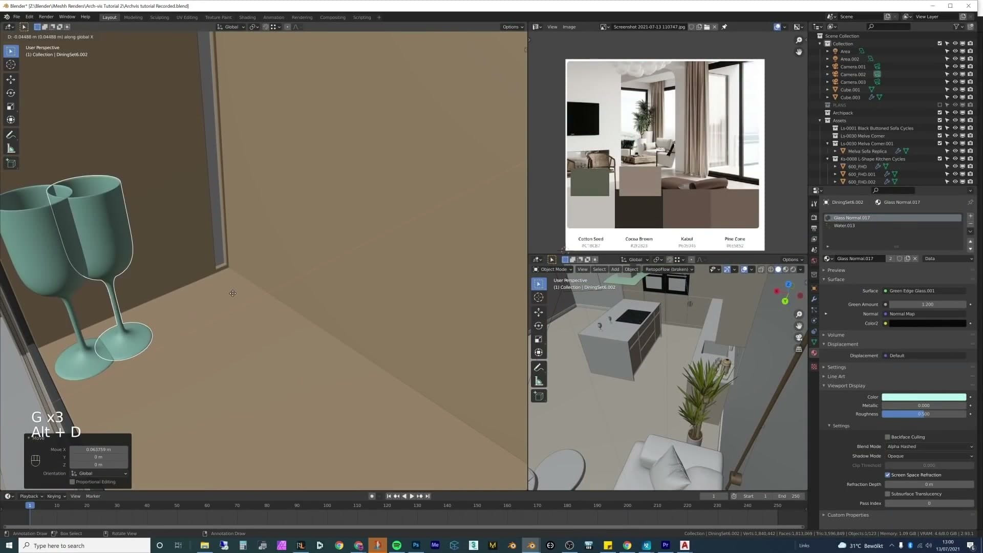
Before populating the glass cabinet, the cabinet glass itself needs reworking. The original is still using the old glass shader and reads as too opaque, which defeats the point of putting decor inside it. Select the glass faces, separate them out with P, and apply the cleaner glass shader being used elsewhere in the scene. In the new glass's object properties, set its Ray Visibility so it's only visible to Glossy and Transmission rays. This keeps the cabinet glass from polluting other passes and produces noticeably cleaner refractions.
To actually drop objects into the cabinet without the glass blocking your viewport, set the glass mesh's Display As to Wire in its object display settings. The mesh still renders normally, but in the viewport it collapses to an outline so you can see straight through it and position shelves and props precisely against the back panel.
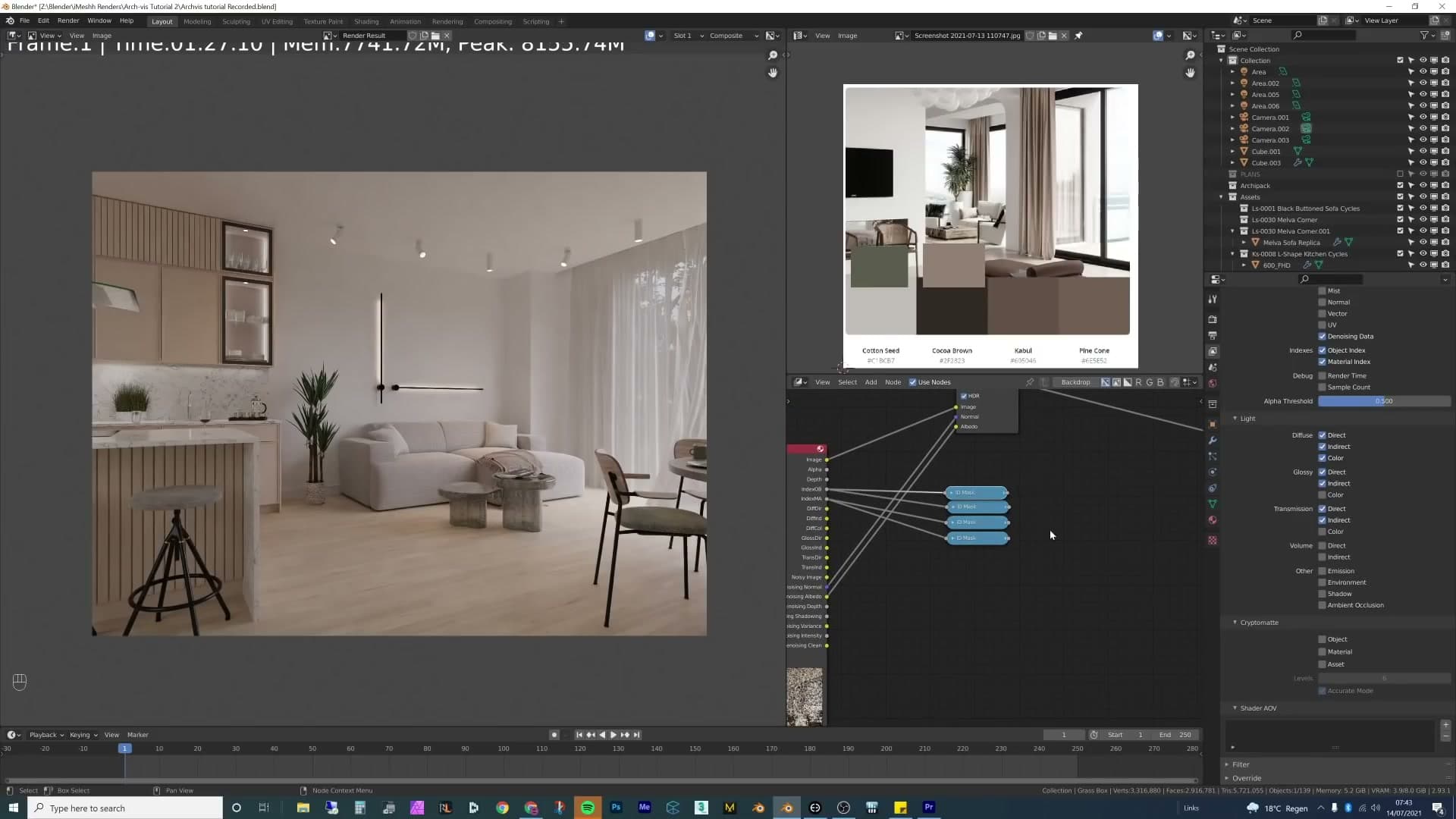
The accessory pass itself runs as a time-lapse. The work is finding library models, scaling them and nudging them into place. Glass shelves go into the cabinet, glassware and small objects sit on them, magazines and a stool round out the seating area, and the kitchen worktop picks up some styling. Two final additions live outside the room rather than in it: a tree placed close to the curtain so the daylight has something to read against instead of a blank background, and a small object on the cabinet's top shelf to fill the dead space up there. The plant near the cabinet ends up moved further from the wall so it doesn't kiss the stucco.
Building a skirting board from the floor curve
Now for the skirting board. The trick is that the floor mesh already traces every wall in the room, so its outline is exactly the path a skirting board needs to follow. Select the floor, duplicate it in place with Shift+D, and convert the duplicate to a curve via Object ▸ Convert ▸ Curve. You now have a closed loop that hugs the inside of every wall.
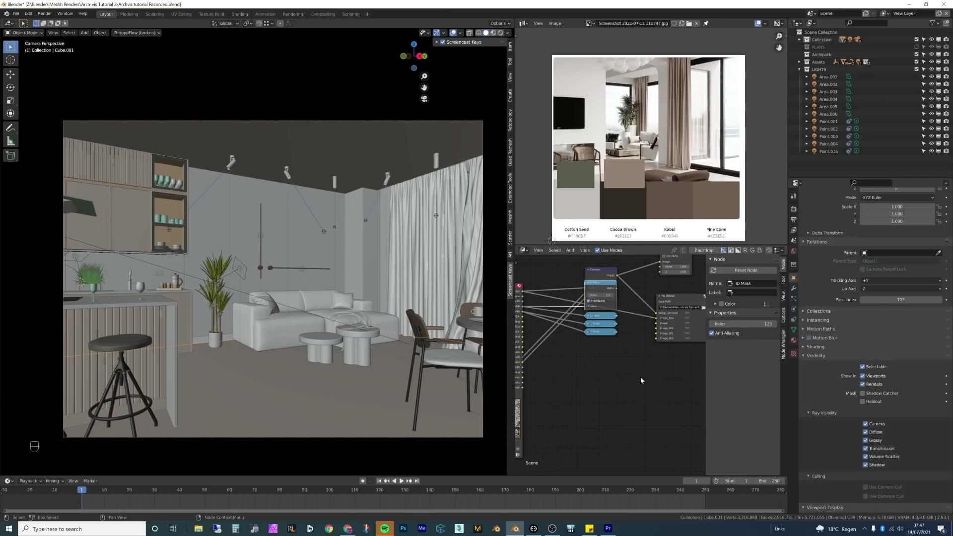
Tab into edit mode on the new curve and delete the one segment that crosses any doorway or opening you don't want skirting board running across. The curve doesn't need to remain closed for the bevel trick to work. Gaps are exactly what you want where the wall isn't.
Then bring in your skirting profile. A profile is just a small 2D curve drawn as the cross-section of the moulding; I keep a small library of these ready to drop in. Add any one of them, select it, shift-select the floor curve last so the floor curve is the active object, and press Ctrl+J to join them. Blender then extrudes the profile along the floor curve, producing skirting that follows every wall in one operation. If it comes out facing the wrong way, flip the profile around in edit mode and delete any stray segments left over from earlier joins.
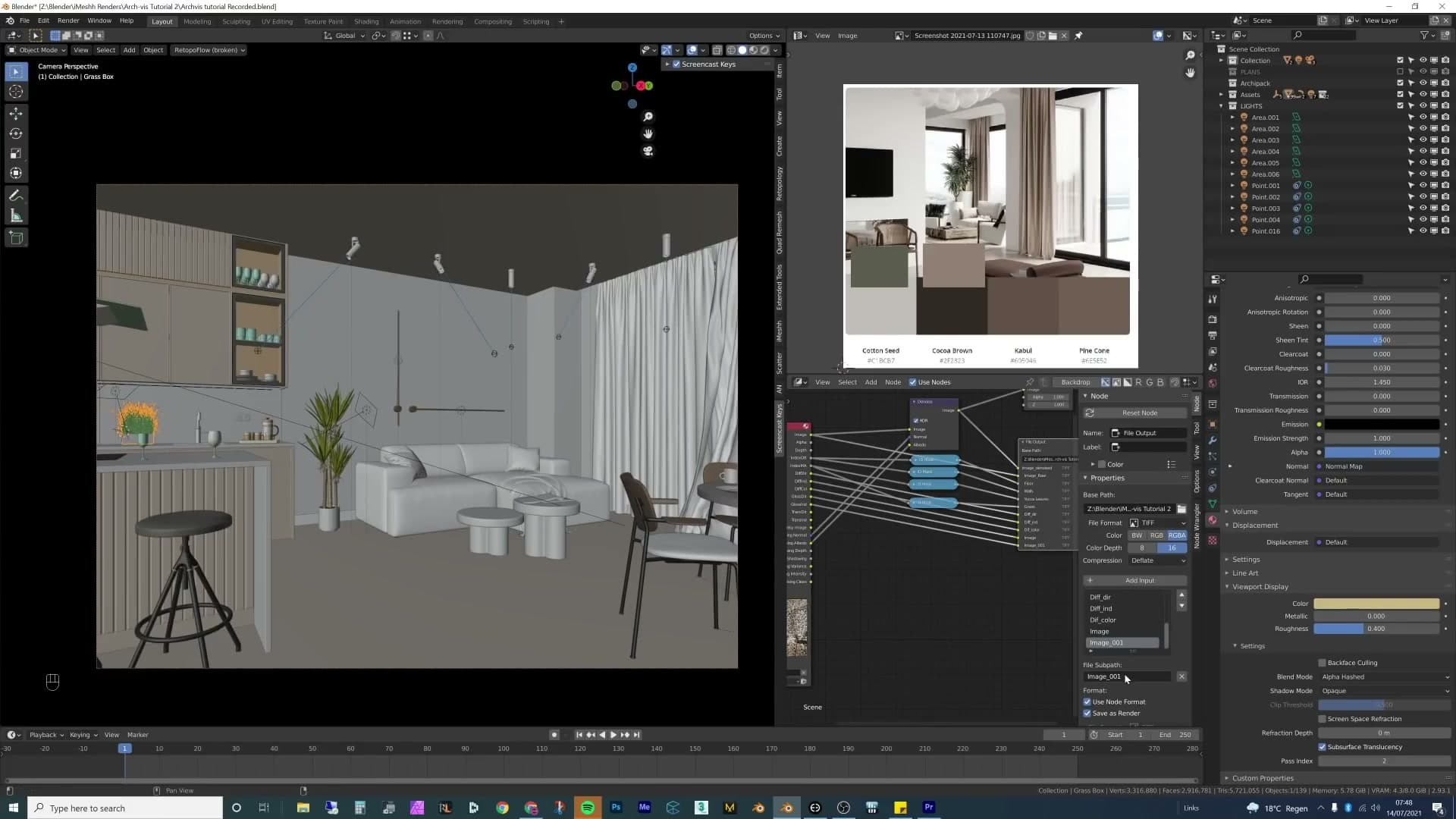
The skirting will almost certainly come in oversized and floating slightly out from the wall. Drop it down to the floor on the Z axis, then go into edit mode on the profile itself and use G then X to push it back until it sits flush against the wall. Scale it down with S until it reads at a realistic skirting height. If the profile is carrying a leftover material, switch it to plain white so it matches the wall and doesn't read as a coloured stripe in the viewport.
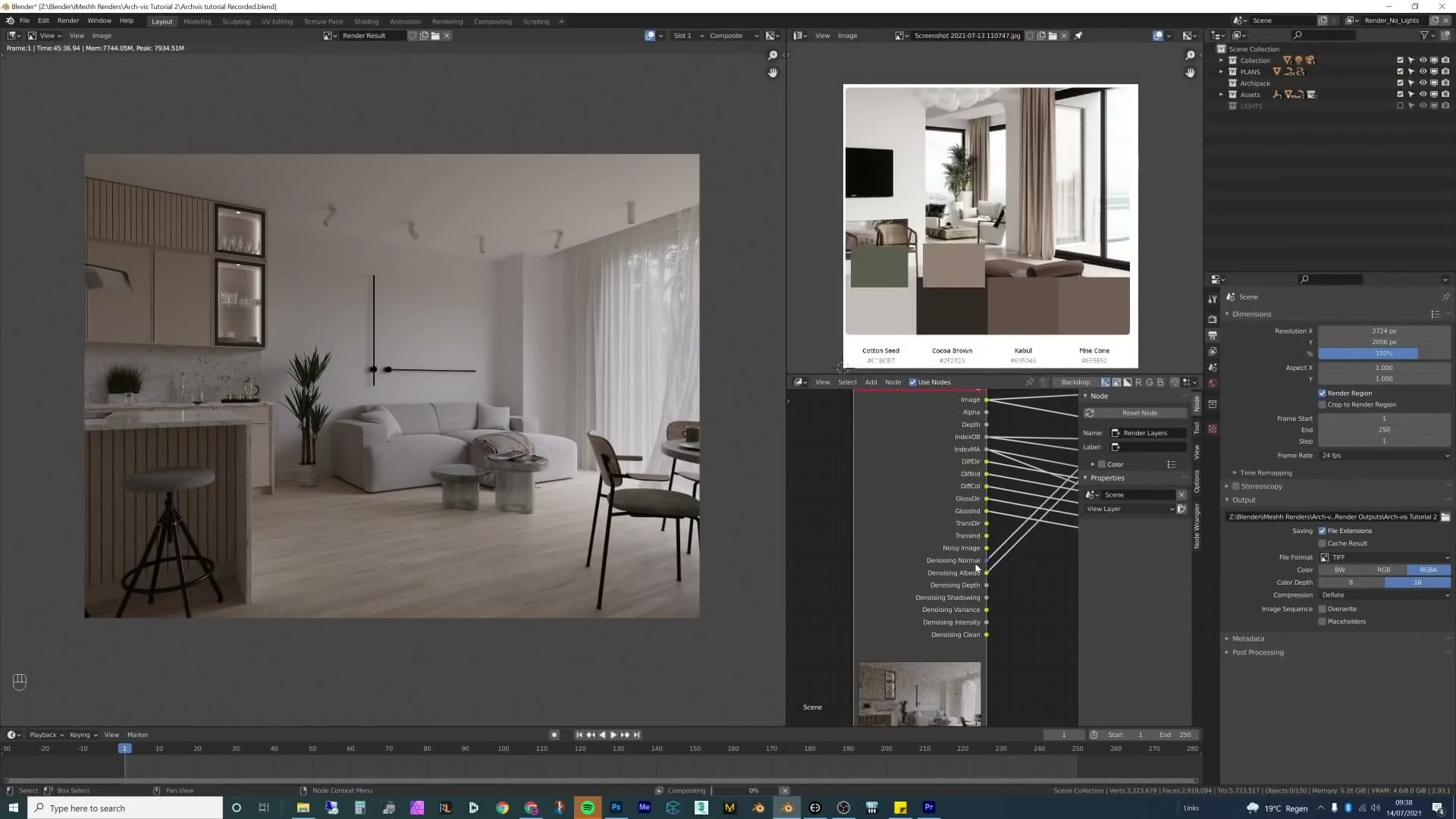
Render passes for compositing
Turn on Denoising Data, Object Index, Material Index, the diffuse and glossy splits, and Cryptomatte. Assign Pass Index numbers per object and material, then route everything through File Output nodes saving 16-bit TIFFs so highlights aren't crushed before they reach Photoshop.
Denoising data and the OptiX denoiser
A denoiser cleans up Monte Carlo noise from a low-sample render, but it can only smooth what's there. It cannot invent missing detail. Push the sample count too low and the denoiser starts filling in blanks where it thinks there should be detail and there isn't, smearing fine fabric weave and softening edges that ought to stay crisp.
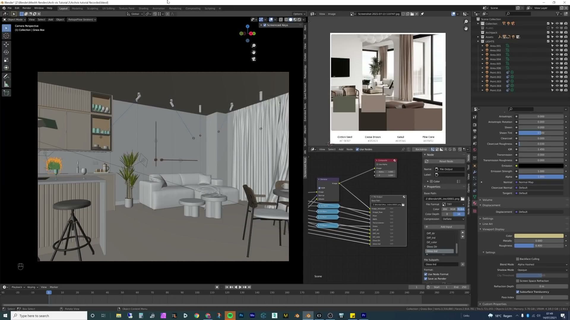
For this scene 250 samples proved to be the sweet spot. If you find the denoiser is doing too much, raise the sample count and let the path tracer carry more of the load. With time on your side, render in as many samples as possible to get the real pure image, but 250 worked fine for the purposes of this tutorial.
Render on CPU or GPU as you prefer, but open Preferences first and confirm Blender is using the correct renderer for your hardware. The right pick varies depending on whether you have an RTX card or not.
Object Index and Material Index masks
The Object Index and Material Index passes come out of Blender as flat black/white cutouts, one for each object you tagged with a unique Pass Index, and one for each material you tagged with a Material Index. They're the cleanest way to isolate a single surface in post, and once they reach Photoshop each one becomes a one-click selection driving whatever adjustment you need.
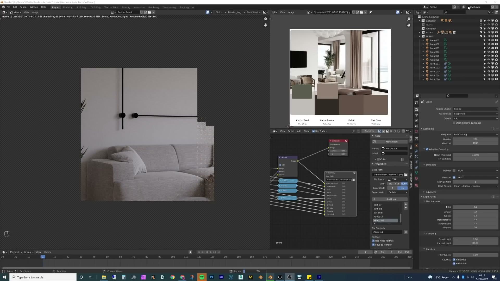
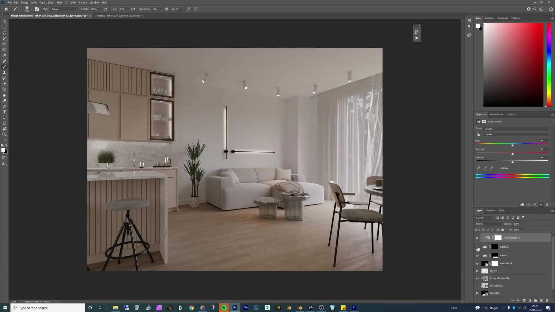
To use one, drop the mask into the layers panel and Ctrl+Click its thumbnail to load it as a marching-ants selection. Press Ctrl+C to copy the mask, add a Levels adjustment layer above your beauty render, Alt+click the adjustment's mask thumbnail to enter it, then paste with Ctrl+V. The Levels now affects only the pixels the mask covers.
That trick gives you independent brightness control for any tagged object. I use it to bring the floor up without touching the rest of the room, then repeat it on the yucca, copying that mask into a Hue/Saturation adjustment so the green can be desaturated and tonally shifted without altering anything else in the image.
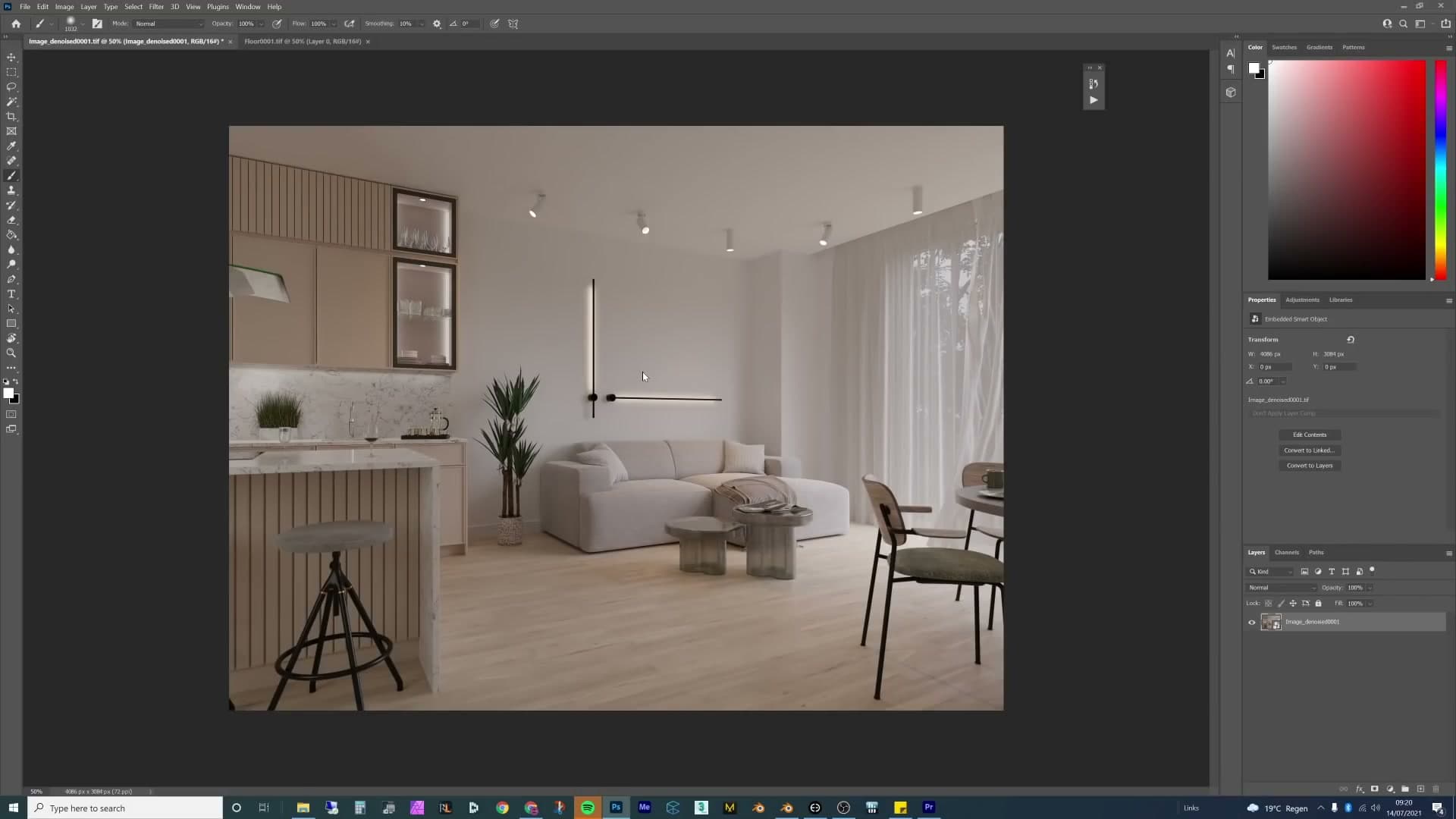
To group related tweaks, hold Alt and hover over the gap between two adjustment layers; click and they clip together, so toggling one hides both. Useful when a Levels and a Hue/Saturation are both targeting the same object.
Built-in diffuse and glossy split passes
Blender's built-in glass shader has one big weakness: it loses highlights. The bright specular hits that sell glass as glass mostly disappear in the beauty pass, leaving the surface looking flat. The fix lives in the Glossy Direct pass, which captures the direct specular highlights from every reflective surface in the scene, not just the glass.
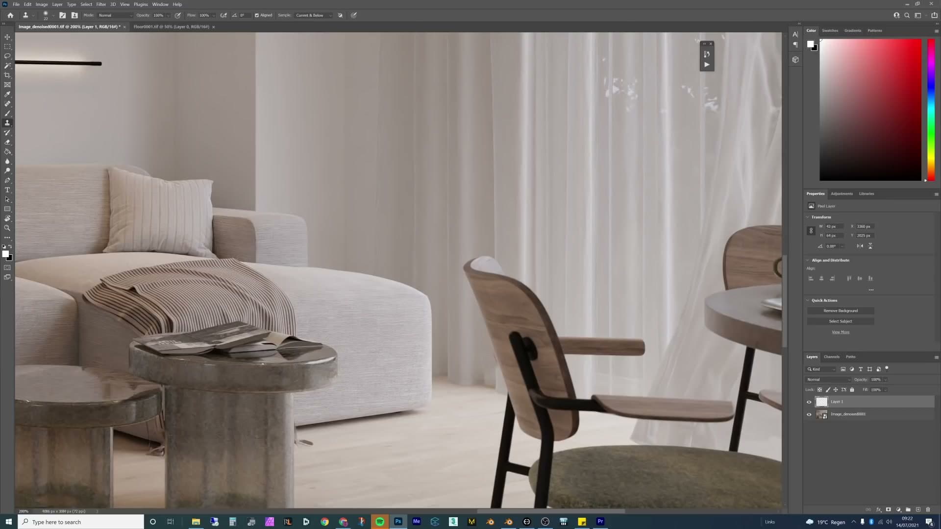
Drop the Glossy Direct pass on top of the render in Photoshop and set its blend mode to Screen. Screen makes the white areas shine through while the dark areas stay invisible, so the highlight detail layers cleanly on top of the beauty pass. Suddenly the glass picks up a real glare from the light behind it and the room starts to read like it was shot in a lighting studio. This almost makes Blender glass look nice.
The Diffuse Colour pass is the other half of the kit. It carries the unlit base colour of every surface, which is what you reach for when the beauty render has blown out an area, direct sunlight clipping the floor, say. Drop the Diffuse Colour pass over the blown highlight, mask it down to just that area, and the lost colour and surface detail come back.
Cryptomatte for fast object selection
Cryptomatte is the fast-route alternative to Object Index. Instead of tagging each object with a Pass Index ahead of time, Cryptomatte bakes a colour-coded selection map of the entire scene in a single pass. Every object's pixels carry their own colour key, and the Cryptomatte node's Matte ID list folds whichever objects you pick into a combined cutout.
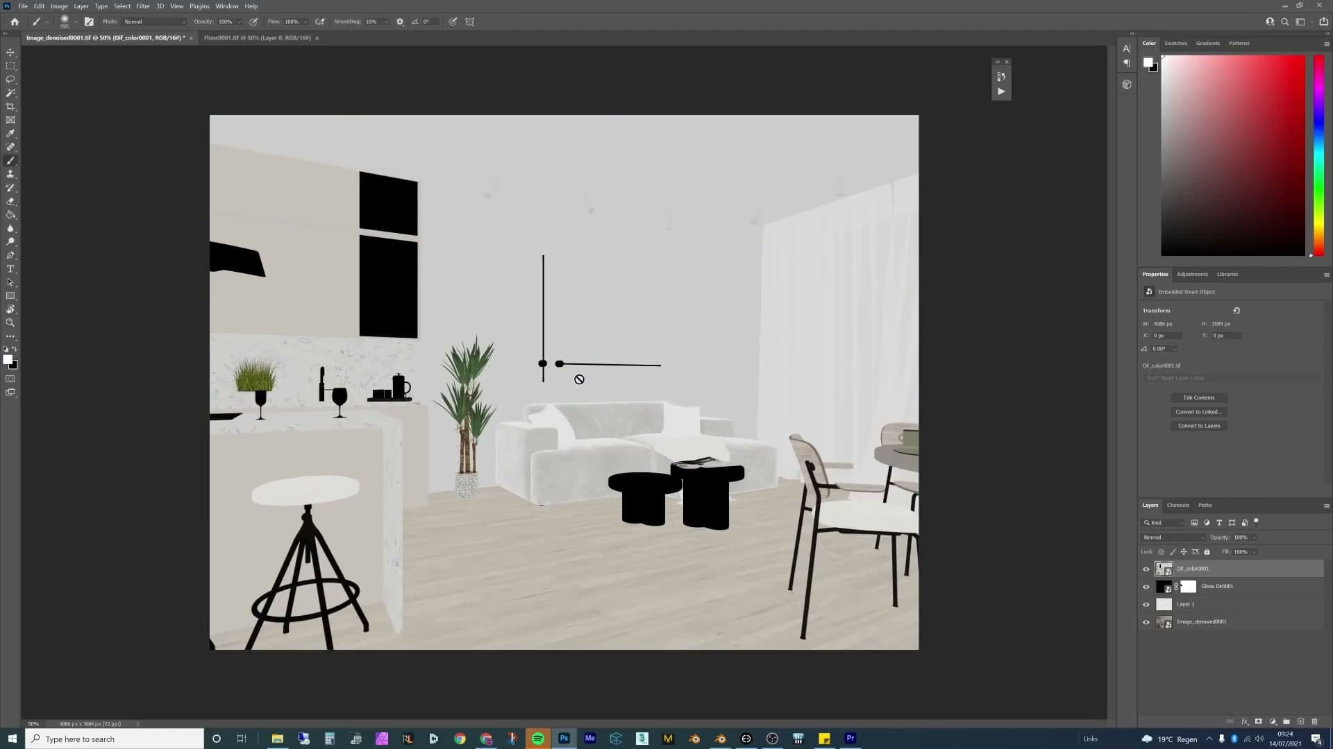
The Photoshop workflow that follows is the same as any object-mask workflow, and most of the time goes into cleanup. Screen-mode brightening from the Glossy Direct pass doesn't discriminate, so the pass that did wonders for the glass also painted highlights onto a tap and revealed an area light that should have stayed invisible. Those have to be masked out by hand.
Click on the layer mask, press B for the brush, then X to toggle the foreground colour between white and black. Paint black over the area-light rectangle to hide the highlight; press X again and paint white to bring it back if you've taken away too much. White reveals, black hides.
Saving every pass through File Output nodes
All those passes need to land on disk in a format you can actually rescue in post. The compositor's File Output node is the way. Drop one in, point it at the scene's folder, and add a named socket for every pass you want written: ImageDenoised, ImageRaw, Floor, Walls, the Glossy Direct, the Diffuse Colour, and any other masks you've set up.
Save those as TIFF, not JPEG. With a TIFF, there's a good chance an area that looks blown out can be pulled down in Photoshop and you'll start to see colour and information again. The same area saved as a JPEG is completely lost. Once a JPEG's white is clipped, you can't really fix that.
Select the File Output node, hit render, and Blender writes every named pass simultaneously into your scene folder. The entire post-production toolkit lands in one go, ready for Photoshop.
Render settings and light-pass strategy
Why a no-lights render layer is worth running even though Blender forces you to render twice, and why eCycles is the cleaner answer if you do this every project. Then 250 samples, eight light bounces, clamping at 80, and a Blackman-Harris pixel filter at 1.15 for sharper edges.
Light-pass render layers (and where Blender falls short)
A clean composite often needs two renders, not one: the full-lit beauty pass that ships to the client, and a stripped-down version with the lights excluded so you have something to multiply or screen back in during post. The simplest way to organise that in Blender is with a second View Layer that excludes the Lights collection. You keep all the geometry and materials, but the indoor lamps stop contributing.
Note: Blender renders View Layers sequentially, so adding a second "no lights" layer roughly doubles your render time. If you're shipping interiors every week, the eCycles workaround I mention elsewhere (rendering both passes in a single go) is the cleaner answer; on a one-off scene, the extra wait is usually worth the flexibility in Photoshop.
Samples, bounces, clamping and pixel filter
Cycles' default sample count is fine for hero exteriors, but interiors lit through a single window need more brute force. My working baseline for this scene is 250 samples with the light bounces pushed up from the defaults, the indirect clamp pulled in to tame fireflies, and the pixel filter switched away from the default Gaussian for a crisper edge.
Once those four numbers are dialled in, save them into your archviz start-up file. The whole point of tuning samples, bounces, clamp and filter once is that you never re-tune them per project. They become the house style, and every new interior inherits them at File ▸ New.
Photoshop post: passes, Camera Raw and lens flare
Bring the saved passes into Photoshop, screen the Glossy Direct over the base render to recover glass highlights, and use mask copies from the Object Index passes to fix individual surfaces. Then a Smart Object Camera Raw layer for the final grade (pulled vibrance, gentle S-curve, +20 sharpening, a touch of grain) and finally a screened lens-flare PNG instead of Blender's much-maligned Glare node.
Fixing render errors and screening Glossy Direct
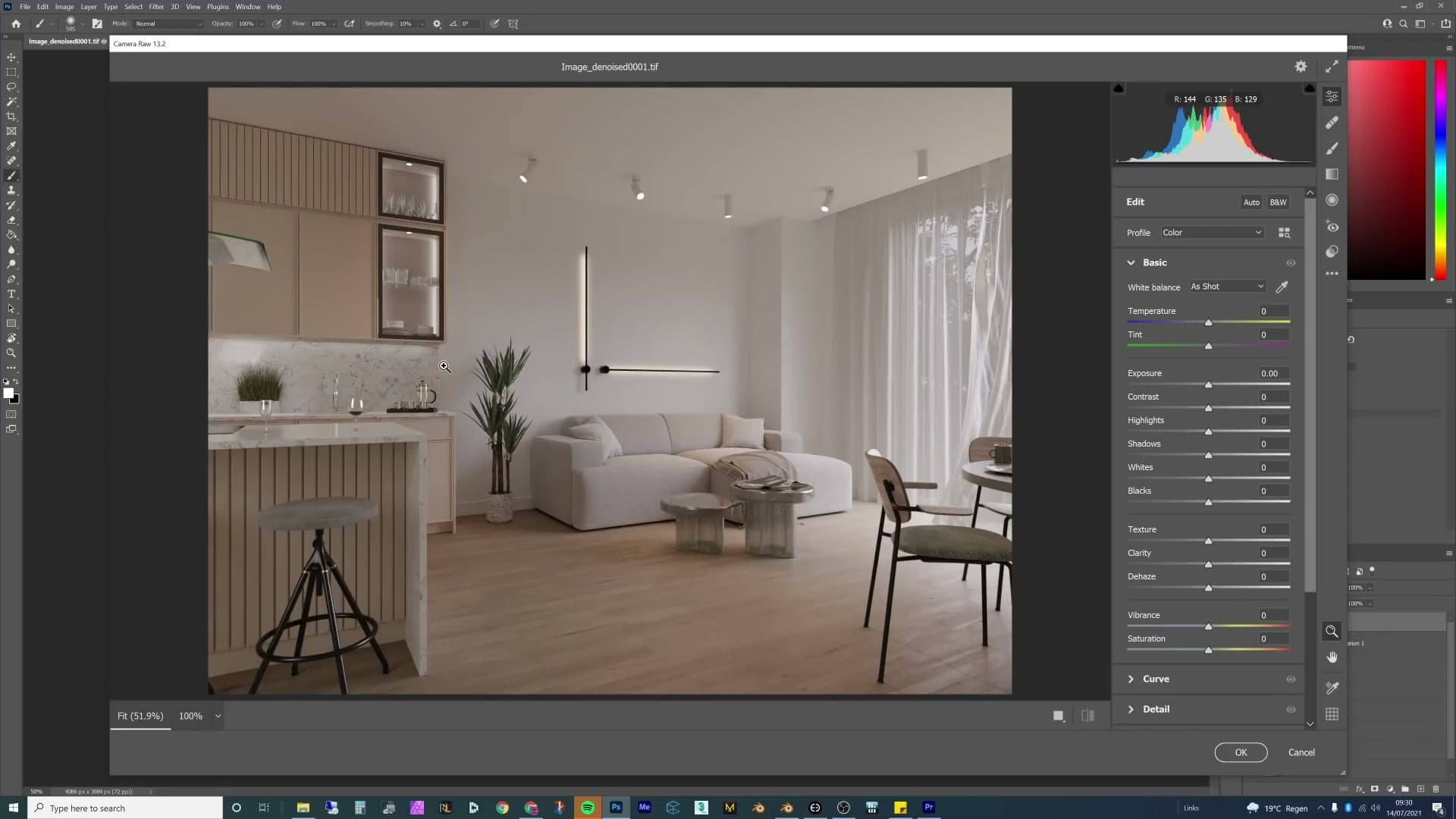
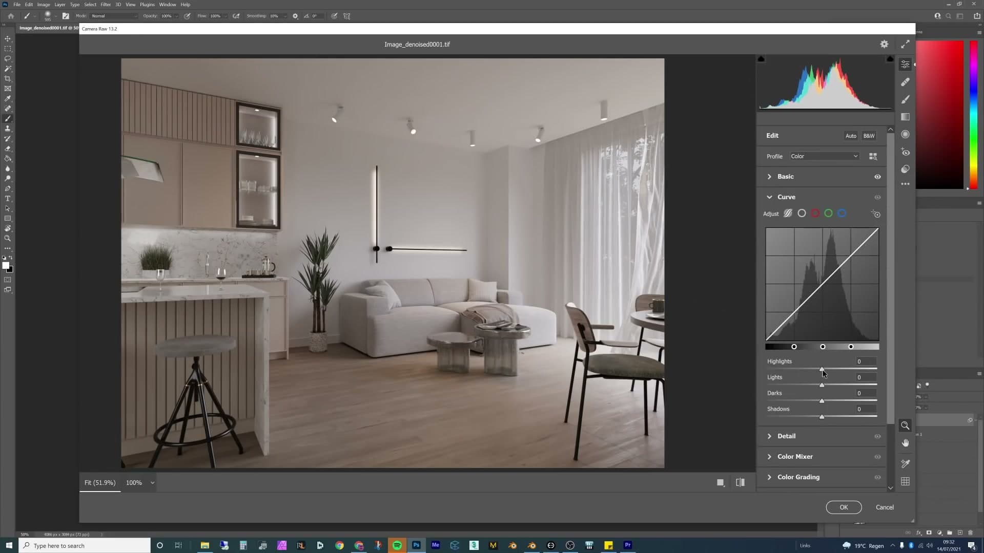
With the basics in, open the HSL panel inside Camera Raw, with saturation, hue and luminance sliders broken out per colour band. The grade so far has been purely tonal; HSL is where you decide which colours sing and which sit back.
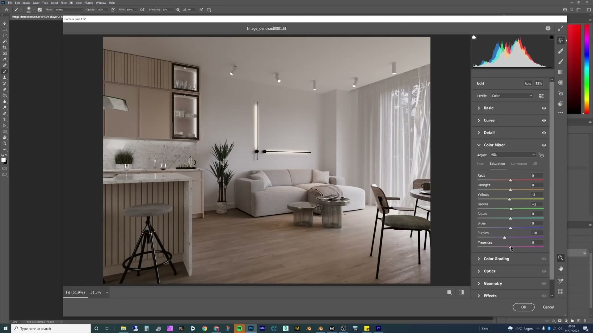
Saturation is the easiest place to start. Bring the yellows all the way up and any warm hit in the room punches forward; pull them down and they fall out of the frame entirely. Do the same with greens and oranges, dialling each by eye. A daylight interior doesn't usually need much rescuing. There's no rogue magenta to kill in this scene, but the same trick is what fixes any colour cast that drifted in from the HDRI.
The luminance tab is the secret weapon for foliage. Bringing greens up adds a soft highlight to the leaves of the yucca without touching anything else in the frame, which is much cleaner than masking the plant by hand. The hue tab is there if you ever want to nudge oranges toward pink or push greens cooler, useful for matching a brief, less useful for a daylight scene that's already on palette.
Below HSL sit the rest of the Camera Raw panels. Add a small vignette to draw the eye toward the centre of the room, subtle rather than the heavy-handed darkening that wrecks an image. Skip distortion and geometry; the camera was locked vertical from the start, so every line is already square. Distortion really only matters for a fisheye lens or a render that's come out broken.
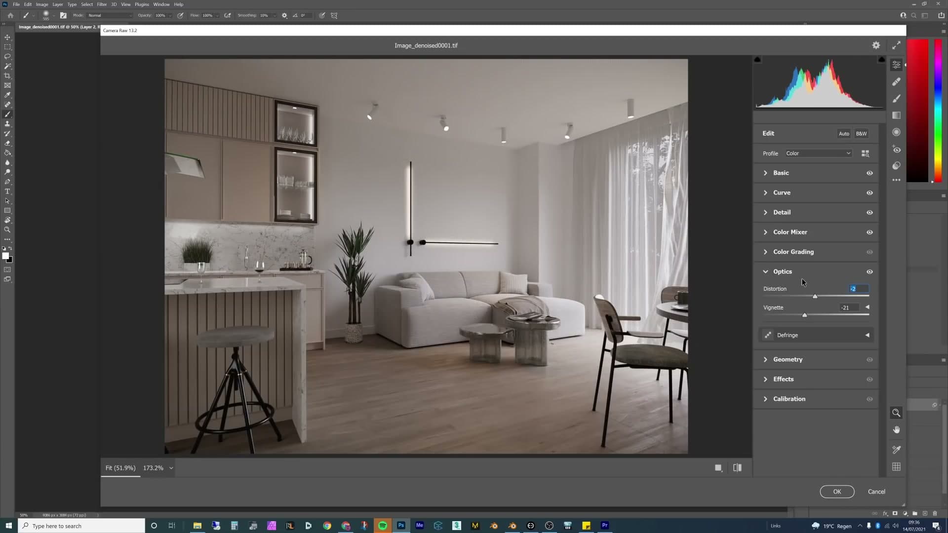
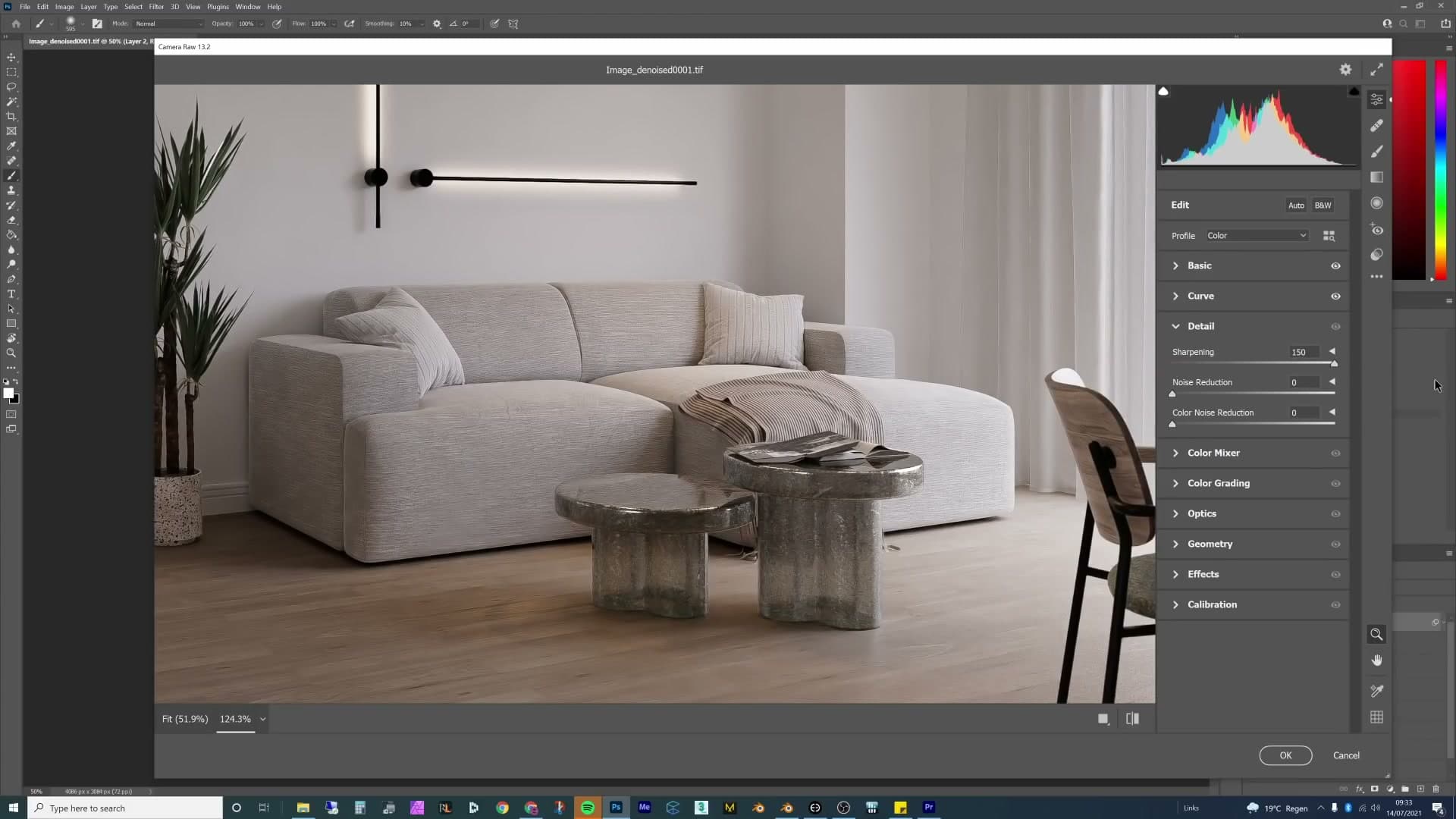
Finish with a touch of grain. Any real DSLR shot has grain when you zoom in. Phones hide it with on-device denoising, which is why phone shots can look unnaturally clean. A whisper of grain in Camera Raw is what stops a render reading as CG. Don't crank it; just enough to give the image some feeling.
There's also a Profiles strip at the top of Camera Raw with one-click looks you can audition. Drop one on, drag the intensity slider until it sits where you want, and press OK.
Using index masks for local adjustments
There's still a wedge of highlight sitting on the curtain that shouldn't be there. The glossy pass landed on fabric where it should have diffused into a soft sheen. Switch the Camera Raw layer off for a moment and drop back into the highlight pass underneath.
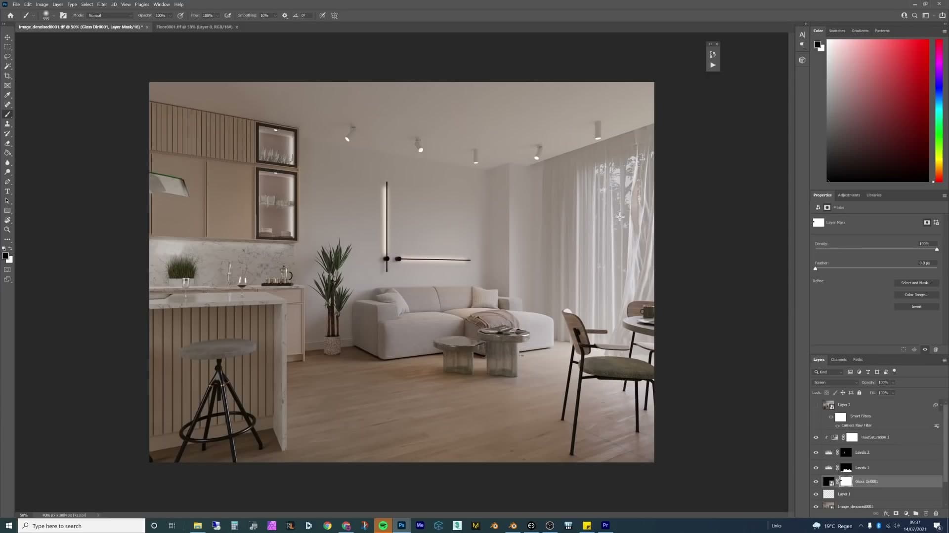
Press B for the brush and mask the unwanted highlight out of the curtain area. If your brush outline has vanished, press Caps Lock to toggle it back. Easy to miss the first time it catches you out. Paint only over the fabric; the highlight should still land on the harder, glossier objects nearby where the pass is genuinely useful.
With the local fix in, stamp every visible layer into one fresh layer using Ctrl+Shift+Alt+E, then right-click and Convert to Smart Object. You don't want to redo the entire Camera Raw treatment on this new stamp, so hold Alt, click the Camera Raw smart filter sitting under the older Smart Object in the Layers panel, and drag it onto the new one. The full grade transfers across in a single move.
Camera Raw grade on a Smart Object
Last touch: a bit of glare on the brightest light source. Blender does ship a Glare node in the compositor, and there's a more physical glare shader in E-Cycles that may eventually find its way into mainline Blender, but the in-engine option is something you wrestle with rather than enjoy. There's a much easier route through Photoshop.
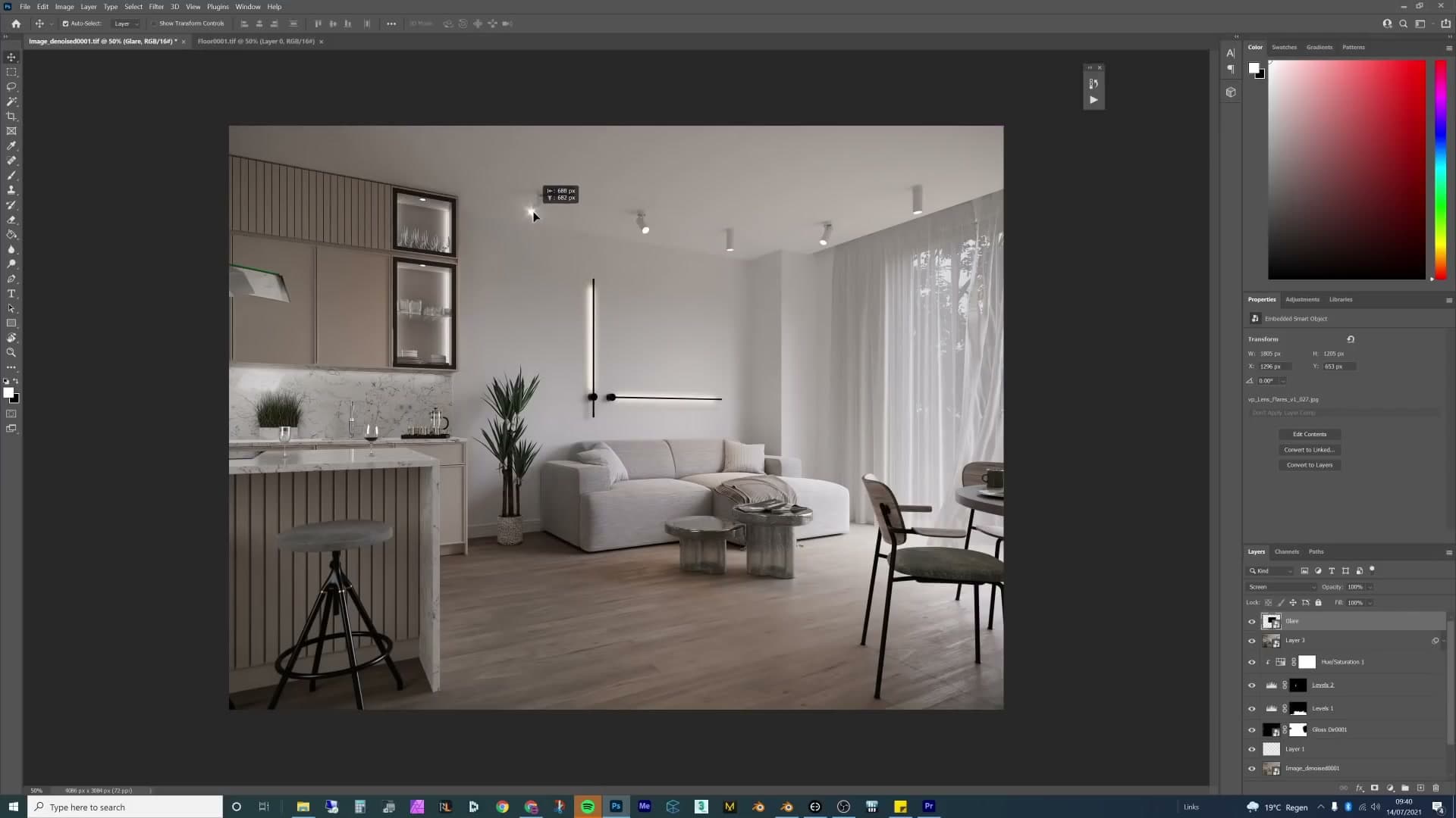
Find a lens-flare image online. Search for "lens flares" or "camera lens glare" and pick something with a bright centre on a black background so the Screen blend mode behaves. Drag the PNG into the document, set the layer blend mode to Screen so only the light reads and the black drops out, and slide it over the brightest part of the window. If it's too hot, drop the layer opacity. Ctrl+T to scale it down if it's drowning the frame.
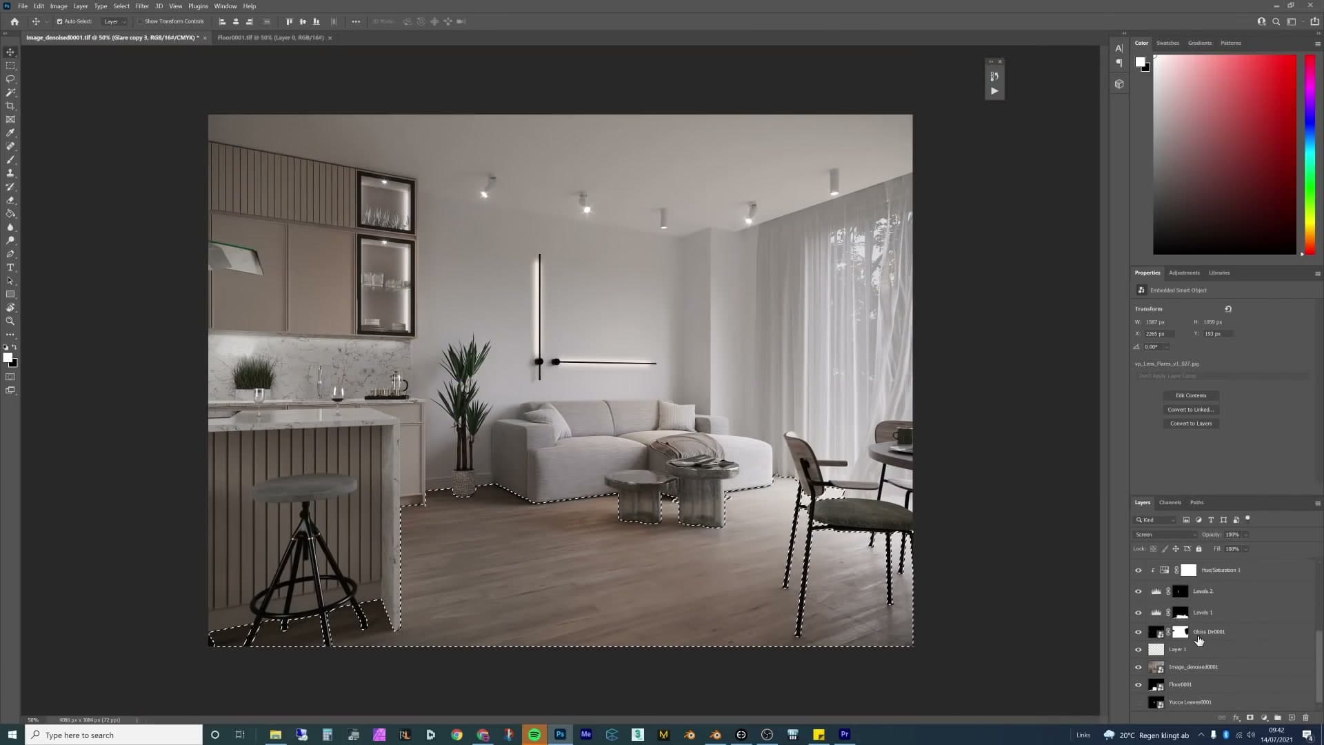
For a second flare on a glossy catch-light (the tap, a vase edge, anywhere the eye is already being pulled) hold Alt, click and drag the flare layer in the Layers panel to duplicate it, then Ctrl+T and shrink the copy to fit. Don't litter the image with them; one or two well-placed flares sell the idea.
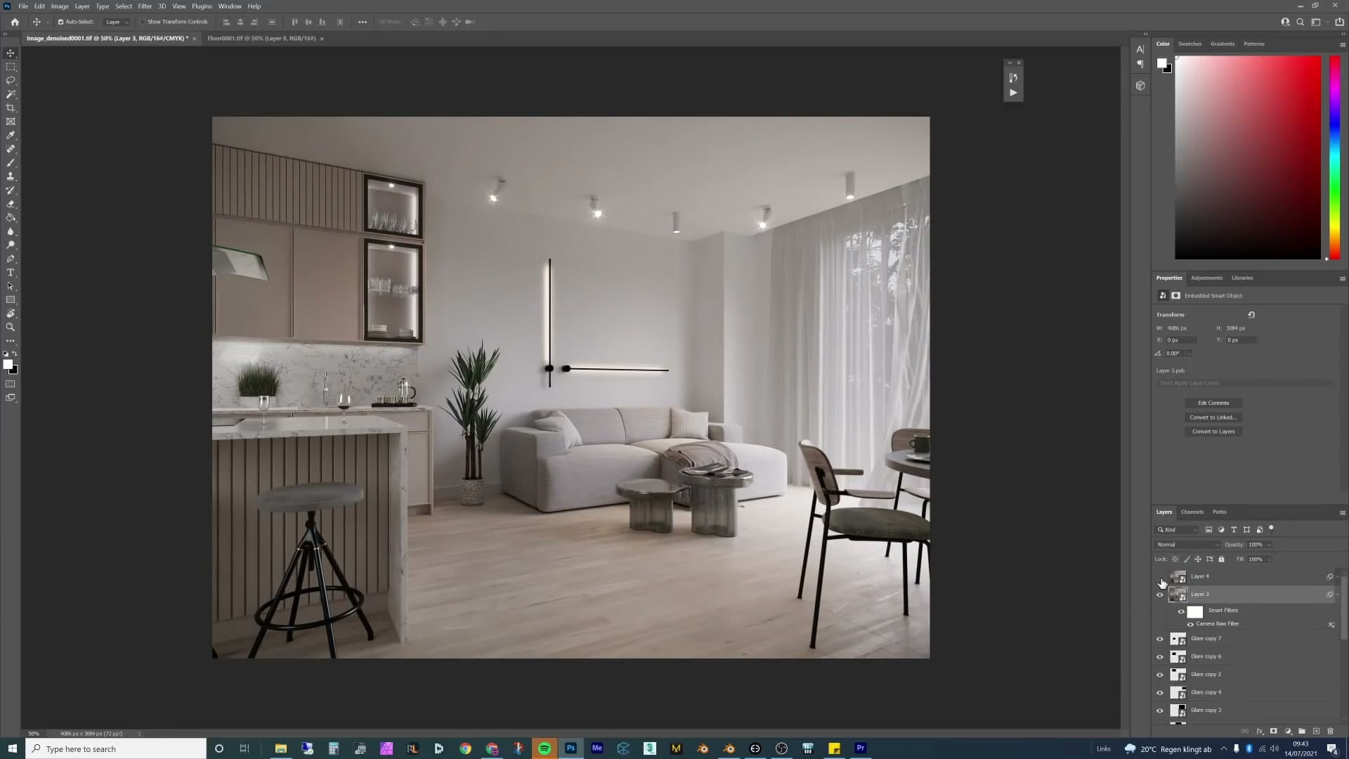
The floor came out a touch dark in the final composite, so disable the earlier floor adjustment, stamp the visible layers again with Ctrl+Shift+Alt+E, Convert to Smart Object, and Alt-drag the Camera Raw filter onto it from the previous stamp. The floor reads better with the original mask switched off and a fresh grade running over the top of everything.
Final image and channel sign-off
That's the image done. Held next to the flat raw render, the graded version reads with far more warmth. The HDRI daylight feels like daylight, the spotlights catch the worktop, the wall sconces sit cleanly on the stucco, and the green palette pulled from the original reference holds across the curtain, plants and decor.
A full start-to-finish archviz inside roughly two hours is tight, and there are areas (unwrapping, render-pass setup, post-production, individual light passes) that each have room for a deeper tutorial in their own right. If one of those is what you came here for, drop a comment on the video and it can become its own dedicated walkthrough.
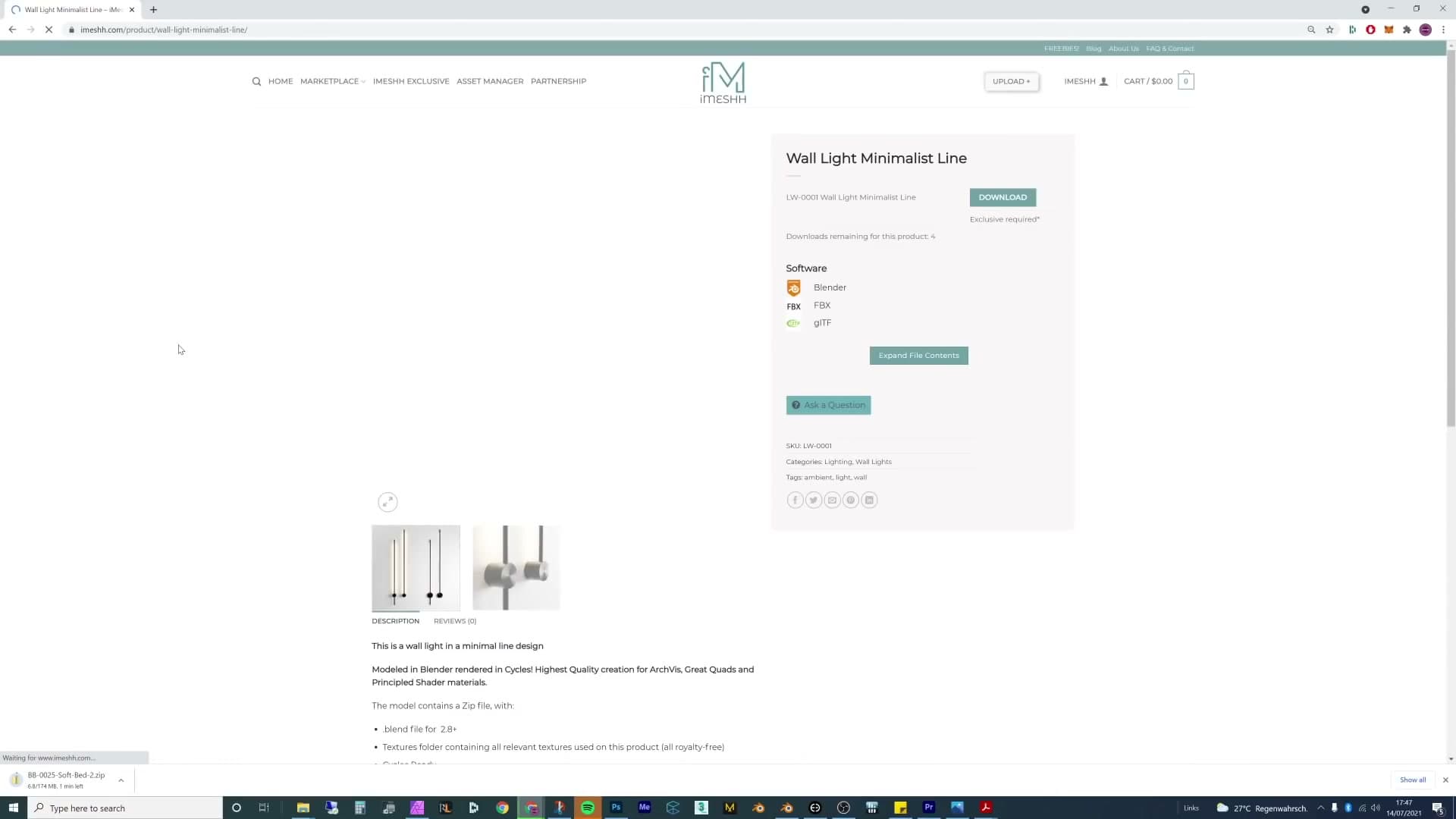
And if you want to drop the exact assets used in this scene into your own (the kitchen, the wall sconces, the spotlights, the yucca, the wood floor) they all live in the iMeshh library, which is the asset side of the platform the rest of this tutorial is built on.
Tools and credits
Everything mentioned in this tutorial, with links.
- Blender : the renderer this entire build runs in.
- iMeshh : studio platform (project management, client review, asset library, invoicing). The asset library used in this tutorial is included with every iMeshh Pro plan.
- Poly Haven : free CC0 textures and HDRIs.
Pillar guide: Masterclasses hub