Why this scene feels off: the liminal space concept
Liminal spaces are transitional places that feel neither here nor there. A familiar daytime kitchen viewed late at night, with full drinks and untouched bread, hits that same uneasy chord without anything overtly scary in frame.
Decorative sets and the distribution of shapes
I started this one by introducing iMeshh's newly released decorative sets: small-scale prop arrangements designed to plug into archviz interiors. In my own work, sets like this come out almost every time I set up an interior, because they're the bit that lifts a render from clean to polished. Without that final layer of small detail, even a well-lit scene reads as a 3D mock-up rather than a photograph.
The theory behind this is something Andrew Price's Creative Shrimp channel covers in a video called Distribution of Shapes. The idea is that a believable composition needs items working at three scales. In an interior, the large tier is your sofas and tables, the medium tier is chairs and lamps, and the small tier is the decorations: the books, candles, fruit bowls and clutter that decorative sets bundle together.
Decorative sets have been a staple of 3DS Max archviz workflows for years, which is part of why iMeshh built them out for Blender users now. Drop one into a scene and you immediately shore up the small-scale tier without having to model and texture a dozen tiny props yourself.
What makes a space liminal
The word liminal comes from the Latin limen, meaning threshold. Liminal spaces are in-between or transitional places: neither fully one thing nor the other, neither here nor there.

When people picture a liminal space they usually picture something large and empty: a car park at night, a desolate hallway, an abandoned building. The common thread is the absence of the activity or context you'd normally expect. You know what a school corridor is supposed to look like during the day, full of pupils and noise. See it empty at midnight and your brain starts hunting for the missing pattern.
That hunt is where the uneasy feeling comes from. Your brain scans the scene for signs of normalcy, finds none, and reports back that something is off. Even when nothing in frame is actually threatening.
Why this Halloween scene reads as liminal
On the surface, a small kitchen scene doesn't look like a liminal space. It's not a vast empty hallway or an abandoned car park. But the limen definition is broader than the canonical examples. Any transitional setting that's familiar during the day, viewed late at night when it's usually empty, can give you the same off-feeling.
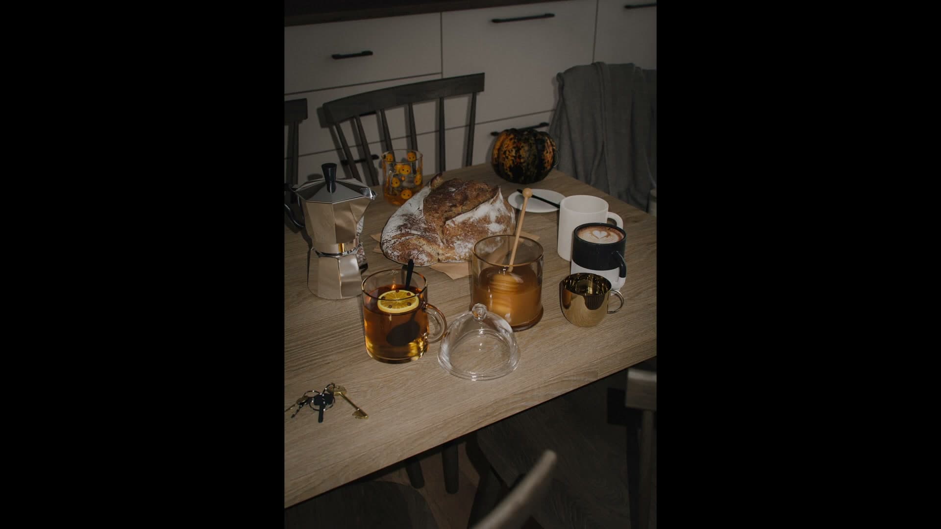
That's what's happening here. The drinks on the table are still full. The bread is untouched. The lighting is the kind you'd only get if somebody was walking through with a phone torch. It reads like the occupants left in a hurry, which is exactly the kind of absent-context cue the liminal framing relies on.
Nothing in this scene is overtly frightening. No monster, no blood, no jump-scare. It just doesn't feel quite right, and that quiet wrongness is the entire point.
Blocking out the empty room
Set up a barely-lit shell with an HDRI at 0.1 strength, drop in an iMeshh wood floor (a plane driven by geometry nodes), add a kitchen for background detail, and slot a glass-less window in for shadow casting.
Artist Workshop HDRI at 0.1 strength
The starting shell is barely a room (some of the walls are still missing) and the only light in the scene is an HDRI dialled almost completely down. The strength sits at 0.1, so the HDRI is doing essentially no lighting work; it is there to whisper a tiny bit of ambient bounce into the corners rather than illuminate anything properly.
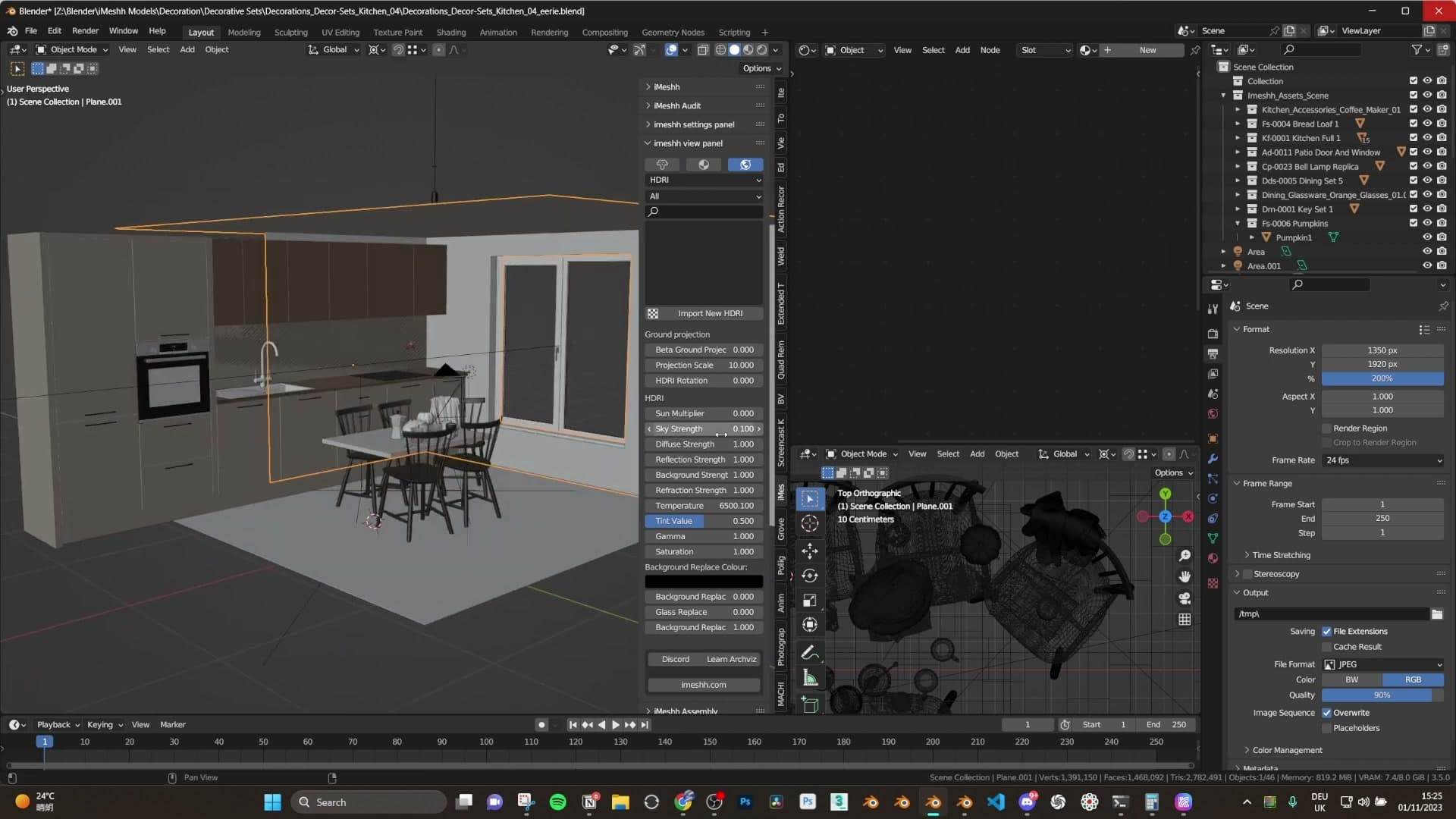
The HDRI itself is Artist Workshop from HDRI Haven. With the value pulled this low, the specific content of the HDRI hardly matters. You just need something present so surfaces don't fall to pure black before the main light goes in. Everything you are about to see is going to be lit by a single tiny area light, and this faint ambience is what keeps the deepest shadows from reading as a solid void.
Geometry-nodes wood floor
With the ambience set, drop in a floor. iMeshh recently added a wood floor collection that fills a gap that had been missing from the library for a long time. Pick a basic wood (you won't really see it in the final render anyway) and pull it into the scene.
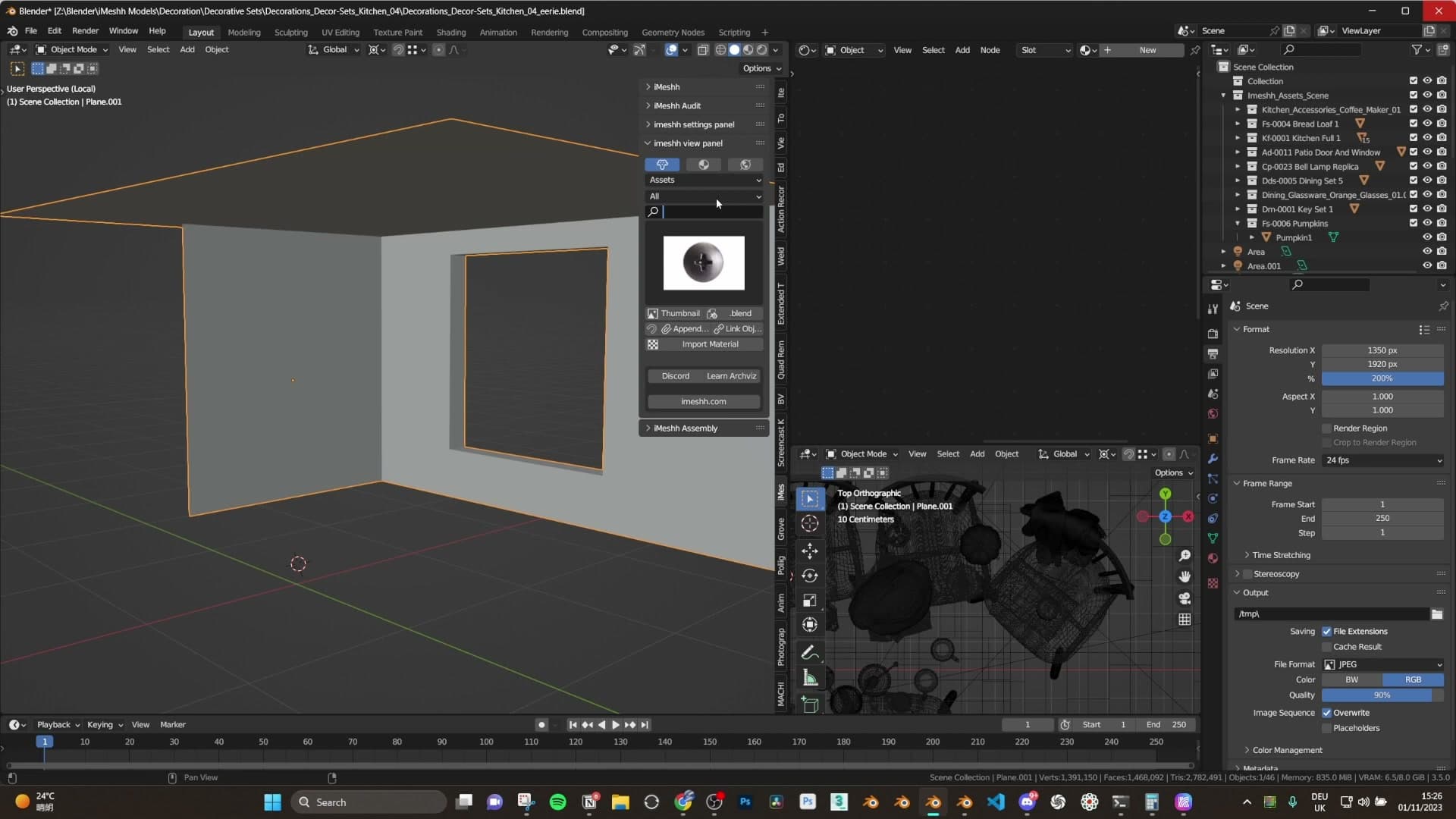
Under the hood, each of these floors is just a single plane with a geometry nodes setup running on top, generating the planks procedurally. That means there is nothing to array, scale or duplicate by hand: grab the edge of the plane and stretch it out until the floor fills the room. The geometry nodes handle the rest.
Background kitchen and a glass-less window
Next, drop in a kitchen asset for the background. There is no need to place it precisely. You are not lighting it and the viewer will only catch a sliver of it through the gloom. The point is to put something behind the camera's eyeline so the back of the frame reads as a real space rather than a flat void.
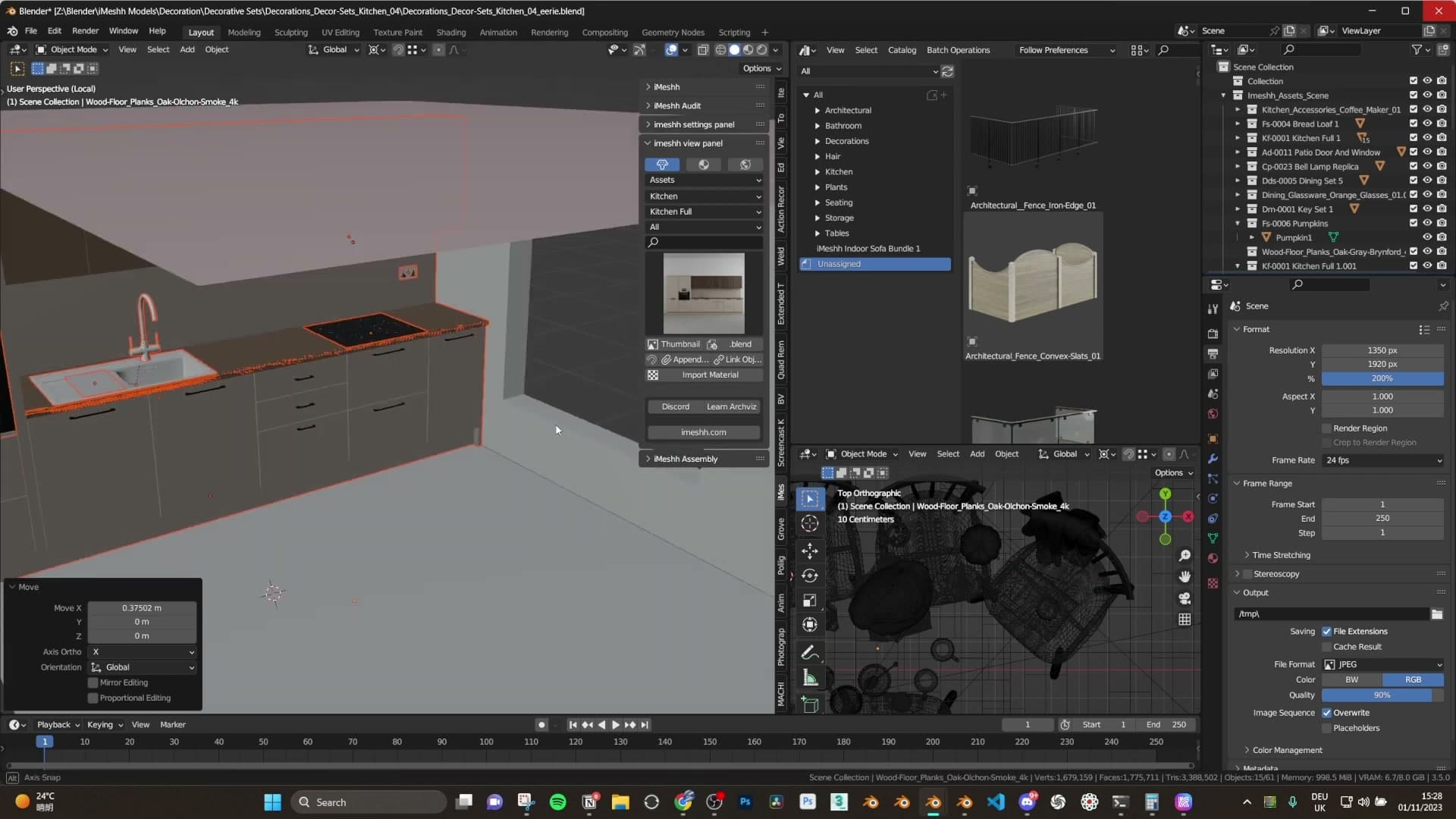
Finish the shell with a window. The window is barely visible in the final image, and glass can be awkward for Cycles to calculate cleanly even with a smart shader, so delete the glass entirely. What is left is just the frame, kept in the scene only so the main light can throw a window-shaped shadow if the angle catches it.
Camera framing for a handheld feel
Set the render to 1530x1920 portrait for Instagram, tilt the camera down slightly so it reads as a handheld phone shot, then drop in a legless table and rough-place the chairs.
1530x1920 portrait for Instagram
Open the Output properties and set the render resolution to 1530x1920. That's a portrait aspect tuned for an Instagram post, a touch larger than the platform's display crop. It gives you headroom and reads cleanly once it's uploaded.
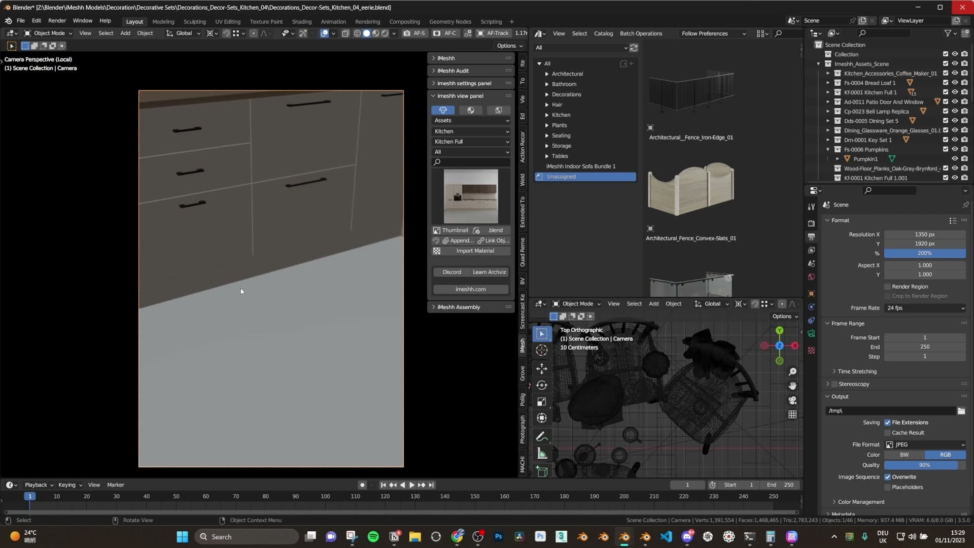
Don't line the camera up dead straight. Tilt it down a little so the framing feels handheld, the way you'd hold a phone slightly angled down as you walked into a room. That subtle downward look is what sells the whole liminal, someone-just-walked-in vibe; a perfectly level shot reads as a tripod, not a person.
Rough-placing the table and chairs
With the framing locked, drop the table into the scene and shuffle it around until it sits where you want the eye to land. The table itself doesn't need any legs modelled. The camera angle crops them out completely, so you can skip that geometry without anyone ever noticing.
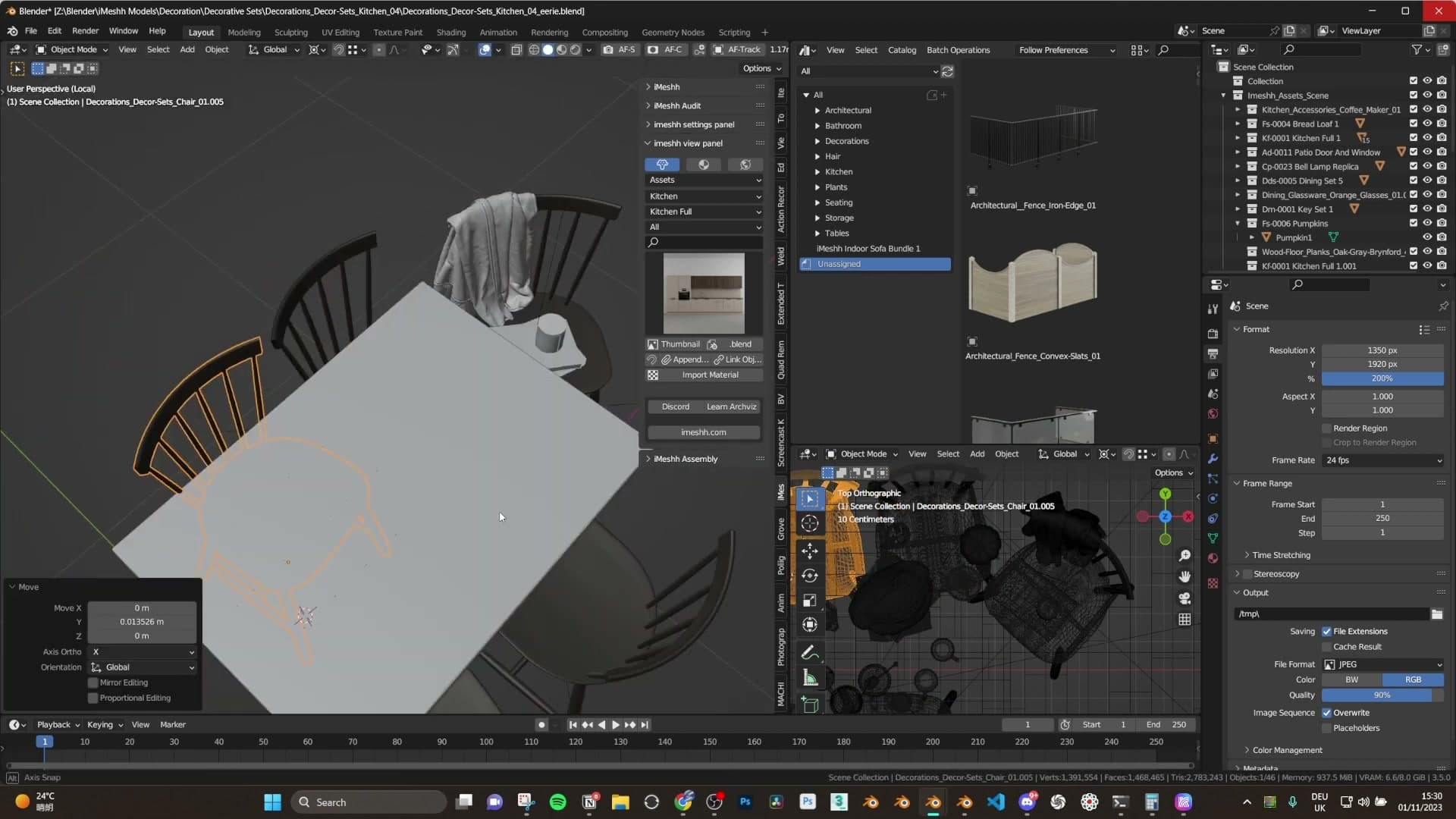
Slot the chairs in roughly around it. There's no need to align them precisely; the scene is meant to feel like people just got up and left, not a furniture showroom. If a chair is clipping into the table or another object, nudge it out. That's the only correction worth making at this stage.
One of the seats here is a full iMeshh decorative set, a table-and-chair combo that comes pre-dressed with props on top. Drop it in, strip out anything that doesn't suit the scene (the blanket came off for this one) and it instantly fills the mid-tier of the composition without any extra arranging.
Dropping in the Halloween decorative set
Place the full table-and-chair decorative set, then sprinkle a juice drink, pumpkins and a set of keys around it. Most items came pre-arranged, only minor tweaks needed.
The full table decorative set
With just the table and chairs in place, the framing still felt flat. It was like staring at an empty table rather than walking into a lived-in room. The fix was to drop in one of the iMeshh decorative sets, which arrives pre-arranged with the props already grouped and positioned.
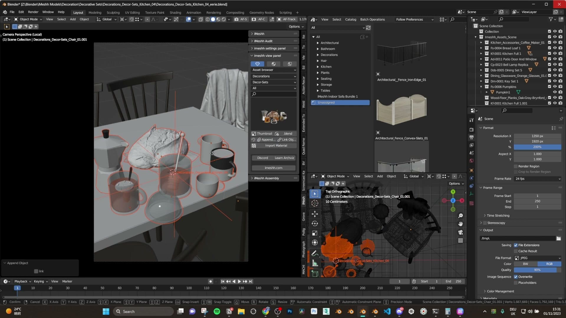
Drag the set into the scene as a single block, then slide it across the table top until it sits where you want it. Because every prop inside the set is its own object, you can nudge individual elements afterwards to break the symmetry and find a composition that feels less staged.
A couple of minutes of small adjustments was all it took to land on a layout that read as something a person had actually left behind, rather than a showroom shot.
Juice drink, pumpkins and keys
On top of the table-and-chairs set, a handful of extra items go in to anchor the Halloween theme. The first is a juice drink (also from the iMeshh library) placed on the table to give the eye something with colour and a clear silhouette.
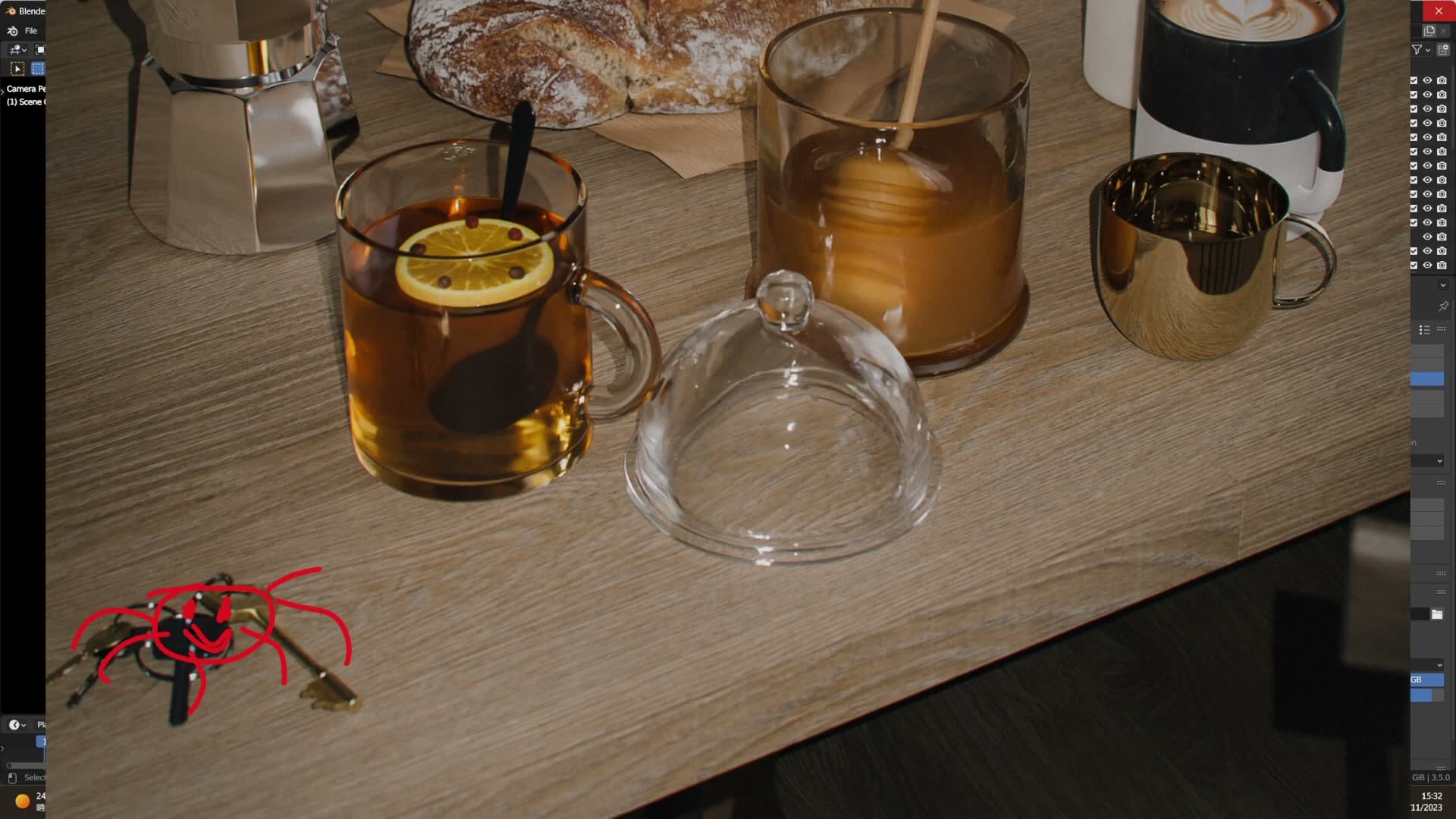
Then a couple of pumpkins go into the background so the seasonal cue isn't carried entirely by the table dressing, and finally a set of keys dropped onto the surface near the place setting.
One quiet bonus of the keys: in the final render, caught with the side of your eye, the silhouette reads almost like a small spider sat on the table. Once you spot it you can't unsee it. It slots neatly into the unsettling, slightly-off mood the scene is going for. Everything else stays roughly where the decorative set ships it, so the heavy lifting has already been done for you.
The phone-flashlight lighting trick
Add a tiny area light at power 10 with the size cranked all the way down: a sharp, point-like source. Offset it a sliver from the camera so shadows just poke out, then parent it to the camera so it follows every reframe.
Tiny area light at power 10
With the power locked at 10, the next move is to crank the area light's size down as far as the slider allows. A tiny emitter behaves like a point source, and that is exactly what you want here: sharp, hard-edged shadows instead of the soft wash a wider panel would throw. The reference I'm chasing is a mobile phone flashlight: small, very sharp, faintly unsettling.
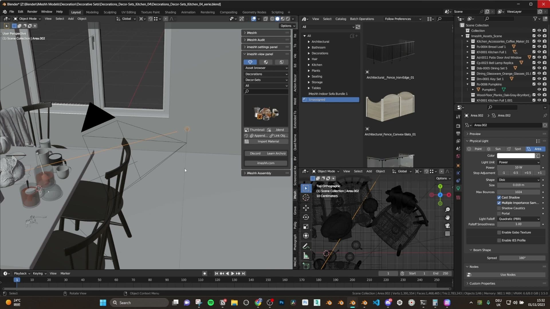
Drop into the camera preview and check the result. The shadows should already be there, but only just. Strong in character yet very subtle in coverage, poking out a sliver from the side of each object rather than streaking across the room. That restraint is what sells the liminal feel; a brighter or fatter source would flatten everything you've built so far.
Offset the light a sliver from camera
Where you place the light relative to the camera matters more than you would expect. Park it directly above the camera and the shadows vanish entirely. Every surface gets lit dead-on, the depth collapses, and the frame ends up feeling oddly wrong in a way that isn't useful.
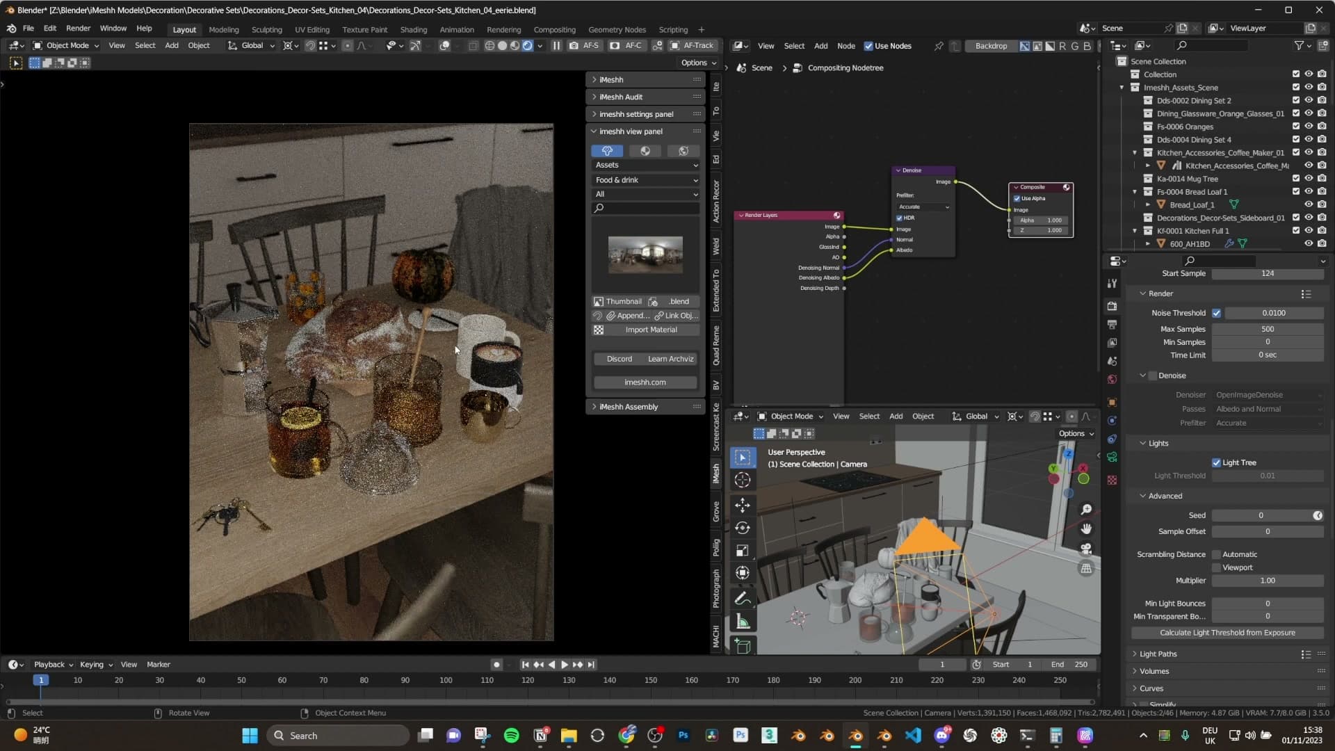
Nudge the light a sliver off-centre instead. Just a small offset is enough for short, sharp shadows to start peeking out from the edge of each object, and that tiny asymmetry is what tells the eye there's a real source nearby. I settled on a very small horizontal displacement, but the principle is the takeaway, not the exact distance: any minor offset from the camera origin will read; sitting flush with it will not.
Feel free to slide the light around once you're in the right ballpark. A few centimetres in one direction versus another can shift the mood of the shot considerably, so it's worth playing with the offset until the shadows pick out the silhouettes you care about.
Parent the light to the camera
The final piece is parenting the light to the camera so the two move as a single unit. Once that relationship is set up, any time you reframe (orbit, dolly, walk through the room) the light tracks along with you, and every new angle stays consistently lit without further fiddling.
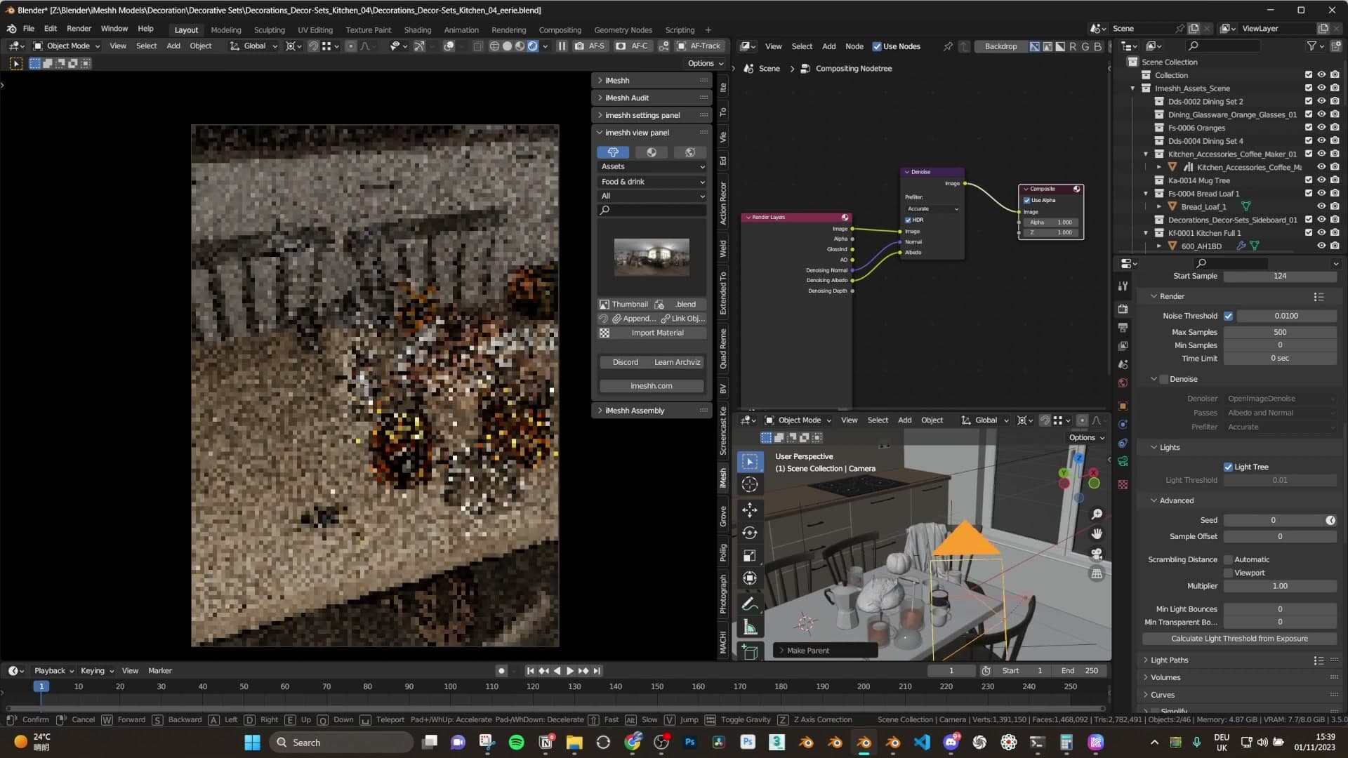
The payoff is immediate. The scene starts to feel like someone holding a phone, sweeping it around a dark room and hunting for a shot. You can stop wrestling with the lighting on every reframe and focus entirely on composition, which is the whole point of pinning the rig together in the first place.
And with that, the lighting is genuinely done. One small area light, slightly offset, parented to the camera. No fill, no rim, no second pass.
Cycles render settings via Render Tone
Run light paths high for reflections, use the Render Tone Blender Market panel as a shortcut to the most-used Cycles settings, denoise in the compositor, and export to 16-bit TIFF for grading.
Render Tone panel for Cycles
For render settings, the panel of choice is Render Tone, a Blender Market add-on that surfaces the Cycles controls you actually reach for on every scene (light paths, denoising, tone mapping) directly at the top of the properties panel instead of leaving them buried across tabs.
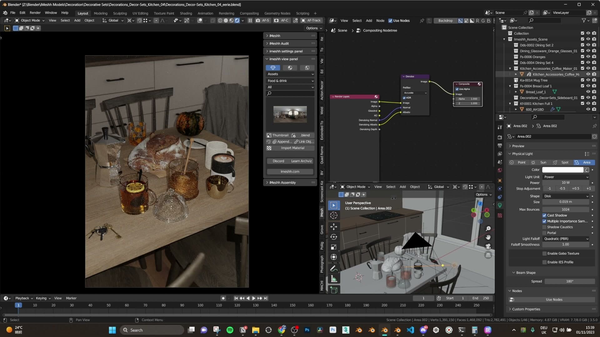
I'd recommend checking it out: it pulls the handful of settings you use most often into one quick-access strip, so you can dial in a look without breaking flow. The lighting for this shot is intentionally minimal. A 50 mm focal length on the camera, the single tiny area light from the previous module, and one very weak HDRI for a touch of ambience. That's the entire setup feeding into these render settings.
Light paths cranked, 16-bit TIFF out
Inside Render Tone, the light path bounces are cranked high. I generally push these well above the defaults on most scenes to get as many reflections through the geometry as Cycles will give you. The goal is clean glossy and transmission behaviour rather than worrying about render time first.
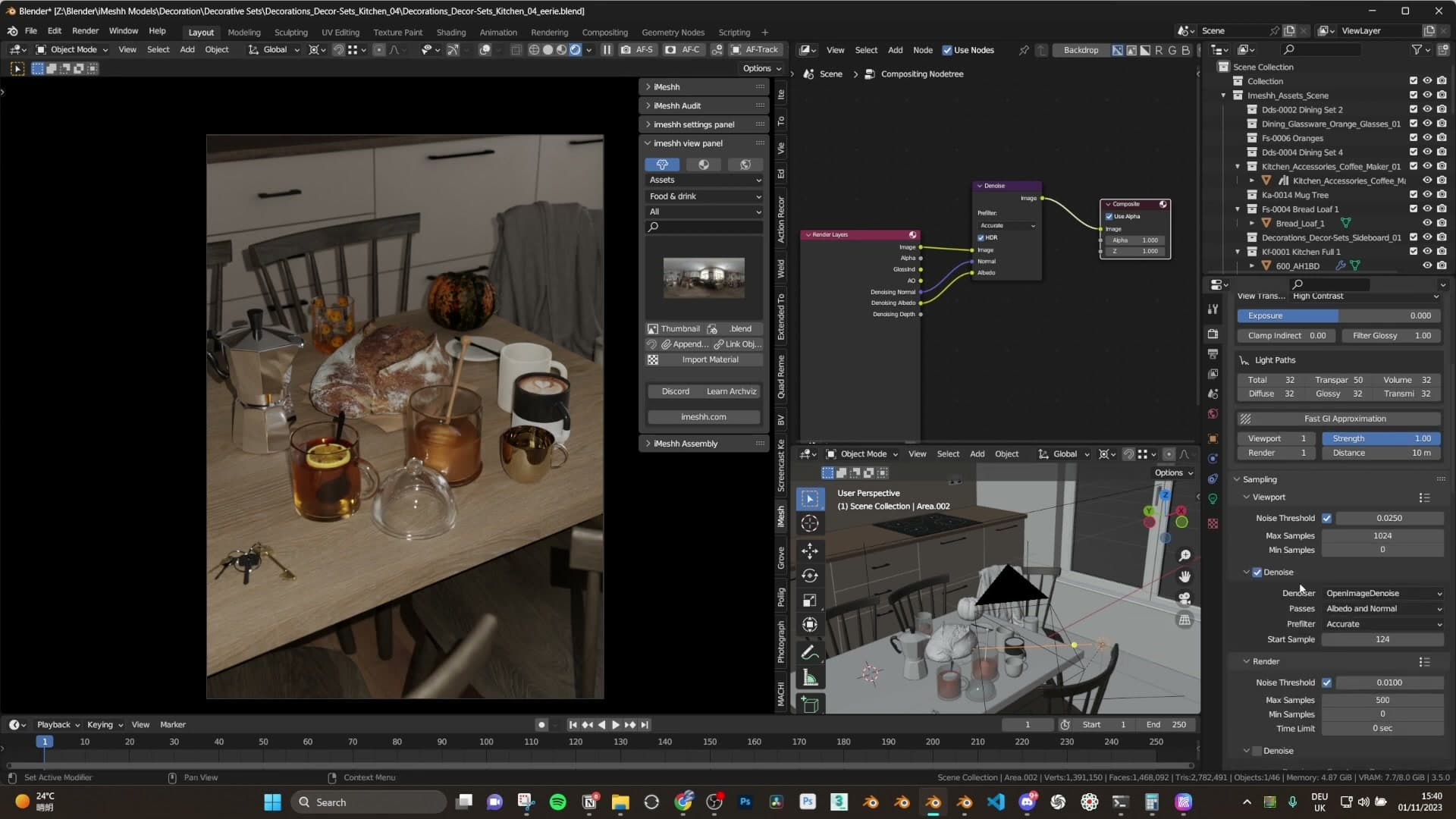
It's almost certainly overkill for a scene this dark, but the render still finished quickly enough that there's no real penalty for being generous with the bounces. If your scene is heavier and the render times start hurting, that's the first place to dial back.
Denoising happens in the compositor rather than at render time, and the rest of the settings stay deliberately basic: Filmic for the view transform, nothing exotic stacked on top.
Render straight out to TIFF 16-bit. The extra bit depth is what makes the Photoshop grade in the next module possible. Lifting the blacks on an 8-bit JPEG would band visibly. With the still saved, the work moves over to Photoshop.
Camera Raw colour grade in Photoshop
Convert the render to a Smart Object so every Camera Raw tweak stays editable. Lift the blacks for a film vibe, drop vibrance and clarity, push the vignette to focus the centre, then add film grain.
Smart Object + Camera Raw filter
With the render open in Photoshop, the first move is to right-click the layer and convert it to a Smart Object. From there, head to Filter > Camera Raw Filter and apply it on top.
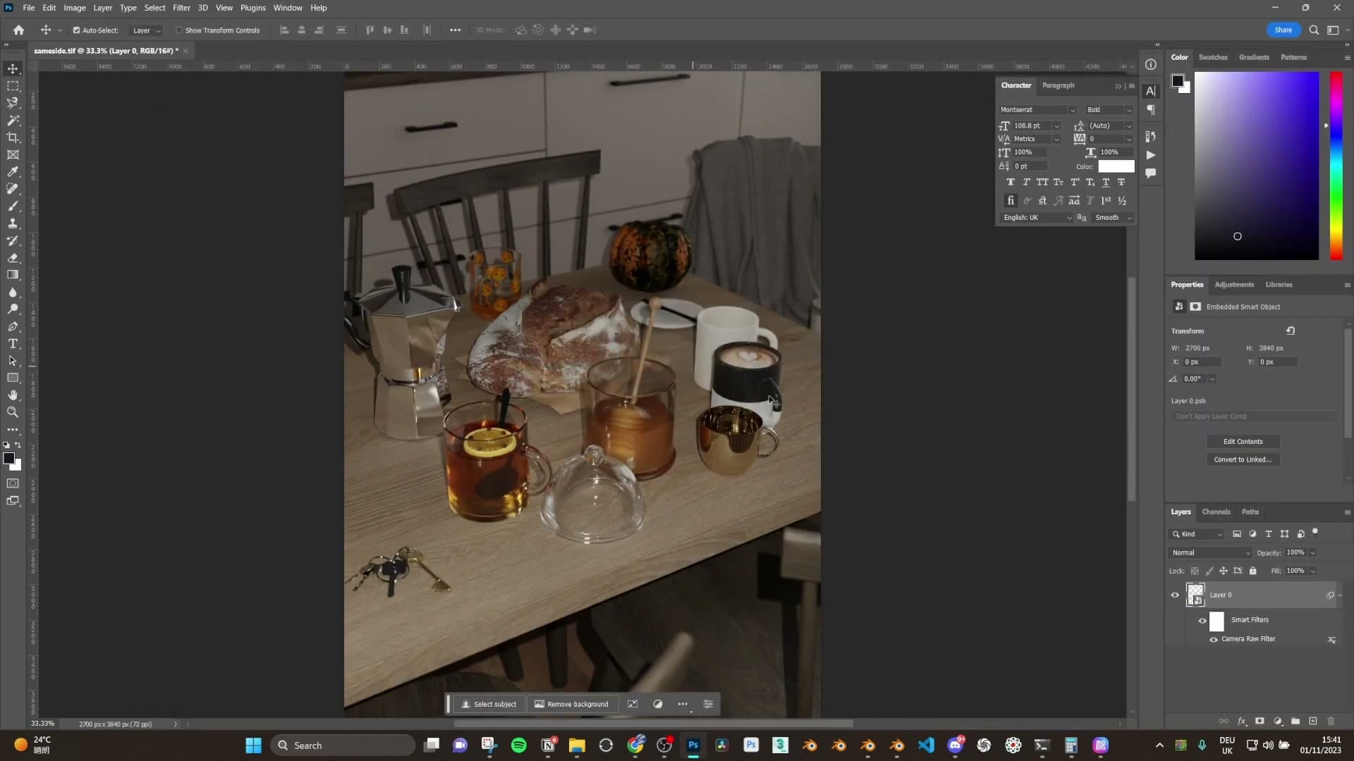
The reason for the Smart Object step is non-destructive editing. Because Camera Raw is now stacked as a smart filter, none of the adjustments get baked into the pixels. You can double-click back in at any point, nudge a slider, and the image updates without losing fidelity.
Blacks, vibrance and exposure for a film vibe
The first slider to touch is Blacks. Lift it a little so the darkest parts of the image aren't crushing all the way to pure black. That lifted-shadow feel is what gives renders a more filmic, slightly faded look rather than a clean digital one. Be careful not to go too far the other way and over-cook the contrast.
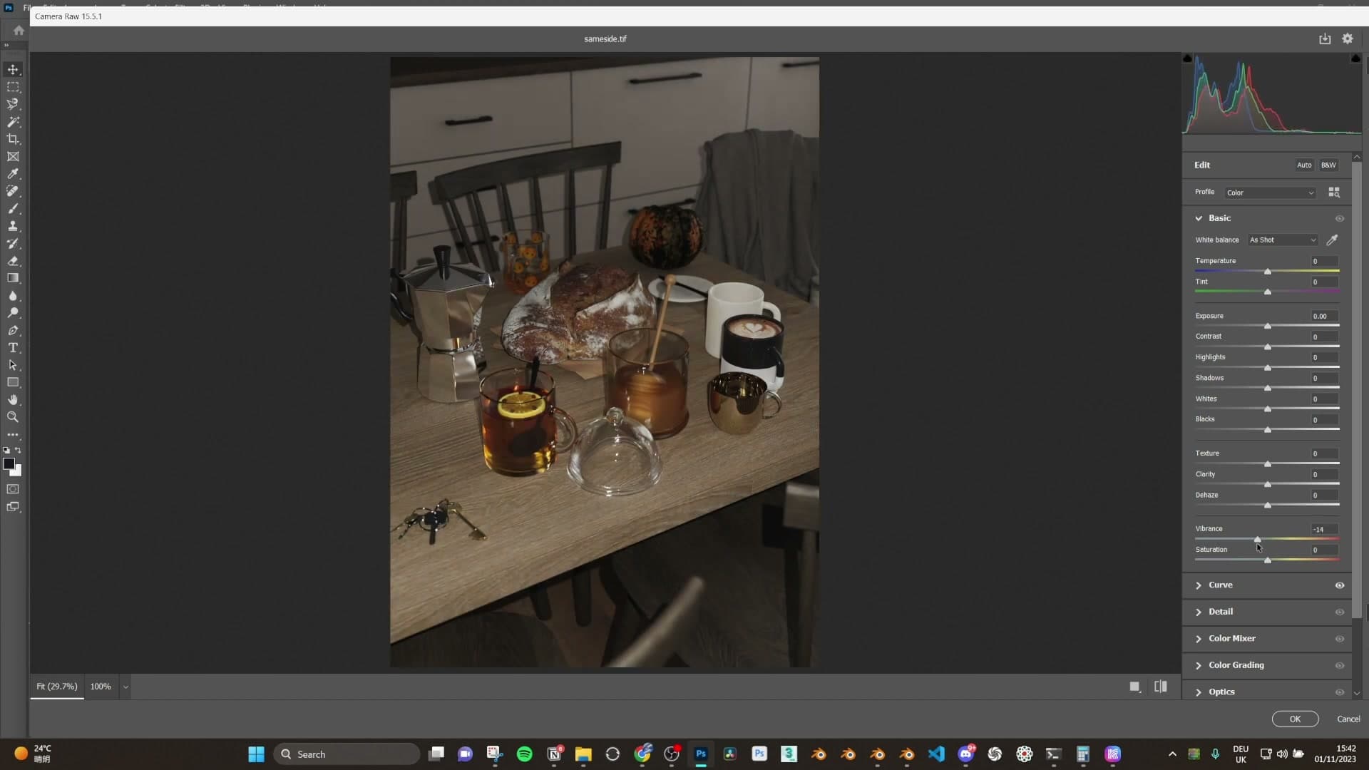
Next, pull Vibrance down a touch. This knocks back the yellowy cast that tends to creep into skin-toned surfaces and warm wood, which keeps the overall palette feeling cooler and more eerie.
Finally, nudge Exposure up slightly to compensate for the lifted blacks, then add a small amount of Sharpening in the Detail panel. Keep the sharpening conservative. The next step is going to add grain, and an over-sharpened image fights against a softer film feel.
Vignette, grain and softened clarity
Over in the Effects panel, dial up the Grain slider. The scene is meant to read like an old photograph, so a visible film grain across the whole image sells that vibe far more than any sharpening would.
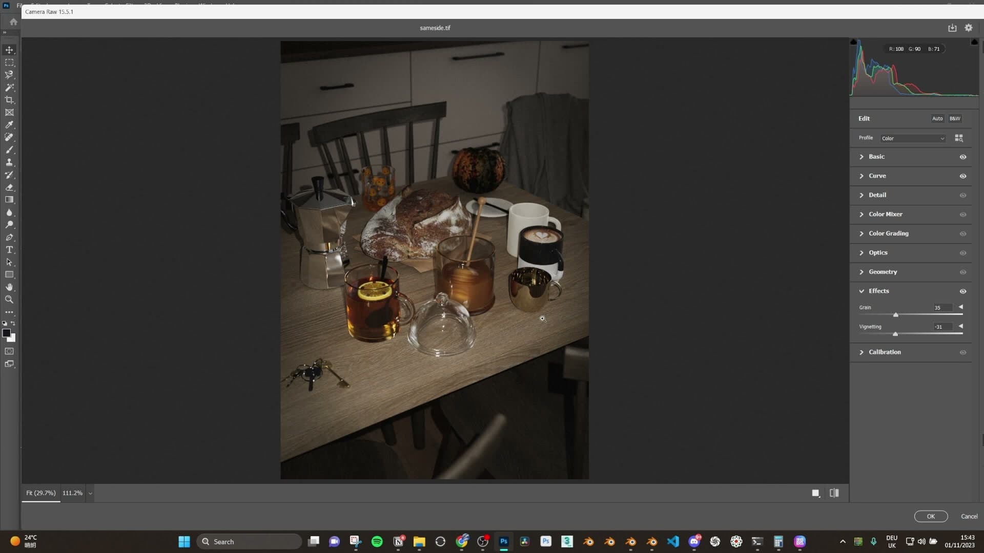
In the same panel, pull the Vignette down hard. Darkening the edges focuses the eye onto the small pool of phone-flashlight light in the middle of the frame. The rest of the room reads as a darker, surrounding space, and the centre becomes the obvious focal point. That's exactly the liminal effect you're after.
Back in the Basic panel, drop the Clarity slider a little to soften the mid-tone contrast. It takes the edge off the render's sharpness and pushes it further toward an old-photo feel.
If the combination of heavy vignette and lifted blacks leaves certain areas reading too dark, lift Exposure back up a hair to balance things out. The final look should feel dim and uneasy without losing the detail in the lit centre.
Subtle chromatic aberration to finish
Most tutorials over-cook chromatic aberration. Use Lens Correction > Custom with very small red/cyan and blue/yellow offsets, just enough to add the lens cues the eye expects from a real photo.
Lens Correction custom offsets
Before touching chromatic aberration, drop the saturation slider down a touch further so the whole image sits a little quieter. That alone gets you close to the look from the original render.
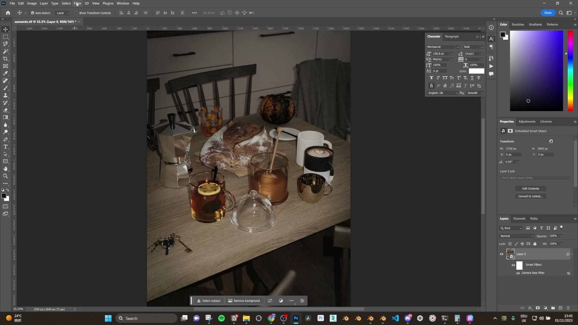
Chromatic aberration is a hit-or-miss effect. Some people love it, some can't stand it, and most photographers actively try to remove it from their photos. The thing is, almost every camera lens out there produces it in some form, so your eye is genuinely used to seeing it in real photographs. Adding a hint of it back into a render is one of those cues that nudges a CG image toward looking shot rather than rendered.
The mistake most tutorials make is laying it on far too heavy, which tips the image straight into looking exaggerated and obviously stylised. You want barely-there, not turned-up-to-eleven.
Inside Camera Raw, open Lens Correction and switch from the default Profile tab to Custom. That gives you two sliders to play with: one for the red/cyan fringe, one for the blue/yellow fringe. Nudge one down a little, the other up a little, and watch the high-contrast edges in the scene start to pick up faint colour fringing.
Pink and green edges, kept subtle
What you're looking for on the edges is a sliver of pink on one side and a sliver of green on the other, sitting only where the contrast is strong enough to catch it. On a softer edge you shouldn't see anything at all.
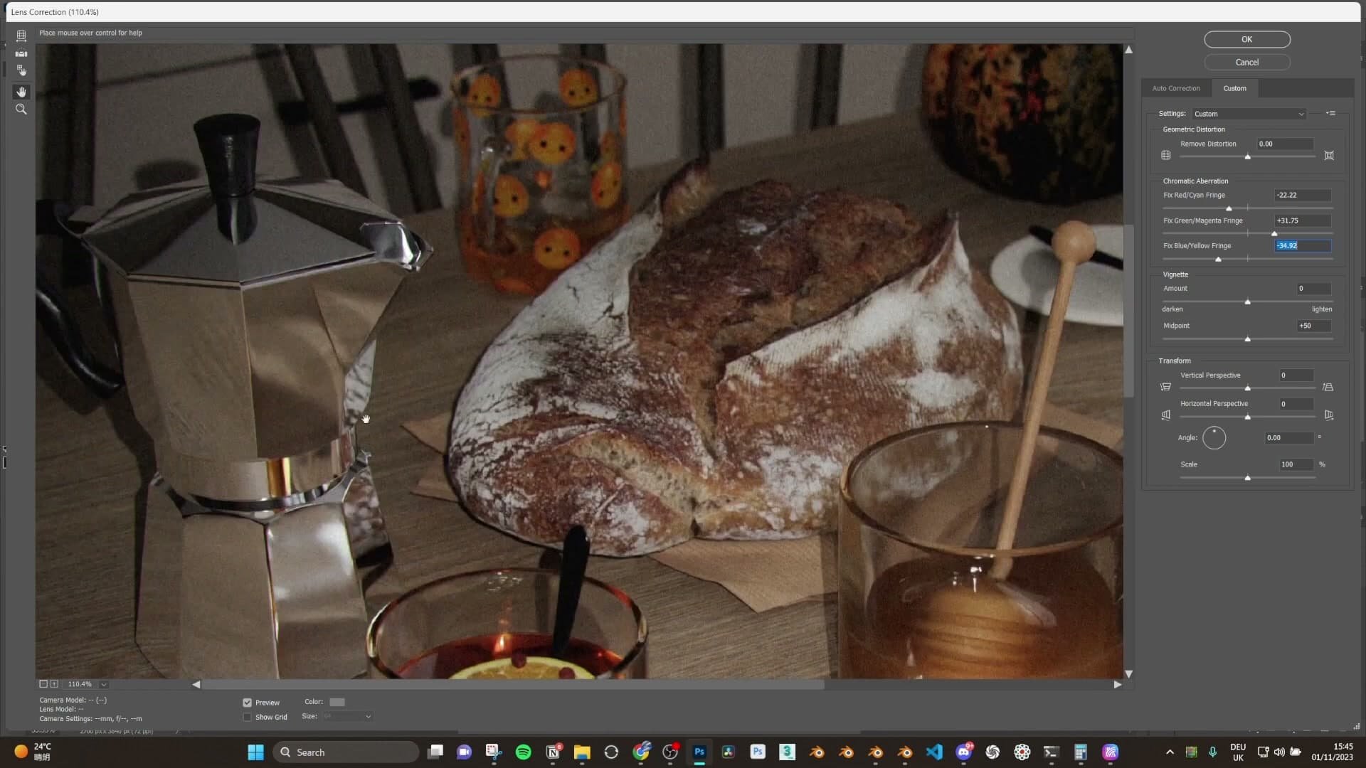
Once you can just about read those colours along the high-contrast edges in the room, the whole frame starts to feel more like a photograph and less like a render. It's subtle. You almost have to look for it. But it's enough.
There's no need to push it any further. You could turn it up if that's the look you want, but at this stage the image is already reading as a photo, so click OK and call it done.
Original vs new edit comparison
Side-by-side against the original Instagram render, the new edit comes in a little less saturated, and the chromatic aberration is gentler than the version that went out on the post. The original had it laid on heavier. The new pass is more restrained but still lands in the same liminal, off-feeling territory.
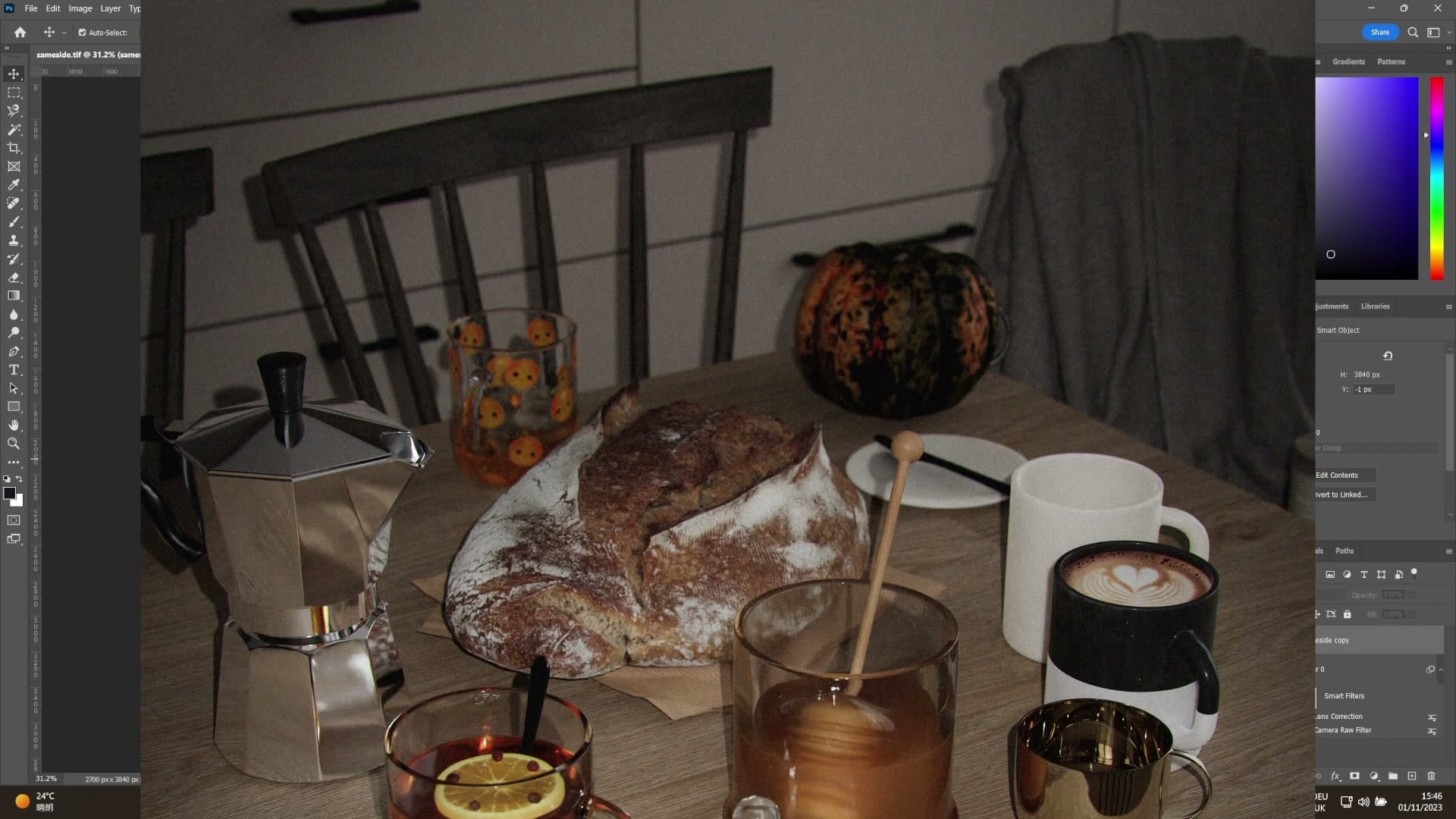
And that's the whole pipeline: one tiny camera-parented area light in Blender, a portrait-aspect Cycles render, and a Smart-Object Camera Raw pass in Photoshop to lift the blacks, calm the colours, drop the vignette in and finish with a hint of lens fringing.
If there's a specific step you want broken down in more depth (particularly the Camera Raw side, which deserves its own video) leave a comment and it can become a dedicated tutorial. And do head over to the iMeshh Instagram and the new decorative sets on the site; each one packs a huge amount of tiny props that took a serious amount of time to design and build, and they're what makes scenes like this one possible without modelling every little detail from scratch.
Tools and credits
Everything mentioned in this tutorial, with links.
- Blender : the renderer this entire build runs in.
- iMeshh : studio platform (project management, client review, asset library, invoicing). The asset library used in this tutorial is included with every iMeshh Pro plan.
- Poly Haven : free CC0 textures and HDRIs.
Pillar guide: Rendering Post hub