Why EEVEE Next changes real-time archviz in Blender 4.2
The 4.2 update gave EEVEE ray tracing and far better material handling, closing most of the gap with Cycles for interior scenes. This walkthrough is half time-lapse, half tutorial, aimed at viewers with a few weeks of Blender under their belt.
What's new in EEVEE Next and who this tutorial is for
EEVEE, Blender's real-time engine, has had a major overhaul in Blender 4.2. For archviz work that has always meant Cycles by default, the practical implication is big: EEVEE Next now uses ray tracing, and the realistic interior results that used to require a slow path-traced render are suddenly achievable in real time.

If you tried EEVEE in previous versions and bounced off it, you're in good company. The results were genuinely rough: flat lighting, awkward reflections, that unmistakable real-time look that nobody wanted attached to a portfolio render. EEVEE Next changes the calculus. The combination of ray tracing and better material handling means you can light a modern living room, dial in soft shadows and bounce light, and walk away with a frame that holds up next to a Cycles render in a fraction of the time.
This walkthrough is a hybrid format (part time-lapse, part full tutorial) covering the build of a modern living room scene from an empty file to the final composite. It moves quickly and packs a lot of small tips and tricks into each section, so it rewards watching end to end rather than skipping around. If you're brand new to Blender, work through the beginner series first; once you've got a few weeks of Blender muscle memory under your belt, you'll be able to follow along here without trouble.
Build the room shell and lock down the camera
Start from a 13 × 7.5 m plane, extrude 6.5 m of walls, and place a 55 mm camera with a fixed shift so the rest of the scene snaps into the right composition.
Plane dimensions, scale apply and wall extrude
Open Blender 4.2 and add a plane to the empty scene. Press N to bring up the sidebar, then set the plane's dimensions to 13 m by 7.5 m. That is the footprint the rest of the room will sit on.
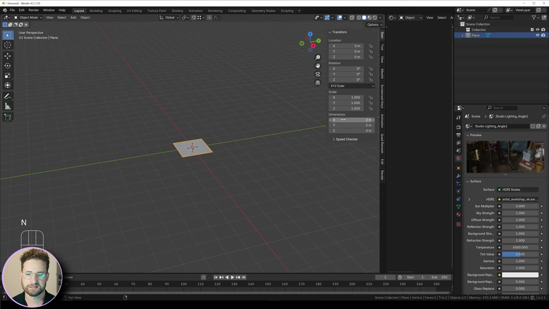
Apply the scale before you do anything else, then tab into edit mode. The wall extrude needs to be exactly 6.5 m tall, so enable the edge length overlay first. That way you can see the height as you drag rather than guessing.
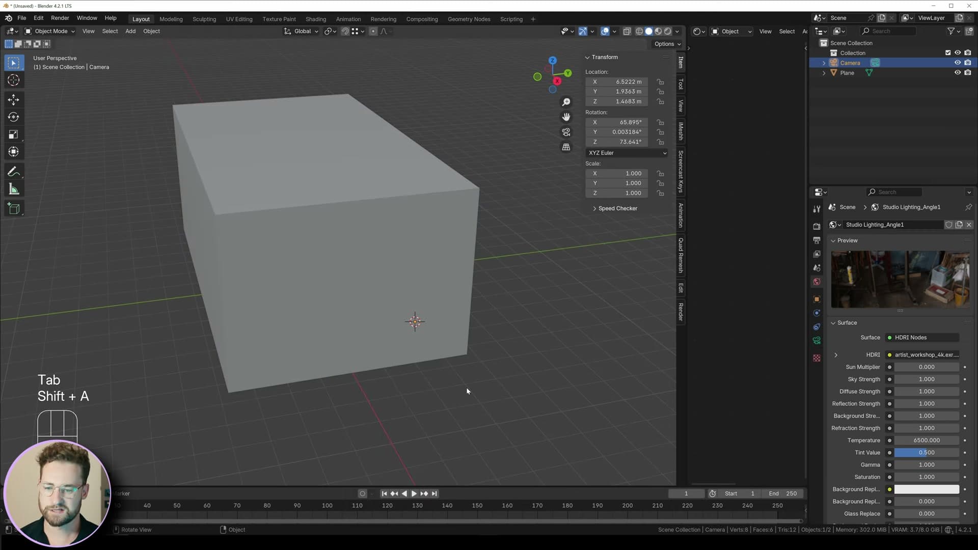
Select all four edges, press E to extrude upward, and watch the on-screen readout until it lands on 6.5 m. That gives you the bare room shell to build the camera and the window into.
Lock the camera with 55mm and PASPA 2
Add a camera and zero out its rotation, then rotate it by 90° on the X-axis and 90° on the Z-axis. That sequence lines the camera up dead straight rather than at the default tilt, which matters because the rest of the composition is built relative to this view.
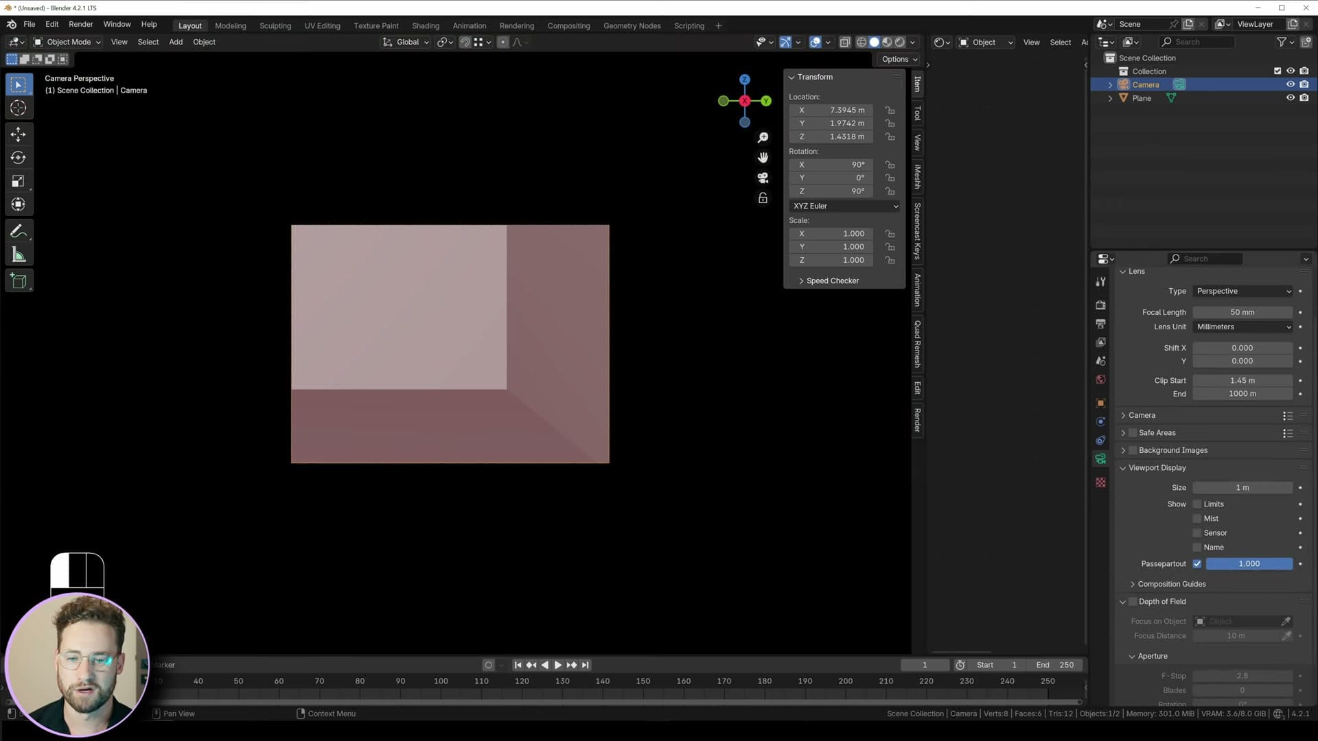
Under the camera's format settings, set the render resolution to whatever you're targeting and push the camera's clipping start inward so the near wall doesn't block the view through to the room.
Turn on Passepartout so the area outside the framed shot is greyed out, then drop the focal length to 55 mm. Add a touch of camera shift to nudge the framing. A small value works as a starting point and can be tweaked later once more of the scene is in place.
Finally, drop a loop cut into the back wall. You'll use it in the next module to slice out the window opening.
Face orientation overlay as a permanent normal check
Open Edit → Preferences and find the face orientation settings. The default red and blue tints are useful for spotting flipped normals but they're loud enough to make the viewport unworkable if you leave them on permanently, so turn the red alpha right down and switch the blue off entirely.
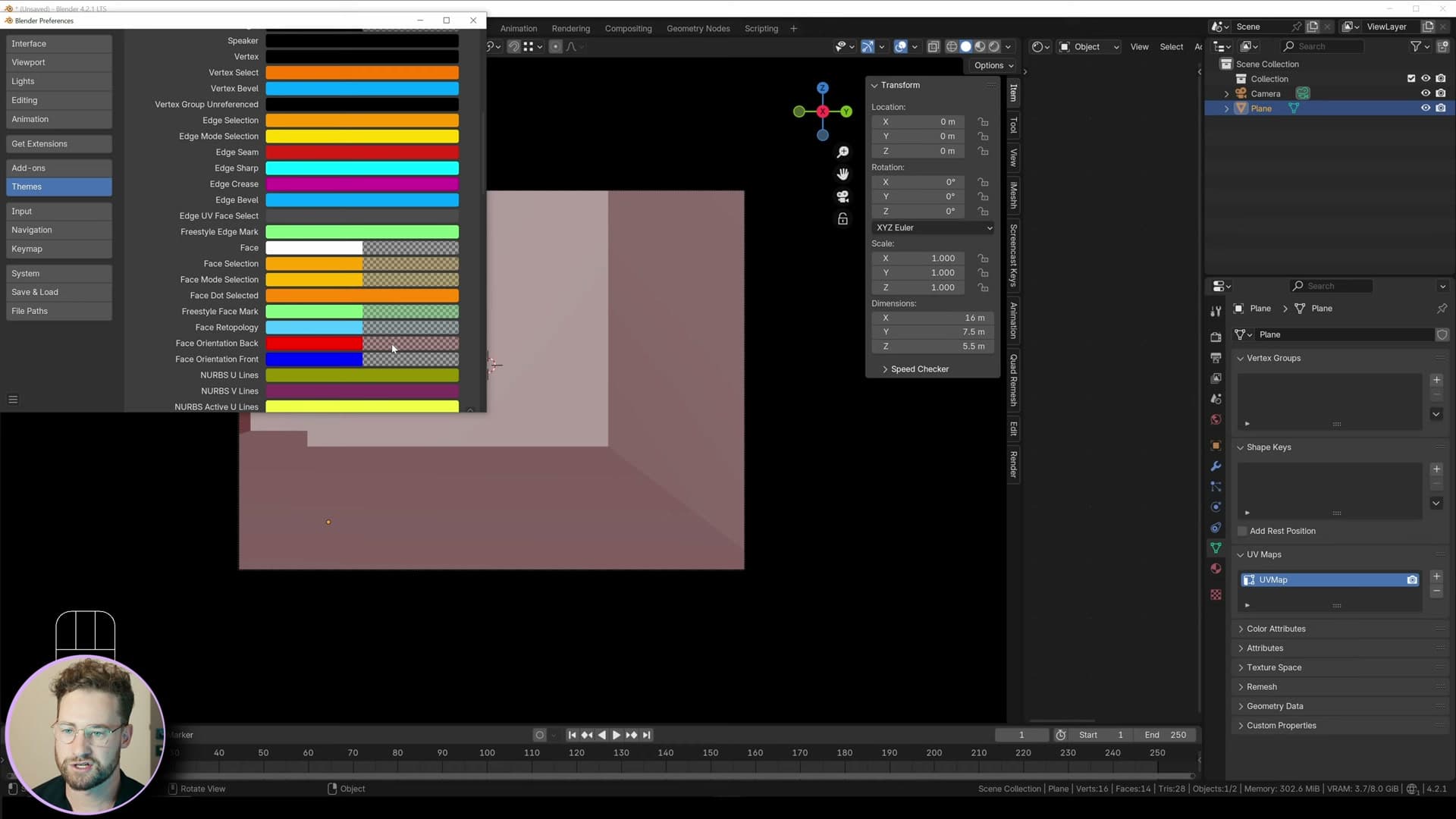
With the colours tamed, you can leave the face orientation overlay enabled all the time via the viewport overlays menu. Any face with a flipped normal still tints faintly red, visible enough to catch, dim enough that you can keep modelling without squinting.
Flip normals and adjust wall positions
With the overlay always on, any wall pointing the wrong way reveals itself immediately. Select the offending face and flip its normal so the whole shell reads the neutral colour.
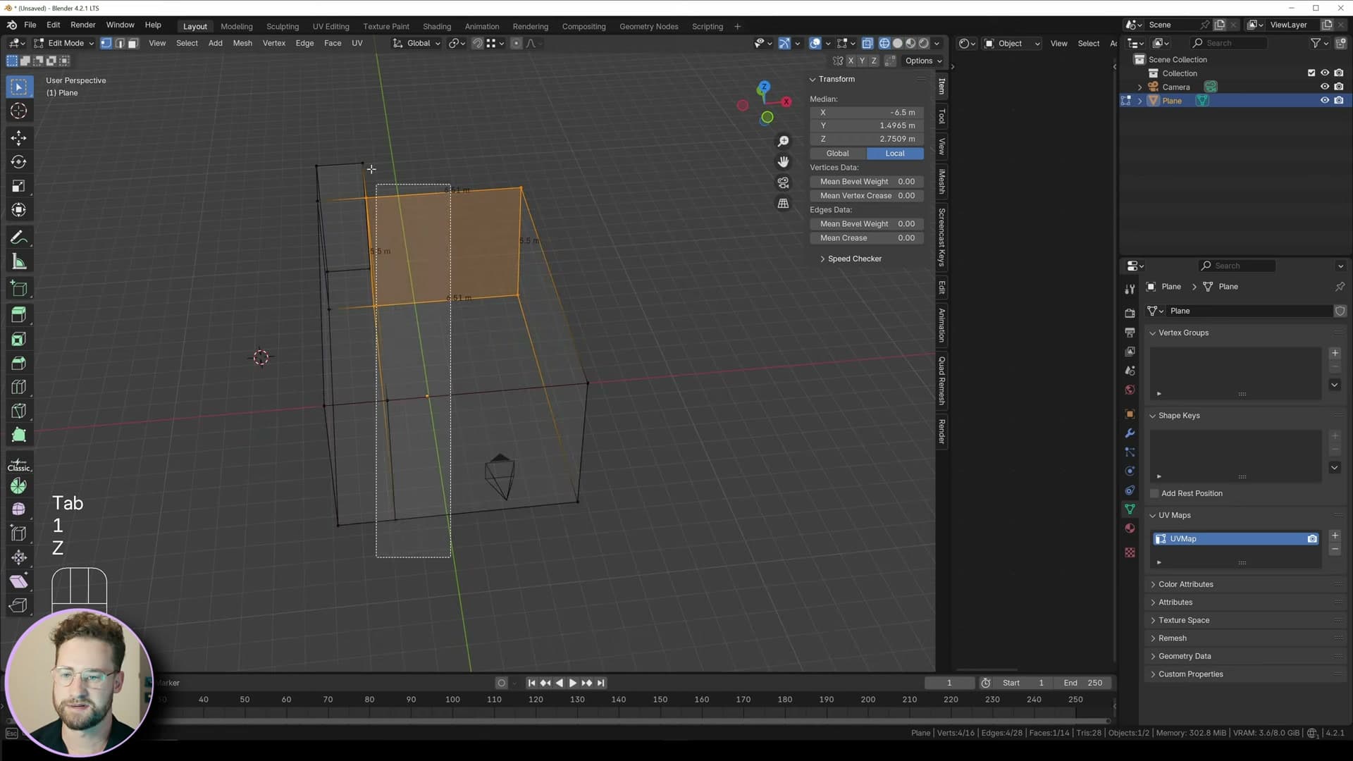
While you're tidying, rotate the entire shell by 90° so it sits flat when you press 1 on the numpad for the front view. Then pull the back wall out by roughly 1 m to give the camera a little more breathing room.
Nudge the side walls in or out a touch until the framing feels right through the camera. You're still working roughly here, just getting the room shape close to what you want in the final shot rather than nailing exact dimensions.
Select the face on the back wall where the window will go and delete it; the opening will be built up properly in the next module. Finally, switch on the composition guides in the camera properties so you can align the walls and major features against the thirds as the scene grows.
Feature wall, the step and the top trim element
Extrude a feature wall, add a cube step that breaks out into the exterior, and build a top wall feature using bridge edge loops and shift+G select by normal. Every block gets a bevel and hardened normals.
Extrude a feature wall with hardened-normal bevel
Select one of the wall faces and pull it outward so a section of the room reads as a recessed feature wall rather than a flat plane. My rule of thumb throughout the build is simple: every object gets a bevel, no exceptions. Even something as architectural as a wall section needs a touch of edge softening to catch light properly in EEVEE Next.
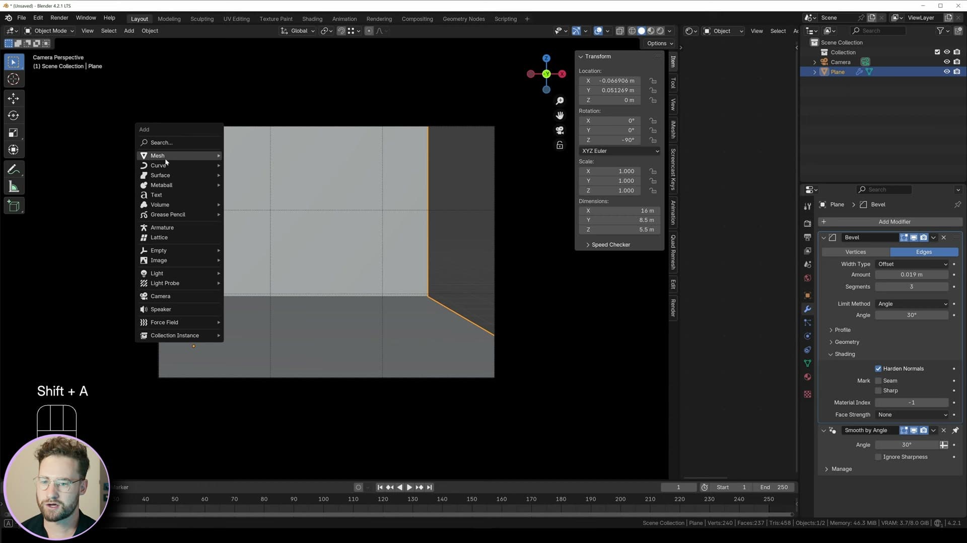
Add a Bevel modifier to the wall, then right-click and choose Shade Auto Smooth. With smoothing on its own, the bevelled edges will look mushy because the auto-smooth angle blends the new bevel faces into the flat wall. To fix that, open the Bevel modifier's Shading section and enable Harden Normals. The bevel keeps its crisp shading break while the flat wall stays smooth.
Step cube with loop cut and Shift+R duplication
Add a cube (Shift+A → Mesh → Cube), scale it right down, and position it against the feature wall so it reads as a step. Pull it out along the X-axis and lift it slightly on the Z-axis, then push it out further so it breaks the line of the wall and continues through to the exterior side of the room. The goal is one block that doubles as an inside step and an outside ledge.
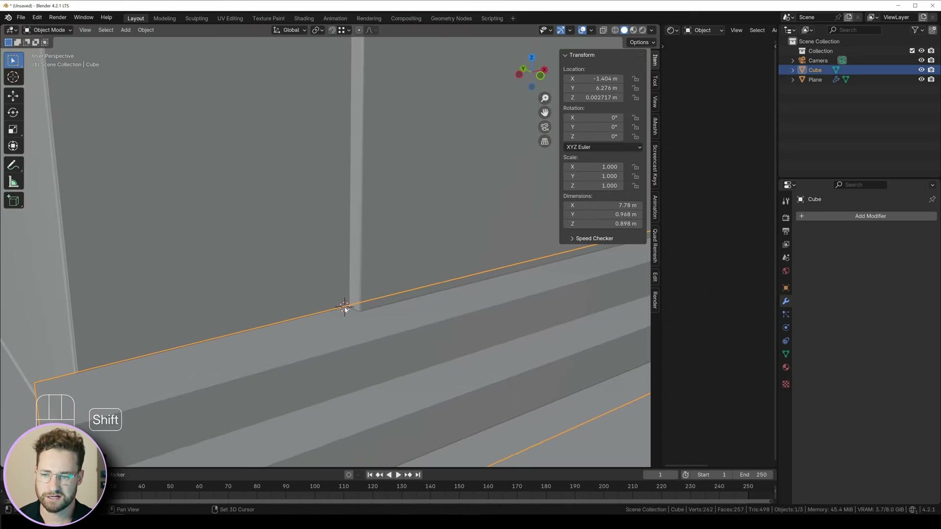
To get the actual step shape, add a loop cut across the top of the cube and slide it upward so the inner half sits proud of the outer half. Alt-click the bottom face to select the lower loop, press E to extrude, and pull it out slightly. Use 1, 2 and 3 on the keyboard to switch between vertex, edge and face select on the fly rather than clicking the mode header.
Add another cube next to the step for a second feature block. Turn off the edge-length measurement overlay so the viewport isn't cluttered with numbers, then select the top face and press G Z to lift it on the Z-axis. Press A to select everything and S X to scale on X until the proportions look right.
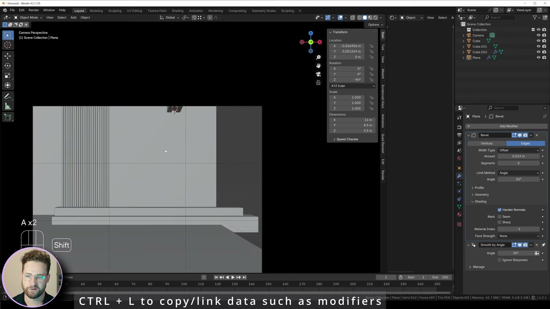
Once one block looks good, press Shift+D and constrain to X to duplicate it along the wall, then immediately press Shift+R to repeat that same translation. Each tap of Shift+R drops another copy at the same offset, which is the fastest way to lay out a repeating row of identical blocks without manually placing each one.
Top wall feature with bridge edge loops
Add one more cube up near the top of the wall for a horizontal trim feature. I'm open about it: I'm not entirely sure what this element is meant to represent in the reference, only that it looks good in the final render, so it goes in.
Add two loop cuts across the bottom of the cube to split it into thirds along its length. The plan is to push the centre section inward to create a recessed channel, but the side faces on that centre band shouldn't move with it, so delete the small edge faces that cap the centre section first.
With the geometry opened up, press Shift+G and choose Select by Normal with the centre face active. That picks up only the face pointing the same way as your selection, isolating the middle band. Press E Z to extrude it inward along Z and the trim's recessed channel forms in one move.
Finally, select the new trim alongside one of the bevelled objects and use Ctrl+L → Copy Modifiers to push the same Bevel + Harden Normals setup onto it. Bring it down into position against the wall and the top trim is done and every block in this module now shares the same bevel recipe.
Model the window panes, frames and door hardware
Insets, bridge edge loops and copied bevel modifiers build the window frames; a small cube and bevelled cylinder make the door handles; hinge cylinders get mirrored onto the second leaf.
Inset, scale-X and bridge edge loops for the frame
With the wall and step sorted, add a fresh cube for the first window. Scale it down to roughly the right proportions and slide it into the opening. Exact height and depth get tidied up later, this is just to get something in the slot.
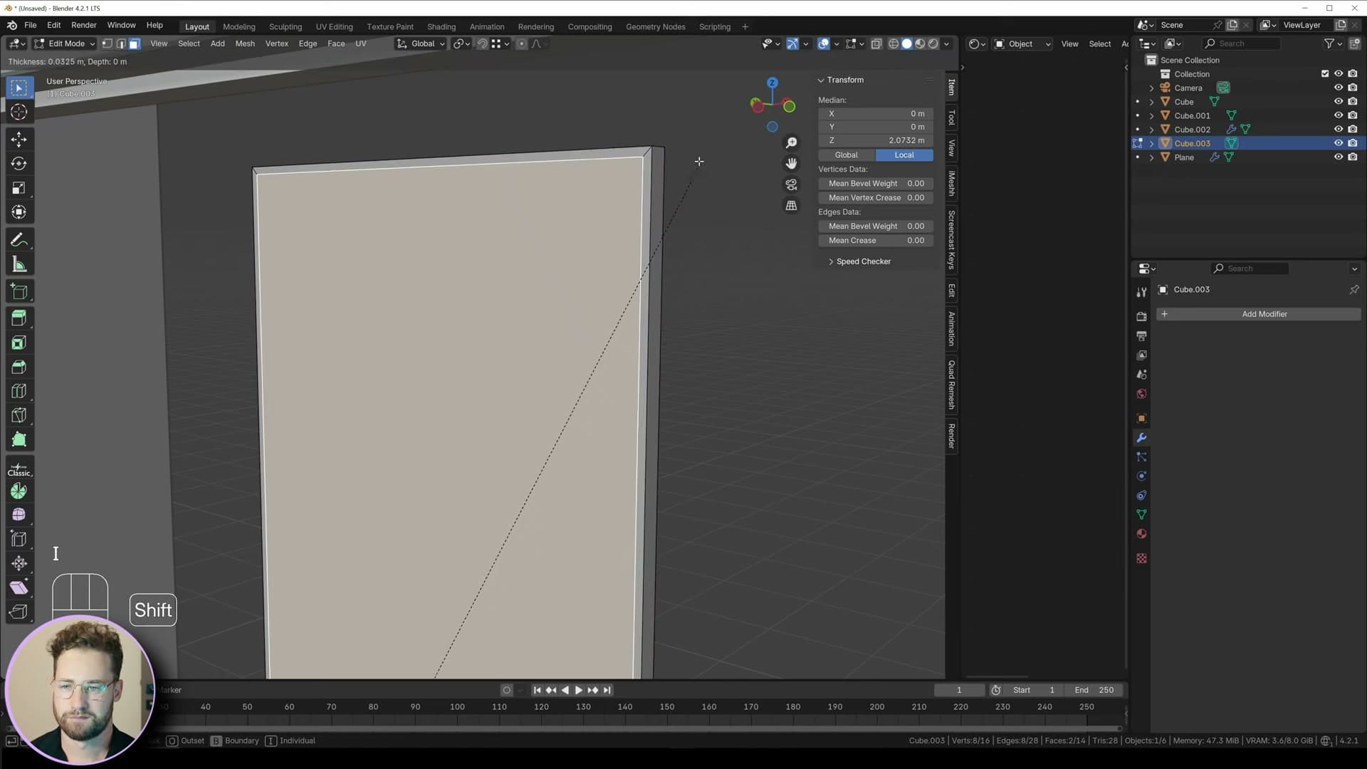
Select both the front and back faces and press I to inset them. Then press E followed by S X to extrude the new face and immediately flatten it on the X axis. That pulls the inset right through the cube so the inner pane becomes a thin sheet. Repeat the same sequence once more: I to inset again, then E, S X to push that second inset through as well. You're left with the silhouette of a frame surrounding a hollow pane.
Delete the faces sitting in the middle of the inset so the inside is genuinely open, then select the two matching edge loops on the front and back and run Edge → Bridge Edge Loops to seal them into a frame ring. With the new bridge selected, press E then Alt+S to extrude along face normals and push the frame outwards into a proper depth.
Tap Shift+D to duplicate the ring, then press E, Alt+S again to give the duplicate its own normal-extruded thickness. Delete the leftover open faces, select the unfilled edge loops and press F to cap them. The window now reads as a glazed pane sitting inside a thin moulded frame.
Door handle cube with copied bevel
Select the new window along with one of the bevelled wall pieces from earlier and press Ctrl+L → Copy Modifiers. The bevel propagates onto the frame, so its corners pick up the same softened edge as the rest of the room without you having to add the modifier by hand.
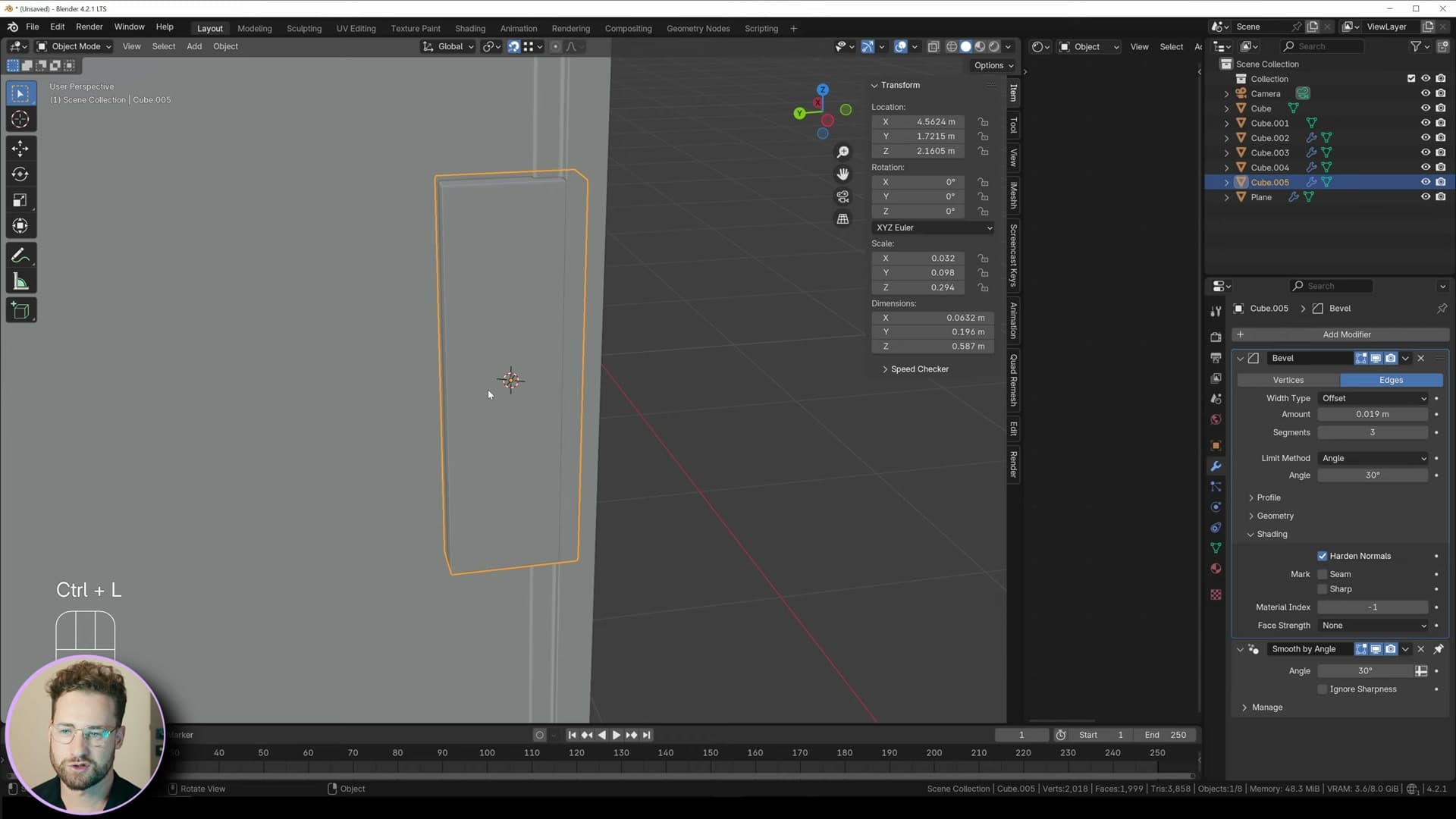
Drop into edit mode, grab the bottom vertices of the frame and slide them slightly to form a small lip that tucks against the step. Back in object mode, duplicate the whole window across to start blocking out the door. Tap Shift+Tab to enable snapping so the duplicate lands cleanly against the existing geometry.
Now build the handle plate. Add a small cube, scale it into a thin rectangle pressed against the door, and run Ctrl+L → Copy Modifiers once more so it inherits the bevel. Use Shift+D to duplicate one of its faces, press E to extrude that face outwards into the protruding base of the handle, then press Ctrl+A to apply scale so future modifiers behave predictably.
Add a cylinder for the lever itself, scale it right down and rotate it so it sits flush with the plate. From the top view, select the leading edge face and use Ctrl+Shift+Alt+S to slide it into the lever shape you want. Try Y first and fall back to X if the slide doesn't move along the axis you expected, then press 1 to set the slide factor. Add a small Ctrl+B bevel along the front edge loop, copy modifiers onto the lever from one of the existing bevelled objects, drop in a loop cut to tighten the silhouette and finish with Shade Auto Smooth. Scale the cylinder down a touch so it reads as slimmer, then pull it out from the plate to give the lever proper presence.
Hinge cylinders and Y-axis mirror for the second leaf
For the hinges, add a fresh cylinder against the door edge and scale it right down to the size of a small barrel hinge. Apply Shade Auto Smooth so the cylinder reads as a turned metal part rather than a faceted prism.
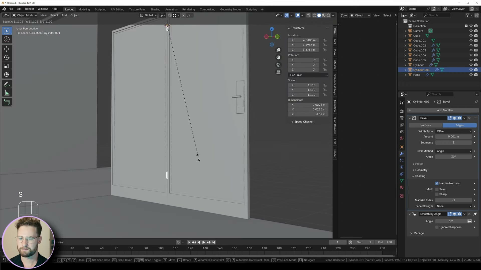
Duplicate the hinge once down the edge of the door, then keep tapping Shift+R to repeat that last duplication. You get three evenly spaced hinges with no manual measuring. Blender just replays the offset. Copy modifiers onto the new hinges so they all share the same bevel as everything else.
If the duplicates end up taller than you want, scale them down a fraction along their long axis and re-apply Shade Auto Smooth. Then dive into edit mode, press A to select all the hinge geometry and Shift+D to duplicate it in place. Scale the duplicates up slightly so they read as a chunkier plate sitting behind each barrel.
With every piece of door hardware selected (handle, plate and hinges), press Shift+D followed by Y to duplicate along the Y axis, then run Object → Mirror → Y Global so the duplicated set flips to suit the second door leaf. The hardware now reads correctly on both sides of the double door.
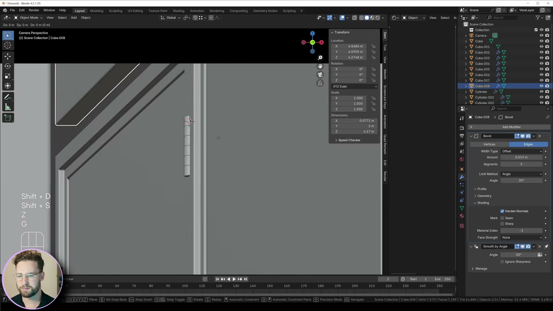
Modify a window to wrap around the step
Duplicate the window once more to make the upper transom that sits above the door. Select its top edge and pull it down so the section becomes a shorter horizontal strip, the same window family, just compressed vertically.
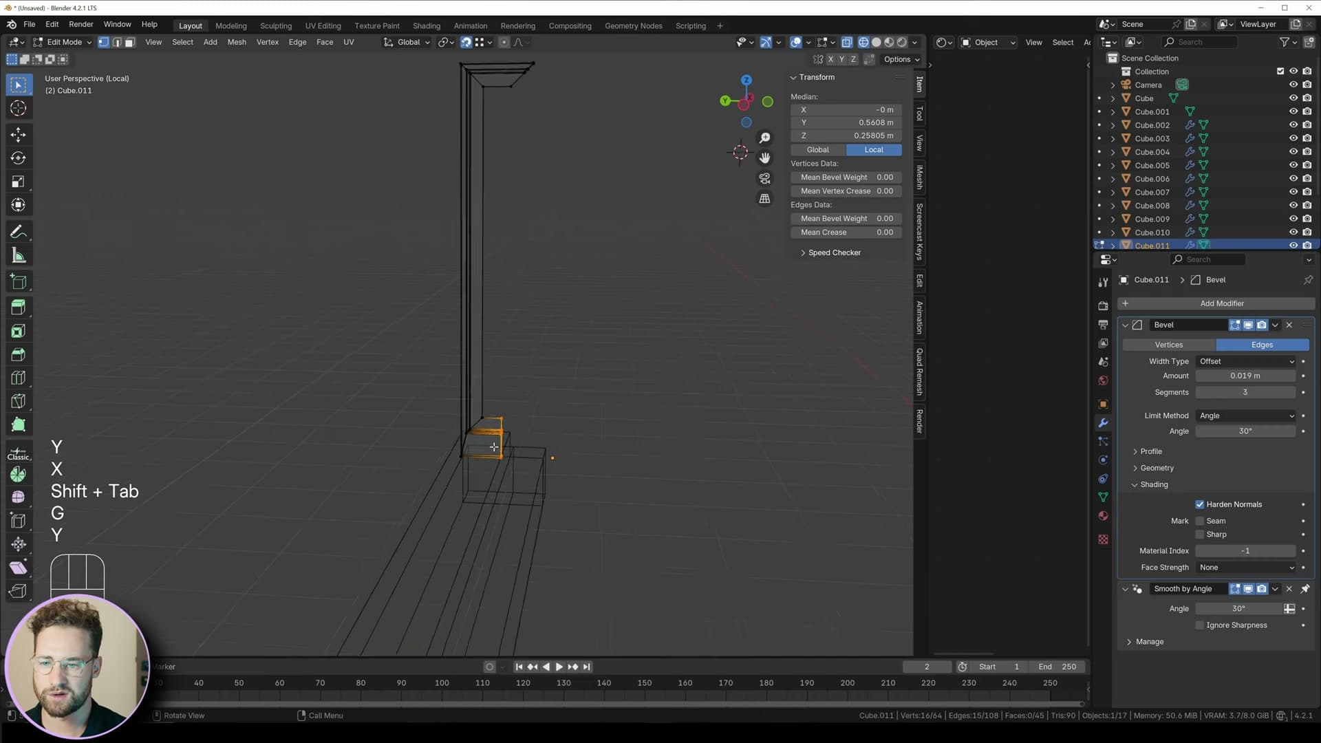
In object mode, duplicate that transom along the wall and snap each copy into position to fill the run above the door. Then duplicate the main window again. This last copy is going to be heavily modified so it wraps around the step rather than clipping through it.
Slide the new copy into position, select it together with the step and press / to enter local view, isolating the two objects so you can work without the rest of the room in the way. In edit mode, press X to delete the faces that overlap the step, then select the open edges and use S Y 0 to flatten them onto the same Y plane. Switch to the side view for clearer alignment.
Run Ctrl+Shift+Alt+S, then X, then 1 to slide the vertices along the X axis without distorting the rest of the geometry. Walk the new edge around the step by extruding in alternating directions (E Z, E Y, E Z, E Y) until the frame steps neatly around the protrusion. Push the final edge out on the Y axis, repeat the Ctrl+Shift+Alt+S, X, 1 slide to true the geometry up, then scale the closing piece up to seal the L-shaped window against the wall.
Place the door asset and prep for materials
Drop the door from the iMeshh library, extrude a makeshift dark room behind it for visible depth, and Smart UV Project every wall element so PBR materials land cleanly later.
Import the door and resize the opening
Rather than modelling a door from scratch, drop one in from the iMeshh library. The whole point of keeping an asset library to hand is that you can skip the bits that aren't the point of the tutorial. Add the door, scale it up so it roughly matches the opening, and nudge it into place.
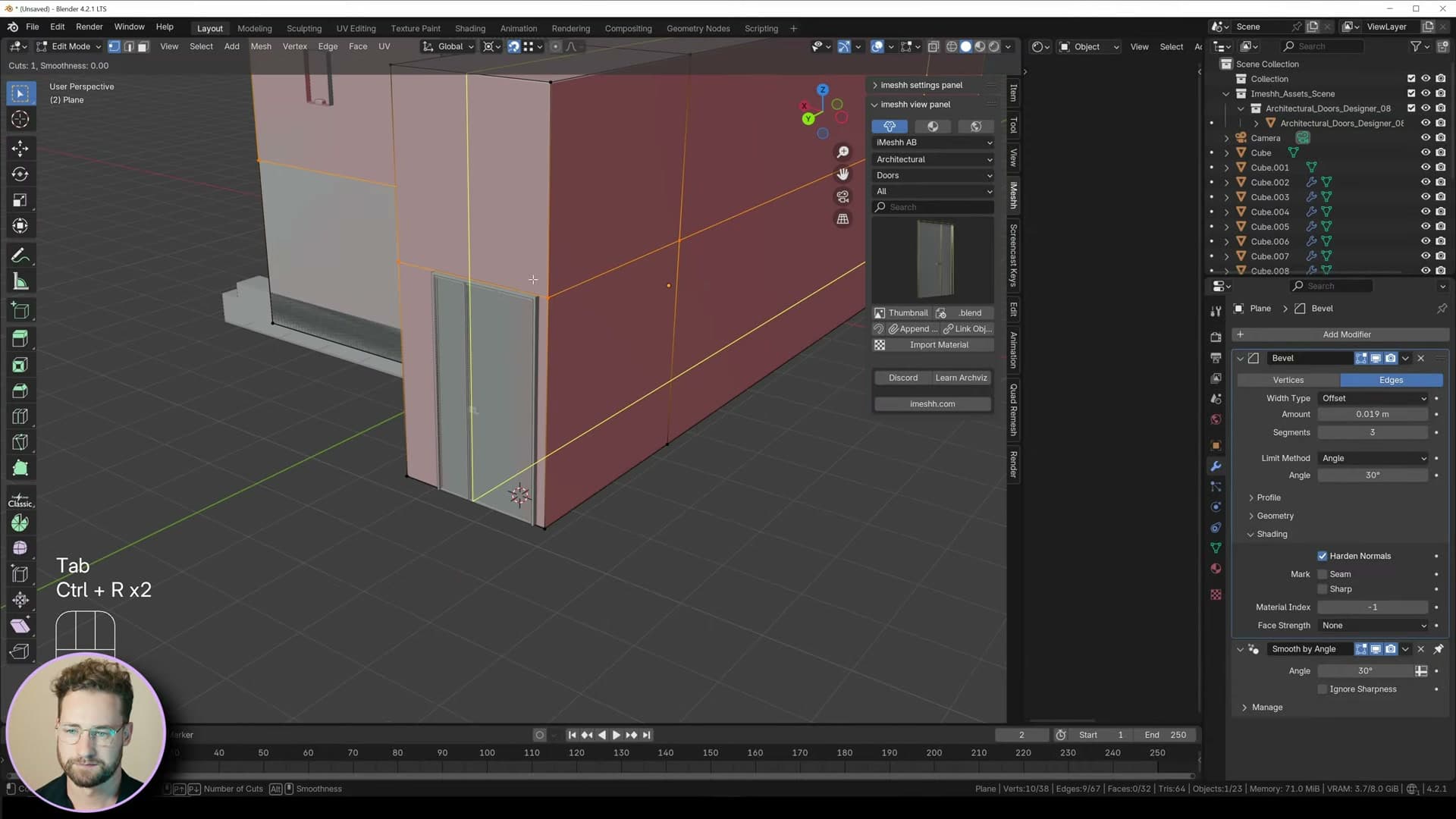
There's a bit of artistic licence allowed here. Doors can read as quite large in general, so don't agonise over hitting exact real-world dimensions on the first pass. Get it close. Once the door is seated against the wall, add a couple of loop cuts to the wall geometry around it so you have clean edges framing the doorway and somewhere to work from in the next step.
Extrude a dark room behind the door
A doorway with nothing behind it reads as flat the moment the camera moves or the lighting lands on it. To stop that, you want some actual dark area sitting behind the door.
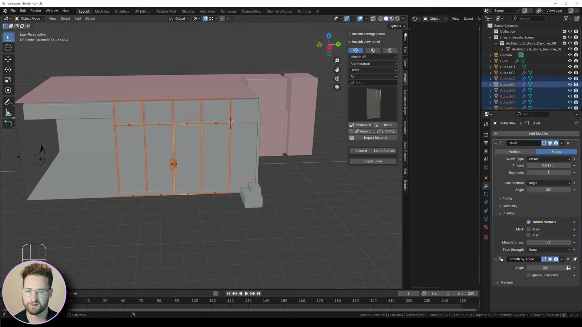
Select the wall face behind the door, extrude it inward, then extrude again to push it back a little further. You're building a makeshift room, not anything you'll ever properly see, just enough recess that the opening reads with genuine depth in the final frame.
Smart UV Project on the walls and trim
With the geometry done you can prep the walls for materials. Run Smart UV Project on the whole wall object, then do the same on the trim element sat next to it.
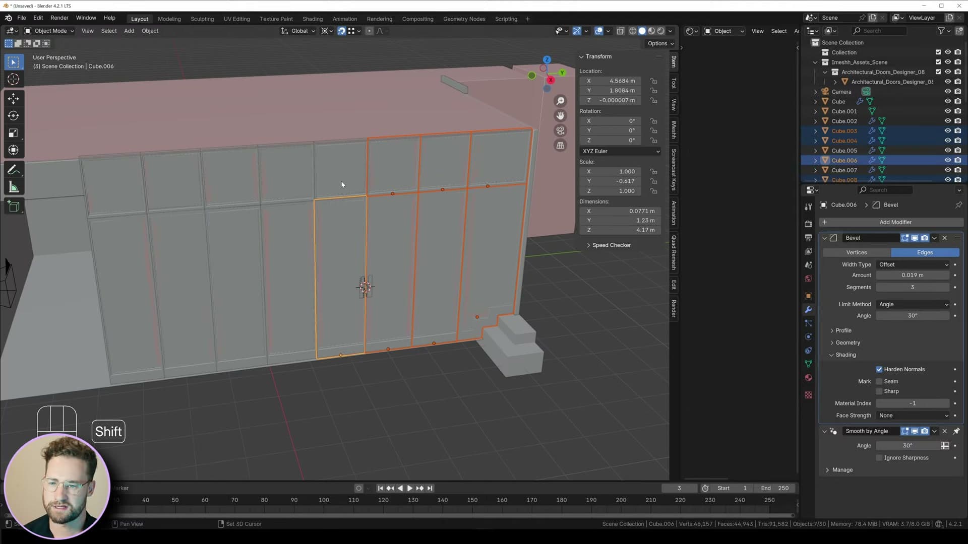
That gives every face a sensible UV layout so when you tile a PBR concrete texture onto the walls later, it lands cleanly without the obvious stretching you'd get from the default cube unwrap. While you're tidying, knock the bevel down a touch if the existing edge is reading too hard. The walls want a soft chamfer, not a noticeable rounded edge.
Black metal frames and alpha-only glass
Join the windows, assign a single black metal material to the frames, and use Shift+G Select Similar by Area to mass-assign a glass slot, then drop the viewport alpha so EEVEE can see through.
Black metal material on the window frames
With every window joined into a single object, give the frames a black metal material slot so the whole window assembly inherits one shader by default. That single slot becomes the base that the glass faces are split out from in the next step.
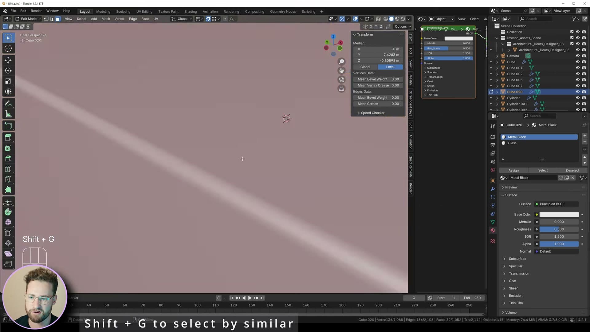
Glass slot via Select Similar by Area
Add a second material slot on the window object and call it glass. In Edit Mode, click one glass pane, press Shift+G and pick Select Similar → Area: every face that matches the size of that pane is added to the selection across all the windows in one shot. Hit Assign on the glass slot and the panes are now on their own material.
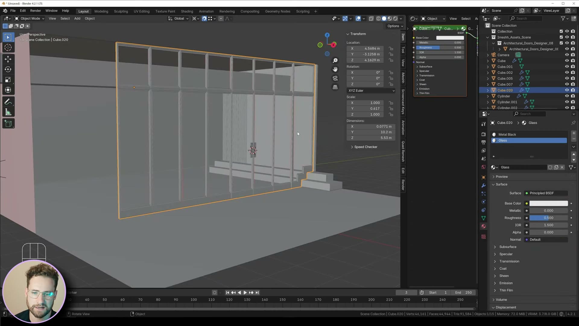
Press A to select everything, then Shift+N to recalculate normals so the outward faces all face the right way.
You don't actually need to shade the glass for this scene. The camera barely catches it, and a proper glass shader is expensive in EEVEE Next. Drop the glass material's viewport alpha right down so you can see straight through to the interior, and leave the shader otherwise empty. If the final render still looks good with the glass effectively transparent, keep it that way. It's the cheapest version of the material you can ship.
EEVEE Next lighting: AGX, ray tracing and jittered shadows
A 1000W area light blocks in the sky, ray tracing and AGX go on, and every lamp plus the render-side shadow setting is switched to jittered. That is the single most important EEVEE Next setting for soft, accurate shadows.
Area light scaled across the exterior for sky fill
Sky light is the bedrock of every interior daylight render, so the first lamp to drop in is a large area light positioned outside the window wall. Add an area light, scale it up so the rectangle roughly spans the glazing, then rotate it to face downwards. Sky light reaches an interior from above, so a face-down orientation gives the most believable falloff. Scale the rectangle back a touch once it covers the opening.
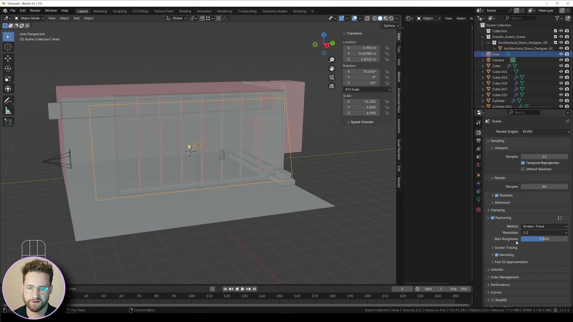
Set the power to 1000W. That sounds extreme by Cycles standards, but EEVEE Next needs the headroom to push light through the windows and bounce it around the room at the contrast level this scene is aiming for.
Ray tracing, AGX and jittered shadow settings
Switch the renderer to EEVEE Next so the rest of the setup can be tuned in the right panel. Turn on ray tracing in the render properties and change the view transform to AGX. That is what gives EEVEE its Cycles-like tonal response in Blender 4.2.
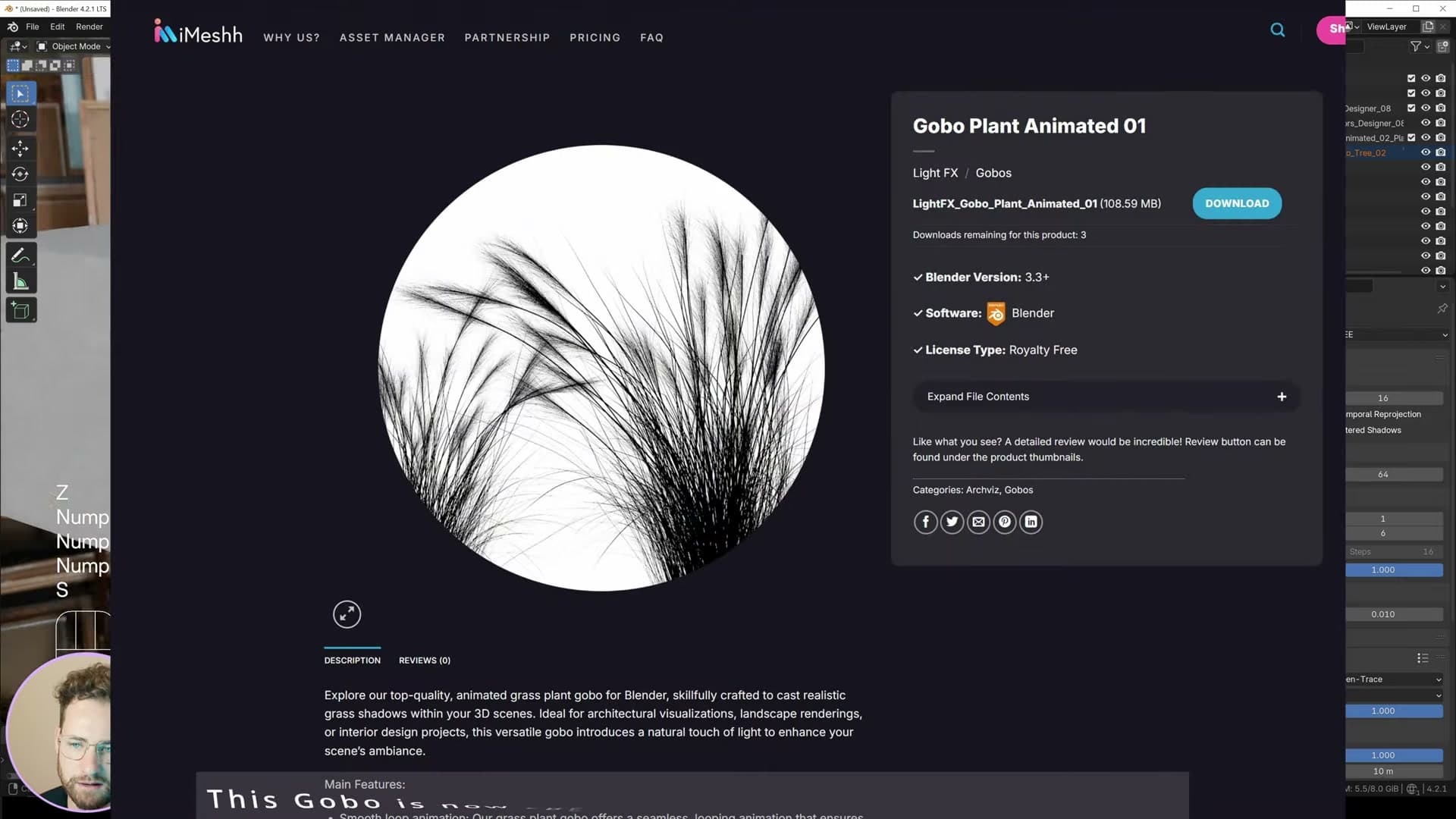
Under the Ray Tracing panel, the defaults work fine for this scene with one exception: raise Max Roughness to 1 so glossy reflections trace correctly across every surface, not just mirror-smooth ones. Under Screen Tracing, set Precision to 1.0 and Thickness to 10m. Those two values were what produced clean indoor reflections without screen-space artefacts on the walls.
The single most important EEVEE Next lighting setting lives in two places. On the area light itself, change the shadow type to Jittered. Then open the render properties and set shadows to Jittered there as well. Miss either toggle and you get EEVEE's classic harsh stair-stepped shadow edges; flip both and the engine produces soft, denoise-friendly shadows that read close to Cycles.
Gobo plane and two sun lamps for directional light
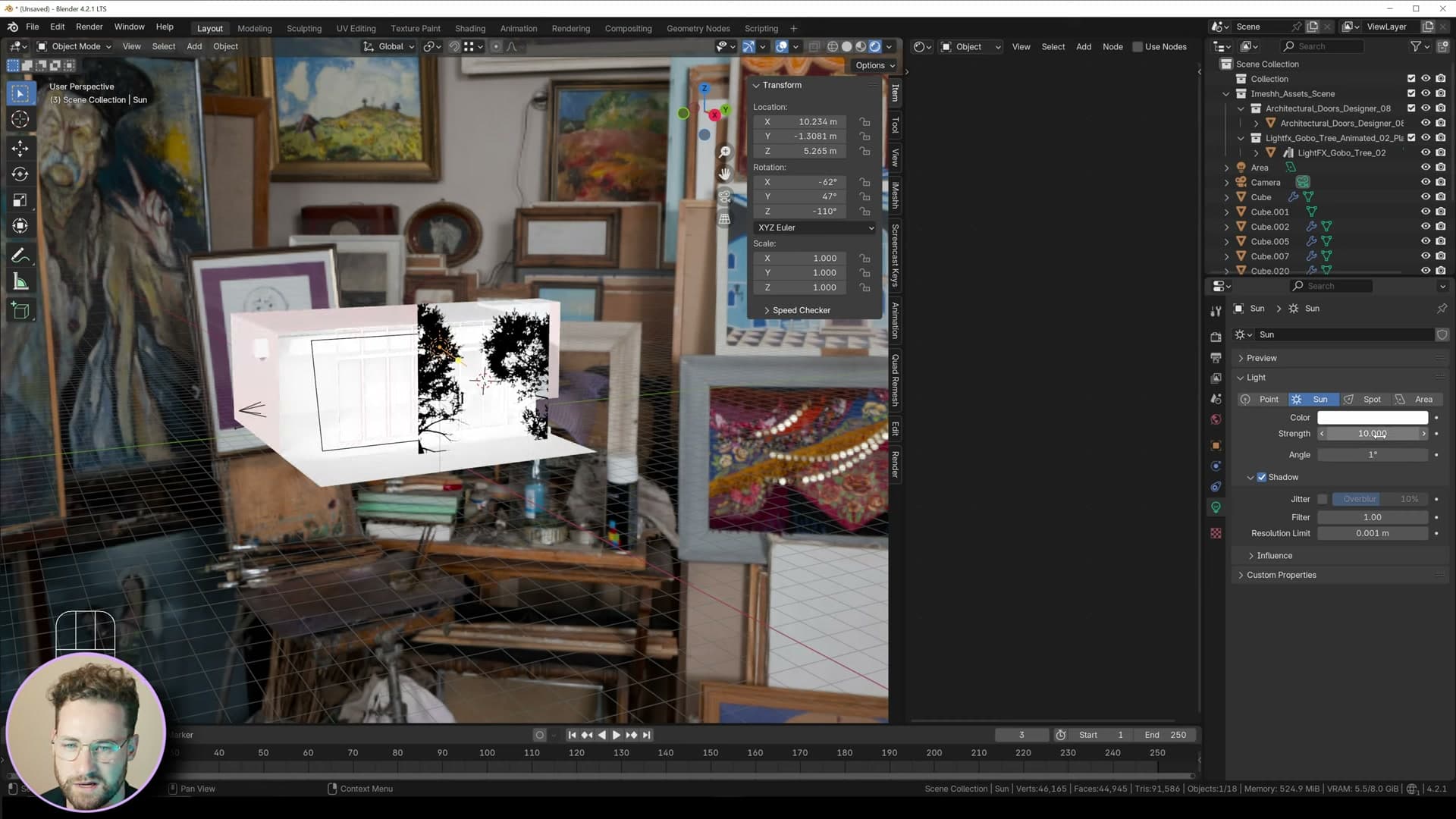
With the sky fill in place, add a Gobo to break up the directional light. A gobo here is a transparent plane mapped with a tree-canopy shadow. Drop one outside the window and it casts dappled tree shadows across the floor. You can find free gobos online or use the animated ones from the iMeshh library, which means the shadows can sway across the floor over a render sequence rather than sitting static. Position a couple of them roughly in front of the window.
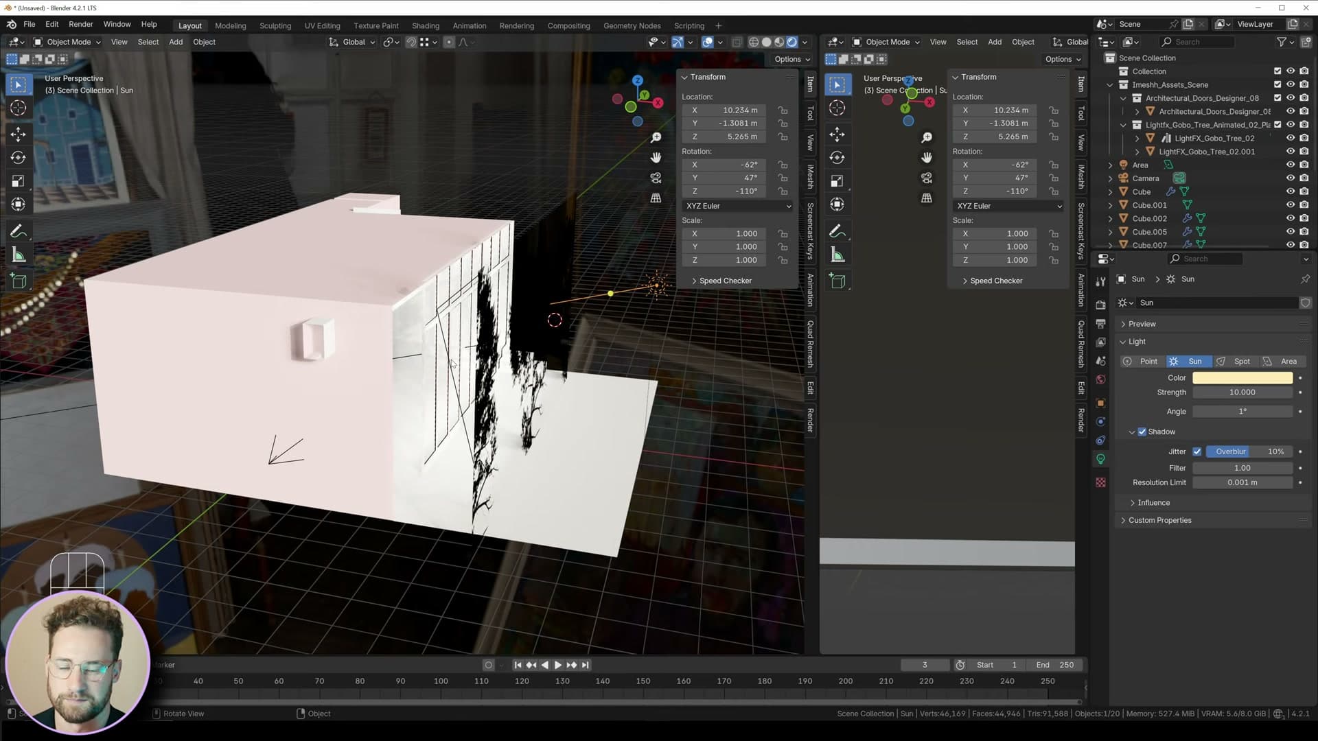
To actually see those shadows you need a directional light, so add a sun lamp and rotate it roughly through the gobo plane toward the room. Under the sun settings, drop the Angle to 1° so the shadow edge softens, push Strength up to 10 so it is visible against the area light, and tint the colour slightly orange to suggest warm afternoon sun.
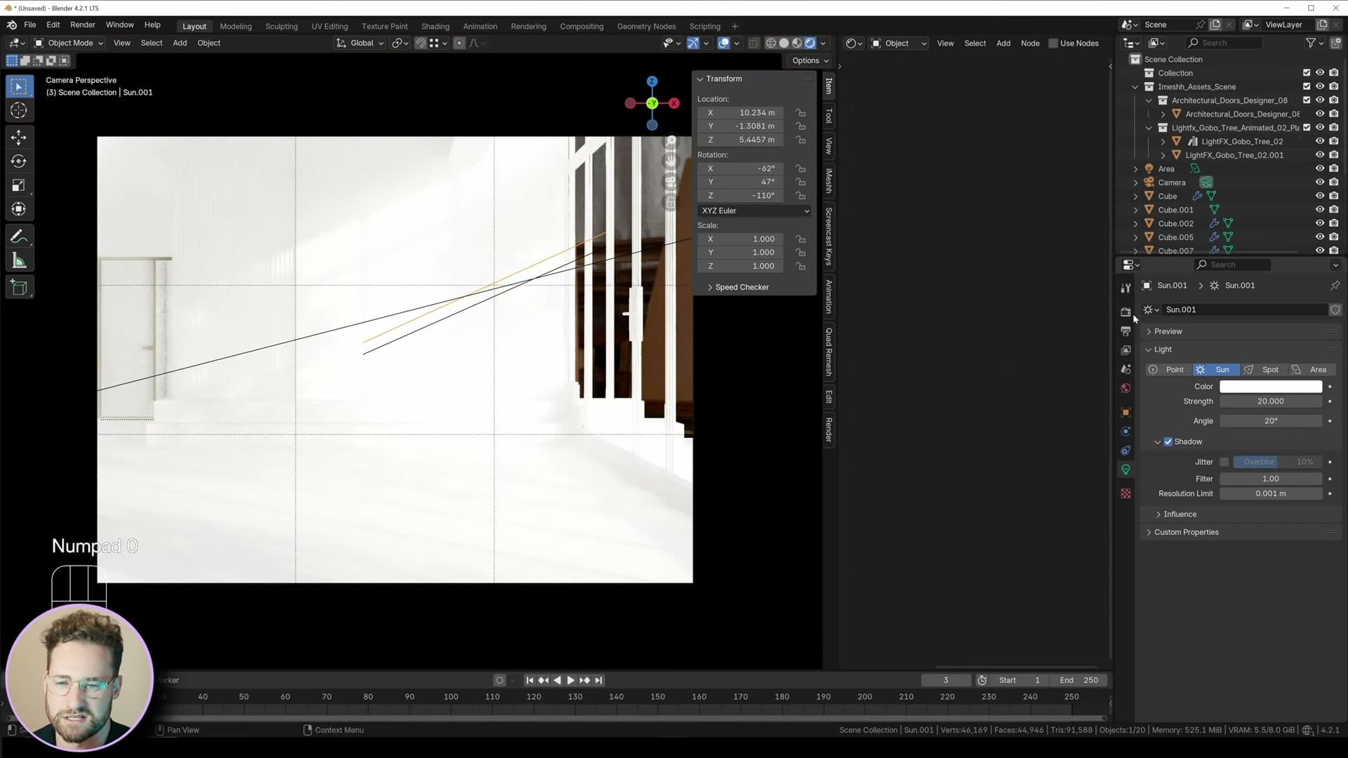
Duplicate the gobo a couple of times so the tree shadows cover more of the floor, then duplicate the sun itself. Change the duplicate's colour to white, set its Strength to 20, and widen its angle considerably. That gives you a soft, directional fill that brightens the interior without flattening the warm shadows the orange sun is casting. The mix of one tight orange sun, one wide white sun and the area light fill is the lighting recipe behind the final frame.
Set both sun lamps to Jittered shadows like the area light, then drop the world exposure a touch to pull the highlights back in. Finally, under Samples in the render properties, set the count to 32. That is enough to clear the noise on this scene without pushing render times past the one-minute target. Push it higher if you want, but expect render time to scale with it.
Wood floor with geometry nodes and a rebuilt shader
Separate the floor face, drop in the iMeshh wood-floors geometry node object for real bevels on every plank, and rebuild its shader as a plain Principled BSDF because the original exceeds EEVEE Next's texture limit.
Separate the floor face and apply the wood object
With the rest of the room sorted, the floor needs to come out as its own object so you can swap it for a planked surface. In edit mode, hover one face of the floor and hit Select Similar → By Normal, deselect anything that isn't actually the floor, then press P → Selection to separate that face into its own plane.
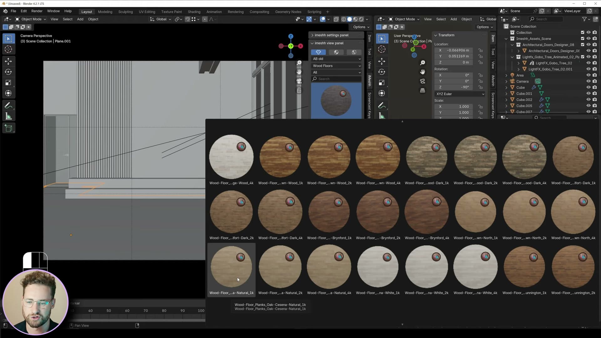
You can drop a flat wood-floor material onto that plane if you just want something simple. There are plenty in the iMeshh library, but the wood-floors geometry-node object is the better pick here. It ships with real bevels on every plank, so the edges catch light the way physical timber would rather than reading as a perfectly flat texture. Drag it into the scene from the asset browser.
With both objects selected (the original floor first, then the new geometry-node wood floor), press Ctrl+J to join them. Drop into edit mode, select the edges of the original imported plane and delete them so only the new planks remain sitting on the floor outline.
The default plank size is small enough that it slows the viewport, so scale it up. You can type calculations straight into Blender's number fields, so set the length to 2.4 metres and use *2 on the width input to land on roughly 30 cm planks. Finally, rotate the planks 90° so they run the right way across the room.
Rebuild the shader as Principled BSDF for EEVEE
Switch the viewport to EEVEE and the planks disappear. EEVEE Next caps the number of textures any one material can carry, and the iMeshh wood-floors geometry-node shader stacks more maps than the engine will accept. The floor renders as nothing at all.
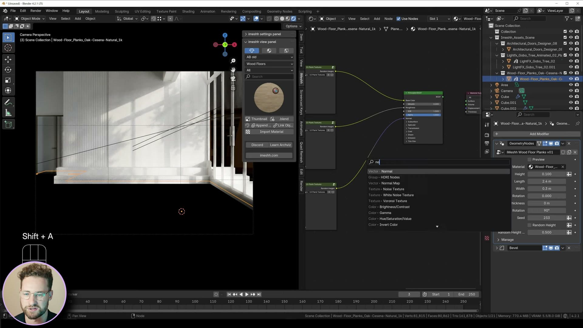
The fix is to rip the bundled shader out and rebuild it as a plain Principled BSDF that only references the few textures EEVEE really needs. Open the shader editor on the wood-floor object, delete the existing node group, and drop in a fresh Principled BSDF wired to the Material Output.
Plug the original base colour image into Base Color and the roughness map into Roughness. For the normal map, run the image texture through a Normal Map node first and then into the Principled Normal input so the vectors are interpreted correctly. The planks pop back into the viewport with full detail: wood grain, bevels and all.
Concrete walls with Node Wrangler
Enable Node Wrangler, select the Principled BSDF and Ctrl+Shift+T the whole PBR set in one shot, then tile the texture and add a Hue/Saturation node to take the colour out and lift the value.
Ctrl+Shift+T to import the full PBR set
With the walls selected, create a new material in the Properties panel and rename it wall. This is where the concrete PBR set is going to live.
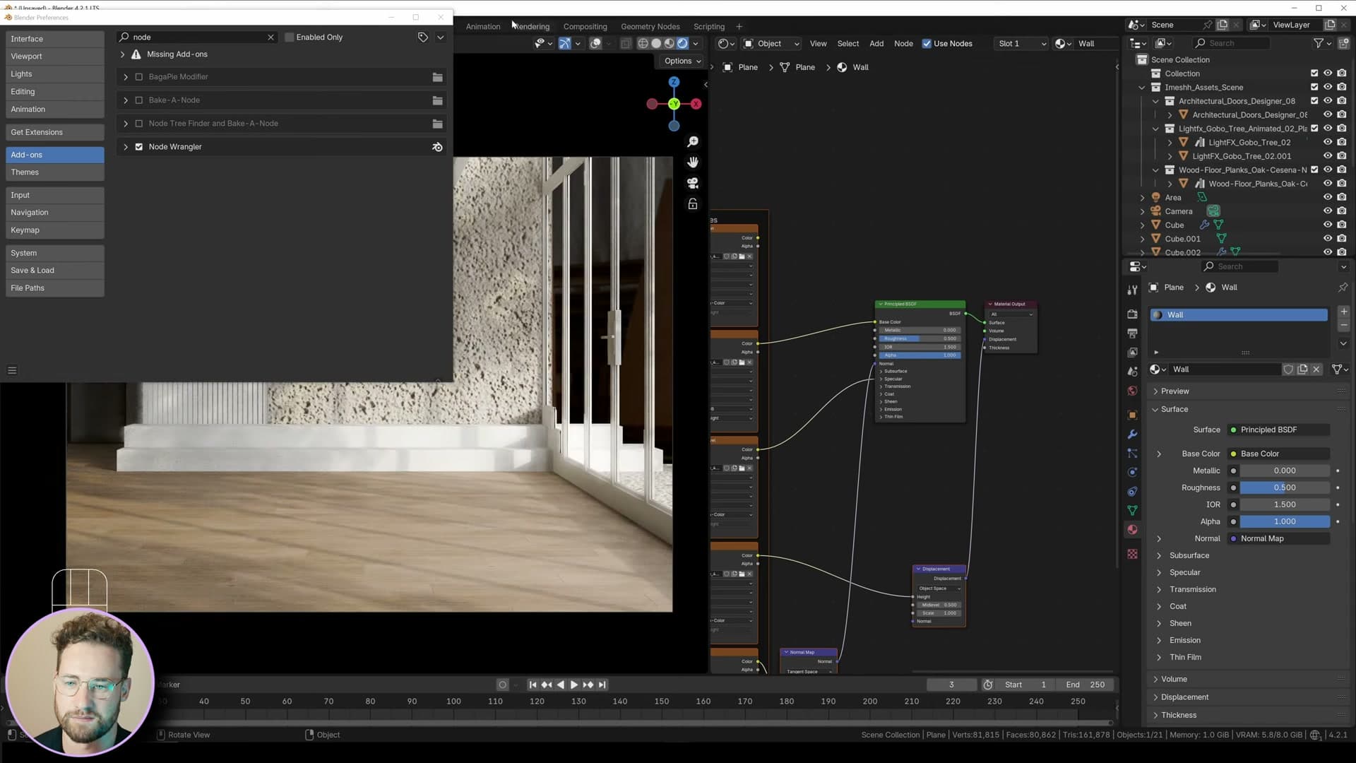
Open Edit → Preferences → Add-ons and search for Node Wrangler. Tick it on if it isn't already enabled. If it doesn't appear in the list at all, jump into Get Extensions and pull it from the Extensions catalogue. The shortcut you're about to use only fires when this add-on is active.
Back in the shader editor, click the Principled BSDF and press Ctrl+Shift+T. A file browser opens; navigate to the concrete folder and select every map in one go. Node Wrangler reads the filename suffixes, drops in the Image Texture, Normal Map and Mapping nodes, and wires the whole PBR set straight into the shader for you.
Delete the Displacement branch the importer added. The concrete pack ships with a fairly punchy height map and you want the wall surface flat for this interior. The bumps would read as harsh against the soft EEVEE Next lighting.
Hue/Saturation and Mapping scale for subtle walls
On the Mapping node Node Wrangler just dropped in, change the Scale value to 4. This tiles the concrete texture down across the wall so the panels read as smaller, more believable blocks rather than one oversized slab stretched across the room.
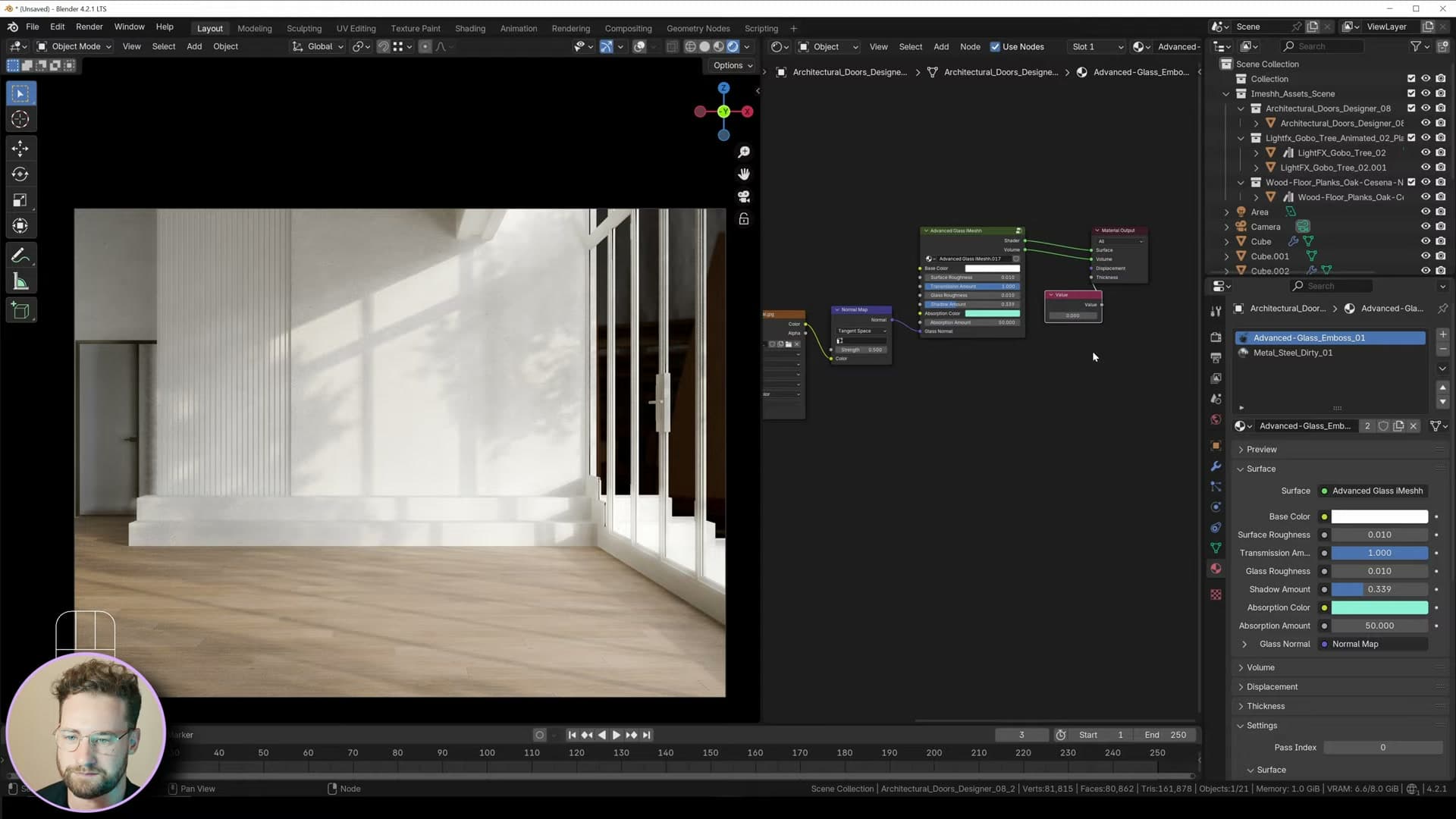
Now strip the warm concrete tone out so the walls behave like clean off-white plaster. Add a Hue Saturation Value node between the base colour Image Texture and the Principled BSDF's Base Color socket. Pull Saturation down to 0 to take the colour out entirely, then push Value up to around 2 so the wall lifts toward white.
Eye the wall in the viewport. If it still feels dim against the rest of the scene, push Value higher still. You want enough brightness for the wall to bounce light around the room, but with the underlying concrete grain still showing through as subtle surface variation.
One quirk to watch for: the Ctrl+Shift+T import sometimes leaves a stray value node sitting in the chain that introduces funky banding across the texture. If you see odd patches across the wall, find the orphan node, delete it, and the texture cleans up immediately. While you're tidying up, nudge the door down so its base sits properly against the floor.
HDRI sky with a Light Path camera-only trick
Two Background nodes mixed by Is Camera Ray let the HDRI look overexposed and bright in the camera view while contributing barely any spill to the actual scene lighting. A single Mix Shader does the whole effect.
Sunset Forest HDRI plugged via Mapping node
Open the World shader editor and load an HDRI that matches the time of day you're going for. I pick Sunset Forest from HDRI Haven and plug it straight into the existing Background node.
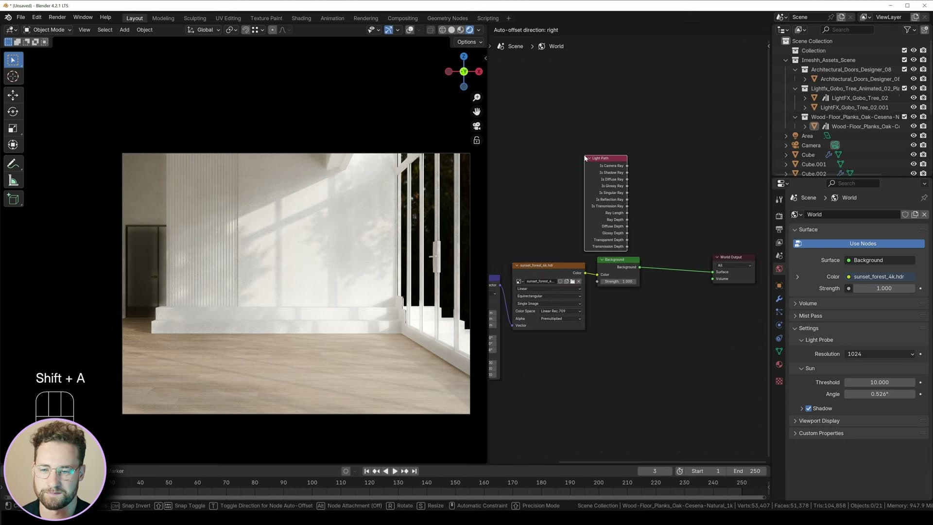
Slot a Mapping node between the Environment Texture and the Background so you can rotate the HDRI freely. That gives you control over where the sun lands relative to the camera without ever moving the camera itself.
Is Camera Ray to make the sky bright in-camera only
The trick that sells the window view is letting the HDRI read as bright and overexposed in-camera while contributing barely any light to the interior. Duplicate the Background node so you have two of them, with the same Environment Texture feeding both.
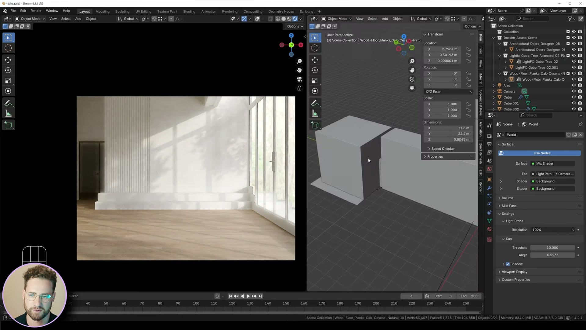
Drop a Mix Shader between the two Background nodes, then add a Light Path node and plug its Is Camera Ray output into the Mix Shader's factor. Camera rays now sample the bright background; every other ray type (diffuse bounces, reflections, glossy hits on the interior surfaces) samples the dimmer one.
Knock the strength of the scene-contribution Background down to 0.5. Through the window the sky reads as a punchy, overexposed exterior, but the interior keeps the controlled lighting setup you've built rather than getting washed out by HDRI spill.
Sculpt a fur rug with displace and hair curves
A plane gets bevelled, displaced with a clouds-textured UV modifier for organic ripple, and then sculpted with hair-curve guides. The comb brush, density, frizz and a clumps preset finish the fur off.
Bevelled plane with a UV displace modifier
Add a plane (Shift+A → Mesh → Plane) where the rug will sit and extrude it upwards slightly to give the slab some thickness. Drop in a loop cut so the top face stays roughly square and is ready for the bevels.
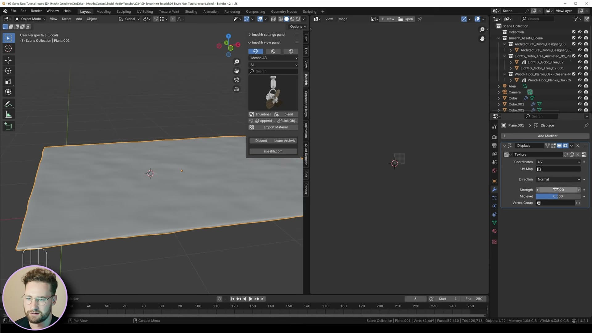
Bevel the top edges with Ctrl+B so the cushion of the rug rounds off softly, then do the same to the bottom edges. Delete the bottom face afterwards. Fur only needs to live on the surfaces you can see, and removing the underside saves you sculpting guides that will never make it into the camera.
Add a few more loop cuts across the plane so there is enough geometry to deform, open the modifier stack, search for Displace, and add one. Set the coordinates to UV, click New on the texture slot, then unwrap the plane with U → Unwrap so the modifier has a clean UV map to read from.
In the texture properties, switch the new texture from Image to Clouds. Drop the displace strength right down so the surface only ripples gently, then raise the Clouds Size to roughly 1. The default noise is too tight and reads as buzzing detail rather than rug weave. Finish by switching on proportional editing and lifting the four corners of the plane a touch, since real rugs almost always curl up at the edges.
Hair guides and the comb brush
Add a hair curves object on top of the plane with Shift+A → Curve → Fur, then enter sculpt mode with the curves selected. The preset drops in a handful of default guide hairs you do not want to keep. Pick the Delete brush (the minus icon) and sweep over the whole object until every one of those starter guides is gone.
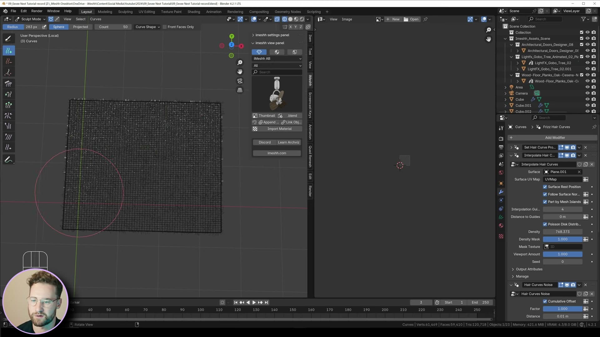
Switch to the Add brush and set edge length to 0.05 with count at 50. Brush a light, even pass over the rug so the surface has a baseline of guides to follow, then lay in extra strokes along the front and side edges. Those are the only edges the camera will actually see, and the denser the guides there, the more control you have when fine-tuning the silhouette later.
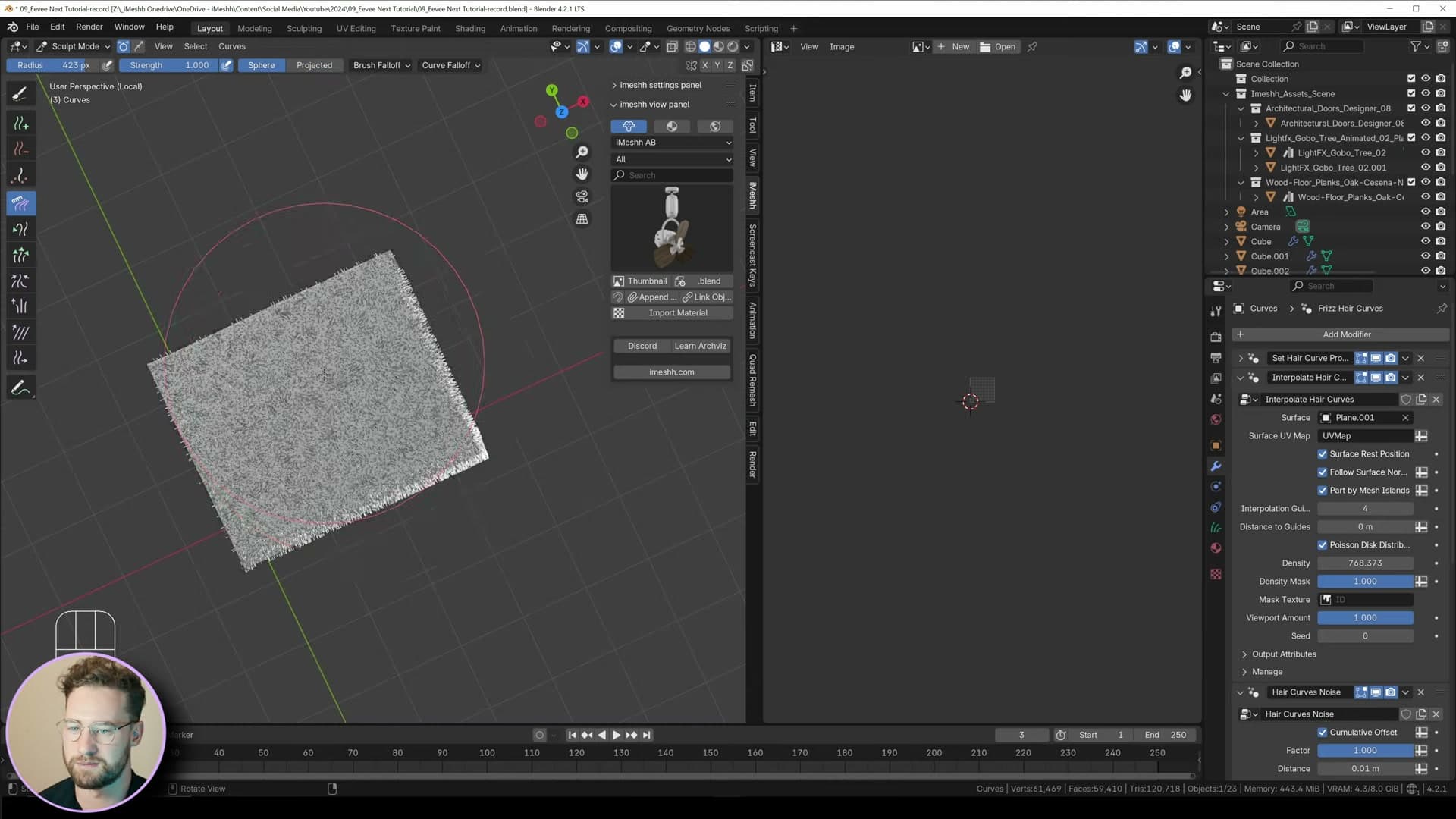
Pick the Comb brush and switch its mode to Projected. Lift any hairs that sit flat against the floor upwards. Real fur bends away from the surface it rests on, not through it. Drop into the top view and comb the rug in random directions to mimic the way someone walking over a carpet pushes the pile around; the goal is irregular, varied movement rather than a perfectly groomed plane. Push the hairs at the back of the rug down a little closer to the floor so the eye reads more depth across the surface.
Density, frizz, clumps and a dirty Principled material
Open the curves properties and set Density to 25,000 with the minimum factor at 0.75 so the fur covers the rug densely without going completely uniform. The default frizz noise is too harsh straight out of the box. Drop the noise strength, scale it larger, and enable preserve length so the frizz wobbles the hairs without stretching them out of shape.
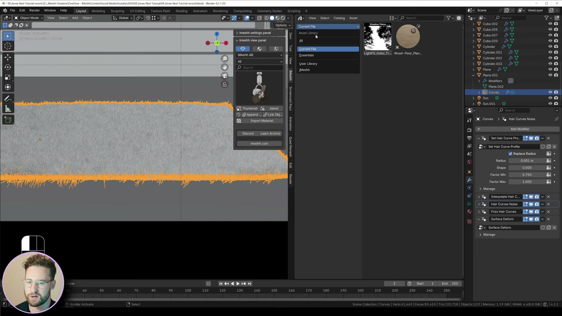
Open the Assets browser, switch the library to Essentials, and look under the hair essentials category. Drag the Clumps preset onto the rug to bundle nearby hairs into natural groupings, then lower the clump factor. The default is too aggressive and reads as obvious tufts, while a much smaller value gives a softer, more believable clump.
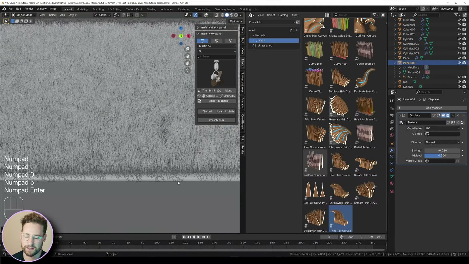
In the shader editor, click Use Nodes on the fur object and leave the default Principled BSDF in place. Add a Texture Coordinate node and plug its Generated output into the colour chain so the rug picks up a dirty, walked-on variation across its surface. Once that is wired in, brush the front-facing edge hairs upward so they cover the front of the rug properly. Without that pass, the blanket sitting underneath shows through and breaks the silhouette.
Sofas, lounge chair and the sheen workflow
Drop in the sofas and lounge chair from the library, then rebuild the legacy sheen shader on the chair using the new Principled BSDF sheen slot. A single Velvet/Fall-off node into Sheen Weight does the lot.
Sofas, lounge chair and cushions roughly into place
With the rug scaled into position, drop the sofas in from the iMeshh library, then add a lounge chair to round out the seating. The library copy of the chair ships with a draped throw. Pull that off so it doesn't conflict with the cushions you'll layer in shortly.
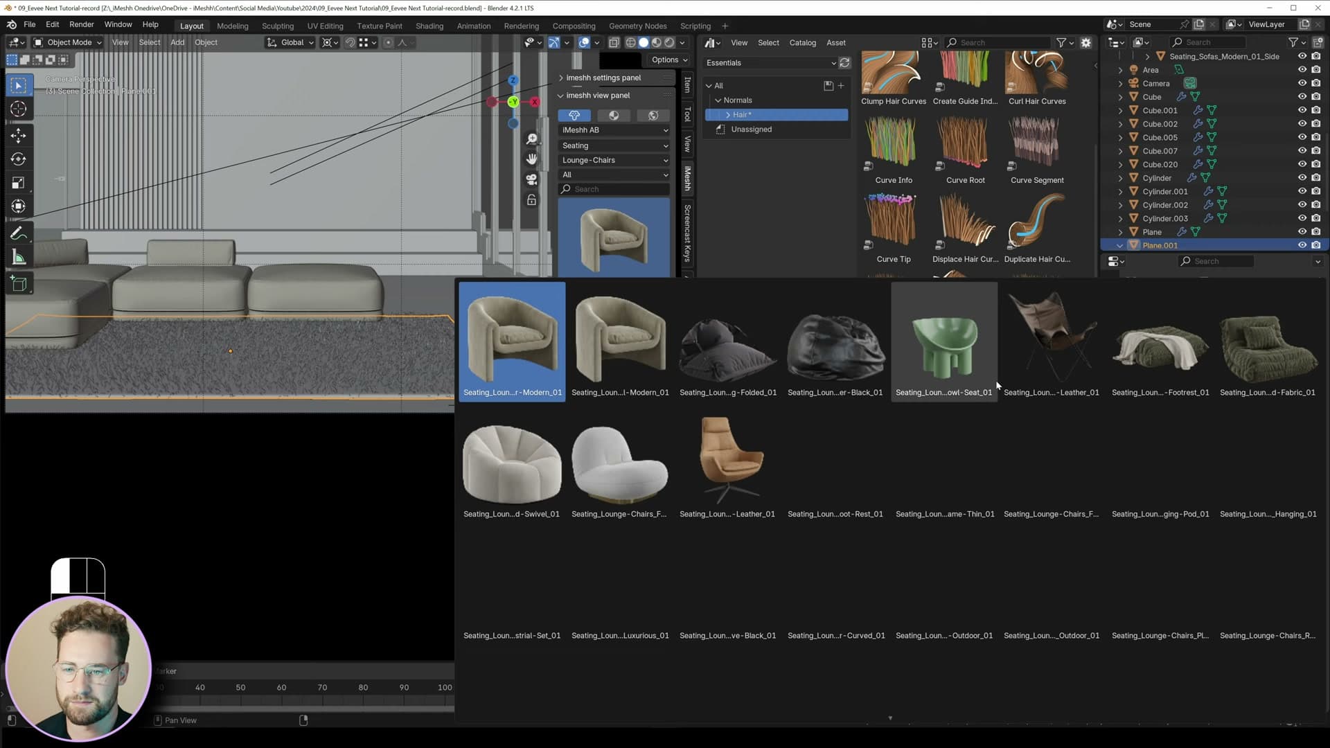
Slide each piece roughly into place around the coffee table. Exact alignment can wait until the camera is locked and you can see what's actually reading through the lens. At this stage the arrangement only needs to look right from the front view.
Rebuild the sheen using Principled BSDF
Open the lounge chair's material in the Shader Editor and you'll find a legacy sheen rig, a small network of helper nodes wired together to fake the soft edge highlight you get on fabrics like velvet. None of it is needed any more. The Principled BSDF in Blender 4.2 has a dedicated Sheen slot, so the whole helper chain can come out.
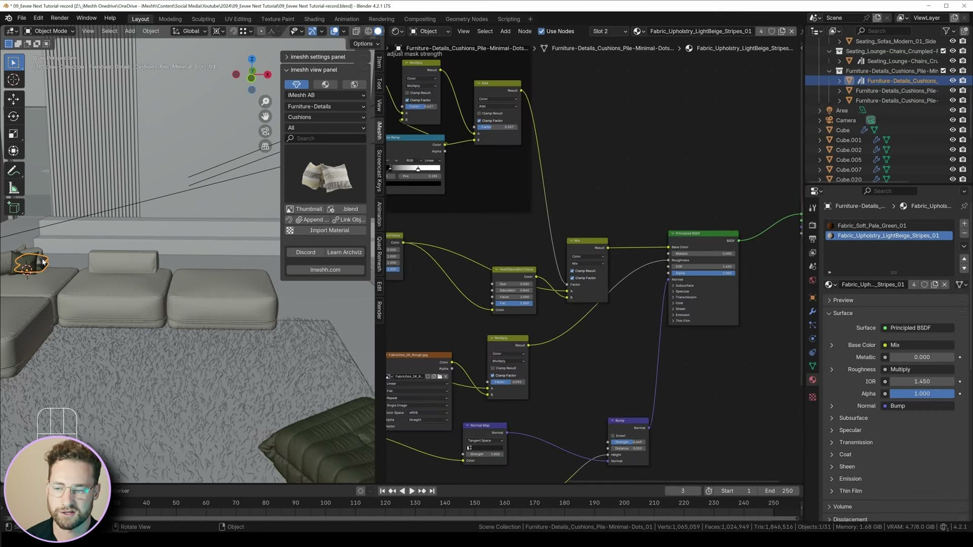
Delete every node in the legacy setup except the one carrying the base colour. iMeshh's own velvet / fall-off node group stays. Plug its output straight into the Principled BSDF's Sheen Weight input, and run the base colour into Base Color the way you would on any other material.
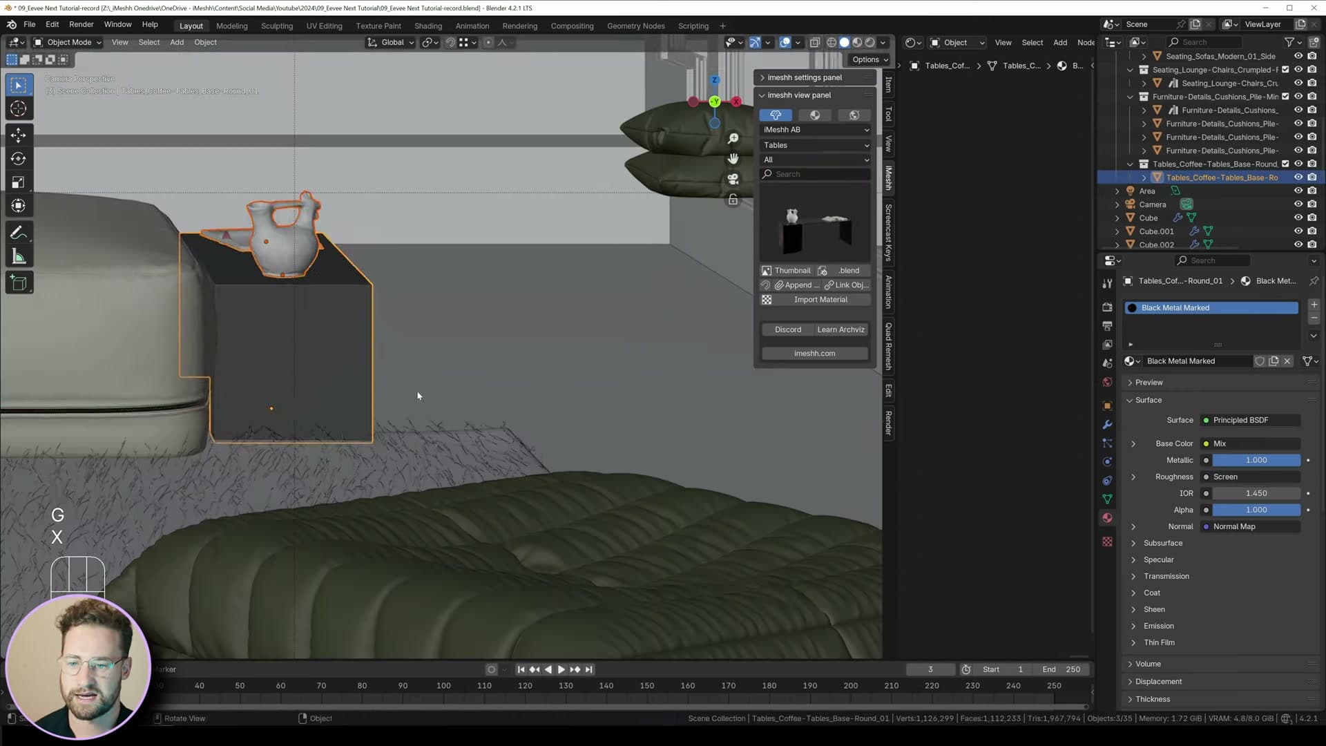
For the finishing touch, drag the base colour into Sheen Tint as well. Pick a warm, slightly orange tone first, then push that copy lighter and pull the saturation almost to zero so it lands as a near-white. The result is a soft, fabric-like edge highlight that breaks up the form of the chair without overpowering it. That is a one-node version of what the legacy shader was trying to emulate.
Decorations and the EEVEE texture-limit trick
Background decorative sets, frames and a hanging lamp finish the dressing, but every background asset gets stripped down to base colour plus a roughness guess so EEVEE Next stays under its texture cap.
Strip non-essential maps from background assets
With the cushions sorted, you can start dressing the room with decorative sets. These are quick decoration assets, typically vases, cylinders and other simple props, and the kind of thing you could build yourself in a few minutes if you wanted to.
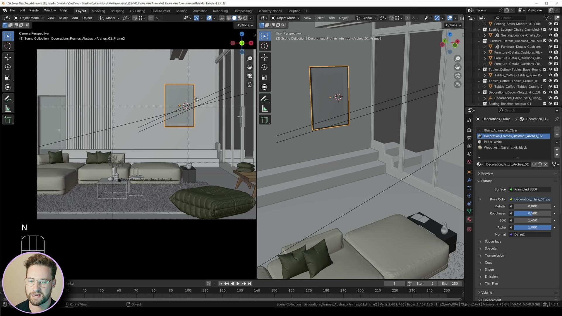
Drop a single frame onto a wall, scale it fairly large and position it roughly on the rule-of-thirds line, then continue adding decorative sets around the room until the space feels populated.
Here is where EEVEE Next starts to struggle. Every fully textured asset compounds the render cost, and a busy scene can push the time up dramatically. The fix is to strip each background asset back to base colour only. Open its shader, delete every texture node except the base colour map, then guess a sensible Roughness value for the surface: glossy where the material should be shiny, rougher for concrete or stone-like objects.
Because these decorative sets sit deep in the scene and the camera's depth of field is going to push them out of focus anyway, the missing roughness, normal and bump maps are invisible to the viewer. The room still reads as fully dressed, but it renders far faster.
Frames, hanging lamp and removing subdivision
Work through the rest of the decorative sets the same way, deleting every map except base colour and picking a rough roughness guess for each one. The further back an asset sits, the more aggressive you can be. None of the detail will read through the depth of field.
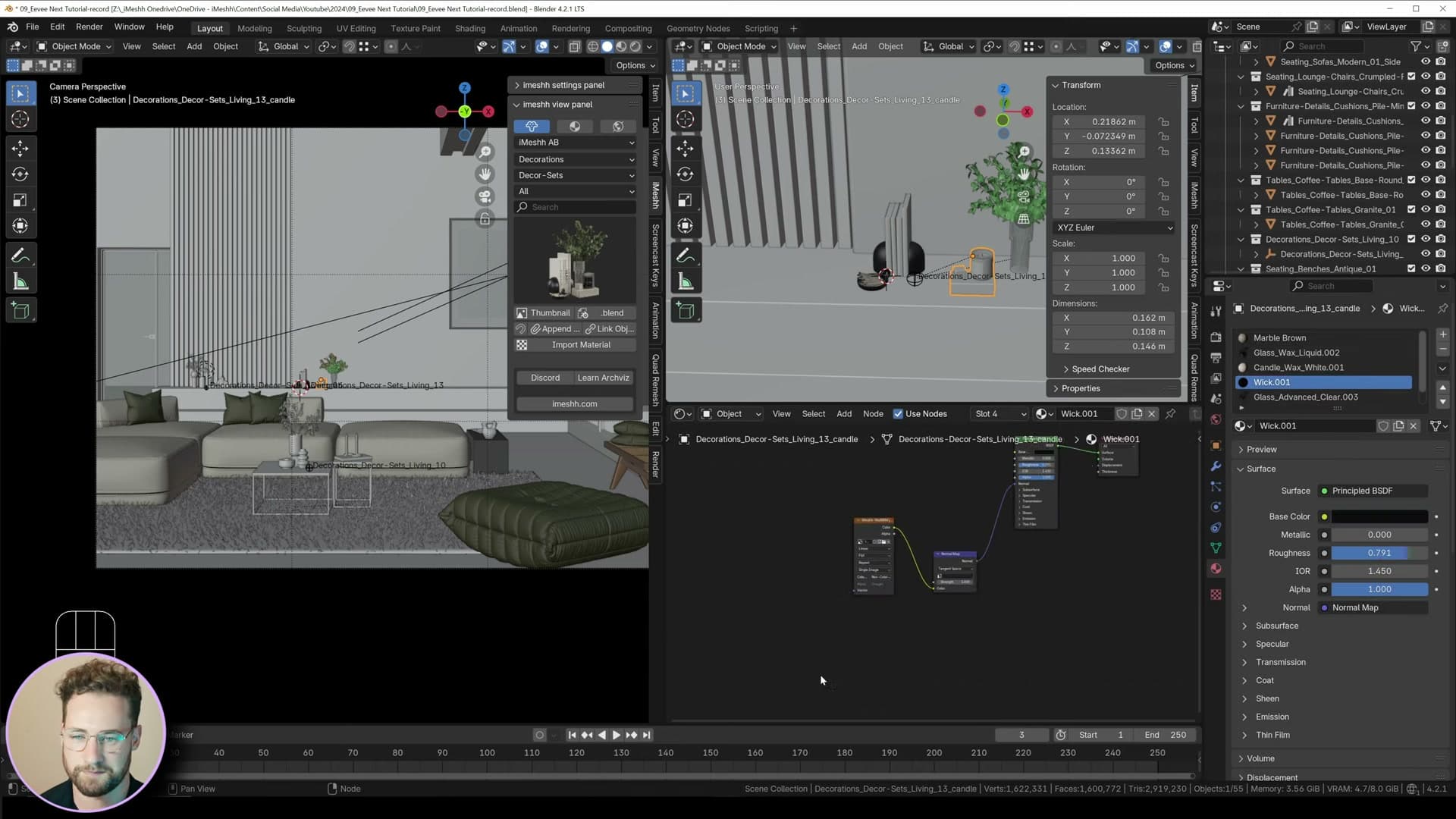
Add a second lounge chair to balance the composition and rotate it to roughly 45 degrees rather than leaving it square to the camera. Perfectly straight furniture tends to look stiff and unnatural in an archviz frame, while a slight angle reads as lived-in.
Finally, remove the subdivision-surface modifier from every background object. At this distance you will never spot the missing smoothing, and the geometry saved adds up quickly across a populated scene. Keep the subdivision in place only for the hero pieces sitting close to camera.
Final composite, 53-second render and texture limit
Zero out the environment's lighting contribution for more contrast, add a Glare node in the compositor for soft bloom on the window, and curve-grade the blacks, then drop the viewport texture limit to 512 to cut render time to 46 seconds.
F-stop 5, environment to zero and final material polish
With the camera angle locked in, drop your hanging lamp into roughly the right spot and bump its power up to around 10 so the bulb actually reads in-camera. Scale the decorative sets up by ten or twenty percent so they fill the surfaces a little more generously. Pure artistic licence at this stage. For the black picture frames, grab one of the pre-made metal materials you already have in the file and assign it across; no need to build anything new.
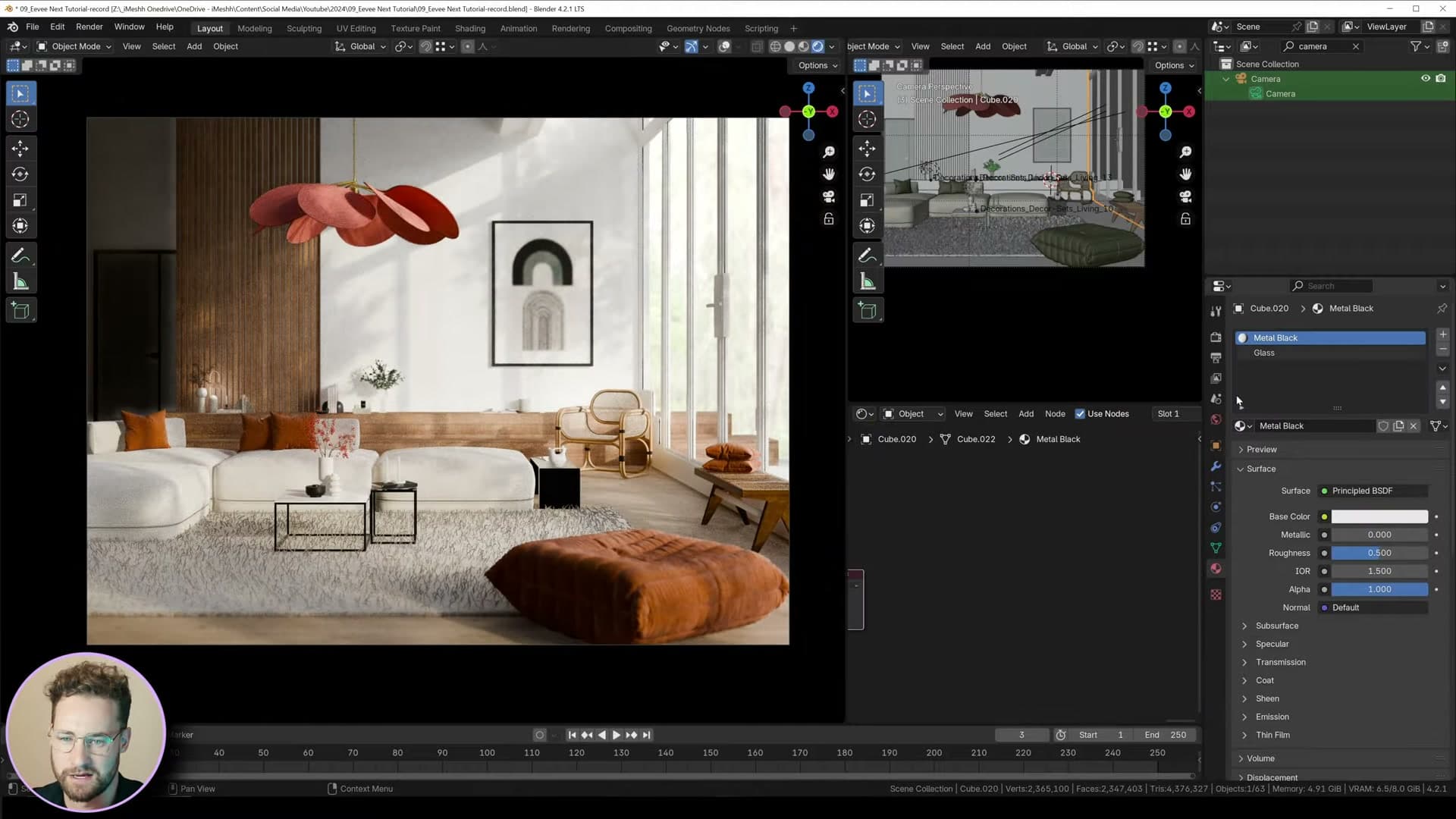
Set the camera F-stop to 5 so depth of field falls off gently behind the seating area, then push the chair and the smaller props around until the composition feels balanced. This is the moment Eevee Next really earns its keep. Moving the camera with depth of field active still updates in real time, which is unheard of in older real-time engines.
To squeeze more contrast out of the frame, drop the second Background strength (the one routed through the Is Camera Ray output of the Light Path node) all the way to zero. The HDRI still reads as an overexposed white-out through the window because it's only visible to camera rays, but it now contributes nothing to the actual scene lighting, so the interior shadows deepen and the wall planes pick up more shape.
Glare bloom and curves grading in the compositor
Open up the Compositor, drop in a Glare node between the Render Layers and the Composite output, then set the viewport's compositor toggle to Camera so you can preview the effect through your final lens rather than the default view.
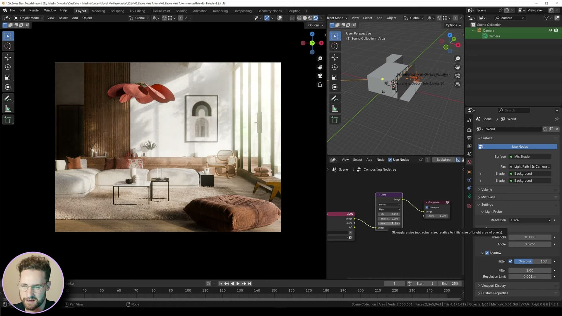
Switch the Glare node to Bloom, push the mix slider down so the bloom is subtle rather than blown out, set the quality to High, then tune the threshold and size until you get a soft halo creeping in from the bright window. The end result sells the overexposed sky so convincingly that you can barely tell there's no glass in the frame. Leave it as a flat alpha or drop real glass back in, whichever you prefer.
Take a final colour pass at the room. Eyedrop the green from the background image onto the cushion material so they tie in with what's visible through the window. Add a Hue Saturation node on the carpet shader and pull the value down so the rug reads a touch darker, then do the opposite on the wood floor (value up, saturation slightly down) for a brighter, more neutral plank.
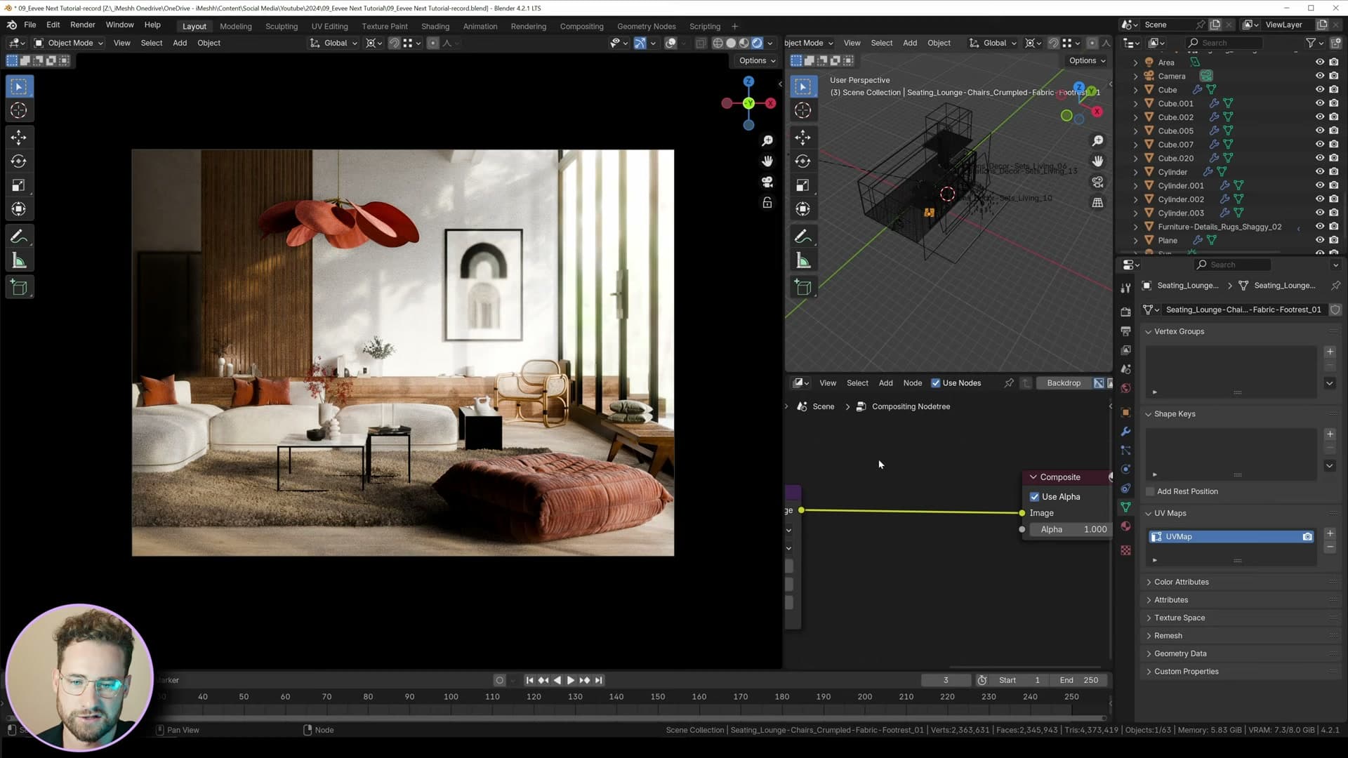
Nudge a couple of the cushions more red so they pull toward the warmth of the hanging lamp instead of fighting it, and tweak the shadow strength one last time if anything is sitting too flat.
Finally, drop a Curves node into the compositor and lift the black point ever so slightly. That little toe in the curve gives the blacks a soft film-print feel rather than the crushed pure black Eevee tends to produce by default, and pairing it with a high-contrast look on the image rounds the grade off nicely.
53-second render and the 512 texture limit
Hit F12 and the full frame comes back in around 53 seconds. For an interior with ray-traced bounce light, soft shadows, depth of field and a sculpted fur rug, that's a genuinely remarkable result out of a real-time engine.
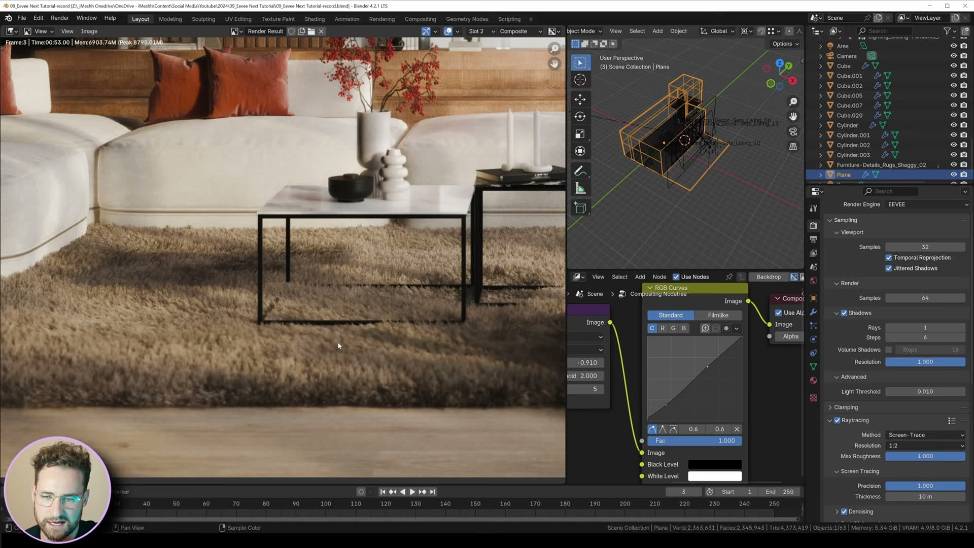
If you want more polish you can scale the resolution up, push the sample count higher, or raise the ray-tracing ray count. All three add detail at the cost of render time. Watch the rug in particular, where the denoiser tends to eat some of the finer hair detail; a targeted sample bump is the most useful upgrade if you spot artefacts in that area.
If your GPU is struggling, head into the render settings and drop the Viewport Texture Limit to 512, or even lower if you need to. On this scene that single change took the render time down from 53 seconds to 46 seconds, a free seven-second saving with almost no perceptible difference in the final frame.

That's the whole scene, start to finish. The two pieces that made the biggest difference here were the lighting layout and the small handful of Eevee Next render settings. Everything else is just dressing on top. Most of the props came from the iMeshh library, so if there's a specific asset you'd like a build tutorial for, drop it in the comments on the video and the most-requested one will get its own follow-up.
Tools and credits
Everything mentioned in this tutorial, with links.
- Blender. The renderer this entire build runs in.
- iMeshh. A studio platform for project management, client review, asset library and invoicing. The asset library used in this tutorial is included with every iMeshh Pro plan.
- Poly Haven. Free CC0 textures and HDRIs.
Pillar guide: Scene Builds hub