Intro and aesthetic goals
The brief: a soft-lit, high-focal-length studio interior that reads like a portfolio photograph, broken into three rooms (living, kitchen, bedroom) and rendered with a moody, monotone palette pulled from real portfolio references.
What this masterclass covers
Welcome to another iMesh masterclass: an end-to-end interior visualisation tutorial that runs from an architect's floor plan all the way through to a finished portfolio render. It's the third in this annual series, following the same brief shape as the last two.
What sets this one apart is the look. The whole build is aimed at a particular aesthetic that keeps surfacing on archviz portfolio sites: soft lighting, a longer focal length, a restrained colour palette. The kind of image that reads more like a magazine photo than a 3D render. Follow it through and you should end with a piece worth pinning to your own portfolio and, with luck, winning work off the back of.
There's a lot of ground to cover in not very long. Some Blender knowledge is assumed: if you spot a faster way through any individual step, take it. The focus throughout is reaching the final look, not litigating every micro-decision along the way.
The studio-portfolio aesthetic
The aesthetic itself is worth pinning down up front, because it dictates almost every decision that follows. It's a soft, even kind of lighting (no hard sun streaming through windows), a longer focal length that flattens perspective the way a real interior photographer's lens does, and a tight, low-saturation palette that ties the whole frame together. It's the look on most of the archviz studio portfolios you'll have scrolled past in the last few years.
Because the look is the goal, the workflow stays loose where it can. The big-ticket steps (wall geometry, the lighting rig, the glass shader, post) get the time and attention. The smaller in-between bits are handled in shorthand. If you have a faster way through any of them, use it; the tutorial isn't claiming to be the one true path to this aesthetic.
About halfway through, the scene starts getting populated with furniture, and that's the natural moment to bring up where the furniture is coming from, and what to make of the recurring debate about whether using it counts as cheating.
Pre-made assets aren't cheating
The recurring debate, restated one more time: using pre-made furniture for archviz is not cheating. The cleanest way to make the point is the photographer analogy: nobody hires a photographer to shoot a living room and expects them to also build every sofa and table from scratch beforehand. The job is to capture the scene well. Architectural visualisation works the same way. The deliverable is the image: the right furniture choices, the right composition, the right palette, the right lighting. Modelling each chair is not the deliverable.
The practical case is just as strong. Furniture modelled from scratch by a visualiser is, more often than not, worse than furniture pulled from a maintained library, and the hours spent building it come straight out of the budget for the parts that actually decide whether the render lands. The iMesh library has roughly 1,500 assets at the time of recording. That's enough range to dress almost any interior brief without ever leaving the asset browser.
The rest of the masterclass runs in six chunks: finding references and locking in a colour palette; importing the floor plan and building a usable room; placing the key furniture, materials, cameras, and a basic lighting rig; layering in the finer details, smaller props, and secondary lights; render settings; and post-production. Chapters in the video timeline let you skip past anything you already know.
One quick apology before getting into it: the recording uses a loud mechanical keyboard, so expect some click in the background. With that out of the way, open Blender and let's start with references.
Mood boards and references
A Pinterest mood board pinned before Blender opens. The reference set shares a soft, dynamic studio light, a 60-80mm focal length that flattens perspective, and a monotone palette of greys, beiges, and blacks with one or two accent greens. Those shared traits, not the individual furniture, are what get reproduced.
Pinterest as a mood-board tool
Before any geometry gets built, the scene gets a mood board. Nobody starting out can hold every style, every piece of furniture, and every lighting trick in their head, and professionals don't try to. They pull references every single time so they can lock in the furniture, the feel, and the overall look they're chasing before they touch the software. Architectural visualisation is no different from the rest of the creative fields on this.
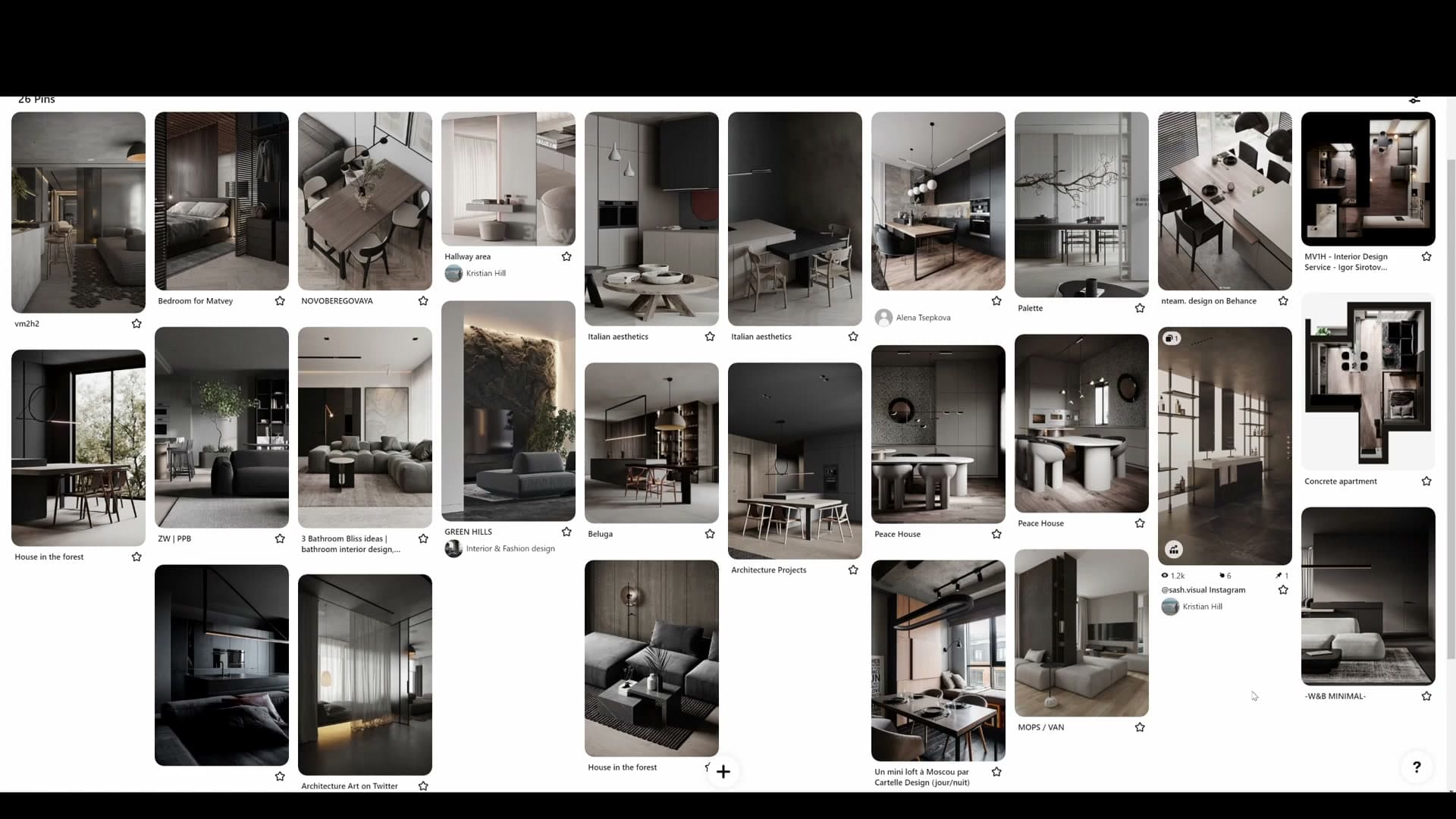
For this project the references live on Pinterest. Previous iMeshh tutorials have used a dedicated desktop mood-board program, but Pinterest earns its keep here because it's relentlessly good at surfacing related images once you've pinned a few. Start a board, drop in 10-15 interiors that share the vibe you want, and let the suggestions feed you more of the same.
If you'd rather work from local files than a browser tab, right-click and download each pinned image to a reference folder on your machine. The board is a starting point. The next step is reading why the images you've pinned look the way they do.
Reading lighting, focal length, and palette
The point of the mood board isn't to copy any single image. It's to spot the traits the images share, because those traits are what you'll reproduce. Run through the pinned references and pull out three things in particular: how they're lit, what focal length they're shot at, and what colours they actually use.
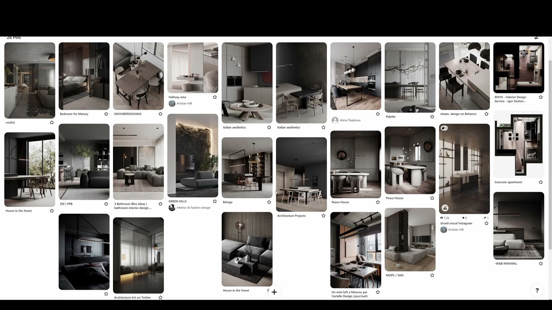
The lighting across this board is dynamic, with strong shadows, strong blacks, and plenty of highlights. It isn't a hundred percent natural, but it doesn't read as unrealistic either. The honest way to describe it is that a photographer has walked into the scene and placed very specific lights into very specific areas to push a particular look. That's the approach the tutorial will copy in Blender later on, rather than relying on a sun and an HDRI to do all the work.
Focal length is the second giveaway. Most of these references sit at roughly 60-80mm, which strips a lot of the perspective out of the frame. The images end up looking quite flat, and that flatness is the aesthetic you're trying to hit. There are also smaller details worth stealing: one of the references uses dark glass and curtains together, which is where the idea for the glass walls in the final scene came from.
Palette is the third. Look at the renders and you'll see they're almost all monotone, working with just a handful of colours. One image is mostly black and grey with a touch of green; others lean beige with black accents. You can absolutely bring more colour in if you want to, but the brief for this tutorial sticks to that restrained, photographic palette.
One more thing fell out of the mood-board pass. A studio-style render came up in the references and stuck. Interesting enough that the tutorial got split into three connected pieces instead of one. The final deliverable will be a living room, a kitchen, and a bedroom shot as a single studio interior.
Floor plan workflow: DXF import and cleanup
How to source CAD plans from the architect (DXF preferred over DWG; ask for sections to read room heights), and how to bring them into Blender via the DXF importer, sift out furniture/electrical layers, and scale-check against a known wall length so the plan reads in real metres.
Sourcing CAD plans from architects
If you're working with a construction company, an architecture practice, or a professional interior designer, there's a good chance they already have CAD plans for the building. Ask for them, and specifically ask for a DXF. That's the format Blender can read. If they can only supply DWG, run it through an online DWG-to-DXF converter before you go any further.
Architects will sometimes offer you the original 3D model as well. Take it as a reference, but don't drop your fee because of it. CAD-software meshes are notoriously difficult to work with inside Blender and you'll end up reworking the geometry anyway. The model is useful as a point of reference for how the building fits together. Nothing more.
If no plans exist at all, you'll need to visit the site and measure the rooms yourself. Measure more areas than you think you'll need, and shoot photographic references with a tape measure visible in frame so you can recover dimensions later if you've forgotten one. And charge the client for that time.
CAD plans usually arrive cluttered with electrical layouts, water outlets, and furniture symbols. If you have access to CAD software, hide or remove those layers there before exporting the DXF. The cleanup is far easier upstream than it is inside Blender.
DXF import and cleanup in Blender
Most archviz artists don't have AutoCAD or an equivalent installed, so the cleanup pass happens inside Blender. First enable the DXF importer: open Edit → Preferences → Add-ons, type DXF into the search field, and tick both addons that appear. Once the importer is ready, make sure your file is in DXF format, then go to File → Import and pick it.
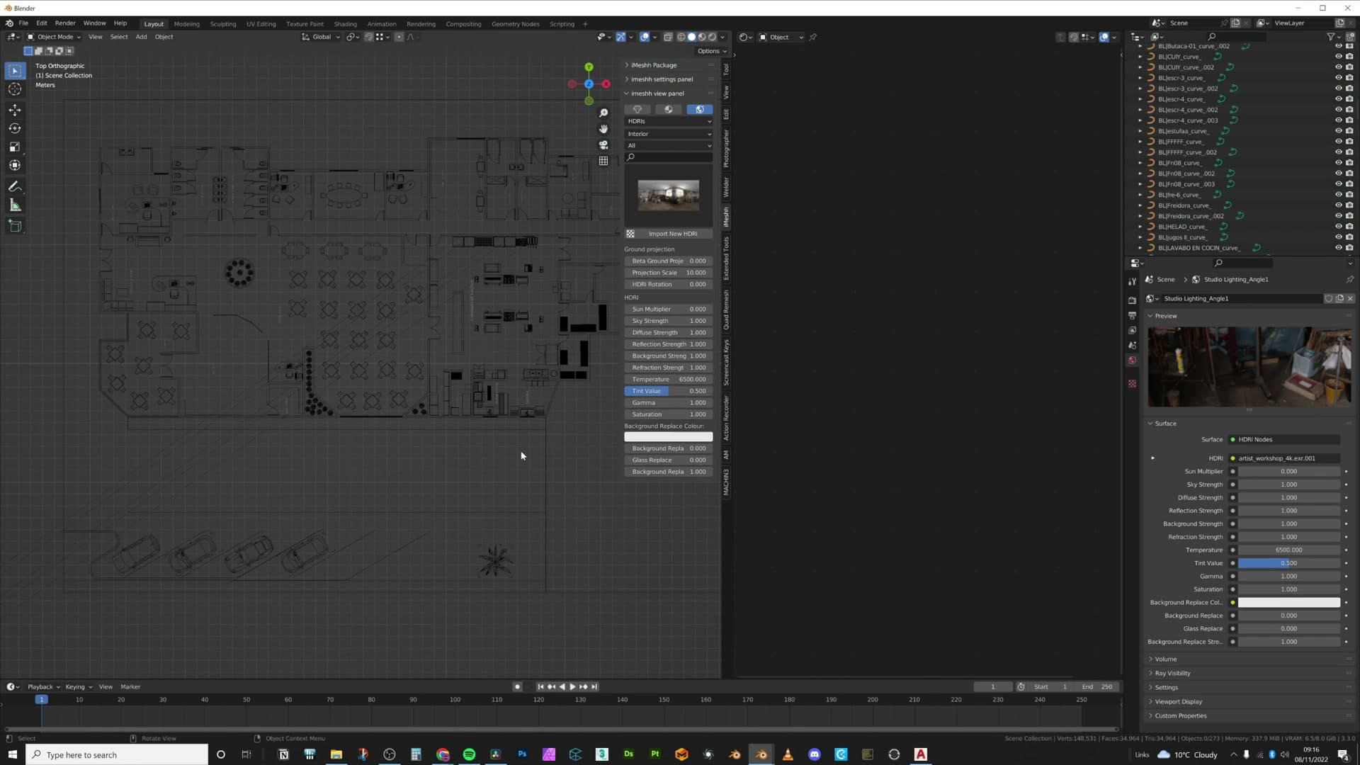
The import will dump a large amount of information into your scene, and it will usually arrive a long way from the world origin. Most of the imported entities are parented in nested hierarchies, so work through them and identify the pieces you actually need: typically the outer wall outline plus a handful of architectural elements like recesses and openings. Select those important pieces, join them together, and delete everything else so you're left with a single, readable plan.
Next, sanity-check the scale. The original CAD documentation should list a known wall length somewhere on the drawing. The imported plan usually arrives as a curve, so press F3 and run Convert to Mesh, then drop into edit mode. Switch on Edge Length in the viewport overlays and select a single edge and its length will now display in metres directly in the viewport. In the tutorial example the selected wall reads 6.37 m, which you can cross-reference against the figure on the plan.
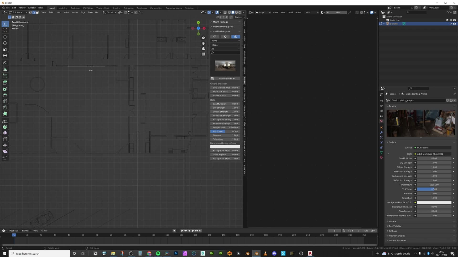
If the two numbers don't match, the file is almost certainly using different units. Inches are common, sometimes the drawing is in centimetres, and sometimes it's simply a factor of ten too large. To rescale, select everything and use S followed by a numerical value (for example, S then 0.1 to bring a 10×-oversized plan back to real-world metres). The goal is for the plan to read in correct units so every wall, modifier, and asset you place later behaves at the right scale.
Building the room shape from a single vertex
Start with Shift+A → Single Vert, snap to the plan, and E-extrude around the entire wall outline, including extra verts at window steps and recesses so the loop cuts you'll need later already exist. Joining the first and last vertices with F closes the floor.
Snap-extruding around the floor plan
With the plan imported, move it into its own collection first. Drag it into a new collection called plans so it doesn't clutter the scene as the geometry starts building up. Because this scene is going to spawn multiple rooms and multiple renders, keeping the source plan isolated from the start saves you from hunting through the outliner later.
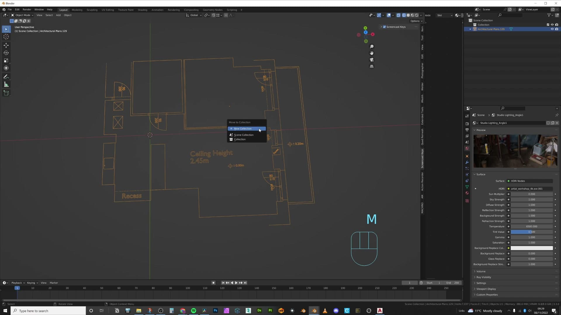
Now start the room shape itself. Press Shift+A and choose Single Vert → Add Single Vert. If that menu entry isn't there, open Preferences, search for extra objects, and enable the add-on. Single Vert lives inside the Extra Objects pack.
Select the vertex, switch to vertex select mode, and turn on snapping with the snap set to Vertex.
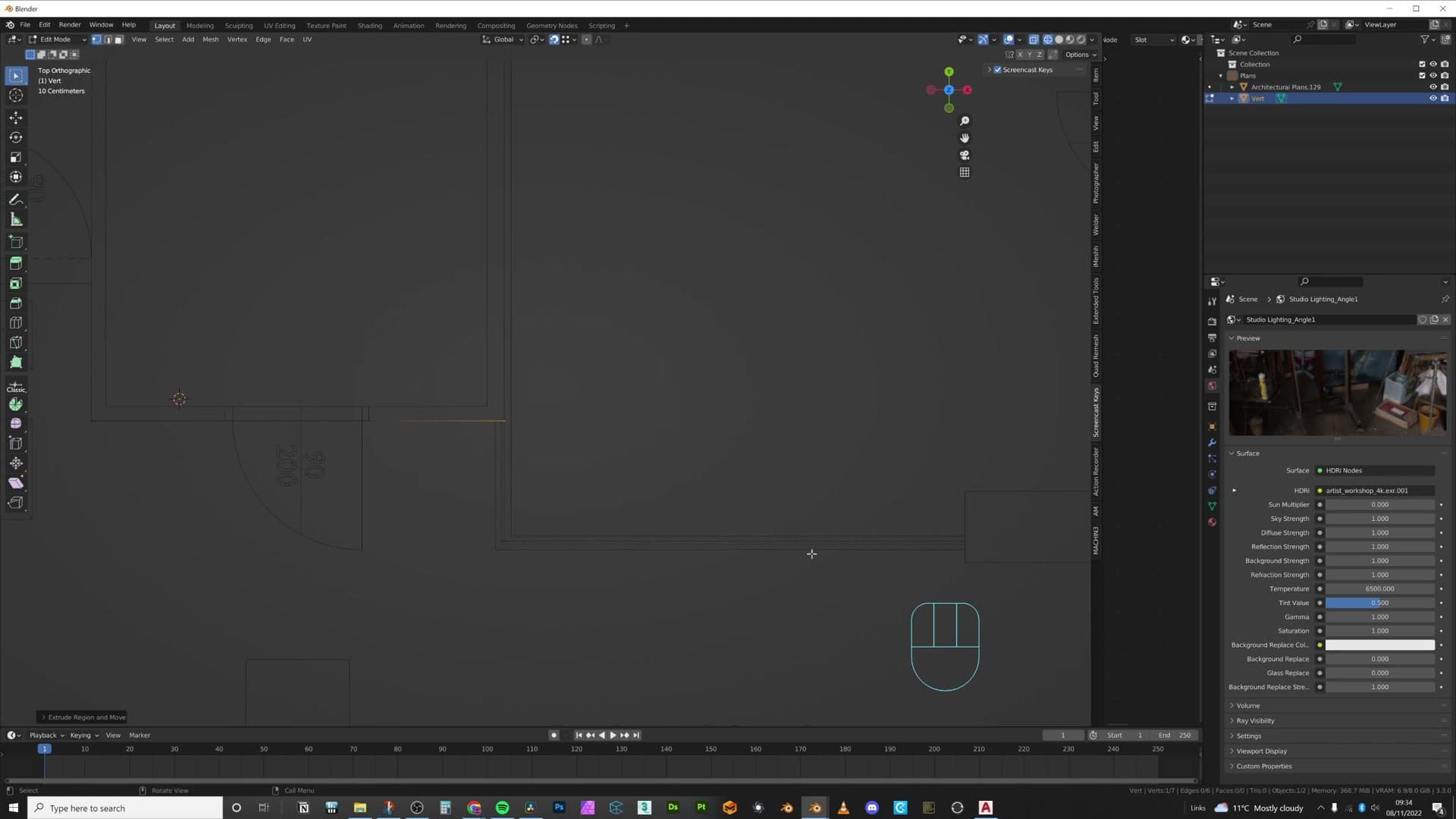
From there it's just E to extrude along each wall of the plan, clicking on the vertex at every corner so the new vert snaps cleanly into place. Work your way around the perimeter. For the doorway, you can place the vert where the door actually closes rather than where it overhangs, since the visual difference will be negligible once the wall is built.
Skip the glass wall. That stretch is reference only. It isn't part of the structural shell, so don't extrude along it. Jump past it, pick up at the top, and keep tracing around the outside of the room.
Window steps and recesses on the outline
When you reach the first window, don't just trace along the outer wall. Drop the vert down into where the window opening sits on the plan. You'll add a 20cm plinth beneath the glass later, and you'll also extrude the sill out to meet the outside wall, but for now you just need the vert positions to exist on the outline. Carrying on with the perimeter extrude is enough.
At any recess, you have a choice: trace into it, or just plant extra vertices along the straight edge where the recess sits. Adding the extra points (without dipping in) gives you spare edges on the outline that you can extrude from later when you cut the recess in properly. Place them now and they're free; place them later and you're slicing into finished geometry.
Treat the kitchen area as a natural part of the construction rather than a recess: run the outline straight across it rather than stepping in and out.
Once you've worked all the way around, select the last vertex and the first vertex together and press F. That joins them with an edge and closes the outline into a complete floor shape, the footprint the walls will rise from in the next step.
Wall heights, doors, and window cutouts
Extrude the outline up by E Z 2.45 for the 2.45m ceiling, fix inward-facing normals with Mesh → Recalculate (and a custom Face Orientation tint so back-faces stay visible during modelling), then add loop cuts at the door head height (200cm), window sill (20cm plinth), and window head (210cm) so faces can be deleted to punch the openings.
Extruding walls to 2.45m and tuning Face Orientation
Before extruding anything upwards, drop the imported plan so the architect's 0.00 datum sits at z=0. That small zero marking on a floor plan is the ground-level reference, and aligning to it now saves headaches once the rest of the building lands on top. With your scene units set to metres in the Scene properties, you'll be working in real-world numbers from here on.
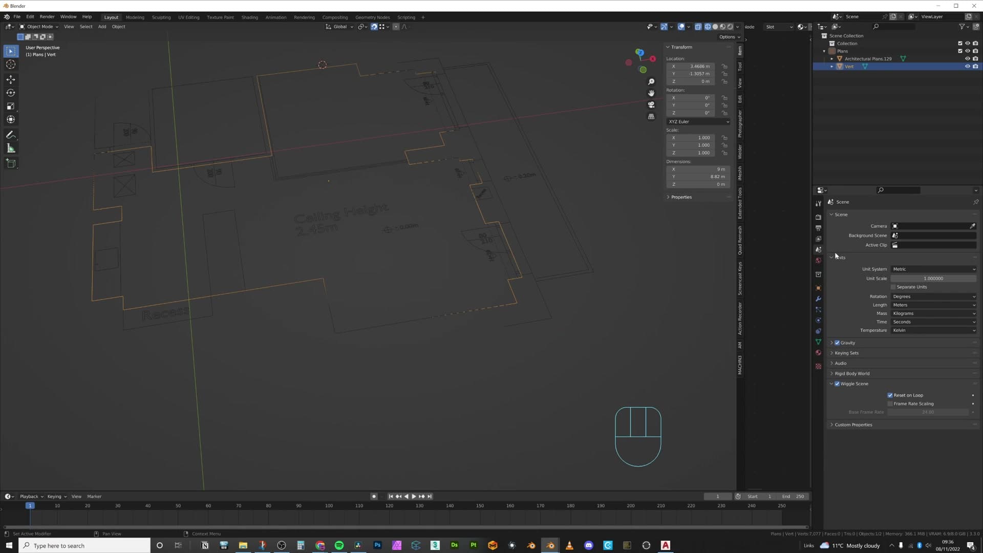
Tab into edit mode, select every edge of the floor outline, then press E Z 2.45 to extrude the walls straight up to the architect-specified 2.45m ceiling height. The whole shell comes up in one move because it's still a single connected outline.
As soon as the walls are up, you'll see one side of each wall tinted bright blue and the other bright red. That's the Face Orientation overlay flagging which way every face's normal is pointing. Red is the back of the face, blue is the front. By default both tints are loud enough that most people only switch the overlay on when something breaks; the trick is to dial it down so you can leave it on permanently without it burying everything else.
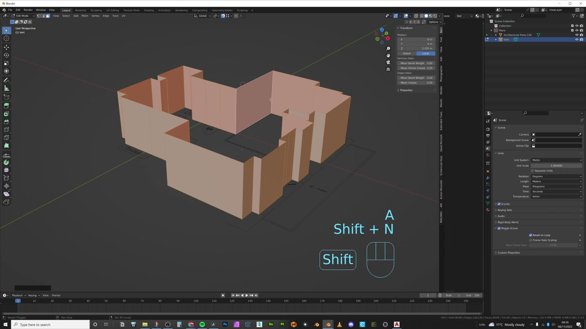
Open Edit → Preferences → Themes → 3D Viewport and scroll down to the Face Orientation Back/Front colour swatches. Pull the blue (front) value all the way down so it's effectively invisible, then drop the red (back) saturation to a low value, just enough that a flipped face still catches your eye. Now any normal pointing the wrong way will reveal itself the second it happens.
The interior of the room is where you'll be looking from, so the visible faces should point inwards, meaning the current normals are flipped. Select everything, press Shift+N to recalculate normals, then Alt+N and pick Flip if any faces are still pointing the wrong way. The subtle red tint should now sit on the outside of the shell instead of the inside.
Cutting door openings with loop cuts
Architect plans usually carry width and height labels for every door and window, and those numbers are exactly what you want to feed into Blender. On this plan the internal doors are 200cm tall, a height you can dial in precisely with a single loop cut.
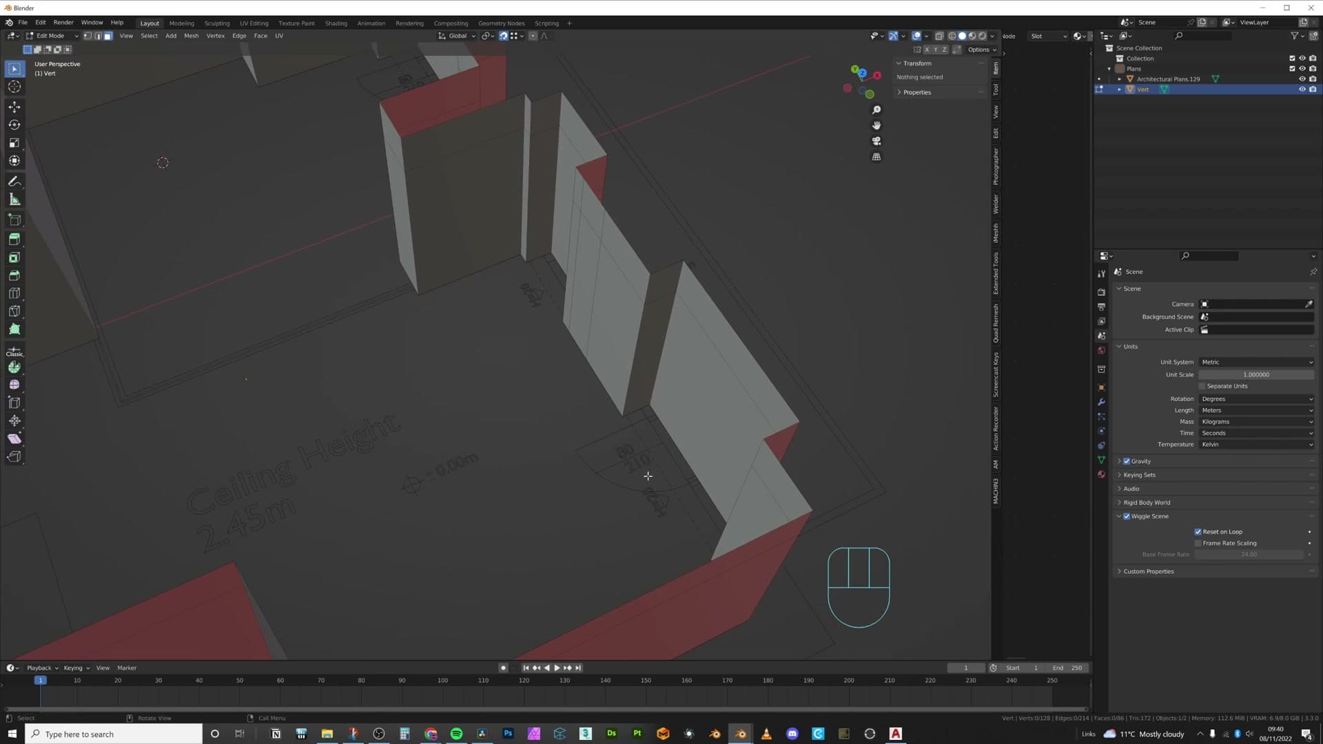
With the wall mesh in edit mode, press Ctrl+R and place a horizontal loop cut around the walls. Slide it all the way to the bottom of the shell, then lift it up to door-head height by pressing G Z 2. Your scene units are metres, so a value of 2 reads as 2m / 200cm, exactly where the door tops should sit.
You now have a ring of edges at door-head height. Switch to face select, pick the two faces that sit between the floor and the new loop cut at each doorway, then press E to extrude them straight out through the wall. Once each opening punches all the way through, delete the bottom face inside it. The floor fill will cover that gap later, so leaving the face there would just create overlapping geometry.
Cutting windows with sills and recesses
Windows are a touch fiddlier than doors because they have two heights to honour: a 20cm sill (the small plinth at the bottom) and a 210cm window opening above that. Both come from loop cuts placed off the existing wall geometry, so there's no need to model the sill as a separate object.
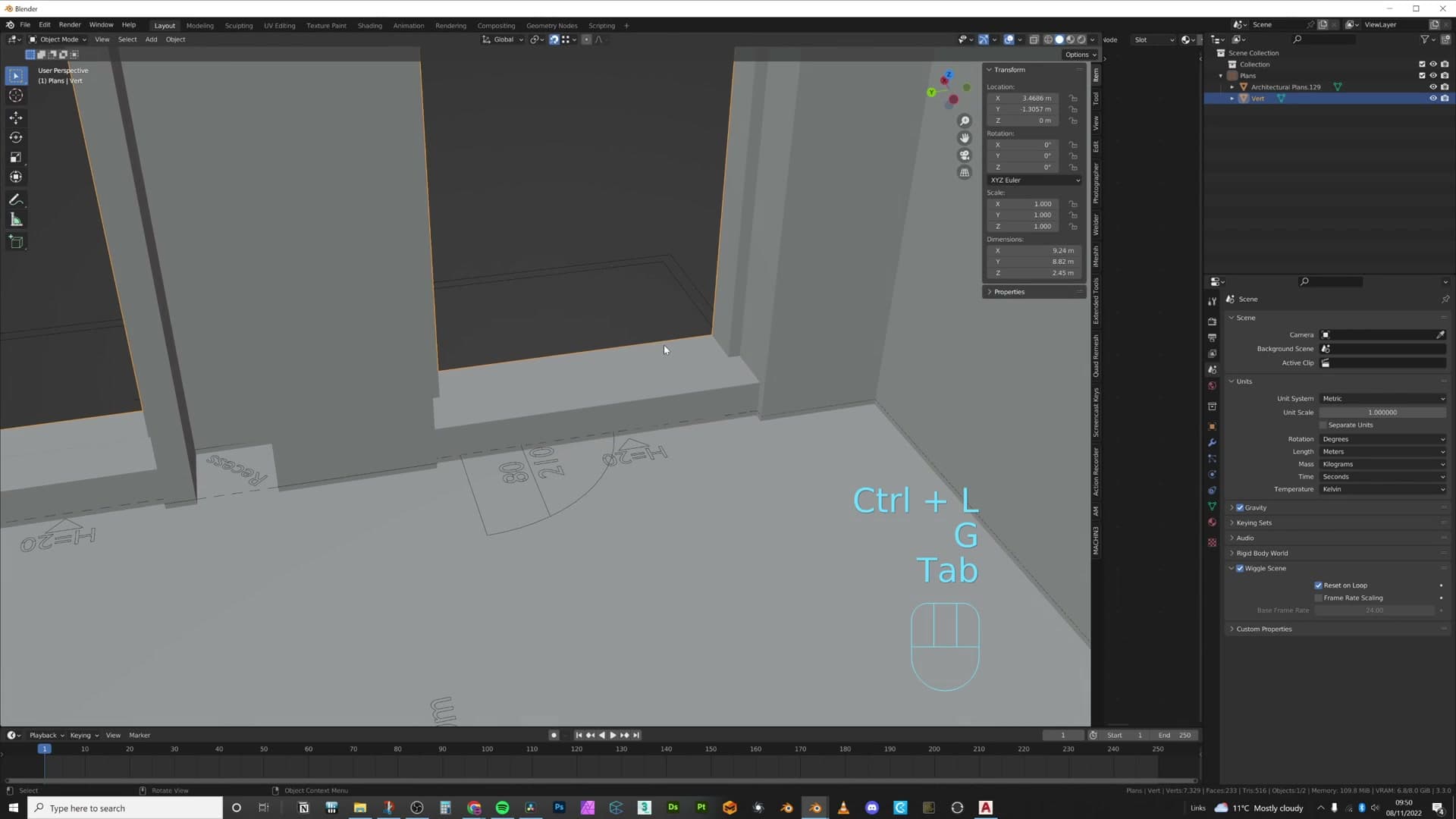
Drop a fresh loop cut into the wall, slide it to the very bottom, then press G Z 0.2 to raise it 20cm. That edge is now your sill line. Add a second loop cut higher up the wall, snap it down to the sill edge first, then press G Z 2.1 to lift it 210cm above the sill. The faces between those two cuts now match the window opening height exactly.
Most window plans push the glazing out into the wall thickness rather than sitting it flush with the inside surface. You can usually spot the overlap on the plan, where the window pokes into the corner of the room. To match that, add a couple of vertical loop cuts either side of each opening so you can extrude the window pocket outwards into the wall. Select the window faces, press E to push them out to the outer wall line, and delete the outer face afterwards so the opening reads as a clean cut.
The wall recesses (an alcove on one side, a bookshelf nook on the other) ride on the same loop cuts you already have, so no extra geometry is required. Select the recess faces, extrude them outwards to whatever depth the plan calls for, and delete the bottom face on each so it joins the floor cleanly. With every opening punched, select the entire bottom face of the shell and press F to fill the floor in one go.
Repeat the same trick on the top: select the upper face ring and press F to seal the ceiling. The moment the ceiling exists, you lose the convenient view down into the room, so toggle Back-face Culling in the viewport shading dropdown. Back-facing geometry now disappears, which means you can always see into the room while modelling inside it. While you're there, drop the viewport's focal length below the default 80mm too. A wider lens stops the room feeling cramped as you work in close.
Glass wall framing and skylight booleans
Knife-cut a recess in the wall to seat the glass detail (no need to perfectly match the architect's construction drawings (the camera can't see into the joinery)), and Boolean-Union a skylight box up through the ceiling so the cutouts read as openings cleanly.
Knife-cutting the glass-wall extrusion
Architects sometimes include construction details showing exactly how a glass partition meets the surrounding joinery. When those details aren't in the drawings, or when the architect hasn't actually worked them out yet, you can fake a believable recess in a few seconds. The camera can't see deep into the joint anyway, so a small discrepancy between your geometry and what would actually be built won't read in the final render.
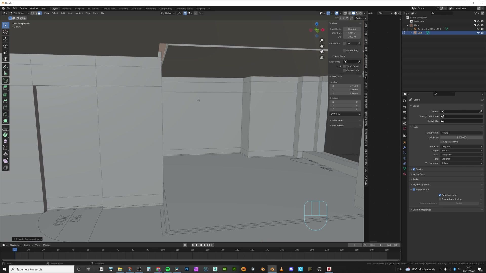
Press K to launch the Knife tool and drop two cuts either side of where the glass will sit. Rough placement is fine. You'll tidy them up next. Loop cuts will do the same job if your wall is clean quads, but Knife works regardless of topology, which matters here because the wall was extruded from a hand-traced floor plan.
Tidy the cuts by selecting each new vertex, enabling snapping, and using G then Y (or G then X) to nudge them flush with the adjacent geometry. With the cuts in line, select the edge between them, press E, and extrude inward a short distance. That shallow extrusion is the recess the glass panel will sit inside, enough to read as a real joinery detail once the glass is dropped in.
Boolean skylights through the ceiling
The ceiling needs two skylight openings, and you've got a choice: knife them out by hand the same way you cut the wall recess, or let a Boolean do the work. Boolean wins here because the skylight outlines are already on the imported floor plan; you just need to push them up and use them as cutters.
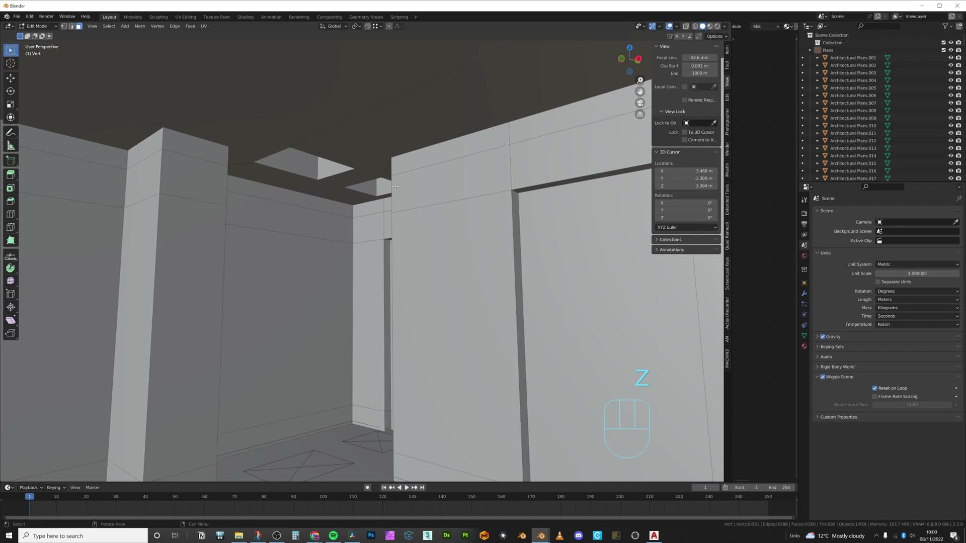
Select the edges of each skylight outline on the ceiling plan and press Shift+D to duplicate them. Move the duplicates above the ceiling and separate them into their own object. Select the duplicated edges, join them into one mesh, press F to fill each outline with a face, and extrude the result upwards. Roof build-ups are typically thick, so give the cutter plenty of vertical headroom. It needs to pass cleanly through the ceiling mesh.
Join the cutter geometry to the ceiling object, drop into Edit Mode, select the cutter faces, press F3 and search Boolean. On the first run one skylight may resolve cleanly while the other refuses to cut. When that happens, lower the cutter slightly so it sits a fraction deeper inside the ceiling. Booleans are happier when the intersection isn't sitting right on the boundary of the target mesh.
Settings: Operation Union with the Fast solver. Once the Boolean resolves, delete the cap faces left behind inside each opening so the skylights actually read as holes. The remaining topology won't be tidy quads, which is fine here. The ceiling doesn't need further detailing, so clean quads aren't worth fighting for. If you planned to add more cuts later you'd want to retopologise, but for a flat ceiling that's the end of the job.
Door and window assets plus light portals
Append doors and windows from the iMeshh library, snap them into the openings, and mirror to flip hinge sides. When the plan doesn't match a real window head, just add new edge loops and bridge. Small construction mistakes are part of the job. Finish by dropping Cycles light portals into every opening so external light samples efficiently.
Appending door and window assets
Open the iMeshh Asset Manager, go to the Door folder, and drop a door in near the first opening. Push it against one side of the cutout so an edge of the door frame sits on an edge of the wall, then jump into edit mode and pull the bottom down to the floor. Lift it back up a fraction so the door isn't scraping the boards. You want a hairline gap underneath, not a press-fit.
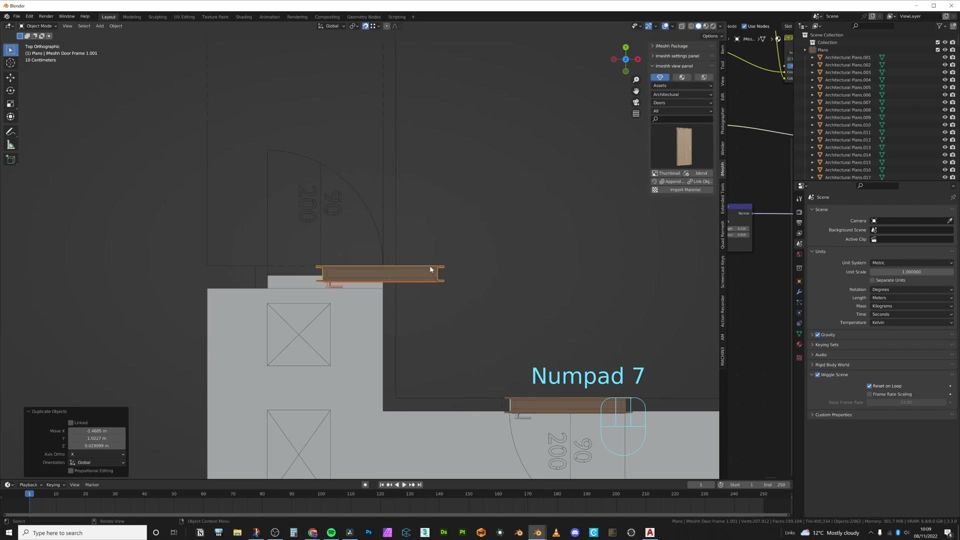
Hinges almost always end up on the wrong side the first time. Look at the swing direction on the plan, then with the door object selected use Object → Mirror along the axis that flips the hinge to the correct side. Slide it back into the opening once it's mirrored.
Duplicate the door over to the front opening and rotate it 180° to face outward. In reality front doors tend to be a little thicker and carry extra locks, but for an interior render you won't see any of that detail, so the same asset is fine. Just nudge the front face flush with the wall edge you've created.
Windows work the same way. Find a window in the iMeshh library that matches the style of opening you're after: for a window where one half opens and the other is fixed, a door-style asset with a hinge on one side is the closest match. Append it, turn snapping off so you can fine-tune, then enter edit mode and slide the window pane across until it sits inside the opening with a sliver of the frame buried in the wall (so there's no visible seam on the outside).
Fixing plan mistakes with extra cuts
You will spot a mismatch at some point: the window asset doesn't reach the head of the opening, or the wall geometry doesn't quite line up with the appended frame. Treat it as part of the job rather than something to redo from scratch. Small plan mistakes are normal, and the fix is almost always a couple of loop cuts.
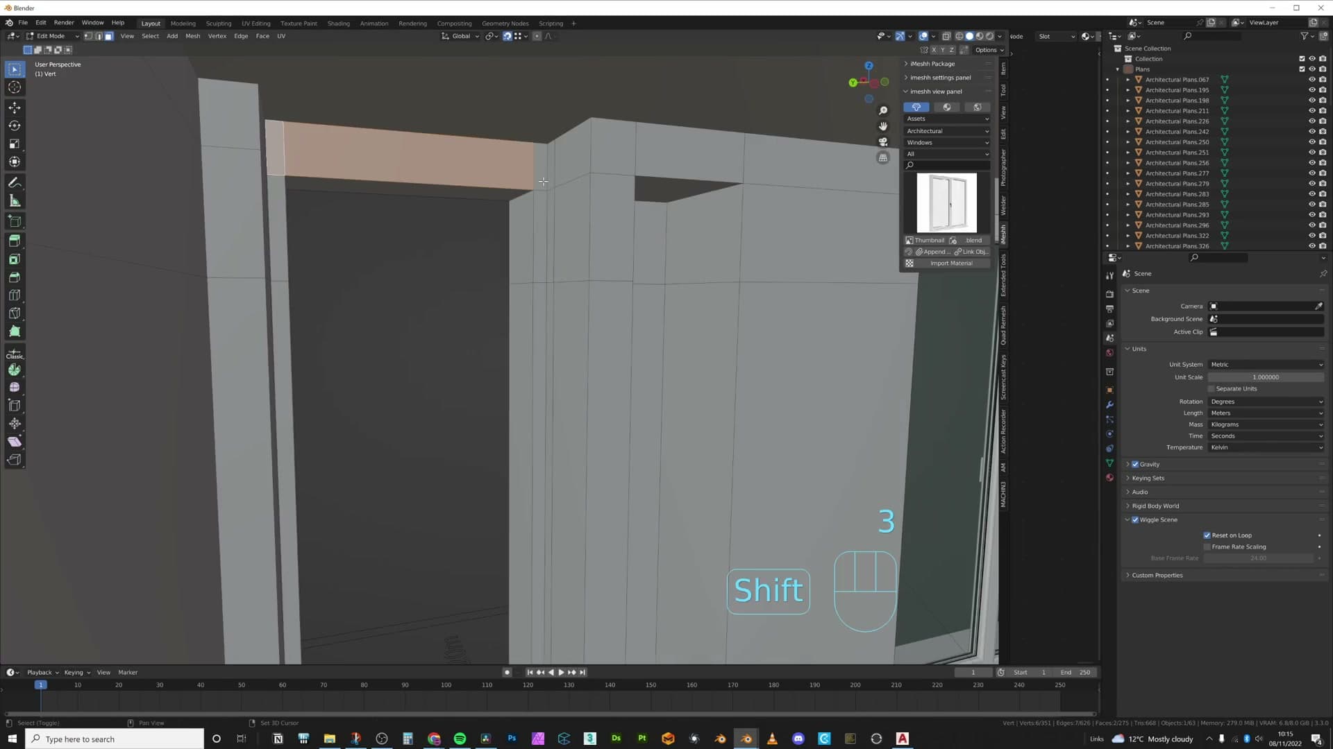
Add a loop cut on the wall and slide it across to the end of the window, then add a second loop cut and slide that one to match the other edge of the frame. Select the faces between the cuts, delete them, and bridge the open edges across to the top of the window. If the geometry overlaps by a millimetre, leave it. In reality there's often a thin piece of trim or plastic running down to meet the frame, so a small overlap reads as that detail rather than as a mistake.
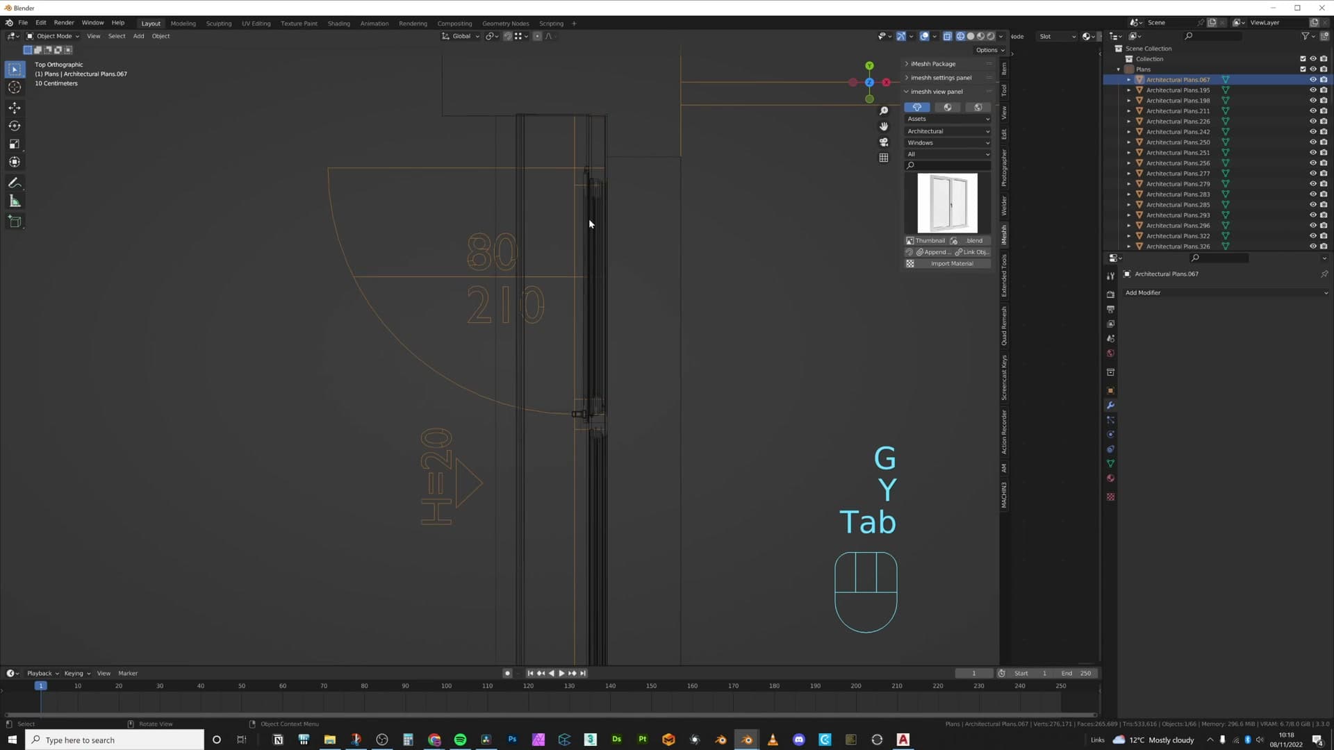
For a fixed window with no opening half, you don't need a separate asset. Just duplicate one of the door-style window panes you've already placed. Move the duplicate roughly into position against the wall, add a Mirror modifier, then bisect along the axis you want to keep and flip the cut so only the glass side survives. Pull the result up flush with the top of the opening. For the next window along, where again one side opens and one doesn't, simply duplicate the previous one across. Same construction issue, same fix.
If you see Z-fighting flickering on the panes while you work, that's the viewport clip distance, not your geometry. Push the clip start higher and the shimmer goes away. Check the origin points of the new windows too: if Blender placed an origin somewhere off-piece, snap the 3D cursor to the corner you want to rotate around and use Set Origin → Origin to 3D Cursor so the asset hinges from the right point later on.
Window glass has one specific shader requirement worth flagging now: you want it to look like glass when you look at it but to barely affect the rest of the scene. Real-world glass tints and absorbs, but for architectural interiors the outside is usually bright enough to overexpose anyway, so the difference is negligible. The saving in render time is large. The iMeshh glass material already has the node setup wired in: a Light Path branch that makes the shader 100% transparent for shadow rays and diffuse rays, leaving only the camera ray to see actual glass. Make sure that branch is connected on every window.
Light portals for window openings
The final piece of construction is light portals. Portals tell Cycles where outside light enters the room so the sampler concentrates its rays through the openings instead of scattering them blindly around the scene. For an interior lit largely through windows, this is the single biggest speed-up you'll get for free.
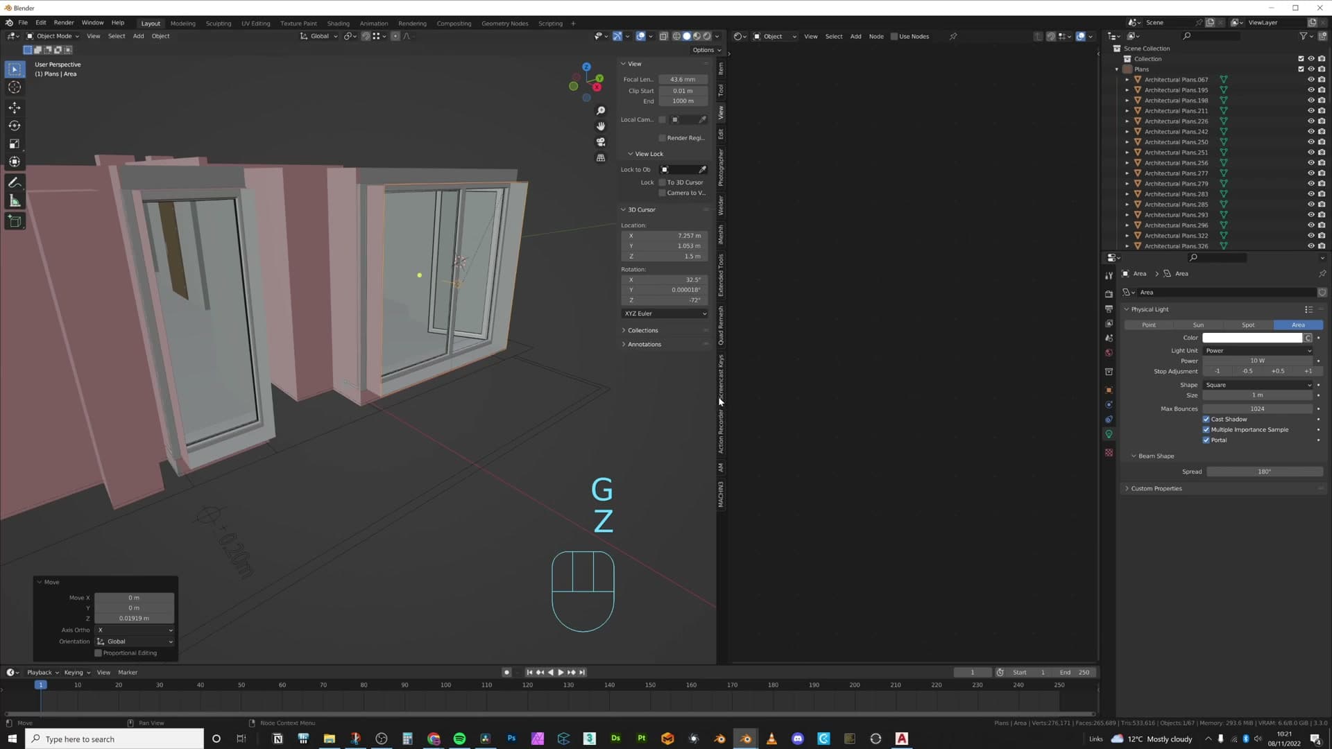
Select the face of a window opening, press Shift+S and choose Cursor to Selected so the 3D cursor lands on that opening, then add an Area light. Scale it to cover the window cleanly (a hair larger than the glass) and in the light's data properties switch the mode to Portal. The light no longer emits anything itself; it just acts as a flag that says "light comes from outside, through here".
Duplicate the portal across to every other window. Use Alt+D rather than Shift+D so the duplicates are linked. If you ever decide to convert these from portals into actual emissive area lights, changing one will change them all. Then S Y (or whichever axis fits the opening) to scale each one to fit, and repeat for every external glass face in the build.
Glass wall, shower-door rig, and advanced glass material
Build the glass partition from beveled cubes, repurpose an iMeshh shower-door asset to get the hinge and plastic-stopper detail for free, and apply the advanced glass shader (volume absorption disconnected to keep render times down, base colour pulled slightly off pure white so the panes read as glass without crushing the view through them).
Block cubes and bevel for the glass wall
The glass partition is built from primitives: there is no clever modelling here, just cubes scaled to length. Add a cube and slide it along the edge that the floor plan marks out for the partition. The plan calls for the glass to butt right up against the adjacent wall, but a small overlap is fine if you prefer it; archviz tolerances are not architectural tolerances.
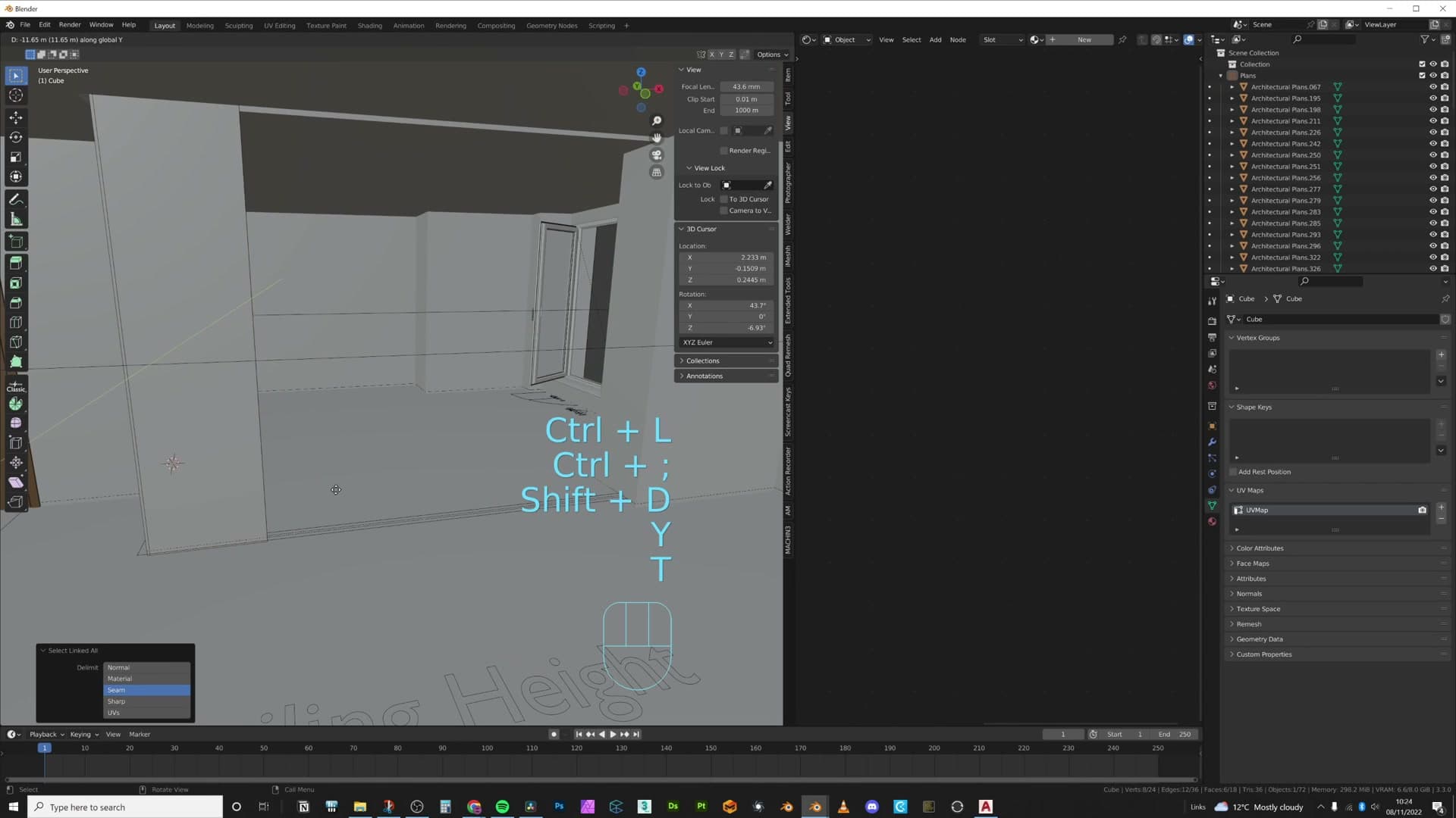
Duplicate that cube, rotate the copy 90 degrees, and slide it into place to form the perpendicular run. Drag both pieces vertically until they reach the ceiling so the partition reads as a full-height wall of glass rather than a half-height divider.
Now cut the door opening in. Rather than booleaning a hole, duplicate the existing cubes and shuffle them along so there is a deliberate gap where the door will sit. The piece above the doorway gets brought down to door height so the head of the frame is implied without needing extra geometry.
Finish the partition by adding a Bevel modifier to every cube so the edges catch light instead of reading as razor-sharp CG corners. Keep the width subtle. These are panes of glass, not chamfered furniture.
Repurposing the shower-door hinges
The door itself is the fiddly bit. Rather than modelling hinges from scratch, raid the iMeshh library for a shower door. It ships with the hinges and the small plastic stoppers that sit between the moving pane and the fixed frame, which is exactly the hardware a glass partition door needs.
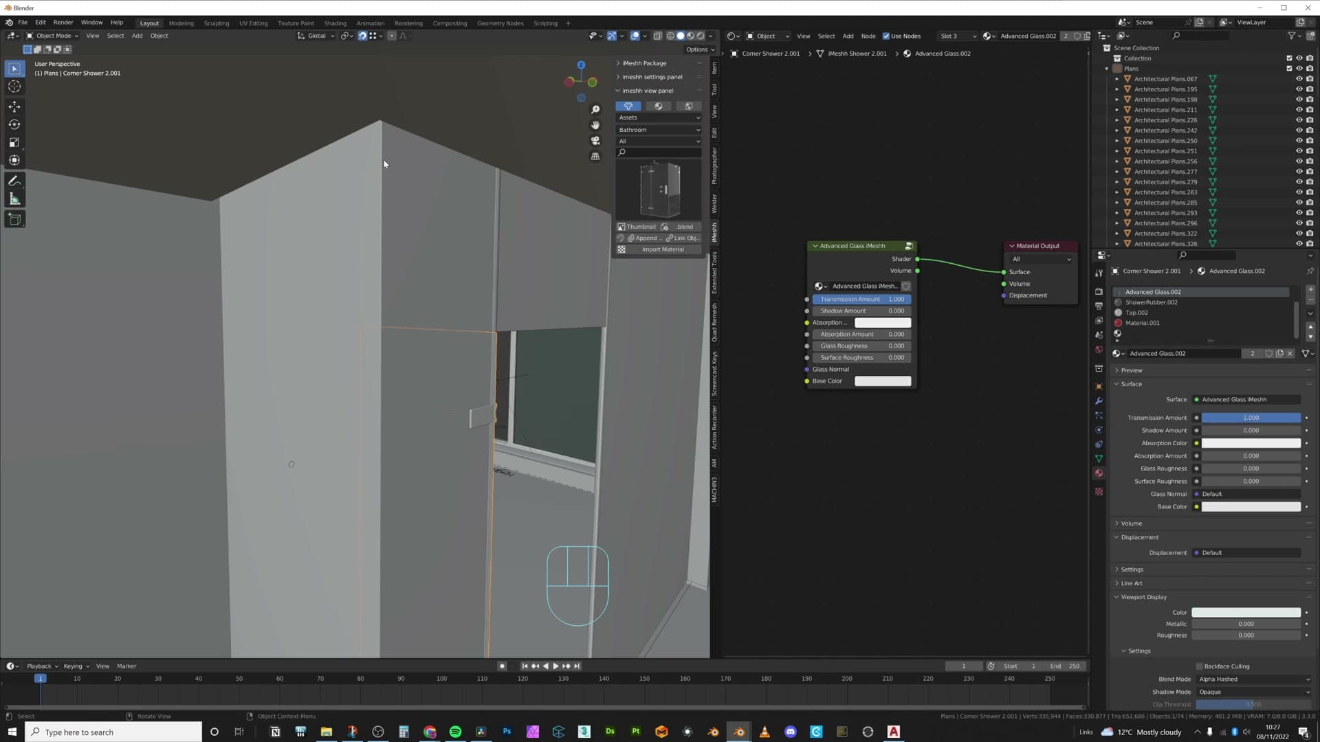
Append the shower-door asset into the scene, then strip it back to the parts you actually want. Delete the shower enclosure and any edges of glass you do not need, leaving just the hinges and the plastic connecting pieces. Those plastic stoppers exist on real shower doors to stop wear and tear where metal meets glass, and that small piece of authenticity sells the result.
Slot the hinges into the doorway gap and nudge them so they overlap the edge of the glass pane, the way a real hinge clamps over both sides. Rotate the door slightly open rather than leaving it perfectly flush; a few degrees of swing reads as a lived-in space instead of a showroom.
Drop the plastic stopper pieces in as a collection so they stay grouped with the door rather than floating loose in the outliner.
Advanced glass shader without volume absorption
For the material, use the iMeshh Advanced Glass shader, the same node group used on the windows earlier. If you are running the iMeshh Asset Manager you can drop it straight onto the partition and the adjacent glass piece in a couple of clicks; the alpha channel is already wired up so you can see what is behind the panes immediately.
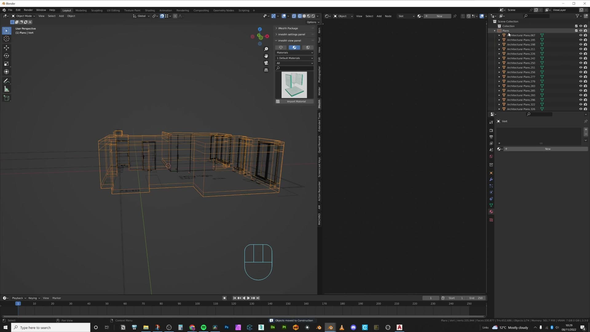
There is one deliberate departure from the default setup: unplug the Volume output. The shader normally pipes a small amount of absorption through the volume socket, which gives the edges of thick glass that subtle green-tinted depth real glass has. It looks lovely in close-ups, but with this much glass on screen the absorption darkens the view through the partition and pushes Cycles render times up sharply.
Pull the base colour very slightly off pure white, darker by a small amount, not enough to read as tinted glass. The trick is in the contrast it produces: the parts of the frame you can see through the panes read as lighter than the parts where you are looking at the glass itself, which is exactly how real glass behaves against a bright background. Everything else on the node group stays at the values it ships with.
With the construction now complete, drag every wall, window, and door piece onto its own collection and call it Construction. Naming is up to you, but a tidy outliner pays for itself once the props start arriving.
One small annoyance worth flagging: Blender currently does not render the technical details that sit behind a glass surface as cleanly as you would hope. The interior hardware visible through the partition will lose some fidelity in the final render. There is nothing wrong with your setup; it is a renderer limitation.
If you imported the iMeshh assets through the Asset Manager they will have created their own outliner categories on the way in. You can keep those if it suits how you organise, or strip them out. For this scene they get removed so the Construction collection stays clean.
Key furniture and terrace blocking
Block the scene with the hero pieces first (sofa, bed, kitchen run) and roughly scale (within 10%) so the room reads at a glance. Duplicate the floor face out to a separate terrace so the outside reads through the glass wall.
Floor and terrace from the existing slab
With the walls closed in, duplicate part of the floor face outward to form the terrace beyond the glass wall. Bring it over, drop it where the plan shows the outside slab and lift it if there's a step between the interior floor and the terrace level. Anything finer than that (drainage trims, planters, joints) only matters if the camera is actually going to catch it. For this scene the terrace barely registers through the glass, so the block-out is enough.
That sets up the next phase: key furniture, cameras, materials and lighting. The aim isn't to dress the room yet. Drop the hero pieces in, test a couple of arrangement ideas and start working out where the camera and the lights need to sit before any of the detailing begins.
Blocking sofa, bed, and kitchen anchors
Treat the key furniture as the anchor pieces: the sofas, the bed, the tables, the kitchen run. Everything else in the room organises around where those land, so it pays to commit to them early even if you change your mind on the secondary props later.
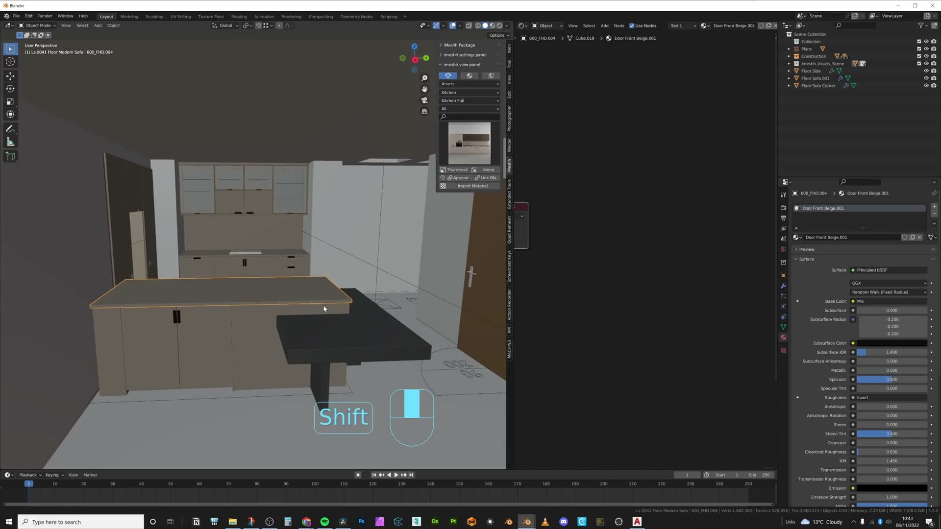
Start with the seating. Open the sofa category in your iMeshh library and append the model you want into the scene. It will usually come in slightly too large, so scale it down, drop it roughly into position and delete any sub-pieces (cushions, throws, side tables) you don't want yet. If a different silhouette would suit the room better, swap it; this is the moment to experiment. Position the sofa so the window sits behind it. That way light from outside can rake across the seat back later. The alcove behind it can take a bookshelf, but if the camera won't see it, don't worry about filling it now.
Block sofas have a bit of latitude on proportions. Scaling them roughly 10% up or 10% down to fit the space tends to read fine. Push beyond that and the seat starts to look wrong against the room. If the customer has specified a particular piece of furniture, leave it at real-world scale; the brief is the brief.
Drop the bed in next. Materials get a full pass later, so don't fight with how it looks straight out of the library. Then add the kitchen. iMeshh has pre-made kitchen runs you can append, or you can pull one in from a previous scene as a starting point. Fit the run neatly against the back wall and tuck the return into the alcove. A small overlap with the wall is acceptable if the camera angle won't reveal it. It's faster to nudge that later than to chase millimetre alignment during the block-out.
With the sofa, bed and kitchen anchored, the three focal points of the room are established. From here the question becomes where the camera should sit, and the rest of the lighting and material work follows from that decision.
Camera setup and composition
Three locked-square cameras at ~60mm. Lock the rotation so verticals stay perpendicular (sloping walls trigger discomfort in viewers), max the passepartout, raise the camera clipping to slice through walls and fit more of the room, and avoid letting object edges line up with the frame edge.
Squaring the camera and the 60mm focal length
With a fresh camera in the scene there's a lot of distracting frame around your shot. To focus the eye on what you actually want to render, select the camera, open Object Data Properties → Viewport Display, find the Passepartout slider, and push it to maximum. Anything outside the camera frame goes pure black, and the composition is suddenly all you can see.
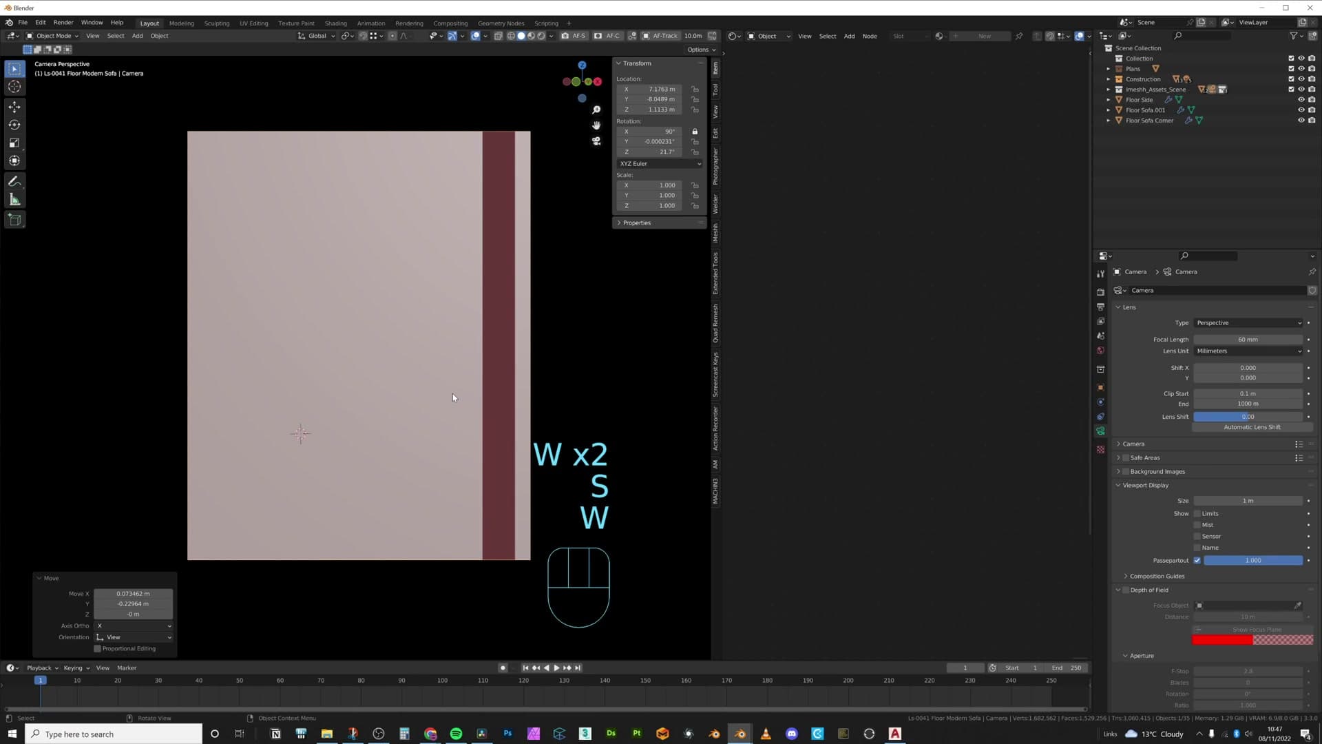
For the focal length, look at the lens choices on your mood board. Archviz interiors often sit at a higher focal length than Blender's 50mm default. A value of about 60mm is a sweet spot for interior portraits: it feels aesthetically tight without the wide-angle distortion that bends walls outwards.
Lock the camera's rotation before you start positioning it. Once locked, you can drag the camera around the room without ever introducing slanted verticals. Perpendicular walls are what the eye expects from architecture. Sloping ones trigger discomfort in the viewer even when they can't articulate what's wrong.
One thing to undo before you start moving the camera: back-face culling. If it's still on from the modelling phase, walls vanish when you view them from the wrong side, and you can drag the camera straight outside the room without realising the framing has fallen apart.
Clipping to fit more of the room
A locked 60mm camera physically cannot fit a whole interior into frame without you dropping to a wide-angle lens that distorts the geometry. Blender's escape hatch: raise the camera's Clip Start value to slice the camera through the front wall. From the same locked-square 60mm position you can now read much more of the room, because the camera is effectively sitting inside the wall it's looking through.
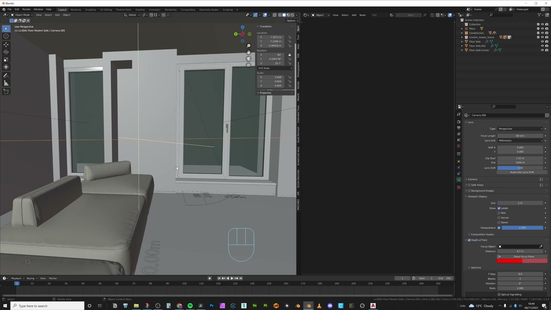
It is a cheat. But in practice, clients respond better to seeing a generous slice of the room than to a purist 'no clipping' rule that ends with you down at a super low focal length and everything bent. The trade is between a small geometric fudge and a much more obvious lens distortion. The fudge usually wins.
With the camera positioned, sweep your eye around the frame and look for object edges that line up with the edge of the image. If a wall corner sits exactly on the right-hand frame edge, the viewer can't tell what's around that corner and the composition feels uneasy. Nudge the camera (or the object) so there's a small gap.
The same principle covers curtains that meet a wall corner, doors that line up with the frame edge, and any other geometry that touches the frame boundary. Separating these edges helps the eye read each object as distinct from the next, and it's a habit worth carrying through your whole architectural visualisation career.
Three named camera angles
Duplicate the first camera twice and reposition each copy to anchor a different room: one looking across the sofa towards the windows, one looking into the kitchen, and one looking through to the bedroom. On the living-room camera, enable Depth of Field and set the f-stop to 8. That's high enough to keep most of the room in focus while distant objects fall gently out, with the option to drop lower if you want the bokeh to be more dramatic. Don't go too low or everything beyond the focal point dissolves into mush.
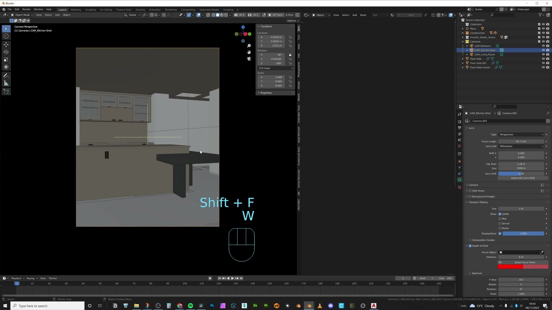
Set the depth-of-field focal point on whatever spot the eye is naturally led to in each composition. On the living-room shot, that's the edge of the sofa, where the lines of the room converge. On the kitchen shot, set the focus around the chairs that will sit at the breakfast bar so they hold the eye and anything further behind gradually softens.
Frame each shot so the neighbouring rooms read as context. If you push the kitchen camera too far forward the kitchen fills the frame and the viewer has no idea where it sits in the apartment. Pull it back until the corner of the sofa is just visible. Now the kitchen has spatial context. The living-room shot should catch a slice of the bedroom doorway, the bedroom shot should hint at the kitchen behind it, and each angle earns the others.
Name the cameras so you can switch between them quickly: Living, Kitchen, Bedroom. Select all three, move them to their own collection, and tint the collection yellow so the cameras stay visually distinct from the geometry in the outliner, and you always know which collection holds your shots when it's time to render.
Wall, floor, and ceiling materials
Split the wall shell into separate material slots (top, bottom, walls) using Select by Normal so each gets its own texture, then build a grey plaster shader where the roughness and normal maps do all the work and the diffuse is essentially flat. Smart UV unwrap once and tile fine.
Splitting top, bottom, and wall material slots
Dropping the wood floor material onto the shell paints the whole room with planks: walls, ceiling, alcoves and all. Before you touch the wall and ceiling shaders you need to carve the mesh into three material slots: floor, walls, and ceiling.
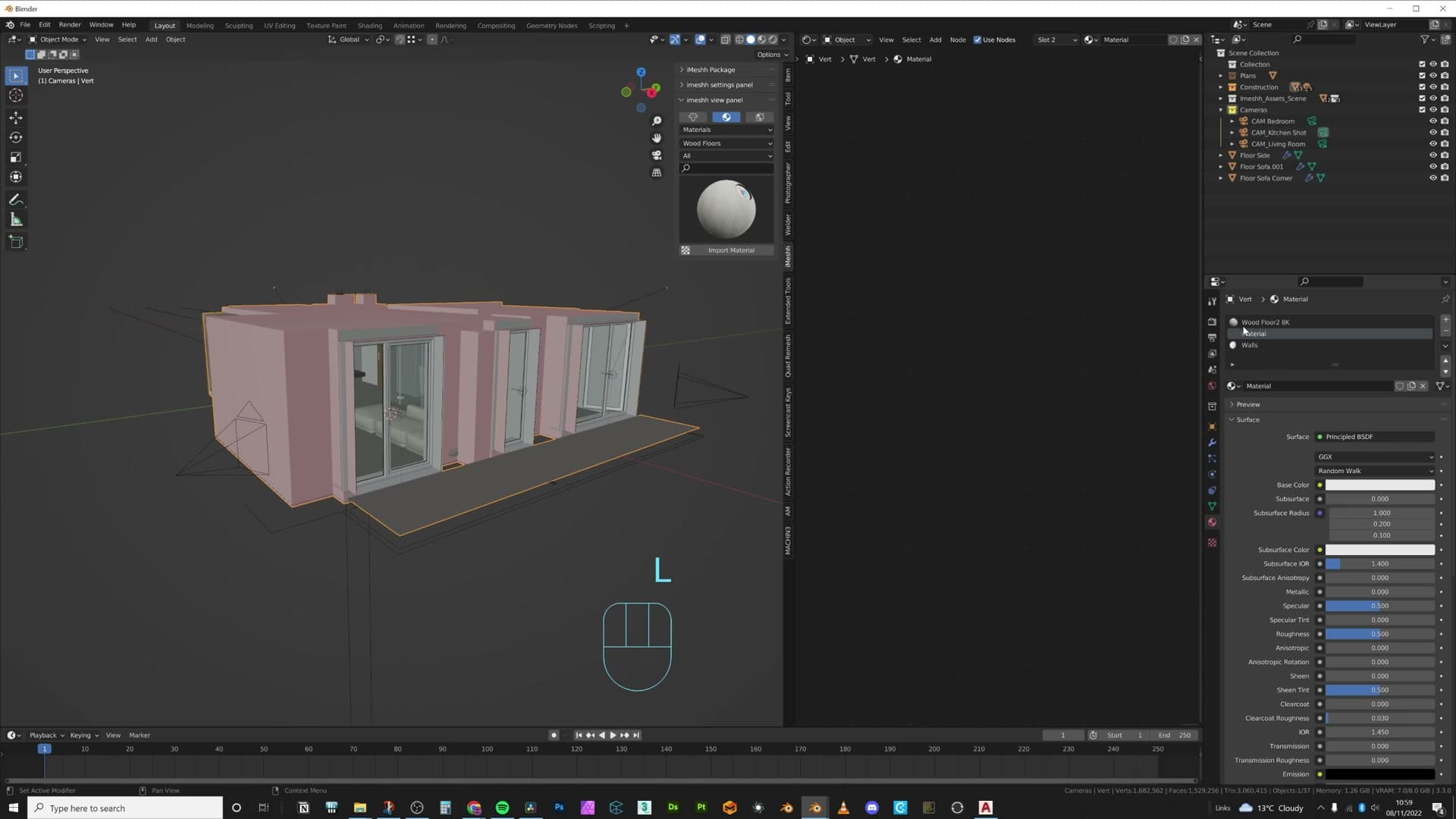
Tab into edit mode on the wall shell and isolate the floor first. Select a single top-facing face (the floor is upward-facing once you flip your view), then use Select Similar → Normal to grab every face pointing the same way. Deselect any alcove faces and the floor of any external area like the terrace that you don't want sharing the wood material. Those need their own treatment later. With the clean floor selection live, assign it to its own material slot.
Now do the ceiling. Pick a downward face, Select by Normal again, and clean up the selection the same way. Remove alcove undersides and any stragglers. Assign the ceiling slot.
Everything left is the walls. Press Ctrl+I to invert the current selection, drop the terrace faces out of the inverted set, and assign that to a third slot. Rename the slots to walls and ceiling so you can tell them apart in the shader editor. The floor slot keeps the wood material that triggered the split in the first place.
Grey plaster with roughness and normal maps
For interior walls the diffuse map is the least interesting input. The walls in a real room are painted a single flat colour with tiny variations. What sells the surface to the camera is the roughness and normal maps. Slight gloss variations and micro-bumps catch the light; the base colour just has to be the right tone.
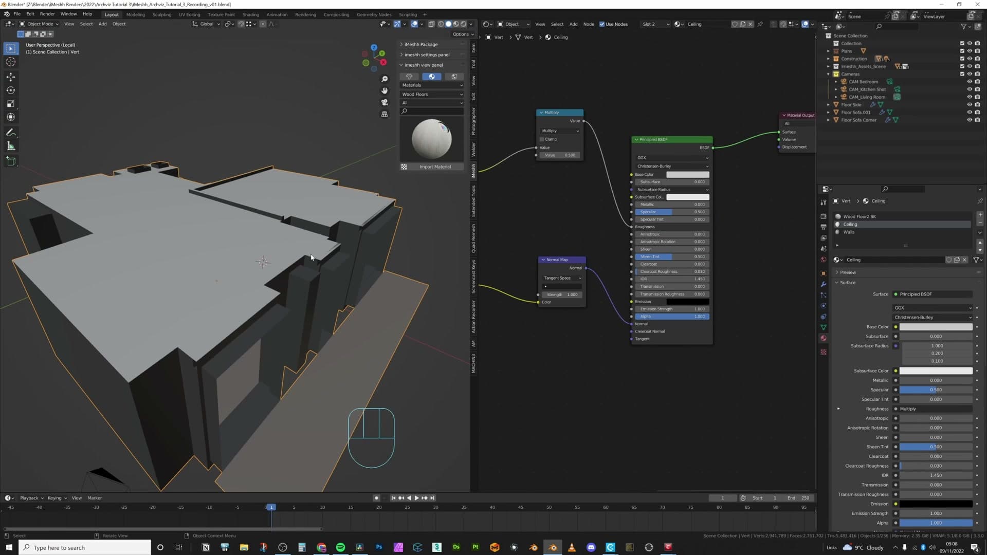
Grab a plaster-style texture set from a CC0 source, something with plenty of fine surface detail so the normal map has something to bite on and the roughness map gives you those subtle glossy variations across the wall.
Build the wall shader minimally: plug the roughness map into the Principled BSDF's Roughness, run the normal map through a Normal Map node into Normal, and leave the colour socket on a flat mid-grey value picked from your mood board. A cool, moody grey reads well under soft studio lighting. While you're there, open the material's Viewport Display panel and set the display colour to match, so the solid-shaded viewport doesn't lie to you when you're framing cameras later.
The ceiling wants exactly the same shader, just lighter. Open the wall material's node tree, select everything with A, copy with Ctrl+C, then in the ceiling material delete the default Principled and paste with Ctrl+V. Push the base colour up toward white so the ceiling reads as a fresh off-white above the darker walls. Same roughness, same normal, different tone.
Smart UV unwrap and texture scale
The walls, floor, and ceiling are still un-unwrapped, so the textures aren't tiling. They're stretching. For a scene like this, where the material is going to read as subtle background grain, a Smart UV Project is plenty. If you were hero-lighting one specific wall you'd want to unwrap that face properly, but for general ambience Smart UV is the fast route.
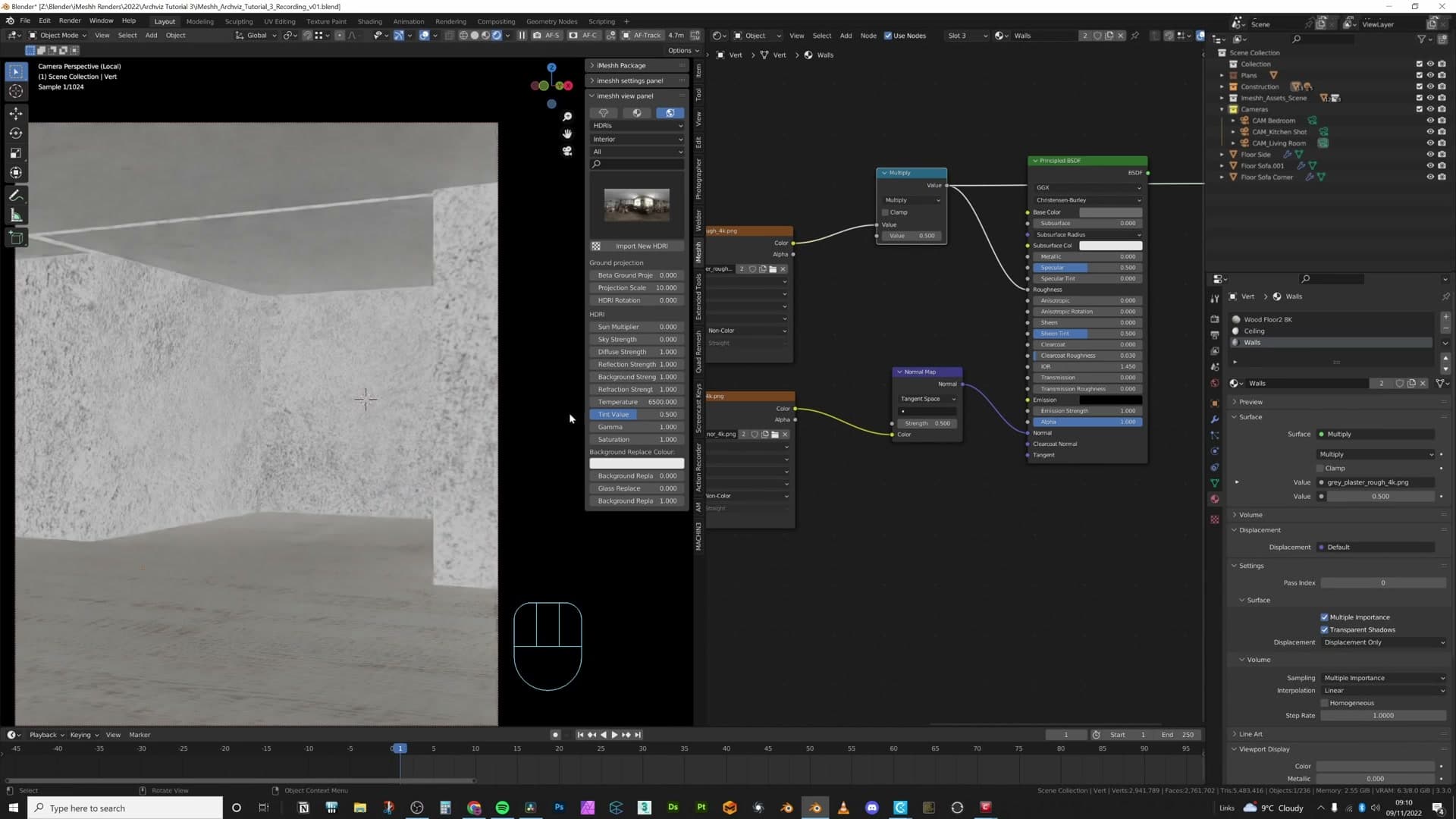
Tab into edit mode, select everything with A, press U, and pick Smart UV Project. Confirm with the defaults. Every face now has usable UVs.
To see what the tiling actually looks like, enable Node Wrangler under Edit → Preferences → Add-ons if you haven't already. Then in the shader editor you can Shift+Ctrl+click any node to preview its output straight to the surface, much faster than wiring viewer nodes by hand. Preview the roughness output first; that's the channel where banding and over-scaling show up clearest.
Out of the box the textures are far too large. You'll see giant smeary patches instead of plaster grain. Drop in a Mapping node ahead of the texture and push the Scale to roughly 20. The wall pattern shrinks down to fine micro-detail across the surface, which is exactly what you want for an ambient material.
You'll still see some diagonal banding where Smart UV gave a face an awkward orientation. The seams show as visible stripes in the roughness preview. For the worst offender, select that face on its own, unwrap it independently, and rotate the UV island so the tiling sits straight. Repeat the same scale-of-20 pass on the wall material. Don't obsess over every band: the back wall will sit behind a tall plant, the ceiling will be partially hidden by glass and lamps, and most of these surfaces never end up centred in frame.
For the wood floor the texture pack ships with a displacement map already plugged in. Disconnect it and lean on the bump output instead, since true displacement is overkill at this scene scale. View the roughness output the same way and set the Mapping Scale to around 4 so the planks read at a believable physical size. For a real client brief you'd match the plank dimensions to whatever they've specified, but for a portfolio scene the eye just needs a plausible read, and most of this floor will end up under the sofa and surrounding furniture anyway.
HDRI plus studio area lights
The HDRI (Urban Street) is desaturated to zero so it only contributes ambient bounce, and the actual shaping light comes from area lights with the new Spread parameter at ~46°, same logic as a photographer placing strobes for a furniture catalogue. The eye reads it as real.
Urban Street HDRI desaturated to zero
The world background is still the Urban Street HDRI from earlier, but it is no longer going to do the heavy lifting. For this scene you do not want any direct sunlight coming off the dome. The HDRI sits in the background purely as ambient fill.
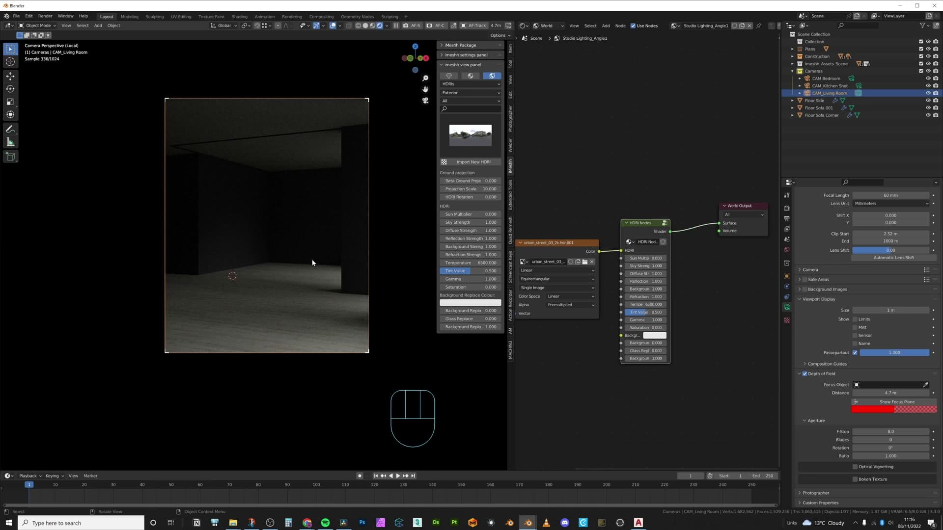
To stop it pushing colour into every surface, drop the Saturation value on the Background node down to zero. The HDRI is now effectively black and white, so the dome contributes light intensity and direction but no warmth or hue. Anything coloured in the final render has to come from the materials themselves or from the lights you place by hand.
The reason for going this route is control. The aesthetic referenced earlier in the build is a moody, photographic interior, and the cleanest way to get there is to treat the HDRI like a softbox you have switched halfway off (useful for a hint of ambient bounce through the glazing) and then build the actual lighting from scratch with area lights.
A lot of online tutorials lean on HDRIs as the only light source and convince viewers that is the only path to realism. It is not. Sun lights, the Nishita sky texture, point lights, spotlights and area lights all have their place, and getting fluent in more than one of them is what lets you choose a look rather than inheriting whatever the HDRI gives you.
Spread-46 area lights as the hero light
Add a single large area light outside the main window. Grab the orientation handle (the small dot on the light) and click on any face to aim the light at it. That is the quickest way to point the light into the room rather than fiddling with rotation values. Pull it down to roughly window height and scale it up so the emitter is a generous slab, not a pinpoint.
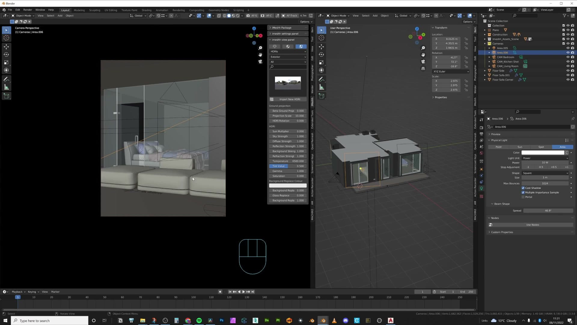
The new ingredient here is the Spread parameter on the area light. By default an area light spreads at 180°, which gives you very soft, omnidirectional fill. Fine for product shots, but it washes out the shadow structure you want in a moody interior. Drop Spread to 46° and the light immediately behaves more like a sun: sharper, more angular shadows, with the falloff staying tight as it crosses the room.
Compare values to feel what Spread is doing. At 180° there is still a hint of a hard edge near the emitter but the shadow dissipates within centimetres. At 10° the shadows become almost spotlight-hard. 46° sits in the middle: directional enough to read as sunlight angling through the glass, soft enough that the edges still feel believable.
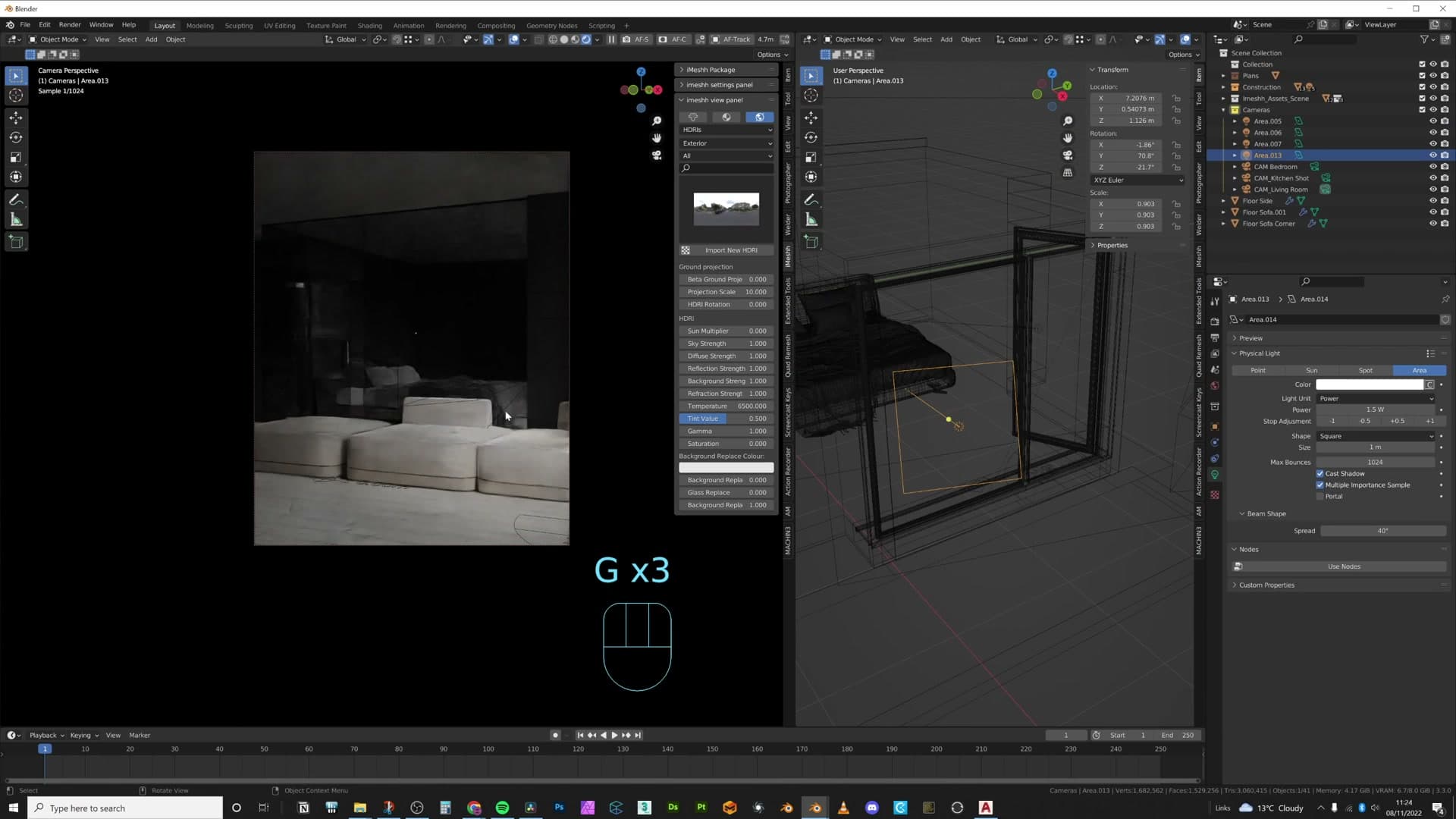
Duplicate this light with Shift+D and place the copy on the opposite side of the window so the same concentrated beam enters from a second angle. Hop into the camera view and fire a test render. Together these two area lights establish the implied direction of the sun, and from this point on every other light you add is shaping detail around that key.
Filling the bedroom and back wall
With the two key lights doing the sun work, the first test render makes the weak spots obvious: the sofa needs a touch more attention and the bedroom is reading almost black. Duplicate one of the existing area lights, shrink it slightly, drag it round to face the sofa head-on, and let that concentrated beam land on the seat back. The sofa now has a clear focal pool of light without losing the directional logic established by the keys.
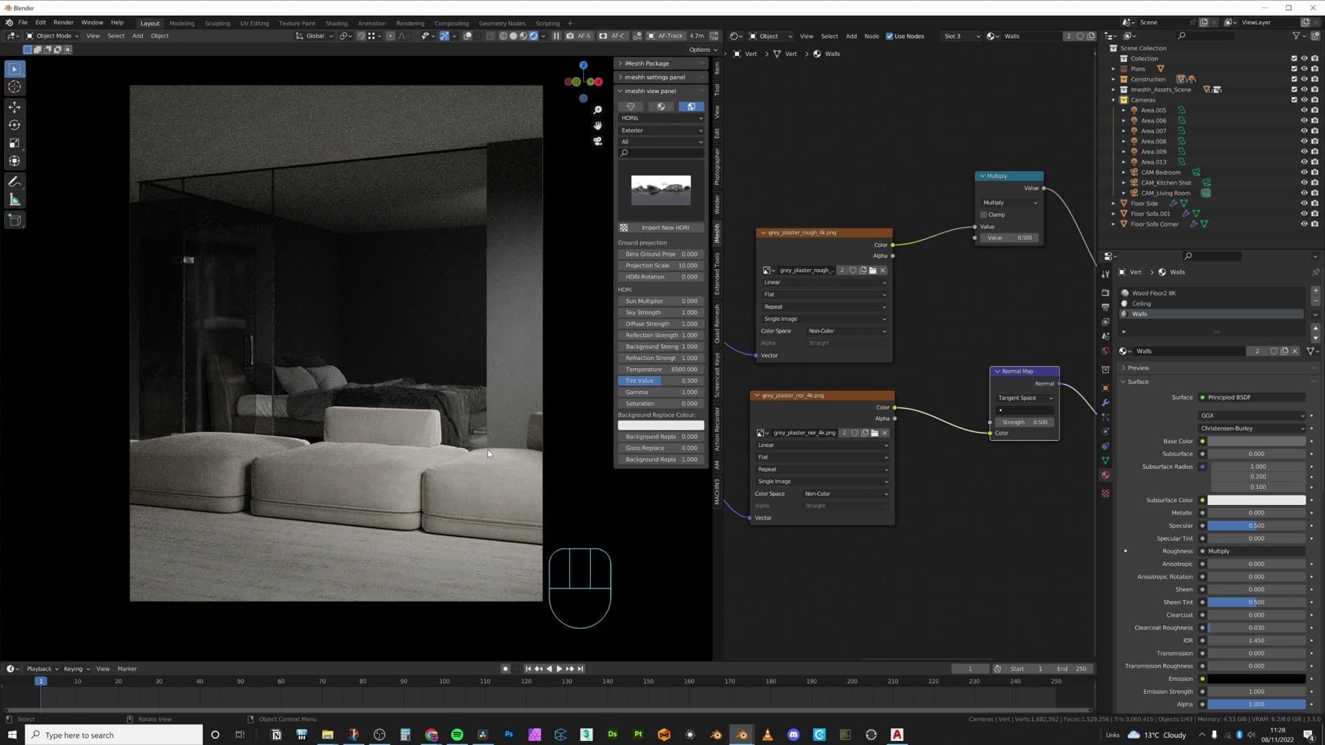
This is a good moment to flip on the viewport Denoiser. Test renders during lighting balance become a lot easier to read once the fireflies are gone, even if you turn it off again briefly to sanity-check fine detail like normal maps.
Repeat the same trick for the bed: duplicate, position behind camera, and widen the spread a touch so the cone covers more of the back of the room where the cabinetry will eventually live. Keep an eye on what the light is intersecting. If its cone clips the ceiling, check whether that ceiling is visible from camera. If it sits comfortably above the frame, treat the light purely as a beauty fill and leave it.
Finally, duplicate one more light, scale it tall so it roughly matches the glass partition, and push it brighter (a value of around 20) so it grazes the back wall. That graze is what reveals the plaster's normal map detail; if the bumps start to look exaggerated, drop the normal map strength back to around 2.5 on the wall material. A wall with a hint of variation reads as real plaster, a perfectly smooth one reads as CGI.
Coffee table, Monstera, and spotlight track
Add the coffee table (dark frosted glass top to echo the partition), drop a Monstera against the back wall to fill empty space, and build a recessed ceiling spotlight cross with IES profiles. Aim each light at a hero object: sofa edge, Monstera leaf, coffee-table corner.
Coffee table and dark-glass continuity
Before adding anything new, take a minute to tidy the outliner. Move the lights into a new collection called Lighting and colour-tag it blue, push the sofas into a Living Room collection, and drop the bed into Bedroom. Working bigger-to-smaller is the rule from here on: large hero objects first, props last.
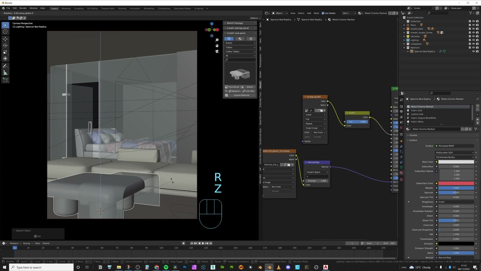
Append a coffee table from the iMesh library under Tables > Coffee Tables. Scale it down a touch and slide it into position in front of the sofa so it doesn't crowd the camera. If you're not following along on a subscription, any pre-made coffee table will work. There's no reason to model furniture by hand for archviz; that time belongs in cameras, composition, materials, and lighting.
The reason for this particular table is continuity with the partition. Its top is a dark, frosted glass that visually rhymes with the dark glass wall behind the sofa. Having two pieces of similar material in the same frame ties the composition together rather than letting each object feel like an isolated dropped-in asset.
Monstera against the back wall
There's still a noticeable empty pocket in the back of the scene. Plants are the most reliable way to fill that kind of gap. They break up flat wall area, add organic shapes against architectural lines, and read as lived-in.
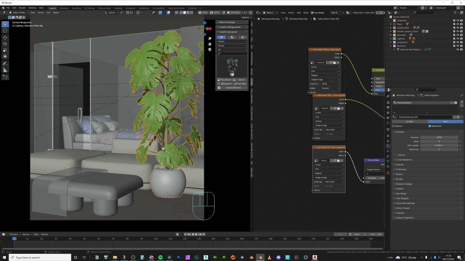
Open the iMesh plant library and append a Monstera. The asset ships with a turntable/display block underneath it, so hide that from the viewport to keep things responsive. The leaves alone are heavy enough.
Place the Monstera flush to the back wall. This particular asset was modelled to sit directly against a wall, which matters more than it sounds: a lot of plant assets you'll find online have such a wide base that you end up shoving them two metres away from anything vertical, which always looks wrong in an interior.
Compose the foliage so the leaves lead off-camera rather than crowd back into frame. That draws the eye in the direction you want it to travel. Watch the silhouette where the Monstera meets the partition; if the leaf edge runs parallel to the glass edge it reads as a coincidence, so push the plant until you get a little overlap instead.
Fire a quick preview render. You'll see immediately that the Monstera is almost pitch black. The area lights outside aren't reaching deep enough into the room to lift it. That's the cue to add some physical interior lighting in the next step.
Aimed spotlights with IES fall-off
Append an iMesh spotlight track and bring it up to the ceiling. Drop into edit mode on the track object, select the end vertices, and translate them to dial in the length you want. Make sure the housing sits completely flush against the ceiling. A millimetre of gap will read as a floating fixture once light is bouncing off it.
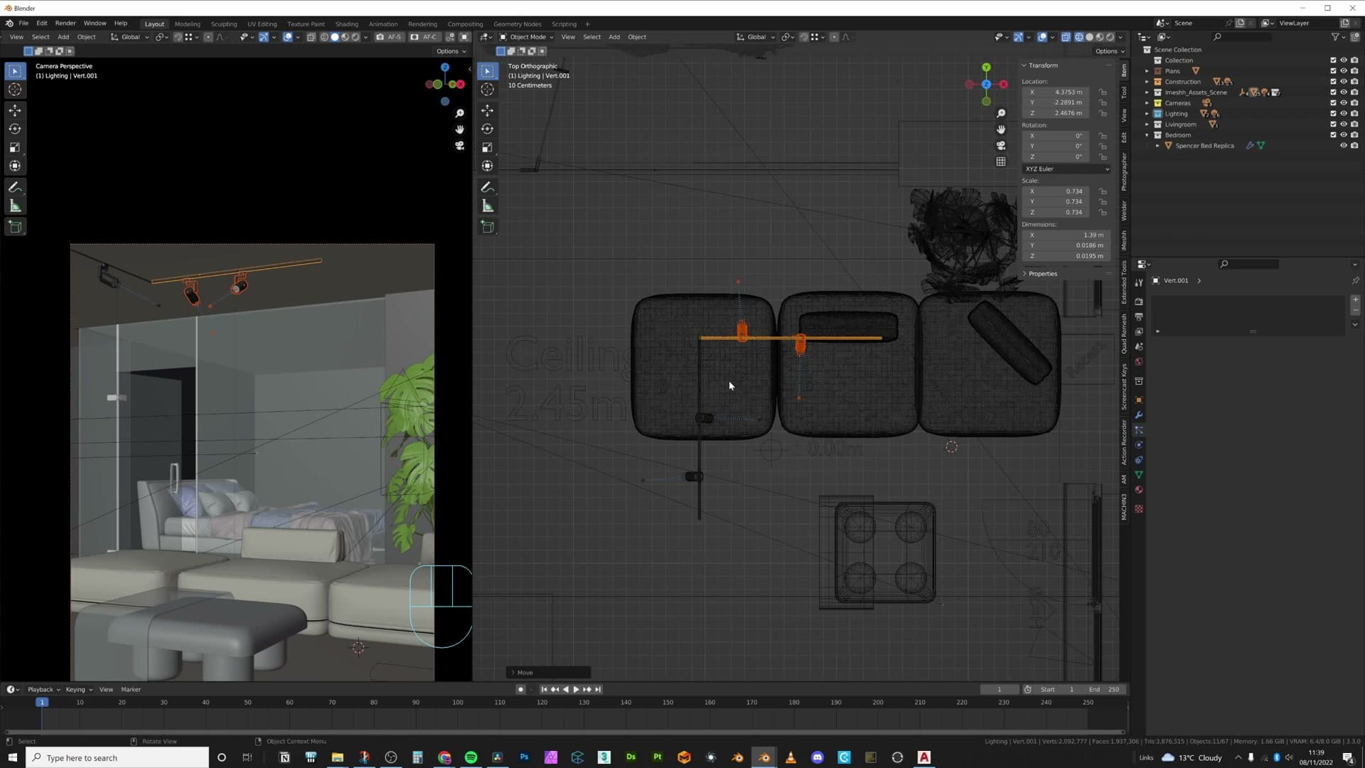
Build a cross pattern from two tracks. Duplicate the first one, rotate the second 90 degrees, and translate the end vertices so the two arms meet cleanly in the middle. This gives you four directions of light coverage from a single ceiling feature.
Recess the whole thing into the ceiling. Switch to top view, knife some quick cuts around the track footprint in the ceiling mesh, select those new faces, and extrude them up. There'll be a small join where the inset meets the housing but it won't be visible from the camera angle.
Aim each spotlight at a hero object. Point one down so its cone catches the front edge of the sofa, one onto a Monstera leaf (the reason for the whole track existing in the first place), one onto the corner of the coffee table to pick up a leading edge of light, and a fourth contributing to that same coffee-table area for fill.
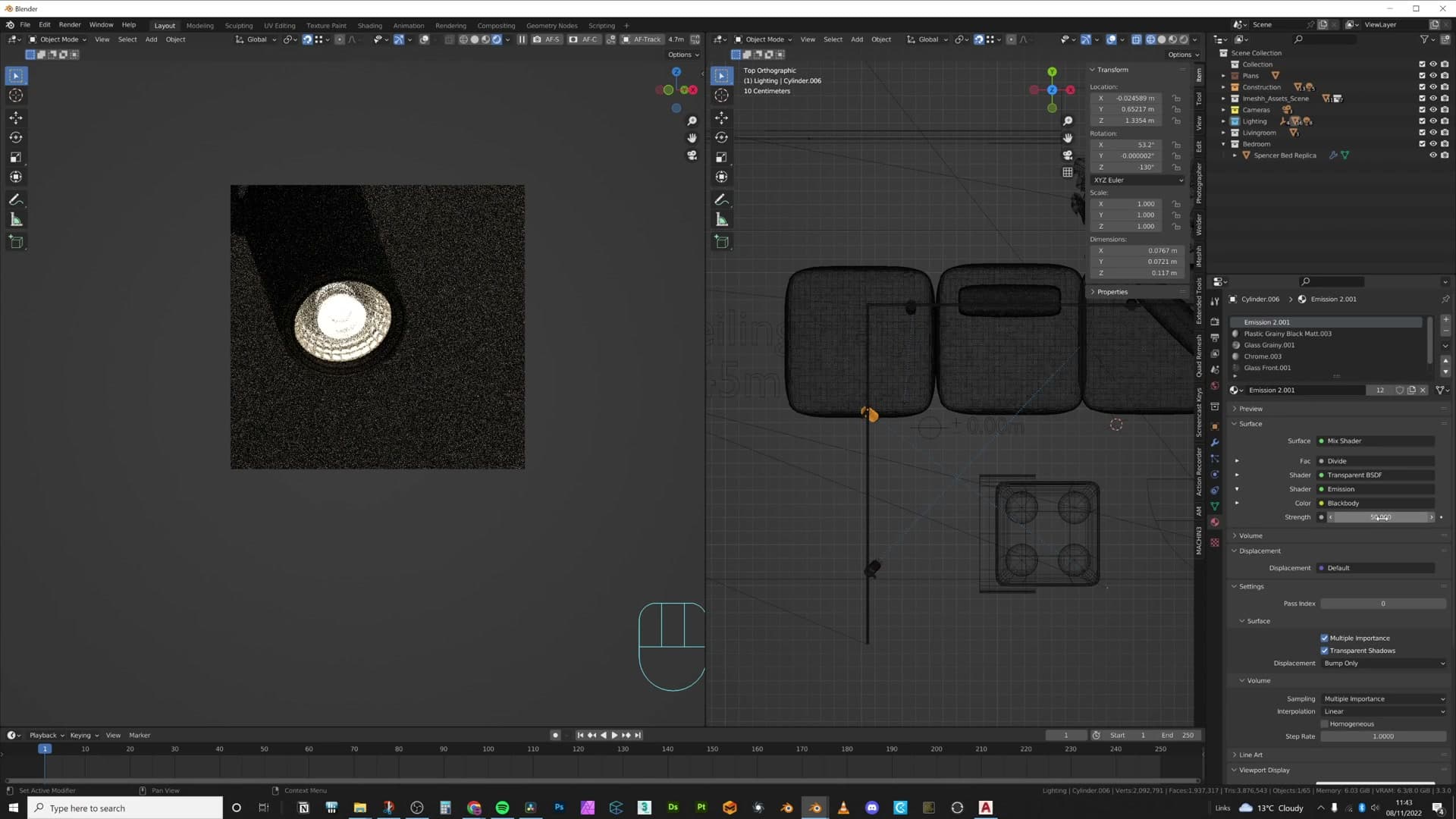
These iMesh spotlights come with an IES profile baked in, which gives you a realistic fall-off: the cone is brightest at the centre and softens at the edges, the way a real recessed spot behaves rather than a flat Blender cone. The viewport indicator lines from each light will stack up quickly once you've got four of them; toggle the indicators off to keep the viewport readable while you work.
Out of the box, the emission shader on the visible bulb is set very hot. If you leave it at the default it blows out the entire fitting, so you lose the detail of the bulb itself. A featureless white blob doesn't contribute much to realism. Dial the emission down until the bulb still reads as bright but you can still see the geometry inside the housing.
Set the colour temperature on every artificial interior light to 4800 K. That value will stay consistent for every fitting in the scene: ceiling spots, lamps, anything that's meant to be a real bulb on a real circuit. The exception is fill lights you add purely to highlight a specific object rather than to imitate a fitting; leave those as plain white so they don't read as another light source on camera.
Color and material harmony
Two cleanup moves that quietly pull everything together: desaturate and shift the Monstera's leaf hue toward yellow-grey so the green stops fighting the palette, and reassign the bed and back sofa to the same beige-fabric material the front sofa uses. Colours work in harmony when they're literally the same material.
Tweaking the Monstera leaf hue
The Monstera ships with a realistic, vivid green leaf colour, and out of the box it looks great. The problem is mood: in a warm, moody studio interior, that saturated green starts shouting over the beige sofa, the wood floor, and the rest of the palette. It doesn't fit the vibe of the scene.
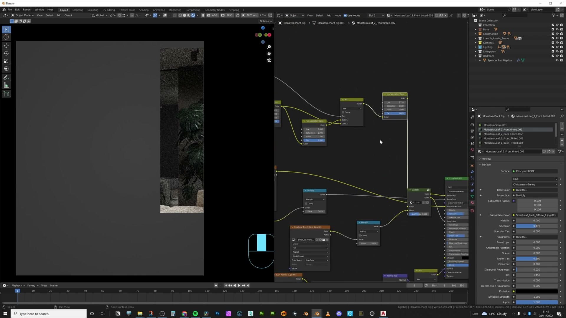
Open one of the leaf materials in the Shader Editor. The leaves are split into several material slots, so this is a per-material tweak rather than a one-shot fix. Drop a Hue Saturation Value node onto the wire feeding the Base Color input, sitting in front of the colour information, before the dust shader that lives on top.
Pull the values in three directions at once. Drop the value (brightness) so the leaf reads a little darker, drop the saturation so the green stops dominating, and nudge the hue a touch off pure green toward the room's warmer tones. The earlier render had saturation sitting around 1.0 and that was too much. Anything below that is a starting point.
Then copy the same Hue Saturation node across to every leaf material on the plant. Consistency matters here: if one leaf is desaturated and its neighbour isn't, the eye picks it up immediately.
This is a habit worth applying everywhere, not just the Monstera. Step back, look at the scene's colour swatch as a whole, and if one element is fighting the rest, tweak it. Often you don't need to swap the material. Just pull a different colour out of the one you've already got.
Reusing one fabric across sofa and bed
Same principle, bigger move. Across the scene there are three soft, upholstered pieces (the front sofa, the back sofa, and the bed) and right now they're all wearing different materials. The front sofa uses one of the iMeshh library's nicest fabrics, a beige weave that already sits beautifully against the wood floor and the warm lighting. The back sofa and bed are on something else entirely (soft leather), and the mismatch reads as visual noise.
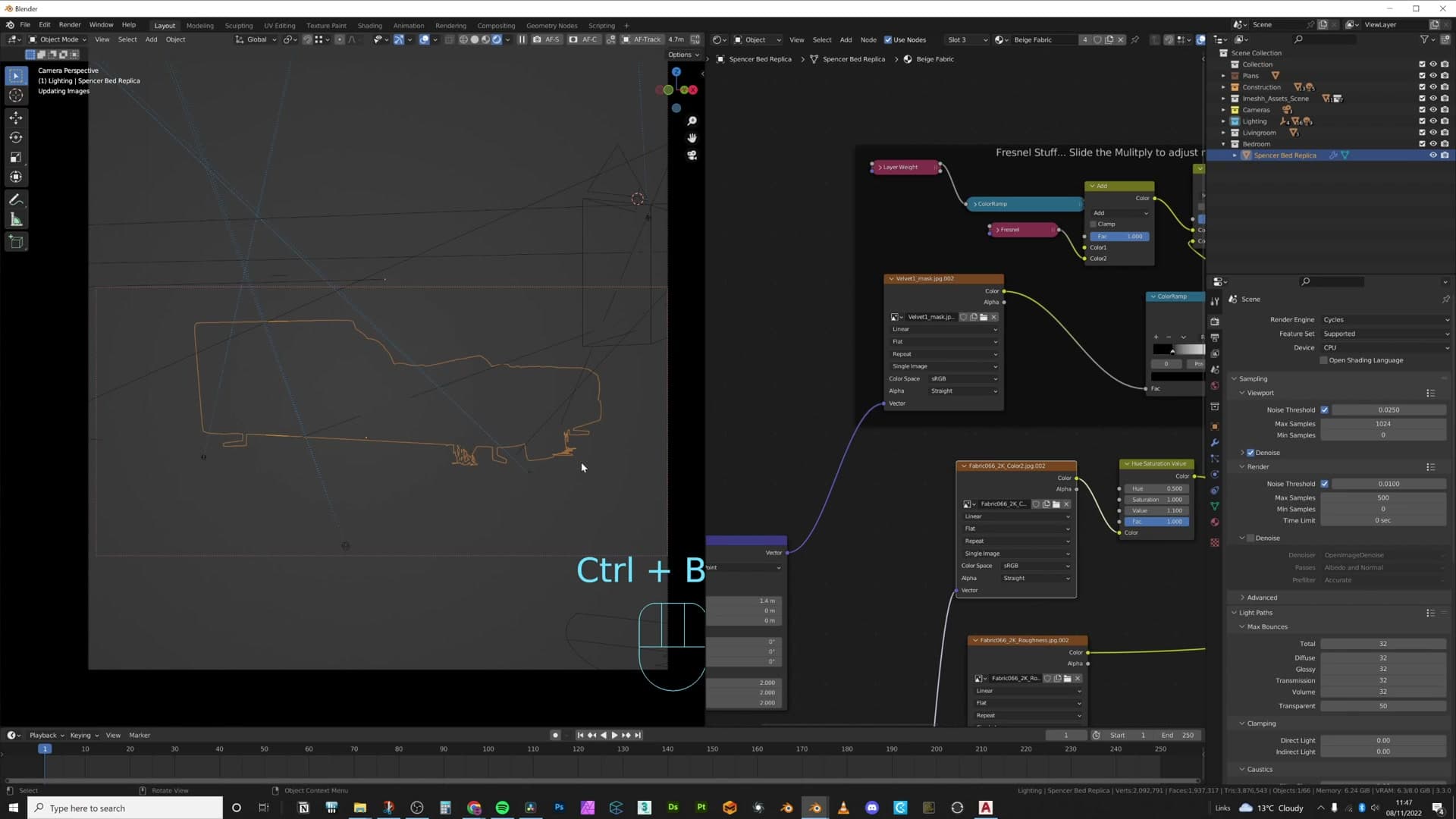
Rather than tweaking three materials to look similar, the simpler answer is to make them literally the same. Click the back sofa, open its material slot, note that it's set to Soft Leather, and remove that assignment. Then assign Beige Fabric in its place, the exact material the front sofa is using. Repeat for the bed.
Render a quick denoised preview and the three pieces now share a single tone. The back sofa lifts noticeably lighter than before, and although you could argue it's getting close to the front sofa's value, the darker pocket of the room behind it gives enough separation that the two still read as distinct objects. The bed, which previously felt like it belonged to a different room, now sits inside the same palette as everything else.
Reuse is the cheat code here. Colours work in harmony most reliably when they aren't harmonised. They're identical.
Bedroom dressing: closet, curtains, bedside details
Fill the deep wall with a clothing closet (which carries its own interior LEDs), then crumple curtains across the glass wall, drop a pampas grass for that ever-reliable beige plume, and finish with bedside candles, a tipped-over book, and an angled reading wall light so the scene reads as if someone just stepped out.
Wardrobe block with interior LEDs
The deep wall behind the bed is the easiest piece to dress, because the wardrobe asset already does the lighting for you. Drop it in, push it up to floor level, then slide it flat against the back wall so it reads as a built-in unit rather than a freestanding cabinet.
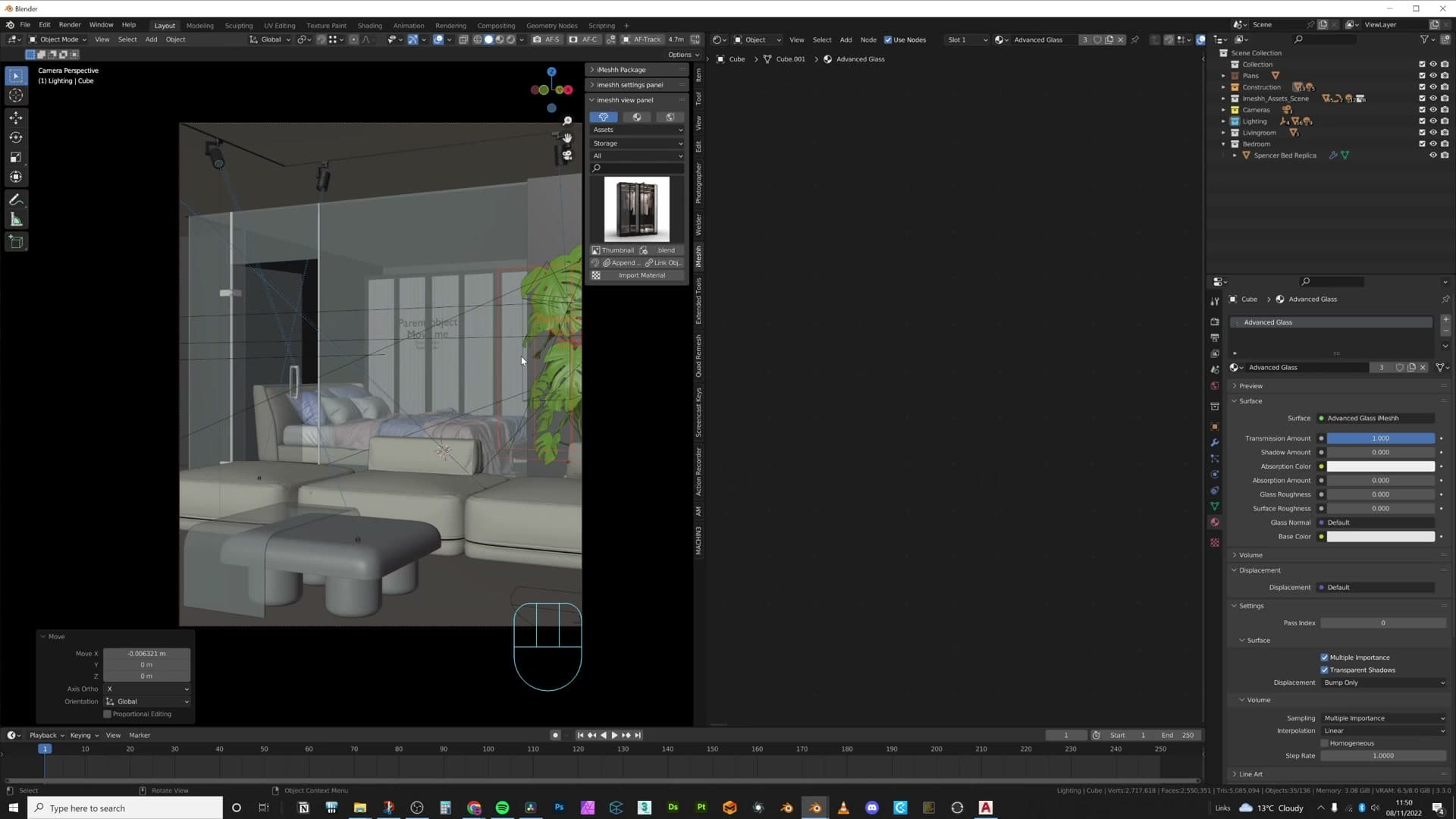
You only need one wardrobe in the library. Press Alt+D to drop a linked copy beside the original, and slide the second copy across so the pair covers the full run of the wall. The far end will clip into the side wall, which sounds untidy but never shows on camera. If you want the join perfect, shorten the second copy to fewer doors before you commit; otherwise leave it as-is and move on.
Switch to render preview and the wardrobes light themselves. The asset ships with shelf LEDs already wired inside, so you get that warm internal glow through the door gaps for free, and the area light you placed earlier in the bedroom adds a soft bounce across the door fronts. The back wall stops being a flat dark slab and starts carrying real depth.
Curtains, candles, pampas, and reading light
With the wardrobes in, switch your attention to the smaller props: a bedside cabinet, a reading light, some plants, and curtains. The curtains earn their place straight away, because this is a bedroom with glass walls and someone living here would absolutely want privacy when guests are using the rest of the studio.
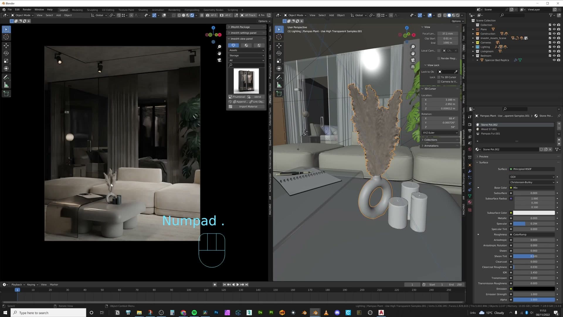
Pull a curtain in along the glass partition and crumple it a little once it lands. Curtains are forgiving in a way most assets aren't. The fabric has a lot of play in it, so you can stretch or shrink the mesh by a fair margin and it still reads as a curtain rather than as a stretched texture. Use that. A perfectly straight, evenly-spaced curtain looks like CGI; a slightly uneven one looks like somebody pulled it across last night.
On the wall above the headboard, add the soft reading light from the iMeshh library. It throws a gentle pool down onto the pillows and bedside cabinet without competing with the main studio lights. Drop a bedside cabinet beneath it with a book and a small object on top. There isn't quite enough floor space for a matching cabinet on the other side, so import a second one if you like and hide it from the render. The geometry stays in the file in case you want to widen the bed later, but it won't show in this shot.
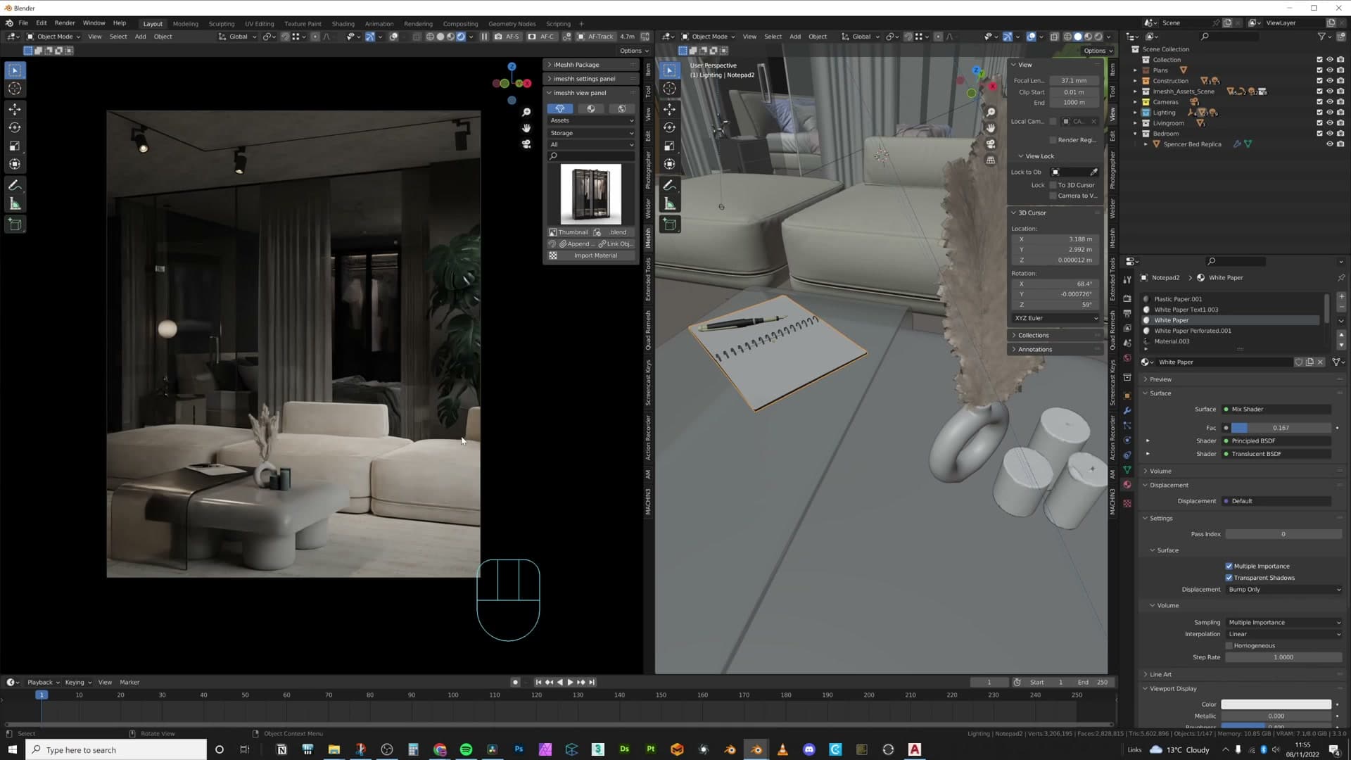
Style the bedside surface with a pampas grass, a pair of candles, and a tipped-over book. Pampas is a reliable choice: the beige plume sits in almost any palette and reads instantly as a real plant rather than a 3D filler. The candles in the library shipped a touch too dark, so push their emission colour brighter so they actually contrast with the dark wall behind them. The book is there as a storytelling cue: somebody sits here and takes notes. Angle it slightly off-square rather than aligning it to the cabinet edge. Perfectly neat props read as fake faster than anything else.
Finally, the chair under the reading light feels a bit bare, so drop a cushion onto it. Rather than modelling one from scratch, import a sofa you've already built, extract just the cushion mesh, and place it on the seat. The cushion almost certainly won't sit perfectly on the new chair, so press O to enable proportional editing, set the falloff to Smooth, and use the middle mouse wheel to scale the influence radius while you nudge vertices into place.
Kitchen scene: lighting and dressing
Drop a pendant over the dining area, hit the back wall with an outside-style area light to fake a window's gradient, and seat the cabinet under-lights at 4800K. Then dress the area: lounge chair, dining chairs (rotated slightly off-axis), a lighter wood swap on the chair frames, terracotta ceramics, pampas, and a tap rotated for context.
Pendant light and back-wall ambient
Switch the camera to the kitchen shot and the problem is immediate: it's almost black. There's no sun reaching this side of the studio, so before touching props you have to get the lighting working. Start with a pendant directly over the dining area, then deal with the back wall and the cabinet run.
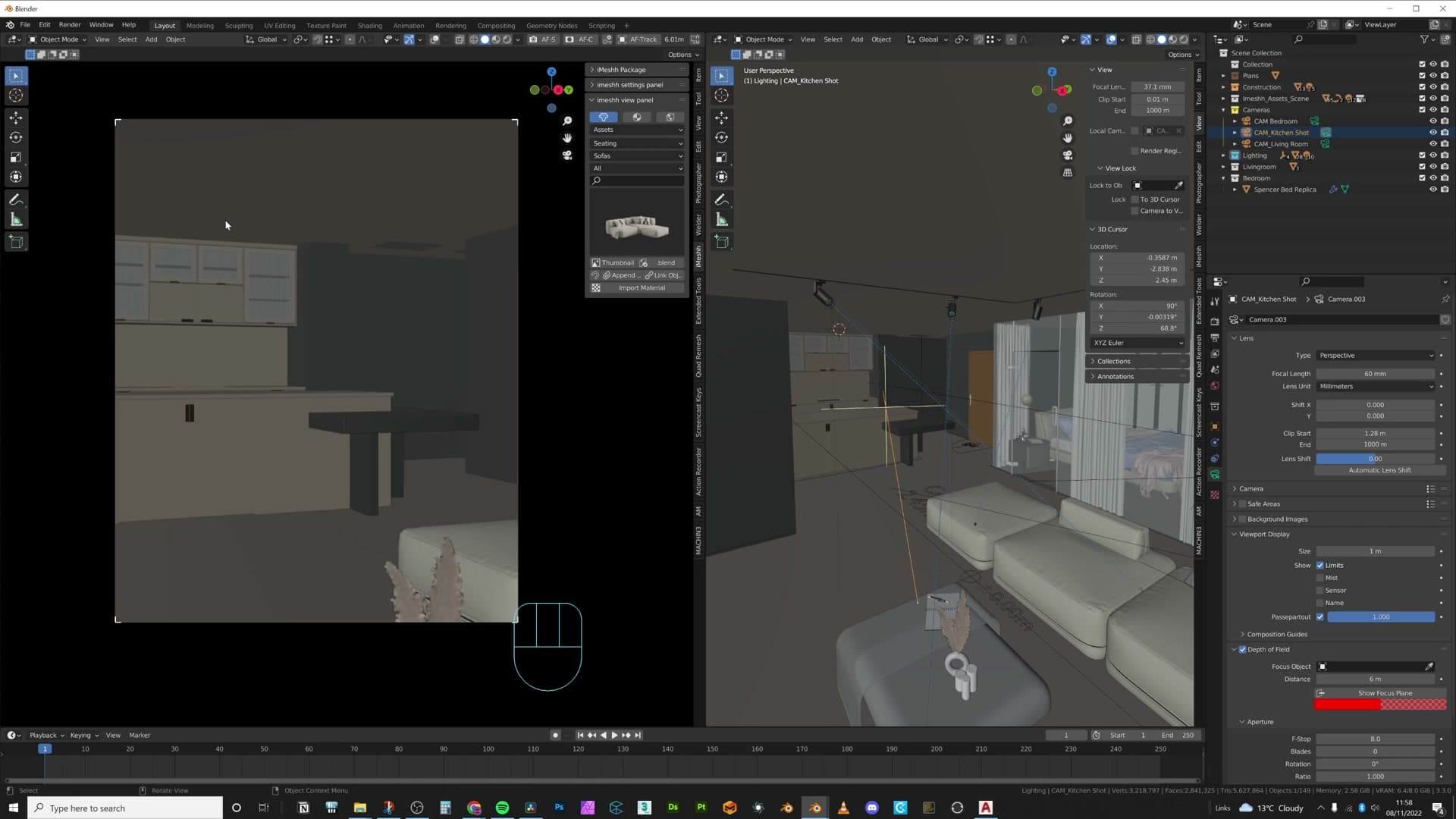
Open the iMeshh asset manager, switch to Lighting, and append a ceiling pendant. Drop it onto the ceiling so the stopper sits flush, then set the light's colour temperature to 4800K via its black body input. That gives a warm artificial cast that reads as an interior fitting, and as a bonus the pendant shows up in the reflections on the partition glass when you check the living-room camera.
The next problem is the back wall behind the kitchen: still dark. Drop in a wide-spread area light angled at the wall and lower the portals a touch. The goal isn't to invent a literal window; it's to grazing-light the wall as if the same outside direction reaching the front of the room is also reaching the back, so the wall reads as part of one space rather than a black void.
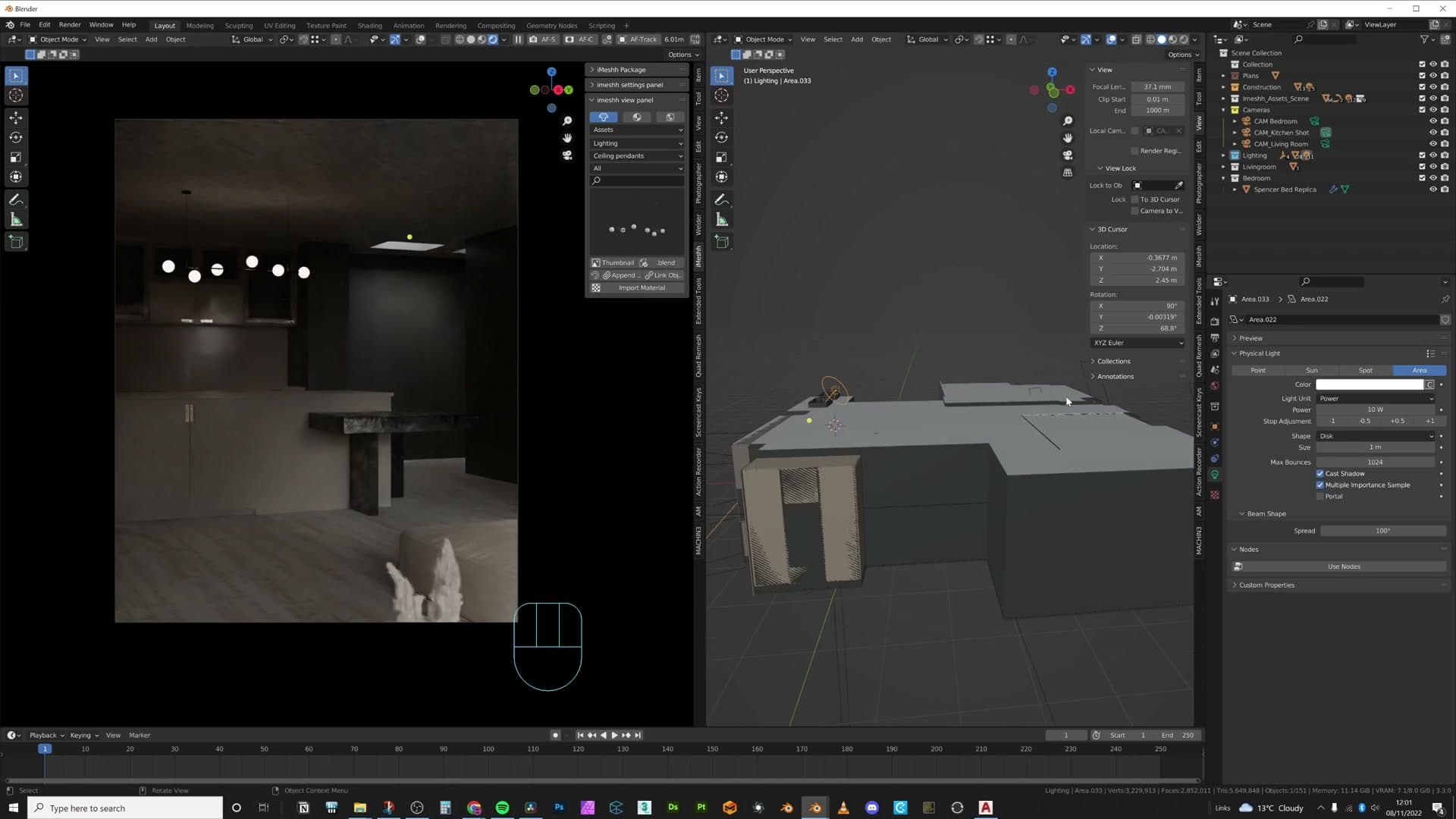
Finally, fake the cabinet LEDs. Add a slim area light under every single shelf along the kitchen run, all at 4800K black body to match the pendant. One light per shelf gives a continuous wash across the worktop and pulls detail out of the area that was sitting in shadow.
Chairs and lighter-wood material swap
Start the dressing pass with the biggest piece: a lounge chair. Append it from the iMeshh library, rotate it into position, and scale it down a touch with artistic licence. You don't need to see all of it in frame; the leading edge with the detail is what carries the silhouette into the shot.
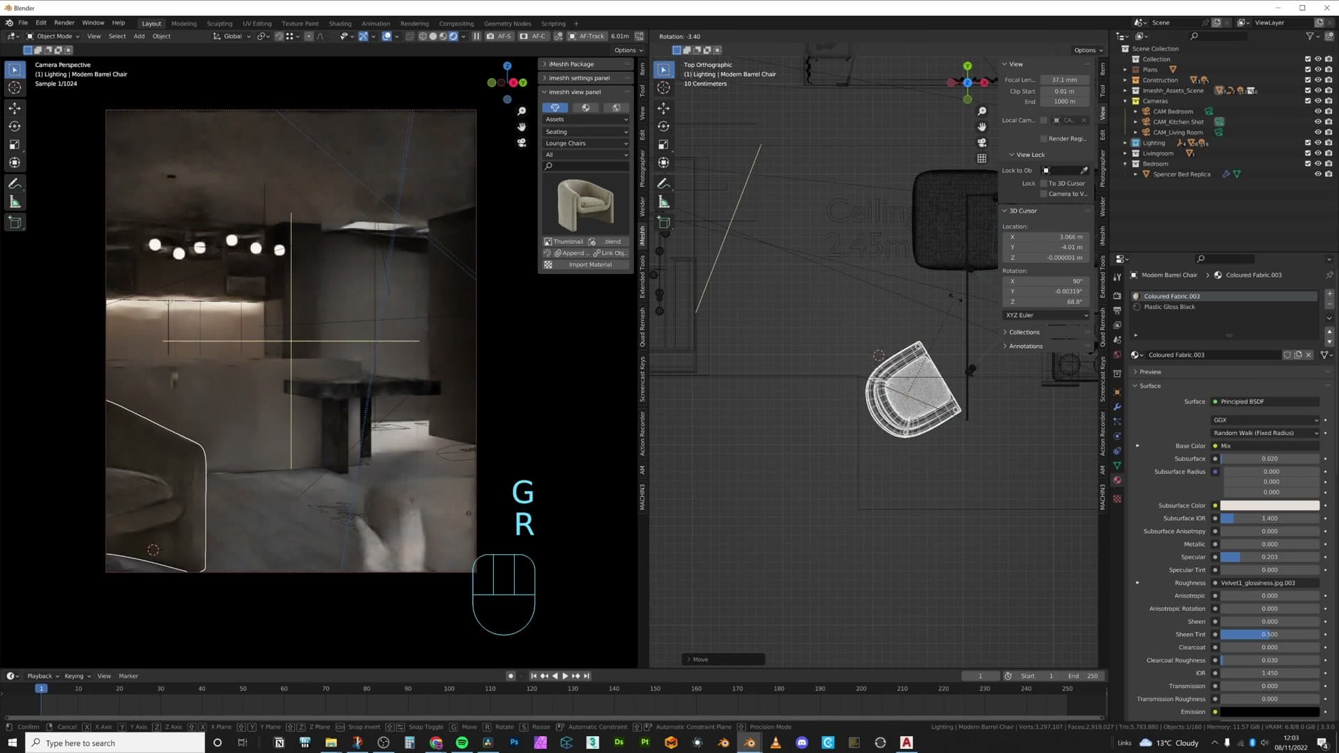
Then add a dining chair, append it, and duplicate it across the dining area with Alt+D so each instance shares a single mesh. Rotate each copy a few degrees off the room's grid before moving on.
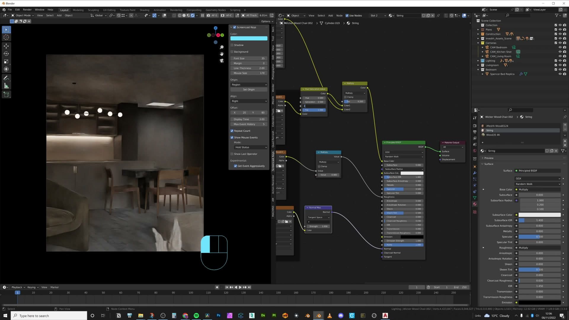
The default wood on the chair frames is reading too dark against the lighter palette in the room. Open the iMeshh asset manager, jump to Woods, and import Wood 35. Select the dark wood slot on the chair, reassign it to the new material, and the frame instantly warms up and stops fighting the rest of the scene.
The string detail on the chair seat is also pulling too much colour. Drop its saturation to 0.5 and bump the value to 2 so the string sits in the same family as the new lighter wood rather than punching through it.
Pampas, tap, and a final beauty light
With the chairs settled, dress the back of the kitchen. Fill the open shelves with plates and small terracotta ceramics, add a tap to the sink area, then bring in a recent iMeshh decoration set that shares the room's palette. Split the pieces, half on one shelf and half on the other, so the styling reads as natural rather than stacked in one spot.
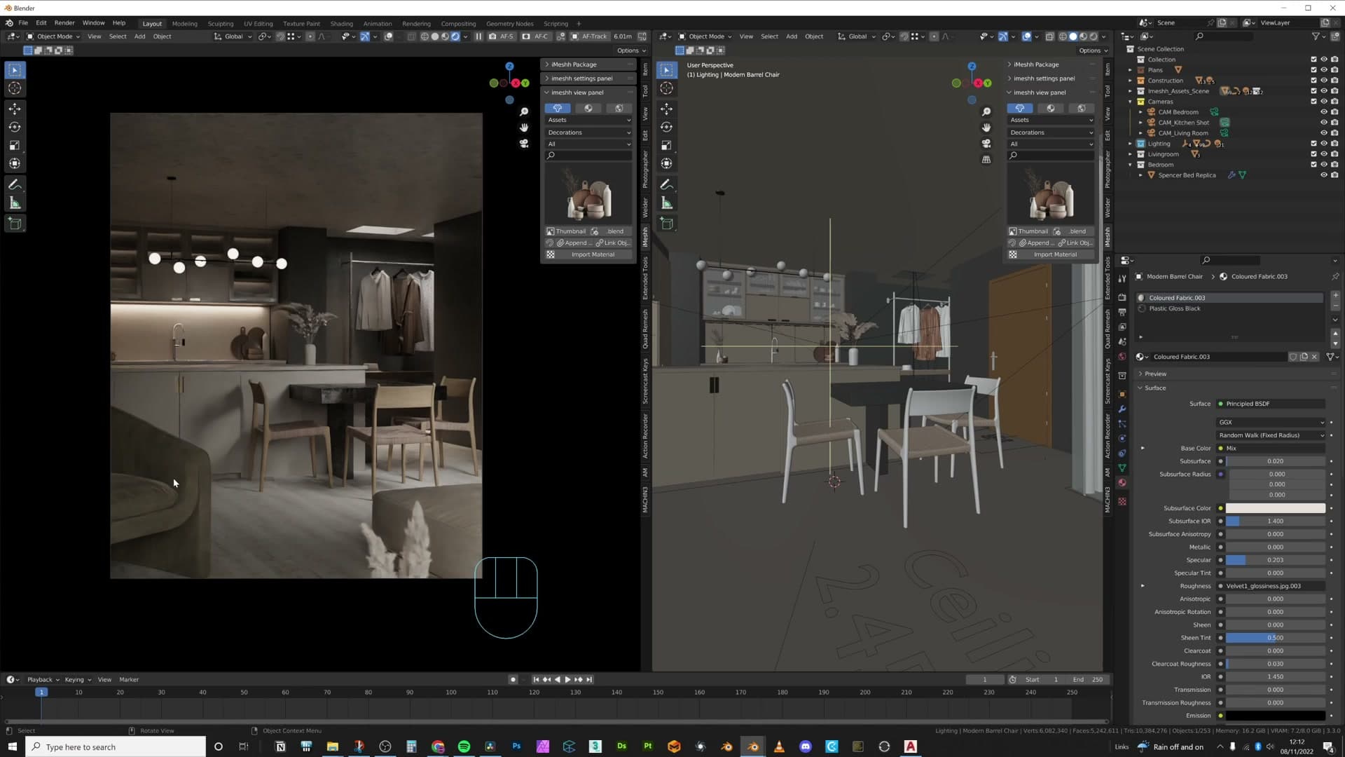
Add a second pampas grass on the shelf. Straight out of the library, the sticks and the grass were carrying too much yellow, so swap their materials to a whiter variant, and do the same for the ceramic vessel they sit in. None of these props should be pushing colour information into the scene; they're there for silhouette and texture, not hue.
One easy fix: the tap was originally rotated dead-straight to camera, which makes it almost impossible to read as a tap at all. Rotate it a few degrees so the spout reads in profile. Once the silhouette is recognisable the whole sink area makes sense.
Then the beauty light. Duplicate the back-wall area light, scale it down to 2.5, and aim it at the pampas. Drop the power to 40 so it's a focused highlight rather than another fill. If you prefer a softer falloff you can switch the light shape to a disc. It doesn't make a meaningful difference here.
Bedroom shot: coloured reflections trick
Even with the HDRI desaturated, the glass partition needs to reflect real colour from outside. A Light Path → Is Glossy Ray node mixed in the world shader lets reflection rays carry the full-saturation HDRI while everything else stays monochrome. Fully decoupled tinting. Finish the room with a carpet, kicked-off shoes, an outdoor accent plant, and wall planks.
Light Path → Is Glossy Ray for tinted reflections
The bedroom shot exposes a quiet problem: with the world HDRI fully desaturated for monochrome ambient, the glass partition has nothing colourful to reflect, so the view through it reads as a flat grey wash instead of an outdoor scene. There is no dedicated reflection-saturation slider in the World tab, but you can fake one with two nodes.
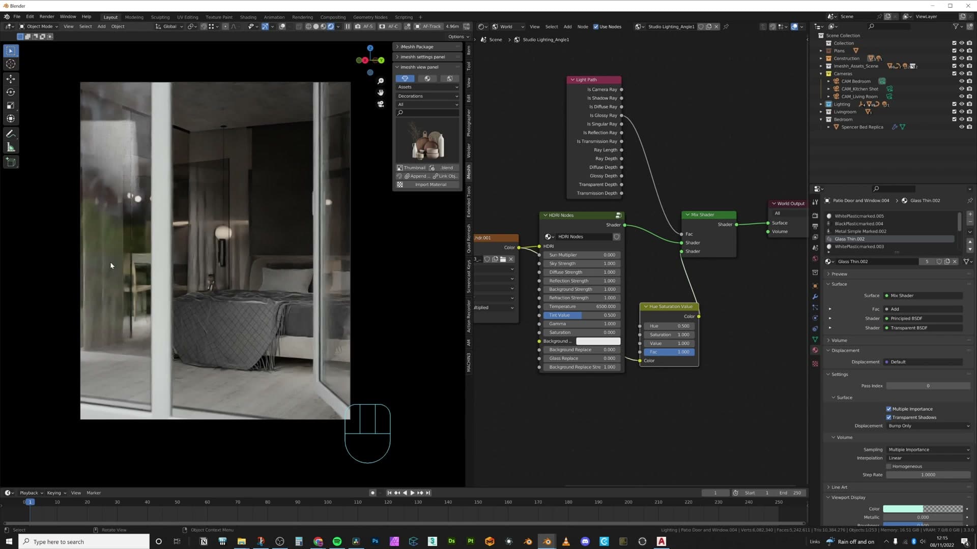
Open the World shader and drop in a Mix Shader, then add a Light Path node. Plug Is Glossy Ray into the Mix factor: the true branch carries the full-colour HDRI, the false branch carries the desaturated version that lights the rest of the scene. The result is that any reflection ray hitting the world picks up real saturation, while diffuse and camera rays still see the monochrome lighting you tuned earlier.
If the reflected greens come through too hot, drop a Hue Saturation node onto the coloured branch and pull saturation down.
Carpet, shoes, and outdoor accent plant
With the reflections sorted, the bedroom still feels too clinical. The fastest way to imply a person lives here is to stage a carpet under the bed and toss a pair of shoes onto it. Drop a carpet asset from the iMesh furniture library and position it so its edge catches the light at the foreground. Then add a pair of shoes from the clothing category.
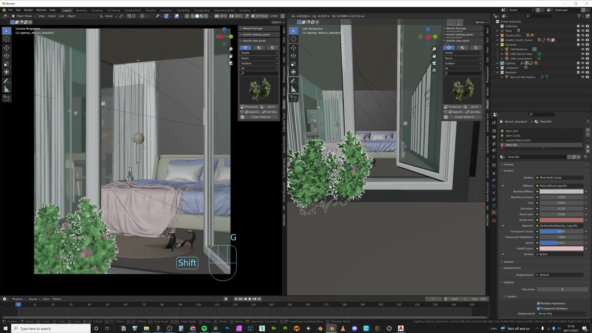
Place the shoes close together at first, then rotate one of them a few degrees off-axis so they don't read as a matched pair on display. Somebody just kicked them off on their way to bed. Nudge them so a sliver of edge faces the camera and confirm the focal point still sits where you want it: in this shot, the front of the bed and the chair beyond it.
The far corner of the frame is bare and that's where colour can do the most work, since depth of field will blur it into a soft wash. Pull an outdoor plant from Plants > Outdoor, something with warm tones to break the monochrome, and tuck it into the corner. Don't worry that the base sinks into the floor; for a portfolio render the silhouette is what matters, and an out-of-focus pot edge would just compete with the focal area.
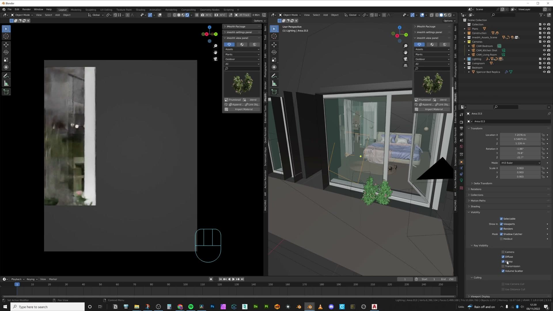
The plant comes in dark, so add a small area light angled at it as a beauty fill. Set the spread to around 40 degrees and keep the power low. You're after a clean highlight on the leaves, not a second key. Once placed you'll see the leaf glossiness pick up immediately.
One catch with that fill light: because there are already area lights nearby, the new one risks showing up as a square hotspot in any glass or glossy reflections in the scene. Select it, open Object Properties → Visibility → Ray Visibility, and untick Glossy and Transmission. The light still adds diffuse illumination but stops contaminating reflections.
Wall planks and the final ceiling-strip light
The back wall of the bedroom is still a featureless slab. You could hang artwork, but a recessed plank panel does more interesting things with the grazing light and stays consistent with the rest of the build. Add a Mesh → Cube, scale it to a flat plank, and assign it the same material as the wall so it reads as a carved-out panel rather than an applied trim. Wood works too if you'd rather break the palette.
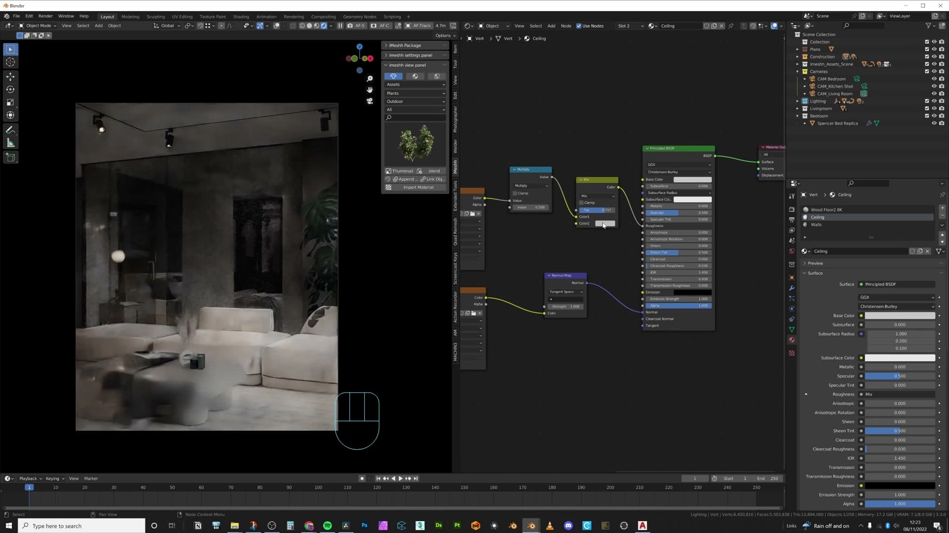
Select all geometry, U → Unwrap, and bevel the edges. The corners are too sharp out of the box. Use a small bevel width with enough segments to round the highlight cleanly. To keep the shading crisp, enable Shade Auto Smooth and turn on Harden Normals in the bevel modifier so the flat faces stay flat and only the rounded corners get smoothed. A UV scale of 5 on the mapping node ties the plank texture into the same tiling rhythm as the surrounding wall.
There's one more detail worth adding before you commit to rendering: a thin strip light tucked into the corrugated recess above the bed. It isn't load-bearing for the lighting, but the soft horizontal glow gives the ceiling something to do and reads as an architectural accent rather than dead space.
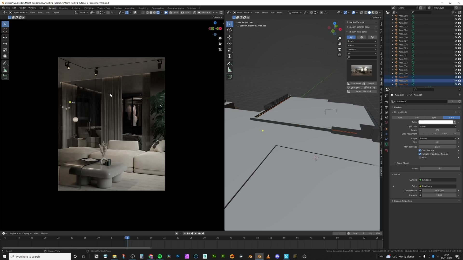
Set the emission colour temperature to 4800K. These are meant to look like real artificial fixtures, not bounce fills, so a cooler-than-tungsten white reads right. Two of the strips at the front of the recess sit on a power value of 2, which gives a gentle glow without blowing out the ceiling. The third strip runs along the back of the recess behind the corrugated panel.
That back strip is the catch. Set to the same value of 2, it disappears. The corrugation absorbs and scatters so much of the emission that the perceived brightness drops well below the others, breaking the illusion of a continuous run. Boost it to 10 and the light reads as evenly bright along the whole length, even though it's pushing five times the power. That continuity is what makes the strip feel architectural rather than added in post.
Render settings: VRAM, samples, and light paths
How to fit a furnished interior in 8GB VRAM: Simplify → Texture Limit at 2K, then strip glossy and normal maps off any asset hiding behind glass. Then production-quality settings: render at 200% scale to feed the denoiser, 1% noise threshold, 4096 max samples, Light Paths bumped to 32 (Transparent 50 for pampas), and Persistent Data on for camera-to-camera reuse.
VRAM strategy: Simplify, Texture Limit, stripping maps
Once the scene is dressed and lit, the next constraint is VRAM. Cycles GPU rendering loads every texture into the graphics card's memory, and a furnished interior (sofas, wardrobes, plants, kitchen units) burns through 8GB faster than most people expect. That's the card sitting in the average enthusiast machine, and it's what these settings are pitched at.
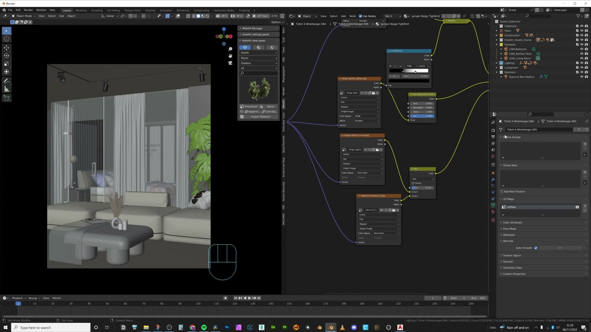
Your single biggest win lives in Render Properties → Simplify. Tick the box and set Texture Limit to 2K. That caps every texture in the scene at 2048px regardless of what's on disk. In testing, 2K and 4K were visually indistinguishable in the final output, and that's not a coincidence. The final render is roughly 2K wide, so a 2K texture covering a sofa is already close to one-to-one pixel density. Anything more is data the camera will never resolve. The wood floor is the one place a 4K texture would have added a touch more sharpness; everywhere else, 2K is invisible savings.
The other lever is the textures themselves. Look at any asset hiding behind one or two layers of glass (the wardrobes filled with clothing, the items inside the cabinet) and ask what the camera will actually pick up. The answer is almost always the diffuse colour and nothing else. Roughness, normal, clear-coat, and any second principled shader can come straight off the node tree. Set a sensible single roughness value, leave the diffuse plugged in, and you're done; the asset still reads correctly through the glass at distance, and you've clawed back a meaningful chunk of VRAM per object. Walk through every background asset doing this.
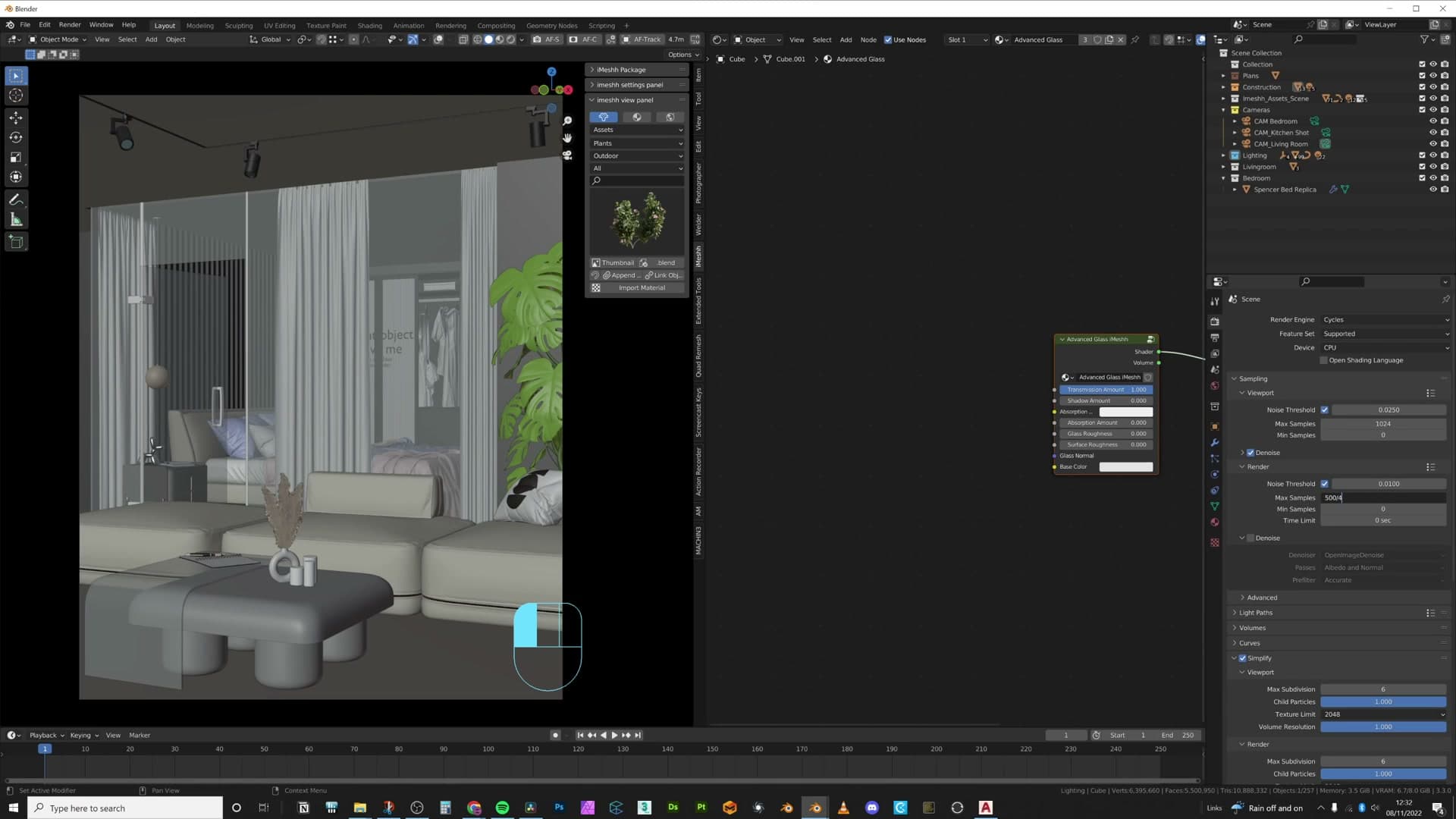
If you're coming from Corona or V-Ray on CPU, this whole conversation will feel alien. CPU renderers reach into system RAM, which is comfortably 64 to 128GB on a decent workstation, and you don't really plan around it. You throw everything at the renderer and let it cope. Cycles on GPU pushes the optimisation work back into your scene, and Simplify plus shader pruning are how you make it fit.
200% resolution and a 4096-sample noise threshold
Resolution Scale is set to 200%. Higher-resolution renders feed the denoiser more pixels to work with, and the denoising models themselves are trained on larger images. They simply perform better the more data they're given. The trade-off is sample count: doubling X and Y quadruples the pixel count, so you can divide your samples by four and still land at the same quality bar. For this render, though, samples are going up, not down.
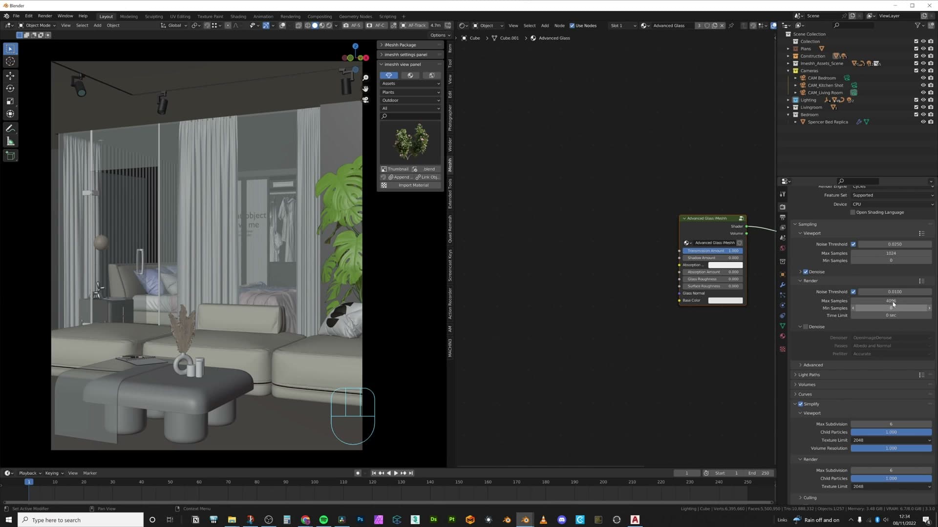
Max samples sit at 4096 with a noise threshold of 0.01, which is 1% remaining noise per region. Cycles renders adaptively, so a flat white area like a table top might hit the threshold in a few hundred samples and stop, while the pampas grass keeps grinding away at the cap. The 4096 ceiling is high on purpose: this is a production render, not a turntable, and there is no point asking the denoiser to clean up what longer rendering would have resolved properly.
Denoisers are AI-trained and they make mistakes. They happily smudge out fine surface detail that the renderer worked hard to produce. The goal is to give the denoiser as little work as possible. If a render needs three or four hours, queue it before bed rather than cutting samples; you'll wake up to a clean image at full quality. The Cycles denoise checkbox in Render Properties is therefore off here, and denoising is moved into the compositor instead. A Denoise node feeding into a Mix node alongside the noisy render lets you dial the strength after the fact. Around 0.75 on that mix tends to land in a good place, enough cleanup to kill the worst noise without flattening genuine detail.
Light paths, clamping, Blackman-Harris filter
Under Light Paths, all four bounce categories (Diffuse, Glossy, Transmission, and Volume) are set to 32. Transparent is bumped higher, to 50. That higher Transparent value is specifically for the pampas grass: each plume is built from dozens of overlapping transparent planes, and rays need enough bounces to pass through all of them. Push Transparent too low and the pampas turns black in the render. If your scene doesn't have a similarly dense transparent asset, you can safely leave Transparent at its default.
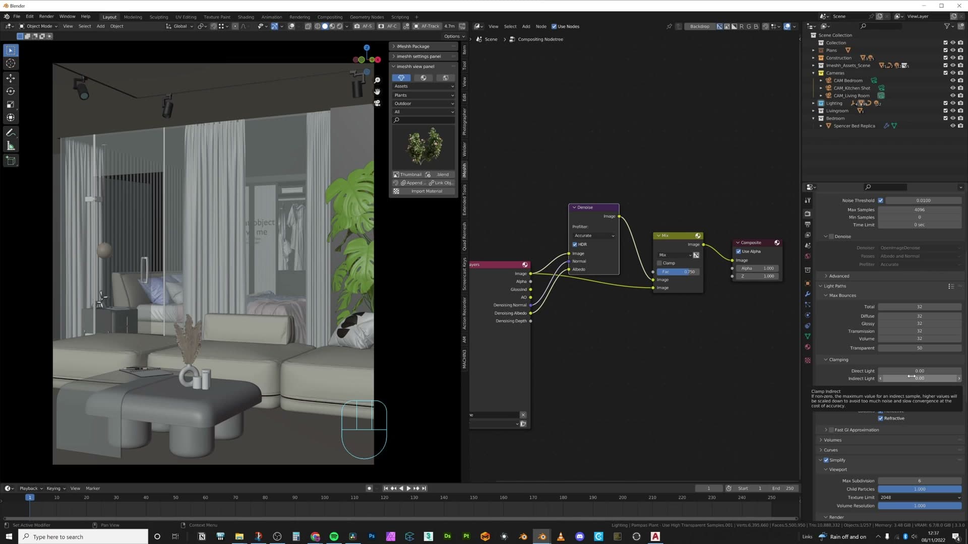
A common misconception worth clearing up: Transparent bounces are independent of the Total bounce count. Setting Transparent to 50 while the rest sit at 32 does not silently cap Transparent at 32. The two are tracked separately. Push Transparent as high as you genuinely need it.
Clamping for indirect and direct light is set to 0, no clamp at all. Clamping is a noise-reduction shortcut that artificially reduces high-energy light samples, and the cost is that lighting starts to feel slightly off, less physically honest. With samples maxed at 4096, fireflies usually resolve themselves cleanly without intervention. If you are seeing persistent fireflies and don't have the patience to let samples do their job, a clamp of around 10 is a reasonable middle ground that preserves most of the light's energy.
Under Film, the Blackman-Harris pixel filter is set to 1.1. Lower filter widths produce a sharper image, with the trade-off that hard high-contrast edges (a bright window against a dark frame, for example) can start to alias and look jagged. For interior archviz the sharpness is usually worth it; if you spot aliasing in test crops, push the value back up.
Persistent Data, passes, and collection cleanup
Persistent Data is enabled. When Cycles renders camera A, then camera B, then camera C in sequence, it normally rebuilds the BVH and shader graphs from scratch for each frame. With Persistent Data on, those calculations are held in memory between frames and reused. For a multi-camera batch where most of the geometry is shared, that's a meaningful time saving.
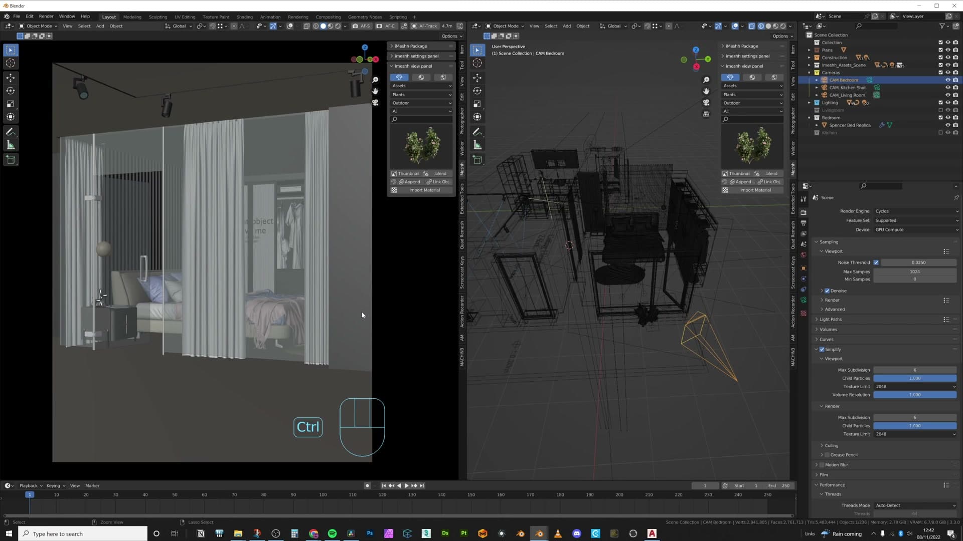
View Transform stays on Filmic, and the indirect glossy pass is enabled alongside the default Combined output so it can be mixed back in during compositing if needed. Light Groups are skipped in this tutorial (they live on individual lights and let you render each contribution as its own pass for finer compositor control) but they're worth knowing about for more involved post workflows.
The last step before hitting Render is collection cleanup. Each camera in the scene only sees part of the apartment: the kitchen camera will never see the living-room sofa, and vice versa. Select every object that's only visible from one camera, move it into a named collection (Kitchen, Living Room, Bedroom) and toggle off the collections that aren't relevant to the current render. The on-screen result is identical, but Cycles stops loading and processing geometry it doesn't need, and VRAM gets some breathing room.
You could push this further by binding cameras to separate scenes and rendering the lot as an animation, and that's a perfectly valid workflow. For three cameras, though, it's just as fast to set each one up by hand, toggle the unused collections off, and hit Render. When each render finishes, save it out via File → Save As as a 16-bit TIFF. That preserves the full tonal range coming out of Cycles and gives Camera Raw the data it needs for the post-processing stage.
Post-production in Photoshop Camera Raw
Save the render as 16-bit TIFF, drop it into Photoshop as a Smart Object, and run it through Camera Raw with the layer kept editable. The workflow: a Denoise node mixed at 0.75 in the compositor, then curves to lift the blacks Instagram-style, brushed exposure into focal areas, sharpening, the colour mixer for the green leaves, a soft vignette, and stock lens-flare PNGs in Screen mode for glare Cycles can't natively produce.
16-bit TIFF and Smart Object workflow
Before leaving Blender, set the compositor up properly. Enable a Denoise node, leave its Prefilter on Accurate, and keep the HDR option on so the denoiser keeps as much information as possible. Plug the render output through that node and save the final frame as a 16-bit TIFF. That bit depth is what gives Camera Raw the room to push the curves later without banding the gradients.
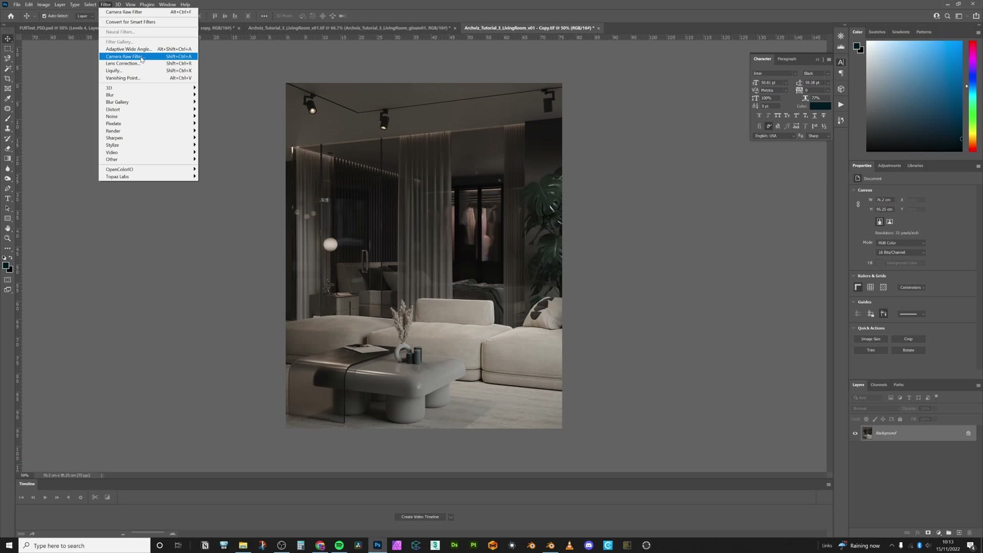
Open Photoshop and drag the TIFF onto a new document. By default it lands as a flat Background layer; right-click it and convert it to a Smart Object. This is the single most important step in the whole post-production stage. Once the layer is a Smart Object, any Camera Raw filter you apply is stored alongside it, so you can re-open the file days later and tweak the curve, the brushes, the vignette, anything, without losing fidelity. Apply Camera Raw to a flat layer and every edit gets baked into the pixels.
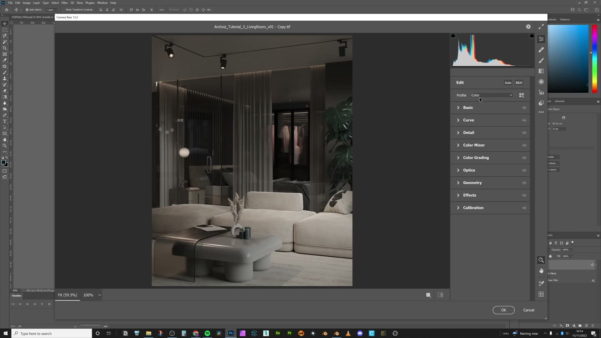
Photoshop is what you'll see throughout this section, but the same approach works in Affinity Photo if you'd rather not pay the subscription. The tools sit in roughly the same panels and most of the edits below translate one-for-one.
Curves and adjustment-brush exposure painting
Open Filter → Camera Raw Filter. In the Basic panel, leave most sliders alone. Knock the exposure down just a touch (you'll brush light back in shortly), nudge contrast up a hair, and pull vibrance down a fraction. Most of the heavy lifting happens in the curves, not here.
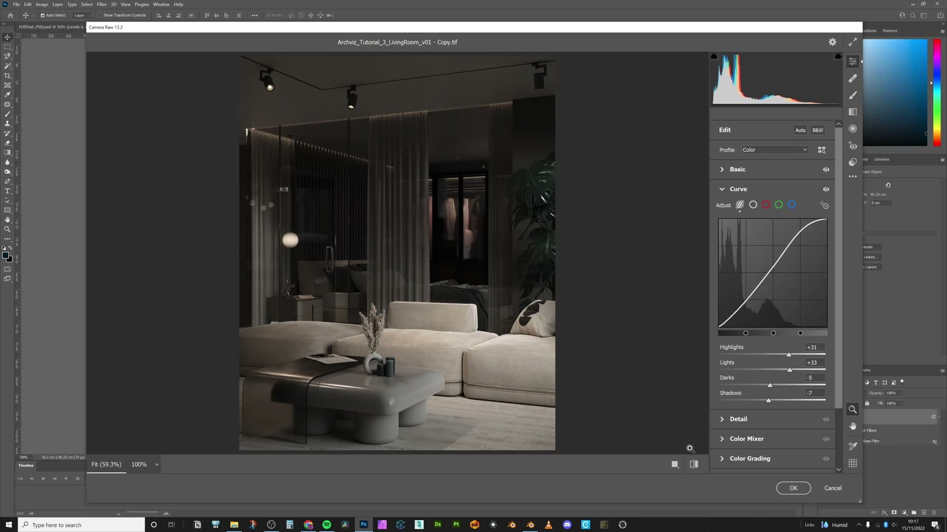
Open the Curves panel and look at the histogram. For a moody interior almost all of the data sits in the shadow half of the graph, with very little in the highlights. That tells you two things at once: pulling the shadow end around will make big visible changes, and you have headroom at the top to lift the highlights without losing detail. Bring the highlights up so the lights themselves pop, then ease the darks and blacks down to deepen the rest of the image.
The room will now be too black overall. Fix that selectively rather than globally. Pick up the adjustment brush, set exposure to a positive value, and paint light back into the focal areas: the corner of the sofa, the bed-side, the pampas. Each new region needs to start as a fresh brush pin so you can tune those areas independently afterwards. Right-click in an empty space to start a new pin instead of adding to the previous one.
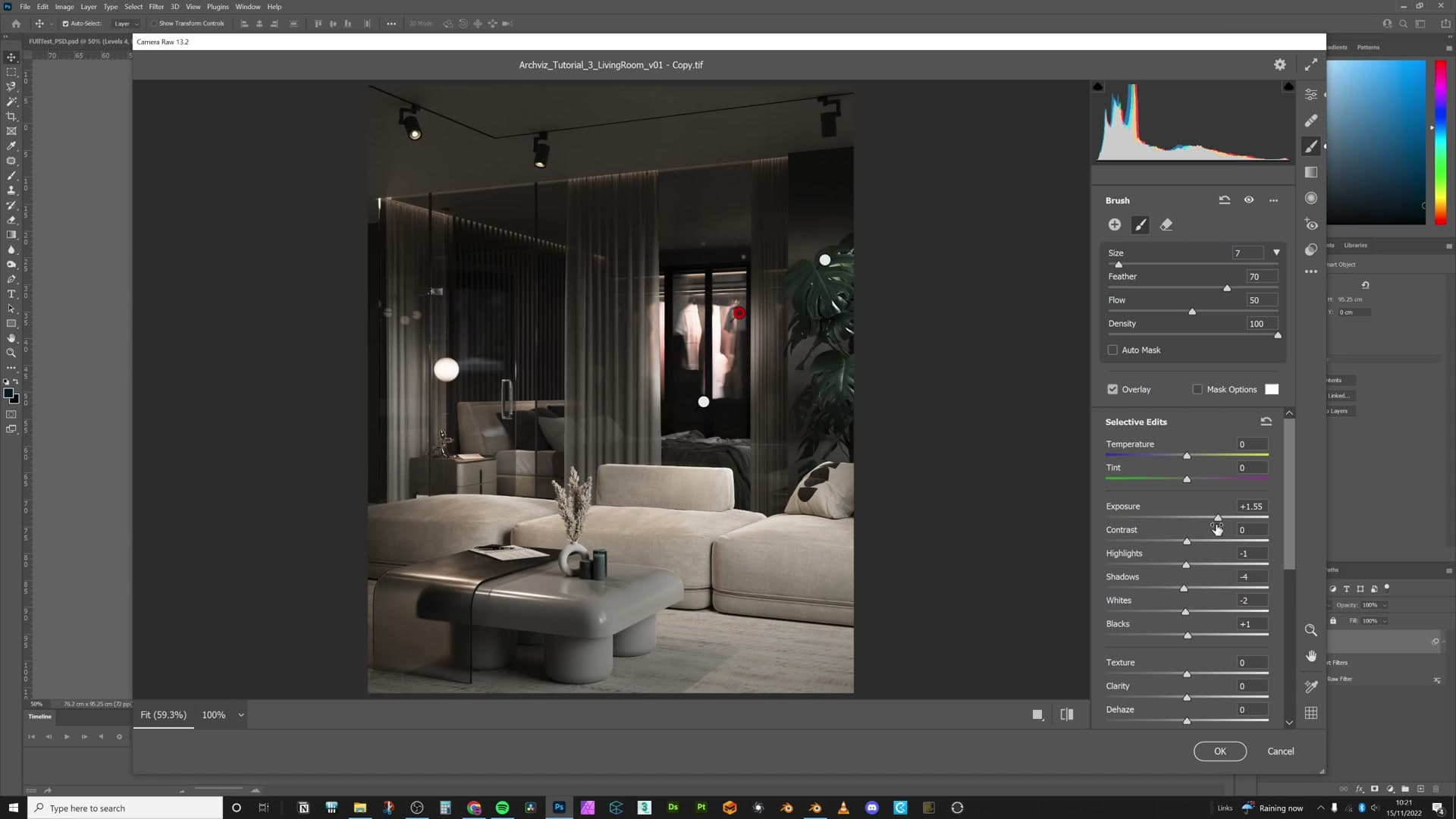
If something in the image is the wrong colour (red light bouncing off curtains in an otherwise neutral palette, for example) start another brush, paint over the offending area, then drag exposure back to zero, shift the hue slightly toward the lights themselves, and pull saturation down. The redness disappears without affecting anything else in the picture.
Finish by clicking on whichever brush region is still too dark and lifting its shadows slider. Particularly useful when the curves have crushed the deepest blacks past the point where you can read detail. This kind of recovery only works because the source is a 16-bit TIFF; an 8-bit JPEG would have nothing left to pull back.
Sharpening, colour mixer, and vignette
Sharpen against an area that's actually in focus. If you tune the slider while looking at out-of-focus geometry, you'll always push it too far. Zoom into the pampas (or whatever sits on the focal plane in your scene) and raise sharpening to around 36. Enough to define the edges, not so much that it looks crispy or starts hurting the eye.
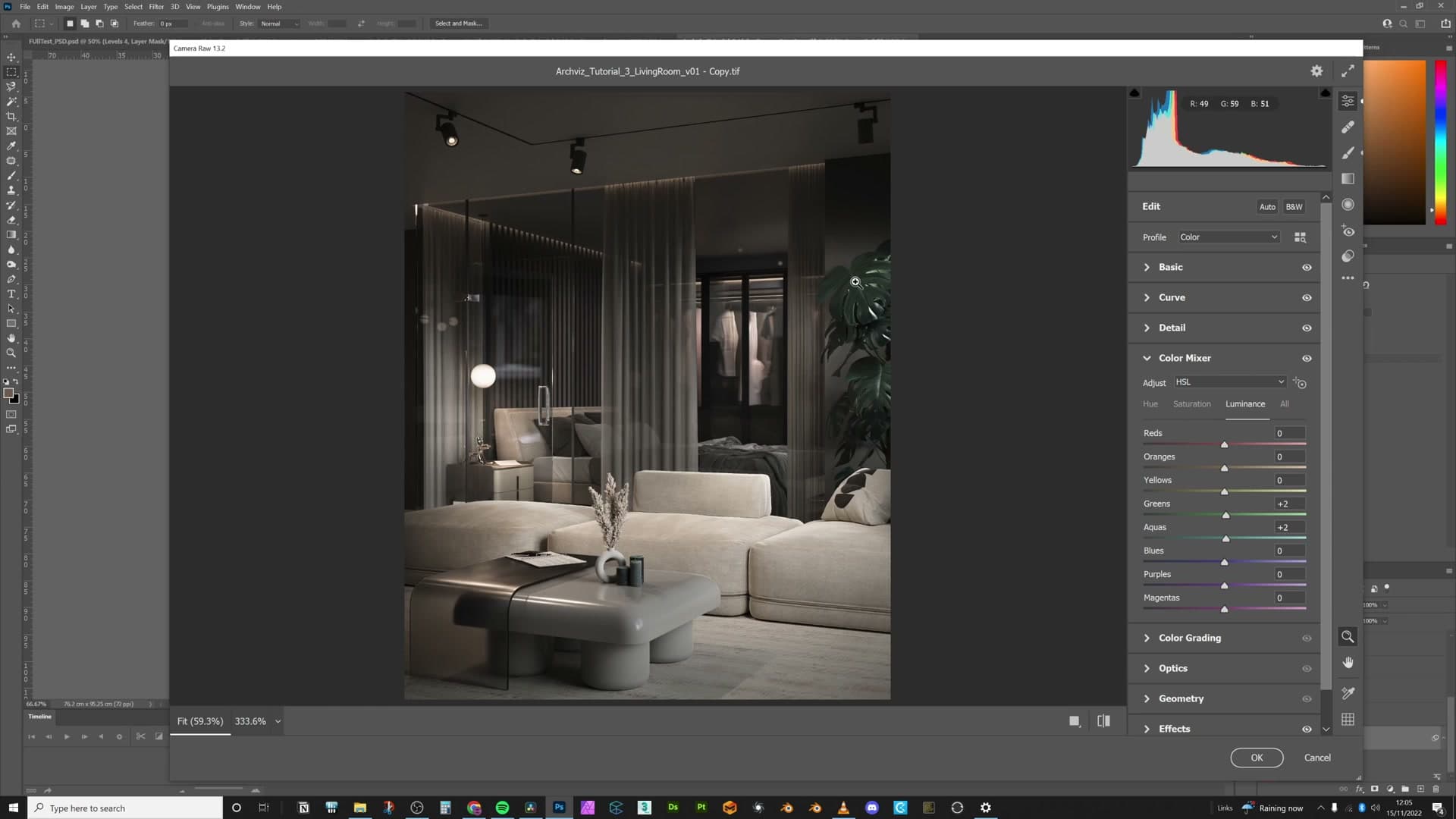
Move to the Colour Mixer. The targeted-adjustment button is the workflow here: click it, click on a green leaf inside the image, then drag. Drag up or down for luminance; pull saturation down a little so the Monstera leaves don't shout against the otherwise neutral palette; and shift hue toward the warmer end so the greens lean yellow-grey rather than fluorescent. The change is subtle (these greens weren't very saturated to begin with) but it ties the plant in with the rest of the room.
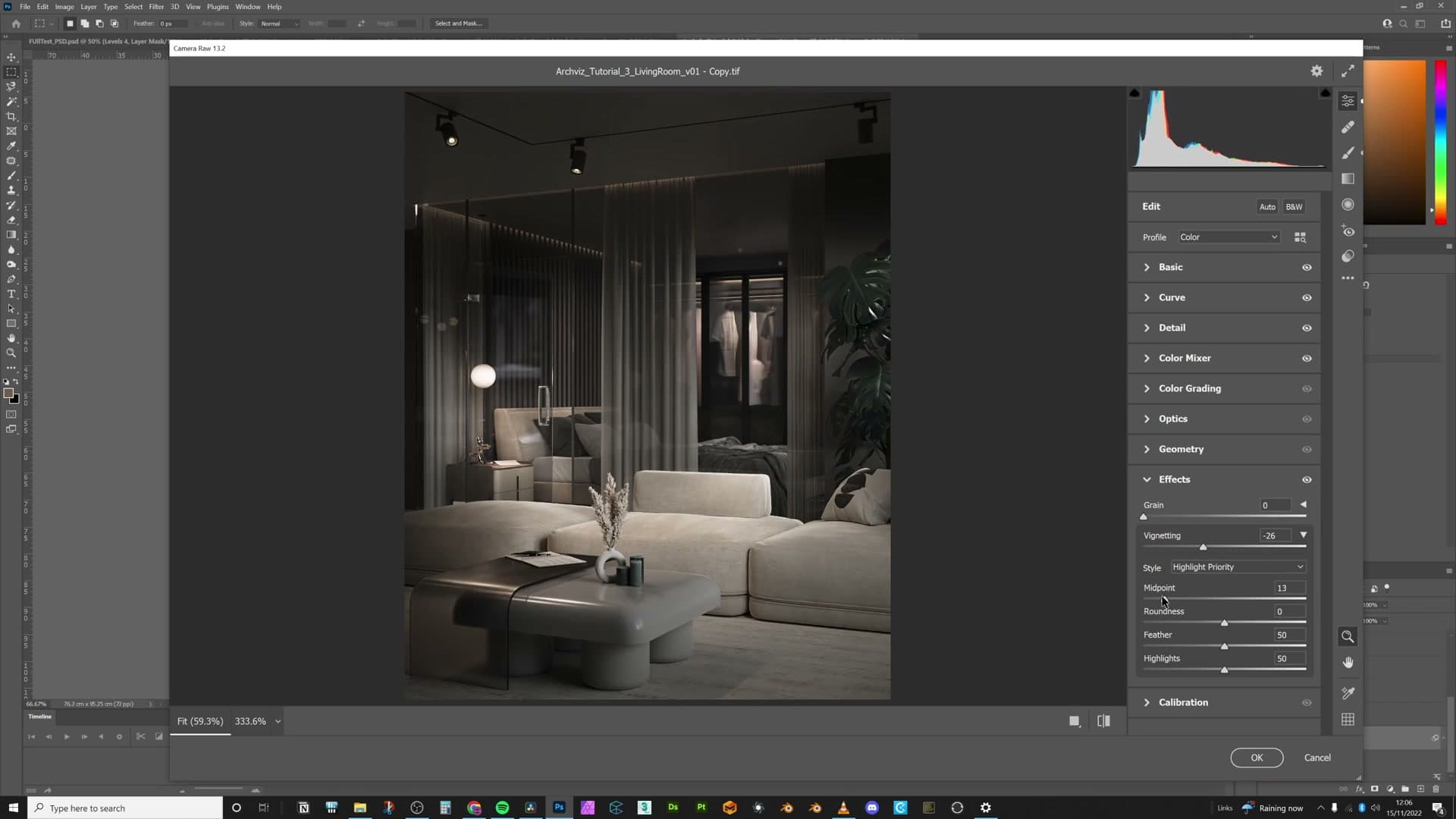
In the Effects panel, add a soft vignette. Pull the amount slider down very lightly, then push the midpoint outward so the darkening stays well clear of the focal area, and increase the feather so the falloff is gentle rather than a hard circle. The vignette should suggest where to look, not announce itself.
Stock lens flares and the Instagram-fade curve
Cycles can't produce the kind of optical glare a real camera lens gives you when light hits the front element. Search online for "lens flare" or "glare" PNGs (there are plenty of free stock packs) and drag one onto the canvas in Photoshop. Set its blend mode to Screen so the black background drops out and only the bright light data composites onto the render below.
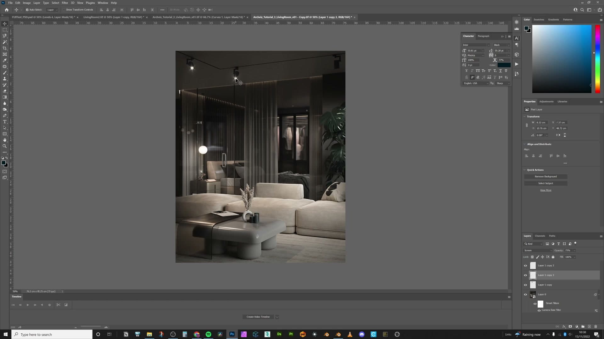
Centre the flare over the hero light, then drop opacity to around 50 so the original light source is still visible through it. To reuse it on the other lights in the room, drag the layer onto the New Layer button at the bottom of the layers panel to duplicate, move it over the next bright spot, then press Ctrl+T to scale it down for smaller highlights: a downlight, a bright object catching a rim light, the side of a sofa.
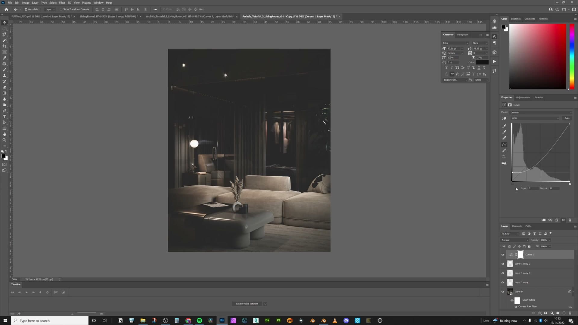
The second post-trick is the Instagram-style fade. The look is simple: the darkest blacks aren't pure black, they're lifted slightly toward grey. Add a Curves adjustment layer on top of the stack. If you drag the bottom-left point straight up, you'll lift the entire image and lose all contrast, so anchor the curve first.
Click somewhere near the brightest part of the histogram to pin the highlights in place, add another anchor down in the lower midtones, then nudge the bottom-left point upward. Now only the deepest blacks rise (the Monstera shadows, the corner recesses, anything that was pure #000000) and the image takes on that slightly faded, editorial feel that runs through most of the references on the mood board.
Living-room and bedroom across-image edits
With the hero shot graded, the next job is keeping the other angles visually consistent. Group all the layers from the first image into a folder, name it Living Room, and right-click to colour-tag it red so it's easy to spot later. Drag the next render into the same document on top.
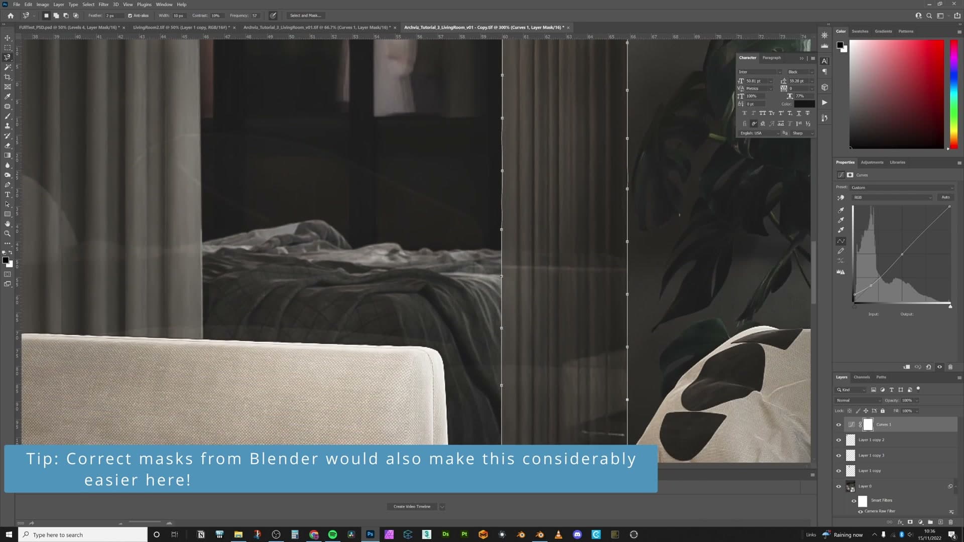
To carry the grade across, hold Alt and drag the Camera Raw smart filter from the first image onto the new one. You get an instant starting point: the curves, the sharpening, the vignette and the colour mixer all transfer in one move. The exposure brushes won't make sense on a different composition, though, so double-click the filter, open the brush list, and delete the pins that don't apply. Then paint fresh exposure into whichever parts of the new image need it, typically the new focal area plus any darks that have collapsed.
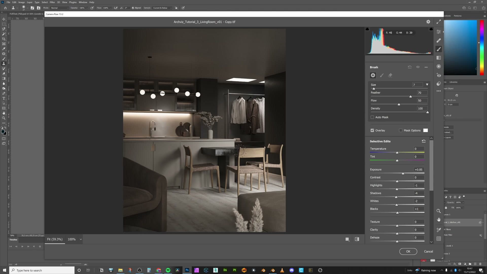
If you spot a render mistake at this point (a curtain clipping through a wall, a small geometry pop) fixing it in Photoshop is far faster than re-rendering. Make a new layer above the render, grab the Clone Stamp, set its Sample dropdown to Current & Below, Alt-click a clean section to set the source, and paint over the mistake. Curtains in particular have so many vertical folds that you can borrow from one side and patch the other without anyone noticing.
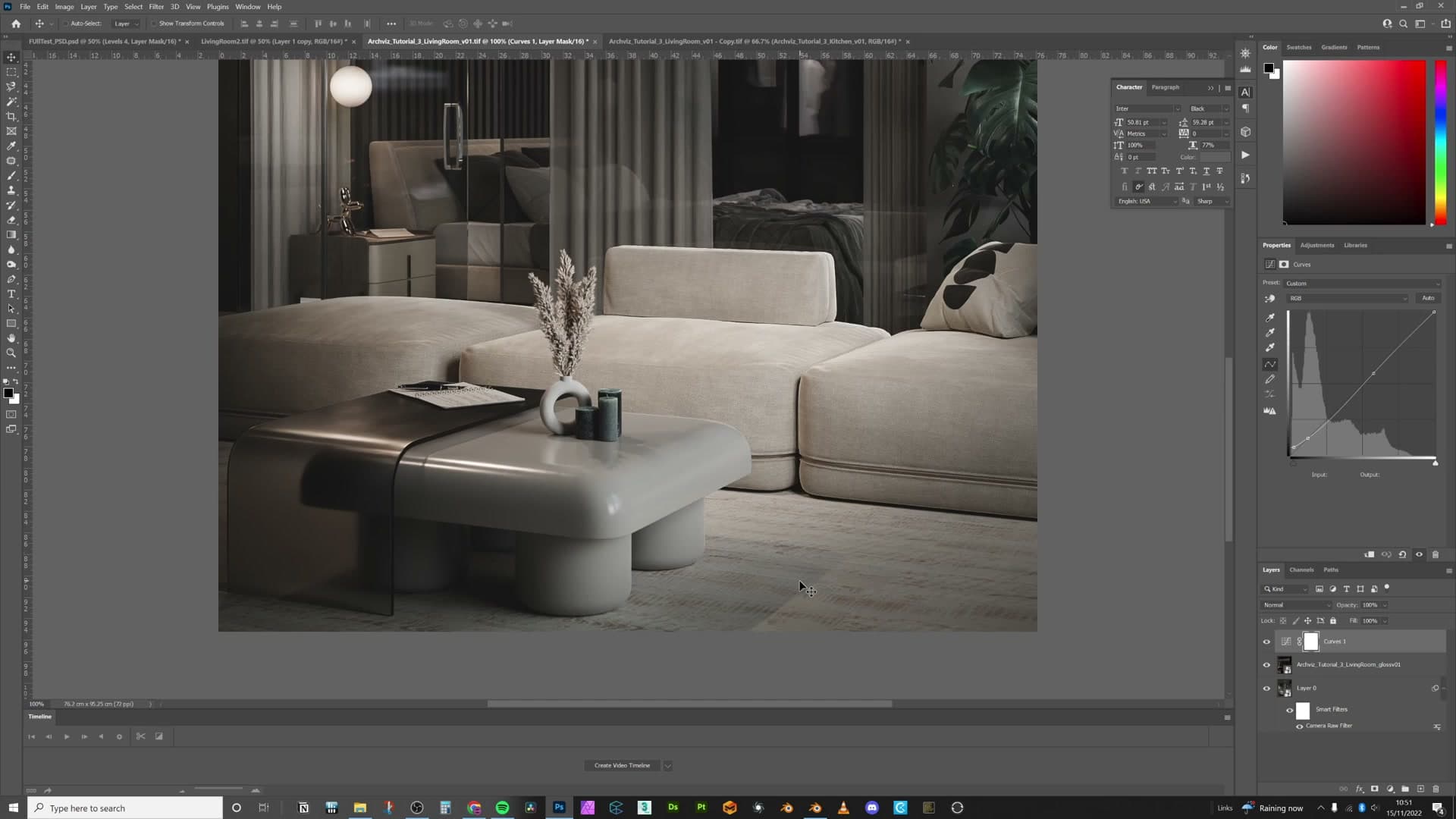
Curtains that are getting lost against the wall behind them are a separate problem. Cut them out with a rough mask, add a Levels adjustment clipped to the mask, and push the brightness up until they read clearly against the background. Slide that adjustment layer below the Curves so the fade still applies on top and the edit reads as natural light rather than a paint-over.
The bedroom is the third image. Drag in the render, Alt-drag the Camera Raw filter from the living room onto it, and judge from there. The greens often come out too strong on a fresh shot, so dip back into the colour mixer and pull their saturation down. The rest of the grade usually holds. Three renders, one consistent treatment, ready as a portfolio set.
Tools and credits
Everything mentioned in this tutorial, with links.
- Blender , the renderer this entire build runs in.
- iMeshh , a studio platform (project management, client review, asset library, invoicing). The asset library used in this tutorial is included with every iMeshh Pro plan.
- Poly Haven , free CC0 textures and HDRIs.
Pillar guide: Masterclasses hub