What is a cinemagraph and why use one in arch-vis
A quick look at the cinemagraph format (a photo where only one element moves) with reference examples and a preview of the looping curtain shot we are about to build.
Photo plus video and the cinemagraph idea
A cinemagraph sits halfway between a photograph and a video. The frame looks like a still image, but one specific element (usually something that would naturally drift in the wind) keeps moving in a soft, repeating loop. Everything else stays locked in place, which gives the shot a quietly hypnotic quality that a normal video clip never quite achieves.
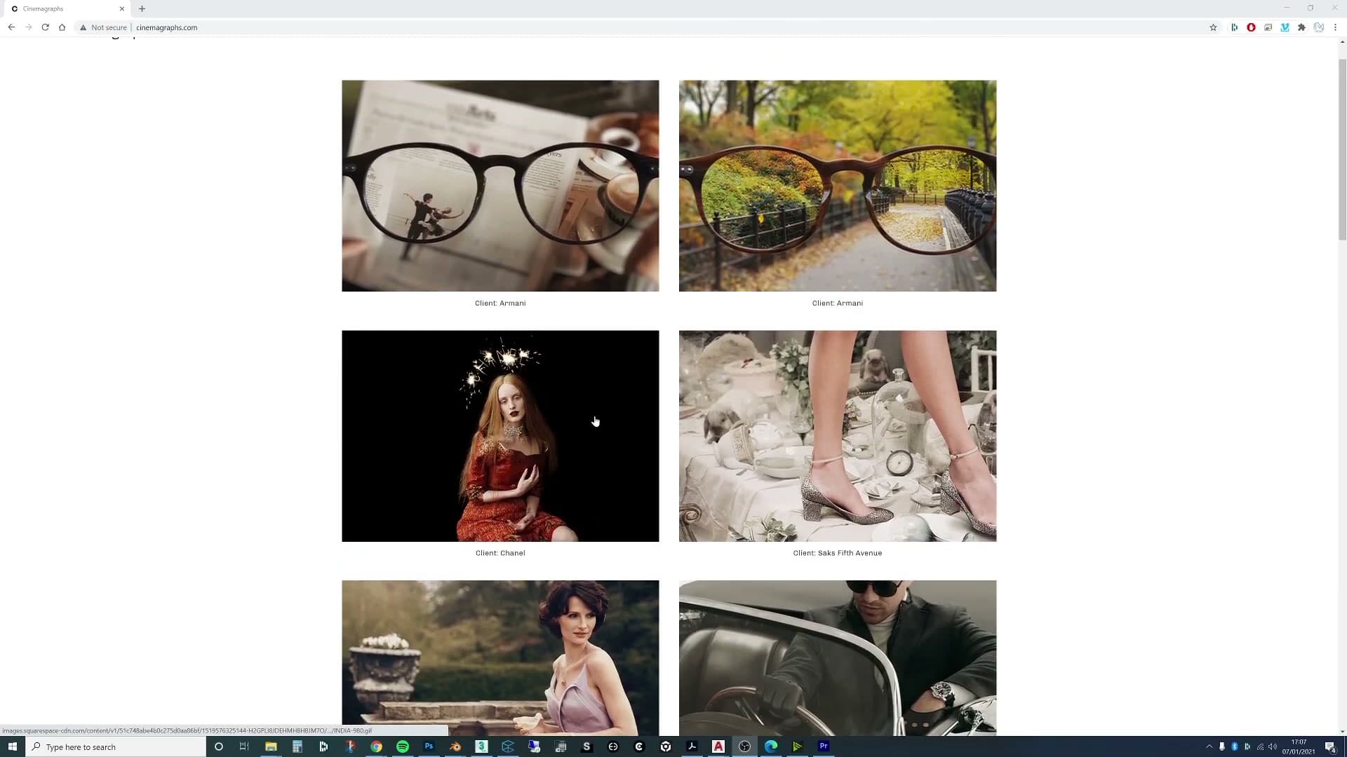
If you look at reference examples online, the pattern is consistent. One curtain billows, or one strand of hair catches a breeze, while every other surface in the frame is utterly motionless. That contrast between the moving region and the static surroundings is what makes the format work. That is exactly what you are going to build in Blender over the rest of this tutorial: a looping curtain shot that reads as a photograph until your eye lands on the window.
Block out the room and window frame
Build the minimal architectural shell: a single room with an extruded window aperture and a frame without glass, so the focus stays squarely on the curtain.
Extrude the window opening
Before you can hang a curtain, you need something to hang it in front of. Keep the architecture deliberately minimal. The whole point of a cinemagraph is that one element moves while everything else stays quietly out of the way, so there is no reward for over-modelling the room.
Start with a basic room and extrude a single window opening in one of the walls. That is genuinely all the shell needs. The rest of the geometry around the camera can be ignored. You are not building a finished interior here; you are building a focus shot whose only job is to frame the curtain.
Resist the urge to add architectural detail you will never see. Skirting, ceiling roses, cornicing and floor transitions are all wasted work in a frame this tight, and every extra surface you add becomes another thing the denoiser has to keep stable across the loop.
Frame without glass behind the curtain
Drop a simple window frame into the aperture you just cut, then stop. The frame only needs to read as a frame. It sits behind the curtain in shot, so the viewer is registering its silhouette rather than studying its joinery.
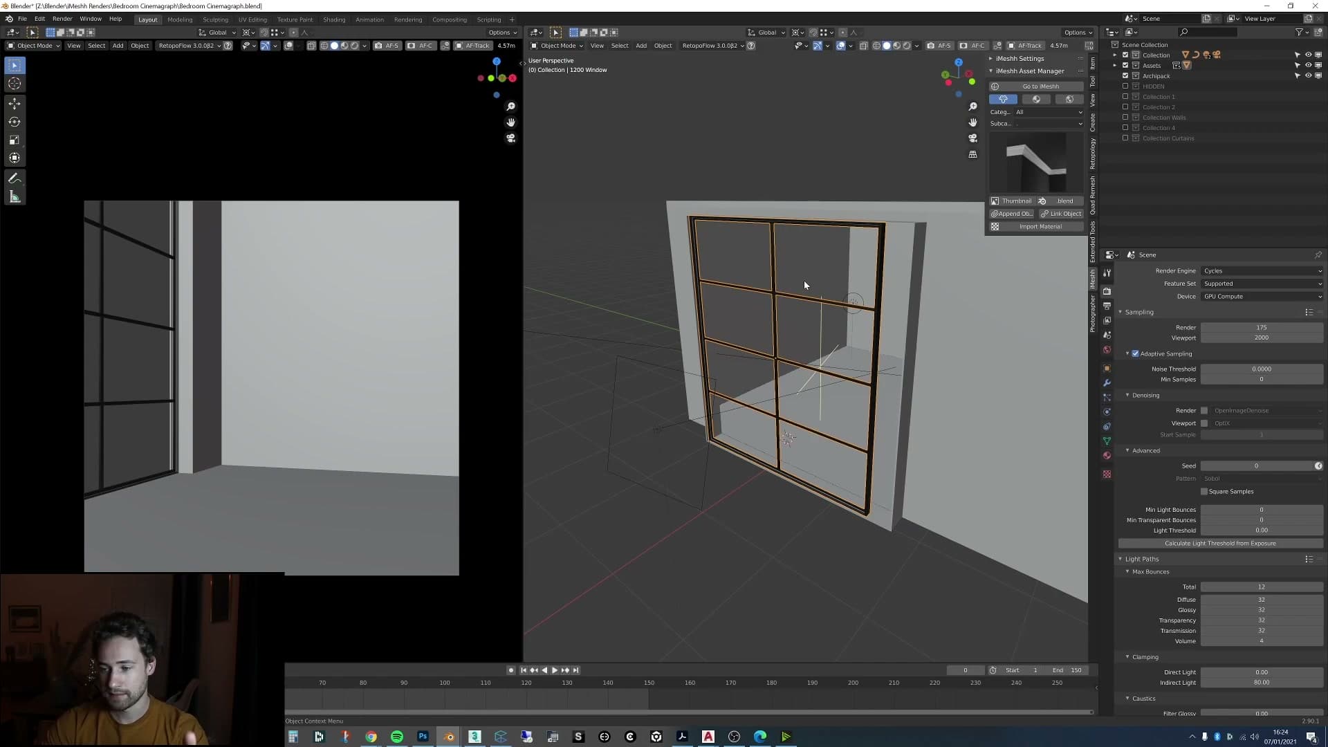
Crucially, do not add glass. The curtain will be covering most of the opening anyway, and a transparent glass shader is one of the more expensive things you can ask Cycles to trace. Leaving the pane empty keeps the suggestion of a window without paying any extra render time for surfaces nobody will see clearly.
Light the scene with HDRI plus an area light
Drop in the Waterbuck Trail HDRI from Poly Haven, tame its saturation, boost the reflection strength for the mirror, then add an area light at the window doing most of the heavy lifting.
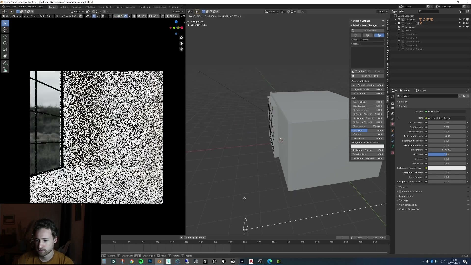
Waterbuck Trail HDRI and the window area light
Lighting on this scene is deliberately minimal. The goal is to frame the bed and the window, not to chase a complicated lighting rig. The base layer is a single HDRI from Poly Haven called Waterbuck Trail, pulled in at a low strength so it barely registers in the scene itself. You don't want the environment doing the heavy lifting here; you want it to fill in the corners and provide something for the mirror to reflect.
The actual workhorse is an area light parked right in front of the window, pointing into the room. To prove how much it is doing, you can scrub the light away from the window: the room drops into near-darkness almost immediately. Pull it back into position and the bedroom lifts back up to where you want it.
That split (a quiet HDRI underneath, an area light doing most of the work) is the entire lighting rig for this build. Everything else in the module is just tuning the HDRI so it plays nicely with the mirror and the wall paint.
Why the portal light was dropped
Before settling on the area-light-only rig, you can try the textbook approach: drop a portal light over the window to help Cycles sample the HDRI more efficiently. In this scene it didn't pay off. The render time actually went up noticeably with the portal in place, almost certainly because the area light is already lighting the room directly and the HDRI contribution is small enough that the portal had little to denoise away.
The window is also large, which means light is getting into the room without any help. With no real quality gain to show for the extra render time, the portal was removed. The takeaway is practical rather than ideological. Portals are a tool, not a rule, and if a quick comparison render shows them costing time without improving the image, leave them out.
HDRI saturation down, reflection strength up
Two HDRI tweaks finish the lighting. The first is saturation. Left at the default value of 1, the Waterbuck Trail environment cast a noticeably green tint across the room. That isn't the look you're after for a calm, neutral bedroom, so you pull the saturation slider down until the colour drops out and the scene reads cleanly.
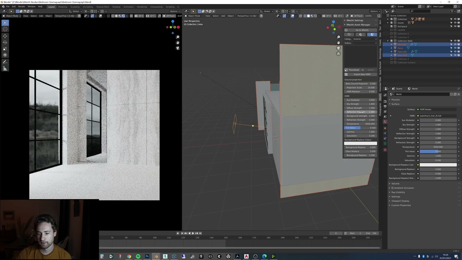
The second tweak is reflection strength. The HDRI is barely visible anywhere in the frame except for one place: the mirror on the wall. That makes the mirror reflection the only signal you have to judge the HDRI by, and at default strength it was reading a bit flat. Push the value up to 100 in the iMeshh Asset Manager and the reflection blows out entirely, so that's clearly too far.
Walk it back to 10 and the mirror picks up a believable amount of punch without the rest of the room shifting. Those two numbers (reflection strength at 10, saturation pulled down) are what give the scene its quietly lit, almost monochrome feel without needing a second HDRI or extra fills.
All of this is exposed through the iMeshh Asset Manager material settings, so you can sweep through the values live and stop wherever the reflection looks right against your mirror.
Build the tiled floor from a curve with Archipack
Select the wall base edges, duplicate them with Shift+D, P-separate, convert to a curve and let Archipack's From Curve generate the floor. Then bevel the tile edges to make them read.
Duplicate the base edges and convert to curve
With the walls toggled out of the way, drop into edit mode on the floor mesh and walk around the room selecting the edges that sit right at the base of every wall. The aim is a single clean loop tracing the inside footprint of the room. Skip any stray internal edges that creep into the selection, because they'll confuse the floor generator further down the line.
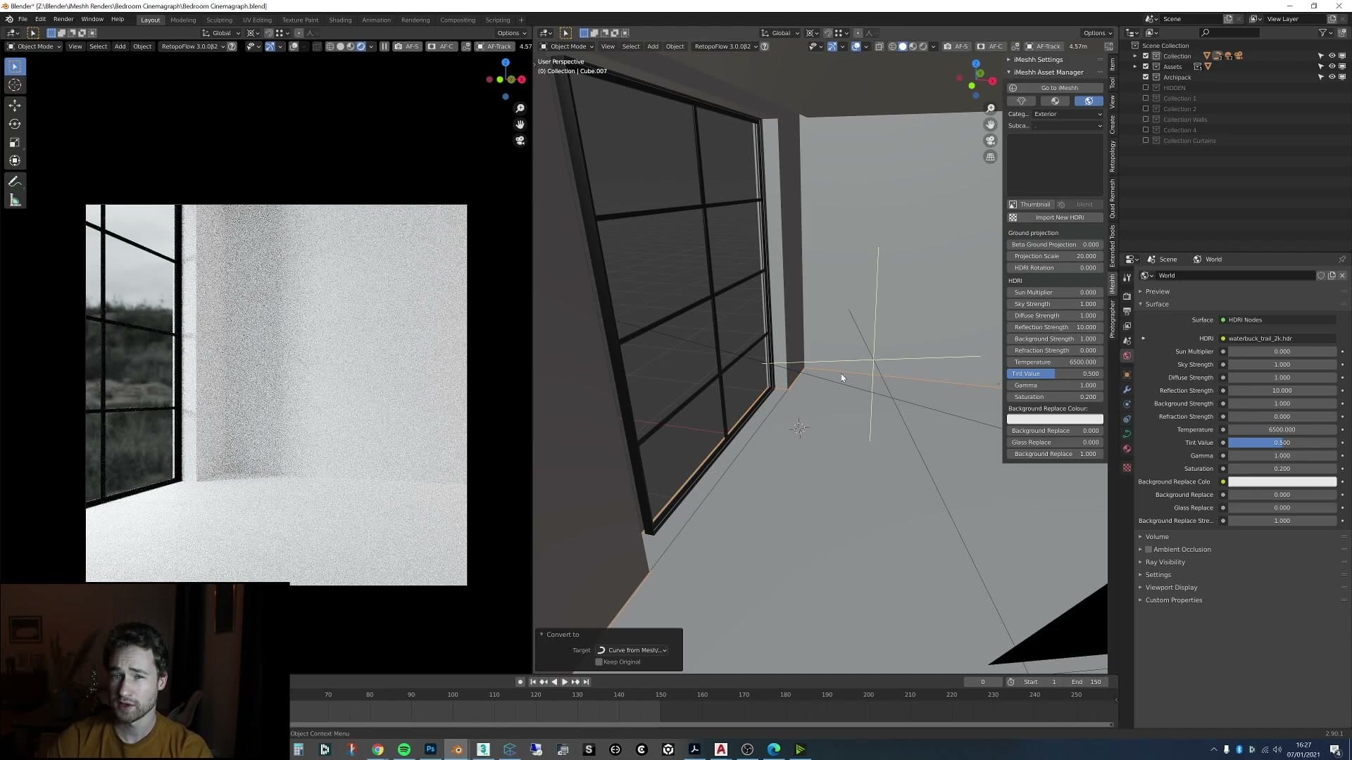
Once the loop is selected, duplicate it in place with Shift+D and right-click to drop it on the spot. Press P and choose Selection to peel the duplicated edges out into their own object. Tab back to object mode, select the new edge object, and convert it to a curve. That curve is the seed shape the floor generator will read.
Archipack From Curve and bevel the tiles
The new curve may have inherited a modifier from the source mesh. Disable or remove anything that isn't needed so Archipack sees a single closed curve rather than a duplicated or mirrored shape.
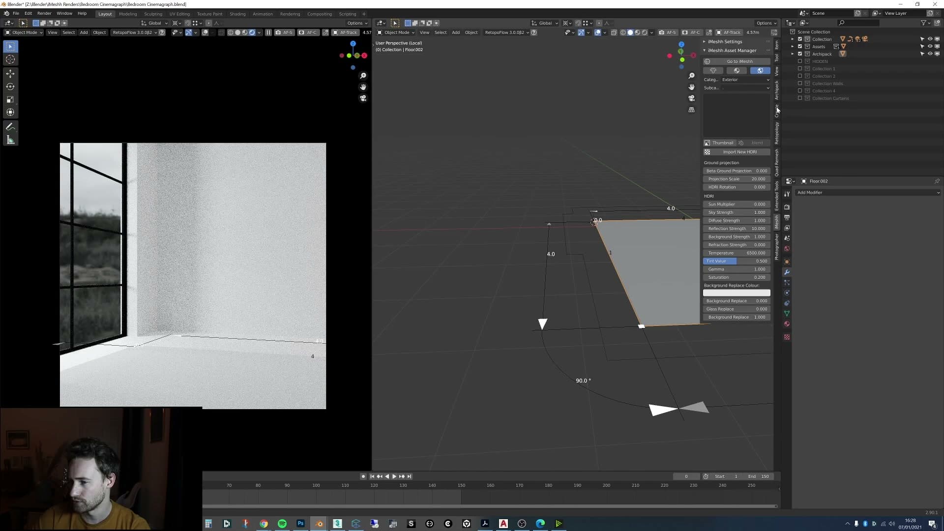
With the curve selected, open the Add menu and pick Archipack → Floor → From Curve. Archipack fills the outline with a tiled floor in a single click.
Straight out of the generator the seams between tiles can read as flat. The joins are there but they don't catch the light. Add a slight bevel to the tile edges in the Archipack floor parameters and the grid pops, because those tiny chamfers pick up just enough reflection for each tile to read as its own piece.
If a small section of floor doesn't fill, check whether it's actually visible in the final frame before fixing it. In this scene a missed strip (a stretch that fell outside the edge loop I selected) was hidden behind the curtain and could be left alone, but tidy up the curve and re-run the generator if the gap is going to show on camera.
Add the bed, side table, lamp and warmer side light
Drop in a new iMeshh bed exclusive and blanket, model a cube side table with a duplicated cylinder lamp, then add a warm secondary area light from the side to push some colour into the wall.
Append the bed and desaturate the blanket
Next into the scene goes the bed. This is actually a brand new model made specifically for this tutorial and heading to the iMeshh library as an exclusive release. If you already subscribe to iMeshh exclusive, you'll be able to download it at no additional cost. The creases on the sheets turned out particularly well on this one, so it reads as a believably lived-in bed rather than the usual perfectly flat showroom version.
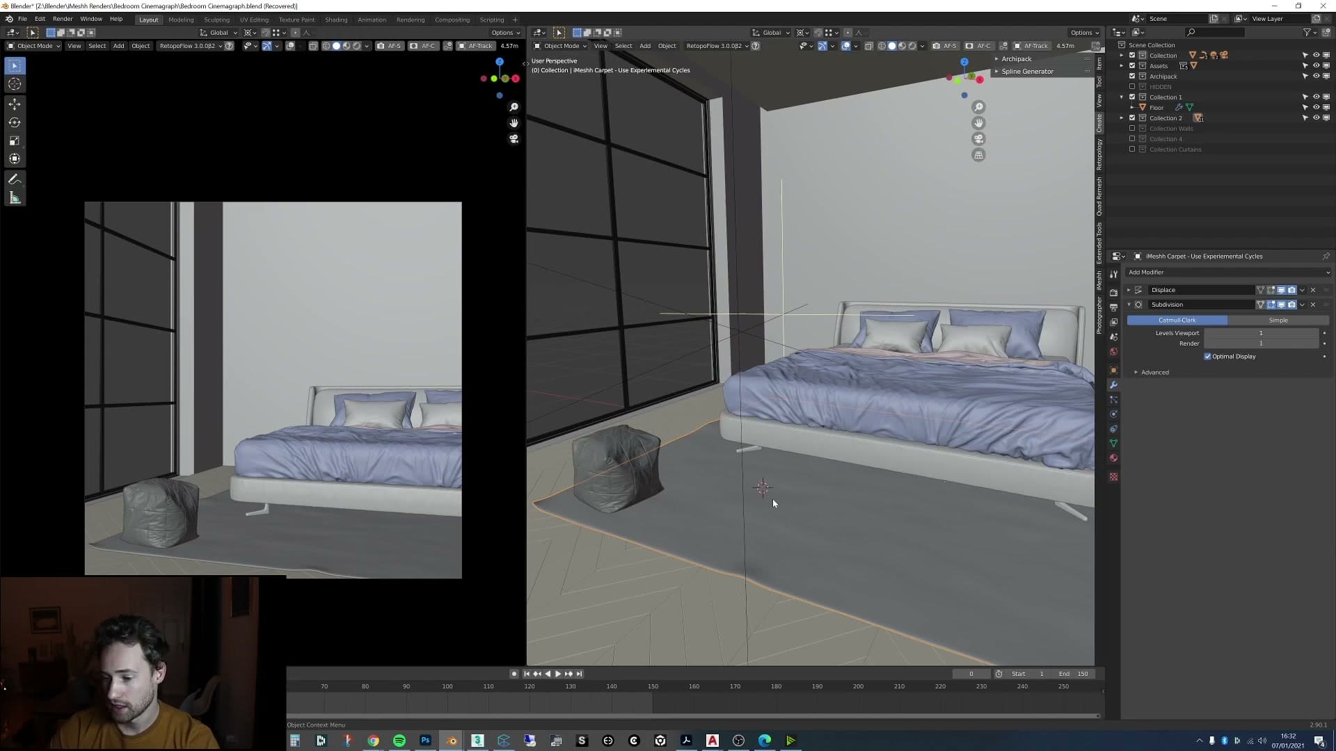
To append it (and the rest of the dressing) into the scene, use the iMeshh Asset Manager. Press Shift and right-click in the viewport, choose the iMeshh Asset Manager from the pie menu, browse into the relevant category (in this case Decoration) and append the object you want directly into your file.
Drop in the bed, then append the matching blanket from the same library. The blanket comes in slightly too red for this room, which would fight the pale, near-colourless look you're building, so tweak its material: desaturate the colour a touch and push the value up to lighten it. That nudges it towards a softer off-white without losing the underlying texture.
Cube side table and a cylinder lamp
The side table is deliberately simple: nothing more than a cube. Inspired by a reference image found on Pinterest, drop in a default cube, scale it to side-table proportions, and bevel the edges so the silhouette doesn't read as a hard CG block. Then apply the same material as the floor; reusing one material across two objects keeps the palette tight and stops the room from sliding into a patchwork of competing wood tones.
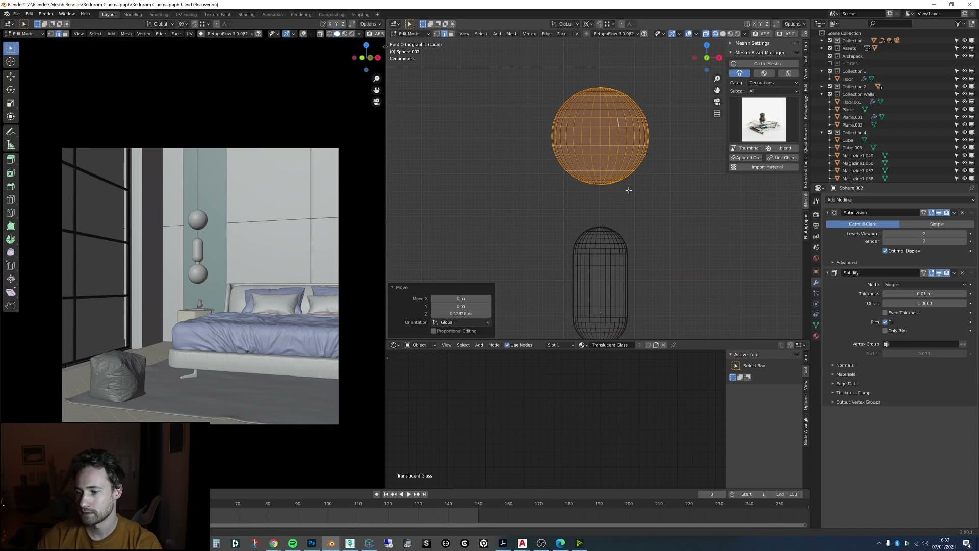
On top of the table sits a stack of magazines from another iMeshh product. The original arrangement had a magazine half falling off the pile, which is a nice bit of believable disorder, so exaggerate it a little. Lean it further off the edge so the eye catches the imperfection.
Finally, add a lamp next to the magazines. It's about as basic as a lamp gets: drop in a cylinder for the base, then duplicate that cylinder, scale it down, and use E then Z to extrude the new cylinder upwards along the Z-axis into a thin stem. That gives you the body of the lamp in two operations.
For the shade, add one more cylinder on top and give it a Solidify modifier so it has actual thickness rather than reading as paper-thin geometry. Assign a glossy white glass material (nothing exotic, just a clean white glass mix) and the lamp is finished.
Warmer side area light to break up the cool window light
With the dressing in place, add a second area light coming in from the side of the room. The window light from the HDRI is doing the heavy lifting, but it's cool and a little flat on its own; a small warm fill from camera-left pushes some colour onto the wall and the bed, breaking up the otherwise uniform daylight.
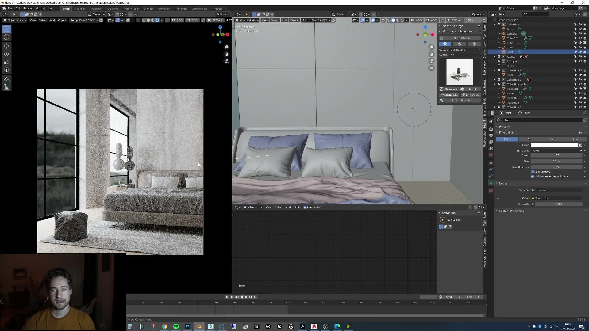
Keep it subtle. The aim of this scene is a pale, almost colourless render, so the warm light is there as a hint of contrast rather than a dramatic key. Position it so it grazes the side of the bed and the wall, then dial the strength down until it reads as ambient warmth rather than a second sun.
Make sure every material you've added so far supports that palette: nothing oversaturated, everything tending towards soft and clean. Once the room reads the way you want it to, you're ready to add the curtain. Because the curtain setup involves cloth, vertex groups, wind and a baked point cache, jump to a fresh Blender file before starting on it. The current scene is already cluttered and a clean file makes the next stage much easier to follow.
Build the curtain with a vertex group and animated shape keys
Drop in a plane sized to the window, subdivide it heavily, mark the top edge as a vertex group and use two shape keys (base + scaled-in on X) to gather it into pleats over time.
Plane sized to the window, then subdivide
Add a plane and scale it to sit flush with the window opening (the same edge the curtain will hang in front of). Getting the dimensions right now saves re-fitting once the cloth solver is doing its thing.
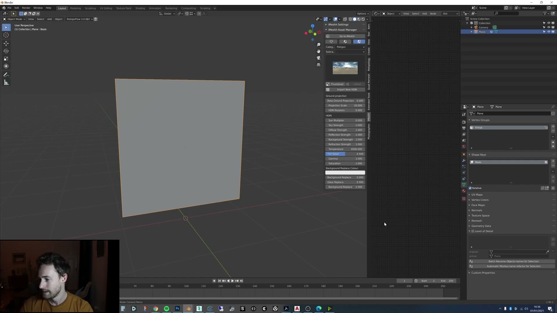
Tab into edit mode, right-click and choose Subdivide, then keep subdividing until the plane is dense with geometry. A low-poly plane has nothing to fold; a heavily subdivided one gathers into believable pleats once the simulation kicks in. I cheerfully admit to subdividing one too many times. On this kind of cloth, that's the right instinct.
Vertex group on the top edge and two shape keys
Select the row of vertices along the top edge, head to the Object Data Properties panel and create a new vertex group, then assign the selection to it. This is the strip of cloth that will stay pinned to the curtain rod while everything below it is free to move.
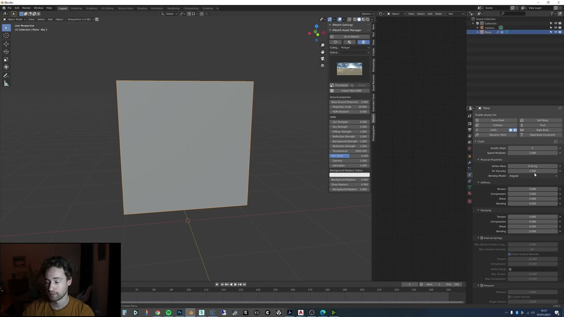
Open the Shape Keys panel and add two keys. The first is the Basis: that locks in the current flat shape as the starting point. Add a second key (Key 1), then with Key 1 active, tab into edit mode and scale all the vertices inwards on the X axis. Push the Key 1 value slider from 0 to 1 and the plane should visibly gather towards the centre. That's the pleat shape you're animating towards.
To animate the gather, hover over the Key 1 value field at frame 1 with the value at 0 and press I to set a keyframe. Jump to frame 30, push the value to 1 and press I again. Over those thirty frames the cloth will slowly bunch up into pleats, giving the solver a graceful intent to follow rather than a flat sheet dropped from nowhere.
Finally, give the plane a Cloth physics simulation and set the preset to Silk. Bump the Quality Steps up to around 12 for a more stable solve, then scroll down to Shape and set the Pin Group to the vertex group you made earlier. That tells Blender the top edge is locked in place while the rest of the plane is free to drape, fold and pleat.
Cloth simulation with the Silk preset and pin group
Apply the Silk cloth preset, raise quality steps, set the vertex group as the Shape Pin Group and enable self collisions so the curtain can hang and gather without intersecting itself.
Silk preset, quality steps and Shape Pin Group
With the cloth modifier added to the curtain, switch the preset to Silk. Out of the stock presets it's the closest match to a light, drapey curtain. The heavier options read as too stiff once they start gathering.
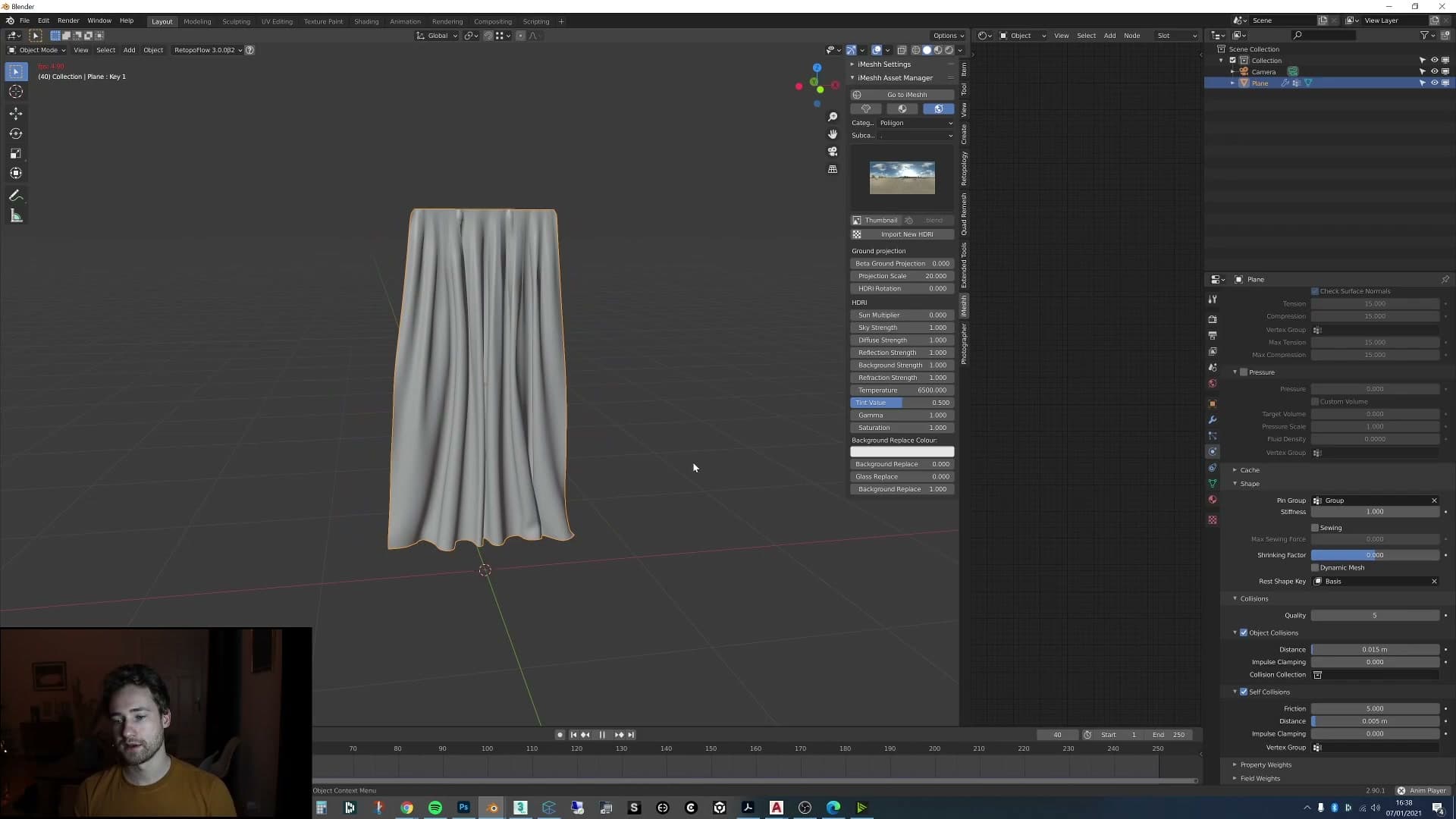
In the Shape section, plug the vertex group you painted along the top edge into Shape Pin Group. That tells the solver which vertices to keep nailed in place, so the body of the curtain swings and drapes while the rail stays locked.
Then push Quality up from its default. A higher step count gives the solver more sub-steps per frame, which keeps thin fabrics like silk from clipping through themselves or jittering as they fall.
Self collisions and let the curtain settle
Tick Self Collisions in the cloth panel and set the distance to around 0.005. That's the buffer the solver uses to keep folds of fabric from passing through one another. Without it, the silk will intersect itself in the pleats and the curtain will look broken.
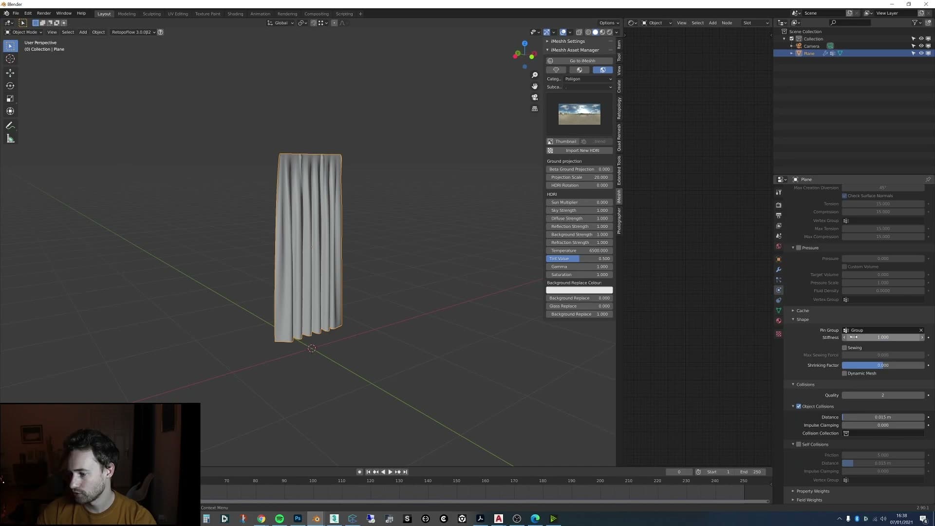
Hit play and watch the curtain fall. If the first run comes out wonky (twisted edges, odd kinks) it's worth checking whether you applied Shade Smooth on the mesh; that can throw the initial simulation off. Just rewind and try again and it should resolve cleanly the second time.
Let it rest. The trick here is patience. Leave the simulation running until the curtain has fallen, gathered into its pleats and come to a complete stop. That settled pose is the one you want to bake into the geometry before moving on.
Once it's still, remove the shape keys on the curtain, then press Ctrl+A on the Cloth modifier to apply it. The curtain mesh now carries the draped shape as its base geometry rather than as a live simulation.
From here, add Cloth back onto the applied mesh and re-enter the Silk preset, the pin group and the self-collision settings. There's almost certainly an easier route through this. Rebuilding the modifier on the baked-down mesh works, and leaves you with a curtain that's ready for the wind pass in the next module.
Add a Wind force field and keyframe its strength
Set the floor and walls as collision objects, add a Wind force field, then keyframe its Strength up to 100 and back to 0 over the loop length so the curtain rises and settles repeatedly.
Set the floor and walls to collide with the cloth
With the cloth simulating freely, the curtain currently passes straight through every surface in the scene. The fix is to flag the floor (and any wall the fabric might brush against) as collision objects so the cloth has something to drape on and react to.
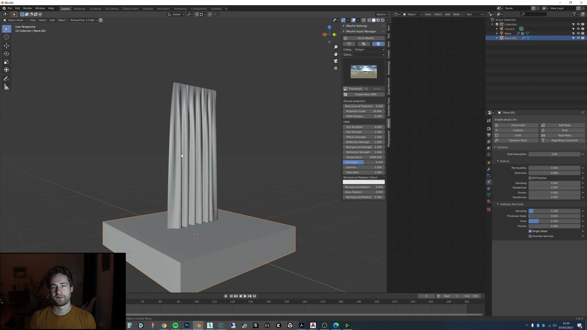
Select the floor, open the Physics properties and add a Collision modifier. That alone is usually enough for a flat surface. You can add the floor collision before you start simulating or later in the process; adding it mid-way lets you tune how the fabric looks and feels as it lands against the floor.
Walls are a different story. A single-sided plane has no thickness, so the cloth solver can end up trying to push the fabric through the inside of the geometry. Give the wall some real depth (either extrude the mesh out, or use a Solidify modifier) and then set it to Collision as well. With both surfaces collidable, the cloth now drapes on the floor and can press against the wall instead of clipping through it.
Add a Wind force field at the window
Now you need something to move the curtain. In the Add menu, choose Force Field → Wind and position it just outside the window so the arrow points into the room. The direction of the empty's Z-axis is the direction the wind blows in.
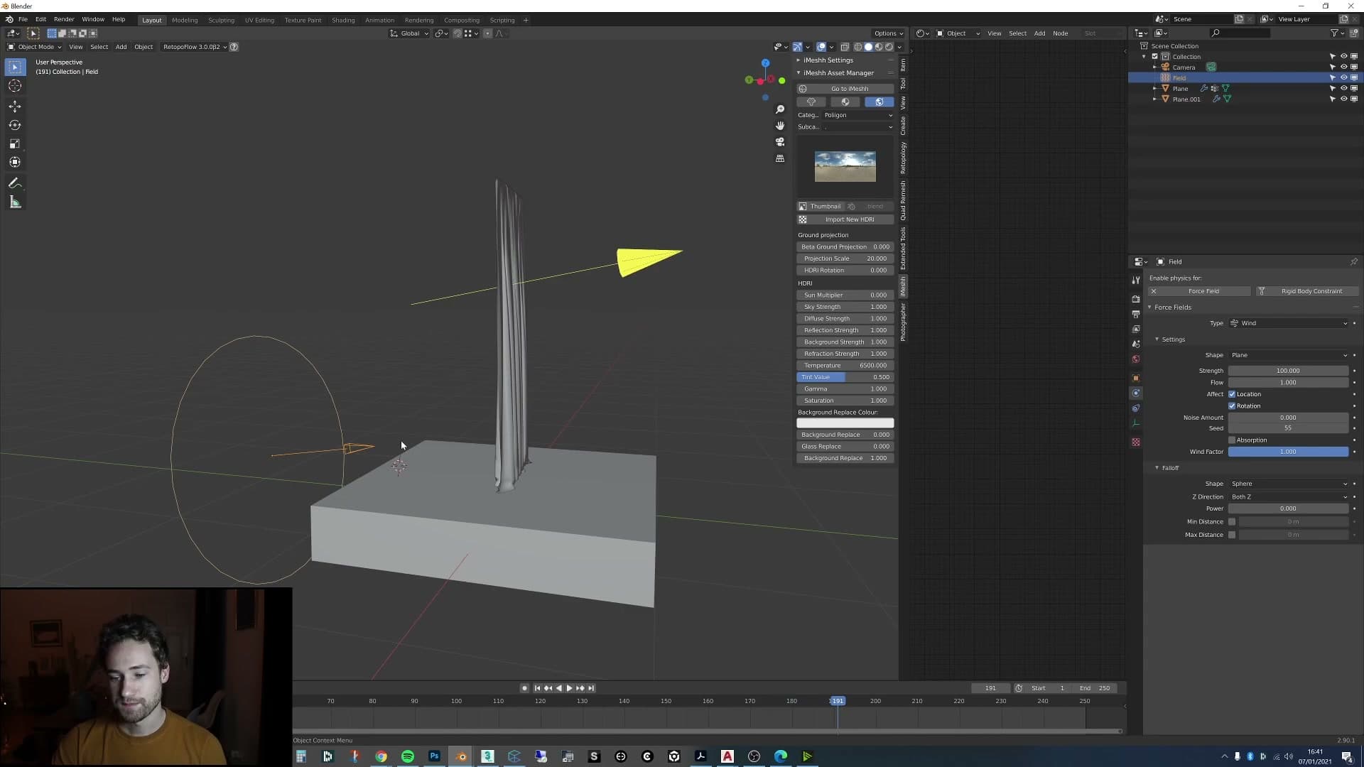
Press play and the curtain should immediately react. The fabric lifts off the rod and blows back into the room, catching on the floor where you set up the collision in the previous step. With the strength at its default value the motion is gentle; push the Strength field on the Wind up to around 100 and you'll see a much stronger, more obvious gust.
That's the look you want for a cinemagraph. Quietly present but not violent. A subtle billow reads as a real breeze through the window; a hurricane reads as a simulation. Settle on a strength that nudges the fabric without flinging it, because the next step is to animate that value rather than leave it constant.
Keyframe wind strength to ramp on and off
A real breeze isn't a steady blast. It rises, holds for a moment, then drops away. To get that behaviour, keyframe the Wind's Strength field so it ramps from nothing, up to full, and back down again over the length of the loop.
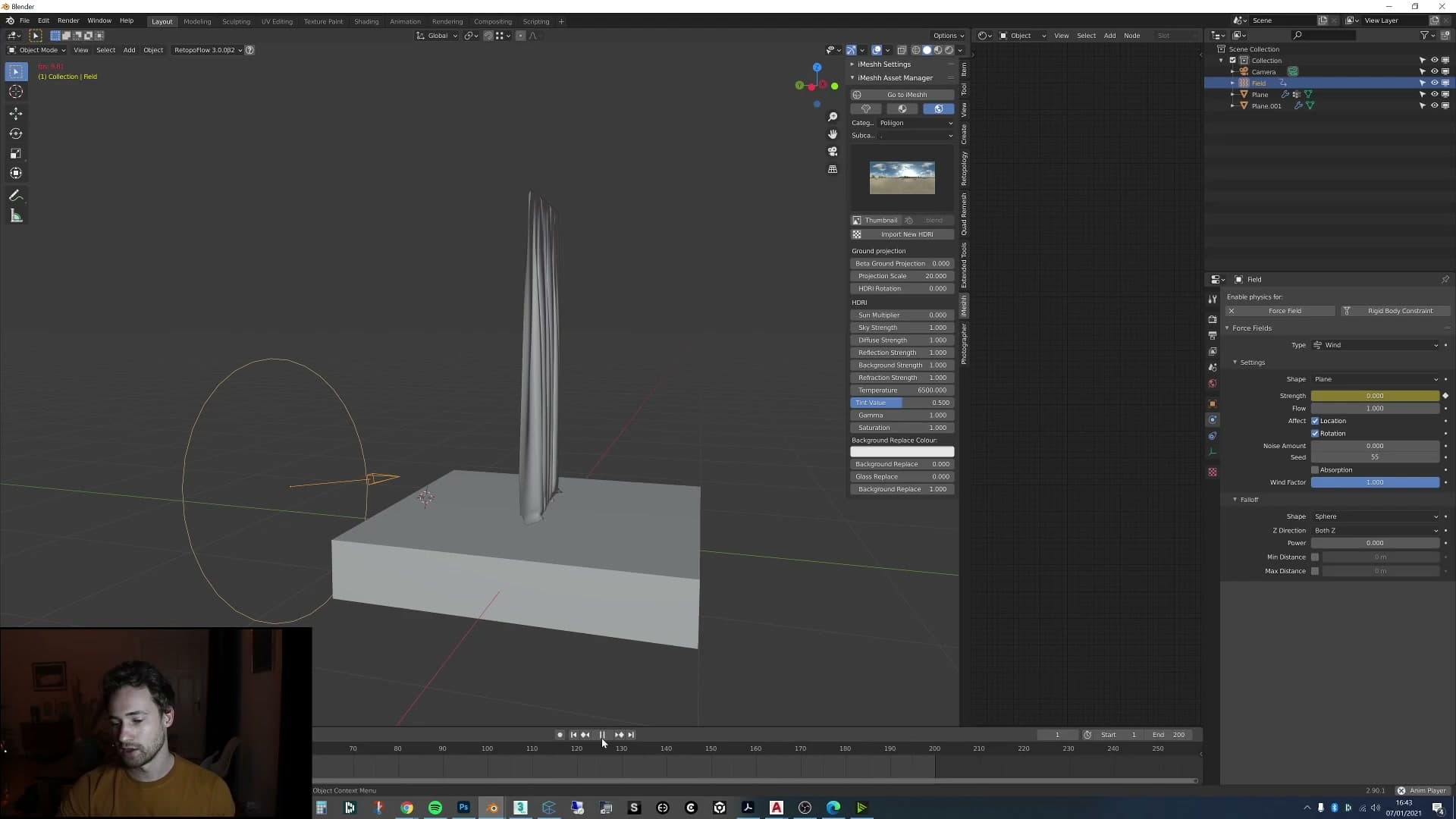
Start at frame 1 with Strength set to 0, hover over the field and press I to insert a keyframe. Step forward a few frames (around frame 10) and key another 0. That short flat run gives the cloth a moment to settle before the wind picks up. On the next frame, raise Strength to 100 and key it again, so the gust comes on quickly.
Move forward to around frame 60 and key the value at 100 a second time to hold the gust steady, then jump one frame ahead, drop the value back to 0 and key it once more. That gives you the full shape: a beat of stillness, a quick ramp on, a sustained blow, and a sharp drop-off.
Scrub the timeline and the curtain should now rise, hold, and fall on its own. If the rhythm feels off (for example if the fabric is still settling when the next gust hits) slide the keyframes around in the dope sheet until the timing reads naturally. For this scene the simulation was baked out to 200 frames, with a second copy of the keyframes offset further down the timeline so the curtain blows, stops, and blows again. The longer the loop, the more believable the breeze.
Set the loop length and bake to MDD point cache
Stretch the timeline to 200 frames, repeat the wind gusts twice, then export the simulated curtain as a Lightwave MDD point cache and re-import it onto a duplicate so the motion becomes editable animation data.
200-frame loop with a duplicated wind gust
A single wind gust over the loop reads as artificial. The curtain rises once, settles, and that is it. To get something closer to a real breeze, stretch the scene length to 200 frames and duplicate the wind-strength keyframes so the gust repeats twice across the timeline. The curtain now catches two waves of air with a calm trough between them, which is much closer to how an open window actually behaves.
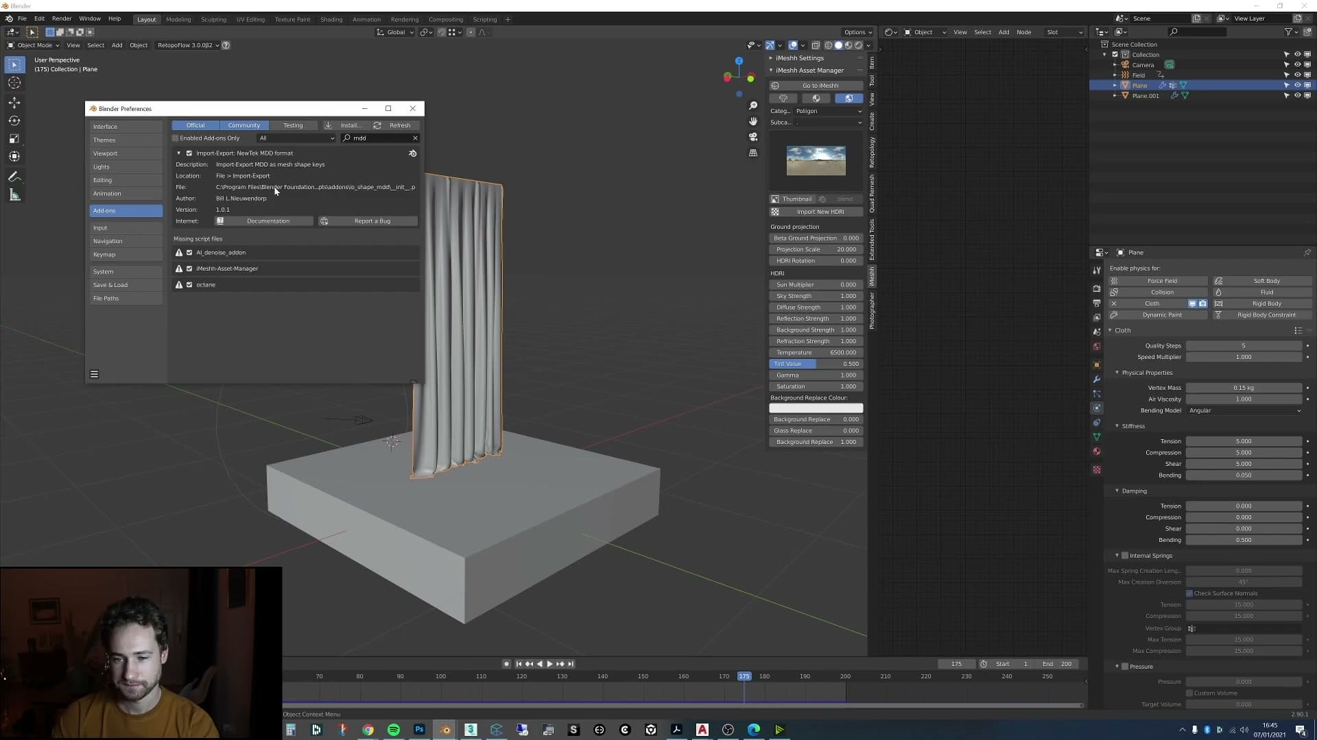
The exact shape is up to you. I tend to say "you can make this wind as realistic as you like": extra easing, varied peaks, micro-gusts in the gaps. For a quiet cinemagraph, a clean rise-fall-rise-fall pattern across the 200 frames is enough. The goal is just to give the simulation enough motion to loop convincingly later.
Export to Lightwave MDD, then re-import
With the simulation behaving the way you want, the next job is to bake it into editable animation data. A live cloth cache is locked to the physics solver. You cannot offset it on the timeline, blend it, or treat it like a normal action. The trick is to export the simulated motion as a Lightwave point cache (.mdd) and then re-import it onto a duplicate mesh, which converts the simulation into per-vertex animation data you can manipulate freely.
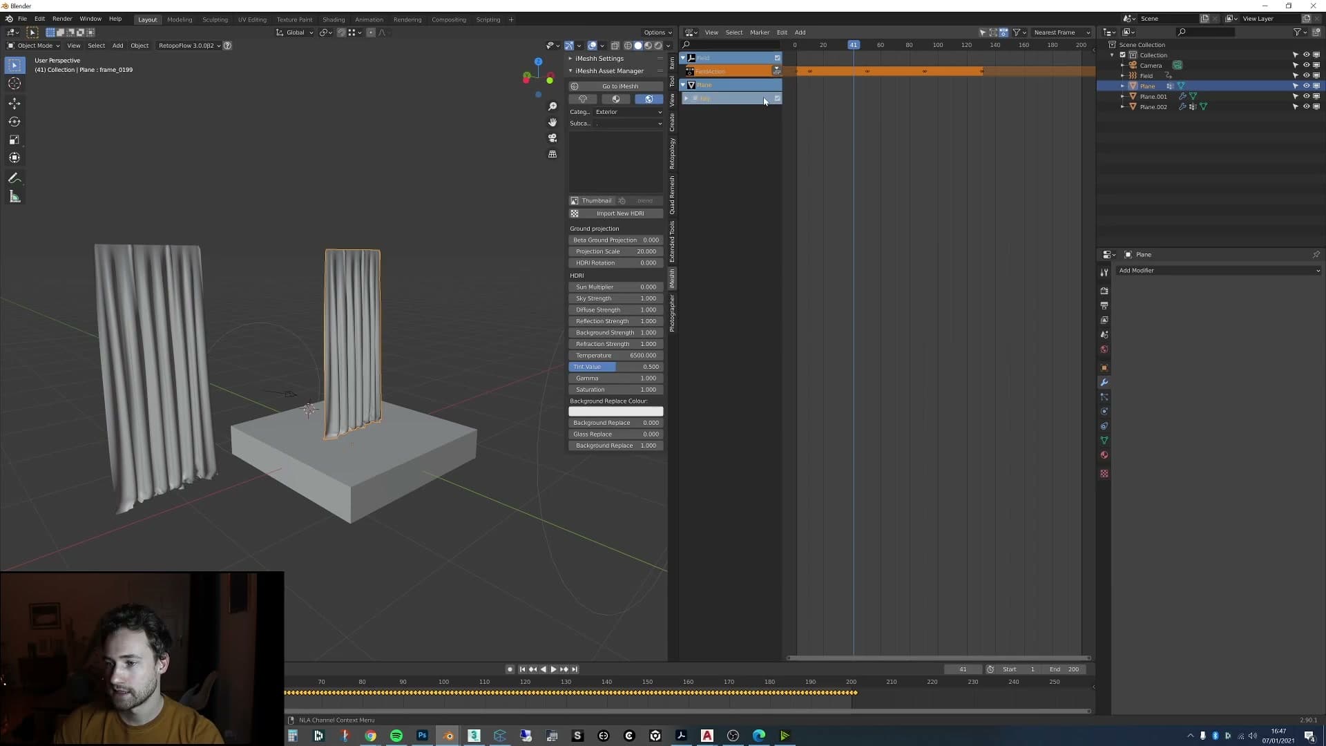
First, enable the MDD addon. Open Preferences, go to the Add-ons tab, search for MDD, and tick the box. You should now see Lightwave Point Cache options under both File > Import and File > Export. Select the curtain, apply its rotation and scale, then run File > Export > Lightwave Point Cache (.mdd) and save the file somewhere you can find it again.
Duplicate the simulated curtain with Shift+D and move the copy aside as a saved backup in case you need to re-bake later. On the working duplicate, apply scale again, then go to File > Import > Lightwave Point Cache (.mdd) and pick the file you just exported. Scrub the timeline and you should see the duplicate playing back exactly the same motion as the original simulation. Now it is stored as animation data on the mesh, ready to drop into the NLA editor as a strip.
Crossfade the loop in the NLA editor
Open the NLA editor, push the curtain action down to a strip, duplicate it, offset both copies and switch on Auto Blend Out. The start and end of the loop crossfade so the seam disappears.
Push the imported action down to a strip
With the MDD applied as an action on the duplicate curtain, open the NLA editor. The action sits at the top of the list, ready to play but not yet treatable as a clip you can shuffle, copy and crossfade. To work with it as a block, you need to push the action down into a strip.
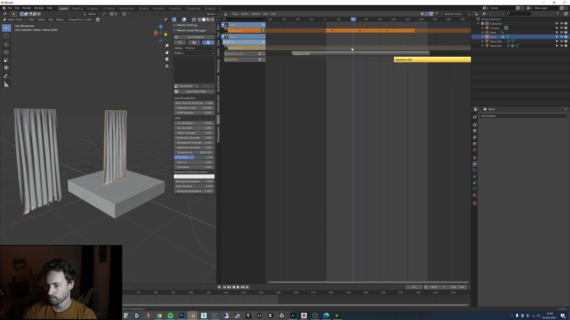
Click Push Down Action next to the action name. Blender converts the live action into a fixed NLA strip and drops it onto a track below. From here, the simulation behaves like a clip on a video timeline (moveable, duplicable, and blendable) rather than a single live action driving the geometry.
Shift+D, offset and Auto Blend Out
With the strip selected, press Shift+D to duplicate it, then drag the copy so it overlaps the original by roughly half the loop length. The aim is for the end of the first strip and the start of the second to sit on top of one another, so the join lives inside an overlapping region rather than on a hard cut. The exact frame offsets only make sense relative to your own bake length. The principle is to land the seam in the middle of the overlap.
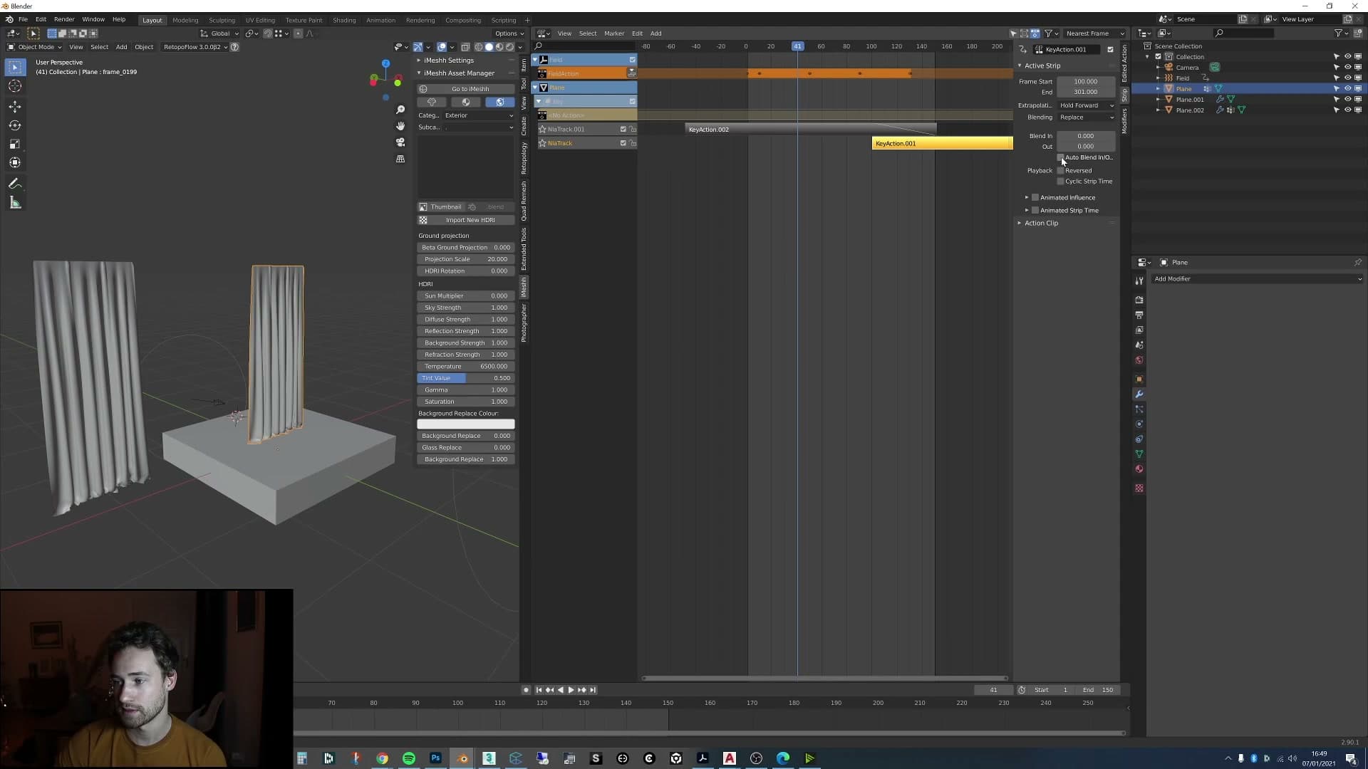
Press N to open the sidebar, select the upper strip, and find the blending controls under the Strip panel. Set the option below Combine under the active strip to Auto Blend In/Out. Blender will now fade the strip's edges automatically. Select the second strip and switch Auto Blend In/Out on for that one too.
Scrub the playhead through the overlapping region and the result is immediate: the fabric is still blowing from the first action while the second one eases in behind it, and the first strip cleanly fades out as the second takes over. The hard seam between the end of the loop and its restart disappears. One motion melts into the next, and the cinemagraph plays as a single continuous breeze.
Curtain hem with extra edge loops and Solidify
Add a subdivision surface for softer pleats, run extra loop cuts down each side and delete inner faces to leave a visible hem, then Solidify it at 0.01 to give the curtain a real-world seam.
Subdivision surface and side edge loops
With the loop itself working, you can go back and refine the curtain mesh so it reads more like real fabric. The first tweak is a Subdivision Surface modifier on the curtain. It softens the creases that fall out of the sim so the pleats look fluid rather than faceted.
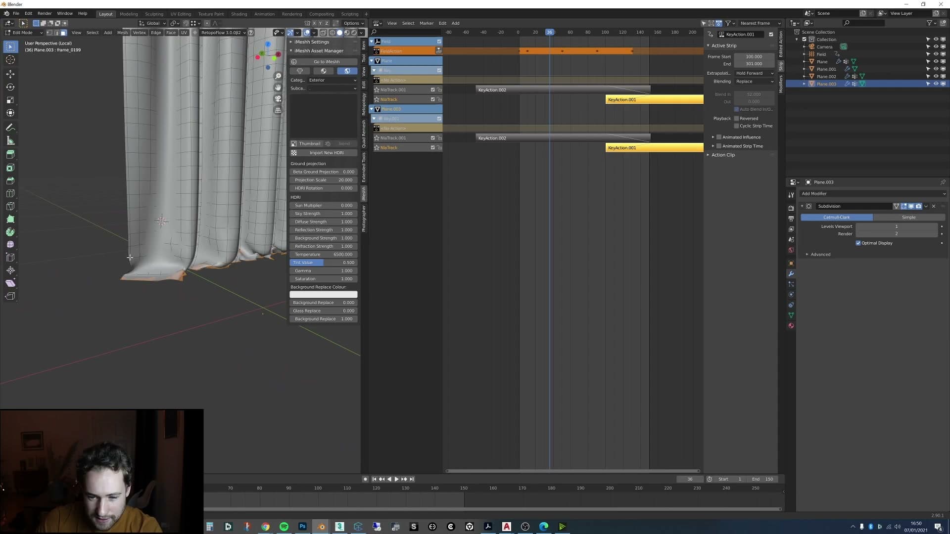
Next, build the edge geometry that sells a curtain as a real-world object. Duplicate the simulated curtain, drop into edit mode and add a couple of extra loop cuts running vertically down each side of the mesh, just inside the outer edges. You're carving a thin strip along each long edge. That strip is going to become the visible hem.
Select the inner edges of those side strips ready for the next step. The point is to isolate the narrow band of faces along the very edge of the curtain so you can treat it as separate geometry from the main panel.
Delete inner faces and Solidify the hem
Once you have the side loops in place, select and delete the inner faces of the strip so only the thin band around the edge of the curtain remains. The deleted faces sit underneath the main panel, so the silhouette of the curtain doesn't change. You're just leaving a slim outline of geometry around the perimeter.
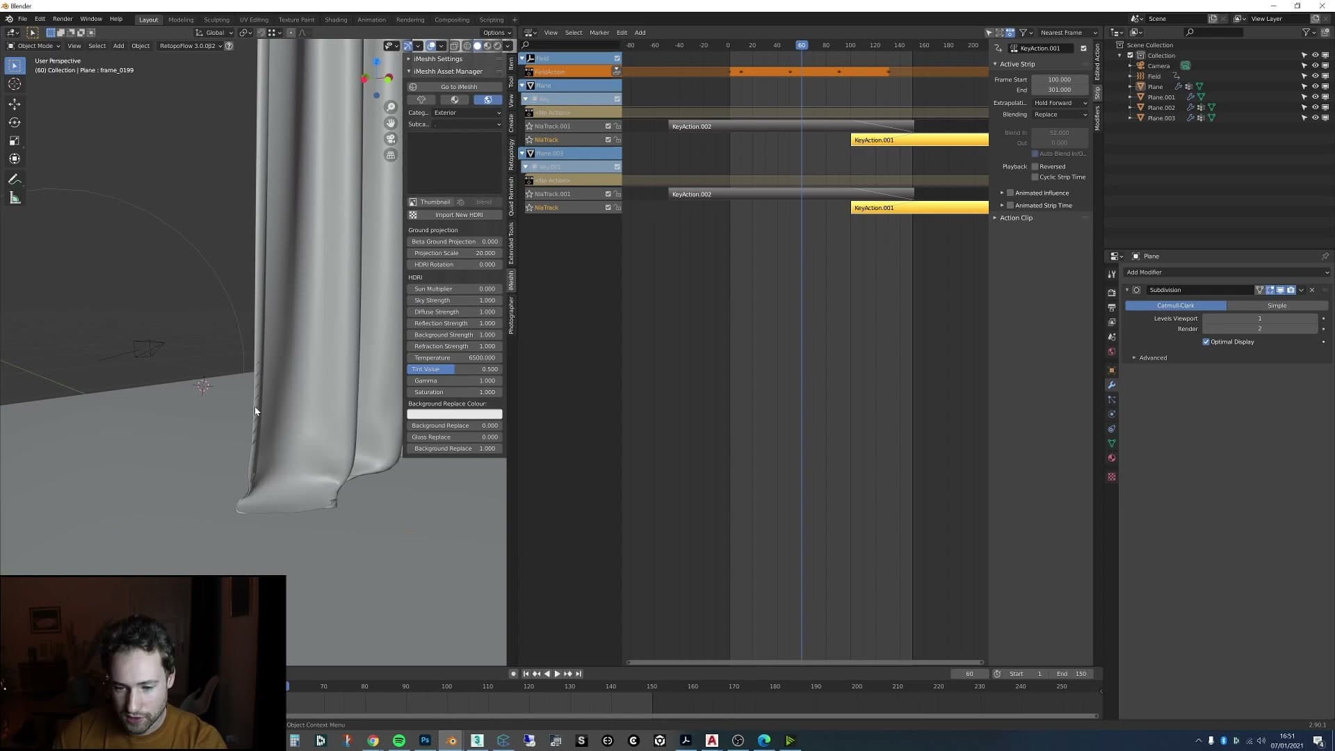
Curtains almost always look fake in arch-vis when they don't have a seam around their edge. It's one of those details you don't consciously notice is missing until it's there, but the eye reads the curtain as a flat plane without it.
With the edge strip selected, add a Solidify modifier and set the thickness fairly low, around 0.01. That gives the hem just enough depth to catch light and shadow like a real folded seam.
If the solidified edge starts intersecting the main curtain panel, set the modifier's offset to 0 so the thickness grows evenly on both sides rather than punching through one face. From there you can dial the thickness up or down to taste depending on how chunky you want the hem to feel.
Repeat the whole process on the second curtain so both panels match. With the hems in place, the cinemagraph reads as a proper piece of fabric drifting in the breeze rather than a flat plane pretending to be one.
Render the loop with E-cycles at near-4K
Use E-cycles to roughly halve render time, push the output close to 4K so the denoiser has more data to chew on, drop samples to 175 and rely on denoising for a clean final result.
E-cycles cuts render time in half
For the final output I switched to E-cycles, the optimised Cycles fork. On this scene it dropped per-frame render time from around 11 minutes in stock Cycles to about 6 minutes (roughly half) with no other changes to the scene. I'll be honest: I don't fully understand how the speedup works. I only know it consistently halves my render times on this kind of interior.
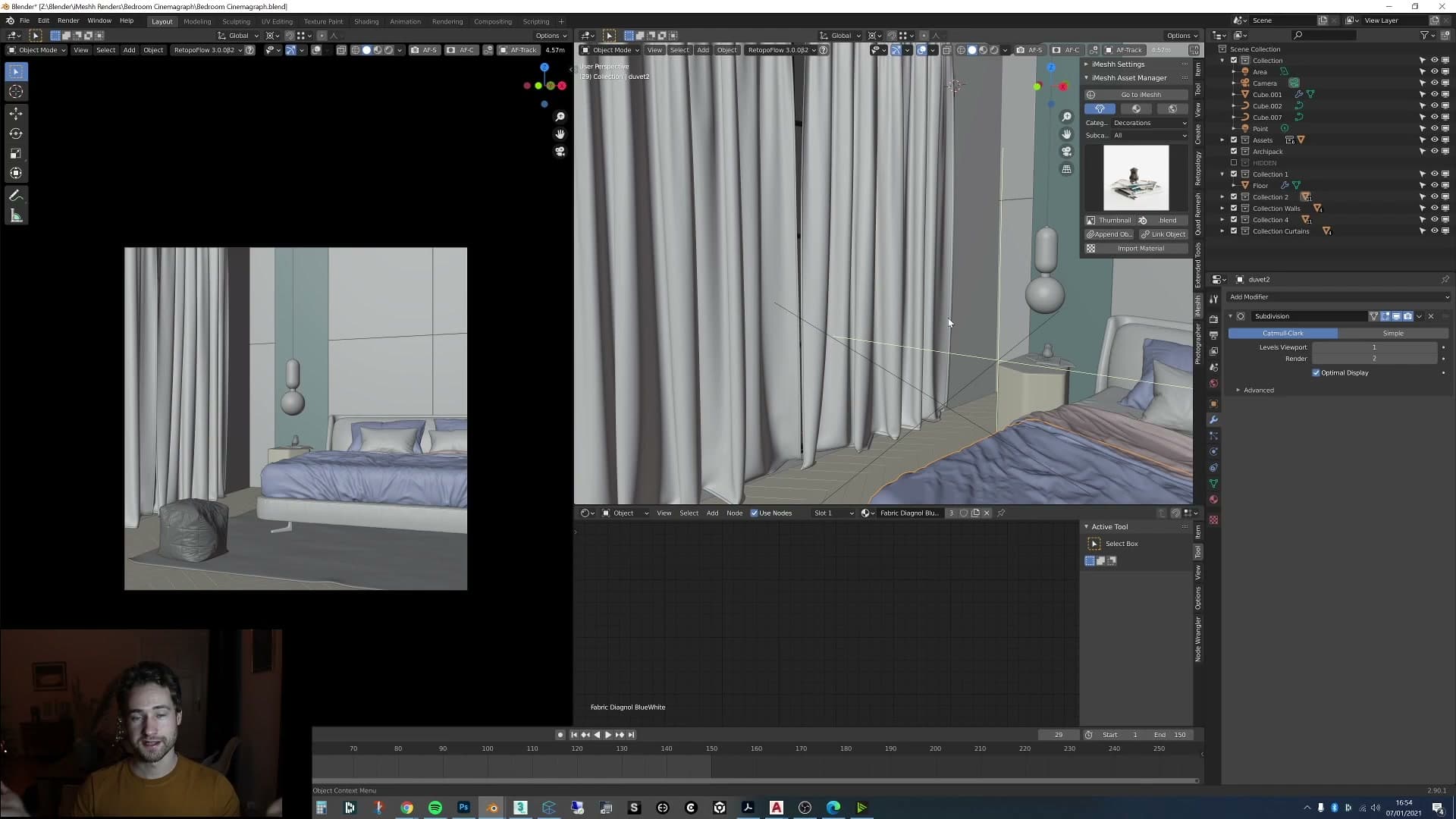
That makes the maths painless for a 150-frame loop: 6 minutes per frame × 150 frames is 900 minutes, or about 15 hours of compute. Split across an overnight render and the following day, the full loop finishes without monopolising your workstation for days.
175 samples, denoise, and near-4K resolution
Two settings carry the rest of the render: a deliberately low sample count, paired with a higher-than-usual output resolution, with the denoiser bridging the gap between them.
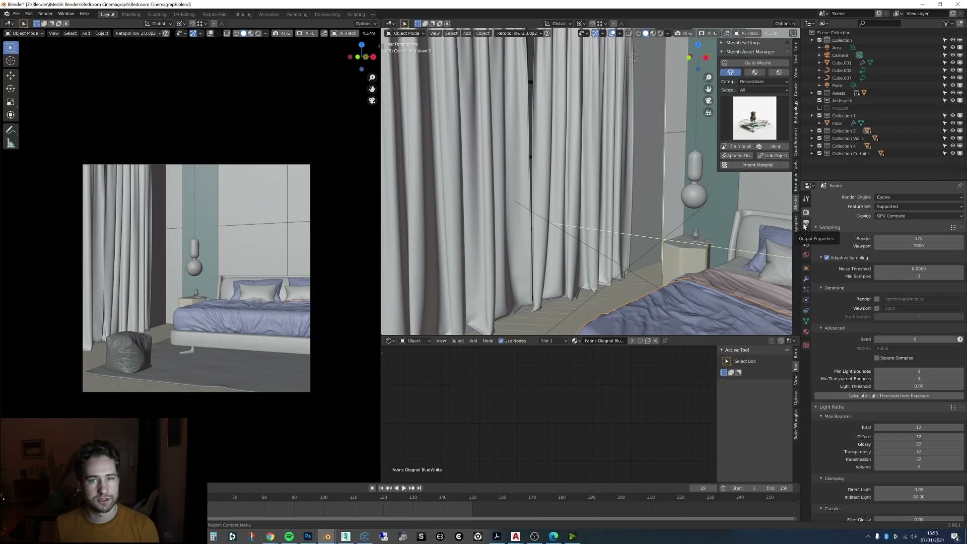
Samples are set to 175. That is very low. The raw frames come out noisy, and the denoiser has to work hard to clean them up. For a still image I'd normally push samples much higher (closer to 1000) if I had the time, but with 150 frames to render in series, keeping samples low and leaning on the denoiser is the trade-off that makes the timeline realistic.
The other half of that trade is resolution. The frames are rendered at almost 4K rather than a smaller delivery size, because denoising tends to behave better when it has more pixels to chew on. My theory is that the denoiser's underlying model was trained on high-resolution imagery, so feeding it a larger frame gives it more detail to recover. In practice, the combination of high resolution and low samples produces a cleaner final image than the same low sample count would at a smaller resolution.
With the frames in the can, the next stop is Premiere. You can do the cinemagraph masking inside Blender's compositor, but I'm faster in Premiere, so that's where I finish the loop.
Build the cinemagraph in Premiere with a feathered mask
Drop the rendered frames as a sequence into Premiere, freeze a still on the lower track, layer the animated render above and feather a mask around just the curtain so every static surface stays grain-free.
Frozen still under the animated curtain
Drag the rendered frames straight into Premiere as a sequence, then duplicate the clip onto a second track directly above it. The two tracks start out identical. The trick is what you do to each one next.
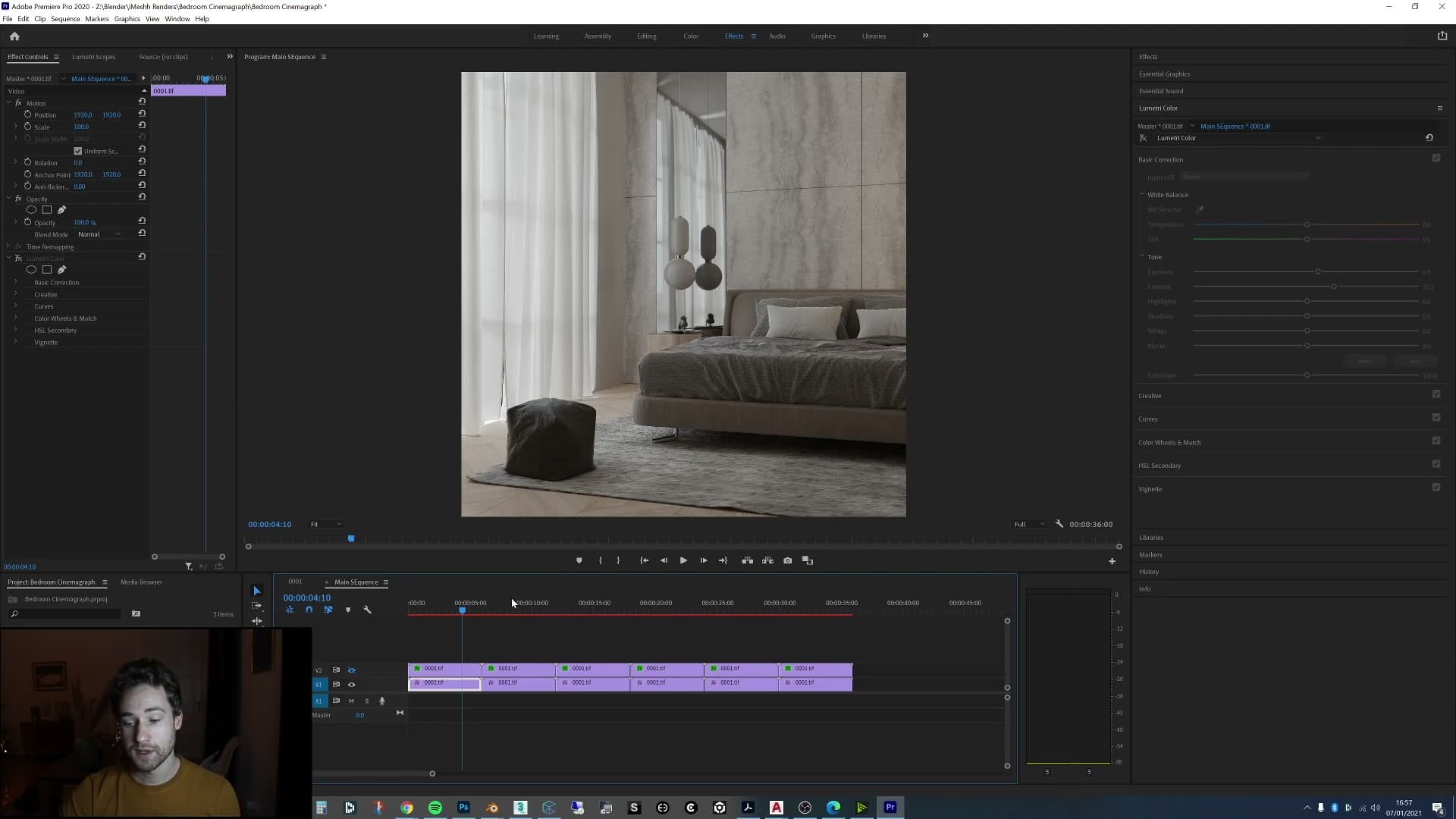
Freeze the lower track on a single frame so it becomes a still photograph for the duration of the loop. Leave the upper track playing as normal. If you scrub the timeline now, the bottom layer never changes while the top layer animates.
The reason for the double-up is the denoiser. With samples that low, the denoised pass shifts subtly from frame to frame and leaves a faint grain crawling across every surface. Perfectly acceptable on a still render, but obvious once it's playing back as video. A real cinemagraph reads as a photograph that one part of has come to life, so any noise change on a supposedly static surface breaks the illusion.
Draw a mask on the upper, animated track that hugs the curtain and nothing else, then add a feather so the edge of the mask blends softly into the still underneath rather than cutting hard. The curtain animates through the mask; everything outside the mask falls through to the frozen still on the lower track, so cushions, walls and floor stop shimmering entirely.
A trace of grain may still creep over surfaces close to the mask edge. There's a touch over the cushion in this shot, for example. It's subtle enough to leave in. If it ever bothered you, the mask could simply be redrawn tighter or extended to cover that area too.
Loop and square format for Instagram and Facebook
With the masked clip working, duplicate it end-to-end across the timeline so the loop repeats several times back-to-back. Instagram and Facebook don't loop video natively, so a viewer scrolling past only sees one play unless the loop is baked into the file itself. Pre-building four or five repeats gives the post a chance to feel hypnotic before the viewer moves on.
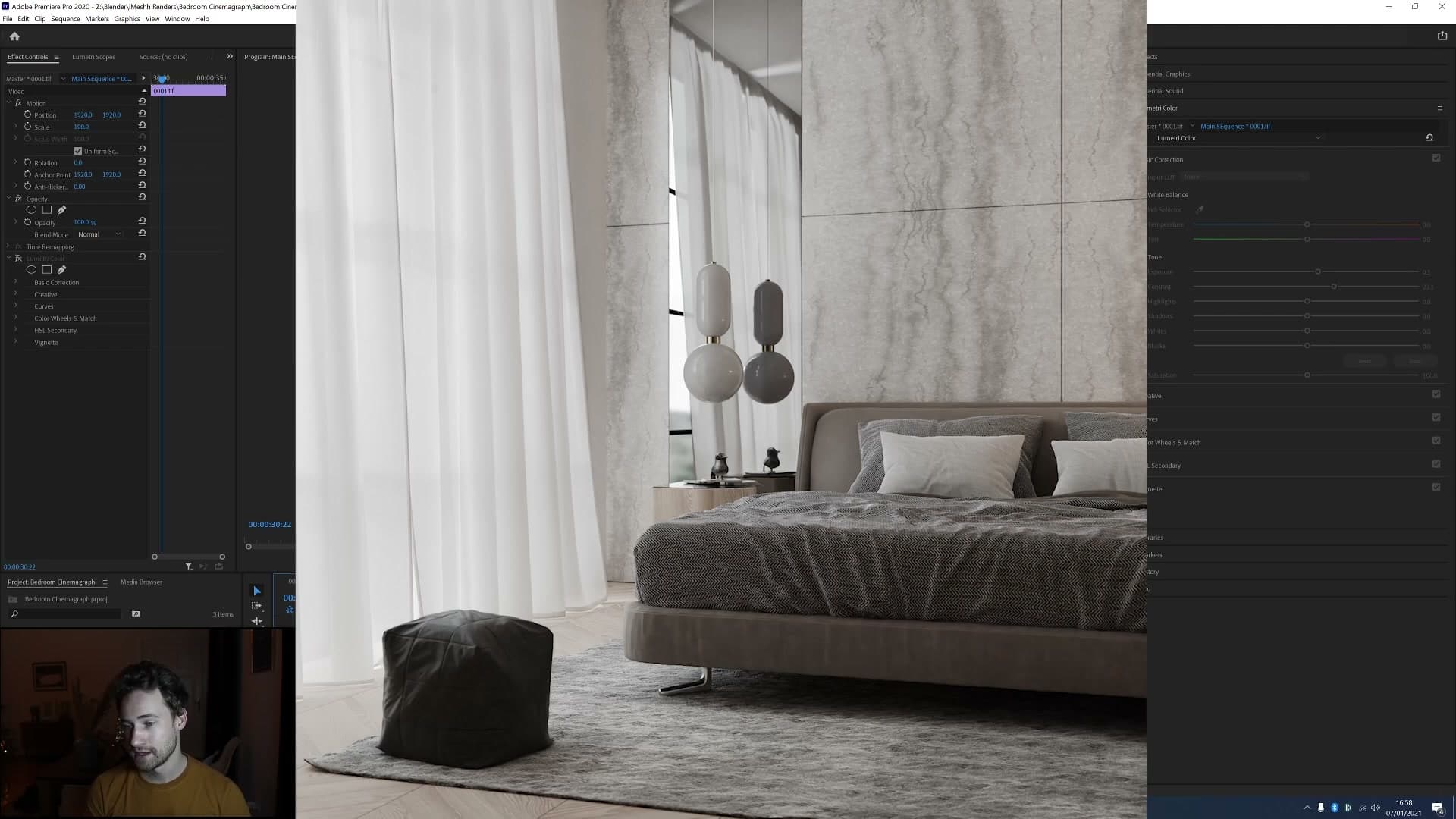
Crop the output to a square frame at the same time. The render was wide for arch-vis framing, but the cinemagraph is destined for social feeds where square sits better in the column than a letterboxed widescreen clip.
Tools and credits
Everything mentioned in this tutorial, with links.
- Blender : the renderer this entire build runs in.
- iMeshh : studio platform (project management, client review, asset library, invoicing). The asset library used in this tutorial is included with every iMeshh Pro plan.
- Poly Haven : free CC0 textures and HDRIs.
Pillar guide: Animation hub