What we're building and why exterior is harder than interior
The tutorial walks through a hillside cabin render. The bigger lesson is that exterior scenes leave you exposed to everything: landscape, weather, surrounding buildings, sky. None of the comfortable shortcuts of an interior ("put a curtain on the window") apply.
The scene we'll build and what it teaches
Welcome to a full exterior arch-vis walkthrough. By the end of this build you'll have a moody hillside cabin render assembled from sculpted terrain, scattered grass, cloud-shadow lighting, a hand-built character and a Photoshop comp on top. Exterior projects have been the most-requested topic on this channel for a long time, and this tutorial is the workflow distilled into one scene.
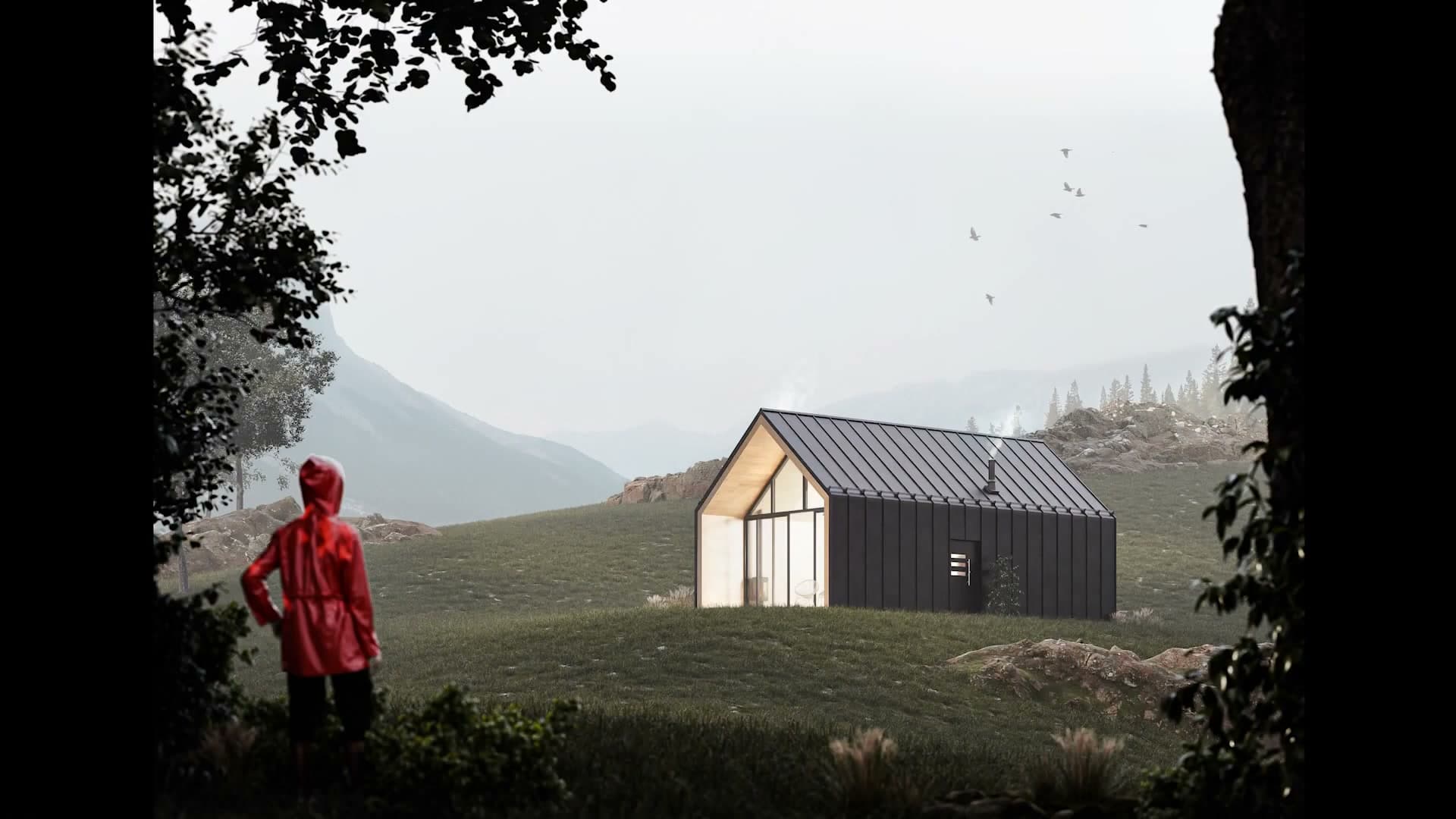
The aim isn't to copy the cabin exactly. It's to walk through the concepts you can lift into your own exterior shots: how to sculpt landscape around an existing building footprint, how to fake cloud shadows on an HDRI day, how to scatter foliage at scale without melting the viewport, and how to finish the render in Photoshop with masks driven straight out of Blender's cryptomatte passes.
iMeshh assets are used throughout for the furnishings and a few of the dressing pieces, but nothing in the build depends on owning a specific pack. Anywhere you see an iMeshh model dropped in, swap it for whatever fits the scene you actually want to make. The techniques carry across unchanged.
Why exterior scenes need a different mindset
Exterior projects sit on the opposite end of the spectrum from interiors. Inside a room the space is confined and you control every sight line; if something outside the window is distracting, you can drop a curtain and the problem disappears.
Outside, you don't have that luxury. The scene is open to every element around it: landscape, weather, sky, neighbouring structures. Each one has to be considered and managed deliberately. In an urban context that means contending with the surrounding buildings and finding a way to stop them competing with your hero. In a natural setting it means selling terrain, foliage and atmosphere as a believable whole.
The hillside picked for this tutorial leans into the natural-setting version of that problem. It's a forgiving environment to start in (aesthetically pleasing on its own and free of the cluttered backdrops you get in cities), but the lessons about layering foreground, midground and background, and about lighting an open scene, transfer directly to any exterior you'll tackle later.
Roughing the cabin and locking the camera
Either drop in the iMeshh cabin asset or build the corrugated-metal shell from an extruded plane with an array modifier. Then frame the camera, set a Y shift to keep verticals straight, and lock the resolution before anything else lands in the scene.
Corrugated metal cabin from an extruded plane
The cabin in this scene comes from the iMeshh library, but if you don't have access you can build the shell yourself in a few minutes. Because the building sits some distance from the camera in the final frame, you don't need a high level of detail to make it read. A rough shape is enough.
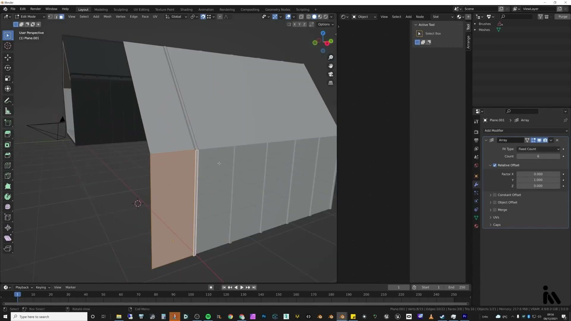
Start with a plane, extrude it out into a strip of corrugated metal profile, then add an Array modifier to repeat that strip into walls. From there it's just blocking out the cabin shape. Before you go any further, double-check the scale so the building sits at a believable size against the rest of the scene. Getting that right now avoids proportion problems later.
This tutorial isn't going deep into building construction itself. The focus is on the landscape, the framing, the lighting and the post-work, so the cabin is treated as a stand-in. Proper construction walkthroughs (from a cabin up to a multi-storey or a regular house) need their own dedicated tutorials, because while the fundamentals overlap, the approach for each is quite different.
Camera framing, resolution and the Y-shift trick
Once the rough cabin is in place, drop into camera view and start shaping the composition. Because this is a free render with no client constraints, you can fly the camera around until you land on a frame you genuinely like. For this scene, that meant a low angle looking up slightly towards the cabin. Set the render resolution first so you're framing into the aspect ratio you'll actually deliver.
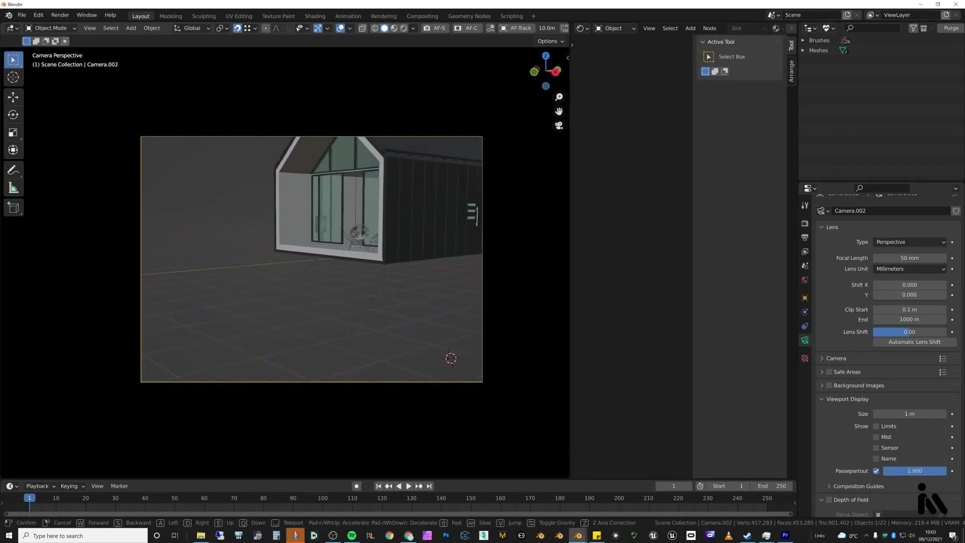
Before composing in earnest, open the camera's viewport display options and turn the Passepartout up to 1. That fully blacks out everything outside the camera frame in the viewport. Seeing the wider scene while you're trying to lock a composition is distracting, and the opaque bars take that distraction away.
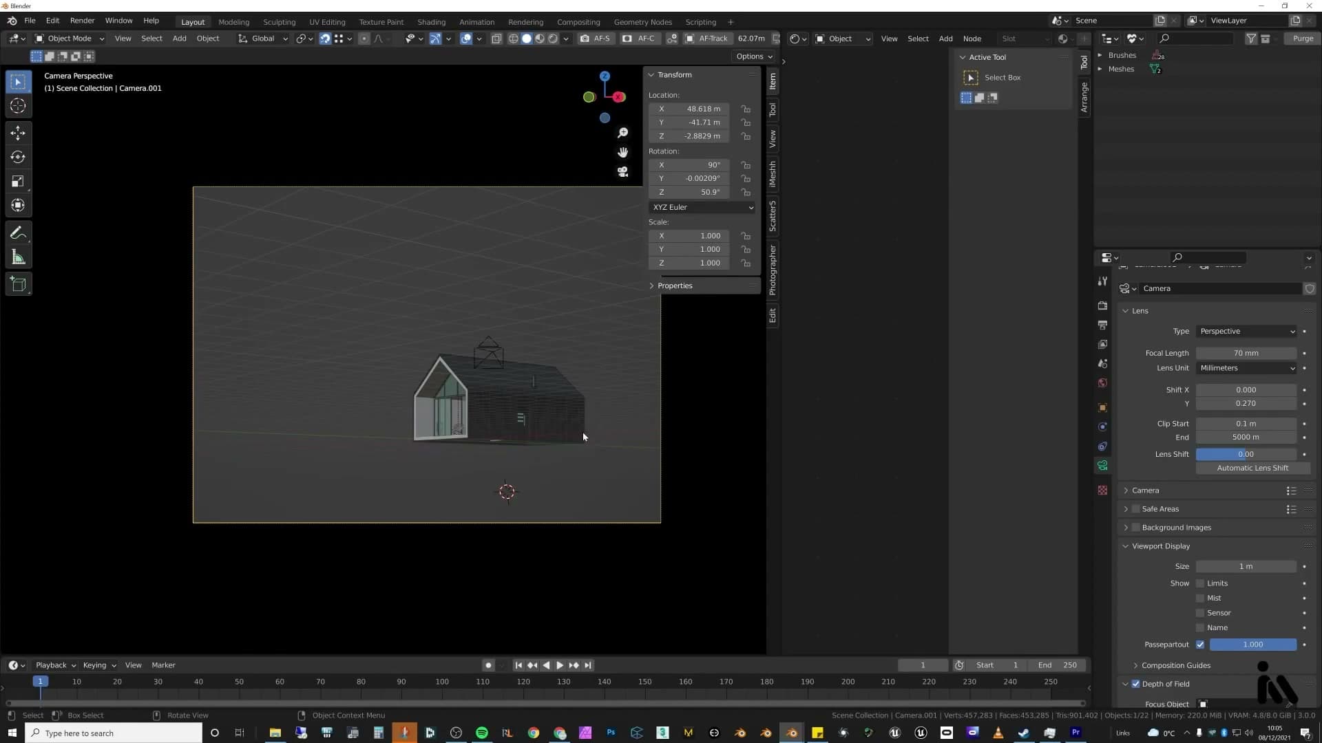
Camera rotation matters next. Click the camera, head into its properties, and make sure it's still sitting level at 90° rather than drifting to some funny angle. A level camera is what keeps vertical lines vertical in the render. The catch is that levelling the camera often doesn't frame the subject the way you want, and that's where the Y shift comes in. Adding a Y shift in the camera's Lens properties slides the framing up or down on the sensor without rotating the camera, so every vertical line stays straight. No warped buildings, no bent edges, no wonky verticals. Just a pleasing, architecturally honest frame.
Sculpting the hillside terrain
Add a giant subdivided plane, apply scale, hide the faces directly under the cabin so proportional editing can't lift them, then sculpt the foreground dip, mid-ground rise and background hill. A flat brown-green diffuse fills any gaps the grass won't cover.
Create the ground plane and add edge loops
Start by adding a new mesh (a plane) and scaling it up until it comfortably covers the area your camera will see. The important step right after scaling is to press Ctrl+A and apply the scale, so every subsequent edit behaves predictably.
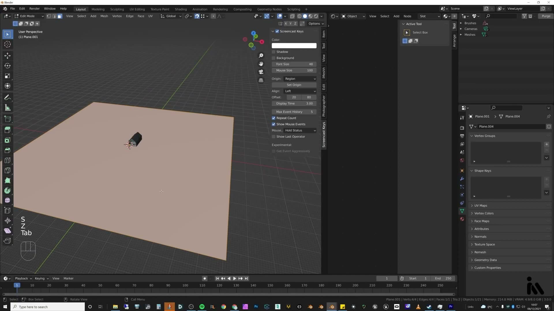
With the plane still selected, drop into edit mode and use Ctrl+R to slice in a generous grid of loop cuts running both ways across the surface. These extra edges are what proportional editing will pull around when you start sculpting hills. The denser the grid, the smoother the curves you can shape.
Hide the centre faces and sculpt with proportional editing
Before you sculpt anything, protect the patch of ground the cabin will sit on. Select the cluster of faces directly under the building's footprint, then press H to hide them. They remain in place geometrically; you just can't see or accidentally edit them any more.
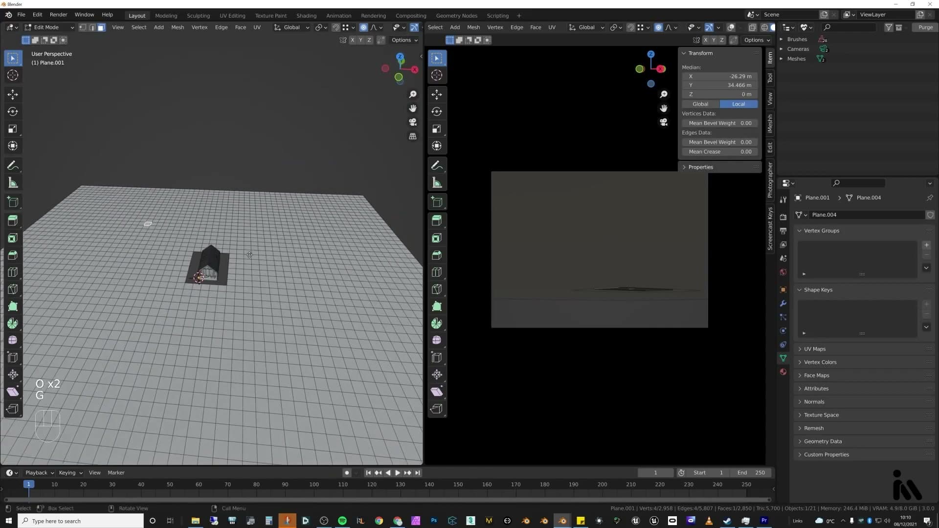
The reason for hiding rather than deleting is what happens next. When you turn proportional editing on with O, any movement you make falls off into the surrounding vertices. Hidden faces are ignored by that falloff, so the ground under the cabin stays flat even as the terrain rises and dips around it. Drop back into object mode at any point and you'll see the centre patch still sitting exactly where you left it.
Switch into camera view so you can judge the shape against your actual framing. The aim here is three distinct reads in the same image: a foreground close to the lens, a mid-ground where the cabin sits, and a background hill behind everything. With proportional editing on, grab a vertex, then use the mouse wheel to widen or narrow the falloff radius before you commit the move.
Pull a strip of vertices near the camera downwards to dig out a small valley in the foreground. Lift the mid-ground back up so the cabin has something to sit on, then raise the back row of vertices higher still to form the distant hill. Keep pushing and pulling until the silhouette reads cleanly through the lens. The shape only has to work from the camera's angle, so it's worth taking the time to play with it until it feels right.
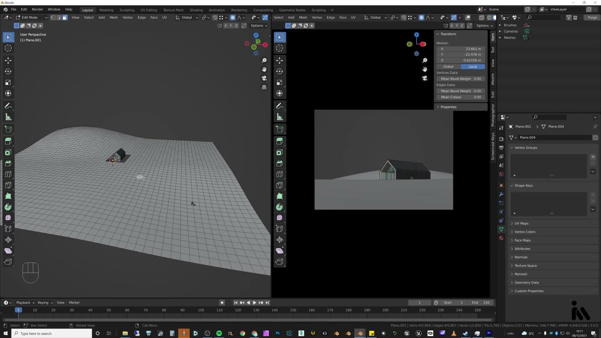
What you should end up with is roughly: camera looks across a near rise, the ground dips into a valley, climbs again where the building stands, and then steps up once more into the hill behind. That whole landscape comes from proportional editing alone. No sculpt brushes needed.
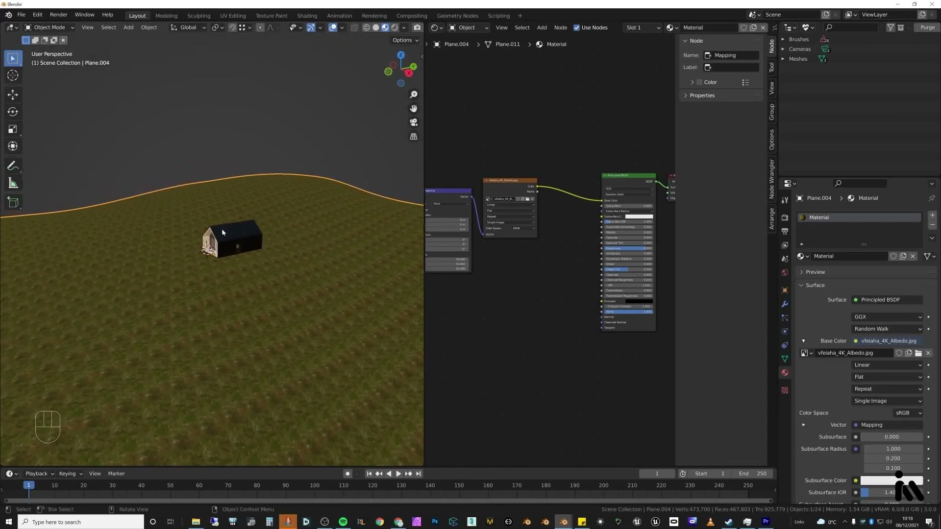
A simple brown-green base shader
With the terrain shape locked in, the last step before moving on is a very simple shader for the ground. The grass scatter that comes next will hide most of it, so the base material only needs to cover any patches that peek through.
HDRI sky, sunlight and fake cloud shadows
Load Waterbuck Trail (2K, since it'll be hidden anyway), add a sun at 4800K, then build the technique most exterior archviz misses: a plane high above the scene with a noise-driven alpha pattern that casts shadows-only, giving you cloud-shaped dappled light the HDRI can't.
Load an HDRI from the iMeshh asset manager
With the terrain dressed in a basic green-brown diffuse, it's time to start lighting the scene. The first job is the world environment. Open the iMeshh asset manager, switch to the HDRIs category, and drag in whichever sky reads as the right mood for the shot. For this hillside cabin, the pick is Waterbuck Trail.
Drop the resolution to the 2K variant rather than the 4K or 8K. The HDRI is doing two jobs here: providing the colour and bounce of the sky, and seeding the ambient lighting on the geometry. It will be almost entirely hidden behind fog and a background plate, so paying the render and memory cost of a higher-resolution sky buys you nothing visible.
Noise + colour ramp + mapping into the alpha
Here's the technique that exterior archviz almost always skips. An HDRI captures the colour and intensity of the sky, but it cannot cast the soft, drifting shadows that clouds actually throw across a landscape. On an overcast day those rolling patches of dappled light are most of what sells the scene, so you have to fake them.
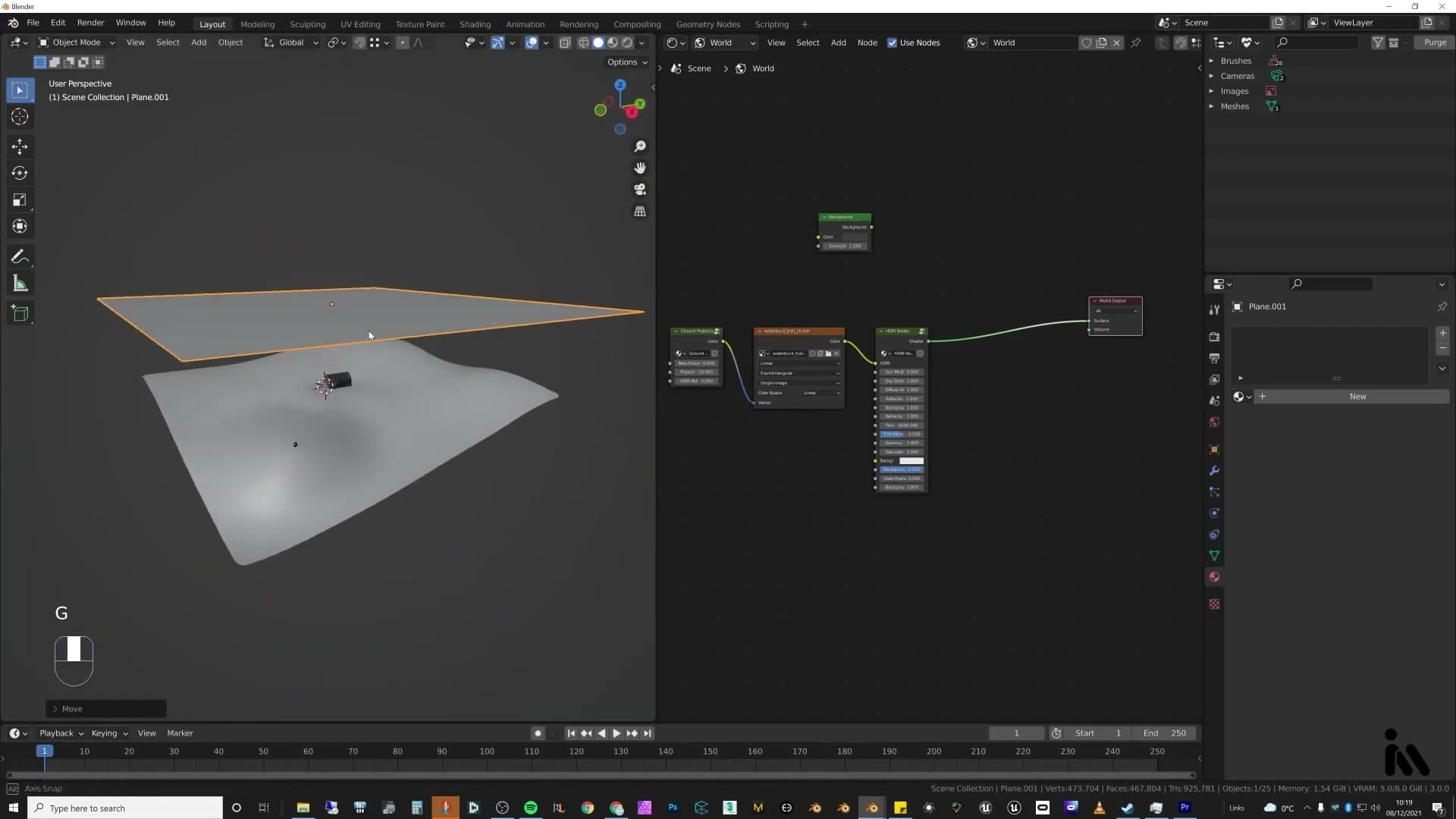
Add a large plane sitting high above the whole scene, covering the full ground footprint and then some. This plane is going to act as the cloud layer between your sun and your terrain. Give it a fresh material and open the shader editor.
Build the shader with Shift+A. You need three nodes wired into a Principled BSDF: a Noise Texture for the cloud pattern, a Color Ramp to tighten that noise into something with sharper shadow edges, and a Mapping node feeding the noise so you can scale and offset the cloud pattern later. Match the values shown on screen, or dial them in by eye until the noise reads as broken-up cloud cover rather than fine grain.
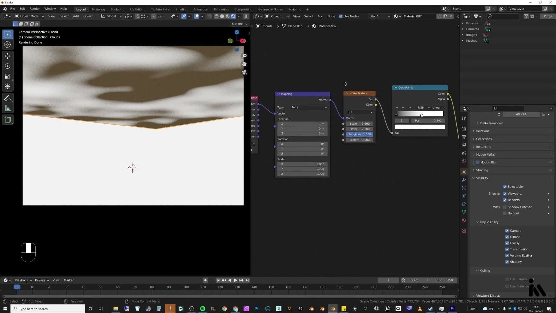
The critical move is where you route the output. Send the colour-ramp output into the shader's base colour and into the Alpha input. Routing it into alpha punches transparent holes through the plane wherever the noise reads as bright. Those holes are where sunlight will pass through and hit the ground.
For the texture coordinates, either generated or UV will do. The Mapping node is what gives you real control over how big the clouds read at ground level. A larger scale gives you wide, lazy patches; a smaller scale gives you tight dappled light.
Sunlight at 4800K and shadow-only visibility
With the cloud plane in place, the shadows only appear once something is actually trying to shine through it. Hit Shift+A and drop in a Sun light. You can drive the colour from the world shader if you prefer, but a dedicated sun gives you more control. Set the colour temperature to 4800K. That's cool enough to read as overcast daylight without going blue.
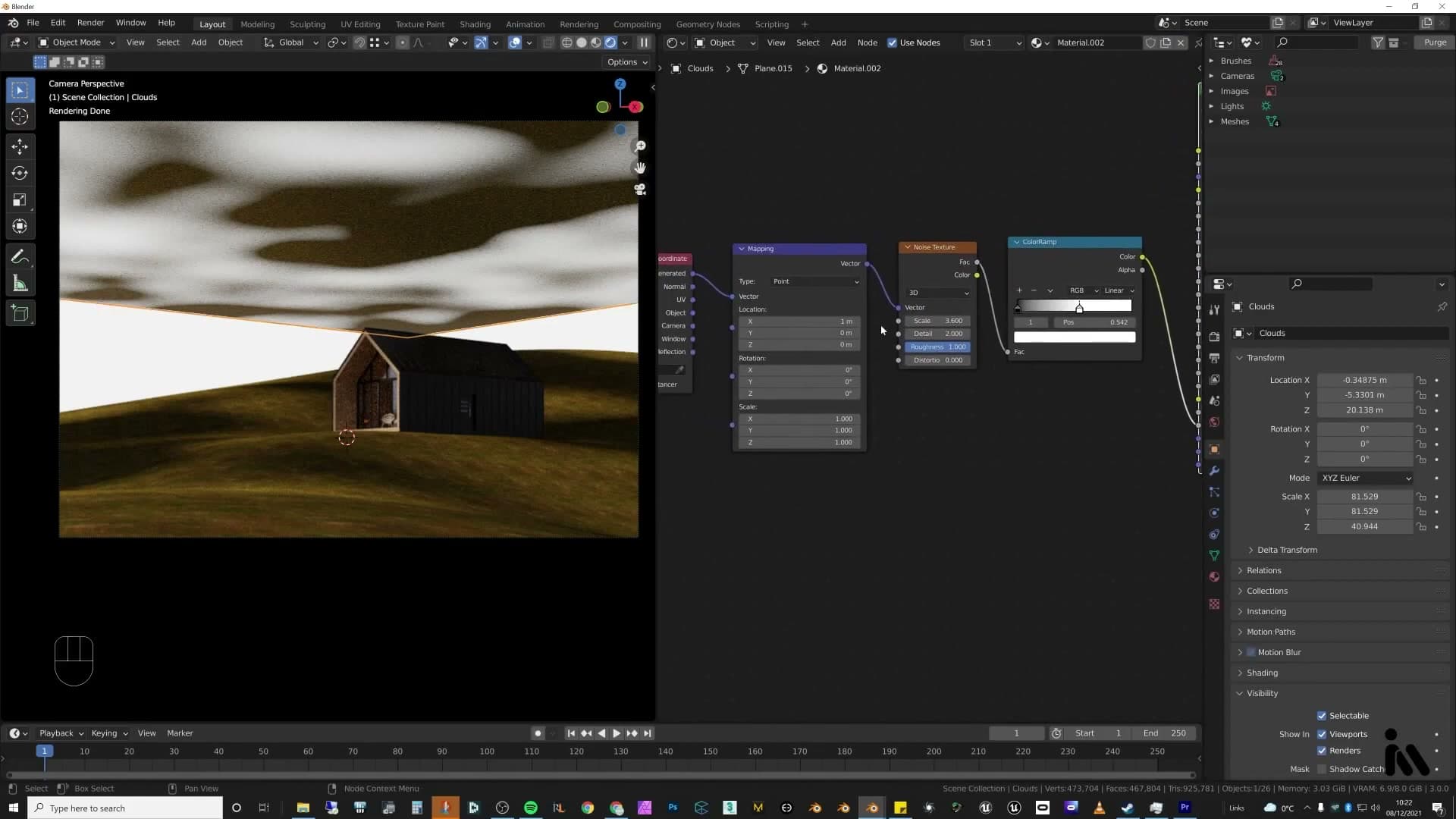
Rotate the sun so it rakes across the scene at the angle you want, then check the viewport. You should now see broken patches of light and shadow falling across the terrain. The cloud plane is doing its job. Grab the plane and slide it sideways and you'll watch the dappled shadows roll across the field in real time, which is the effect that's so hard to get out of an HDRI alone.
The problem is that the cloud plane itself is still visible to the camera, which obviously you don't want. Open the plane's Object Properties, find the Visibility → Ray Visibility section, and turn off every ray type except Shadow. Now the plane contributes nothing to camera, reflection, refraction or diffuse bounce. It exists in the scene only to cast shadows from the sun passing through its alpha holes.
Strictly speaking this isn't physically accurate. Real clouds have volume, they scatter light, and they don't sit on a flat plane above your scene. For this particular render it doesn't matter. The story is a foggy hillside at either early morning or late evening, with breaks starting to appear in the cloud cover as the sun pushes through. The fake cloud shadows read as the sun finding gaps in that broken sky, and the fog hides the cheat completely.
Use the technique whenever you have a wide exterior shot on an overcast or partly cloudy day. The variation it adds to the lighting (subtle dark sweeps across the ground) is what separates a render that looks like a Blender scene from one that looks like a photograph.
Volumetric fog with Principled Volume
Box-scale a cube around the whole scene, add Principled Volume with a tiny emission, and drive density through a colour ramp + multiply node so the fog reads as a subtle morning haze rather than a wall of grey.
Cube and Principled Volume shader
Fog in this scene is just a big cube filled with a volume shader. Add a cube, scale it up, then use S, Shift+Z to push it along the Z axis until the box comfortably covers the ground and everything that's going to sit inside the frame.
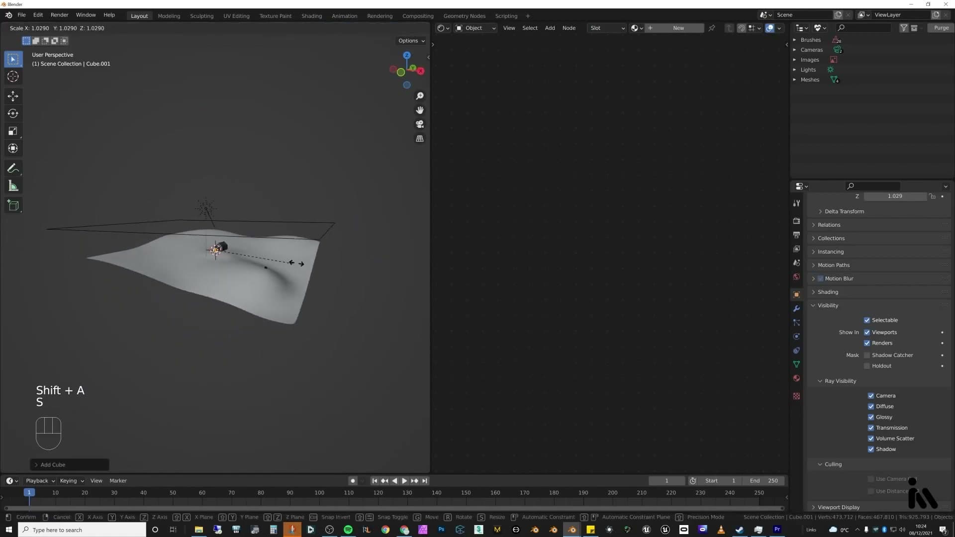
With the cube selected, open a fresh shader setup, delete the default surface node, and search for Principled Volume. Plug it into the Volume input on the material output. The one tweak worth making up front is Emission Strength: set it to 0.001 so the volume carries a faint internal glow rather than reading as flat grey.
Colour ramps and multiply for density falloff
Density is where the fog earns its mood. A flat value pumped into the Density socket gives a wall of grey; what you want is a procedural shape that clumps and thins across the scene. Build a base texture, run it through a Colour Ramp to tighten the values, then a Multiply node to darken the result, and feed that chain into the Density input on the Principled Volume.
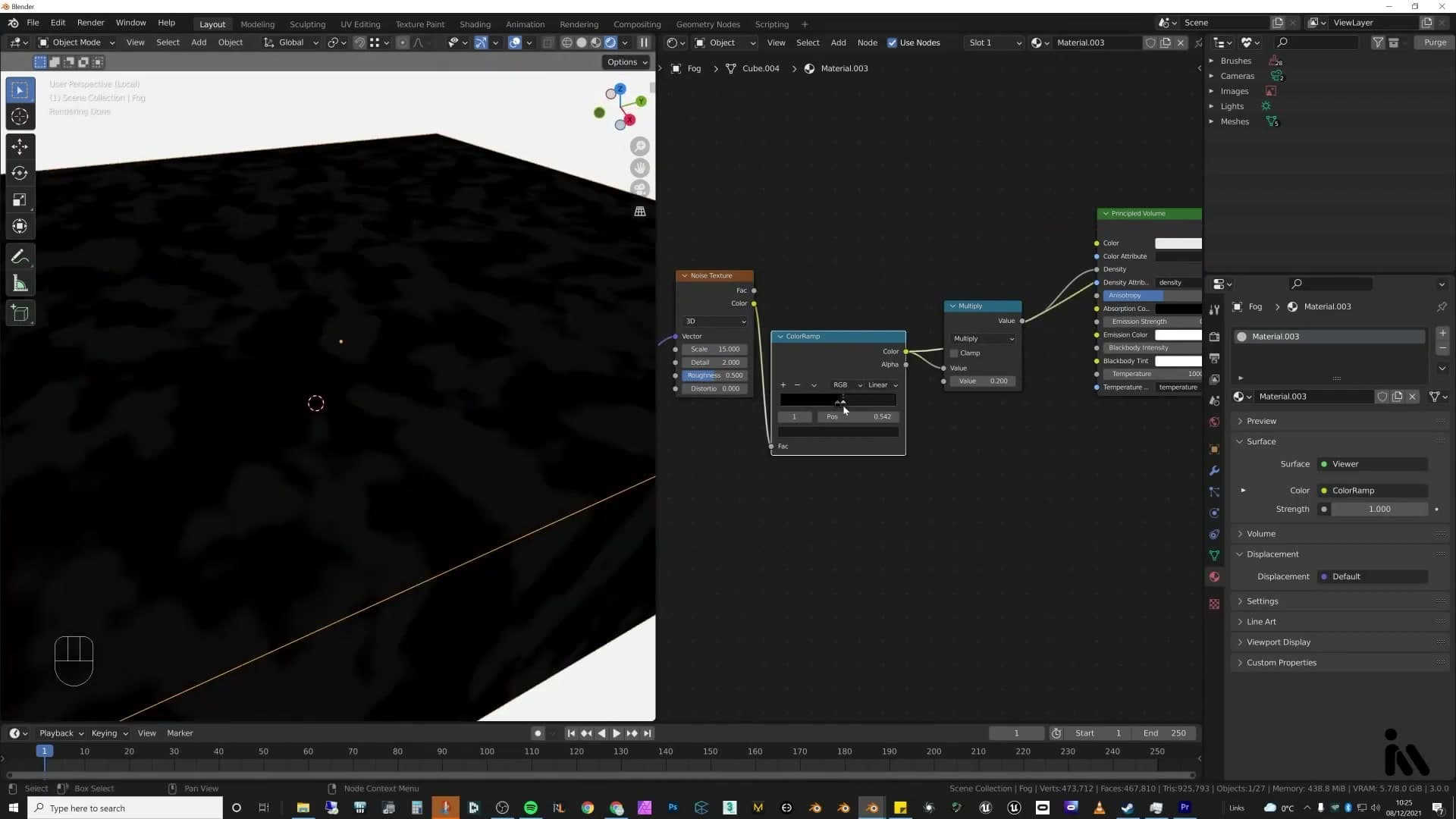
Resist the urge to crank density. Pushing the value to 1 or 10 works, and you can clearly see the fog get heavier each time, but it quickly starts fighting the sun for attention. The whole point of this lighting setup was the dappled cloud-shadow contrast. Keep the density really low; you want enough haze for distant geometry to sit back, not enough to grey out the highlights.
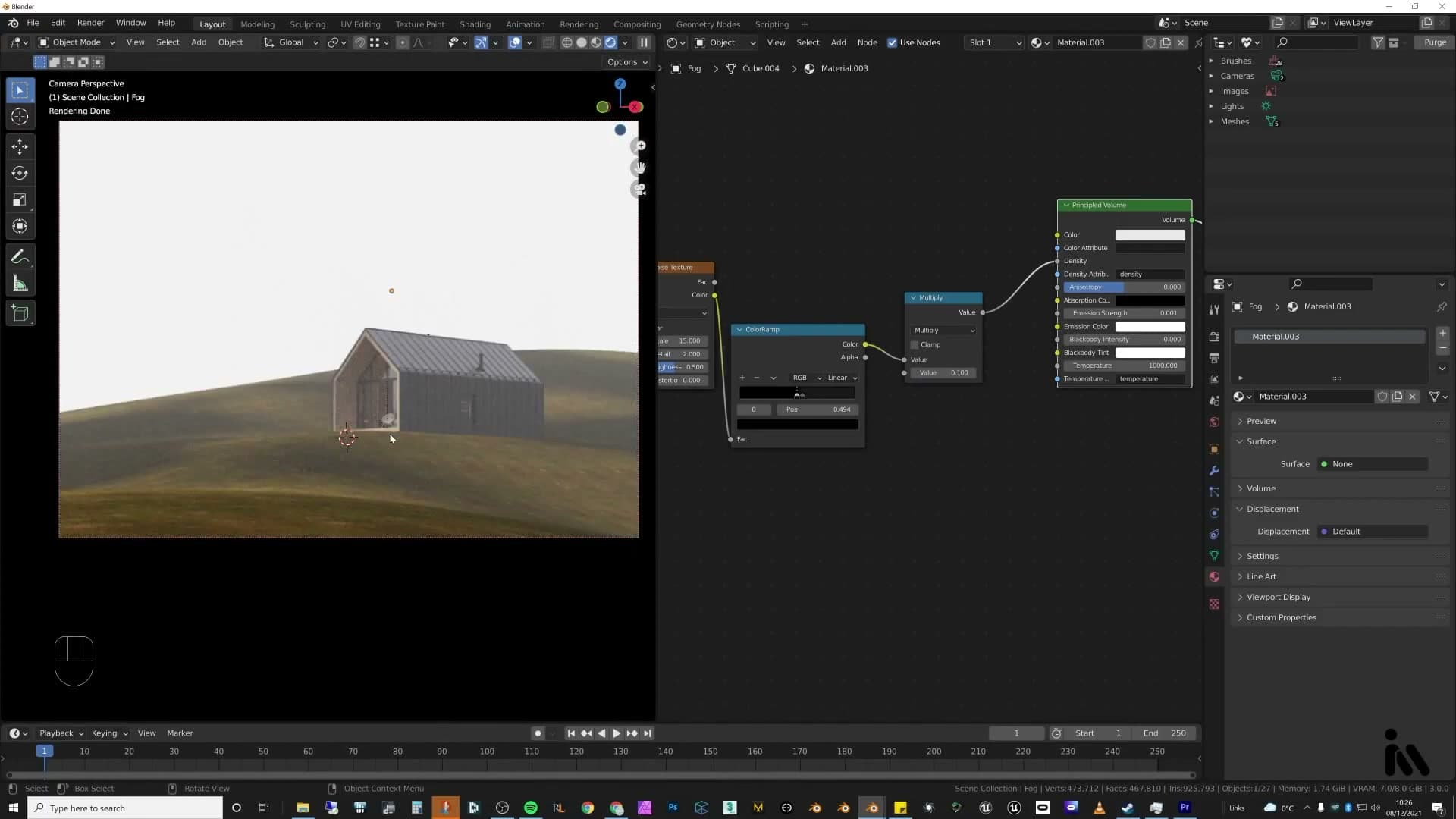
If the rendered fog still reads as too heavy, you can knock it back further in post. The final comp on this scene actually has the volume dialled down a touch because it came out a little too strong straight out of Cycles. Better to err on the side of subtle and lift it in Photoshop than to bake in a wall of haze you can't claw back.
Grass that doesn't kill the viewport: Scatter
Native particle systems will choke a viewport this big. Scatter (the add-on) generates the same instances but adds point-cloud display, camera-frustum culling and reveal-near-camera, so grass-heavy exteriors stay interactive.
Why native particle systems lag
The first real exterior-render wall hits the moment grass goes in. A standard particle system scatters across the terrain and the viewport stops responding. You try to orbit and nothing moves. That is the default experience on any large outdoor scene, and it gets in the way of every composition decision still on your list.
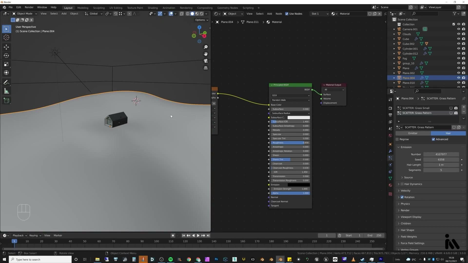
There are two workarounds inside vanilla Blender. The easiest is to add the particle system and then immediately turn it off in the viewport, accepting that you will be working blind until render time. Geometry nodes also has a scattering workflow that can distribute lots of objects across a wide surface with a bit more control over what gets evaluated. For this scene though, the tool of choice is the Scatter add-on.
Scatter setup with point-cloud display
Scatter is a particle system with the bottlenecks taken out. It still builds a Blender particle system under the hood, but layers on presets and pre-built grass biomes. On the Blender 3.0 pre-release used here the bundled biome packs would not load, so the workflow falls back to bringing in your own grass planes (a collection of single planes with various grass clumps mapped onto them, pulled from an existing scatter pack) and treating those as the source objects Scatter will distribute.
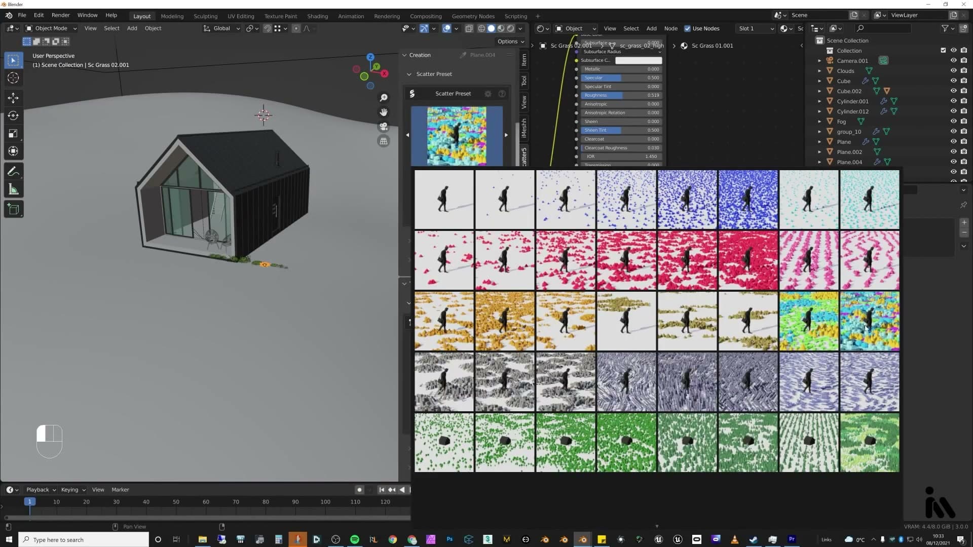
The setup runs in four clicks:
1. Select the terrain plane you want to scatter onto. 2. Pick a scatter type from the distribution presets. 3. Select all the grass plane objects you want distributed. 4. Hit Scatter Objects.
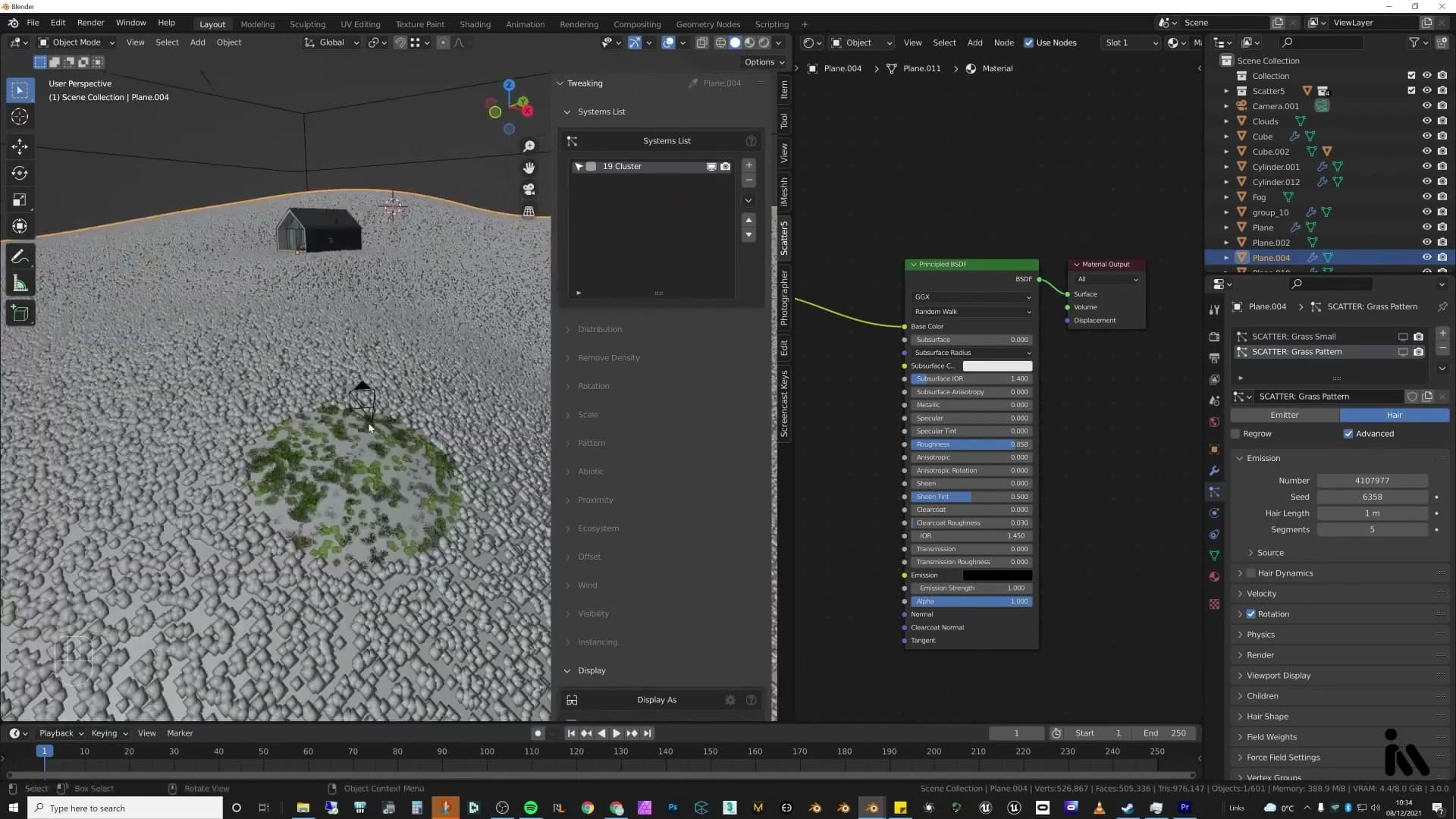
Scatter notices when you are about to drop a huge number of instances and hides them by default, which already prevents the lag spike a native particle system would cause. From there, open the display panel, set Display As to Point Cloud, and turn on Reveal Near Camera. Every blade past the foreground now shows as a single dot rather than full geometry, and only the planes immediately in front of the camera resolve as real grass. The viewport snaps back to being fluid.
Density, camera optimisation and render preview
Density comes next. Push the particle density up (somewhere around 30 to start, then up to roughly 50 if the ground still looks bald) and paint in extra density in the patches you want lusher. With the biome packs installed this step would be automated for you; without them it is a manual pass and worth a couple of minutes of tweaking until the coverage reads right.
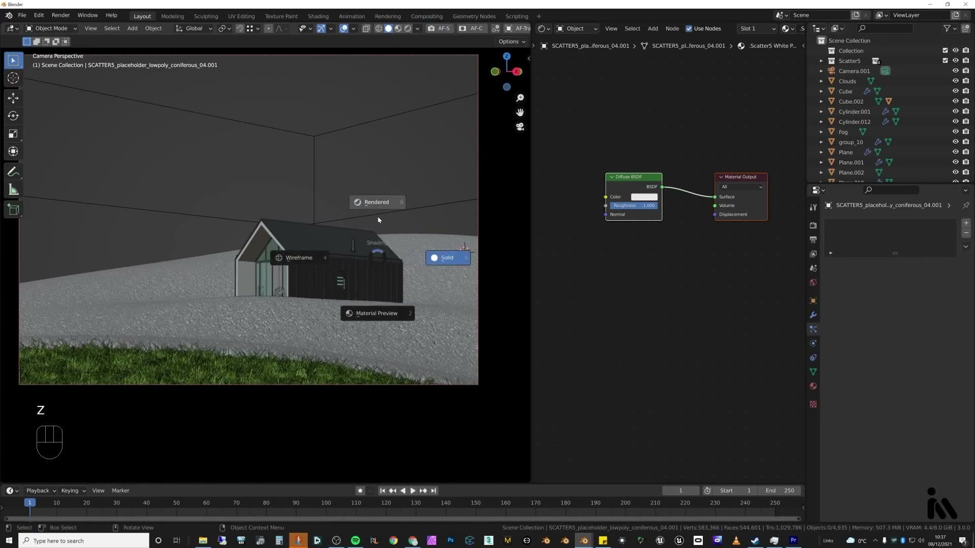
The other essential setting is Camera Optimisation. Switch it on and Scatter culls anything outside the camera frustum entirely. None of the off-frame grass is generated or evaluated. For a scene this size, that single toggle is what makes the whole approach viable.
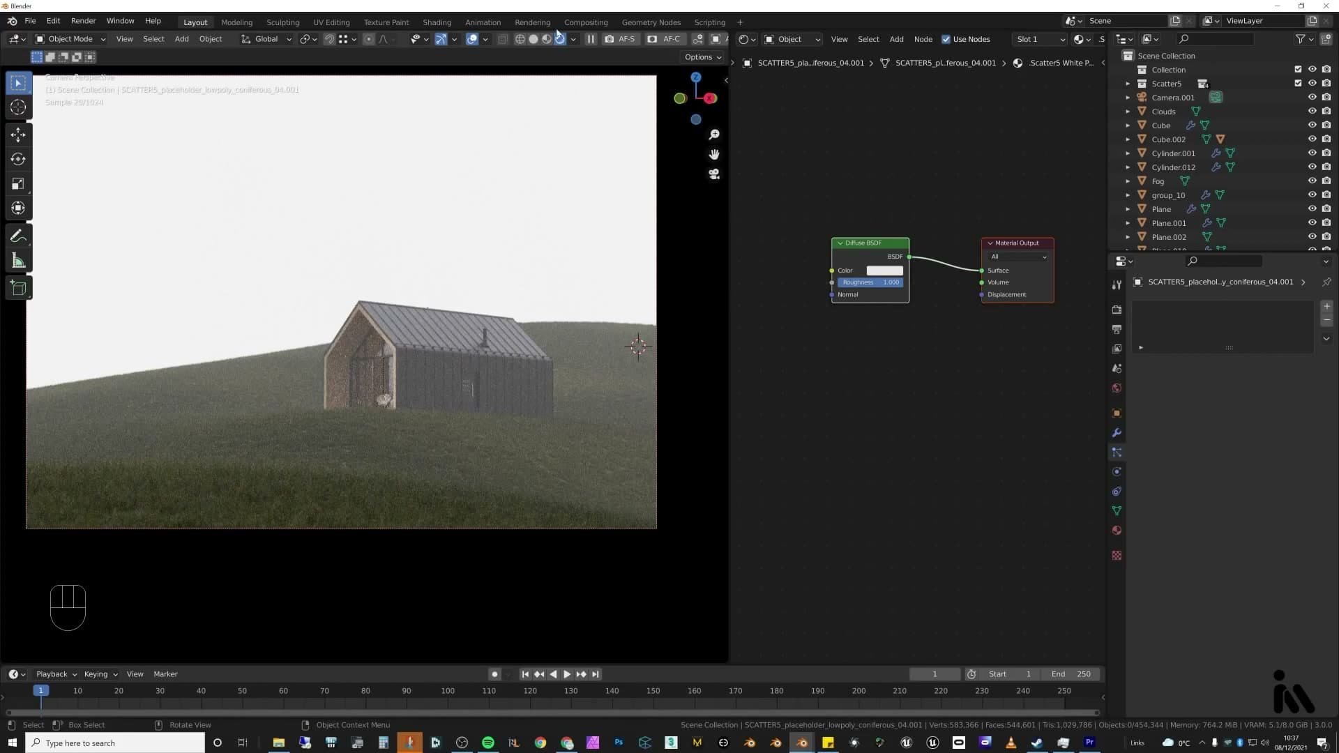
Drop into render view and Scatter resolves the point cloud back into full geometry. The viewport will lag while it evaluates everything (there is genuinely a lot to draw), but flipping back to solid shading restores smooth navigation immediately. Solid view stays the workspace; render view is only there to spot-check before you commit to a frame.
Foreground, midground, background: three stories
MIR's work is the reference: every great archviz frame layers a personal foreground beat, a building-as-subject midground and a contextual background. Plan all three before adding props.
The three-layer composition rule
Foreground, midground and background is one of the most important ideas in architectural visualisation. The premise is simple: your frame is three layers deep, and each layer is free to tell its own story.
The foreground sits closest to the viewer, so it carries the most personal beat. Because the camera is effectively the audience, anything you place here lands intimately. Think a rabbit darting out from a hillside, somebody holding a balloon and letting it go, or any small detail that feels personal to whoever is reading the image.
The midground is usually where the building lives, the subject the render is being made for, telling the architectural story. The background then carries the wider setting: the landscape, sky and context that places the building in the world. Plan all three layers before you start dressing the scene rather than retrofitting a foreground onto a finished frame.
Studying MIR and choosing a foreground story
Before going further it's worth studying the studio that does this better than almost anyone. Open Google and search for mir.no. MIR are a Norwegian archviz studio whose work is the reference point for this kind of layered composition. Scroll through their projects and you'll see the foreground / midground / background rule applied in almost every frame.
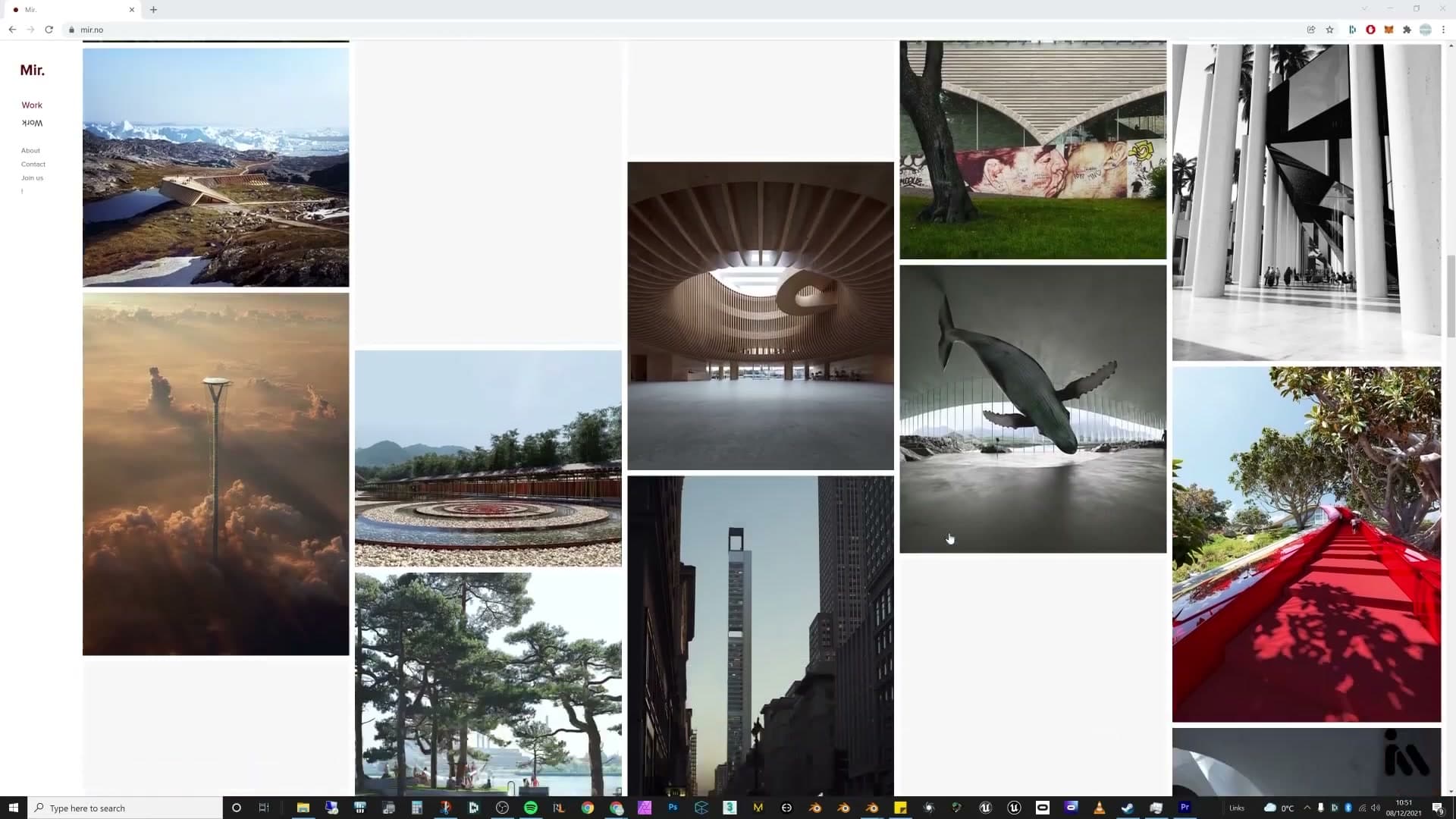
One thing you'll notice is that MIR often push the hero building into the background rather than the centre, because the building is large enough to read clearly even from distance and can tell its own story from back there. A lot of their frames also merge real photography into the foreground, which grounds the CG portion of the render in something physically real.
Apply the same thinking to your own foreground choice. It might be a character, a set of footprints left behind, or something deliberately playful. Drop a flamingo into the foreground of an otherwise serious render and the whole image takes on a funny contrast that almost takes the mickey out of itself. Whatever you pick, this is the layer the viewer reads first, so it carries disproportionate weight.
Placing iMeshh foliage, hedges and plants
For this scene the foreground story is built from iMeshh foliage: a mix of plants and hedges from the library. Append the assets into the file, then nudge them around the camera until the arrangement reads. The goal here was a sense that the camera is sitting inside a forest, looking out of the treeline towards the character and the cabin beyond.
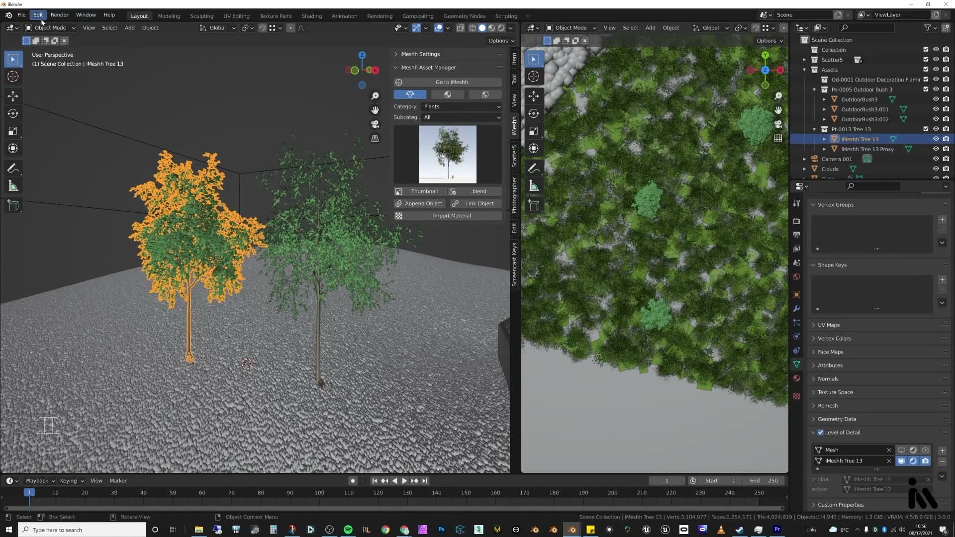
Background trees pull the rest of the setting together. If you're using the iMeshh tree pack, every tree ships with a low-poly LOD version that pairs with the free Lodify plug-in (a quick Google search will turn it up). Lodify swaps between LOD and full-resolution geometry in the viewport: an LOD tree sits at around 20,000 faces against roughly a million for the full mesh, so you can scatter many more of them across a scene without grinding the viewport to a halt.
When you hit render, Lodify flips back to the full-resolution mesh, so the final frame still gets the high-detail tree. For this hillside scene only a handful of background trees were needed (the foreground foliage was doing most of the compositional work), but the same workflow scales up to a dense forest if the shot calls for it.
Trees and the Lodify trick
iMeshh trees ship with LOD variants; the free Lodify add-on lets you swap a 20k-face proxy in the viewport for the million-face hero at render time. With trees framed as a canopy over the camera and clusters behind the cabin, the woods feeling locks in.
Canopy framing and Lodify for fast trees
The trick that keeps a forest of full-resolution iMeshh trees from grinding the viewport to a halt is Lodify. Each iMeshh tree ships with a lightweight LOD variant alongside the hero mesh, and the free Lodify add-on manages the swap so you can work against the proxy while you frame the scene and render against the full-quality tree. Flipping the toggle to full quality at this stage is just so you can preview what the canopy will actually look like before committing to placement.
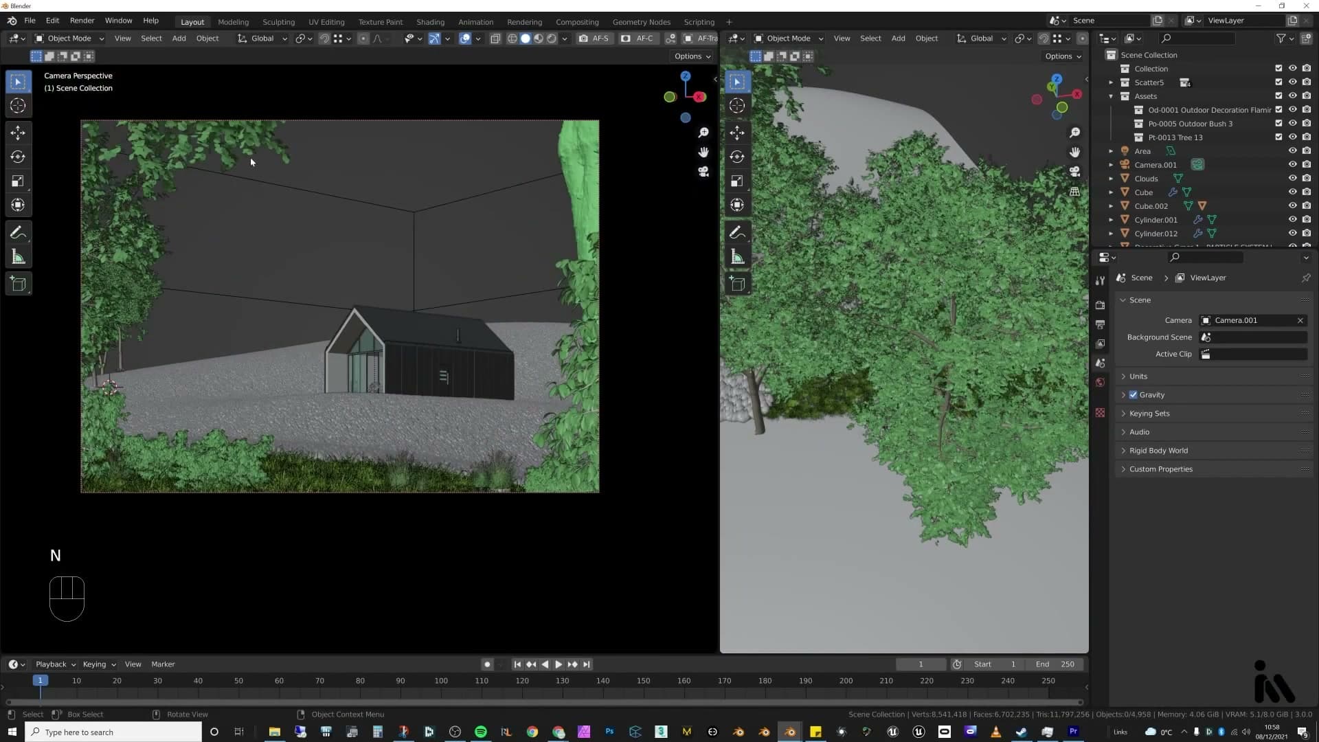
The framing idea is to build a canopy directly over the camera. Position one tree close enough that its lowest branches drift into the top of the frame, just about visible, not dominating the shot. Slide it around in the viewport until the branches break up the sky and throw a hint of shade across the foreground.
With the front tree placed, add a second one off to the side to balance the composition, then push a cluster of trees back behind the cabin. That layering (branches overhead, foliage flanking the camera, more trees set further back) is what makes the scene read as sitting inside the woods looking out, rather than a house parked on an open hillside.
Final tree, foliage and prop arrangement
With the canopy locked in, the rest of the midground falls into place quickly. Drop a couple of hedges around the cabin to soften its base, and bring a few plant pots from the iMeshh library onto the deck to add small clusters of greenery near the seating area.
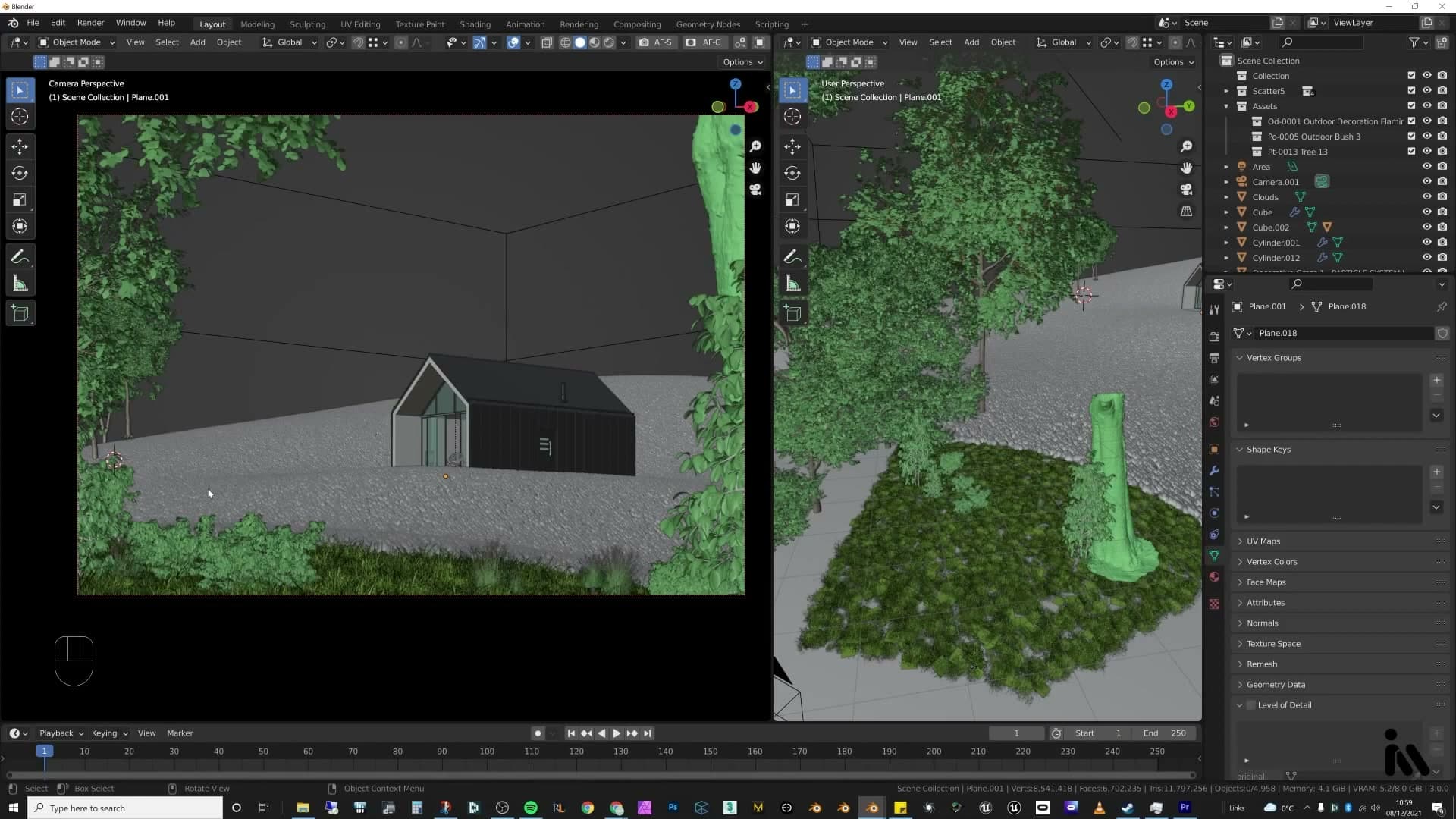
The pots themselves don't really suit a wild hillside, but they're easy to lose. You have two options:
1. Tab into Edit Mode, select the pot geometry and delete it outright. 2. Or simply push the whole asset downwards until the pot sinks beneath the terrain.
The second method is faster, and from the camera's angle you'll never know the pot was there.
That's the foreground foliage and props handled. The last piece left is a human figure to anchor the camera: a young woman in a brightly coloured jacket, standing on the deck looking out over the valley. The colour pop against the moody greens gives the eye somewhere to land, and the lone-walker framing hints at a quiet story behind the shot. Building her up is the next job.
Building the character with Make Human and Marvelous Designer
A figure in a red jacket gives the frame a focal point. Make Human generates the body, Marvelous Designer the jacket and trousers, and free CC0 wellies finish the silhouette. Proportional editing tucks the trousers into the boots; the feet are deleted afterwards because they're never seen.
Generating the avatar and the jacket
A figure in the foreground gives the frame a focal point, so the next job is to build one. Start with the body in Make Human, the open-source character generator that spits out a base human in minutes. Generate a quick female avatar; nothing precious, nothing fine-tuned. She only needs to read as a person from middle distance, so a serviceable starting point is enough.
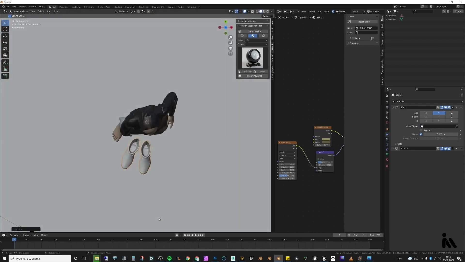
From there, jump to Marvelous Designer for the clothing. Bring in a jacket pattern and fit it to the avatar. Honest admission on the workflow: I took the long, hard route of actually applying the clothes to the avatar rather than using one of the cleaner export pipelines between the two tools. It works in the end, which is what matters when the character is going to sit small in the frame anyway.
CC0 wellies and tucking the trousers in
There's no point modelling boots from scratch when good free ones exist. Grab a free CC0 pair of wellies and import them alongside the Marvelous Designer jacket and trousers.
Give both garments a glossy material rather than diving into proper fabric shaders. For a character this small in the frame, reflective surfaces tend to read as believable in 3D regardless of the underlying setup, so a clean gloss does the job without the rabbit hole.
Fitting the wellies to the avatar is a four-step routine:
1. Position each welly using the avatar's feet as a rough placement guide. 2. Select the trouser cuffs, turn on proportional editing, and nudge the fabric down so it folds inside the boot opening; visually it reads as tucked in. 3. Repeat on the other foot. 4. Once both wellies are seated, delete the avatar's feet entirely. They sit inside opaque boots and are never seen, so the polygons are just dead weight.
Finish with a quick material pass: black for the trousers, and a welly colour pulled close to the red of the jacket so the figure reads as one cohesive silhouette rather than three separate garments. Drop her into the scene and place her roughly where the eye lands. In hindsight, sliding her a touch further across would have respected the rule of thirds more cleanly, but she settled where she settled.
Quick heads-up on the character herself: she's rough around the edges and she doesn't have eyes, which is why she isn't part of the paid library, but she's free to grab if you want a stand-in figure for your own background plates.
Dressing the terrain with Megascans rocks
Bridge-export Quixel rocks straight into Blender. They arrive already textured and look correct in render preview immediately. Sink them slightly into the grass so the transition reads as natural, and use the foreground ones to hide leftover plant pots.
Importing and placing Quixel Megascans rocks
With the Megascans rocks brought into the scene, the work is almost entirely about placement. They arrive already textured and read as photoreal in the render preview the moment they land, so there is no shader tweaking to do. The first one slots in just behind the cabin so it pokes up between the buildings, reading as if the rocky terrain underneath the structure simply continues straight through.
A second rock sits further back, parked where the wooded edge begins so it bridges the cleared ground around the cabin and the start of the forest. It is doing compositional work rather than hero work: a piece of silhouette that signals the transition between the open midground and the trees beyond.
The smaller rocks belong right at the front of the frame. Drop a cluster of them across the foreground to break up what would otherwise be an uninterrupted carpet of grass, and sink them into the scatter slightly so the grass reads as growing around them rather than sitting on top. These foreground rocks pull a second job too: they sit exactly where the plant pots from the foliage assets would otherwise be visible, so the rocks hide them without any extra clean-up.
Lighting the windows and rendering passes
A plane light at power 1000 fakes interior glow through the windows. Cycles is set to 250 samples / 0.01 noise threshold, output as 16-bit TIFF, with crypto-matte, glossy direct and denoising data enabled. A compositor graph denoises each pass before writing.
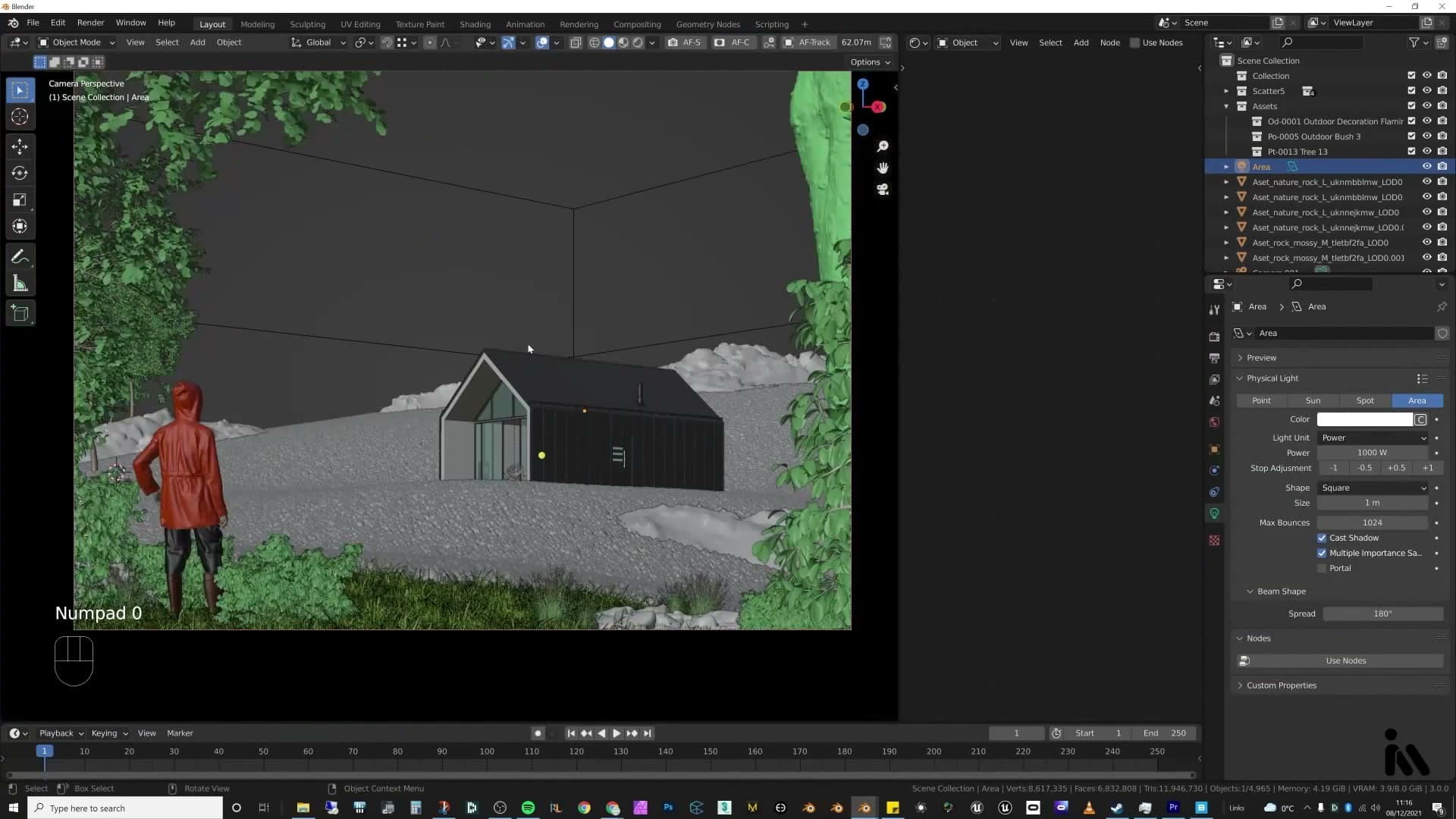
Plane light through the windows
Before kicking off the render, slot a plane light inside the cabin shell so the windows read warm instead of as flat black holes against the moody exterior. A power of around 1000 W on a small plane is enough to push a warm spill through the glass and sell the idea of an interior lamp burning behind the panes, without bleeding so much light that it bullies the overcast exterior exposure.
I checked the existing setup here and it was already behaving well. There's no need to keep fiddling: this is a single fake interior light, not a full interior build, and it only has to do enough to suggest occupancy.
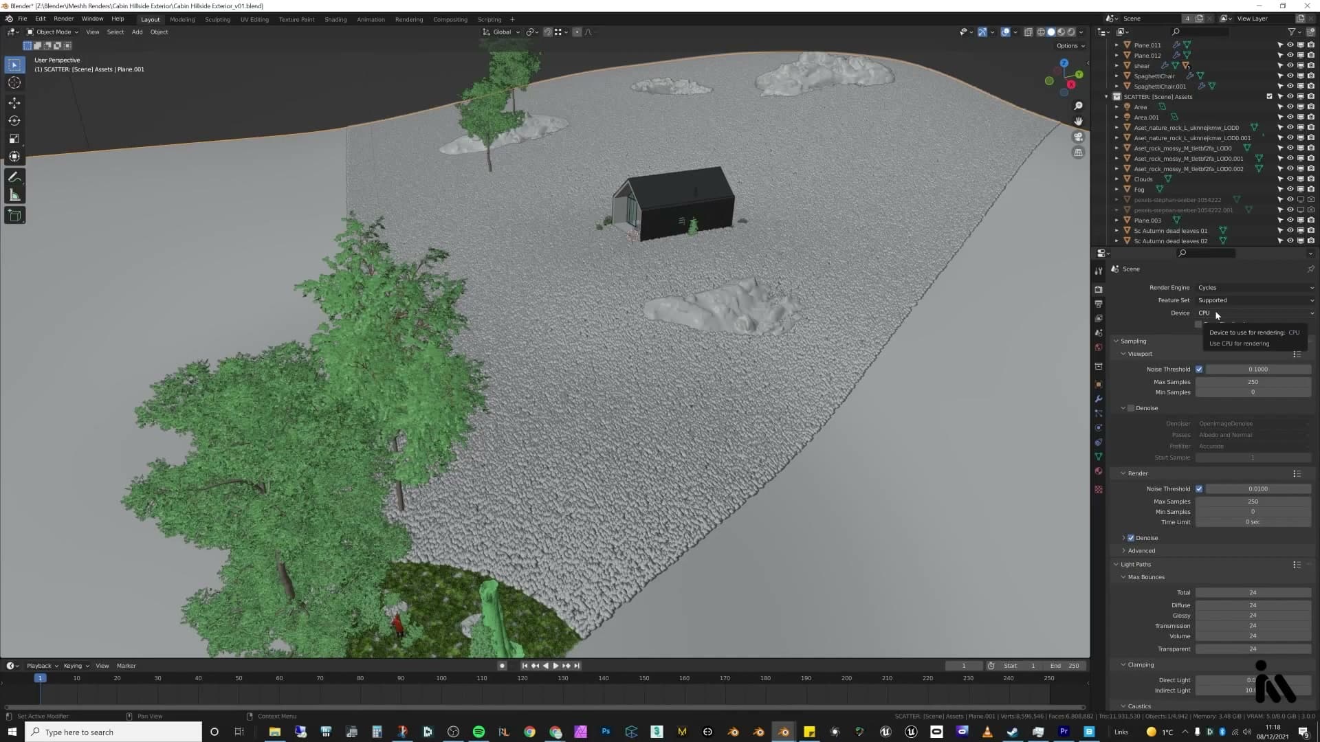
Cycles samples, output format and render passes
Open the output properties and set the file format to TIFF at 16-bit. The extra bit depth gives you the most amount of play in post. Exposure pushes, curves and the colour mixer all behave far better on a 16-bit file than on a flattened 8-bit export, which is exactly what you want when the whole point of the comp is heavy grading in Camera Raw later.
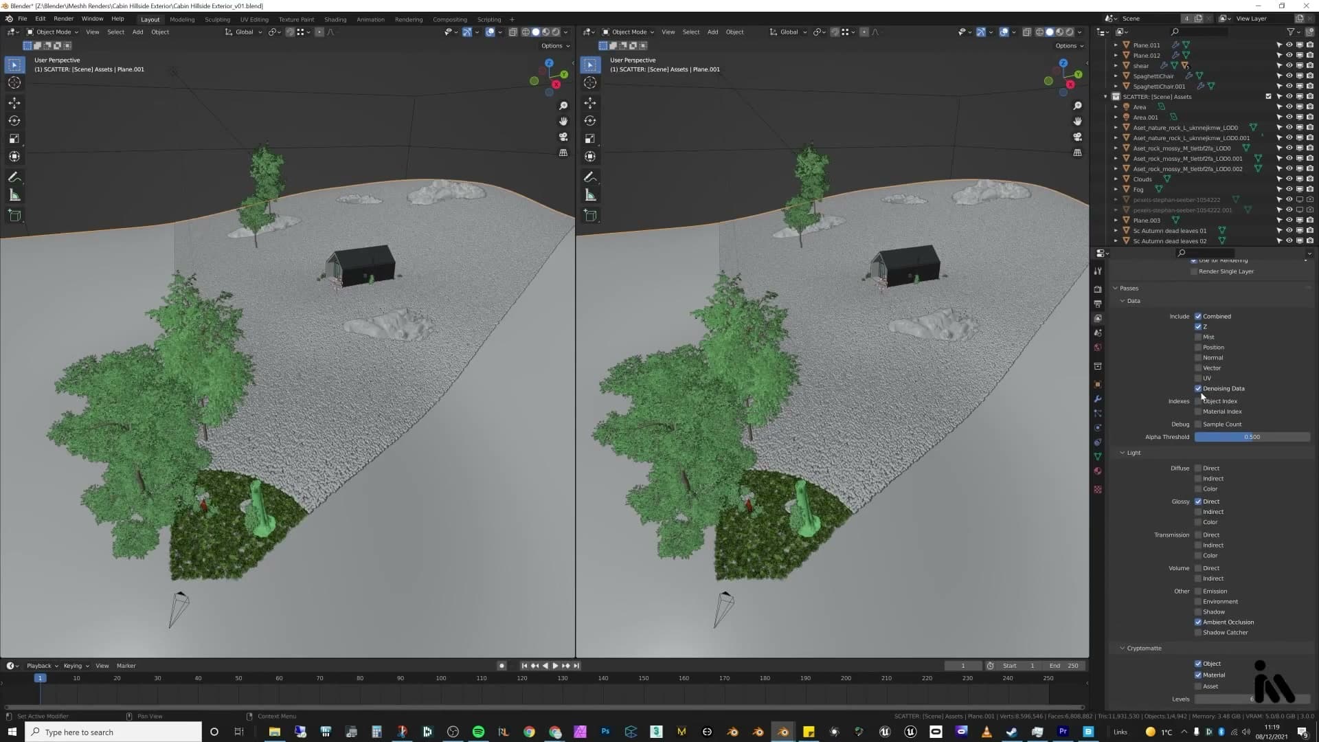
Drop into the render passes panel and switch on the passes you'll actually use. Enable Glossy Direct so the highlights come out as their own layer you can lift in Photoshop. I find Glossy Indirect isn't necessary for this shot, so it's safe to leave that one off. Tick Denoising Data too: the compositor uses those auxiliary passes to drive cleaner denoise nodes per layer.
While you're here, enable both Cryptomatte Object and Cryptomatte Material. I don't go deep into Cryptomatte in this video (I cover it in a previous tutorial), but the masks it generates are what drive the per-object grading later in Photoshop, so it's worth turning on now rather than re-rendering for it afterwards.
Compositor denoising and crypto-matte masks
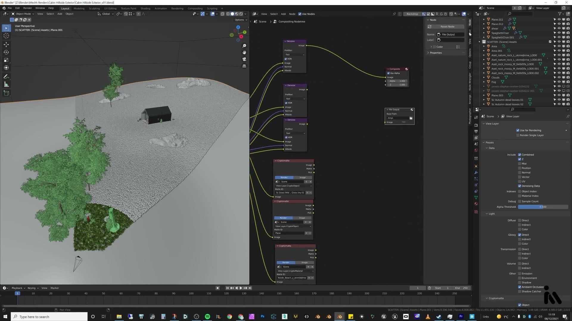
Switch to the Compositor and build a small graph that cleans up each pass on its own. The main beauty output from the Render Layers node feeds into its own Denoise node, fed by the noisy image plus the denoising data passes you just enabled. This is the pass that becomes the master render in Photoshop.
Pull Glossy Direct off the same Render Layers node and run it through its own dedicated Denoise node, then do the same for Ambient Occlusion. Denoising each pass independently keeps the highlights and AO clean without smearing detail in the main render. I wanted to denoise all of them properly rather than rely on a single denoiser on the combined image.
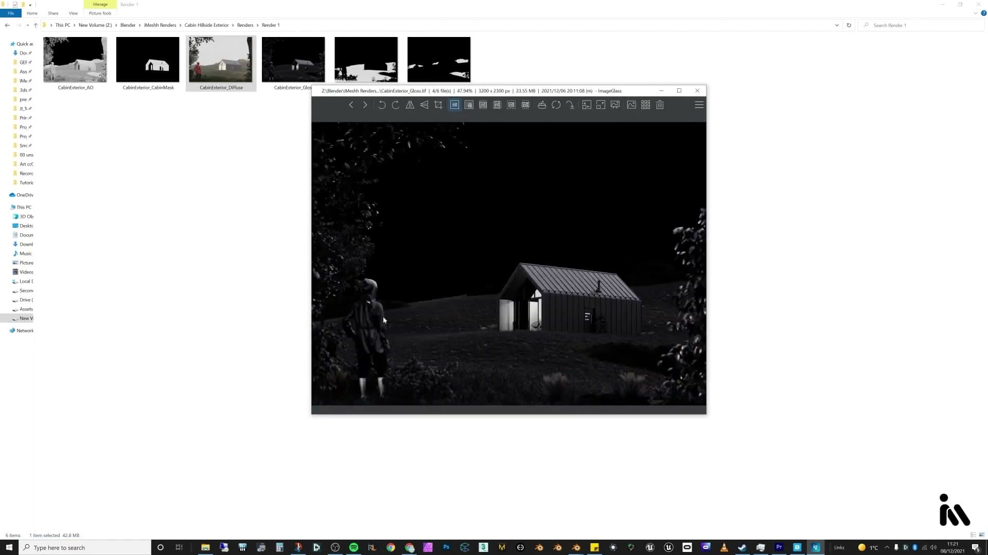
The passes that come out the other side give you the full Photoshop kit: the main exterior colour render, a mask for the cabin, the AO (which also reads quite nicely on its own as a clay render preview), the glossy direct highlights, a mask for just the grass, and a mask for the rock and prop objects. I don't break down Cryptomatte in detail here (the previous tutorial covers it), but these are the masks you'll Ctrl-click into Photoshop adjustment layers later.
Photoshop comp: Camera Raw filter
Convert the main render to a smart object so Camera Raw stays non-destructive. Work top-to-bottom in the panel: exposure and contrast, then highlights/shadows/whites/blacks, then texture for grass detail, dehaze to thin the fog, and vibrance for overall colour.
Smart object + open in Camera Raw
With the main render selected, head to Filter → Camera Raw Filter. What you get is a long stack of adjustment groups in a side panel, and the easiest way through it is to start at the top and work your way all the way down.
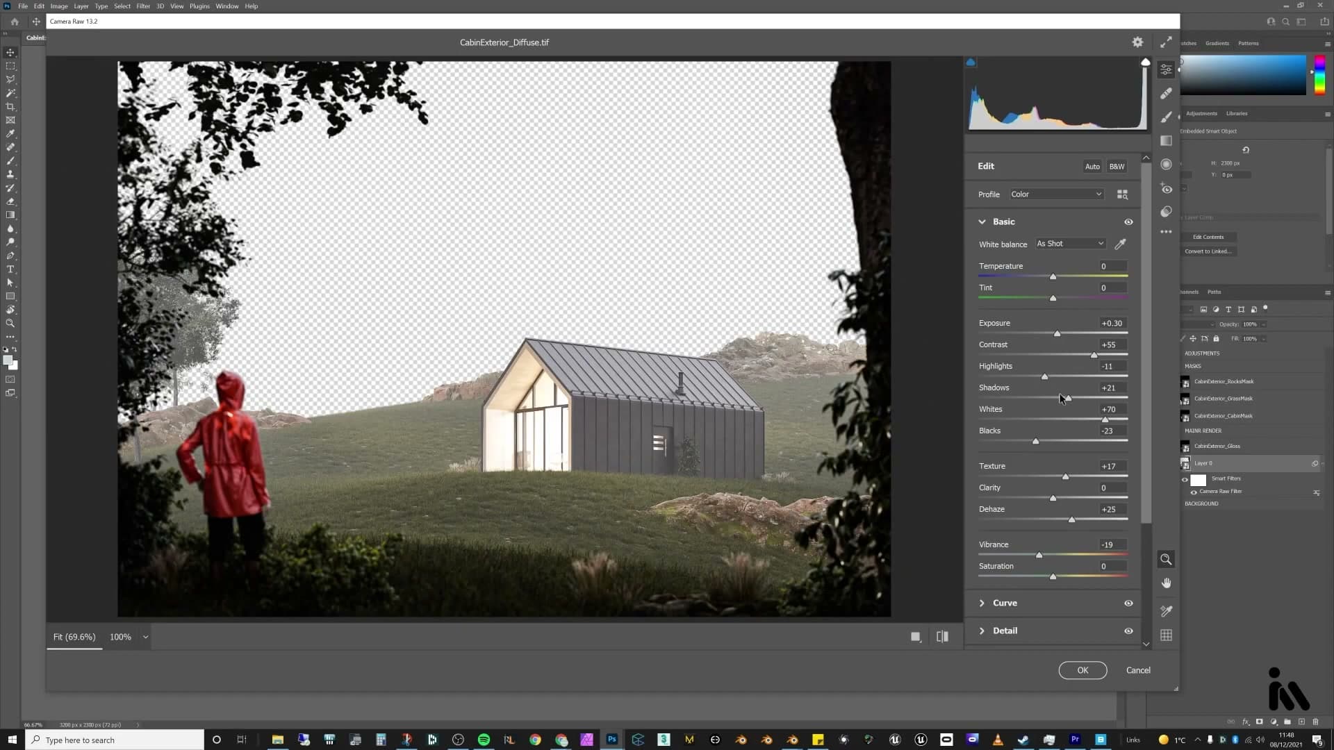
To stay consistent across renders, you can also paste the settings from a previous Camera Raw session as a starting point (useful if you're grading a series of shots in the same look), then nudge each slider on a per-image basis from there.
Exposure, texture, dehaze and vibrance
First pass, lift Exposure a touch to brighten the image, then push Contrast up. Both are subjective; slide each one until the image reads the way you want.
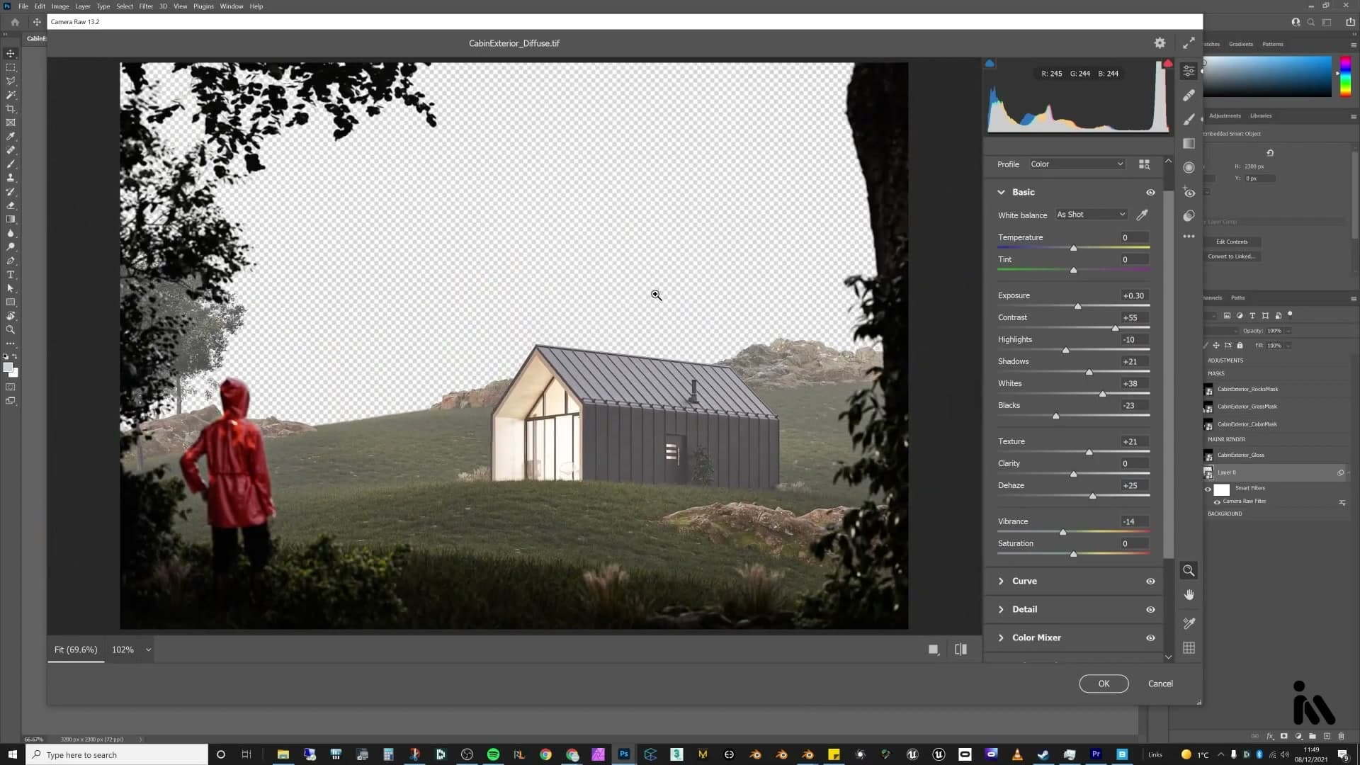
Work down through Highlights, Shadows, Whites and Blacks. There's no fixed recipe; slide each one along until you find a setting that sits nicely. If you're not sure what they do, leave them at zero and reach for Curves instead. That panel is a little easier to read.
Push Texture up next. On the grass especially it pulls out a lot of fine detail and makes the foreground really pop.
There's still a fair bit of fog sitting over the render at this point, and Dehaze literally pulls it back out. A modest positive value thins the haze without killing the atmospheric depth you spent the lighting pass building.
Finally, pull Vibrance down a touch. The render felt a bit too colourful straight out of Cycles, and vibrance softens the overall saturation more gently than the Saturation slider itself. It's a more forgiving control when you just want to take the edge off.
Curves, sharpening, colour mixer and vignette
Curves are more legible than the highlights/shadows sliders. Pull the highlights down, lift lights, lift darks, deepen shadows for contrast. The colour mixer rebalances each hue independently; the oranges in the cabin glow and the jacket are dialled to taste, and a vignette closes the frame.
Curves: highlights, lights, darks, shadows
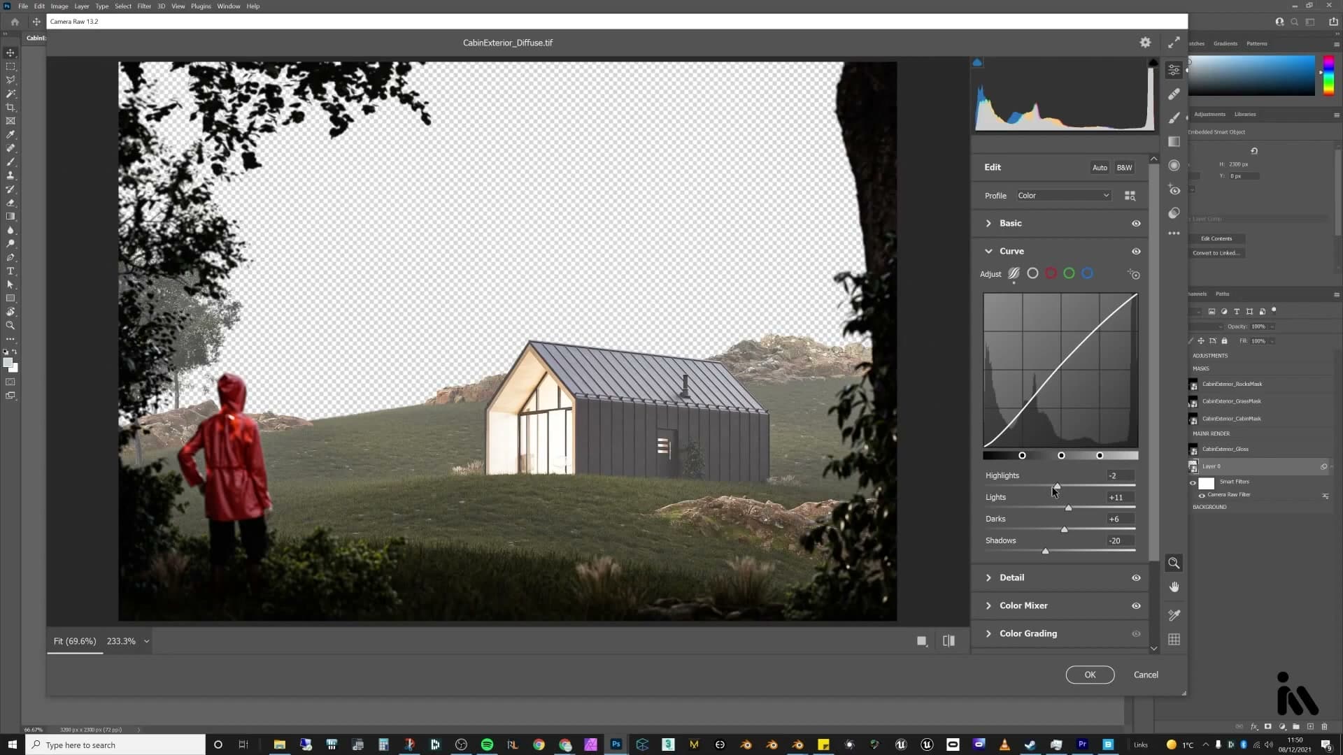
The Curves panel splits the tonal range into four bands (highlights, lights, darks and shadows), which reads more clearly than the broader exposure sliders above it. Pull the highlights down to recover the brightest values, then lift the lights and darks a small amount to open up the midtones.
The shadows slider controls the complete blacks at the bottom of the image. Pull that one inward to deepen the shadow point, which reintroduces the contrast that lifting the lights and darks tends to soften.
Sharpening and the colour mixer
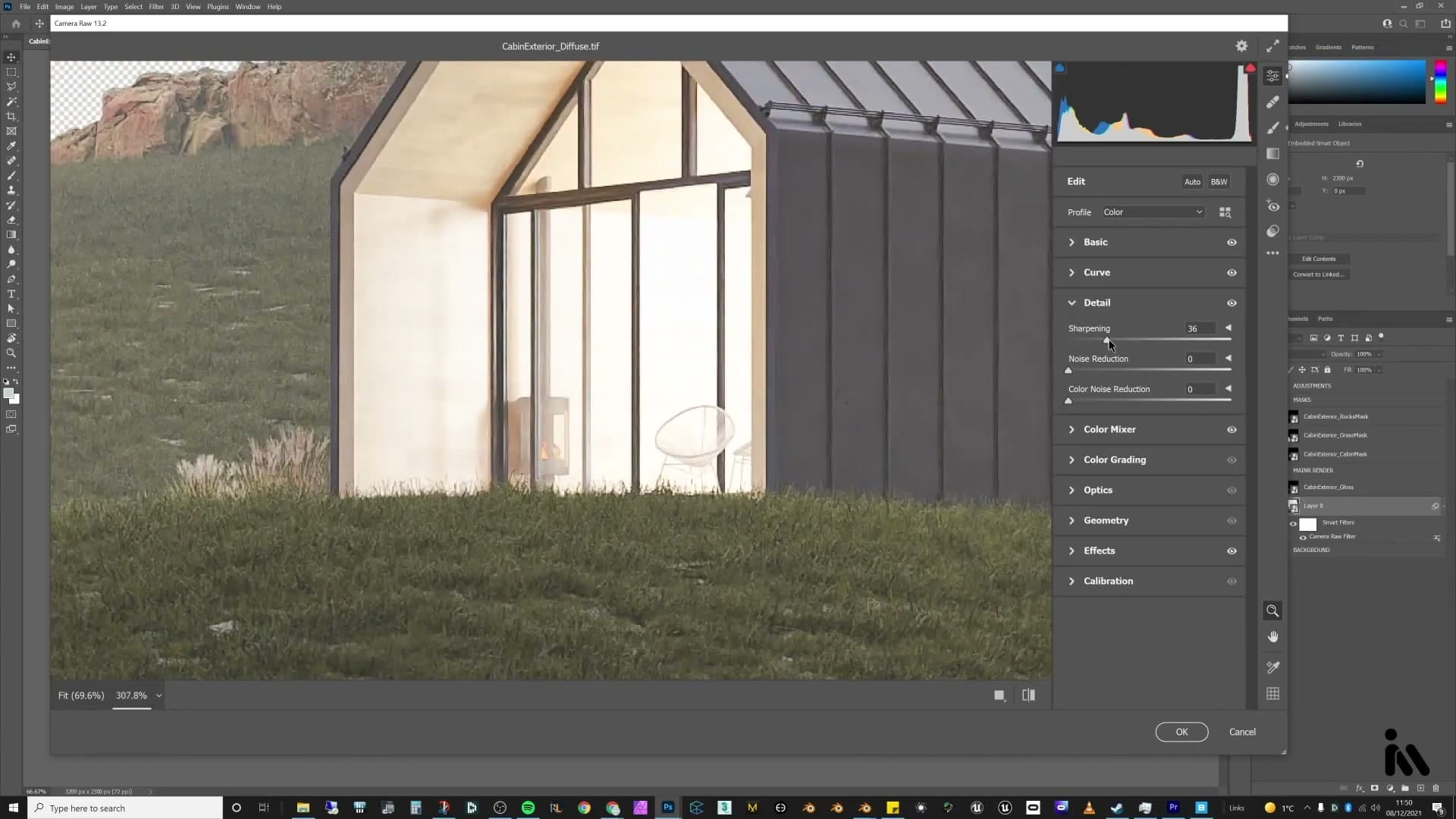
A small dose of sharpening lifts the perceived detail in the render. Push the slider up gently rather than to the maximum. Over-sharpening makes denoising artefacts more obvious, and any noise left in the original render gets crunchier with it.
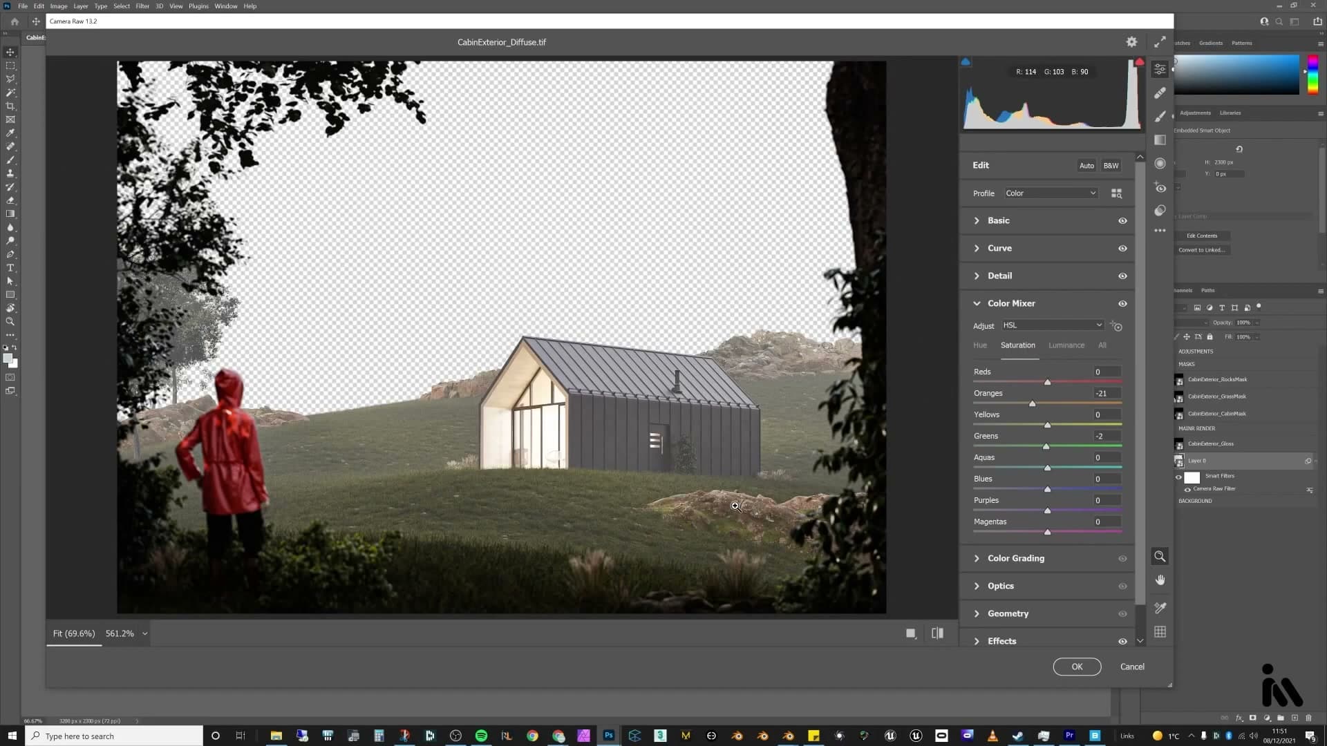
The Colour Mixer is one of the most useful panels in Camera Raw because it lays out every hue range as its own set of sliders. Boost the oranges and every orange in the frame shifts together; boost the reds and only the red objects respond; the same applies to greens, blues and the rest. That isolation makes it easy to rebalance one colour without dragging the whole image with it.
In this scene the oranges spilling out of the cabin interior and bouncing onto the nearby rocks were reading a little too hot, so the orange saturation gets pulled down a touch. The greens in the grass and trees felt a fraction too cold against the warm rocks, so the green hue is nudged toward yellow. Sliding the other way would have pushed them into the blues, which would have fought the rest of the palette.
Vignette to close the frame
The final move in the Colour Mixer adjusts the oranges one more time, which mostly affects the figure's jacket, pulling it slightly toward red so it sits more naturally alongside the rocks and the warm cabin light rather than popping out as a separate accent.
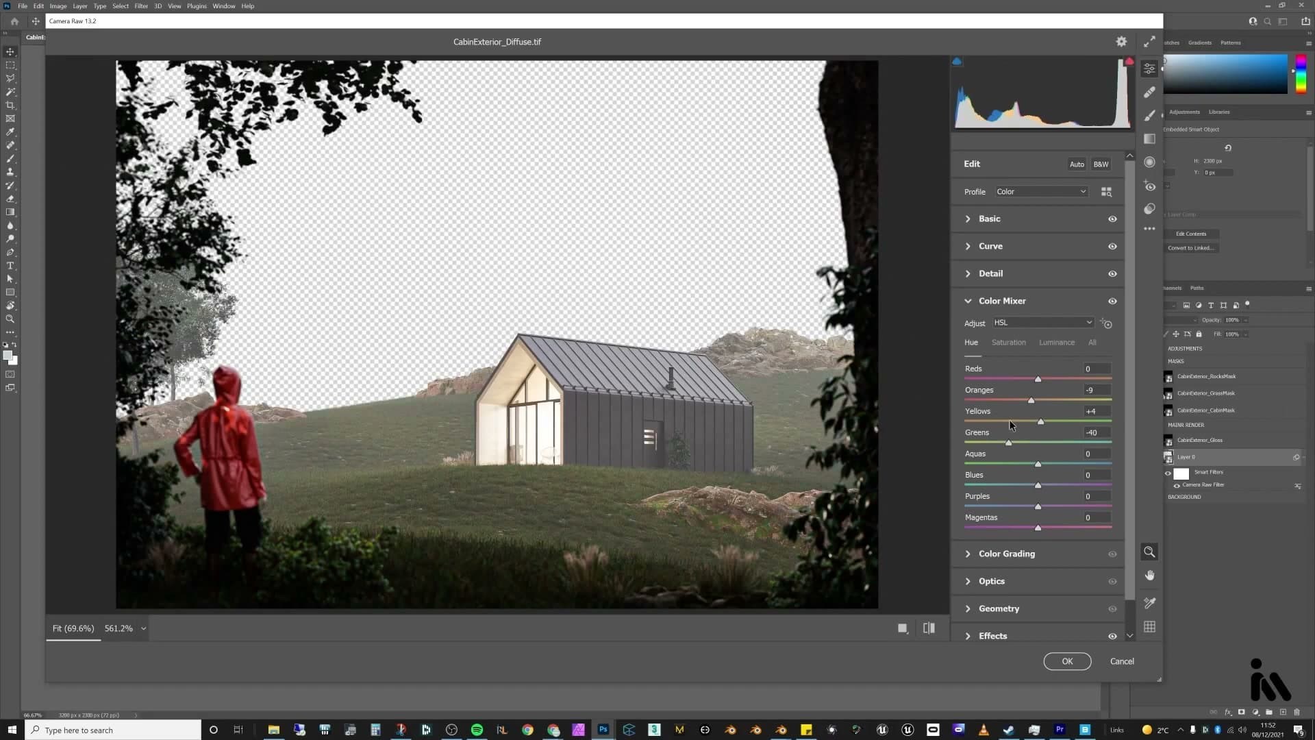
A subtle vignette finishes the frame, darkening the corners just enough to draw the eye toward the cabin and the figure in the centre of the composition. Keep it gentle. A heavy vignette flattens the corners and starts looking like a filter rather than natural lens fall-off.
Background plate, fog and birds
A free Pexels hill plate becomes the background mountain. A white solid-colour layer at low opacity adds atmospheric haze. Birds, also from Pexels, get a magic-wand mask, dropped below the fog layer so they recede into the distance correctly.
Soft-light gloss pass over the whole render
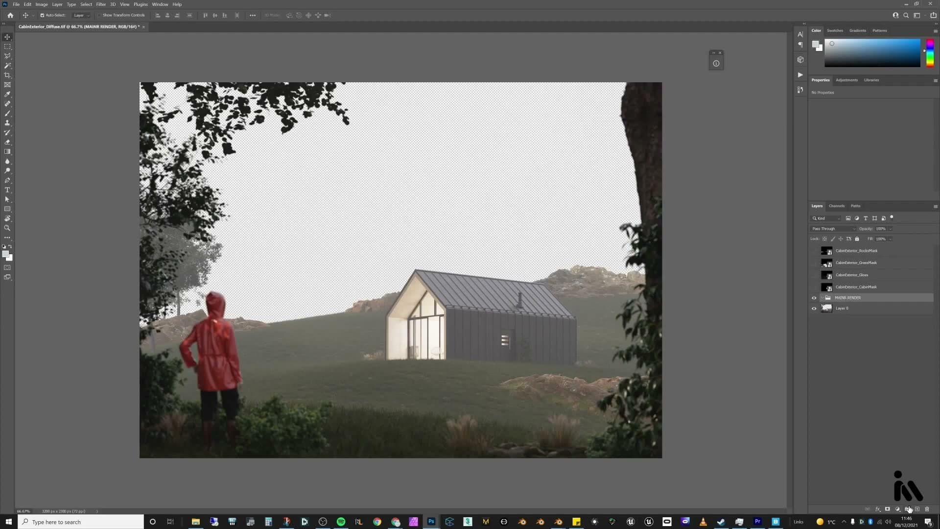
The glossy direct pass that fell out of your render contains every highlight in the scene. Drag it above the base render in the layer stack and you can audition different blend modes to see which one fits the grade.
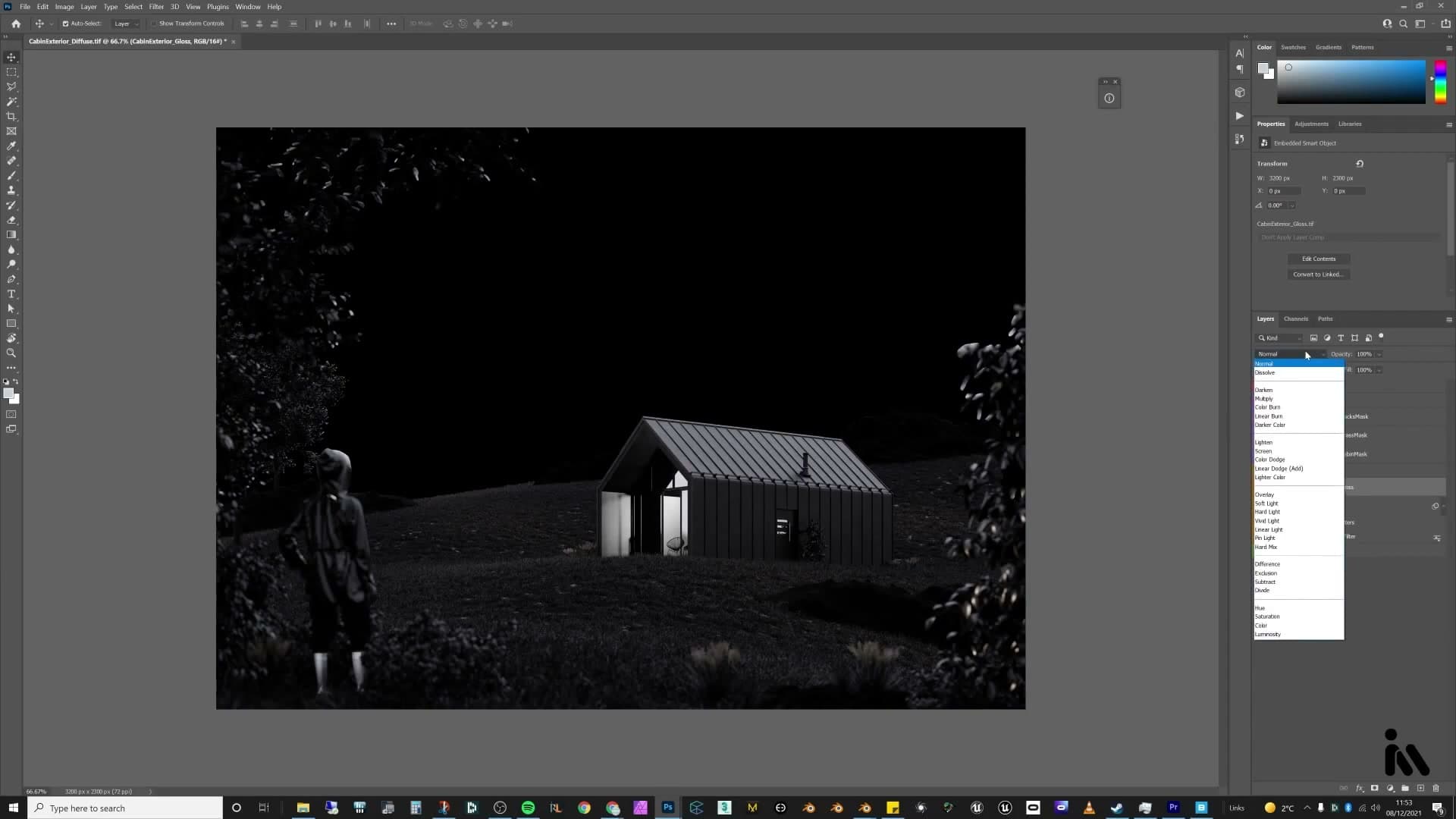
Screen is the obvious first try: it only lifts the whites and leaves the blacks alone, so the highlights pop without crushing the shadows. The mode that actually sells this scene, though, is Soft Light. Soft Light reads as added contrast rather than added brightness, and there's a happy side-effect: the gloss falling through the volumetric fog now looks like sheets of rain coming down through the trees.
Full opacity is too aggressive, so pull the gloss layer down to roughly 40%. The rainy contrast slots into the image without flattening the colour grade you spent the previous section building.
Pexels hill plate plus white fog layer
The cabin is sitting on a hillside but the deep background is empty, and Cycles isn't going to fill it in for you. The fastest fix is a photographed mountain plate. Head to pexels.com, search for hill, and scroll until you find an image with a silhouette and a lighting direction that match your render. The library is free to use, so credit the photographer in your tools section and move on.
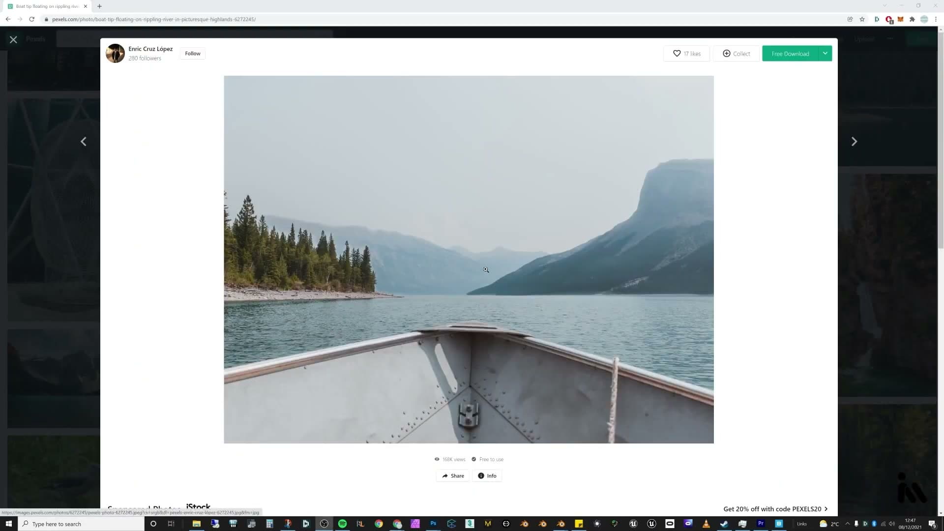
Drop the plate into the composition as a new layer above the render and slide it vertically until trees poke up through the lower edge of the photograph and the water in front of the cabin is still readable. If a sliver of the photograph's original sky shows above the hill, add a fresh empty layer above the plate, press B for the brush, then hold Alt + Right-Click and drag (horizontal motion scales the brush, vertical motion softens the edge). Tap I to sample the sky colour just above the hill, switch back to B, and paint the gap closed so the join disappears.
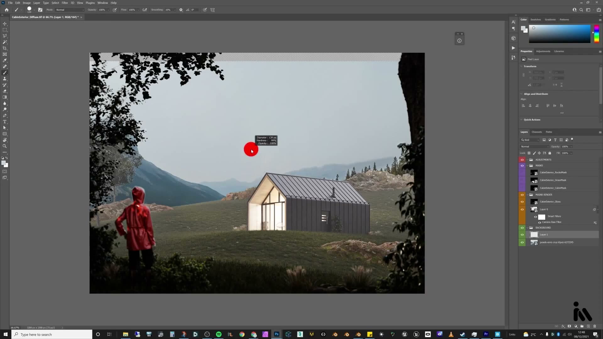
The hill is now reading a touch too sharp and too bright compared to the foggy midground. Add a Solid Color fill layer above the plate, set it to pure white, and drop the opacity until the mountain recedes into atmospheric haze rather than sitting forward like a postcard pasted on the back wall.
Birds with a magic-wand mask
A handful of birds in the sky finishes the comp and gives the eye something to land on between the cabin and the hills. Back on Pexels, search for birds and grab one of the first results. A flock photographed against a plain sky is what you want, because the uniform background lifts away in a single click.
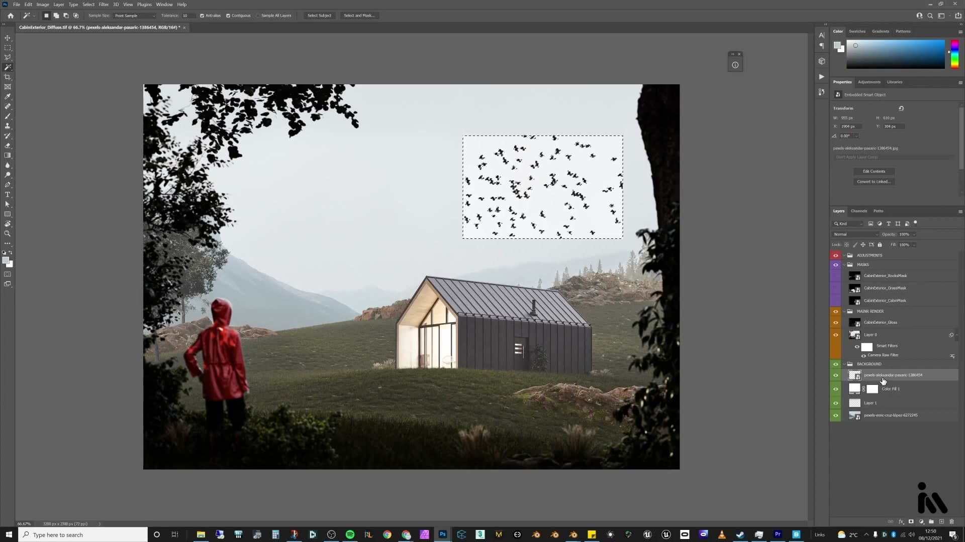
Drop the bird image into the composition, press W for the Magic Wand and click anywhere on the sky. Because the background is essentially one colour, the wand will grab the whole sky in one go. With the bird layer still selected, click the add-layer-mask button at the bottom of the Layers panel. That converts your selection into a mask. The mask is the wrong way round at this point (sky kept, birds hidden), so hit Ctrl+I to invert it. Now only the birds remain.
Tap B and paint black into the mask to remove any birds whose position or pose doesn't compose well, keeping just the few that lead the eye across the frame.
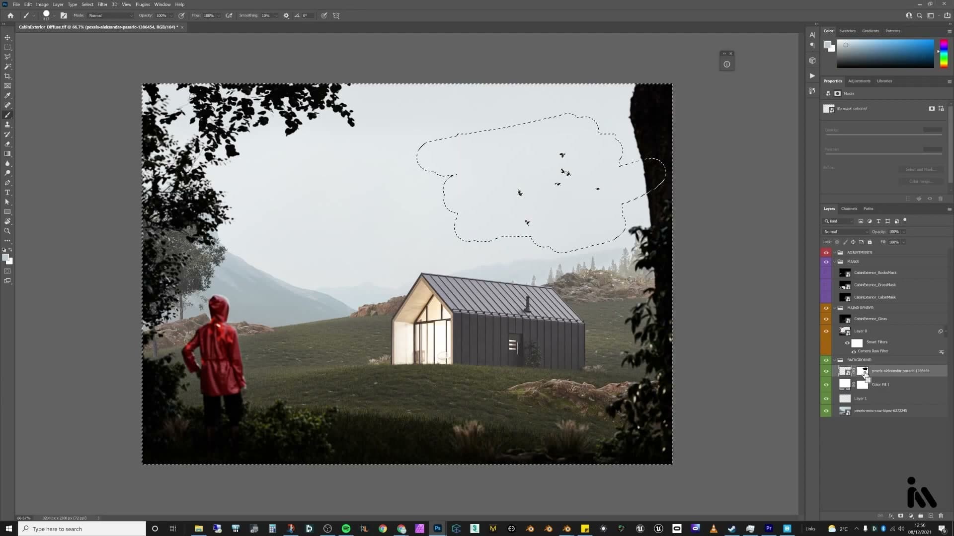
There's one final step that ties them into the image properly: drag the white fog layer back above the birds in the layer stack. The haze now sits on top of them and they immediately recede into the distance, picking up the same atmospheric falloff as the hills behind. That's the comp done.
Local adjustments from Blender masks
The crypto-matte masks become reusable adjustment layers in Photoshop. Ctrl-click a mask, copy, alt-click into a new adjustment-layer mask, paste. Any tweak now only touches the grass, the cabin or the rocks. Wet grass via screen-mode gloss; cabin contrast via masked levels; rock-moss colour-matched to the grass.
Wet grass with screen-mode gloss + grass mask
With the global Camera Raw and gloss passes in place, you can start tuning effects locally. The first target is the grass. You want it to feel a touch wetter, almost like morning dew or fresh spider webs catching the light, rather than the dry sheen it has now.
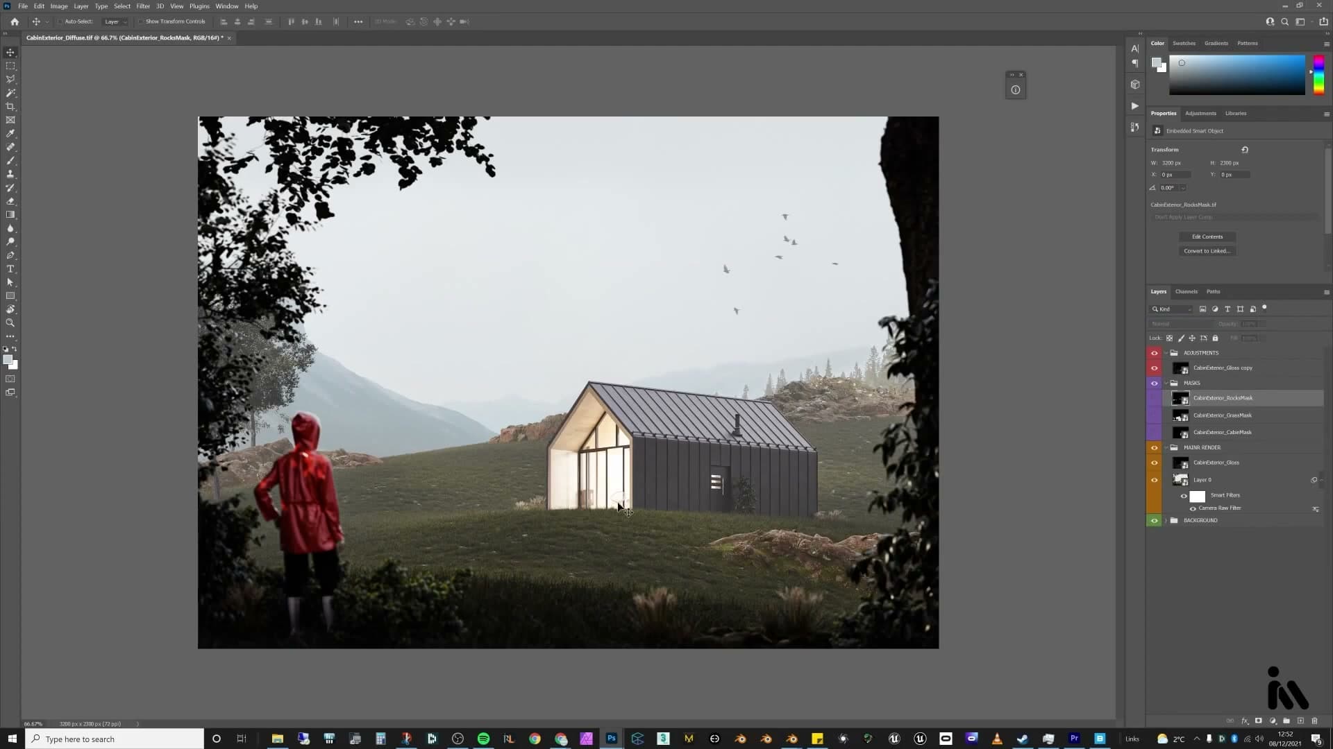
Duplicate the gloss layer you made earlier, drag the copy to the top of the adjustments stack and set its blend mode to Screen. Screen pushes the highlights harder than Soft Light, which is exactly the effect you want on damp foliage. Applied across the whole frame it would blow out the cabin and rocks too, so the fix is a mask driven by the grass crypto-matte.
Make the grass crypto-matte layer visible, hold Ctrl and hover over its thumbnail until the small selection square appears, then click to load the grass area as a selection. Press Ctrl+C to copy. Turn the crypto-matte layer back off, then add a new layer mask to the duplicated gloss layer. Hold Alt and click the new mask thumbnail so the canvas shows the mask itself, then press Ctrl+V to paste the grass selection straight into it.
Now the screen-mode reflections only land on the grass. Shift-click the layer's eye icon to compare: with the mask disabled the reflections spill onto everything, and with it active they read only on the foliage. It's a quiet adjustment, but the grass now feels properly dew-soaked instead of dry.
Cabin contrast via a masked Levels adjustment
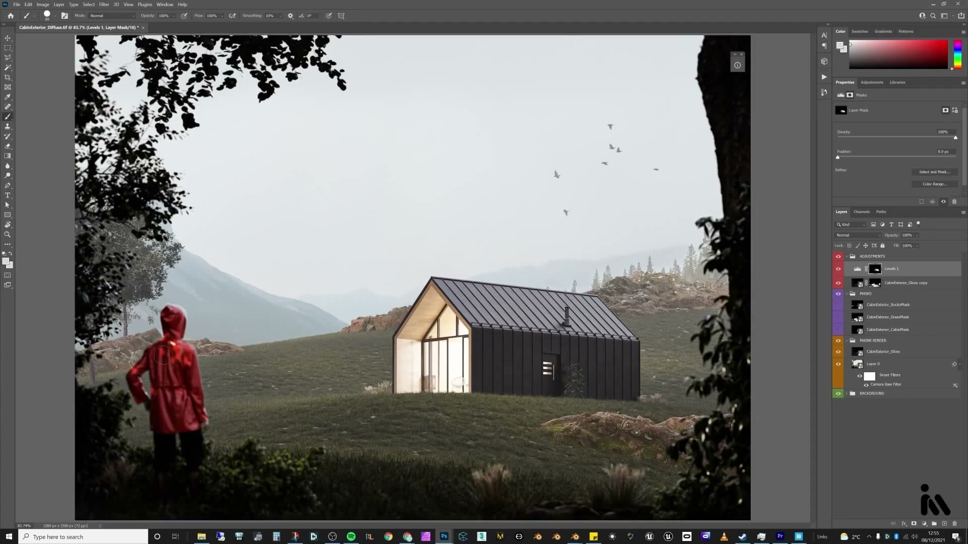
The cabin metal still reads a touch flat against the new lighting, so you want a small contrast lift confined to the building. Add a Levels adjustment layer at the top of the stack.
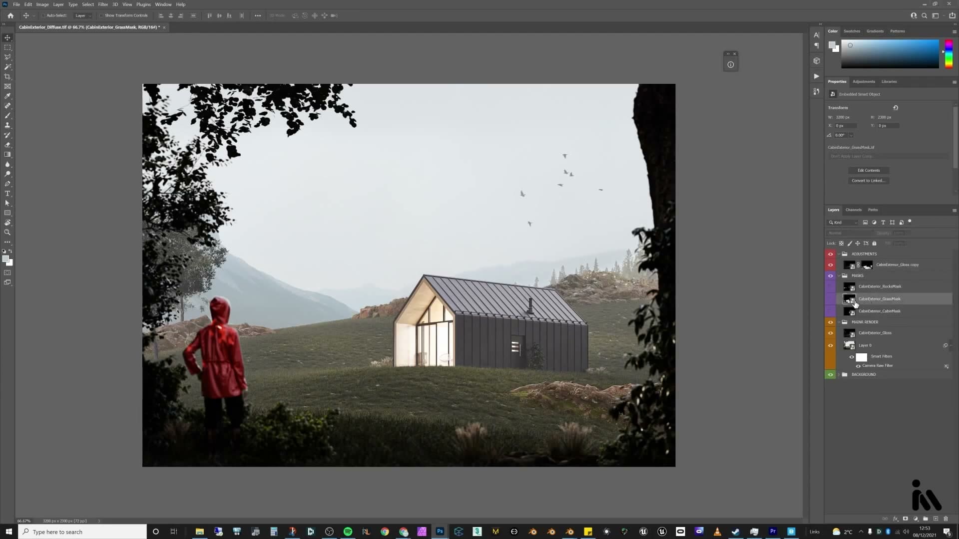
The mask trick is identical to the grass step. Make the cabin crypto-matte layer visible, Ctrl+click its thumbnail to load the cabin selection, then Ctrl+C to copy. Turn the crypto-matte layer back off, Alt+click into the new Levels mask, and Ctrl+V the selection in. The Levels adjustment now only touches the cabin.
Pull the input sliders in slightly (the black point up a little, the white point down) to deepen the metal and bring out more contrast. The landscape stays untouched, so the cabin gains bite without darkening the hillside around it.
One detail to watch for: the crypto-matte sometimes excludes elements that were separate materials in Blender, and in this scene the cabin door fell outside the mask. To patch the mask, grab the brush, press I to eyedrop a sample of white from the cabin mask area, press B for the brush, and paint roughly over the door inside the Levels mask. It only needs to be approximate. The mask is greyscale, not a fine selection.
Stamp-tool patching and rock-moss colour match
Two finishing patches sharpen up the comp. The first is a stray bright highlight on the cabin that pulls the eye too aggressively. It does not really fit the rest of the surface.
Add a new empty layer above the rest of the stack and press S for the Clone Stamp. Hold Alt and click a clean section of the cabin to set the source, then paint over the offending highlight as if you were extending the surrounding panel. It will not be perfect up close, but at viewing distance the offending bright spot is gone and the surface reads much calmer.
The second patch is a colour issue. The moss on the foreground rocks reads as a different green from the grass behind them. Moss legitimately is a different shade, but the scene flows better if the two greens sit in the same family.
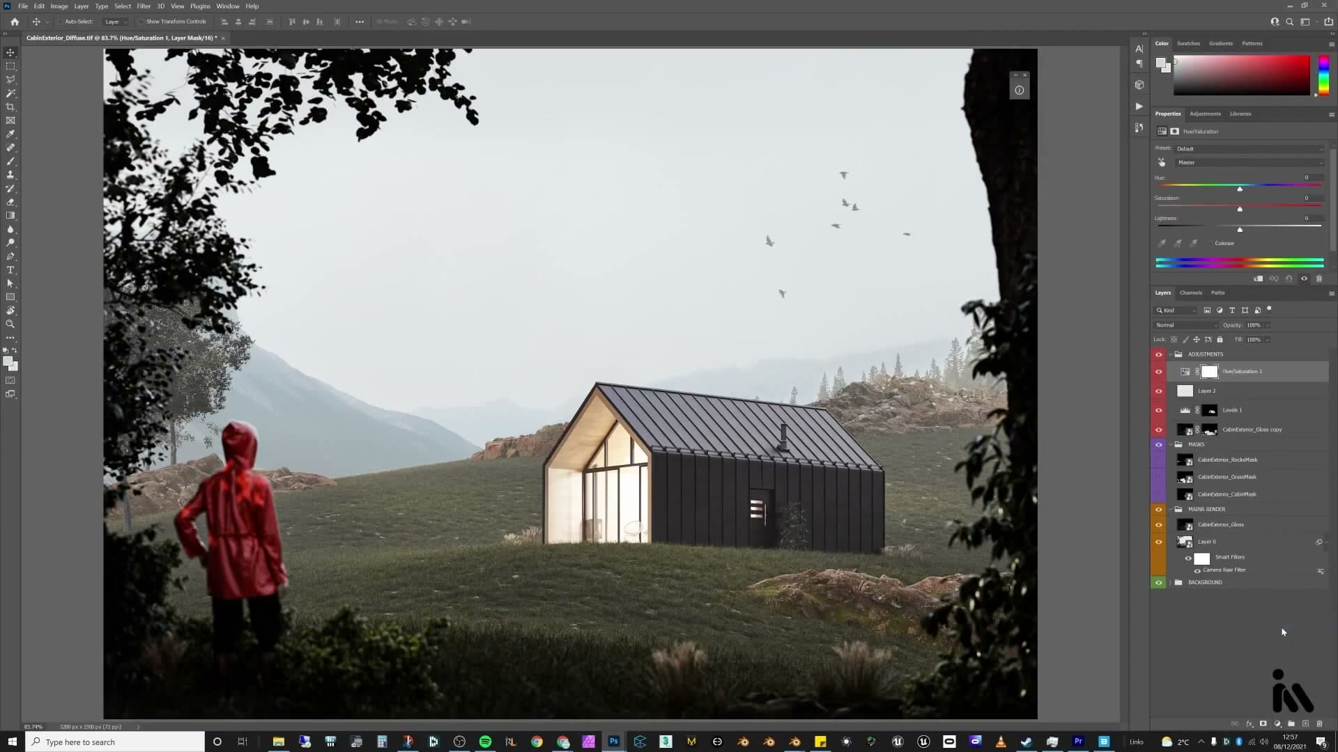
Load the rocks crypto-matte the same way: Ctrl+click the thumbnail, Ctrl+C, then hide the crypto-matte layer again, and add a Hue/Saturation adjustment. Alt+click into its mask and paste. The adjustment is now isolated to the rocks alone.
Inside Hue/Saturation, switch the channel from Master to Yellows rather than Greens. The moss leans warm enough that the yellows slider is what actually shifts it. Pull the hue down a little and the moss falls into the same band as the grass, so the foreground reads as one continuous patch of vegetation instead of two competing greens. With that, the per-object grading is done and the scene is ready for the smoke and birds.
Chimney smoke and the final comparison
A free Pexels smoke image, warped sideways and set to overlay with a clipped Levels layer to crush the blacks, drifts off the chimney. A duplicate inside the cabin mask shows smoke emerging from the chimney itself. The before/after at the end makes the case for spending an hour in post.
Warped Pexels smoke on the chimney
The chimney needs smoke, and a free Pexels image does the job without ever touching a fluid sim. Drop a smoke photo onto its own layer above the render, hit Ctrl+T and right-click to pick Warp, then pull the handles until the plume looks like it's drifting sideways in the wind rather than rising straight up. Apply the transform and nudge the layer roughly into place above the chimney stack.
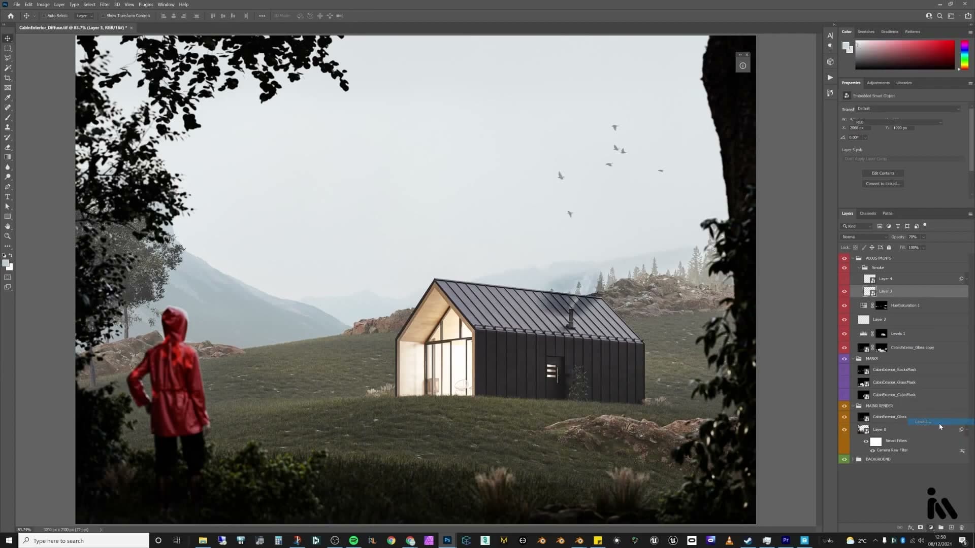
Set the blend mode to Screen first and drop the opacity to around 70%, then flip it to Overlay for a stronger read. Overlay punches the highlights but leaves the dark background of the smoke photo visible, which ruins the illusion. Those black bits give the cheat away.
Crush those blacks with a clipped Levels layer. Add a Levels adjustment directly above the smoke layer, then either click the small clipping button at the bottom of the Properties panel or hold Alt and click the line between the two layers, so the Levels only affects the smoke beneath it and nothing else in the comp. Drag the white-point slider inwards until the dark background disappears and only the wispy highlights remain.
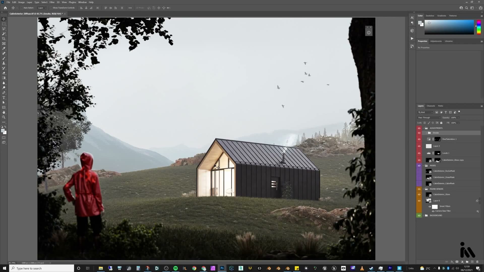
Drop a second Pexels smoke on top to give the plume more shape, this one set to Screen at roughly 53%. Two layered passes read as a thicker, more believable column than a single image stretched too far.
Before/after and parting thoughts on post
A single plume drifting off into open sky is fine, but the smoke should also appear to emerge from the chimney itself, partly hidden by the cabin walls in front of it. Duplicate the warped smoke layer and shift the copy down so the base of the plume sits just behind the chimney stack, where you'd expect it to be physically rising from the fire inside.
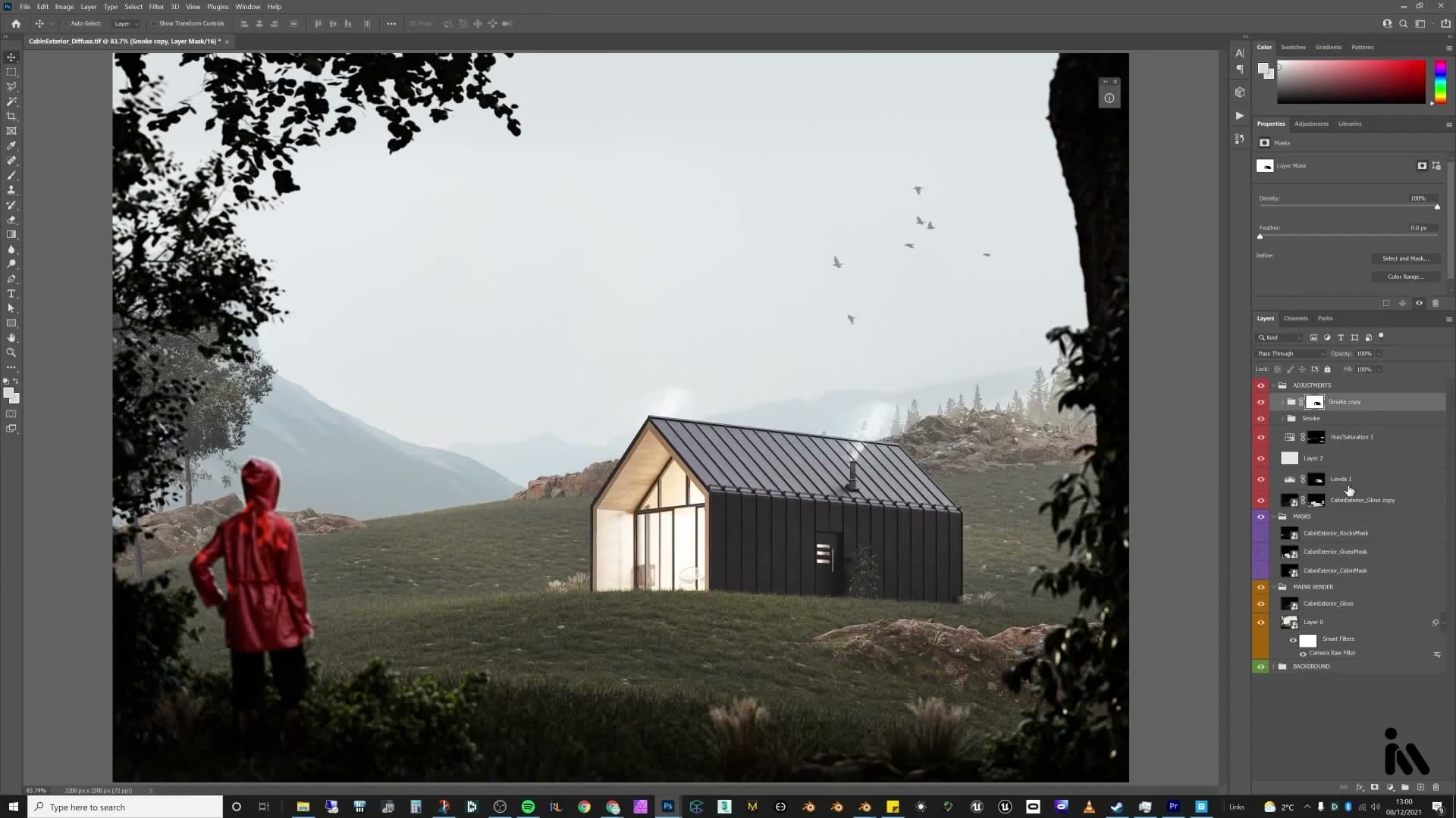
Now hide the part that should be behind the building with the existing cabin mask. Ctrl+click the cabin mask thumbnail to load its selection, then click the Add Layer Mask button at the bottom of the Layers panel with that selection still active. Photoshop converts the marching ants into a fresh mask on the duplicated smoke layer. By default the smoke now only shows up inside the cabin shape, which is backwards, so click the new mask and hit Ctrl+I to invert it. The smoke is hidden over the cabin and visible everywhere else, exactly as if the building were blocking it.
The cabin masks aren't pure white inside, so the smoke still bleeds through faintly. With the mask selected, press Ctrl+L to bring up a Levels dialog scoped to the mask itself and drag the black-point slider inwards to push the mid-greys to solid black. The masked area becomes fully opaque and the smoke is properly occluded.
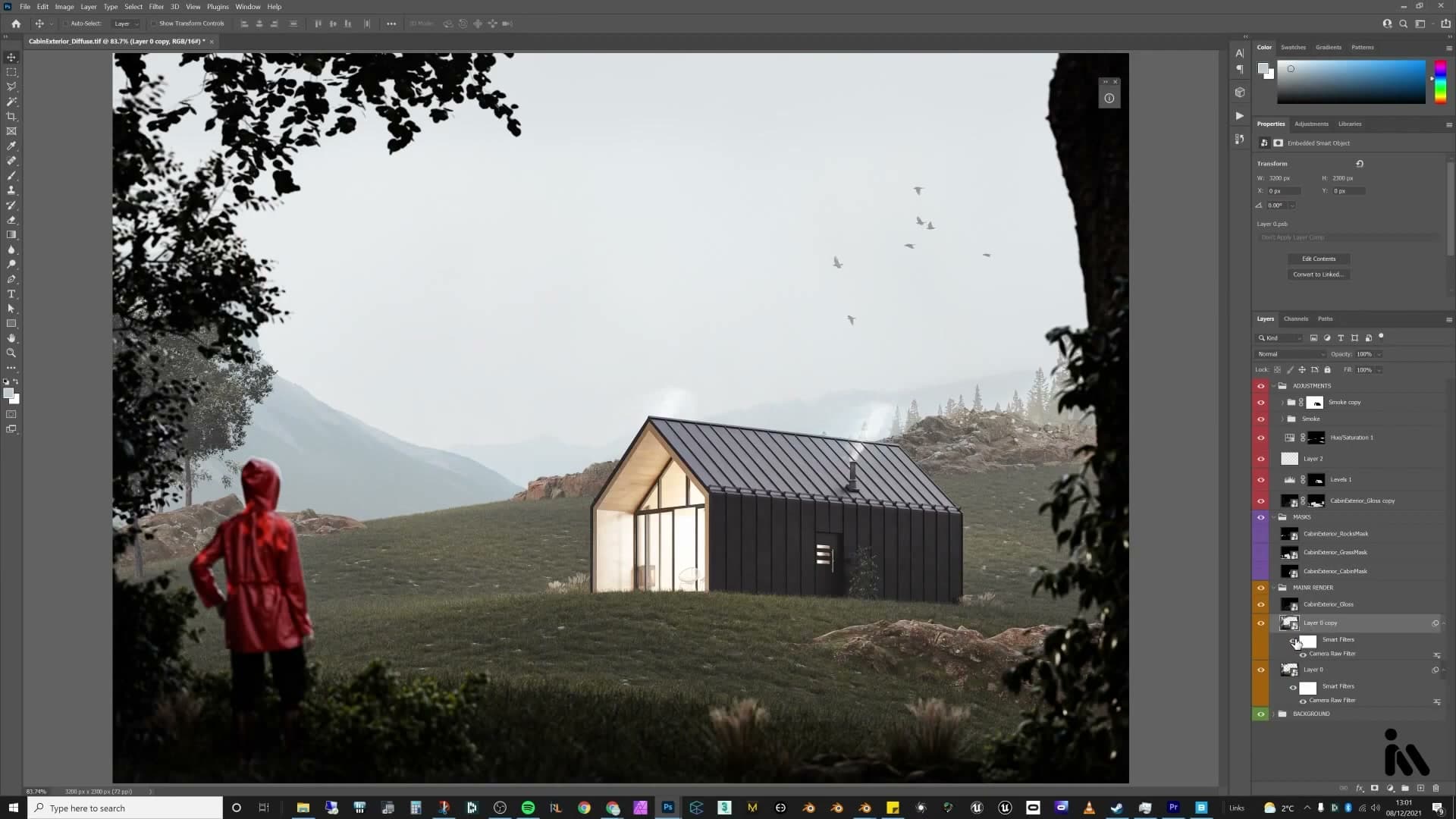
That's the post finished. Toggle the original Blender render against the graded comp and the difference tells you everything: flat sky becomes a layered hill plate, neutral light becomes a graded contrast, empty air becomes birds and rolling smoke. Post-production is often the part people skip, but it's where a clean render becomes an image.
Almost all of this could be done in the Blender compositor, but Photoshop is built for exactly this kind of work and the fine-tuning is faster. Render passes, blend modes and crypto-matte masks are worth getting comfortable with. A more dedicated video on what to do with each pass may follow.
If you make your own version of this scene, share it with the hashtag #imeshh on YouTube, Facebook or anywhere else. Seeing other people's renders from these tutorials is what makes them feel worth making.
Tools and credits
Everything mentioned in this tutorial, with links.
- Blender: the renderer this entire build runs in.
- iMeshh: studio platform (project management, client review, asset library, invoicing). The asset library used in this tutorial is included with every iMeshh Pro plan.
- Poly Haven: free CC0 textures and HDRIs.
Pillar guide: Masterclasses hub