How to digest 100 Blender tips
Chris frames the video as background-listening: you don't need to memorise every step, you just need to know a feature exists so you can find it again when you hit the same problem.
Why "knowing it exists" is half the battle
I open with a warning that this is a mammoth sitting. One hundred tips packed into a single video, where some of the entries are closer to mini-tutorials than throwaway shortcuts. The intended mode of consumption is background listening: have it on while you're working, revising, or being driven somewhere. Only stop and dig in when something catches your ear.

That framing matters, because the real value of a long video like this is not memorising the click-by-click of every tip. It's knowing the feature exists at all. My argument is that learning Blender is half discovery and half execution: once you know that a tool, modifier or shader trick is possible, you can always research your way back to it when a project actually demands it. Without that mental bookmark, you don't even know there's anything to search for.
Treat this post the same way as the video. Skim it, pin the bits that surprise you, and come back when a real scene forces the question. The coverage leans towards my own interests, with lots of materials, lighting, rendering and compositing, and modelling, geometry nodes and the occasional "I didn't know Blender could do that" trick mixed in. Most of the demonstrations use scenes and assets from the iMeshh archviz library, which is where the production-tested side of the advice comes from.
Three quick realism wins: ripples, grid textures and dust
Built-in dynamic paint generates real water ripples in seconds, Blender ships hidden UV/colour grid textures, and the free iMeshh dust node shader adds top-surface dust to any object.
Dynamic paint ripples on water
Real water ripples are a two-object setup in Blender, and the whole thing takes under a minute. Add a plane, subdivide it a handful of times so it has the geometry to deform, right-click and Shade Smooth, then add a UV sphere as the thing that will disturb the surface.
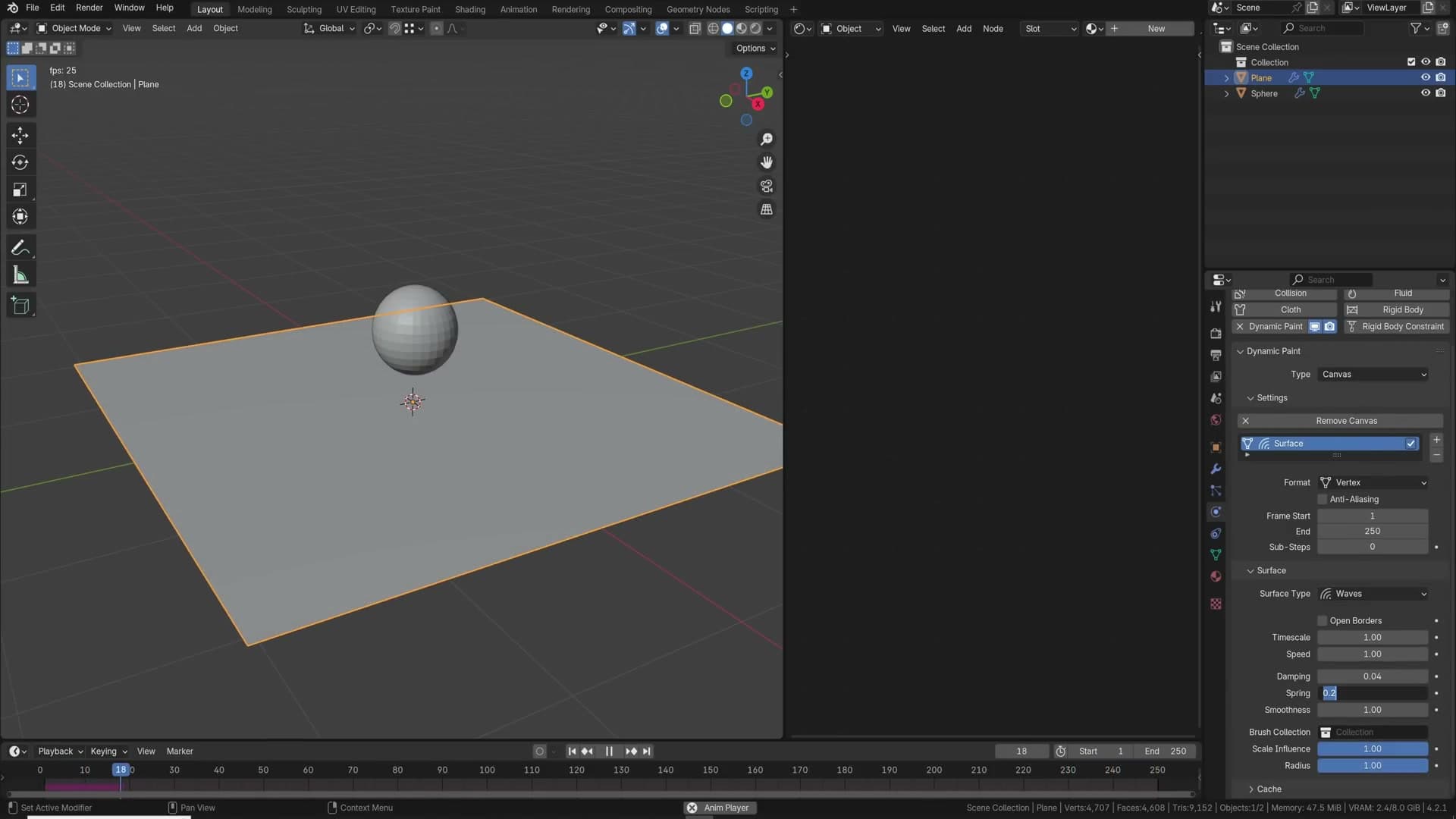
Select the plane and head to the Physics tab. Enable Dynamic Paint, set the type to Canvas, click Add Canvas, then change the surface type to Waves. Select the sphere, enable Dynamic Paint again, set the type to Brush, and click Add Brush.
Nothing happens in the static viewport. You need the simulation running. Press play on the timeline, then drag the sphere across the plane and the ripples spread out from every contact point. The wave strength sits around 0.1 by default and you can dial it up or down for bigger or subtler splashes.
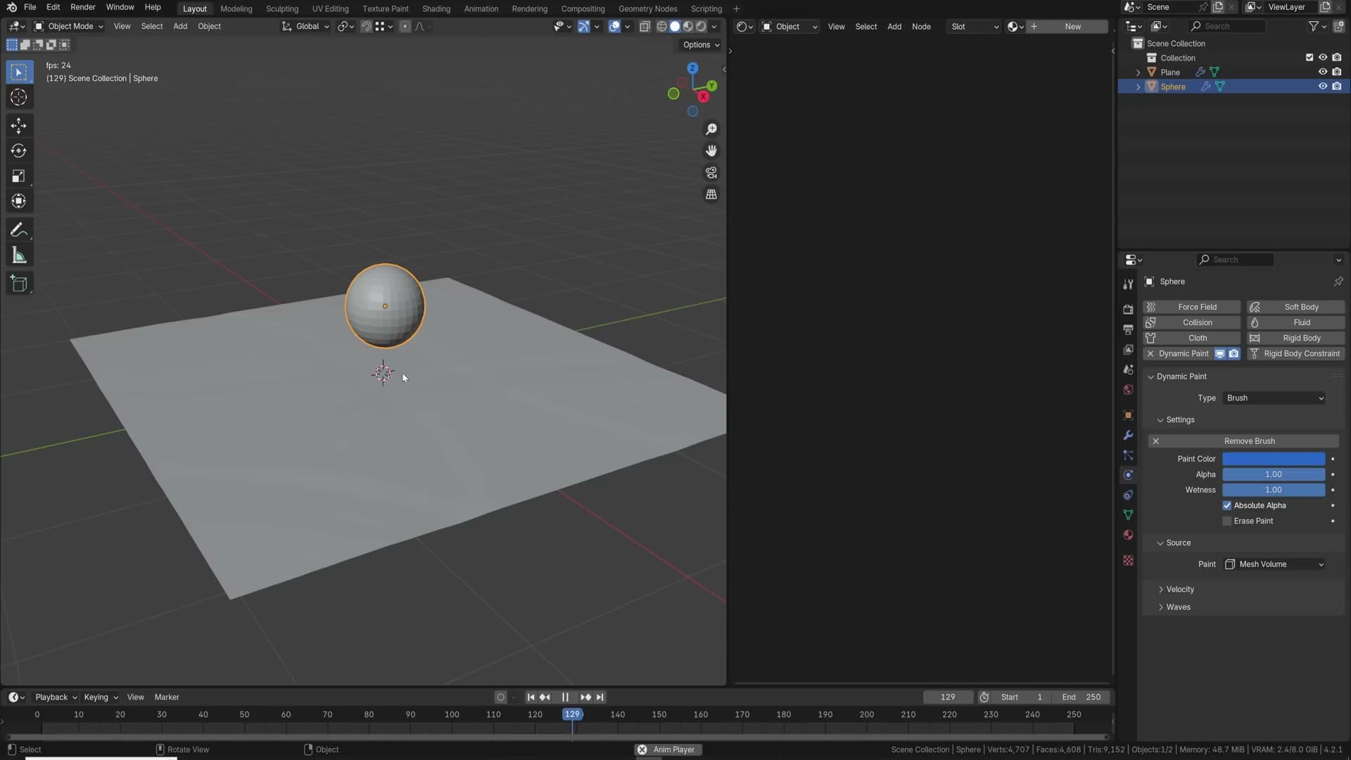
The behaviour at the canvas edge is controlled by the Open Borders checkbox on the canvas. Leave it enabled and the waves travel off the plane and die at the edge, which is what you want for a pond that's supposed to continue past frame. Disable it and the waves bounce back off the edges of the mesh, which is useful when you want the energy to keep reverberating inside a bathtub or sink.
Built-in UV and colour grid textures
Those UV-checker and colour-grid textures you see in other people's tutorials aren't a download. They ship inside Blender. In the shader editor, press Shift+A and add an Image Texture node, then click New.
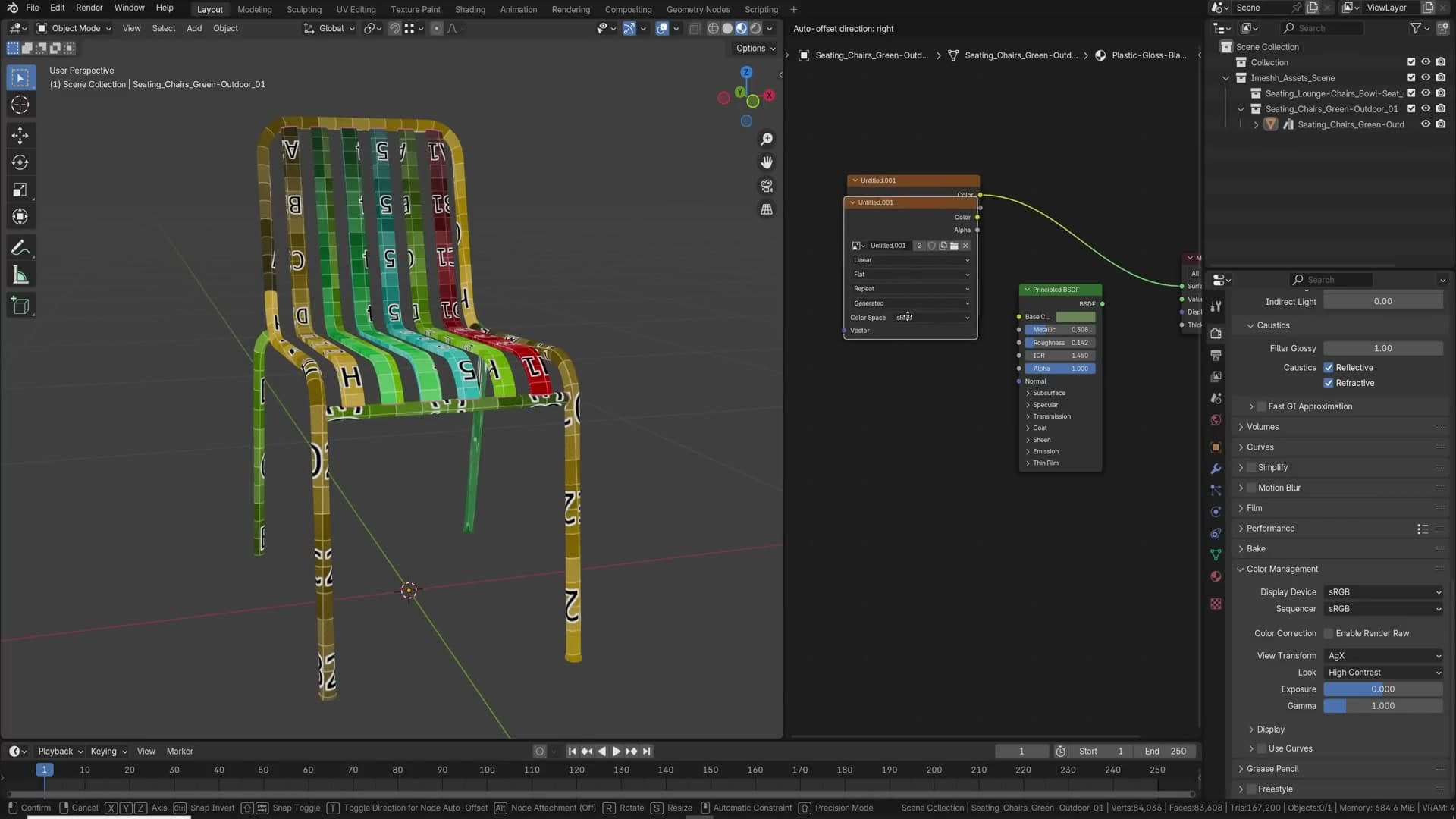
In the new image dialog, change Generated Type from Blank to one of the other two options. Color Grid gives you the rainbow numbered checker that's perfect for spotting UV stretching and seams. UV Grid is the plain black-and-white version with letters and numbers. Blank stays as flat colour, which is what you reach for when you're about to bake into the image.
The free iMeshh dust node shader
Almost every real-world surface has a thin film of dust sitting on its top-facing planes, and leaving it out is one of the easiest tells that a render is CG. Look around the room you're in: there's dust on every shelf, every picture frame, every flat surface, and your model probably has none.
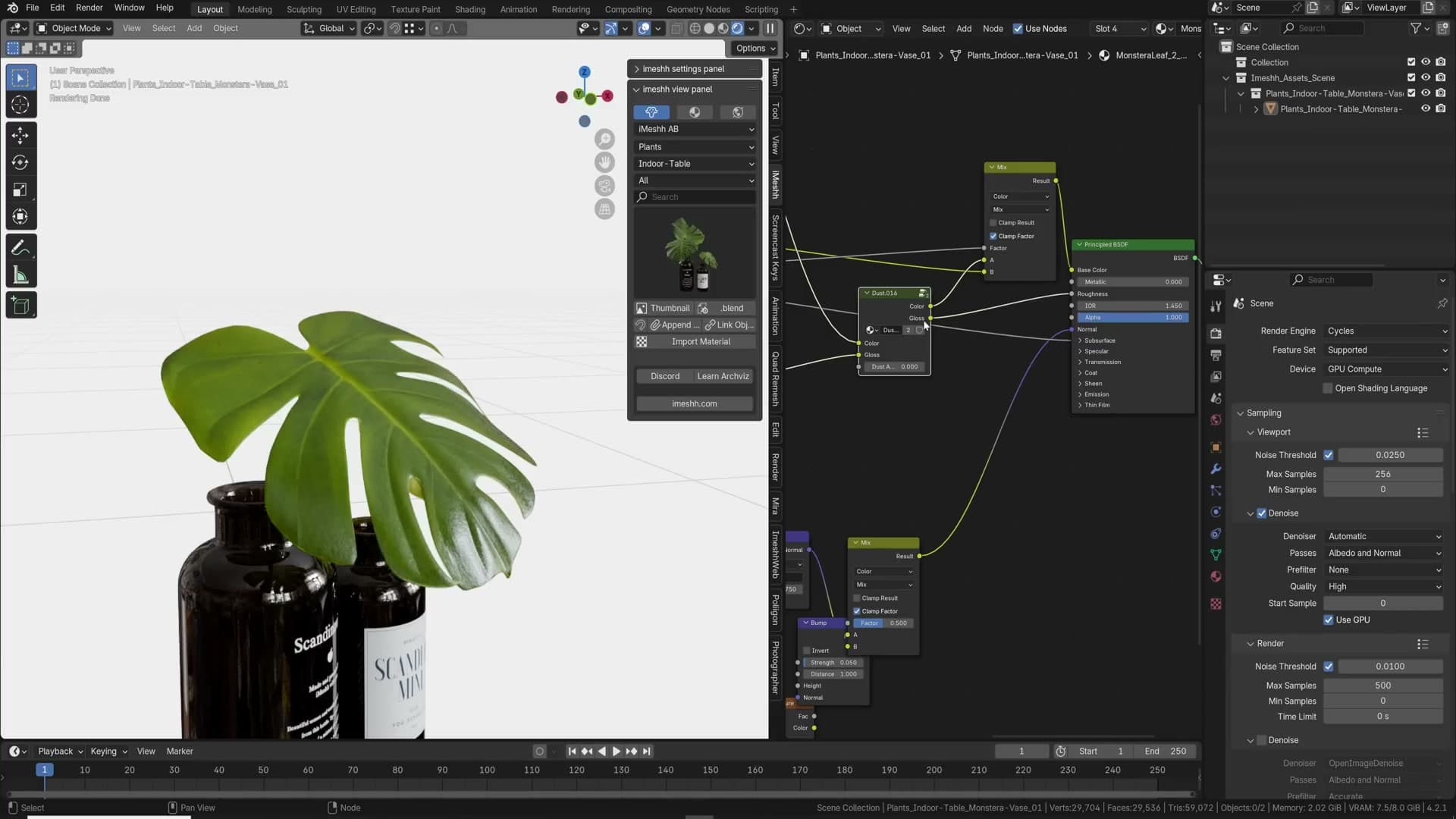
iMeshh publishes a free dust asset that solves this in one node group. Grab it from the free category on the iMeshh site; the download includes a node shader you can drop into any other material. The wiring is dead simple: plug your existing material's colour output into the dust group's colour input and the gloss output into the gloss input, then route the group's outputs back into the surface shader.
Once it's wired up, a single slider drives how much dust appears. Slide it up and dust accumulates on the top-facing surfaces of the object, exactly as it would in real life. The underside of a table stays clean while the top picks up a fine layer.
Viewing angle changes how obvious the effect is. Dust reads strongest from a low camera angle that grazes across the surface; from directly overhead it's much subtler. That's true of real dust too, so the shader matches the way our eyes naturally pick it up. Apply the node group across a batch of props and the whole scene starts to feel like it has been sitting in a room rather than spawned a second ago.
Adaptive subdivision, clean quads and the bump node
Cycles real geometric displacement only behaves if you flip on Experimental features, work on clean-quad geometry and stack the subdiv modifier last. Then the bump node and bevel modifier carry the rest.
Enabling adaptive subdivision
If you ever download a material that already has a Displacement node feeding into the Displacement output of the Material Output, you will usually plug it into a flat plane and see absolutely nothing happen. That is because real displacement needs actual geometry to push around. The naive fix is a Subdivision Surface modifier cranked high enough that the surface finally starts to look like brickwork, and at that point you are paying for millions of polygons whether the camera sees them or not.
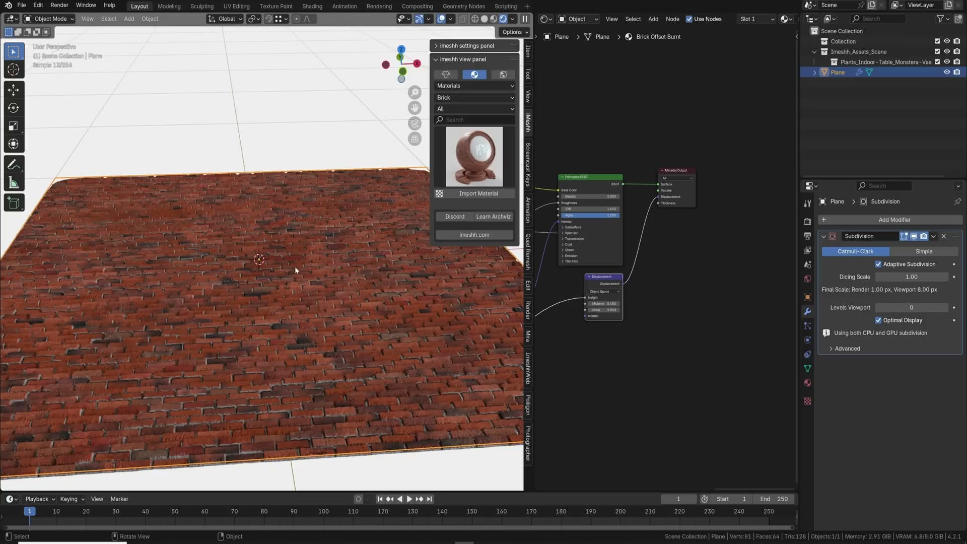
Blender has a much better answer hiding under the experimental flag. In Render Properties set the Feature Set to Experimental, then open the Subdivision Surface modifier on your object. A new Adaptive Subdivision checkbox appears. Switch the viewport to render preview, tick the box, and the surface immediately picks up far more detail than the static subdivisions were giving you.
Push the detail further from the global dicing rate under Render Properties → Subdivision. The viewport dicing rate defaults to roughly 8 pixels per micropolygon, and the render dicing rate is separate, so you can drop the render value to around 2 for noticeably crisper displacement at the camera. The lower the number, the more micropolygons Cycles dices into VRAM. Go too low and you will crash the render, so step it down rather than slamming it to a fraction.
One stacking rule catches almost everyone the first time. The Adaptive Subdivision option will quietly disappear if any other modifier sits below the Subdivision Surface modifier in the stack. Keep the subdiv modifier last, with everything else (Bevel, Solidify, Boolean) sitting above it.
Why quads matter for displacement
Turn on adaptive subdivision over a messy base mesh and the render preview will betray you instantly: pinched ridges, torn ripples, ugly streaks where the brick pattern should sit flat. The cause is almost always the geometry underneath. Adaptive subdivision works by slicing the existing topology into smaller and smaller pieces based on how close each face is to the camera, and triangle soup simply does not slice cleanly.
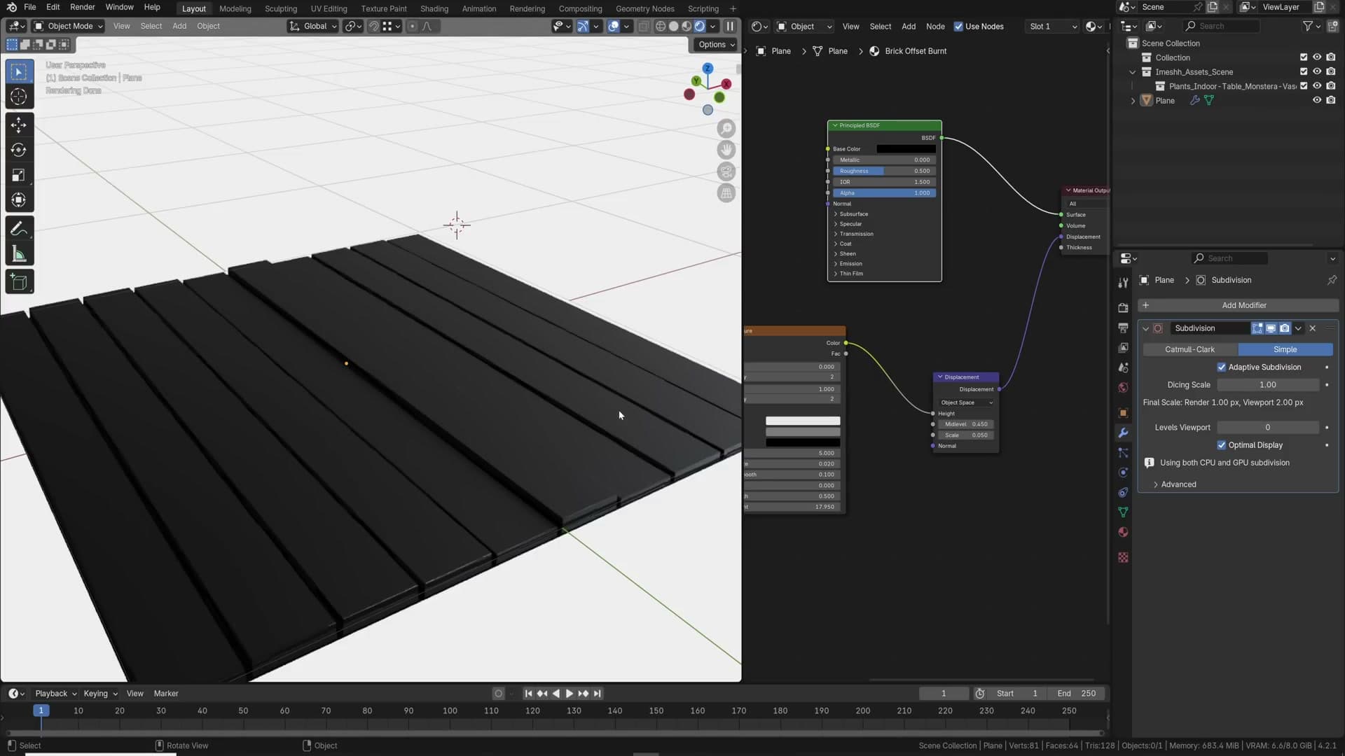
Rebuild the same object on clean quads and the artifacts vanish. The micropolygon grid now has a predictable surface to follow, so the displacement reads straight where it should read straight and curves where it should curve.
This catches a lot of people. Anything with strong directional detail (brickwork, planks, tiles, panelling, anywhere the eye expects a clean line) will show the breakdown the second you preview it. On scattered, organic surfaces such as a path of pebbles you can usually get away with worse topology because no straight edge gives the artifacts away, but for any architectural surface it is worth taking the time to retopologise to quads before you commit to displacement.
Pulling extra detail with a Bump node
Sometimes a material is almost there, the normal map is doing its job, but you can see lovely fine detail sitting in the diffuse map that the surface is not picking up. Cranking the normal map strength is the obvious lever, and often the wrong one. It exaggerates what is already there rather than introducing the new detail you actually want.
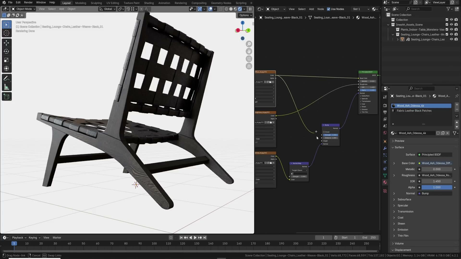
Instead, add a Bump node and feed the diffuse texture into its Height input, then plug the Bump output into the Normal socket of the Principled BSDF (chaining it after the existing normal map if you have one). Dial the strength down low and you start pulling micro-detail out of the colour map itself: pores, grain, dust, the things the normal map never captured.
The Bump node is one of the more underused shader nodes in archviz. Most people stop at the normal map and never think to layer on a second pass of relief from the diffuse, but it is a quick, free way to push a material from convincing to genuinely close-up ready.
The bevel modifier on every object
This one is simple, but it makes more of a difference than almost any other tip. You have modelled an object, you are happy with the silhouette and the materials, and yet something feels off. The edges read as perfectly mathematical because, in 3D, they are. There is no tiny highlight catching the light along the corner the way there would be in real life.
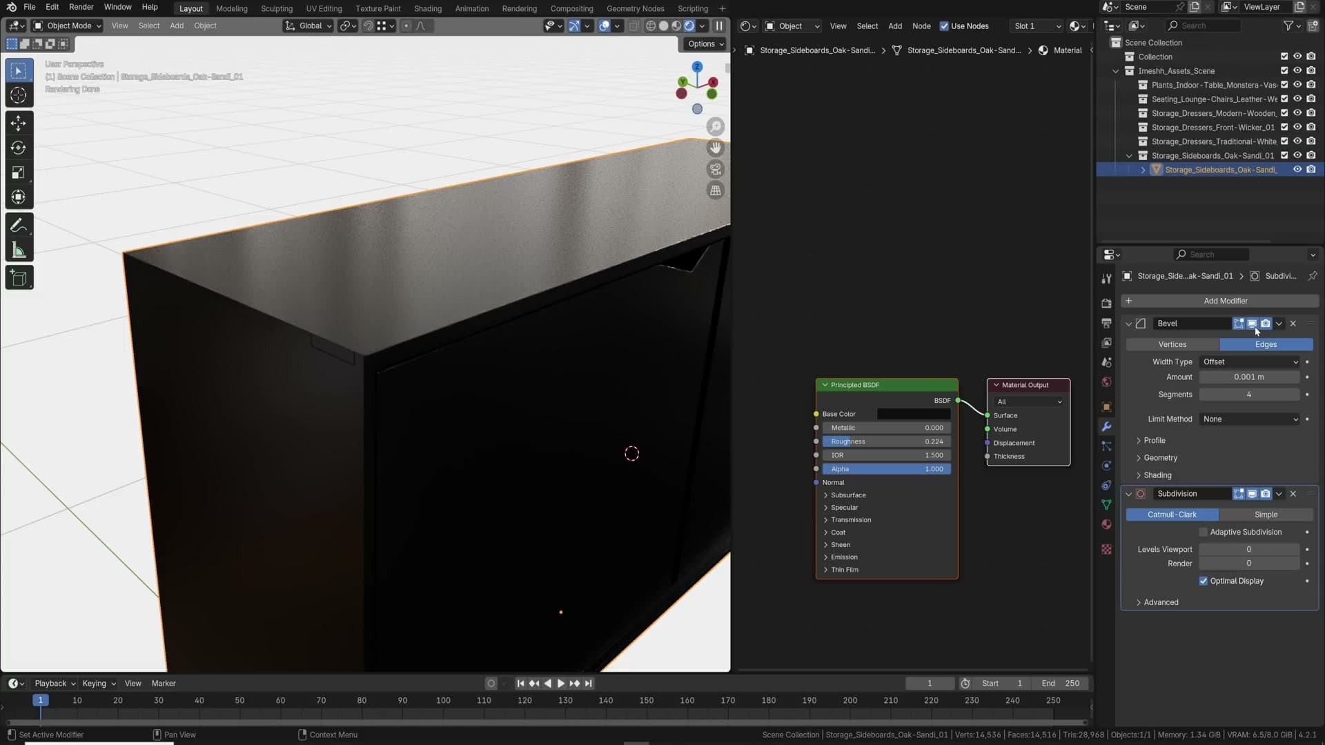
Add a Bevel modifier with a small radius and watch every edge suddenly pick up that thin specular highlight. Real-world objects almost never have a truly sharp edge. Manufacturing, wear, even paint thickness rounds them off, and the bevel modifier is the cheapest way to fake that for every object in the scene. Make a habit of dropping one onto everything you model.
Randomise duplicates so nothing looks robotic
Two operators do most of the work: Object Info plus Math and Combine XYZ shifts UVs per duplicate, and Randomise Transform breaks the perfect alignment of identical assets.
Randomise UVs with Object Info
Duplicate a chair around a dining table, hit render preview, and the wood grain gives the game away. Every seat shows the exact same UV layout in the exact same orientation. In a real photograph that never happens, because every plank, every panel, every dowel was cut from a slightly different part of the tree.
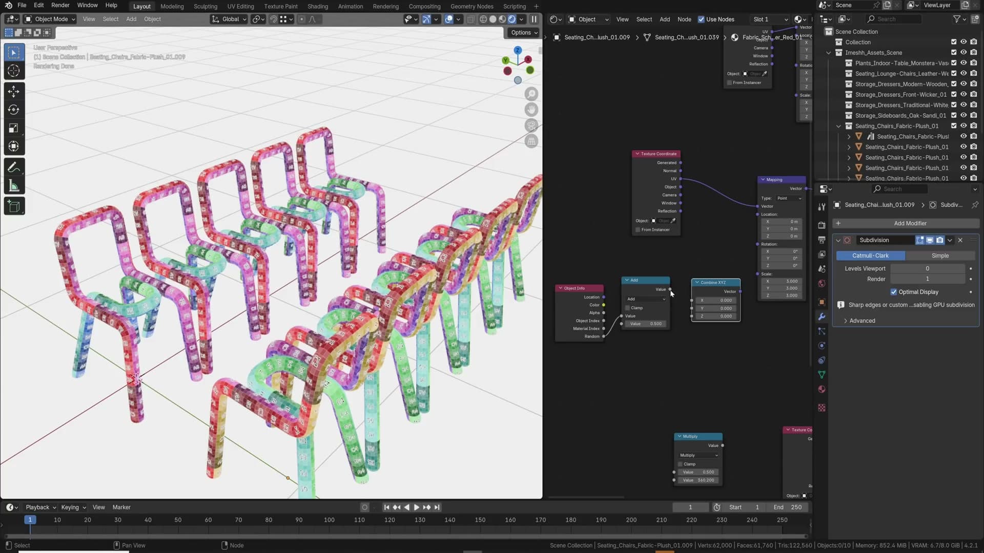
Fix it in the shader. Add an Object Info node, pipe its Random output into a Math node set to multiply, then feed the result into a Combine XYZ. Plug the Combine XYZ vector into the texture coordinate driving your wood-grain map. Use the X channel, the Y channel, or both, since you barely notice the difference once the multiplier is high enough. Slide the multiply value up until the seeds spread out and you stop seeing the regimented repeat. Drop it back to zero for a moment and the duplicates snap back to identical; raise it again and they all shift to a new seed.
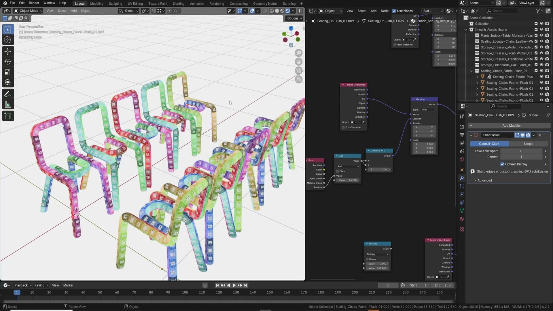
Use this on anything you duplicate in volume: chairs, leaves, lamps, tables, toys. It is one of those tricks that quietly adds a lot of realism, and most people forget to do it.
Randomise Transform on duplicates
Even with varied UVs, a duplicated dining set still reads as CG because the rotations are machine-perfect: one chair at 0°, the next at exactly 180°, every seat pushed in to the millimetre. No human places furniture that precisely. The person taking the photograph might try, but they will still be a couple of degrees off on every chair.
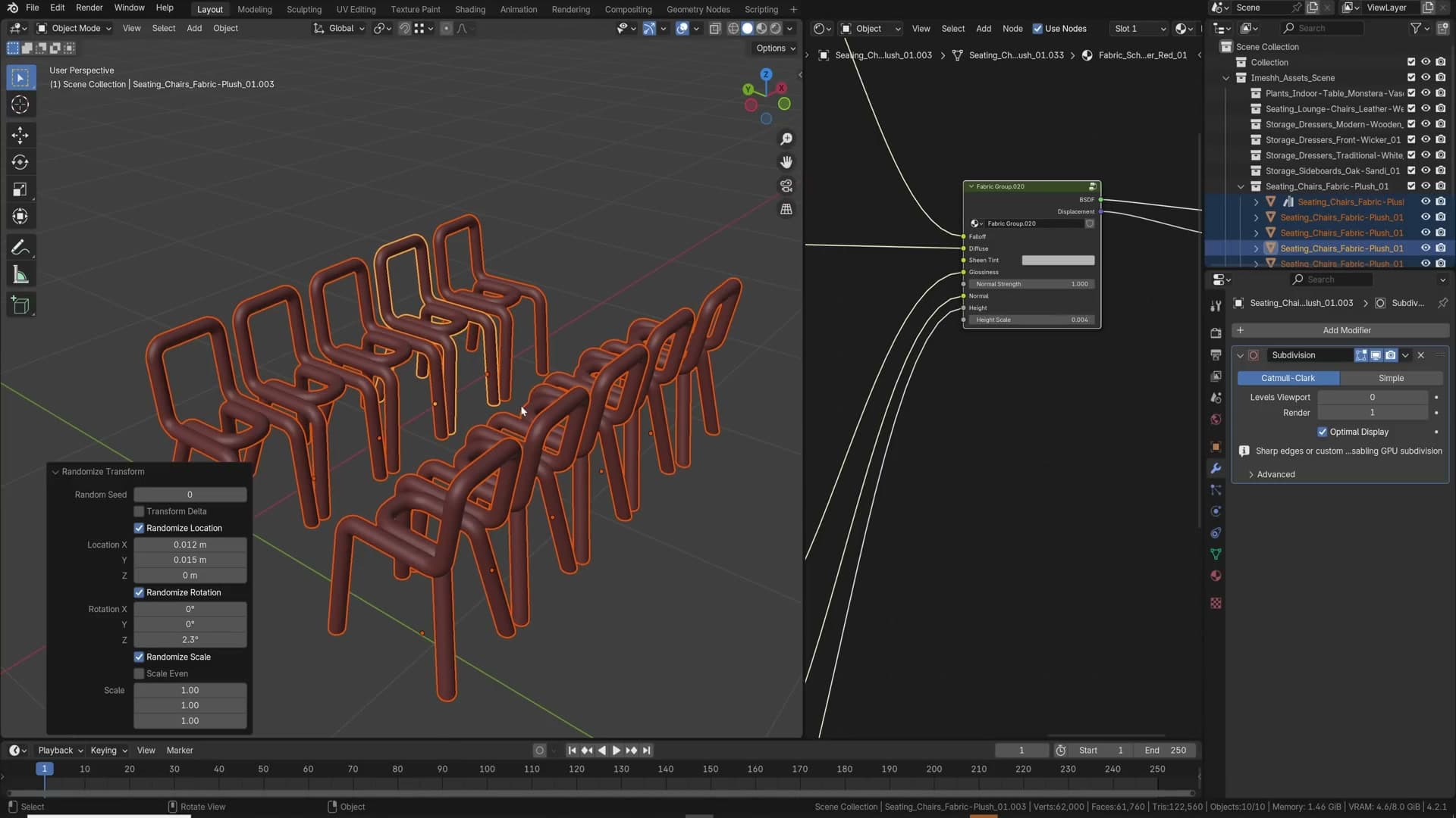
Select all the objects you want to nudge, press F3, and search for Randomize Transform. The operator panel appears in the bottom-left corner with toggles for location, rotation and scale. Dial in a very small location offset, then push a few degrees of rotation on the Z axis. Chairs are not going to flop on their sides, so leave X and Y alone for furniture. Even a tiny amount of variation is enough to convince the eye that a real person arranged the scene.
Push it further on natural assets. For plants, scattered props or anything organic, switch the scale toggle on as well so the duplicates vary in size as well as orientation. That is where the operator earns its keep. A row of identical pot plants gives itself away instantly, but a row of slightly different sizes and angles reads as a real shelf.
Modelling shortcuts: copy/paste, Select Similar, loop cuts, mirrors and 3D-cursor orientation
Five hand-saving shortcuts that come up every session: Ctrl+C/V across project files, Shift+G to grab similar geometry, loop-cut E and F flips, Ctrl+M for mirror, and aligning Transform Orientation to the 3D cursor for axis-locked edits.
Copy and paste objects between projects
You have just finished modelling an asset in one file and you want it in another scene you have open. Most people assume that means appending or linking, but Blender lets you do it with the same shortcut you use in every other application on your machine.
Select the object, hit Ctrl+C, switch to the other open Blender window, and press Ctrl+V. The object lands in the second project at its original world coordinates. It is by far the fastest way to shuttle a single asset between files when a full library or append workflow would be overkill.
Select Similar with Shift+G
Shift+G is the shortcut you should reach for any time you find yourself click-click-clicking to gather geometry that is obviously related. Select one element first, then hit Shift+G to open the Select Similar menu. The options change depending on whether you are in vertex, edge or face mode.
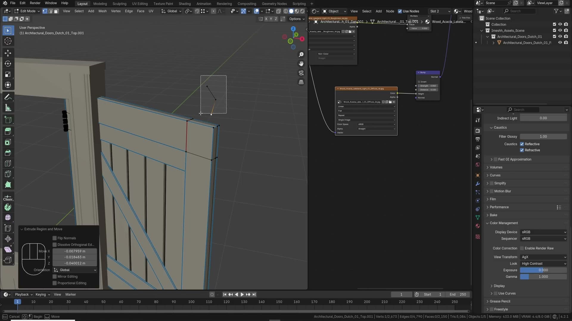
On an edge, the most useful entry is Length. Pick one edge and Blender grabs every edge in the mesh that matches it. A threshold field appears in the operator panel at the bottom of the viewport, so you can widen or tighten the match if it is selecting too few or too many. On faces, Face Angle grabs everything at the same orientation (handy for selecting an entire run of edges to bevel), and Area matches face size.
It is also the cleanest way to deal with stray geometry. If you have a mess of floating vertices left over from a Boolean or an import, click one of them, hit Shift+G and choose Amount of Adjacent Faces. Every disconnected vertex with the same neighbour count gets selected at once, ready to delete.
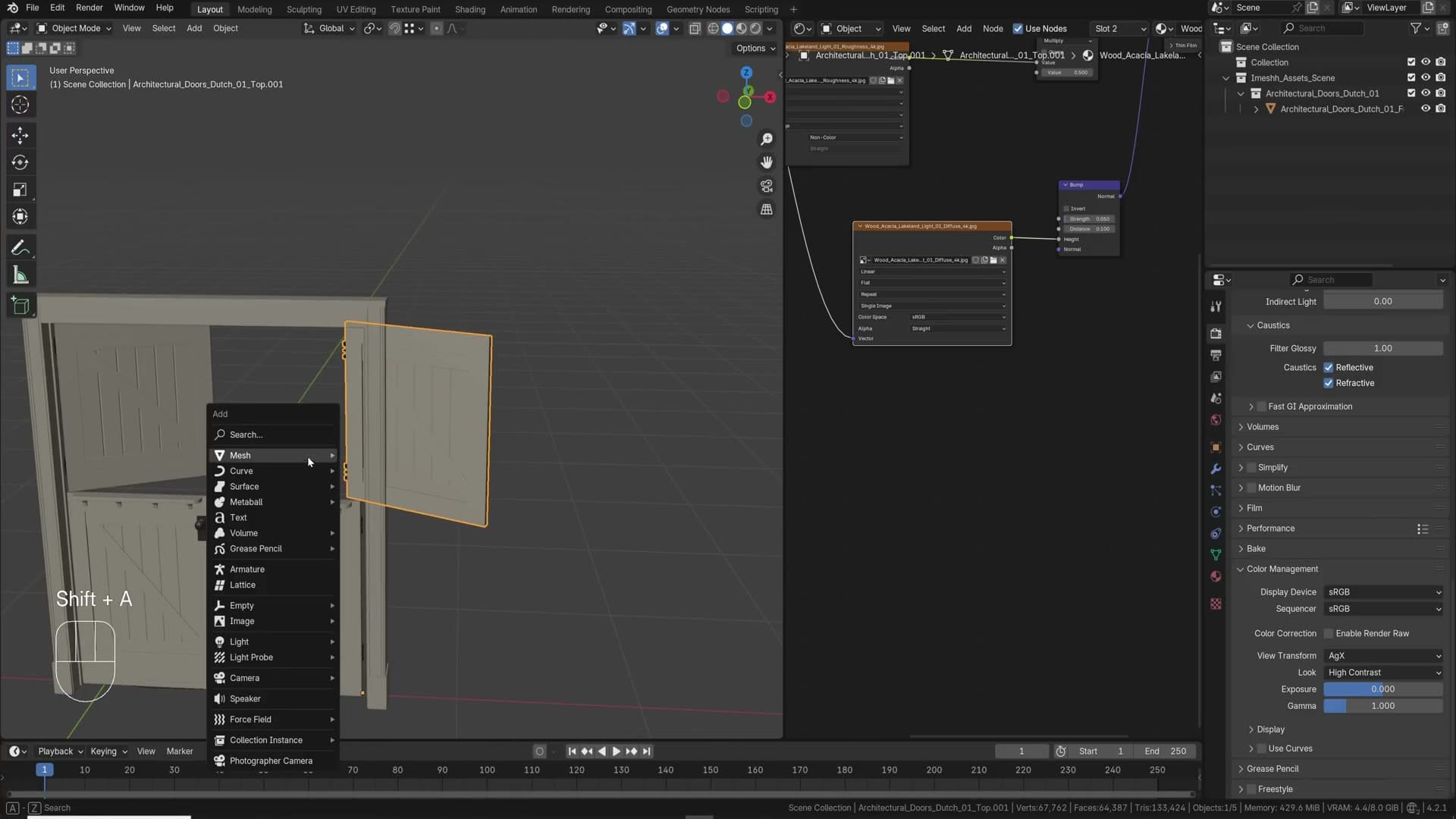
The shortcut works in Object Mode too. Click a lamp, press Shift+G, and you can grab everything of the same Type, or every object that shares the same Sibling or Parent. It is the kind of shortcut that quietly removes a hundred clicks a day once it is in your fingers.
Loop cut even and flip with E and F
Loop cuts on geometry that has one straight edge and one sloped edge produce a cut that follows the slope. That is fine if it is what you want, but frustrating when you actually need a perfectly flat ring sitting somewhere in the middle. The usual workaround is to add the cut, then press S, S, 0 to slide it back to zero on the relevant axis. Blender has a better way built in.
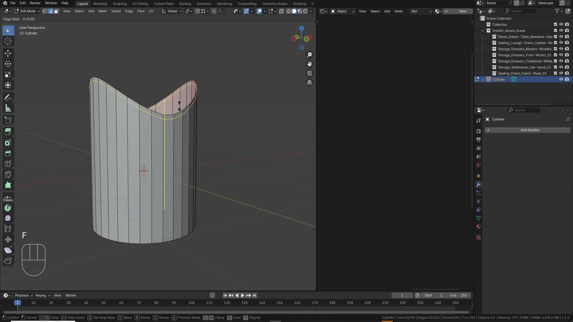
Press Ctrl+R to start the loop cut and click once to confirm the placement. While the cut is still in its sliding state, look at the operator hint at the bottom of the viewport. It tells you to press E to switch the alignment. Tap E and the cut snaps perpendicular to one of the source edges instead of averaging between the two.
From there, F flips which edge the cut conforms to. Press F again to flip back, or press E a second time to turn the behaviour off and return to the original evenly-interpolated cut. The combination of E and F means you can drop a perfectly flat loop into a slanted mesh in one operation, then carry on with your bevel or extrusion.
Ctrl+M for instant mirror
You have duplicated a door across to the other side of a doorway and realised it is facing the wrong way. Rotating it does not fix it. The handle ends up on the wrong side and the chamfers run the wrong direction. What you actually want is a mirror.
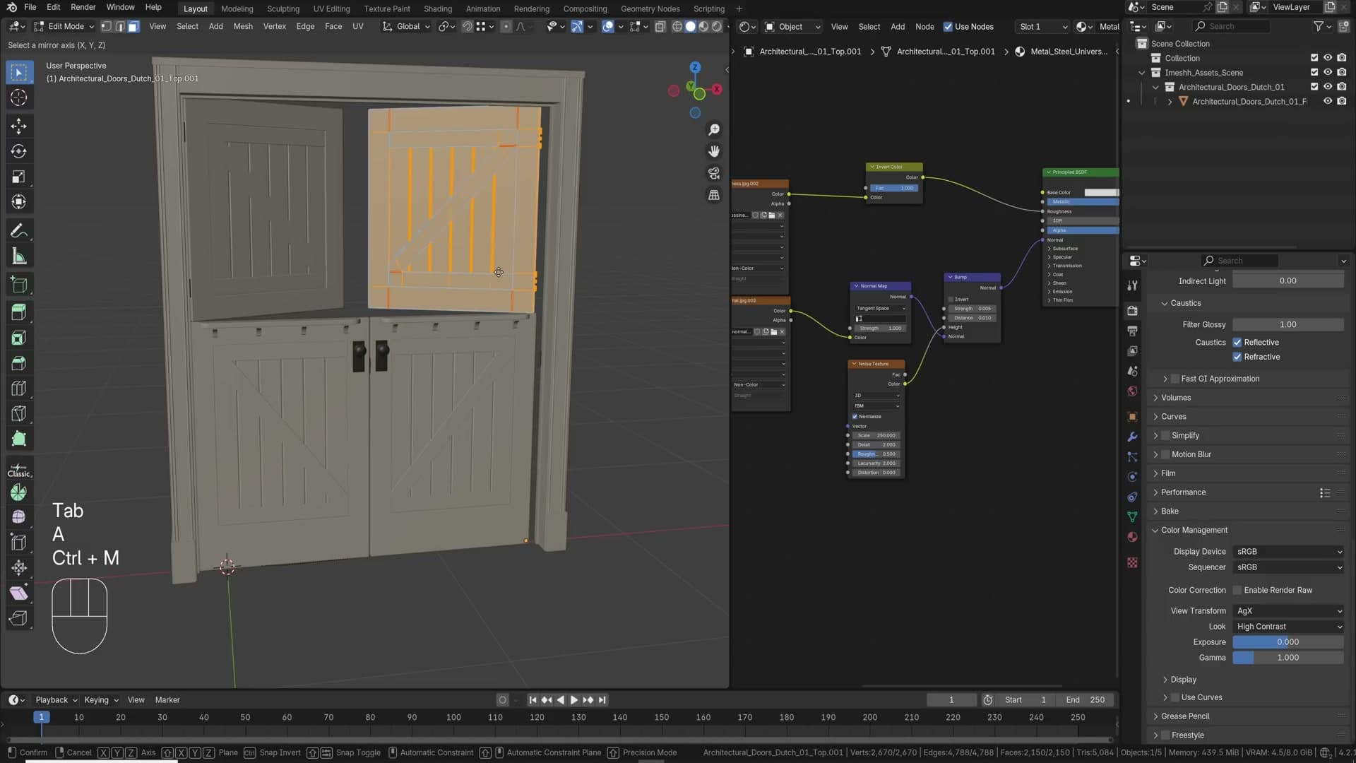
Ctrl+M is the shortcut. Press it, then tap X, Y or Z to choose the axis to mirror across. The same shortcut works in Edit Mode: select the geometry, hit Ctrl+M, then the axis. The menu equivalent is buried under Object → Mirror (or Mesh → Mirror in Edit Mode), which means clicking, picking the wrong axis, undoing and trying again. Ctrl+M turns that into a single keystroke and is genuinely one of the shortcuts that changes how you work once it is in your muscle memory.
Transform Orientation set to 3D Cursor
Sometimes you need to push geometry along the axis of a face that is not aligned to world XYZ. Local orientation usually handles this, but if you have already applied rotation to the object, local and global are the same and the trick stops working. The reliable fix is to align the 3D cursor to the face you want, then transform along the cursor.
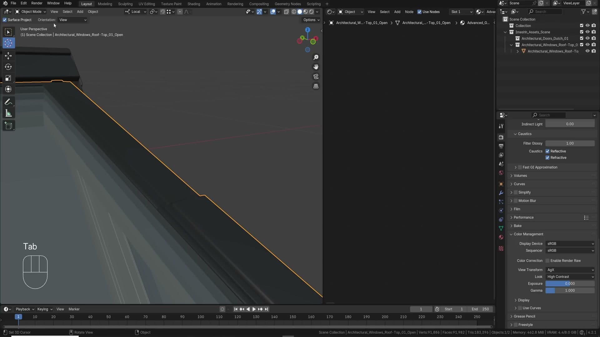
Open the snap menu (the magnet-style icon in the header) and enable Cursor Orientation by Geometry. Click anywhere on the face whose orientation you want to borrow. The 3D cursor jumps there and tilts to match the surface normal. Then open the Transform Orientation dropdown at the top of the viewport and set it to 3D Cursor.
Drop back into Edit Mode, select the geometry you want to move, and press G Z. The move is now locked to the cursor's Z axis, which is the face normal you just sampled. The same trick works for any axis-locked extrude, scale or rotate when applied rotation has stranded you off the local grid.
Smarter modifiers and instances: Copy Attributes, linked data, bevel shader, lattices, surface curves and Alt+D
Six time and VRAM savers. Copy Attributes spreads rotation or location between objects, Ctrl+L links mesh data, the Bevel shader node fakes edge highlights without geometry, lattices warp high-poly assets non-destructively, Bezier curves can be drawn on surfaces for cabling, and Alt+D instances scale to billions of faces where Shift+D crashes.
The Copy Attributes addon
Open Edit → Preferences → Add-ons and enable Copy Attributes. With it on, select the source object first, the destination object second, then press Ctrl+C to open a menu of attributes you can paste across: rotation, location, scale and a handful of others.
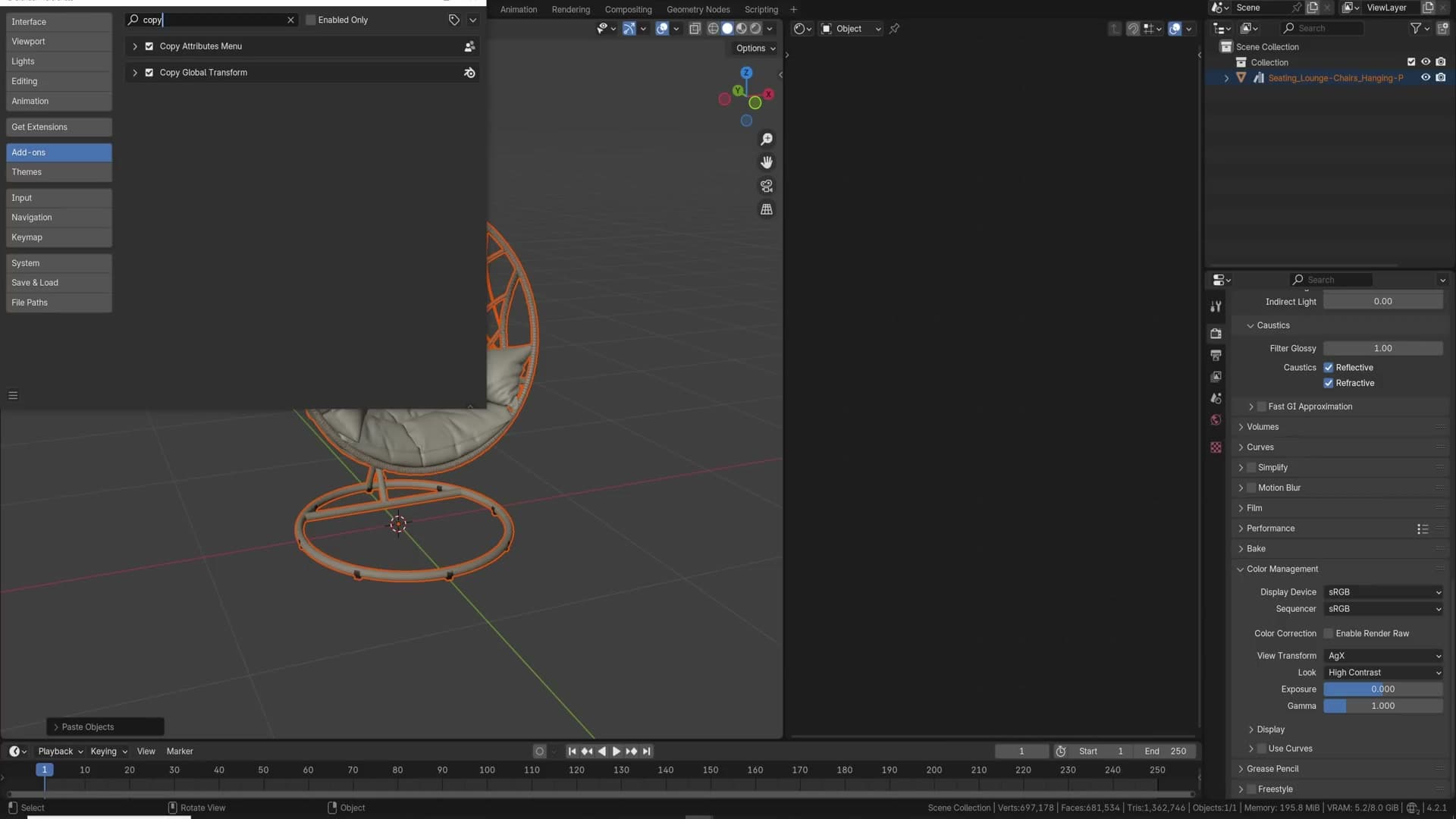
Each entry copies just that property. Copy Rotation snaps the second object's orientation to match the first's; Copy Location snaps its position. The same Ctrl+C menu is also how you carry objects between separate .blend files. Pick Copy Objects in one project and paste them into another.
Ctrl+L to link object data
Once Copy Attributes is doing the obvious work, reach for Ctrl+L for the less obvious. With two objects selected it offers a different menu: animation data, materials, modifiers and, most usefully, Object Data.
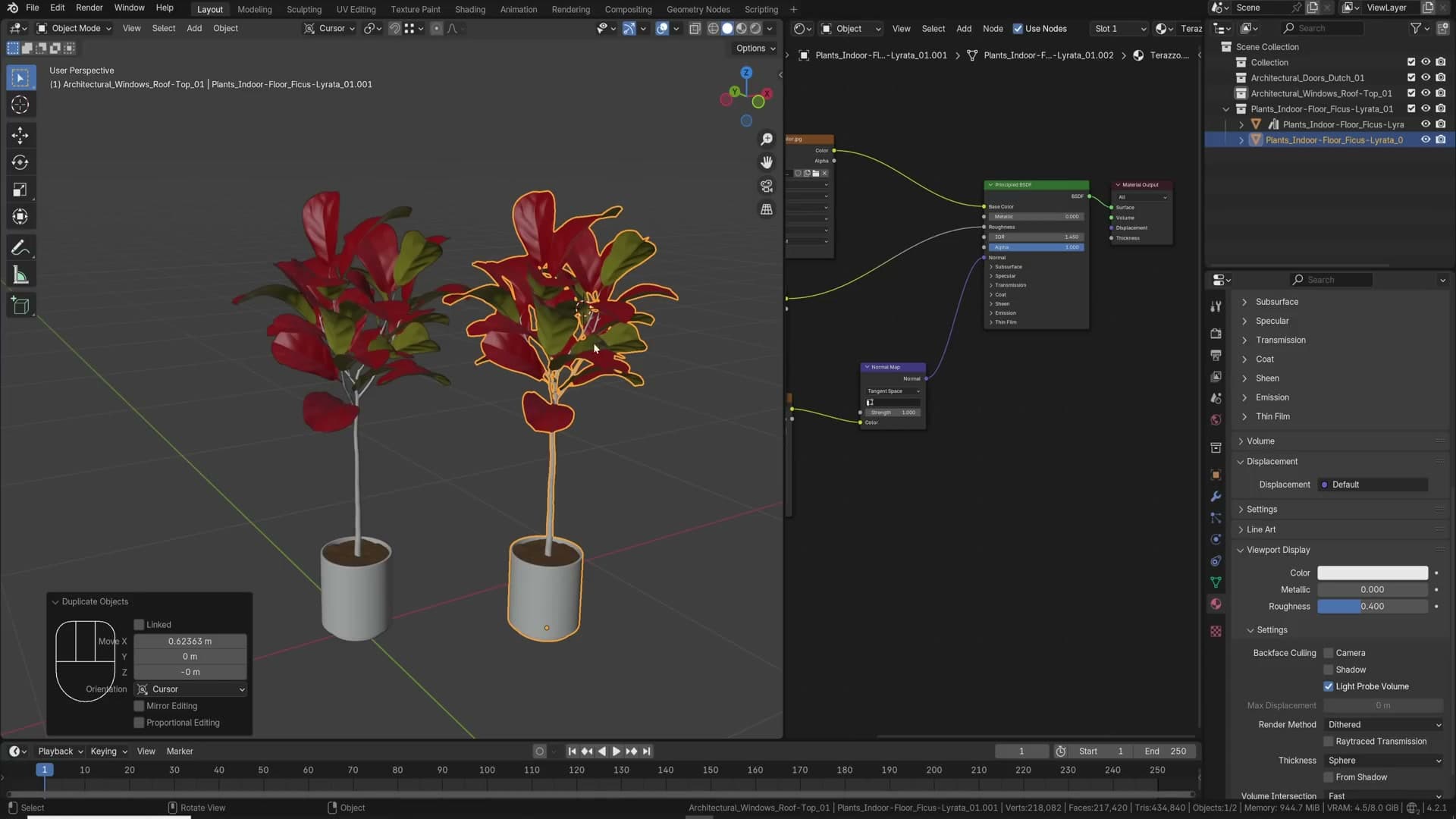
The classic case is realising you pressed Shift+D when you meant Alt+D. You now have two independent copies of the same mesh sitting in VRAM instead of one shared instance. Select both, press Ctrl+L and choose Link Object Data. Blender treats them as one shared mesh from that point on. Edit one in edit mode and the other updates with it.
This is two tips in one: a recovery move when you've duplicated by mistake, and an ongoing habit that keeps VRAM use down whenever the same asset repeats through a scene.
Bevel shader node for far-away objects
Adding a bevel modifier to every object is sensible advice for interiors, but it falls apart on exterior scenes where a single office tower can run hundreds of storeys tall. The geometry cost of bevelling every edge on a building like that is wasteful, especially when the building is sitting deep in the background.
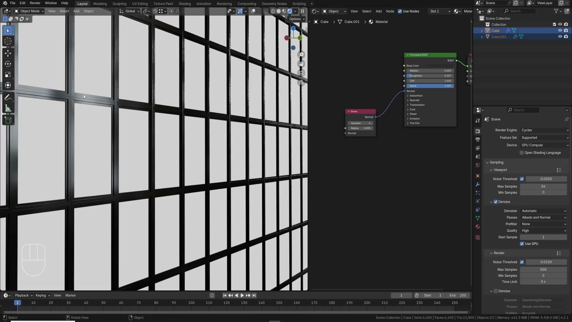
The fix is the Bevel node in the shader editor. Drop it in, plug its output into the Normal input of your Principled BSDF, and bring the radius down. A value of 0.01 is a reasonable starting point. Push it much higher and the shading goes funky.
You get the same crisp edge highlights you'd see from real bevelled geometry, with zero extra polygons. It is a shading trick rather than a true bevel though, so it doesn't hold up under close inspection. For hero objects sitting near the camera, stick to physical geometry. For everything mid-distance and back, the shader bevel is the smarter choice.
Lattice deform on high-poly assets
You've downloaded a high-poly asset and you like how it looks, but you need to warp it: curve it, taper it, bend the silhouette slightly. Going into edit mode and pushing verts around with proportional edit on a heavy mesh is slow, and once you commit the change, it's baked in.
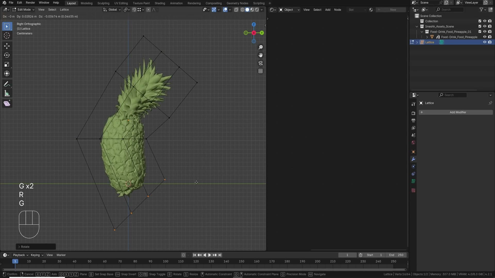
Lattices are the non-destructive answer. Press Shift+A and add a Lattice. Scale it so it covers the whole object and add a few extra cuts along each axis from the lattice's Object Data panel. Those extra control points are what give you something to deform with.
Select the original mesh, add a Deform → Lattice modifier and point it at the lattice you just made. Now jump into edit mode on the lattice and push its control points around. The high-poly mesh follows in real time, with none of the lag you would hit dragging individual verts on the source geometry.
Because it's a modifier, the change stays live. Disable the modifier and the asset snaps back to its original shape; apply it when you're happy, or leave it on so you can keep tweaking later.
Bezier curves drawn on surfaces for cables
Cables and wires that conform to a surface are quicker to make than they look. Press Shift+A → Curve → Bezier Curve and give the curve a small bevel depth in its Object Data properties so it actually renders as a tube.
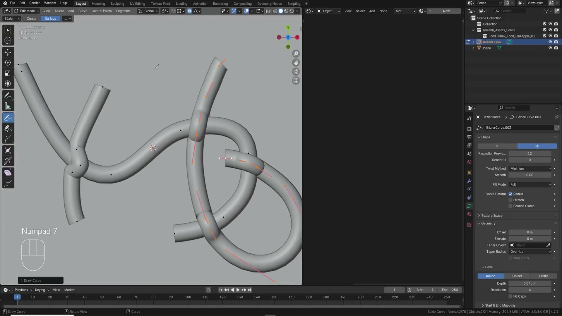
Jump into edit mode, press A to select everything and X → Delete to clear the default points. Then switch to the Draw tool, enable its Surface option, and start drawing directly across the object you want the cable to sit on.
The curve snaps to whatever surface is underneath the cursor as you go, so cables follow walls, floors and the edges of desks without you having to fiddle with depth. From the top view you can sketch in any direction and the height still tracks the surface beneath.
If a stroke isn't quite right, tweak the control points afterwards. Pull the bevel width down if the cables come out too thick. It is the fastest route to a believable spaghetti junction of pipes or wires.
Alt+D instances vs Shift+D duplicates
This is the single biggest VRAM trick in Blender, and it's a one-keystroke change. Shift+D duplicates an object by copying its geometry into a brand new mesh. Do that a few hundred times in a row and the face count climbs into the millions, the viewport chokes, and eventually Blender crashes outright.
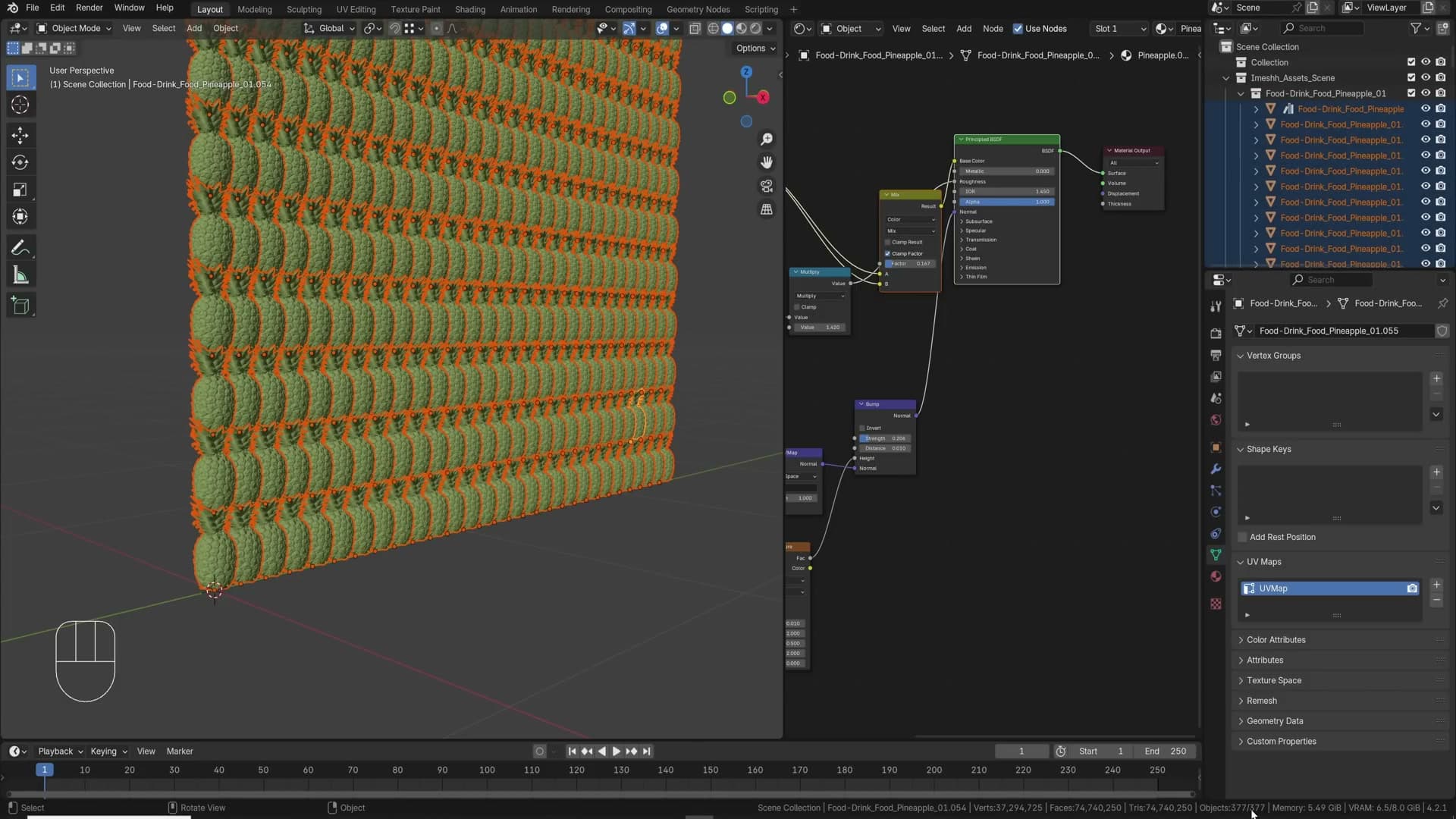
Alt+D looks identical on screen but behaves differently. It creates an instance, a new object that shares the same mesh data as the original. Duplicate a thousand chairs with Alt+D and the scene still reports the face count of a single chair, not a thousand.
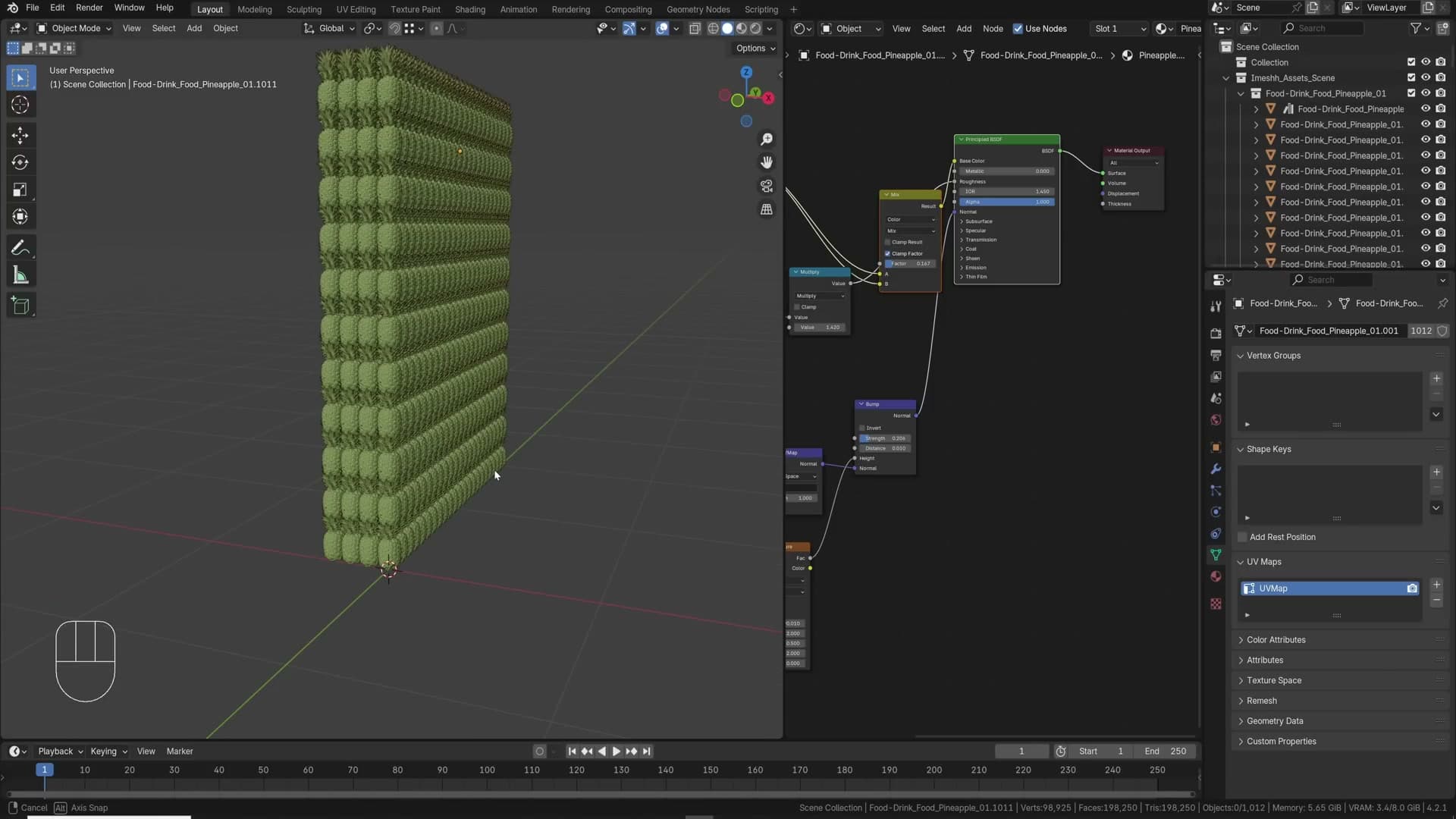
The reason is that Blender only needs the transform for each instance (where it sits, how it's rotated, how it's scaled) and reuses the underlying geometry for every copy. One mesh in VRAM, a thousand placements on screen. The viewport stays usable far longer; only the sheer number of objects in the outliner eventually starts to slow things down.
Precision modelling: measurements, snap to base and unbevel
Edge-length overlays, the Blender 4.2 Snap to Base for vertex-perfect placement, holding Ctrl for temporary snapping, and the Myra Tools Unbevel for collapsing edges back together.
Display edge length and face angles
For precision modelling, Blender can display the exact length of every edge directly in the viewport while you work. No calculator, no eyeballing the N-panel.
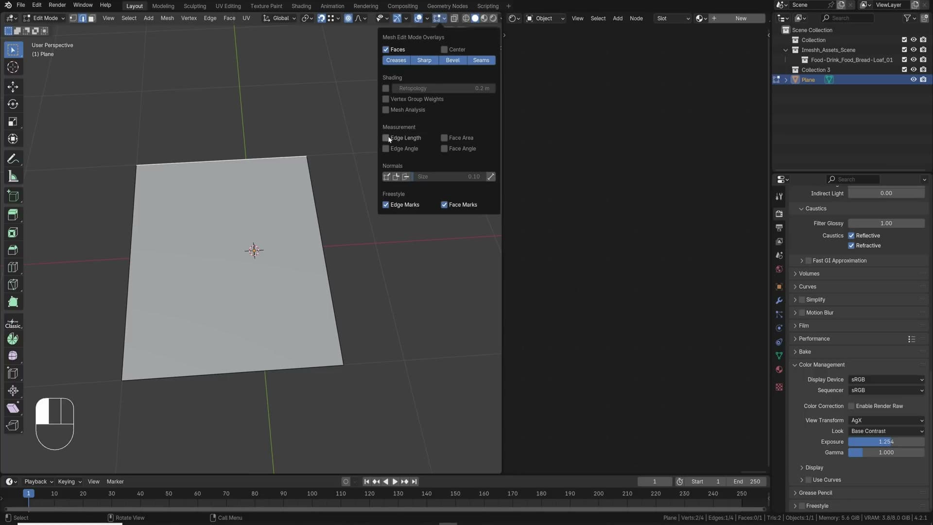
In edit mode, open the overlays popover at the top of the viewport and enable Edge Length under the measurements section. Each edge now shows its dimension (1.57 on the example mesh) and the numbers update live as you move geometry around.
The same panel exposes Face Area and Face Angle readouts. Tick those when you need a wall, a mitre or a window frame to land on a specific size, or when you need to confirm that an angle is exactly what you expect before committing to the next step.
Snap to Base for vertex-perfect placement
Placing one vertex exactly on top of another vertex is fiddly by eye. Even with regular snapping enabled, a plain Shift+D and drag rarely lands the duplicate exactly where you want it. The move snaps from the object's origin, not from the corner you actually care about.
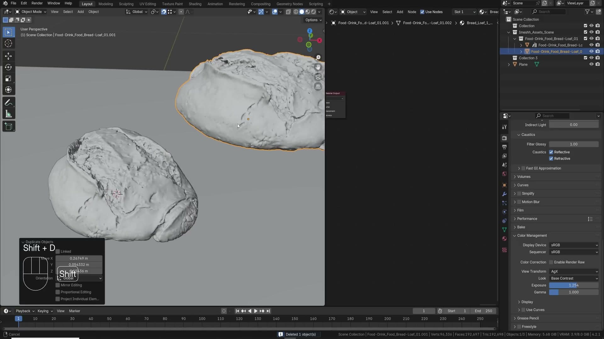
Snap to Base solves this. With snapping enabled, duplicate the object with Shift+D, then press G followed by B. Click the vertex on the moving object that you want to use as the snap anchor, drag the object towards your target vertex, and click again to confirm. The chosen vertex lands precisely on the target.
This is the move you reach for whenever window frames have to align perfectly with wall geometry, floor plans need vertex-true joins, or any part of a model has to hit a specific point with zero drift.
Hold Ctrl for temporary snapping
If you prefer to keep snapping switched off most of the time, you do not need to toggle it back on every time you want a quick alignment. Start a move with G (or constrain to an axis with G X, G Y or G Z), then hold Ctrl. Snapping turns on for as long as the key is held and switches back off the moment you release it.
It is not as surgical as Snap to Base. You are snapping the object's origin to the nearest snap target rather than a vertex you specifically picked. But for rough placement without committing to a snapping mode, it is the fastest option in the box.
Unbevel with Myra Tools
Removing a bevel after the fact used to be a manual chore: dissolve the loops by hand, tidy the geometry, and hope the verts merged cleanly. A handful of free add-ons can collapse the whole job into a single slider. Myra Tools is the one used here, and the developer's site has the download link.
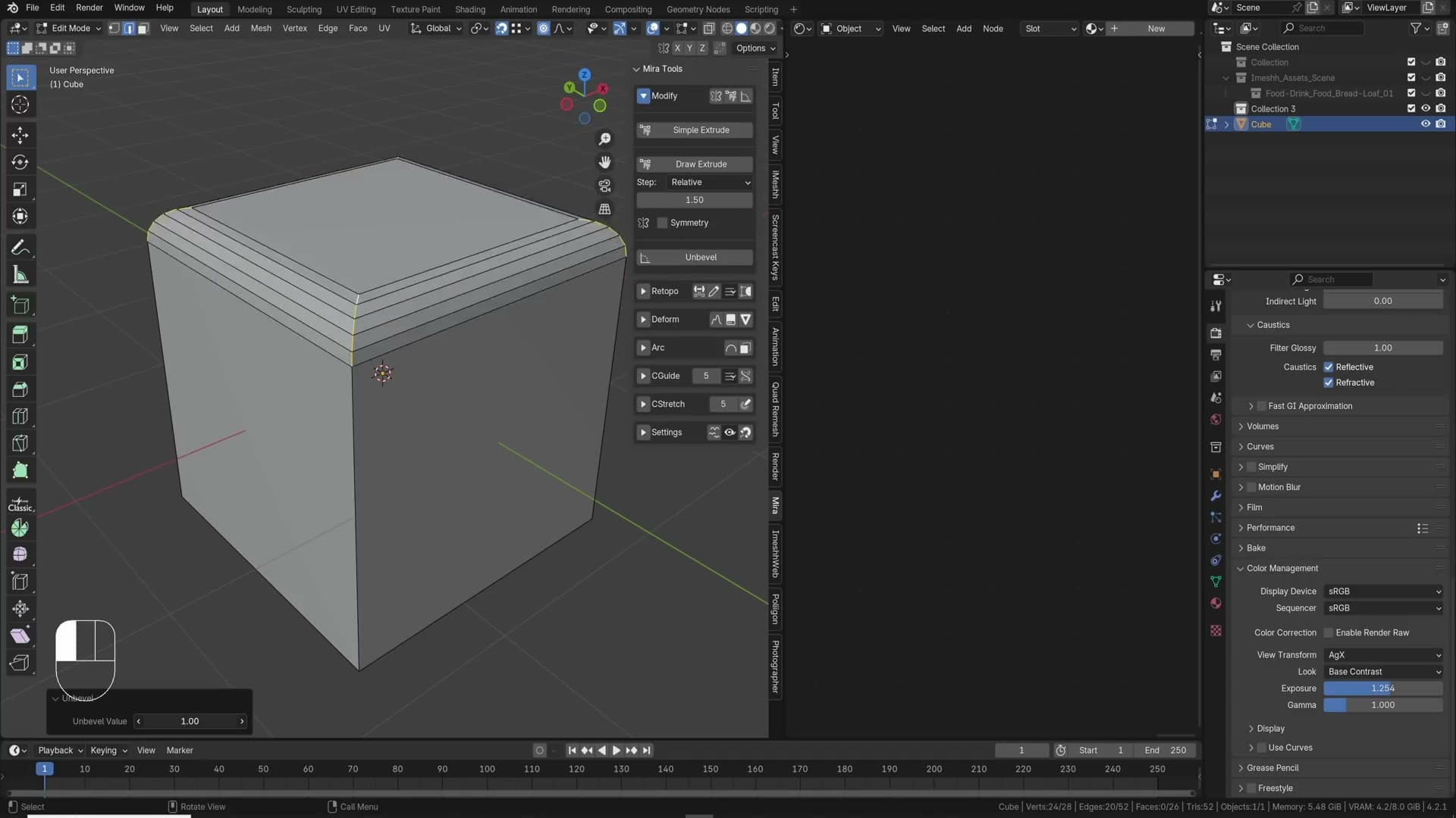
With the add-on installed, drop into edit mode on the bevelled object and select the edges that make up the bevel. Ctrl+Alt+click grabs the first ring of edges running around the bevel, then Shift+click any further edges that were not picked up automatically.
Open the Myra Tools panel, click Unbevel, and drag the slider down towards zero.
The bevel collapses back into a hard edge and the add-on merges the duplicate vertices for you in the same step. No doubles left to clean up afterwards.
Lighting fundamentals: HDRIs, layered lights, time of day and IES
Why HDRIs are the fastest way to photorealism, when to layer sun + area + point lamps on top of a sky texture, why morning and evening flatter most archviz, and how IES profiles give spotlights real-world falloff.
HDRIs as your first lighting choice
Default Cycles lighting is flat. There's no contrast, no mood, nothing in the image that reads as a photograph. Plug an HDRI into the World output and the whole scene shifts. Suddenly the render has life, interest, and enough photographic information that it could pass as a real image.
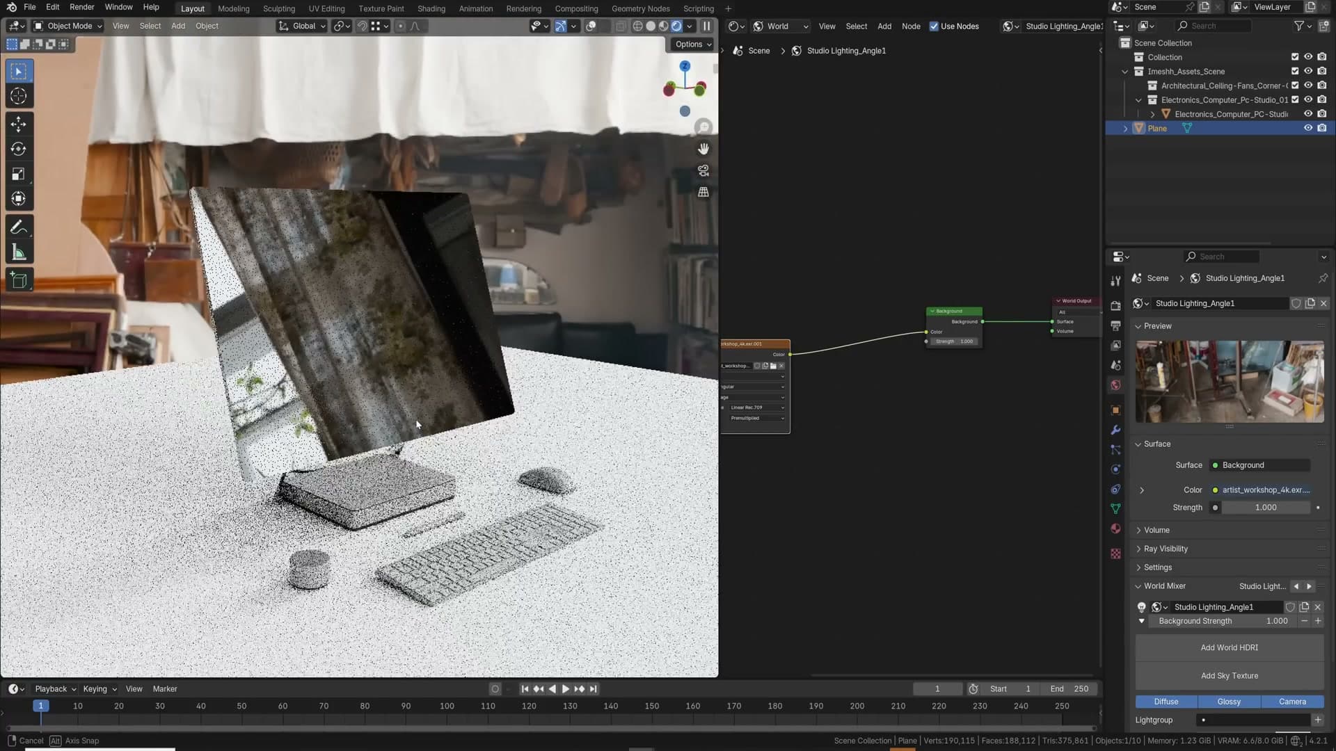
That's the headline tip for lighting in archviz: reach for HDRIs first. They deliver immediate, photoreal results without the hours of trial-and-error that go into hand-built rigs. Other techniques exist, such as area lights configured as proper studio setups, but they take far more practice before they look convincing.
Treat HDRIs as the shortcut. Learn area lights and studio rigs later, but understand that knowing how to use HDRIs well already gets you over halfway to a believable lighting setup.
Layering sun, area and point lamps on top of an HDRI
Once an HDRI is in, treat it as the foundation rather than the finished image. The scene shown here actually layers four lighting sources on top of each other: a sky texture providing the sun, a sun lamp on top of that, an area light, and a handful of point lights tucked into the hanging fixtures.
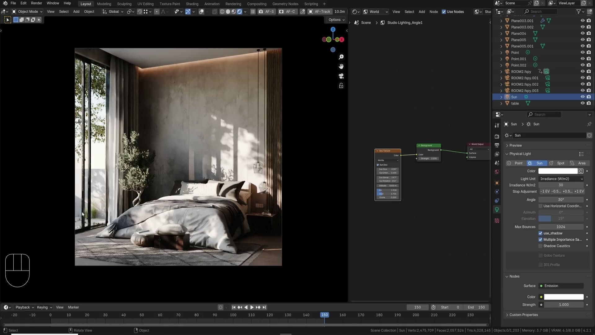
The sky texture handles the broad daylight contribution. On top of it sits a sun lamp with its Angle set to 30°, wide enough that you can't read a single sharp shadow direction and soft enough to act as a big diffuse fill across the room. Because the angle is so wide, it doesn't fight the HDRI; it just gently brightens the scene where it was sitting too dark.
An area light fills in another corner with complementary highlights, and the point lights inside the hanging fixtures add a subtle glow. During daytime they aren't doing heavy lifting, but they sell those practical fittings as real lights rather than dead props.
The principle: don't stop at one HDRI or one sky texture. Look at every hanging fixture, every dark corner, every wall that wants a highlight, and ask whether another sun, area or point lamp would help. Stacking complementary lights is what pushes a render past "lit" and into "directed". Get creative. Multiple suns are fair game if the scene benefits.
Morning and evening light for drama
A surprising number of archviz renders default to high-noon sun: a steep angle that punches a small patch of light onto the floor and leaves the rest of the room flat. It reads as realistic, but it isn't dramatic, and the back walls lose all the long shadows that would have given the shot interest.
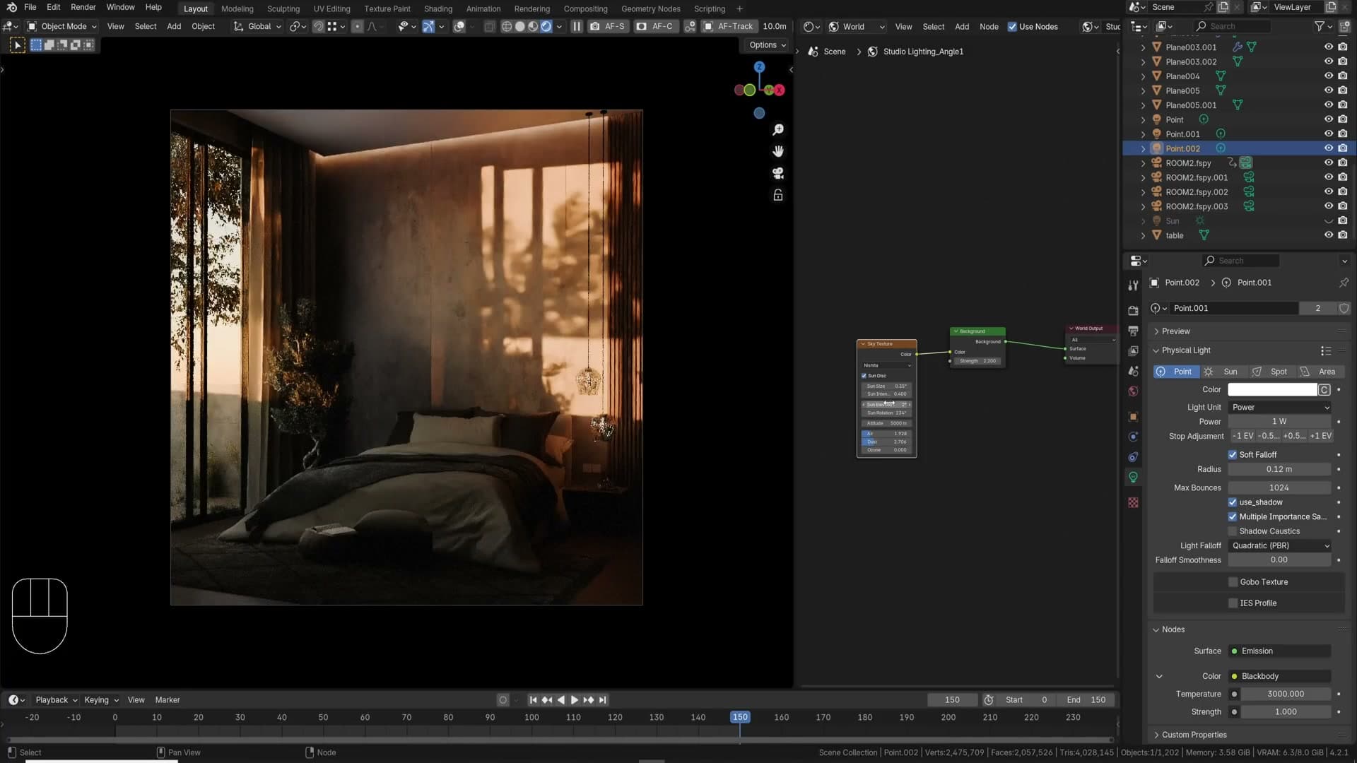
Drop the sun towards the horizon and the whole scene changes. Lower the elevation in the sky texture far enough that the light starts grazing across the room and you push into sunset territory: long raking shadows, warmer colour, angles that wrap around objects rather than stamping straight down on top of them.
As a rule of thumb, morning and evening light flatter most archviz scenes. If you've just added a sky texture and you're not sure where to put the sun, try an early-morning or late-evening elevation first and see whether the shot reads more interesting before you commit to anything else.
IES profiles for realistic spotlights
Out of the box, a Blender point light throws a uniform pool of light. It works, but it looks nothing like a real luminaire. Real spotlights have shaped beams: a hotspot in the middle, soft falloff at the edges, sometimes scalloped patterns where the reflector cuts the beam. IES profiles describe exactly that, and plugging one into a point light immediately upgrades how the lighting reads.
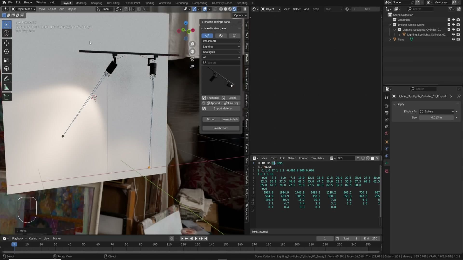
To wire one up, select the point light and enable Use Nodes in its data properties. In the shader editor, press Shift+A and add an IES Texture node. The .ies file itself is just a series of numbers describing the shape of the beam. You can open it in the text editor and inspect it if you're curious. Plug the IES Texture output into the Strength input of the Emission node and the flat circle of light becomes a properly shaped beam with a real hotspot and falloff.
That, to my eye, is how a spotlight should look. The shape sells it as a photograph rather than a CG render, and the difference is one node deep.
Pull more profiles from ieslibrary.com. The library runs into the thousands of patterns, free to download, covering downlights, spotlights, washes and pendants. If you're using a basic spotlight without any IES data behind it, you're missing one of the cheapest wins for spotlight realism in the whole pipeline.
Glass IOR, real-time glare and white balance
Three tweaks that lift archviz polish: cranking IOR for sky-rise glass, mixing glare nodes in the always-on compositor, and using the Blender 4.3 white-balance slider to neutralise an orange cast.
IOR for reflective architectural glass
Blender's stock glass shader can read a little dull when you compare it to the mirror-finish glazing on real-world office towers. Most sky-rise windows have a film laminated over the outside that knocks back transmission and makes the panes behave almost like one-way mirrors. The cheapest way to fake that look in Cycles is to leave the shader alone and push the IOR.
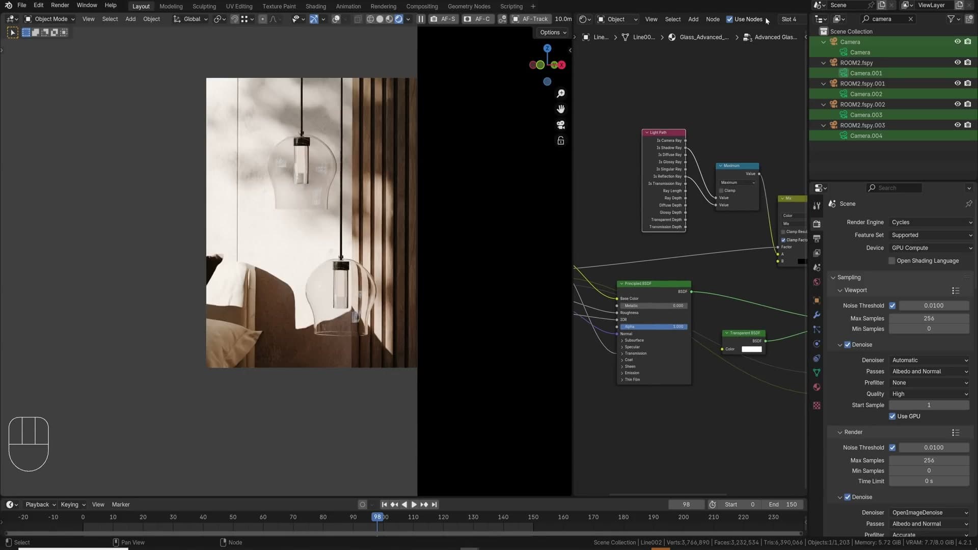
Open the glass material and bump the IOR value. The default sits at 1.45, which gives you physically plausible window glass; pushing it to around 1.9 tips the shader into far more reflective territory, edging on metallic, but still letting you see through to whatever sits behind. For a different scene I drive a custom node group's IOR all the way to 3, which is arguably too much, but the panes go from flat to genuinely shiny.
Treat IOR as a slider you can taste-test rather than a single magic number. Push it up until the windows start reflecting the environment back at you the way you want; pull it down the moment the surface stops reading as glass and starts looking like chrome.
Mixing glare nodes in the always-on compositor
A surprising number of finished archviz renders come out with no glare at all. In the real world there's almost always something kicking light back at the lens (a spec on a leaf, a polished countertop edge, a chrome lamp base) and even a small amount of bloom on the highlights helps the image read as a photograph rather than a clean CG render.
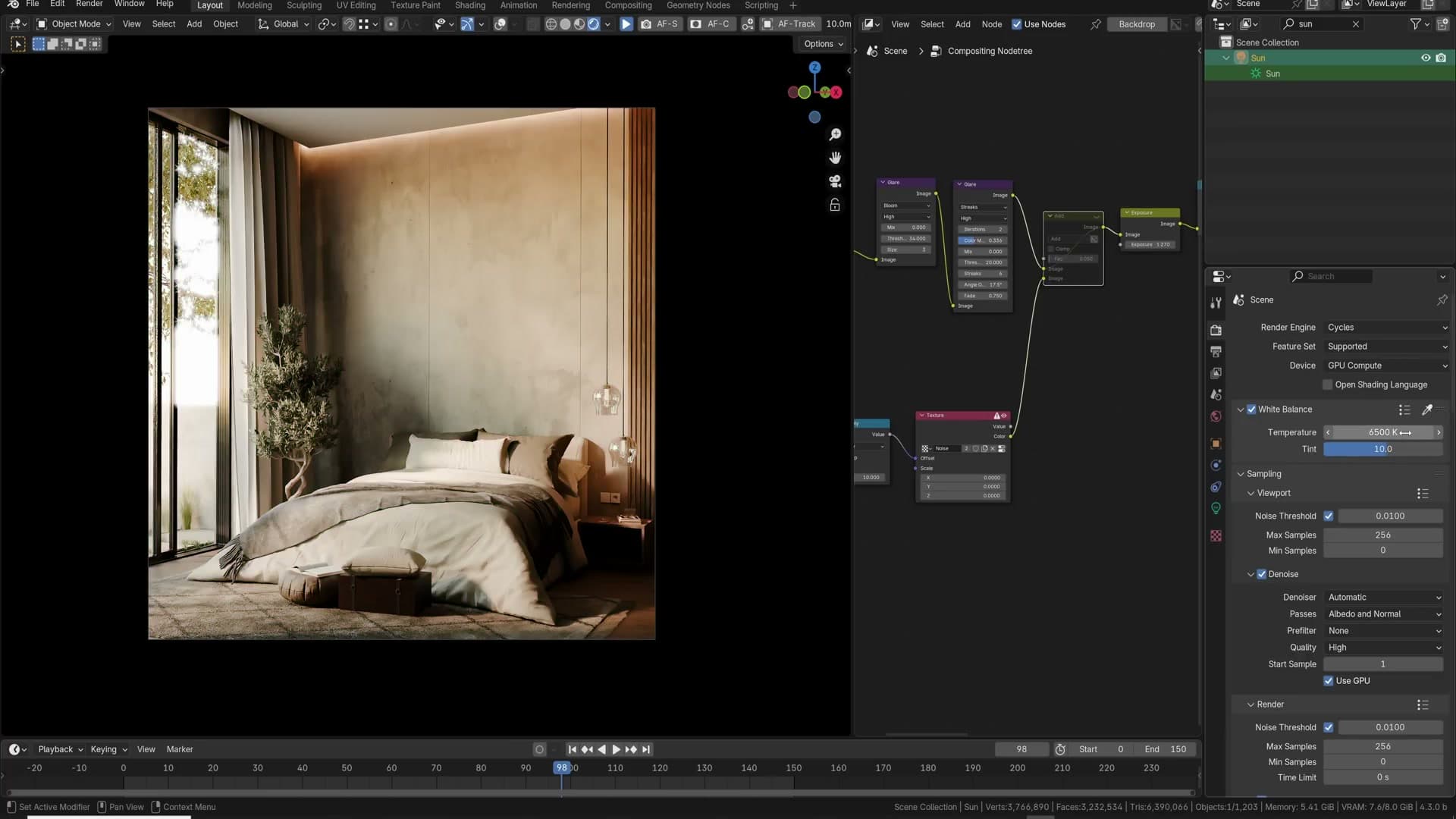
Since Blender 4.2, the compositor can be left on permanently, which means you can drop a Glare node into your compositing tree and tune it while watching the viewport update in real time. Pull the threshold down so genuinely bright areas start to spill over their neighbours, push the intensity until those highlights feel a touch overexposed, and watch the bloom soften the transition between bright and dark surfaces.
Don't stop at one Glare node. Mixing types tends to read more like a real camera. I layer a soft bloom with a streak glare; up close the streaks turn the brightest pixels into a four-pointed star, which can look slightly tacky on its own, but blended underneath the bloom it adds the kind of lens character you'd expect from a photo. I'm hoping a future release of Blender will introduce a physically accurate camera glare node, but until then, stacking the existing ones gets you most of the way there.
White balance in Blender 4.3
A lot of archviz renders ship with an obvious orange cast. Warm sunlight bouncing off warm wood and blending with warm artificial lights can make the whole image end up feeling like it was lit by a campfire. A touch of warmth reads as cosy; too much and every surface in the scene picks up the same hue, so the render stops looking neutral and starts looking jaundiced.
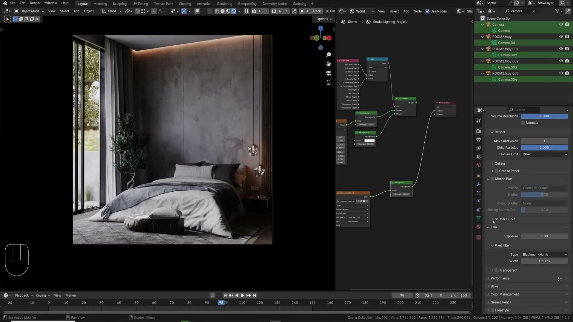
Blender 4.3 finally fixes this without a compositor detour. Under Render Properties → Color Management, enable the new White Balance section. Drag the temperature slider down for a cooler, bluer cast or up for warmer and more orange; the tint slider runs from green at the bottom to magenta at the top. The aim isn't to hit a specific number. Drive both sliders until something you know is white in the scene actually reads as white.
In the bedroom I'm working on, the bedsheets and the wall behind the bed should both be neutral white. Sampling them neutralises the orange warmth coming off the sun lamp and pulls a slight magenta cast out of the tint at the same time. Toggling White Balance off and on shows the difference immediately: the original render feels washed warm, while the corrected version reads as a daylit room with accurate colour across the rest of the scene.
Exposure, max bounces and the Photographer addon
Lift exposure under Color Management rather than blowing out the sun, understand why Total clips your individual Diffuse/Glossy bounce counts, and use the paid Photographer addon to drive aperture, shutter and focus tracking from a real camera UI.
Exposure for interior vs exterior
Max Bounces vs Total: what "total" actually does
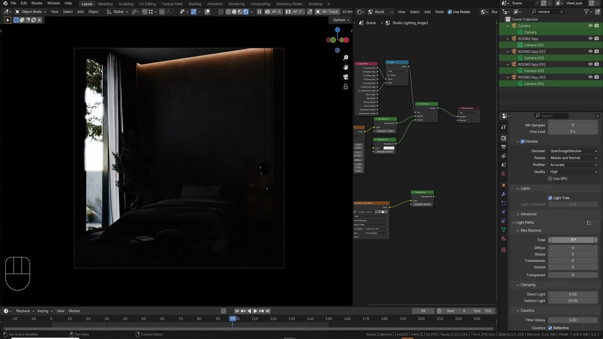
Cycles' Light Paths panel hides a subtle gotcha. The Total slider isn't an extra cap added on top of the individual Diffuse, Glossy, Transmission and Volume bounce counts. It's a clip applied across all of them. Drop Total to zero and your scene receives no bounces at all, no matter what those four values say. Set it to one and only one bounce gets through. Set it to thirty-two and the individual sliders are free to use up to their own ceilings.
The reverse is also true. If you leave Total at thirty-two but drop each of the four type-specific sliders to one, the maximum number of bounces in the scene is one. I can't explain why Blender exposes Total at all rather than just letting you set the individual values directly. The point worth remembering is that whichever value is lowest wins.
The cost of pushing bounces high is smaller than you might expect. In a quick comparison, five bounces rendered in 26 seconds and thirty-two bounces rendered in 27 seconds, a single second of difference. The 32-bounce frame shows visibly more light bleeding through the geometry, with the deeper recesses of the scene picking up a fraction more diffuse contribution. The shift is subtle but real.
My default is to leave the scene at 32 and let Cycles brute-force the fuller result. Only drop the value if render times become a problem on a specific scene. Every time I've tested it, the time saved by cutting bounces has been marginal.
The Photographer addon for real camera controls
Photographer is a paid add-on that I reach for in almost every render. It's the deepest photography-focused plugin I've found for Cycles: it surfaces every area light in one panel, lets you bind specific cameras to specific lights, supports per-camera aspect ratios and queues batches of renders. For archviz this matters because the job is effectively photography, with the same exposure logic, depth-of-field decisions and motion-blur considerations as a physical shoot, and the same intuition transfers across to VFX work too.
Switch the exposure mode to Manual and you get the three controls a real-world photographer expects. Aperture is dialled in as an f-stop, and the relationship is the one any camera operator already knows: increasing the f-number shrinks the aperture and lets less light through the lens. ISO sets sensor sensitivity. Shutter speed controls the exposure time and, crucially, ties into Cycles' motion blur on animations, so the value you pick interacts with your frame rate to produce physically plausible blur trails.
Camera post-effects live in the same panel. Toggle vignette for a soft darkened frame, or enable streaks and bloom for lens-flare and highlight halation. The list is long enough that the right approach is to explore it rather than enumerate it.
The feature I keep coming back to is the focus picker. Click the picker button on the camera and then click anywhere in the viewport to set that point as the focal distance. That gives you instant iteration on what's sharp and what isn't, with no fiddling in the depth-of-field properties.
Aperture Track is the standout for animation work. Click on an object (a moving car, say) and a small tracking cube parents itself to it. The camera now keeps that object in focus automatically as it travels through the scene, which would otherwise mean keyframing the focal distance by hand and adjusting it shot by shot.
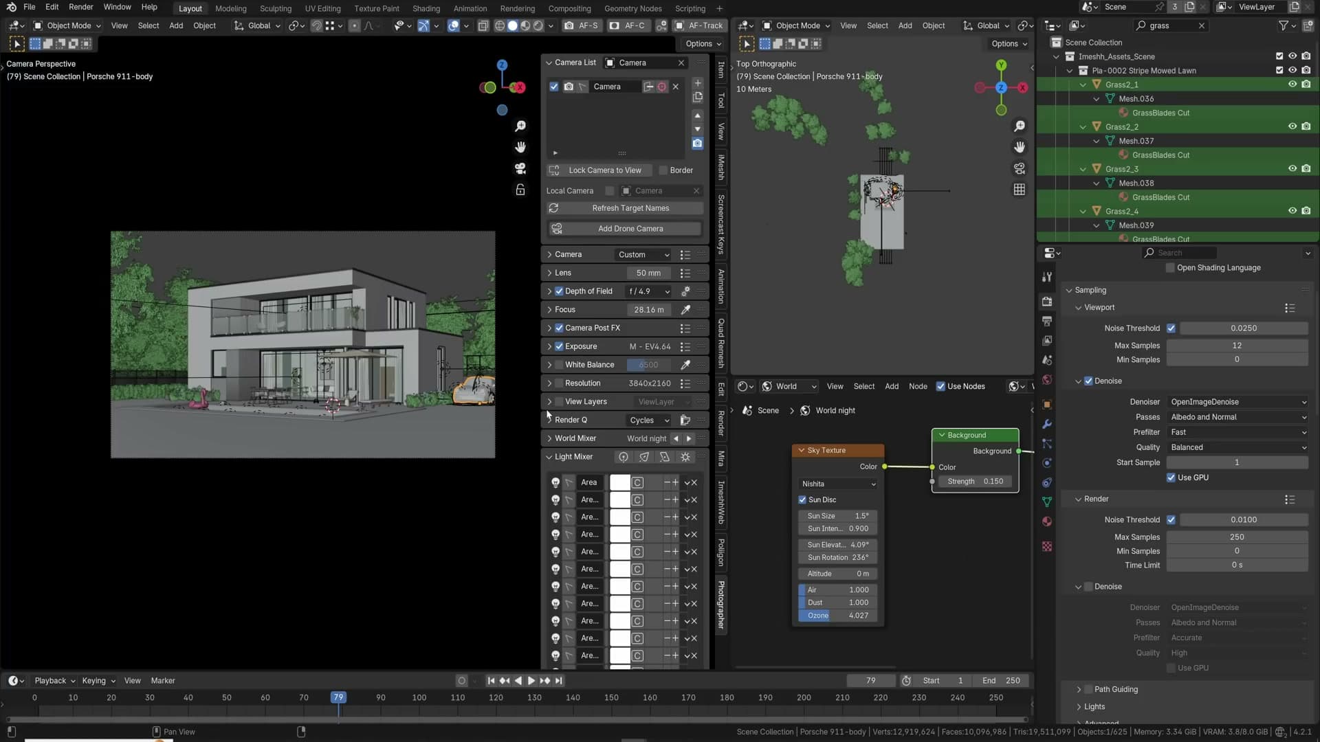
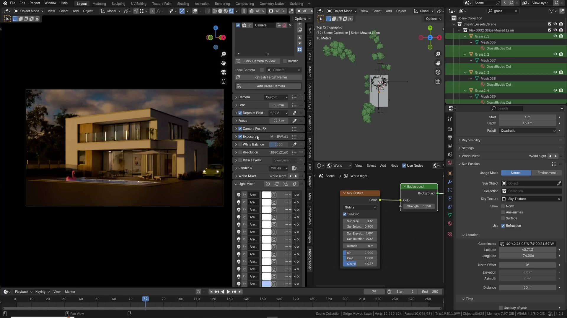
Sun Position, caustics and subsurface scattering
Drive the sun from real-world coordinates with the Sun Position addon, lower Filter Glossy for natural caustics without fireflies, enable Shadow Caustics for pool-bottom light, and finally add subsurface scattering to plastics and natural materials.
Sun Position addon with real coordinates
The Sun Position addon ships with Blender and gives you a real-world sun driver. Enable it from the addon list, punch in a location and a date and time, and Cycles places the sun at the exact angle that latitude and longitude would actually see at that moment. Hooked up to a Nishita sky texture, the lighting becomes physically grounded rather than artistically guessed.
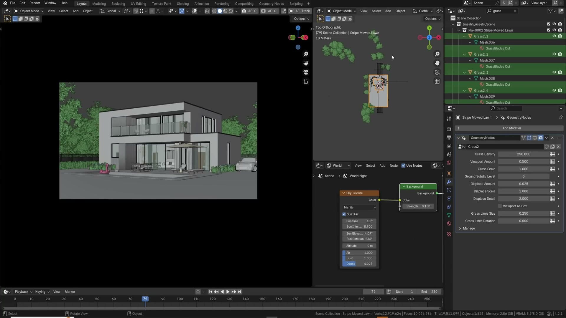
Set the date to 1 December 2024 at 1pm and you get clean midday light. Roll the clock forward to 17:00 and the scene falls into night. The sun has already set for that latitude on that day. Pull back to 15:00 and the sun is sitting low, already heading down for the afternoon. Drop to 9am and the light is bright again; 8am puts you mid sunrise. Every position is geographically accurate, not just artistically pleasant.
This is the part that matters for real-life client work. When somebody hands you a plot in a specific city, the lighting in the final render needs to match the sun angles that plot will actually see across the year. Approximating with a tilted sun lamp gets you in the ballpark; the addon gets you the answer.
One catch worth flagging. Floor plans are not always aligned with true north. Many are rotated to fit a page or a project frame. Work out the angle between the floor plan's "up" and actual north, then dial that value into the addon's North Offset so the sun arc rotates around the building correctly. Without it, the sun is right for the city but wrong for the building.
Filter Glossy for native caustics
Filter Glossy lives under Render Properties → Light Paths → Caustics and defaults to 1.00. At that value Cycles is deliberately blurring all the glossy caustics: those bright pinpoints of light that bounce off a curved or polished surface and land on the floor, the wall, or the tabletop. The blur is there to suppress noise, which is why most people never notice the feature is hiding native caustics from them.
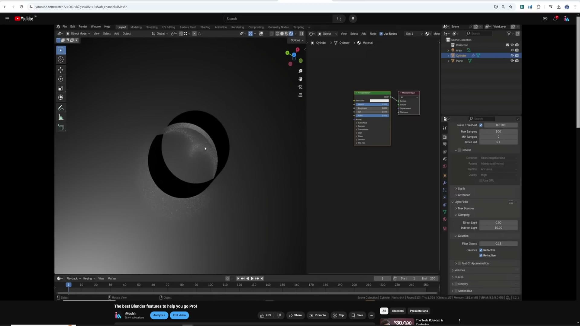
Lowering the value brings the caustics back. Drop it from 1.0 towards zero and you start seeing real glossy bounces on the surfaces below shiny objects, the kind of light behaviour that sells a render as "this was lit, not painted". The trade is fireflies: bright stray pixels Cycles can't denoise away, caused by individual high-energy paths.
The recipe is to lower Filter Glossy gradually and nudge it back up the moment fireflies start to appear, settling on the smallest value that still keeps the noise under control. You want visible caustics on the tabletop without a snowstorm of hot pixels around them.
Shadow caustics through glass and water
Filter Glossy gives you native Cycles caustics, but they're slow and noisy. For the specific case of light passing through glass or water onto a surface below, Blender has a more accurate and much faster system called Shadow Caustics. The example scene is a swimming pool with a single displaced glass plane standing in for the water surface: a simple plane with a wave displacement, nothing exotic.
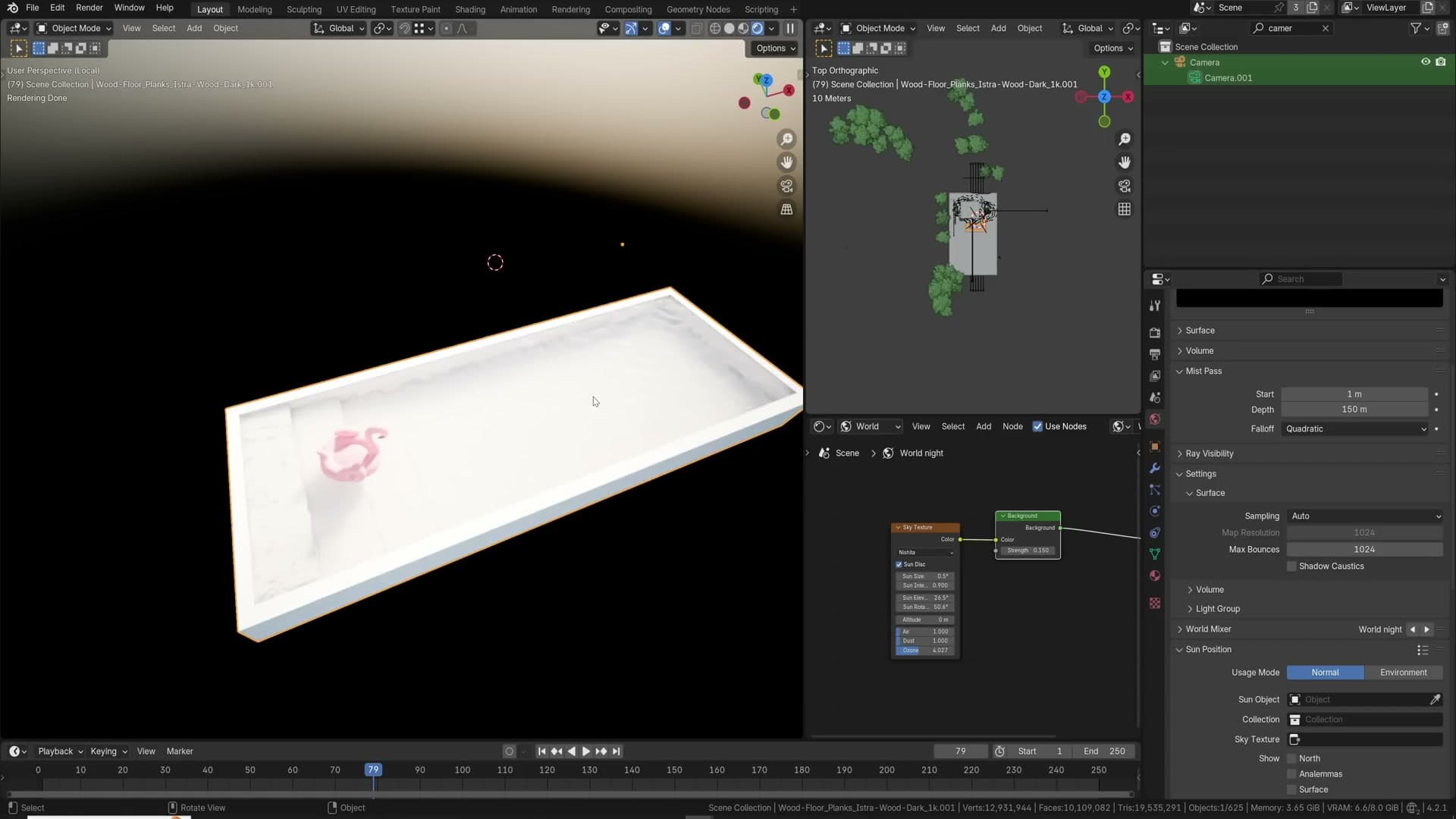
Start by selecting the glass plane, the surface light needs to pass through. Open Object Properties → Visibility → Shading → Caustics and tick Cast Shadow Caustics. Then select the pool floor (the object that should actually show the caustic pattern) and tick Receive Shadow Caustics in the same panel. Finally tell the world to participate by opening World Properties → Settings → Surface and ticking Shadow Caustics there too.
Hit a render preview and the pool floor lights up with the bright rippling caustic pattern you'd expect at the bottom of any real pool. Toggle Shadow Caustics back off for a moment and the same shot collapses into a flat lit surface, technically lit but visually inert and obviously fake. Even at 12 samples the difference is dramatic; bump the sample count and the caustic detail sharpens up.
This is one of those settings where a single checkbox carries an enormous amount of the realism. If the scene has glass and water in it, Shadow Caustics is almost never the wrong choice.
Subsurface scattering on plastics and naturals
A surprising number of materials read as fake without subsurface scattering. Plastic is the big one. Almost all plastic objects allow a small amount of light to penetrate the surface and scatter just under the skin. The same is true of wax, food, leather, and most natural materials. Leaving subsurface at zero on these makes them look like painted resin instead of the real thing.
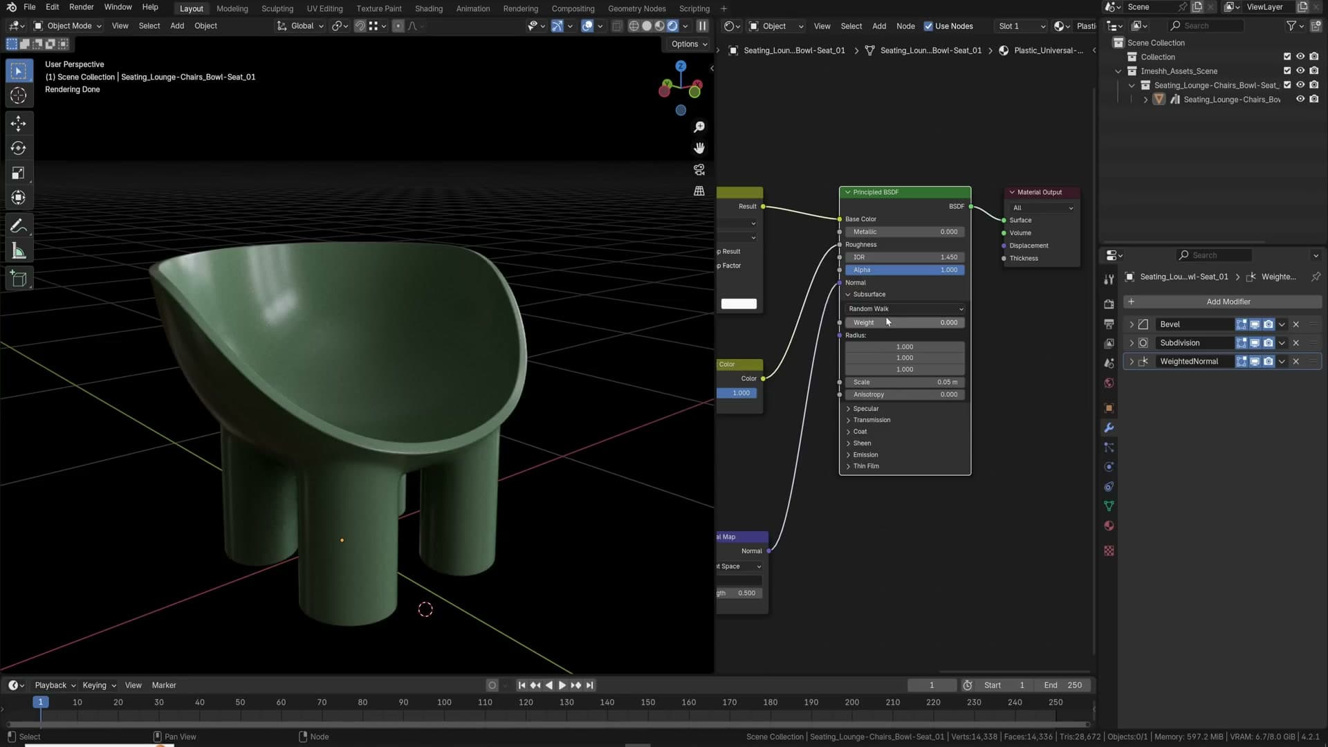
The starting point in the Principled BSDF is the Subsurface Weight slider. Set it to 1.0 for any material that should have subsurface scattering at all. The weight is effectively an on/off switch saying "yes, this object scatters light under the surface". Pulling it down to a fractional value isn't how you make the effect subtler; that path is for varying subsurface across a surface with a texture, not for dialling overall intensity.
Control how far light actually travels through the material with the Subsurface Scale value. Larger numbers let light pass deeper through the body of the object; smaller numbers keep the scatter tight to the edges. For a thin plastic shoe, something around 0.05 is a good starting point. Light only just kisses the silhouette and softens the edges, exactly the behaviour you'd see if you held the shoe up to a window. Push the scale bigger and light starts flooding all the way through, which is wrong for anything thicker than a wafer.
The Radius input is an R/G/B triplet controlling how far each colour channel travels through the material. The default white means all three travel the same distance, which gives a neutral scatter. That is usually what you want. Pull the red channel down and blue and green travel further while red is absorbed, tinting the back-light cooler. Pull green and blue down instead and red travels further, giving the warm rim you see on skin and thinner organic materials. Use it to colour the light that emerges from inside the object, not the surface itself.
Side by side, a material with subsurface enabled has soft, alive edges; the same material with subsurface off looks like a bog-standard solid lump. Add denoising on top and the soft halo around the silhouette becomes one of those details viewers can't name but immediately read as real.
Light portals, gobos and the glass shadow trick
Three lighting cheats: area-light portals slash window noise, gobos project dappled or fake caustic light through your scene, and a Light Path mix-shader lets sunlight pierce architectural glass without the noise.
Light portals for cleaner window noise
Archviz interiors almost always have the same lighting problem: a small window, and all of the sun and sky energy has to squeeze through it. Cycles fires rays from the camera, hopes they bounce out through that narrow opening, and most of them miss. The result is a noisy render that takes a lot of samples to clean up. A light portal tells Cycles "the light is over here, sample this opening directly," which dramatically cuts the noise for the same sample count.
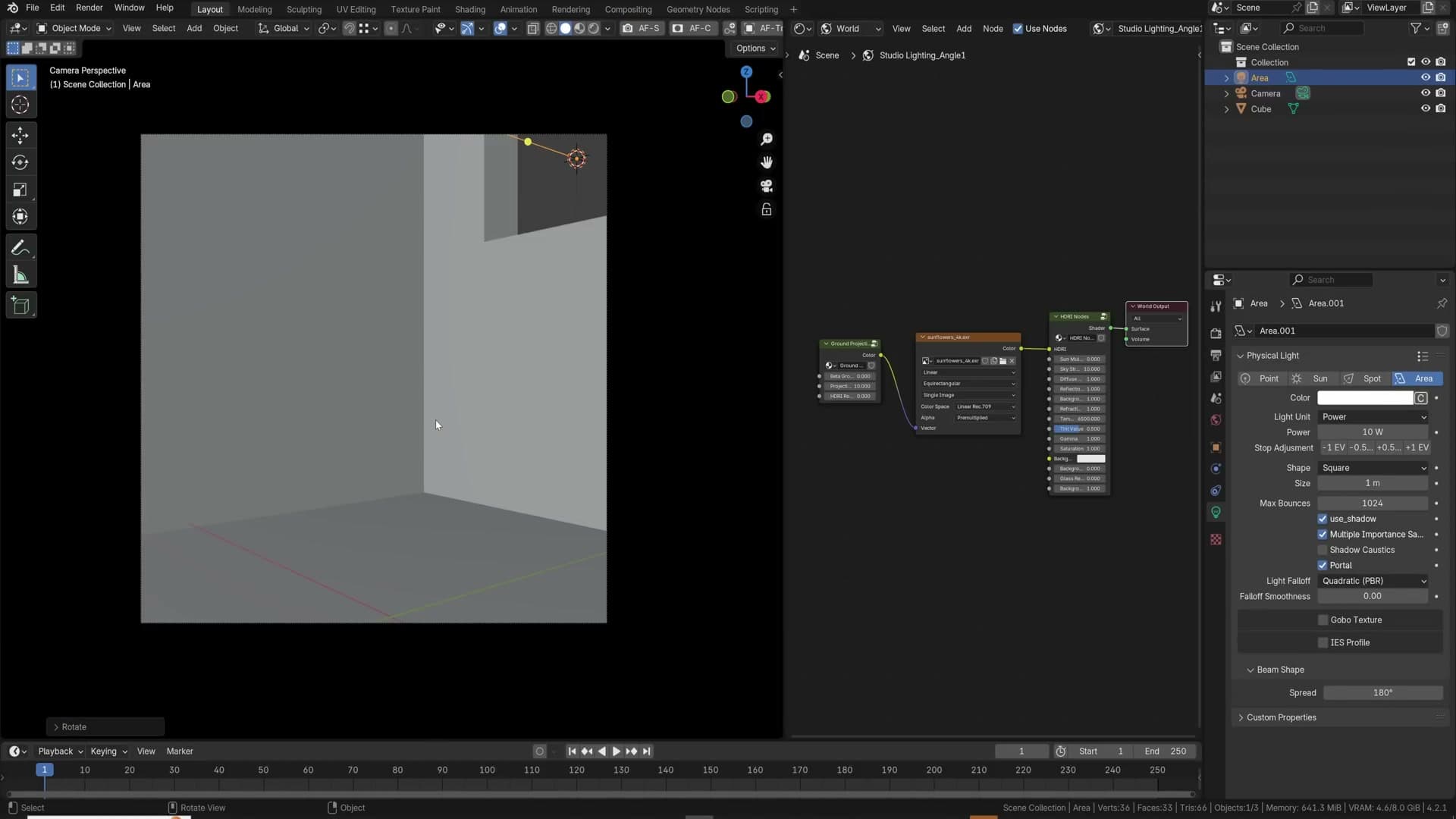
To add one, snap your 3D cursor to the window frame with Shift+S → Cursor to Selected, then Shift+A → Light → Area. Scale the area lamp down so it sits inside the opening and rotate it so it points into the room. In the lamp properties, tick the Portal checkbox. The lamp now contributes nothing on its own; it just guides ray sampling toward the window.
In the comparison render here both images are at the same sample count (around 56 samples). The portal version is visibly cleaner around the window frame, the floor and the back wall. You're getting far fewer fireflies for free.
The bigger the opening, the smaller the win. If the entire wall is a window, a portal can actually have the inverse effect and slow your renders down because Cycles is being told to weight a region that was already easy to sample. The rule of thumb: small punched openings are where portals shine; wall-sized glazing is where you should benchmark with and without before committing.
Gobos for dappled light and fake caustics
A gobo is a plate that sits in front of a lamp and breaks the light into a shape. In archviz, that shape is usually leaves, branches or window mullions casting onto a back wall. They're a cheap trick that adds an enormous amount of perceived realism, because the eye reads dappled, irregular light as "sunlight through trees" without you having to actually model the trees.
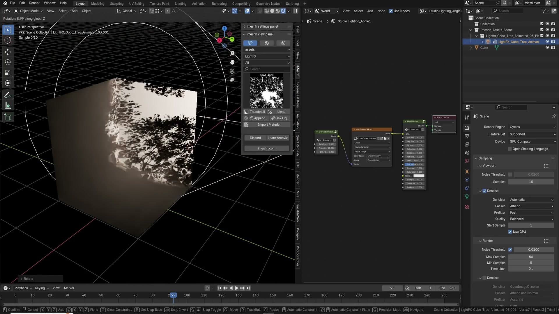
The iMeshh gobos come in two flavours, and which one you use depends on whether you want to add a new light or borrow an existing one. The first is a self-contained spotlight gobo. It brings its own lamp and projects a tree-shadow pattern straight onto whatever wall you point it at. Drop it in, aim it at the back of the room, and you get a dappled splash behind your sofas with no further setup.
The second flavour is a plane carrying a transparent map. You position the plane somewhere your existing sun lamp will pass through it (typically just outside the window) and the sun does the projection for you. This is the version to reach for when your lighting is already balanced and you don't want a second light source upsetting the exposure; you're just shaping the light that's already in the scene.
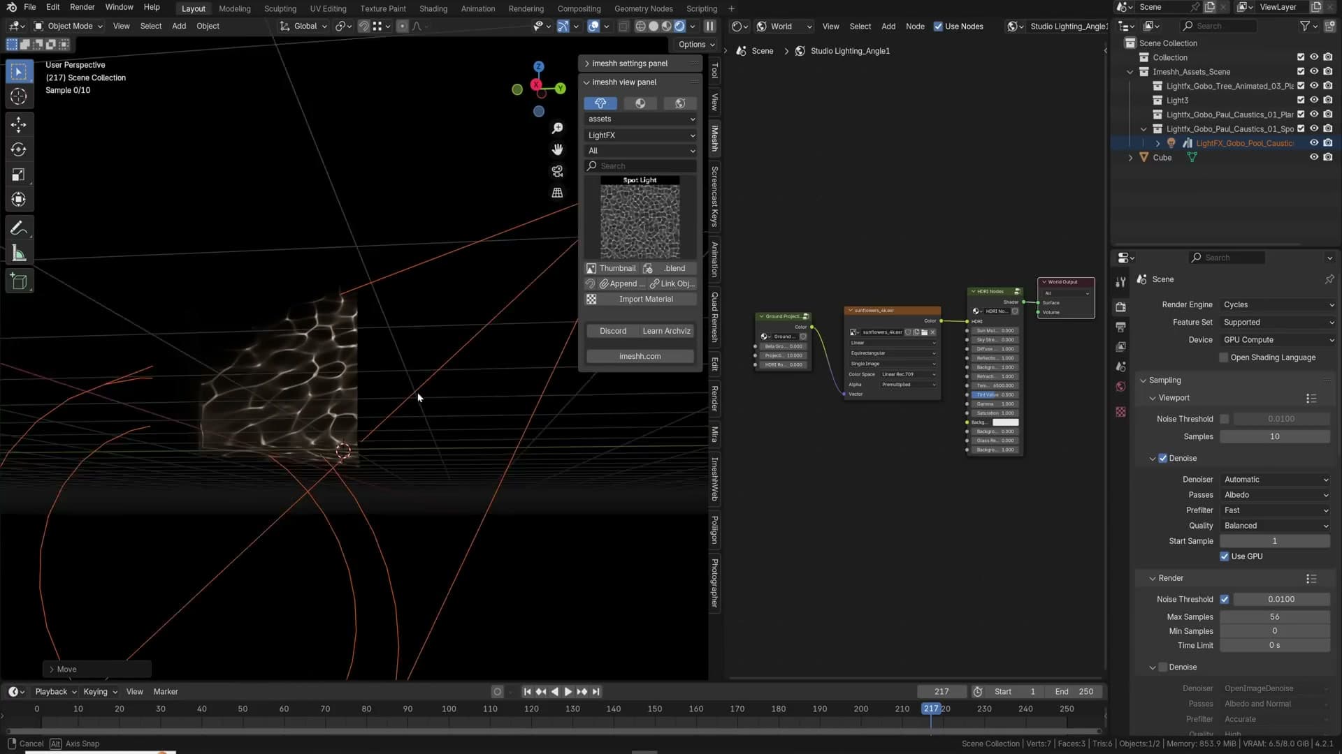
The same trick scales to fake caustics. A pool-caustic gobo is just a plane with an animated caustic pattern on it; rotate it 90 degrees so light passes through and casts onto the ceiling, and you get the rippling underwater light you'd normally have to brute-force with Cycles' shadow caustics. Press play in the timeline and the gobo animates, so the ripples crawl across the ceiling in a render animation without any actual fluid simulation.
Because the lighting is faked at the texture level, these gobos cost almost nothing to render compared to real caustics. For background detail (trees outside, a pool reflecting onto a soffit, sunlight through louvres) a gobo is almost always the right answer before you reach for anything more expensive.
Light Path trick for translucent glass shadows
Set up a dark interior with a sun lamp outside and a sheet of glass in the window. Pull the glass away and the sunlight floods in; slide it back into place and the room goes dark again. Out of the box, Blender's Glass BSDF is opaque to direct sunlight unless you tune transmission and refraction carefully. That is not what you want when you're trying to render a sunlit room behind realistic-looking architectural glass.
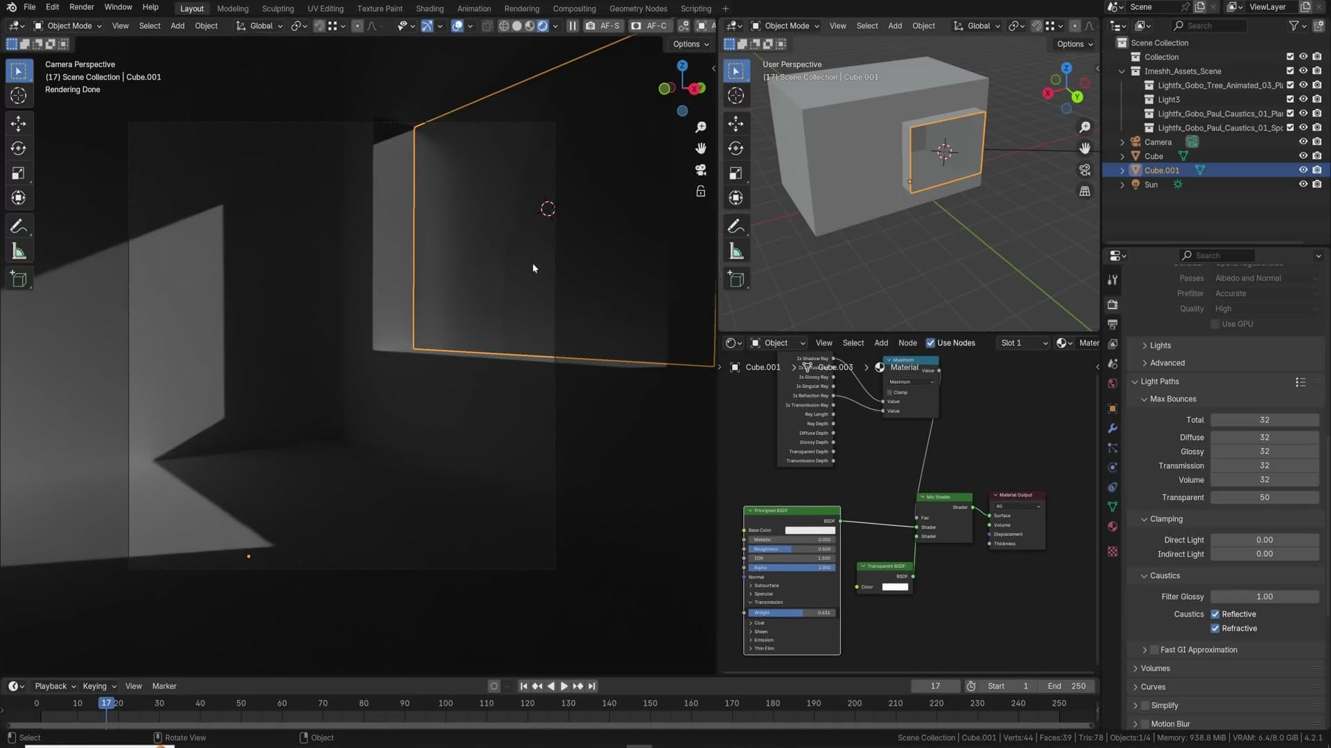
The fix is a small Light Path mix. Add a Light Path node, a Mix Shader, a Math node set to Maximum, and a Transparent BSDF. From the Light Path node, feed both Is Shadow Ray and Is Reflection Ray into the Math node; plug the Math node's output into the Mix Shader's Fac. Your existing glass shader goes into the first Mix Shader input, the Transparent BSDF into the second. The result: camera rays see the full glass material, but shadow and reflection rays see a transparent surface, so the sun pours through.
What you've actually said is "to the viewer this still looks like glass, but to the rest of the scene it isn't there." Visually you keep the reflections and refraction that sell the material; lighting-wise the sun behaves as if the window were open.
Pure transparency isn't strictly accurate, as real glass casts a soft shadow. If you need it you can add a second Mix Shader and blend a little of the original glass back into the shadow path. In practice, for architectural exteriors the view out of the window is usually blown out and glaring anyway, so the missing shadow rarely reads on camera and most of the time you can leave it as pure transparent.
iMeshh has a pre-made node group that wraps this setup behind a couple of sliders: one for how much shadow to mix back in, and one for absorption, which is the next tip in this run.
Skirting boards from a curve profile and volumetric clouds
Generate a skirting board by spinning a profile around a Bezier path, then build physical volumetric clouds with the Nishita sky texture driving a 50km-wide cube high in the sky.
Skirting boards from a profile curve
With the profile spinning around the Bezier path, drag it into position along the wall. Chances are it's enormous compared to the room. That's expected for a fresh profile, and you fix it with a single scale operation pivoted on the 3D cursor.
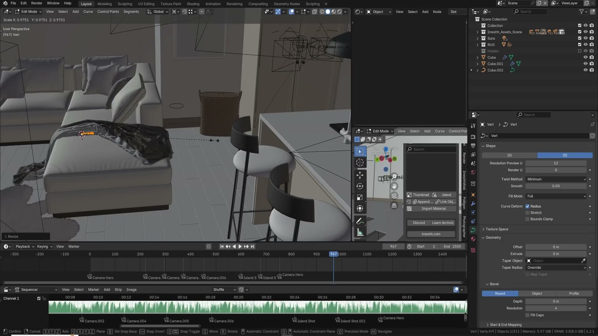
Snap the cursor to the profile with Shift+S → Cursor to Selected, switch the pivot point to 3D Cursor, then select everything and scale down until the skirting sits at a believable height against the skirting line. Hide the original profile mesh and you're left with a clean skirting board running the full length of the wall.
Don't feel obliged to model an ornate profile every time. For a lot of contemporary archviz interiors a square cross-section with the top corners bevelled is all you need. It reads correctly at camera distance and takes seconds to set up.
Volumetric clouds with the Nishita sky texture
The clouds in the iMeshh exterior masterclass scene aren't baked into the HDRI. They're physical geometry filled with a volume shader that's driven by the Nishita sky texture. Open the shader editor on the world, change the sun elevation, and you'll see the clouds themselves shift in response because they're sampling the same sky model that's lighting the scene.
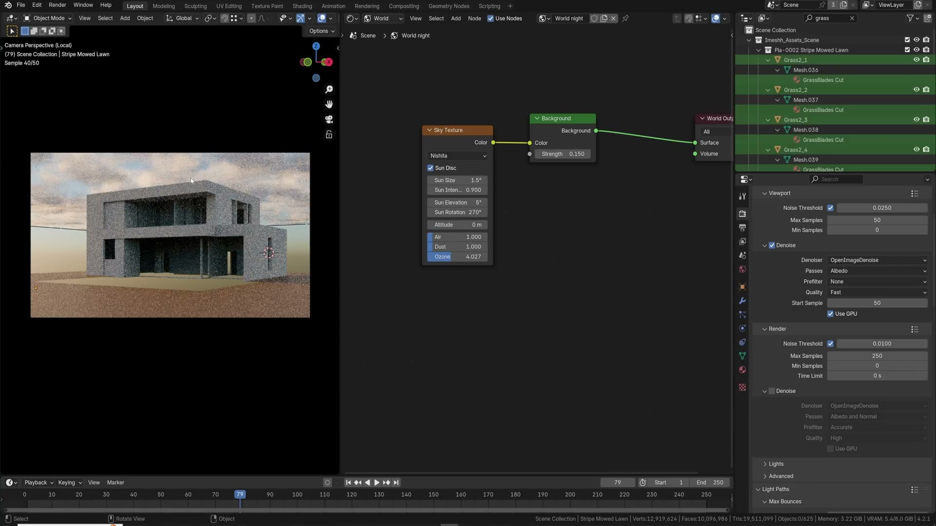
Because the volume reacts to the real sun angle, sunsets give you those pink and purple highlights along the underside of the clouds for free. No painting, no compositor trickery, just the Nishita model behaving the way the atmosphere actually does.
To rebuild the setup, head to the cloud object's material slot and copy the node tree from the screenshot below. There are too many individual nodes to walk through in a tips video, so treat it as a reference shot. Wire it up exactly as shown and the shader will do the rest.
The object itself is intentionally massive: roughly 50,000 m wide on X, 50,000 m on Y, and 2,000 m tall, positioned almost 4,000 m up in the sky. That kind of scale is what sells the clouds as a real atmospheric layer rather than a prop floating just above the roofline.
Once the volume is in place you can tweak the cloud density on the object, adjust the noise scales to push the formations from wispy to chunky, and animate the clouds by sliding the location or changing the seed value over time. Same setup, completely different sky.
Camera composition tools: guides, Shift Y and clip start
Per-camera composition guides for rule of thirds and golden ratio, passepartout for focused rendering, Shift Y to reframe without rotating, and Clip Start to slice through walls in tight rooms.
Composition guides and passepartout
Composition guides live on each camera individually. Select the camera, open the Object Data Properties, expand Viewport Display and tick Composition Guides. From there you can layer on rule of thirds, centre, diagonal and golden ratio overlays. I recommend enabling them all at once so you can read multiple compositional anchors against the same frame without toggling.
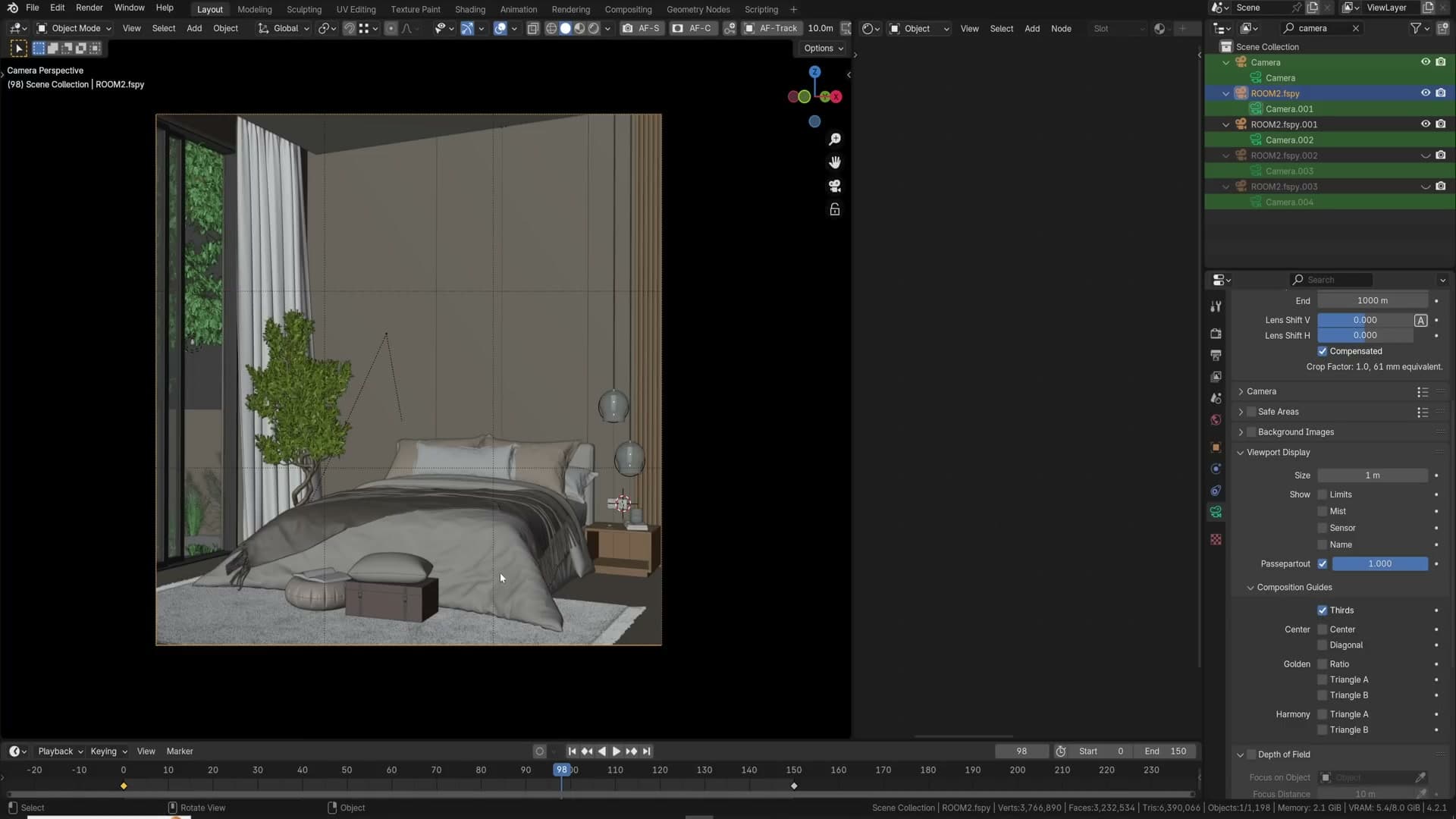
Rule of thirds splits the frame into a 3×3 grid and is the quickest sanity check for where your main subjects should sit. Centre is the one you want for product shots where the hero object needs to land bang in the middle. Diagonal and golden ratio give you alternative anchor lines for more cinematic or organic layouts. None of these guides render. They only show in the camera viewport as a framing aid.
While you are in Viewport Display, also turn on Passepartout and set the value to 1.0. With passepartout off, a render preview will try to shade the entire viewport, including everything outside the camera frame you can't even see in the final image, wasted samples and a much slower preview.
Cranking passepartout to 1.0 makes the area outside the camera frame fully opaque black, so Cycles only renders what you actually care about. It also concentrates the eye on the composition itself, which is half the reason to enable it in the first place.
Camera Shift Y for clean framing
A common archviz problem: you have the camera locked to the 90° rule (X rotation at 90°) so your verticals stay perfectly parallel, you've framed the bed roughly in the centre, but you can't see the top of the mattress. The instinct is to slide the camera upwards, but that drops the bed down to the bottom of the frame and you lose the low angle that made the shot interesting in the first place.
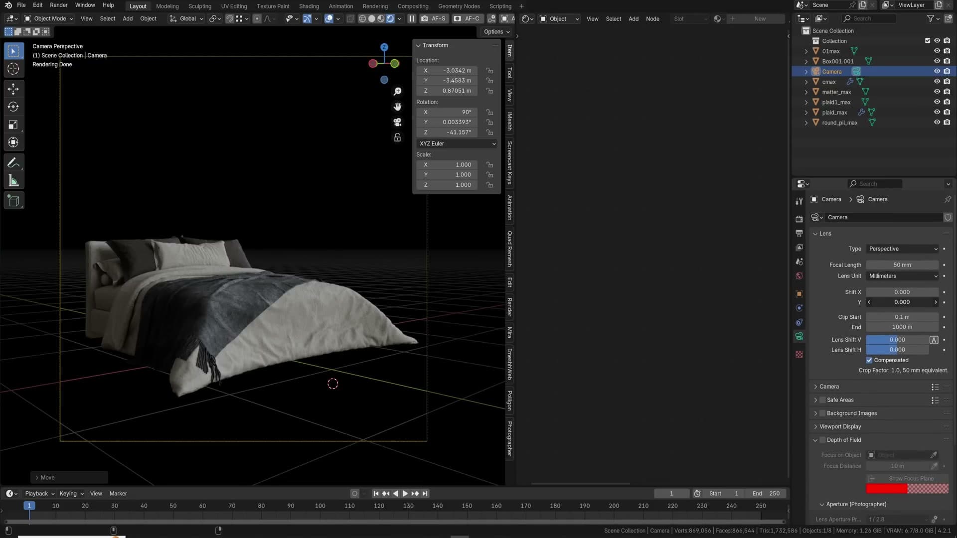
The fix is Shift Y on the camera. Keep the camera position and rotation exactly where you want them, then dial Shift Y down in the camera properties. The framing slides up inside the sensor without rotating the camera, so the bed pops back into the centre of the frame and the top of the mattress comes into view, all while the verticals stay dead straight.
The same trick is what saves you on tall exterior buildings. Instead of tilting the camera up to catch the top of a tower (which throws every vertical line into perspective distortion), keep the camera level and use Shift Y to push the frame upward until the roofline sits inside the composition. It is the digital equivalent of a tilt-shift lens.
Camera Clip Start for tight rooms
You finish a tight interior, dolly the camera back to find a wider angle, and the camera punches straight through the back wall. The hack most people reach for is to extrude that wall outwards to give the camera more room. That approach is messy, breaks the floorplan, and never quite looks right.
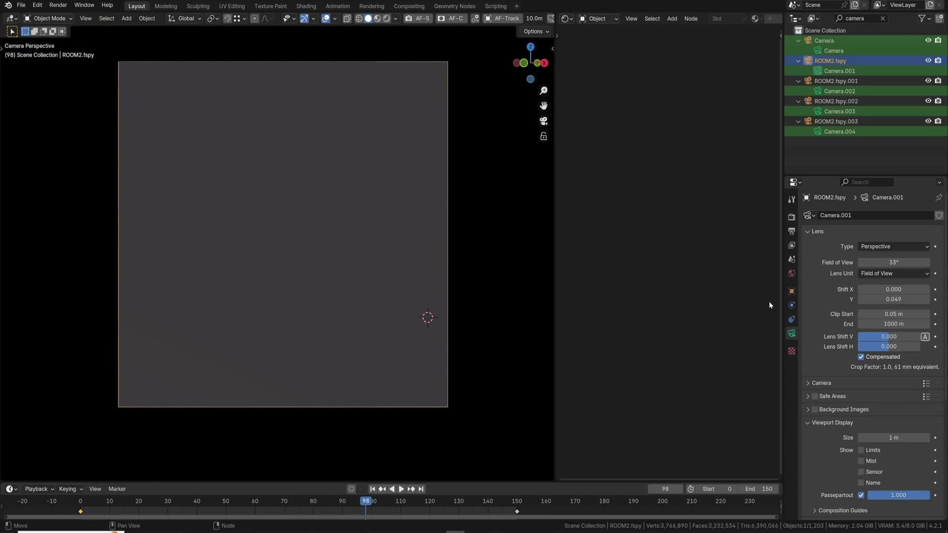
The cleaner fix is the camera's Clip Start value. Select the camera, open the Object Data Properties and increase Clip Start. Anything closer to the camera than that distance simply isn't drawn, so you can bump the value up until the back wall disappears and the room opens out in front of you, all without moving a single piece of geometry.
Clip Start is especially useful for small scenes where there is no physical room to pull the camera back. The trade-off is obvious: push it too far and you start clipping through furniture, then walls, then everything in the scene. Increase it just enough to clear the obstruction you actually care about.
Art direction: plants, mood boards, colour theory and storytelling
What separates pro archviz from clean-but-empty renders: densely populated greenery, PureRef mood boards, basic colour theory, narrative storytelling, the freedom to fake what the camera doesn't see, and keeping the camera at a true 90°.
Plants for exterior depth
In almost every exterior visualisation I ship, plants are doing more work than any other prop. They are the finishing layer, the thing that turns a clean architectural box into a place that looks lived-in. Pack them along every edge, scatter leaves on the ground, drop extra foliage into the negative space, and keep going until the corners of the frame feel full rather than empty.
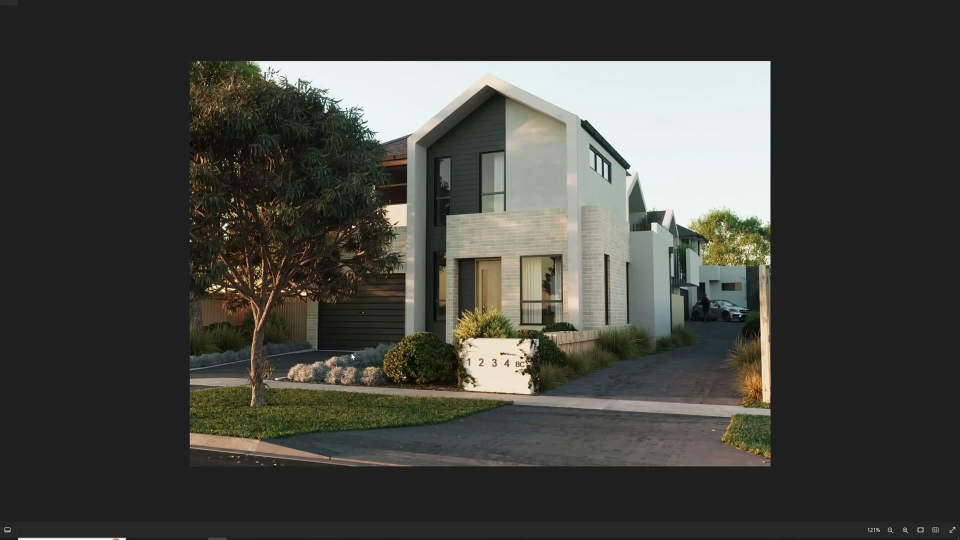
Variety is what sells it. A row of identical plants at identical spacing looks like a CG asset library, not a garden. Mix species, mix heights, randomise scale, and avoid the sparse arrangement of one plant here, one plant there. The eye reads even spacing as artificial, so deliberately stagger things into clumps and outliers.
Background depth is the other half of the job. If you can see past a wall (through a window, over a fence, past the edge of a building) there must be something filling that gap, or the scene reads as a house on a mountain or a house by the sea. One distant tree against a clear sky almost never works. Layer trees, mid-ground shrubs and foreground foliage until the horizon line is broken everywhere the camera can find it.
Direct sunlight raking across the foliage is what makes the plants pop. The contrast between the lit and shadowed sides of a tree gives volume to what would otherwise be a flat silhouette, so try to compose the sun direction so the planting catches that side light rather than sitting in flat ambient shade.
PureRef mood boards
Download PureRef. It is the de-facto reference tool for building mood boards quickly. Drop images onto an infinite canvas, scale them, drag them into groups, and organise them however you want.
The workflow is simple: gather references, paste them in, and arrange them by category: tables in one cluster, chairs in another, lighting moods in a third, material samples in a fourth. Being able to lay everything out visually, side by side, makes it dramatically easier to see whether your ideas hang together as a single design language or whether you have accidentally pulled from five different aesthetics.
AI tools have a place in this workflow, but a specific one. If you find a couple of reference images you really like, you can ask something like Midjourney to generate variations along the same theme, which is a quick way to expand the pool of ideas in a direction you already know you want. What is not recommended is asking AI to invent the whole image and then copying it one-to-one in 3D. That is a shortcut that shows.
Every professional you respect is using a mood board of some kind. Build one for every scene you start. The renders that go further are almost always the ones that began with a clear visual target.
Colour theory basics for archviz
Every architectural piece you make is, underneath the geometry, a composition of colours that have to live together. Walls, floors, fabrics, props, plants, sky: they all contribute, and if they fight each other the whole image looks off in a way that is hard to diagnose unless you know what you are looking at.
You do not need an art school degree to fix this. The basics (the colour wheel, complementary and analogous schemes, warm-versus-cool relationships) are enough to massively change how your work reads. iMeshh has a short course covering exactly this material, and there is an enormous amount of free content online covering the same ground in more depth.
Once you start paying attention, you can spot it instantly: the renders made by artists who understand colour theory pull together into a coherent whole, where every surface feels chosen rather than defaulted. If you are heading into archviz, product design or any visual career, the basics of colour theory are non-negotiable groundwork.
Storytelling in the frame
Every scene benefits from a story. Before you start dressing the shot, ask who lives here. What do they like? What do they do when they are not at work? You are not designing a building. You are designing the life inside it, and the props you choose are the evidence of that life.
A glass of wine left on the table tells the viewer somebody was just sitting there. A door cracked open onto another room with drinks visible beyond it suggests a party that has spread out across the space. Half-prepared food on the counter and a pair of shoes kicked off by the entrance imply someone has just walked in from outside and started cooking. None of these props are about the architecture. They are about the moment the viewer is being invited into.
This matters more than usual when the render is for a client. They are not selling square metres, they are selling the life a buyer might live in that space. The more storytelling cues you plant (a child's play area, a telescope by the window, a half-finished book on the arm of a chair) the easier it becomes for the viewer to picture themselves there.
The cumulative effect is a render someone wants to keep looking at. Each detail rewards a second pass, and the viewer stays in the image longer rather than bouncing off it.
Faking what the camera doesn't see
Do not be afraid to cheat. The camera is the only viewpoint that matters, and anything outside its frustum, or anything the depth of field will blur into a soft mass, can be placed wherever it needs to be to make the composition work.
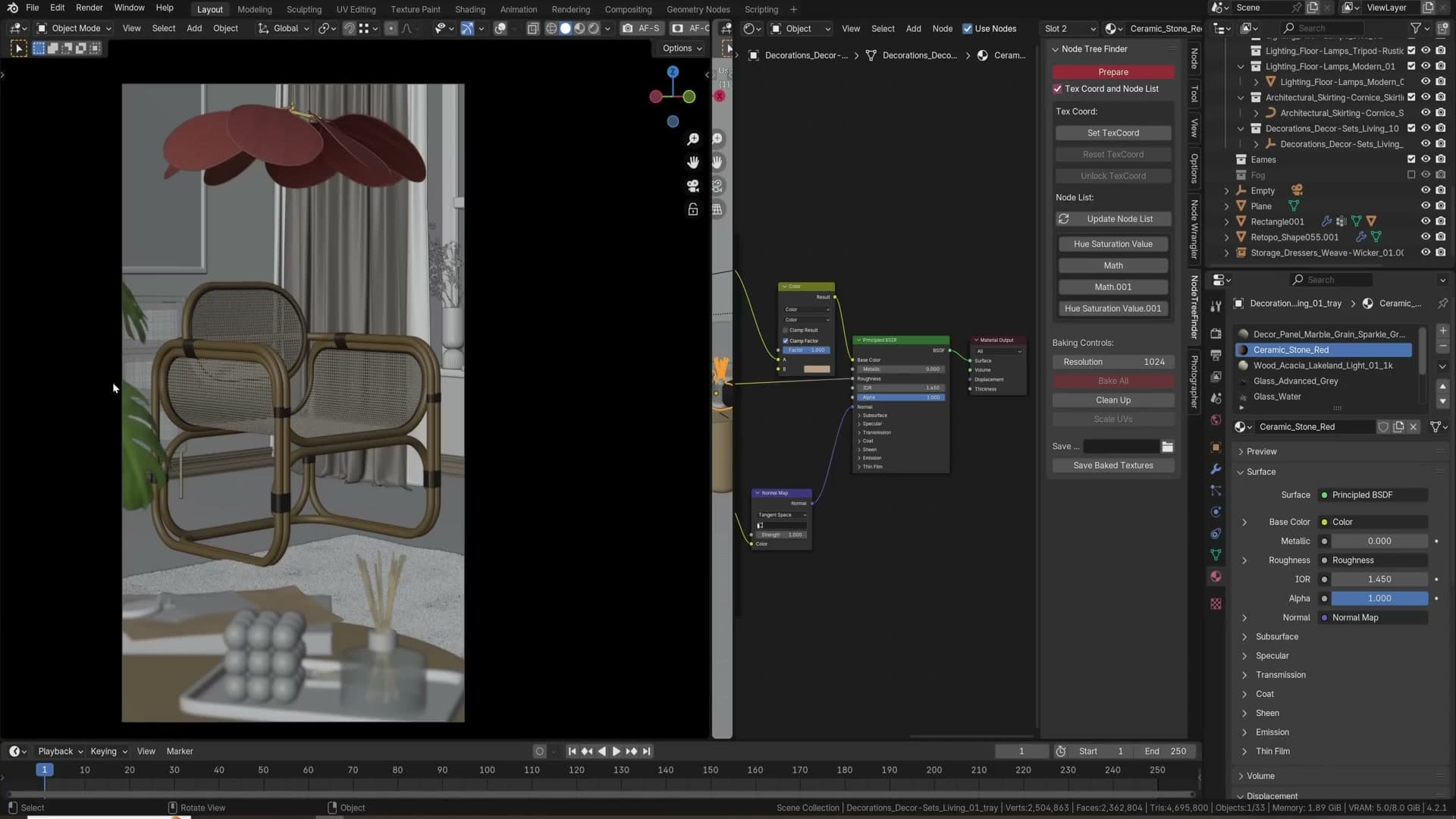
Look at a foreground plant in a typical archviz render. It might appear to be sitting tidily on the floor, framing the shot, anchoring the composition. In reality it is often floating mid-air, plopped roughly into place to fill exactly that wedge of negative space. The plant is there for the framing, not for the physics of the scene.
This is also the way high-budget animated films work. If you saw the off-camera side of most pixel-perfect movie sets, they would look like nonsense: props clipping into each other, geometry that ends abruptly, objects floating because the camera angle hides their lack of support. None of it matters because the audience only ever sees the framed shot.
Apply the same logic to your own renders. Drop foreground plants into weird floating positions to add a soft frame to the edge of the image. Move props off their logical resting points if the composition benefits. Anything slightly out of focus or out of frame is fair game. Fake it until the final image works.
Straight cameras and added curtains
If you take one tip from this entire run-through, take this one: rotate the camera to exactly 90° on the X axis so every vertical line in the scene stays perfectly vertical. Walls, door frames, window mullions, table legs: they should all read as plumb to the floor.
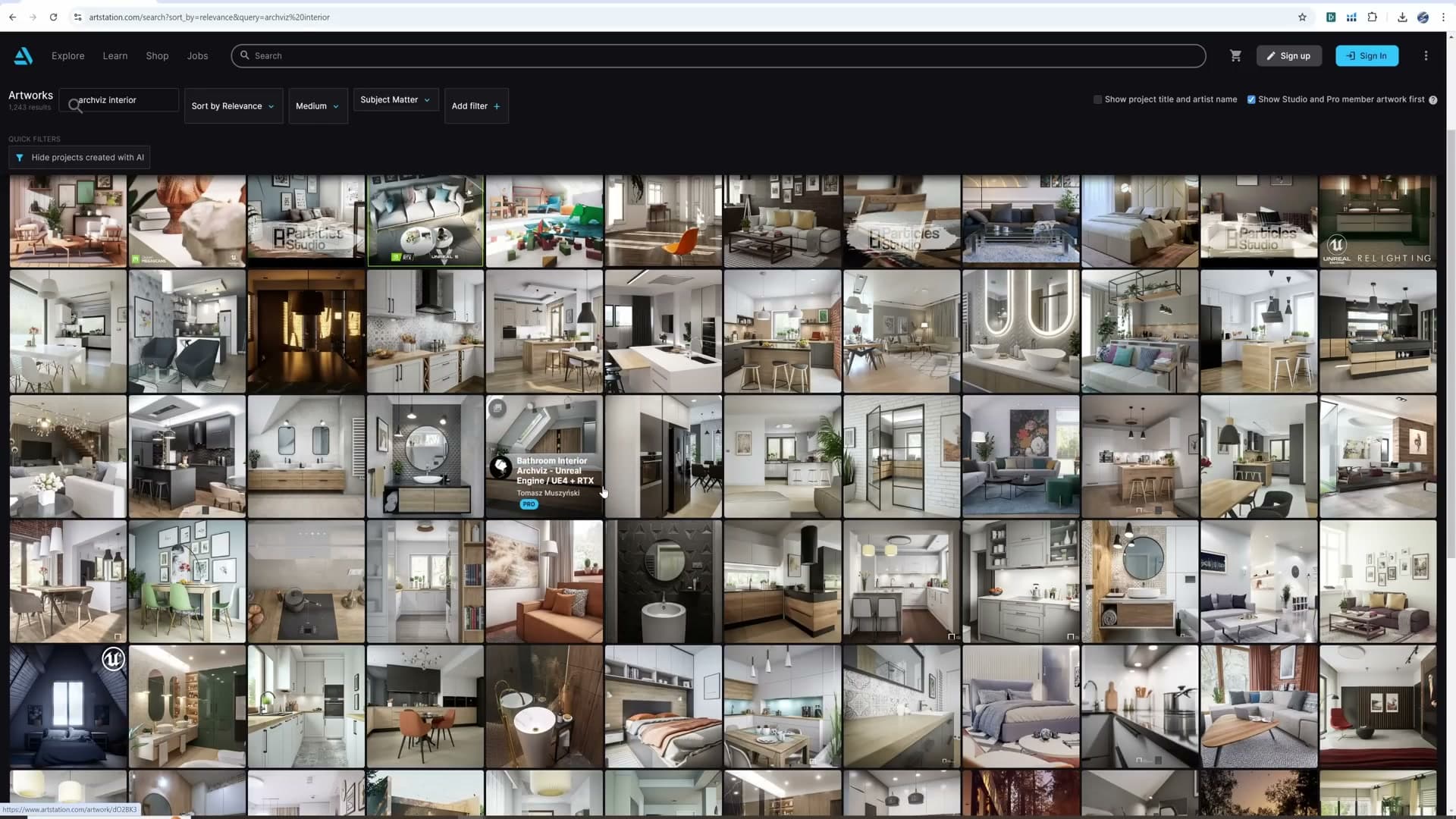
A camera tilted even slightly off vertical gives the render a wonky, falling-over feel that is one of the clearest tells of an amateur image. Every professional reference you can pull up online (the work that gets shared, awarded, used in client decks) has lines that are dead straight. The difference between a render that respects this and one that ignores it is enormous, and it is one of the fastest reads of professionalism the eye has.
There are exceptions. A beauty shot looking down at a hero object, or a close-up that deliberately uses an angled camera for drama, is its own thing. But if the goal is to show a whole room or a whole exterior, keep the camera straight.
The second half of this tip is curtains. On nearly every exterior shot of a residential building, add curtains to the windows. Bare interiors visible through glass (pure white walls, hard furniture, no soft material anywhere) feel sterile, especially on apartment buildings. A curtain instantly adds a sense that somebody lives there, softens the visual weight of the window, and gives the eye something other than hard right angles to rest on.
AGX colour management and the EXR animation pipeline
Why curves clip when AGX is the view transform, how Convert Color Space lets you grade AGX-aware in the compositor, why you should walk the real site, and the EXR-out → VSE-re-AGX workflow that cuts animation storage by 80%.
Floor generators for hours saved
A good floor generator is hours of work compressed into a few sliders. The wood-floor shader on screen is randomising plank scale, rotation and dirt across the whole surface with a handful of controls, and there is a sister geometry-nodes version that builds the planks as actual geometry, with spacing, height variation and per-plank thickness all adjustable. The shader version is light on resources; the geometry version is heavier but indispensable when the camera gets close enough to catch silhouettes.
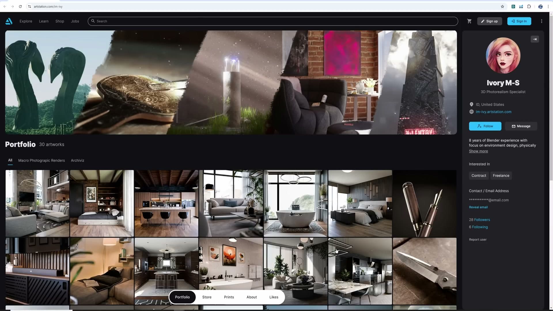
The wider point: if a generator already exists for the thing you are about to model by hand, use it. Generators and geometry-nodes systems exist for floors, arrays, pipes and a dozen other repeatable jobs. Ignoring them is paid time you are not getting back.
Why AGX clips your compositor curves
Photoshop and Blender's compositor look like they should behave the same way when you push curves around, but they do not. Pull the white point up in Photoshop and the highlights drive cleanly toward pure white. Add an RGB Curves node in Blender's compositor and push the same white point up, and the highlights stop short. The image never quite gets to a clean white, no matter how aggressively you yank the curve.
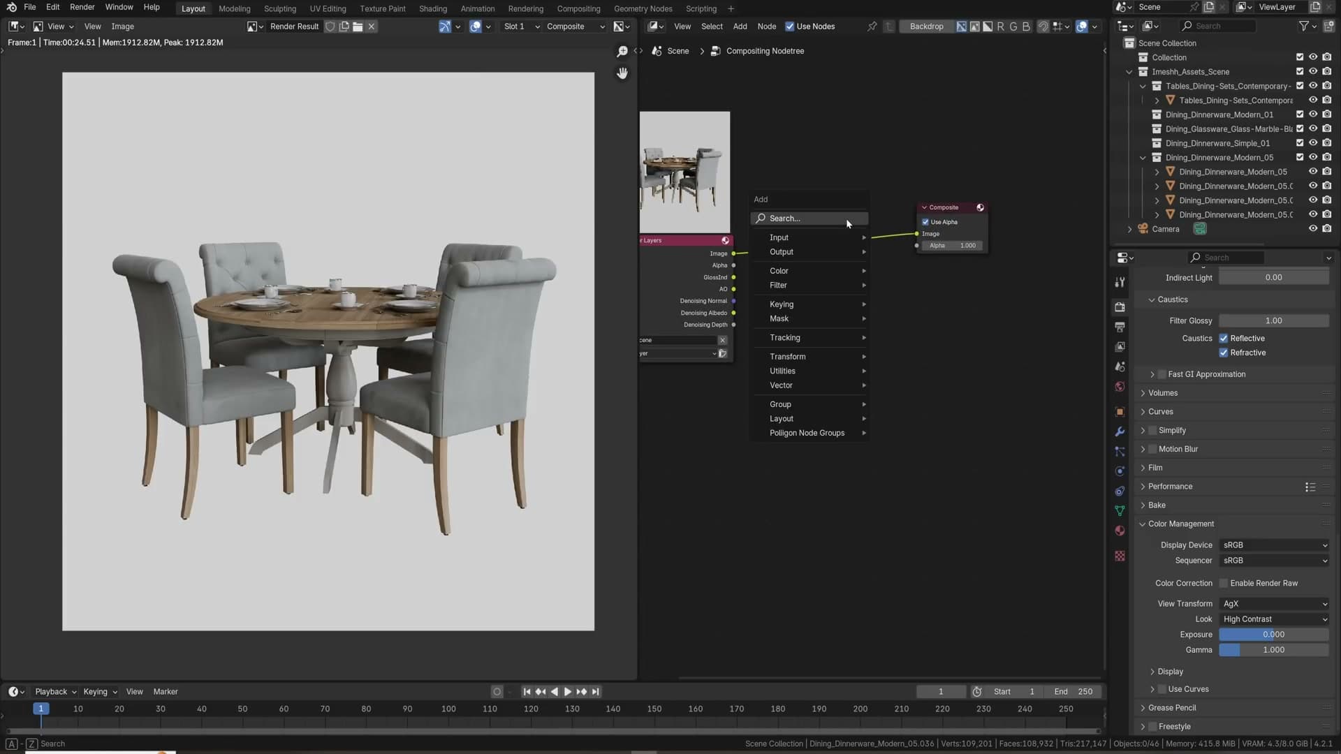
The culprit is the view transform. AGX, which is Blender's default and the one you almost certainly want on for the final render, deliberately compresses highlights so nothing hits pure white. That highlight roll-off is exactly what makes AGX look photoreal in the first place, but it also means any grading you do downstream of it is fighting a curve that has already squashed the top end of your data.
So the curves are not broken. They are working on data that AGX has already rolled off, and you are watching the roll-off resist your adjustment. To grade freely, you need the curves operating on the un-rolled-off image and AGX applied after.
Convert Color Space for AGX-aware grading
The fix is to take AGX out of the view-transform slot and put it inside the compositor instead, where you can grade before it rolls off your highlights rather than after.
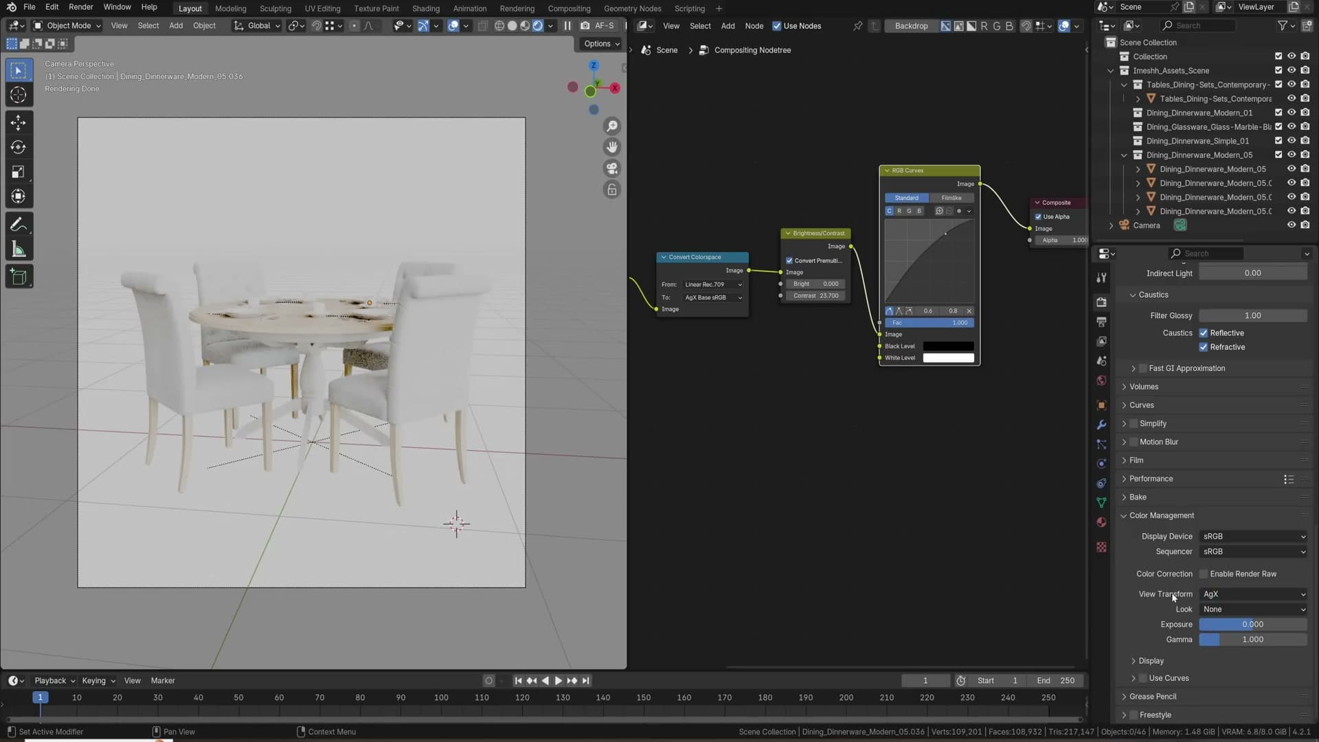
Start in the render properties panel. Set View Transform to Raw and Look to None. The render preview will go washed out and flat. That is correct, you have just stripped the display transform off the image. In the compositor, drop a Convert Color Space node directly after the Render Layers output. Set the From socket to Linear Rec.709 and the To socket to AGX Base. Enable Use Nodes on the compositor and set it to refresh on Always so you can see the result update live.
Now your curves and brightness/contrast nodes sit between the render and the Convert Color Space node. They are operating on the linear scene-referred image, exactly what Photoshop is doing under the hood, and the AGX transform is applied last, on whatever you have graded the image into. Push an S-curve, lift the blacks, crank contrast: the highlights now respond like you expect.
It is worth understanding what changed. Before, AGX was compressing everything before you got near it; you were trying to grade an image whose top end had already been squashed. Now the compression happens last, after your grade, so you keep the AGX look in the final output but you get full control over the data on the way in.
Walk the real site (or Google Maps it)
When a client gives you an address, go there. If the building is far enough away that flying out is silly, open Google Maps and walk the location in Street View. Either way, gather reference: the trees down the road, the fence styles, the road markings, the kerb heights, the signage, the neighbours' window patterns.
Plenty of artists skim the satellite view, lift a rough road layout from it, and invent everything else. The result reads as invented. The site already contains every detail you need to make the surroundings feel like they belong to the real place. There is no reason to fabricate them. Google Maps is one tab away.
EXR vs TIFF and PNG for animation frames
Animation file storage adds up fast. A thousand-frame sequence rendered as EXR weighs in at roughly one megabyte per frame, about a gigabyte for the whole shot. The same sequence saved as TIFF is closer to five megabytes per frame, putting it around five gigabytes. PNG is worse still. Over years of work that compounds into terabytes of frames you did not need to keep on disk.
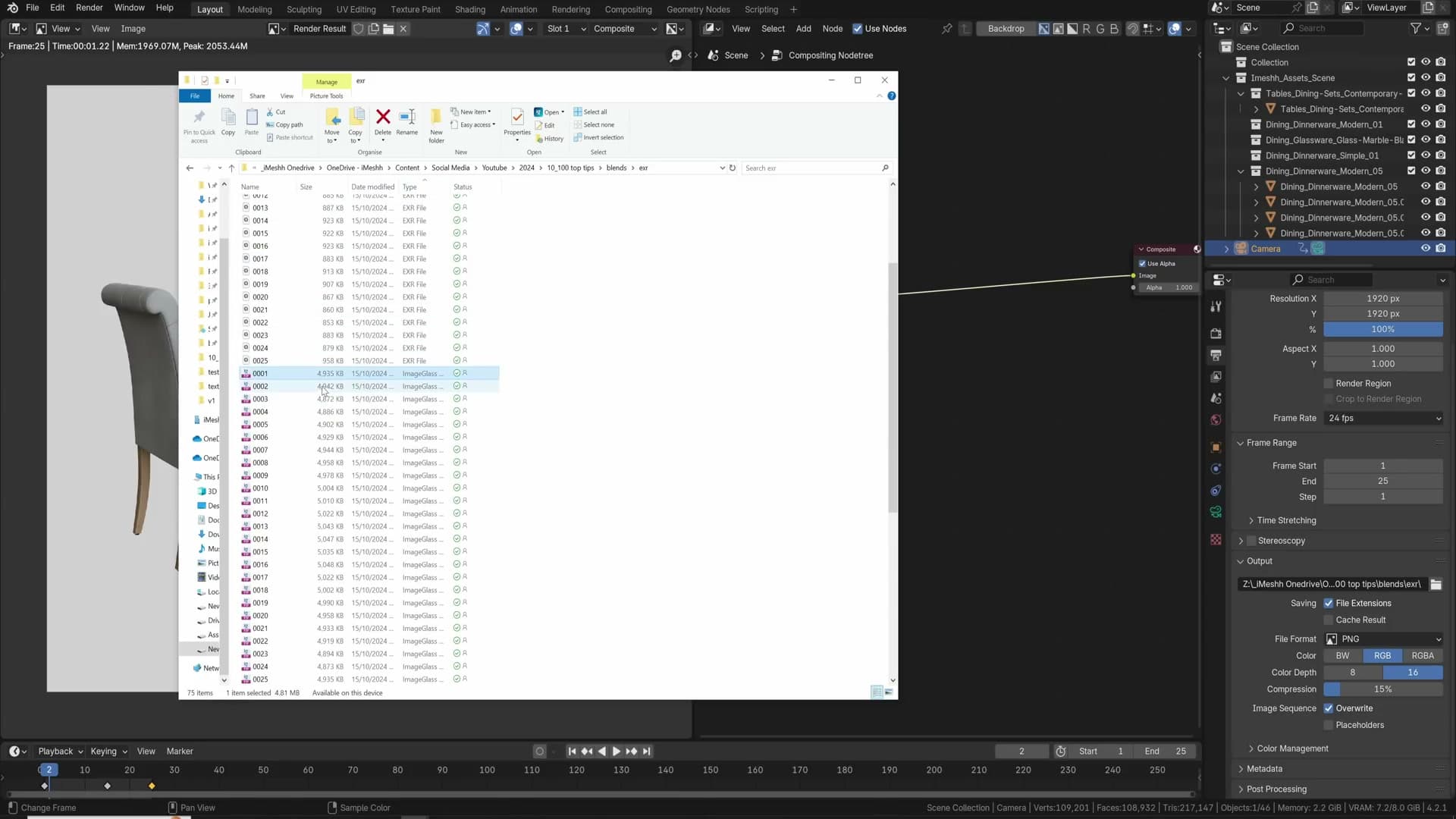
EXR wins because it is built for keeping enormous amounts of image data efficiently. It can hold 32-bit float per channel if you ask it to, and it still ends up smaller than the 8- or 16-bit formats. The encoding is just better suited to the kind of data a render produces.
There is a catch, and it is the reason a lot of people get burned the first time they switch. Drop an EXR frame and a TIFF frame from the same render onto the same image viewer side by side and they will not match. The PNG and TIFF have the AGX view transform baked into them; the EXR does not. The EXR is the scene-referred data straight out of the render, with no display transform applied. Looking at it raw is the same as looking at your scene with View Transform set to Standard and Look set to None: highlights clip hard, blacks crush, everything looks wrong.
That is not EXR being broken. That is EXR doing its job, storing the full unprocessed data so you can decide how to display it later. You still want AGX on the final output; you just need to apply it at the right step, which is the next sub-lesson.
Rebuild the AGX look in the VSE
Render the animation as EXR for the storage saving, then reapply AGX inside Blender's Video Sequence Editor when you compile the final video. The look you would have baked into each frame gets applied once, at encode time, instead.
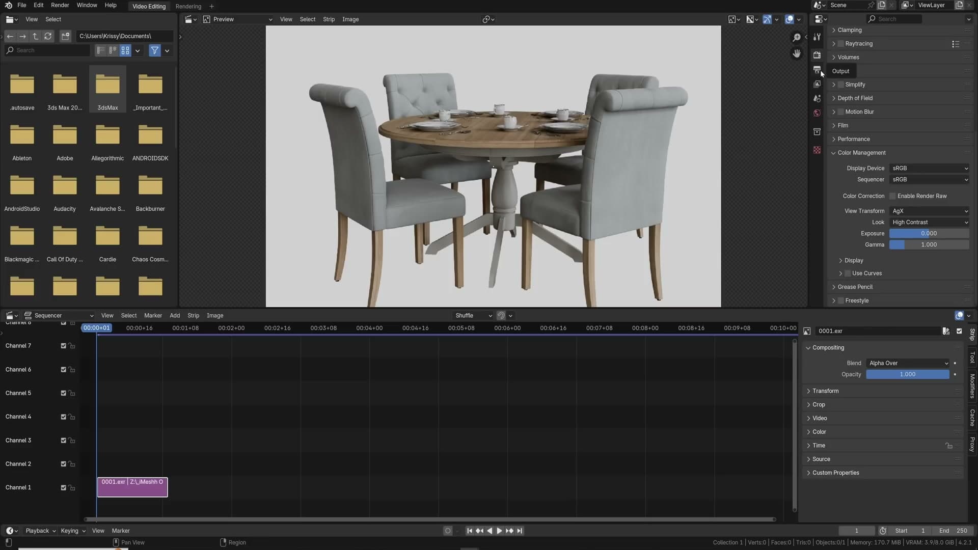
Open a new Video Editing workspace from File → New → Video Editing. Click Add → Image/Sequence and point it at the folder of EXR frames. With the strip selected, find the View Transform under the colour-management settings and set it to AGX. If you want the same punch the render preview had, set the look to High Contrast. The EXR strip now matches the AGX-baked TIFFs frame for frame.
From there, head to the output properties, set the file format to FFmpeg Video, and pick a container under the encoding tab. QuickTime is a sensible choice for round-tripping into DaVinci Resolve. Render the strip out and you have a graded MP4 or MOV ready for the edit.
Compression artefacts in the encoded video usually trace back to one setting: the GOP keyframe interval. If your output is showing blocky regions or smearing on motion, drop the keyframe interval to a low value before re-encoding.
Project organisation, navigation and VR rendering
Colour-tag collections, store eight renders side-by-side in image slots, use Track To and the eyedropper for fast scene work, walk through your build with WASD, scatter Suzannes with the Scatter Objects addon, and ship a 360° stereo render to VR goggles.
Colour-tagged collections for big scenes
This scene comes from the latest iMeshh course, and at this scale, project organisation stops being a nice-to-have. The moment a project has to be handed to a colleague, sent to a client, or picked up six months from now, every collection needs a clear home, otherwise you spend the first half-day reverse-engineering the file before you can change anything. I've been on the receiving end of that more than once: third-party scenes with no naming, nested collections, locked objects I could not unhide, and hours lost cleaning up before any real work could start.
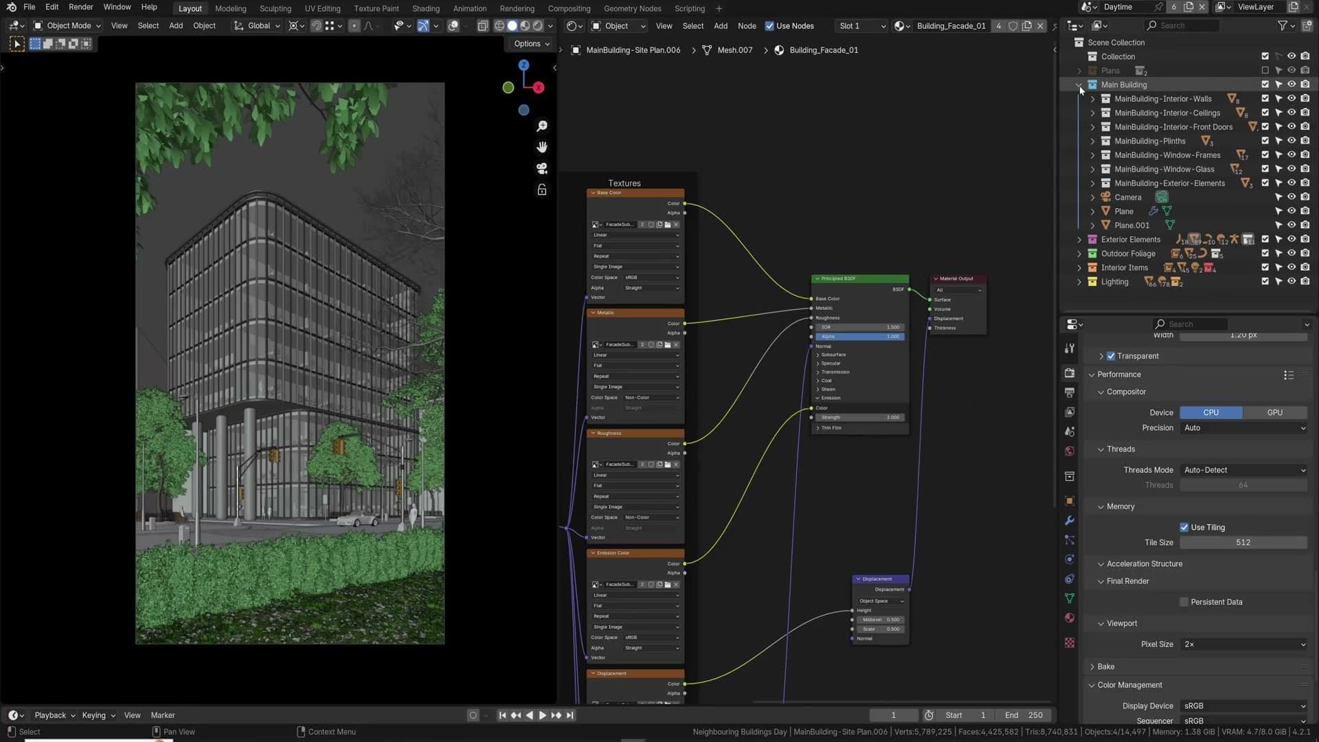
Blender's collection colour tags are an underused fix. Right-click a collection in the Outliner, pick a colour, and the structure reads at a glance: Lighting in yellow, the Daytime variant in orange, Nighttime in blue, props in green, and so on. The colours travel with the collections as you switch scenes, so the hierarchy stays legible no matter how deep it goes.
Image slots for render comparison
Blender's image editor keeps up to eight renders alive in memory at once, which turns it into a back-to-back comparison tool. After a render finishes, press 2 on the numpad (or pick slot 2 from the dropdown above the image), tweak the scene, and hit render again. Flick between 1 and 2 with the number keys and you have an A/B view of two lighting attempts, all the way up to slot 8.
It is the move I reach for whenever lighting is in flux: render a baseline, change one variable, render into the next slot, and compare. The same workflow doubles as an optimisation tool. Switching between slots makes render-time differences obvious as you push settings up and down, so you can find the sweet spot between quality and speed without losing the previous result.
Track To constraint for moving subjects
If you want the camera to keep its eye on a specific object no matter where that object moves, the Track To constraint does it in three clicks.
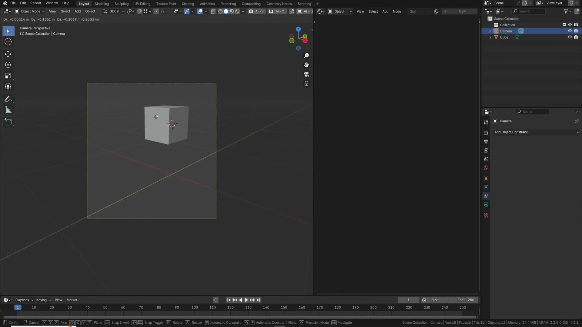
With the camera selected, open the Object Constraints tab, click Add Object Constraint, and pick Track To. Click the eyedropper next to the Target field and pick the object you want the camera to follow.
Move the target around the scene and the camera rotates to keep tracking it. It is the right tool any time the subject is not going to stay still: a turntable product shot, a car driving along a path, a character walking through frame.
Eyedropper colour picking with E
There are two ways to make a viewport colour match the rendered colour you actually want. The first is the standard one: click the colour swatch in Object Properties, then click straight into the viewport, and Blender drags whatever colour is under the cursor into the swatch.
The faster method: hover the mouse over the colour swatch and press E. An eyedropper cursor appears, and the very next click anywhere on screen, including the shaded pixels of an active render preview, becomes the new colour. Press E again to pick the next swatch, and again, and again. Once it is in your muscle memory you will stop using the click-and-drag method entirely.
Walk navigation through the scene
A finished archviz scene begs to be walked through, and Blender's Walk Navigation lets you do exactly that. It lives under View → Navigation → Walk Navigation. Right-click the menu entry and assign it to Shift+F so you can drop into it from anywhere. That single binding is what makes the tool worth using day-to-day.
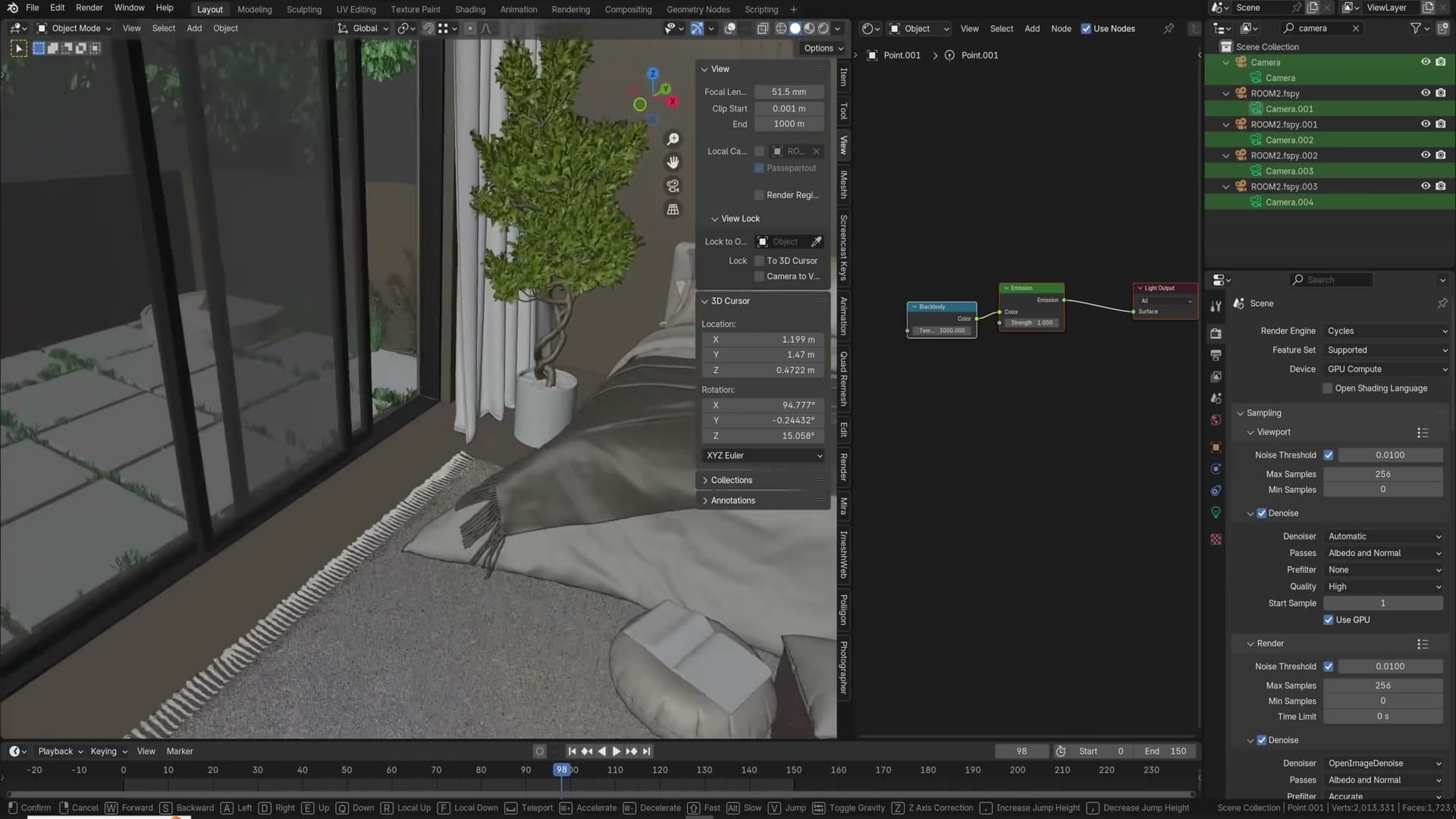
Press Shift+F and you are flying around the scene like a first-person game: mouse to look, WASD to move. Tap Tab while in walk mode and gravity kicks in: now you are standing on the floor and walking the room properly. You can even step up onto furniture, so jumping onto the bed or strolling out into the hall both work.
Scroll the middle mouse wheel to change speed. Beyond being surreal (I've built whole multi-room houses just to walk through them), it is a genuinely useful way to scout camera angles you would never have noticed from an orbit view.
Scatter Objects addon
Scattering objects across a surface used to mean wrestling with particle systems or geometry nodes. The Scatter Objects extension reduces it to a brush stroke.
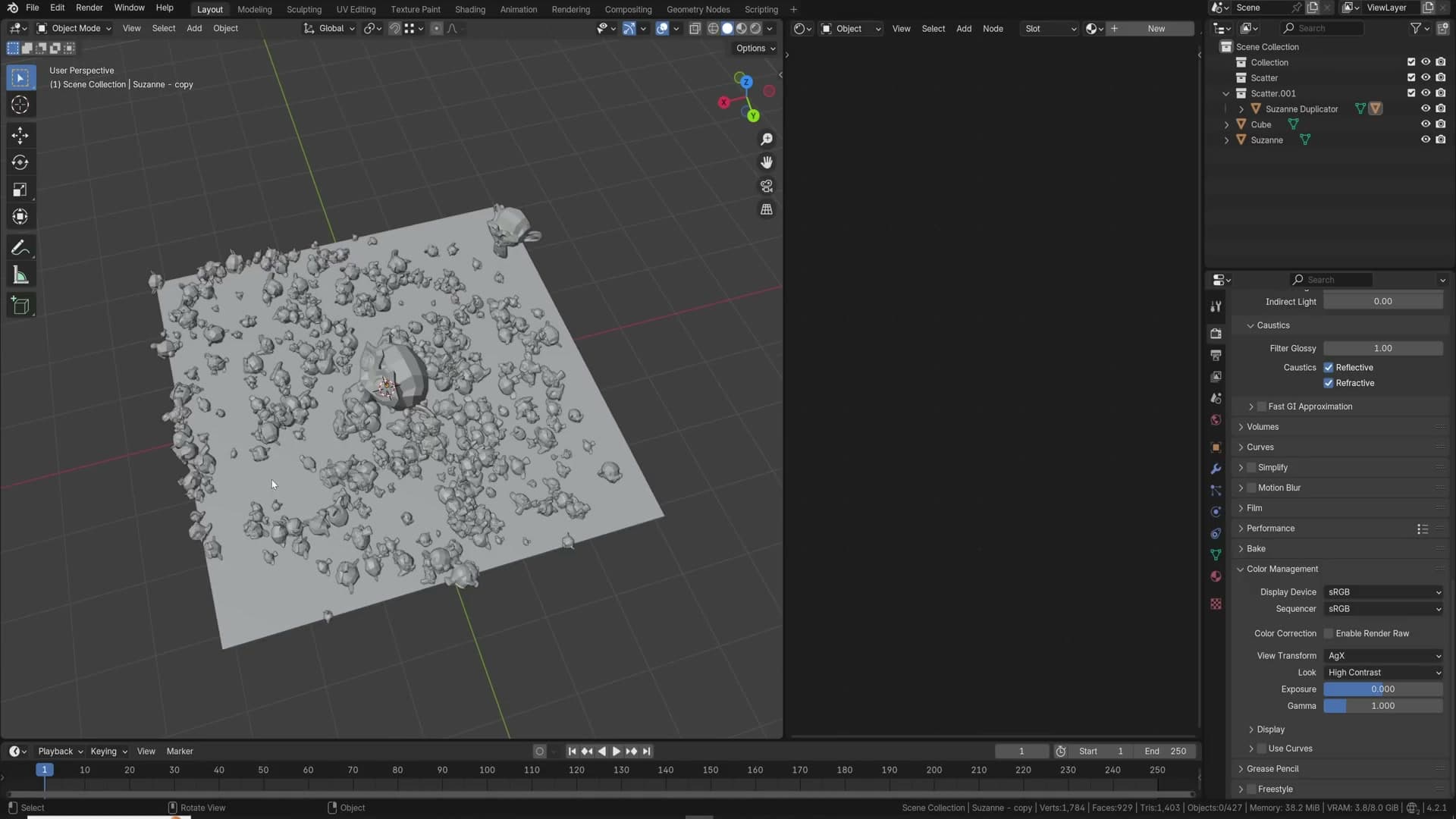
Open Edit → Preferences → Get Extensions and search for scatter. Install Scatter Objects.
In the viewport, click the source object (a Suzanne, a pebble, a stone), hold Shift, and click the target surface to add it to the selection. Press F3, type scatter, and pick the Scatter Objects operator.
Drag across the surface to paint instances, then press Enter to confirm. The operator returns a single object you can scale up, rotate, and lift on the Z-axis to fine-tune coverage. For gravel paths, scattered stones, or leaf litter, this turns a half-hour setup into thirty seconds.
360° VR stereo rendering
Stereo VR renders sound exotic, but Blender ships everything you need to produce a stereo equirectangular image you can drop into an Oculus or any other VR headset.
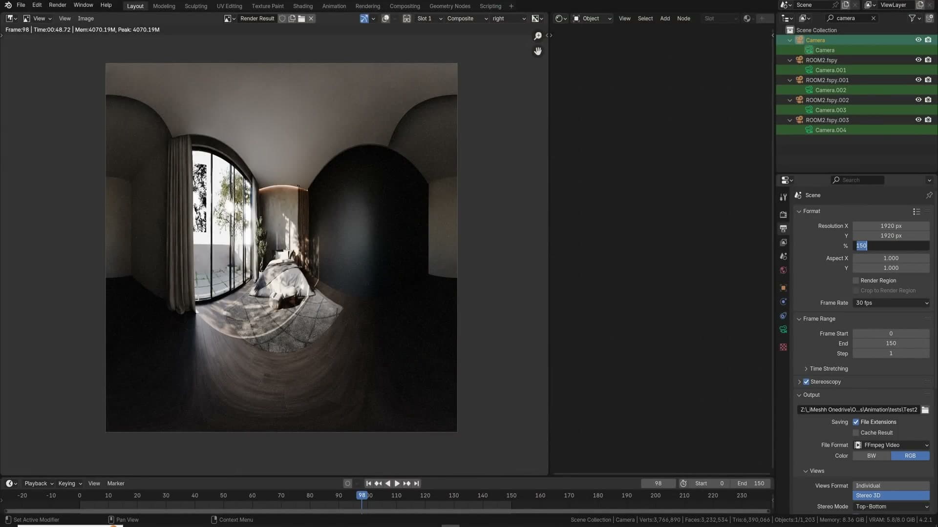
Place your camera roughly in the centre of the room and make sure it is level: 90° rotation, no tilt. In Output Properties, open the Stereoscopy panel, enable it, and set the layout to Stereo 3D → Top-Bottom. Most VR players (Oculus included) expect this layout.
Open the Camera Properties → Stereoscopy section. Set the convergence plane to roughly where the focal subject sits. Around 2.5 m works for an average room. Leave the rest of the stereo settings at their defaults.
Back in the Camera Properties → Lens panel, switch the camera type to Panoramic and the panorama type to Equirectangular. Hit render. Blender produces a left-eye pass and a right-eye pass, and you can watch the image switch between the two as the second finishes.
Save the result via Image → Save As and pick the Stereo 3D / Top-Bottom output. The top half feeds your left eye, the bottom half feeds your right, and the small offset between them is your interocular distance, the gap between your pupils, which is what gives the image its depth.
Push the resolution high. You are only ever looking at a tiny slice of the full sphere at any one time, so a render percentage of 200% or even 400% is not unreasonable. Try one, check how sharp it feels in the headset, then increase from there.
Text editor for in-project notes
Sometimes the best place to keep project notes is inside the project itself. Split off a new editor in your workspace, change its type to Text Editor, and click New to create a text block.
By default the text editor is a coding view, so you get keyword colouring and line numbers for anything you type. Open the View menu and turn off syntax highlighting to make it behave as a plain notepad.
From there, write down whatever the next person (or future-you) needs to know. Client requests ("customer asked for pink bed sheets"), camera setups ("camera 1 fires at 1900 with sun option 1"), the specific frame the client signed off on ("car renders correctly at frame 10"). The notes travel inside the .blend, so nothing important gets lost in an email thread.
Material override for clay renders
A clay render is the same scene with every material replaced by a single neutral one, so you can read the lighting and form without colour and texture pulling your eye around. Blender does this through the view layer's Material Override slot.

Create a new material (call it override) and leave it on the default white principled shader, or whatever neutral surface you prefer. Open the View Layer Properties tab, scroll to the Override section near the bottom, and drop your override material into the Material slot. Every surface in the layer now renders with that material, so what you see is pure light and geometry.
One caveat: the override applies to everything, including volumetric fog. If the scene has a fog cube, the override turns it into a solid clay block and ruins the preview. Hide the fog volume before rendering and the clay pass behaves.
Save your own startup file
If you find yourself rebuilding the same starting setup every time you open Blender (deleting the default cube, loading your favourite HDRI, dialling in render settings) turn it into your startup file instead.
Set up a fresh scene exactly the way you would want a new Blender file to look. Add your world HDRI, configure render properties, open the editors you actually use, even drop in objects if you always start with the same ones. Then go to File → Defaults → Save Startup File.
Every new file from now on opens into that scene. It is a one-minute job that pays back every working day for years.
A subtle face orientation theme
Face Orientation is one of Blender's most useful overlays. Switch it on and any face whose normal is pointing the wrong way lights up, but the default colours are so blinding that almost nobody leaves it on. The fix is a theme tweak.
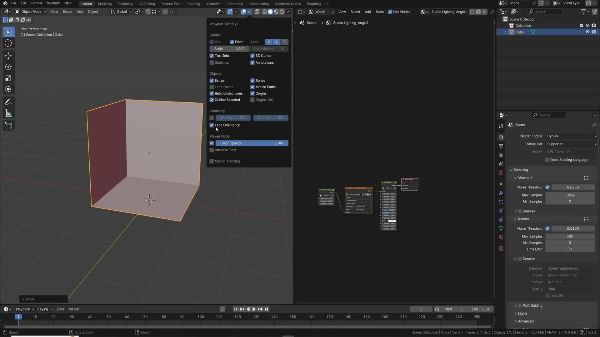
Open Edit → Preferences → Themes → 3D Viewport and scroll to Face Orientation Front and Face Orientation Back.
Drop the front (blue) overlay's alpha to zero. If a face is not lit blue, it is already correct. You do not need the overlay to tell you that. Then pull the back (red) overlay's alpha way down too, leaving just a soft red tint on flipped faces.
The result is subtle enough to keep on permanently. The moment you import somebody else's asset with flipped normals, the red tint shows up immediately, and you catch the problem on the way in instead of discovering it mid-render.
Scene optimisation, Simplify and geometry nodes
Strip subdivisions and unneeded maps from distant assets, cap texture sizes with Simplify, and lean on geometry nodes for everything from full pipe systems down to scattering a few plants.
Strip subdivisions on distant assets
Far-away objects don't need full subdivision detail. Select a distant background asset, press F3 and run Unsubdivide. A background building drops from around 7,000 faces to 2,700 with no visible change at this camera distance.
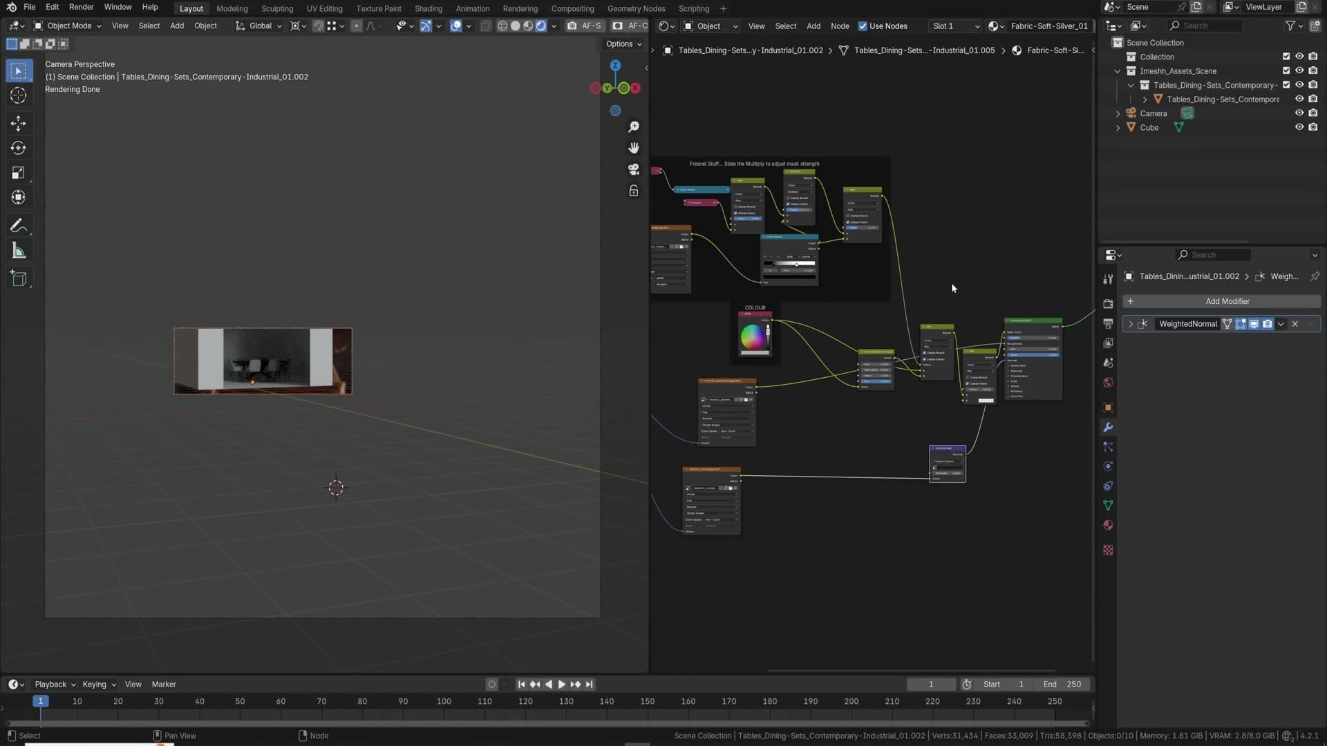
That headroom matters as the scene fills up. The further an object sits from the camera, the more aggressive you can be with this kind of cleanup. Nothing on the back wall earns the polygons it was shipped with.
Drop unneeded maps from far objects
Every map on a material contributes to VRAM, so distant assets should carry as few of them as you can get away with. Open the chairs sitting at the back of the room and look at what's plugged in: typically a diffuse, a roughness and a normal map.
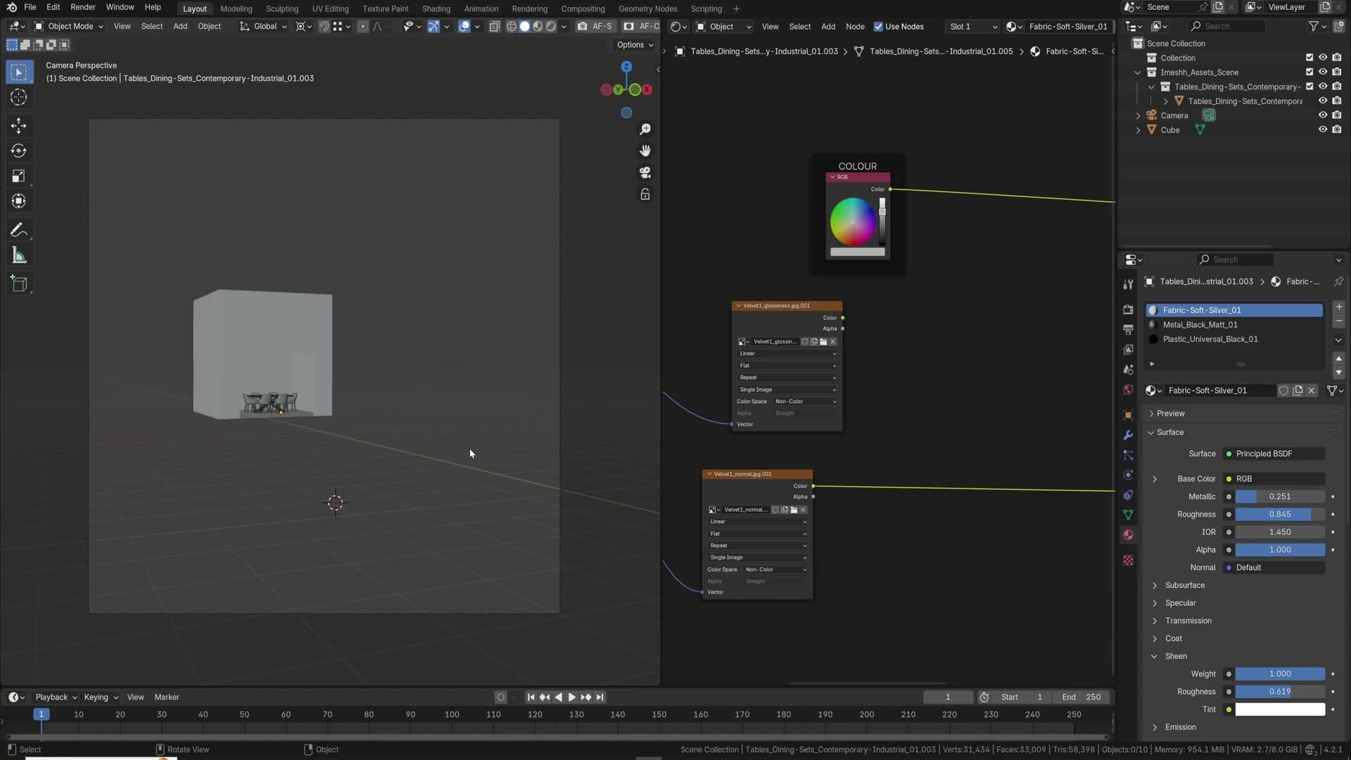
At that distance you won't read the normal map and you won't read the roughness map, so disconnect both. If the original shader relied on an older node trick to fake sheen, replace it with the Sheen slider on Principled BSDF instead. The silhouette holds up identically.
Repeat the pass on the tables, metal frames and wood pieces in the background. Keep the diffuse colour because that's the only thing the eye will pick up at distance; everything else can go. Every map you drop is VRAM back in the bank, which is headroom for more objects later.
On objects sitting off to the side, away from the focal point, you simply won't see a missing normal map. Nobody looks at a background chair leg and notices the absence of micro-roughness.
Simplify to cap texture sizes
If a scene refuses to render because you keep hitting the VRAM ceiling, or render times balloon from minutes into hours, open Render Properties and turn on Simplify. The most useful field is the Texture Size Limit under the Render column, which caps every texture in the scene at the value you set.
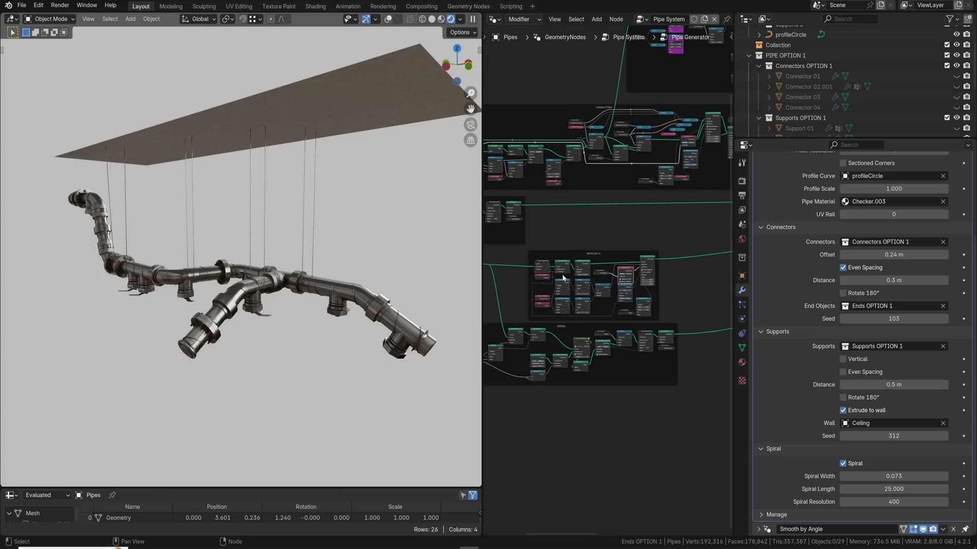
512 is drastic; 1024 is usually the sweet spot. A 4K texture on a cushion sitting deep in the frame is wasted memory anyway. The cushion occupies only a small patch of a 2,000-pixel-wide image, so the source resolution will never resolve. The asset most affected by the cap is whichever object sits closest to the camera and fills the most pixels, so check that one visually after enabling it.
On a 6 to 8 GB GPU you'll reach for Simplify on most projects. The texture-size cap alone is often enough to bring a stuck render back into the budget.
Geometry nodes for pipe systems and scattering
Geometry nodes are worth learning even if you never become an expert. A well-built pipe system shows what's possible: extrude a few control points along the ceiling and the node tree generates the pipes, the support brackets and any scattered fittings automatically.
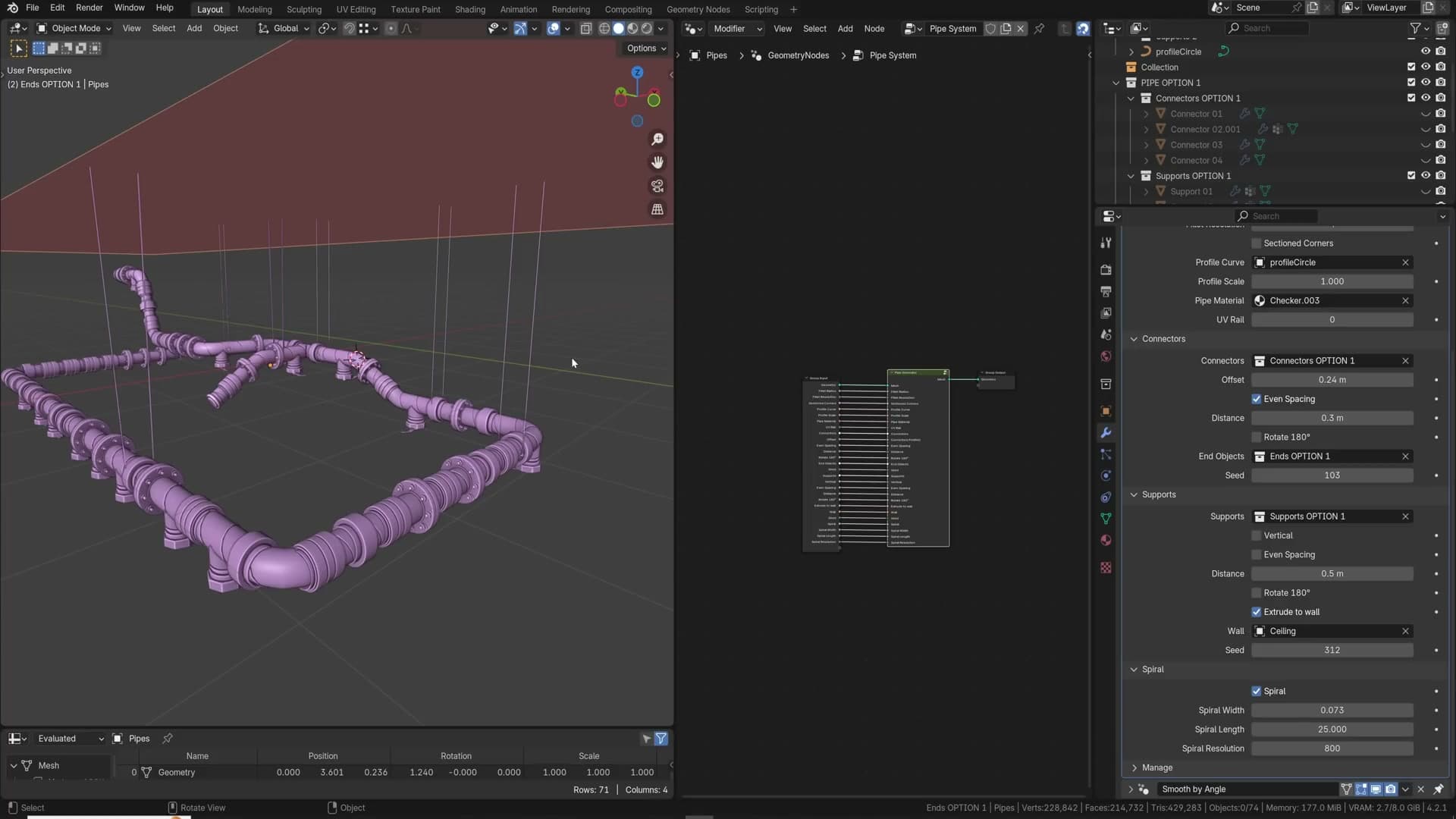
When the room scale changes (say you stretch the ceiling up by four times) the supports re-aim and reattach without manual intervention. Parameters like spiral resolution control how dense the geometry runs along each pipe; bumping it from 600 to 800 fills in the curves more smoothly when something looks faceted.
You don't need that level of complexity to benefit. Even a setup that scatters a handful of plants across a surface (one here, one there, one over there) is enough to speed up scene dressing by orders of magnitude over manual placement.
There's a learning curve, but the cost is worth paying. Try to do something with geometry nodes in every project, even something trivial, and your fluency builds without ever having to sit down and study them deliberately.
Compositor glare in every render
Real photographs always have some glare, so every render should too. In Render Properties enable the Compositor and set it to Always rather than Camera, then drop into the Compositor and Shift+A a Glare node between the render layers and the output.
The newer Bloom mode looks lovely on its own. Set Mix to 1 temporarily so you can see exactly which pixels are being lifted, raise the Threshold until only the genuine highlights pick up the effect, choose Higher Quality, then drop Mix back to 0 for the natural blend. The result feels immediately more dimensional than the raw render.
Mist pass for atmospheric depth
Physical volumetric fog is heavy to render, so for atmospheric depth in still images reach for the mist pass instead. In the View Layer properties tick Mist on, then under the World tab use the Mist Pass section to set the Start distance and the Depth. Start is where the haze begins, Depth is how far it extends from there.
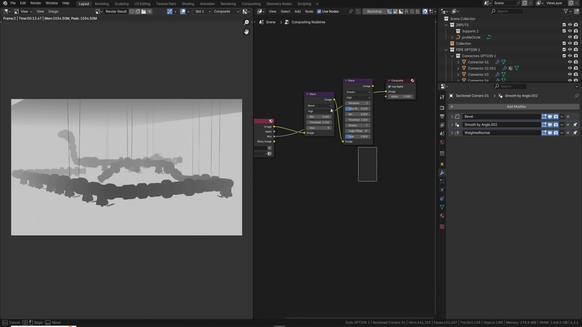
Pick a Start that matches the foreground and a Depth that reaches the back wall, somewhere around 20 metres if the back of the room is around 15 metres away. Render with F12 and the mist comes out as a separate pass alongside the beauty.
In the Compositor, plug the mist pass into a Mix Color node set to Add and combine it with the render. Lower the factor so the effect is subtle rather than blown out, and you have controllable atmospheric depth without any volume in the scene.
For sharper control, drop a Color Ramp between the mist pass and the mix node. Dragging the black handle inward tightens the near edge of the haze; pulling the white handle in thickens the far end into something closer to a wall of mist. Both moves give you push-and-pull control over depth without ever touching the 3D scene.
Denoise: accurate vs none
The Denoise node has a prefilter mode that defaults to Accurate, and Accurate is usually the right call, but not always. On surfaces with subtle micro-detail like woven fabric, Accurate smooths the noise and the texture along with it.
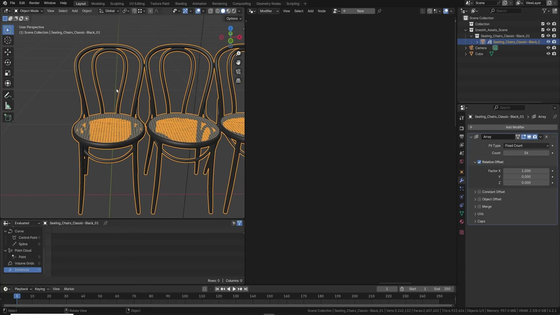
Switch the prefilter to None on a duplicate slot and compare. The fabric weave that vanished under Accurate often comes back, and the same applies to faint surface detail on walls and other broad, low-frequency materials that should still carry a hint of grain.
None costs you a little residual noise, so nudge the sample count up to compensate. It's also marginally faster than Accurate, which is a small bonus on top of the detail it preserves.
The difference is subtle, which is why it's easy to overlook, but on the right material it brings back exactly the texture the denoiser was quietly eating.
Compositor passes, post-production and the last advanced tips
A grab-bag of pro post tools: the iMeshh geometry-node array, cryptomatte, sample counts, vignette, gloss-direct and AO passes, light groups for relighting, the Camera Raw-style addon, Z-depth defocus, alpha recovery, handheld camera noise, colour-cast control, F-Spy photo matching, asset scale, and a surface-deform soft body hack.
The iMeshh geometry-node array
Blender's built-in Array modifier is fine for simple linear repeats, but for scattering thousands of unique-looking copies of an asset across a scene you want a geometry-nodes-based array. I demonstrate a custom node group, the iMeshh Array, that wraps dozens of controls into one modifier: offset (with a secondary cube to push instances around), random rotation per axis, minimum/maximum random scale, independent scale per axis, merging, and translation offsets. The number of physical faces in the scene stays flat because everything is instanced, so a 15×15×15 grid still reports the same face count as the source mesh.
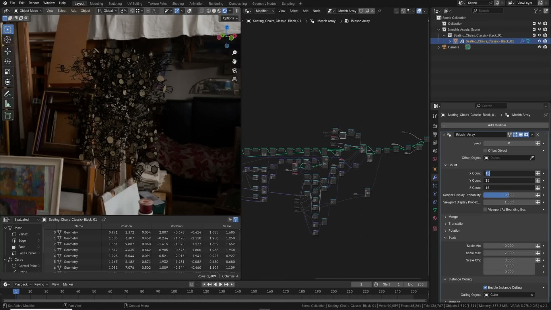
Two performance levers are baked in. Rendered display probability lowers the chance of any given instance being drawn at render time, useful for testing big scatter setups quickly. A separate viewport display probability hides instances in the 3D view only, so the editor stays responsive while the render still gets the full count. Pair that with the viewport draw set to Bounding Box and even ridiculous arrays remain workable.
Culling is handled by an Instance Culling input. Point it at any object and the array deletes instances that fall inside that volume, perfect for carving out paths through grass, removing chairs around a table leg, or punching holes in roof-tile arrays.
I push the demo to absurd lengths: a 250×250×250 grid with viewport probability dropped to 0.01 and render probability at 1.0. That works out to roughly 15 million chairs, each about 68,000 faces, a trillion faces rendering on a single frame without breaking the viewport. You almost never need that many, but it shows the headroom: each instance can be a tree and you can have a forest stretching to the horizon.
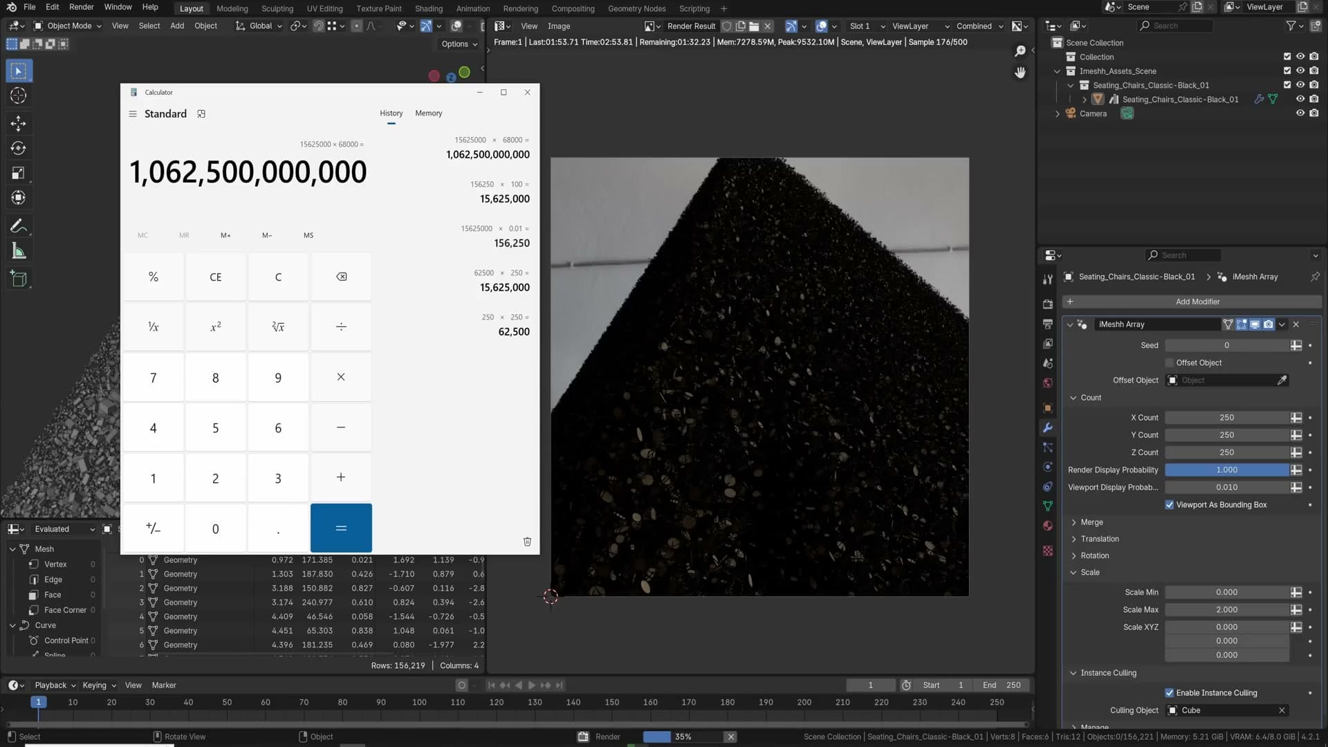
To make a geometry-nodes array part of your default workflow, append the node group into an empty scene then save it as the startup file via File → Defaults → Save Startup File. Every new file will then have it ready to drop onto any object.
Cryptomatte for object masks
Cryptomatte is the cleanest way to generate per-object masks for post-production without setting up dedicated render passes for every element. To enable it, go to the View Layer Properties, scroll to Cryptomatte and tick the option you want: Object, Material or Asset. Object is the most common; it gives each named object its own mask.
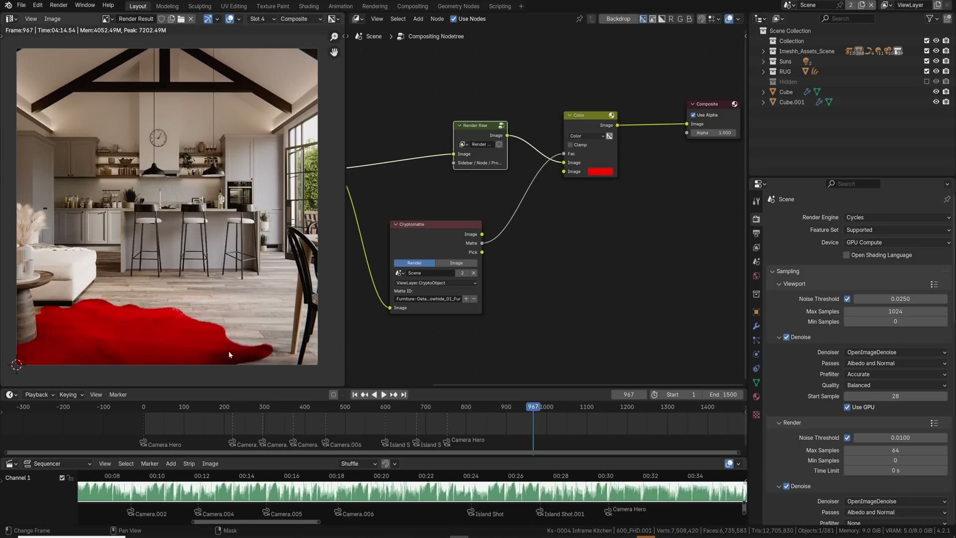
In the compositor, add a Cryptomatte node and feed your render passes into it. Click the small eyedropper labelled + and click any object in the preview to add it to the mask. The matte output is a clean black-and-white selection of that object (or several, if you keep clicking) that you can preview through a Viewer node to confirm the right pixels are selected.
Once you have the mask, plug it into the Factor of a Mix Color node and use that to push a different colour, lift exposure on a single object, or composite a different element over only that region. Switching from Object mode to Material or Asset lets you mask by shader or by asset library entry instead, which is helpful when you have many objects sharing one material.
The power of Cryptomatte is that the masks are generated dynamically from the existing render. You don't need to plan them at render time, so you can come back to an old EXR and pull selections out months later. For archviz that means relighting a single rug, retinting a single chair, or hiding a single ceiling panel without touching the source scene.
Use enough samples to preserve detail
Cycles' AI denoiser is so good now that it's tempting to render at 32 or 64 samples and call it done. For a still that often looks fine at first glance, but zoom in and you'll see that the denoiser has flattened detail it couldn't confidently reconstruct. Soft fabrics turn waxy, subtle bump on stone disappears, and small specular flickers across foliage get smeared into shapeless blobs.
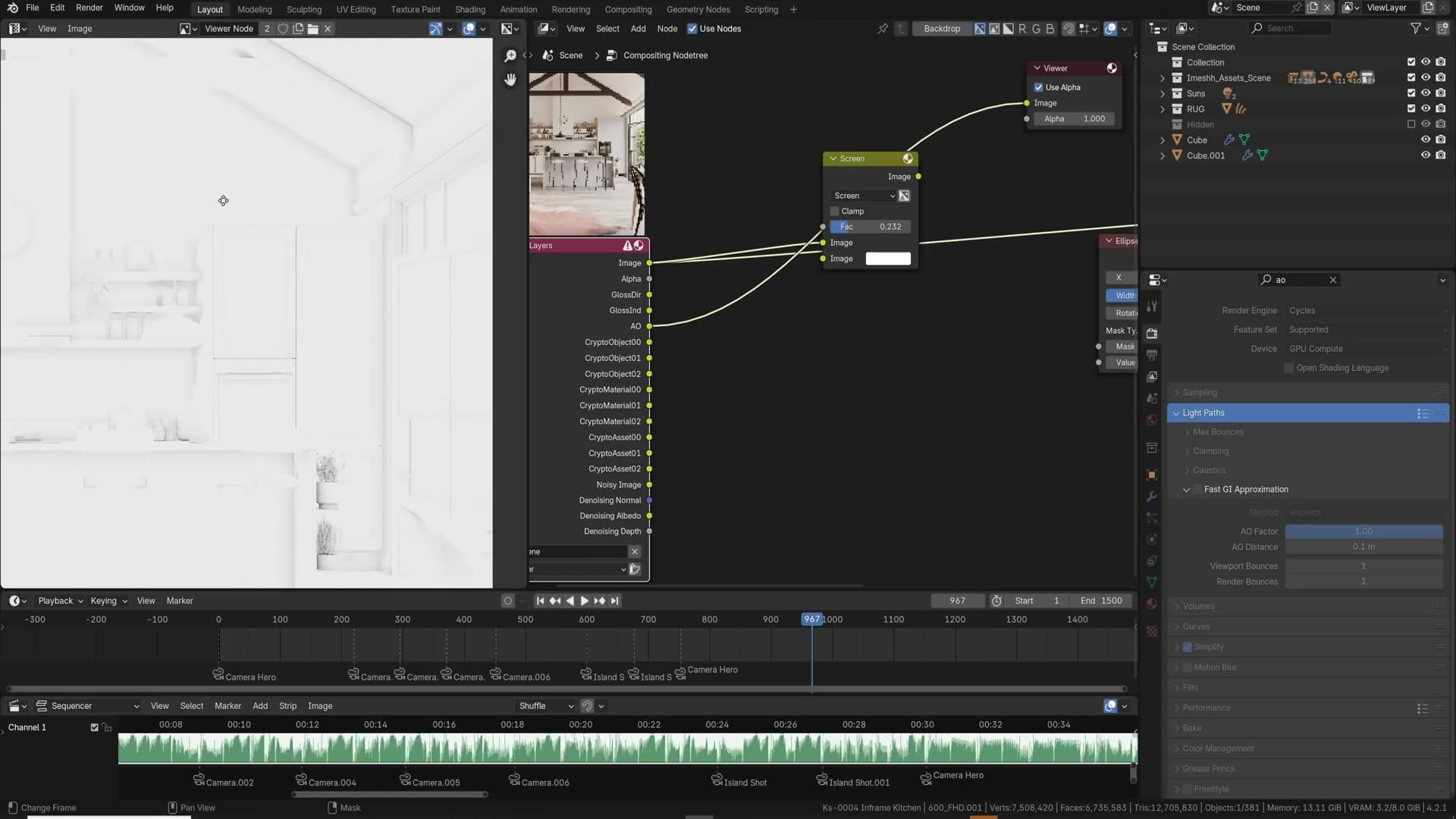
My rule of thumb is to step up to 256 samples as a baseline and compare. In my test the 256-sample render only took about three minutes longer than the 64-sample version, and a side-by-side reveals significant detail that had been wiped out at the lower count.
The problem compounds in animation. Denoiser artefacts shift slightly from frame to frame, so what looks like clean detail in a still becomes a painterly wash crawling across surfaces as the camera moves. Higher sample counts give the denoiser more real signal to work with and quiet that flickering down.
If you came from CPU rendering ten years ago, waiting twenty or thirty minutes for an image feels normal. If your reference is a five-minute Cycles render, ten minutes can feel slow, but it is almost always worth the extra time. Pick a small detailed area of your image, render at low and high samples, and compare the two crops before committing to a render time.
Vignette in the compositor
A subtle vignette darkens the corners of the frame and pushes the viewer's eye towards the centre. You can fake it in post but it's faster to build it in Blender's compositor so it bakes into every render automatically.
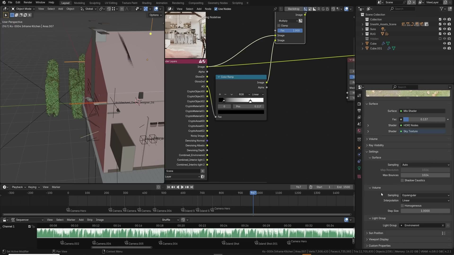
Add an Ellipse Mask node and set its Width to 1 so it fills the frame. Drop a Blur node after it and crank the blur amount up. This turns the hard ellipse edge into a soft falloff. Then add a Mix Color node set to Multiply, plug your rendered image into the top slot and the blurred ellipse into the bottom, and pipe the result into the Composite output.
The default mask is too aggressive and produces a heavy black ring around the image. Pull the factor down (somewhere around 0.3 to 0.5 usually feels right) until the darkening is visible but not distracting. You can also adjust the ellipse's Width and Height to match your frame's aspect, and shrink the ellipse below 1 (try 1.25 in either axis) to push the darkening further into the image rather than only the corners.
Keep it gentle: a vignette you have to look for is doing its job.
Gloss Direct pass for extra highlights
The Gloss Direct pass isolates the specular highlights bouncing once from your light sources off reflective surfaces: the bright edges on tiles, glints on glass, and hot spots on chrome. Enable it under View Layer Properties → Passes → Light → Glossy Direct, then re-render so the pass is available in the compositor.
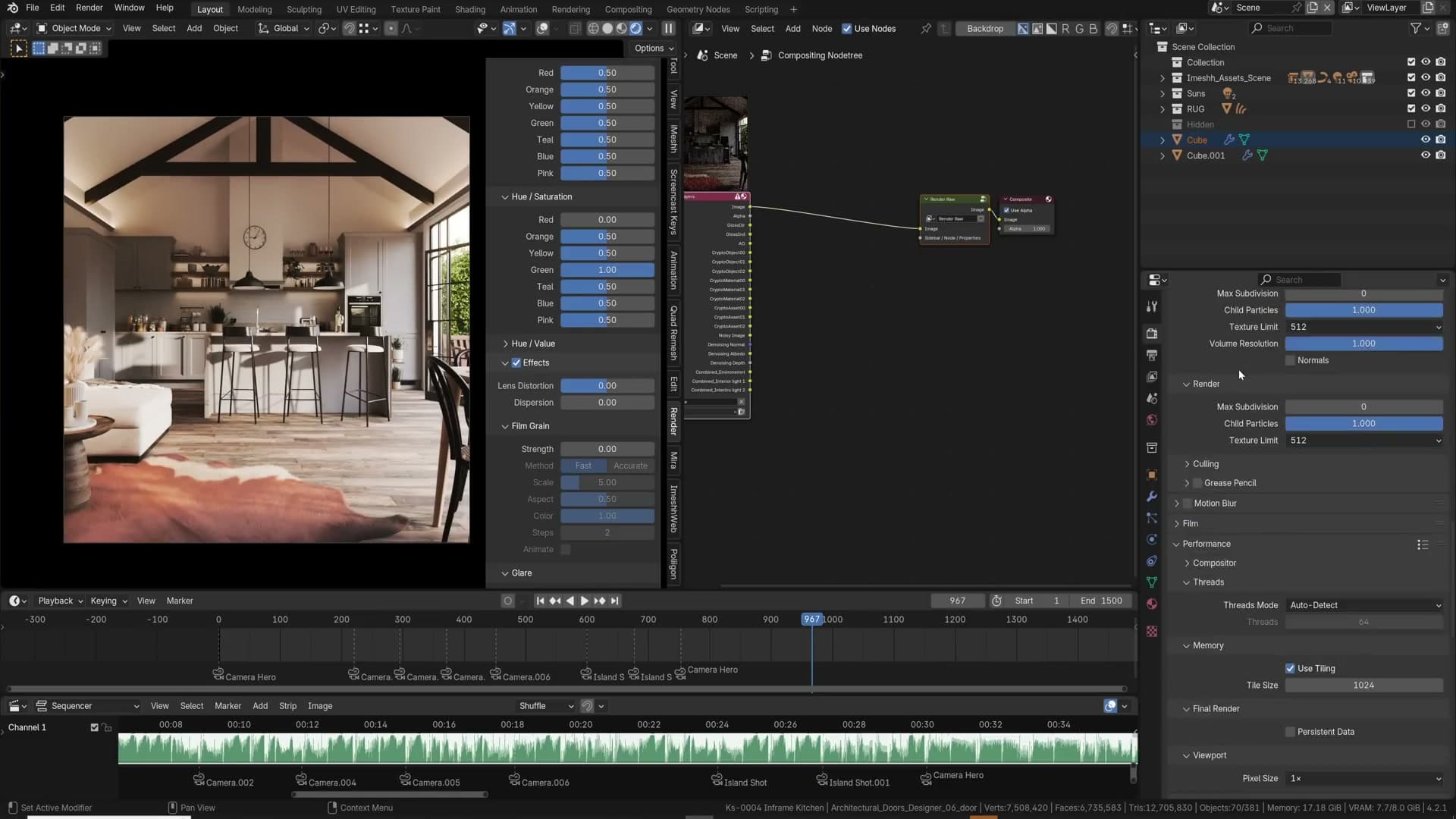
To use it, add a Mix Color node set to Screen, plug your beauty image into the top slot and the Gloss Direct pass into the bottom, and pipe the result onwards. Screen brightens wherever the pass is bright, so the existing highlights get pushed harder without affecting the rest of the image. Tiles and glass especially benefit. They suddenly read as polished rather than dull.
The catch is that Glossy Direct is a noisy pass, often dramatically noisier than the beauty render. Plug it through a Denoise node before the Mix so the screen blend doesn't dump grain back into your clean image. Denoise is slow, so do it once at the end rather than chaining multiple denoise nodes around the graph.
Don't overdo the factor. Pushed too high, everything starts to look metallic and plasticky. The trick is to lift the existing highlights, not invent new ones.
Ambient occlusion pass
Adding a manual Ambient Occlusion pass over the beauty render is a classic archviz trick for tightening up contact shadows where objects meet: door edges into frames, skirting boards against walls, cabinet doors against carcasses. Cycles already produces physically-accurate contact darkening through indirect light, but a separate AO pass lets you exaggerate it where the geometry needs more readability.
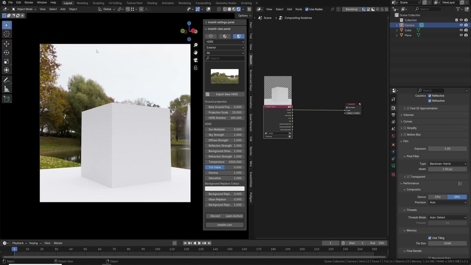
Enable the pass under View Layer Properties → Passes → Light → Ambient Occlusion. Then go to Render Properties, search for AO and find the Distance setting. The default is 10 metres, which means every object within ten metres of another contributes to occlusion, far too broad for tight edge contact. Drop it to 0.1 metres (10cm). Now only surfaces within 10cm of each other generate darkening, which gives you crisp lines along seams and edges instead of muddy room-wide shading.
In the compositor, add a Mix Color node set to Multiply, plug the beauty into one slot and the AO pass into the other, and pipe through to Composite. Slide the factor up until edges read clearly.
For more punch, drop a Color Ramp on the AO pass before the multiply. Pull the white stop in and push the black stop out to increase contrast. Be careful: the result is not physically accurate, so use it for clarity rather than realism. Cabinet door edges, skirting boards and bookshelf shelves all benefit; smooth open surfaces shouldn't change.
Light groups for after-the-fact relighting
Light groups let you split the lighting in a single render into separately-renderable layers, then re-balance them in the compositor after the render finishes. That is huge for client-review iterations where you don't want to re-render the whole scene just to dim a lamp.
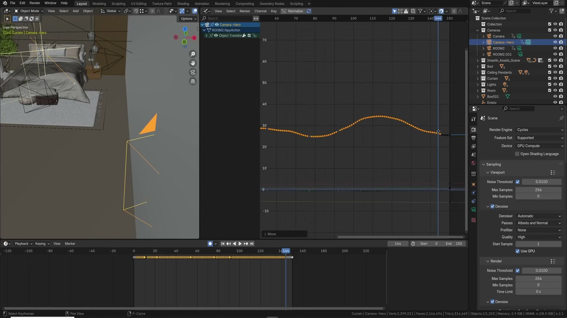
Set up the groups in the View Layer Properties by adding entries to the Light Groups list, for example environment, interior_light_1, interior_light_2. Then assign each light source to a group. For the world, go to World Properties → Settings → Light Group and pick environment. For lamps, select the lamp and use the same Light Group dropdown in Object Data Properties.
Multi-select assignment saves time when you have many lamps in one group. Box-select all the lamps that should belong to interior_light_1, then Alt+click on the Light Group dropdown of one of them. The value is applied to every selected lamp at once.
Render. Light Groups aren't supported in the viewport yet, so you'll only see the new passes after a full render completes. In the compositor each group appears as its own image output; combine them back together with Mix Color nodes set to Add. The output you build that way matches the original lighting, but now you can scale each group's contribution independently. Turn the environment down a stop, push one lamp up, or even tint a single group without re-rendering anything.
Camera Raw-style addon for in-viewport grading
The biggest post-production find I've made since switching to Blender is a paid add-on that drops a Photoshop-Camera-Raw-style grading node into the compositor. Inside a single node you get exposure, contrast, highlights, shadows, blacks, whites, full RGB curves, HSL with hue-vs-hue and hue-vs-saturation sliders, and effects like film grain, all updating live in the 3D viewport.
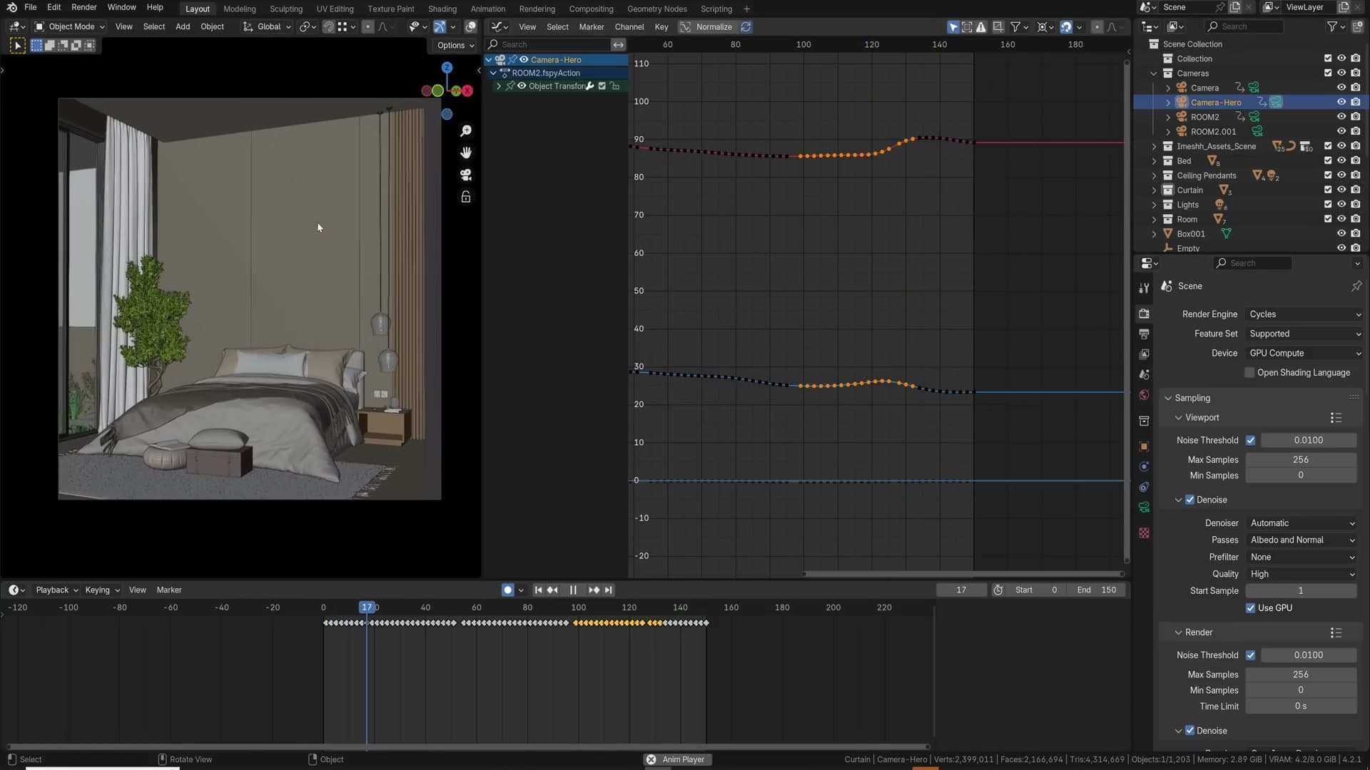
What makes it powerful isn't the controls themselves but where they live in the pipeline. Because the add-on operates inside Blender's compositor, it's grading the full 32-bit linear render data, every bit of highlight and shadow information the engine produced. Save the same image as a JPEG, 16-bit TIFF or even a 16-bit EXR and then grade it in Photoshop and you've already discarded most of that information. Lifting deep shadows or recovering blown highlights in a JPEG gives you crushed banding; doing it on the raw render gives you clean recovery.
My workflow is to do all the colour work inside this node, then save the final result as a JPEG because the image is already finished. No further round-trip needed. That's not necessarily best practice (EXR is still the safer archive format), but it's a measure of how much the add-on collapses the post-production pipeline.
It's a paid add-on, but if it ever goes on sale or a trial appears, my recommendation is unreserved. Pick it up.
Z-depth defocus after the render
Rendering with the camera's depth of field on locks the focus distance in at render time. A simpler workflow is to render at infinite focus and add the defocus in the compositor, which means you can pull focus after the fact with no re-render needed.
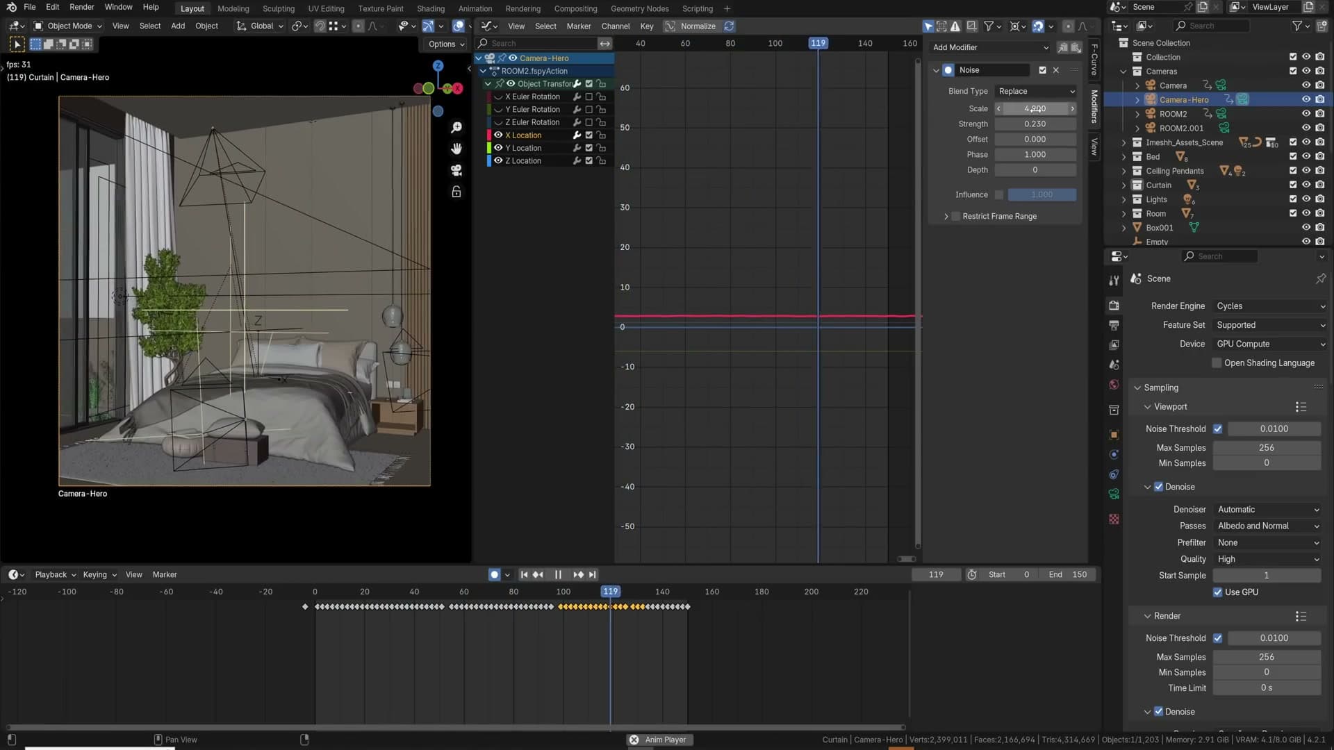
Enable the Z (Depth) pass under View Layer Properties → Passes → Data. In the compositor, take the Depth output and feed it through a Normalize node to map the raw distance values into a 0 to 1 range. Pipe that into a Color Ramp set up with white-black-white stops, with the black point sitting at the depth you want to be in focus.
Plug the ramp into the Z input of a Defocus node, with the beauty image into the image input. Slide the black stop in the Color Ramp to move the focus plane through the scene. Push it back to bring the rear wall into focus, pull it forward to land on the chairs in the middle distance. The Z Scale control on the Defocus node sets the strength of the blur; the default is high, so drop it to something like 2 to 9 for a believable shallow-DoF look.
The Defocus node also lets you choose the Bokeh Type, which controls the shape of out-of-focus highlights. Useful when you have bright lamps or window highlights in the background and want hexagonal or circular bokeh.
Alpha pass with environment recovery
If you try to pull an alpha matte from a normal render you get a fully opaque white. There's no transparency information because the world is treated as part of the image. To get a usable alpha pass, go to Render Properties → Film and enable Transparent. Now the alpha output cleanly separates foreground from background.
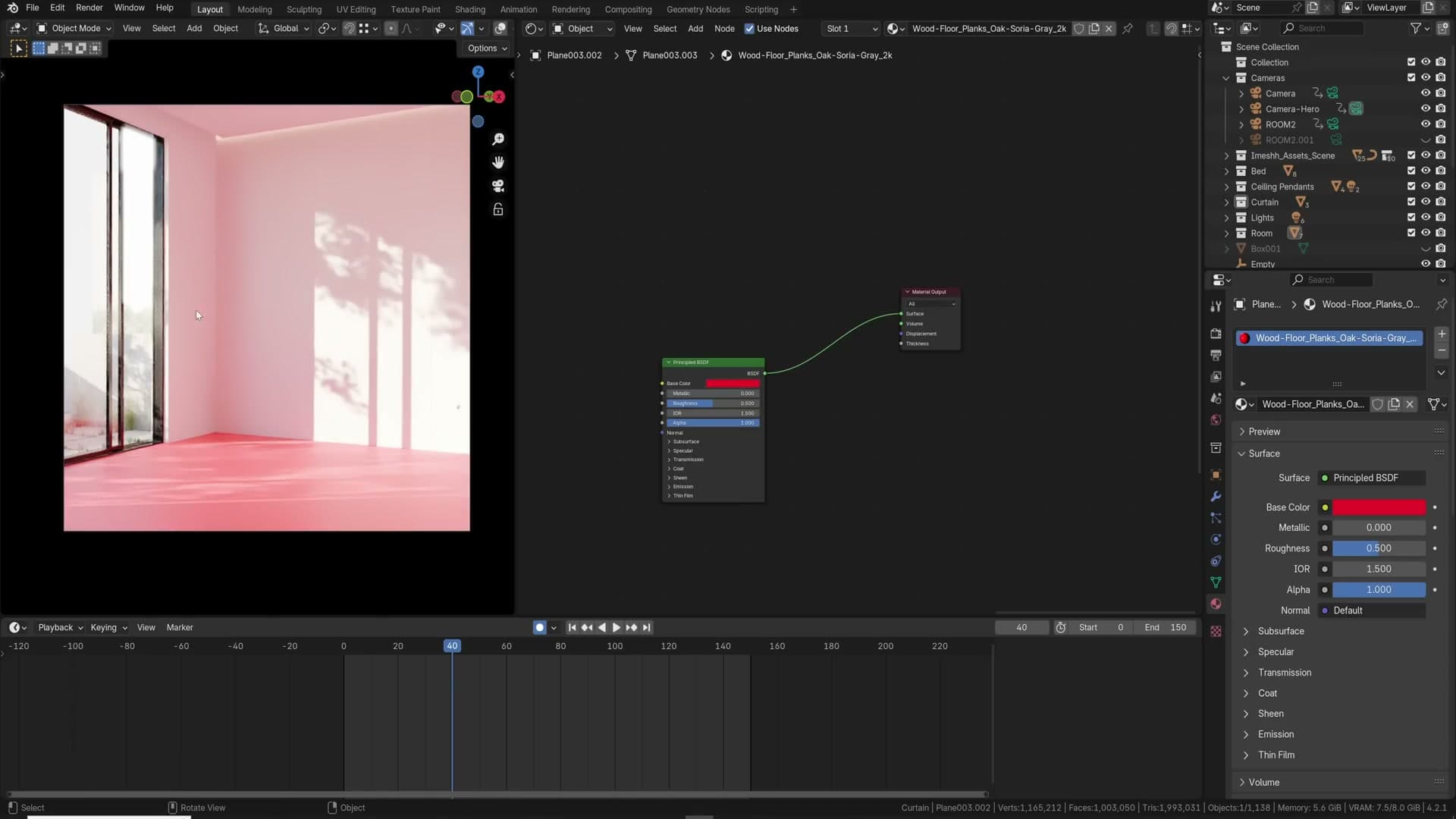
The catch: you probably still want the environment visible in the final image, because the HDRI sky outside the window is doing real compositional work. The trick is to render the environment as a separate pass. Enable the Environment render pass under View Layer Properties → Passes and re-render.
In the compositor, add an Alpha Over node. Plug the Environment pass into the bottom (background) slot, the main beauty into the top (foreground) slot, and feed the alpha output into the Factor. The result looks identical to your original render, but you now have a true alpha matte you can use for compositing the building into a different sky, swapping the back plate in post, or adding atmospheric layers between the building and the horizon.
Handheld camera with noise modifiers
A locked-off tripod camera reads as obviously 3D in animation. A handheld camera reads as documentary footage. There are two parts to faking it: a low-frequency motion path that feels like a person looking around, and a high-frequency jitter on top to simulate the constant micro-movements of human hands.
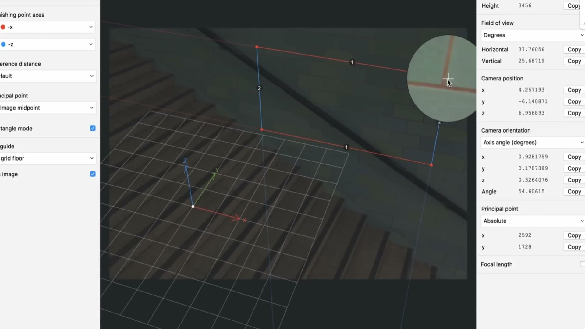
Record the broad motion first by using Blender's walk-navigation tools to fly the camera around the scene while auto-keying is active. Take a slow look around, glance up at the ceiling, peek at the rug, return roughly to where you started. The result will almost certainly be too fast and too jolty.
Open the Graph Editor, select the camera's keyframes and smooth them: F3 → Gaussian Smooth rounds out the spikiest motion. Use S+Y on selected keyframes to compress them vertically (reducing the strength of each move) and S+X to stretch them horizontally (slowing the timing). Trim off any keyframes outside your animation range. If you want the motion to loop, mirror the first frame's values to the last frame with S+X+-1 on a duplicated keyframe and smooth the join.
Now add the jitter. Select the camera, drop one location keyframe so the f-curves exist, then open the N panel → Modifiers → Add Modifier → Noise on the Location X channel. Out of the box the noise will be wildly too strong and too fast. Drop the Strength to around 0.05 and push the Scale up to around 10 to slow the jitter to a believable pace. Repeat for Location Y and Location Z so the camera shakes on every axis.
Play back with both layers combined and you should see something that genuinely reads as a person holding a camera. If it still feels like the operator is having a heart attack, lower the noise strength further or push the scale higher to slow it down.
Controlling colour casting on walls
Strongly-coloured floors and walls bounce coloured light onto every nearby surface. A red rug turns the room pink, an orange wood floor tints the entire ceiling. That's physically accurate and Cycles will calculate it perfectly. But it's often more colour than you actually want, and any photographer working in the real world would correct it back towards neutral white in post.
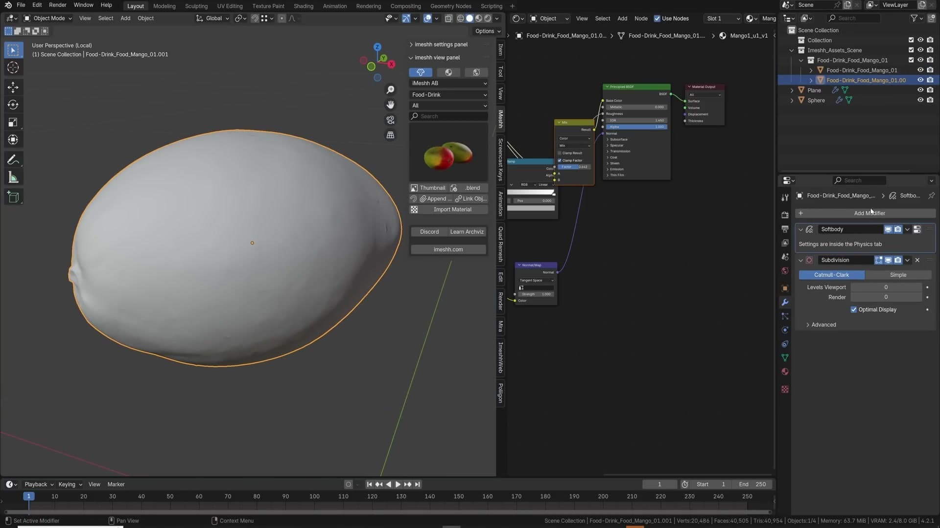
Rather than fixing it after rendering, you can stop the bounced colour from being so saturated in the first place using a Light Path node. Add a Mix Shader to the offending material, then add a Light Path node and plug its Is Camera Ray output into the Mix Shader's Factor.
Now you have two branches. The Is Camera Ray = 1 branch (top slot) is what the camera sees directly. Feed your original full-saturation shader into it. The Is Camera Ray = 0 branch (bottom slot) is what other surfaces see when they're picking up bounce light. Feed a desaturated copy of the same shader into it. Use Ctrl+Shift+D to duplicate the existing node links cleanly, then add a Hue Saturation Value node on the bounce branch and pull the saturation down.
The visible floor still looks correctly coloured because the camera takes the saturated branch. But the light bouncing off it onto the walls and ceiling is now using the desaturated copy, so the room reads as the colour you intended without losing the floor itself. It's not physically accurate, but it's the same correction a photographer would make in post, baked into the render.
F-Spy for matching photographs
If you need to drop 3D objects into a real photograph (adding furniture to an empty room shot, replacing a roof on an existing building, mocking up signage on a streetscape) the perspective of the camera that took the photo has to match the perspective of Blender's virtual camera exactly. Doing that by eye is painful. fSpy is a free piece of software that solves it: you load the photo, drag two pairs of perspective lines onto vanishing points, and fSpy calculates the camera's focal length, position and rotation for you.
There's a dedicated Blender add-on that imports fSpy projects directly, dropping a matched camera and the reference image straight into your scene. From there, walls and floors snap into place against the photographed geometry and any object you add inherits the same perspective. I have a full tutorial covering the workflow end-to-end on the iMeshh channel, well worth watching if you need to do this kind of matching regularly.
Asset scale and the surface-deform soft body hack
Two final tips. The first is mundane but constantly missed: check that every asset you bring in is at the correct real-world scale. Use the Item panel's dimensions readout to verify. A double bed should sit at roughly 1.8m wide and 2m long, a dining chair seat at roughly 0.45m high. When scale is off you can't always name what's wrong with a render, but everything reads as either oversized lamps in a doll's house or undersized furniture in a giant's room. Five seconds with the dimensions panel prevents it.
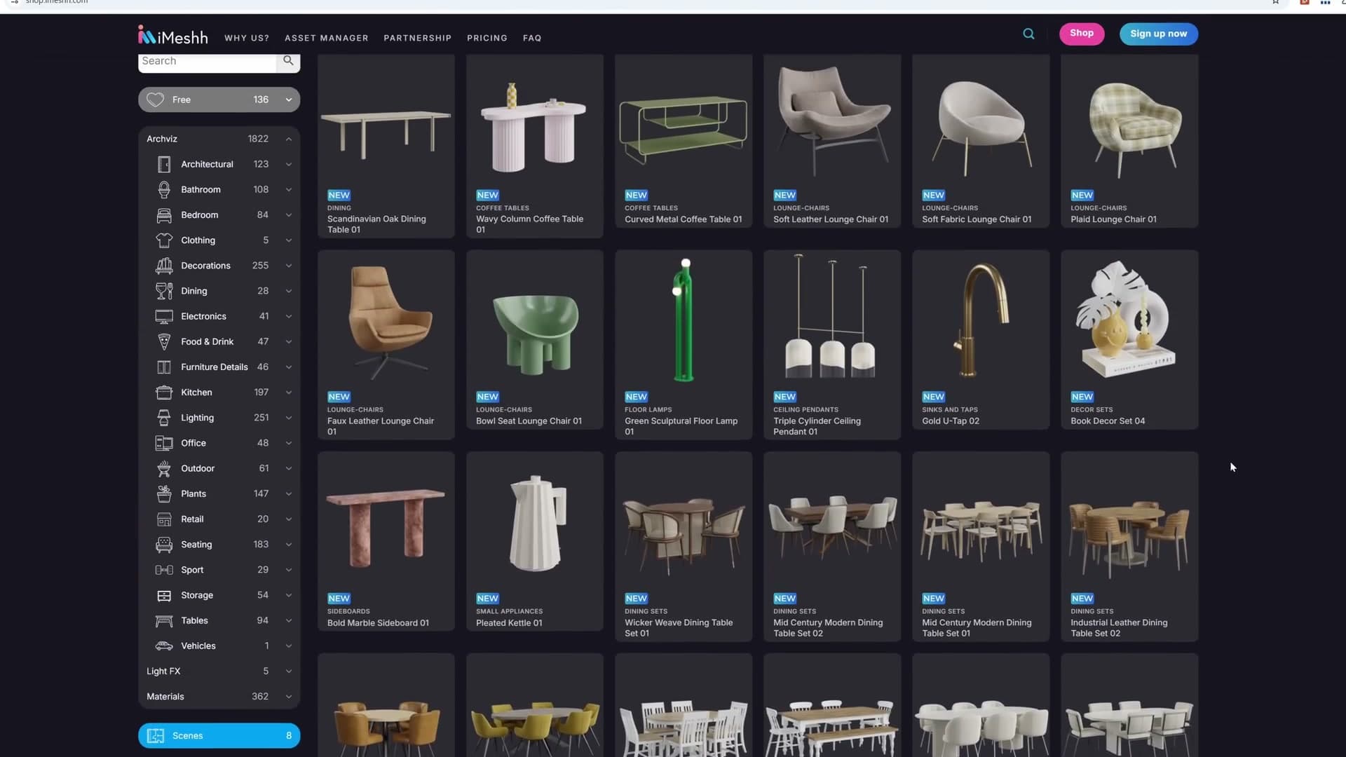
The second is a soft-body simulation trick. Running soft body on a dense, high-poly model is painfully slow. Try it on a mango with subdivided geometry and Blender effectively grinds to a halt. The fix is to simulate a low-poly proxy and have the high-poly mesh follow it with the Surface Deform modifier.
Duplicate the high-poly object with Shift+D. On the copy, turn off any Subdivision Surface modifier and add a Decimate modifier set to roughly 0.01 ratio, then apply it. You're left with a sparse cage that matches the original's silhouette. Add a Soft Body modifier to this decimated cage and tune the settings: disable Goal, enable Edges with a stiffness around 5, and enable Self Collision. For damping, push it up to around 5 on both edge and goal damping to stop oscillations.
Now select the original high-poly object, remove any soft body modifier from it, and add a Surface Deform modifier. Set the Target to the decimated copy and click Bind. The high-poly mesh is now glued to the low-poly cage's deformation. Hide the cage at render time and the high-poly mesh runs the soft body simulation at viewport speed, fast enough to actually scrub the timeline and iterate on settings.
And that's the last tip. The full set covers modelling shortcuts, lighting, materials, render settings and compositor passes. Pick the ones that map to where you're losing time and bring them into your daily Blender workflow.
Tools and credits
Everything mentioned in this tutorial, with links.
- Blender , the renderer this entire build runs in.
- iMeshh , studio platform (project management, client review, asset library, invoicing). The asset library used in this tutorial is included with every iMeshh Pro plan.
- Poly Haven , free CC0 textures and HDRIs.
Pillar guide: Tips Tricks hub