What you'll build from one photo of your room
Kristian shows the finished kitchen scene built on top of a real photo and explains the fSpy + Blender workflow this tutorial will cover end-to-end.
Previewing the finished photo-matched room
In my previous video I built a small CG kitchen on top of a real-life photo of my own room, and the response made it clear people wanted to know how the trick was done. Enough of you asked how to recreate the effect that I turned the workflow into this full tutorial, so you can photograph any room in your home and rebuild it in 3D the same way.
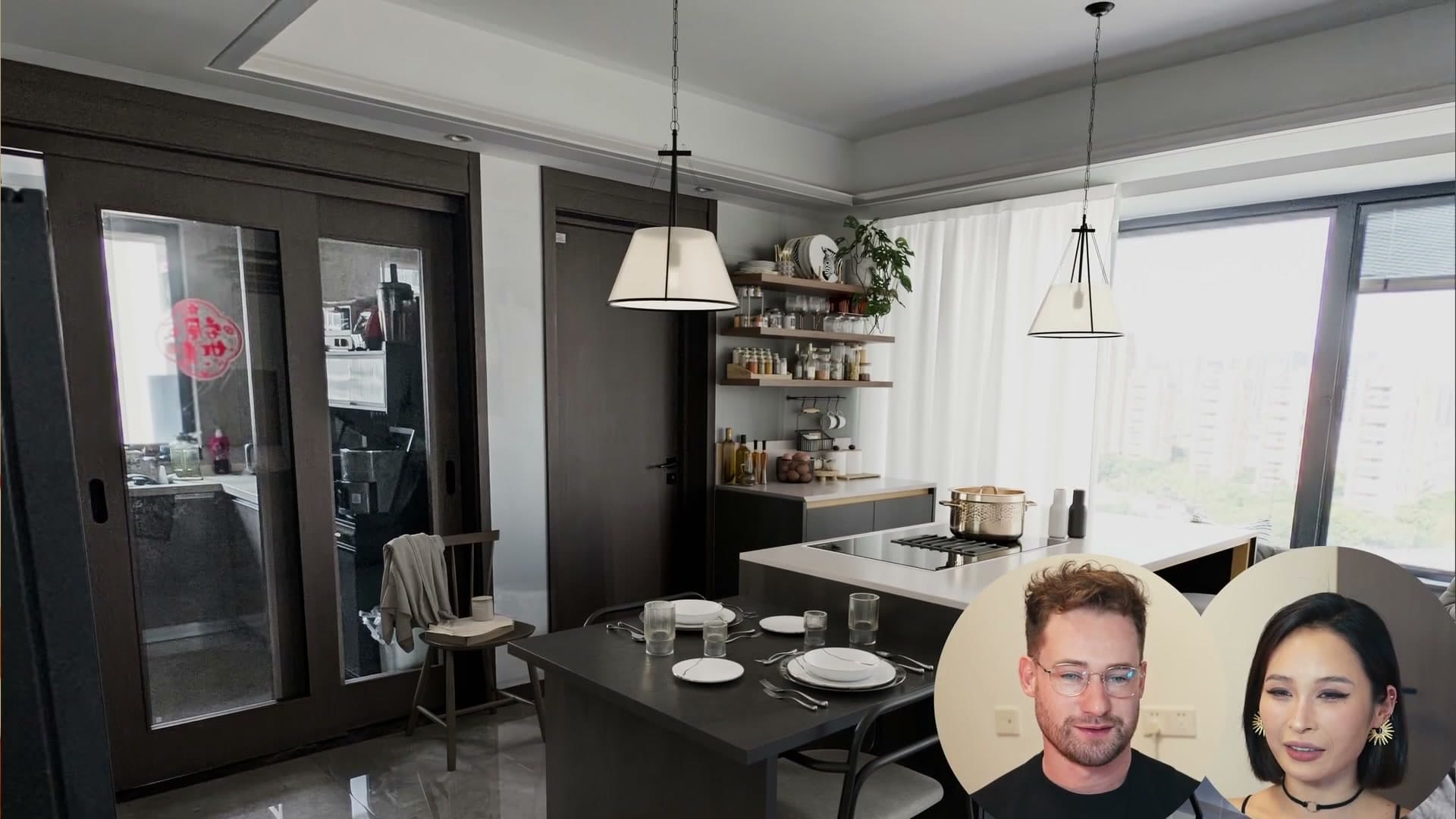
Before any of the technical steps, take a moment to look at where you're heading. The finished scene combines a single photograph of my kitchen with CG furniture that sits inside the room, casts real shadows on the floor, and reflects in the surfaces. It's matched so precisely to the camera that it's hard to tell which pieces are real and which were added in Blender.
Over the next half hour you'll learn the full pipeline end-to-end: solving the camera with fSpy, tracing the floor plan, scaling the scene to real-world dimensions, projecting the photo onto your geometry, lighting the room through its own windows, and finally dropping in furniture so it looks like it was always there. Let's jump straight in.
Installing fSpy and setting the vanishing points
Download fSpy, install its Blender add-on, then drag the red and green handles onto wall edges so the program can solve the camera's perspective.
Downloading fSpy and the Blender add-on
Head to fspy.io and download the program itself (either the .zip archive or the .exe installer, whichever suits your setup). On the same page you'll find a separate link for the Blender importer add-on, which is what lets you pull the solved camera into Blender once you've finished tracing the photo. Grab that too.
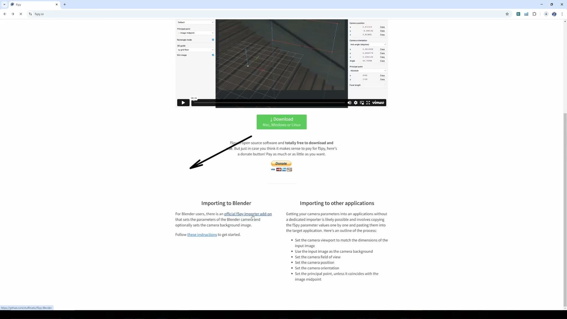
The download page also lists the installation steps for the Blender add-on, so follow those once both files are on disk. With the add-on installed, open fSpy on your desktop and you're ready to load the room photo.
Dragging the red handles along the first wall
Drag and drop a photo of your room straight onto the fSpy window. A standard interior shot has two vanishing points, so the default two-axis setup is what you want here. You'll see two red handles and two green handles overlaid on the image, and your job is to align each pair with a real edge in the photo.
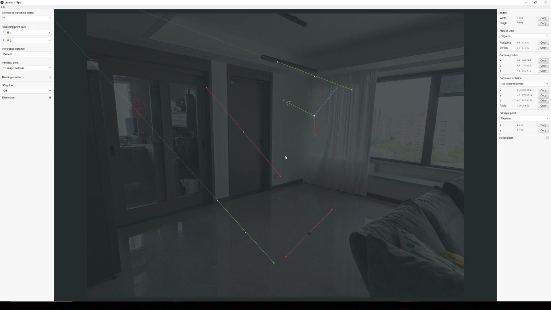
Start with the red handles. Grab one end of the first handle and hold Shift as you drag. That zooms you in so you can place the point precisely against the edge of a wall. Follow the wall all the way along and look for a spot where it's genuinely easy to see where the edge meets another feature, then drop the handle there.
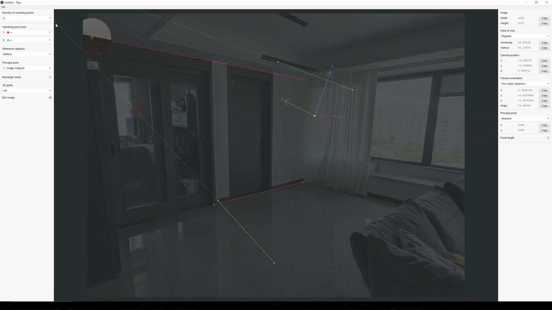
Repeat with the second red handle on a different edge that runs in the same direction. Pick another clear, unambiguous part of the wall, zoom in with Shift, and snap the endpoint to it. The closer you get to the actual edge, the better fSpy can solve the perspective.
Setting the perpendicular green handles
Now do the same with the green handles. These need to sit on lines that run perpendicular to the red ones: if your red handles followed walls heading away from camera, the green ones should follow edges that cross them at right angles.
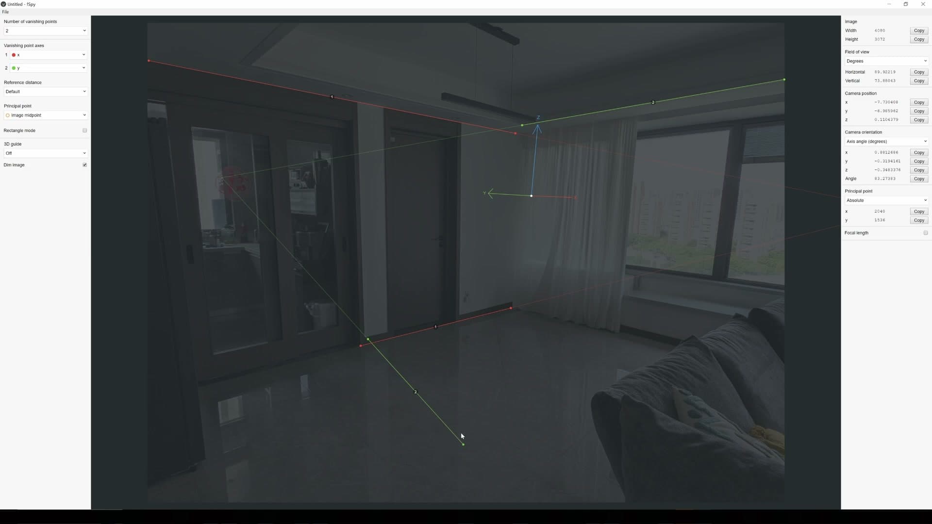
Find an easy-to-spot line in the photo that clearly travels in the perpendicular direction, zoom in, and place the handle as accurately as you can. For the second green handle there are usually fewer good candidates to choose from, so just pick the cleanest edge you can find and align it as best you can.
Once both pairs are placed, go to File > Save As and save the fSpy project wherever's convenient. You'll point Blender at this file in the next step.
Tracing the floor plan in Blender
Import the fSpy file, add a plane, and slide vertices along the photographed walls to build a polygon that matches your room's footprint.
Importing fSpy and adding the base plane
With the fSpy file imported, the room photo loads as a camera background and the camera sits in its solved position. The next job is to lay down a base mesh that will become the floor of the scene.
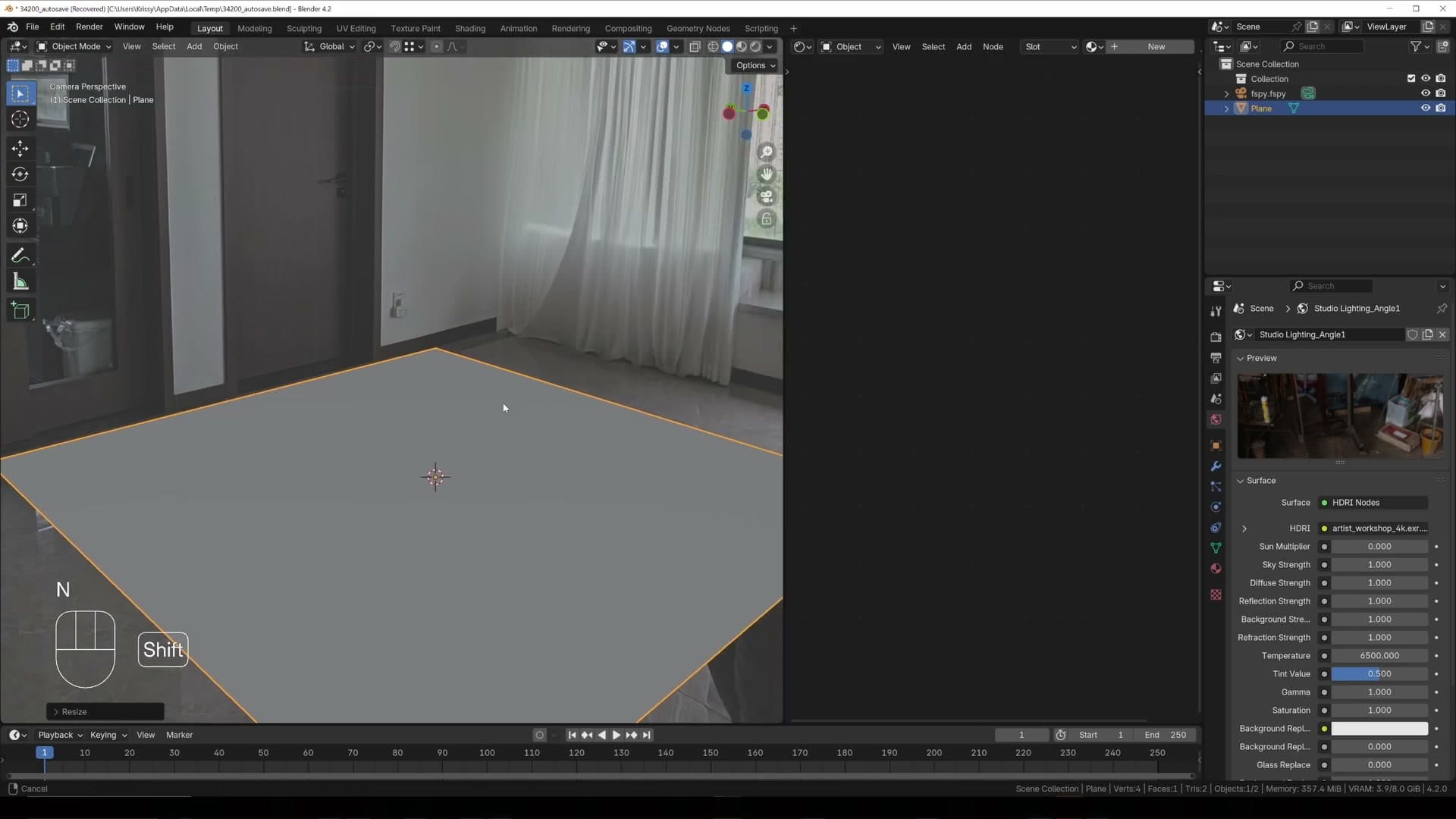
Add a default plane and scale it up. Because the camera is matched to the photo, the plane lines up naturally with the floor in the image. Its edges should already feel parallel to the real walls.
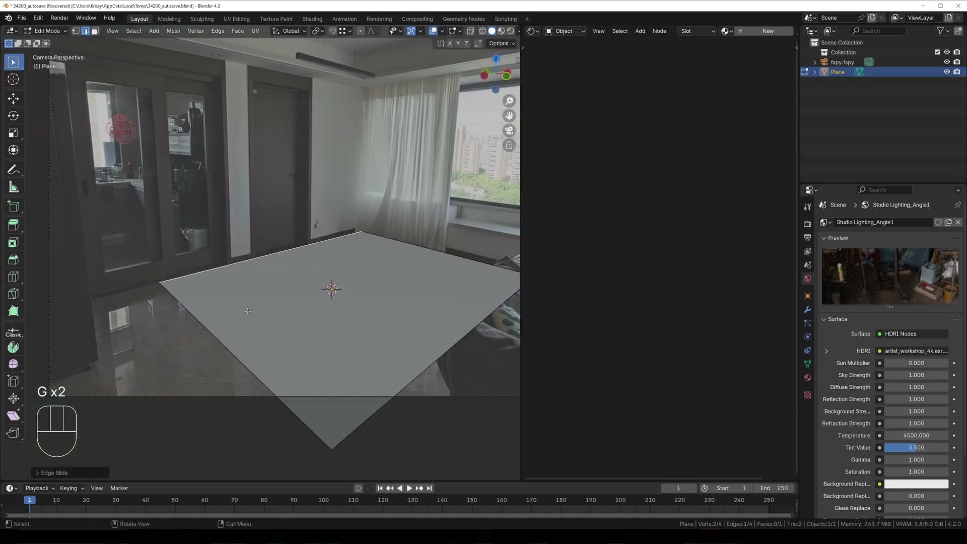
Press Tab to enter edit mode and select one of the plane's edges. Hit G G to start an edge slide, then hold Alt as you drag so the edge can extend past its original limits and snap along the photographed wall. Work around each side of the plane until every edge runs flush with a clear wall edge in the photo.
Sliding edges and extruding perpendicular walls
A four-sided plane only works for a perfectly rectangular room. Most rooms have bays, alcoves and doorways, so the next step is to walk the polygon around the actual outline of the room visible in the photo.
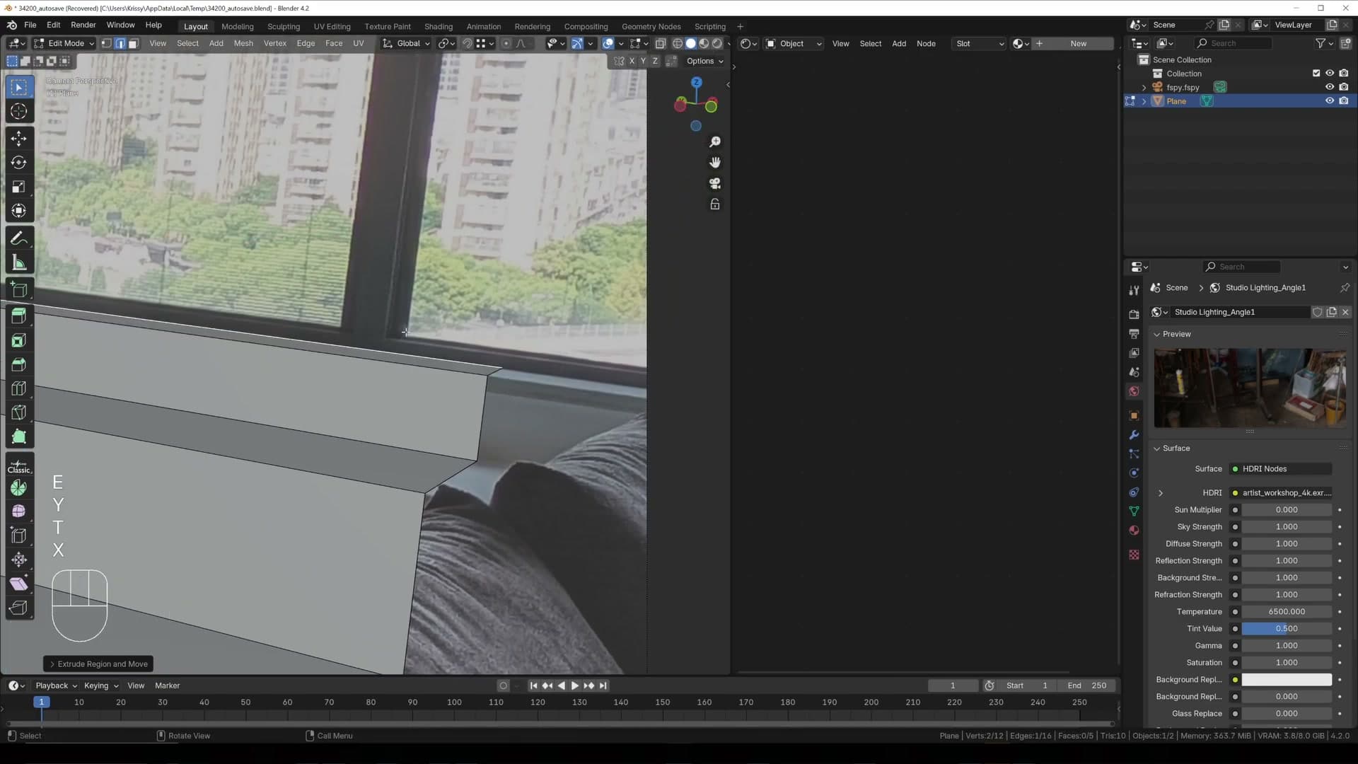
Pick an edge and extrude perpendicular to the wall you're tracing. Press E then Z to extrude along the Z axis, or E then X to extrude along the X axis. Alternate between the two to step around each corner of the room.
Follow the photographed wall all the way along. Where the room steps out for a curtain bay, add a short E + Z to move outwards, an E + X across the bay, and another E + Z to come back in line with the main wall.
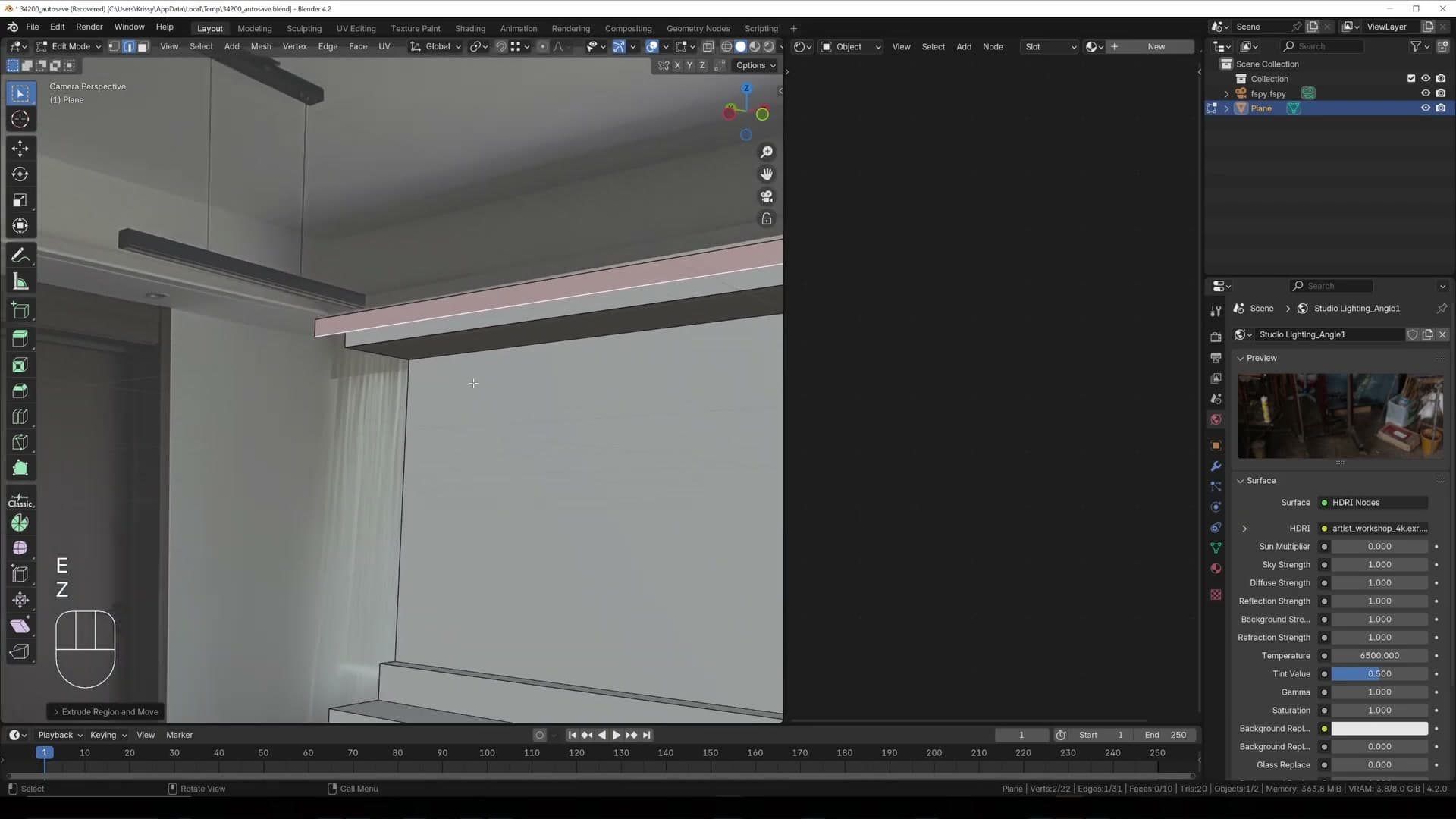
Carry the polygon on past the bay and extrude out to the edge of the door, keeping each segment locked to a single world axis. By the time you reach the corner of the room, the open edge of the polygon should trace the entire visible footprint.
Closing the floor polygon with F
The back wall of the room sits behind the camera, so you never see it in the render. Select the two open edges left at the back of the polygon and press F to bridge them, then use S X 0 to flatten the new geometry onto a single axis.
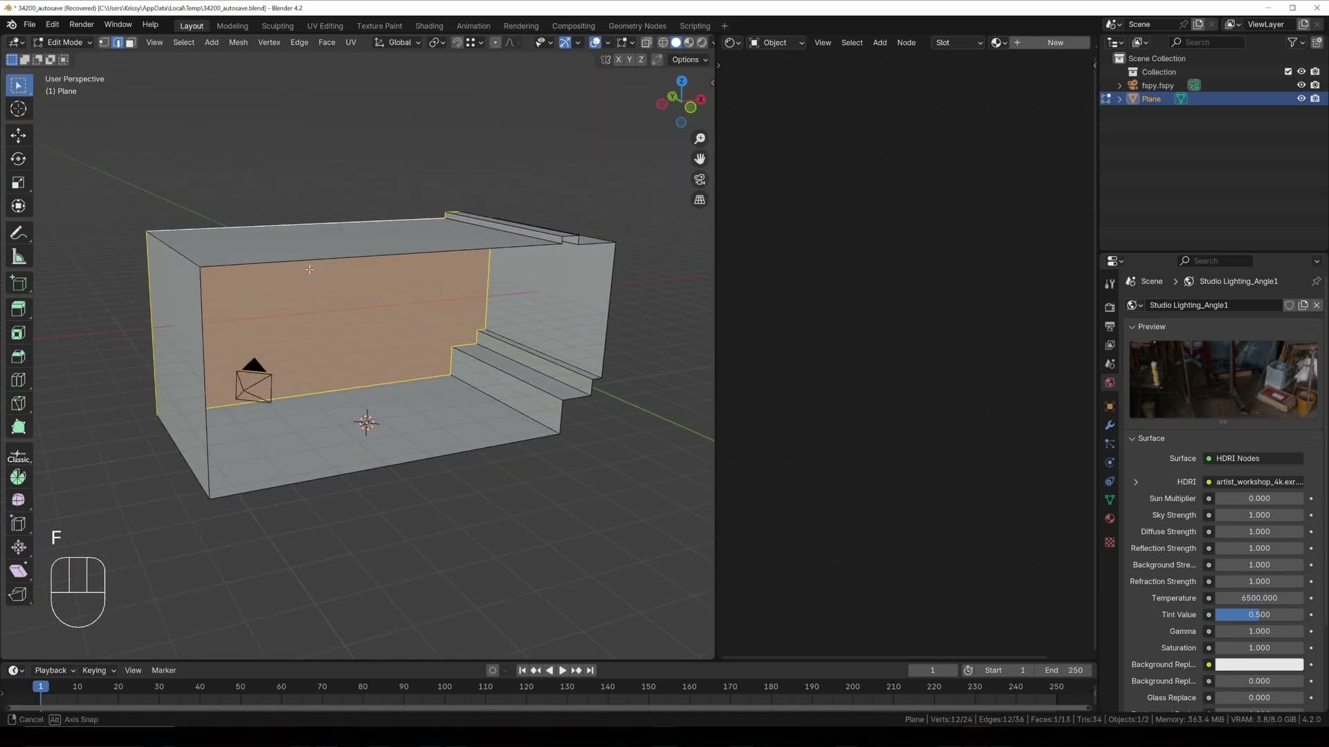
If you plan to reuse this scene from other angles, model that hidden wall to the room's actual dimensions instead of leaving it approximate. For a single-camera render, anything behind the camera is fine as a rough shape.
To finish the floor, hold Alt and click on the outer edge loop. Blender selects the full boundary in one go. Press F to fill the loop and create a single floor face. That face is the basis for everything that follows.
If your room shape needed a second region (for example, a bay that ended up as its own loop), Alt-click that loop, drag it out so it roughly covers the matching area in the photo, and press F again. Every part of the footprint should now have a filled face.
Scaling the room to real-world dimensions
Use a known measurement (here a 98cm door frame) to make the entire room true-to-scale, so any furniture you append later fits correctly.
Separating the door frame edge to scale against
Pick the two vertices that bridge the doorway in your floor plan, right-click and choose Subdivide. That drops a fresh vertex on the wall between them. Press G G to slide-select that new vertex along the wall and nudge it until it lines up with the inside of the door frame in the photo. You now have an edge that runs the exact width of the door.
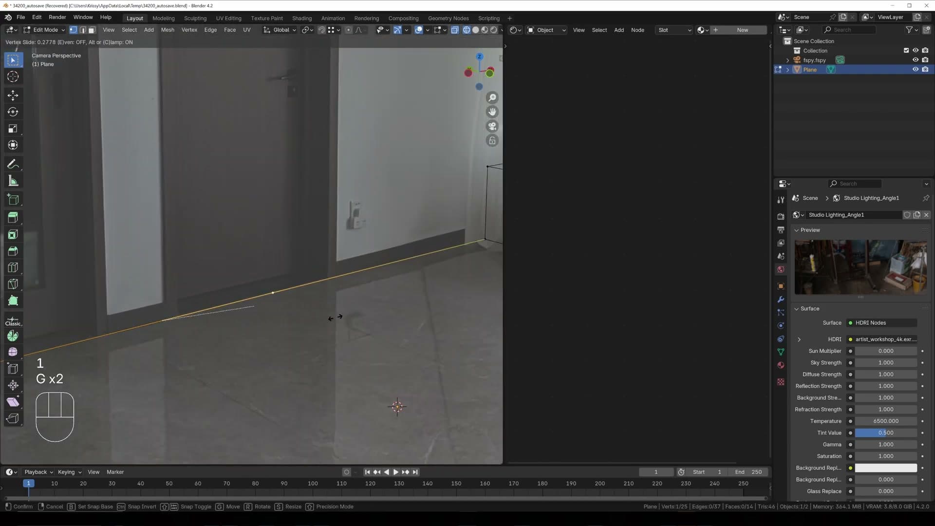
Switch to edge mode with 2, click the door-frame edge to select it, then Shift+D to duplicate and P > Selection to separate that duplicate into its own object. You need it as a standalone object because you're about to use it as a measuring stick. The real door frame is 98cm wide, and that's the only number you need to lock the whole room to real-world scale.
Scaling the scene until the door reads 0.98m
Tab back to object mode and click the new reference edge so it becomes the active object. Press N to open the side panel, jump to the Item tab and read the Dimensions value. In this scene the edge measures roughly three metres, which tells you the whole room is currently about three times larger than it should be.
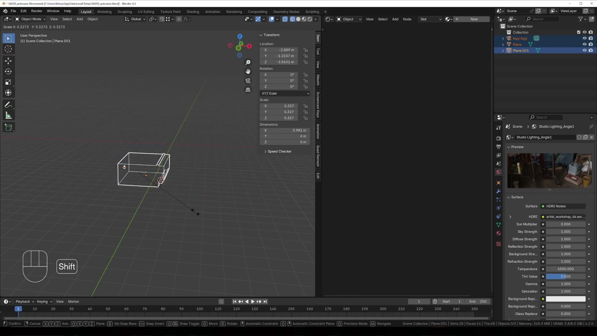
Now select everything in the scene with A, leaving the door-frame edge as the active object so its dimensions stay live in the N-panel. Press S and drag inwards, watching the Dimensions field. When it reads 0.98m, release. Because you scaled the whole selection from one origin, every wall, floor and vertex in the room shrinks proportionally with the reference edge, so the entire scene is now true to life.
With the scale locked in, you no longer need the reference edge. Delete it and move on. From here, any furniture you append from a library will arrive at its real-world size and sit naturally inside the room.
Cutting out doors and windows
Knife and loop cuts mark the door and window openings, then extrudes push the frames inward to give the room depth and let light through.
Cutting door frames with the Knife tool
With the room scaled and roughly centred on the world origin, switch to the Knife tool to mark the first door opening. Click the edge where the door starts, press Z to lock the cut to the vertical axis, click to drop the next point, then press X to swing across, click again, press Z once more to drop back down, and click until the cut snaps onto the bottom edge. Press Enter to confirm and you have a clean door outline.
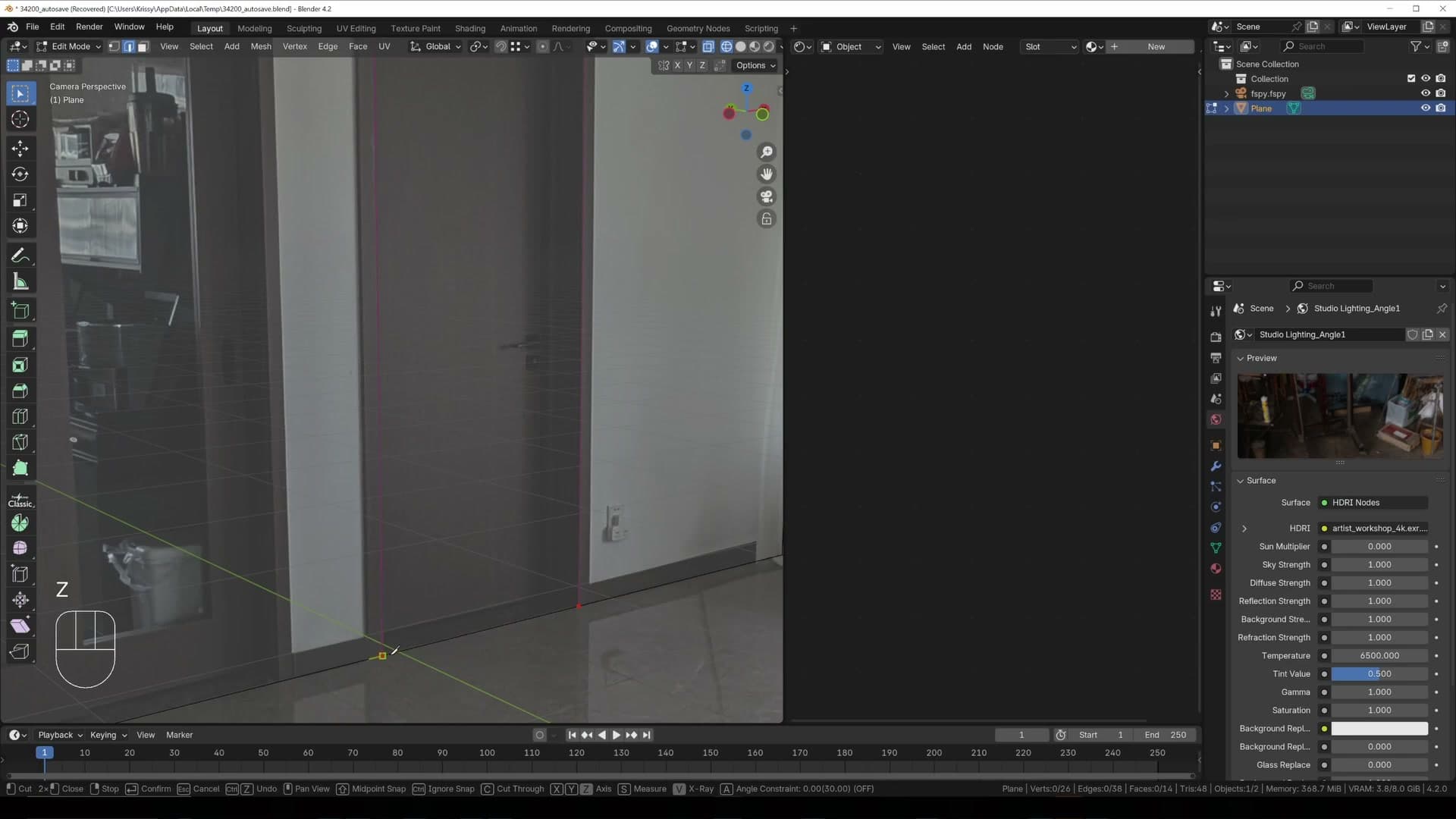
Repeat the same pattern for the second door. Press K to bring the Knife back, click to start, press Z, click, press X, click, press Z, click, then Enter. Locking each segment to an axis as you go is what keeps the frame square. Without the Z/X constraints the cuts drift off true and the door reads crooked later.
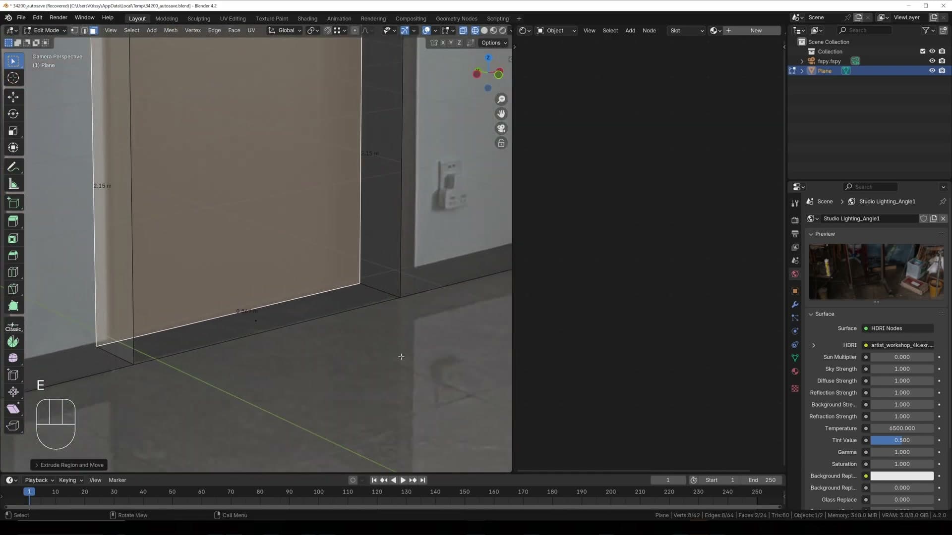
Now give the doors some depth. Press 3 to switch into face select mode, click the new door face, press E and extrude it inward to roughly the thickness of the real door frame. That extrude is what turns a flat cut-out into a recessed opening you can actually walk through in the final scene.
Edge loops and knife cuts for the window frames
Windows are quicker because most of the cuts can be loop cuts rather than freehand knife strokes. Press Ctrl+R and click on the wall to drop an edge loop, then slide it up to the sill height. Turn off edge-length snapping so you can place the loop exactly where you want it, then run a second loop and slide it down for the bottom of the window.
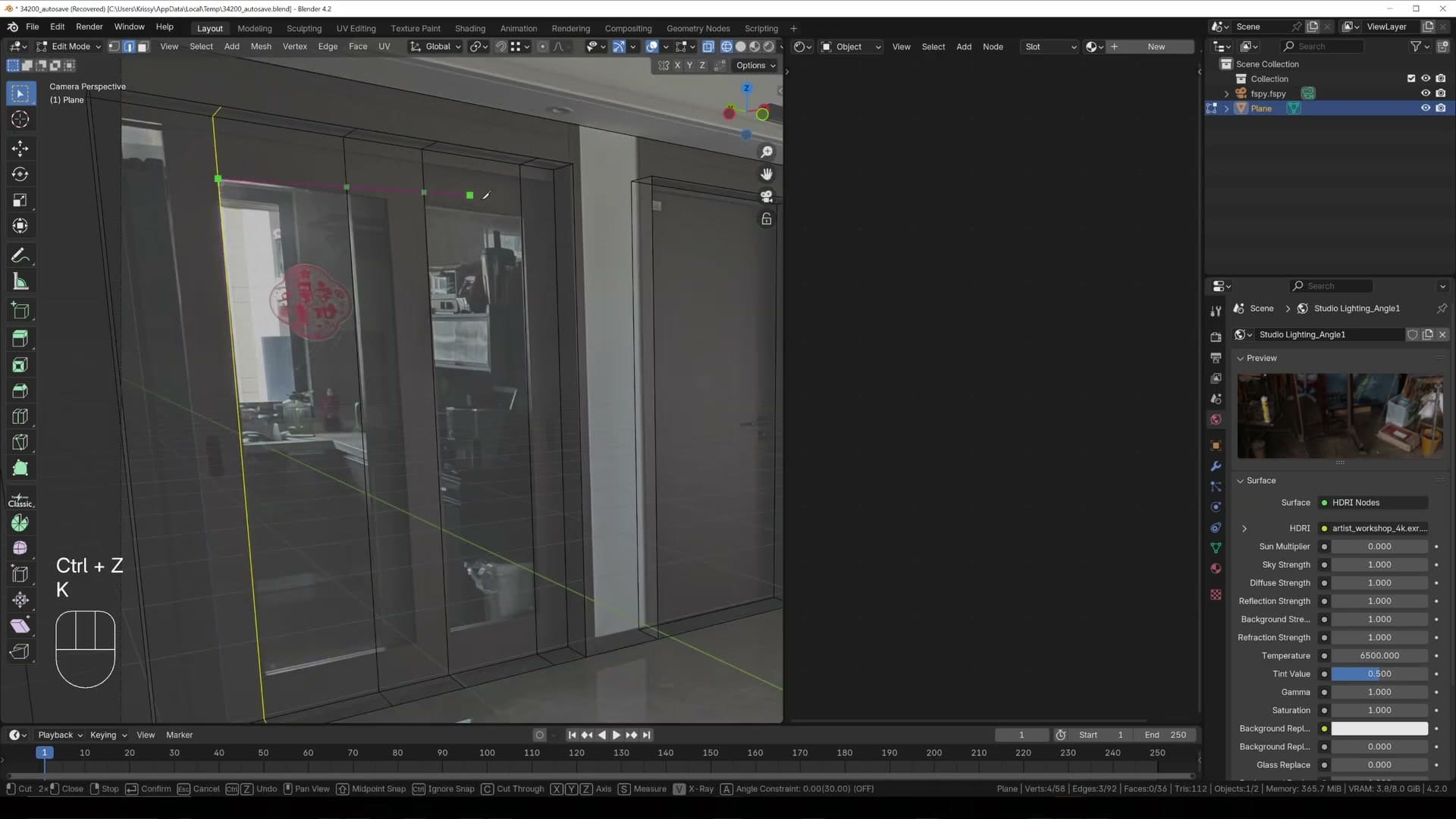
The top edge is the awkward one. Loop cuts can throw odd artefacts depending on how the wall geometry was built, so if Ctrl+R misbehaves, fall back to the Knife. Press K, draw a quick straight line across the top of the window, and press Enter. It is the same result in two clicks.
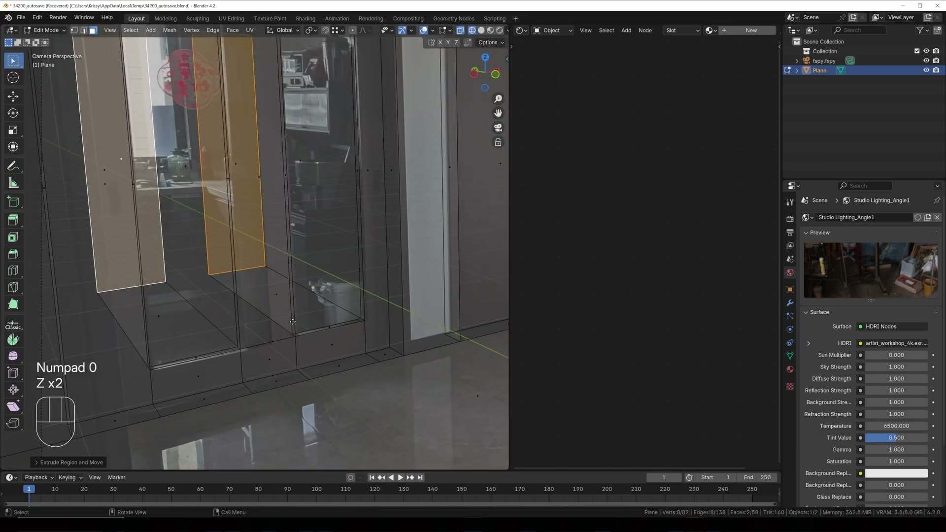
Select the new window faces and press E to extrude them inward by roughly the depth of the door frame. This is the reveal where the glass would sit. Then press E a second time and push that face back outward, roughly to the thickness of the wall, so the opening punches all the way through. Eyeball the depth; it does not need to be exact, just close enough that the window reads as a real hole rather than a painted-on rectangle.
Bridging faces for the deep window reveal
The two window cut-outs are still separate openings at this stage: an inner face and an outer face with nothing joining them. Select both faces, right-click, and choose Bridge Faces. Blender stitches the two together into a single tunnel through the wall, which is exactly what a real window reveal looks like.
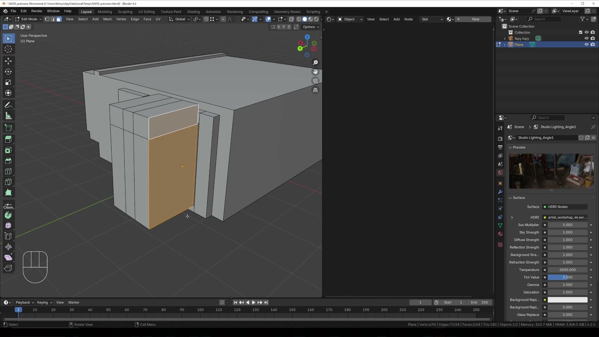
Finally, click the new top faces, press E followed by Z, and lift them upward to open a small skylight above the windows. This extra slot is what will let an area lamp pour daylight into the room in a later step. Without it the interior would stay completely sealed and the lighting pass would have nothing to bleed through.
Projecting the photo as a texture and fixing warps
Project-from-view unwrapping warps badly on n-gon walls. A sharp remesh modifier converts the room to quads so the texture lands cleanly.
First project-from-view unwrap and the warping problem
With the room selected, drop into edit mode, select everything, press U and pick Project from View. Head over to the Materials tab, click New, and name this material room.
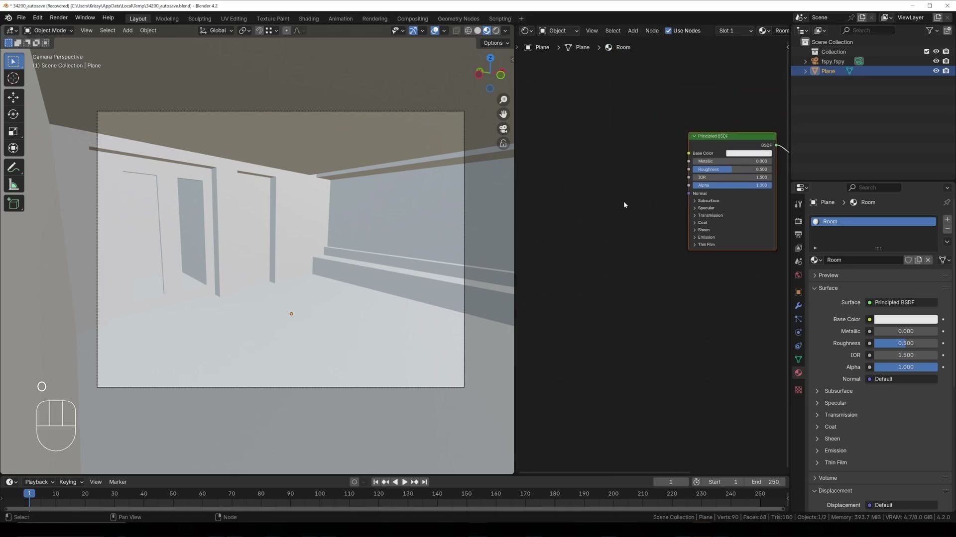
Now add an image texture to the base colour. fSpy has already loaded the reference photo into the scene, so click the image-browse button on the texture node and pick the fSpy image rather than browsing the disk for it.
The result looks very strange. The photo is completely warped across the geometry and is unusable as it stands. The reason is that there is not enough data for Blender to understand how to unwrap this mesh correctly: most of the room consists of large n-gon faces, so the projection has nothing to anchor onto outside the camera's frame.
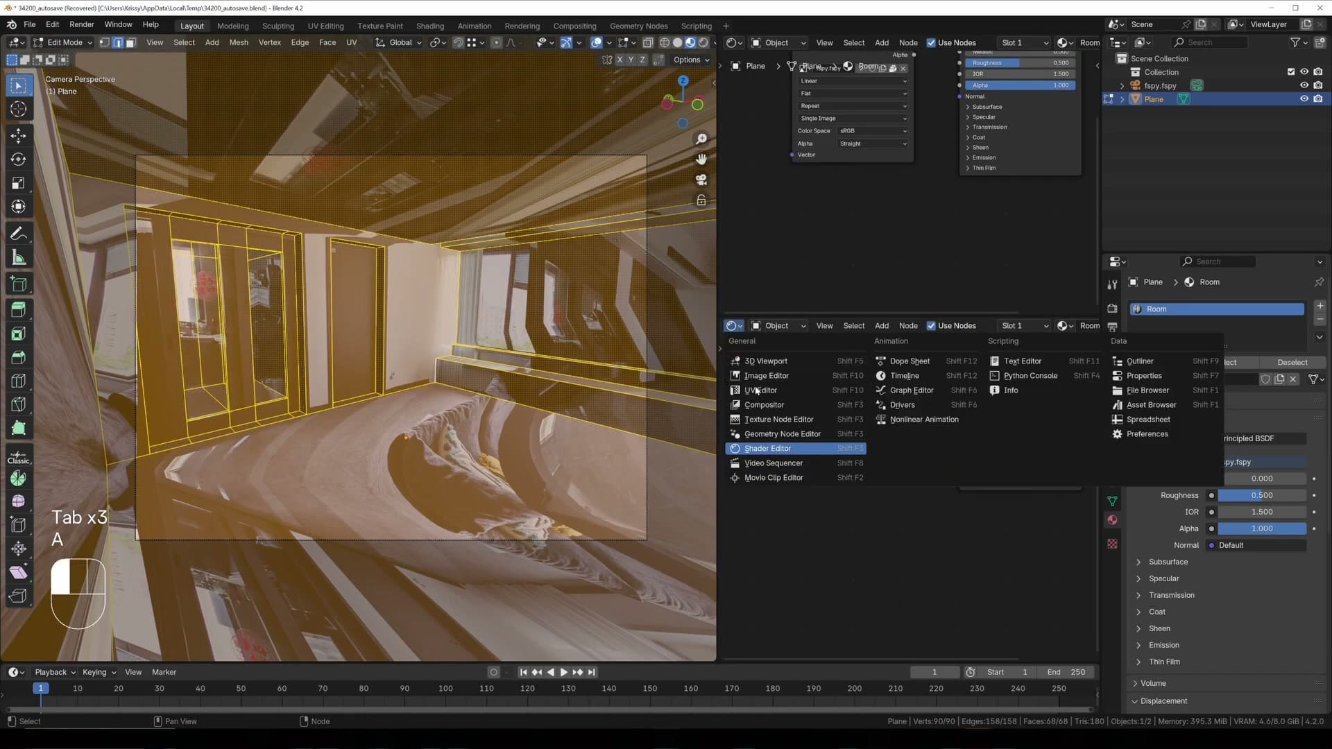
If you slide the workspace open and switch to the UV editor, you can see exactly what has gone wrong: the edges of the room that fall outside the camera's view have collapsed in on themselves. The fix is to convert the mesh into quads before unwrapping again.
Sharp remesh at level 6 to create quads
Open the Modifiers tab, add a new modifier and type Remesh to filter the list down.
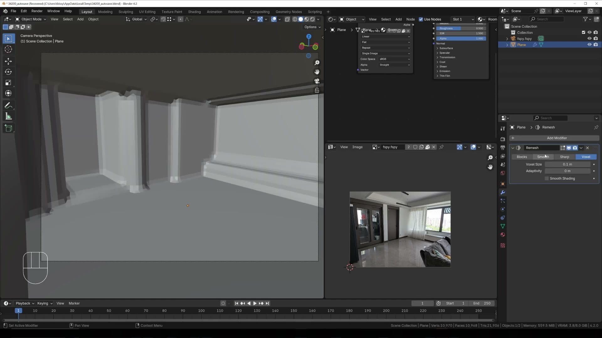
With the Remesh modifier added, click the Sharp mode button and increase the octree depth to 6. Toggling the modifier on and off, you can see the whole room has been rebuilt as quads, which is exactly what you want for the next projection.
Six is the sweet spot here. It keeps the original silhouette of the room intact without softening the corners. If your scene loses any geometry at this value, push the depth up to 7 and re-check the shape.
Reapplying project-from-view for a clean result
Hover over the Remesh modifier and press Ctrl+A to apply it. Drop back into edit mode, press U and choose Project from View a second time. Switch the viewport to Material Preview and the photo now sits cleanly across the entire room with no visible distortion.
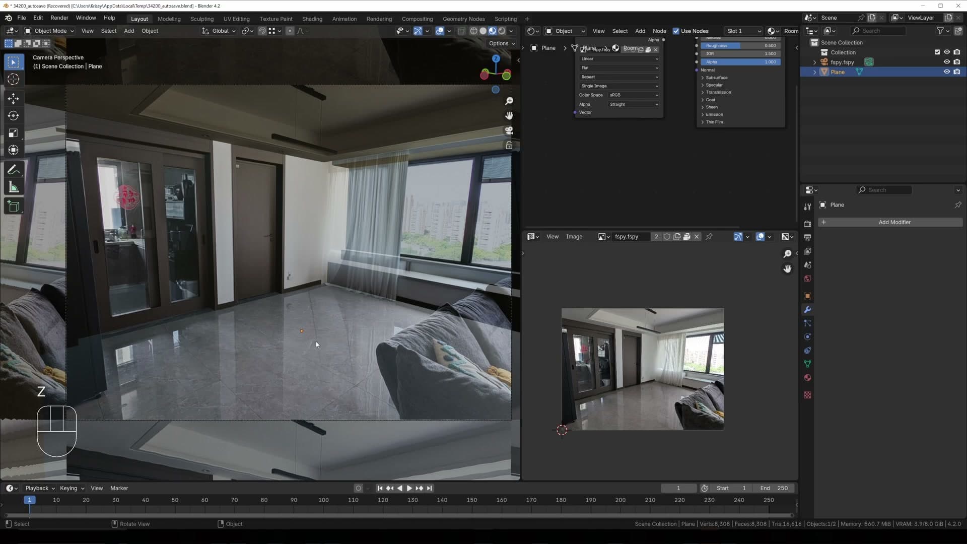
Splitting visible from hidden geometry
A camera-aligned plane plus a Boolean difference splits the room into a clean photo-mapped half facing camera and a plain-walls half behind it.
Adding a plane locked to the camera's rotation
Through the lens the room looks correct, but the moment you orbit behind the camera the geometry collapses into a warped, interstellar mess of stretched walls. Most of the time you can ignore it. Nobody is rendering from back there. The problem appears as soon as you drop a reflective object into the scene. A glossy floor or a chrome lamp will catch the back of the photo-mapped shell in its reflection, and a wall that should read as plain white will instead reflect a smeared chunk of the original photograph.
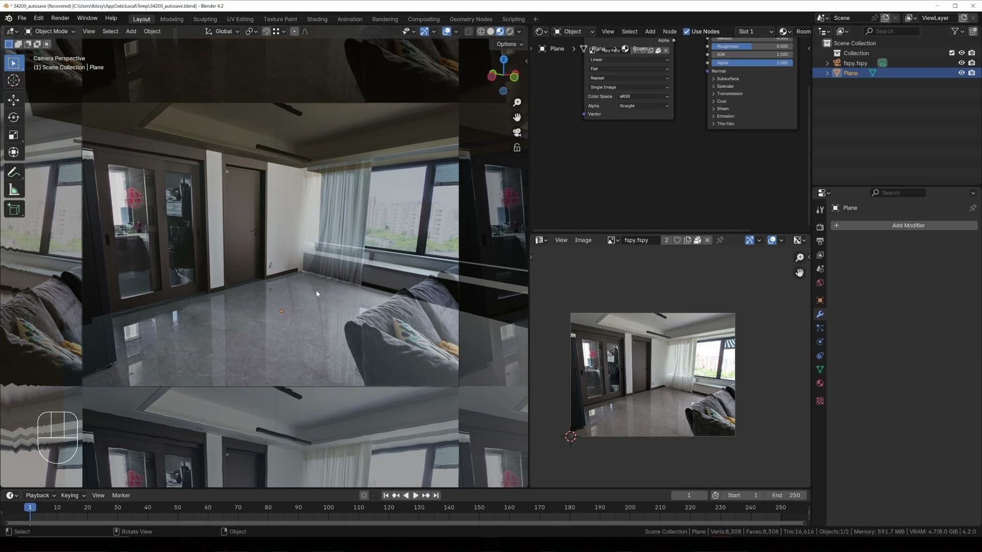
The fix is to split the room into two halves. The front half stays photo-mapped and faces the camera; the back half gets stripped down to plain materials (white walls and a flat floor colour) so reflections behave sensibly. To carve a clean split you need a cutter that exactly matches the camera's framing.
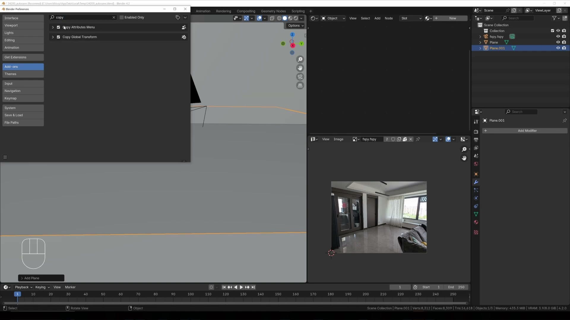
Snap the 3D cursor to the camera with Shift+S › Cursor to Selected, then add a plane. The plane lands at the camera's origin but stays in world orientation, which is no use yet. The next sub-lesson locks it to the camera's rotation.
Copy attributes add-on for the camera rotation
To match the plane's rotation to the camera in a single click you need the Copy Attributes Menu add-on. Open Edit › Preferences › Add-ons and search for copy attributes. If it appears in the list, tick it on. If it doesn't, jump to the Get Extensions tab, search the same term, and install it from the Blender extensions platform.
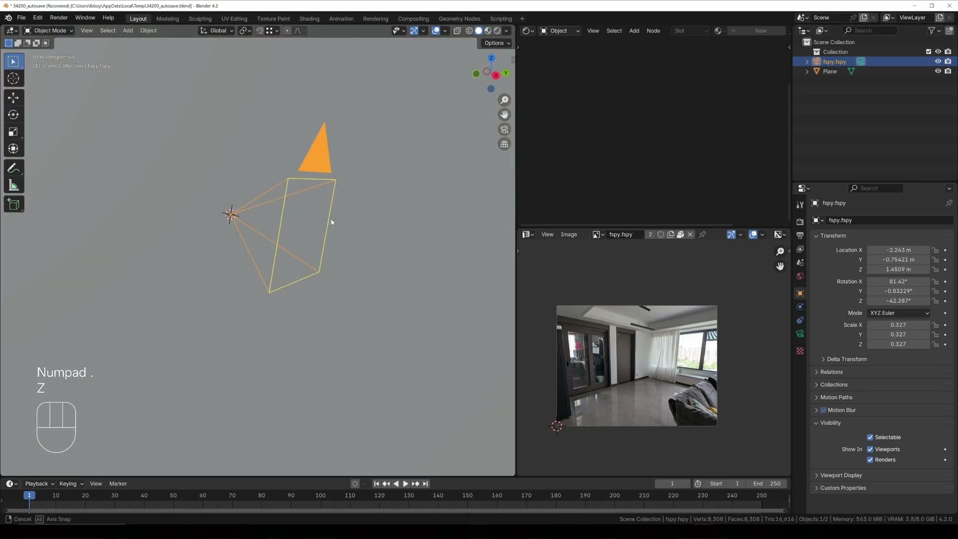
Back in the viewport, select the plane first, then Shift-click the camera so the camera is the active object. Press Ctrl+C to open the Copy Attributes menu and choose Copy Rotation. The plane snaps to the camera's exact orientation.
Switch the transform orientation header to Local so the next moves run along the plane's own axes rather than world. Press G Z to push the plane forward along the camera's local Z until it sits a short distance in front of the lens, then scale it in until each edge lines up with the camera's frame. Finish with S Y to flatten it on its local Y so the plane sits flush with the camera's view, covering exactly what the lens sees and nothing more.
Extruding the plane to form the camera frustum volume
A flat plane can't cut a 3D room. You need a volume. To grow the plane into a frustum that radiates outward from the lens, the camera itself has to act as the pivot point.
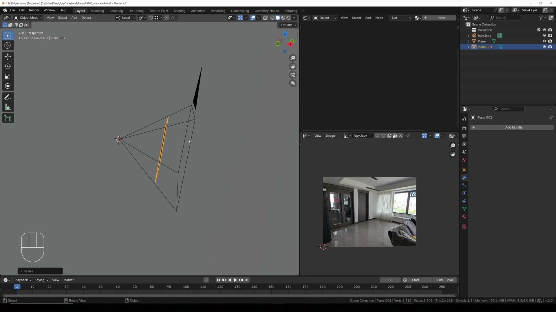
With the camera selected, run Shift+S › Cursor to Selected again so the 3D cursor is sat exactly on the lens, then set the pivot point in the viewport header to 3D Cursor. Drop into edit mode on the plane, select all of its geometry, and press E followed immediately by S. Scale outward until the extruded box completely encloses the building. The frustum should punch straight through every wall, floor and ceiling of the room with room to spare.
Back in object mode, select both the room and the frustum and press Ctrl+J to join them into one mesh. Press Shift+D to duplicate the joined object and hide one of the copies for now. You'll Boolean each copy in opposite directions in the next step: one to keep the camera-visible half, one to keep the rest.
Boolean difference splits the room in two
Unhide the first copy and enter edit mode. Click any edge of the frustum and press Ctrl+L to select-linked across the entire extruded box. With that selection live, hit F3 and search for Boolean. A small operator panel docks at the bottom of the viewport. Set the operation to Difference and the solver to Fast.
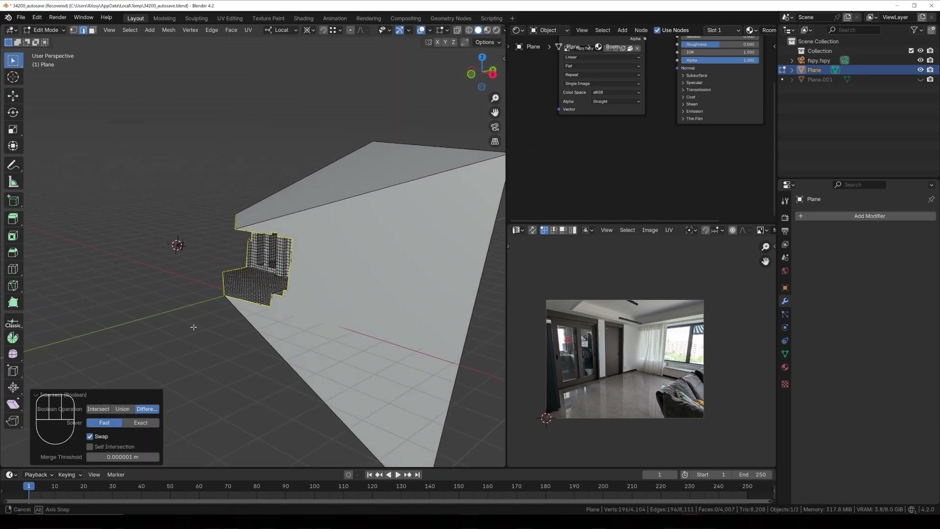
Blender's Booleans can be temperamental and you may need to try different options for your own scene. On this room the Exact solver produces a bad result, so Fast is the right call. The operator panel also exposes a Swap toggle. Flicking it flips which side of the cut is kept versus discarded, so you can preview both halves without re-running the operation.
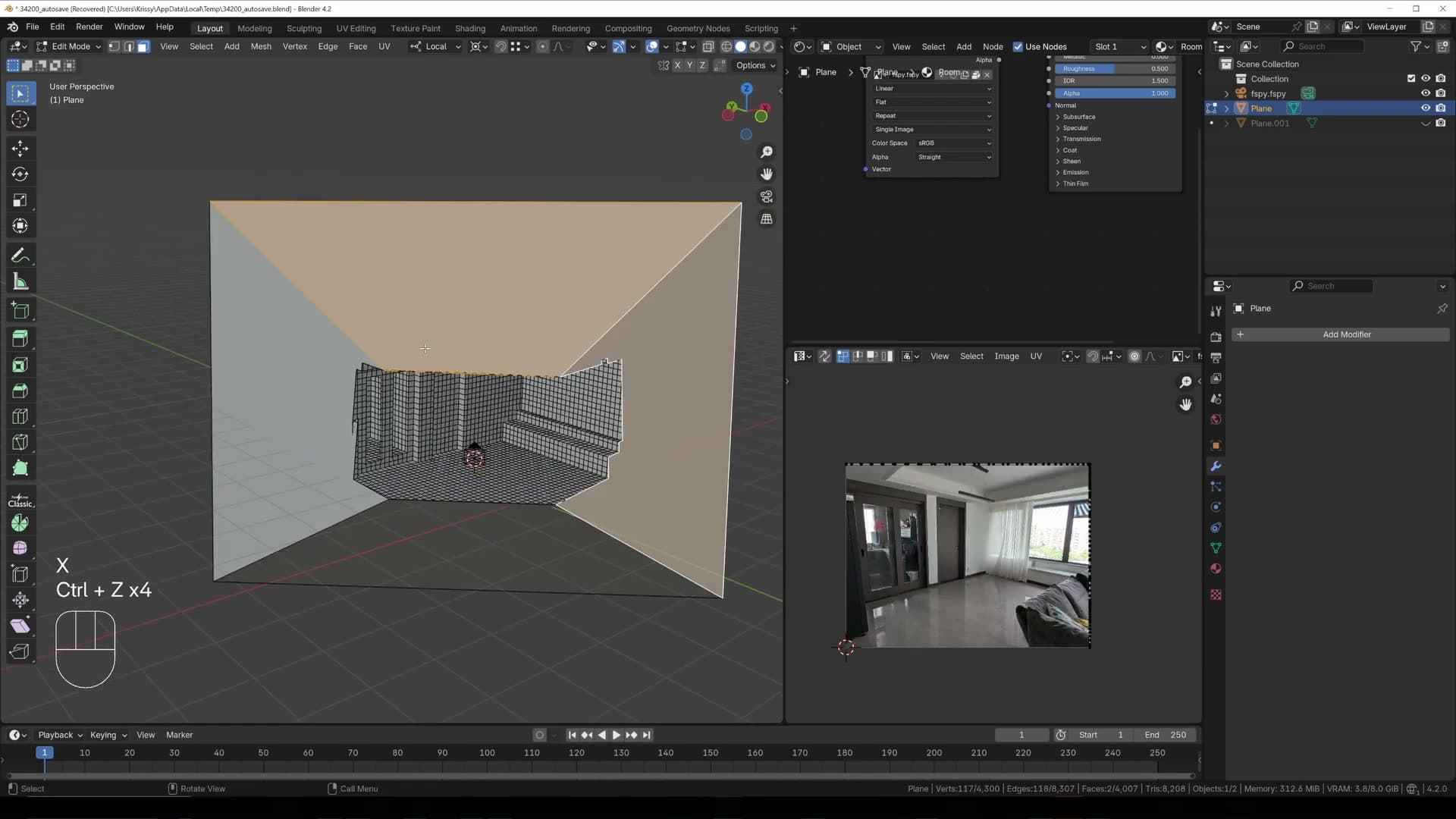
The cut leaves the leftover frustum geometry attached to the room mesh. With the cut edges still selected, press V to rip them apart, then select the leftover frustum box and remove it with X › Faces. If V refuses to separate cleanly, switch to face select with 3, box-select the extra faces by hand and delete them. The end result is identical.
Now unhide the second copy and repeat the same recipe: edit mode, Ctrl+L on a frustum edge, F3 › Boolean, Difference, Fast. This time tick the Swap checkbox so you keep the opposite half. You end up with two clean shells: the photo-mapped front facing the camera and the plain back half ready to receive white wall and flat floor materials.
Wall, floor and window materials
Assign a plain wall material to the hidden half, sample the floor colour with the eyedropper, then delete window faces so light can come through.
Plain wall material and eyedropper floor colour
With the room split into a camera-facing half and a hidden half, the back half no longer needs the projected photo material. The unwrap behind the camera is messy, and you only ever see those faces edge-on anyway. Select the hidden half, remove the projected material from its slot, and add a fresh one. Call it wall: every wall and the ceiling in this scene are going to read as plain white, so one neutral material covers all of them.
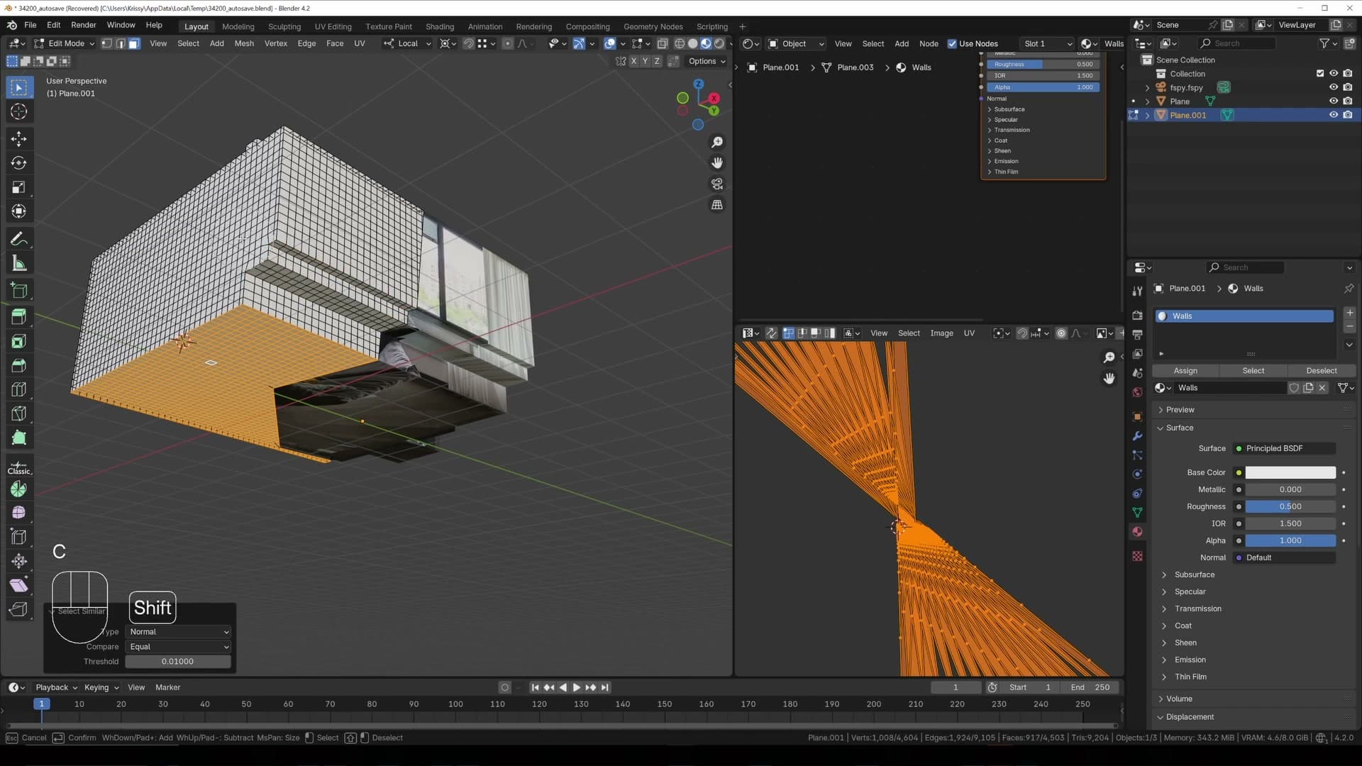
The floor needs a slightly different colour from the walls, so isolate the floor faces before assigning a new material. Click one face on the floor, then press Shift+G and choose Normal. Blender selects every face pointing in the same direction. If anything other than the floor sneaks into the selection (the ceiling faces upward too in some scenes), deselect those by hand until only the floor remains.
Add another new material slot, name it floor, and click Assign so the selected faces take it. To match the floor tone in the photo, click the Base Color swatch, switch to the eyedropper, and sample directly from the main floor area in the viewport. The new material now carries the dominant colour of your real floor without any guesswork.
Deleting window faces so light passes through
The room still has solid faces where the windows should be, which means no light can pass through later. To open them up, drop into Face select mode and press C to bring up Circle Select. The cursor turns into a brush you can drag across the faces that sit inside each window frame.
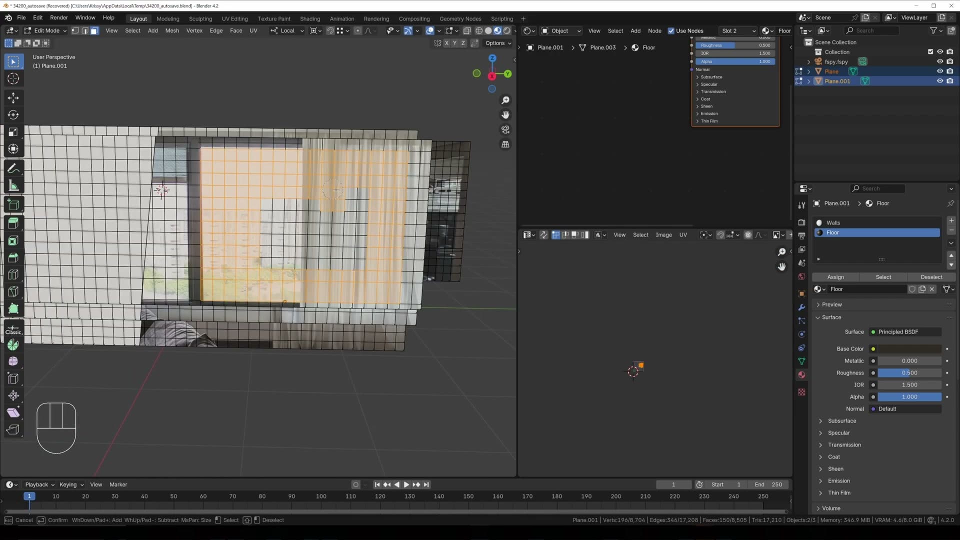
Before painting over a window, check the edge loop that defines its outline. If the loop sits slightly off the actual frame in the photo, tap G G on it to slide along its neighbours and snap it tight against the frame. Then press C again, paint over the window faces, and press X followed by Delete Faces to punch the hole through.
Repeat this for every window on the visible half. For tall windows that run to a corner where the real-life wall stops, include those edge faces in the selection too so the geometry matches the room. As you work, keep an eye on which faces actually sit inside the frame versus which belong to the wall around it.
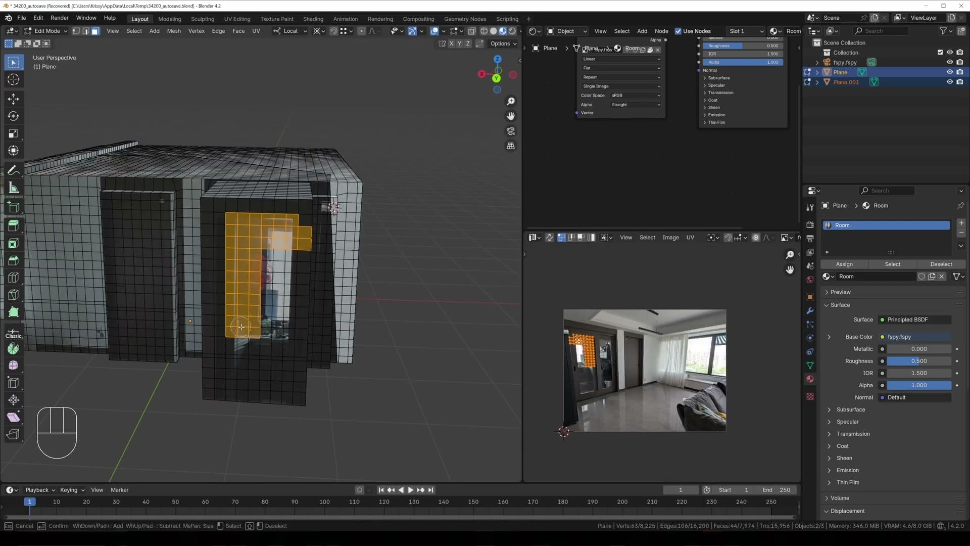
The hidden half still has all of its window faces intact, and those holes have to line up with the visible side or light won't pass through the room cleanly. Select the back-half object, jump into Local View to see it on its own, enter Edit Mode, and delete the matching window faces (including the centre divider between two windows if there is one). Drop out of Local View when you're done.
For square windows you can speed things up by pressing B to use Box Select and drag a rectangle over the faces, which is faster than painting them. Flick into Camera View periodically (Numpad 0) to confirm you're deleting only the panes and not catching nearby wall faces. Once both halves match, every window opening is a clean void ready for light to come through.
Shadow catcher and photo background
Toggle the room to a shadow catcher and wire the FSPY image into the World shader so it becomes the background behind every CG asset you drop in.
Enabling shadow catcher on the room mesh
Switch to rendered view and the room looks almost black. That is fine. You do not actually want to see the room mesh in the final image. Its job is to receive the shadows of the CG furniture you are about to drop in, so that those objects look like they belong on the photo. The trick is to turn the entire room into a shadow catcher.
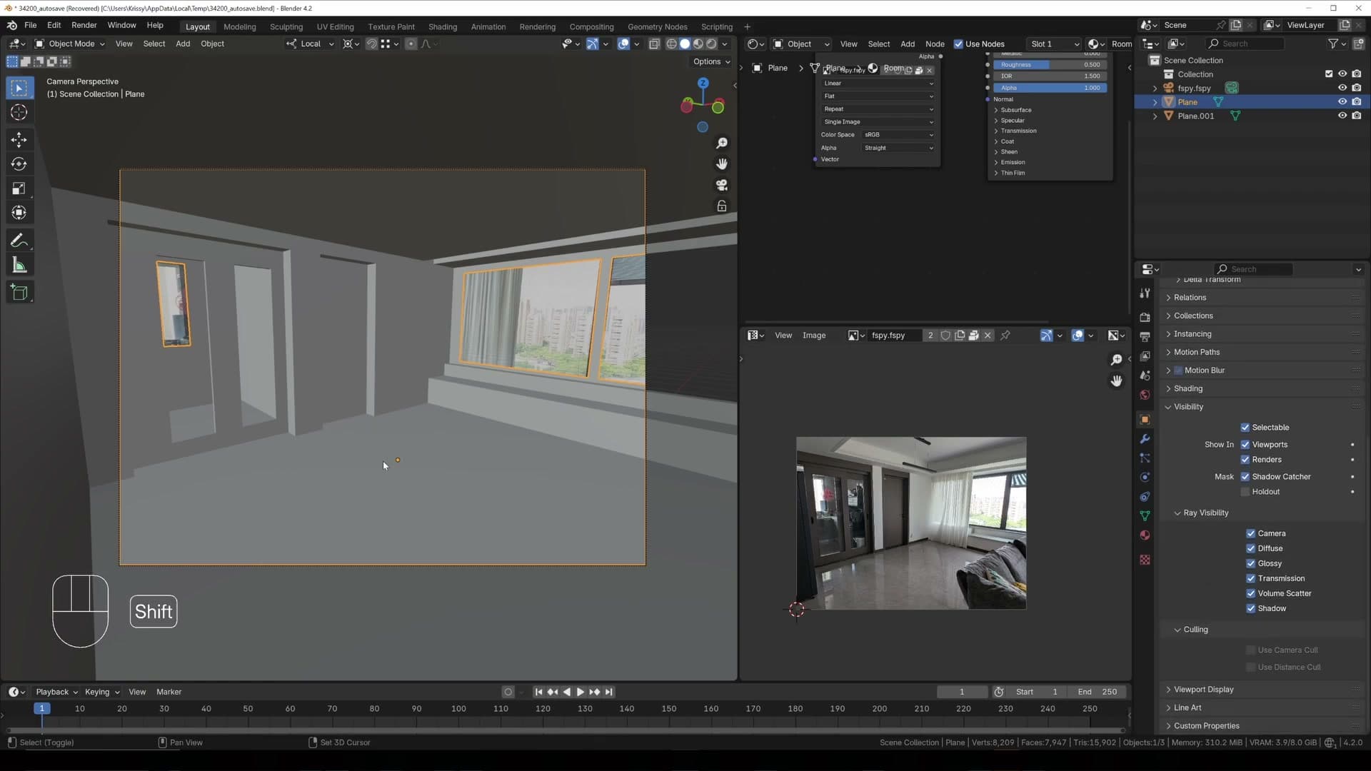
Select the room mesh, open the Object Properties tab, scroll down to the Visibility section and tick Shadow Catcher. The mesh now stops contributing colour to the render and only receives shadows from anything you place in the scene.
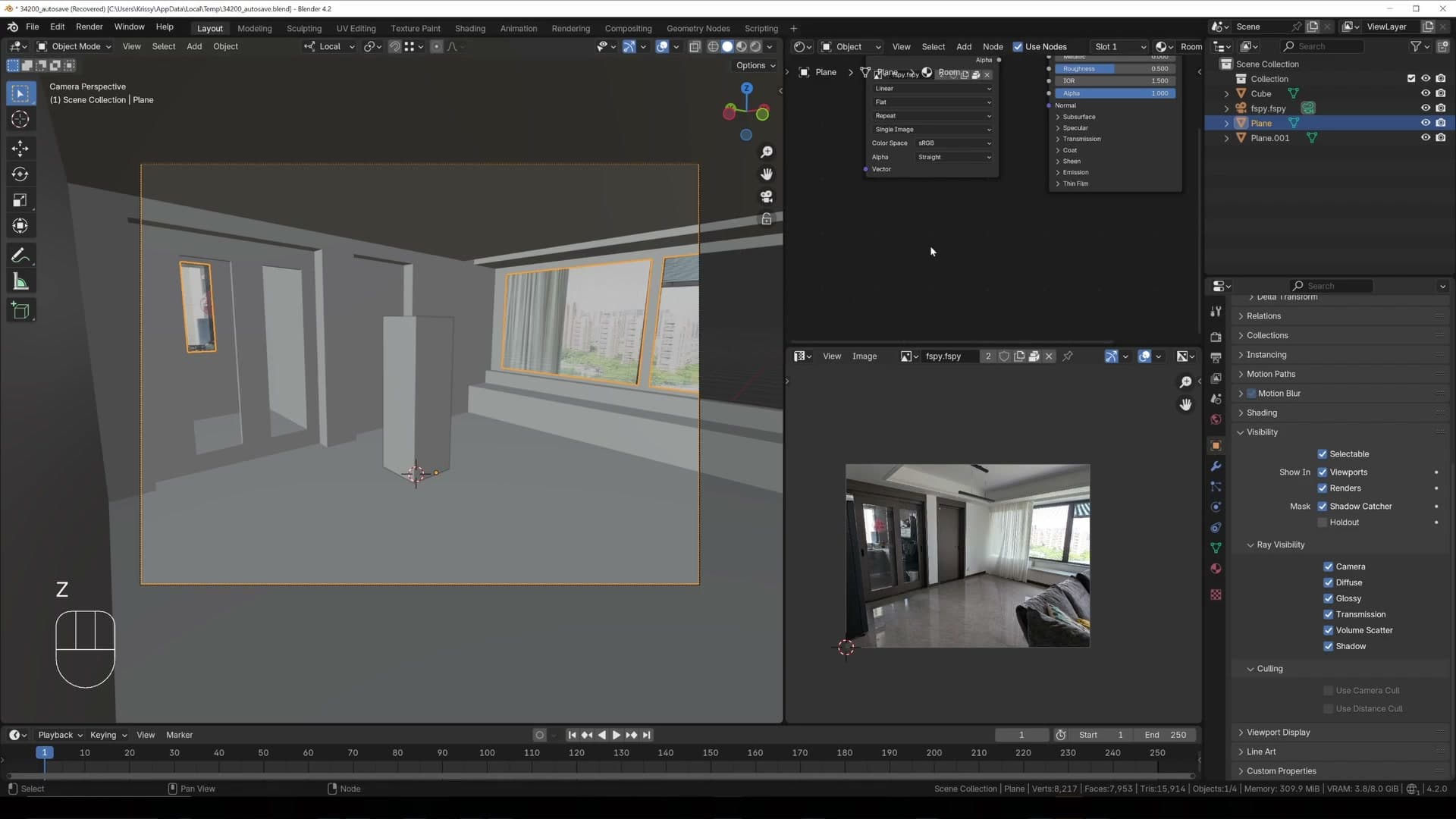
Test it straight away. Add a default cube, scale it up a touch so it sits clearly on the floor, and switch to rendered preview. You should see a real shadow falling behind the cube onto what used to be the dark room geometry. The shadow is correct, but the background behind everything is still the default world HDRI. That needs to become your room photo, which is the next step.
World shader with the FSPY image as background
Delete the existing world and create a new empty one, then open the Shader Editor and switch the dropdown from Object to World. You will build a tiny node chain that pins your fSpy photo behind the camera as a flat backplate.
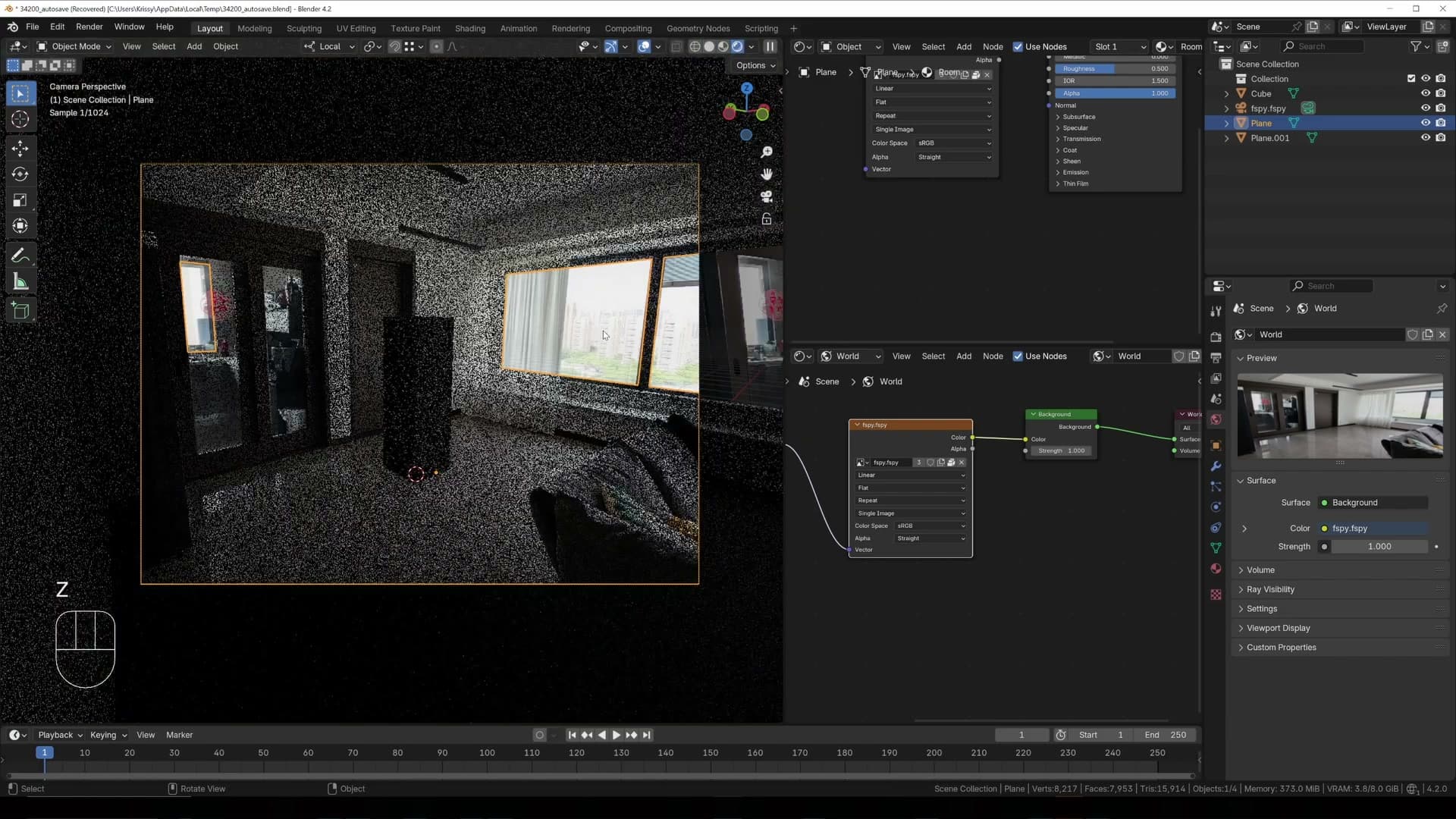
Add an Image Texture node, a Mapping node and a Texture Coordinate node. Connect the Window output of the Texture Coordinate node into the Vector input of Mapping, Mapping into the Vector input of the Image Texture, and the Image Texture colour into the Background input of the world output. Load the same fSpy photo into the Image Texture node.
Preview the render and the background now reads as the actual room rather than the default HDRI. It will still look very dark (the photo is being lit by the same dim world as before, and the room itself is a fairly shadowy space), but the geometry, the shadow catcher and the backplate are now all aligned. The lighting fix comes in the next module.
Lighting the room through the window frames
Area lamps positioned inside each window opening fake natural daylight; linked duplicates with Alt+D keep all lamps synced as you tune brightness.
Placing area lamps in each window opening
The fSpy backplate behind the room contributes almost no light to the scene on its own, so the windows currently read as dim panels rather than light sources. The fix is to fake daylight by placing an area lamp inside each window opening and pointing it into the room.
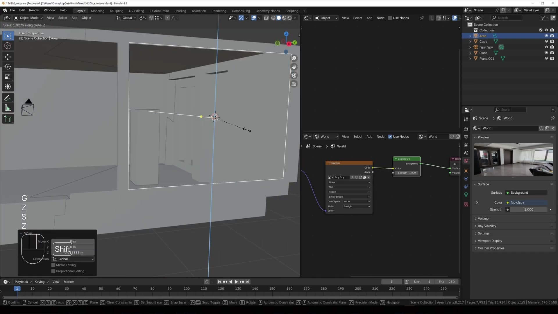
Drop into edit mode and Alt+click the edge loop running around the first window frame. Snap the 3D cursor to that loop with Shift+S → Cursor to Selected, then add an area lamp with Shift+A. Scale the lamp up and rotate it so the face is pointing inwards into the room. Switching the transform orientation back to Global makes the rotation easier to dial in. Keep scaling until the lamp roughly fills the window frame.
Rather than building a second lamp from scratch, use Alt+D to make a linked duplicate. Linked duplicates share their data block, so any value you tweak on one lamp (power, colour, size) propagates to every copy. Set the first lamp's power to 100 and the duplicate jumps to 100 as well, which is exactly what you want for a row of windows that are all being lit by the same sky.
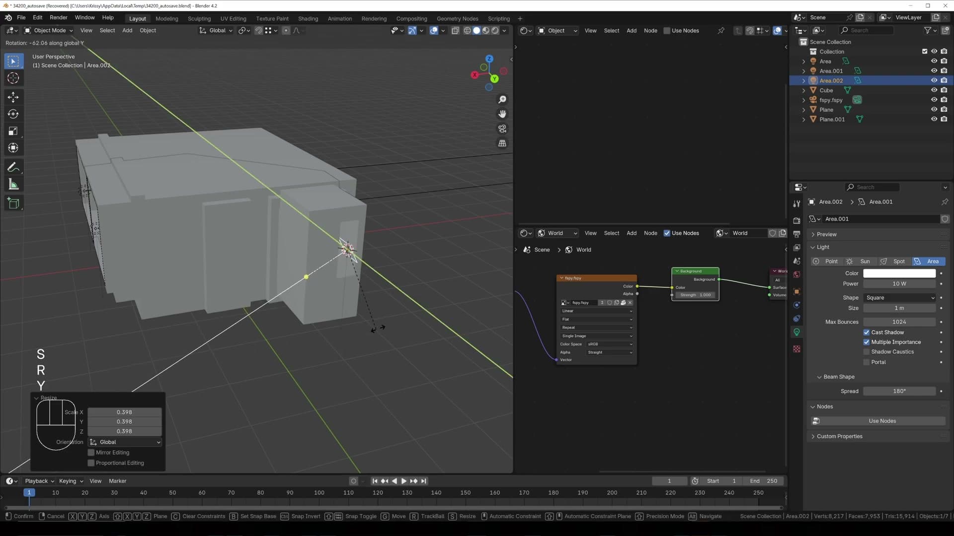
Repeat the loop-select-and-snap routine for the second window: Alt+click the frame loop, Shift+S → Cursor to Selected, add another area lamp, and rotate it (typically three 90-degree rotations on different axes until it faces the right way) so it also emits into the room. Scale it to fill the opening.
Switch to rendered preview and the interior reads much brighter and far more believable. The window frames are now genuine light sources instead of holes in a wall.
Matching CG brightness to the photo
With the lamps lit, the next job is calibrating their power so the CG geometry sits convincingly inside the photo. The trick is to pick a known-white surface in the real-life image and compare it to a known-white surface in CG. The wall in the photo is white, and the default cube in the scene is also white, so the two should be reading at roughly the same brightness.
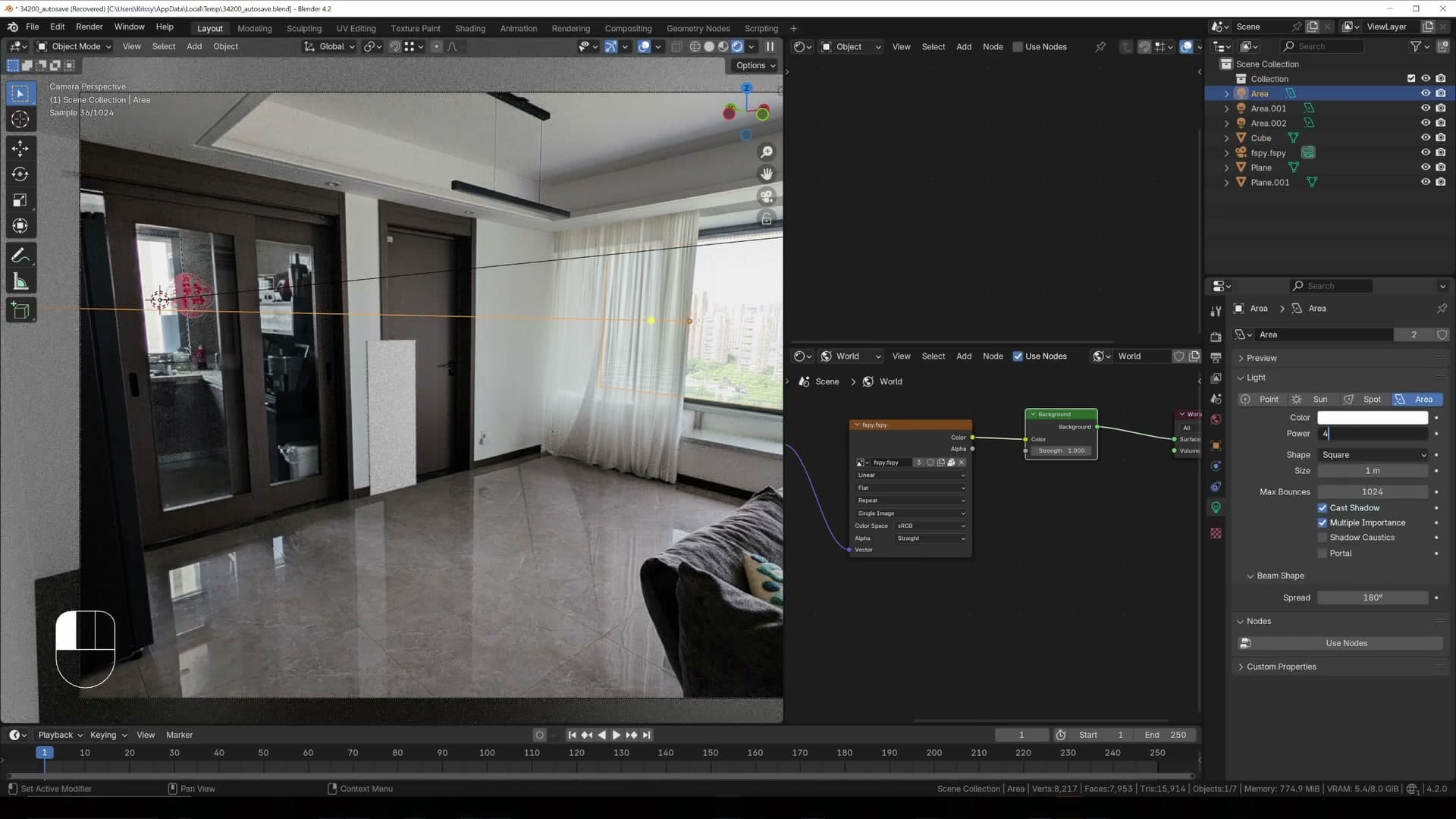
Adjust the area-lamp power up or down by eye until those two whites match. If the lamps are too strong, the cube will go pure white while the painted wall in the photo still looks slightly off-white. Too weak and the cube will look grey next to the wall. Nudge the value down when the CG side blows out, nudge it back up when it goes muddy, and stop when they read as the same tone.
Colour is a separate question. The light coming through real windows is rarely pure white. Outside this particular room the sky is reading slightly blue, but the area lamps are emitting neutral white. You're not trying to match the colour exactly here, only the brightness. As you drop in more furniture and the scene fills out, expect to come back and tweak these values again to keep everything looking natural.
This is always an approximation. Without a real HDRI shot from outside the window, you'll never hit 100% accuracy. Matching the whites by eye gets you most of the way there, and the room is now ready for furniture.
Dropping in furniture from the iMeshh library
With the room scaled and lit, any pre-built asset can be appended and will inherit the photo's light and shadow direction automatically.
Appending an iMeshh asset to the scene
With the room scaled, lit and ready, you can finally bring in some furniture. The iMeshh library carries over 2,000 ready-made furniture assets, so drop one straight into the scene to confirm the workflow is paying off.
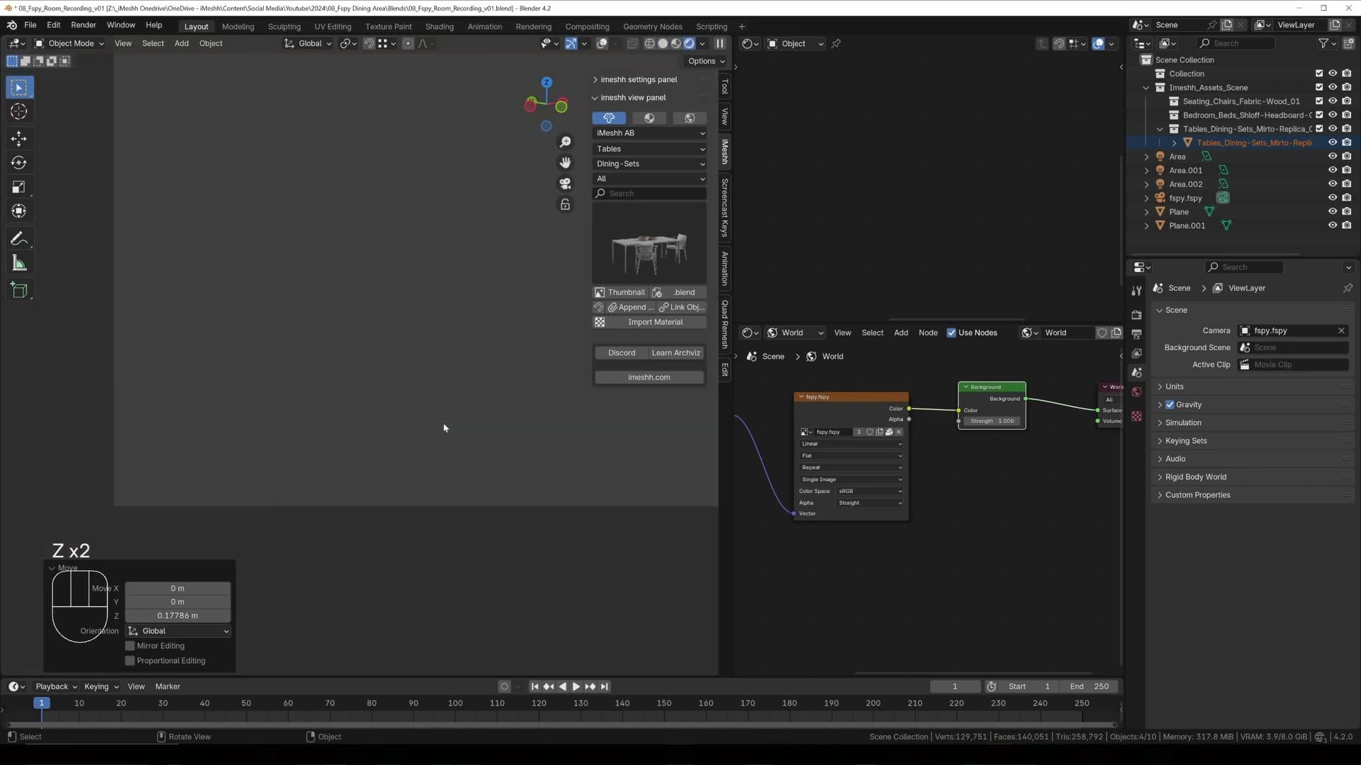
This is effectively the hardest part of the project done. Any item you append automatically picks up the area-lamp lighting and casts shadows in the right direction, because the shadow catcher and window lights are already doing the heavy lifting. You can place the object anywhere in the room and it keeps matching the photo. It's quite something how well this sometimes works.
Reviewing the result will often reveal a light you forgot to switch on earlier. Increase its brightness and adjust any other values that look unnatural until the lighting on the new asset reads convincingly. From this point onwards, the work is mostly a case of playing with a couple of lights and dropping in the items you want.
Camera passepartout and viewport denoising
Once furniture is in place, it helps to focus the viewport on what the final render will actually show. In the camera view, open the Passepartout setting and slide its opacity up so that everything outside the camera frame is dimmed. Your eye stops wandering to off-screen geometry and stays on the part of the image that matters.
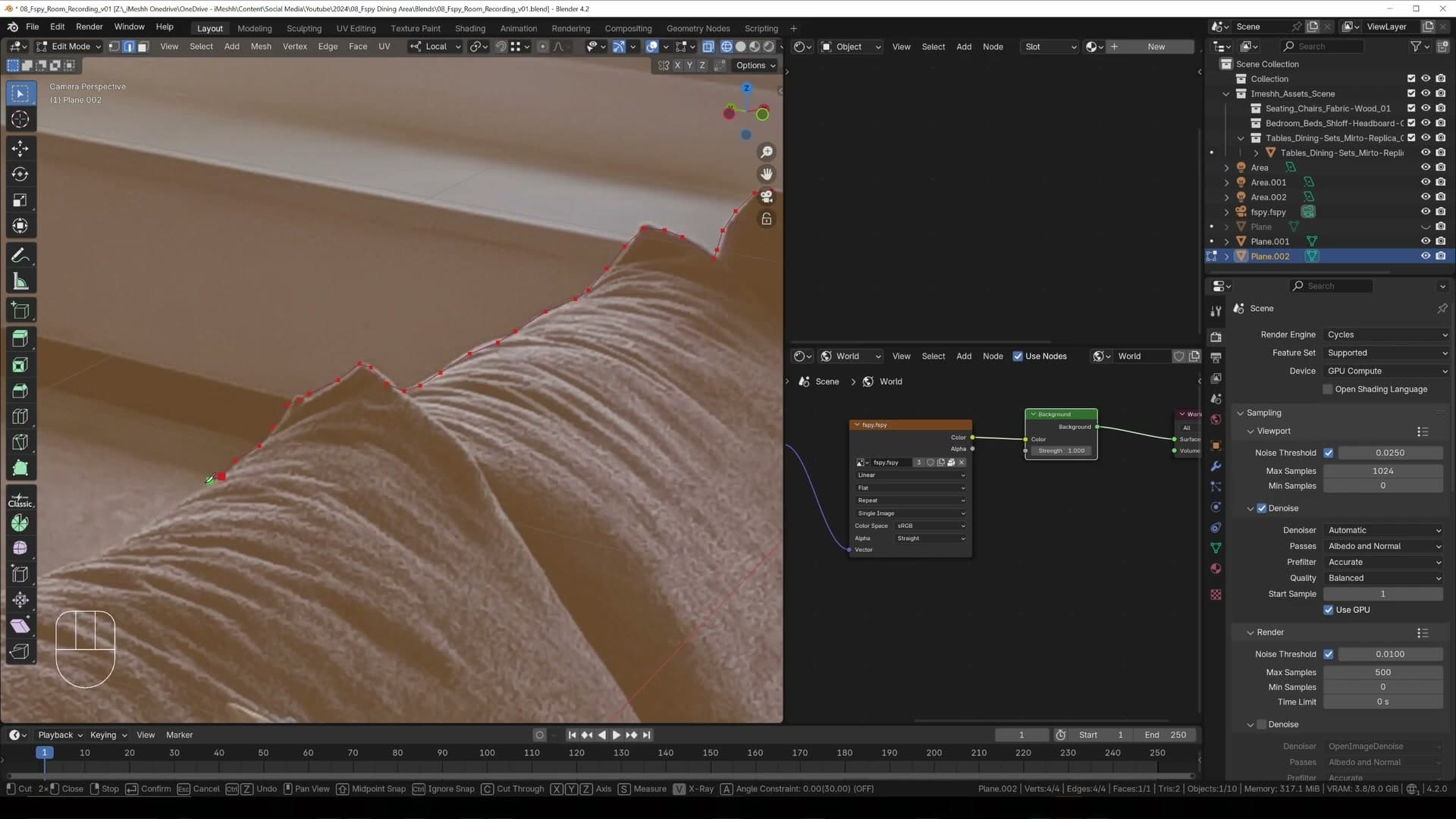
Next, head into the render settings tab and enable viewport denoising for much faster previewing. Set it to a fairly high quality so the preview reads cleanly, and as long as your GPU is reasonably fast you will get very rapid feedback on how the project is going to look.
Cutting out a foreground sofa with an emission plane
Knife the sofa silhouette out of a camera-aligned plane and shade it with emission. CG objects can then pass behind the real-life sofa convincingly.
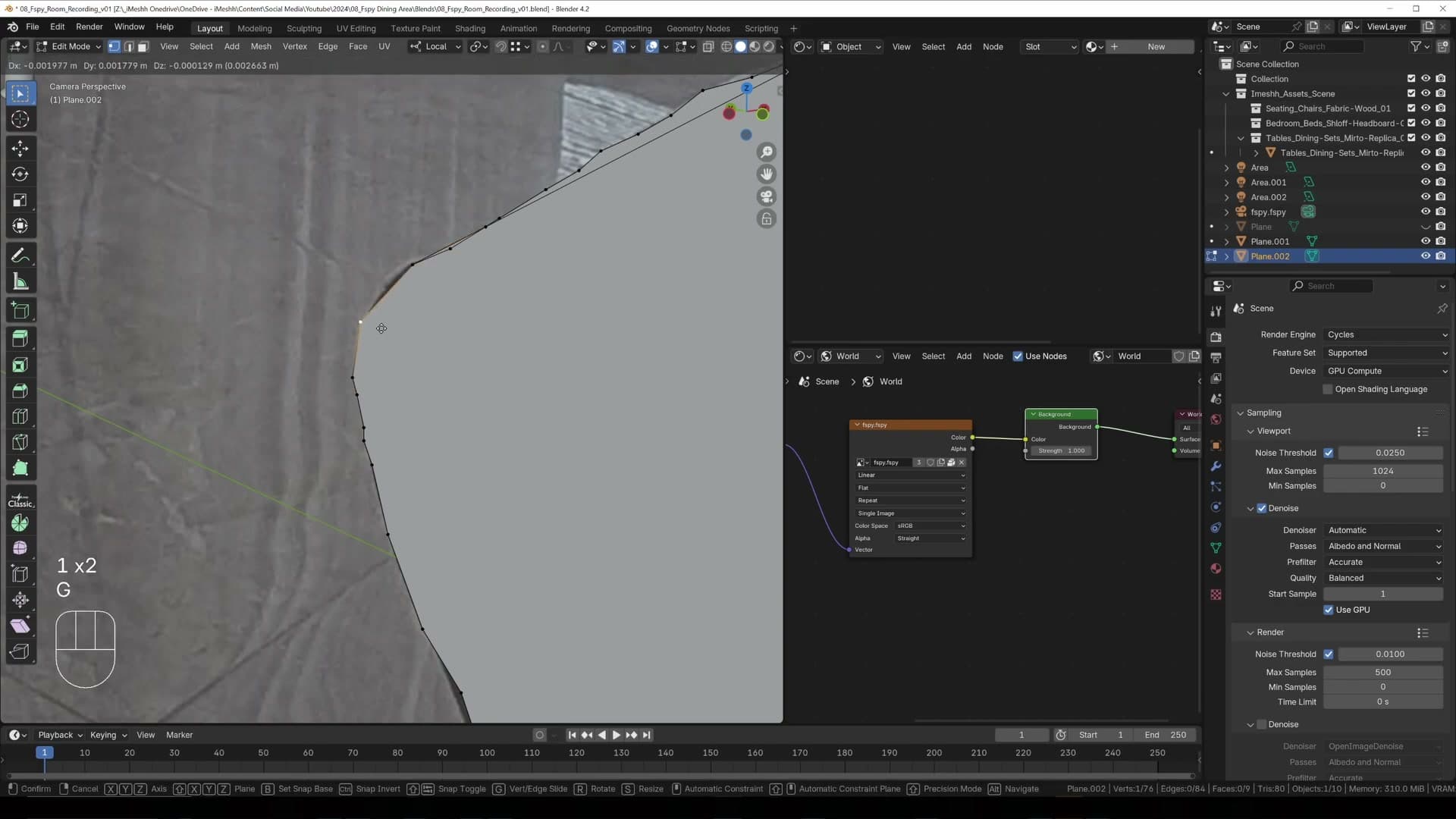
Knifing the sofa outline on a camera-aligned plane
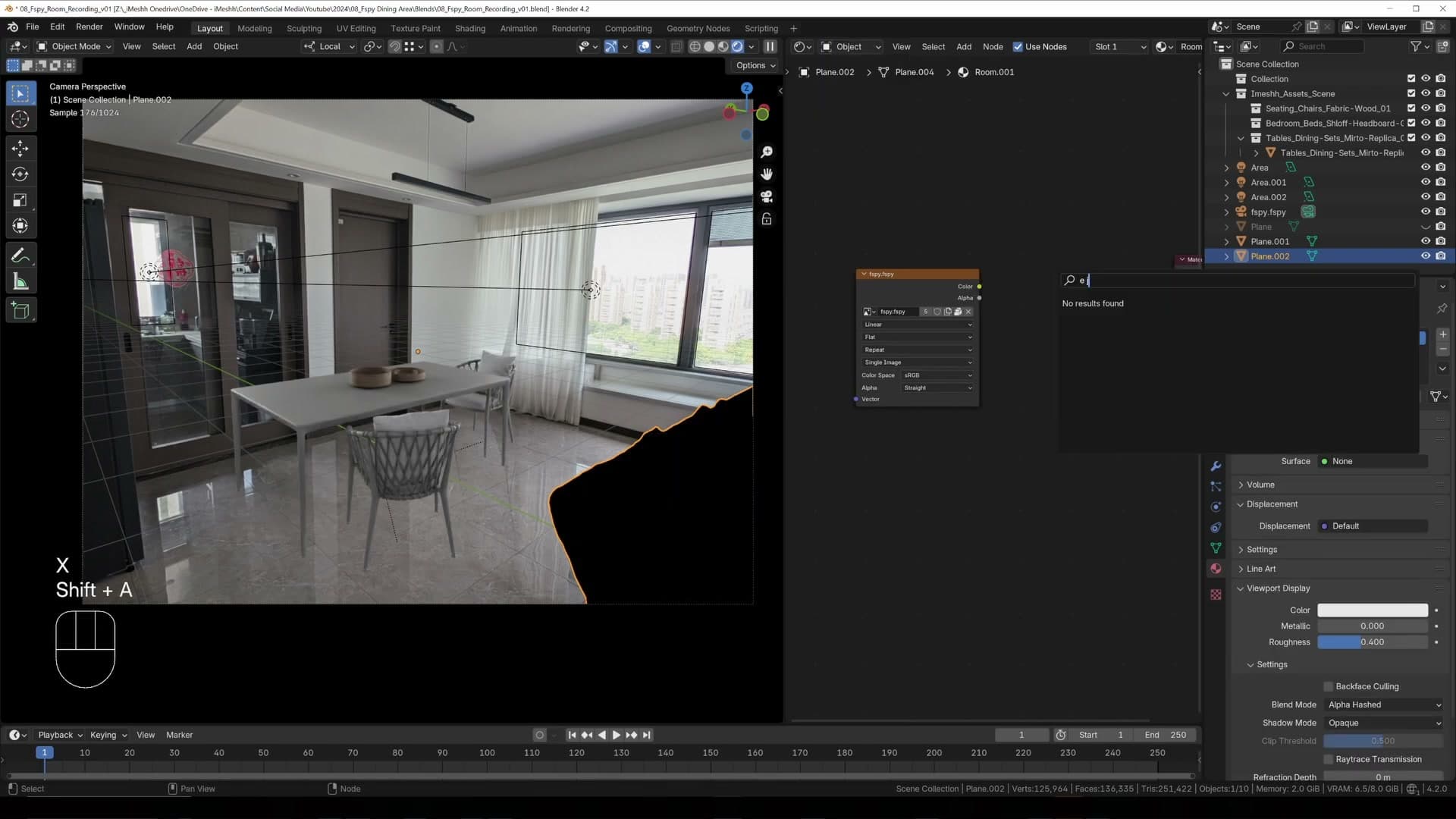
The trick to making foreground objects feel like they belong in the scene is to cut them out on a plane that follows the camera's rotation, so the cutout always sits flat to the lens. With the plane parented to the camera, you knife around the sofa's silhouette directly on the plane, tracing every visible edge (back, armrests, cushions, base) until you've described a closed loop. Delete the surrounding faces and you're left with a sofa-shaped patch hovering in front of the room, ready to be textured with the original photo.
Cleaning up stray knife geometry
The Knife tool often leaves small artefacts that need tidying before you unwrap. Where two cuts don't meet, select both endpoint vertices and press J to join them with a new edge. If a face has appeared that shouldn't be there, delete it. To refine the silhouette where it needs an extra control point, subdivide the existing edge and drag the new vertex out into space. Spend as long as you need on this step. The cleaner the topology, the cleaner the final cutout.
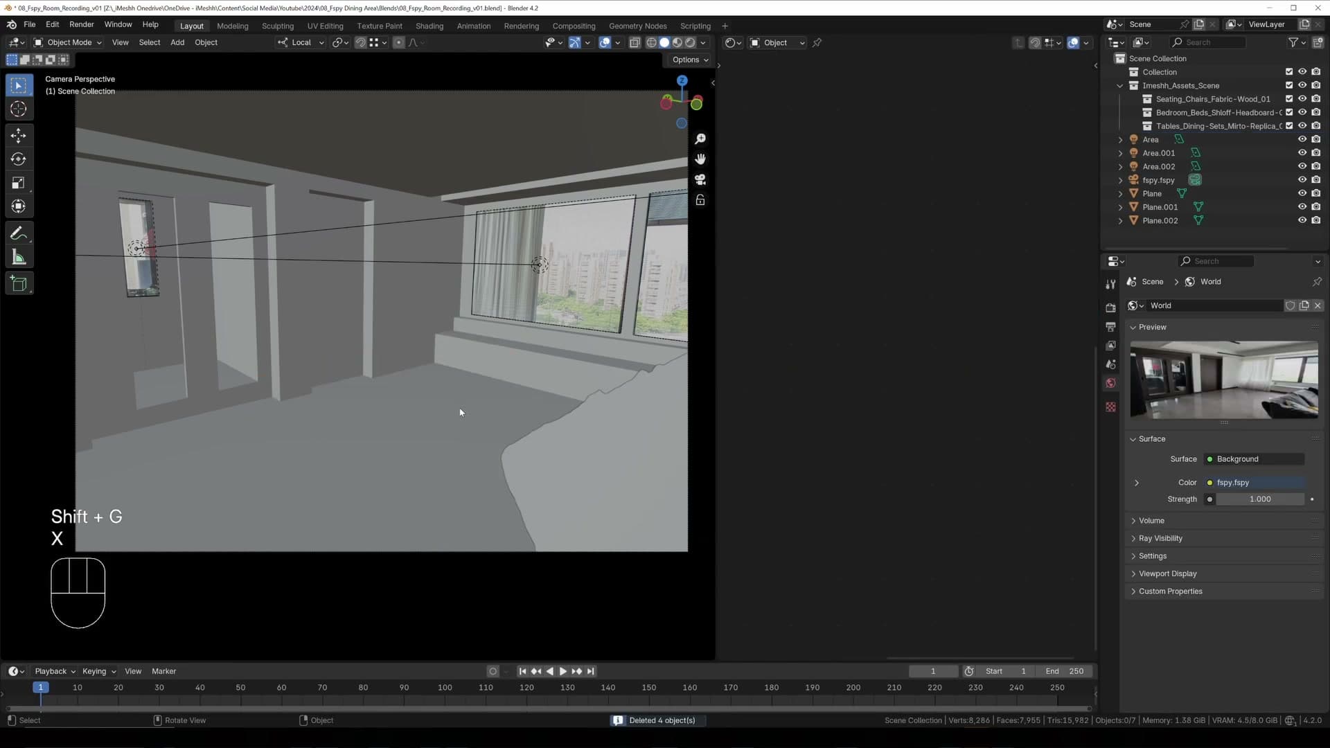
Once the outline is tidy, press A to select everything, then U → Project From View. Switch to Material Preview and confirm the sofa texture has landed in the right spot before moving on.
Emission shader to lock in the photo's lighting
Material Preview makes the unwrap look right, but switching to Render Preview reveals a problem: the sofa cutout is picking up light from the scene's lamps. Sweep one of your area lights past the cutout and you'll watch the surface react. That's wrong. The original photo already has the sofa's lighting baked into it, so any extra contribution from CG lights makes the cutout look fake.
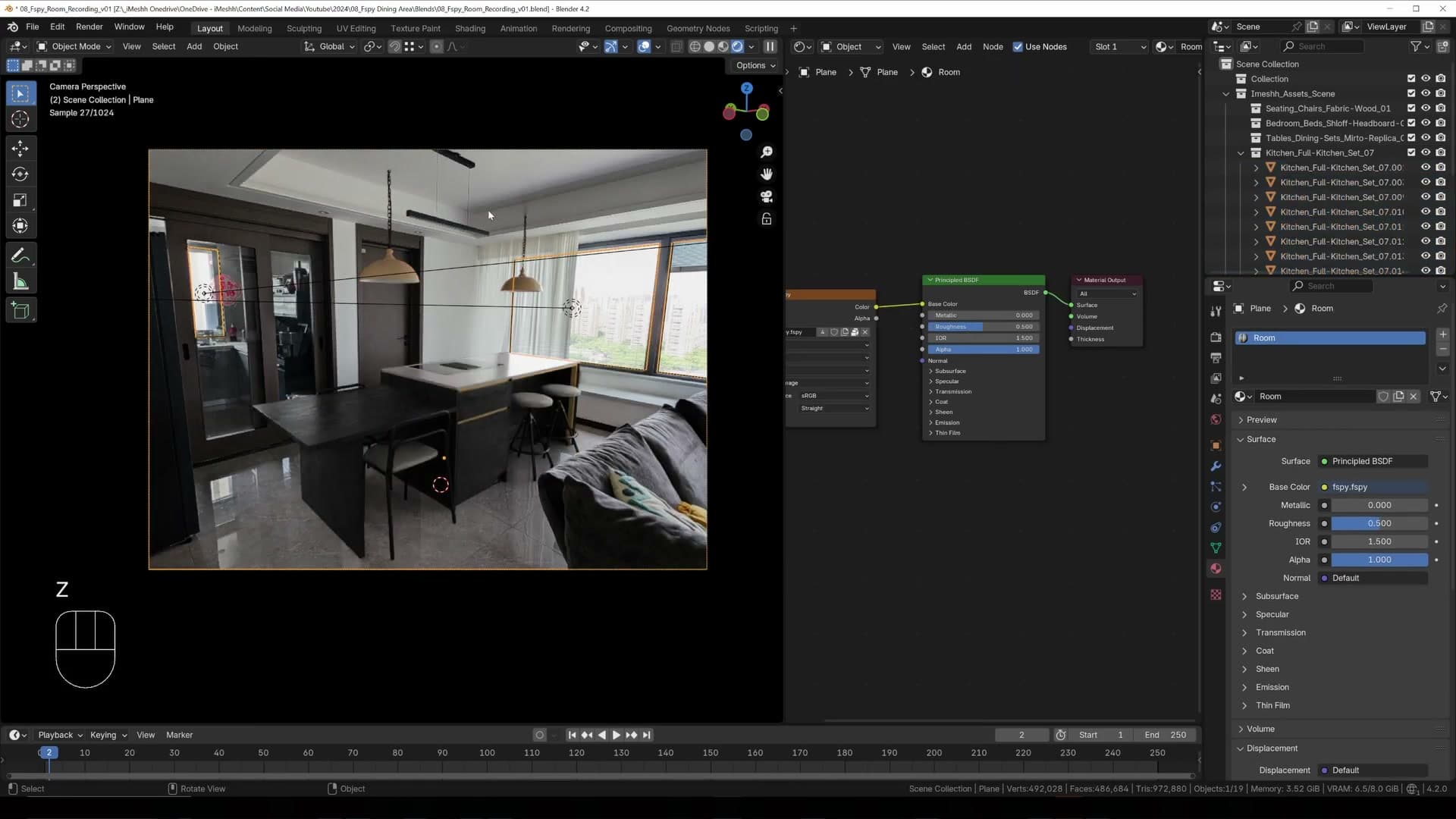
To lock in the photo's existing lighting, swap the cutout's Principled BSDF for an Emission shader. Duplicate the material so the original is preserved, drop into the shader editor, delete the Principled node, and add an Emission node in its place. Wire the Image Texture's Color output into the Emission's Color input, then route the Emission's output into the Material Output's Surface socket. The cutout now displays the raw photo in its original form and ignores every lamp in your scene.
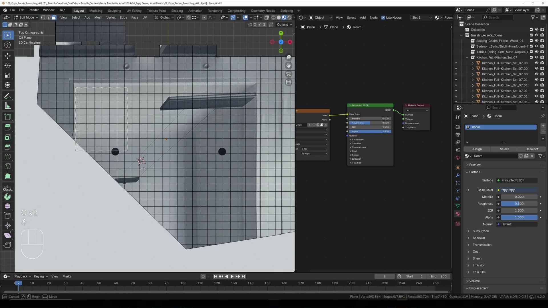
With the emission cutout sitting in front of the room, CG furniture can pass behind the real-life sofa convincingly. Slide chairs back so they're geometrically behind the cutout and the depth ordering reads correctly. A table pushed right up against the sofa, or a chair tucked partly behind it, both sit in the scene without giving the trick away. The cutout reads as part of the original photograph because, materially, that's exactly what it is.
Building the kitchen and extending the ceiling
Append a pre-made iMeshh kitchen, cannibalise its perfectly-measured parts, and extrude the ceiling upward so hanging lamps render in full.
Appending the iMeshh kitchen and detaching parts
With the iMeshh kitchen already appended into the scene, you can see there is already a lamp in the photo that now clashes with what you want to put in there. The simplest fix is to open the source photo in Photoshop and paint that original lamp out completely.
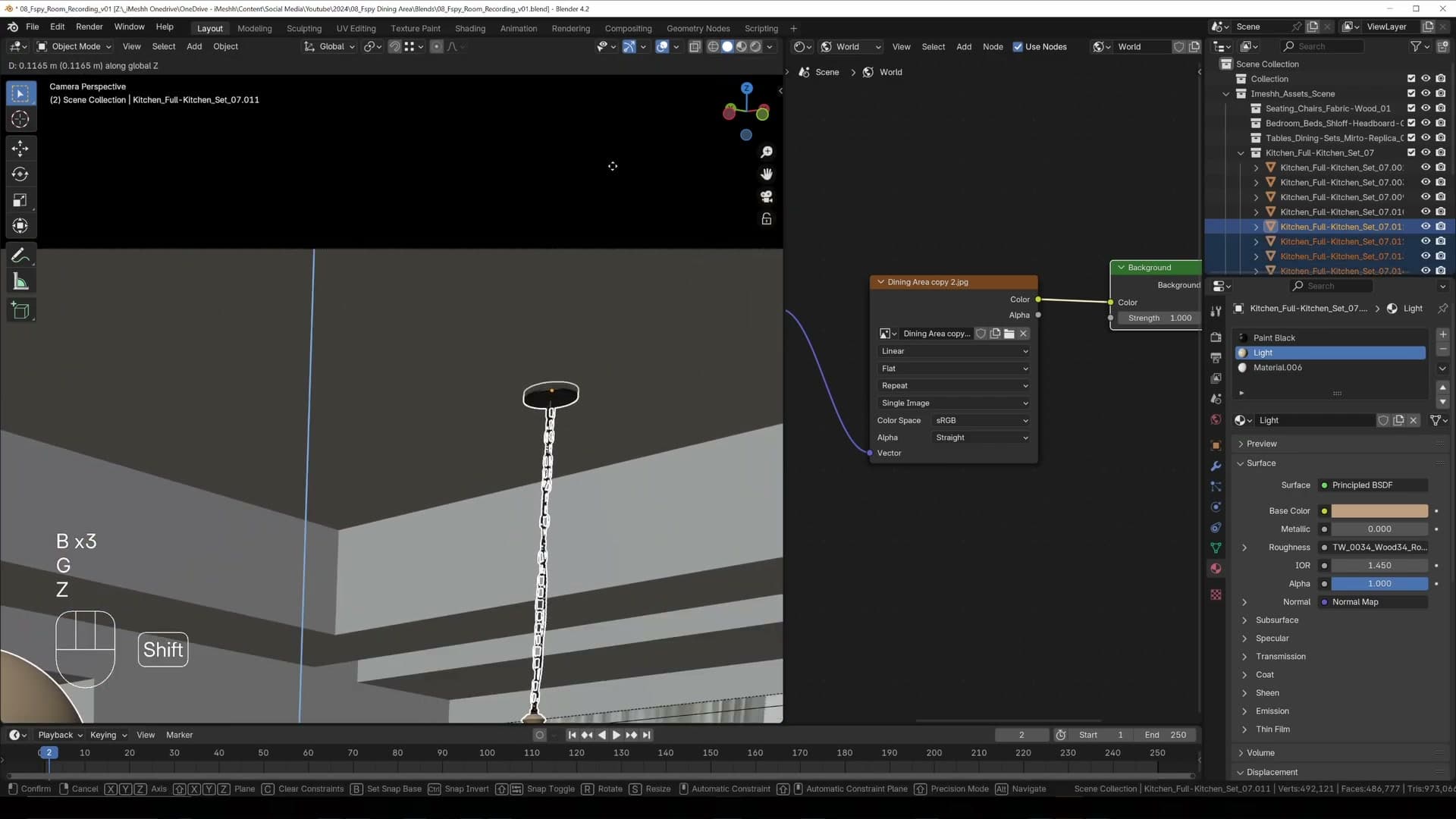
Once you have that cleaner plate, you can add any pendant or hanging lamps you want straight onto the ceiling in 3D. Because the real one is no longer baked into the backplate, the new lamps have nothing to fight with and read as if they belong in the room.
Do the same trick for the sofa. Because the sofa was detached earlier into its own object, painting it out of the original image as well means you can slide it around freely in the 3D scene. The original silhouette never peeks through behind it as you move it, which is quite useful.
For the back wall, rather than modelling a brand-new cabinet from scratch, cannibalise the existing kitchen island and turn that into a cabinet. It is probably not going to be 100% accurate to what a real cabinet would look like, but the geometry is already at sensible dimensions and the result is good enough for the purposes of the shot.
Extruding the ceiling for hanging pendant lamps
Once the new lamps are dropped in, they will obviously not be touching the ceiling. Nudge them upward a little until they read as if they are hanging from a proper fixture rather than floating in mid-air.
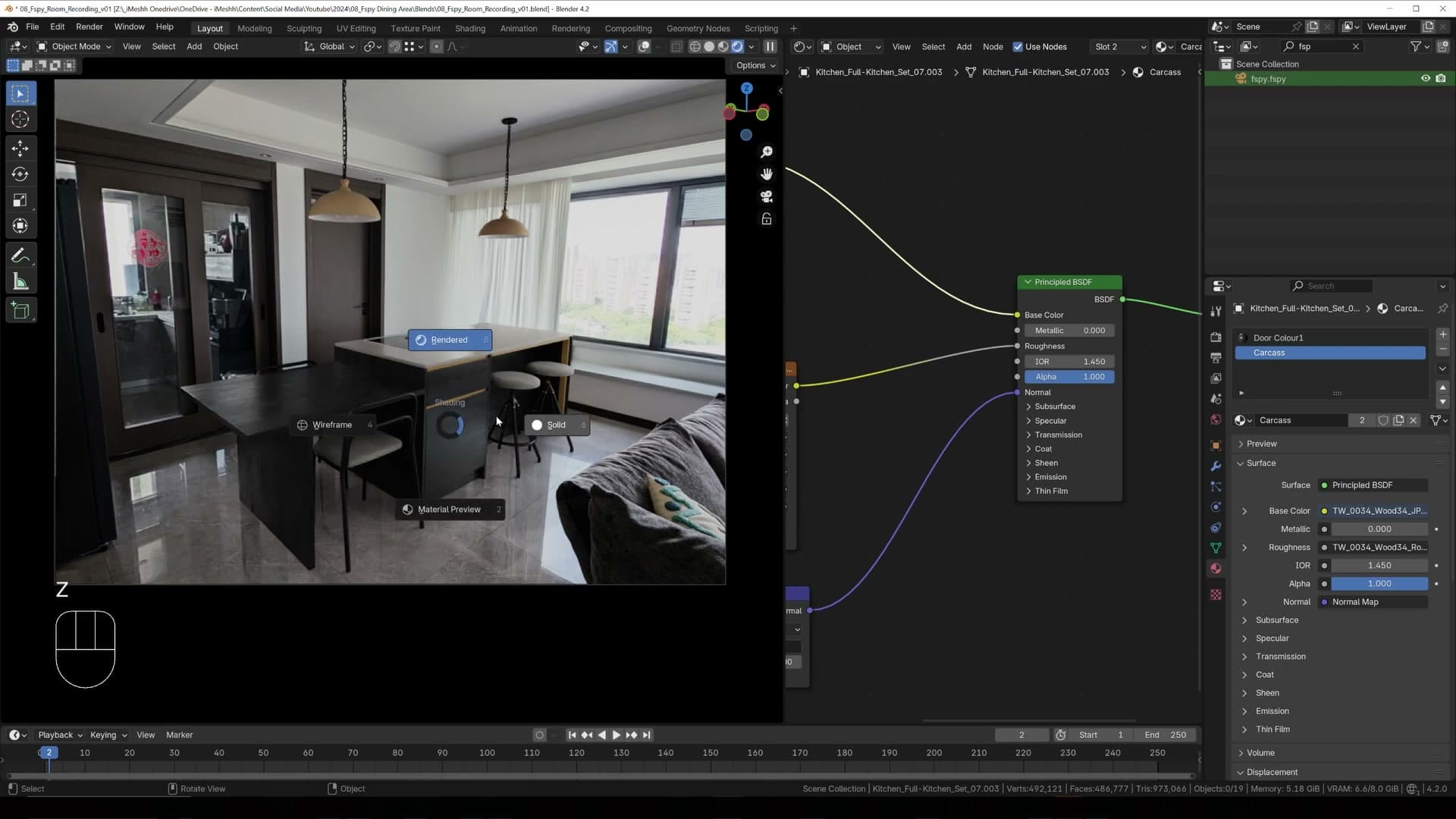
While the camera angle is still framed up, give the floor a pass too. The real floor in the photo is quite glossy, but right now there is no gloss or reflection on it. The shadow catcher is only giving you shadow. To fix that, select the floor and press Shift+G, then deselect everything except the main floor element so you are working on that face set alone.
Create a new material and assign it to that selection, then make sure the Roughness slider is dragged straight down so the surface becomes reflective. For the colour input, plug in the newly-created Photoshop image (the one with the sofa removed) so the sofa is not reflected back at you from below the stools, which would instantly give the trick away.
The reflections on this shadow catcher floor are quite subtle but they add enough of a sheen to sell that the floor is glossy. There will be small inconsistencies. On the right-hand side, for example, the original background did not contain the new stools, so the window's reflection on the floor will not include them either. At that scale the eye does not notice, and because the whole scene is built on a real image, it stays convincing enough to read as real.
Adding glossy floor reflections
Assign a second material to just the floor face with the sofa removed in Photoshop. The shadow catcher then produces subtle real-looking reflections.
New floor material with the sofa-removed image
With the basic shadow-catcher floor working, the next pass is to give it a hint of reflection so the CG furniture sitting on top has something to bounce off. The way to do that is to add a second material to the room mesh and assign it only to the floor face.
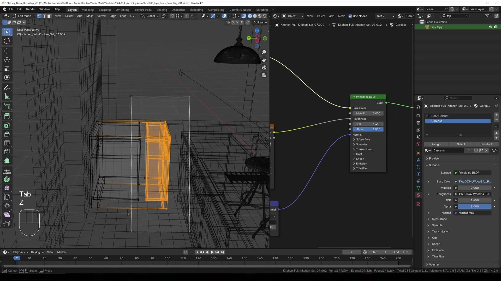
Drop into edit mode on the room, switch to face select, and pick one face on the floor. Then use Shift+G > Normal to grab every face pointing the same way. It's the same selection trick used earlier in the build to isolate the floor for the shadow catcher.
Add a new material slot, hit Assign so it only lands on those floor faces, and plug in the Photoshop-edited version of the FSpy backplate (the one where the sofa has been painted out). With the foreground object gone from the source image, the floor material sees a clean photo of itself, which is what the reflection will sample from.
Dialling roughness for subtle reflection
Out of the box the new floor material reads as completely matte, so to coax a reflection out of it the roughness needs to come down. Drag the roughness slider straight down on the new material until the floor starts to pick up the geometry above it.
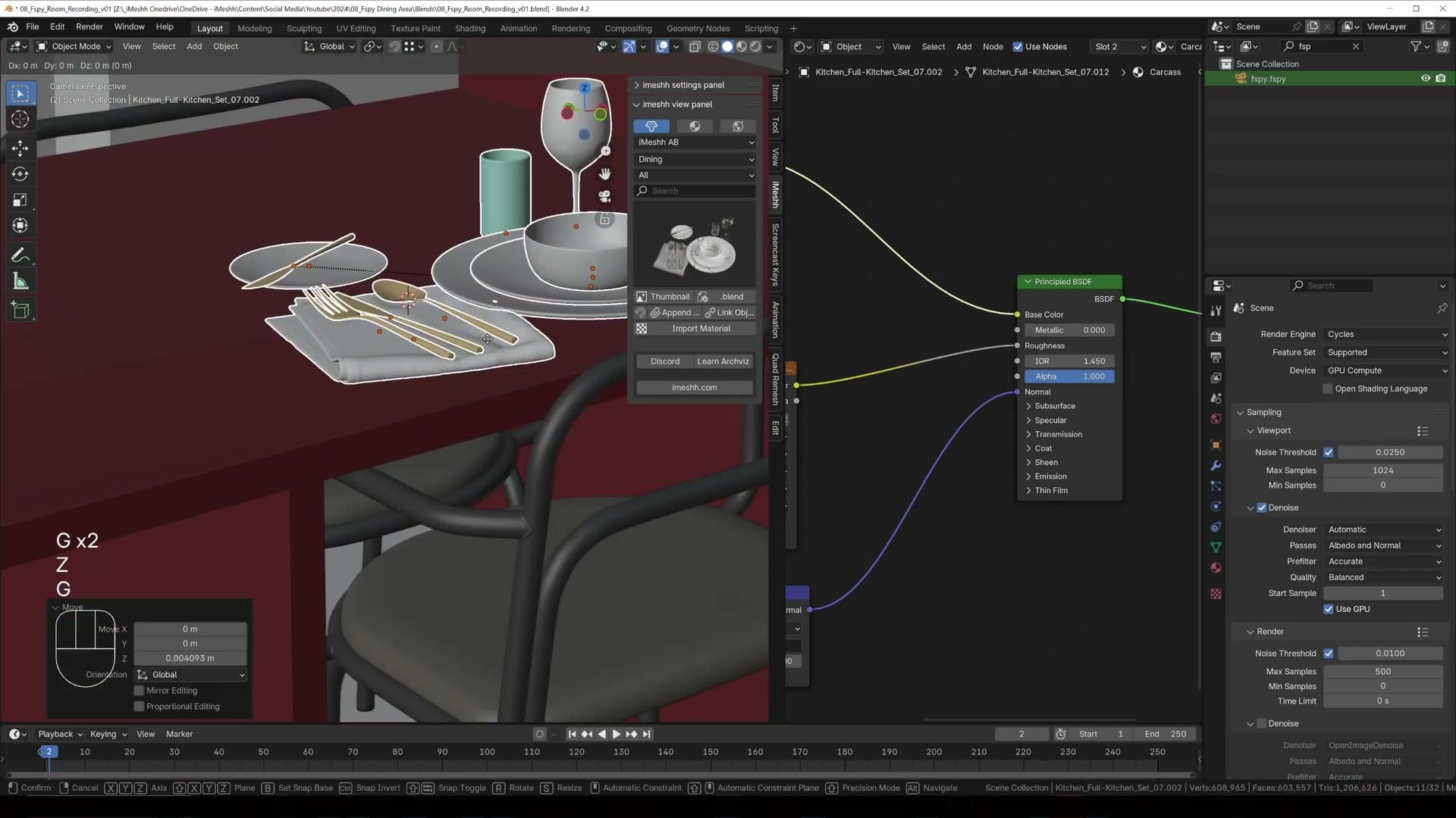
As the roughness drops, the kitchen stools and the nearby CG pieces begin to appear faintly in the floor. The aim is subtle. The photographed flooring is still doing the heavy lifting, and the reflection only needs to be strong enough to suggest that the new furniture is genuinely sitting in the room rather than pasted on top of it.
Because the shadow catcher underneath is still receiving shadows from the CG objects, the final look combines both: real shadows grounding the furniture, and a soft reflection in the floor selling the contact. That combination is what makes the composite read as a real photo of a real room rather than a render dropped onto a backplate.
Cannibalising for a back cabinet and adding decor
Reuse the kitchen island geometry as a back-wall cabinet, then drop chairs, plants, shelving and a giant melon onto the dimensioned scene.
Reshaping the island into a back-wall cabinet
With the kitchen island in and dimensioned, the back wall is the next thing crying out for something to look at. I pull a set of cloud-shaped children's shelves out of the library and drop them straight in against the back wall. Because the room itself is built to scale, the shelves land at the right height and the right depth on the first try. Exactly what I want to have in my kitchen.
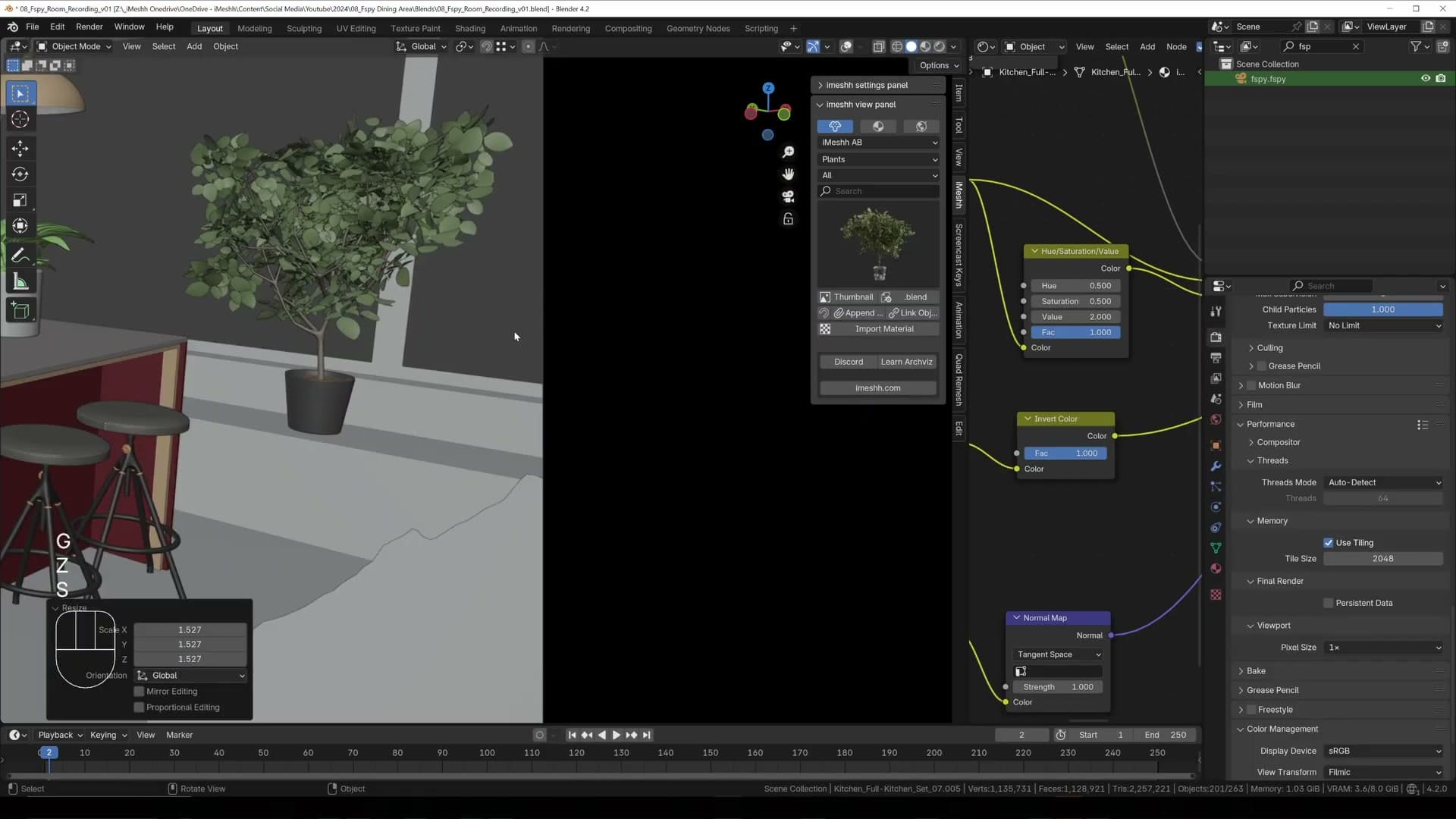
From there I turn to the dining table. A small piece of decor goes on the table top, and another ornament drops in nearby just to break up the empty surface. Each appended asset inherits the same lighting and perspective as the rest of the room, so nothing has to be nudged or rescaled to make it look like it belongs.
Adding stools, plants and final decorations
Plants always look nice, so a tall plant goes in next and gets scaled up freely until it reads the right size for the corner of the room. Because the floor plan was built to real-world dimensions earlier in the tutorial, anything you bring in lands at a believable size straight away. You are scaling against the room rather than against guesswork.

This is where the earlier surface-snapping work pays off. Click on any face inside the room (a worktop, the floor, the table) and the appended asset drops onto that surface in the right place. Hit render, and Blender already has the area lamps, the shadow catcher and the window cut-outs wired up, so new objects pick up perfect shadows the moment they appear. The back-lit leaves on the plant look genuinely illuminated by the window light behind them, exactly as they would if the plant had been standing there when the original photo was taken.
It looks like it's actually on that surface, and that is the whole point of the workflow. Because both the lighting and the perspective were solved against a real photograph, anything dropped into the room inherits that realism. I prove the point by adding a giant melon to the dining table: any asset, even a deliberately absurd one, sits convincingly on a real-world surface as long as the room underneath is correct.
I'll be honest: the build feels fast-paced because the difficult part is all at the start. The fSpy camera match, the floor-plan trace, the scaling to the door frame, the shadow catcher and the cutout plane. Once those are in, swapping furniture and decor in and out is the easy part, and every new piece can be checked against the real dimensions of the room. Any follow-up questions are welcome in the YouTube comments, and there is also an iMeshh Discord for ongoing help.
Wrap-up and reuse for any scene
Once the room is built, the same workflow lets you swap in any asset (even a giant melon) and the photo-matched lighting just works.
Reusing the workflow on your own home
That's the whole workflow: one photo of a real room, an fSpy camera match, a traced and scaled floor plan, a remeshed photo projection, a shadow catcher with area lights through the windows, and finally CG furniture that drops in as if it was always there. Once the bones of the scene are built, swapping the furniture out for anything else in your library is just an append away. The lighting and perspective are already locked to the photo, so new assets inherit the match for free.

If you want to take this further, head to imeshh.com and click the Discord link in the top right. You're welcome to drop in there with questions about your own scene. And if there's a specific room, technique or asset workflow you'd like covered next, leave a comment on the video so it can feed into a future tutorial. Thanks for watching, and good luck rebuilding your own home in Blender.
Tools and credits
Everything mentioned in this tutorial, with links.
- Blender (the renderer this entire build runs in).
- iMeshh (studio platform: project management, client review, asset library, invoicing). The asset library used in this tutorial is included with every iMeshh Pro plan.
- Poly Haven (free CC0 textures and HDRIs).
Pillar guide: Scene Builds hub