Why a flat colour map isn't enough
Why photoreal surfaces need more than a base colour, what PBR materials are, and the four texture maps you'll see bundled with most free downloads.
What PBR materials are and where to find them
Before applying anything to the archway model, it's worth seeing how Blender's material system works on a simpler object. Add a fresh cube, drop into Local View so the rest of the scene gets out of the way, and switch the viewport to Material Preview. Then open the Shader Editor. By default it's set to World because you've been editing the sky in the previous part. Flip the header dropdown to Object so you're working on the cube's surface instead.
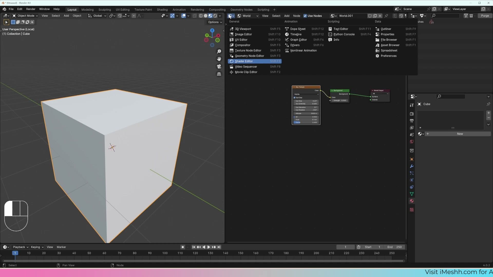
Create a new material and name it plaster (the archways are going to be a plaster surface, so naming as you go keeps the project tidy). The harder question is what to plug in. In photoreal scenes, almost every surface uses a PBR material (physically based rendering), and a PBR material is rarely just one image. It's a bundle of textures, each describing a different property of the surface, that work together to fool the renderer into treating a flat plane like a real wall.
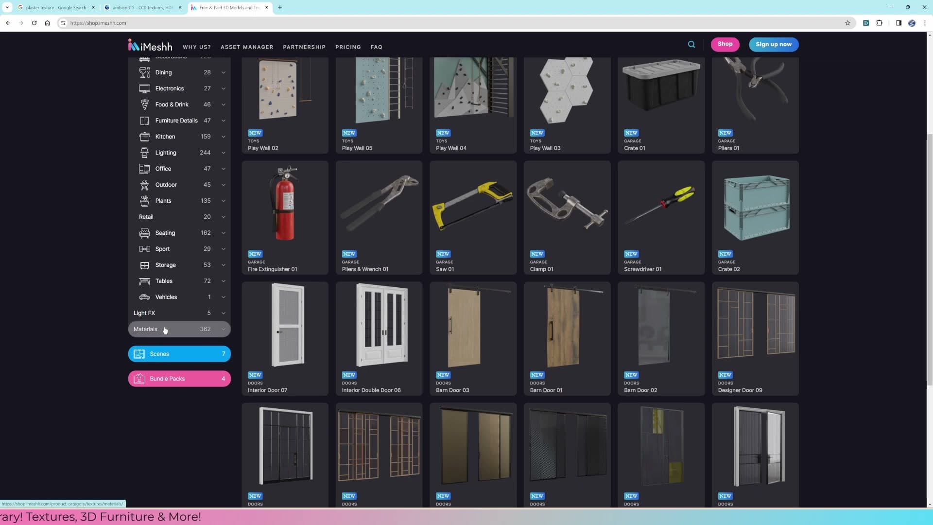
You can grab PBR sets from a number of free libraries packed with high-quality bundles released under permissive licences. iMeshh's own library ships materials too, with the bonus that they come pre-wired inside a Blender file: open it, drag the material across, and the node setup is already done for you.
The four texture maps and what each one tells Blender
Search online for a plaster texture and you'll find what looks like a usable image: a tileable photo of a plaster wall. Drop that straight onto the cube on its own, though, and the surface reads as flat plastic. It carries the right colour, but there's no sense that one patch is rougher than another and no hint of the tiny ridges the plaster trowel left behind. The image only tells Blender one thing, when a real surface is doing several at once.
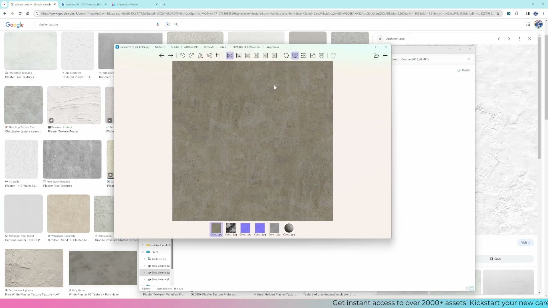
That missing detail lives in additional texture maps. In 3D parlance, a map is just an image that tells the renderer where a particular property varies across the surface. Most PBR bundles ship with four. The diffuse map carries the colour. The roughness map tells Blender which spots should be rough and matte and which should be glossy. The normal and displacement maps both add bumpiness: fine surface detail that would be impractical to model as real geometry.
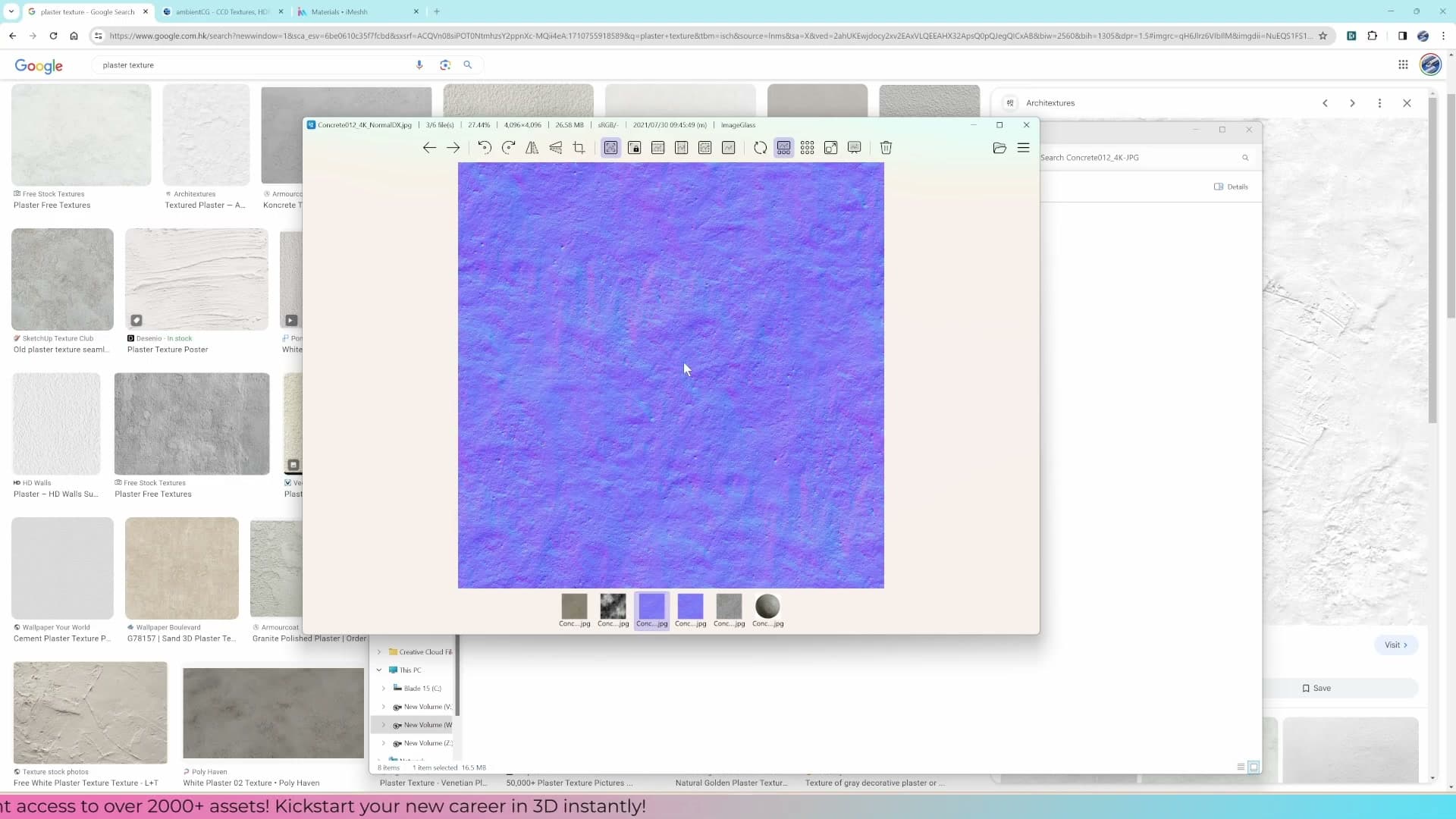
On their own, none of those images is impressive. The roughness map looks like a grainy black-and-white photo; the normal map is a wash of pale blue and purple. Stacked together through a Principled BSDF, though, they describe the surface completely enough that the renderer can light it as if it were a real wall: light bouncing off the glossy patches, sinking into the rough ones, catching the edges of every tiny bump.
Wiring up a PBR shader on a test cube
Build the plaster material node by node (base colour, roughness, and normal map) and learn which inputs need to be flipped to Non-Color.
Creating a new material in the Shader Editor
With a cube selected in the viewport, open a Shader Editor panel and switch the mode dropdown at the top from World to Object. The material slot will be empty, as this cube has no surface assigned yet.
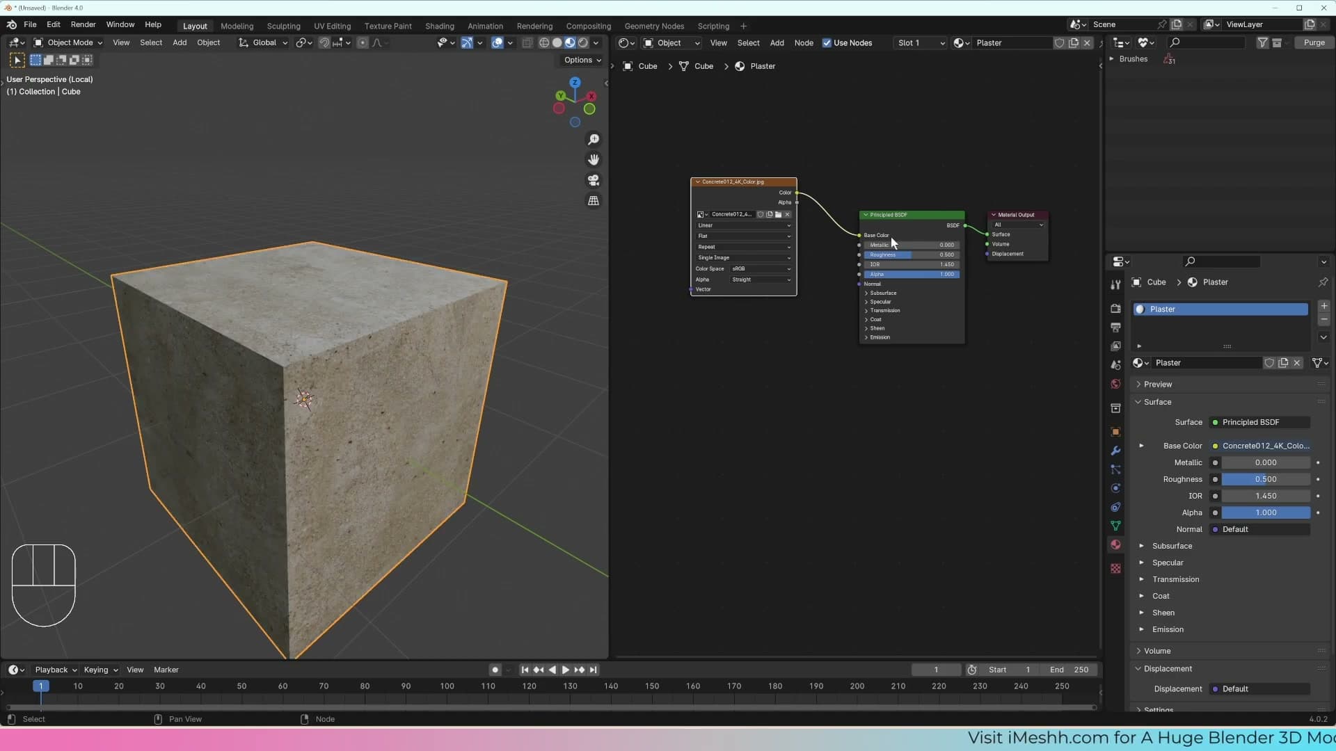
Click New and rename the material 'plaster' so it's easy to find later. Blender drops in a default Principled BSDF connected to Material Output. That's the node you'll be wiring the texture maps into next.
Plugging in the base colour map
Drag the diffuse image straight from your file browser into the Shader Editor. Blender creates an Image Texture node with the file already loaded, no manual Open click needed.
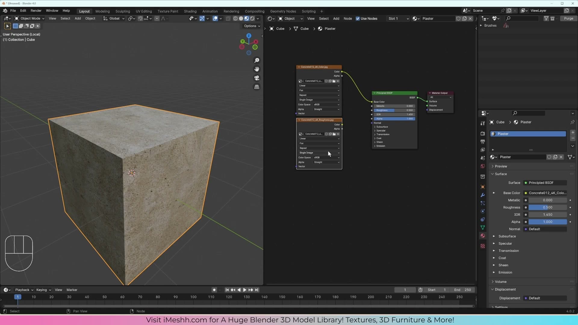
Plug the Color output of the Image Texture into the Base Color input on the Principled BSDF. The cube switches from grey to the plaster colour the instant the link snaps into place.
Texture libraries label the colour map differently depending on the source. In Blender it's Base Color, while older workflows call it diffuse. Both names refer to the same image: the flat surface colour with no lighting baked in.
Roughness map: set to Non-Color
Drag the roughness map into the Shader Editor as well. It looks like a black-and-white photo, but those brightness values aren't there to be viewed. They tell Blender how matte or glossy each individual pixel of the surface should be.
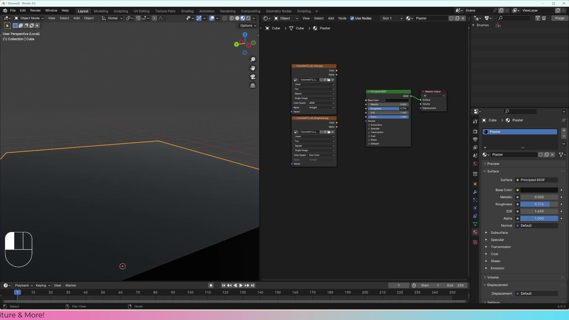
Before wiring it up, change the Image Texture node's Color Space from sRGB to Non-Color. Leaving it as colour data lets Blender gamma-correct the brightness values, which warps the roughness reading right across the surface.
Now plug Color into the Roughness input on the Principled BSDF. Some patches of the plaster look glossier than others, which is what a real surface does: the recesses stay matte and the high points catch more light.
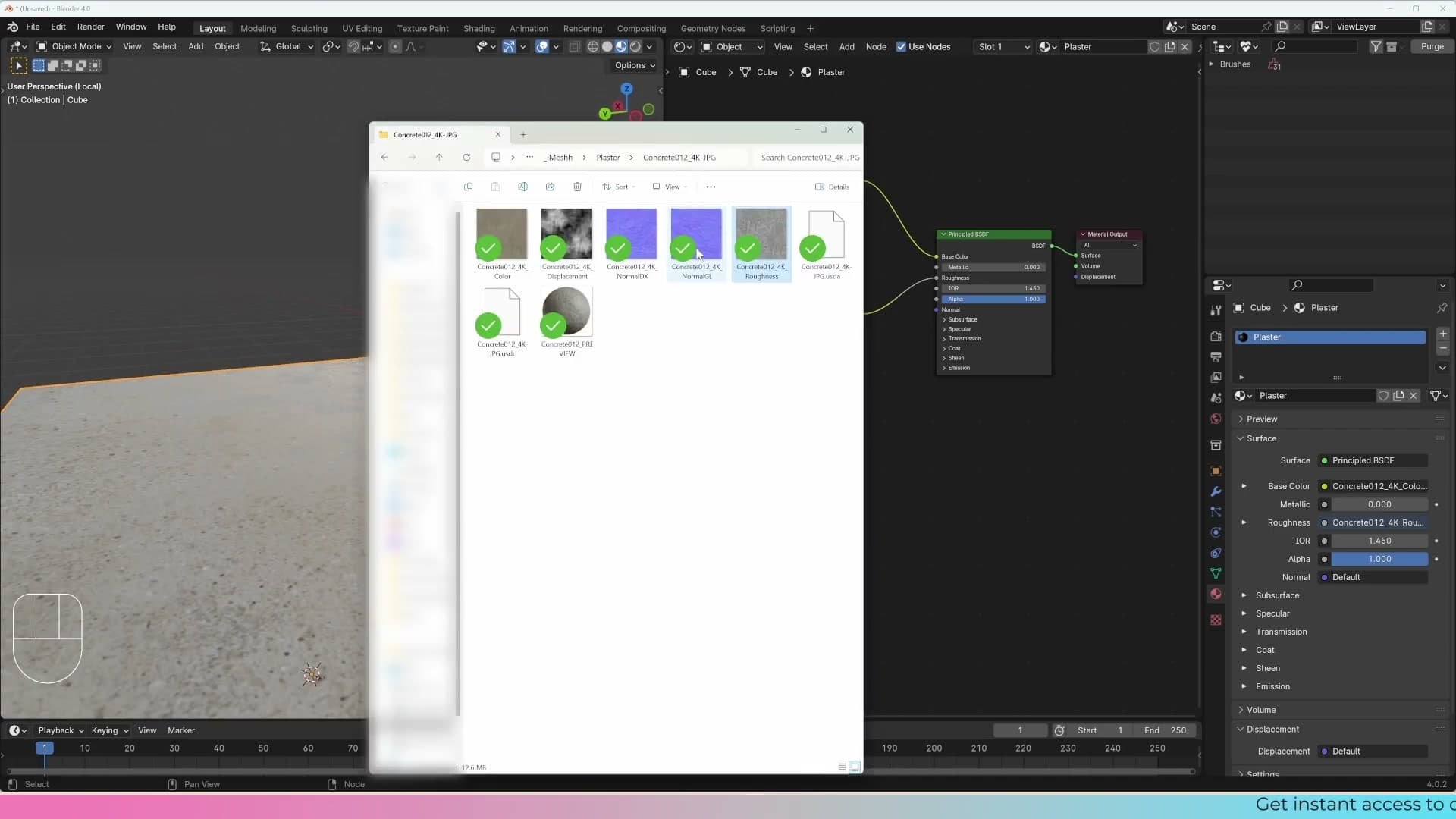
To see how much the map is really doing, unplug it for a moment and dial the Roughness slider to a single value. The whole cube goes uniformly shiny or uniformly matte. Plug the map back in and the per-pixel variation returns. That's detail you'd never realistically paint by hand.
Normal map through a Normal Map node
Drag in the normal map last. If the texture pack ships with two versions, pick the GL (OpenGL) one, as that's the convention Blender expects. The DX (DirectX) variant is for software that interprets the green channel the other way around.
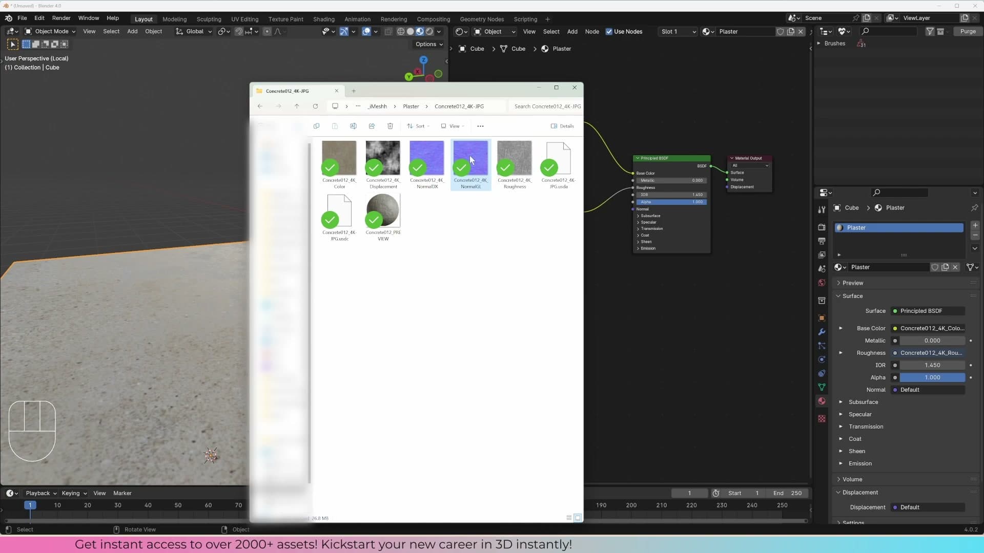
Most packs also include a displacement map. Leave that one alone for now. Displacement actually changes the geometry of the object, whereas the normal map just fakes surface bumps through shading.
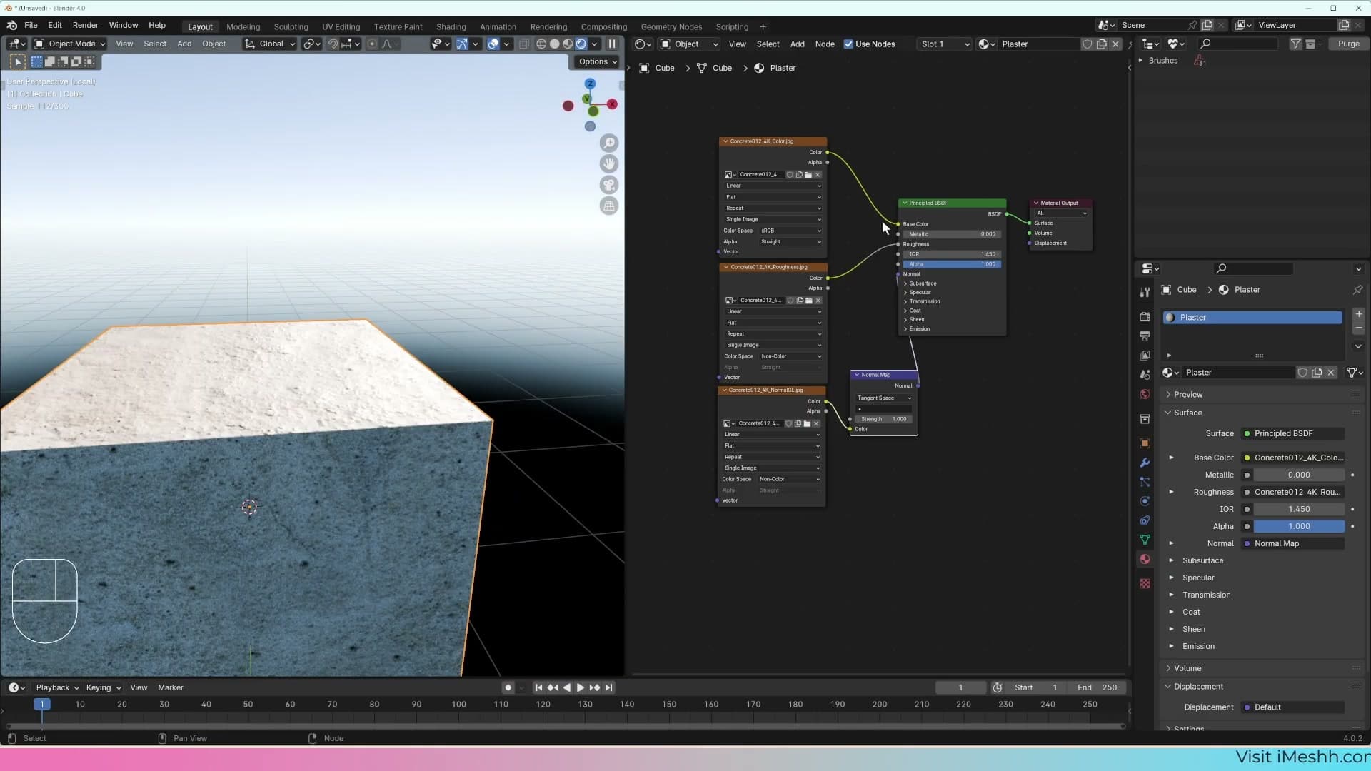
Set the normal map's Color Space to Non-Color for the same reason as the roughness map. It looks colourful (that purple-blue tint), but each channel encodes a direction, not a colour, and sRGB gamma correction would scramble the data.
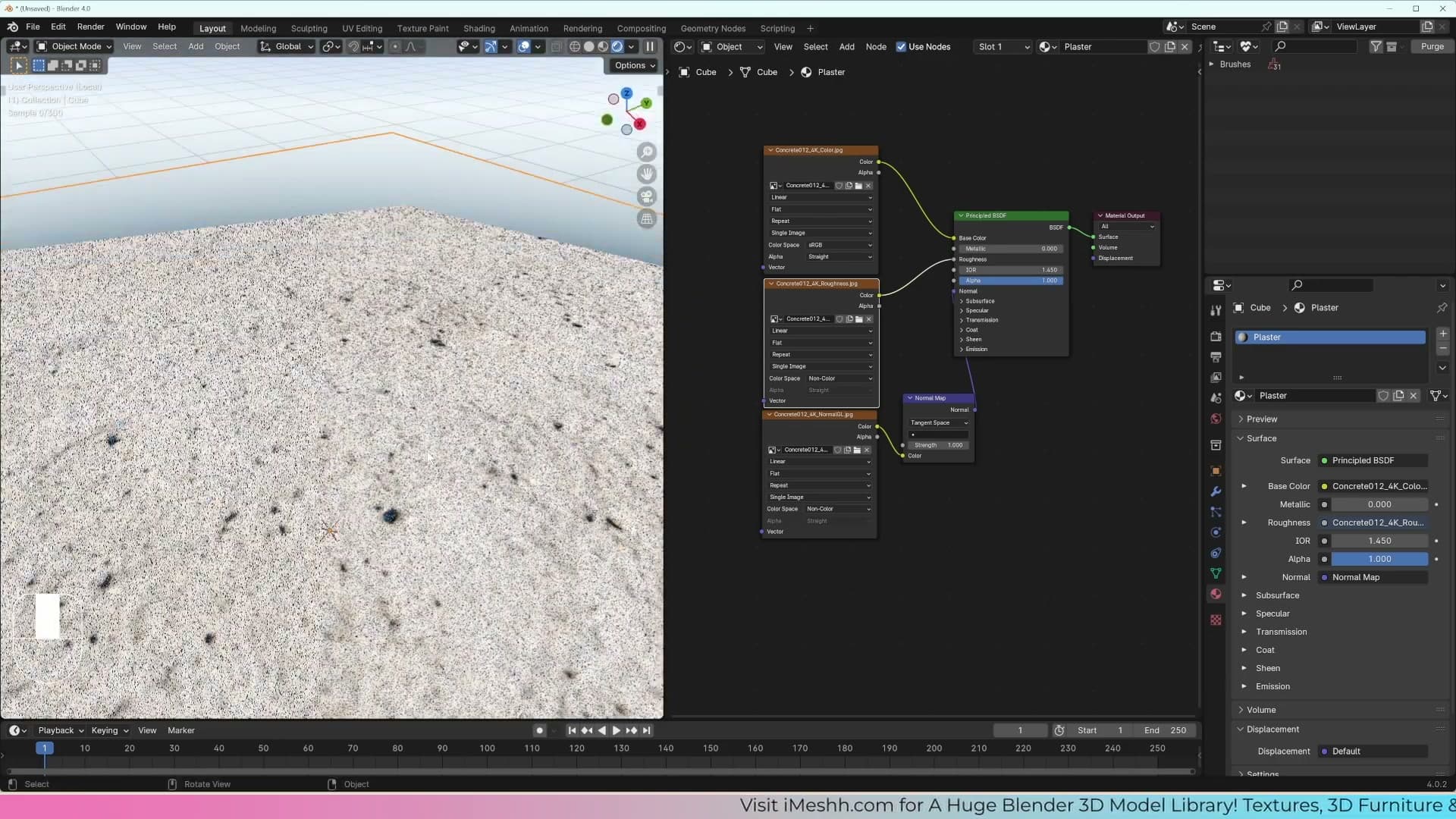
Add a Normal Map node from Add → Vector → Normal Map. Plug the Image Texture's Color output into the Normal Map node's Color input, then run the Normal Map node's Normal output into the Normal socket on the Principled BSDF.
Switch to Rendered view and the cube picks up bumps that aren't really there. The lighting reacts to micro-detail encoded in the map. Unplug the normal connection briefly to compare against a smooth surface; the difference is what sells the material as photoreal rather than plastic.
Scaling textures with Texture Coordinate and Mapping nodes
Add a Texture Coordinate node and a Mapping node so you can rotate, scale, and reposition the texture across your object without re-exporting anything.
Adding Texture Coordinate and Mapping nodes
Right now the image texture sits on the cube using Blender's default coordinates, which gives you no real control over how it lands on the object. Two extra nodes fix that and turn the placement into something you can dial in.
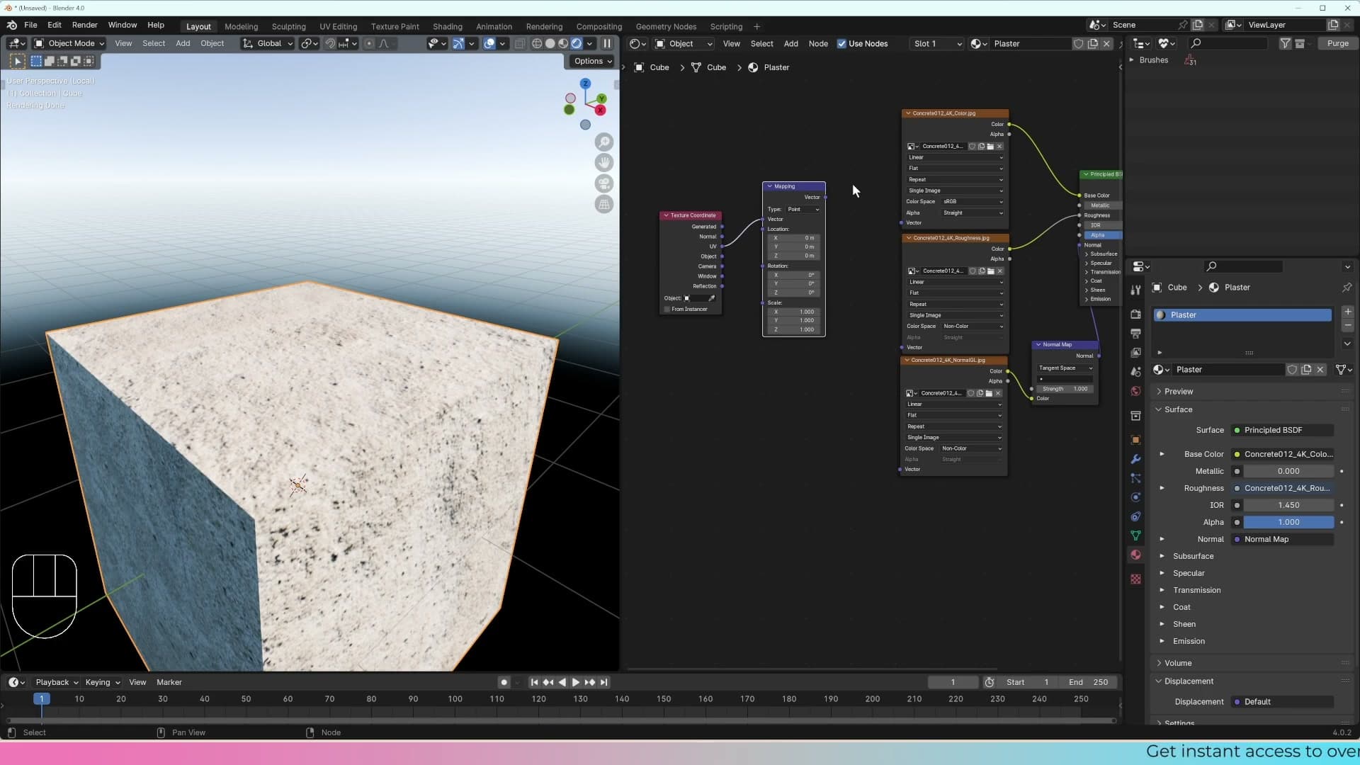
In the Shader Editor, add a Texture Coordinate node and a Mapping node. Run the UV output from the Texture Coordinate into the Vector input on the Mapping node (UV rather than Generated, because the texture is meant to follow the object's UV map, which you'll mark and unwrap later in the post). Then plug the Mapping node's Vector output into the Vector input on the image texture.
With that chain wired up, the Mapping node becomes your single control point for the texture: rotation, scale, and position all live in one place instead of being baked into the image itself.
Scaling the texture to fit the object
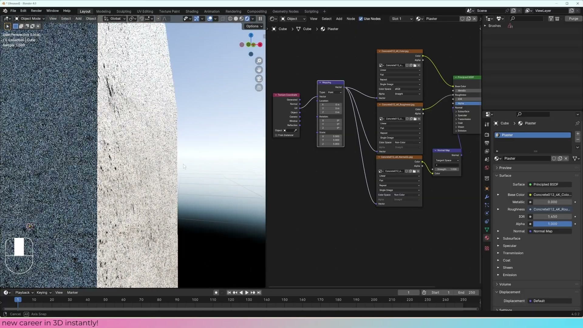
Click and drag across the Mapping node's Scale values and multiply them by around 5. The plaster pattern instantly reads at a more believable size on the cube: small enough that individual bumps are visible, big enough that the texture isn't smeared across each face.
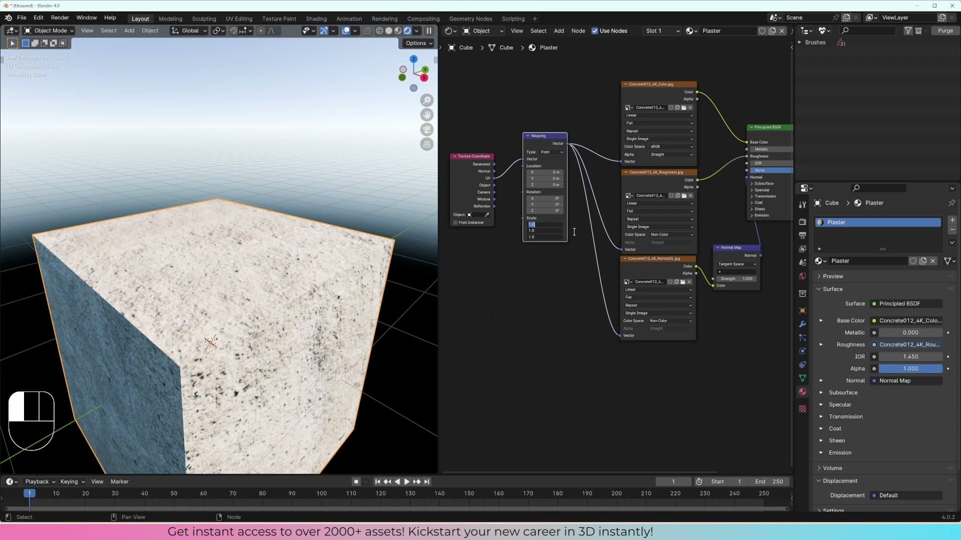
One thing worth checking before you move on: orbit round and look at the cube edge-on. The silhouette is still perfectly flat. There's no actual geometry being added by the normal map. Blender is just pretending the bumps exist by changing how light bounces off the surface.
How UV maps actually work
The paper-cube analogy: a UV map is just an unfolded version of your 3D mesh laid flat so a 2D image can be wrapped around it.
The paper-cube analogy and the UV Editor
With the maps plugged in, the next question is how the image actually knows where to sit on the mesh. Drop into Edit Mode, select everything with A, then open a second editor window and switch it to the UV Editor. The cube's faces appear laid out flat. You can confirm the same map exists by opening Object Properties → Object Data → UV Maps, which lists every UV map the object owns. Objects can carry more than one, but for now stick with the single default.
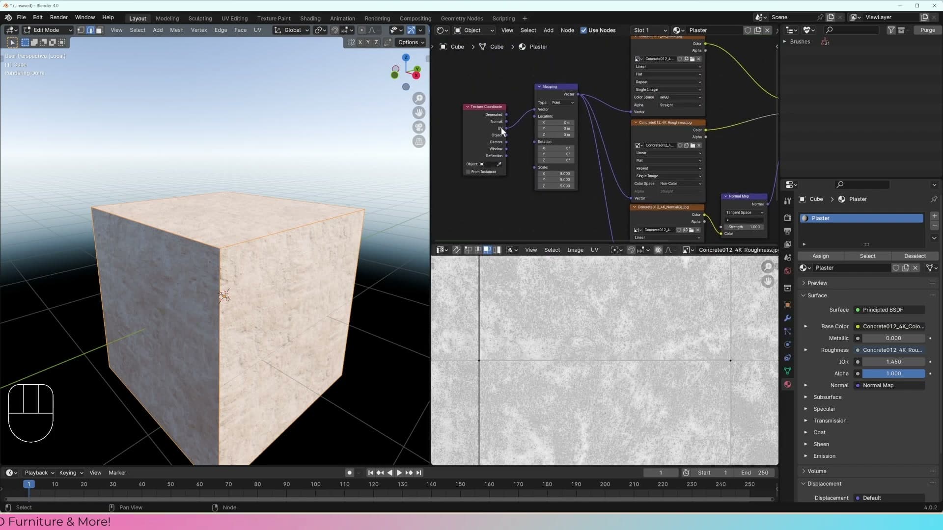
If you ever did that school exercise where you cut a cross-shape out of paper and folded it into a cube, you already understand a UV map. The flat layout in the UV Editor is the same idea in reverse: Blender has unfolded the 3D cube into a 2D shape so the texture image has somewhere to land. Wrapping a real piece of paper around a real cube means cutting it at certain edges first, and the same is true in Blender. The cuts are called seams, and they're what allow a flat image to wrap around 3D geometry.
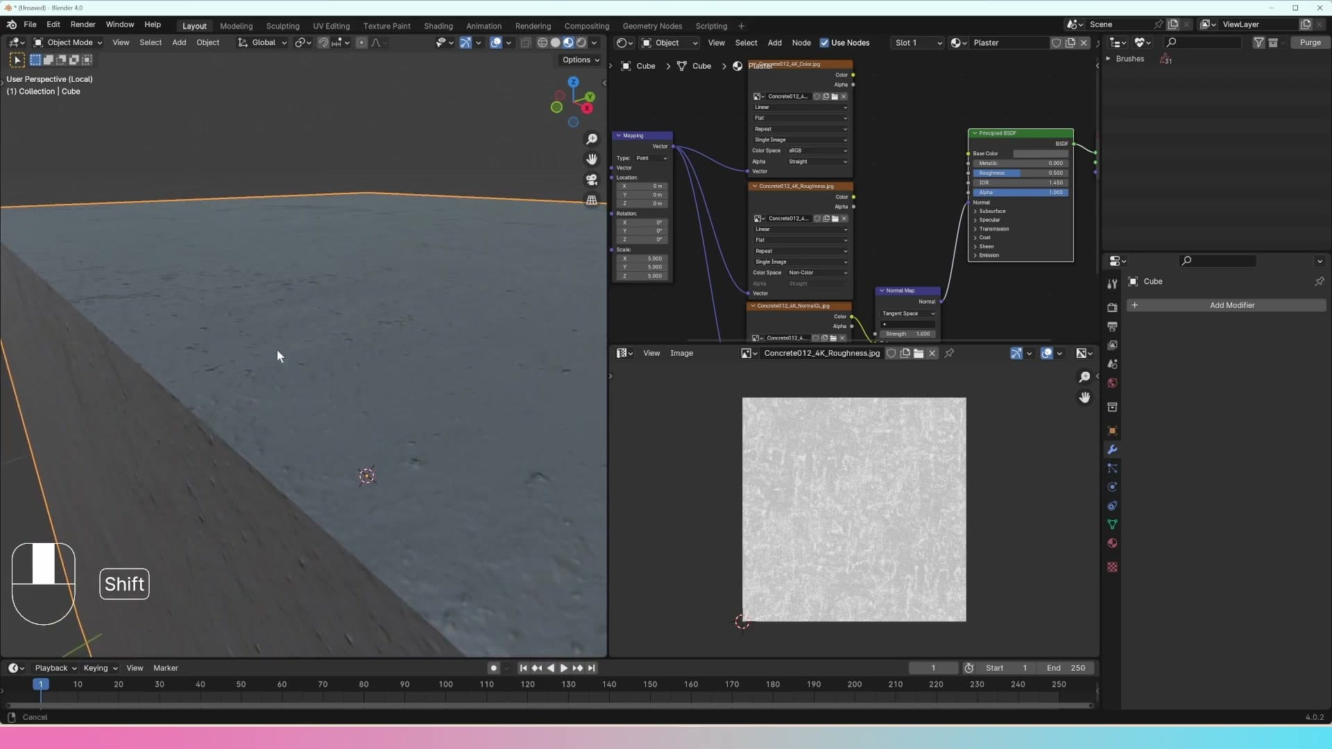
Look closely at the cube and you can see this in action. Along one edge the brick pattern continues smoothly around the corner. Find a recognisable bump in the texture and you can trace it across two faces. Along another edge it doesn't: the pattern abruptly breaks because there's a seam splitting those faces apart in the UV layout. On a sharp cube it's subtle, but add a little geometry and the break becomes obvious. Whether the texture joins or doesn't is entirely down to where the seams sit on the UV map.
Primitive shapes get a UV map for free. Yours don't.
Here's the catch: Blender only does the unwrapping for you on shapes it created. When you press Shift+A and add a cube, plane, or any other primitive, a sensible UV map is generated automatically. But the moment you start modelling (extruding a plane, adding loops, building a custom shape) that new geometry has no UV data attached to it, and any texture you plug in will stretch or smear across the new faces.
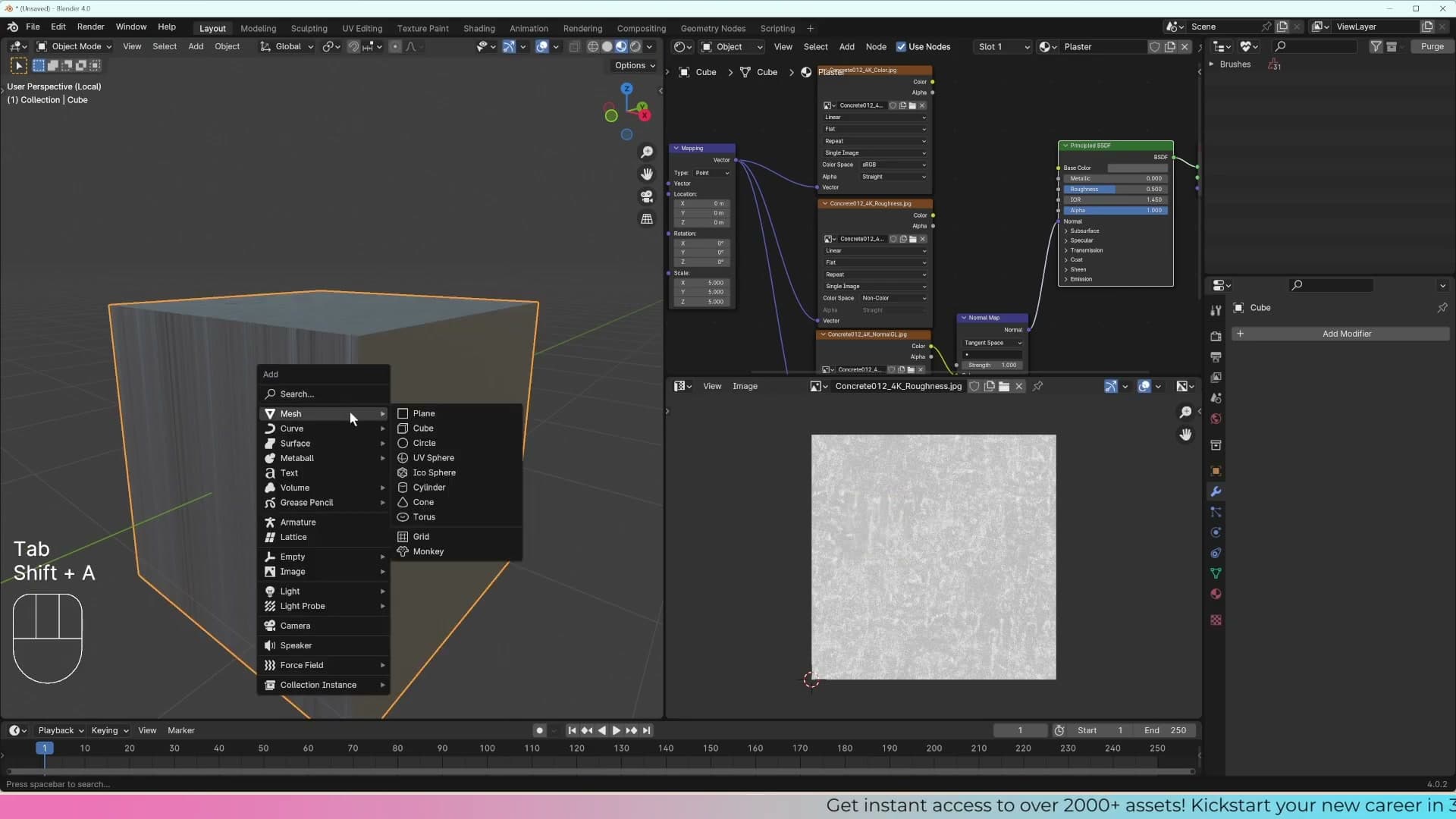
That's why your archway scene needs unwrapping. The geometry has been pushed around enough that the default UV map no longer matches what's on screen, so you have to tell Blender where to make the cuts yourself. There are several ways to unwrap a cube or any other object, but the foundation is the same every time: switch to Edge select mode by pressing 2, pick the edges you want to act as seams, then run the unwrap. The next section walks through exactly how to choose those edges.
Marking seams and unwrapping a cube manually
Practice the full manual unwrap workflow on a cube: select edges, mark seam, press U, and compare the two unwrap algorithms.
Mark Seam, U, Unwrap
Back in Edit Mode, select the edges you want to cut along. For a cube, a chain running down one side and across the bottom does the job. Right-click and choose Mark Seam, and those edges turn red in the viewport. Press A to select every face, hit U to bring up the UV menu, and choose Unwrap.
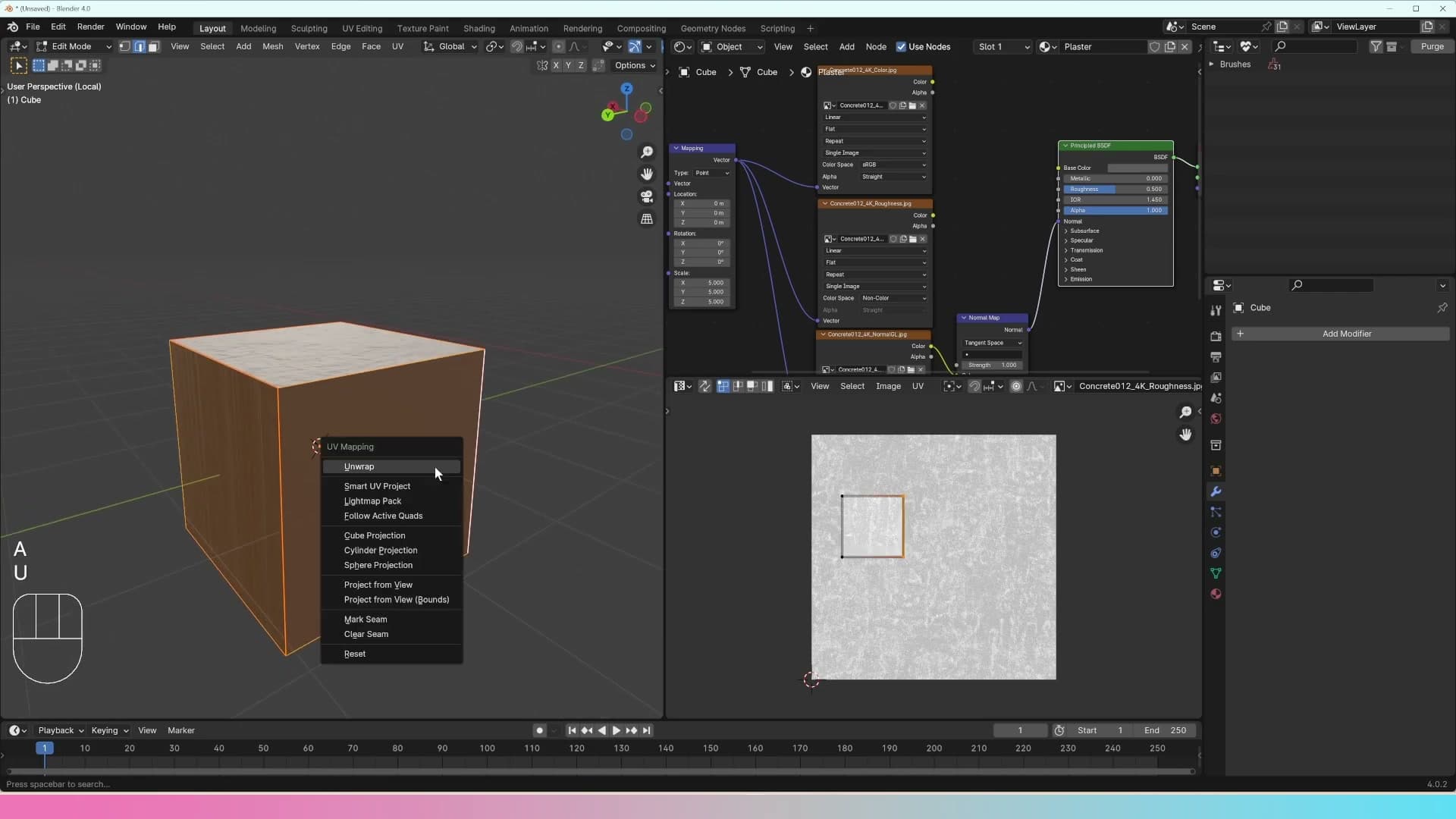
Look at the result in the UV Editor. Faces that share an edge with no seam between them stay joined in the layout, so any texture you apply will wrap continuously across that join. Wherever you marked a red edge, Blender cuts the mesh open at that point so it can lay it flat. That cut will show up as a visible seam in the render if the texture lines up across it.
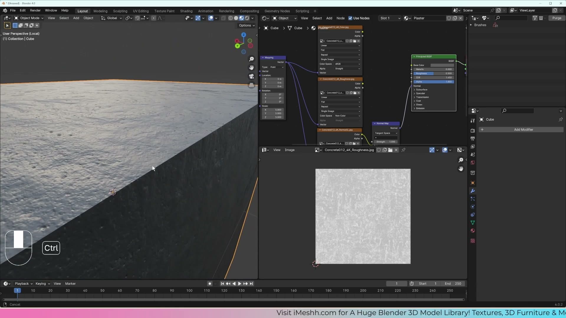
Seams are unavoidable on any closed shape. You can't peel a cube flat without snipping it somewhere. The job is to hide those cuts on faces the camera will never see, and keep the most visible surfaces of the model seam-free.
Smart UV Project: the 66° angle shortcut
If marking every seam by hand sounds tedious, there's a shortcut. With every face selected, press U and choose Smart UV Project instead of Unwrap. Blender works out where the seams should go for you and drops the result straight into the UV Editor.
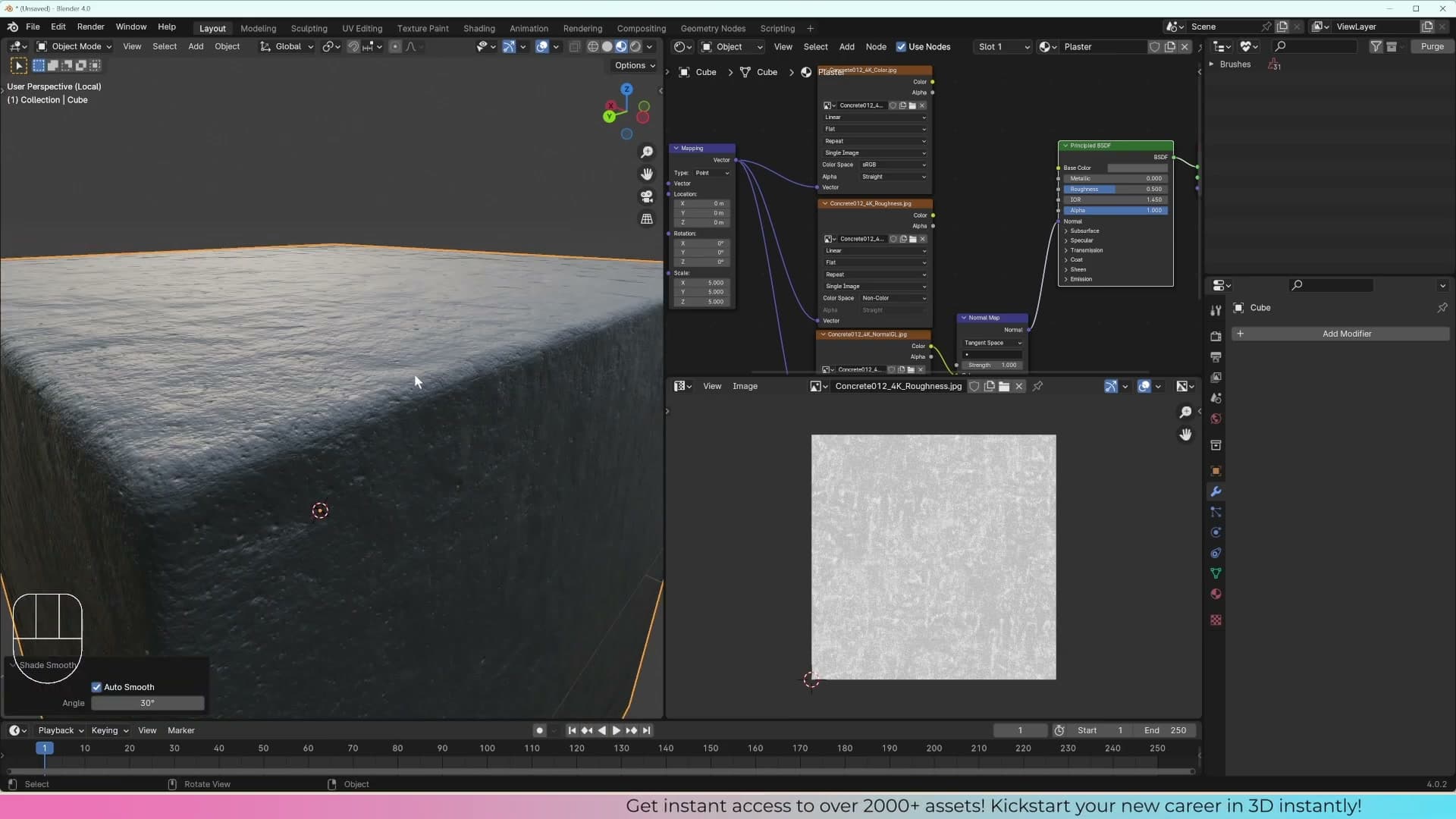
It does this with an angle limit. Blender measures the angle between every pair of adjacent faces, and anything sharper than the threshold becomes a seam, splitting the mesh into a new island at that point. The default value is 66°, which is enough to break a cube into its six faces automatically.
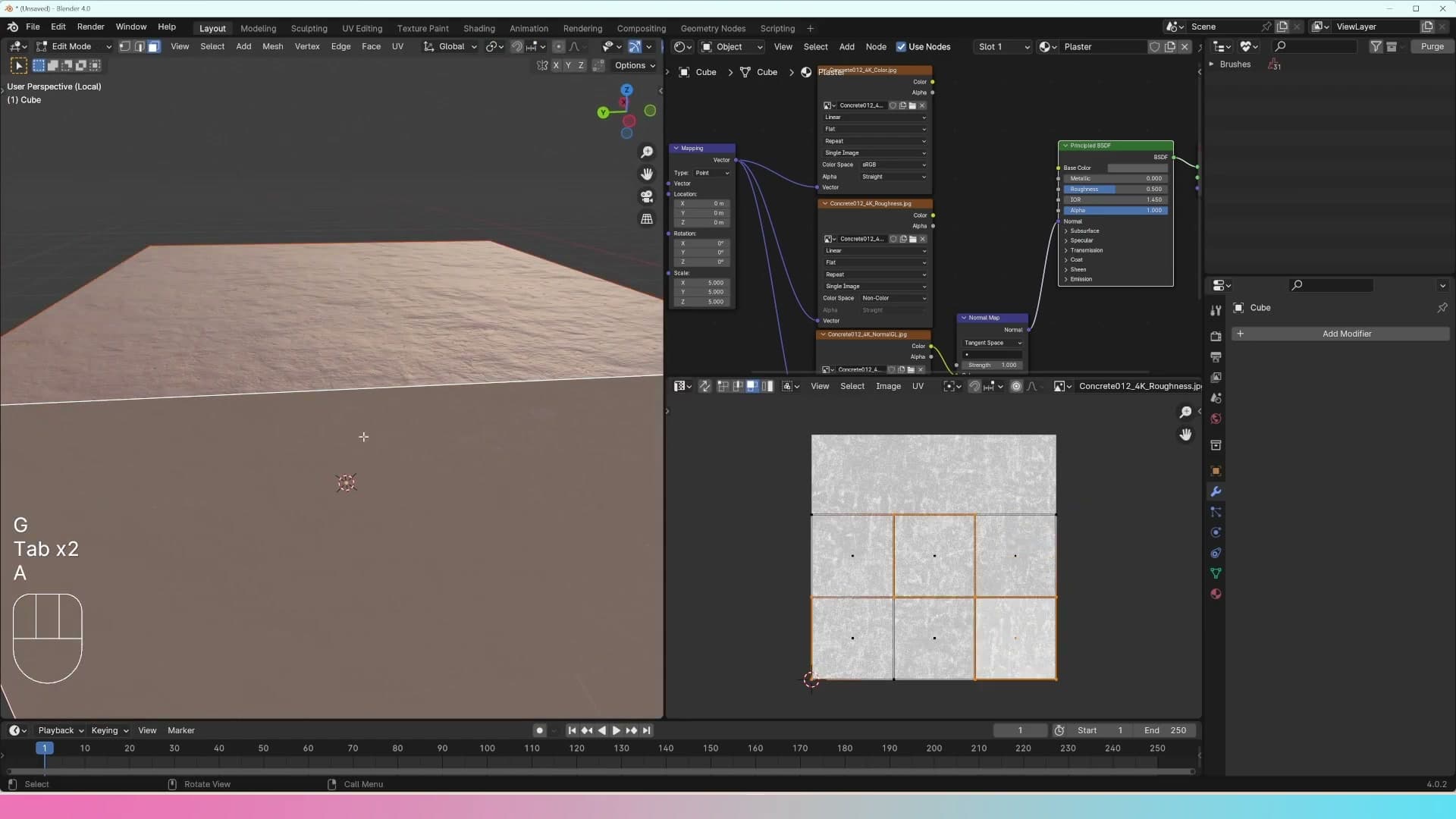
The catch is that none of those islands are joined any more. A face that looks like it should sit next to its neighbour in the UV layout is actually a separate patch, so any continuous pattern will visibly break at every cut. That's fine for repeating textures viewed from a distance (plaster, brick, tiles on a stair) but it's a poor choice for a hero object the camera will get close to.
Unwrapping the archway in the scene
Back in the project file: apply Mirror and Solidify first, then mark a continuous seam along the edges hidden from the camera and unwrap with Angle Based.
Applying Mirror and Solidify so the geometry can be unwrapped
Back in the actual project, select the archway and try to unwrap it as it currently stands. Press Tab to drop into Edit Mode, hit A to select everything, then U → Unwrap. At first glance the unwrap looks fine. It isn't doing what you think it's doing, though.
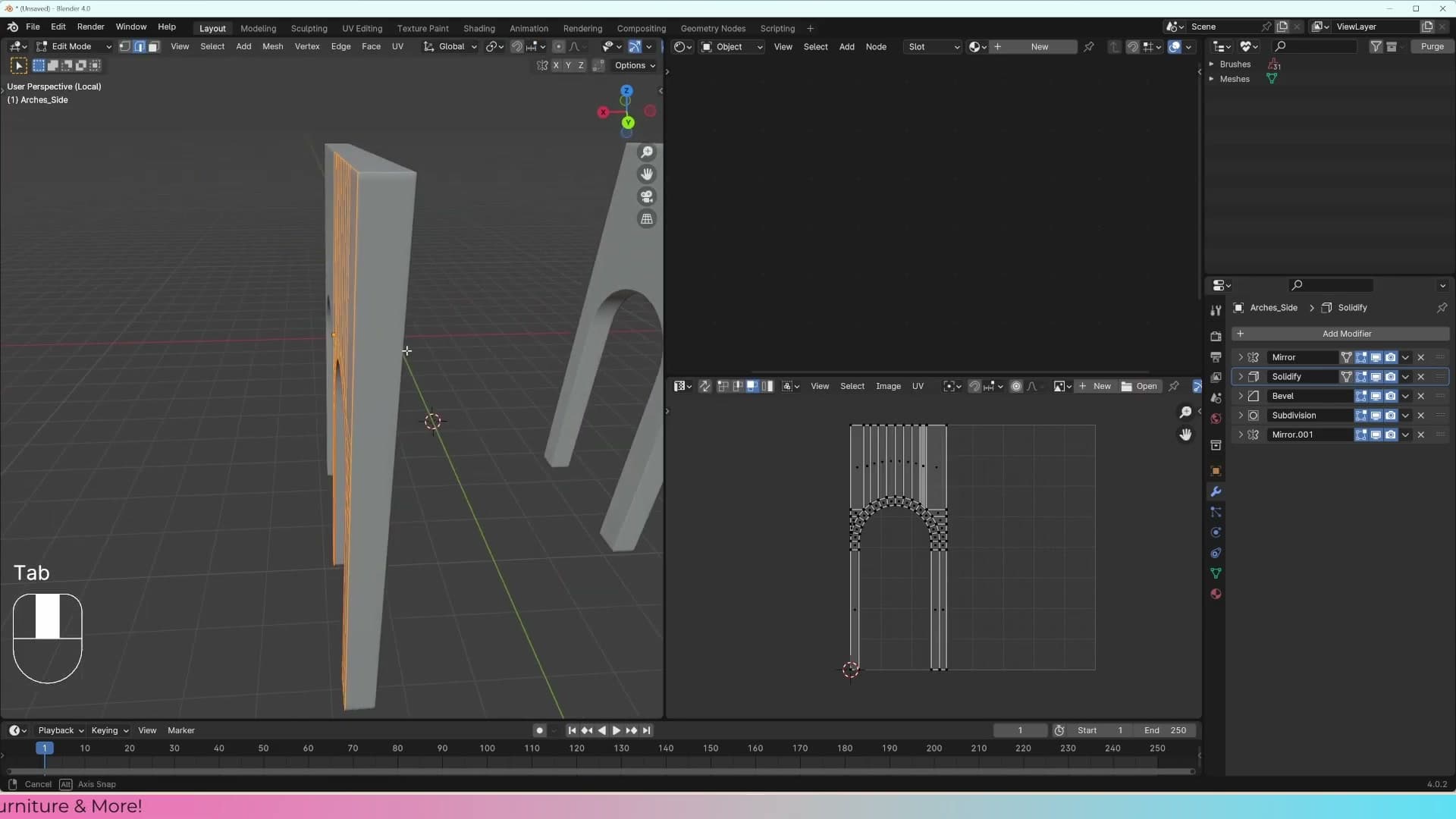
The archway still carries a Mirror modifier and a Solidify modifier, and both generate their geometry procedurally. In Edit Mode you only see the single source face, so that's the only thing Blender can lay out. Drop the plaster material onto the object and the problem surfaces straight away: the visible face textures cleanly, but every edge produced by the modifiers shows horrible stretching artefacts where the unwrap simply wasn't there.
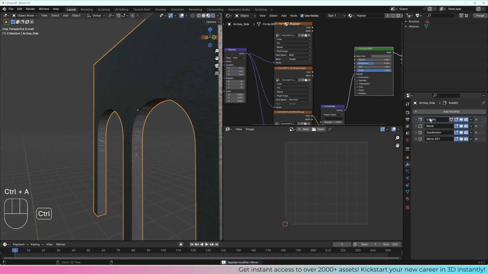
The fix is to commit those modifier results to real geometry before unwrapping. Open the modifier stack and apply Mirror first, then apply Solidify. Once both are baked down, the archway has actual faces and edges you can select, seam, and unwrap properly.
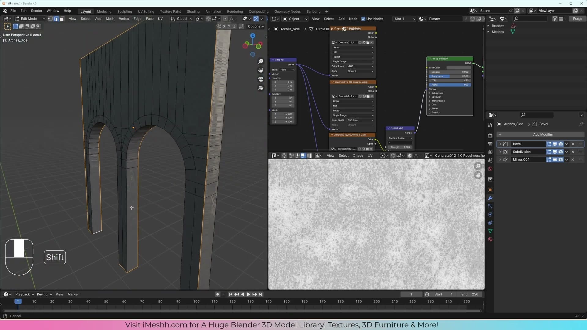
Angle Based vs Conformal unwrap
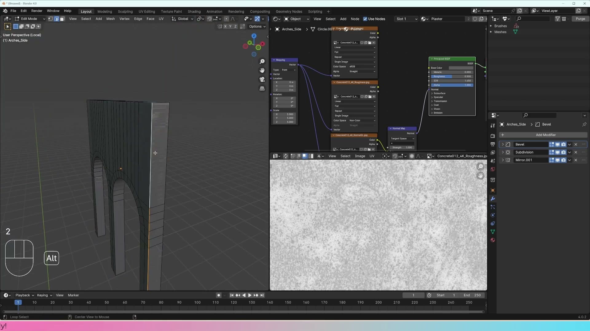
Triggering Unwrap pops up an Operator panel in the bottom-left of the viewport. The Method dropdown there lets you switch between Angle Based (the default) and Conformal. Each one suits different shapes, and the same seams can produce very different results depending on which you pick.
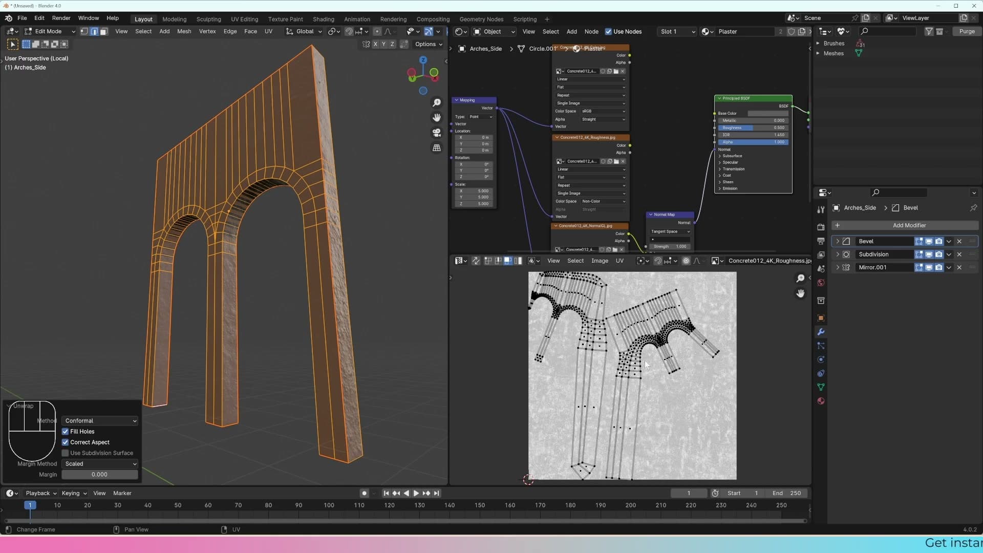
Set the method to Conformal and the archway distorts noticeably along its longer span. Conformal tries to preserve angles, which can warp the UV island on long, curved shapes like this one.
Switch back to Angle Based and the archway lays out flat with much less stretching. That's the version you want for the plaster texture coming up next.
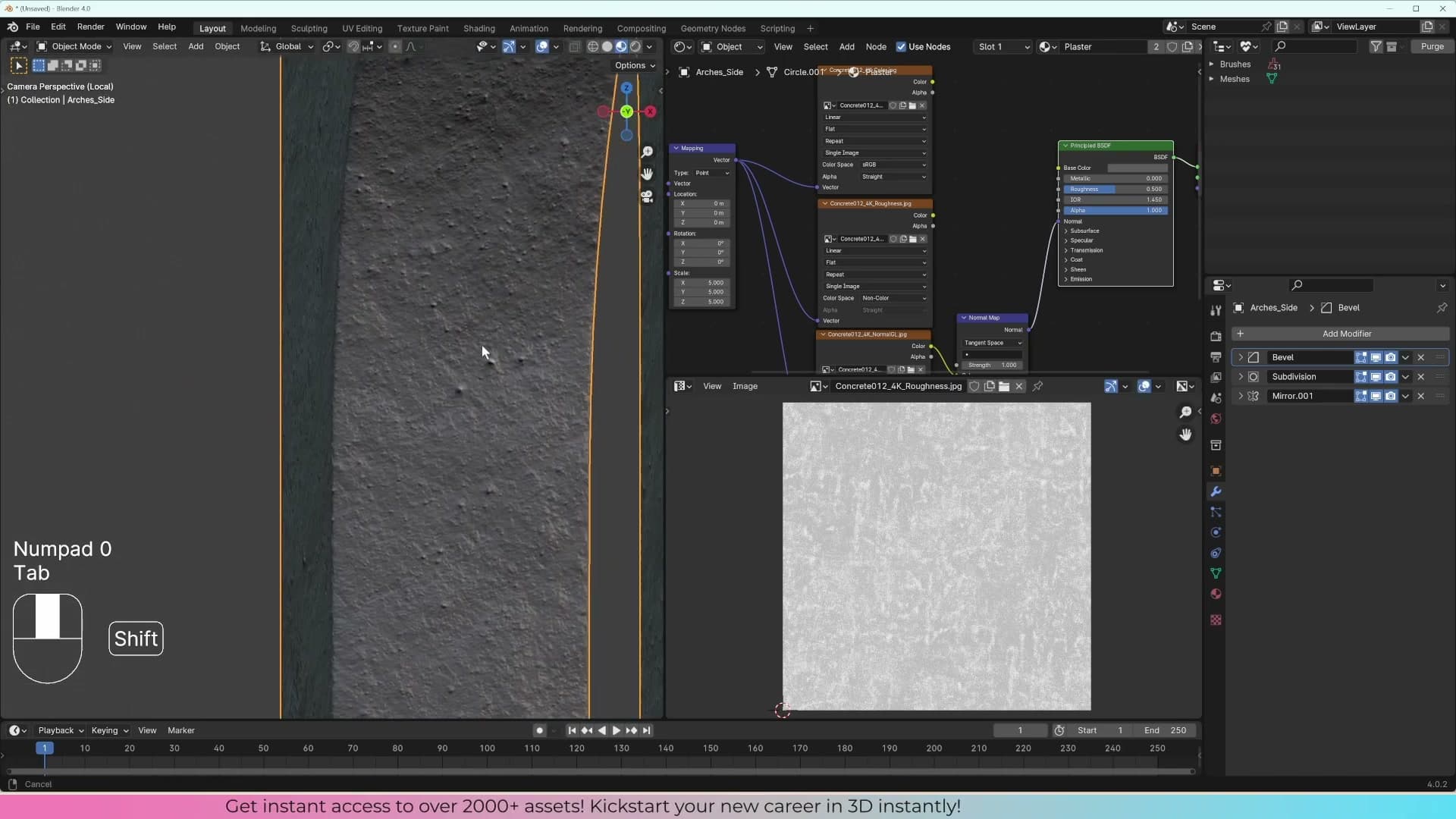
Don't worry if your unwrap doesn't look pixel-identical to the one in the video. As long as the seam routes through hidden edges and the result is roughly flat with no major pinches, the texture will sit happily on the geometry.
Tuning the plaster material in render view
Drop the base colour when the normal and roughness already carry enough information, then dial in roughness and bump strength to taste.
Skipping the base colour for a uniform painted look
Plug the base colour socket back in for a moment to see what it does. In my reference render the plaster reads as a soft pink, and the base colour is what drives that hue. Pick a brighter swatch, switch to pink, or push it to blue and the wall follows. Whatever you load in here will dominate the look.
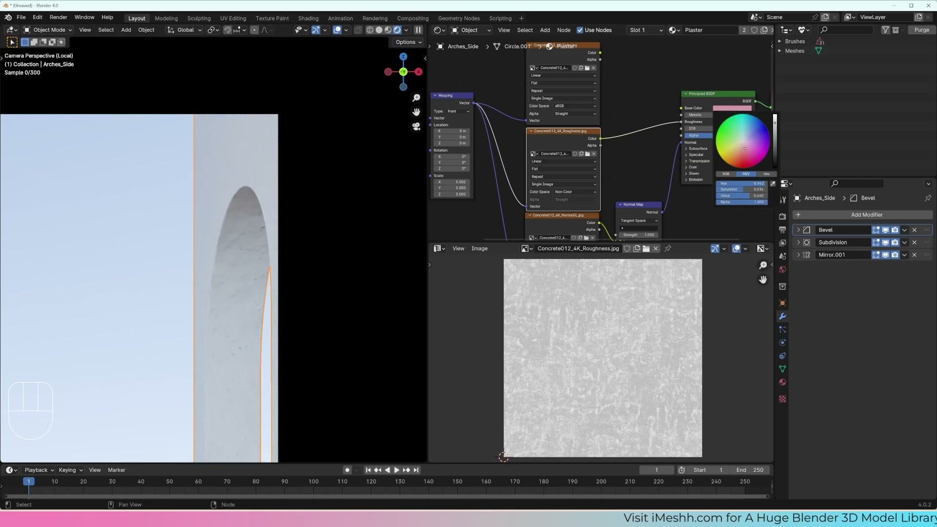
Then unplug it again. With the roughness and normal map already wired up, the surface carries more than enough information on its own to read as a uniformly painted plaster: you get the micro-variation in shine and the subtle bumpiness, but the colour stays clean and flat. For a freshly painted wall that is usually what you want, so leaving the base colour input unconnected is a perfectly valid finish for this material.
Optional: blending two colours with a Mix Color node
If you do want a hint of the diffuse map's variation back in the colour, you can mix it in rather than plugging it straight through. Add a Mix Color node, route the original diffuse texture into one colour input, pick a flat swatch for the other, and feed the result into the Principled BSDF's Base Color socket.
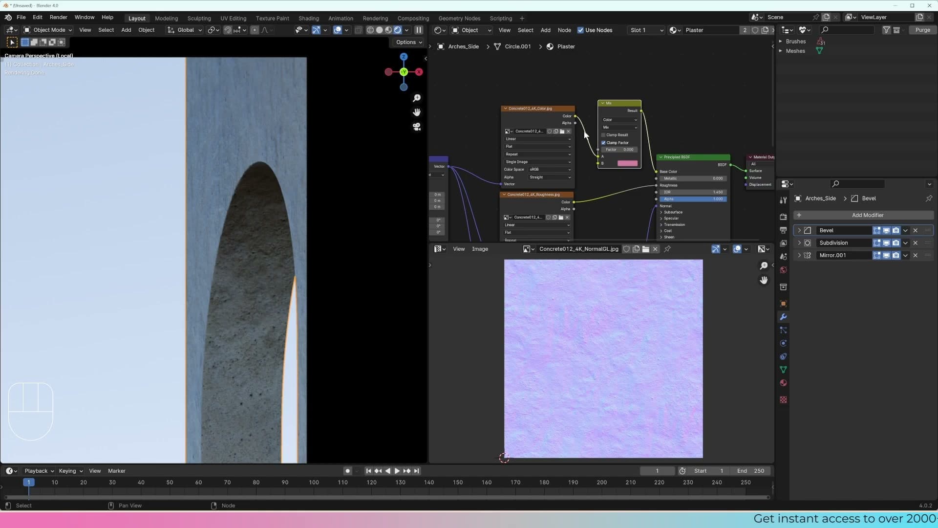
The Factor controls the blend. Drop it to 0 and you see the first input at full strength; push it to 1 and the second input takes over; anywhere in between gives you a weighted mix of the two. Switch the node into Material Preview while you do this, as the response is quicker than waiting for Cycles to resolve every nudge.
The blend mode matters too. The default Mix method literally averages the two colours, but switching it to Color tints the diffuse with the flat swatch instead, which can look interesting on a plaster wall. I find the result too dark here and prefer the cleaner unplugged-base-colour version, so the Mix Color node is deleted and the material reverts to the simpler setup.
Tuning roughness value and normal strength
With the base colour question settled, the plaster material is essentially finished. The roughness and normal maps are doing all the work, and you can move on to applying the same approach to other objects in the scene.
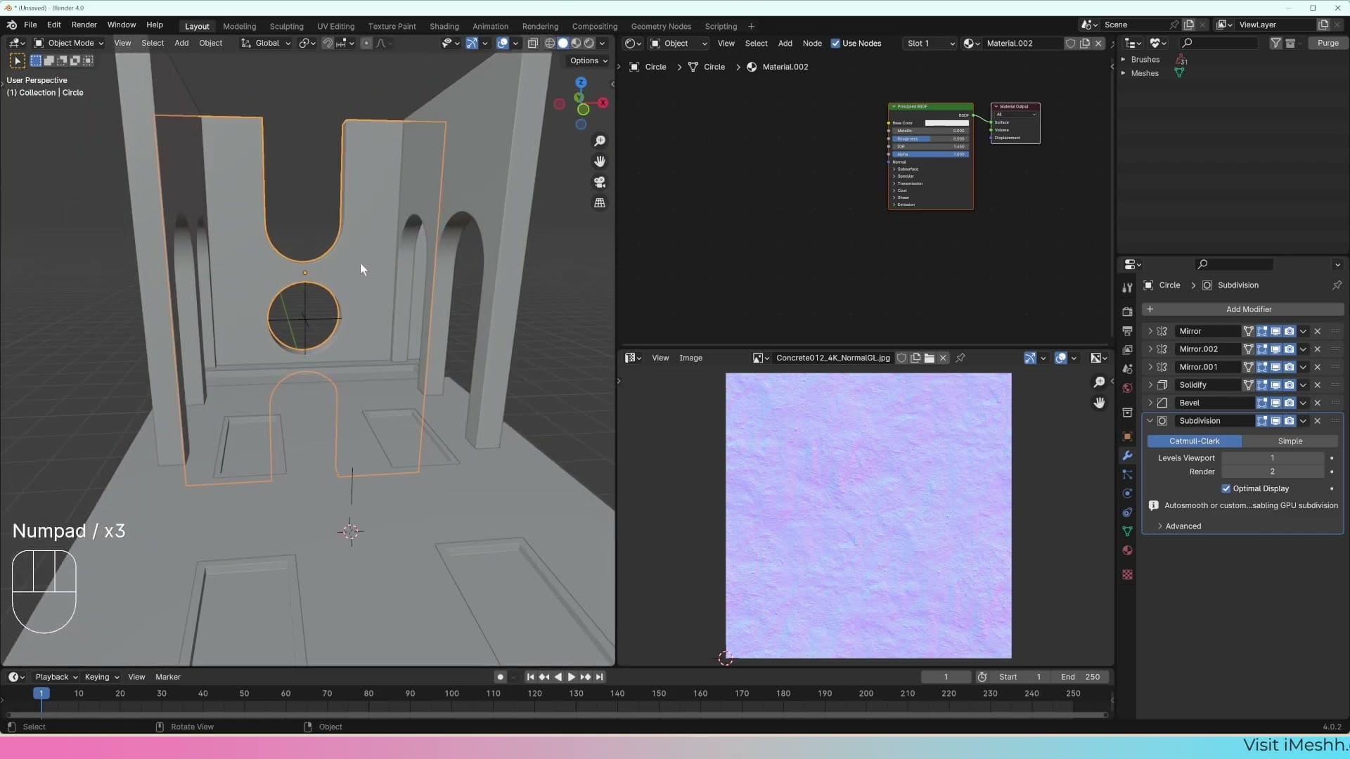
Roughness and bump strength are still worth treating as taste dials rather than fixed values. Nudge the Roughness input upward if the surface feels too sheeny under your lights, and drop the Strength on the Normal Map node if the bumpiness is reading too aggressively at the camera's distance. Both are non-destructive, so it costs nothing to dial them in once the rest of the scene is lit.
Saving versions and backing up with an 'old' collection
Save incremental versions of the .blend, then duplicate complex objects into a hidden 'old' collection before applying destructive modifiers.
File → Save As for incremental versions
Before you commit to a destructive change (applying a modifier, joining meshes, deleting geometry you might want back) save the file as a new version. Go to File → Save As and write a fresh .blend rather than overwriting the current one. If the next round of edits goes wrong, you can reopen the previous version instead of fighting the undo stack.
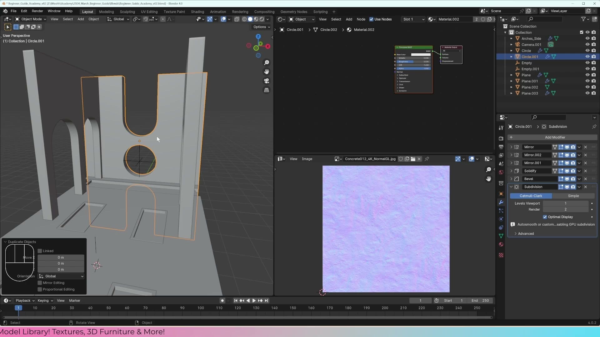
Get into the habit of doing this every time you reach a stage you'd be unhappy to lose. The next sub-lesson covers a per-object backup pattern that lives inside a single file, but a brand new .blend on disk is the cheapest insurance you have.
Shift+D, M, new collection: keeping a hidden backup
For one complicated object you're about to edit destructively, you don't need a whole new file. You can keep a reserved copy inside the same scene. Select the object and press Shift+D to duplicate it, leaving the copy sitting on top of the original.
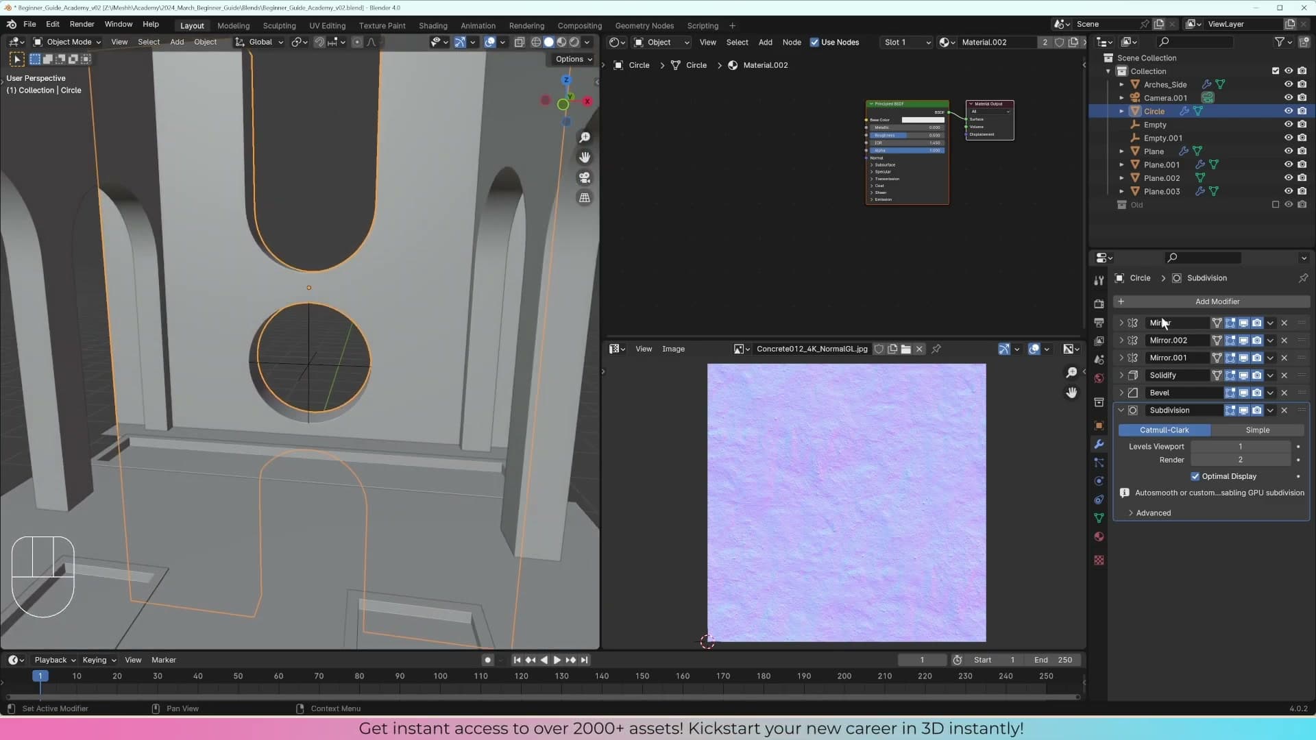
With the duplicate still selected, press M to bring up the Move to Collection menu and choose New Collection. Name that collection old. The duplicate now sits in its own group in the Outliner, separate from the working geometry.
Toggle the old collection off in the Outliner so it's hidden from the viewport. The geometry is still in the file; you just can't see it. If you edit the working copy and break it, or apply a modifier and regret the result, switch the old collection back on and pull a clean copy out of it.
This habit pays for itself across every 3D project. You won't always know when you're about to make a mistake, and a hidden backup that lives in the same .blend costs nothing in performance. It just sits there waiting until you need it.
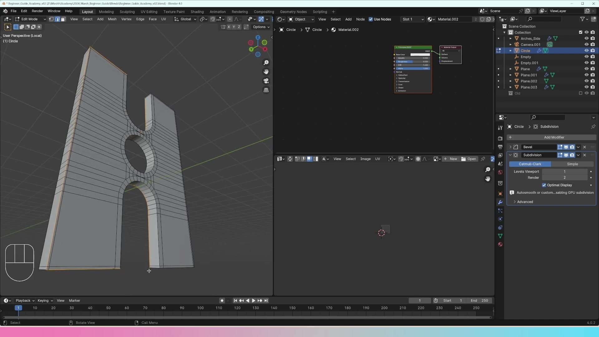
Unwrapping the staircase and making a white variant
Use Smart UV Project on the boxy staircase, then duplicate the plaster material to create a paintable white version without breaking the realism rule.
Smart UV Project on the staircase
With the archway done, the staircase is next. It's a much simpler shape (a boxy stack of cubes) but the same problem applies: leave it on the default UV and the plaster texture will stretch and twist at every corner.
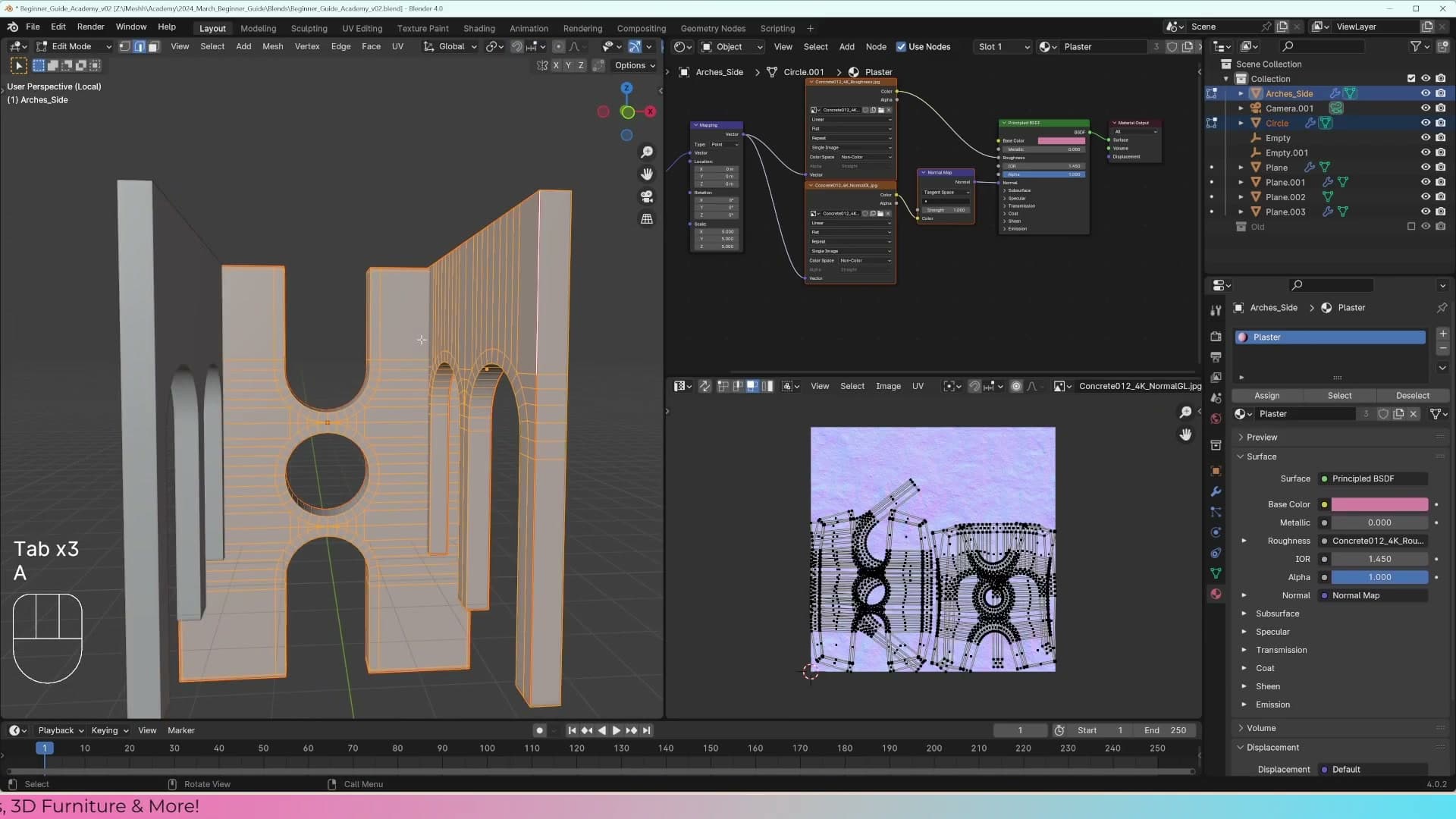
Start by marking seams the same way you did on the archway. Run a seam along the base edge of the staircase and across the inside faces that will be hidden once you drop grass on top later. Press U and try a normal Unwrap. You'll get some strange artefacts: the unwrapper is trying to lay the surface flat by bending it around the box, which warps the texture on the visible steps.
Rather than chasing this with more seams, switch to Smart UV Project. The menu label is technically Smart UV Project in Blender 4.0, although I tend to call it Smart UV Unwrap. With the staircase still selected, press U and choose Smart UV Project. For a square, repeating object like this the defaults handle it fine.
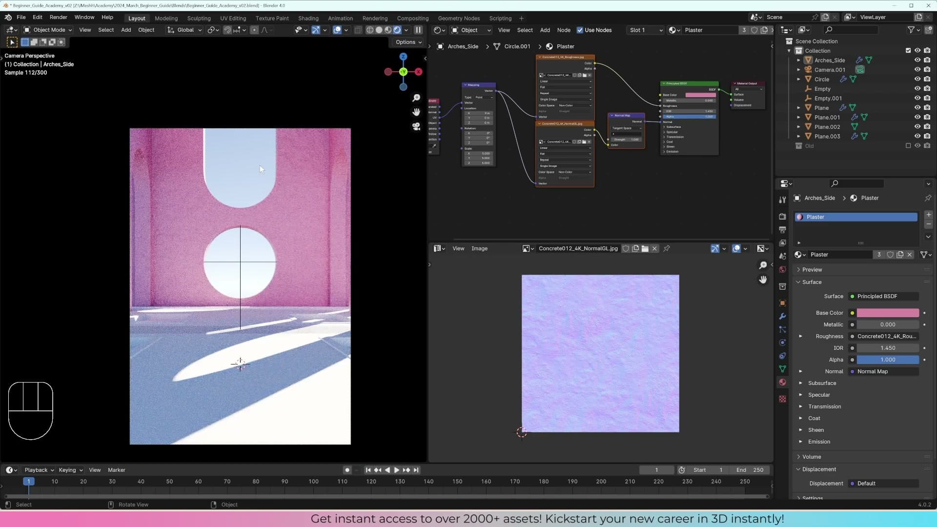
You'll see seams running between the steps in the UV editor, but check the camera view. The corners are so tight, and the plaster texture is busy enough, that the seams disappear at any realistic viewing distance. For a step that the viewer never gets within a metre of, that's all the precision you need.
Duplicating the material for a white variant
The plaster material works for the archway, but the staircase shouldn't share its pink-grey tone. It wants to read as painted white. Rather than rebuild the shader from scratch, duplicate the material you already have and change just the base colour on the copy.
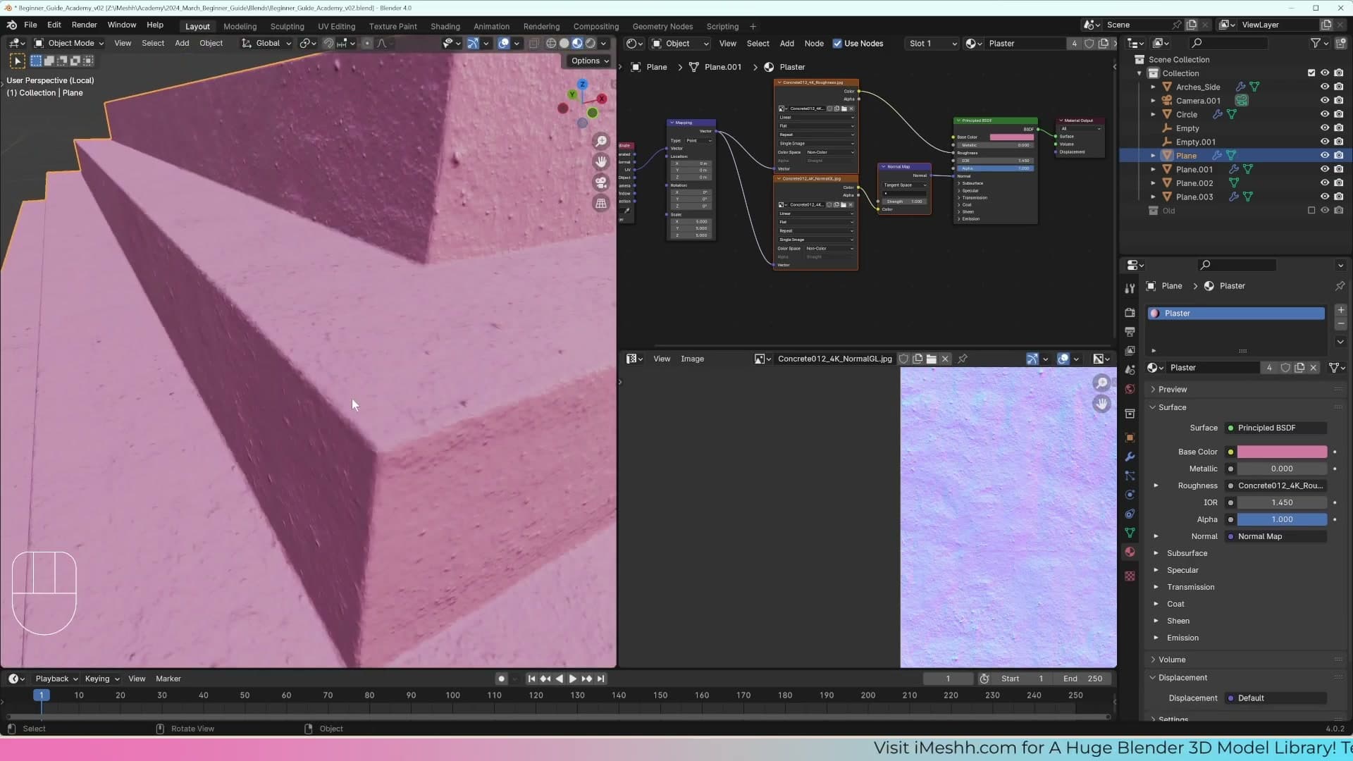
In the Properties panel, click the small number next to the material name (the user-count button on the material datablock). Blender duplicates the material and renames the copy plaster.001. Open the material dropdown next to it and you'll see both the original and the new copy listed.
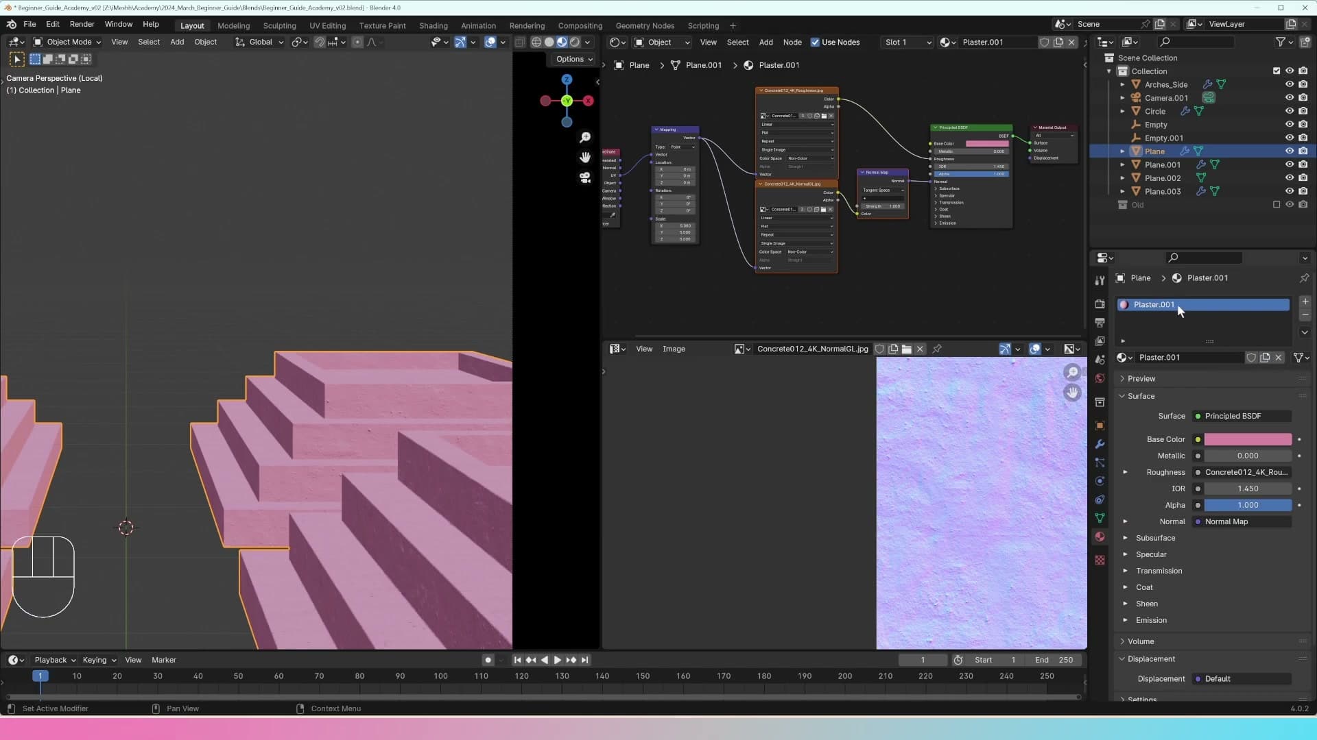
Rename plaster.001 to something descriptive like white so future-you can find it. The roughness map, normal map and node wiring all carry across automatically. Only the base colour needs to change. Lighten it towards white and you have a second variant of the same physical surface, with all the bump and roughness detail intact.
Why you should never use pure white or pure black
Before you drag the colour picker all the way up, a rule worth committing to memory: never use 100% white or 100% black for a base colour. Neither value exists in the real world, and Cycles treats both as physically impossible surfaces.
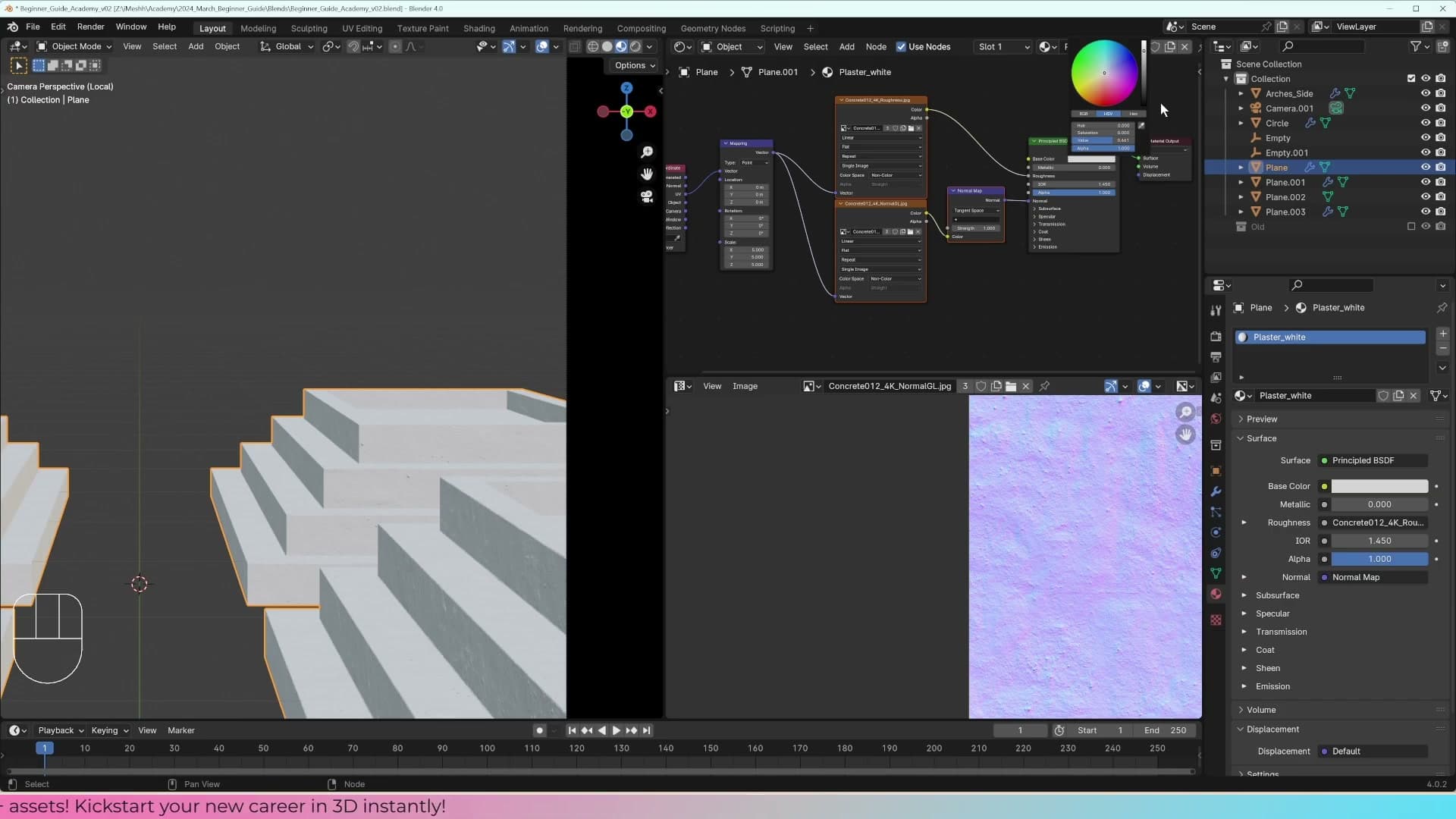
A base colour at 1.0 tells the renderer the surface returns every photon it receives, which is the definition of an emitter. It'll glow rather than read as paint. A base colour at 0.0 swallows everything, behaving like a black hole. Real-world black surfaces still reflect a little light; even a matte charcoal returns enough to show up in a render.
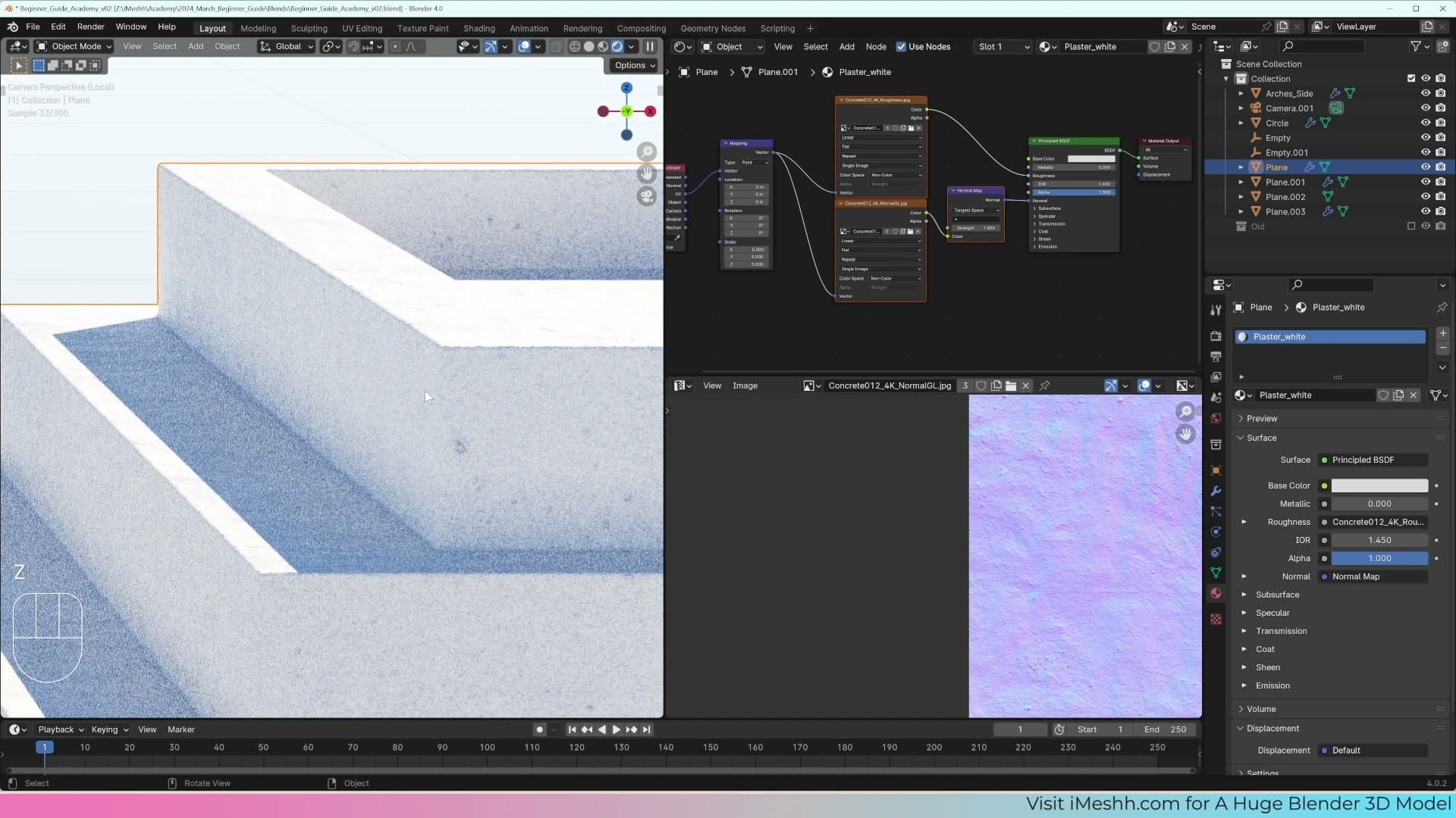
Vantablack (around 99.99% light absorption) is the rare counter-example, and even that looks strange and otherworldly. It's not the kind of surface you find on a wall in someone's house.
Pull the colour back to a slightly greyer near-white instead. The bumpy normal map and the roughness map still do their work, and the preview now reads as believable painted plaster rather than a glowing rectangle.
Tools and credits
Everything mentioned in this tutorial, with links.
- Blender is the renderer this entire build runs in.
- iMeshh is a studio platform covering project management, client review, asset library, and invoicing. The asset library used in this tutorial is included with every iMeshh Pro plan.
- Poly Haven offers free CC0 textures and HDRIs.
Pillar guide: Beginner Course hub