Cycles render properties and sampling basics
Open the Render Properties tab, confirm Cycles is using GPU compute, and walk through the noise threshold, max samples, and viewport denoising. Sample count directly affects how cleanly the denoiser can resolve an image.
Cycles, GPU compute, and the viewport sample target
Open the Render Properties tab on the right-hand sidebar and run through the top section to make sure everything is configured the same way it has been throughout the course. The render engine should be set to Cycles, the feature set to Supported, and the device to GPU Compute. If you don't have a discrete GPU, swap to CPU. It works exactly the same, just slower.
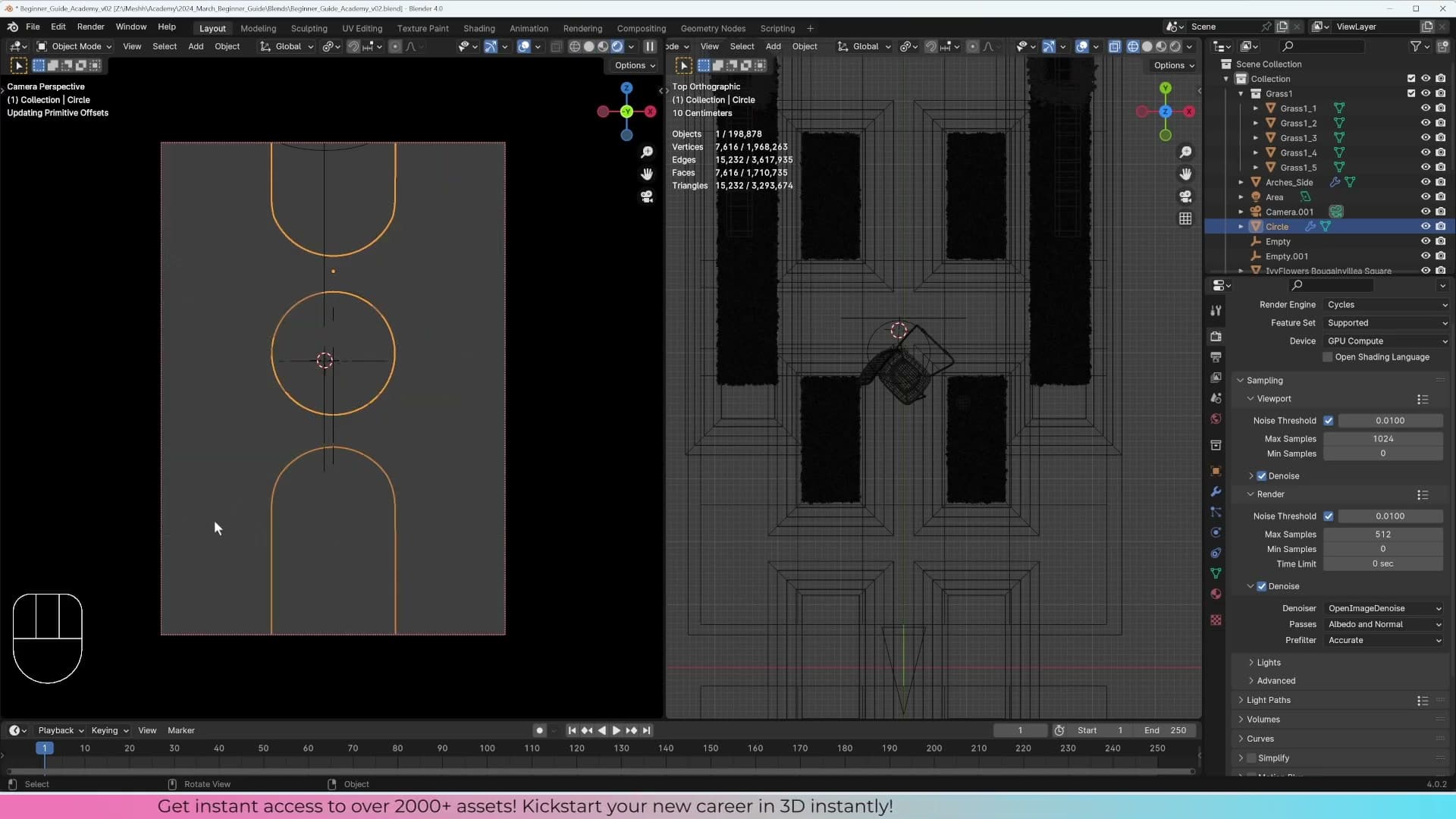
Under the Sampling section, the viewport noise threshold sits at 0.01 and the max samples at 1024, the same values used in the preview renders earlier in the course. The denoise settings sit just below: by default the viewport denoiser begins cleaning the image once you reach 150 samples, which gets you to a final-looking result well before the full sample budget finishes.
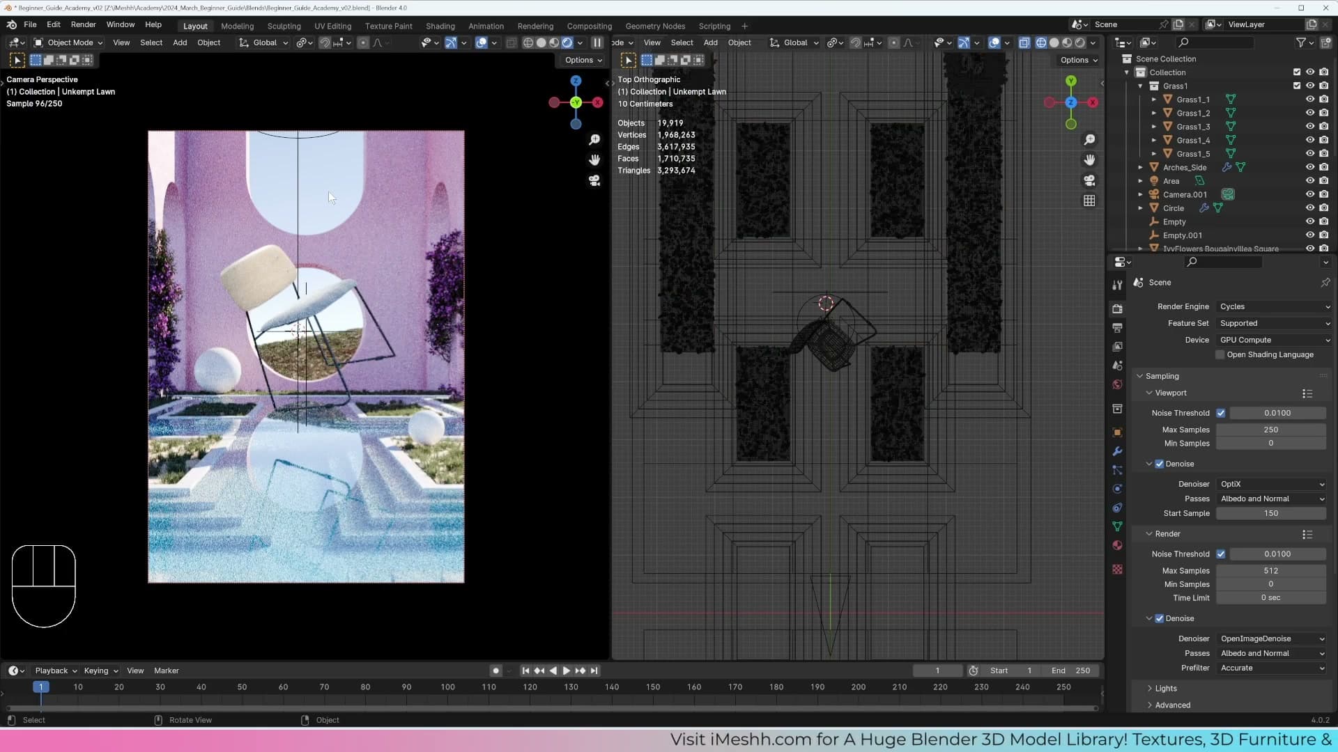
Before you trigger a rendered preview, drop the viewport setting on your geometry nodes down to 0.1. The scene is heavy enough that the live samples crawl otherwise. Now switch to rendered preview and watch the sample counter climb toward 1024. For a working viewport that's overkill: around 250 samples is usually plenty, since you only need the image clean enough to judge composition and lighting. The full 1024 is for the final F12 render, which you'll configure separately.
How sample count affects what the denoiser can recover
It's tempting to think the denoiser can rescue any render, but it can't. It only has the information you give it. To see this for yourself, drop the viewport max samples down to 2 and set the denoise start sample to 0 so the denoiser kicks in immediately. The result vaguely resembles the scene, but it's smudgy and paintery; edges blur into the surrounding colour because the denoiser has almost no signal to work with.
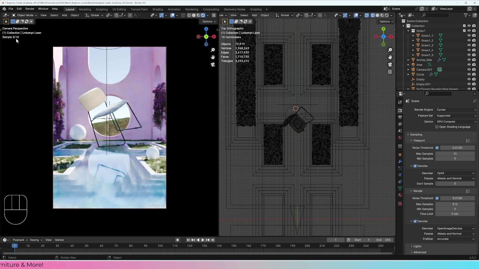
Now push samples up to 10 and watch the viewport refresh. With those extra few samples the denoiser has enough information to resolve the geometry properly. Edges sharpen, materials read correctly, and the paintery smear collapses into a recognisable image. Eight, nine, ten samples in, you can already see it cleaning up pass by pass.
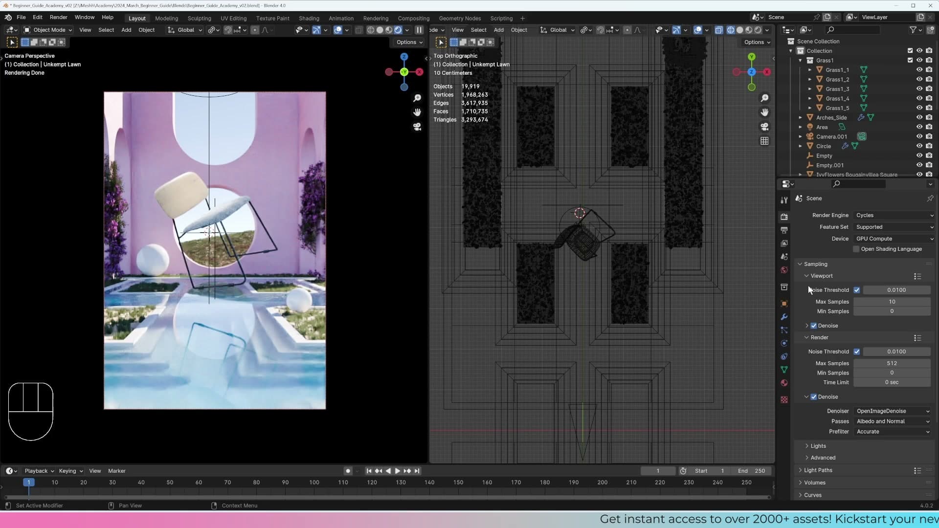
The principle to take away: the denoiser is a finishing pass, not a substitute for samples. The more information it has about the underlying render, the better the result. That's why your final F12 render uses a higher sample count than the viewport. You trade a bit of render time for a cleaner image the denoiser can polish, rather than asking it to invent detail that was never there.
Final render settings and light paths
Switch from viewport to render settings, pick a sample count appropriate for the scene's lighting, understand why the built-in Denoise checkbox is destructive, and configure light path bounces.
Choosing render-tab samples for the final image
With the viewport dialled in, switch your attention to the Render samples: the count that controls what F12 actually bakes out. This is a separate field from the viewport samples you set earlier, and the viewport value has no bearing on the final image. Whatever you choose here is what Cycles will commit to.
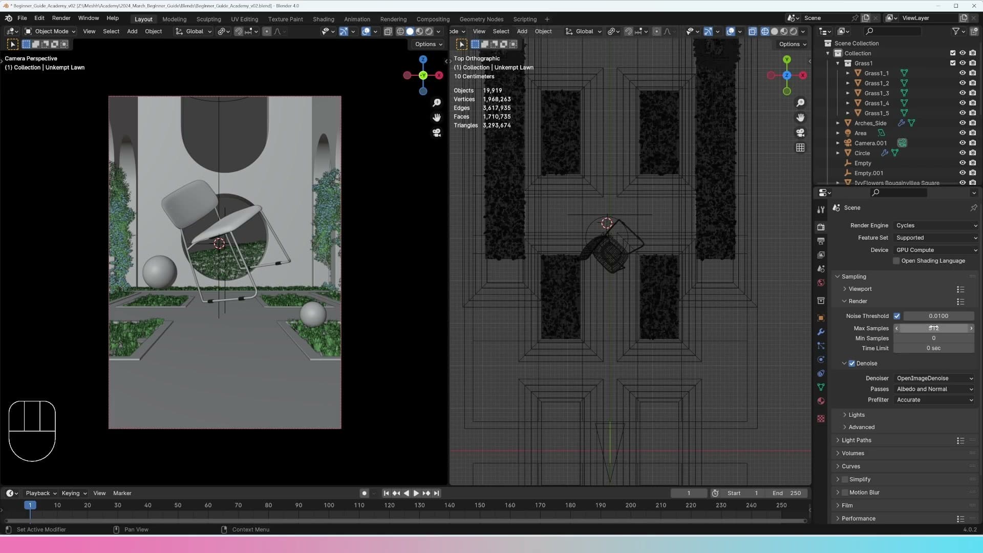
How many samples you need depends entirely on the scene. If you're lighting through a very small window, or relying on a small emissive light, Cycles has fewer paths to find that light through, so the image takes much longer to clean up. It's the same principle as a phone camera at night: low-light photos pick up far more noise than daytime shots because there's less light to work with, and harder lighting conditions in Blender behave the same way.
Because of that, you'll usually do a handful of test renders at different sample counts before locking in the final number. For this scene, 512 samples is enough to produce a clean image without spending unnecessary render time.
Why to skip the built-in Denoise checkbox
Directly underneath the sample count you'll see a Denoise checkbox with its own dropdown of settings. It's tempting to tick it and let Cycles handle denoising automatically at the end of the render, but leave it off.
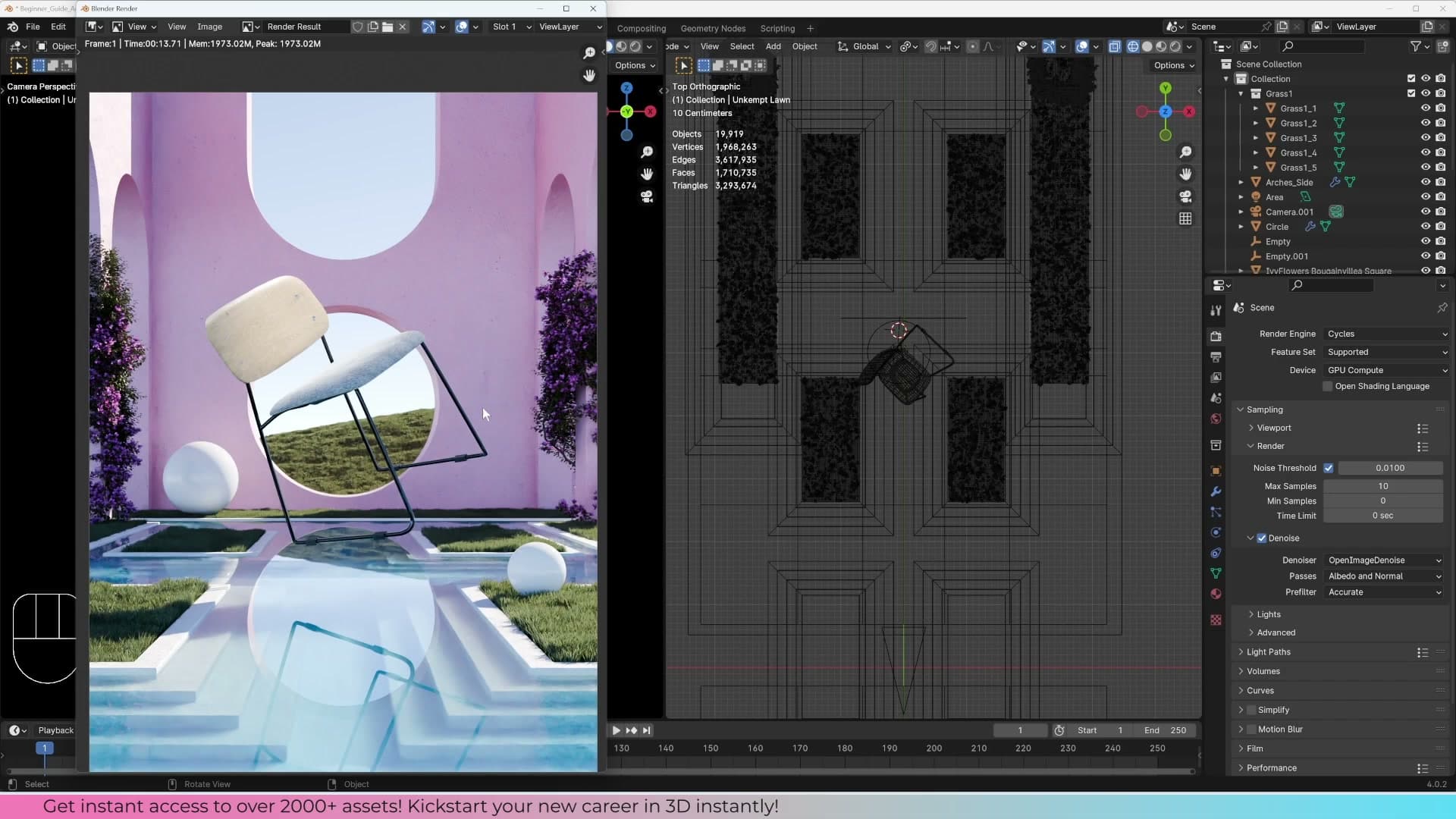
The problem is that this toggle bakes the denoised result straight into the saved image. As a quick demonstration, drop the samples to 10 and hit render with Denoise enabled: once Cycles finishes the last sample, it runs the denoiser and replaces the noisy image with the cleaned-up version. That cleaned version is the only thing you can save.
If the denoiser has been a little too aggressive, smudging fine details into the background or softening a solid edge that should still read clearly, there's no way back. The detail is gone from the file, and no amount of post-processing will recover it. Untick the Denoise checkbox in the render properties and leave it disabled.
You'll still denoise the final image, but you'll do it as a separate step in the compositor where it can be blended back against the noisy original. That's covered later in the post.
Light paths, indirect bounces, and AGX
A little further down the render properties is the Light Tree option. It mostly matters when a scene has a lot of small individual lights, where it helps Cycles sample them more efficiently. Just leave it switched on and move on.
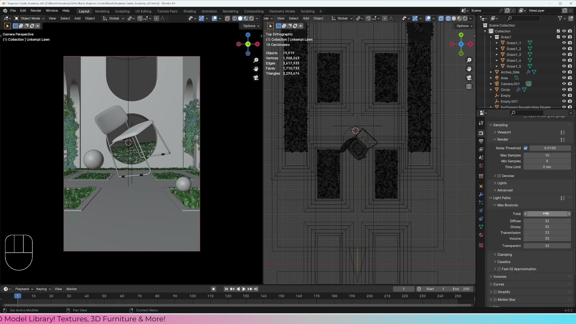
Under Light Paths, indirect is set to 0 and filter glossy is enabled. Then in the Max Bounces section, the bounce counts are all set to 32. That gives the renderer plenty of headroom for indirect light and reflections to travel through the scene without getting cut off prematurely.
Finally, the view transform is set to AGX High Contrast, which gives the final image a punchier tonal range than the default look. With that, the render settings are ready. Hit F12.
Output formats and view-layer passes
Compare PNG, TIFF, EXR, and JPEG output options for how much information they preserve for later editing, then enable the Denoise Data and Mist passes on the view layer so the compositor can use them.
Picking an output format for editing flexibility
Before kicking off the render, drop down to the Output Properties panel and check the file format. This choice matters more than it looks: the format you save in decides how much editing headroom you have afterwards.
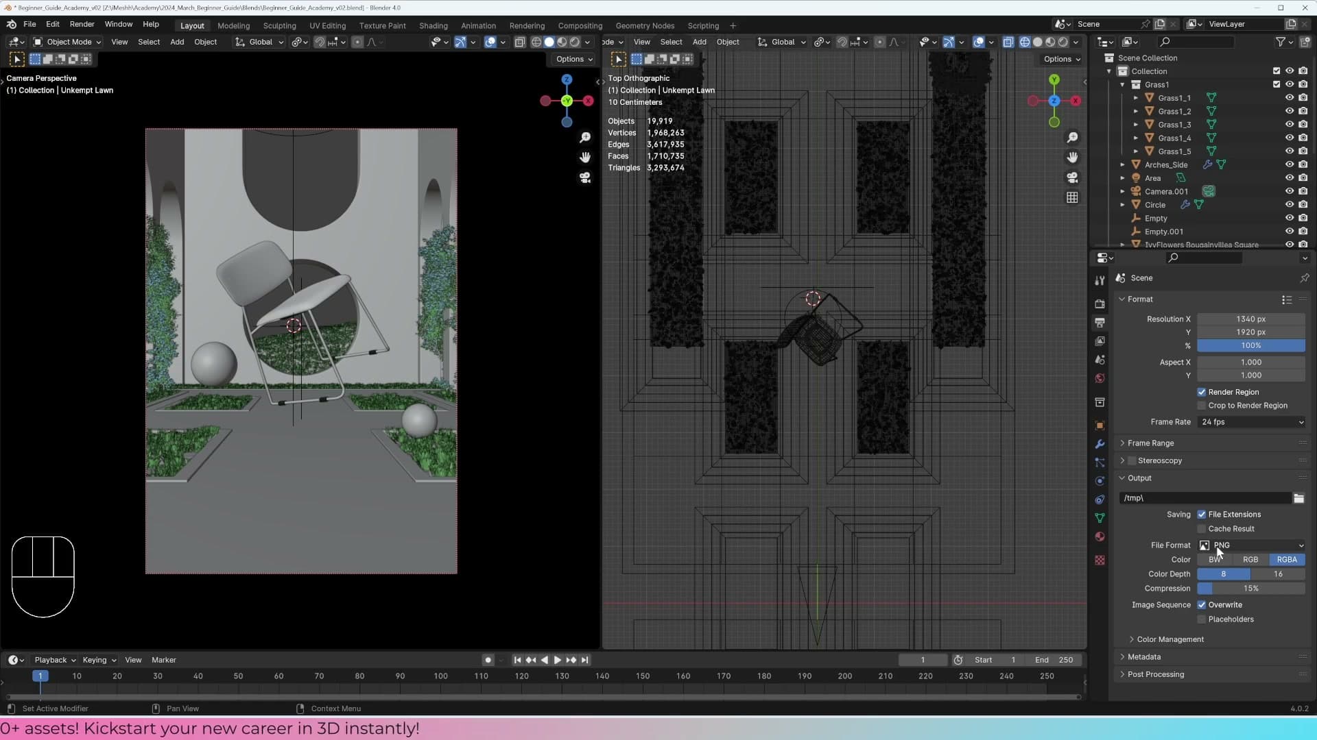
The four options worth knowing are TIFF, OpenEXR, PNG, and JPEG. TIFF, OpenEXR, and 16-bit PNG all retain a lot more information per pixel than a standard JPEG. That extra information is what lets you push contrast, recover highlights, or shift colours in post without the image falling apart.
JPEG is the opposite end of the trade-off: small file size, but the colour information has been crushed down for the internet. That's exactly what you want as a final delivery format, but it's a bad choice to render straight into if you plan to edit at all.
The practical workflow is therefore two-stage. Render out to a high-bit-depth format (TIFF, OpenEXR, or 16-bit PNG), do all your grading on that master, then export a JPEG copy at the end for sharing online. In this tutorial most of the editing happens inside Blender's compositor rather than Photoshop, so the final output format isn't going to be the deciding factor, but it's worth setting up properly so the option is there.
Enabling Denoise Data and Mist passes
Next, switch over to the View Layer Properties tab and scroll down to the Passes section. The first thing to enable is Denoise Data. With this turned on, Blender saves out additional buffers alongside the main render: the Normal and Albedo data the denoiser needs to do its job. That means you can run the denoiser later, in the compositor, and decide exactly how much of it to apply rather than baking it permanently into the image.
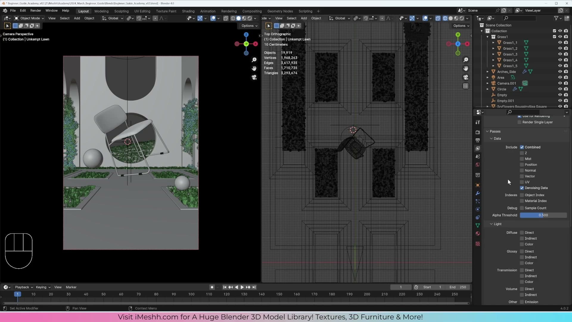
While you're in the Passes panel, also enable Mist. Mist gives you an atmospheric depth pass that you can mix back over the render in the compositor to add a subtle sense of distance and air to the scene.
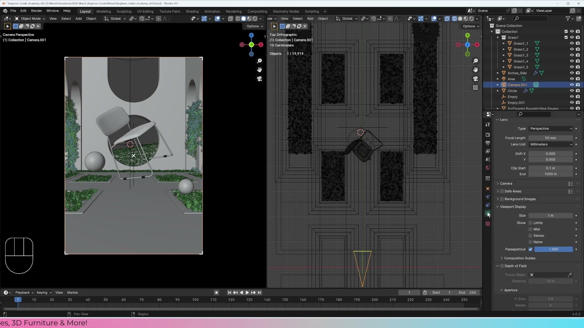
Enabling the Mist pass on the view layer is only half of the setup though. The actual range of the mist is driven by the camera. Select the camera and you'll see two markers in the viewport indicating where the mist starts and where it ends. Those values, along with the rest of the mist controls, live on the World tab, which we'll dial in once the render is finished.
Mist range and camera depth of field
Set the mist start and depth from the World tab so the falloff covers the scene, then enable depth of field on the camera with the chair as the focus target and an f/5.6 aperture for a believable archviz blur.
Configuring mist start and depth in the World tab
Switch to the World Properties tab and open the Mist Pass panel. This is where you tell Blender where the mist begins, how deep it reaches, and how aggressively it ramps from clear to fully fogged. The compositor will use that gradient later as a depth-based atmosphere.
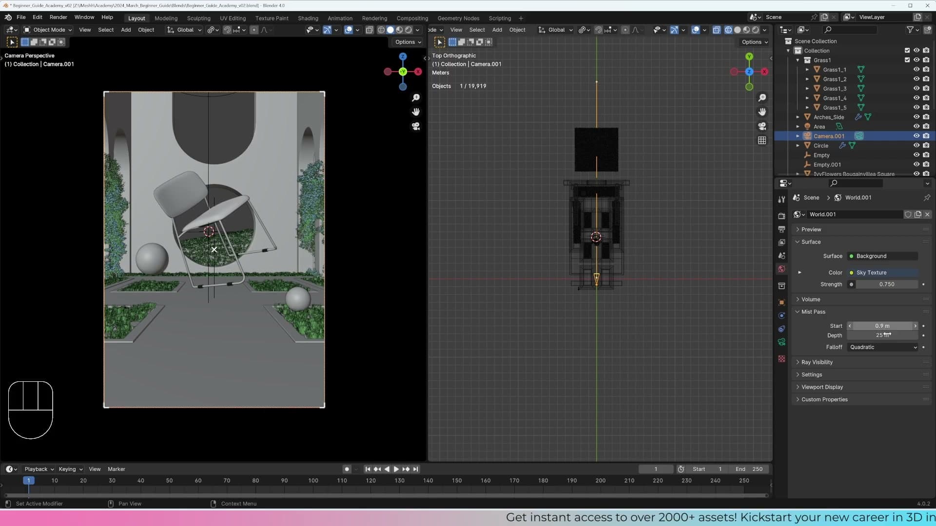
Set Start to 0 so the falloff begins right at the camera, then dial the Depth outwards until the gradient covers the full scene. The aim is to include the whole image in the ramp: as the pass moves away from the lens it should climb steadily from 0 toward 100, with anything past the end point reading as fully misted.
Rather than guessing numerical values, use the gizmo Blender draws in the camera view. It shows the mist start and end as two markers along the lens axis, so you can drag the depth visually until the back wall of the scene sits comfortably inside the range.
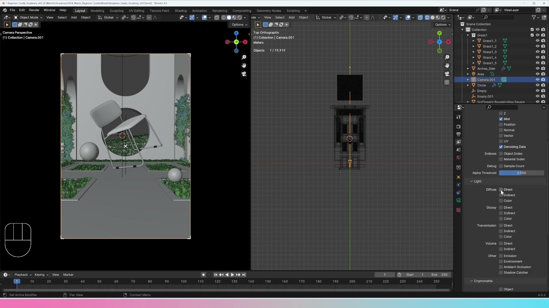
The Passes panel also exposes other data you can pull out of the render, including Cryptomatte masks for per-object selections, but you don't need them for this project. Denoising Data and Mist are the only two extras the compositor work coming up actually relies on.
Depth of field at f/5.6 with the chair as focus
There's one final camera setting that's easy to forget before hitting render: depth of field. Select the camera, open the Camera Properties tab, and tick the Depth of Field checkbox to switch the lens from pinhole-sharp to physically realistic.
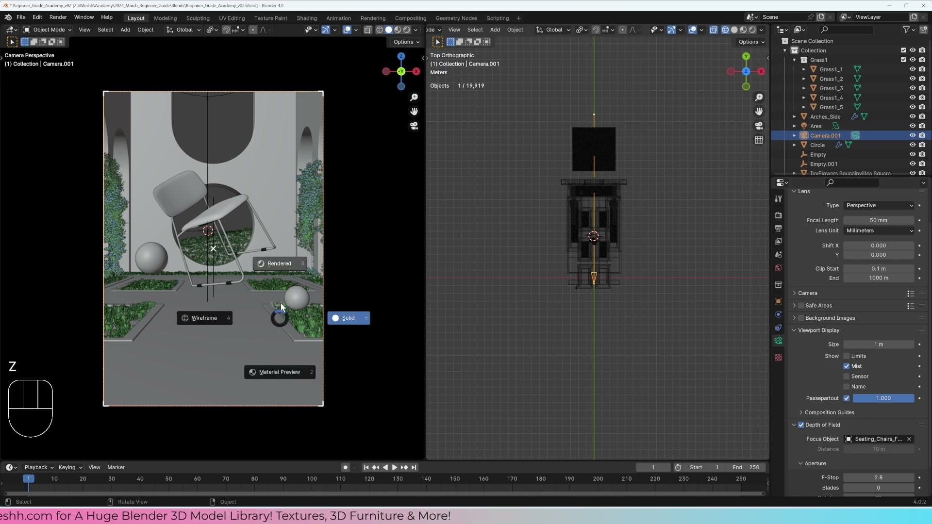
Under the same panel, use the Focus on Object picker and point it at the hero chair in the scene. Switch the viewport to rendered shading and you'll see the chair snap into focus while everything in front of and behind it softens, which is the look you want for a focal subject in an archviz still.
Blender's default aperture of 2.8 tends to be too shallow for interior work. The background dissolves and you lose all sense of the room. Push the F-Stop up to 5.6 so more of the scene stays readable while the defocus is still strong enough to sell the camera depth.
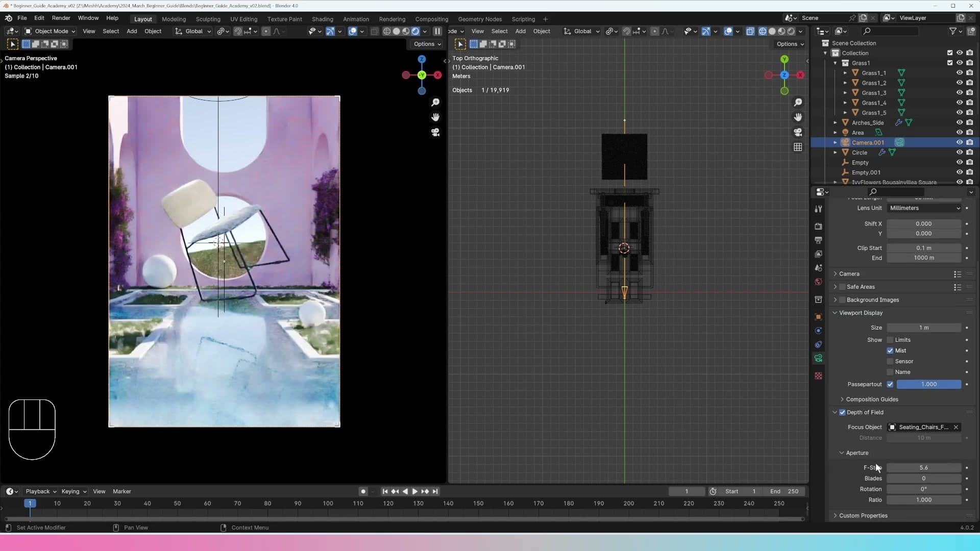
If you want a visual confirmation of where the focal plane is landing, enable Limits on the camera. A small marker appears at the focus distance in the viewport so you can check the chair is actually the object sitting on the plane of sharpest focus before you commit to a render.
First render and fixing what it reveals
Press F12 for the first true render, spot that the plaster displacement reads as too bumpy at full quality, dial it down and re-render to confirm the fix.
First F12 render and spotting the bumpy plaster
With samples set to 512 and the output format left as PNG, you're ready for the first proper render. Press F12 and let Cycles do its work.
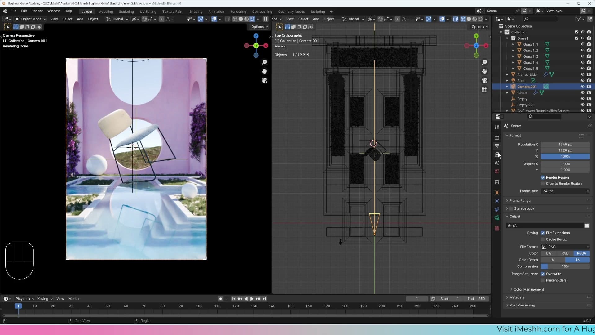
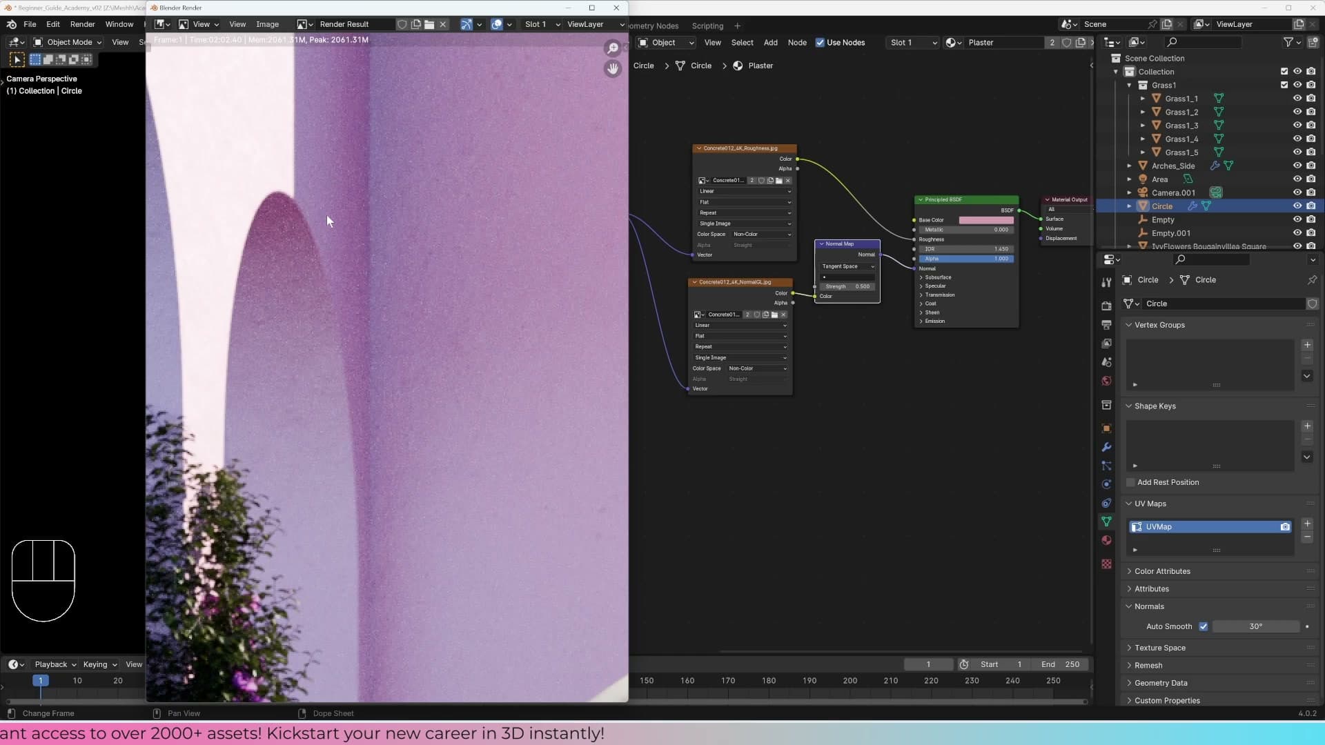
When the image comes back, the depth of field reads as expected. The background sits softly out of focus thanks to the f/5.6 setting on the camera, and that defocus adds a layer of realism. What does jump out, though, is the plaster wall behind the scene. At viewport quality it looked fine; at full render quality it reads as too bumpy and starts pulling attention away from the foreground.
Reducing displacement on the plaster and re-rendering
To fix the plaster, select the wall and open the object's modifier settings. The displacement value driving the bumpiness is what needs to come down.
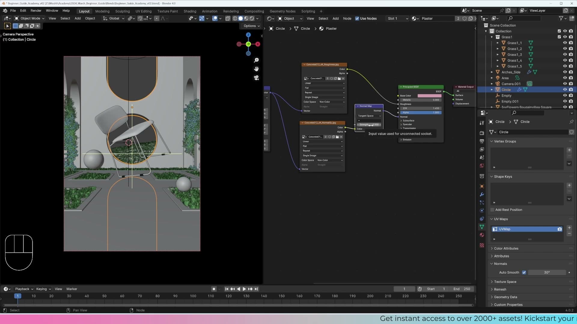
Drop the strength to 0.5. That's low enough to take the rough, overstated texture out of the surface but high enough to keep the wall reading as plaster rather than a flat, painted card.
Re-render with F12. On an RTX 3070 the second pass takes around three minutes at 512 samples. Slower hardware will be longer, faster cards quicker.
The wall now reads as a believable plaster surface, smoother and a lot more realistic, and it no longer fights for attention with the hero of the shot. The render isn't finished yet, though: look closely and you'll see sparkly bits and grain scattered across the image. That's the noise the denoise data was enabled to handle, and the next step is to extract it inside the compositor.
Compositor setup and the Denoise node
Build a custom workspace with the Compositor on one side and the Image Editor showing Render Result on the other, then wire up the Denoise node with Image, Normal, and Albedo inputs and mix it against the noisy original.
Custom workspace: Compositor plus Image Editor
Before you can start wiring nodes, you need a workspace that lets you see the render and the compositor graph at the same time. Split your screen in two and set the top half to the Image Editor with its header set to Render Result. Set the bottom half to the Compositor and toggle on Use Nodes so the default Render Layers and Composite nodes appear.
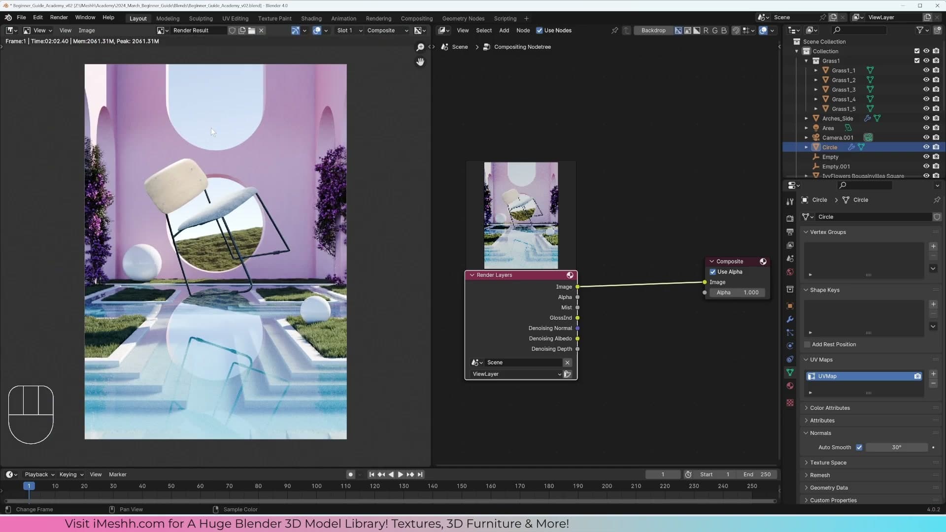
The Compositor does have its own backdrop option that lets you preview the rendering inside the node editor itself, but a dedicated Image Editor pane gives you a larger, cleaner view of what is changing as you add nodes. With this split in place you can zoom in on the noisy areas of the render in the top pane while you build the denoise graph underneath.
Denoise node wired with Normal and Albedo
With the Denoise Data pass enabled back in Module 5, the Render Layers node now exposes two extra sockets alongside the usual Image output: Normal and Albedo. These two passes give the denoiser the geometry and base-colour information it needs to clean up fireflies and grain without smudging away surface detail.
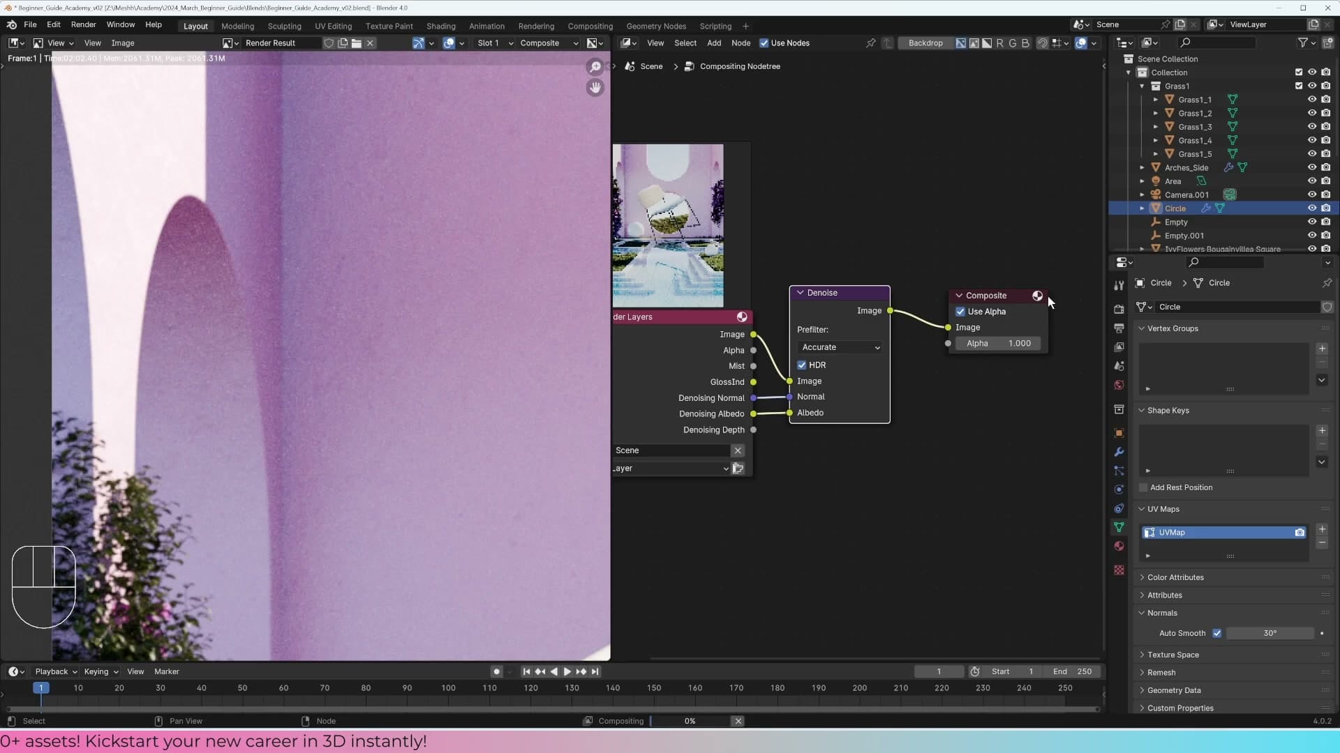
Hover over the compositor and press Shift+A, type denoise, and drop the Denoise node into the graph. Wire the Render Layers Image into the Denoise node's Image input, Normal into Normal, and Albedo into Albedo. Connect the Denoise node's output into the Composite node and the compositor will start churning. After a moment the cleaned image will appear in the Image Editor above.
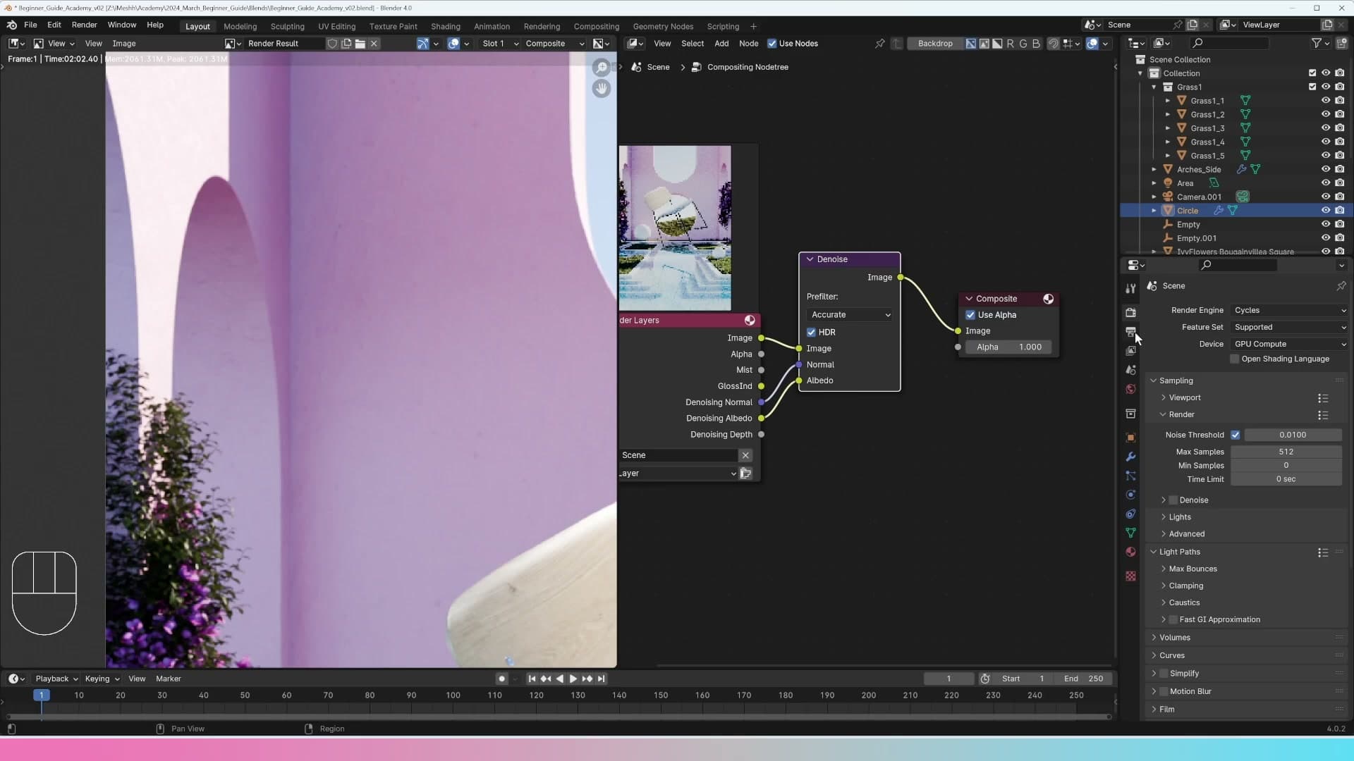
This node-based approach is far more accurate than enabling the Denoise toggle inside the render settings. Because it runs in the compositor rather than baking into the render, you can swap it out, blend it back against the noisy original, or feed the result into further nodes without ever having to re-render the scene.
Mixing noisy and denoised with a Mix Color node
Sometimes the Denoise node smooths the image a little too aggressively and you lose the natural micro-grain that makes a render feel photographic. The fix is to mix a slice of the noisy original back in.
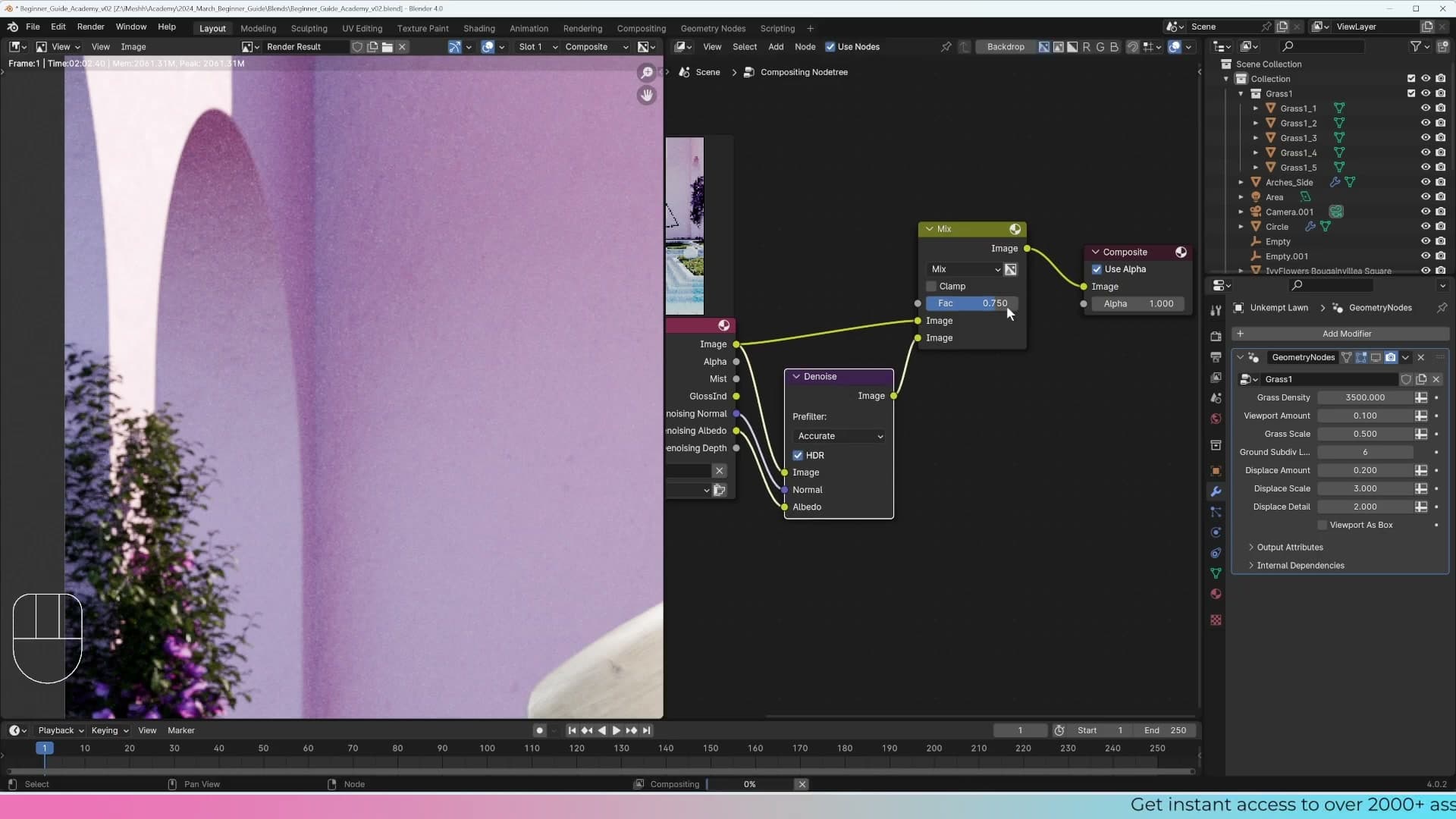
Press Shift+A, type mix, and add a Mix Color node. Run the noisy Render Layers Image into the first colour input and the denoised output into the second. The Factor slider now blends between the two: at 0 you get 100% of the noisy image, at 1 you get 100% of the denoised image.
Set the factor to around 0.75 and you keep most of the cleanliness from the denoiser while letting roughly a quarter of the original grain through. Wire the Mix output into the Composite node and you've got a non-destructive denoise strength dial you can tweak at any point.
One caveat: when you push the denoiser to 100% on a render that was sampled too low, fine details in adjacent surfaces can start to blur together. If you spot that happening, the real fix is more samples. Bumping the F12 render to 1024 usually gives the denoiser enough information to produce a totally clean image without losing edges.
Mist compositing with a Color Ramp
Pipe the Mist pass into a Mix Color node set to Screen, dial in the strength, and add a Color Ramp before the mix so you can decide where the mist begins and ends.
Viewing the raw Mist pass
With the Mist pass enabled on the view layer, the Render Layers node now exposes a Mist socket alongside the usual Image, Normal and Albedo outputs. Drag a noodle from Mist into the Viewer (or your second Image Editor output) so you can see the raw pass on its own before you start mixing it back into the render.
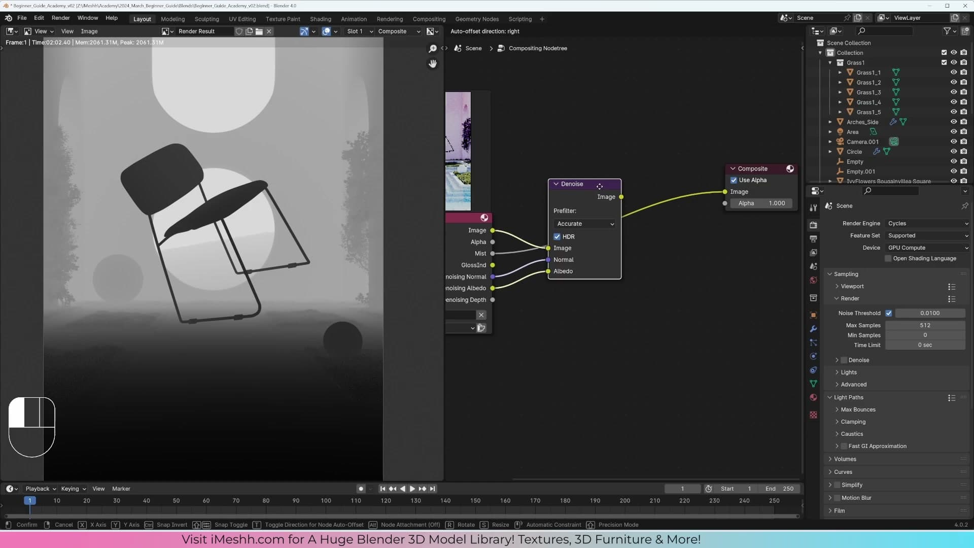
What you should see is a greyscale falloff: black at the camera, white in the distance, with the in-between gradient telling Blender how far each pixel sits from the lens. That's the data you'll use to drive the atmospheric haze. Light pixels get more mist; dark pixels stay clear.
Screen-blending mist over the image
Press Shift+A and search for Mix Color. Wire the rendered image into the first colour input and the Mist pass into the second, then change the blend mode from Mix to Screen.
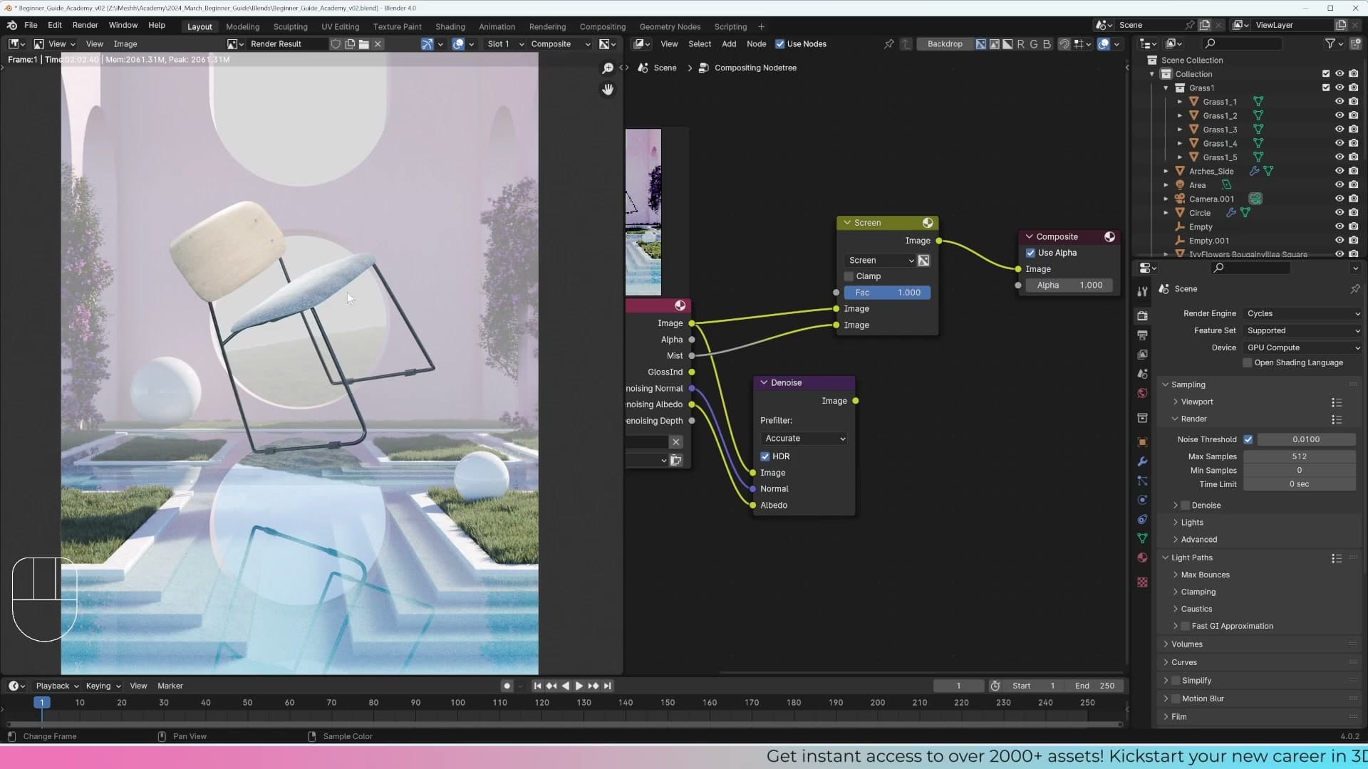
Screen is the more believable choice here. Real mist scatters and absorbs light, so as it builds up in the distance the background gets a touch darker as well as hazier. The Add blend mode does the opposite: it brightens everything it touches and tends to wash the far plane out. Screen keeps that subtle darkening behaviour and reads as proper atmosphere rather than a foggy overlay.
Now adjust the Fac slider to taste. At 1.0 the whole image is buried in white; pull it down until the mist sits just under the threshold of being noticeable. A soft, low-percentage value usually reads best. You're suggesting depth, not painting weather.
There's an alternative if you want a coloured mist rather than a white one: plug the Mist pass into the Factor input of the Mix node and use the two colour pickers to choose the tint. It's a more artistic, less physically motivated approach, but it works nicely for stylised scenes.
Color Ramp to shape mist depth
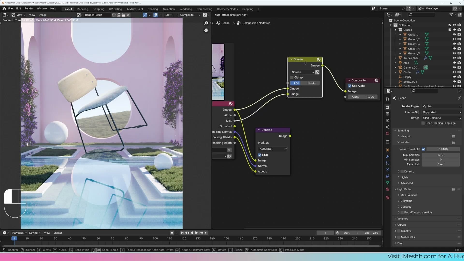
The raw Mist pass starts the moment you leave the camera, which usually means foreground objects pick up a faint veil you don't actually want. A Color Ramp placed between the Mist pass and the Mix node lets you decide where the haze begins and how quickly it ramps up.
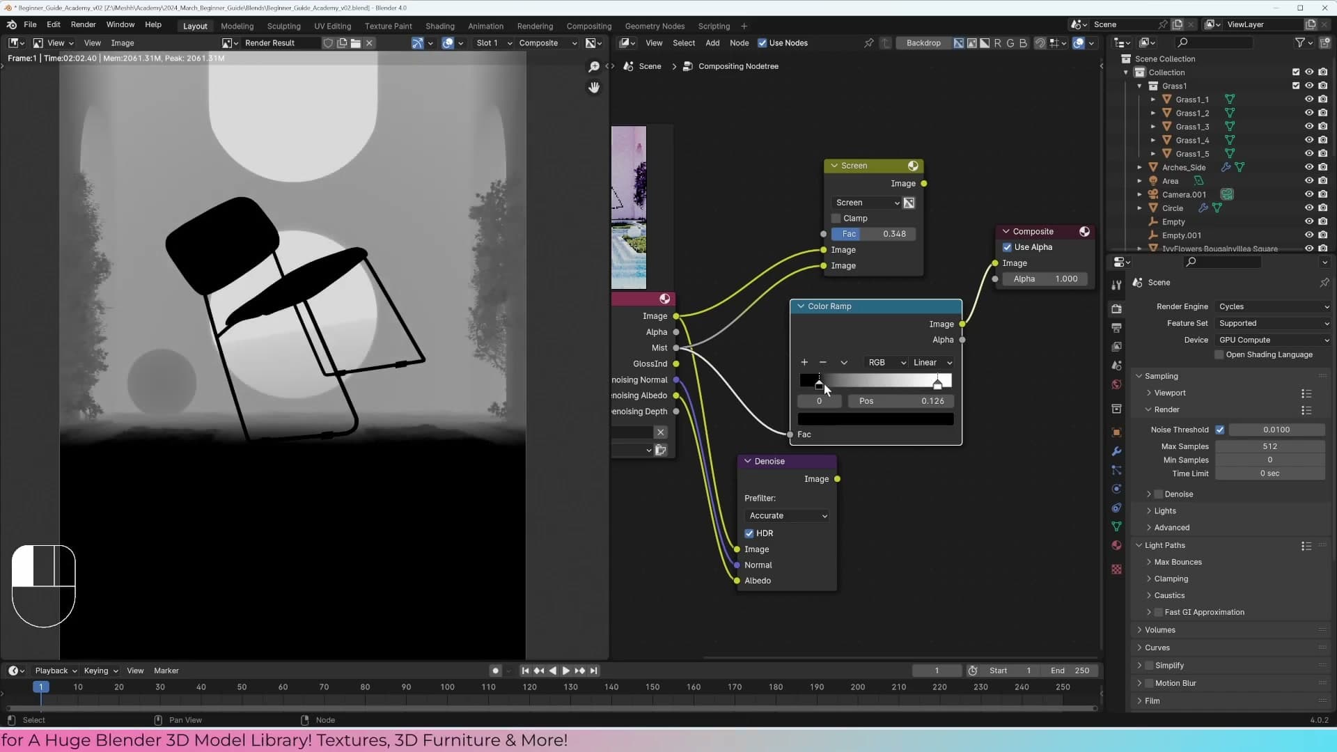
Press Shift+A, search for Color Ramp, and drop it on the noodle running from the Mist socket into the Mix node so the mist now travels through the ramp first. Slide the black handle to the right and the white handle inwards from the far end to push the mist further back into the scene. Watch the result update in the Viewer as you drag. When the foreground reads clean and the haze sits only on the distant geometry, you've found the right window.
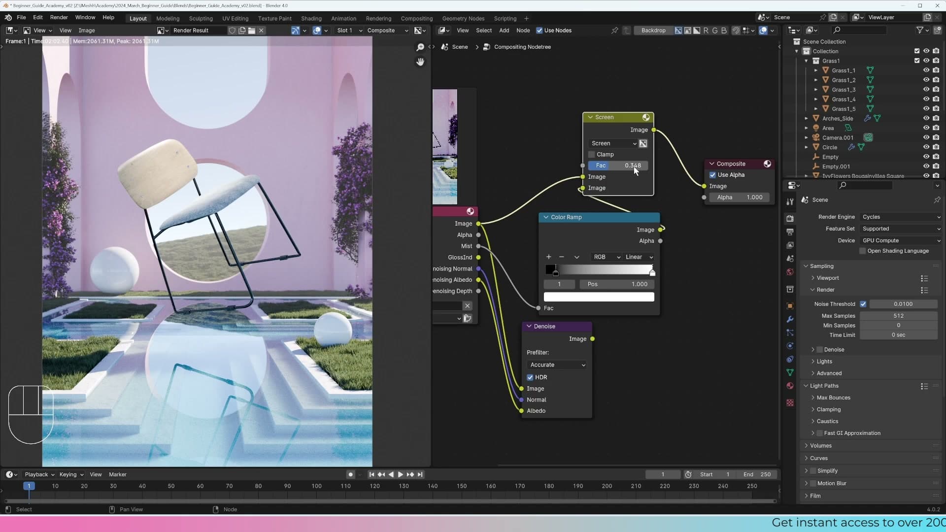
In the masterclass scene that means the foreground stays crisp while the background hill picks up almost all of the atmosphere. Toggle the Mix factor up and down once more for a final before-and-after sanity check; a touch less is usually better than a touch more. The goal is depth, not weather.
Boosting reflections with the Glossy Indirect pass
Enable the Glossy Indirect pass, view it standalone to see how much reflected light is in the scene, then additively mix it back over the denoised image to give the chrome sphere extra dimension.
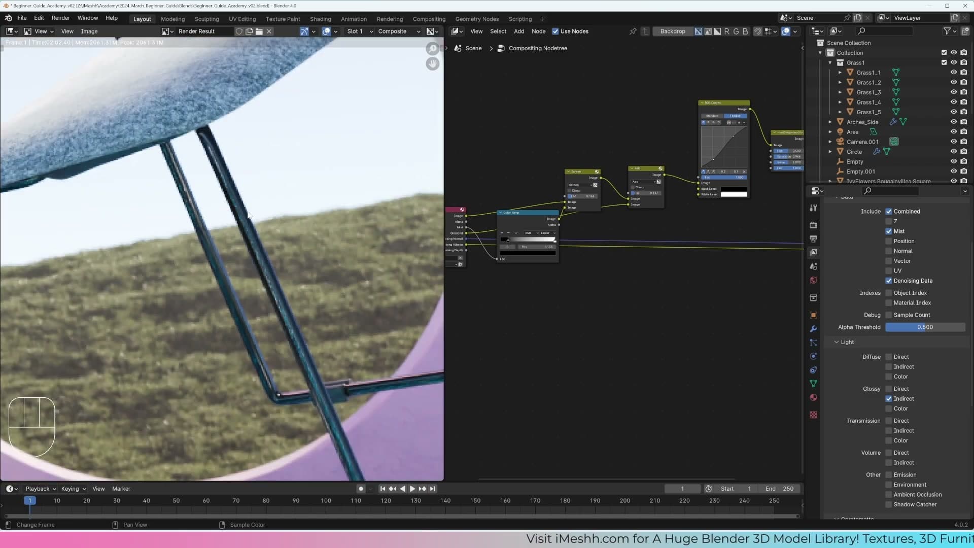
Viewing the Glossy Indirect pass standalone
The Denoise Data pass is only one of several extra outputs Cycles can hand you. The Render Layers node exposes a whole stack of light passes (diffuse, glossy, transmission, volume) each split into direct and indirect components. Each one deserves its own tutorial, but the Glossy Indirect pass is worth a quick look here because it has a direct, useful effect on this scene.
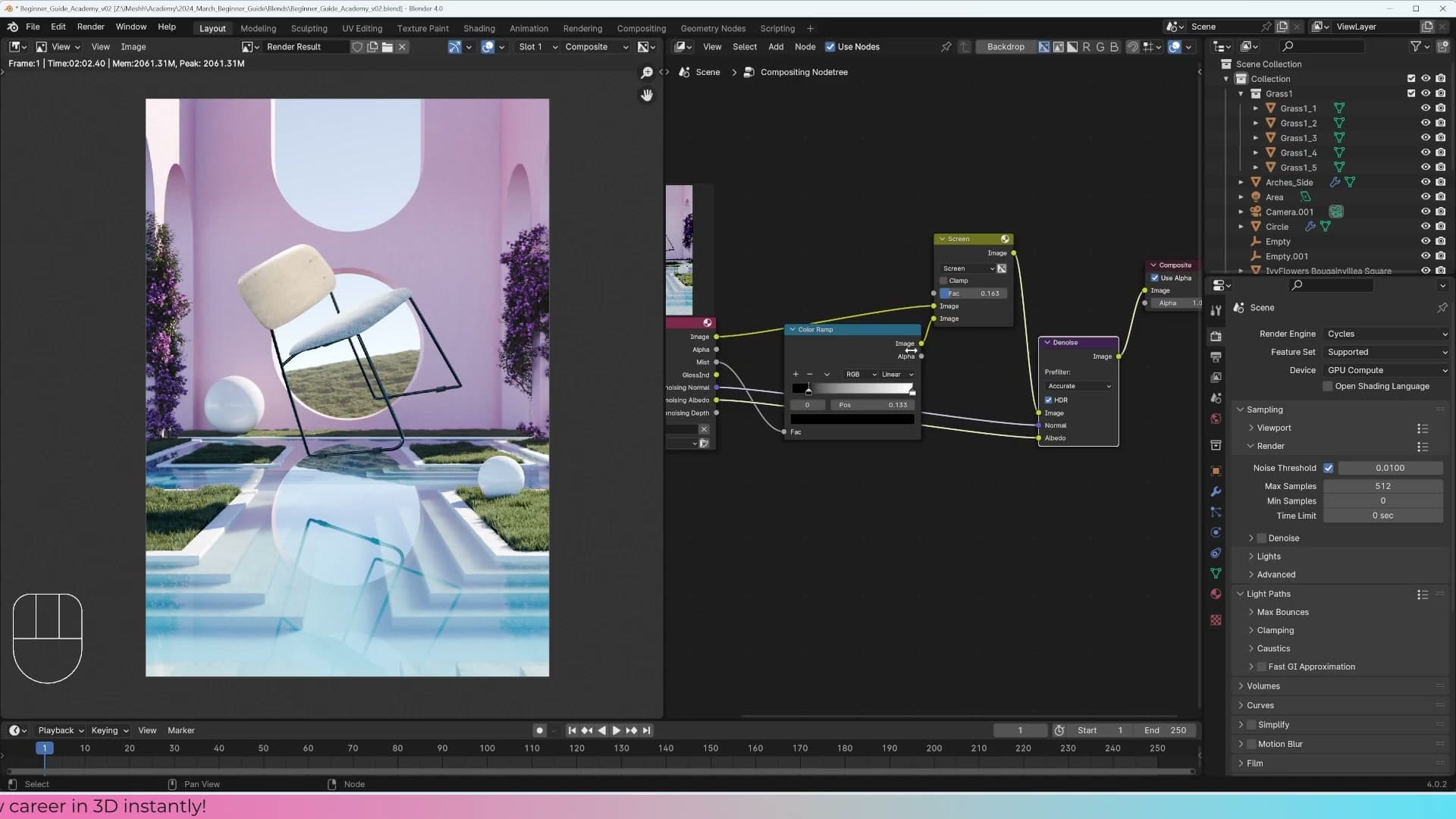
To inspect it on its own, drag a connection from the Glossy Indirect socket on the Render Layers node straight into the Composite output's image input. Hit render on the compositor and you'll see only the reflected lighting in the scene. The chrome sphere lights up dramatically while everything matte falls away. That's all the indirect glossy information bouncing around your objects, isolated from the rest of the image.
Adding glossy back into the image
Once you can see what the glossy pass contains, you can mix a little of it back over the main image to add extra punch to the reflections. Press Shift+A and search for Mix Color to drop in a new mix node. Feed the output of your previous Screen mix (the denoised image with mist added) into the top colour input, and plug the Glossy Indirect pass into the bottom input.
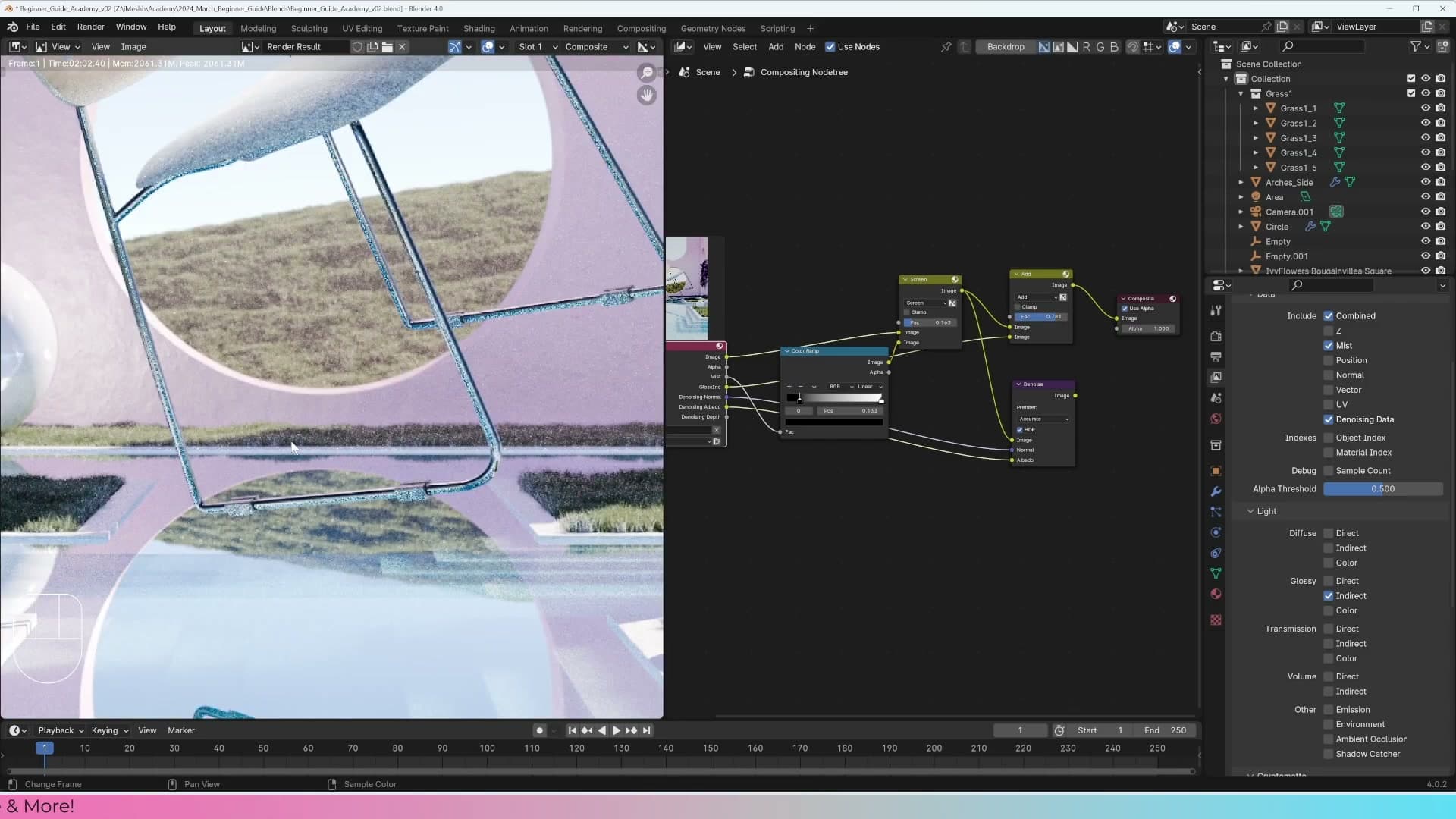
Change the blend mode on this node from Mix to Add. As soon as it updates, you'll see the reflected lighting layered on top of the existing image. The whole shot brightens slightly, and the chrome ball in particular picks up a lot more dimension. It reads as a proper reflective object rather than a flat grey sphere.
One thing to watch out for: the Glossy Indirect pass is noisy on its own, just like the original render. Because you're adding it directly on top, that noise comes with it. The simplest fix is to route the output of this Add mix back into your main Denoise node so the whole composited image (denoised render, mist, and glossy boost) gets cleaned up in one final pass.
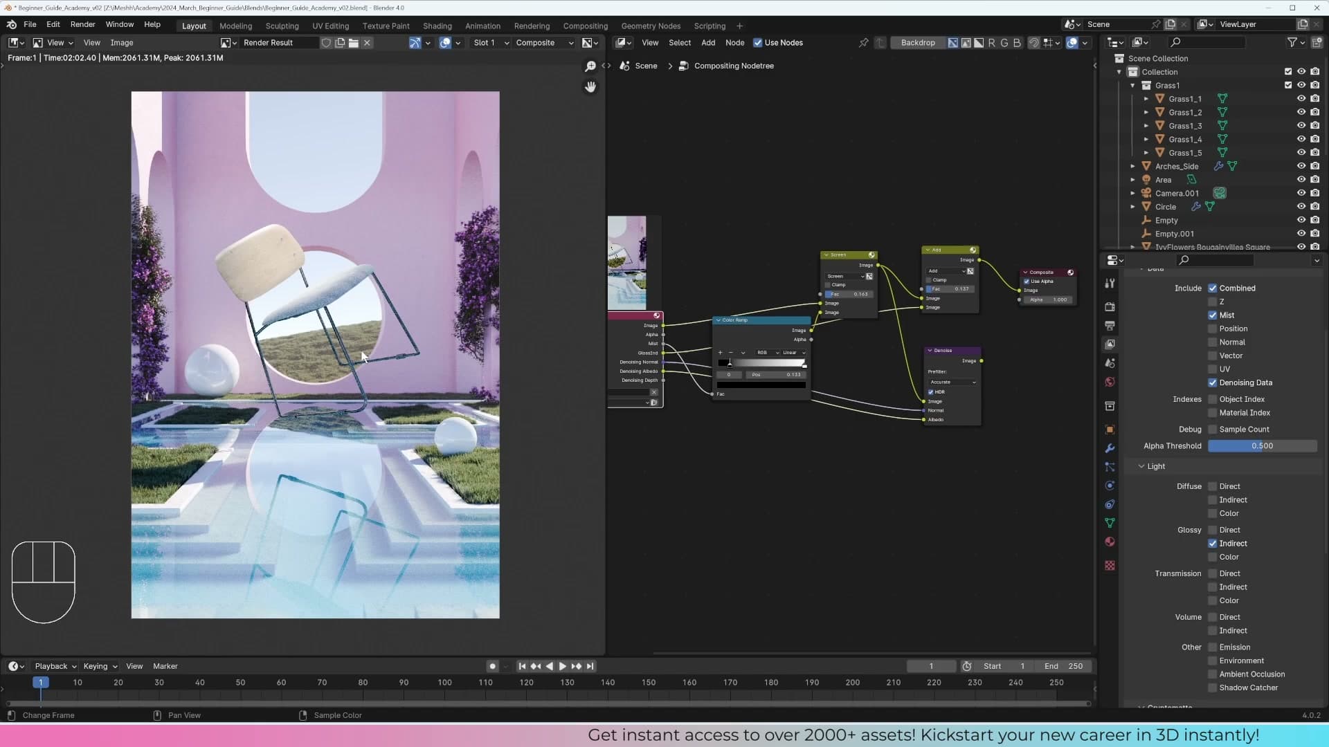
Compare the result to where you started and the difference is significant. The image has depth from the mist, contrast from the lighting, and now extra life in the reflections, all without re-rendering.
Final colour grading: curves, look, and saturation
Add an RGB Curves node with a subtle S-curve, switch the view-transform look from Standard to Film High Contrast, and finish with a Hue Saturation Value node. Then route the whole chain back through the Denoise node.
RGB Curves with a subtle S-curve
With the mist and reflection passes mixed in, the image has crept a little too bright. Stacking lighter passes on top of an already-lit render tends to do that. To pull the contrast back and finish the grade, add a colour-curves node to the chain. Hit Shift+A, head to Color → Adjust, and drop in an RGB Curves node.
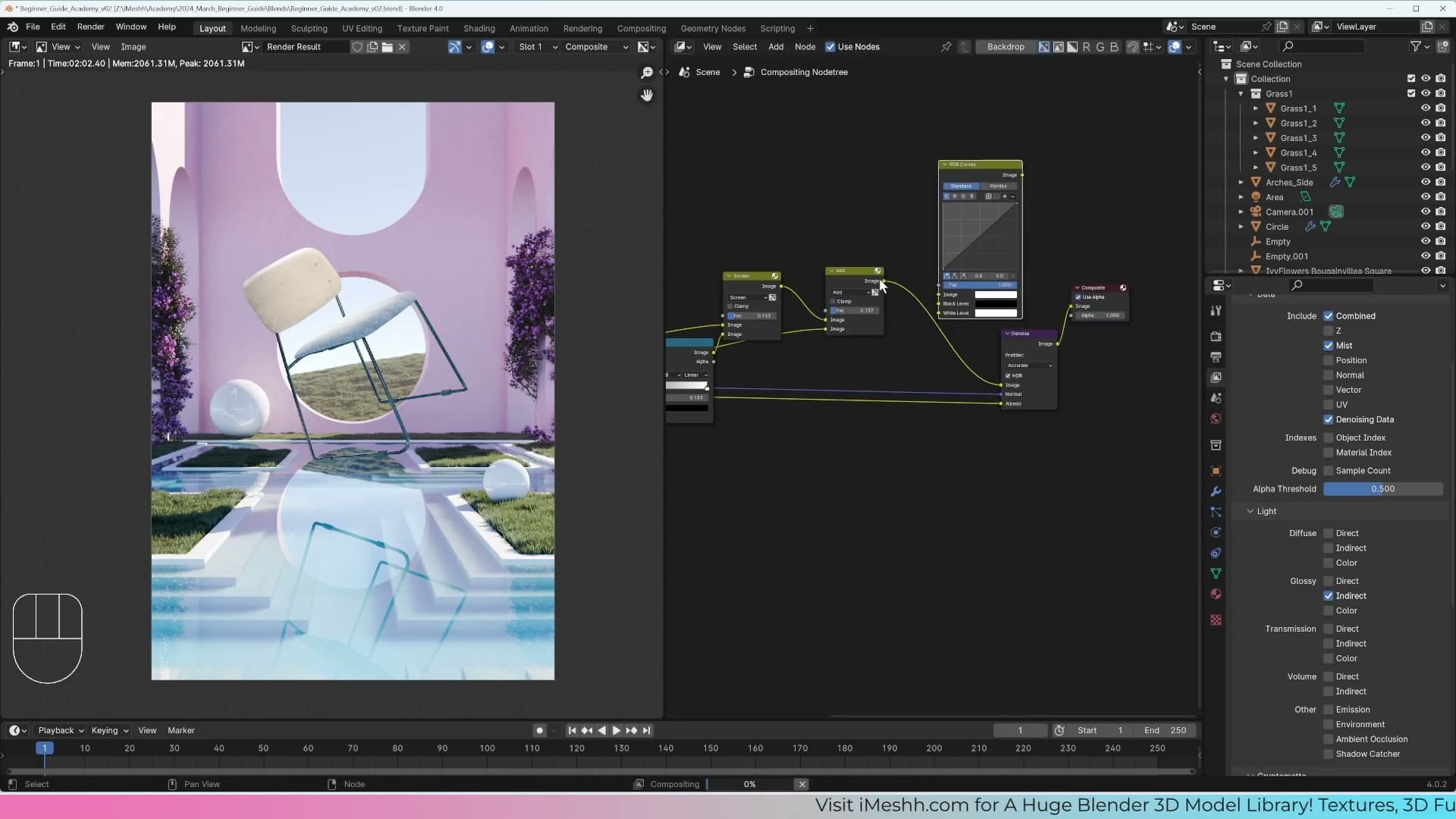
Place the RGB Curves node into the chain before the final Denoise stage, not after it. Routing every adjustment back through the denoiser is slow, so park RGB Curves on the noisy stream for now and you'll reconnect everything through Denoise once the grade is locked in.
Shape a gentle S-curve on the node's graph. Click on the lower portion of the line and drag it down a touch, then click on the upper portion and pull it up. That single move brightens the highlights and deepens the shadows in one stroke: a quick, classic way to add contrast without crushing the image. If the blacks start to feel too pure, click the bottom-left handle and lift it slightly to soften them, but don't overdo it. I push it up and then immediately walk it back.
Switching the Look to Film High Contrast
With the curve in place, the image still feels a touch dark. That's largely down to the view-transform Look still sitting on Standard. The Look dropdown in your colour-management settings has more flattering options than Standard for an archviz render, and switching to one of them gives the whole image a richer, more filmic feel.
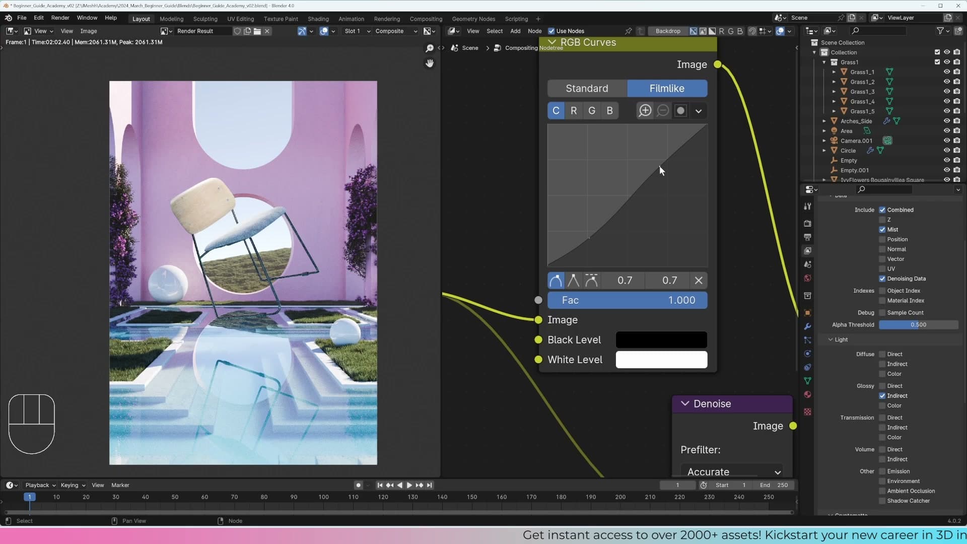
Change the Look from Standard to Film High Contrast. The shadows and midtones land in a punchier, more cinematic place straight away. If the overall image still reads a little dim after the switch, nudge the top handle on the RGB Curves node up a touch to compensate. The goal is a brighter, more confident result, not a crushed one.
Hue Saturation Value and the final denoise
For the last node in the grading chain, hit Shift+A and add a Hue Saturation Value node. The three sliders let you shift the overall hue, dial saturation up or down, and brighten or darken the whole image via the Value slider. It's useful for a final balance pass once the curve and Look have done the heavy lifting. Pull one of the sliders down a touch to take the very last bit of edge off the grade.
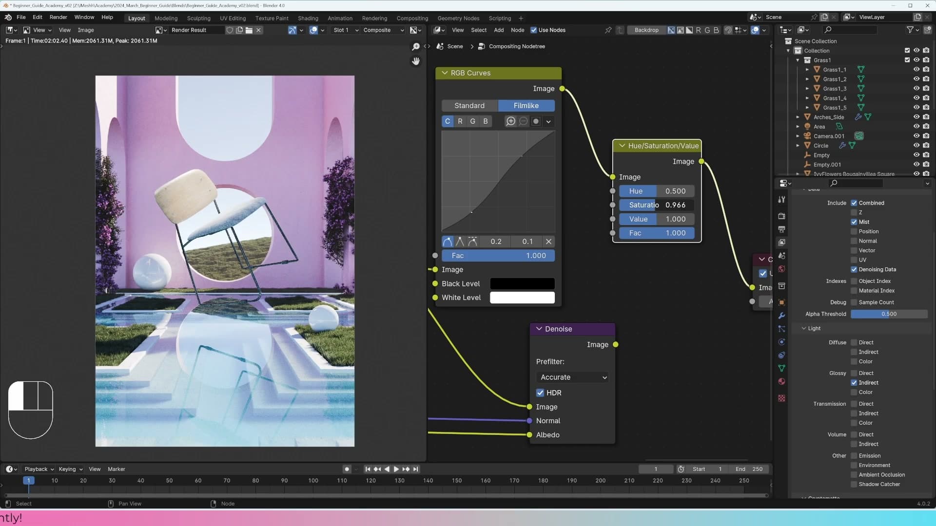
With the grade finished, route the entire chain back through the Denoise node so the final output stays clean. Everything you've layered in (the denoised base, the glossy indirect boost, the mist composite, the S-curve, the Look change, and the hue/sat tweak) feeds into Denoise before being saved out. That way the colour-graded image inherits the same clean finish you got from the original Denoise pass earlier.
Saving the final image and course wrap-up
Save the finished render as a 16-bit TIFF, PNG, or final-delivery JPEG, then close out the Zero to Hero series with where to go next: the iMeshh asset library, the exterior masterclass, and the Discord community.
Save Image As: picking TIFF, PNG, or JPEG
The render is done and the grade is dialled in. Now you just need to save the file. From the image editor header, open Image → Save As Image, give the file a name, then head over to the format dropdown on the right-hand side of the save dialog.
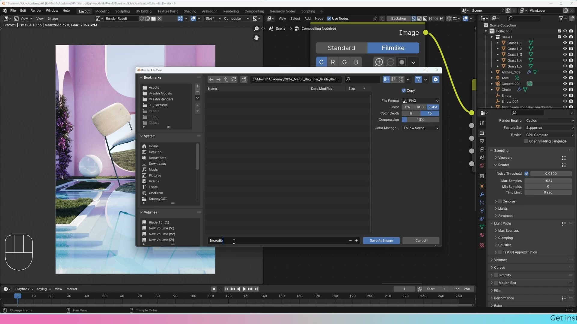
Three formats cover almost every case. If you plan to do more work on the image in Photoshop or another editor (extra colour grading, retouching, compositing in plants or people in 2D), choose TIFF at 16-bit. PNG at 16-bit is a perfectly good alternative; both formats hold far more image information than an 8-bit equivalent, which is exactly what you want if you're about to push curves and levels around in post. TIFF is my usual default.
If this is the finished image and you're not going to touch it again, a JPEG is more than good enough: smaller file, faster to upload, and visually indistinguishable for a render that's heading straight to a client or to social media.
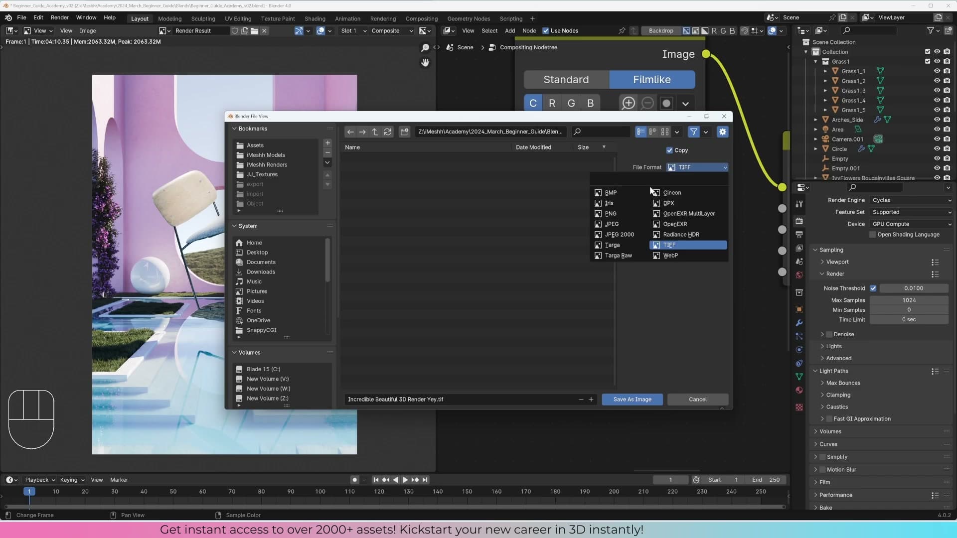
Click Save As Image and the file is on disk. That's your render delivered.
Wrap-up and where to go from here
That's the end of the course. As the modules went on you'll have noticed sections speeding up. Once you've moved, scaled and rotated objects a few hundred times, the shortcut keys stop needing a callout every time. Don't get disheartened if any of it felt heavy going. 3D is a genuinely new way of thinking compared to 2D art, and it does get easier the more hours you put in, to the point where you stop noticing the mechanics and just think about the picture you're trying to make.
If you do get stuck on a specific step, jump into the iMeshh Discord. There are plenty of people, including the team, happy to work through any part of this course with you.
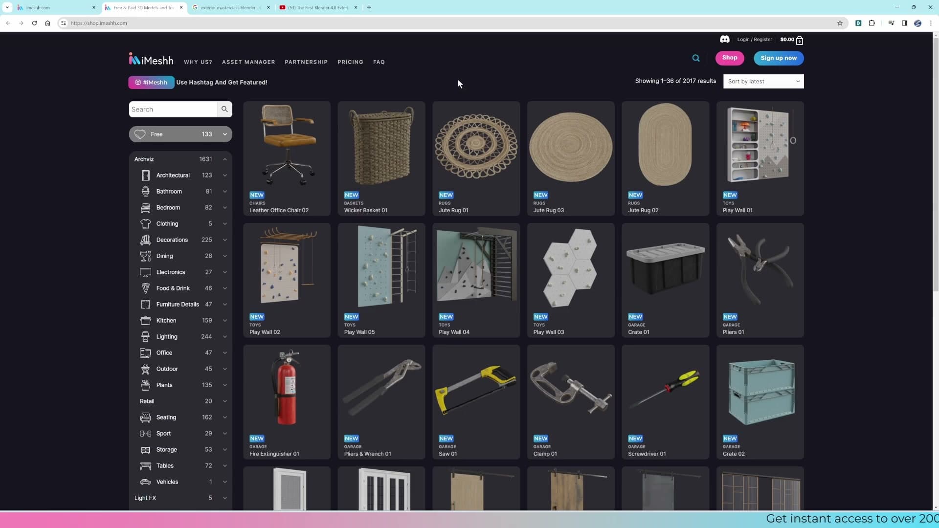
For where to go next: the iMeshh platform's asset library gives you over 2,000 archviz-ready models (furniture, decor, plants, materials) so you can focus your time on lighting, cameras and composition rather than modelling every chair from scratch. Real archviz studios all lean on libraries; nobody is hand-modelling every asset on a deadline, and using a library is what makes the work commercially viable.
After this beginner course, the natural next step is the iMeshh exterior masterclass on YouTube, nearly three hours long and walking through a complete exterior scene. It moves faster than this beginner series, but with the foundations you've built across these ten parts you'll be able to follow along.

Architectural visualization is a viable way to make money on the side or as a career. With a library to lean on, the skills you really need to develop are lighting, composition and cameras: exactly the muscles you've started building here.
At the very least, subscribe to the iMeshh YouTube channel and consider signing up to the newsletter. There's a free scene bundled with the sign-up so you can pull apart how a finished file goes together. Thanks for sticking with the course to this point.
Tools and credits
Everything mentioned in this tutorial, with links.
- Blender is the renderer this entire build runs in.
- iMeshh is a studio platform (project management, client review, asset library, invoicing). The asset library used in this tutorial is included with every iMeshh Pro plan.
- Poly Haven provides free CC0 textures and HDRIs.
Pillar guide: Beginner Course hub