Scene overview and what we're breaking down
A look at the original 30-second video and the surprisingly simple scene behind it: a few iMeshh assets, a basic room with backface culling, and what each section of this breakdown will cover.
Watching the original 30-second animation
Welcome back. This post breaks down the 30-second animation I released the week before. It was an attempt to push Cycles as far as I could toward realism in a short, music-driven piece.
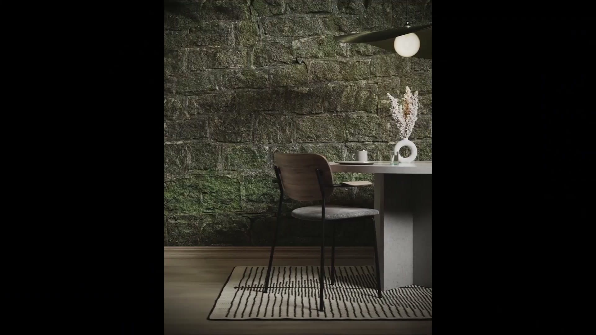
If you've not seen the original, watch it through once before you carry on. Everything covered below (the beat-synced wall materials, the camera cuts, the area-light setup) only makes sense once you've seen the finished result it's all building toward.
The simple room setup with backface culling
The scene itself is genuinely simple. It's a basic room with a handful of props inside it. One of those props is actually floating in mid-air because it sits right next to the camera and never reads as disconnected from the floor in any of the shots. If something will never be seen from a particular angle, it doesn't need to be correct from that angle.
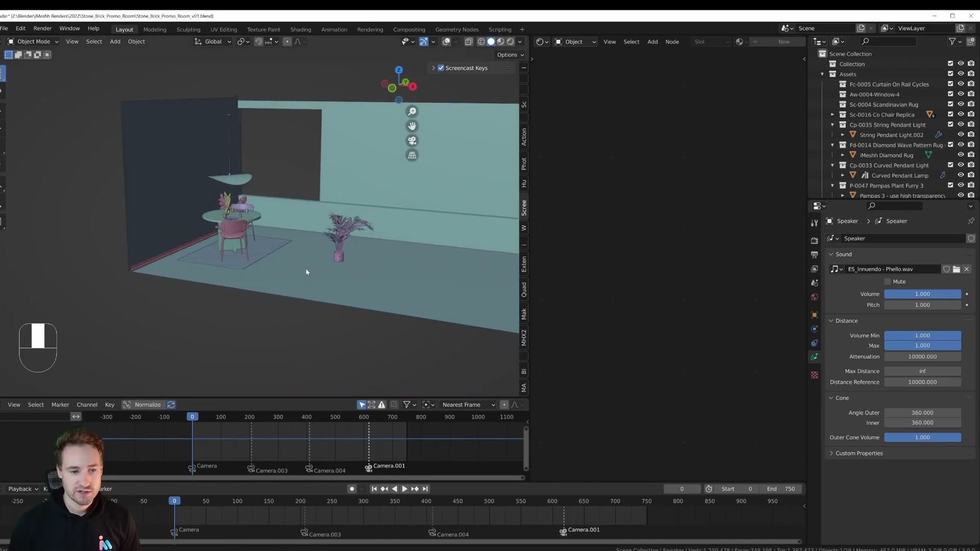
The room has Backface Culling enabled on the wall material. That's the trick that lets you fly the camera around outside the room and still see straight through into the interior. The back-facing polygons become invisible, so the four walls never block your view of what's inside. For archviz this is essential. You'll want it on for any interior scene where the camera might end up outside the geometry, even briefly.
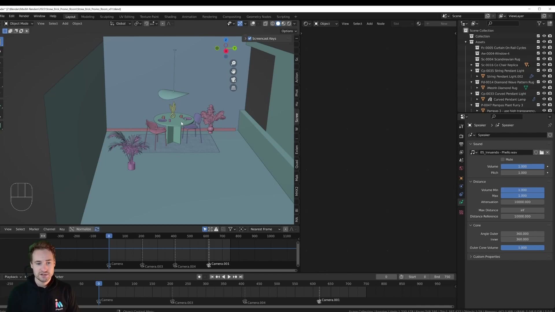
The two hero pieces in the room came from iMeshh.com and were dropped in ready-to-go. No remodelling, no re-shading. Everything else is just the room shell. From here the rest of this breakdown moves through four areas in order: how the music is wired into the scene so events can be timed to the beat, how the cameras are set up to switch automatically on those beats, the wall material setup that drives the headline visual effect, and finally the lighting (which is probably the part most people came here for).
Syncing Blender to music with a Speaker object
Add a Speaker, load a track, set the distance falloff so the volume stays constant, then enable Audio Scrubbing and Frame Dropping so you can drop keyframes precisely on every beat.
Adding a Speaker and loading a track
Music drives every keyframe in this animation, so the first thing to set up is a reference track that plays back inside Blender itself. Most Blender users have scrolled past Add > Speaker without ever clicking it. That changes here.
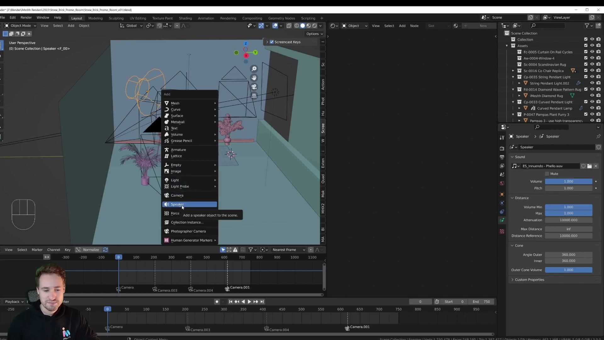
Go to Add > Speaker to drop one into the scene, then load your track into it. In this project the track came from Epidemic Sound, but any audio file will do. Once it's loaded, it behaves like a physical sound source. That introduces one problem worth fixing before you go any further.
By default, a Speaker object uses distance-based volume falloff, so the further the camera sits from it, the quieter the music gets. That's useful for diegetic sound design but annoying when you're using the track purely as a timing reference. Tune the distance and falloff settings so the volume stays constant wherever the camera is in the scene.
Why bother with this at all? Because once the audio is bound to the scene, you can scrub the timeline and hear the beat. That's what makes the rest of this module possible.
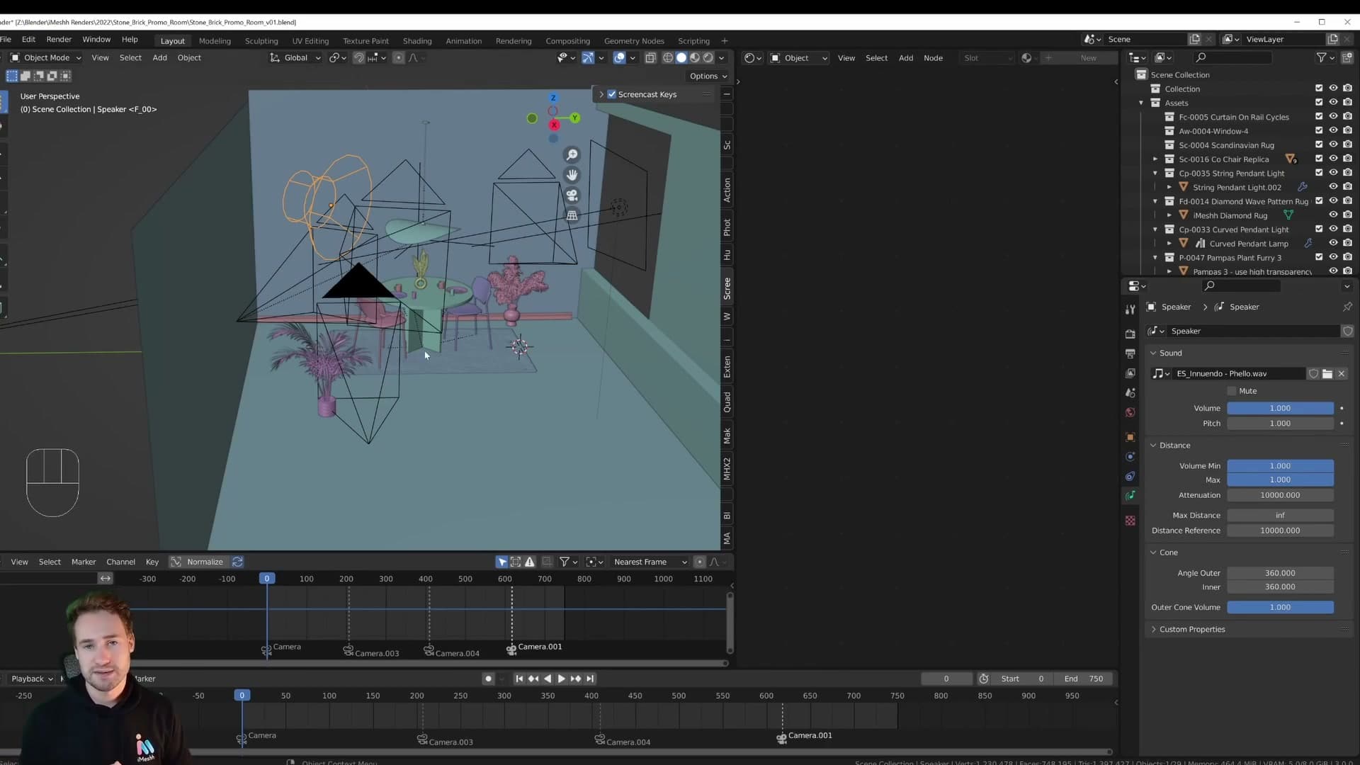
Enabling Audio Scrubbing and Frame Dropping
With the audio object in place, the next job is to make sure Blender actually plays it when you drag the timeline cursor. By default, scrubbing the timeline is silent. You only hear the music when you press play. For beat-timed work that's not good enough; you need to be able to land the playhead exactly on a beat and drop a keyframe there.
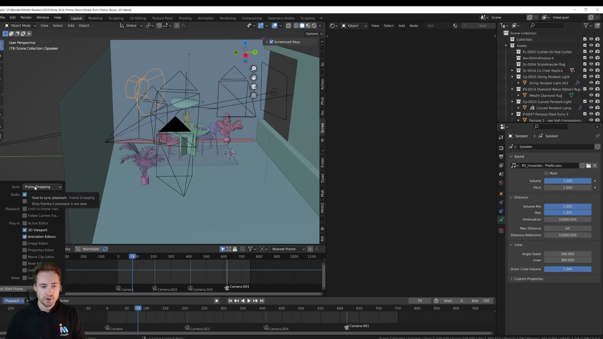
Open the Playback popover in the timeline header and enable Audio Scrubbing. Now whenever you drag through the timeline, audio plays in real time and you can hear every kick and snare as you move.
While you're in there, also enable Frame Dropping. If your viewport gets heavy (and a scene like this with displacement-driven walls absolutely will), playback can start to stutter and stop-start. That makes it impossible to follow the beat. Frame Dropping tells Blender to skip frames rather than slow playback, so the music stays in sync with real time even when the viewport can't keep up.
With both enabled, the workflow is simple: in this scene the wall changes every four beats, so you scrub or play through the timeline, follow the music with your ear (or by tapping the beat on the desk, which is what happened here), stop on the exact beat you want, and add a keyframe. From this point on, every animation event in the project is being placed against the music you can hear directly in Blender.
Binding cameras to timeline markers
Use markers to switch active cameras automatically during playback. No need to bake or test-render to preview your cuts.
Bind Camera to Marker workflow
With the music in place, you can move on to camera switching. Each marker along the timeline can be tied to a specific camera, so as the playhead crosses a marker the active view jumps to the corresponding camera automatically. That's a big win for animation work. You can scrub the whole sequence and preview every cut in context without baking anything down or kicking off a test render.
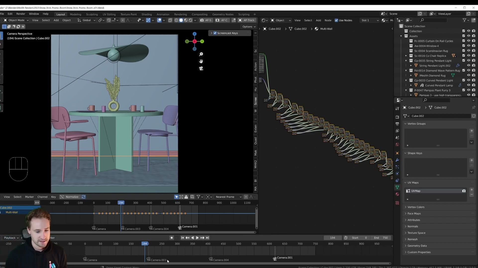
To bind a camera to a marker, first drop the camera into the scene with Add > Camera and position it where you want the shot. Move the playhead to the frame of the cut, make sure the camera is selected, then run Marker > Bind Camera to Marker. Blender links that camera to that marker, and the marker now drives the active view from that frame onwards.
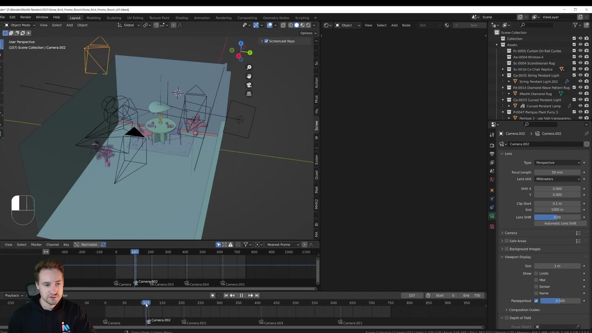
Scrub through the timeline and the viewport flips between cameras at every bound marker. It's a one-line operation per cut, and the result is an editable shot list you can rearrange just by dragging the markers around. To remove a binding, you simply delete the camera or the marker.
Smooth constant-speed cameras with Linear interpolation
Why default Bezier F-curves make camera moves feel disorientating in archviz, and how switching keyframes to Linear gives you constant, deliberate motion instead.
Why ease-in/ease-out ruins archviz cameras
Camera motion is the thing I bring up every time I talk about animation, because it's the detail most archviz shots get wrong. The rule is simple: every camera in the cut should travel at the same speed for the entire clip. No easing in at the start of the move, no slowing down before the cut, no acceleration in the middle. Just a steady, constant dolly.
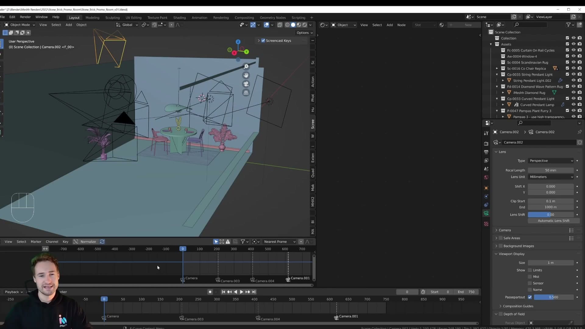
Watch the reference render and you'll see it. Each shot glides at a uniform pace from the first frame to the last, then snaps to the next camera at the marker. The eye reads that as calm and deliberate. That's the feel a brochure animation needs.
The reason matters. When a camera speeds up and slows down between frames, the change in velocity is something your brain notices even if you can't name it. It feels disjointed and slightly disorientating, almost as if the viewer is being pulled forwards and then held back inside the scene. A constant-speed move removes that friction entirely and lets the architecture do the talking.
Setting keyframes to Linear interpolation
Creating the move is the easy part. Add a camera, press I and choose Location to drop the first keyframe, scrub forward to the end of the shot, reposition the camera, then press I and Location again. You've now got a basic A-to-B dolly.
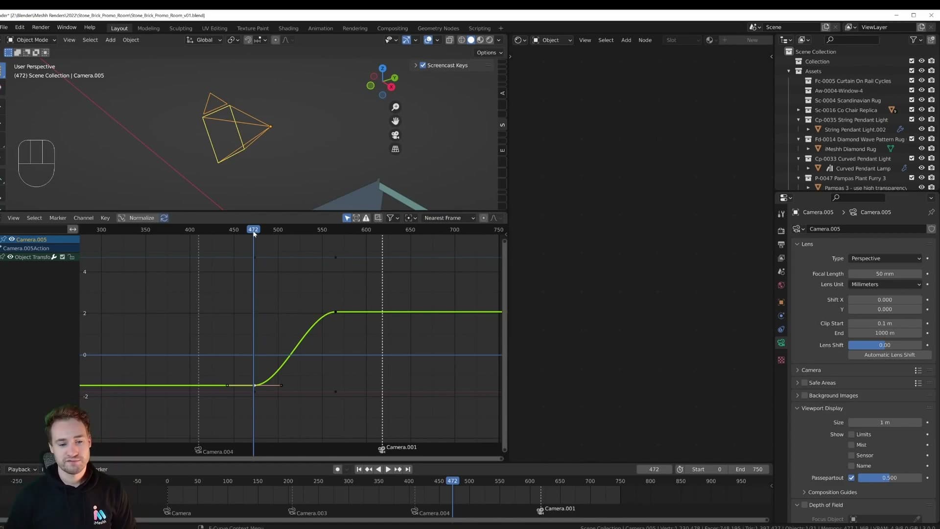
If you open the graph editor, you'll see Blender has set those keys to Bezier by default. The resulting F-curve is an S-shape: the camera eases in at the start of the move, runs faster through the middle, and eases out at the end. That's the behaviour you want to kill for archviz.
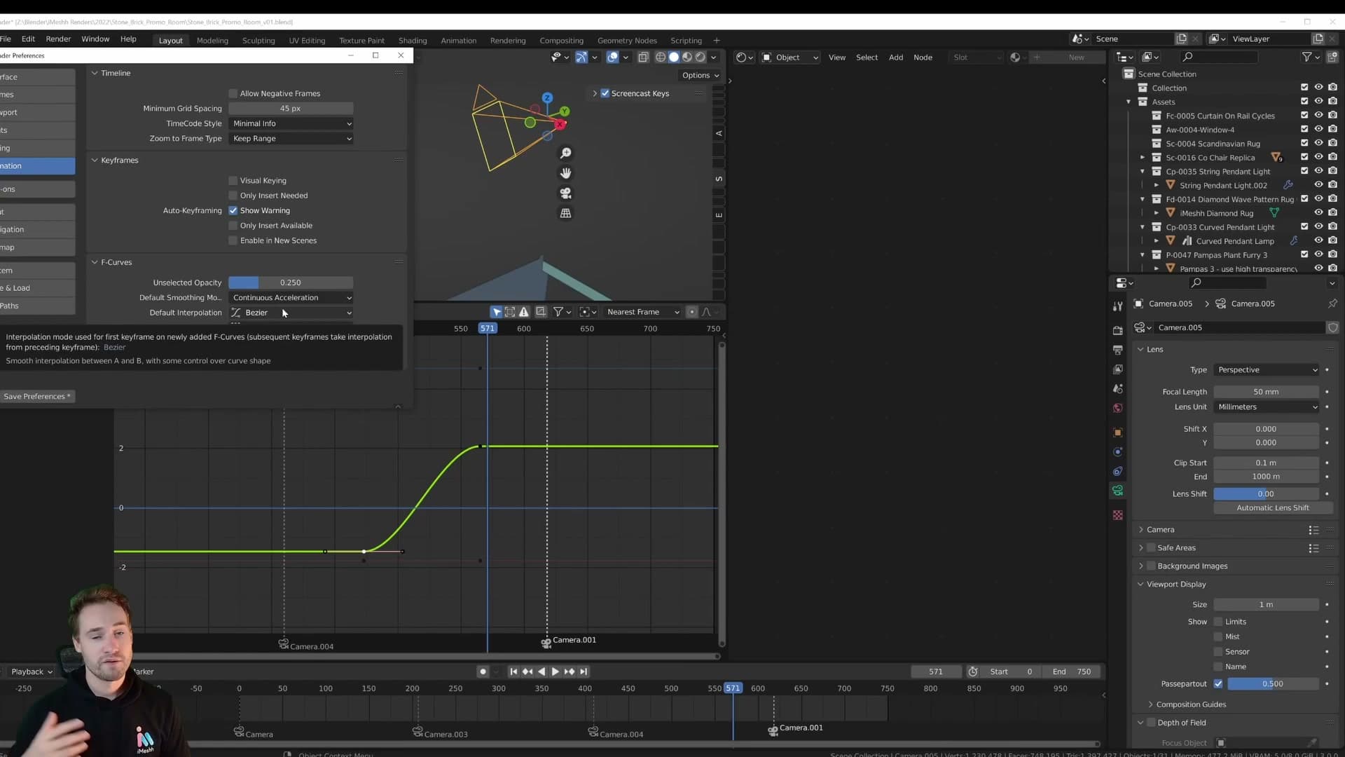
There are two ways to fix it. To change the global default, go to Edit > Preferences > Animation > F-Curves and set the default interpolation to Linear. Every keyframe you create from that point onwards will be linear by default. To convert keys that already exist, select them in the timeline or graph editor and choose Key > Interpolation Mode > Linear.
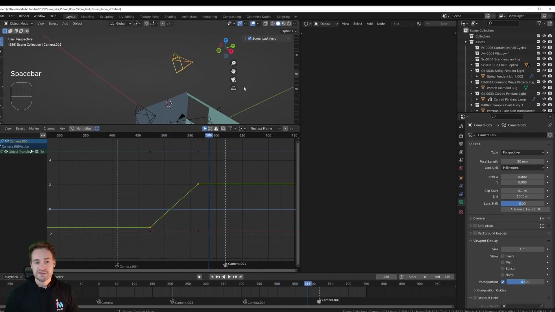
I keep the global default on Bezier because that's the right choice for most general animation work: character motion, prop movement and anything else that benefits from a natural ease. The Linear override is reserved for camera moves, where the visual goal is the opposite.
Once the keyframes are converted, the F-curve becomes a straight line from the first key to the last, and pressing play gives you a perfectly constant-speed dolly. Repeat the same setup for every camera in the scene (a single location keyframe at the start, another at the end, both linear) and the cut between shots stays as smooth as the moves themselves.
Building a node-based wall material switcher
All 27 wall materials live in node groups, chained together with Mix Shader nodes whose Fac values are keyframed 0→1 on the beat. Displacement is mixed in parallel so heightmaps switch with the shaders.
The 27-material wall bundle (and the free section)
Before the node graph: the wall textures in this animation come from the iMeshh wall bundle. 27 8K wall materials, weighing in at roughly 9GB. The animation was built to showcase them, so every switch you are about to see flips between one of those 27 surfaces.
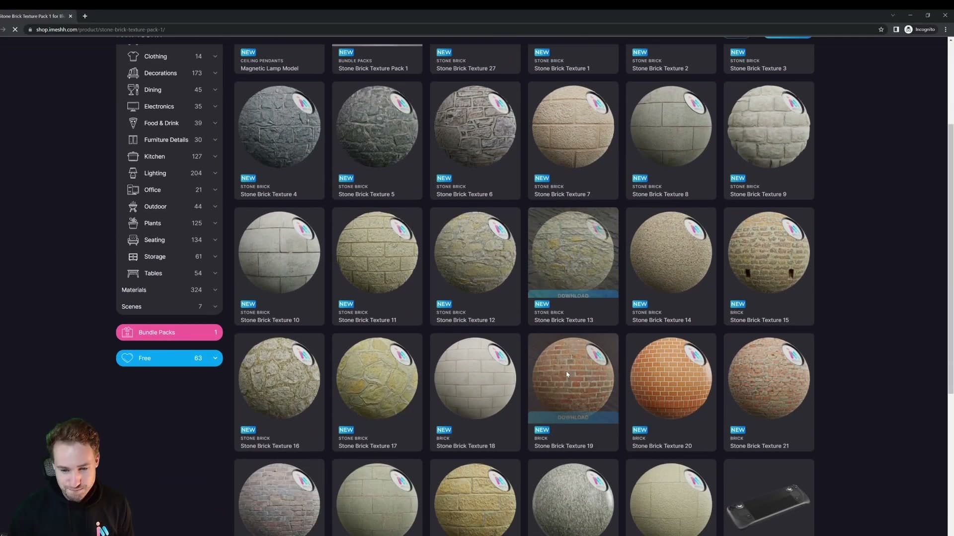
If you would rather try the technique without buying anything, the iMeshh store has a Free section that lists every freebie in one place. Grab a couple of wall materials from there and the switcher works the same way. The node setup does not care whether the textures came from the bundle or the freebies.
Stacking Mix Shader nodes for a material switch
Every wall material is imported into the scene as its own node group, and each group is numbered to match the texture it wraps. So the group labelled 2 contains stone brick 2, the group labelled 3 contains stone brick 3, and so on down to 27. Numbering them this way means you can scan the editor and instantly see which surface a given group represents. No double-clicking to check.
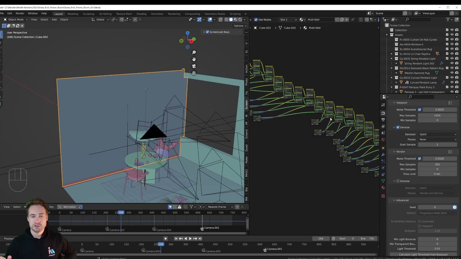
The switcher itself is easier to grasp on a fresh cube than on the finished wall. Add a new cube, give it a material, then add a second material slot (call them material 1 and material 2). Drop a Mix Shader into the editor, plug material 1 into the top input and material 2 into the bottom input, and feed the Mix Shader's output into Material Output. Set material 2 to a flat red so the switch is obvious in viewport shading.
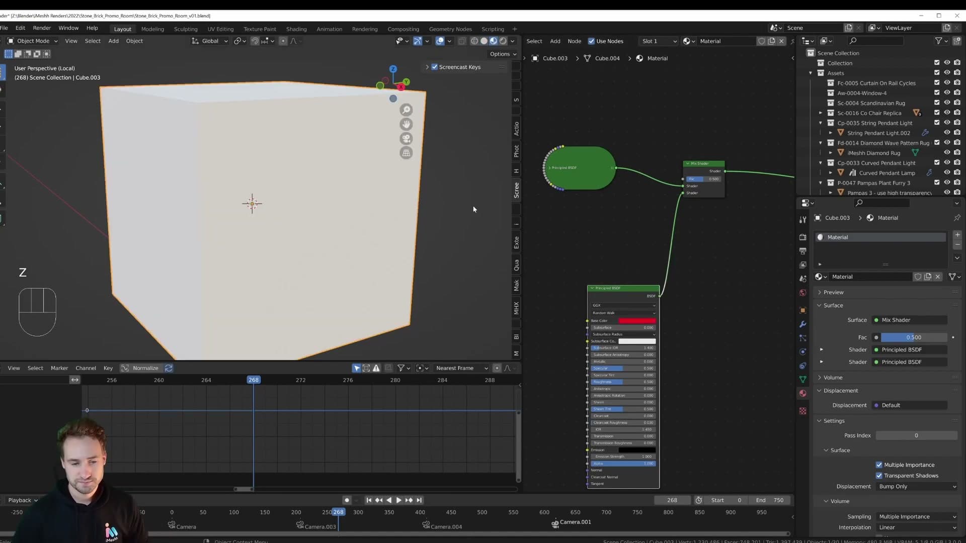
Now animate the Fac. On the frame where you want material 1 visible, set the Mix Shader's Fac to 0, hover over the slider and press I to keyframe it. Step one frame forward, set Fac to 1 and press I again. Scrub back and forth and the cube flips from white to red across those two frames. That is the switch.
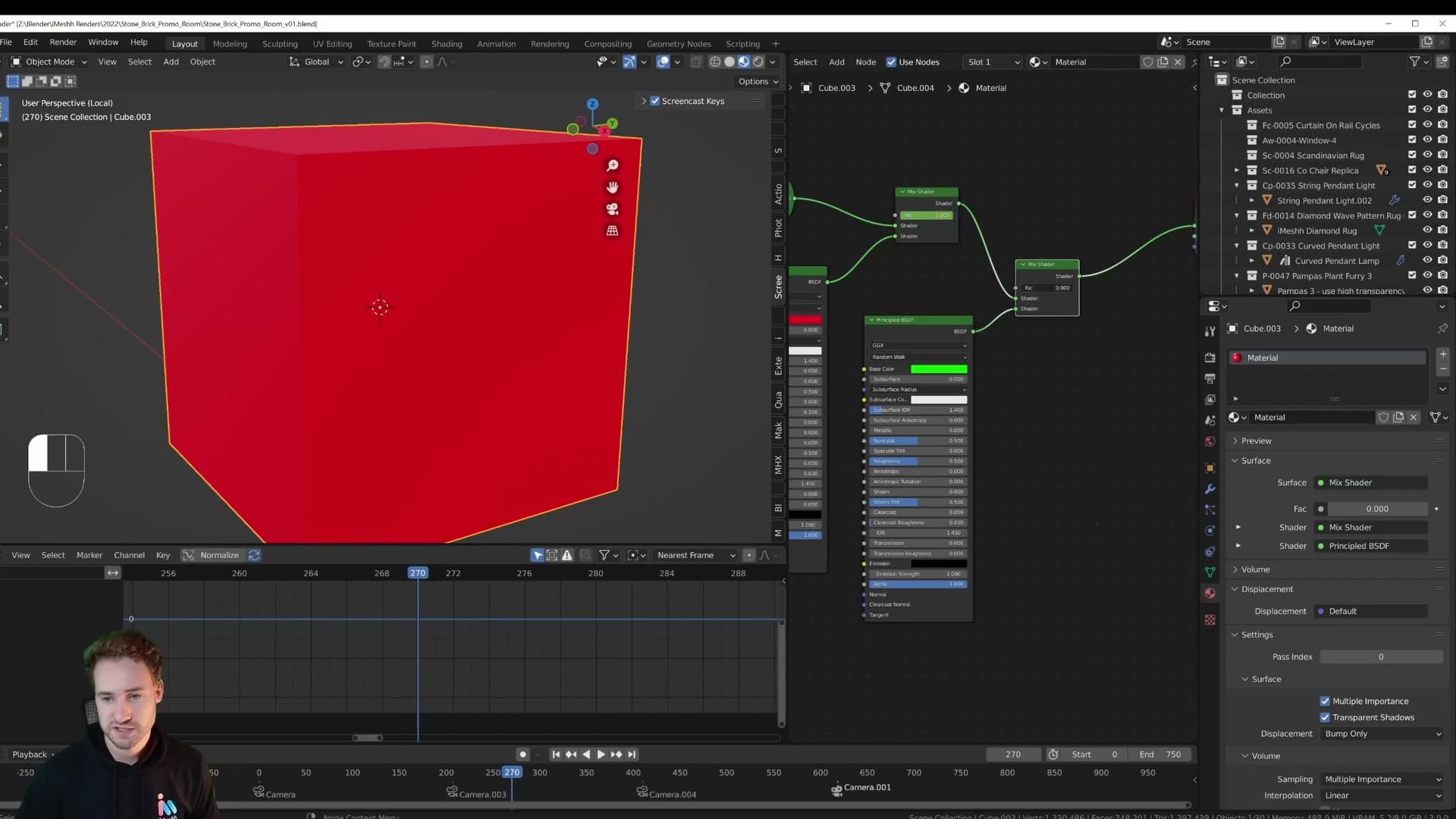
To chain in a third material, add another Mix Shader stacked on top of the first. The output of the previous Mix Shader becomes the top input of the new one, and the new material (here, green) goes into the bottom input. Animate the new Fac the same way: 0 on the frame the previous material is still showing, 1 on the next frame. Add a fourth Mix Shader for a blue material at frame 70 and the pattern repeats. At frame 70, Fac is 0; at frame 71, Fac is 1.
Select every Fac keyframe in the dope sheet and you can see the whole sequence as a staircase: each material owns the surface until the next Mix Shader takes over a frame later. That is the entire mechanism. 27 materials, 26 Mix Shaders stacked in a column, one pair of keyframes per switch.
Mixing displacement outputs in parallel
The wall materials are not flat. Every one of them uses displacement to push real geometry off the surface. That means a Mix Shader alone is not enough: if you only switch the surface shader, the displacement output of whichever material happens to be wired in keeps driving the heightmap, and the wall ends up wearing the wrong silhouette for its texture.
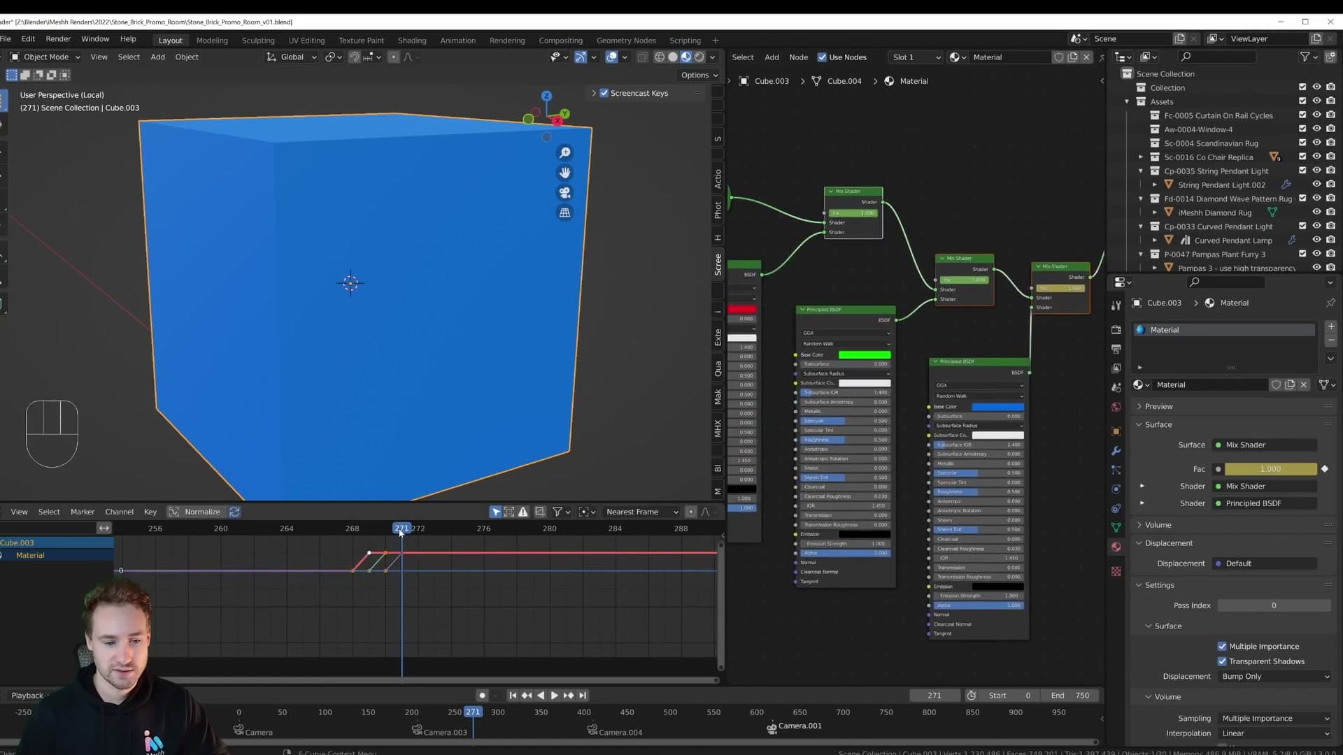
The fix is to mix the displacement output in parallel. For every material pair you stack a Mix Shader on the surface side, you also stack a matching mix node on the displacement side, and you drive both Fac inputs from the same animated value. When the Fac flips from 0 to 1, the shader and the displacement switch together on the same frame, so the bumps belong to the texture you are now looking at.
Trace the chain from the bottom of the node tree upward and you can follow it: each material feeds two outputs (a surface and a displacement), and each pair is gated by its own pair of mix nodes. Scrub the timeline and the whole column switches in lockstep, all the way down to the final Material Output.
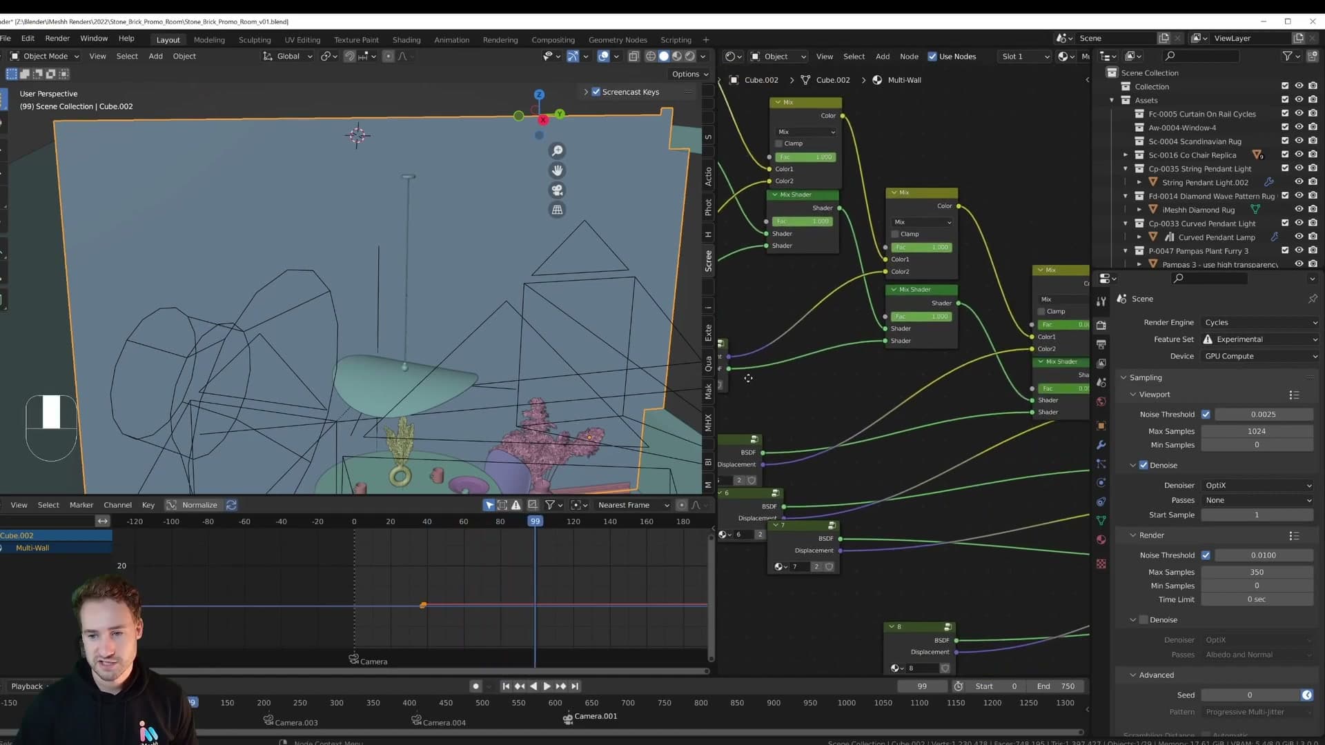
Drop into a rendered viewport and the result is a clean single-frame cut. One wall material is on screen; the next frame a completely different surface (its own colour, normal detail and heightmap) has taken its place. No fading, no shared displacement leaking from one material to another.
Placing keyframes on the beat with Audio Scrubbing
The switch only works musically if it lands on the beat. With the audio track still loaded, open the Playback popover in the timeline header and turn on Audio Scrubbing. Now dragging the playhead plays the audio as you scrub, so you can hear the downbeat instead of guessing where it is.
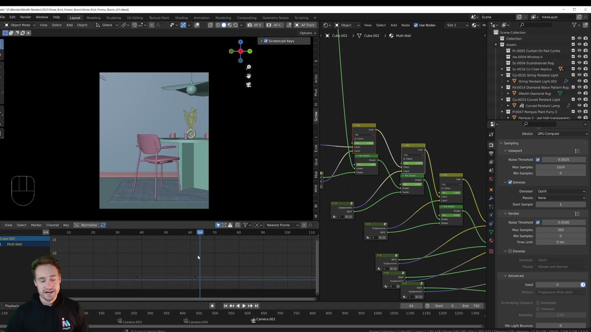
Press play once to get into the rhythm of the track, then start scrubbing around the moment a switch should happen. When the playhead is sitting on the beat itself, that is where the Fac 0 → 1 keyframe pair belongs. If you select all of the existing keyframes in the dope sheet, you can see them clustered roughly on the downbeats. The odd one drifts a frame either side, but the ear forgives a single frame if the cluster is right.
There is no waveform displayed in Blender's timeline itself, which would make this far quicker. Scrubbing with audio on is the workaround: ears decide the frame, then you keyframe it.
Studio area lights instead of HDRIs
Why area lights beat HDRIs for archviz: they mimic the brochure photography lighting your eye is trained to read as real, render faster, and need no light portals. The Spread value gives you control over how directional the light is.
The case for area lights in archviz
People get too hung up on the idea that the only way to a realistic render (especially in archviz) is an HDRI or a sky texture. That isn't true. The lighting in this scene is just a couple of area lights, and I wanted to emulate a brochure photography studio rather than a real interior.
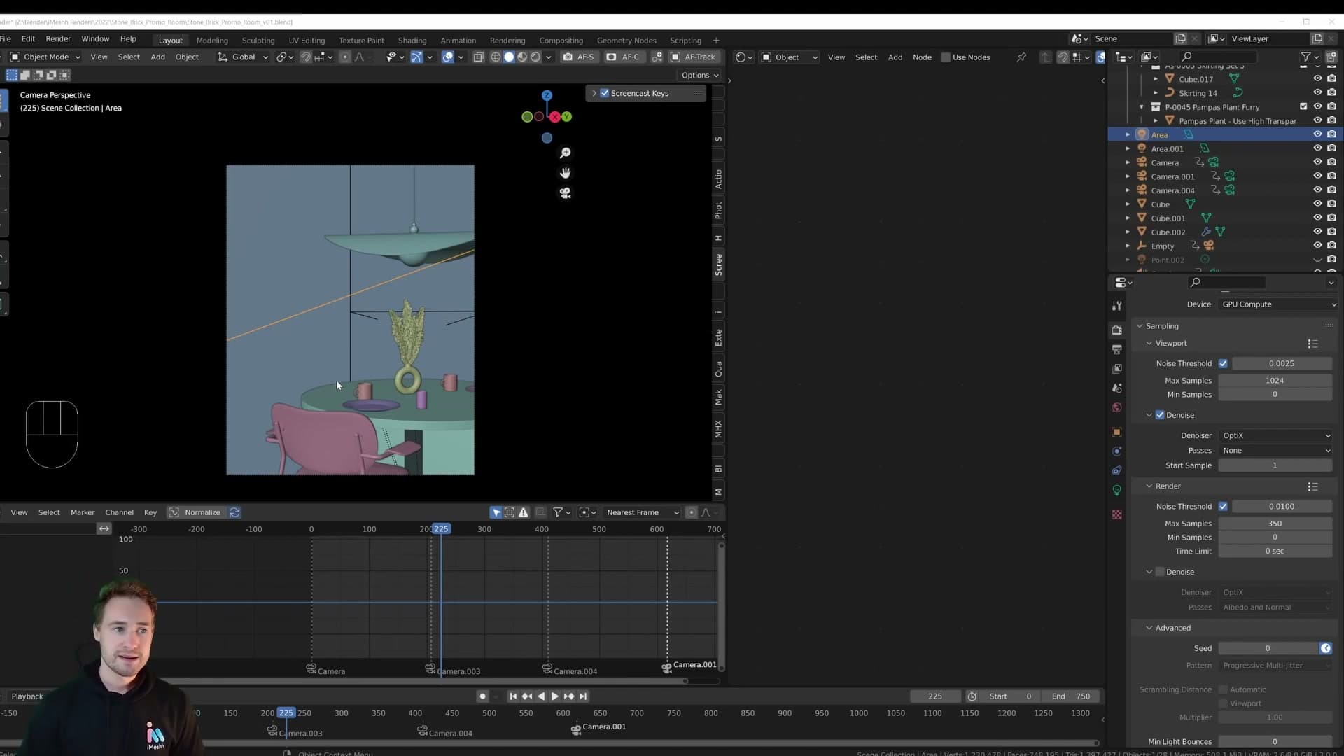
Photography studios deliberately avoid natural light because they can't guarantee the weather from one day to the next. Instead they rig area lights throughout the space, each one aimed at a specific item, in whatever colour the shot calls for. It's a very controlled look, and crucially your eye is already trained on it. You've seen that brochure-style lighting on every advert and product page for years, so when you see it in a render your brain reads it as real.
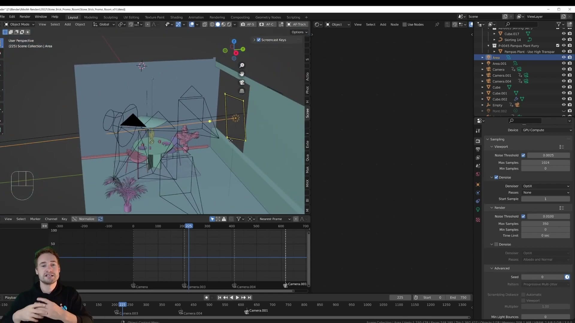
The rig in this scene is small. Two area lights (the second is just a duplicate of the first, repositioned to light a different part of the room), plus a small point light tucked inside the table lamp that came with the asset when it was appended. The point light isn't doing any heavy lifting; it just casts a gentle glow over the table so the lamp reads as switched on.
Why HDRIs are slow for interiors
The other reason to reach for area lights instead of HDRIs in an interior is speed. Consider an HDRI sitting outside the room: to light the inside, the rays have to enter through the openings, bounce around the geometry, and eventually find their way to every surface you care about. To stop that from being painfully noisy you also have to set up light portals on every window and opening so Cycles knows where to focus its sampling, and even then it's slow.
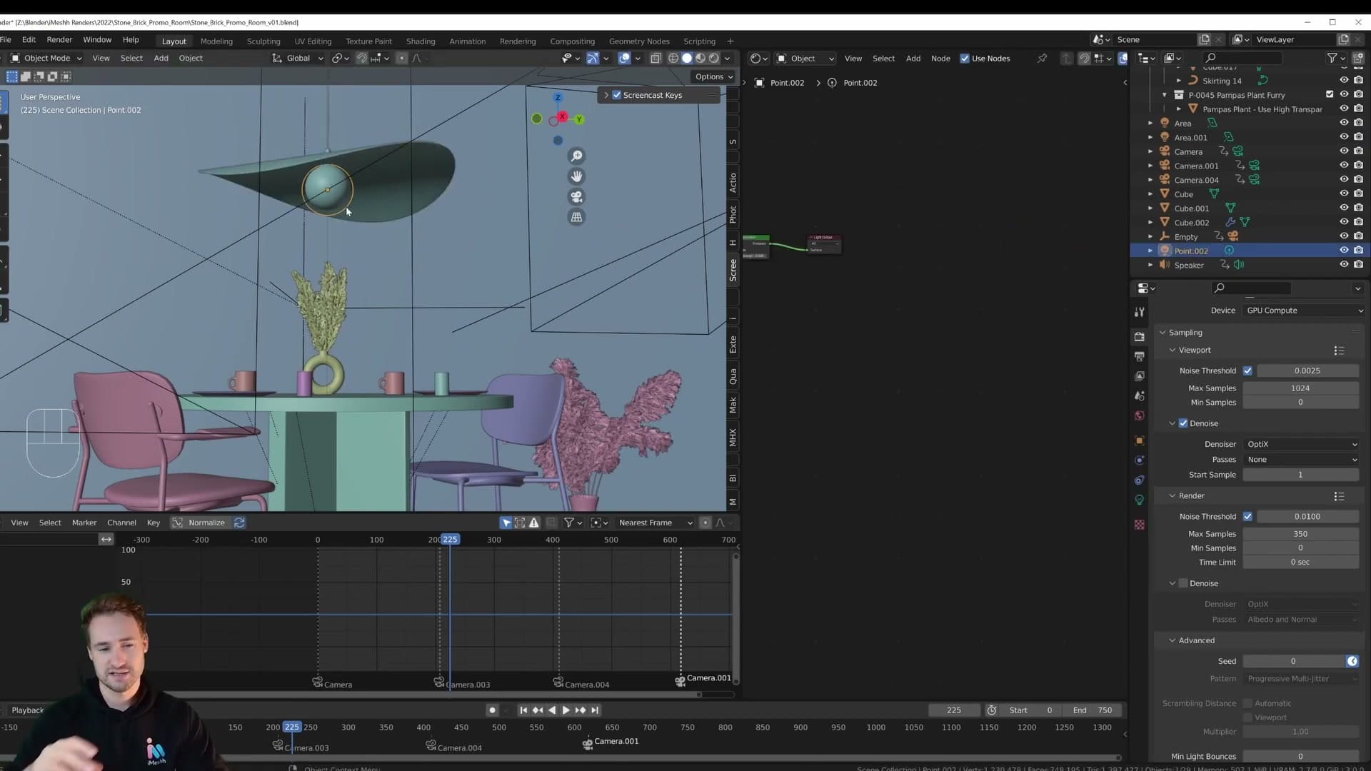
An area light skips all of that. You're telling Cycles directly: I want the light here, pointing this way. No extra bounces to chase, no portals to manage. Area-light scenes generally clean up in a fraction of the samples an HDRI-lit version would need. On a 750-frame animation where every frame counts, that is a significant saving.
Controlling beam shape with the Spread setting
Switch on the main area light on its own and you get a surprisingly natural-looking interior from a single source. The trick is the Spread value on the area light. Leave it at the default 180° and you get a very wide-angle light that throws photons in every direction across the hemisphere. Fine for fill, but soft and undirected.
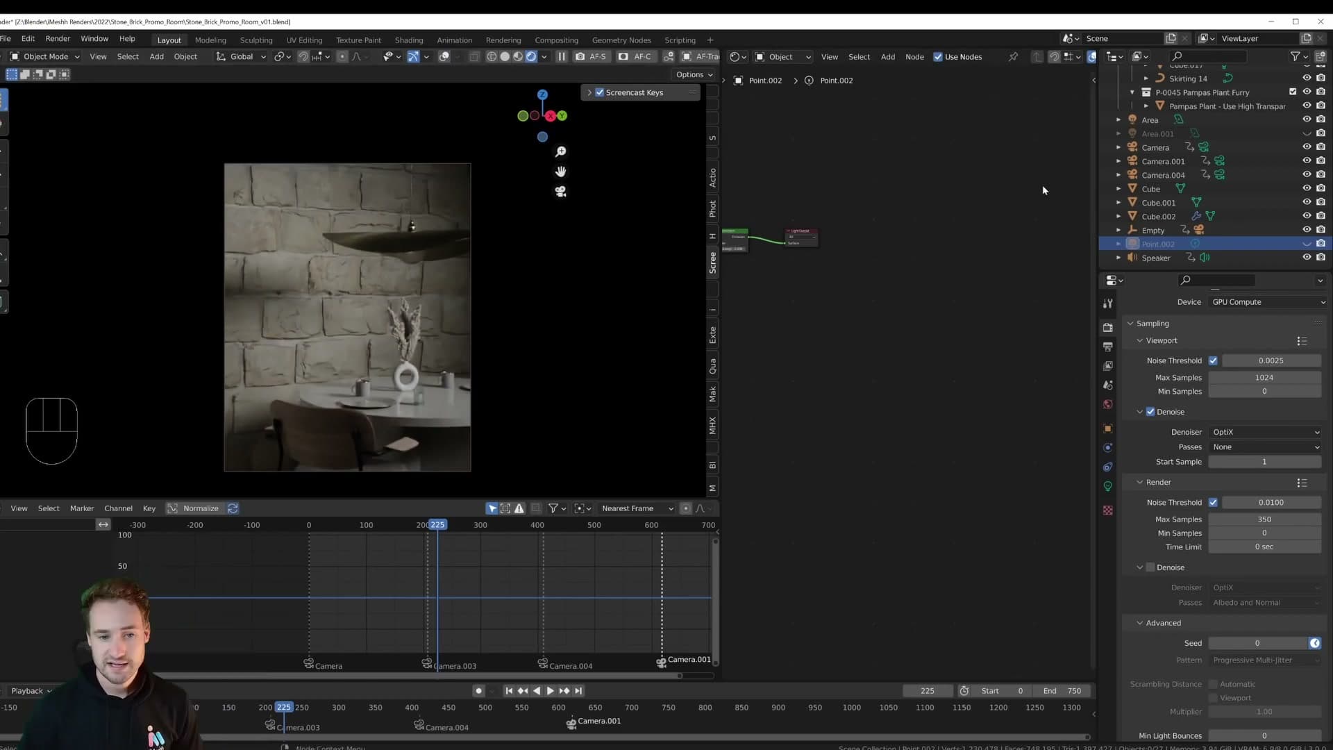
Drop the Spread to 58° and the light becomes much more focused, as if it has already passed through a window and the rays are arriving roughly parallel. The shadows tighten up and read as sharp and clean. That is the look brochure photography uses, and it's a quality that's hard to fake with an HDRI.
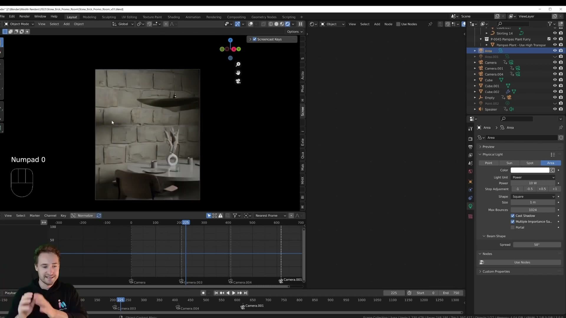
If area lights aren't part of your usual workflow, try them on your next scene before reaching for an HDRI. A single area light with a tuned Spread can carry a surprising amount of an interior on its own.
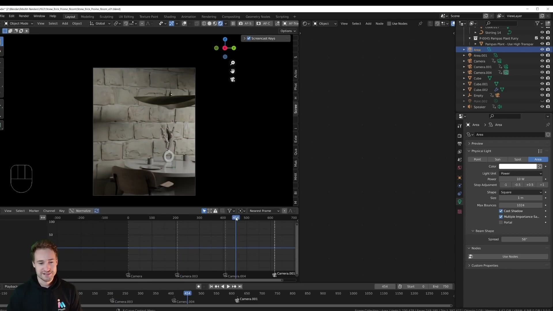
A second area light to feature a wall
The second area light is the duplicate mentioned earlier, repositioned to feature one specific wall as the camera tracks down the scene. The walls had so much work poured into them that I wanted to give them a dedicated key light rather than rely on bounce from the main fixture.
And that really is the whole lighting setup. Two area lights, the small point light in the lamp, the materials, and the models. Nothing more elaborate than that. It's one of the scenes I'm most pleased with, and the lighting was a big part of why the walls finally got the showcase they deserved.
Cycles render settings for the animation
350 samples, ~2 minutes per frame on an RTX 3070, 25 hours for the full 750-frame animation. Animated Seed, 32 transparent bounces, clamping off, and Simplify capping textures at 4K.
350 samples + compositor denoise
For the final animation I settled on 350 samples, which renders in roughly 1 minute 59 seconds per frame on an RTX 3070. At 750 frames that works out to about 25 hours for the whole sequence. Leave the machine running overnight and the next day, and the animation is finished. For an archviz piece at this quality, that's a sensible budget.
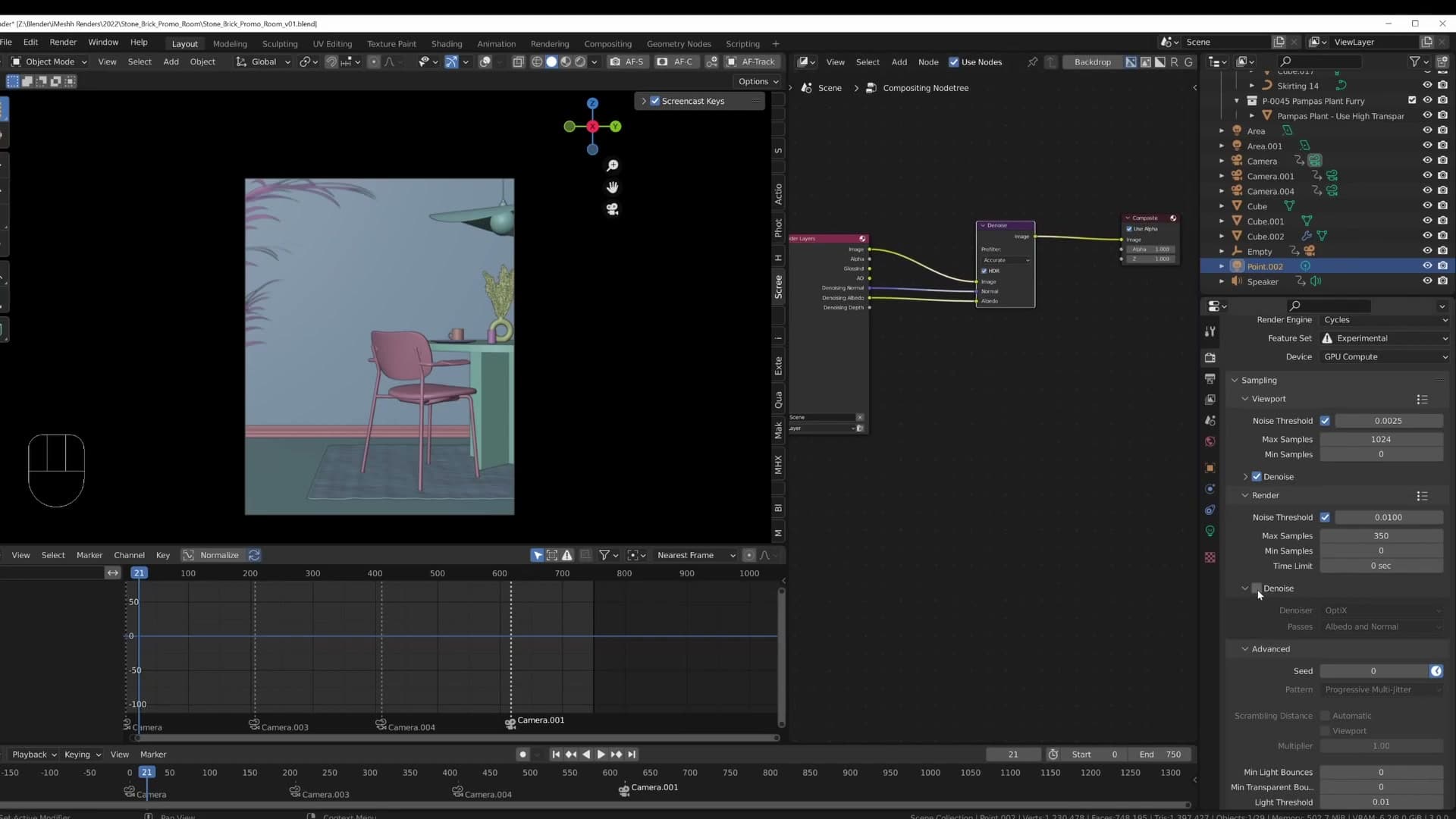
Denoising inside the render settings is turned off. Instead, the compositor handles it: a single Denoise node sits on the render output and cleans up whatever noise is left from 350 samples. Doing it in the compositor gives you more control over the result and keeps the in-render denoiser out of the way.
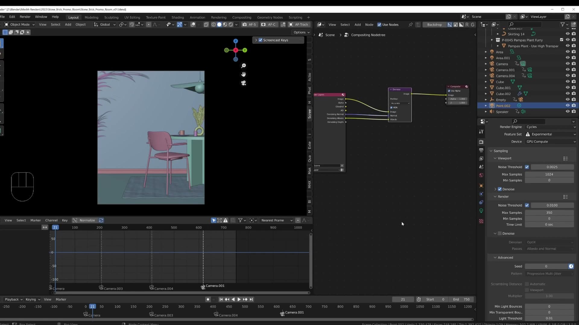
Use Animated Seed to break noise lock
The next switch worth flipping is Animated Seed, under Render Properties > Sampling > Advanced. By default, Cycles uses the same noise seed on every frame. That sounds fine in theory, but in practice the noise pattern ends up locked to the geometry. When you play the animation back, you can see the noise crawling across the scene as the camera moves. It reads as a strange shimmer that doesn't look like real grain.
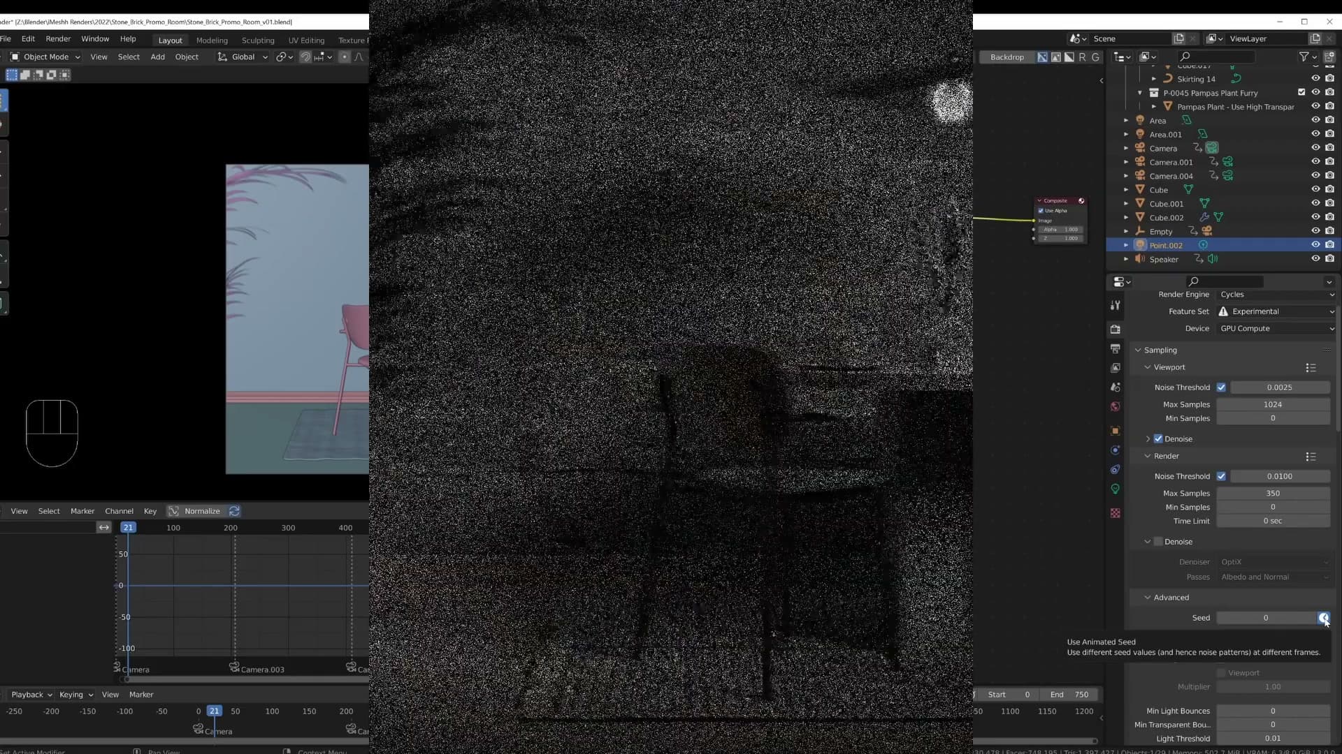
With Animated Seed enabled, every frame gets a fresh noise pattern. The result looks much more natural, more like film grain than a stuck artefact, and the compositor's Denoise node cleans it up frame-by-frame without dragging the pattern along with it.
Transparent bounces, clamping, and Simplify
Drop down to Light Paths and you'll see one specific change: Transparent bounces are pushed up to 32. That's there for the pampas grass. The leaves are made of overlapping alpha-cut planes, and at the default value Cycles runs out of bounces before the ray clears the foliage, leaving artefacts. At 350 samples the rest of the scene is clean, but the pampas was still flickering in places, so for shots that focus on the grass you could push the value higher again.
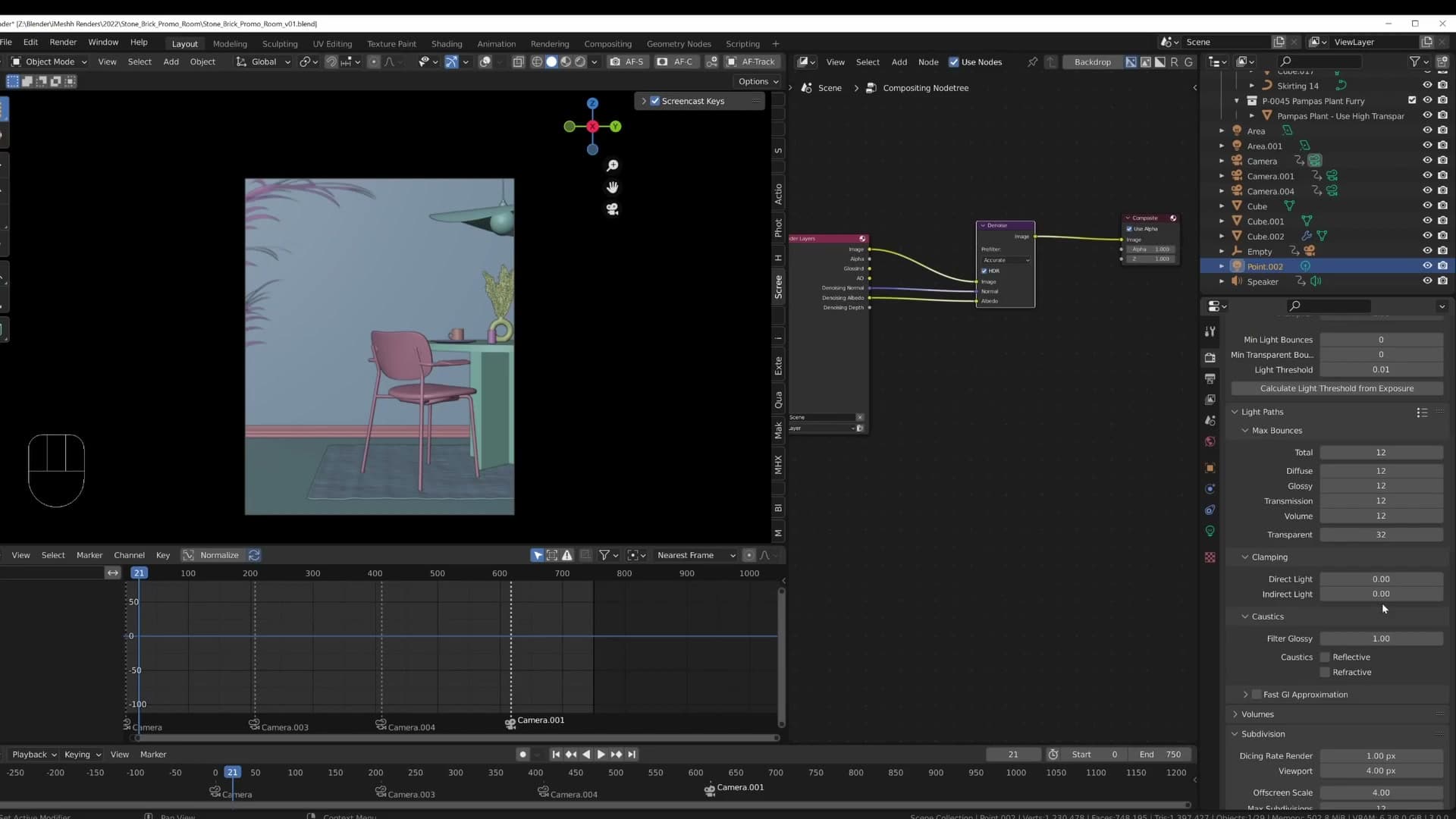
Clamping is turned off completely. Clamping exists to kill fireflies (those bright stray pixels that come from a single noisy ray finding an extreme highlight), but the lighting here is clean: two area lights and a single point light, no aggressive caustic paths. Without fireflies to fight, clamping just throws away energy and flattens the result. Leaving it off is the more physically accurate choice when your lighting setup is already calm.
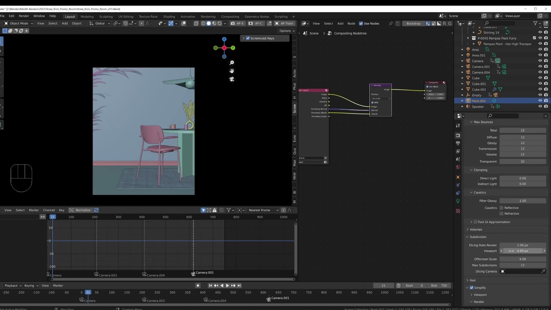
For the displacement, the Dicing Rate is set to 1 for render and 4 for viewport. Sharp displacement where it counts, lighter geometry while you're working.
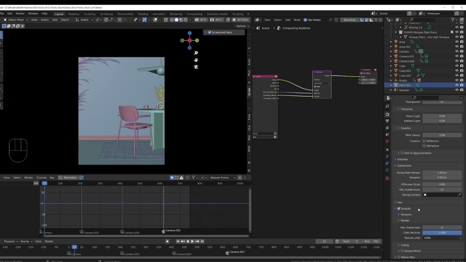
The final box ticked is Simplify, capping textures at 4K. The bundle ships with 8K source maps, but at this camera distance you can't see the difference between 4K and 8K on screen. Capping them shortens the render time noticeably without any visible cost. It's a free saving, and for a 25-hour animation, free savings are worth taking.
Key takeaways and wrap-up
Linear camera motion, beat-synced events, and area lights over HDRIs. The three habits that make this animation read as real.
The three habits to copy
If you take three things from this breakdown, take these. Keep camera moves solid and linear: no easing, no overshoot, no swooping. Set your F-curves to Linear interpolation and let every dolly run at a constant speed end-to-end.
Don't go too crazy with your lighting. Try simple methods first: drop in an area light or two to highlight specific parts of the scene rather than leaning on an HDRI to do everything. Even just using area lights to lift the key areas of a shot reads more like real studio photography than a sky-only setup.
And try adding music. Build the cuts and the material switches so they land in time with the beat. When the camera moves, the lighting, and the wall changes all hit on the same downbeat, the whole thing reads as deliberate rather than decorative. Those three habits together are what make these short animation videos interesting to watch.
That's the breakdown. If there are other videos you'd like pulled apart like this, leave a comment and let me know. Thanks for watching, check out imeshh.com, and if you've made it this far, the subscribe button would be very much appreciated.
Tools and credits
Everything mentioned in this tutorial, with links.
- Blender is the renderer this entire build runs in.
- iMeshh is a studio platform (project management, client review, asset library, invoicing). The asset library used in this tutorial is included with every iMeshh Pro plan.
- Poly Haven provides free CC0 textures and HDRIs.
Pillar guide: Animation hub