Spotting the shading problem and the Auto Smooth trap
Set the critique up, identify the gradient-style shading artifacts on what should be flat panels, and learn why Auto Smooth is a tempting one-click fix that bites you the moment the model leaves Blender.
The submitted cabinet and what we're going to fix
Welcome to a slightly different iMeshh tutorial. A viewer has sent in a chest of drawers they have designed, along with their own render of it, and asked for tips on what to look for when you want to start selling your products. This walkthrough is a full teardown: the geometry first, then the materials, then the lighting and rendering. By the end you should have a checklist of the things that quietly stop a model from being marketplace-ready.
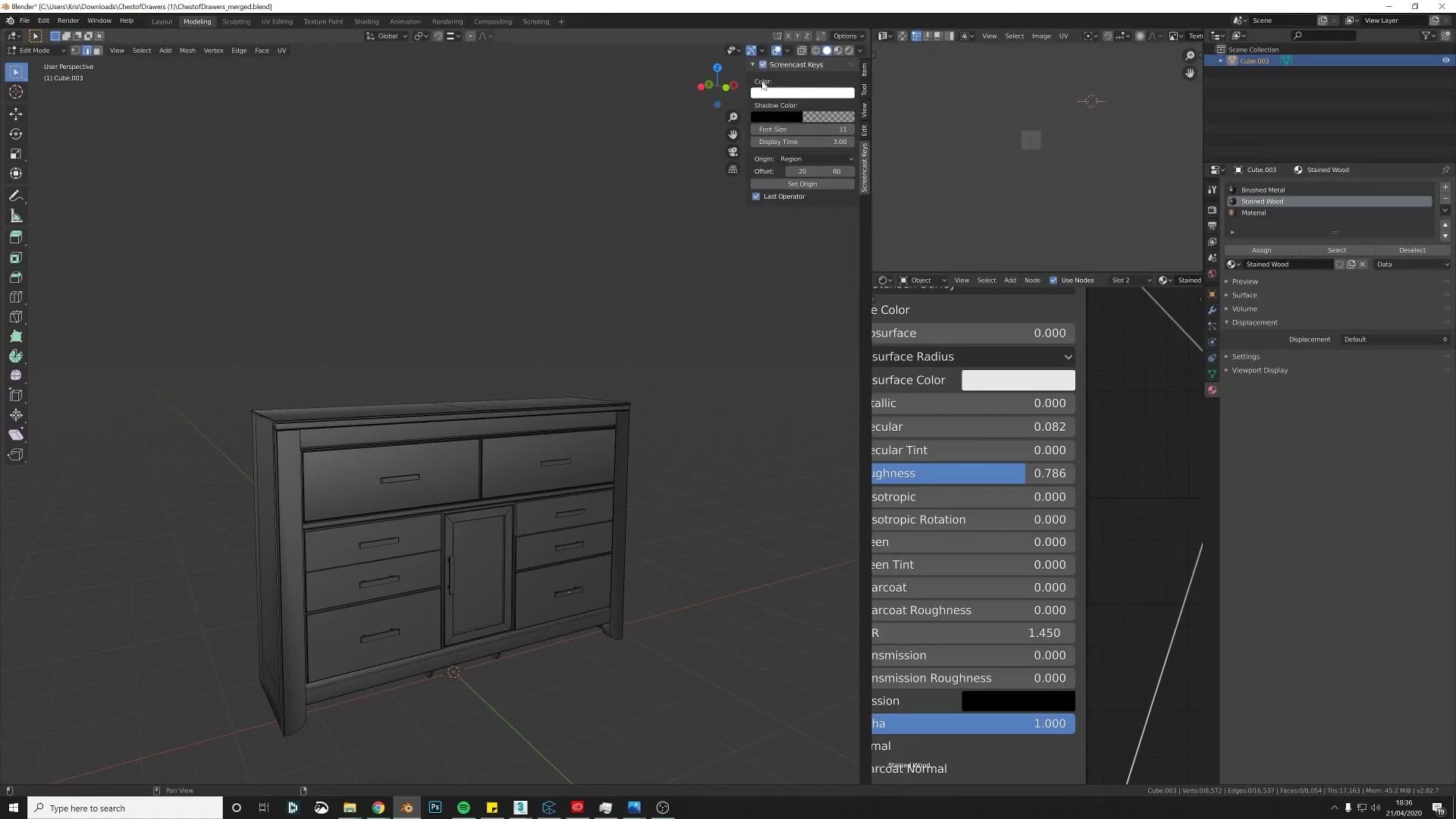
Before diving in, switch on screencast keys so every shortcut shows up on screen. The commentary tries to call out each one, but if a key press slips by unspoken, you can always glance at the overlay to catch what was pressed.
Why a 'flat' panel is shading like a curve
The first thing that jumps out on this cabinet is the shading. It is visible in the submitted render as well as in the viewport: smooth shading has been applied across the whole object, but Blender has no idea which parts are meant to be flat and which are meant to be curved. The result is a soft gradient of light running across panels that should read as completely flat, hard surfaces.
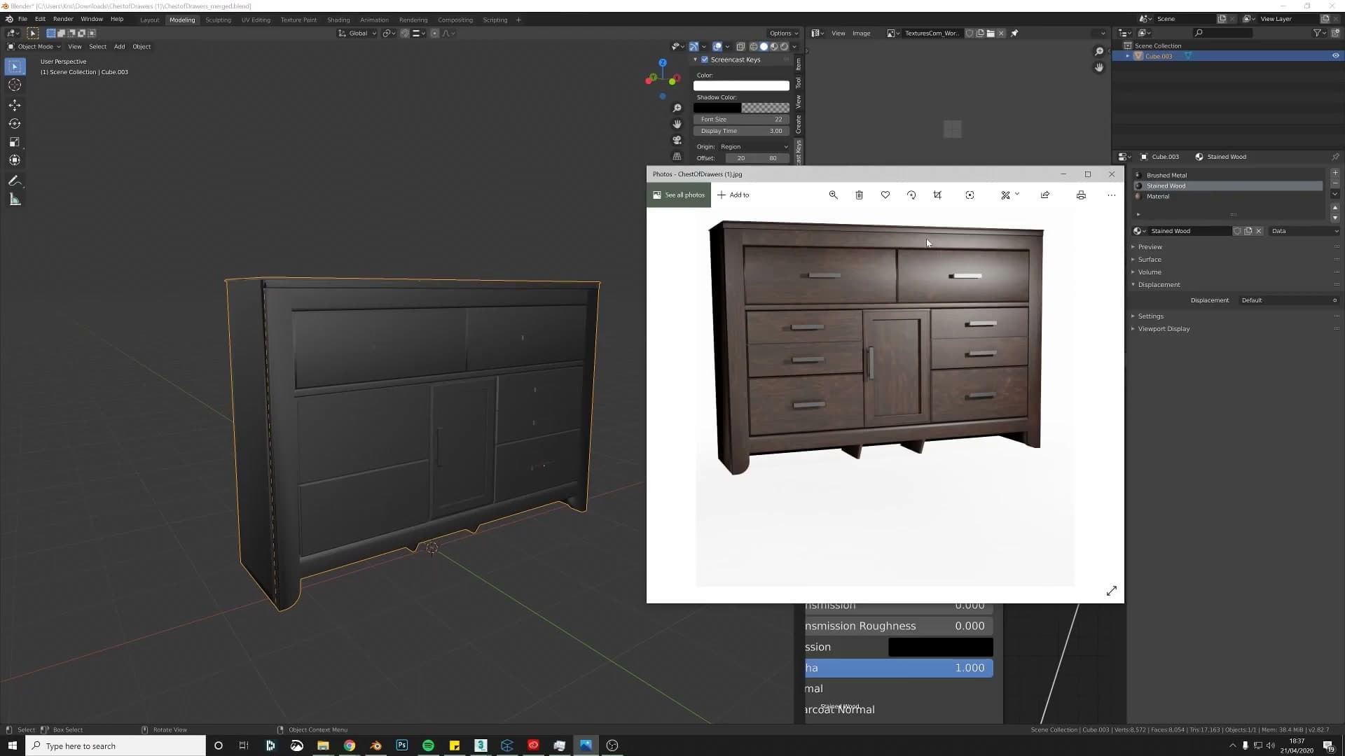
There is a tempting one-click fix for this. Head into the Object Data Properties and switch on Auto Smooth. Almost immediately the gradient disappears and the panel reads as a single flat face. So far, so good.
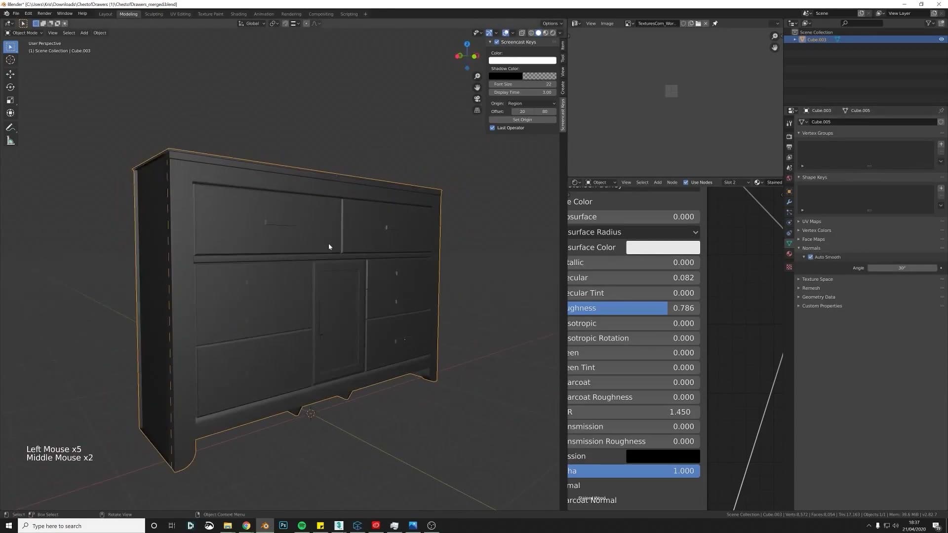
The problem is that Auto Smooth does not actually solve the underlying geometry issue. The corners are still razor-sharp in a way real furniture never is, so you will need to add a little bevelling anyway. That makes Auto Smooth a shortcut worth understanding but not one worth leaning on.
Adding supporting edges so shading survives an export
The deeper reason to avoid Auto Smooth is portability. Other programs do not necessarily have a matching button: import the same mesh into something like 3ds Max and the shading will not carry across, because the Auto Smooth flag is a Blender concept rather than a property baked into the mesh itself. If you ever plan to sell the model, the safer assumption is that the buyer is opening it somewhere else.
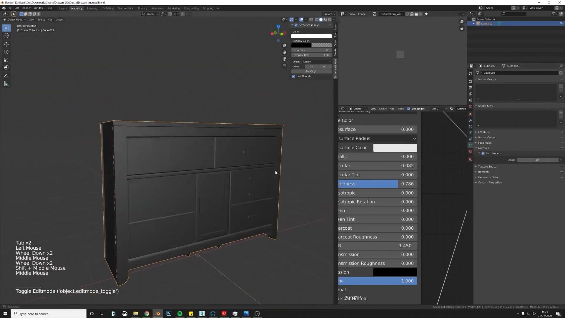
The fix is to add a couple of supporting edges along each hard corner. It only takes a few seconds per edge and it has the bonus of leaving the file friendlier for whoever opens it next, since they can subdivide or smooth from there if they want to.
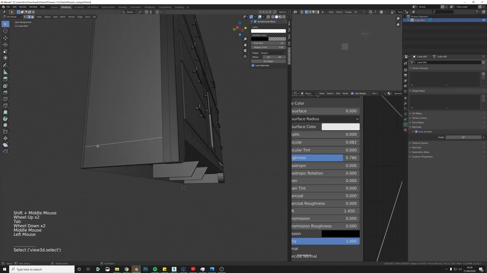
Start with a loop cut using Ctrl+R, dropped in close to the corner you want to define. Then run a small bevel with Ctrl+B to add another control loop right next to it. Repeat on the opposing side of the corner. Those extra edges give Blender the information it was missing. They tell it where the flat ends and the corner begins.
With the supporting loops in place, the same panel now shades as a clean, flat surface, and Auto Smooth can stay switched off entirely. The shading is now travelling with the geometry rather than with a Blender-only toggle.
Rebuilding a missing face from scratch
Isolate a broken section using Ctrl+L select-linked and hide-others, separate it, and rebuild the panel from a fresh cube with vertex snapping and a Mirror modifier. Includes a metric vs imperial sidebar.
Isolating the broken panel with select-linked + hide
The previous fix exposed a panel with no inside face, a single-sided plane standing where a solid piece of timber should be. Rather than try to patch the broken mesh, the cleaner move is to isolate that section, lift it out of the cabinet, and rebuild it from a fresh primitive.
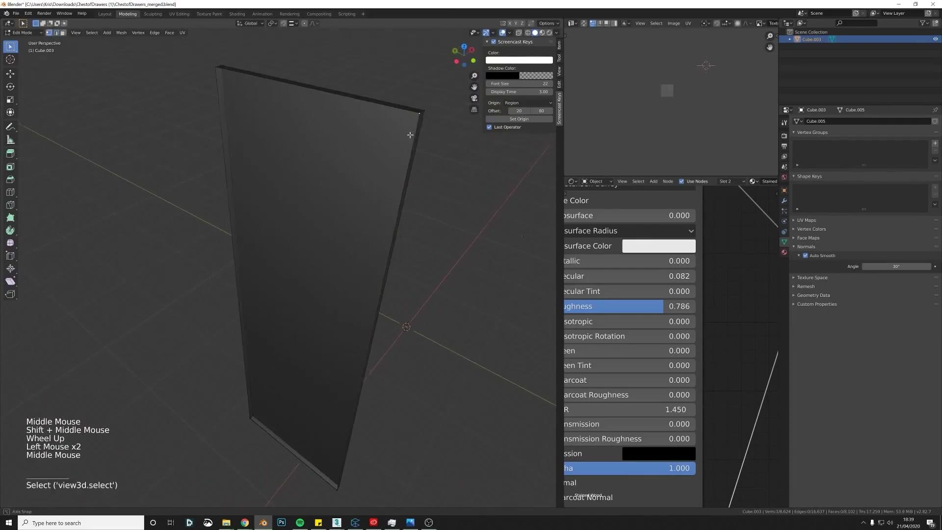
Bring all the hidden geometry back into view with Alt+H, then click one face on the broken panel. Press Ctrl+L to grow the selection across every face that's connected to it, and use P → Selection to separate the bad piece into its own object. With the panel split out, drop a fresh cube into the scene to act as the rebuild surface, and solo it alongside the original outline so the rest of the cabinet drops out of view while you work.
Rebuilding from a fresh cube with vertex snapping
With a fresh cube in place, the rebuild is mostly about pulling each of its corners onto the existing panel outline. No measuring, no eyeballing.
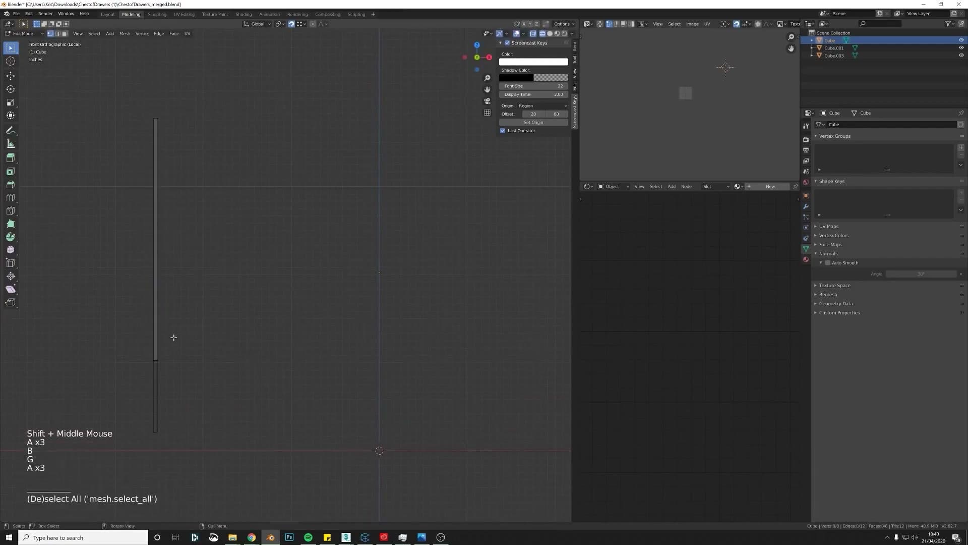
Press Shift+Tab to toggle snapping on, with the snap target set to Vertex so each move locks to the nearest point on the existing geometry. Drop into edit mode, grab a vertex on the cube, and press G then X. Blender drags the vertex along the X axis and snaps it onto the matching corner of the original panel. Repeat for each vertex you need to align, swapping the axis to G then Y where the move runs the other way. In a handful of nudges the cube takes on the exact proportions of the panel it's replacing.
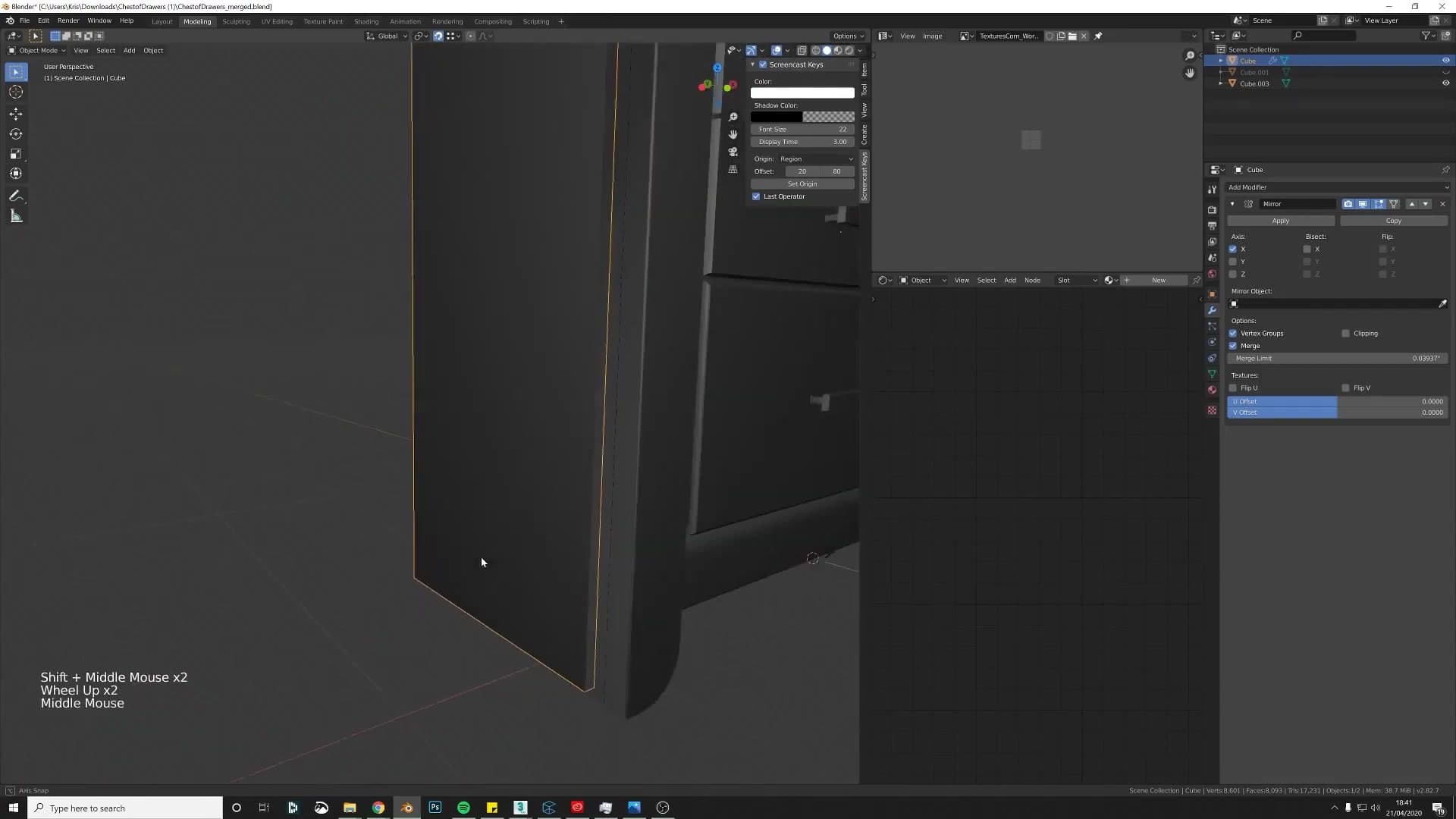
Once the corners are in place, select the old single-sided panel and press H to hide it. It's still in the scene if you ever need to compare, but it's out of the way. Then add a Mirror modifier to the new piece. Because the chest is symmetrical, mirroring across the centre line rebuilds both side panels from the one cube you just snapped into position. Unlike the original, the result has real thickness on both faces instead of a paper-thin plane.
Bevel modifier on the rebuilt piece, and why metric beats inches
The geometry is correct now, but it's still a hard-edged box. Before adding any bevel, apply the cube's scale with Ctrl+A -> Scale. Bevelling an object whose scale hasn't been applied bakes a skew into the result, with the bevel running wider along whichever axis was scaled more. You'll see this problem again in later modules when fixing the existing top trim.
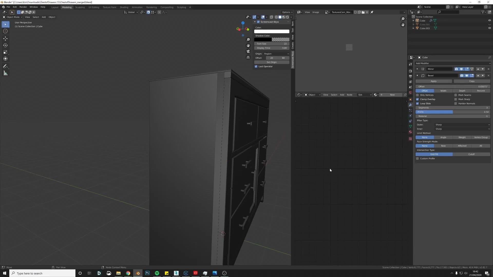
Then add the bevel as a Bevel modifier rather than running Ctrl+B directly on the mesh. As a modifier the bevel stays non-destructive: you can dial the width up and down, add or remove segments, or disable it entirely without touching the underlying geometry. Drag the width down until the corners catch a soft highlight without visibly rounding off the panel, and add a couple of extra segments if you want a smoother fillet.
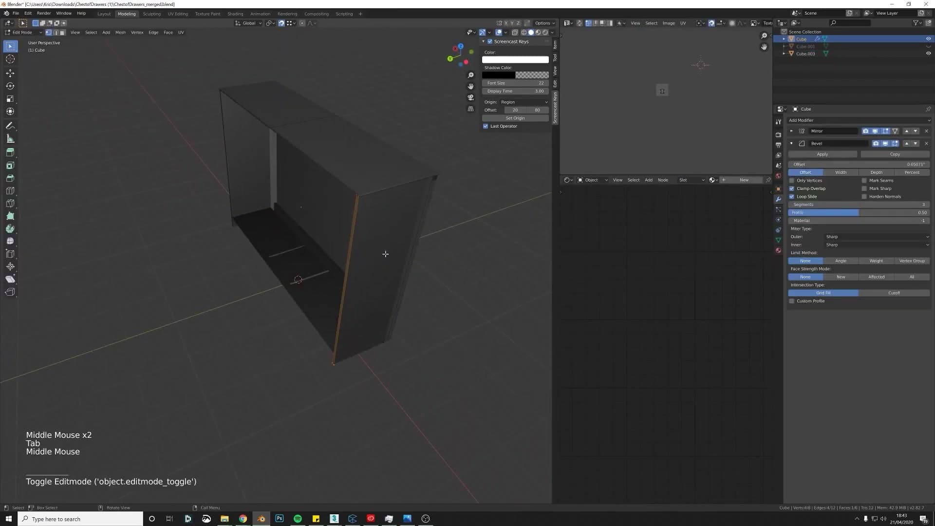
While you're tidying the file, switch the scene units from inches to metric. Blender ships with metres as its default, and 3ds Max (along with most game engines) works in centimetres and metres. Exporting an inches-scaled model into any of those tools risks the geometry arriving at the wrong size, or drifting in ways that break modifier-driven values on import. Keep the working units in metric and the cabinet travels cleanly between platforms.
Hunting down 2D planes and floating edges
Delete the single-sided plane Blender was hiding on the front of the model, then track down the orphaned edge that was leaving a tell-tale line across the surface.
Deleting flat planes and replacing them with real geometry
With the back panel solid and bevelled, the next pass is a hunt for the smaller giveaways still visible on the outside of the cabinet. A faint line where the surface should be smooth is almost always a sign that an edge there isn't connecting to anything around it. The topology hasn't welded the way it looks like it has.
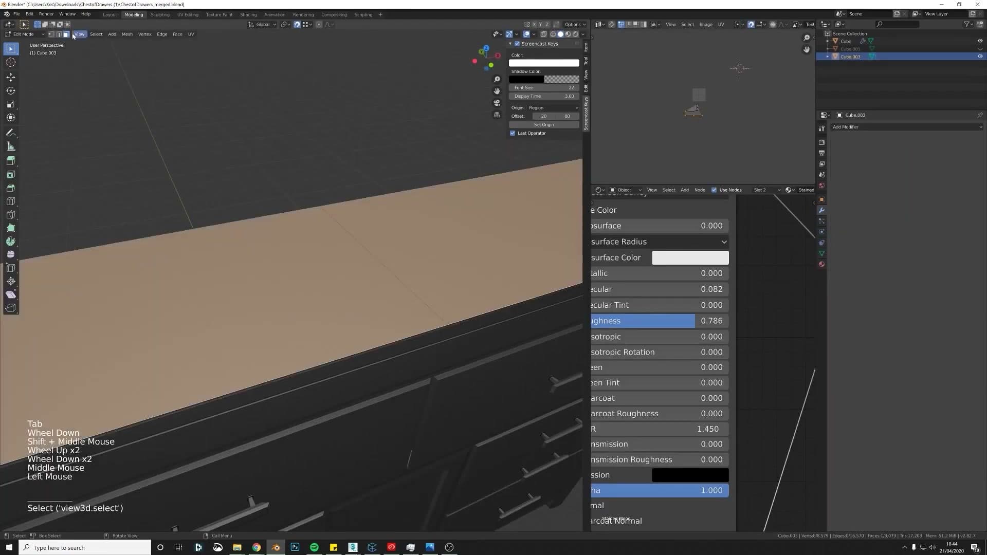
To confirm what you're looking at, click on the suspicious face in edit mode. If the selection extends well beyond the small patch you expected, highlighting the whole larger area instead of just the section between the visible edges, you've found a duplicate single-sided plane sitting on top of the real geometry. A clean face would only select the area between its own edges.
Isolate the offender so you can deal with it properly. Hover over the problem face, press Ctrl+L to grab everything linked to it, then separate the selection out into its own object and switch to local view. That hides the rest of the cabinet so you can examine the problem piece on its own without anything else getting in the way.
Why a visible edge means something's not welded
In local view the cause of the visible line gets much easier to see. The offending geometry is an edge floating across what should be one continuous face. It runs through the surface but doesn't actually belong to any geometry on either side of it. Select the stray edge and delete it, and the underlying face is whole again.
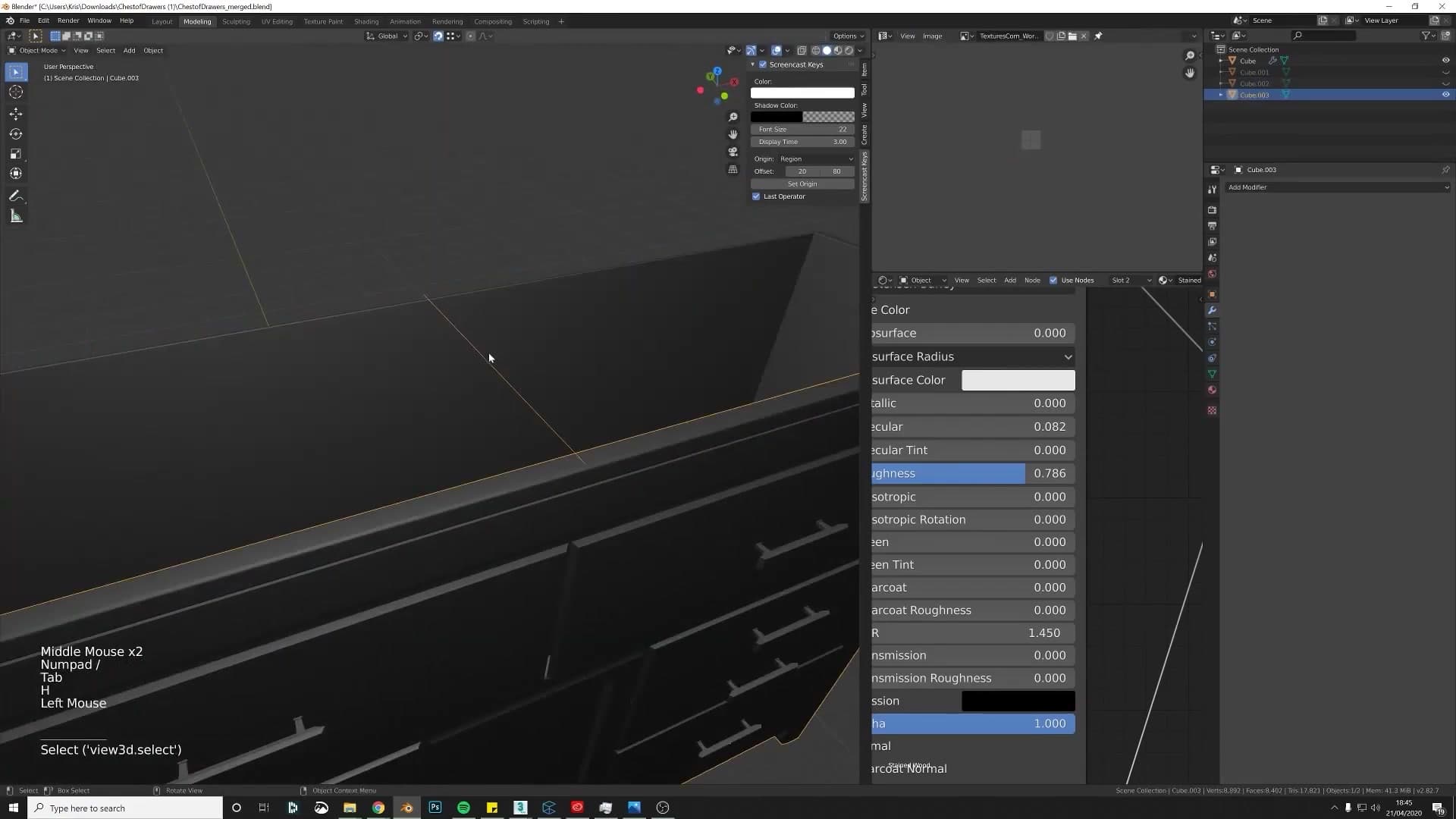
Drop out of local view, look at the cabinet from the outside, and the tell-tale line you'd spotted earlier is gone. From here you can carry on to the next issue: the bevel that was applied without the object's scale being applied first.
Fixing a skewed bevel with the Shear tool
Diagnose the asymmetric bevel caused by bevelling before applying scale, then straighten the offending edges with the Shear tool (Shift+Ctrl+Alt+S) and use mirroring to avoid re-doing the work on the other side.
Why your bevel ended up lopsided
If your bevel comes out wider on one side than the other, the cause is almost always the same: you bevelled the object before applying its scale. When a mesh is stretched along an axis in Object Mode and the scale never gets baked in, Blender carries that non-uniform scaling into every subsequent edit. The bevel operator still measures its width in local space, so the edge that runs along the stretched axis ends up pushed further out than the edge that runs across it. The result is the lopsided shape you see here.
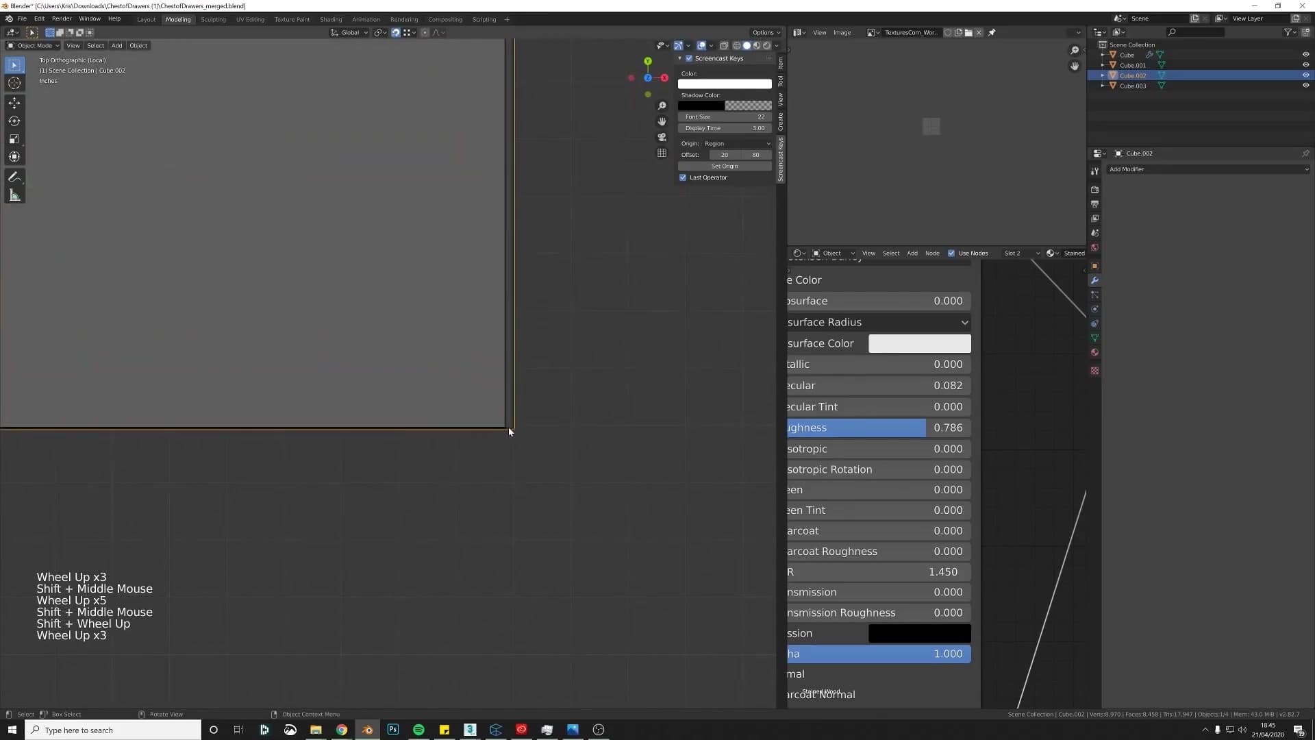
Once you know the signature it is unmistakable: a bevel that leans one way along a face instead of sitting symmetrically on both sides. The fix is also quick. You do not have to rebuild the face from scratch; you can shear the skewed edges back into place.
Going forward, the habit to lock in is to hit Ctrl+A > Scale before any bevel work so the object's scale values read 1, 1, 1. That single step prevents this whole class of bug.
Shift+Ctrl+Alt+S: the Shear shortcut and how to use it
Drop into Edit Mode, switch to face select, and isolate the skewed faces. Then run the Shear operator, either by pressing F3 and typing shear, or with the shortcut Shift+Ctrl+Alt+S. The operator starts immediately but does not constrain to an axis on its own, so it can feel like nothing is happening until you tell it where to push.
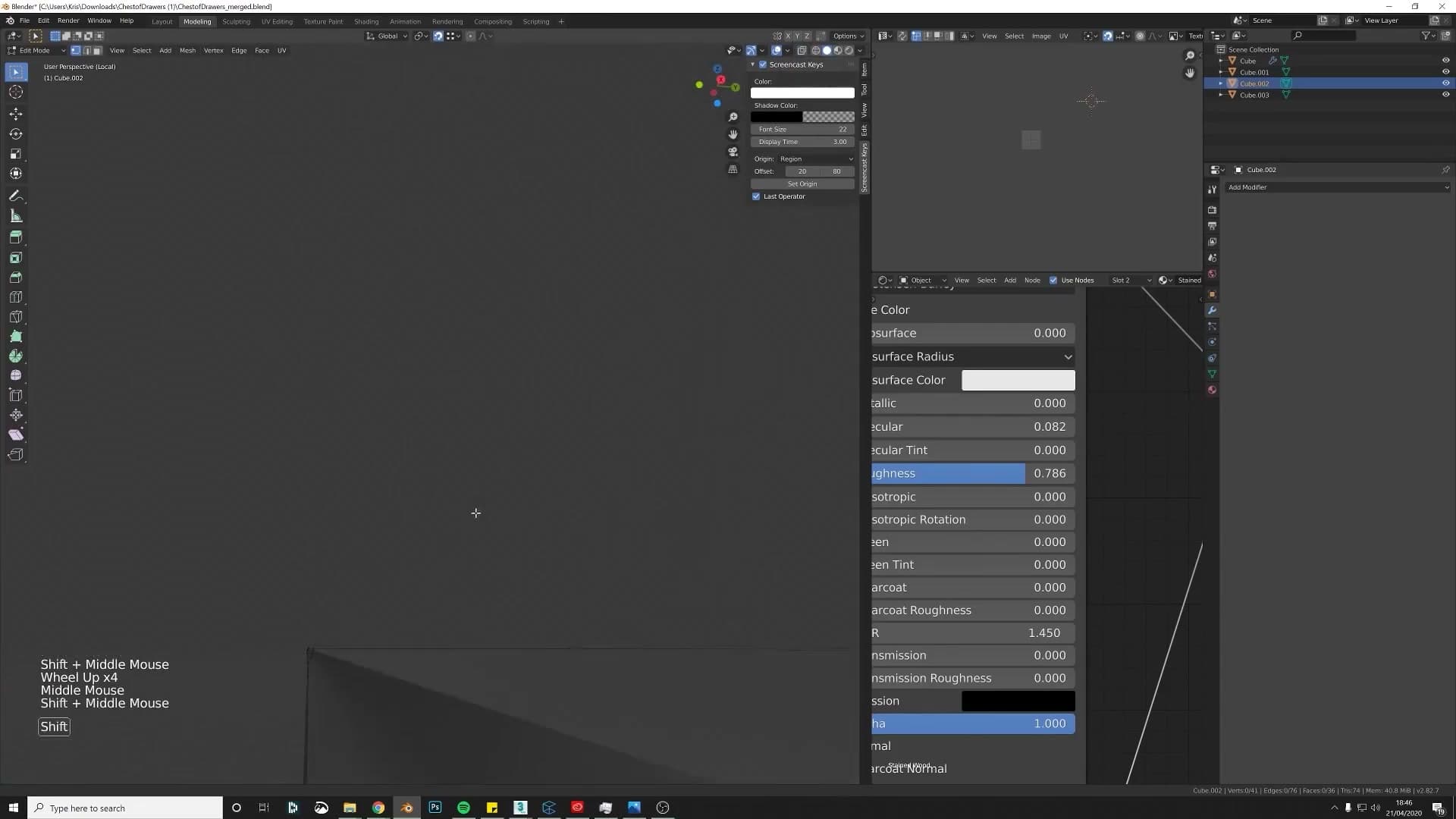
Tap Y to lock the shear to the Y axis (in this case; X would be the right choice on a different orientation, so try both if the first axis does nothing useful). Drag until the skewed edges sit at roughly 45 degrees, matching the angle the bevel should have produced in the first place. Click to confirm.
Rather than repeat the whole correction on the opposite side of the cabinet, delete the mirrored half and re-build it with a Mirror modifier. Before adding the modifier, snap the origin back to the centre line with Object > Set Origin > Origin to 3D Cursor. If the 3D Cursor is not already there, click a neighbouring object whose origin is correctly placed, press Shift+S > Cursor to Selected, then run Set Origin on the skewed mesh. Once the origin is in the right spot, the Mirror modifier reflects your now-clean side perfectly onto the other.
Working symmetrically like this saves a surprising amount of cleanup time on furniture. If a panel has a left and a right, fix one side properly and let the modifier handle the other.
Back faces, Inset > Boundary, and the case for bevel modifiers
Fill the missing bottom face, work around the classic Inset-vs-Mirror seam problem with the Boundary checkbox, then add a Bevel modifier set to Angle so the geometry stays editable.
Closing the open back with Alt-select + F
Before moving on to surface detail, do one last pass for missing back faces. The general rule: try not to leave any open back panels on a piece of furniture, even ones the camera will rarely see. Open back faces mess with the shading and, more practically, an asset that's clean all the way round just reads as more professional. The edges sit where they would in real life.
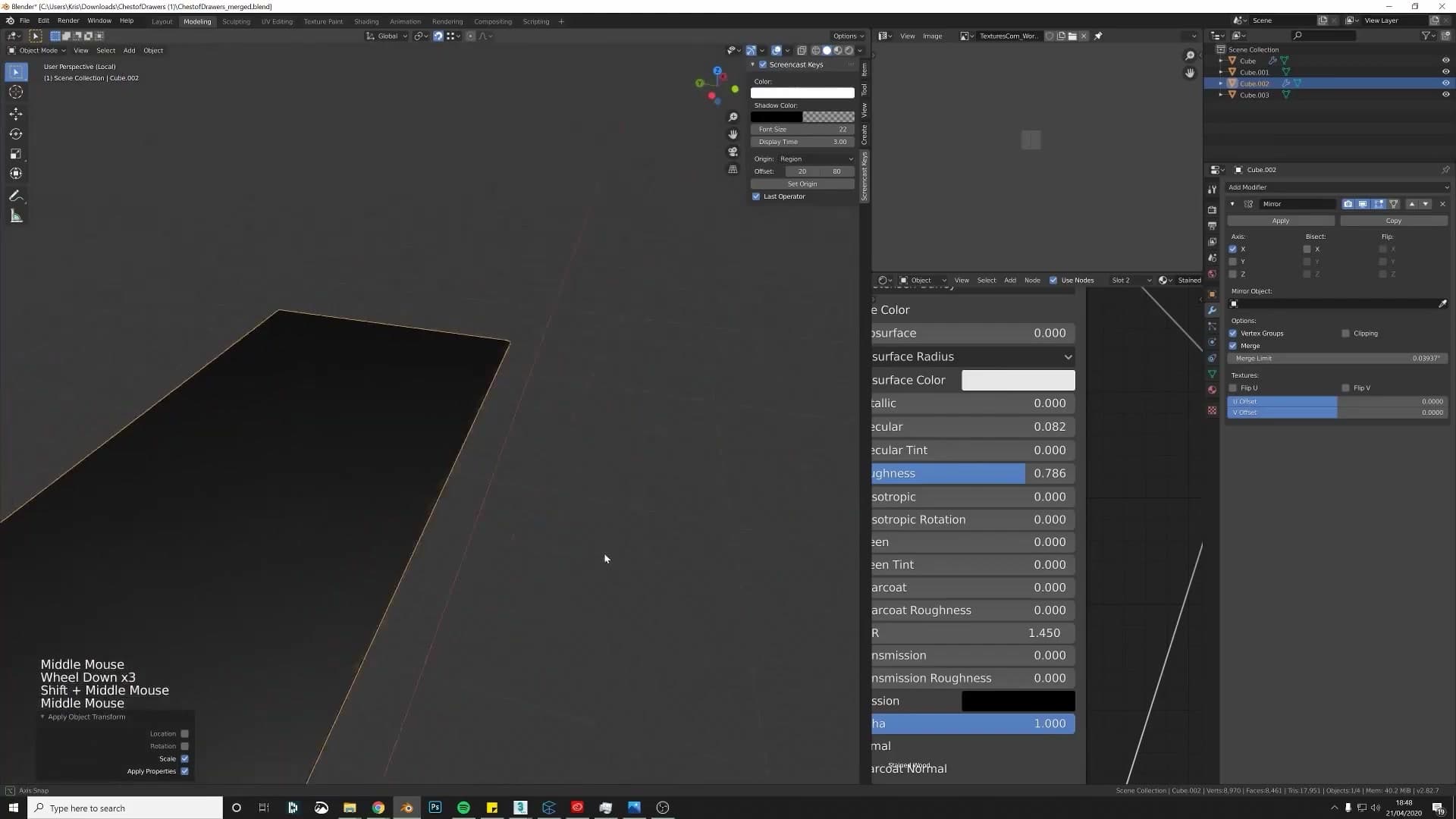
Where you do find a hole, the fix is the same every time. Hover the object and tap numpad full-stop to frame it, then select the loose edges that should form the missing face and press F to fill. If an edge is missing on one side but present on the mirrored side, select the matching vertex, press E to extrude with clipping on so it lands cleanly on the centre, and then bridge the gap with F.
On this cabinet that meant closing the bottom panel of the carcass with a single filled face. The back is no longer an open box. The drawer interior is a judgement call: if the model is destined for a wide arch-vis shot where nobody will pull the drawer out, you can leave it empty, but modelling the inner drawer anyway is the safer habit.
Inset > Boundary so the mirror plays nicely
With the back closed up, the next job is to add some supporting geometry to the front panels so the shading reads cleanly. The natural tool here is Inset: select a face, press I, and drag inwards. But the Inset operator has a quirk that bites every time you combine it with a Mirror modifier.
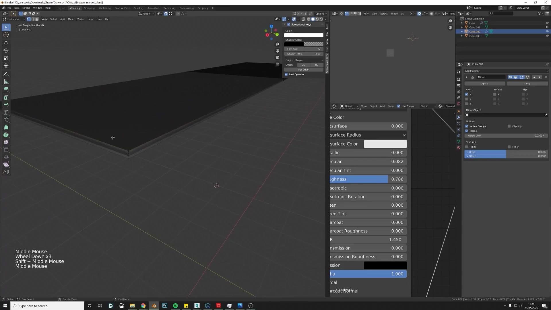
By default, Inset treats the mirror seam as a real boundary edge and walks the inset all the way around the face, leaving a visible cut straight down the centre of your model where the two halves meet. The fix lives in the redo panel at the bottom-left of the viewport (or press F9 to pop it open after the inset). Tick the Boundary checkbox and the inset will now respect the mirror seam, treating the centre edge as interior and only drawing the inset along the genuinely outside edges.
It's the kind of one-click toggle that's invisible until you know to look for it, and then it solves the problem instantly. Worth committing to muscle memory if you mirror anything regularly.
Bevel modifier set to Angle: the non-destructive approach
With the extra geometry from the inset in place, the sharp edges of the cabinet need a small bevel so they catch light like real wood instead of reading as a CG-perfect knife edge. You have two options. The destructive route is to select the edges manually and press Ctrl+B. The non-destructive route, and the one to reach for if you're still iterating, is the Bevel modifier.
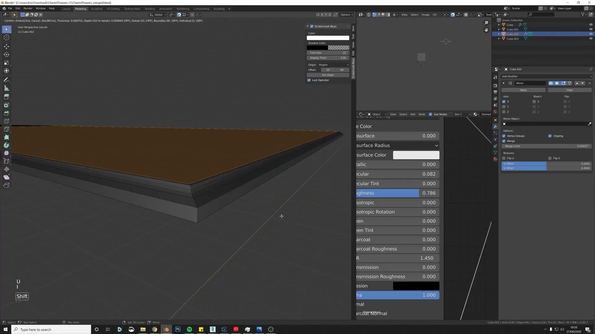
Add a Bevel modifier to the object and change the Limit Method from None to Angle. With Angle limiting, the modifier looks at the angle between adjacent faces and only bevels edges sharper than the threshold, so your flat panels stay flat and only the genuinely sharp corners pick up the bevel. Turn the bevel Width right down. You want a thin highlight, not a chunky chamfer.
Before you add or trust any bevel, check the object's scale. Open the N-panel, look at the Scale values under Item, and if they're not all 1.0 press Ctrl+A and apply Scale. A bevel run on an object with unapplied scale bakes the skew straight into the result. The bevel will be wider on one axis than the other and the geometry will look wrong before you've even started.
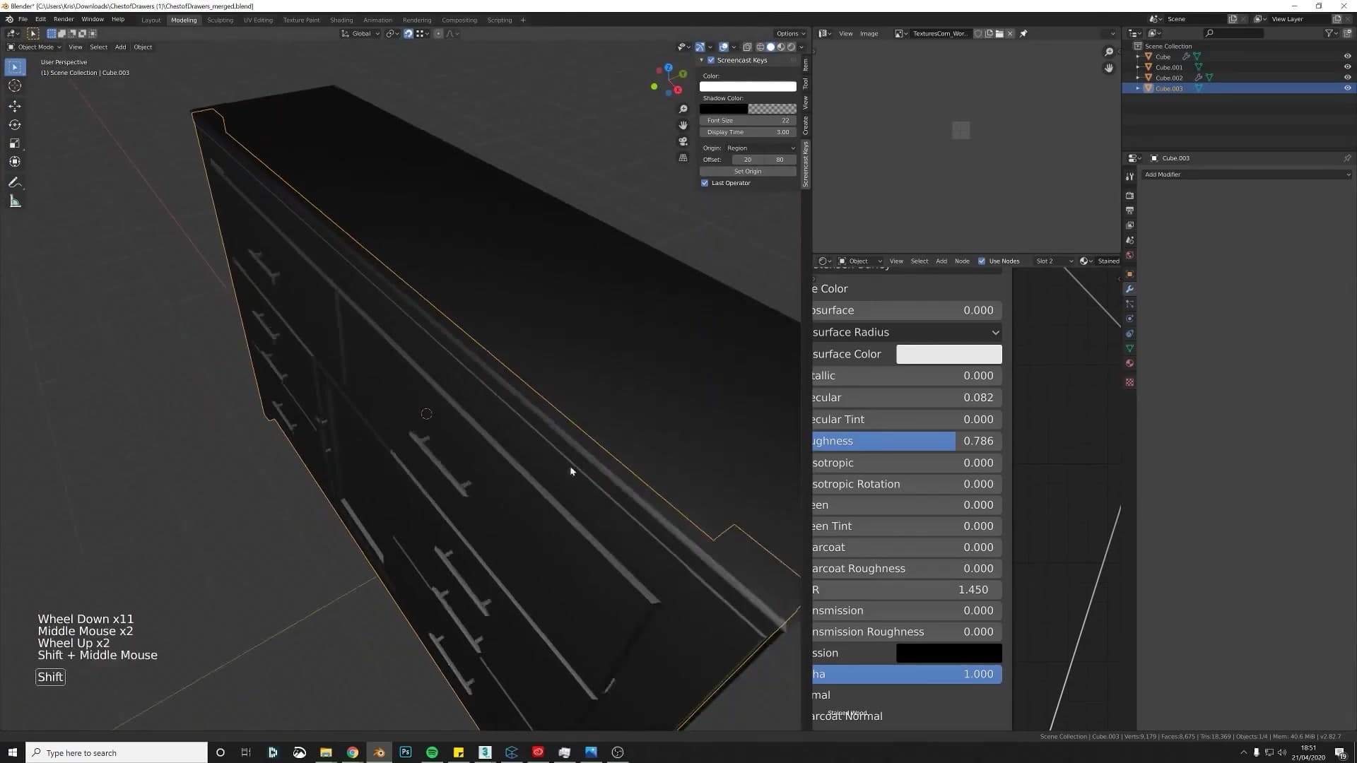
Once the bevel is in, you can add a touch more supporting geometry around the sharp edges (a loop cut on either side of a beveled corner, for example) and you'll see the shading visibly tighten up in the viewport. The point of doing it this way is that you don't need Auto Smooth turned on for the shading to behave. That matters because other applications (3ds Max, real-time engines) ignore Blender's Auto Smooth flag on import. Real supporting geometry travels.
Don't go overboard. Two or three extra loops around a corner is usually enough. Keep adding and you'll start to chew through your poly budget for no visual gain. The Bevel modifier will sometimes refuse to widen any further on dense areas with lots of tight edges nearby; that's it telling you the geometry's already crowded, not a bug to fight.
Rebuilding the curved bottom: two valid approaches
Two ways to remake the curved base section: the quick loop-cut + Ctrl+B method (game-engine friendly) and the supporting-edges + Subdivision Surface approach (archviz-friendly). When to reach for each.
Quick method: extrude, Ctrl+B, scroll for more segments
The curved bottom panel on the submitted model has the same problems as the rest of the cabinet: a missing back face, sharp shading on what should be a soft curve, and a bevel applied so late that Blender can't really tell what the geometry was supposed to be. Rather than try to patch it, you'll rebuild the section from scratch. There are several valid ways to do this and the right answer depends on where the model is going to end up. The quick method shown here is perfectly fine for game-engine work because it produces low-poly geometry.
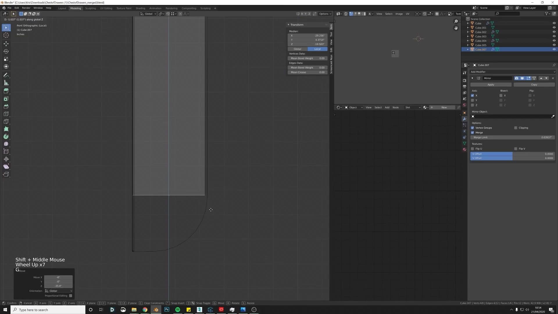
Start by snapping the 3D cursor to the existing object with Shift+S > Cursor to Selected, then add a fresh cube and drop into edit mode. Adding a Mirror modifier at this stage means anything you build on one side will appear symmetrically on the other. Move the new cube into position alongside the original so you can see what shape you're trying to match.
Select the bottom face of your new geometry and extrude it downward with E then Z to start the curved section. Check that the object has its scale applied before you bevel. Without that, the bevel widths come out skewed. Then select the corner edge and press Ctrl+B to start a bevel. While the bevel is still live, scroll the mouse wheel to add more segments until the curve looks smooth. The submitted model's edges were left too sharp because not enough segments were added at this step.
Once you're happy with the rounded corner, you can also bevel the outside edge to take the hard line off the front face. This produces a clean, low-poly result that ships well to a game engine and renders fine for most applications.
Cleaner result: loop cuts + Subdivision Surface
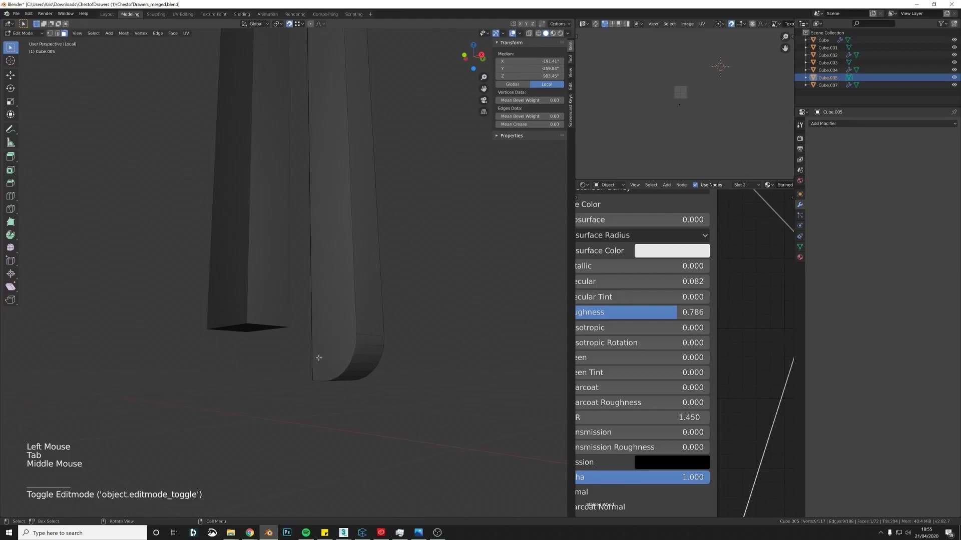
The loop-cut-and-bevel approach is fine for game work, but for architectural visualisation where poly count matters less than non-destructive control, a Subdivision Surface workflow gives you a cleaner result and lets you keep tweaking the curve after the fact. Geometry that ends up at ten or fifteen million faces in a full archviz scene won't notice a few extra loops on a cabinet base, so the trade-off is almost always worth it.
Undo the bevel from the previous method and instead add a couple of loop cuts running along the section you want to curve. These are your supporting edges. They give the Subdivision Surface modifier something to pull against so the corners stay defined instead of collapsing into a soft blob.
Now add a Bevel modifier and turn the width down. Set the Limit Method to Angle so that only the sharp corners get bevelled and the supporting loops you just added are left alone. Bump the segment count up by a couple to smooth the rounded section. The angle threshold here is dialled down from the default so it picks up only the edges you actually want softened.
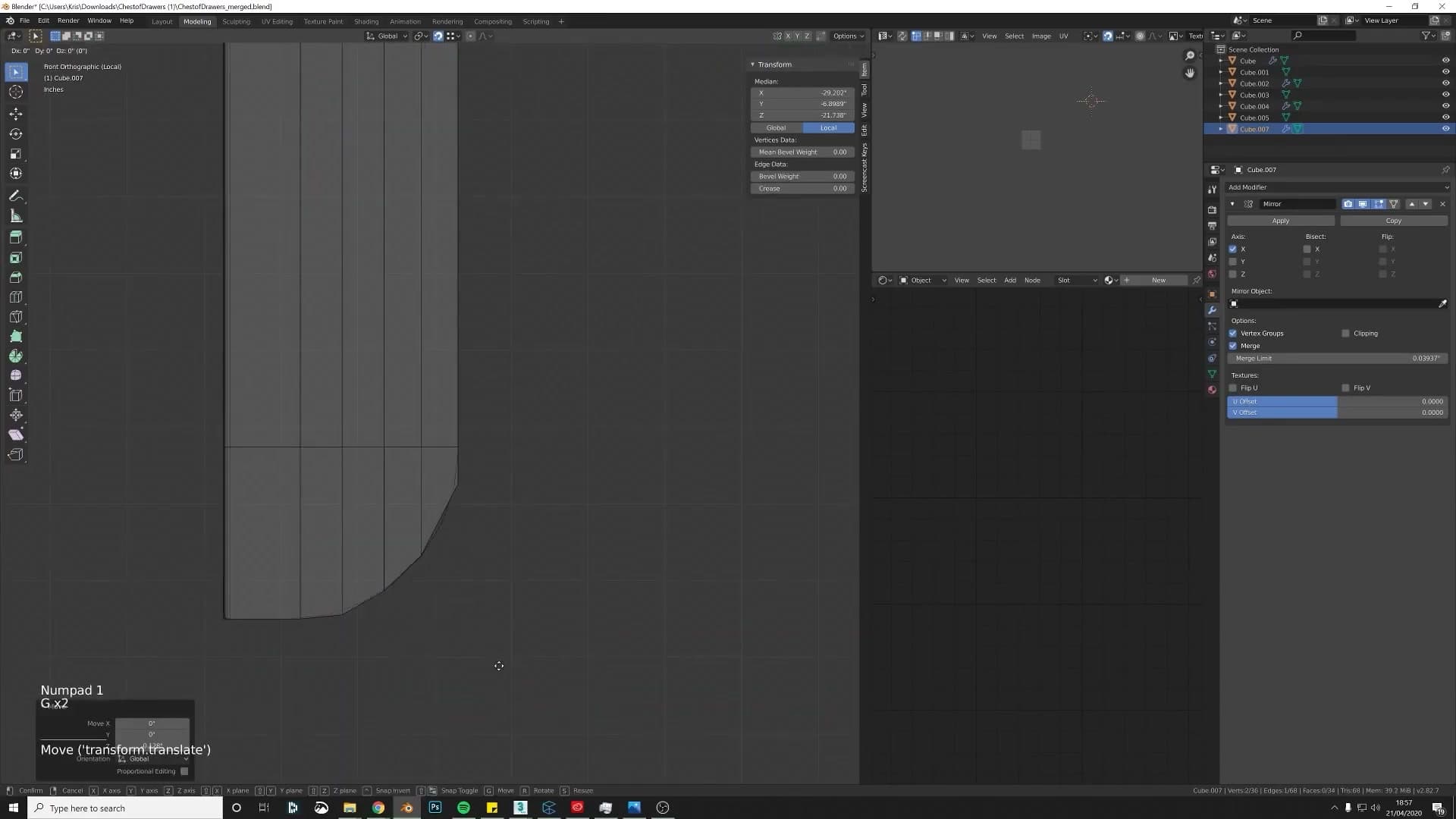
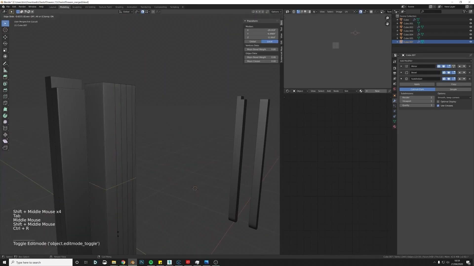
Add a Subdivision Surface modifier on top. You'll usually find one corner that isn't quite tightening up the way you want, which is your cue to drop in one more supporting loop cut at that spot to pull it back into shape. Right-click and choose Shade Smooth to finish.
The advantage of this approach is that it's non-destructive. The base mesh stays simple, only a handful of loops, and the smoothing is all controlled by modifier sliders you can revisit at any time. Trying to do the same Subdivision Surface trick on the original messy geometry would have produced bad shading because the bevel wasn't behaving correctly to begin with. Building it cleanly from the start gives you control you don't have when you're patching over someone else's work.
If the viewport starts to slow down once Subdivision Surface is active, drop the viewport subdivision level to 1 while you work. That's normally fine for modelling, and you can push it back up for the final render.
Materials, HDRIs and the free iMeshh wood library
Why materials drive 70-80% of perceived realism, the 1K HDRI rule (lighting vs reflections), and how to use the four free wood materials iMeshh releases for community asset creators.
1K HDRIs look identical to 16K for lighting
With the geometry cleaned up, the focus shifts to texturing, and I want to be blunt about why. Materials carry roughly 70-80% of the perceived realism of a finished model. You can build the most beautifully topologised cabinet in the world, but if the wood material is low-resolution or flatly lit, the asset will still read as amateur.
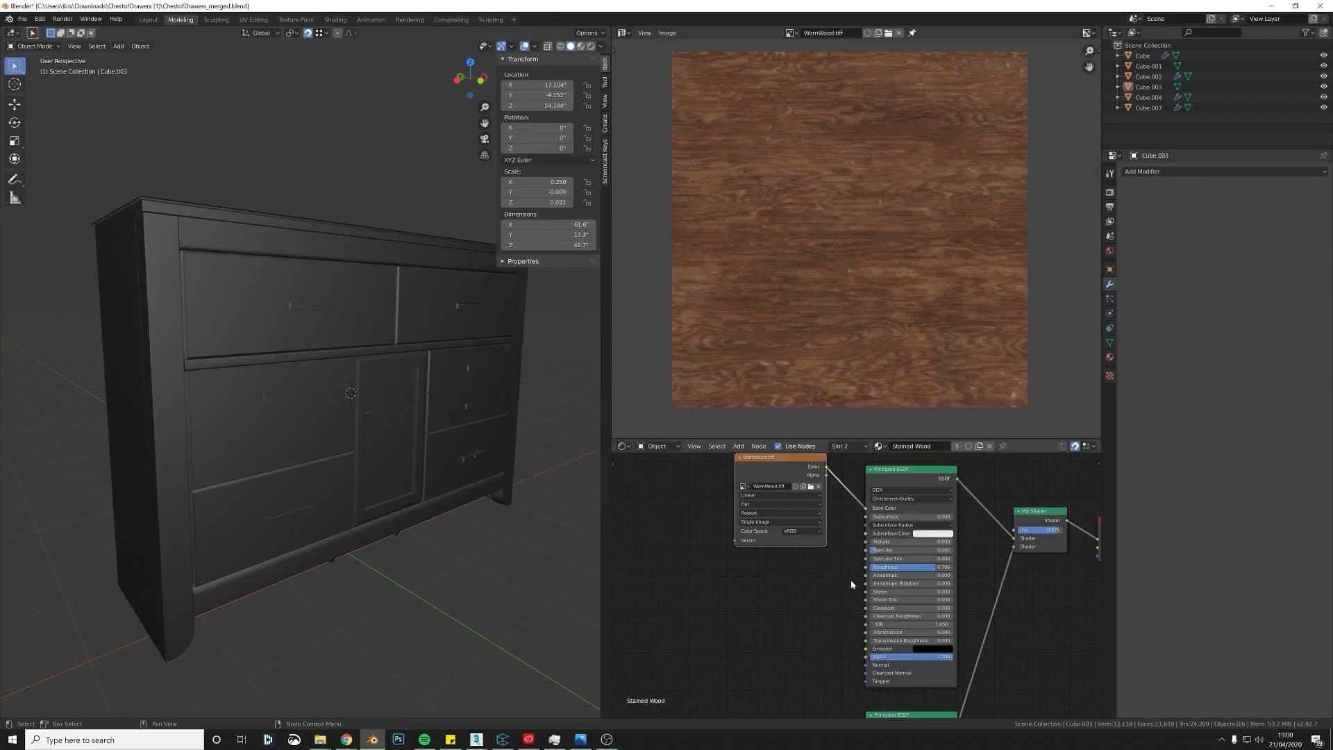
Before judging the supplied texture properly, the scene needs lighting. Switching from Cycles to Eevee, I load an HDRI in the World Properties. Here is a rule that saves a lot of viewport pain. For lighting purposes only, a 1K HDRI looks identical to a 16K HDRI. The sun, sky and bounce contribution it puts into the scene is the same. The only reason to reach for a high-resolution version is when the dome itself will be visible: through glass, in polished reflections, or as a back plate behind the product. Otherwise a pixelated flower will eventually betray you in a chrome highlight.
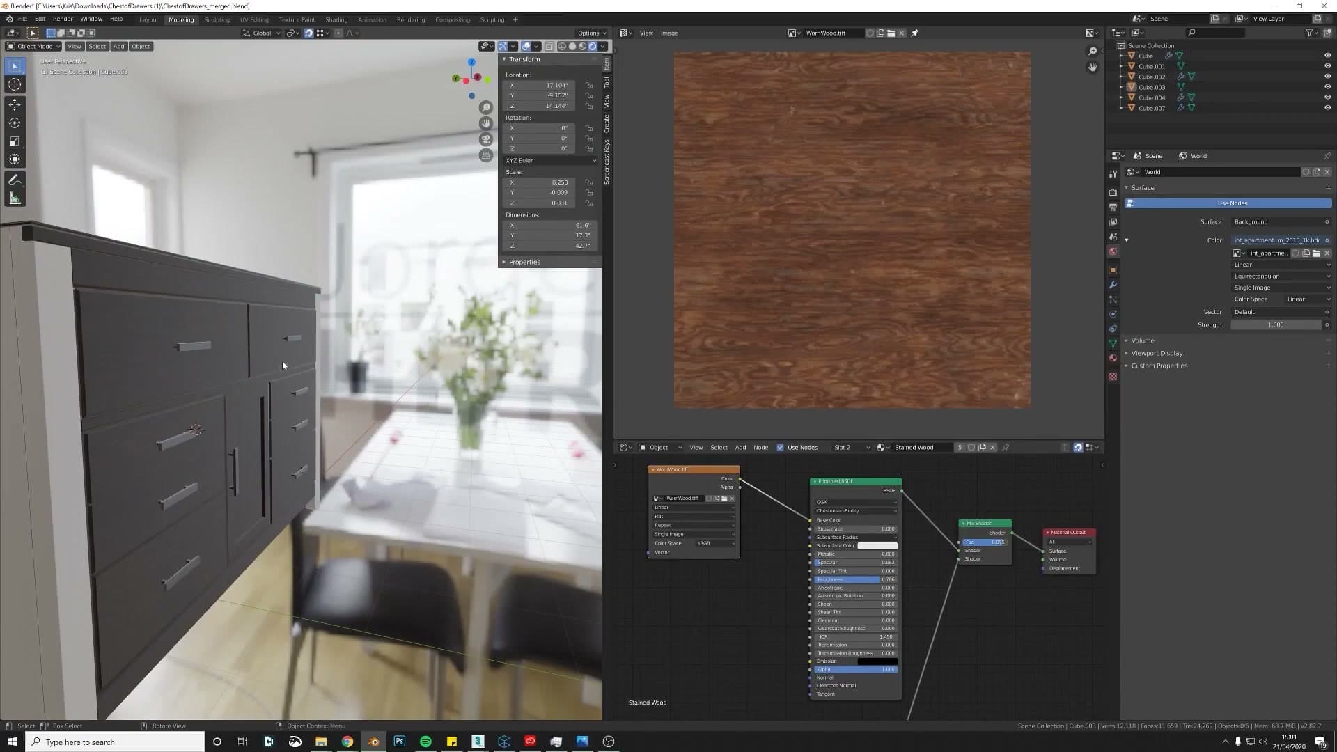
Sticking to 1K keeps the viewport responsive too, which matters when you are iterating on shaders. The HDRI I use here is a free sample from a creator I recommend. It's a natural, soft setup I keep coming back to for product shots.
Four free iMeshh wood materials you can use commercially
Before fixing the supplied wood, I want to flag a resource you can use immediately. The iMeshh library contains four wood materials that are free to download and free to use commercially, including on assets you intend to sell on a marketplace. The rest of the iMeshh wood library is paid and off-limits for resale, but those four are explicitly there for community asset creators who need a high-quality wood without licensing friction.
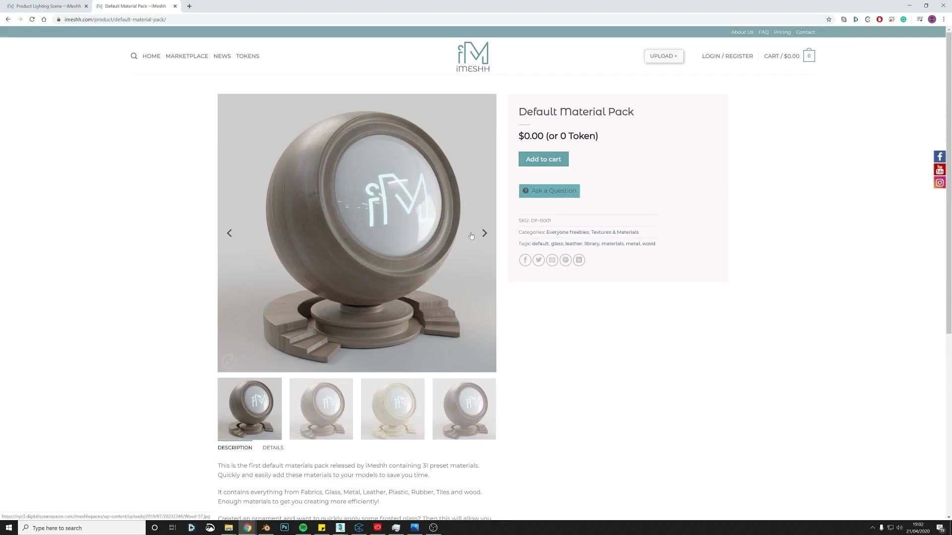
I'll use one of them for the final render rather than the original supplied texture, which was too low-resolution to hold up under close inspection. For the next few minutes, though, the focus stays on the texture the contributor sent in. The goal is to show you how to coax more out of a diffuse-only image inside Blender's shader editor before you give up and swap it.
Generating roughness and bump from a diffuse-only texture
When a texture only ships with a diffuse map, you can still fake a full PBR setup. Enable Node Wrangler, preview shader nodes with Ctrl+Shift+click, then drive Roughness and Bump from the same image.
Enabling Node Wrangler and the Ctrl+Shift+click preview
Most wood textures you download ship with at least a diffuse, a normal and a glossy map. This one only came with a diffuse, which is workable. You can still fake a passable PBR setup off the back of that single image; you just need a couple of helper nodes and one Blender add-on enabled.
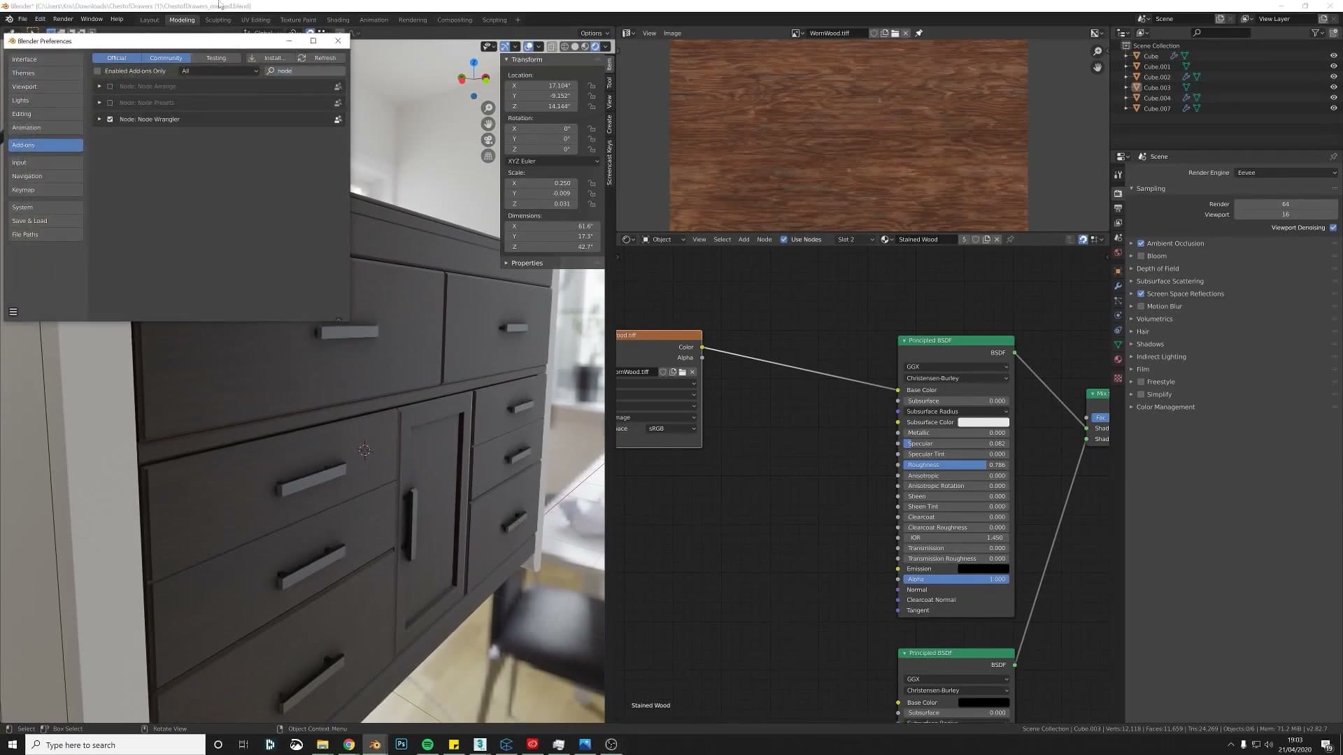
Open Edit > Preferences > Add-ons and turn on Node Wrangler. It ships with Blender, so you don't need to download anything. Just tick the box. Node Wrangler adds a stack of shader-editor shortcuts, but the one that matters here is the preview shortcut.
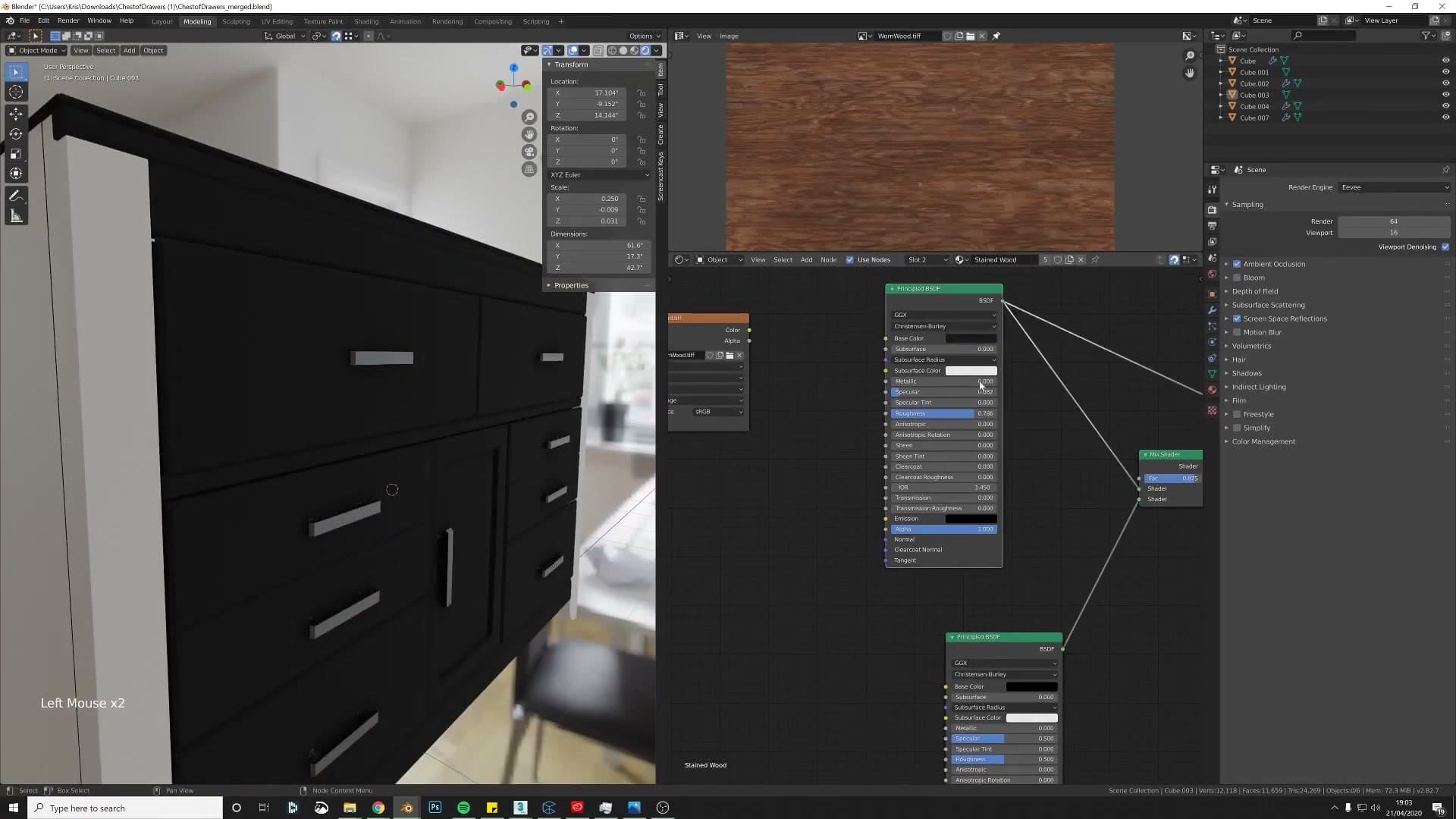
With Node Wrangler enabled, select any node in the shader editor and press Ctrl+Shift+click on it. Blender wires that node's output straight into the Material Output so you can see, in isolation, what that single node is producing on the model. It's the fastest way to debug a shader graph node-by-node without unplugging anything by hand.
Diffuse → Hue/Saturation → Roughness
To fake roughness from a diffuse-only texture, take the Image Texture node and plug its Color output into the Principled BSDF's Roughness socket. Blender reads the brightness of the image as roughness values: the brighter a pixel, the rougher that part of the surface; the darker a pixel, the glossier. It's a rough approximation (pun intended) but it gives you variation that responds to the grain of the wood instead of a flat, uniform reflection.
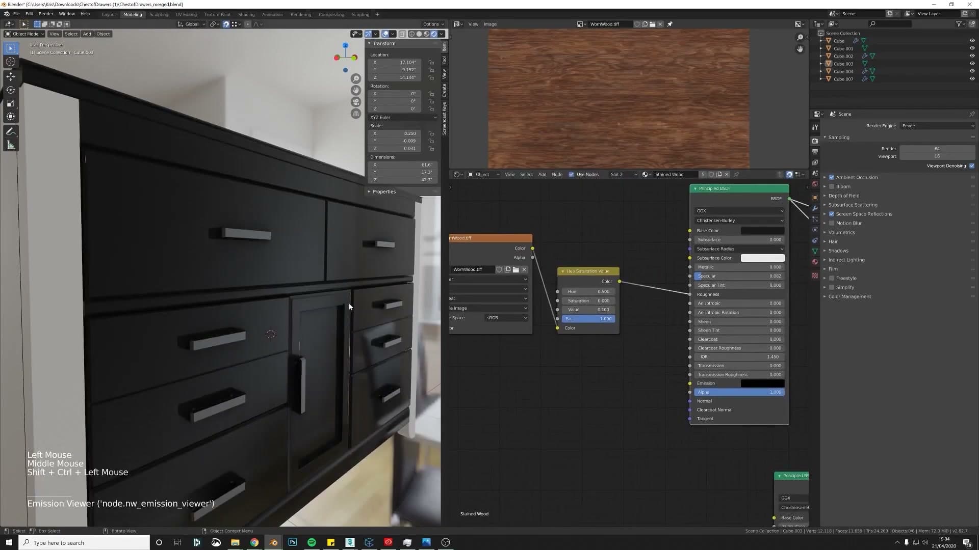
Because the Roughness socket only cares about value, not colour, the wood's hue is irrelevant to the shading maths. To make it easier on your eyes while you tune the strength, drop a Hue/Saturation node in between the image and the BSDF and pull Saturation down to 0. You're now looking at a greyscale roughness map and can judge the highlights and shadows for what they actually represent.
Read the preview as a sanity check: if the map is mostly bright, the surface will come out very rough; if it's mostly dark (say a value around 0.2), the surface will be dark and very glossy. Aim for whichever feels right for your material, and remember that the diffuse image's contrast is doing most of the work for you.
Bump node + Ctrl+T mapping for subtle surface micro-detail
You can squeeze a bump map out of the same diffuse texture in much the same way. Add a Bump node, plug the diffuse's Color into the bump's Height socket, and run the bump's Normal output into the Principled BSDF's Normal socket. Use Ctrl+Shift+click on the BSDF to preview the result and you'll see the surface pick up micro-detail it didn't have before.
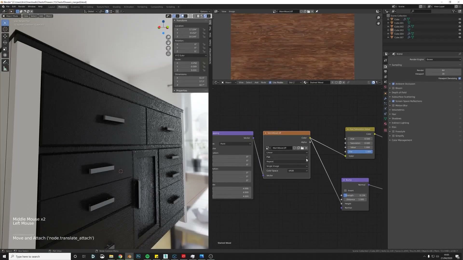
Straight out of the box the bump is far too aggressive. Drop the Bump node's Strength right down, around 0.05 or possibly even less, until the surface picks up a hint of texture without looking like cratered moonscape.
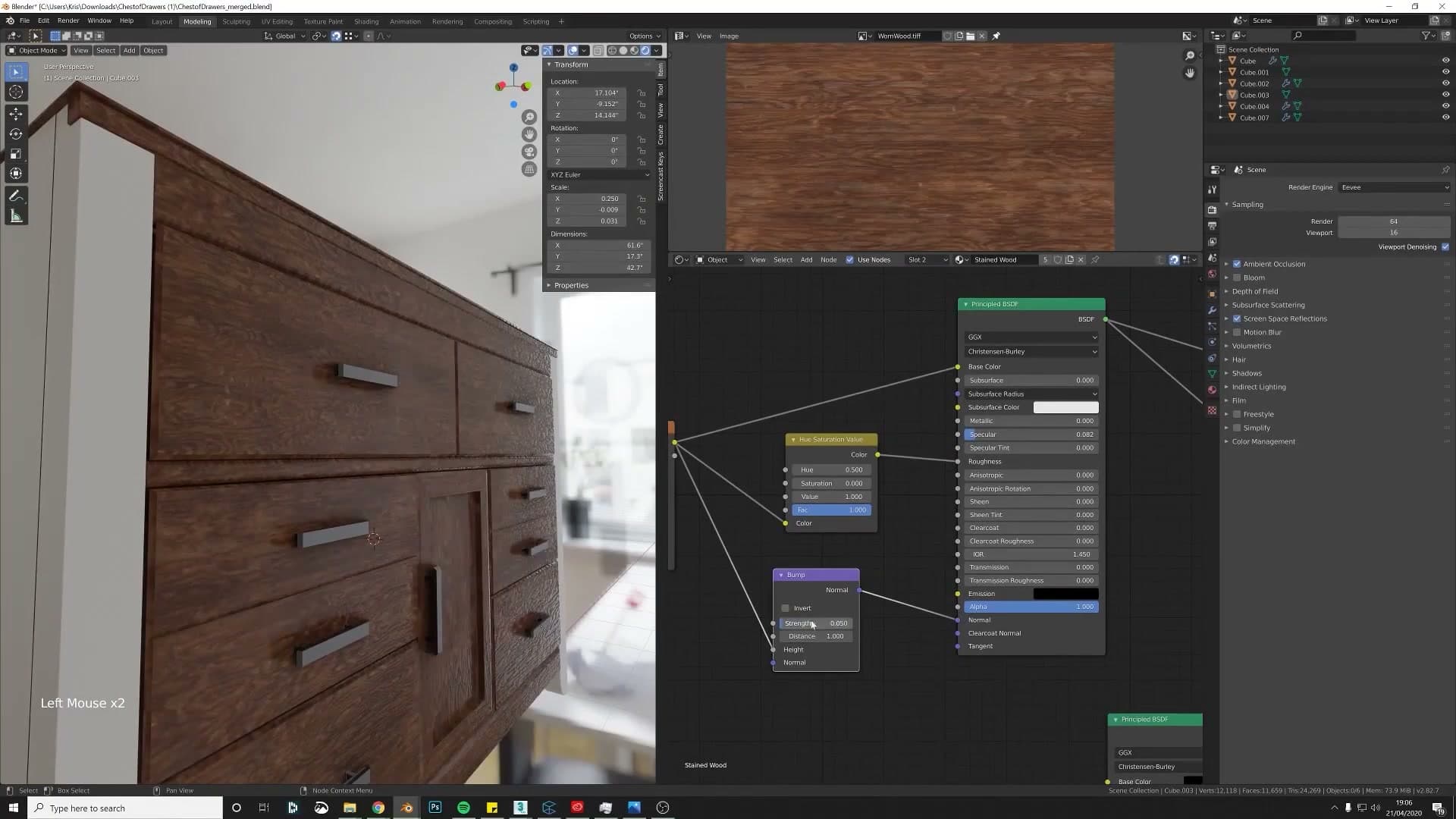
If the wood grain is tiling at the wrong scale, click the Image Texture node and press Ctrl+T. Node Wrangler adds a Mapping node and a Texture Coordinate node wired up automatically. Bump the Mapping node's Scale up to around 2 to tighten the tiling (3 or 4 tends to look overdone), and make sure the source image is genuinely tileable, otherwise you'll see seams repeating across the surface.
UV unwrapping and controlling wood grain direction
Mark seams before bevels (or they'll multiply), pick Conformal vs Angle-Based per situation, fall back on Smart UV Project for awkward pieces, and rotate UV islands so the grain reads like a real cabinet. Frame around the centre panel.
Marking seams that won't multiply across bevelled edges
Before you can unwrap, you need somewhere for the seams to land. Apply the Mirror modifier so the geometry is committed, then think carefully about where you mark the seam, because a bevel will turn a single edge mark into a whole row of them.
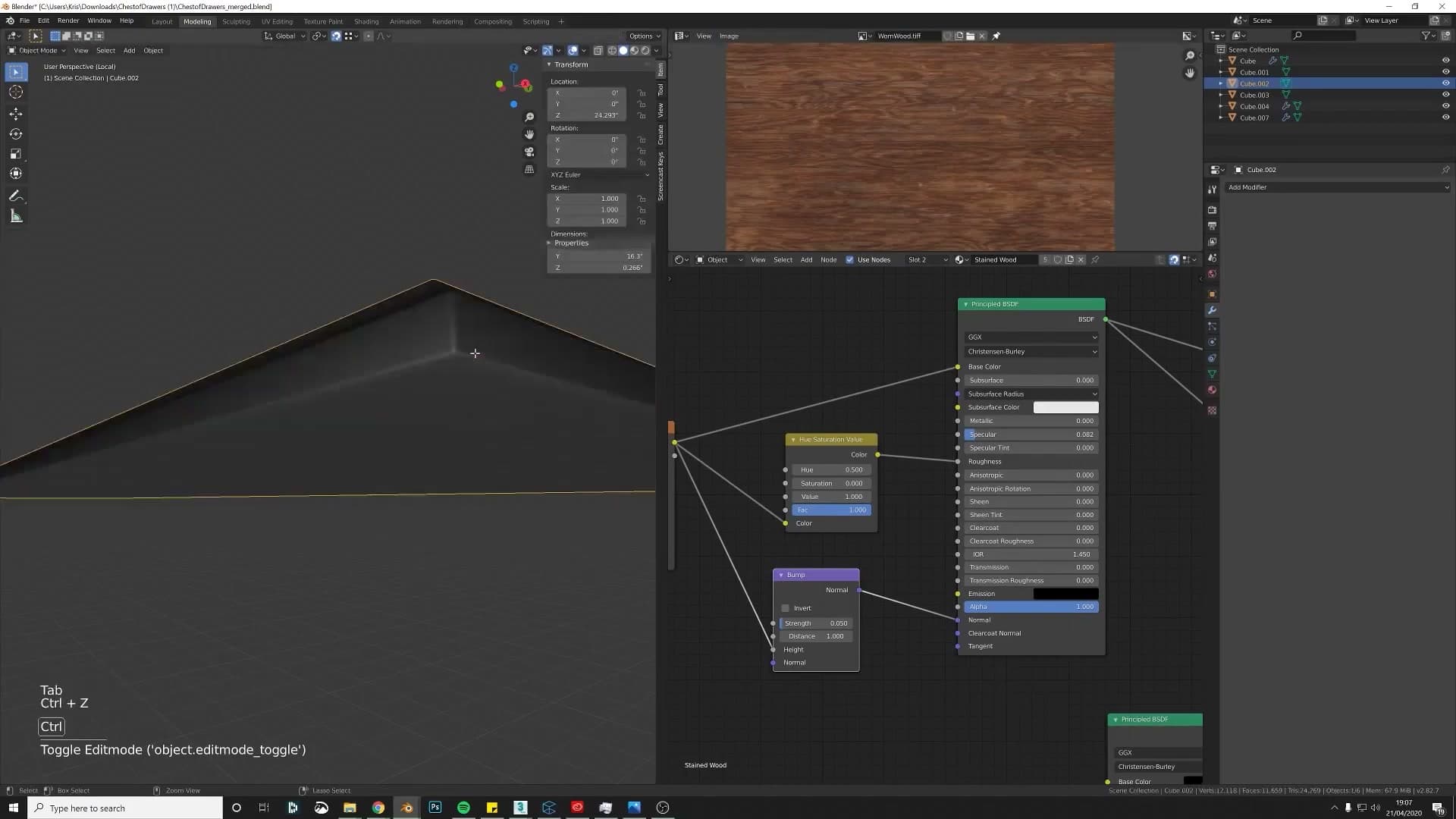
Your first instinct will be to seam the bottom outside edge, which on a flat-faced panel makes sense. The problem is that this edge has already been bevelled, so it's no longer one edge. It's two, three, or four parallel edges sitting a fraction of a millimetre apart. Mark a seam on the bevelled edge and you'll get a seam on every loop, which is exactly what you don't want.
The fix is to add one more loop cut just inside the bevel, on the flat face, and mark that single clean edge as your seam. Right-click on the edge and pick Mark Seam from the context menu. You now have one continuous seam line for the unwrapper to work with rather than four overlapping ones.
Conformal unwrap when Angle-Based goes funny
With your seam in place, select the whole object and press U to unwrap. Blender's default Method is Angle Based, which is the right choice most of the time. On certain shapes, though, it produces a UV layout that just looks off, with the proportions wrong or the island twisted.
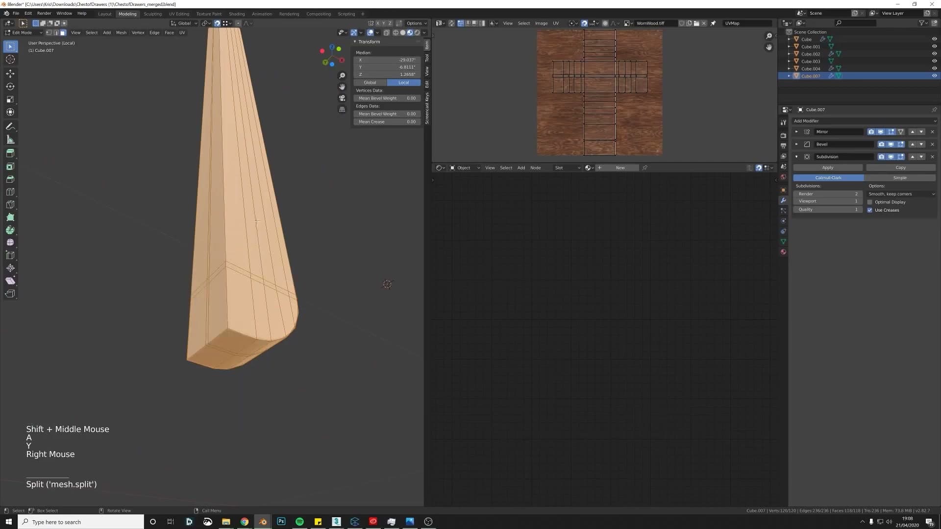
When that happens, open the redo panel in the bottom-left of the viewport (or press F9) and switch the Method dropdown from Angle Based to Conformal. Conformal preserves angles rather than minimising stretch, and for flat-faced panels it usually snaps the unwrap into a clean rectangle straight away.
Because the cabinet panels are quite flat, you can get away with a single seam running all the way around the outside edge. That lets the wood texture wrap continuously over the edges of the panel, exactly how it would look on a real piece of veneered furniture, and the small amount of stretching at the corners is invisible once the material is on.
Smart UV Project as a quick fallback for awkward pieces
Not every piece is worth hand-seaming. For awkward parts (fiddly mouldings, trim pieces, or anything tucked away where the seams won't be visible) Smart UV Project is the right tool. Select everything, press U, and pick Smart UV Project. Blender chops the mesh into islands automatically based on face angles and packs them into the UV square. It's not perfect, but it's quick, and for hidden geometry that's all you need.
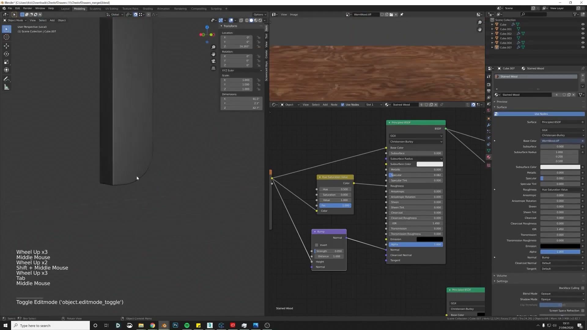
Use the same logic for any panel where you can see exactly one face and the rest are covered. The top piece of the cabinet, for example, is completely hidden in the final assembly, so it doesn't matter how its UVs end up. Smart UV Project and move on.
For pieces in between, visible but not centre-stage, you can leave the bevel applied for speed and just decide which faces want a clean unwrap and which can take the seam. Keep the front-facing surface in one piece, since that's the one people actually look at, and tuck the seam onto a face that's pointing away from the camera. Right-click, Mark Seam, then unwrap and check the result in Material Preview.
Frame the centre: rotate UVs so the grain reads like a real cabinet
Unwrapping is only half the job. The other half is making sure the wood grain runs the right way. Real cabinet makers don't apply veneer randomly; they orient it so the grain frames the piece. Typically that means vertical grain on the upright side frames and horizontal grain across the centre panel, so the eye is drawn inward.
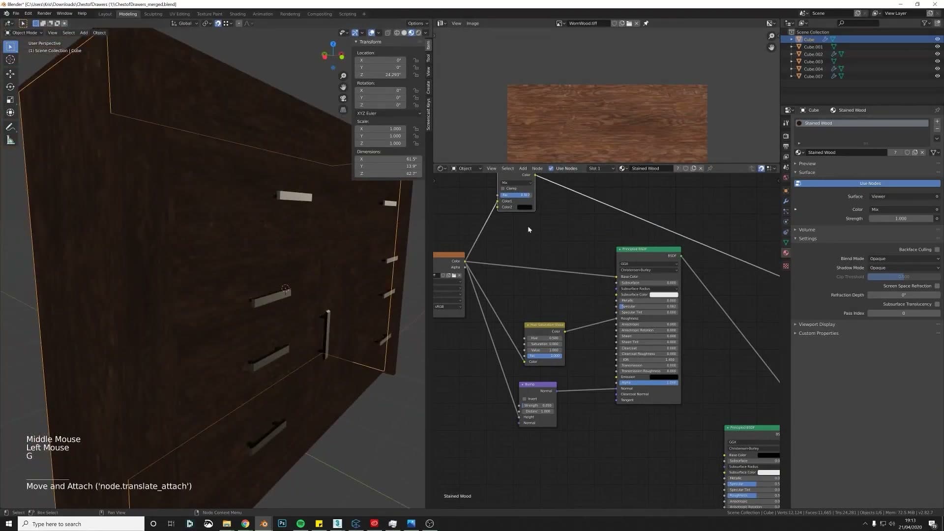
Switch to the UV Editor, select the island for the panel you just unwrapped, and check which direction the grain will read once the texture is on. If it's running the wrong way, grab the whole island, press R, type 90 and confirm. The texture now rotates ninety degrees relative to the geometry: vertical becomes horizontal, or vice versa.
Do this systematically for every panel. The side frames want grain running top-to-bottom, the centre panel wants it running across, and the drawers usually follow whatever convention the side frames have set. It's a small adjustment per island, but it's the difference between a model that looks like a 3D mock-up and one that looks like a real piece of furniture.
Darkening wood, fixing flipped normals, auditing UV scale
Three legitimate ways to darken a wood material (with the warning that pure black is never realistic), then Shift+N to recalculate broken normals, and finally the checker-texture trick that surfaces every inconsistent UV scale in seconds.
Mix RGB vs Hue/Saturation vs Color Ramp
With the new wood applied, I run a quick side-by-side to see how the panel would look taken darker. Three options sit on screen at the same time: a Mix RGB pulled toward black, a Hue/Saturation node with the Value reduced, and a Color Ramp clamping the brightness.
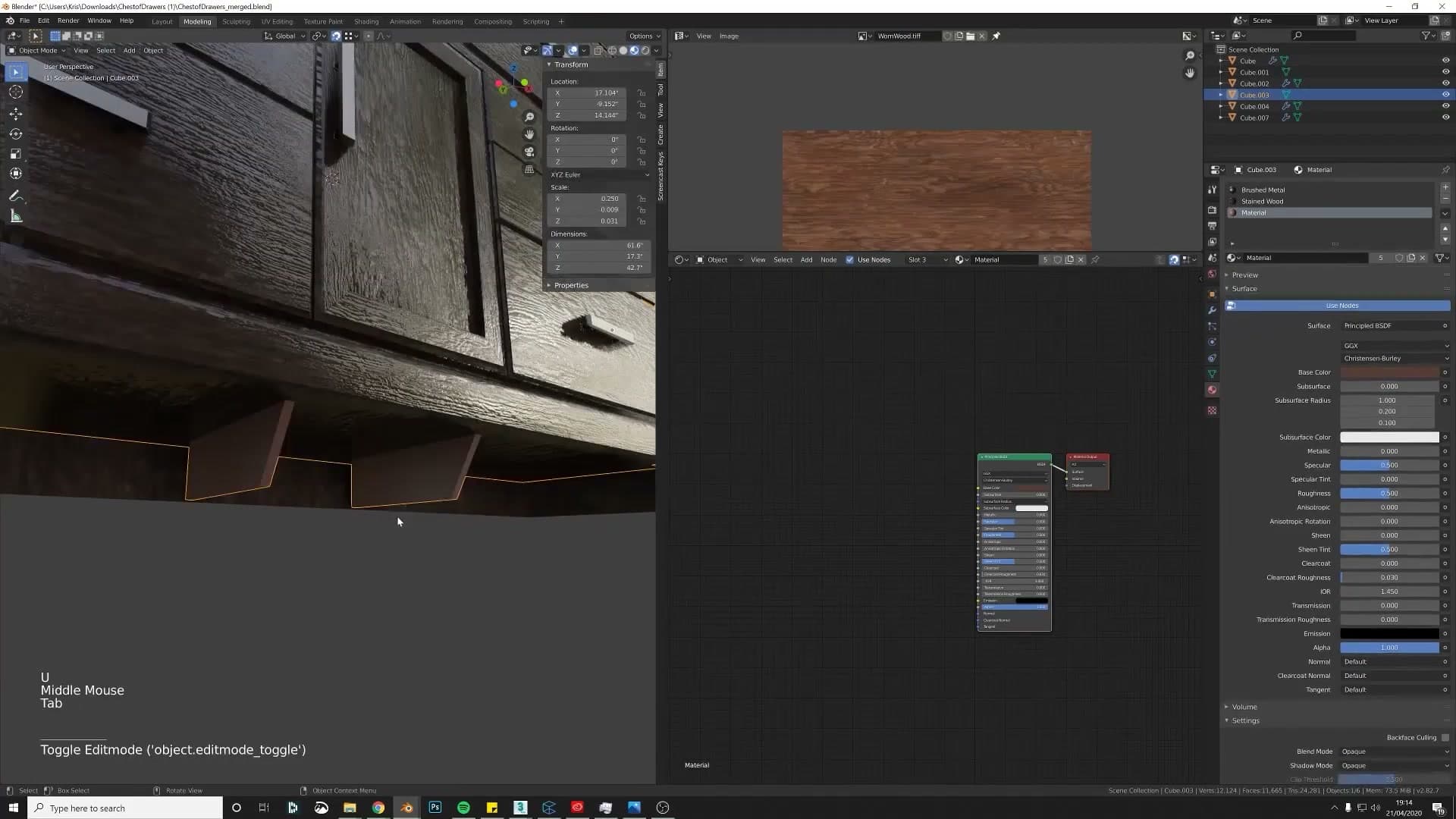
One of them knocks the body of the colour toward black but leaves the highlights still firing, and that's the one I rule out. The bright spots fight what's meant to be a darker species of wood. The pick is whichever variant doesn't leave those highlights stranded: "I'd probably work with this one if it was me."
Face Orientation overlay + Shift+N to recalculate normals
Something on the front of the cabinet kept reading a little off, so I switch on Face Orientation from the Viewport Overlays popover at the top of the 3D viewport. Faces with normals pointing outward paint blue; faces pointing inward paint red. The panel lights up red. A chunk of its geometry is inverted, which is enough to wreck shading and bake bad data into anything downstream that reads normals.
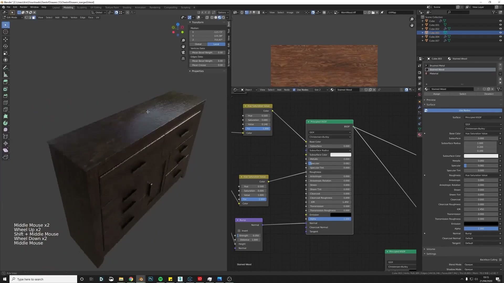
The fix is one shortcut. Drop into edit mode, select all, and press Shift+N to recalculate normals. Every face flips to outward-facing and the overlay reads blue everywhere on that part.
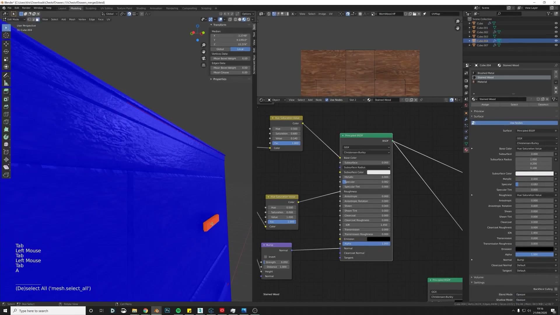
The same problem turns up on a second piece further into the cabinet ("that one's funny") and gets the same treatment. Once every part reads blue under the overlay, switch Face Orientation back off and carry on.
Checker texture: the fastest UV scale audit there is
I swap a different wood onto the cabinet. I call it Wood 58 and the species fits. But because the same material is now sharing across panels that were unwrapped at different orientations, the grain runs the wrong way across most of the model.
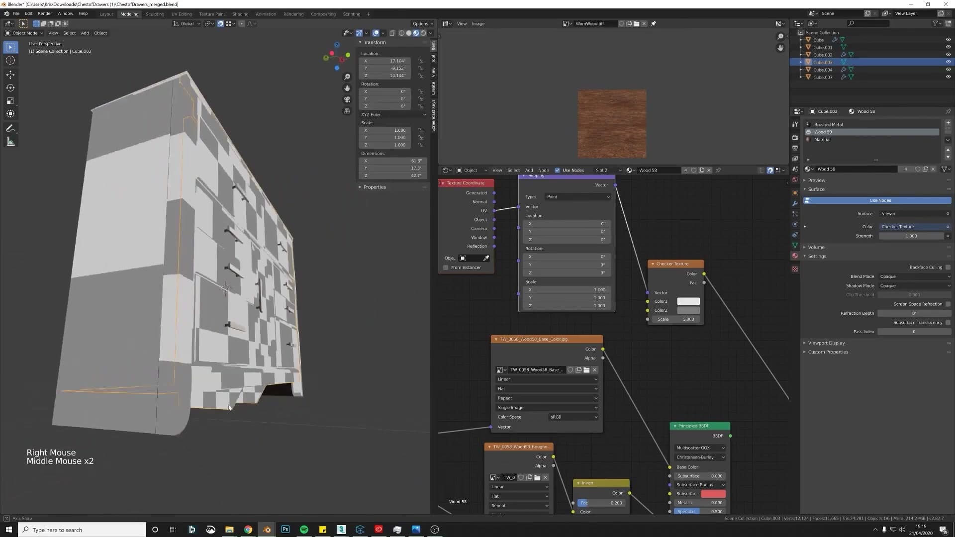
To rotate the grain, jump into edit mode on each piece using the wood, select everything, open the UV editor, and press R then type 90. The alternative is opening the material and setting Rotation Z = 90 on the Mapping node. Either approach gets you to the same place; I use the UV-editor route on this run.
The centre panel keeps the rotated orientation while the surrounding frame pieces get rotated the other way, so the cabinet face reads as a separately-framed inset rather than one slab of grain. When a panel needs re-unwrapping mid-fix, I hit Blender's classic "didn't like that" warning and have to Ctrl+A -> Scale first. With the scale applied, U -> Unwrap behaves and the grain finally sits right.
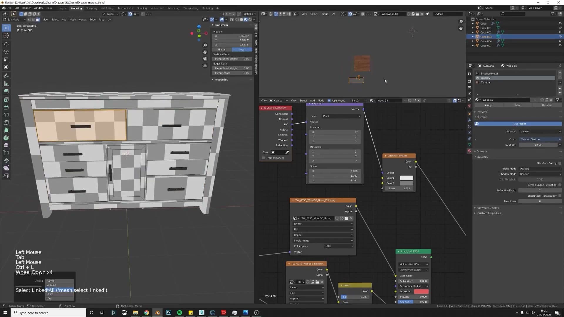
Grain direction sorted, the next question is whether every panel is using the wood at the same tile size. The fastest audit there is is a checker texture. In the shader editor press Shift+A, type checker texture, drop it where the wood would feed Base Color, and press Ctrl+T. Node Wrangler adds the Texture Coordinate and Mapping nodes so the checker pins to the UVs instead of floating in world space.
Switch the viewport to rendered and the checker squares broadcast every inconsistency in seconds: some panels show enormous boxes, others tiny ones, and the centre piece is somewhere else entirely. Hover an offending island in the UV editor, press Ctrl+L to grab the whole linked island, and scale it until its squares match the rest. Work around every panel until the entire model reads with one checker size. From that moment on, the wood material itself will tile consistently across the cabinet, and any other tile-able texture you swap in afterwards will too.
Product rendering with the free iMeshh lighting scene
Group the cabinet into a collection, File > Append it into iMeshh's free product-lighting scene, set the camera's focal point, then nudge exposure in Color Management for the hero shot. Closes with a side-by-side comparison vs the original submission.
Group → save → File > Append into the lighting scene
Before you can light the cabinet properly you need somewhere to put it. iMeshh ships a free Product Lighting Scene for exactly this job. It's a pre-built three-point setup with a soft floor and a clean white backdrop. The workflow is drag-and-drop: append your model, nudge the three lights around until they flatter your geometry, and hit render.
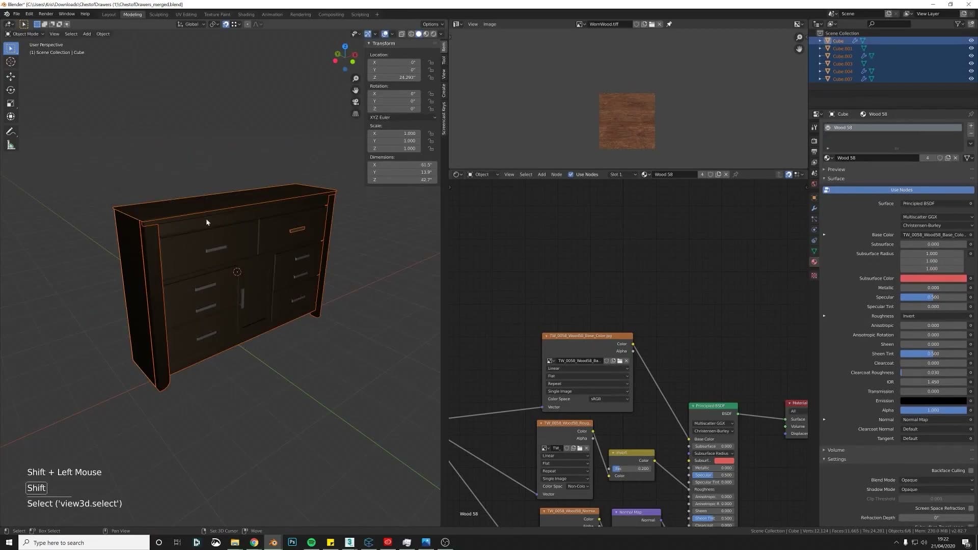
Looking at the original render, the cabinet floats slightly above the floor and sits a little too high in frame, with no contact shadow underneath. That's a small detail that subconsciously reads as "fake". Even a faint shadow grounds the object and makes the whole image feel more real. The lighting scene gives you that floor and shadow for free.
To get the cabinet into the scene, first gather every part into a single container in the source file. Select the whole cabinet and press Ctrl+G to put it into a collection. Name it something obvious like cabinet. If you'd rather keep the parts as separate meshes, that's fine, but they need to travel together: either keep them all inside that one collection, or parent the lot to the top-most piece (select everything, shift-select the parent last, then Ctrl+P > Object (Keep Transform)). The cleanest option of all is to merge everything into one mesh if your workflow allows it.
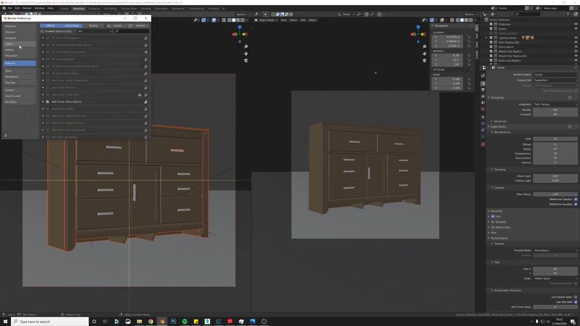
Save the source file, then open the Product Lighting Scene and use File > Append. Navigate into your saved .blend, open the Collection folder, and pick the cabinet collection you just made. The whole model lands inside the lit set, sitting on the floor, ready to render.
Camera focal point + GPU Compute for a cleaner preview
With the cabinet appended, switch the viewport to Rendered shading so you can judge the lighting live. In Render Properties, set the device to GPU Compute. Cycles will preview noticeably faster, which matters when you're nudging lights and the camera over and over.
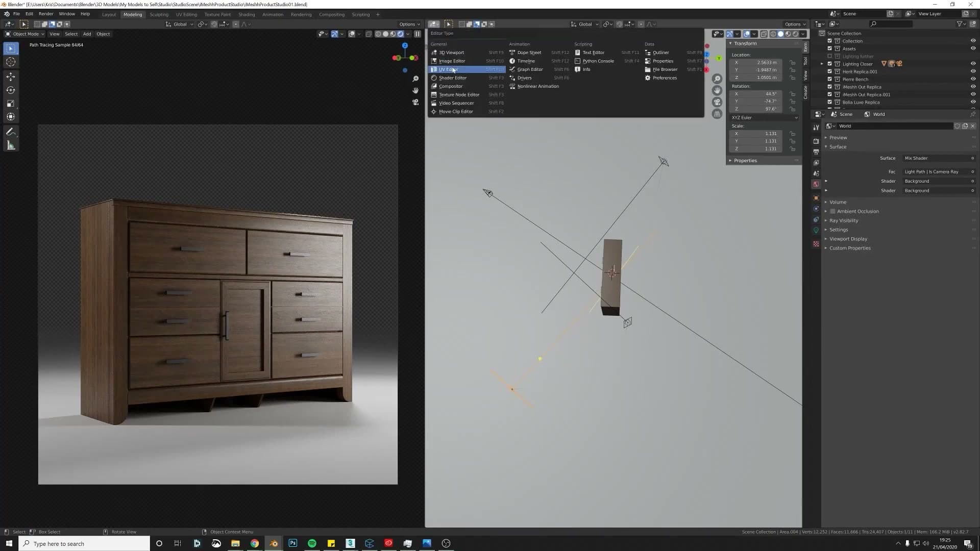
The first preview will probably look soft and out of focus, because the scene's camera was set up with depth of field aimed at a previous object. Select the camera, open its Object Data Properties, and under Depth of Field set the focus object to your cabinet. The preview snaps to sharpness immediately.
From here it's a sandbox: drag the floor up a touch if the cabinet looks like it's sinking, and rotate the three-point lights around the model to find a setup with real contrast and shadow falling in the right places. You can lose hours to this, but the goal is simple. Push light into the side that should read first, let the opposite side fall into shadow, and keep the camera angle low enough that any subtle top-edge curvature stays hidden.
Finally, lift the world environment a touch to fill in the deepest shadows. Open the World properties and set the environment strength to around 0.3 so the cabinet doesn't feel like it's sitting in a vacuum.
Quick exposure lift in Render Properties > Color Management
Kick off a test render. The compositor in the lighting scene automatically slots a clean white background behind whatever you've appended, so you'll see the final hero composition straight out of Cycles. No extra compositing needed.
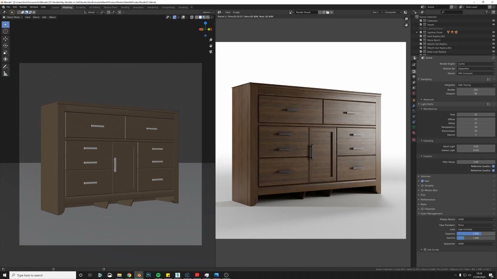
When the render lands, compare the cabinet against the white backdrop. If the wood reads too dark and the whole image feels muddy, you have two honest choices: rearrange the lights for more direct fill, or take it into Photoshop afterwards. For a one-click fix in Blender itself, open Render Properties > Color Management and nudge the Exposure slider upwards until the cabinet sits comfortably against the background.
Be aware this is a global lift. It brightens everything, not just the cabinet, so if you go too far the white backdrop blows out. The cleaner long-term fix is to dial the key lights back down once you've raised exposure, but for a quick hero shot the exposure slider gets you 90% of the way there in seconds.
Final 90° hero shot vs the original angled render
Putting the two renders side by side makes the case on its own. The original submission uses an angled three-quarter view. It has a nice stance and reads as interesting, but the slanted perspective pulls the eye away from the product itself and the top edge reads as flat shading rather than a real curve.
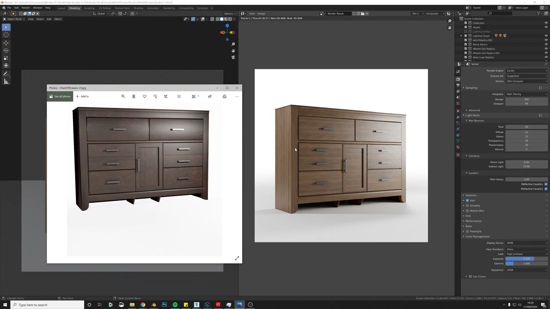
The reworked hero shot puts the camera at 90° to the cabinet, dead centre. That's the canonical main product shot you want on a marketplace listing or a portfolio thumbnail: symmetrical, framed cleanly against the white backdrop, with the contact shadow grounding it on the floor and the new bevels catching just enough light along the top edge to show the curvature you spent the modelling section adding.
Same model, same materials. The presentation difference is the whole reason a buyer scrolls past one listing and clicks on the next. That's the takeaway: even modest geometry and shading fixes only land if you photograph the result properly at the end.
If you'd like your own model put through the same teardown, send it across and it can be picked apart and rebuilt in a future video. And if you upload the finished asset to iMeshh, a link back to your listing goes in the description so other people can pick it up too.
Tools and credits
Everything mentioned in this tutorial, with links.
- Blender (the renderer this entire build runs in).
- iMeshh (studio platform: project management, client review, asset library, invoicing). The asset library used in this tutorial is included with every iMeshh Pro plan.
- Poly Haven (free CC0 textures and HDRIs).
Pillar guide: Modelling hub