The scene and what we'll optimise
An overview of the finished photorealistic art-studio scene: what it contains, why it pushed an 8GB GPU to its limits, and the techniques the rest of the post covers, including materials, ambient occlusion, lighting, displacement and render settings.
Why this scene needed heavy optimisation
This art-studio scene has been a regular request from the iMeshh community: the dried bouquets, pampas grass, plaster walls and wood floor all rendered to a near-photoreal finish, with light pouring in from a large industrial window. Rather than rebuild it click-by-click, this walkthrough focuses on the techniques that made it possible. The shader tricks that sell the realism, the lighting choices, and most importantly the optimisations that kept it renderable in the first place.

The single constraint that shaped almost every decision was VRAM. Those heavy bouquets are exactly the kind of asset that eats memory: dense polygon counts, multiple high-resolution texture maps per leaf, and dozens of instances scattered around the room. With only an 8 GB GPU on hand, the scene would not have fitted into memory without an aggressive optimisation pass.

The rest of this post breaks that pass into the moves that actually moved the needle: variable specularity on the plaster and wood, ambient occlusion driven through a custom dirt mask, instanced plants, bulk texture-cap workflows for background props, edge displacement via Cycles' max dicing rate, and the final lighting and render settings that brought everything together.
Wood floor with variable specularity
The iMeshh geometry-nodes wood floor provides the base gloss and bevelled edge detail. Christopher 3D's variable specularity node group sits on top and makes the surface read as matte head-on but glossy at grazing angles. That's the trick that sells real-world plaster and timber materials.
The iMeshh geometry-nodes wood floor
The first layer of realism in this room comes from the iMeshh wood floor, a geometry-nodes plank system pulled straight from the library. The rig is being updated very soon to run faster, but even in its current form it does most of the heavy lifting on the floor's look without any extra shader work from you.
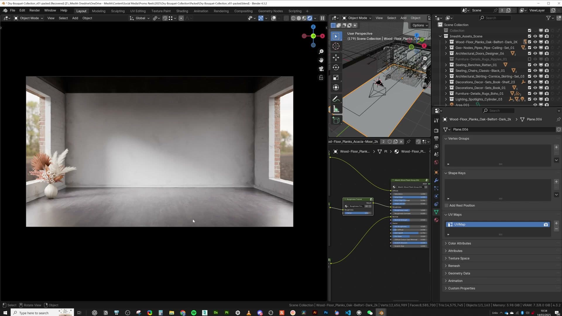
Out of the box the planks already read as quite glossy, which is most of what you want from finished timber. Sitting on top of that is a bevel that picks up edge highlights wherever board seams catch the light. That bevel is the detail that stops the floor from collapsing into a flat plane. Every plank edge becomes a thin, visible line of reflection rather than a hard 90-degree corner.
Christopher 3D's variable specularity node group
Sitting on top of the wood-floor shader is a node group from a YouTuber called Christopher 3D. Kristian recommends the channel directly: it digs into how Blender's shading internals actually work, and explains them clearly enough that the ideas stick. The variable-specularity group is one of the techniques that came out of those videos.
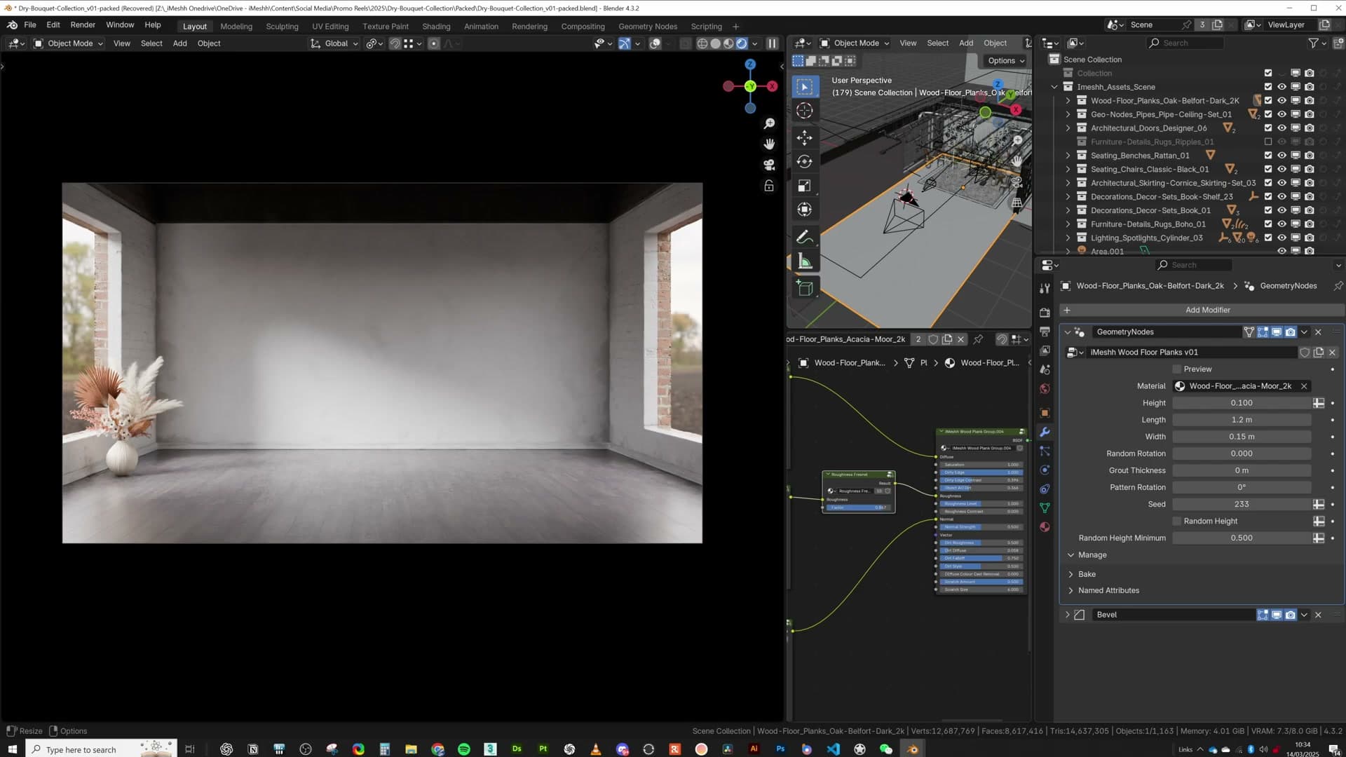
The technical premise (and I'll admit I'm not deeply technical about this): Blender's Principled BSDF doesn't expose a view-angle-dependent roughness input natively. Christopher 3D's node group fills that gap and gives the surface a different gloss reading depending on the angle you view it from.
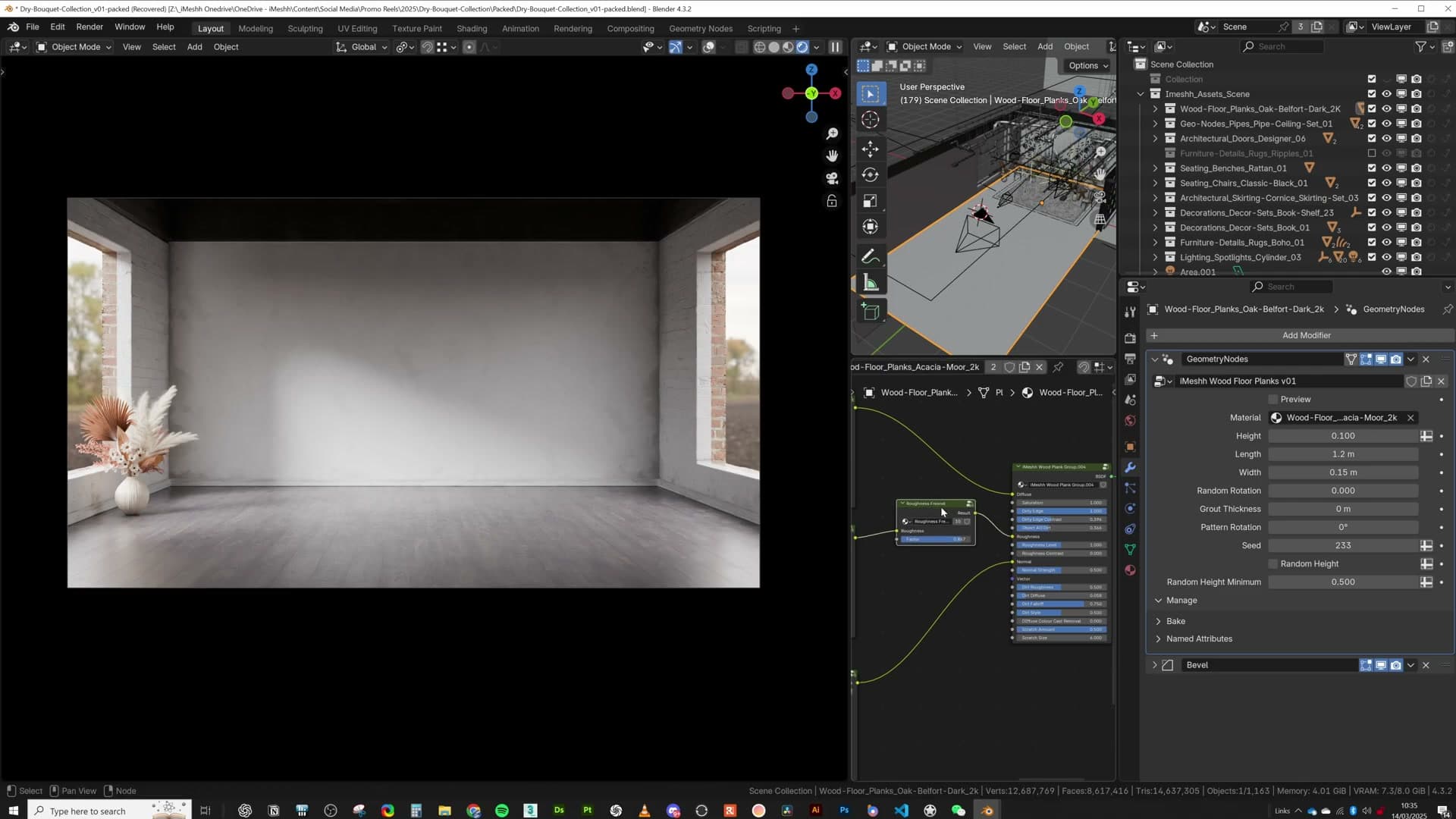
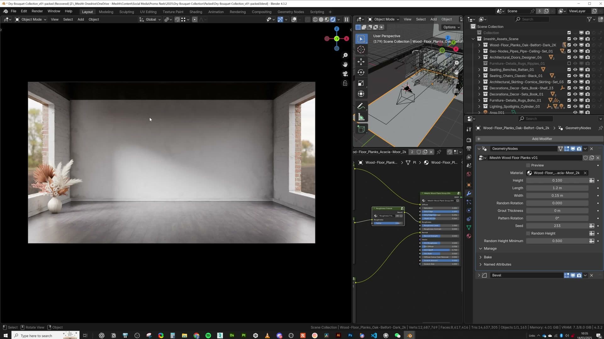
The behaviour you get is the trick that sells real-world materials. Look at a plaster wall straight on and it reads as matte clay. Tilt the same wall to a grazing angle and the highlight stretches out into the long, soft sheen you see on real painted gypsum. Wire the same group onto the iMeshh wood floor and the planks pick up that same shift: restrained underfoot, glossier as they recede toward the back wall.
Splitting brick walls for inside-out paint
The same brick texture is split into three variants (white inside, red outside, dark up top) so the window frame divides painted interior wall from raw exterior brick. A subtle displacement breaks up the silhouette without dicing too aggressively.
Three brick variants across the same wall
The wall around the window uses a single brick texture, but three colour variants of it. There's a white version for the painted interior face, a red version for the bare exterior, and a much darker variant up near the ceiling that you can barely pick out because that part of the room is in shadow anyway.
The wall is split into two sections, and the split line is positioned exactly where the window opening will sit. The logic is the same one builders use in real life: people paint the inside of a brick wall, not the outside. So the interior side of the split gets the white paint variant, and the exterior side keeps the raw red brick. Once the window frame drops in, that boundary disappears behind the frame and reads as a natural transition rather than a seam.
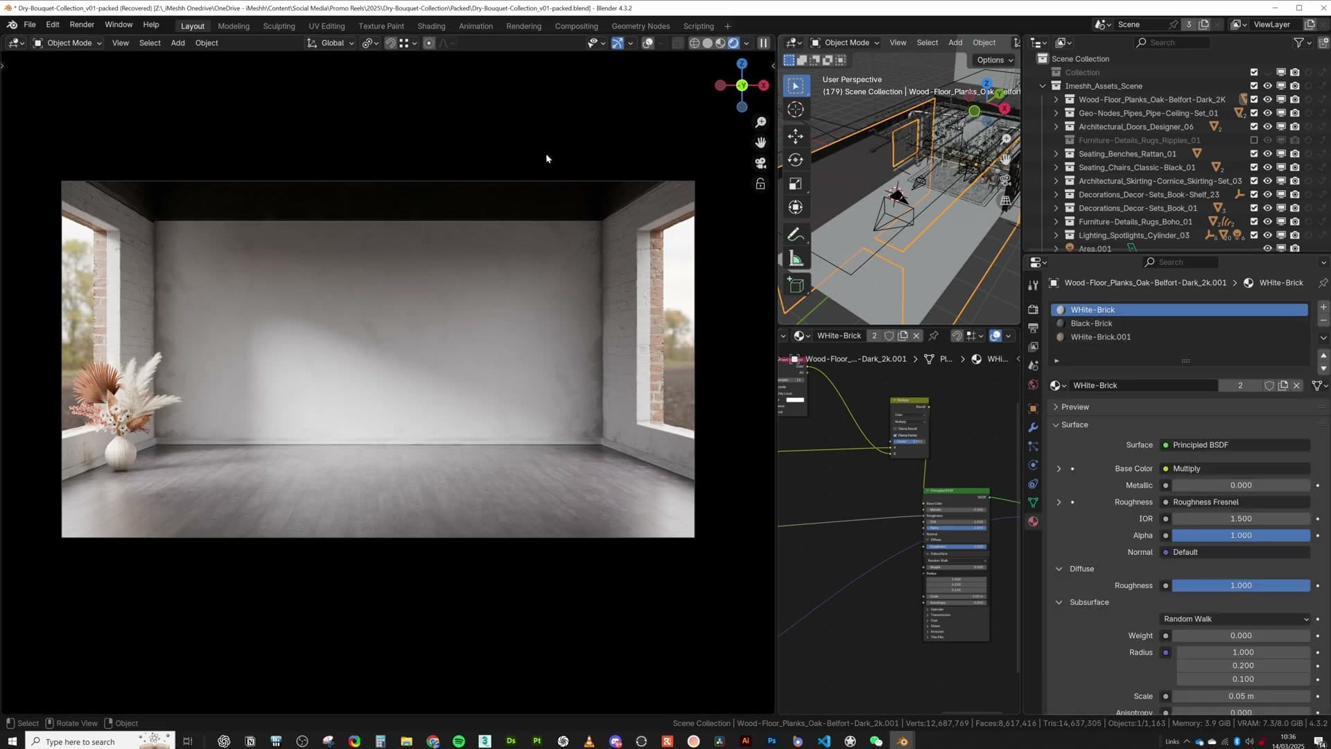
A small amount of displacement runs across the brick on top of the colour split. It's just enough to break up the silhouette of the wall and stop the mortar lines from looking flat, without dicing the geometry so aggressively that it eats memory you'll need elsewhere.
Ambient occlusion driven by a dirt mask
The plaster gets its character from a stacked AO setup: a base plaster shader, a UV rotated 15° to hide tiling, and a dirt texture plugged into the AO distance socket so wear only appears at edges and seams. A second dirt texture is mixed in via the AO mask for extra randomness.
Plugging dirt into the AO distance socket
The plaster gets most of its character from ambient occlusion. Without it, the wall would read as a flat slab of white. The base shader on its own is exactly that: a plain plaster texture with a few subtle marks, nothing else going on.
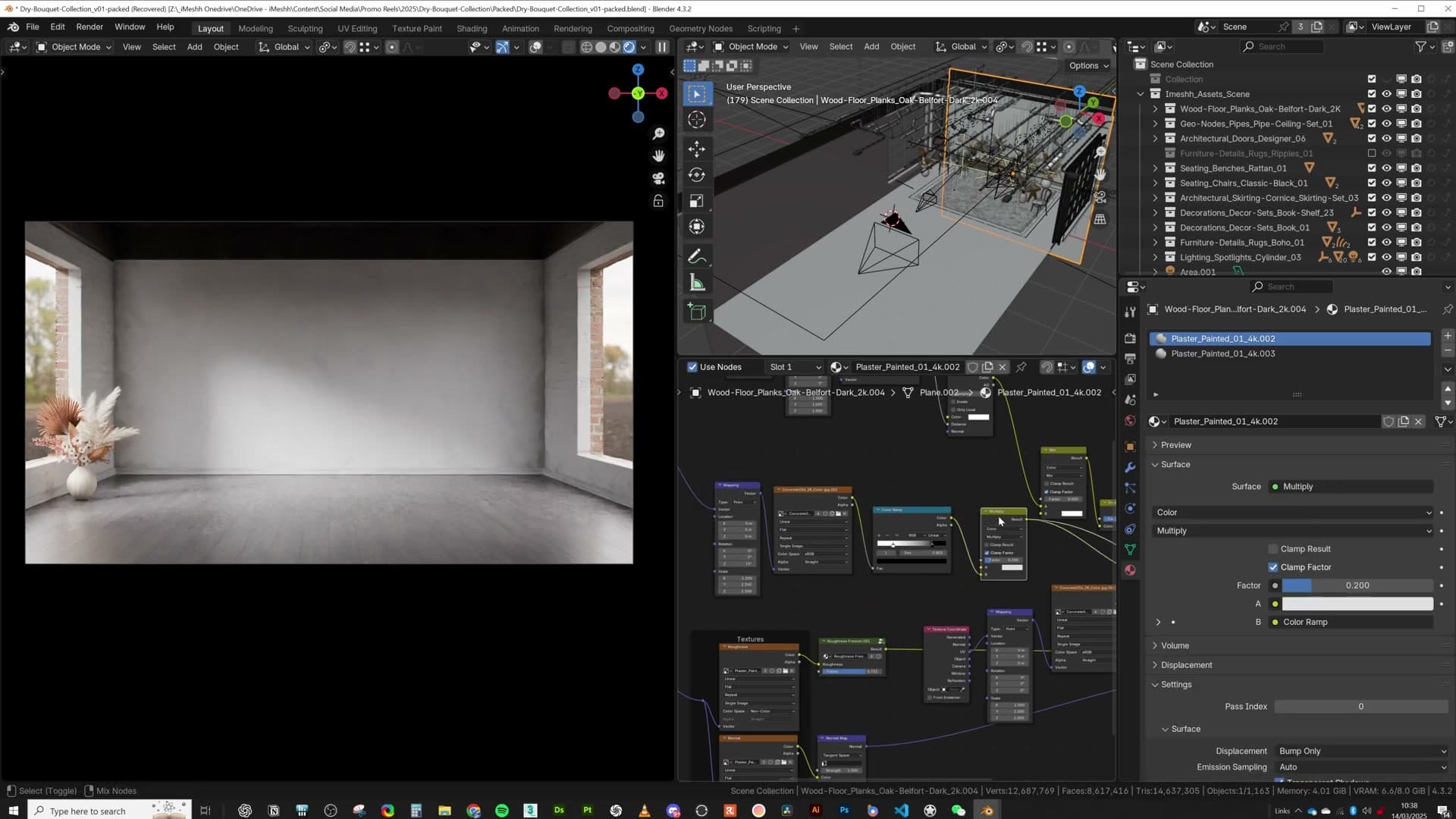
Before stacking anything on top, rotate the plaster UVs by 15 degrees. Tiling repeats in a strict horizontal-and-vertical grid, and the eye locks onto that regimented pattern instantly. A slight rotation breaks the lines off-axis and makes the repeat much harder to spot.
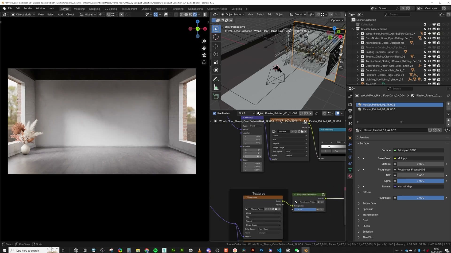
Next, bring in a second, much dirtier texture. This is what will eventually become the visible wear. The problem is you can't just blend it across the whole wall, or the surface ends up uniformly grimy. You need a mask that confines the dirt to corners and seams. The trick is to take a separate dirt texture (the one from the iMeshh wood-floor system works well here) and plug it into the Distance input of the Ambient Occlusion node. AO now only fires where geometry meets, and because the distance is driven by a texture rather than a single number, the wear has natural variation along those edges instead of a clean uniform band.
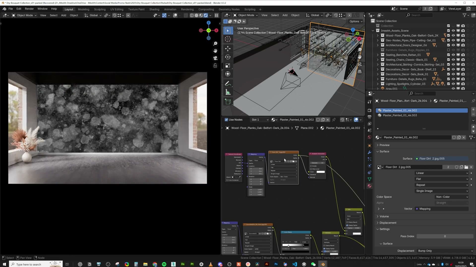
Look closely at any internal corner of the wall and you can see the result: the dirt only appears at the edges, exactly where grime would actually settle on a real plaster surface.
Mixing two textures through the AO mask
With the AO mask working, feed its output into a Mix shader. The mask decides which of two plaster variants shows at each pixel: where the mask reads black you get the clean base plaster, and where it reads white the dirty texture comes through. In the actual node tree this is wired via a Multiply with inverted inputs, but you can get the same result by simply swapping the order of the two textures going into the Mix.
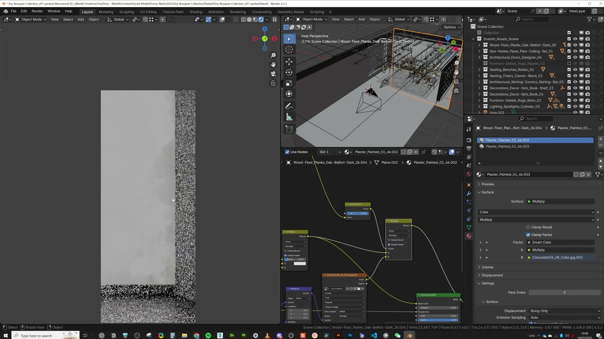
The dirty texture is doing more work than it looks. The AO mask on its own gives you grime in the right places, but the second texture supplies the randomness on top of that: speckles, blotches, and tonal variation that make the wear feel like real weathered plaster rather than a smooth procedural gradient.
Unplug that input and you can see the detail drop off straight away: the AO still darkens the edges, but the result looks cleaner and less believable. Keeping both layers stacked is what sells the surface.
Cityscape backplate through the window
A simple plane outside the window, set to be visible only through transmission rays, sells the exterior. Optionally an emission strength compensates for an over-exposed interior. The geometry can be rough; the silhouette of a skyline is enough.
Plane visible only to transmission rays
The view outside the window is a single flat plane sitting beyond the glass. The trick is the visibility setting: the plane is configured so it only registers to transmission rays, which means the camera can't see it directly. Only the light that passes through the window glass picks it up. From any other angle it's effectively invisible, so it can't accidentally clip into reflections or block other geometry.
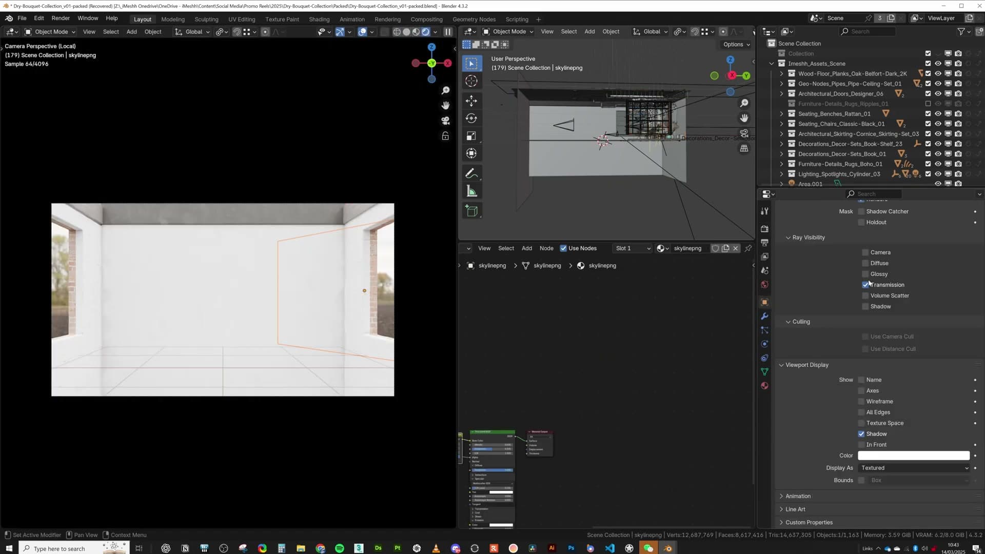
Drop the plane far enough back from the window opening that it reads as distance, then build the silhouette of a skyline onto it. You don't need to model anything. A basic image of a cityscape with enough detail to suggest buildings and rooflines is plenty. The eye is only ever going to glance at it through the framing of the window, so the bar for fidelity is low.
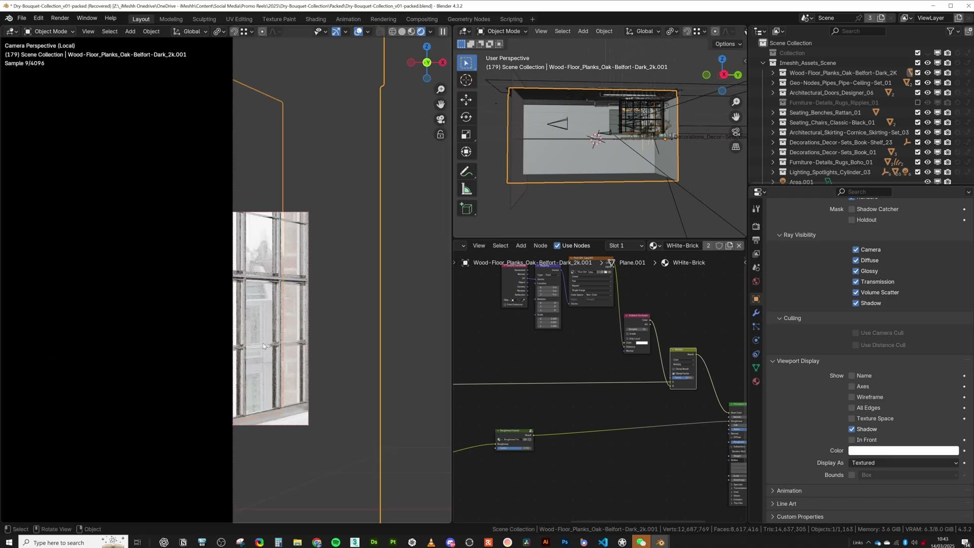
Two notes on lighting the plate. Usually the back plate sits inside the world environment and picks up enough light from that to read correctly, but you'll occasionally hit a render where the interior is over-exposed while the city outside drops into shadow. When that happens, add an emission shader to the plane and dial the strength up until the exterior balances against the interior again. For this particular scene the world light alone was bright enough, so no emission was needed.
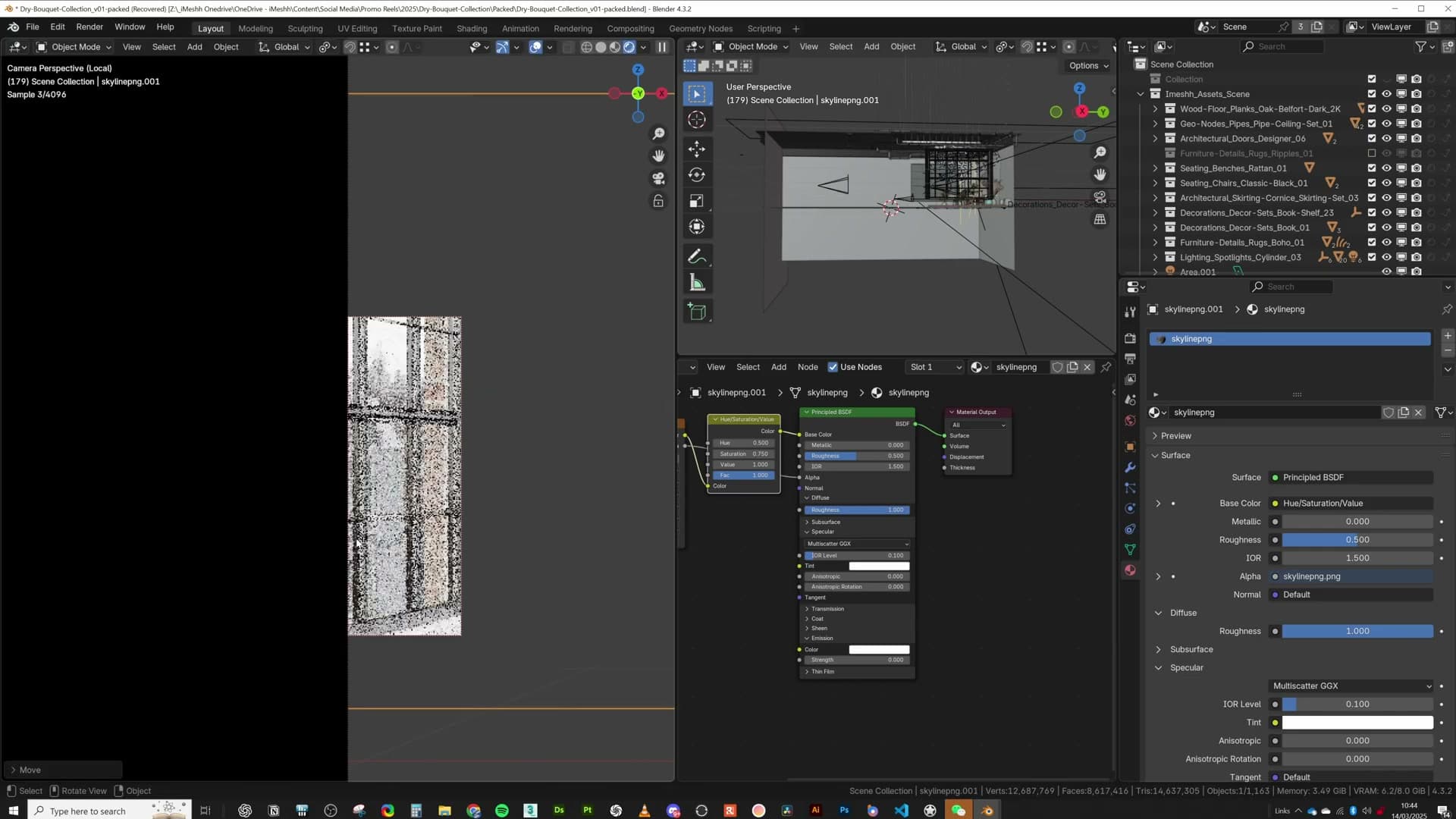
If the plate doesn't sit flush with the outside wall, nudge it sideways until it does. A back plate that visibly fights the architecture breaks the illusion straight away. When it lines up cleanly with the exterior, the room feels grounded in a real building.
Pipes, plants and furniture placement
The ceiling pipe system uses instances under the hood, so chaotic over-the-top runs don't punish VRAM. Furniture from the iMeshh library is eyeballed to scale and dressed with small decorations to read as a working art studio.
Instance-based pipe system on the ceiling
The ceiling carries a tangle of pipes, some running across the underside, others punching through it. From the side it looks chaotic, but the camera angle means none of that mess is ever visible in the final frame, so you can leave the routing rough rather than spending hours tidying geometry the renderer will never see.
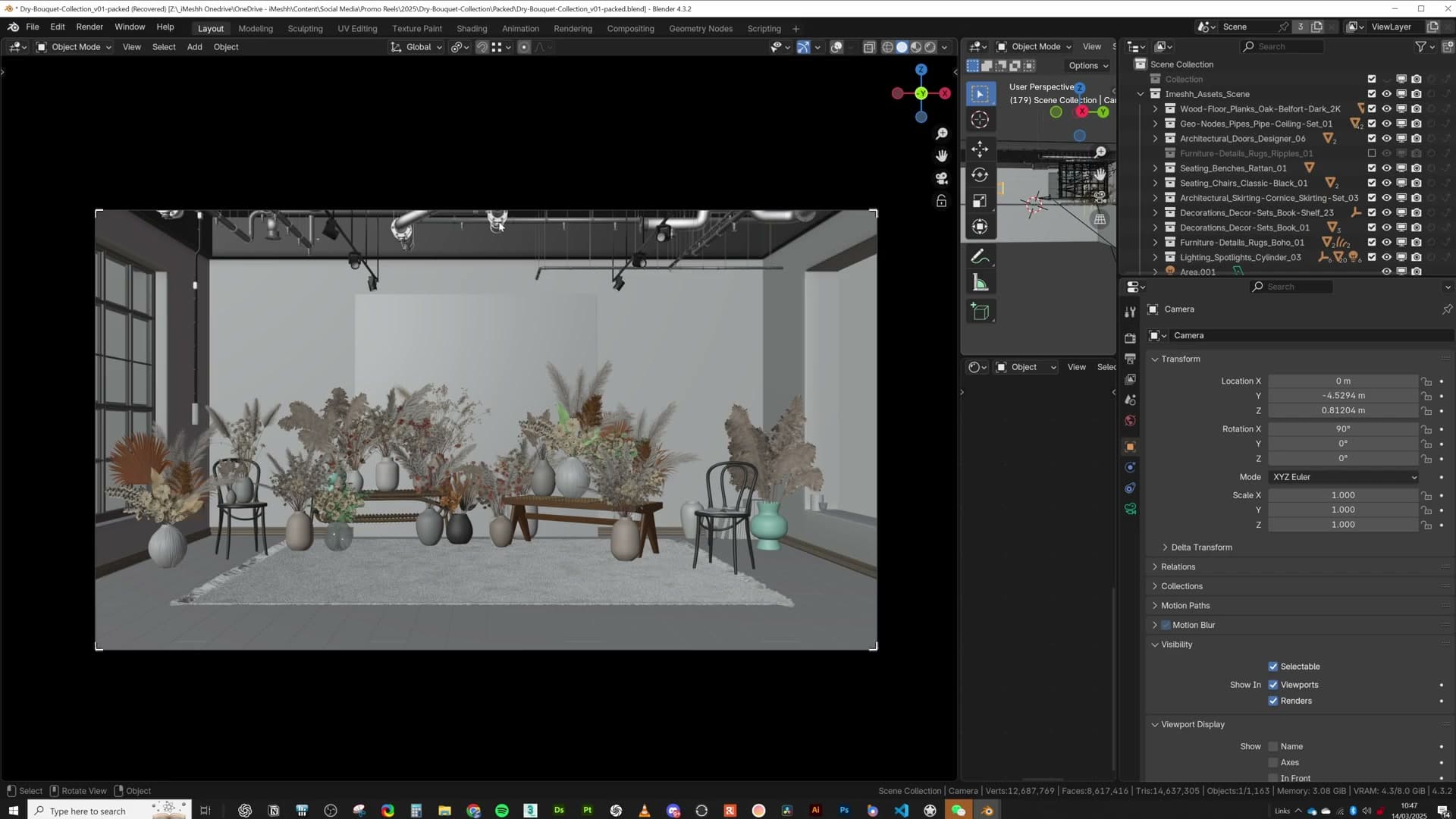
The reason you can be that liberal with the count is that the iMeshh pipe system is built on instances. Each new length of pipe shares geometry with the originals, so doubling or tripling the run barely moves the VRAM needle. Add as many as you need to sell the industrial-loft feel without worrying about budget.
Eyeballing furniture scale and dressing the room
The furniture all comes from the iMeshh library, and although each piece is modelled to real-world scale, dropping them into this particular room sometimes made them read a touch too big or too small. Rather than fussing over exact dimensions, eyeball each item against the space and scale it until it looks right. The goal is for the room to feel believable, not for the tape measure to agree.
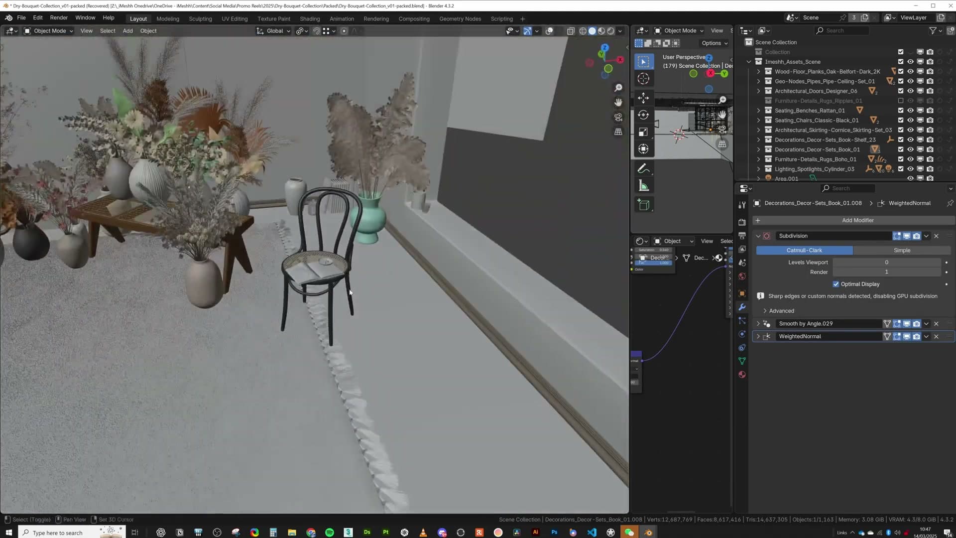
Once the larger pieces are in, dress them with smaller decoration props, again pulled from the iMeshh library, so each surface reads as a working art studio rather than a furniture showroom. Little props on shelves, tables and side units do most of the storytelling.
Plants and bouquets get the same treatment, but with one important twist: instances. Append a single plant from the library, then with it selected press Alt+D and move the duplicate into place. That gives you a linked copy that shares geometry with the original. Editing one edits both, and Blender only has to calculate the mesh once, so adding twenty bouquets doesn't cost twenty bouquets' worth of VRAM.
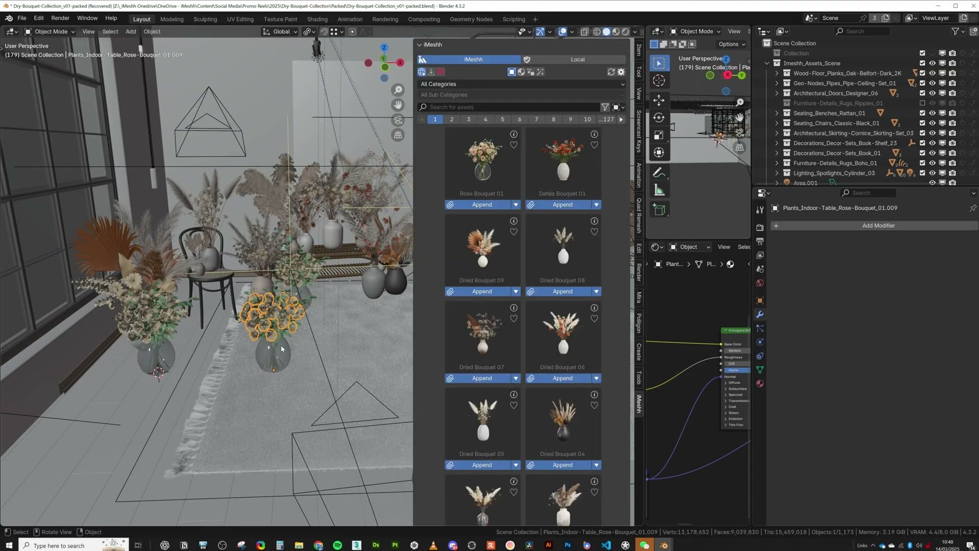
Spread the instances around the scene, rotate them, hide a few behind larger objects, and don't be afraid to scale individual copies independently. The pampas grass tucked into one corner is the same instance as a much smaller version elsewhere in the room. Stretching one out has no effect on the other, so a single source mesh can read as several different plants once it's been scaled and reoriented.
Alt+D linked instances for heavy plants
Pampas and dried bouquets are some of the heaviest assets in the library. Appending one and Alt+D-ing it creates linked duplicates that share geometry but can be individually rescaled, letting one master mesh dress the entire scene without inflating VRAM.
Duplicating bouquets as linked instances
Dried-plant clusters are some of the heaviest assets in the iMeshh library, so when you populate a corner of the room with them you want the duplicates to share geometry rather than copy it. What this stretch of the walkthrough does cover is a small visual tweak on top of that: Kristian made a handful of the bouquets green rather than the natural dried tone, a quiet tonal shift that stops the cluster from reading as a single prop on repeat.

Just outside the window sits the back plate the camera sees through the glass. It isn't a photograph. I wanted a view of dried pampas to echo the bouquets indoors, and when stock libraries didn't have anything that fitted, I generated one with an AI image tool until the framing felt right. A real-looking image rather than a flat gradient sells the idea that there's a world beyond the wall, which matters more for interior renders than it tends to get credit for.
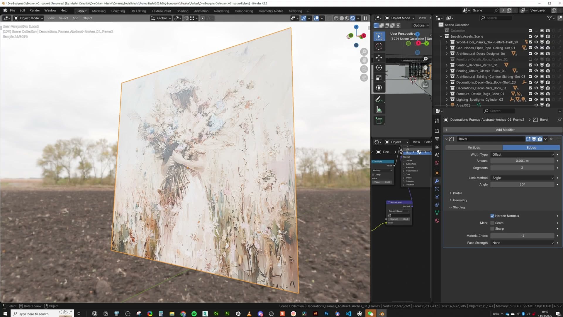
From there the AI image was run through a tool that derived the extra texture maps (roughness, normal, the supporting passes) from that single colour input. The result has a slightly painted, slightly three-dimensional feel, which is what you want for a back plate the eye should accept at a glance but never stop to inspect.
AI-generated pampas backplate
Real-world reference for a dried-pampas wall art piece was hard to source, so the image was generated in Midjourney and pushed through Adobe Sampler to produce displacement and roughness maps, giving the backplate a slightly painted, 3D feel.
Midjourney plus Adobe Sampler for the wall art
Finding usable reference for the dried-pampas wall art turned out to be harder than expected, so rather than chase a clean photograph the image was generated in Midjourney. A handful of prompt iterations was enough to land on a composition that felt like a real piece of framed art rather than an obvious AI render.
From there the flat image was pushed through Adobe Substance 3D Sampler, which can take a single photograph and infer extra channels from it: in this case a displacement map and a roughness map. Plugging those back into the shader gave the backplate a subtly painted, slightly three-dimensional feel rather than the dead-flat look of a plain texture applied to a plane.
Spotlights for directional pop
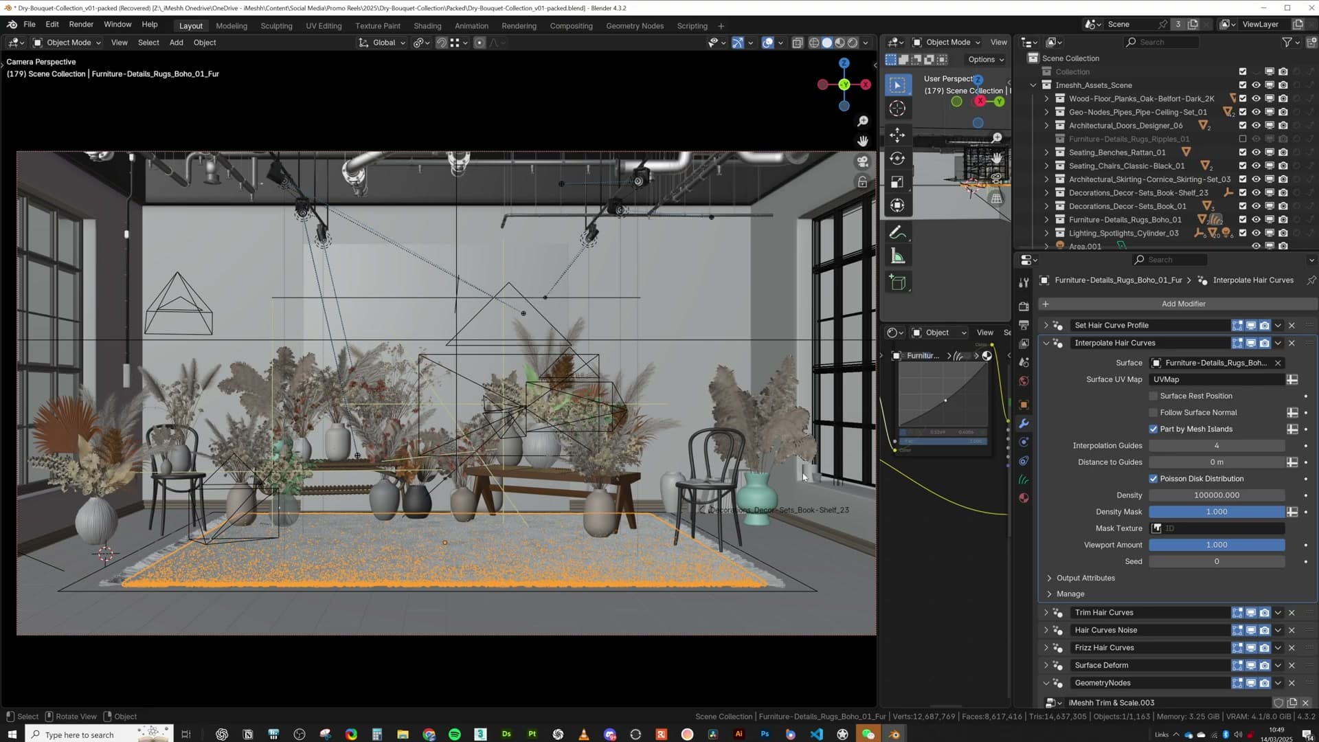
The scene felt flat until iMeshh spotlights were dropped in and aimed individually at the back wall, a plant, and the camera lens for a touch of glare. Each light comes with a pointer empty that makes aiming intuitive.
Symmetry, decoration and the art-studio feel
With the materials and plants in place, the scene was technically finished. And yet something felt off. The main key light was pushing in nicely from one side, with a softer fill coming through the secondary window, but the overall image still read as a little flat.
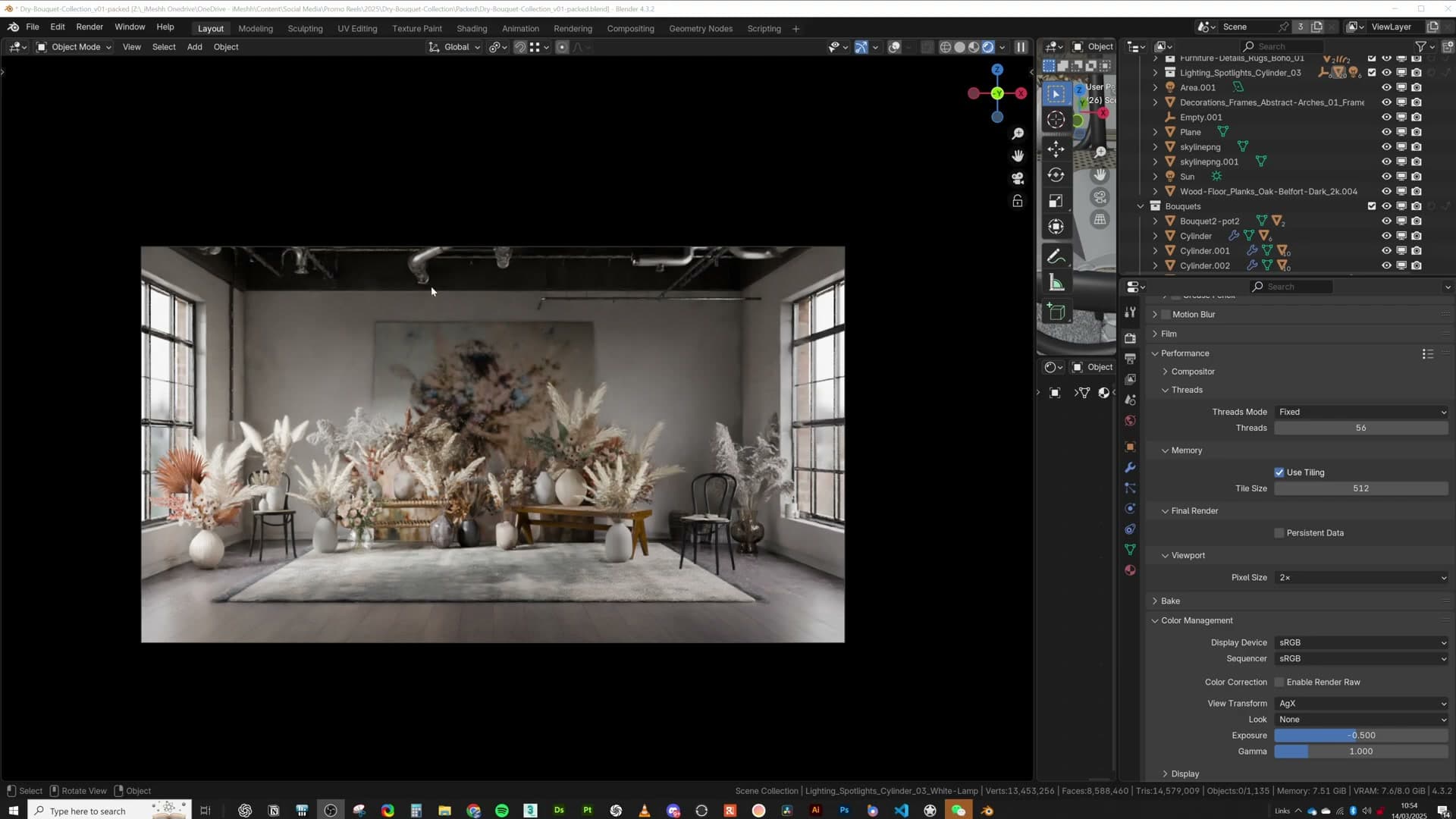
It took a while to put a finger on what was missing. The bones of the lighting were right; the problem was that nothing in the room was being picked out. The back wall, the plants and the props were all sitting at roughly the same brightness, so the eye had nowhere obvious to land.
Aiming spotlights at walls, plants and the camera
The fix was a handful of spotlights, each one aimed deliberately rather than scattered around the room. Drop them in from the iMeshh library and each spotlight arrives paired with a pointer empty, so you don't have to fight with rotation values. Just grab the pointer and drag it onto whatever you want lit.
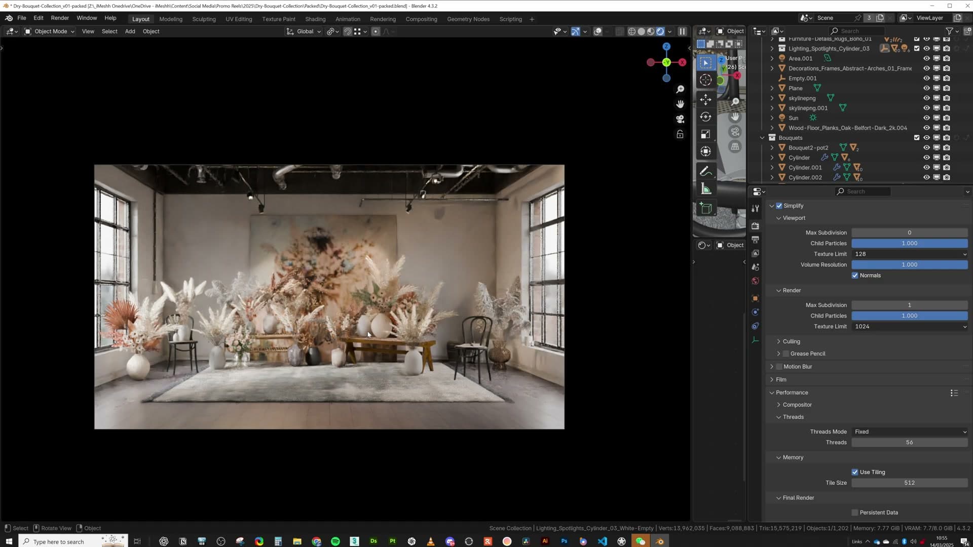
Four placements did the work in this scene. One spotlight was pointed at the back wall to lift it away from the foreground, another was aimed at a plant to give the foliage a hot edge, a third pushed light into the rear of the room, and a fourth was deliberately steered towards the camera lens to catch a touch of glare in the final frame.
The result was an immediate transformation. The render gained flow, the props started to pop against the walls, and the room finally read like an art studio rather than a flat box of nice materials.
Render Raw addon and final grading
Final colour, contrast and glare passes were applied with the Render Raw addon, then a slight temperature tweak in Photoshop. The actual render ran on CPU at 4096 samples and took roughly 10 hours overnight, partly to test how much the denoiser was working.
Render Raw adjustments and glare
With the lighting locked in, the last pass is colour and contrast. Enable the Render Raw addon, work through a few light adjustments, and add some glare on top. That small chain of effects is what pulls the image into its final look. Even with the background still capped at 128px and looking a little rough, you can see the intended mood landing.
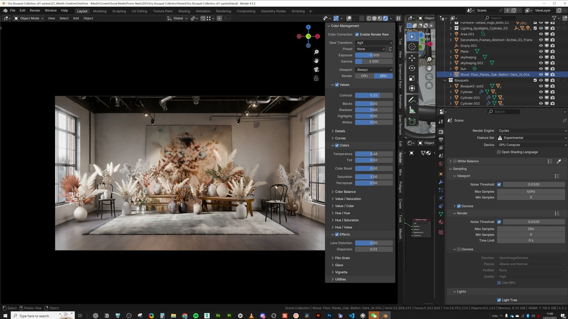
Once Render Raw has done its job, take the image into Photoshop for one more pass. Nudge the temperature very slightly, lift the contrast a touch, and stop there. The render itself is doing the heavy lifting; Photoshop is only smoothing off the edges.
That is the scene finished from a creative standpoint. The next problem is purely technical: getting it through the render engine on an 8 GB GPU.
Render settings: CPU, 4096 samples, 10 hours
By the time the scene was ready to ship, VRAM usage was already sitting at 7.7 GB on an 8 GB card. Squeezing the final frame out on the GPU was almost impossible, so the actual render was sent to the CPU and left to run overnight.
Total render time was around 10 hours. Samples were pushed to 4096, knowingly far too high, purely so you could watch the denoiser's behaviour over a long render and see how much work it was actually doing. In practice, the image looked finished at roughly the four-and-a-half hour mark; the remaining samples were diagnostic, not necessary.
That wraps the scene. Variable specularity on the plaster and wood, an AO-masked dirt pass, linked instances for the bouquets, aggressive texture capping through Format Swap and Simplify, and a final grade through Render Raw. All of it adding up to a photoreal interior delivered from an 8 GB machine.
The 8GB VRAM strategy
The Simplify panel is the single most useful tool for scenes that don't fit. Capping global texture size at 1024 (with a 4K render target) worked for most assets. Only objects taking up huge screen area need anything higher.
Simplify with a 1024px texture limit
The Simplify panel is the single biggest lever for a heavy scene on a small GPU. Open Render Properties → Simplify, switch to the Render tab, and set a global texture size limit. For this scene the cap sat at 1024, which sounds aggressive until you do the maths against the output resolution.
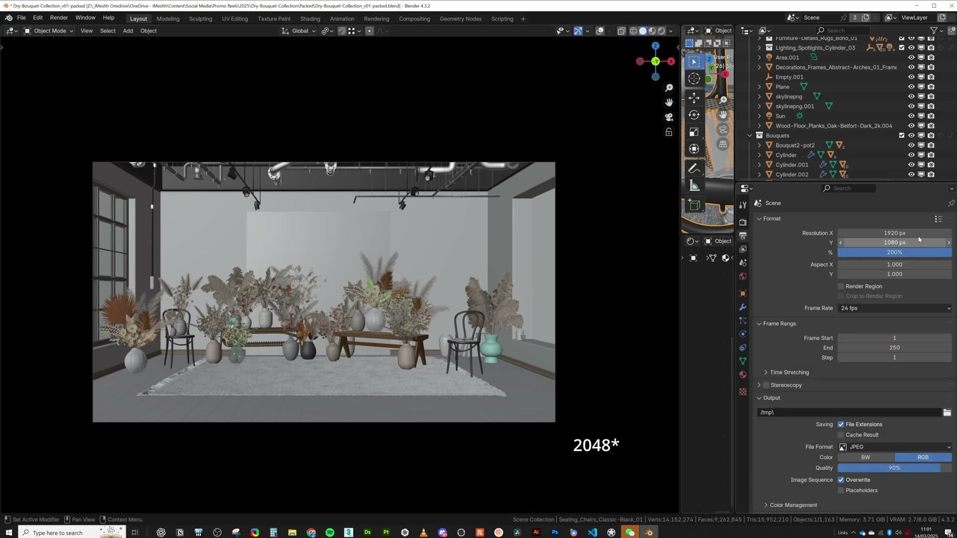
The final image was rendered at 3840 × 2160, a 1920×1080 base scaled to 200%, giving you 4K UHD. At that output, a 1024 texture only starts to show its limits when the object is taking up more than roughly half the screen. Anything smaller than that and you simply cannot see the extra detail a higher cap would give you.
Because nearly every textured asset in the scene sits in the mid-ground or background (plants, pipes, distant props) the 1024 cap holds up. The hero surfaces that take up serious screen area, the wall, the floor, the rug, are the only ones you'd consider exempting from the limit if they did start to look soft.
Why iMeshh assets ship at high resolution
iMeshh ships assets with large source textures because every asset is built so you can pull the camera in for a tight close-up without the surface falling apart. The resolution has to be there if you want the option.
It is far easier to take a high-resolution texture and shrink it via Simplify (or per-object with Format Swap) than it is to start with something small and discover, halfway through a hero render, that your wood grain has turned to mush. Ship high, cap down when you need to. Never the other way round.
Format Swap for bulk texture reduction
Background leaves and petals can be dropped to 128px without a visible difference because they're only a handful of pixels wide on screen. Format Swap handles the bulk conversion in one click. Where roughness and normals can't be perceived, unplug them entirely.
Dropping background leaf textures to 128px
The dried bouquets are the heaviest texture load in the scene, and most of those leaves and petals are only a handful of pixels wide once the camera frames the shot. Sitting at native resolution, they're burning VRAM on detail you can't perceive. Format Swap fixes that in a single pass.
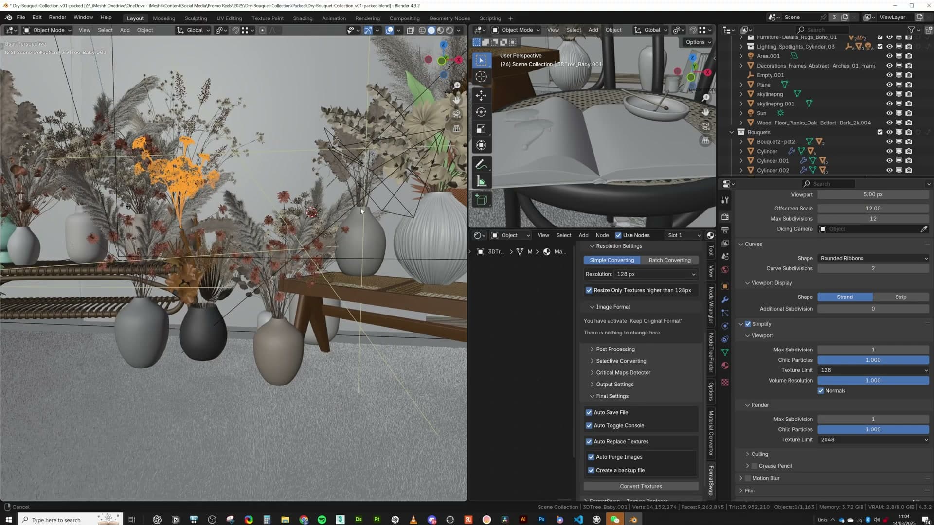
Select every plant in the bouquet, open Format Swap, set the maximum texture size to 128, and hit convert. The addon walks every material on the selection, finds each image texture, and downsamples anything above the cap. Leaves, petals, stems, all dropped to 128px at once, no per-material clicking.
The same logic applies to anything sitting in shadow or buried in the back of the frame. Distant foliage up near the top of the wall went down to 128 because the lighting hides any texture detail there anyway. The vases in the foreground stayed high. There was a chance of a close-up on that area, and a 128px cap on something that fills the frame would show immediately.
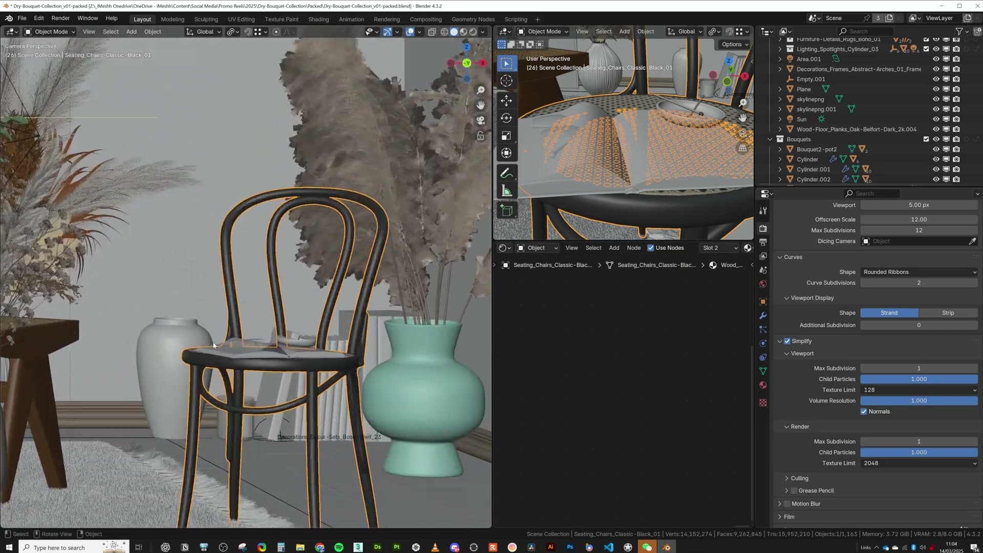
The rule is simple: cap aggressively for anything you're certain stays small or shadowed on screen, and leave the budget alone for hero geometry that might get a tight shot.
Unplugging roughness and normal maps you can't see
Capping resolution is one lever; unplugging maps entirely is the next. On the same background plants, the roughness and normal maps contribute nothing visible. The geometry is too small, too soft-lit, or too far from camera for those microsurface details to land. So strip them.

Open the shader for each background material, unplug the roughness and normal map inputs from the Principled BSDF, and replace the roughness with a single guessed value typed straight into the slider. Eyeball it against the colour map and move on. The image won't change perceptibly, and you've just freed measurable VRAM across dozens of materials.
Apply the same treatment to anything else hidden in shadow or out of frame: surrounding props, distant petals, branches the camera never reaches. If you can't see the surface detail in the final render, the maps driving that detail are dead weight.
Cheap displacement via dicing rate
For the brick walls, the Cycles render dicing rate was set to 5 pixels, far higher than the default, and still produced enough bump for the look. The window frame was pushed outside the wall and its textures unplugged because they were no longer visible.
Render dicing rate at 5 pixels
Adaptive subdivision gives the brick walls real edge displacement instead of a flat normal map, but it is expensive. Every pixel of every brick face gets diced into micro-polygons at render time. The lever for controlling that cost is the Render Dicing Rate on the object's subdivision modifier, measured in pixels: smaller numbers mean finer geometry and slower renders.
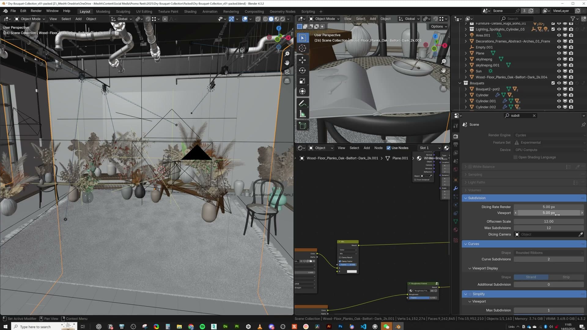
Open the brick wall object, find the Subdivision Surface modifier with Adaptive Subdivision enabled, and set the Render Dicing Rate to 5 pixels. That is well above Blender's default of 1 and would normally be considered coarse, but on these walls it still produces enough bump to read as displaced brick in the final frame, without spending memory on micro-geometry no one will notice.
Pushing the window frame out and stripping its textures
The window frame began life inset into the wall, sitting flush behind the brick opening. That look did not work in context, so the fix was simply to push the frame outward so it sits proud of the wall on the exterior side. A cleaner read, no extra geometry, no shader work.
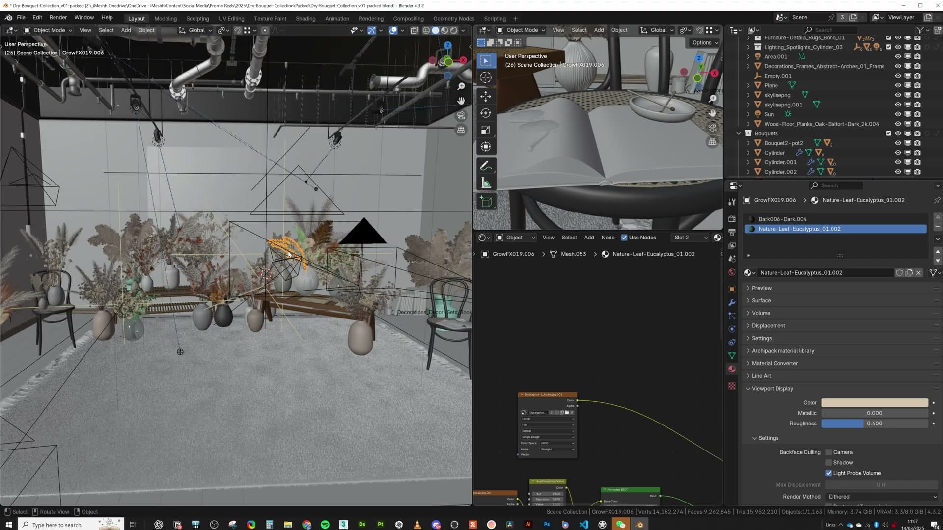
The catch: the frame is now mostly hidden by the wall from camera, but it still carries a full PBR stack (base colour, roughness and normal map) all loaded into VRAM for surfaces the render will never see. Open the frame's material, find the image texture nodes feeding roughness and normal, and unplug them. That memory is reclaimed instantly.
Leave the base colour plugged in rather than stripping it entirely. There is a chance a sliver of the frame pokes through somewhere the wall doesn't fully cover, and a flat white edge on a brick wall is far less jarring than a magenta missing-texture flash.
A progressive optimisation workflow
When a scene refuses to render, start with Simplify at 128px textures and zero subdivisions. If it renders, climb to 256, 512, 1024 until something breaks. That's your VRAM ceiling. Textures, not geometry, are usually the culprit.
The step-by-step texture-cap method for any scene
When a scene refuses to render, or it limps along and crashes mid-bake, work through this method before you start ripping geometry apart. It treats textures as the first suspect, which is almost always the right call.
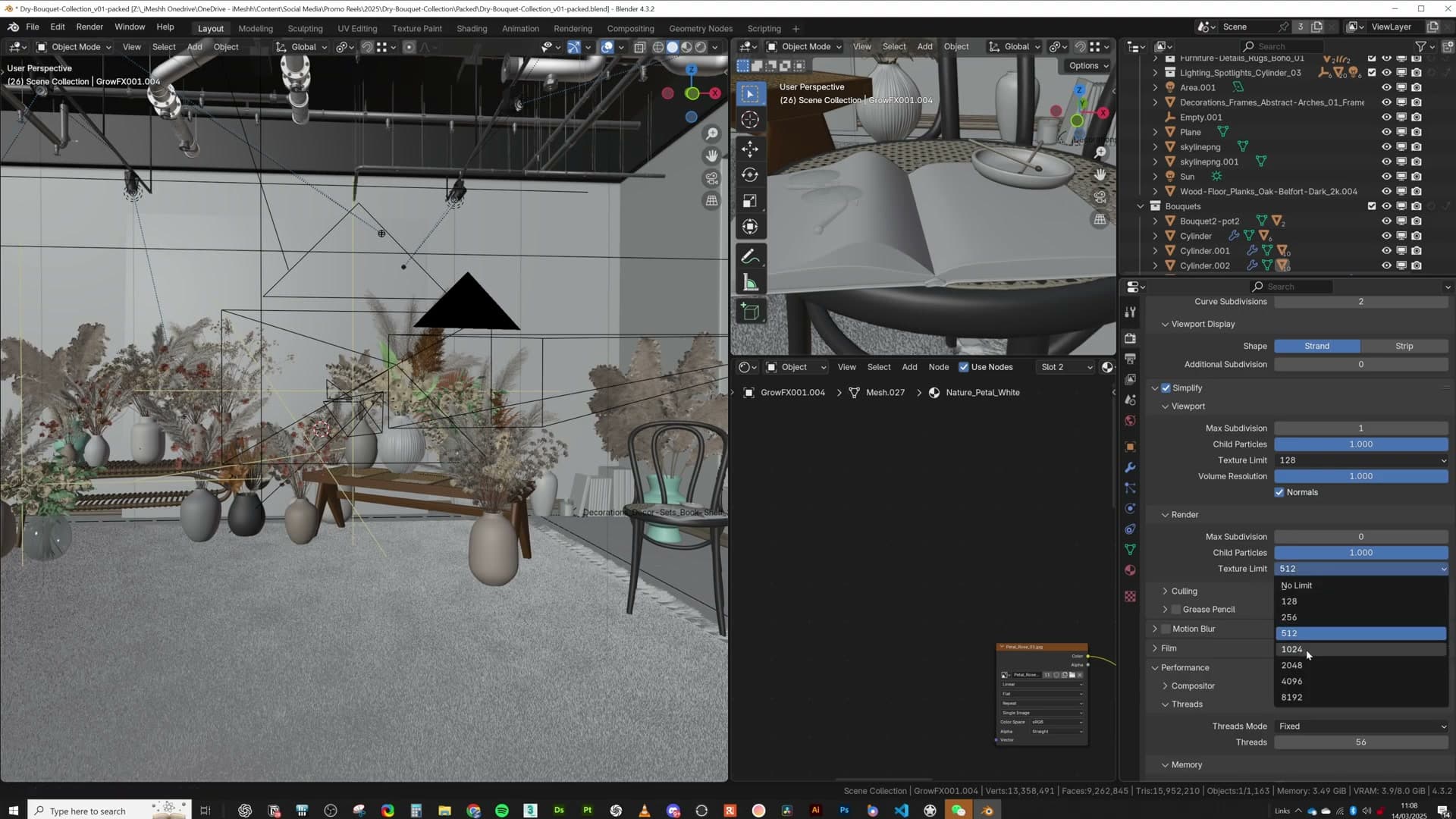
Open the Render Properties panel and tick Simplify. Under the Render section, set the Texture Size Limit to 128 and pull Subdivision down to 0. Hit render. If the image comes through, you've confirmed the scene fits on the GPU at its smallest possible footprint. That gives you a working baseline to climb back up from.
Now walk the texture cap up one step at a time. Try 256, then 512, then 1024, then 2048. The render that fails tells you your real ceiling; drop back one step and that's the budget you're working with for the rest of the scene.
Take the same approach with subdivisions. With them sat at zero you'll often find that most of your geometry looks completely fine. Modifiers and bevels are usually doing enough heavy lifting that adaptive dicing isn't buying you anything you can see. If the scene reads well without it, leave it off.
Once the global cap is as high as it can go, switch to per-object pruning. Pick out background props: a distant leaf, a petal tucked behind other plants, a branch that's only a few pixels wide on screen. Unplug the roughness and normal maps inside its shader. You won't see the difference. The camera is only ever going to read the colour anyway, so the extra maps are paying for detail that never reaches the final frame.
Textures are nearly always the biggest culprit when you run out of VRAM, not geometry. Start there and you'll solve most rendering problems before you ever consider deleting an object.
Wrap-up and where to go next
That covers the techniques behind this particular scene. If there's a node setup, an optimisation, or a decision you'd like unpacked in more detail, drop a comment. This was very much a smash-it-together build where the bar was "does it look kind of nice?", so there are corners worth exploring more slowly.
Special mention for the iMeshh pipe systems. The scene would have been almost impossible without them. They're already using instances under the hood, which is the only reason a wall of industrial pipework didn't blow straight through the VRAM budget. They're being updated to be faster still, but even now they earn their place in the library.
If there's a specific tutorial or technique you'd like covered next, leave it in the comments. Thanks for watching.
Tools and credits
Everything mentioned in this tutorial, with links.
- Blender: the renderer this entire build runs in.
- iMeshh: studio platform (project management, client review, asset library, invoicing). The asset library used in this tutorial is included with every iMeshh Pro plan.
- Poly Haven: free CC0 textures and HDRIs.
Pillar guide: Scene Builds hub