Building a handheld walking camera rig
The animation opens with a subtle steady-cam wobble built from a stack of nested empties. Each empty handles one type of motion so translation, rotation, and noise can be tuned independently. I parent the whole rig to a master empty so the entire animation can be slid around the room without rebuilding keyframes.
Setting the scene and the walking-camera goal
The animation in this breakdown started as a render test. iMeshh had just finished a new plant pack, and to see how the leaves and stems read in context I dropped them into an interior scene. Then I got carried away and turned a still into a full walking shot through the bedroom.
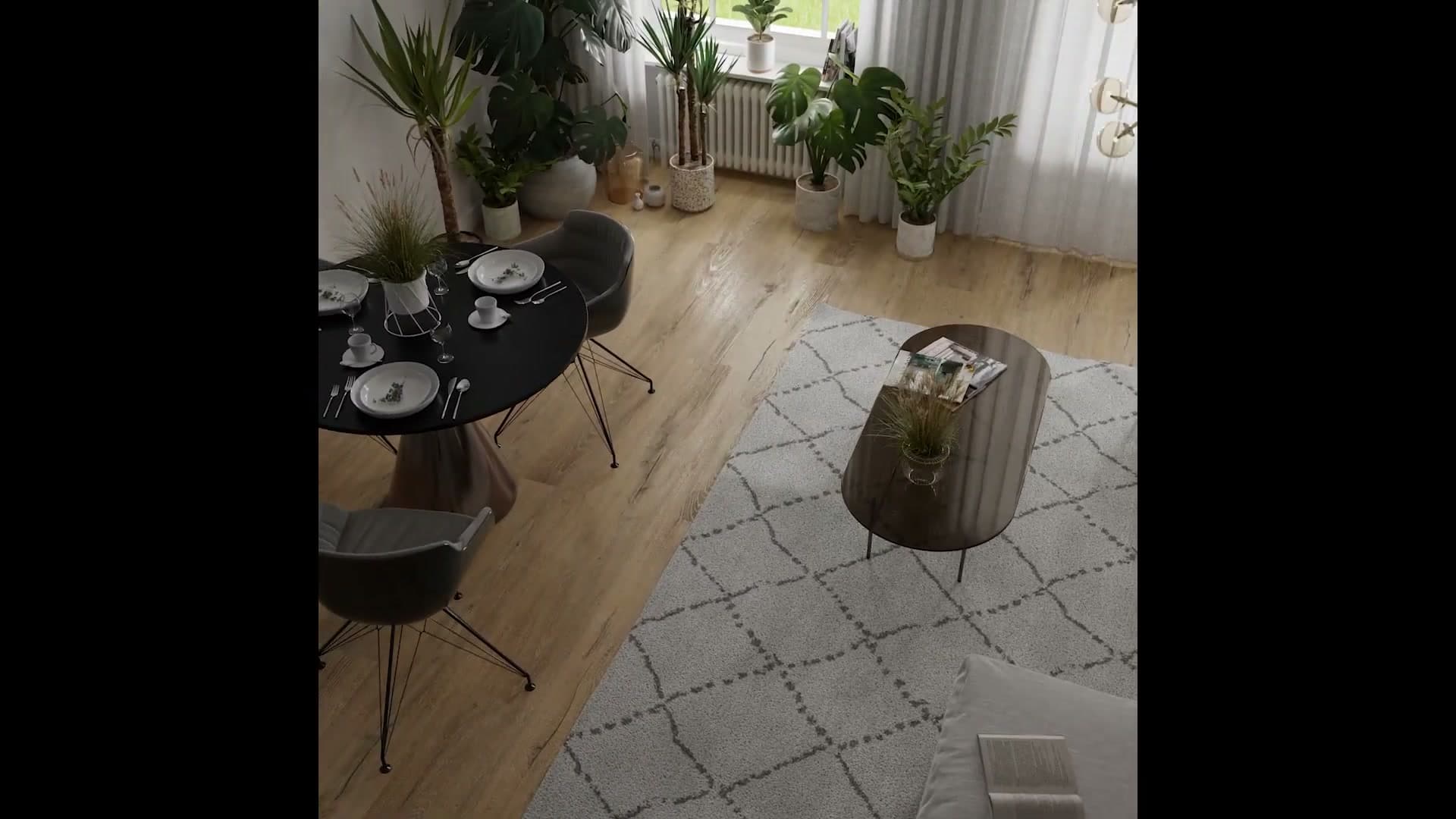
The scene itself is available to iMeshh members as a downloadable file, so you can pull it apart frame by frame if you want to follow along. If not, every technique covered here is reproducible from scratch in any Blender project.
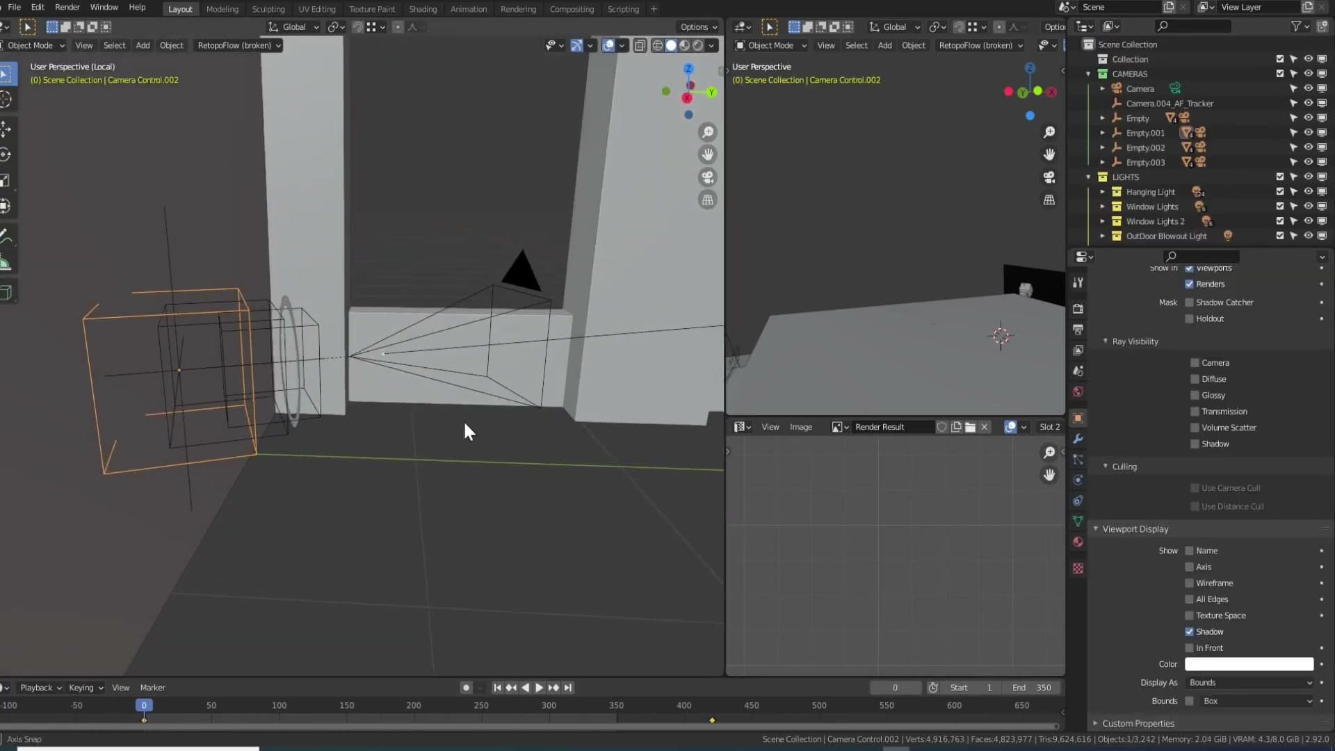
The brief for the camera was deliberately small: make it feel like someone is walking through the room with a steady-cam in their hands. Not full handheld jitter, just a hint of body sway. The rest of this module covers how that subtle motion is built.
Stacked-empty rig: translation, rotation, and orbit
A walking shot in real life is the sum of several small motions stacked on top of each other. The operator's body moves forward along the path, their hands wobble laterally, the rig tilts on its grip. I mirror that in Blender by chaining several empties above the camera, each one responsible for a single type of motion. The setup was loosely inspired by a Creative Shrimp tutorial on camera rigs, then adapted as the shot evolved.
At the top of the chain sits a main object that handles the broad path through the room: the position-to-position keyframes that take the camera from where the shot starts to where it ends. Everything else is parented underneath it.
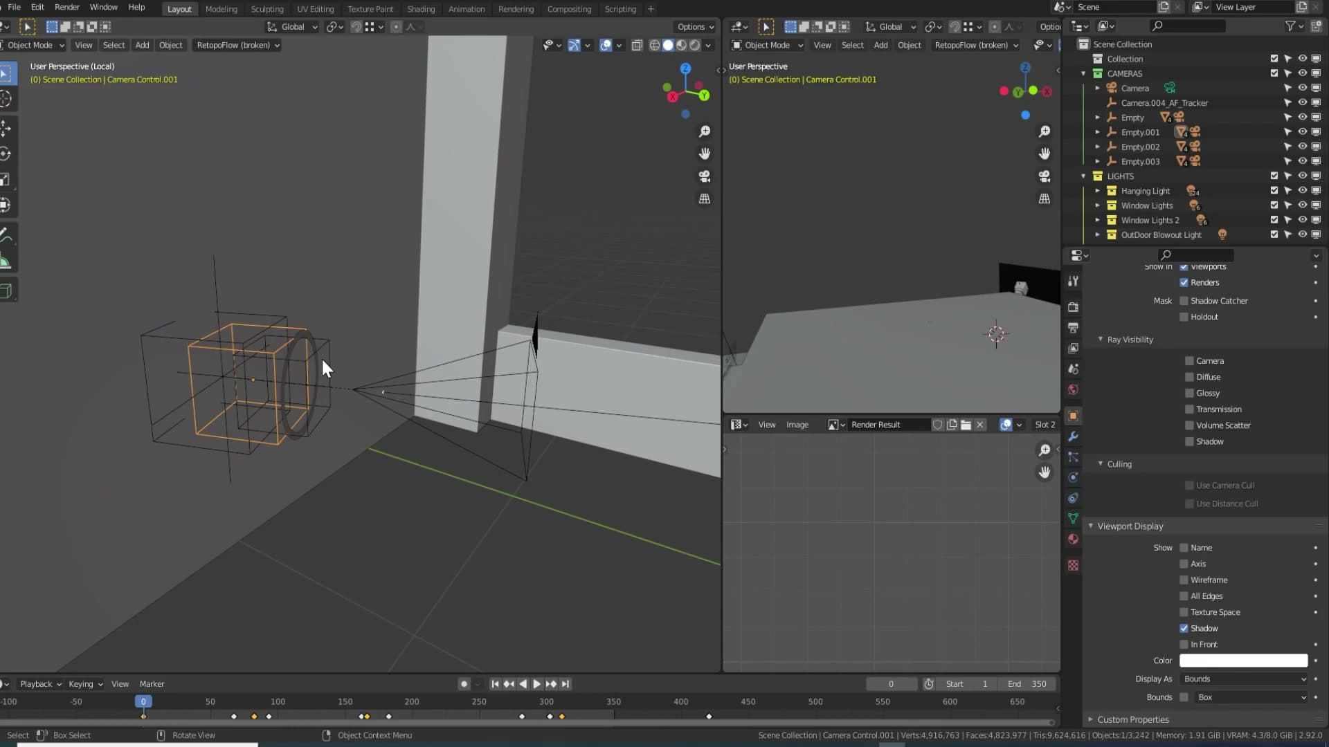
Below that sits an empty dedicated to lateral translation in camera space. Select it, press G, and it slides left, right, up or down relative to where the camera is pointing. That's the kind of weight shift you get from a walker's torso.
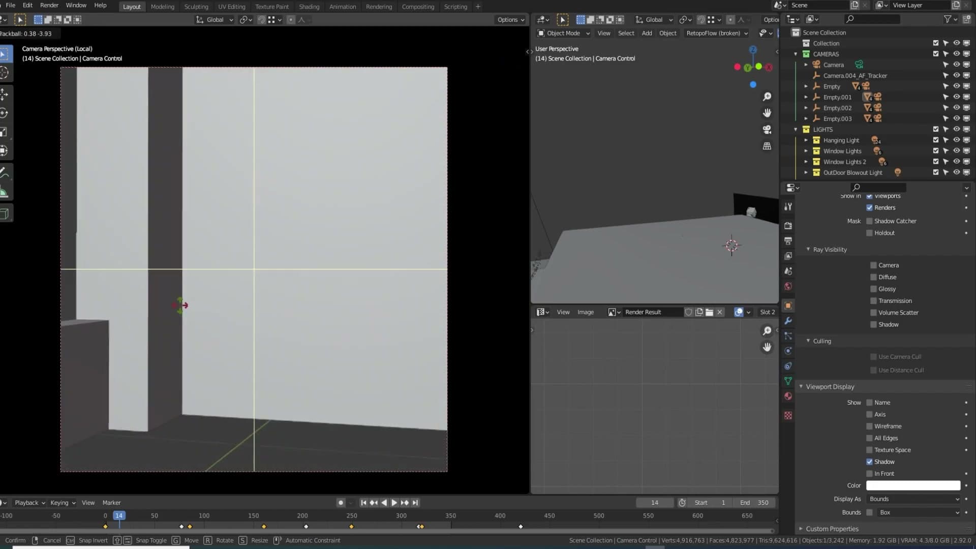
Next in the chain is an empty for rotation. Press R on this one and the rig tilts around the camera's own axis, mimicking the small wrist movements of someone holding the camera in their hands. Splitting the motion across separate empties means you can tune each component independently. If the rotation feels overcooked you only touch the rotation empty, never the rest of the rig.
Noise constraint driven by keyframed influence
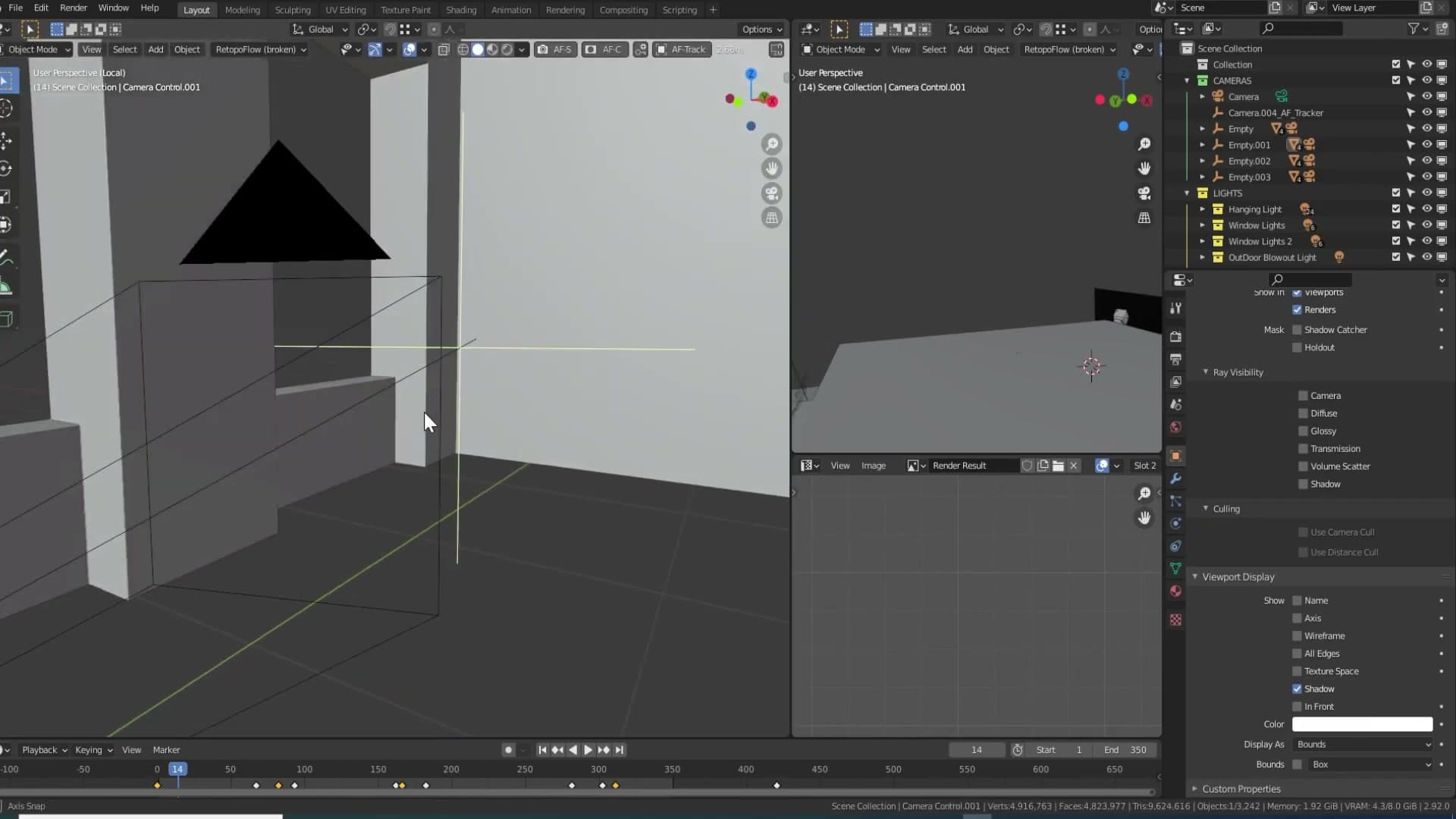
The final empty in the chain has no manual transform keyframes of its own. Instead it carries a constraint that pulls the camera towards a small target object (a cylinder parented off to the side), and the Influence slider on that constraint is what gets animated.
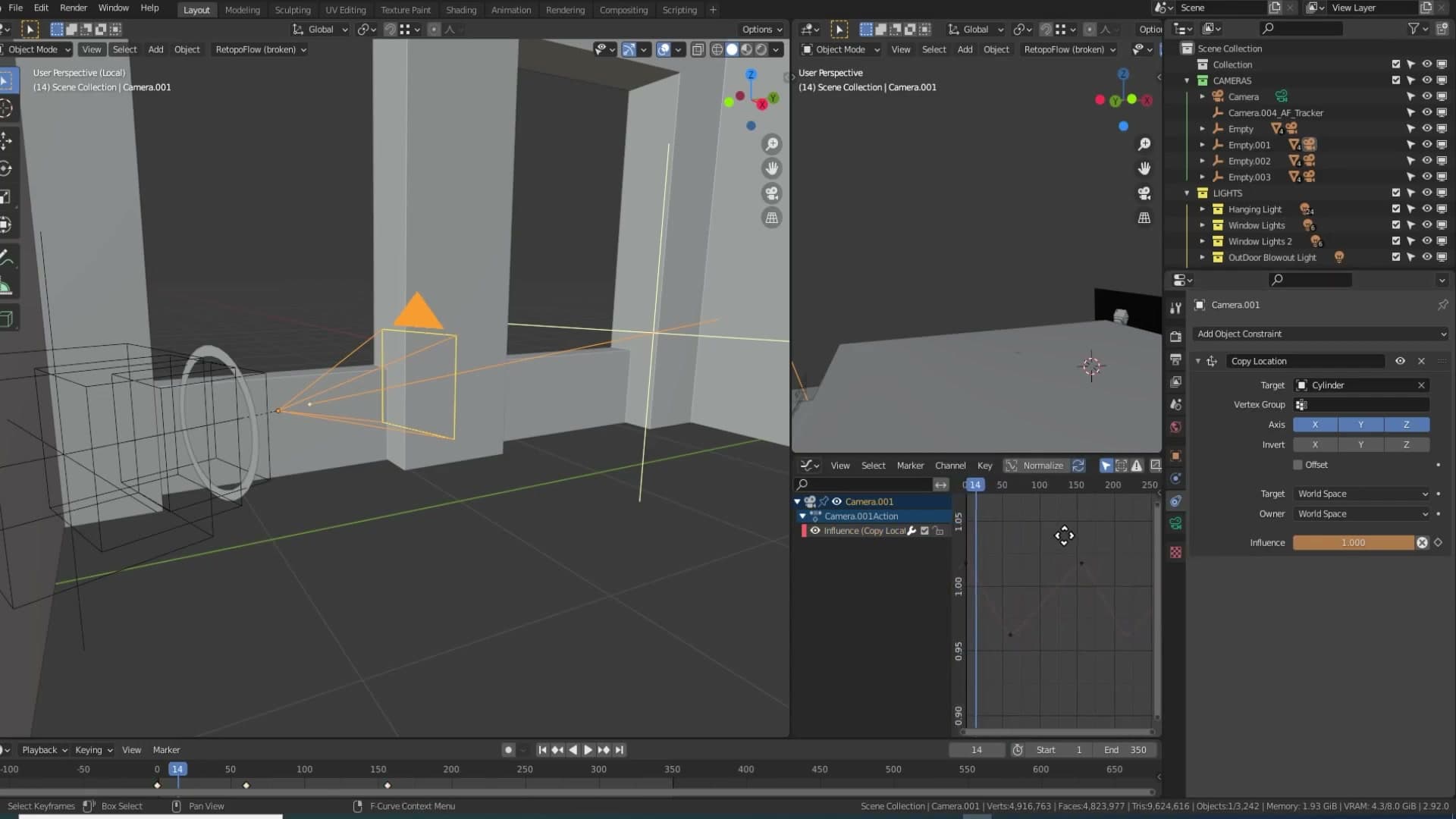
To make the follow-then-release behaviour feel organic, I don't keyframe the influence by hand. Open the Graph Editor, select the influence channel, and add an F-Curve modifier so the value oscillates between strong and weak over time. The viewport result is a camera that almost tracks the cylinder, drifts off, then catches it again. Same rhythm as a person taking steps.
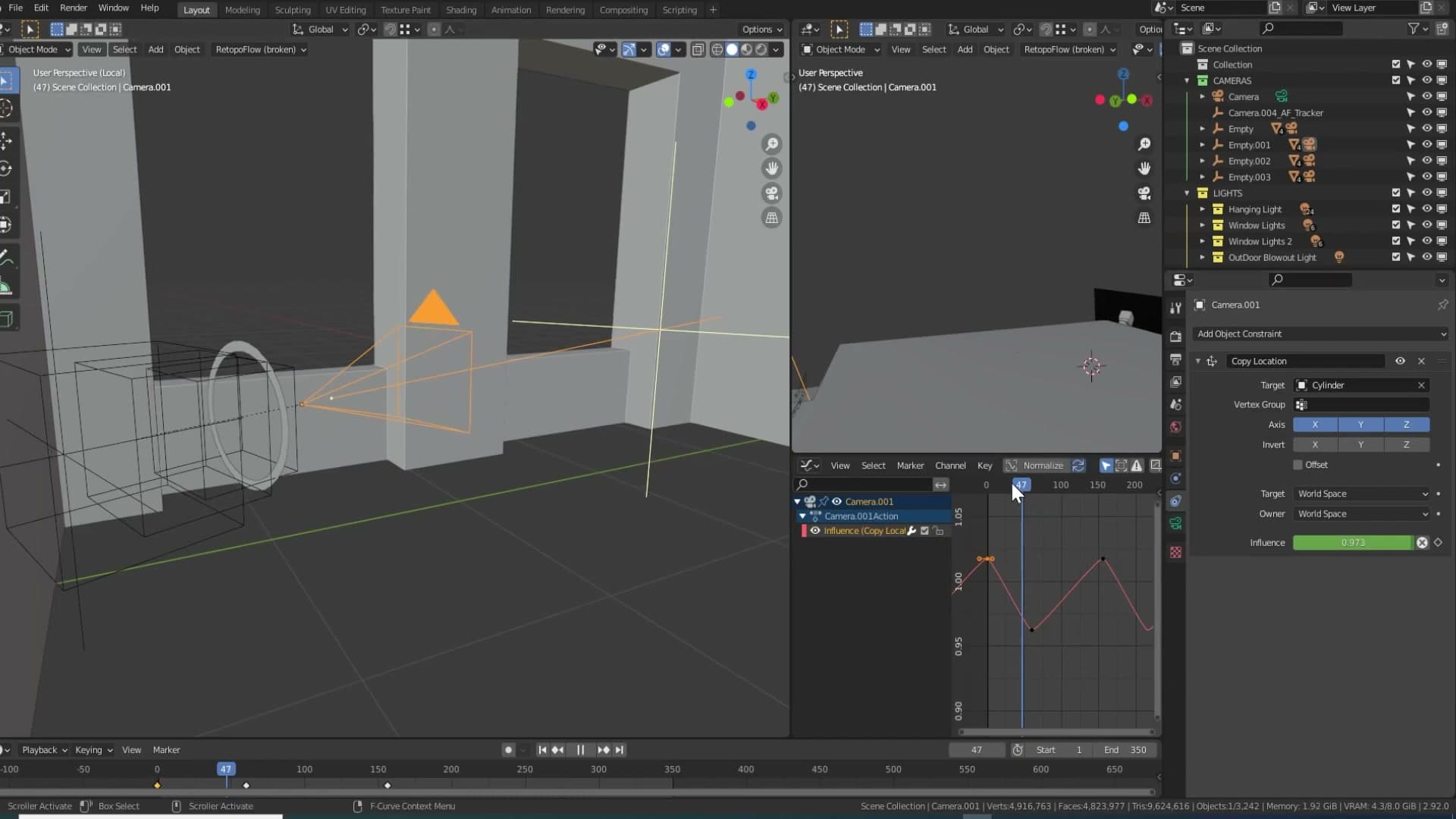
The single most important thing here is restraint. Cranked up, the influence makes the camera lurch around like someone running rather than walking. I found a strong value felt technically correct (it did read as footfalls) but wrong for the mood of the shot, so I pulled the curve almost flat. A little of this trick goes a long way.
Parenting the whole rig to a master empty
With the rig working, the final step is to parent every empty in the chain to one extra master empty sitting above everything else. The master exists for a single purpose: to let you move the entire animation as one object without disturbing any of the underlying keyframes.
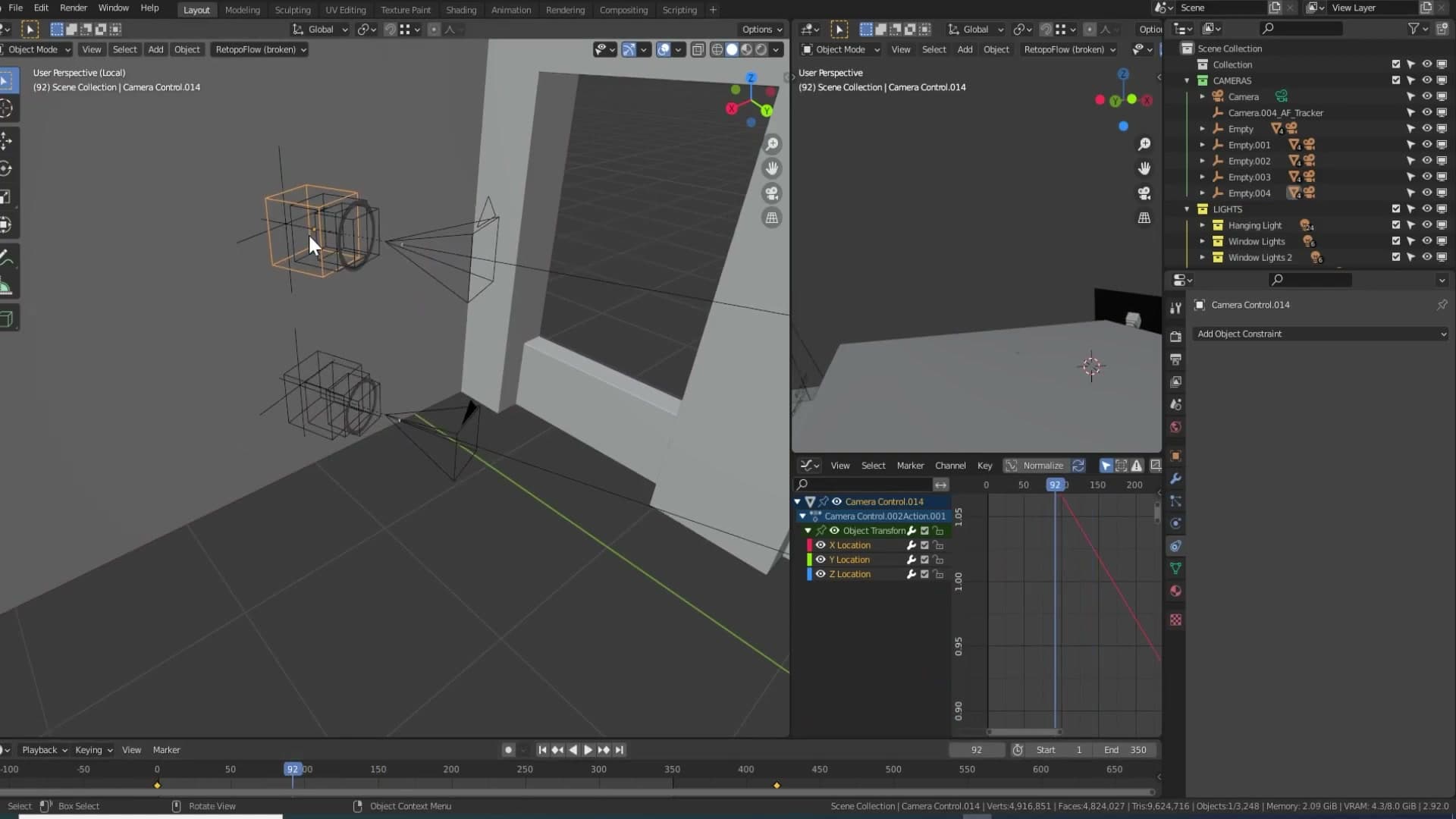
Why bother? Two reasons. First, the rig can be duplicated cleanly: drag a copy of the master and you have an identical walking camera ready to point at a different part of the room. Second, if mid-project you decide the shot should start two metres further to the left, you grab the master, slide it across, and every keyframe travels with it. The animation stays local to the parent rather than baked into world space.
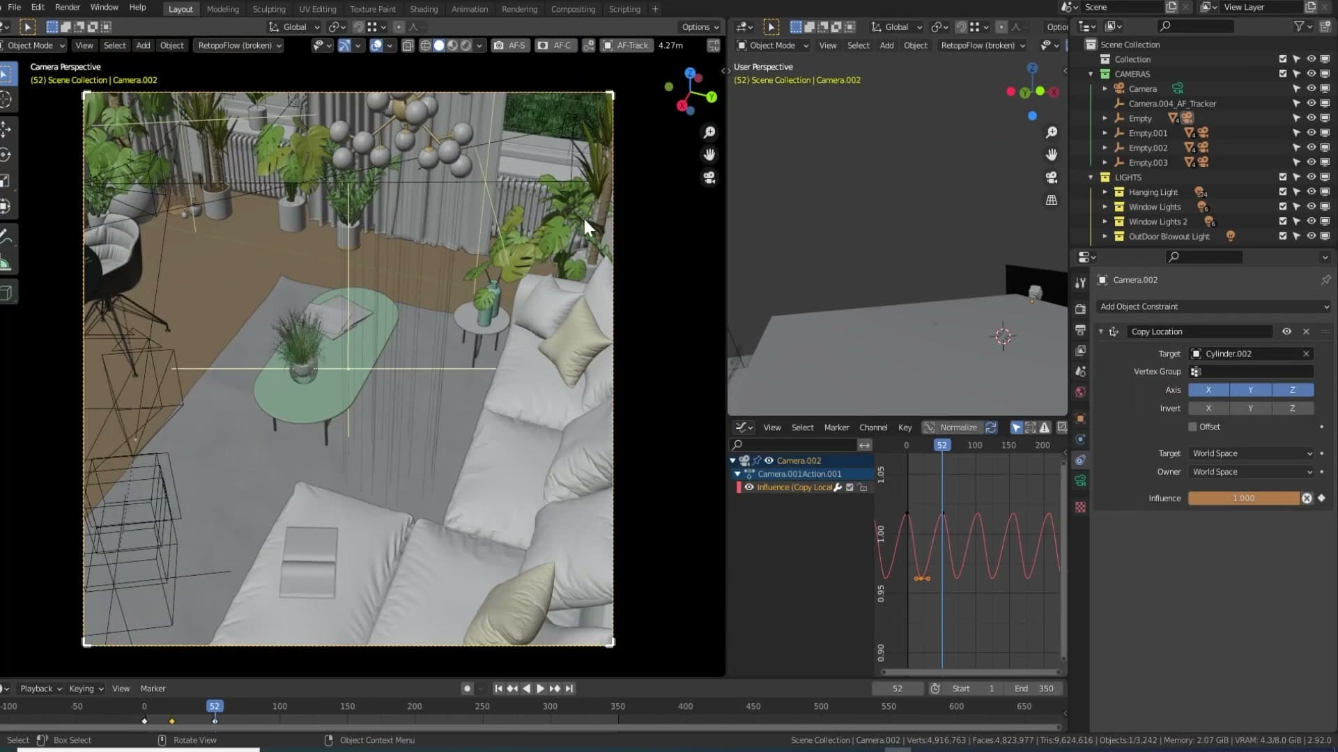
Not every shot in the final animation uses the full rig. A second camera, the one looking down from near the ceiling, runs on a stripped-back version with fewer empties. The reasoning is practical rather than technical: nobody walks across a room with a camera mounted at ceiling height, so a handheld wobble up there would read as fake. That camera moves along a simpler, smoother path instead.
Multi-pane window lighting for realistic shadow stacking
Inspired by an old bedroom photo, I set up one area light per window pane, each pointed at a slightly different angle so the wall picks up the soft, layered shadow refraction real old glass produces. A single HDR cannot fake this effect.
Six area lights, one per window pane
Open the window-side of the scene and you'll find something a little unusual: six area lights distributed across the window geometry, each rotated to face in a slightly different direction. Most archviz scenes solve daylight with a single sun lamp or an HDR, so the arrangement looks fussy at first glance. It's there for a specific reason.
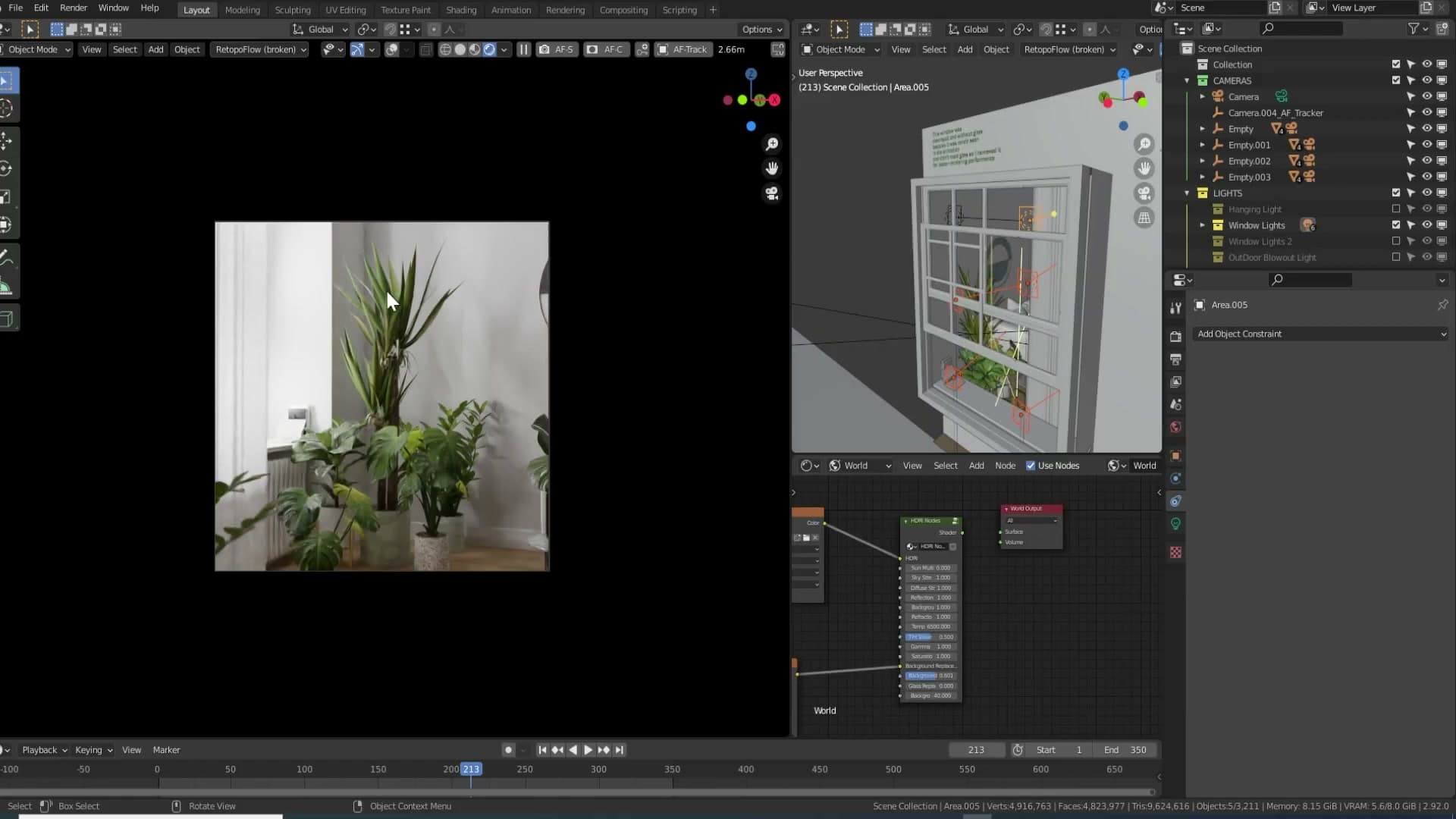
The inspiration came from an old photograph of my bedroom. That room had a yucca plant standing in front of a multi-pane window, and the shadow cast on the wall behind it was unmistakably split into five or six overlapping shapes, despite there being only one window. Old pane glass isn't optically flat. Each pane refracts daylight at its own slight angle, so a single source of light arrives at the wall as several gently offset copies of itself. A single sun lamp or HDR collapses all of that into one clean shadow, which is why those setups can never quite match the look of a real period window.

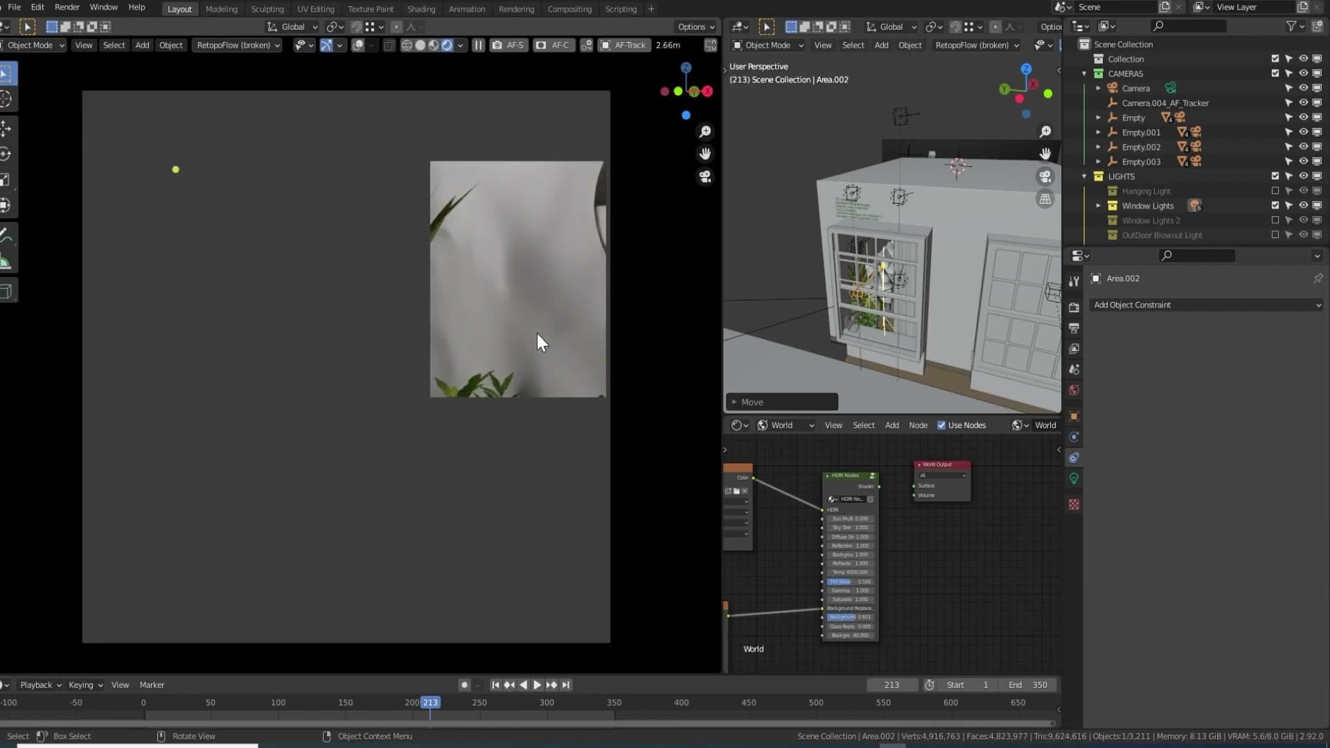
To rebuild the effect, start with just one area light positioned in front of one pane. A single clean shadow falls on the wall behind the plant. Bring in the second light, point it at a marginally different angle, and a second shadow appears alongside the first. Each additional light contributes its own angle of attack, and the wall slowly builds up the layered, slightly fragmented shadow pattern the reference photo captured.
Why varied angles create realistic stacked shadows
Repeat the process across the rest of the panes and the wall picks up a soft, stacked variation of shadows that a uniform light source flattens out. In the viewport preview the effect is barely visible, easy to talk yourself out of, but it survives into the final render as a gentle layered drift. The yucca itself helps a lot here: the leaves throw plenty of shadow detail of their own, and the per-light angle variation adds just enough wobble to stop the overall pattern from feeling stamped or repeated.
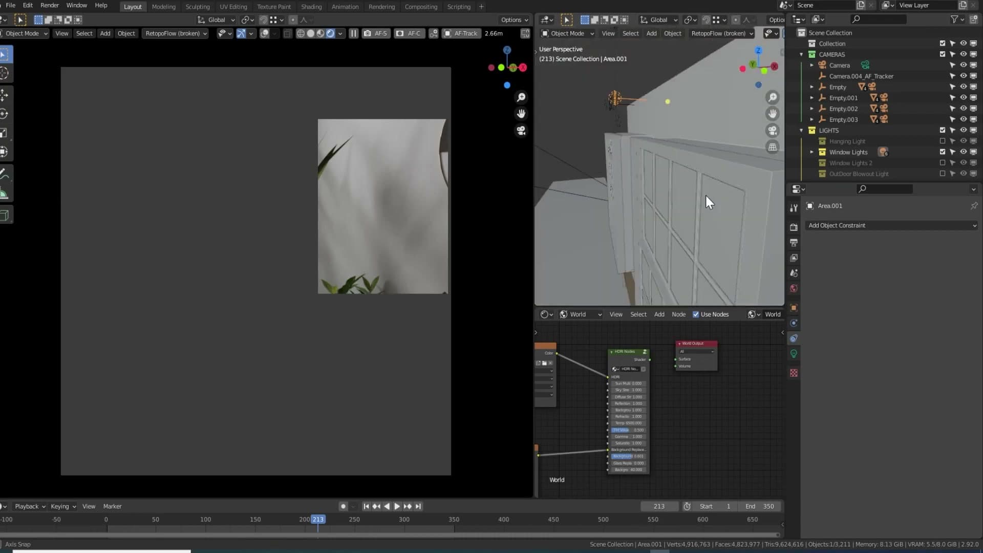
There are a couple of honest compromises behind the scenes. The lights don't actually line up one-to-one with the visible panes. They're roughly in the right region rather than measured to each frame. One pane is missing from the geometry entirely because nothing in the animation ever needed to see it, and a section of the muntin (the wooden strips between the panes) was deleted because it sat directly in the path of one of the original lights. Both pieces hide behind the curtain, so the cut never reads on screen.
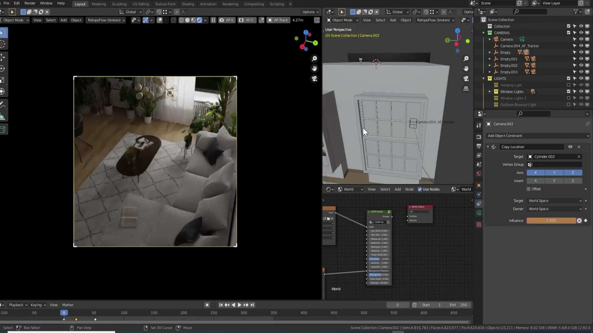
The glass itself was also tuned for speed. Behind the curtains the glass pane was removed outright. On the visible side it stays in, but its ray-visibility flags are dialled down: Transmission stays on so light still refracts through it correctly, and Camera is turned off so primary camera rays skip the panel entirely. I toggled this per shot during the animation. Some frames needed the glass visible to camera, others didn't, and hiding it from camera shaved time off the render whenever it could be afforded.
Outdoor light without HDR overexposure
Bumping the HDR strength high enough to light the interior blows out the exterior view. The solution: a custom grass plane and a single strong area light replace the HDR backdrop, with the Photographer add-on keeping the growing light list under control.
Managing many lights with the Photographer add-on
Before getting to the outdoor light itself, it's worth a side tangent on the add-on that made juggling everything in this scene bearable. The Photographer add-on scans your scene for collections that contain lights and lists each one in its own panel. Any collection holding lights shows up with a toggle, so flipping the entire outdoor rig off and on is a single click rather than a hunt through the outliner.
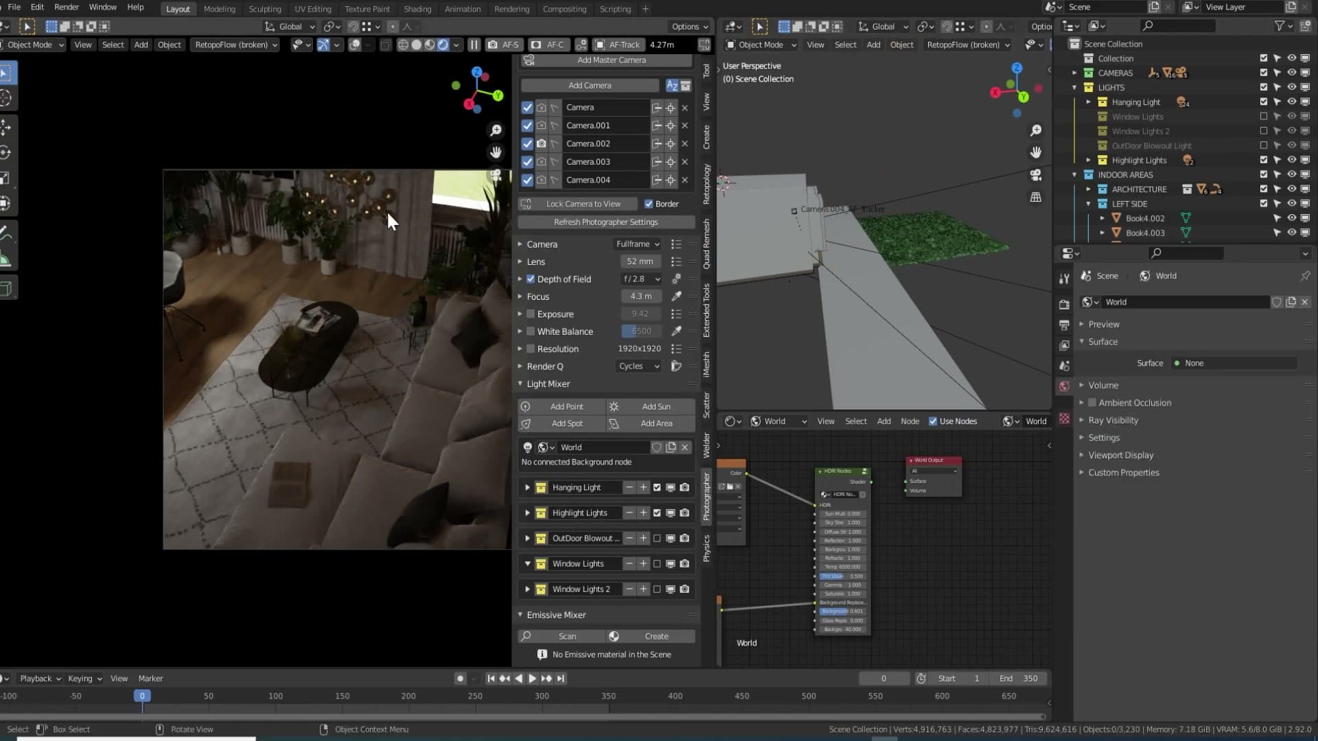
The frustration this solves came up in an earlier iMeshh video comparing 3ds Max and Blender. The complaint there was that Blender lights don't have a dedicated on/off switch the way Max lights do. The comments correctly pointed out you can disable a light from the outliner, and that is true, but disabling it that way hides the light entirely. You lose the visual cue that it was ever in the scene, and in a project with hundreds of fixtures it becomes a chore to remember which one needs switching back on.
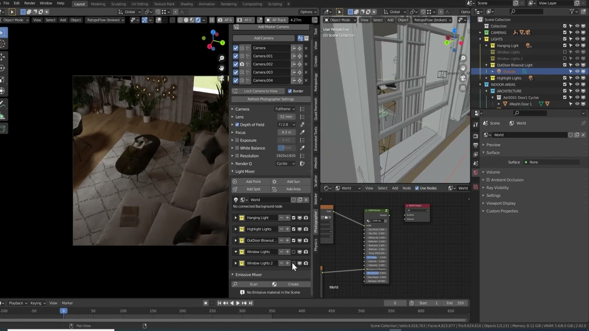
In 3ds Max the equivalent toggle leaves the light sitting visibly in the viewport, just switched off. You can see it's there, you don't forget about it, and you flip it back on when you need it. Photographer is the closest thing in Blender: each light collection stays on the panel whether it's contributing or not, so a quick scan tells you exactly what's live and what's parked.
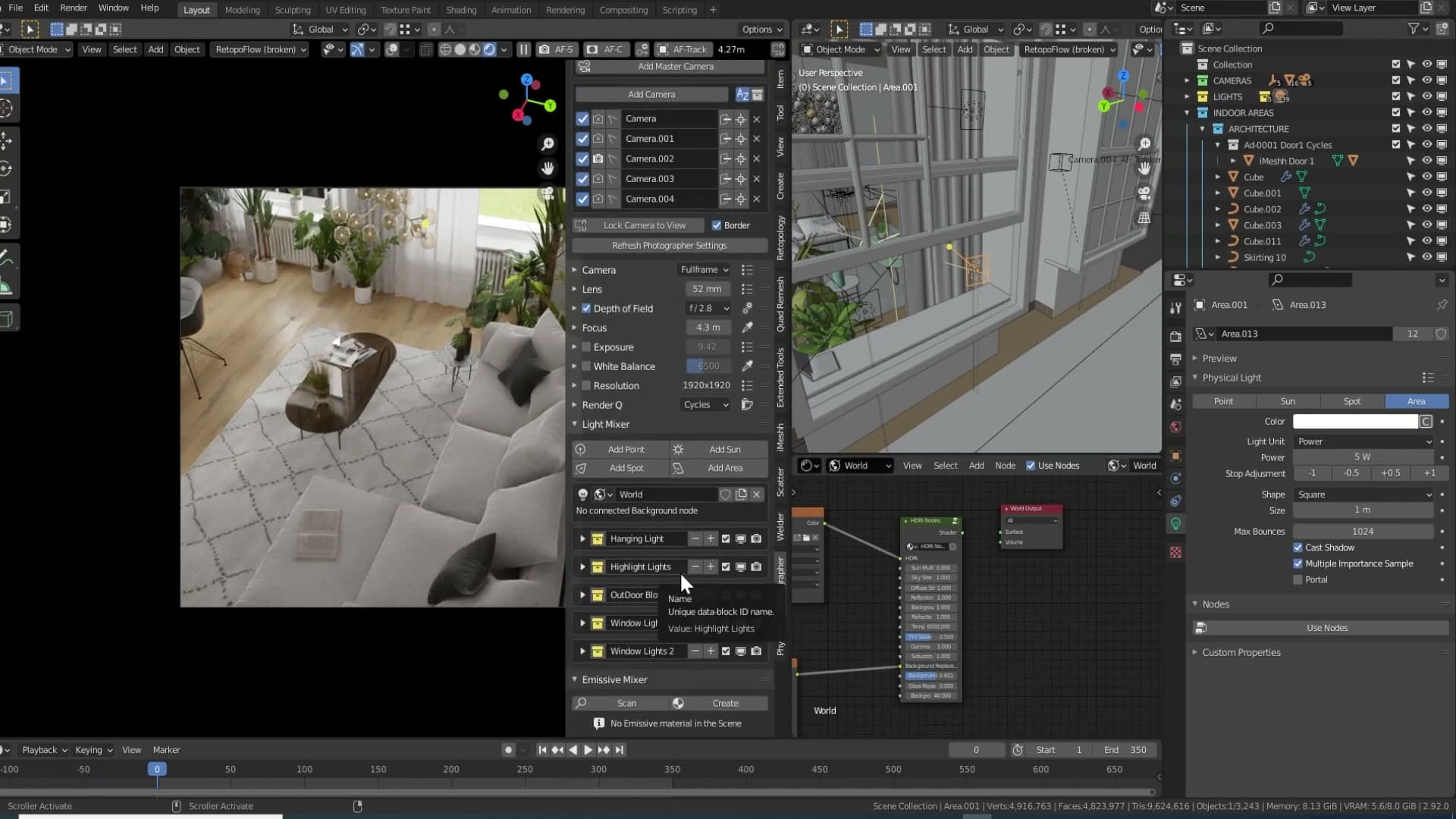
Around the time of the previous Max-versus-Blender video, Photographer pushed an update that surfaces every light collection in the panel at once. That single change is what makes it usable on a heavy scene. You can be working anywhere in the viewport, glance at the Photographer panel, and find the lighting layer you want without digging. I used it a lot during this animation and it's worth installing if your scenes routinely run dozens of lights deep.
Replacing the HDR background with a custom outdoor light and grass
Back to the outdoor light, and the reason it's so big and so bright. The usual approach to lighting an interior in Cycles is to let a strong HDR provide both the sky and the bounce that fills the room. The problem with that approach in this scene is the strength the HDR needs to reach before the indoor area is properly lit. Turn off every other light and crank the HDR up to roughly 15 and the inside finally reads. But the grass and the rest of the exterior view are now completely blown out.
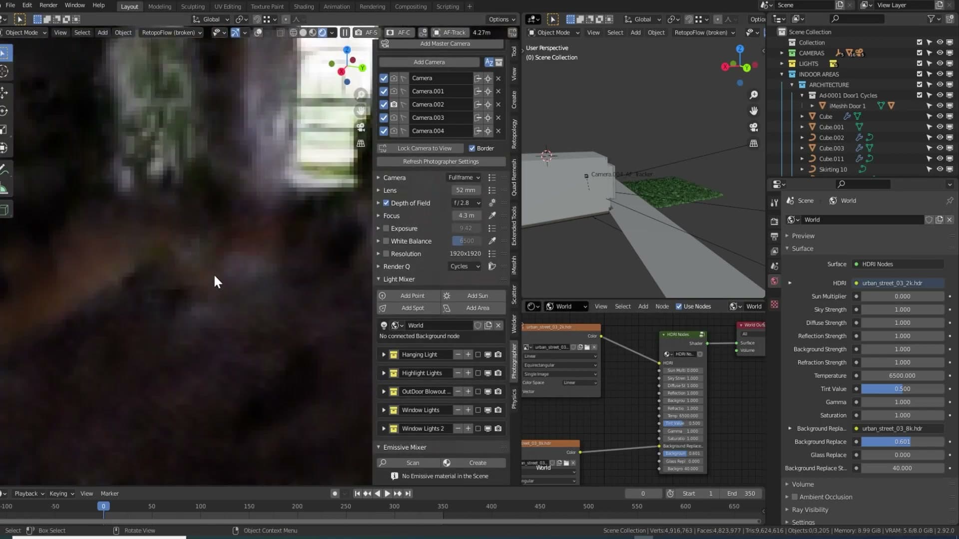
That overexposed-exterior look isn't necessarily wrong. If you photograph a room from the inside, the windows naturally clip. The indoor area lands at a sensible exposure and the outside takes the hit. So the brightness behaviour is realistic. The issue here is that the HDR's own ground texture is doing the heavy lifting for the view through the windows, and the look of that HDR ground didn't fit the scene.
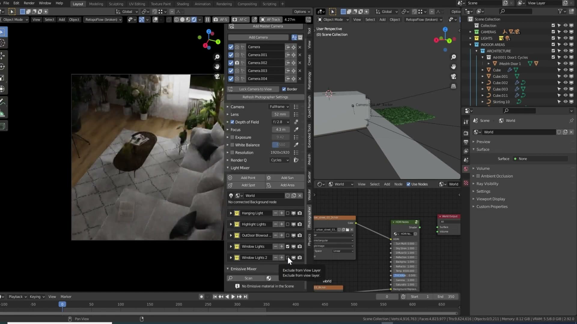
The fix was to swap the HDR's contribution to the visible exterior for something authored. A simple outdoor floor was thrown together with a custom grass material, so the view through the windows is driven by geometry you control rather than by whatever the HDR happens to show. Once the grass plane took over the foreground, the HDR no longer needed to be cranked to 15 just to look right outside, and the indoor lighting could be handled by the area lights covered in the previous module.
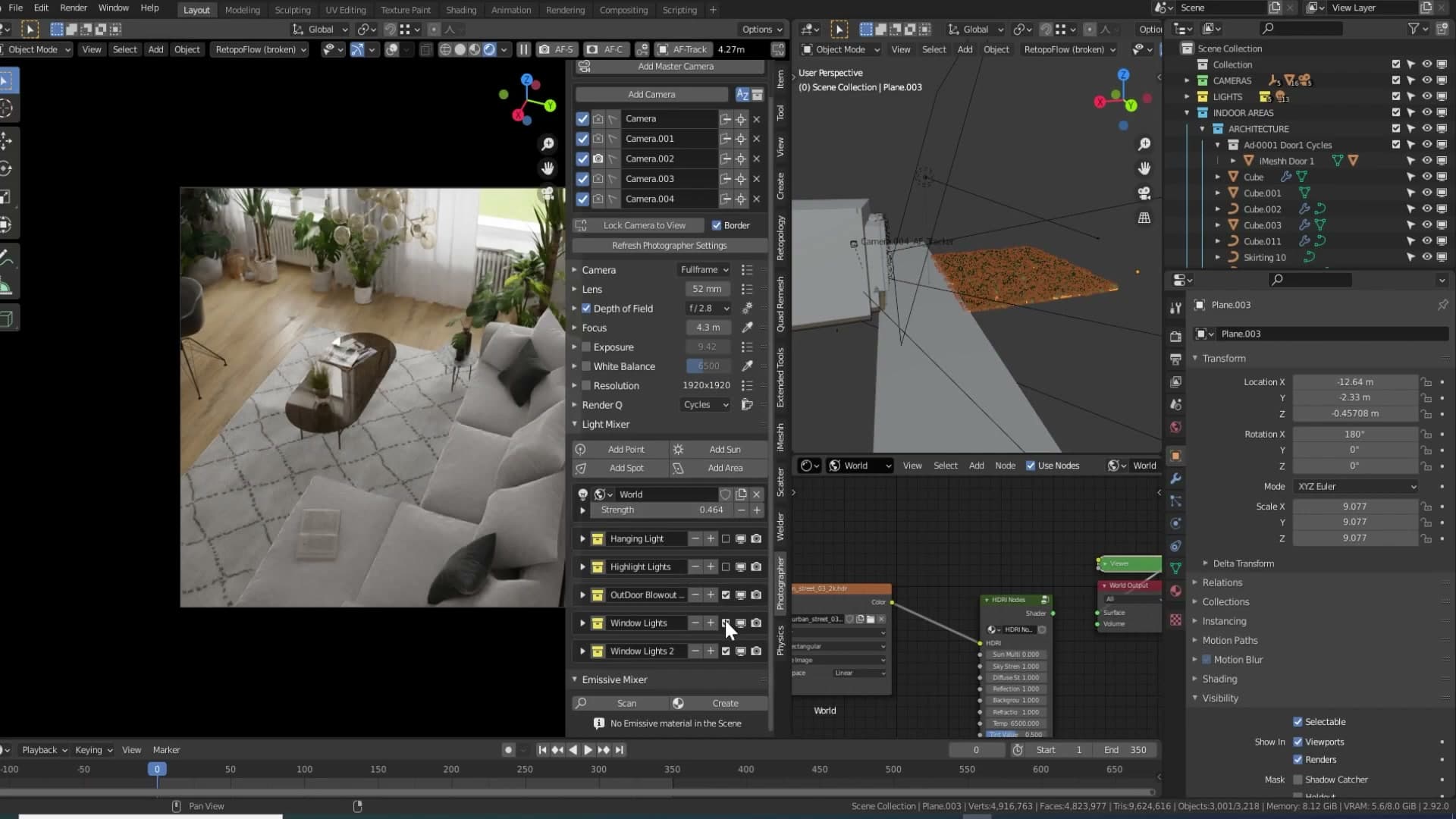
To replace the indoor lift the over-bright HDR used to give, one strong area light was added pointing into the room. On its own the result reads very close to how the cranked HDR did. The interior is lit, the exterior remains plausibly bright, and the soft window shadows from module 2 still do their job.
There was one wrinkle. With ray visibility left at its defaults, that big outdoor light was throwing a lot of indirect noise into the scene as it bounced off the grass plane and back through the windows. The plane was only meant to be seen, not to act as a bounce surface. Switching its object visibility so it no longer contributes to lighting kills the noise immediately. The grass still renders to camera, but it stops feeding rays back into the room.
Hanging bulb noise reduction with the Ray Length trick
The cluster of glass bulbs visually anchors the scene but dumps speckly indirect noise everywhere. Plugging Ray Length into Emission Strength preserves the bulb glow while drastically reducing the noise the bulbs throw into the rest of the room.
The indirect noise problem with bright emission bulbs
The hanging fixture above the dining area is an iMeshh asset, a cluster of glass bulbs suspended from the ceiling. Open it up and you'll see that every single bulb has its own emission light tucked inside the glass. Visually it sells the fixture beautifully: each bulb reads as switched on, and the cluster anchors the eye in the room.
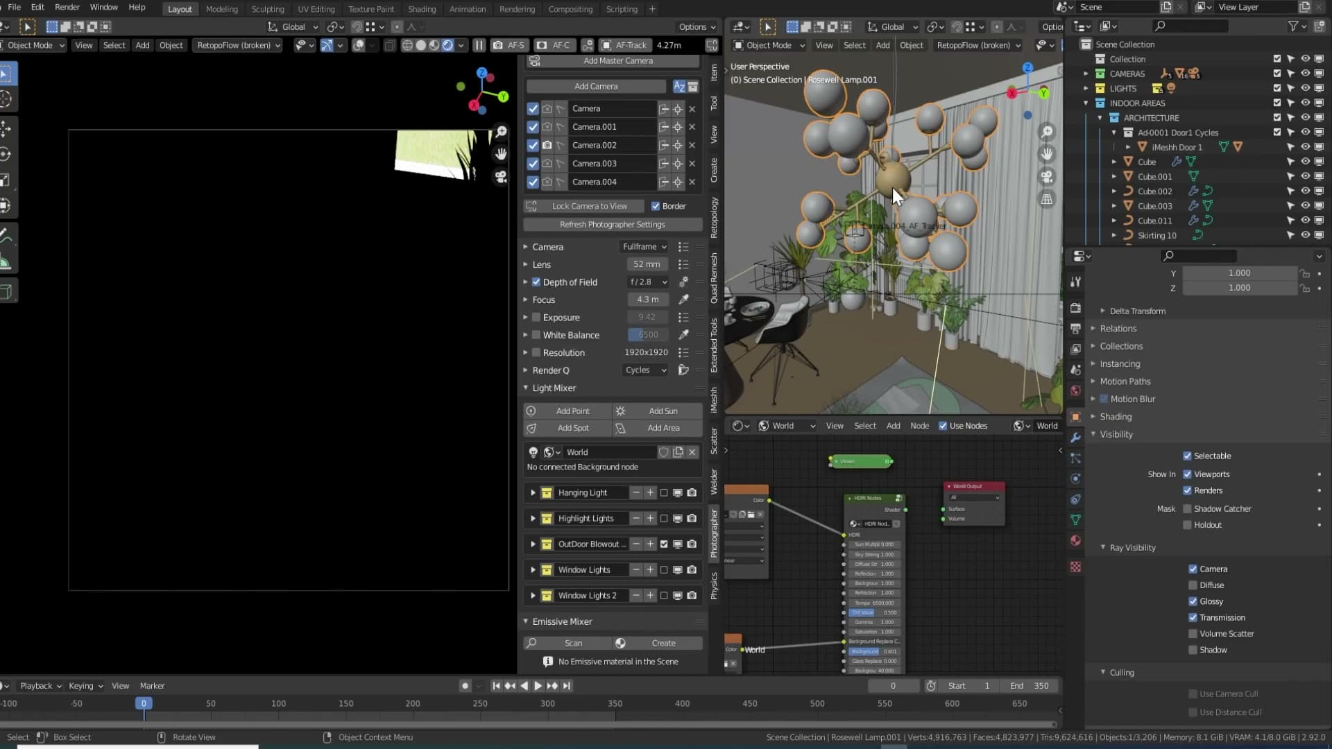
The trouble only shows up once you start rendering. Because every bulb is a small, bright emitter, the indirect light they throw around the room turns into a speckled mess across the surfaces nearby. Toggle the bulbs on and you can watch the surrounding walls and the table fill up with the kind of fine, granular diffuse noise that a denoiser will fight all night.
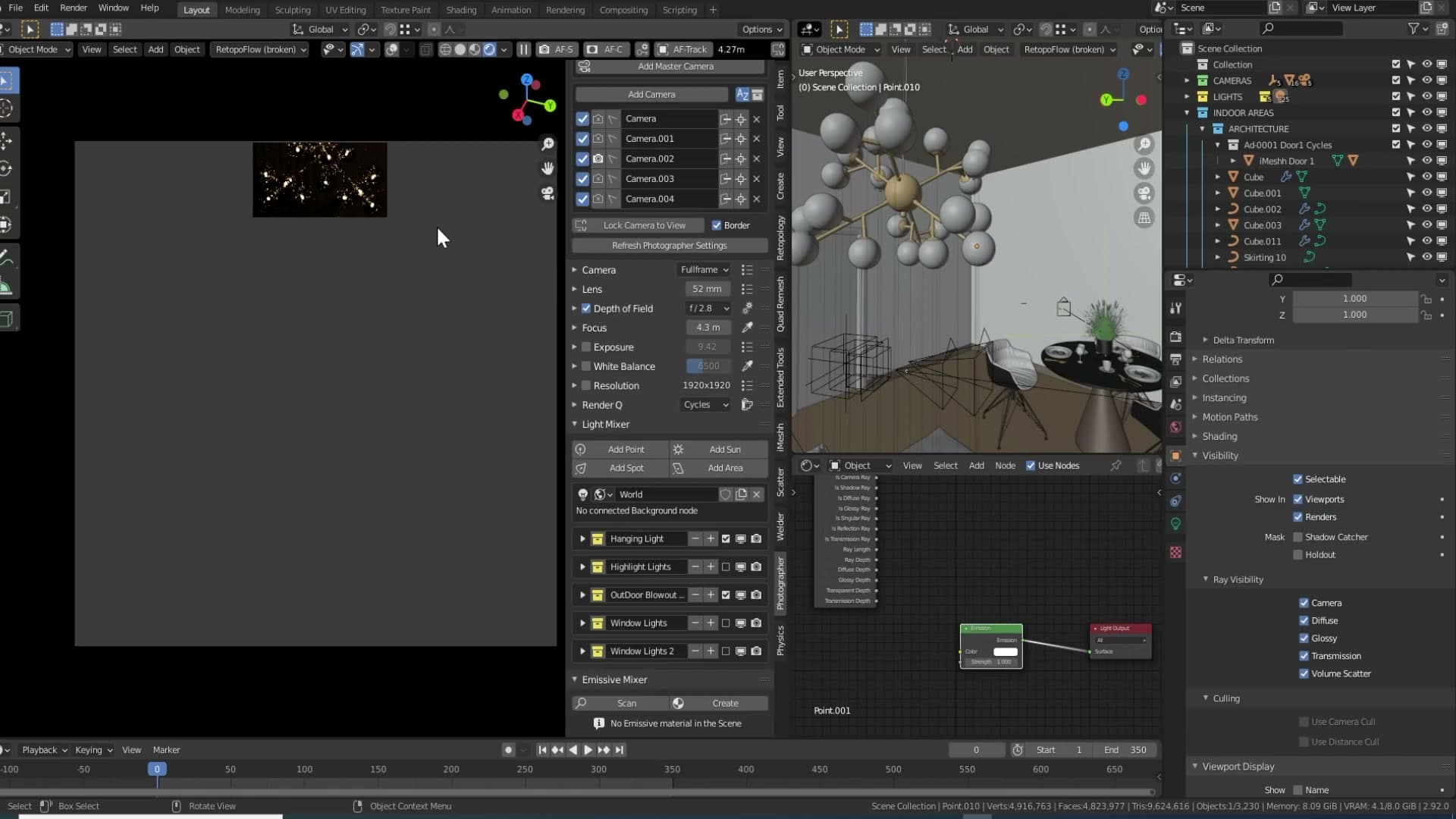
Crucially, those bulbs were never meant to be the room's primary light source. The window area lights from the previous module are already doing the heavy lifting; the hanging fixture is there to look on, not to illuminate. Every speckle the bulbs contribute is completely unnecessary noise.
Plugging Ray Length into Strength
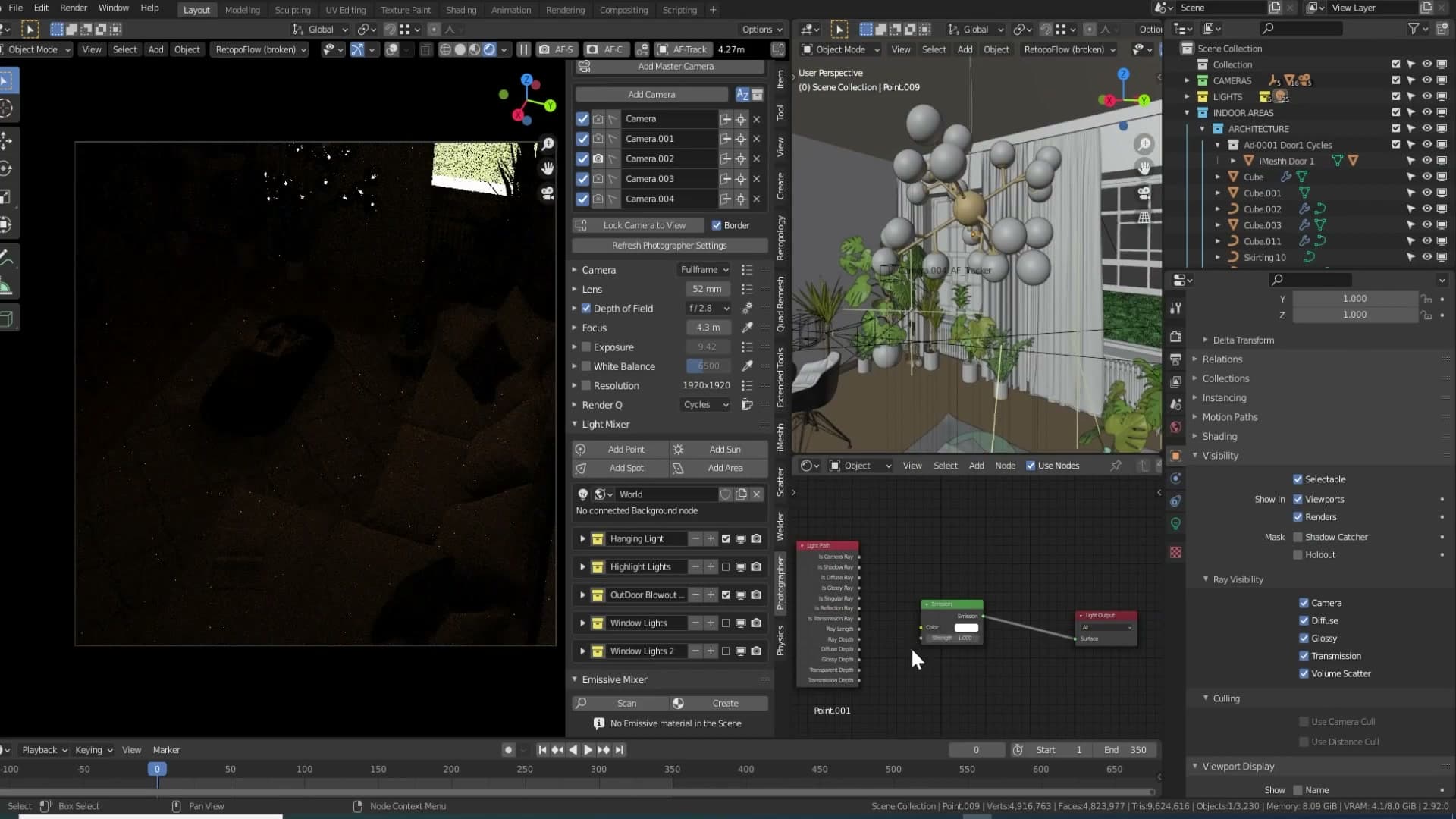
The fix is a single connection in the shader graph. On the emission shader driving each bulb, plug the Ray Length output of a Light Path node straight into the Strength input of the emission.
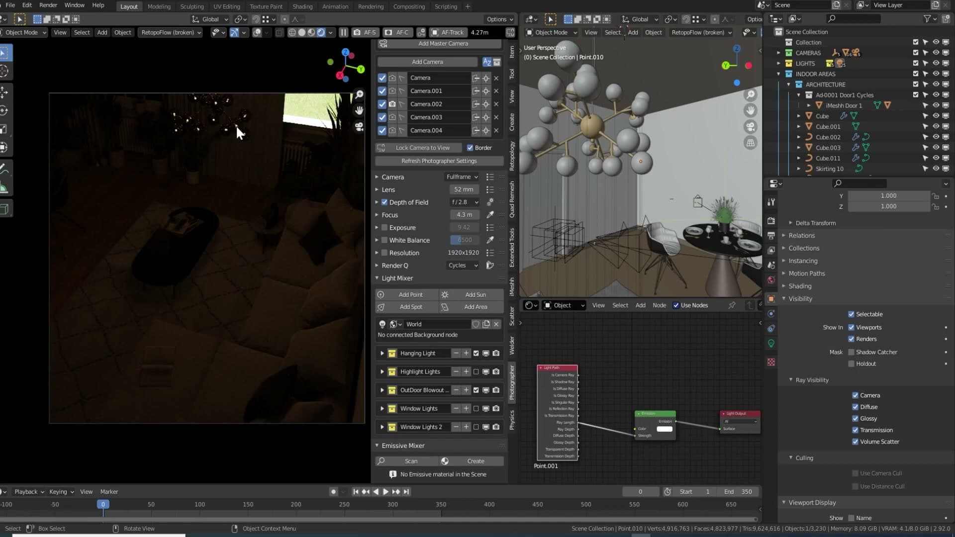
Ray Length is the distance a ray has travelled before it hits the surface. For a camera ray landing directly on the bulb, that distance is short, so the bulb still reads as a bright, glowing element in the frame. For an indirect ray that has already bounced off a wall or the table before arriving at the bulb, the travelled distance is much larger, and routing that into Strength suppresses the bulb's contribution back into the scene. The result is that the bulb still looks lit to the camera but stops flooding the room with secondary noise.
Re-render the scene with that one change in place and the speckled mess across the surrounding surfaces is essentially gone. The bulbs still glow, the room still reads as lit by the same fixture, and the window light continues to do the actual work of filling the space. I was genuinely surprised at how cleanly such a small node connection solved the problem.
The deeper frustration sits where most Cycles users' does: nearly every other major renderer ships an include/exclude feature that lets a light contribute only to specific objects, which would solve this whole category of problem outright. Until Blender adds it, the Ray Length trick is the cleanest workaround for emitters you want to look bright without actually lighting much.
Accent table and sofa lights for moody alternatives
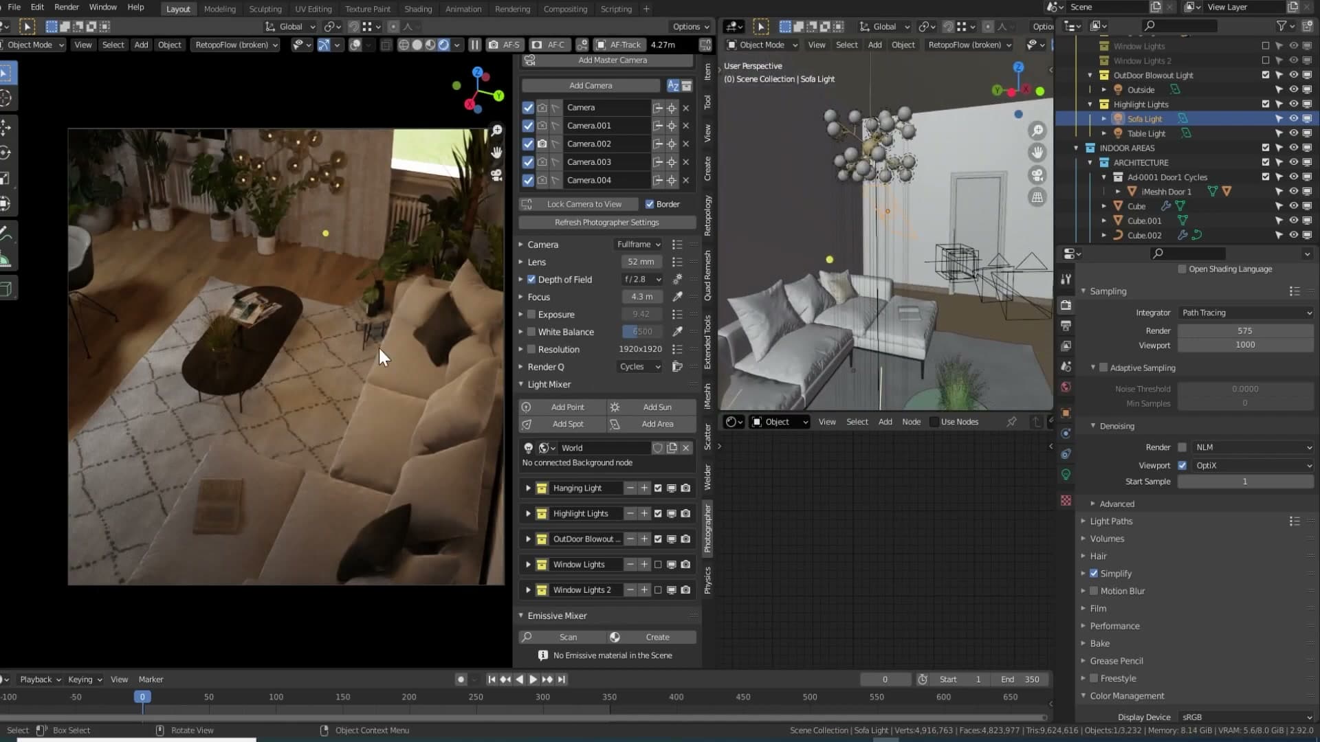
A couple of extra lights live in the scene as moody alternatives rather than animation lights. They aren't needed for the main camera move, but they're worth knowing about if you reuse the file for stills. The first set sits above the table, a small accent rig that drops a pool of warmer highlight onto the surface. I tested them for a few still renders, didn't end up keeping them in the final animation, but left them in the file so they're a single click away if you want that kind of focused tabletop glow.
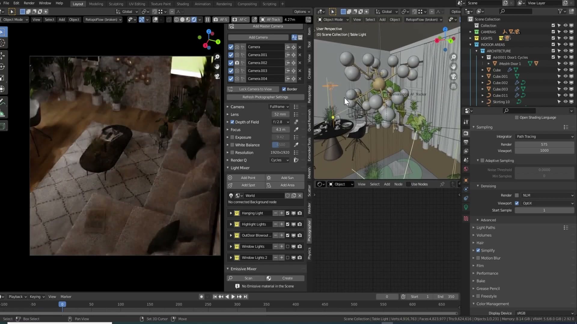
The second is a sofa light, positioned to emulate the look of the hanging fixture actually casting light down onto the couch. With the outdoor area lights from module 3 turned off, this one carries the whole shot and the scene shifts into a convincing night-time mood. Same set dressing, completely different feel. It's a useful reminder that once you've built one lighting setup, you can usually pull two or three different shots out of the same file just by enabling different subsets of the lights.
Denoising stills at 200% scale
Because Cycles' AI denoiser was trained on 4K data, it reconstructs detail far better from higher-resolution noise. Rendering at 200% and dropping samples by four produces a cleaner image in the same total render time.
Why AI denoisers reward higher resolutions
Lighting was the slow part. Denoising is where the maths gets interesting. Modern Cycles denoisers are AI models, and like any AI they only know what they were trained on. The current generation was trained predominantly on high-resolution imagery, around 4K. Feed it something smaller and it has less detail to reconstruct from, so the result looks softer and noisier than it needs to.
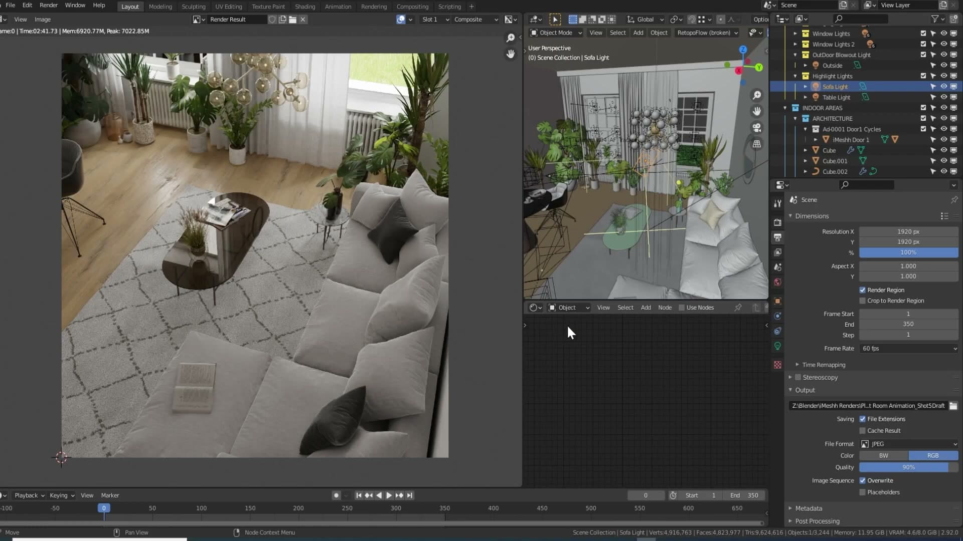
The fix sounds counter-intuitive: render bigger. If you push the resolution to 200%, you give the denoiser the kind of input it was trained on, and it returns far more detail when the image is scaled back down for delivery.
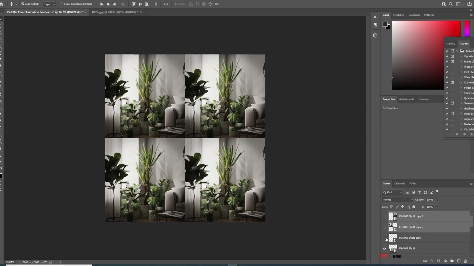
The obvious problem is render time. Doubling the resolution doesn't double the work. It quadruples it. You're multiplying by two on the horizontal axis and two on the vertical, so a 200% render is four times as many pixels and, naively, four times the render time.
200% render with a quarter of the samples
The trick that makes this practical is to cancel out the extra pixels with fewer samples. Take whatever sample count you'd normally use, divide it by four, and the total render time lands right back where you started. The denoiser now has a 4K-scale image to work from instead of a 1080p one.
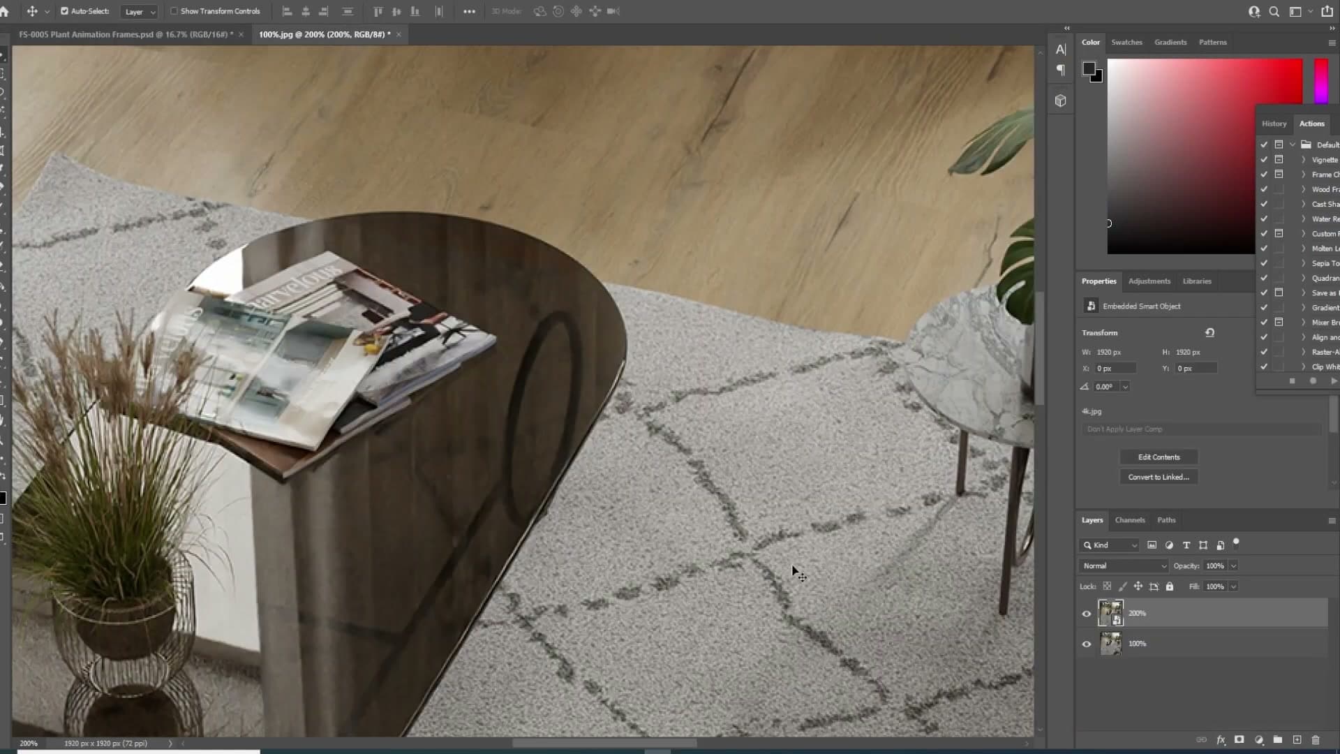
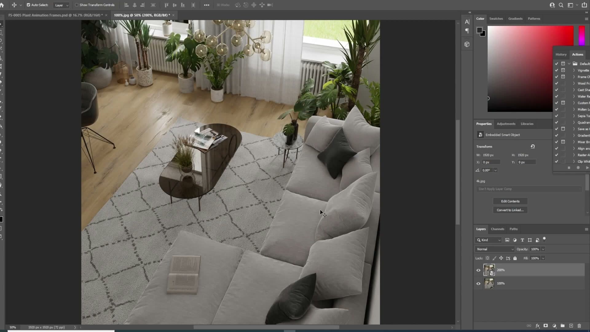
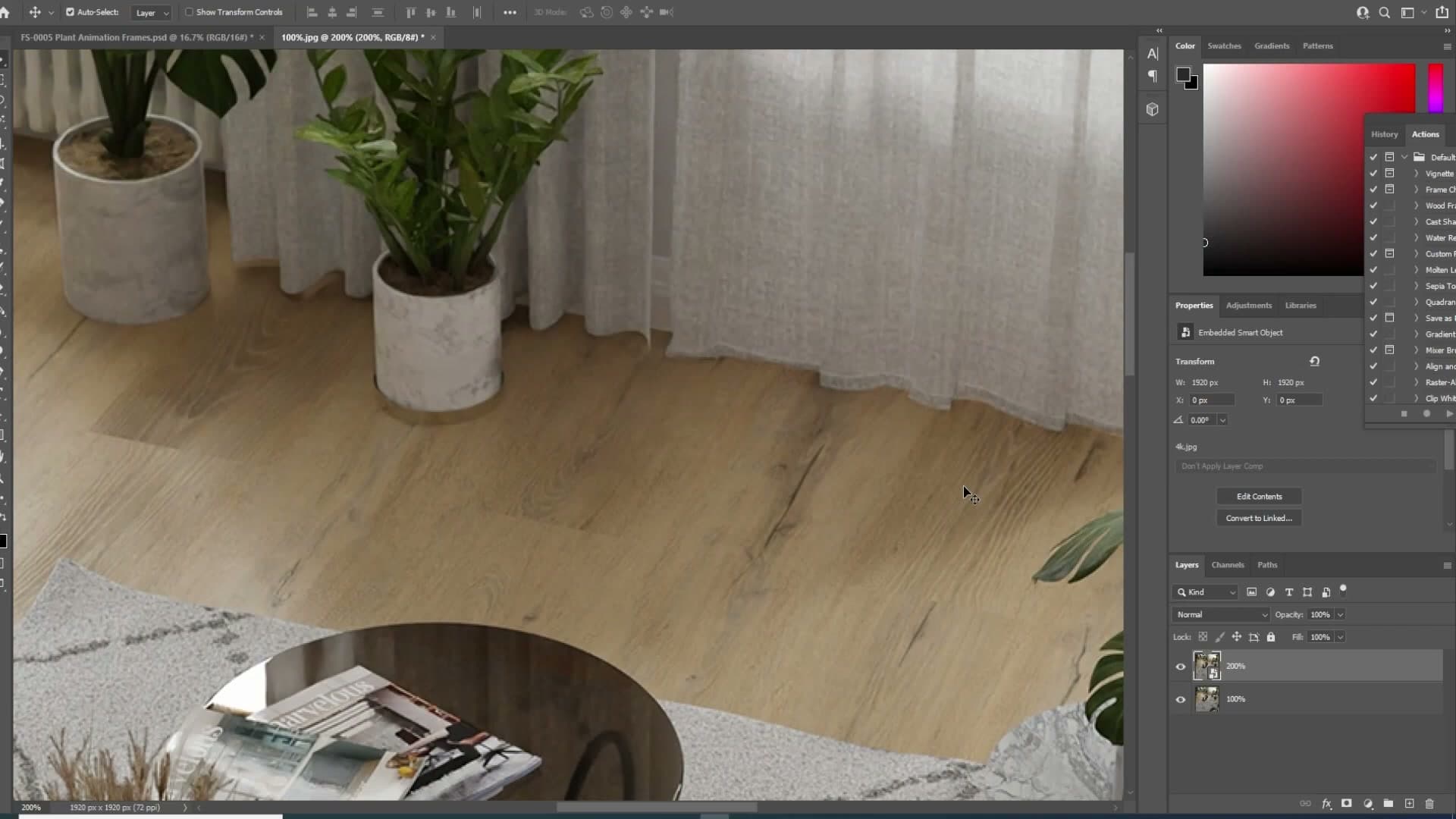
You can see the result in a side-by-side render: slot one is the 4K image at full samples, slot two is the 200% version at quarter samples. Render times come out roughly the same (the 200% pass takes a touch longer because the denoising step itself scales with pixel count) but the detail recovered in the 200% version is noticeably crisper once it's compressed back down.
That comparison is why every still these days starts at 1920×1920 as the base resolution. The workflow is to find the sample count that keeps the base render relatively clean, then flip the Resolution Scale to 200% and quarter the samples. With this scene, that worked out to around 20 samples. At 10 samples you can still see noise lines creeping in along the edges, but 20 was enough to land a clean image.
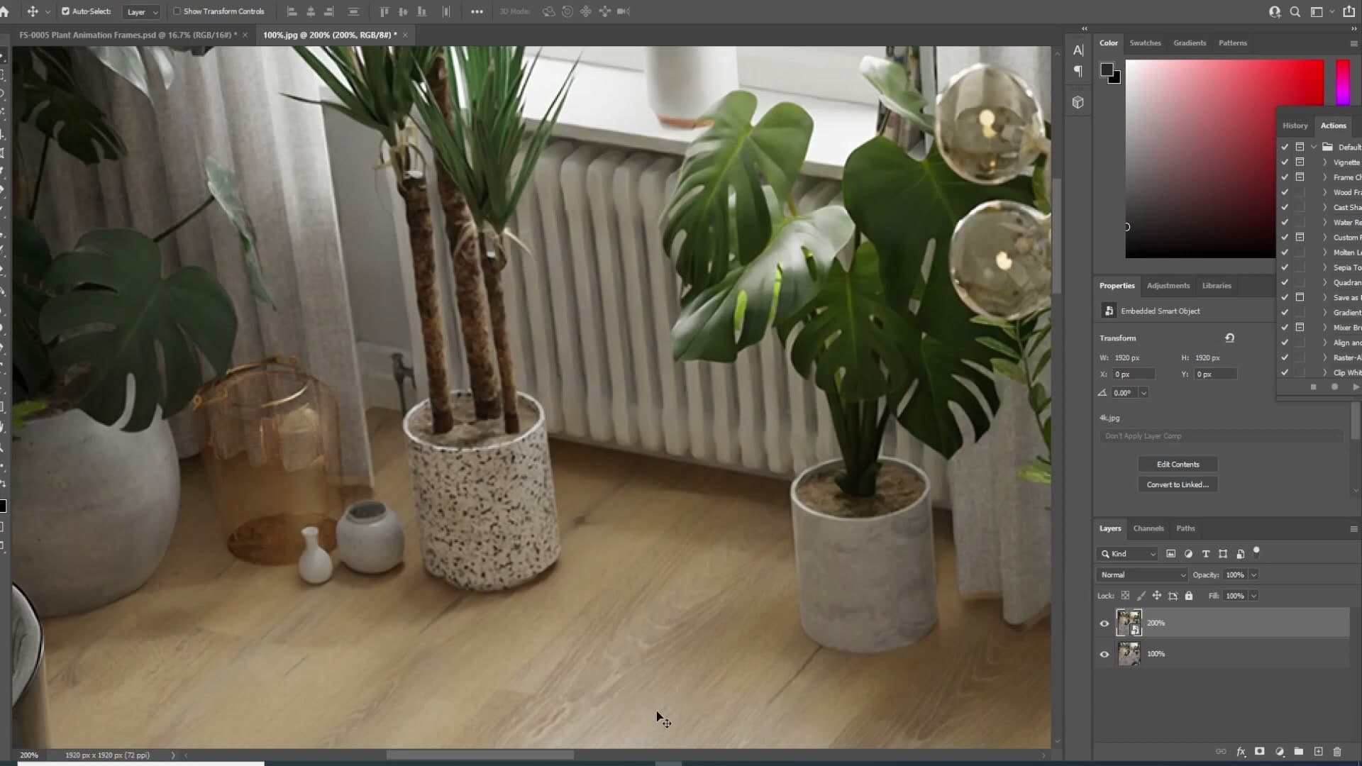
For stills, this is genuinely transformative. You're getting a render that looks like it had four times the samples thrown at it, for the same wall-clock time. There is one catch, and it's a big one: this approach doesn't survive the jump to animation, which is where the next section comes in.
Why animations need the opposite approach
The 200% trick that works wonders for stills falls apart in animation: the denoiser hallucinates detail differently per frame, causing edges and veins to crawl. Dropping the resolution and increasing samples gives the denoiser a cleaner input and stable output frame-to-frame.
RenderStreet whole-month package for affordable animation
Renting render time was the only way this animation was going to happen at home, and RenderStreet's whole-month package was the closest fit. You pay a set fee per month and get a set allocation of nodes and frame time, which makes budgeting a long animation much more predictable than ad-hoc per-frame pricing.
On the tier used here, frames were capped at roughly one hour each and rendering was CPU-only, which is the slower of the two options but the only one available on that plan. Paying a little more per month bought a little more headroom, and the headroom mattered because this shot had heavy translucency, subsurface scattering and stacked light sources. Those are exactly the ingredients that punish low sample counts.
The numbers landed almost on the edge. Each frame came out at about 58 minutes, just inside the one-hour ceiling, so the animation finished without any frames being killed by the time limit. There's no slack in that figure. Push the scene any harder and the next frame would have been thrown away.
How temporal noise causes edge crawl between frames
The first version of the animation was rendered at 4K with the sample count pushed down to fit the one-hour budget, somewhere around 130 samples per frame. As a still it looked great: zoom to 100%, every detail reads, the denoiser has done its job. Switching to a still-image mindset, you'd ship it.
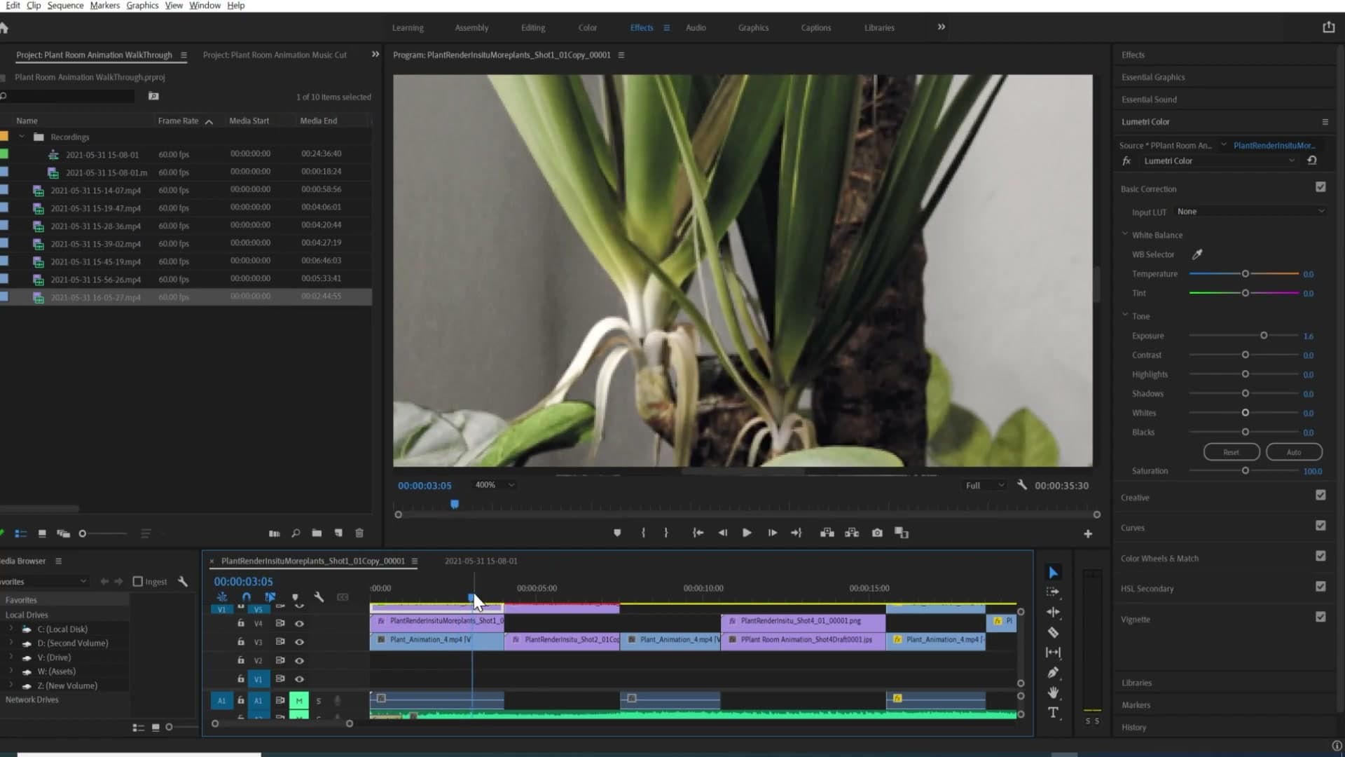
Scrubbing the timeline at 400% zoom told a different story. Every edge in the scene was jittering frame to frame, not a smooth shimmer but more like the geometry itself was rearranging slightly between exposures. Plant edges, window mullions, fine trim. All of it was crawling.
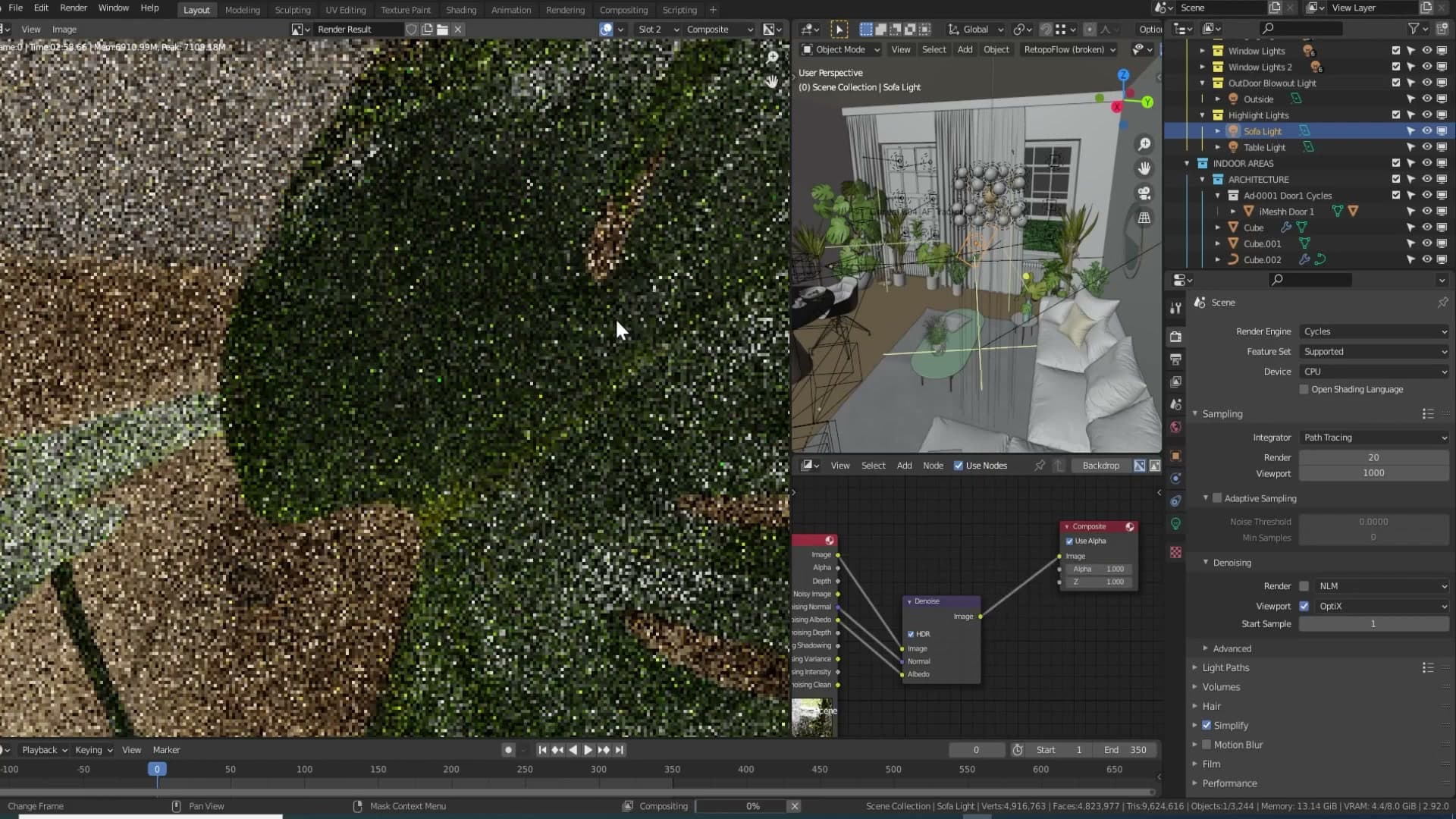
Plugging the raw render straight into the compositor and bypassing the denoise node revealed why. At only 20 samples of direct output, the image is barely legible: clouds of noise where leaf veins should be. The denoiser is doing an astonishing job reconstructing detail from that input, but it is, in effect, guessing. Lines and veins that look crisp in the final frame are not measured from the render. They're inferred from a sparse, noisy signal.
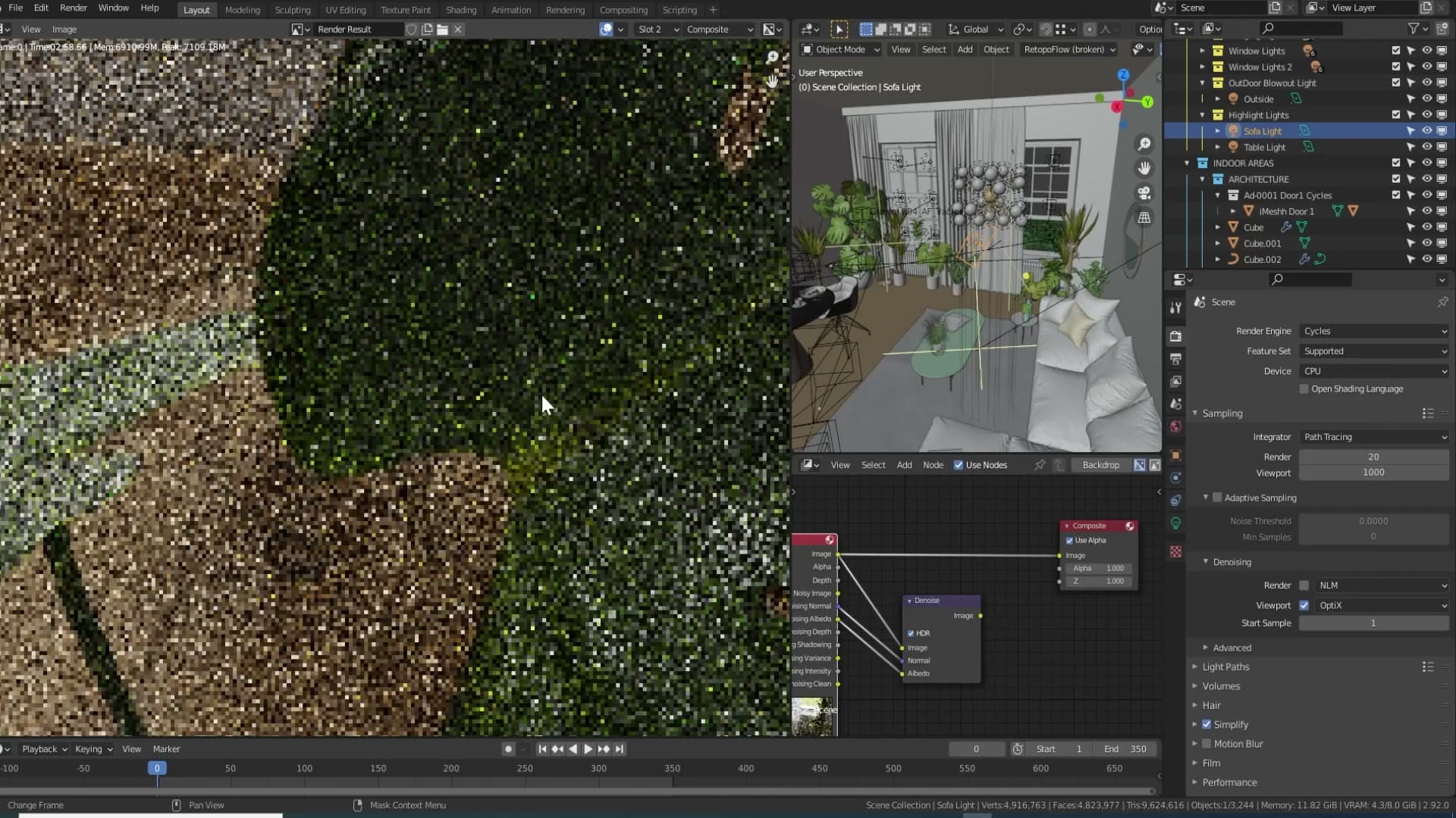
For a still that's fine: the denoiser guesses once and the result reads as detail. For an animation it is the whole problem. On the next frame the noise pattern lands in a slightly different arrangement, so the denoiser's guess at where an edge sits shifts by a pixel or two. Each individual frame still looks clean; the difference between frames is what crawls.
Lower resolution with more samples wins for animations
The fix was to drop the resolution and pour the saved time back into samples. Frames were re-rendered at 1920×1920 at roughly 600 to 700 samples instead of the 4K version's 130, all within the same per-frame time budget.
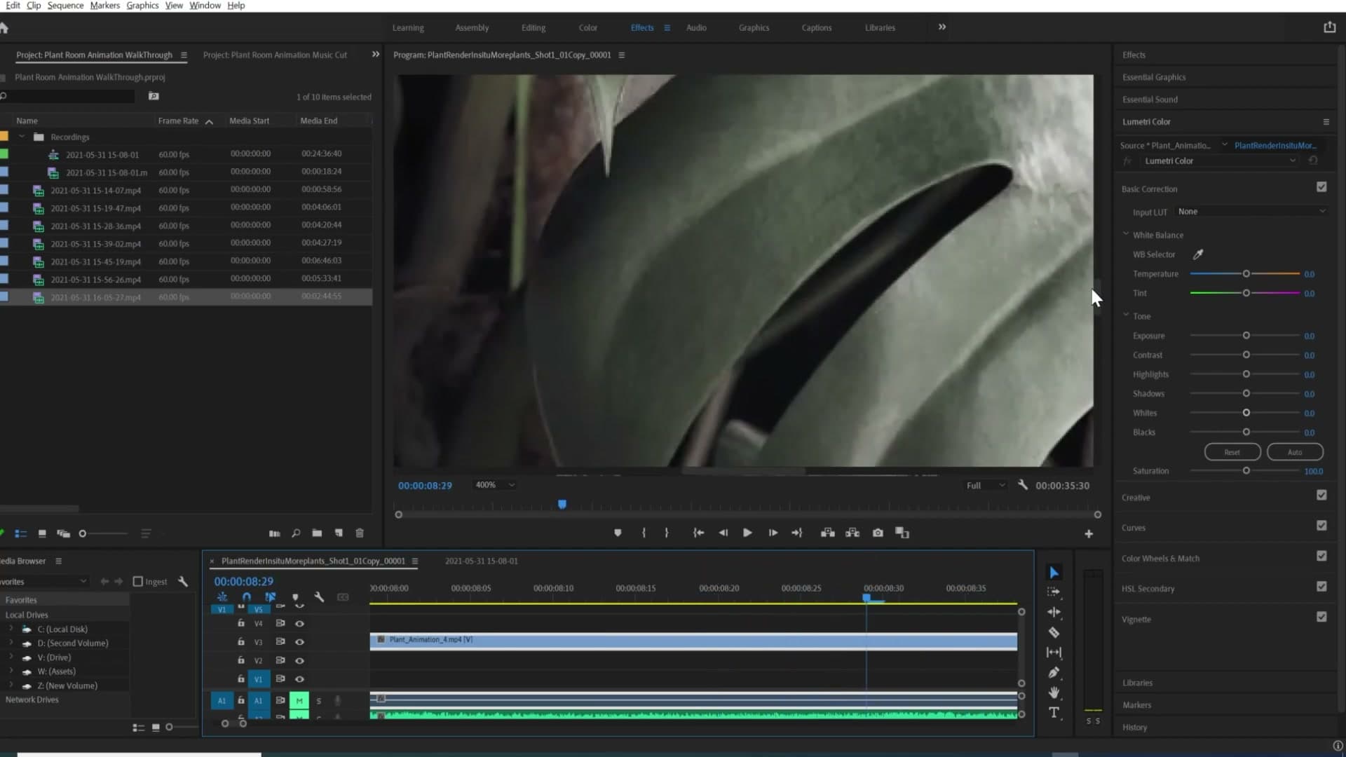
The denoiser was now reading a much cleaner input, so it had to invent far less. Zooming into a leaf and stepping through frames, the veins stay where they should. There's still a touch of movement, but the previous arrangement where individual veins blinked in and out of existence is gone. Compared side by side, the 4K version looks painterly and mushy in motion, while the lower-resolution high-sample version holds its detail.
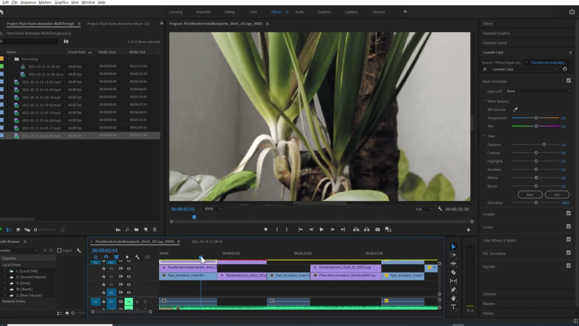
The practical recommendation for animations is the reverse of the stills workflow. For a still, rendering at 200% or 400% with a lower sample count is a huge win. For animation, start at base resolution, push as many samples as your time budget allows, and only then experiment with dropping the count. Going straight to 200% or 400% for moving footage will almost certainly land you on the same crawling-edge wall.
Render output and the 60fps decision
16-bit PNG sequences keep the file count manageable compared to TIFF while preserving compositing headroom. Choosing 60fps doubles the render bill but only pays off when the camera or foreground actually moves enough to read at high framerate.
16-bit PNG sequence and the choice of 60fps
For the final frames you want a format that holds up under compositing without burying your drive. Render the sequence as PNG at 16-bit colour depth. That gives you enough headroom for grading and curve work in post without the file size of a TIFF sequence. Across thousands of frames a TIFF set will run into hundreds of gigabytes, so PNG is the practical middle ground.
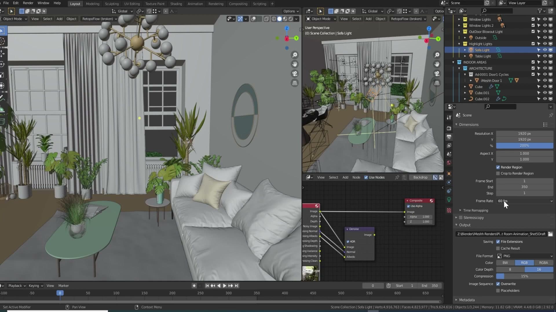
The other big output decision on this project was frame rate. The animation was rendered at 60fps, which is unusual for archviz but deliberate. The thinking comes from how 60fps content reads online. When you come across a 60fps GIF on Reddit or a 60fps clip on YouTube, the motion has a noticeably more lifelike quality, the kind that makes you feel like you could step into the scene. That perceived realism was the goal here.
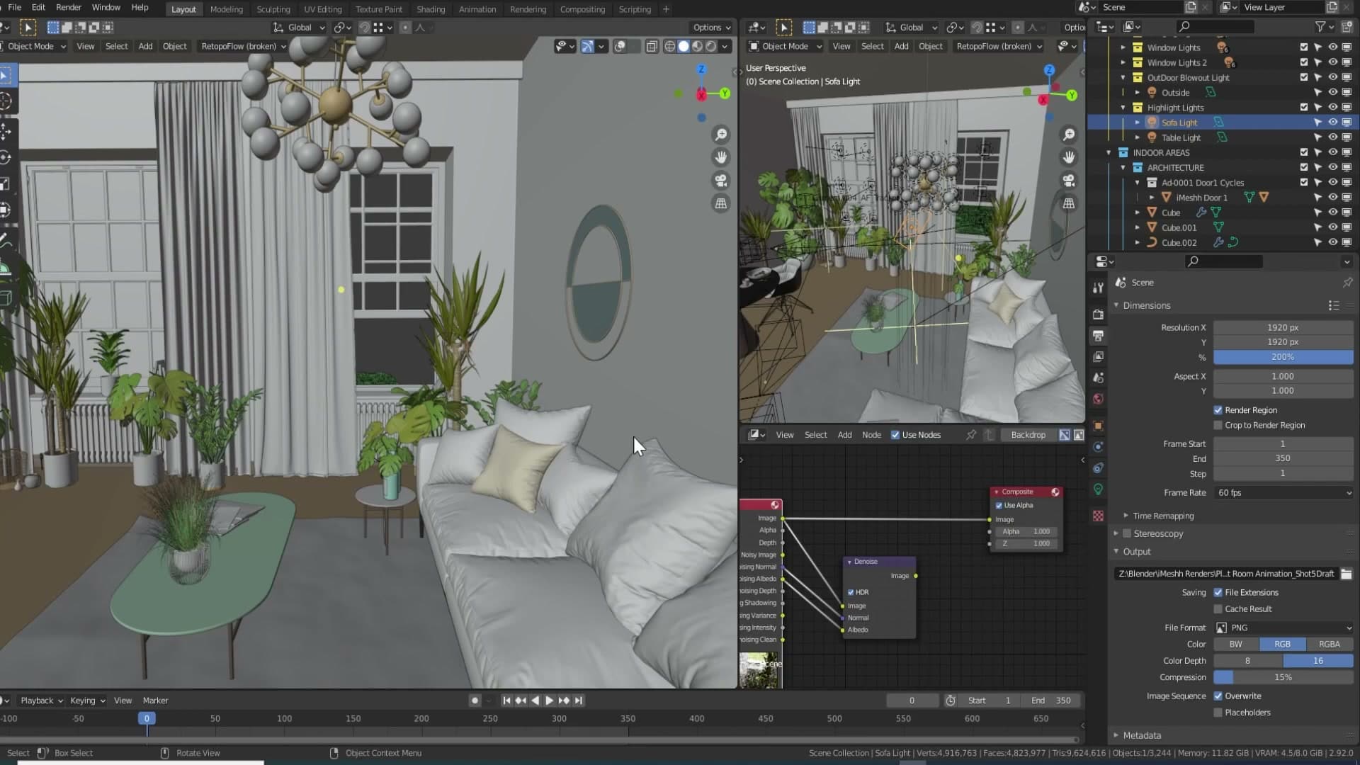
The catch is that 60fps doubles your render time compared to 30fps, frame for frame. That is a real cost on a long animation and the reason most archviz work stays at 24 or 30. A render farm makes the maths work. In this case RenderStreet absorbed the extra load and made shipping the project at 60fps viable in the first place.
When 60fps actually sells: motion and pace matter
Looking at the finished animation, the 60fps payoff is not evenly spread across the shots. The ones that genuinely benefit are the shots where the camera moves quickly and there is a lot happening on screen at once. Those frames read as smooth, immersive, and noticeably more realistic than the same shot would at 30fps. That is where the doubled render bill earns its keep.
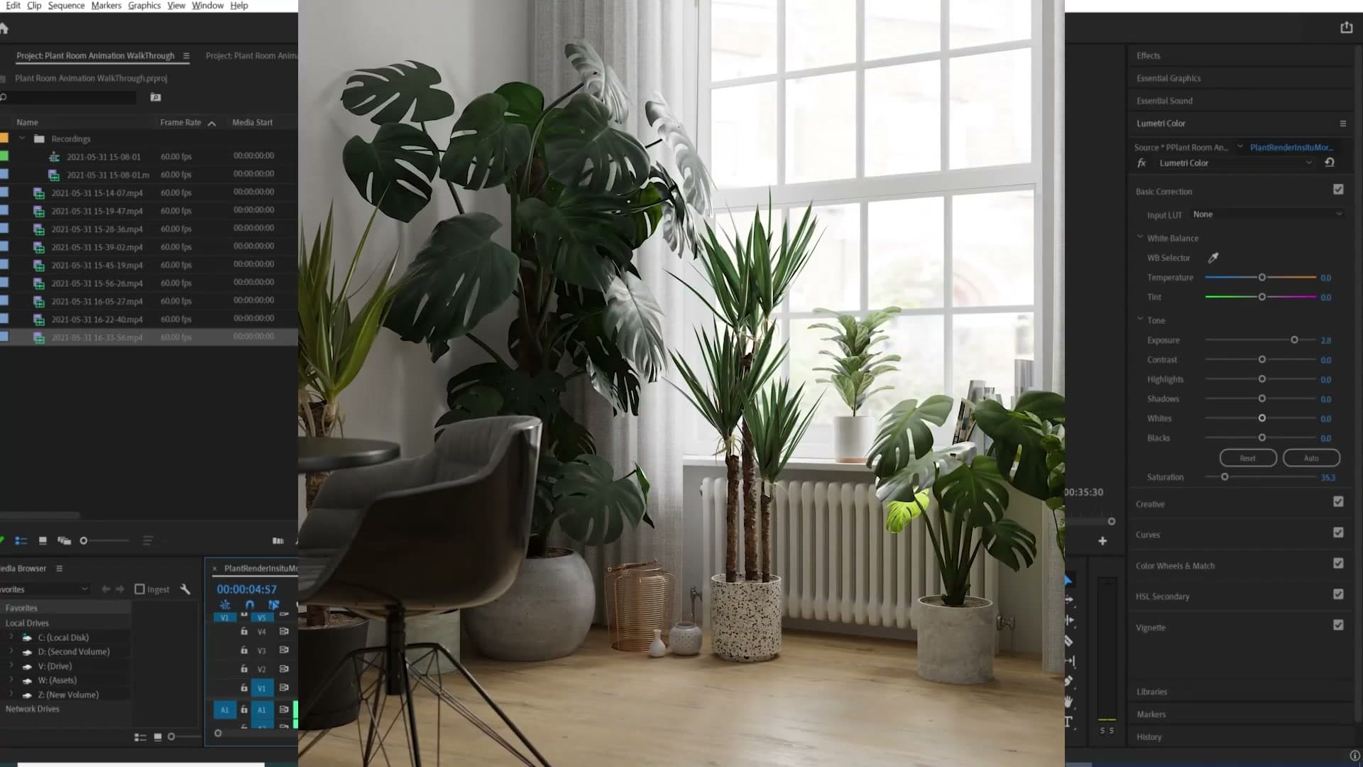
The first couple of shots in the animation are the opposite. The camera drifts forward only slightly over several seconds and there is not much movement in the scene itself, so the higher frame rate has very little to do. The most lifelike element in those slow shots ends up being the curtain on the left, simply because it carries the most motion in the frame.
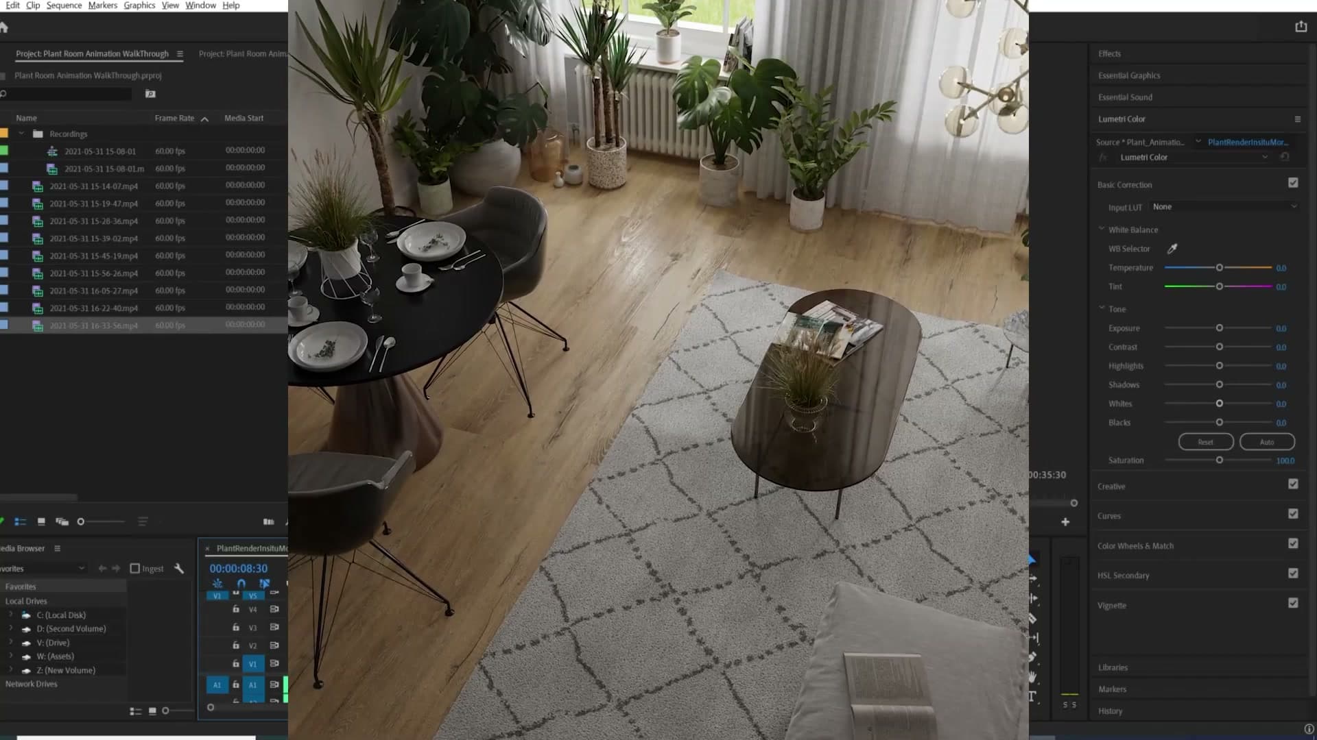
The takeaway for your own work: only commit to 60fps if there is enough motion in the shot to justify it. A fast camera move across the room, or a panning shot that travels past plants, foreground props and changing light, will sell the framerate. A slow dolly that nudges forward a couple of steps over five or six seconds will still look fine, but you will not see the 60fps benefit. You will have paid double the render time for very little return.
Premiere export and Cycles polish settings
Premiere's default 30fps interpretation has to be overridden per-clip and per-sequence for a true 60fps timeline. Two-pass encoding at a higher bitrate fixes playback stutter, and a Blackman-Harris pixel filter at 1.2 squeezes out a little extra Cycles sharpness.
Interpreting 60fps footage in Premiere
Premiere will quietly misinterpret your 60fps clip the moment it lands in the Project panel. By default it assumes the footage is 25 or 30 frames per second, so the playback rate is wrong from the first frame. You need to override this twice, once on the clip and once on the sequence, before the timeline reflects what you actually rendered.
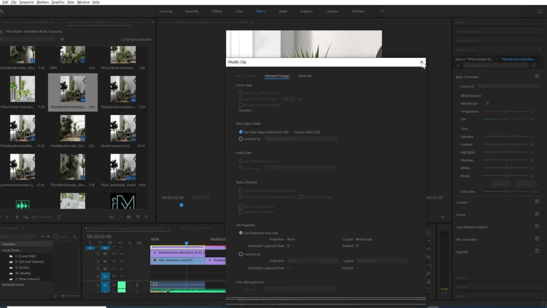
In the Project panel, right-click the 60fps clip and choose Modify → Interpret Footage. Set the assumed frame rate to 60fps and click OK. Repeat for every 60fps clip you have imported.
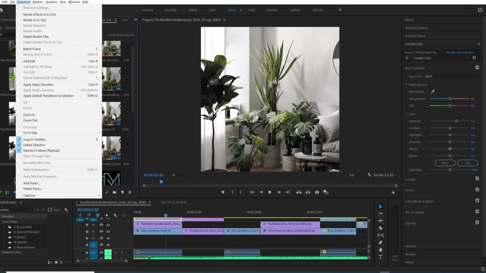
Then check the sequence settings and confirm the timebase is also 60fps. If the sequence is still 30fps, the 60fps footage gets resampled down on playback and export, and all the work you did rendering at the higher rate is thrown away.
Two-pass encoding for smoother high-framerate playback
With the interpretation sorted, head to File → Export → Media. The two settings that matter for 60fps delivery are the encoding pass count and the bitrate. Switch the encoding from 1-pass to 2-pass. It's slower to export, but the encoder uses the first pass to analyse the footage and the second to allocate bits where they are actually needed, which pays off at high framerates.
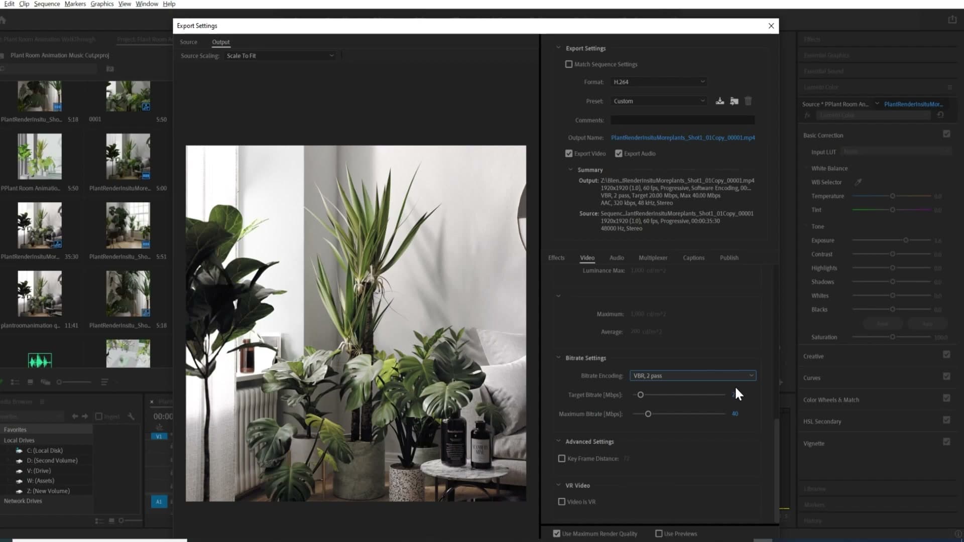
For bitrate, YouTube's recommendation sits between 10 and 18 Mbps for 1080p. Push it higher: a target of around 20 Mbps with a maximum of around 40 Mbps is well above the spec, but it makes a real difference to local playback smoothness. A 1-pass export at the lower recommended bitrate stuttered visibly on the same machine; the bumped-up two-pass version played back cleanly.
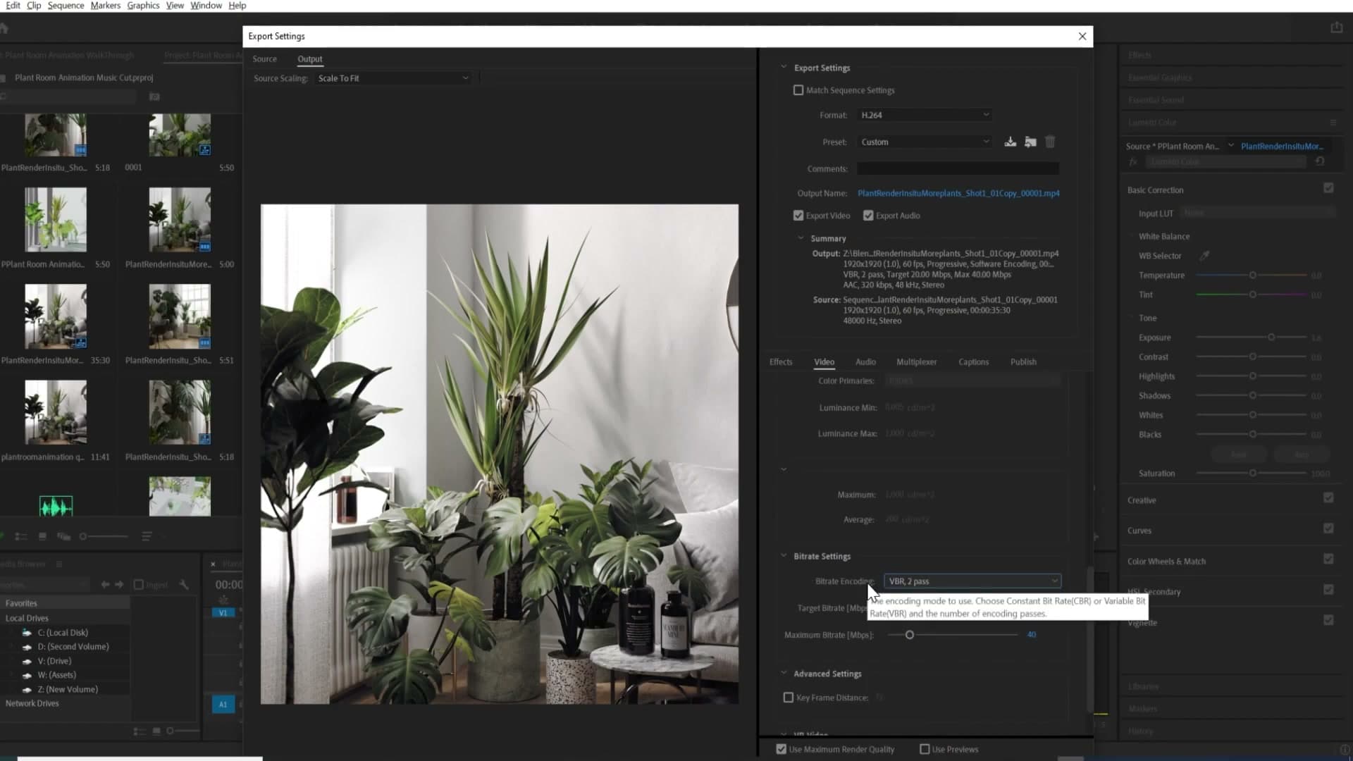
There may still be a little residual stutter, and it is genuinely hard to tell whether the cause is the file or the computer struggling to decode 60fps in real time. Test the export on a second machine or on a phone before blaming the settings. 60fps playback is a lot more demanding than 30fps and the bottleneck is often on the decode side.
Blackman-Harris pixel filter at 1.2 for sharper edges
Cycles' pixel filter controls how each sample's contribution is spread across neighbouring pixels during the render. The default is Blackman-Harris with a width of 1.5, which is a safe all-rounder, but narrowing the filter pushes the final image a touch sharper.
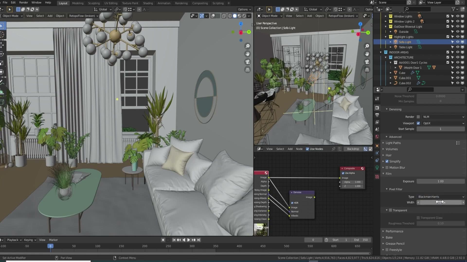
In Render Properties, scroll down to the Film section and leave the filter type on Blackman-Harris. Drop the width from 1.5 to 1.2. The change is subtle on a single frame but adds up across an animation. Fabric weave, leaf veins, and material edges all read with a little more crispness.

The trade-off is slightly more jagged edges in high-contrast areas, the kind of thing you would see on a dark window frame against a bright sky. At higher resolutions that aliasing is much harder to spot at normal viewing distance, so the extra sharpness is usually worth it.
Tools and credits
Everything mentioned in this tutorial, with links.
- Blender the renderer this entire build runs in.
- iMeshh studio platform (project management, client review, asset library, invoicing). The asset library used in this tutorial is included with every iMeshh Pro plan.
- Poly Haven free CC0 textures and HDRIs.
Pillar guide: Animation hub