The three-lighting challenge for one scene
Why a single archviz scene benefits from day, night and beauty shot variants, and how View Layers make it practical to maintain all three in one .blend.
The brief: day, night and beauty from one scene
Your model is done, the textures are on every surface, and the scene is ready to render. The one thing still open is the lighting. Should it be a sun-drenched morning, a moody evening, or a clean studio shot to sell the hero objects? Most of the time I do all three. Each version tells a different story about the same room, and it gives clients something to choose from instead of one render to react to.
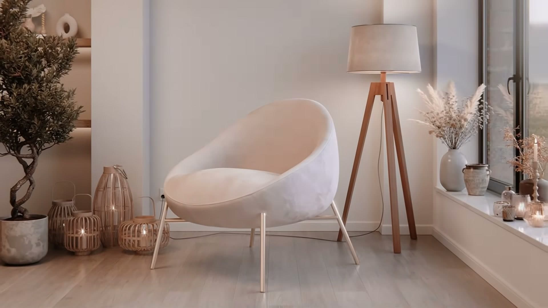
This tutorial takes a single bedroom scene and relights it three completely different ways. First a soft Scandinavian daytime using an overcast HDRI, then a warm nighttime mood lit largely by candles and a magenta sky, and finally a studio-style beauty shot built on a classic three-point rig. The geometry never changes; only the lights and a couple of background tweaks do. Despite the very different outcomes, each setup is deliberately simple: a small handful of lights, sensible strengths and colour temperatures, and a few compositor tricks at the end.
The exact bedroom used here is available in the iMeshh asset library, so you can open the finished file and inspect every light, modifier and material yourself. If you'd rather follow along inside your own scene, the principles all transfer. What matters is the structure of each lighting recipe, not this specific room.
Using View Layers as a lighting switcher
Set up day, night and beauty View Layers so each toggles its own collections of lights on and off, so you stop hunting through the outliner every time you swap mood.
Creating day, night and beauty View Layers
Each of the three final renders uses a completely different rig of area lights and point lights, and you don't want to be hunting through the outliner enabling and disabling collections every time you switch mood. Blender's View Layers solve this neatly. Each layer remembers its own collection visibility, so picking a layer from the dropdown in the top-right of the viewport instantly swaps the whole lighting setup.
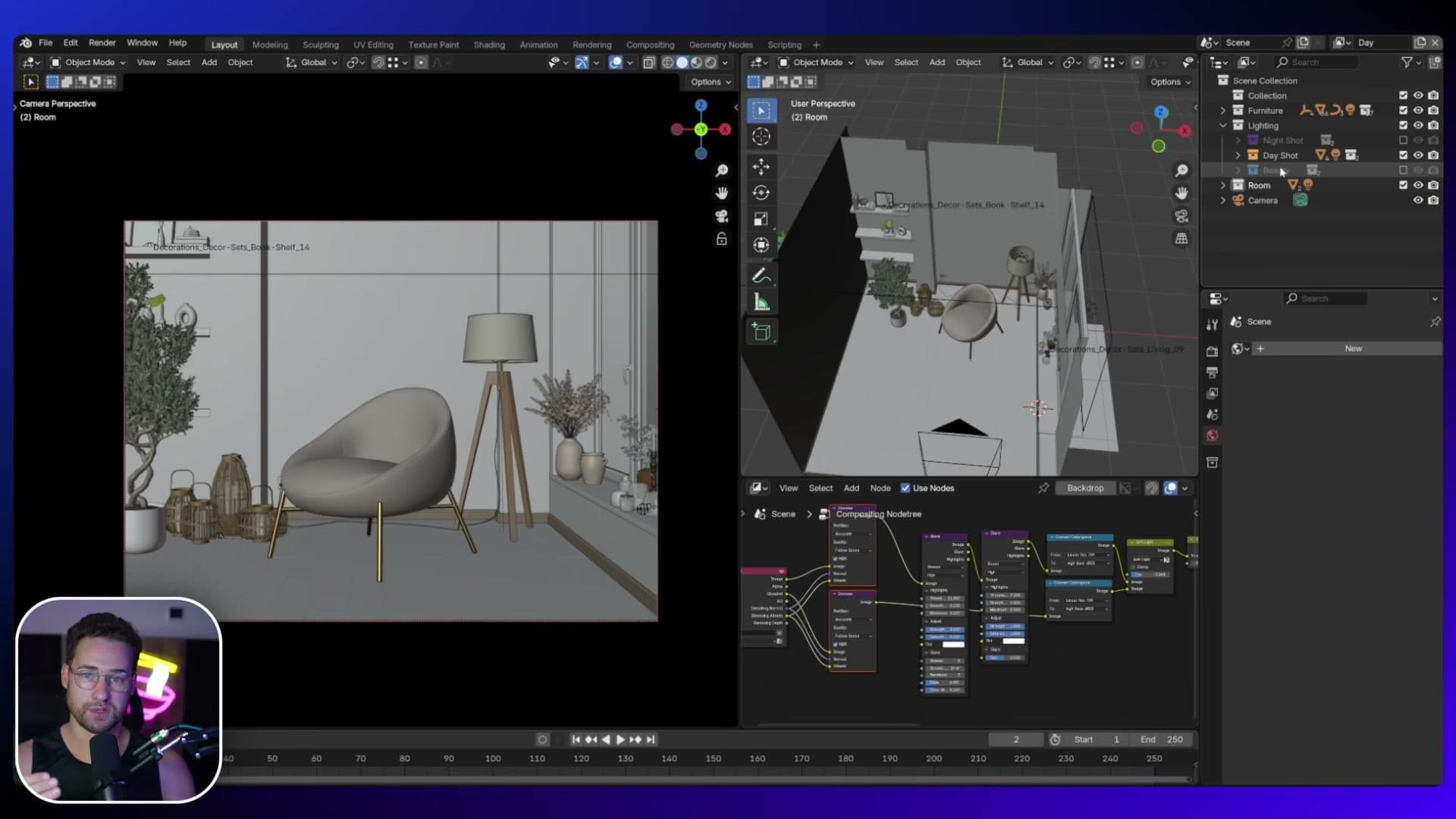
Three layers are already prepared in the scene: Day Shot, Night Shot and Beauty Shot. Click Night Shot and the outliner automatically enables the night-specific collections and disables the others. Click Beauty Shot and the beauty collections take over. Any change you make while a layer is active, like toggling a stray collection on, sticks to that layer only, so you can refine each setup in isolation and the others stay untouched.
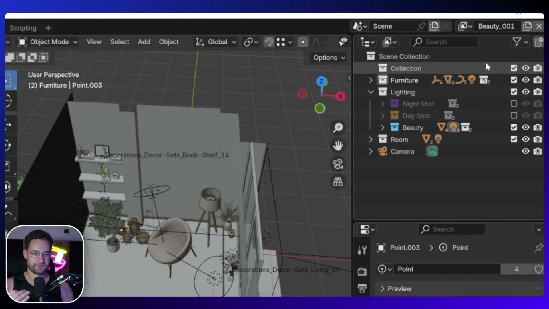
To start a new layer from a known-good state, create it and choose Copy Settings from the View Layer menu. It duplicates the current layer's collection visibility so you can prune from there rather than rebuild from scratch. The base scene (walls, furniture, camera) used here was put together in a previous bedroom masterclass and isn't re-covered in this tutorial; you can grab the file from iMeshh or watch the original walkthrough on YouTube. With the View Layers in place, the daytime shot is the natural starting point.
Daytime shot: Scandinavian soft daylight
Build a soft, overcast daytime interior driven by an HDRI, contrasted with a black backdrop, and warmed up with a single interior fill light and under-shelf accents.
Picking and rotating an overcast HDRI
The most important light in a daytime interior is the daylight coming through the window, so that's what you build first. Head to the World tab, hit New, then click the Colour slot and pick Environment Texture to load an HDRI in.
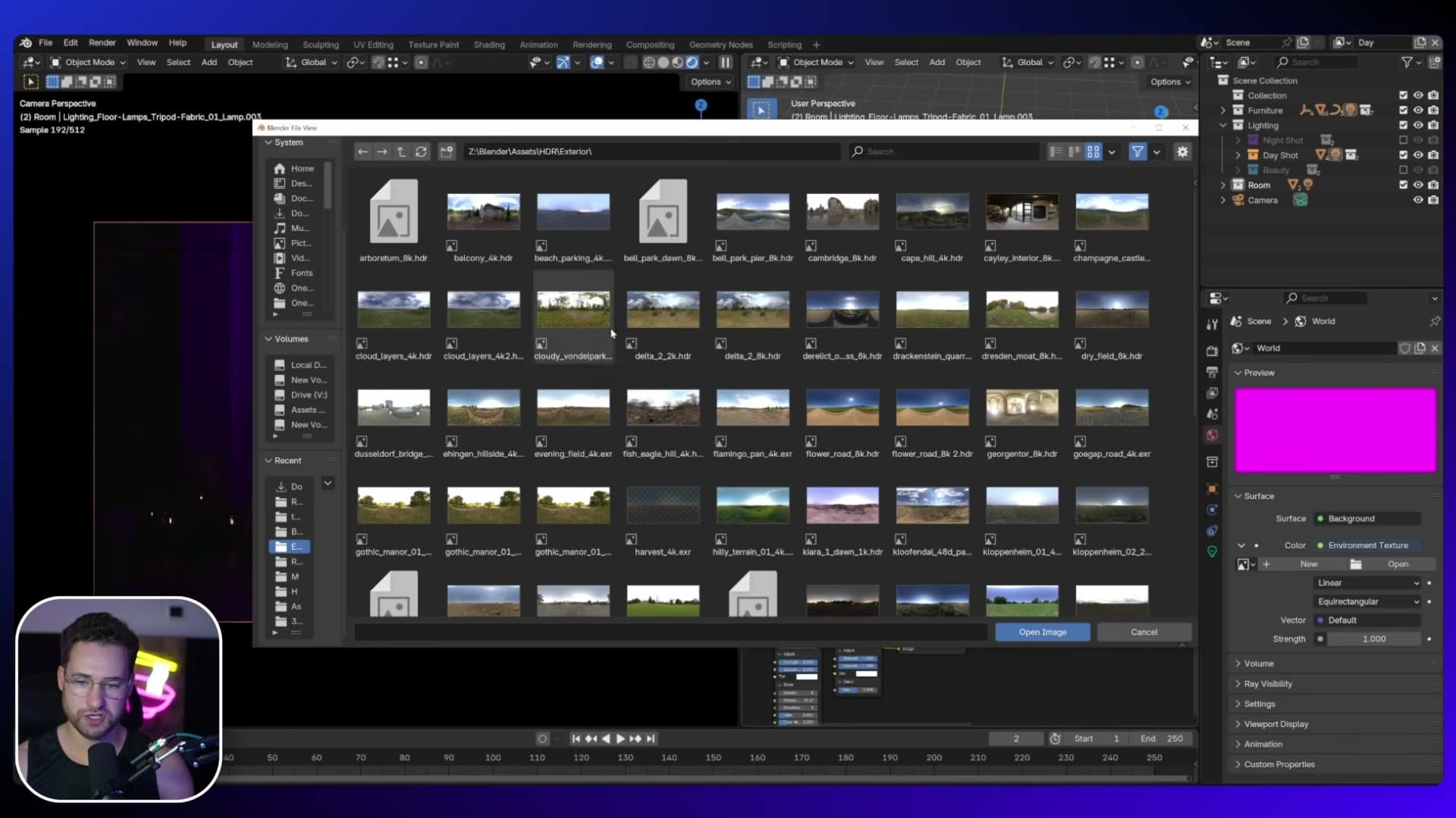
For this scene you want a mostly overcast sky. The softbox effect gives the room a natural, cosy feel and stops your eye chasing a hot sunbeam across the floor. The focus stays on the furniture, not the weather.
Once the HDRI is loaded, rotate it with the Node Wrangler shortcut Ctrl+T. That drops a Texture Coordinate and Mapping node pair onto the Environment Texture; spin the Mapping node's Z rotation until the brighter, sun-tinged panel of the sky is pointing away from the window. You want the soft, even part of the sky doing the work, not the patch where the sun was peeking through.
The result is flat at default strength, so push the Background strength up to about 8. The room brightens straight away into a pale, slightly Scandinavian daylight that reads cleanly off the sofa and the walls.
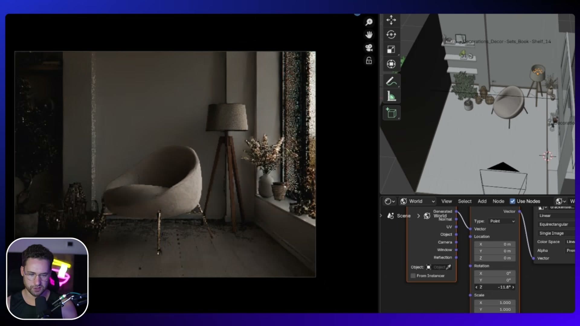
Adding a black backdrop for interior contrast
The scene also ships with a black backdrop, literally a black plane sitting behind the camera. It isn't lit. Its job is to cast contrast into the room by absorbing the light that would otherwise bounce back off a bright wall behind the lens.
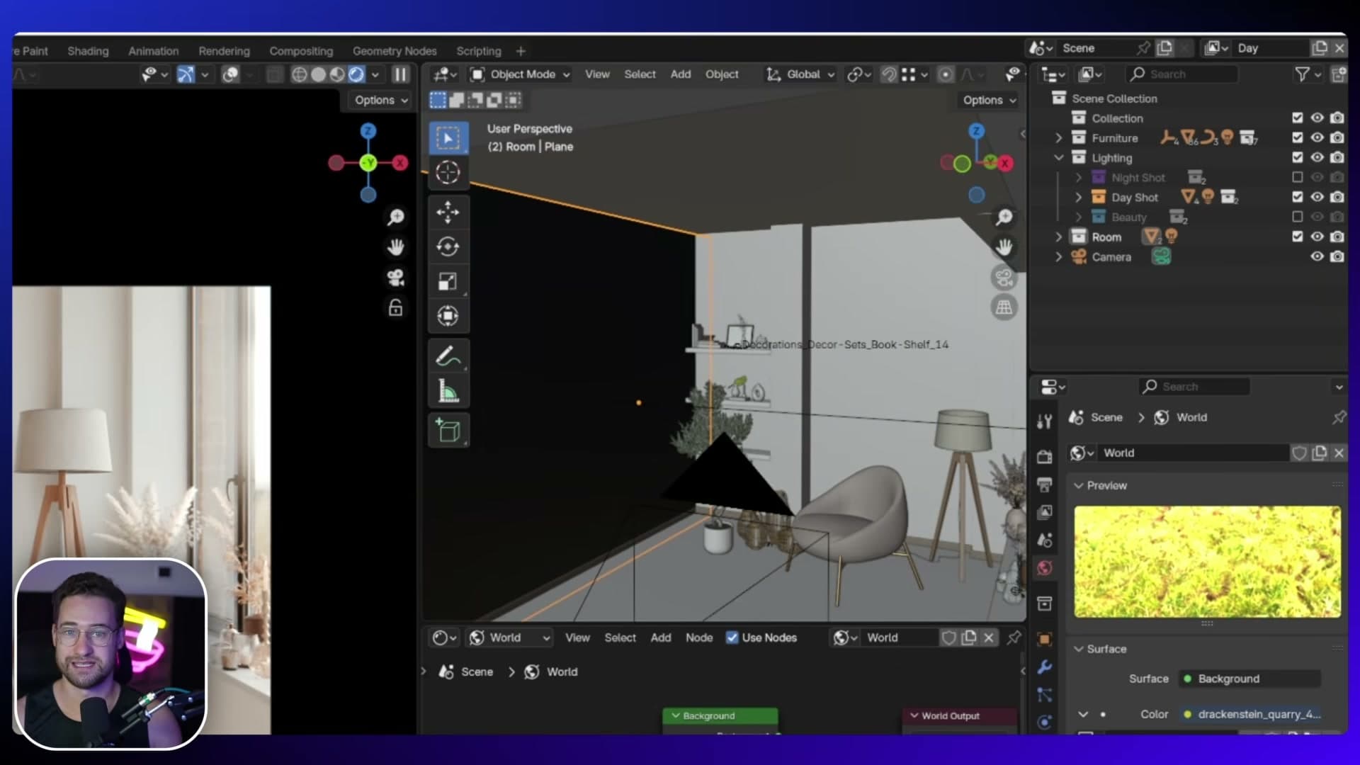
Toggle the backdrop off and the room flattens. More fill floods in from behind camera and the punchy, dynamic reading is gone. Some people prefer that softer look, but for an arch-viz interior the dark plane gives the image a much more cinematic feel.
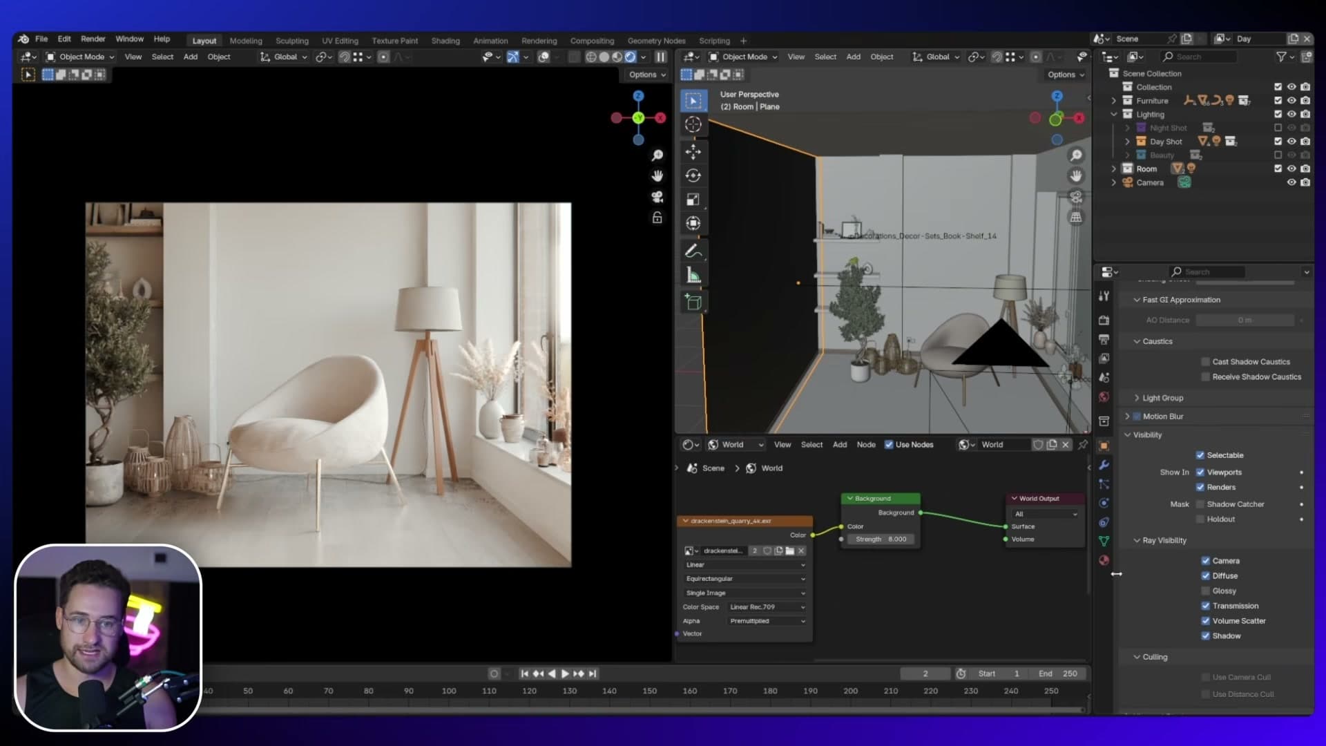
Two visibility tweaks make the backdrop behave. With the plane selected, open Object Properties, scroll to Visibility > Ray Visibility, and untick Glossy so it stops painting a black stripe into the floor and sofa reflections. Then untick Shadow too, otherwise the backdrop casts a shadow onto the back wall behind the window, which reads as a dark band across the room.
Warm interior area light to fill the shadow side
Even on a bright day, interior bulbs are often on. Faking one is what separates a believable room from a CGI test render. Treat the window light as your key, then add a fill on the shadow side to balance it.
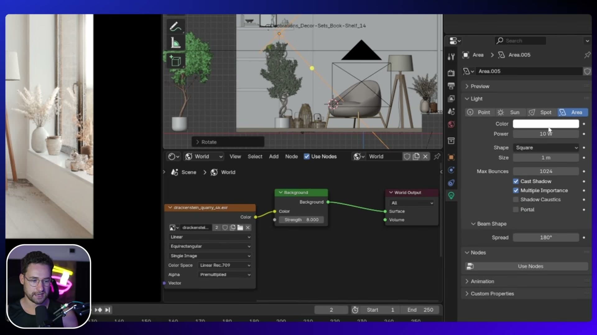
Press Shift+A, drop in an Area light, and position it so it pushes light into the shadowed half of the room. Set the Strength to 10, tick Use Nodes, switch the colour to Blackbody, and dial in 3800 K. Warm enough to read as a tungsten interior bulb without going amber.
The shadow side picks up a subtle orange tint that contrasts nicely against the cool HDRI. That gives you the teal-and-orange split you get from mixing daylight and a bulb.
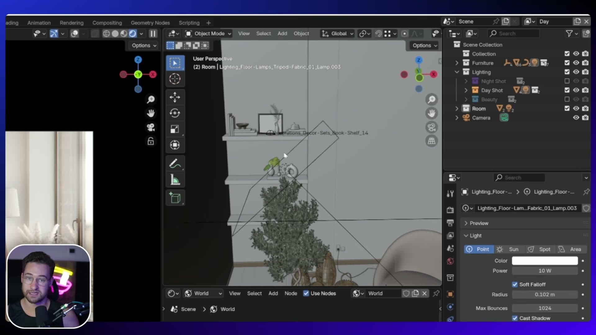
The floor lamp by the window gets the same treatment. Tuck a small area light directly inside the shade with a Strength of around 10, just enough to make the bulb glow and push a little warmth into that corner without overpowering the daylight.
Shelf under-lights and an optional sun
The shelves already have small area lights tucked underneath, casting light straight down onto the decor. The bounce off the shelf surface is what sells the depth. Without those under-shelf lights the shelving reads flat, even with a good HDRI doing the heavy lifting.
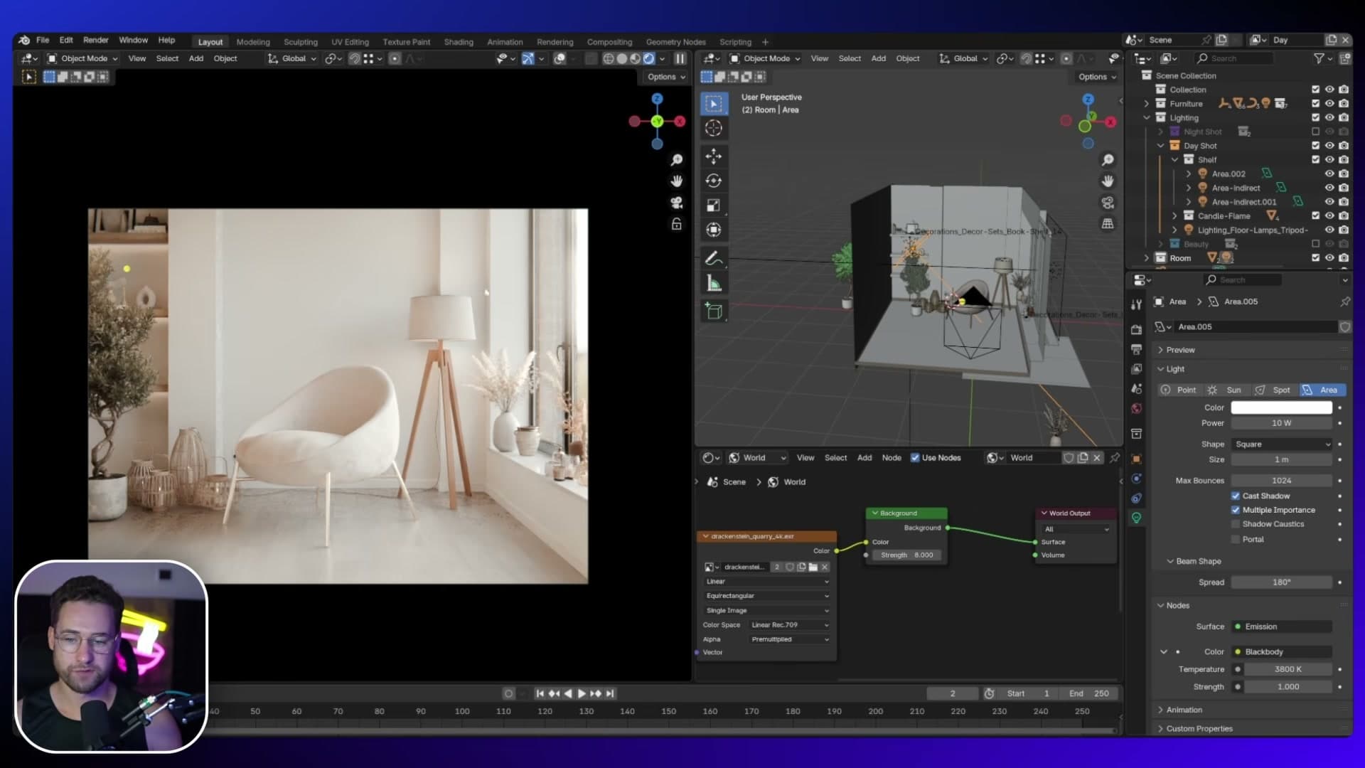
Notice the warm side-fill is also picking up the olive tree, which is otherwise quite a dark object. Toggle the fill off and the tree disappears into shadow; toggle it back on and that single area light lifts the tree, fills the shadow side of the room and adds the glow around the floor lamp all at once.
If you want a sunnier mood, you can drop a Sun lamp in too. Set the Strength to about 10, push the Angle up to soften the shadow edge, then enable Use Nodes and Blackbody for a warm colour temperature.
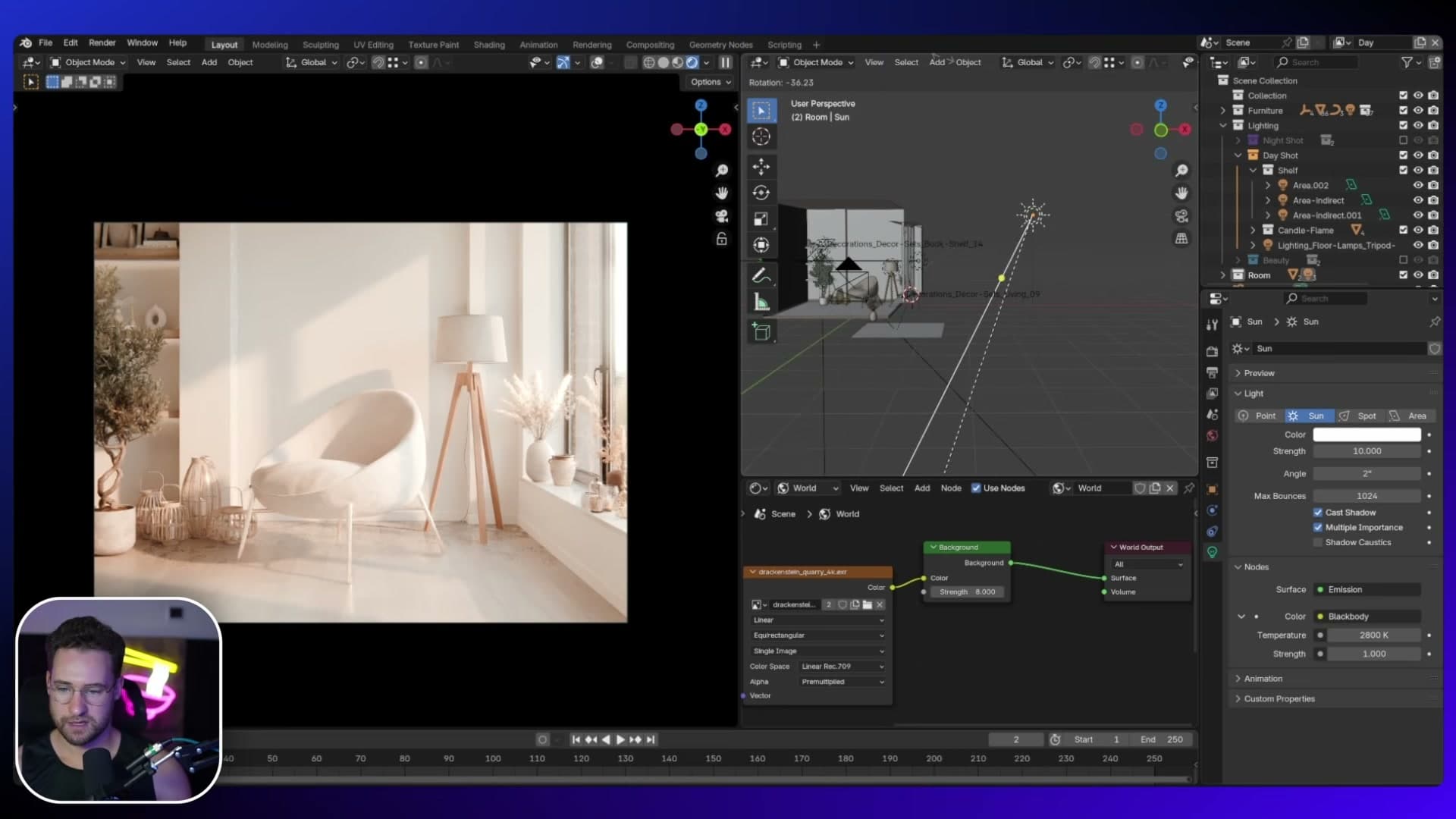
The Sun completely changes the look. It's gorgeous in isolation, especially when the beam grazes the floor. But here it pulls focus away from the hero chair, which is the whole point of the setup, so I switch it off again.
To finish the daytime pass, the scene file already has a Gamma node and an Exposure node wired up in the compositor. Slide the Gamma across to add a touch more contrast, then nudge the Exposure up a hair to brighten the final image.
Nighttime shot: candle glow and a purple sky
Trade the white overcast HDRI for a dusky magenta-blue one, anchor the room with a single ceiling area light, then use candle bulbs and Glare nodes to make the flames bloom.
Loading a magenta-blue dusk HDRI
Nighttime exteriors are rarely white. There's almost always some colour bleeding in from the sky: magentas, deep blues, the leftover warmth of a sunset. Your HDRI has to carry that information or the rest of the scene won't feel believable. A plain neutral dome just reads as overcast daylight that someone forgot to expose properly.
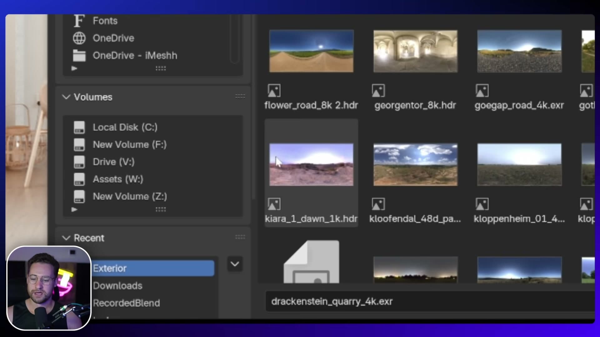
The HDRI used here is browsed from the Poly Haven HDRI library. It's technically a dawn shot rather than a true night, but it leans heavily on purples and blues, which is the colour cast you want pushing through the windows of an evening interior.
The node setup looks a little different to a standard Environment Texture because the HDRI is loaded through the iMeshh Asset Manager. Open the local tab in the Asset Manager and append the HDRI from there. It drops in as a node group that exposes rotation, strength and a handful of other parameters as sliders, which is much friendlier to tweak than digging into the raw nodes.
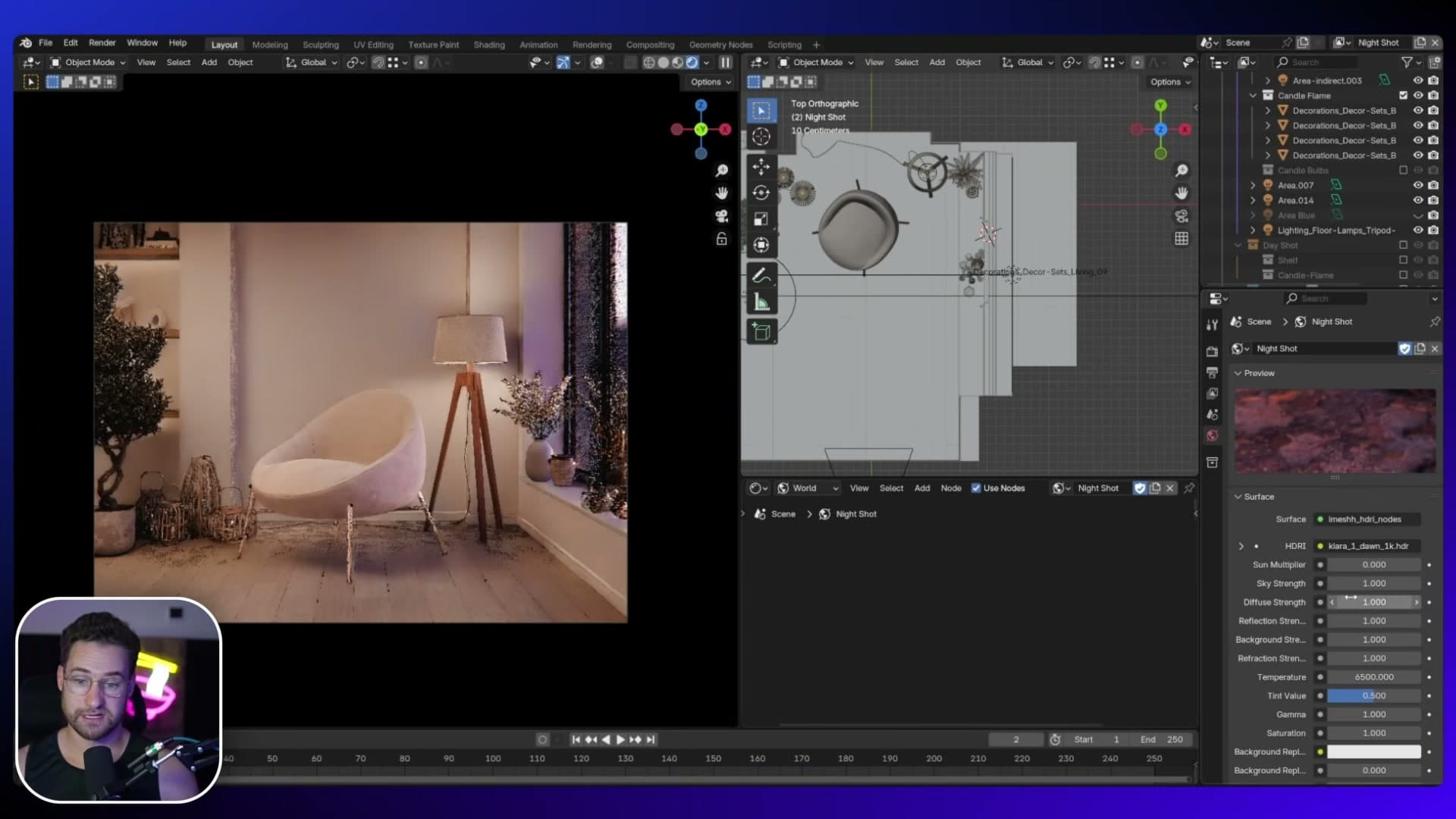
Straight away the room reads darker and you can see purple and magenta light spilling in from outside. Pull the background strength down to 0.5 to take the overall level a touch lower so the interior lights have somewhere to breathe.
The main ceiling pendant area light
Every scene needs one dominant light source, and everything else should support it. For this nighttime interior, the role goes to a ceiling pendant simulated with a single area light pointing straight down from above.
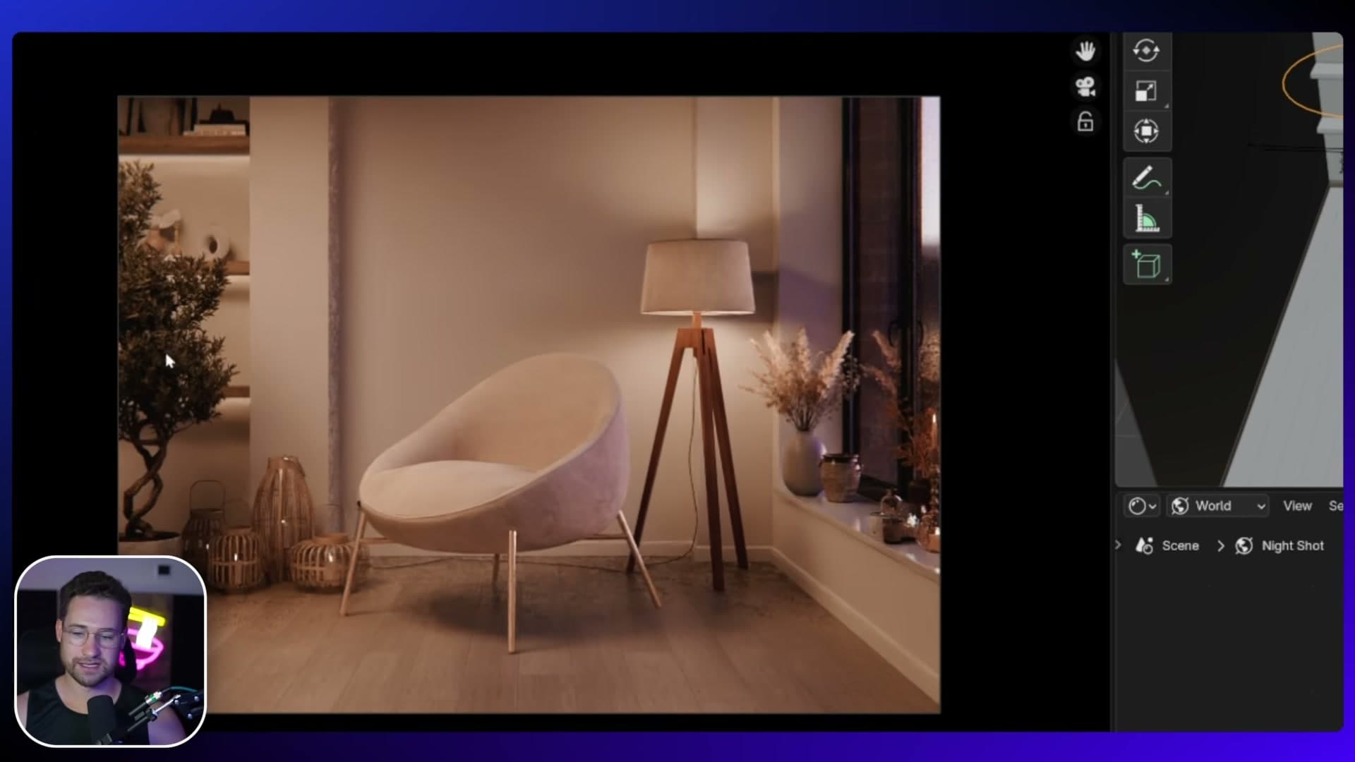
Set the area light shape to Disc. Shape doesn't really matter here because the spread is left at the default 180°, which means light fans out in every direction evenly regardless of whether the emitter is round or square. Position the light below the ceiling roughly where a pendant would hang.
Aim it directly downward rather than tilting it towards the seating area. Angling the light at the chair is a valid choice, but a straight-down throw better sells the idea of a fixture mounted to the ceiling, and the light spreads naturally across the room from that origin point.
Push the strength to 40. Toggle it off for a moment and the scene drops back to just the HDRI, which is extremely dark and barely readable. Switch it back on and the pendant clearly becomes the key light, with the purple HDRI now playing a supporting role through the windows.
Window-side area light to amplify the HDRI
The HDRI is doing good work pushing colour through the glass, but you can amplify it with a second area light positioned right on the window itself, facing inwards. This is essentially a fill that exaggerates whatever the sky is already doing.
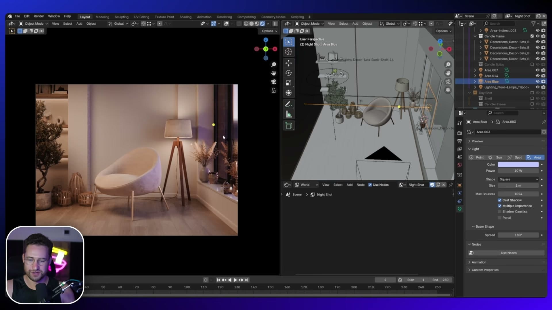
Tint the colour towards purple and magenta to match or push the HDRI's evening cast, then set the strength to 10. Toggle the light off and on a few times and you'll see it lifts the colour temperature of the room without overwhelming the pendant.
Treat it as a creative dial rather than a strict physical light. Because it sits on the window, anything you do here looks like it's coming from outside, so you can dial in deeper purples or more saturated magentas to push the mood without it feeling artificial.
Candle bulbs + Glare nodes for the bloom
The candles in the scene already have a fire/flame element, but a flame on its own won't actually illuminate the surfaces around it. You fake that with a real light source attached to each one. Parent a small point light ("bulb") to every candle flame.
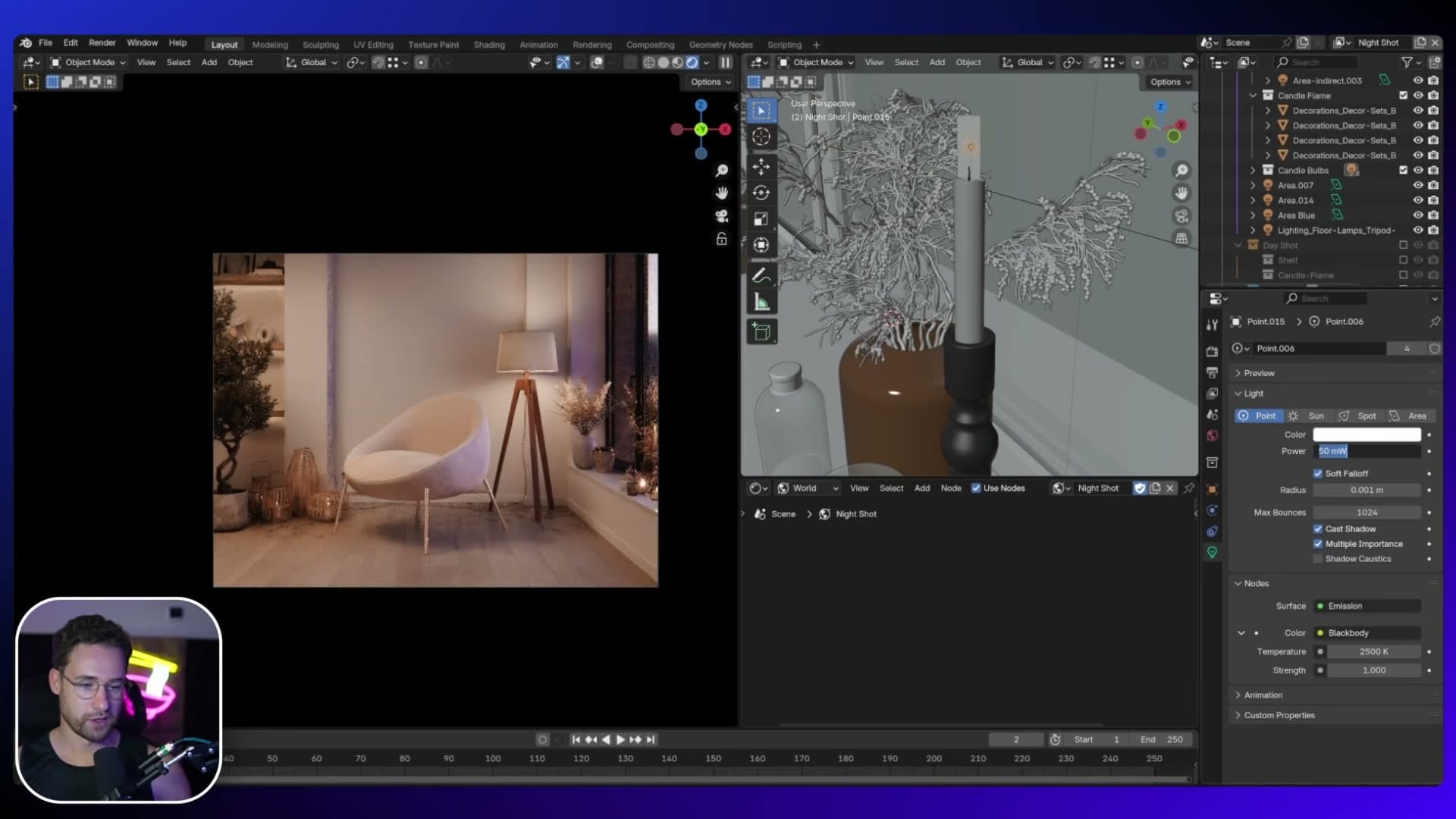
Each bulb is set to a low brightness. Enable them and a soft glow appears on the candle holders and the surrounding wall. That's the look I'm after here: the flame now feels like it's emitting light rather than floating in front of unlit geometry.
The bloom around each flame happens in the compositor, not in the render. Add two Glare nodes stacked one after the other. The first produces the crisp star shape over each flame, and the second softens that into a wider halo. Together they sell the idea of a bright light source seen through camera optics.
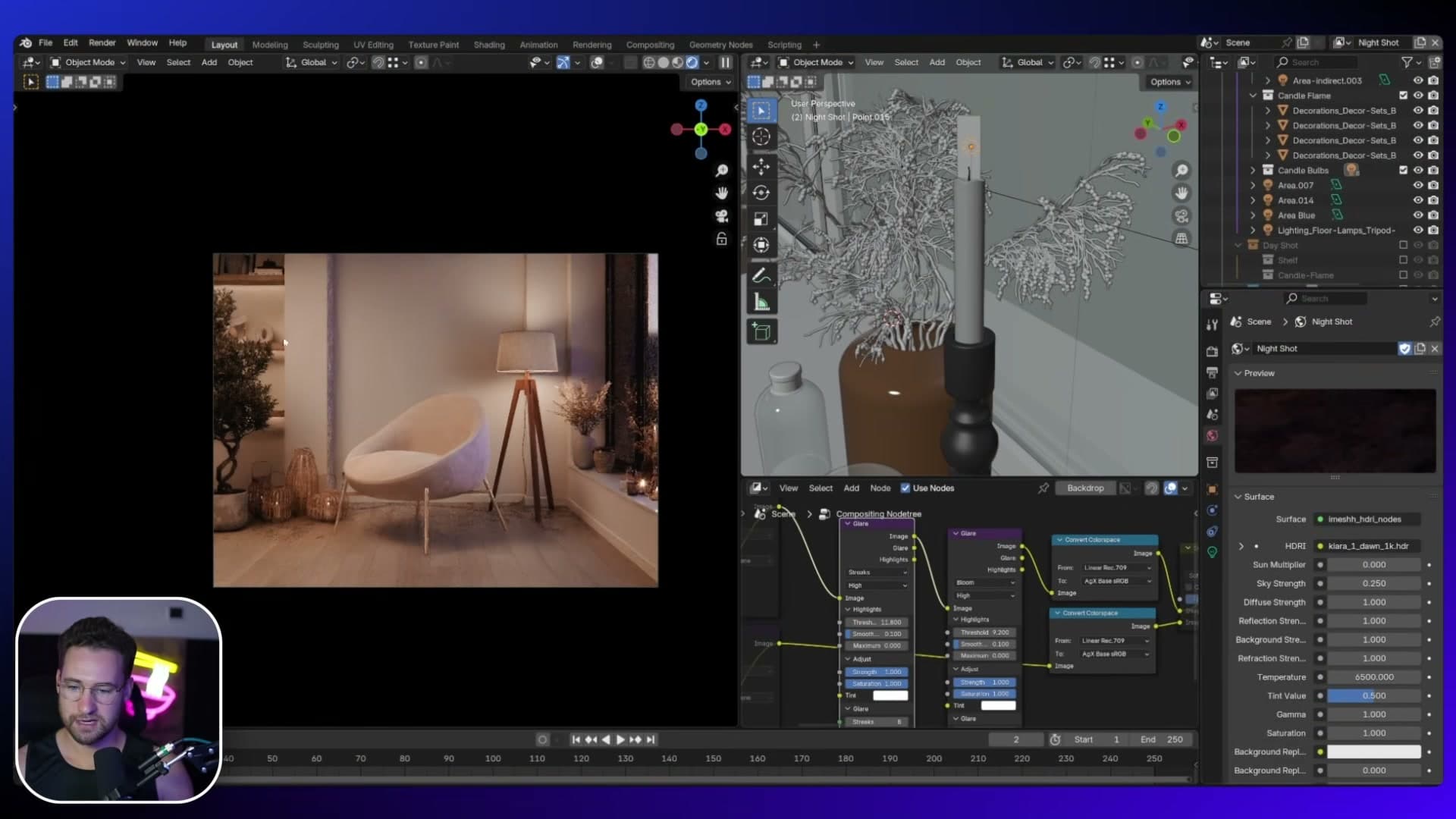
This is what I love about nighttime shots over daytime ones. You get to play with lots of tiny light sources that bring character into the frame. Candles, lamps, accent lights, anything that glows. Daytime is dominated by one huge soft source, but at night every small bulb gets a chance to add atmosphere.
Beauty shot: classic three-point lighting
Kill the HDRI entirely, then build a studio rig from scratch (cold key, warm fill, cool rim) and use Light Linking to feature the olive tree and shelf decor without flooding the walls.
Killing the HDRI and boosting the candles
The beauty shot is my favourite of the three. It's the most artistic of the bunch and the one that gives you the most room to play. The starting point is the evening pass: the candle bulbs are still in place, still throwing their warm pools onto the wall, and that's a foundation worth keeping.
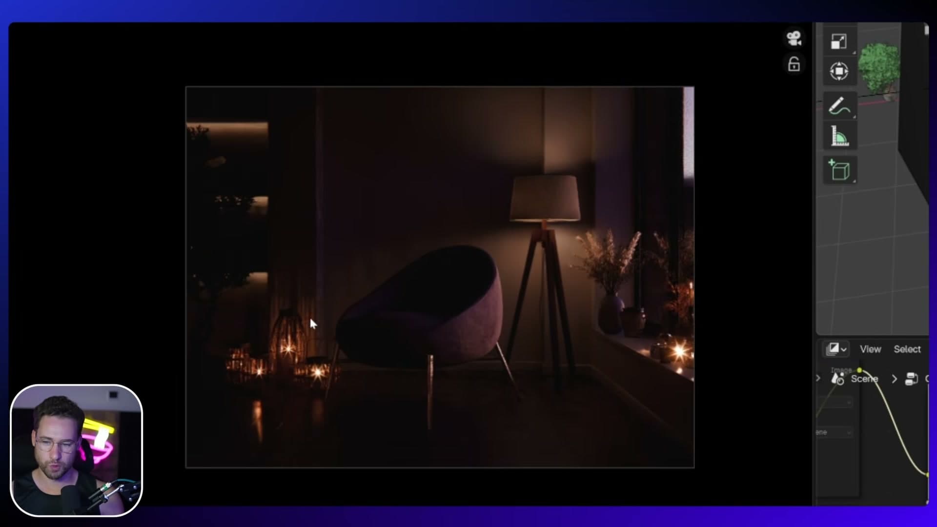
Select the candle bulb and push its strength up to 0.34. You're not after a brighter flame. You want the streaky vertical lines those bulbs cast onto the wall behind the candles. At this strength those lines become a deliberate compositional feature rather than something to fight. Keep the floor lamp and the existing shelf lights dialled down from where the evening shot had them, since you don't want them competing with the rig you're about to build.
Now kill the HDRI completely. Where the night render kept a faint purple-blue tint pushing through the window, the beauty shot leans abstract. A totally black background reads cleaner than even a low-strength sky. You're left with a near-empty canvas and a few warm candle hotspots, which is the base you want for a three-point rig built from scratch.
Cold 6500 K key light with a tight spread
Classic three-point lighting is what stills photographers reach for, and it's the structure for this whole shot. The first of the three is the key light, the lamp that defines the subject. Drop an area light into the scene aimed at the chair and set its colour temperature to a cold 6500 K.
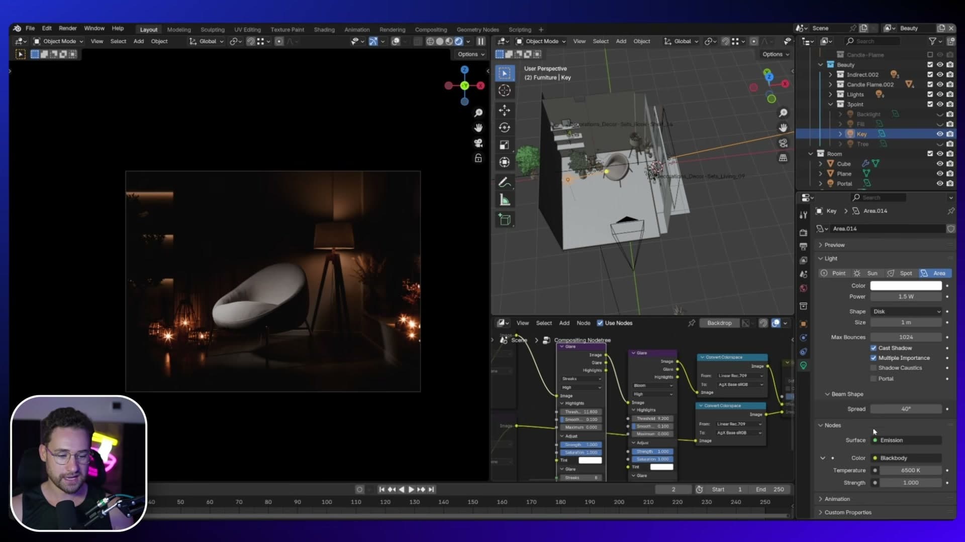
The trick that turns this area light into something more focused is the Spread value. At its default of 180° an area light disperses so widely it barely registers as a directional source, and you can't even see where the light is hitting. Pull it down to 80° to focus the beam, then drop it again to 40°. The light now behaves much more like a soft spotlight, pooling on the chair without bleeding across the floor and walls.
Warm fill light into the shadow side
The cold key carves the chair out of the gloom, but it leaves the opposite side in deep shadow. That's where the fill light comes in. Add a second area light on the shadow side of the chair at a much lower strength, around 2, and give it a wider spread than the key so it diffuses into the shadow rather than punching another hard pool.
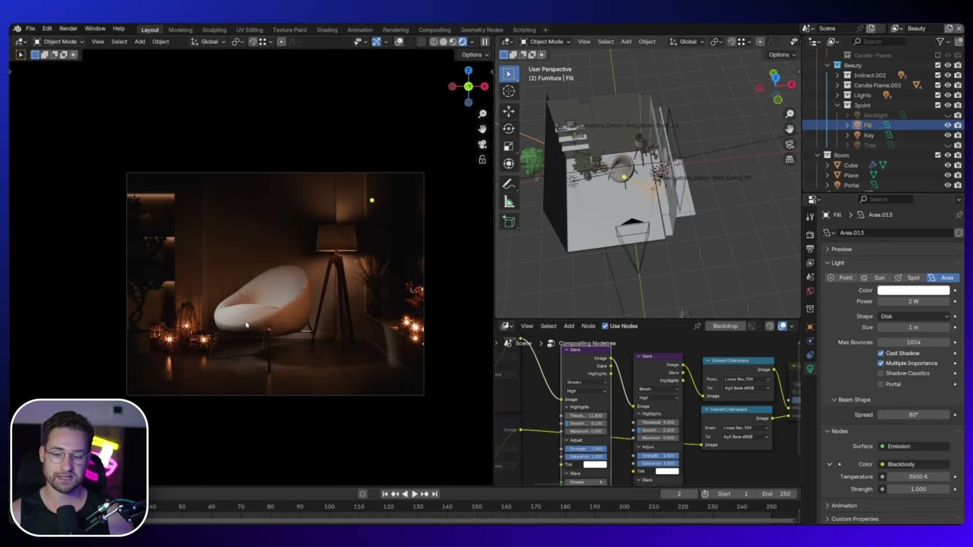
Pull the colour temperature toward warm. A warmer fill on the shadow side does two useful things at once: it ties the rig back into the warm candle pools already in the scene, and it sets up a complementary palette where the lit side reads cold and the shadow side reads warm. That contrast is the foundation of the cinematic look this shot is aiming for.
Cool rim back-light for teal-and-orange separation
The third element is a back-light placed behind the chair, acting as a thin rim. To audition it, toggle the key and the fill off for a moment so the rim is the only source firing. You should see a delicate edge of light tracing the chair's silhouette where it meets the dark background.
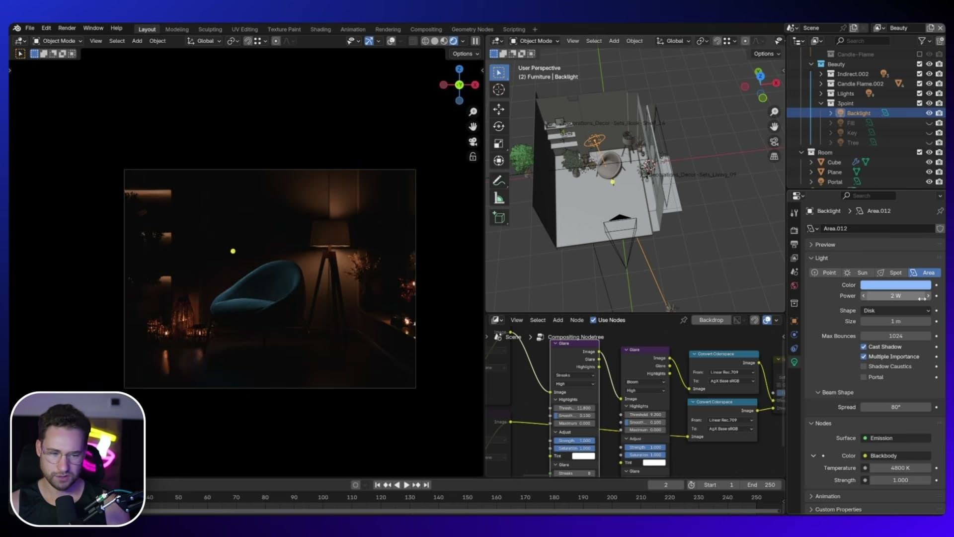
Nudge the strength up so the rim reads clearly without taking over. Somewhere between 2 and 5 works, depending on how present you want it. Pull the colour toward a cool blue, deliberately opposite to the warm candle pools and warm fill. That cool rim is the missing piece of the teal-and-orange separation you see all over modern cinematography: warm on one side, cool on the other, with a third cool accent slicing the subject away from the backdrop. Bring the key and fill back in and the three lights resolve into a clean, photographic read on the chair.
Light Linking a dedicated tree light
With the three-point rig finished, there's one obvious problem left in frame: the olive tree behind the chair is pure black. The key, fill and rim are all aimed at the chair, so nothing is reaching the foliage and it reads as a flat silhouette instead of a living plant.
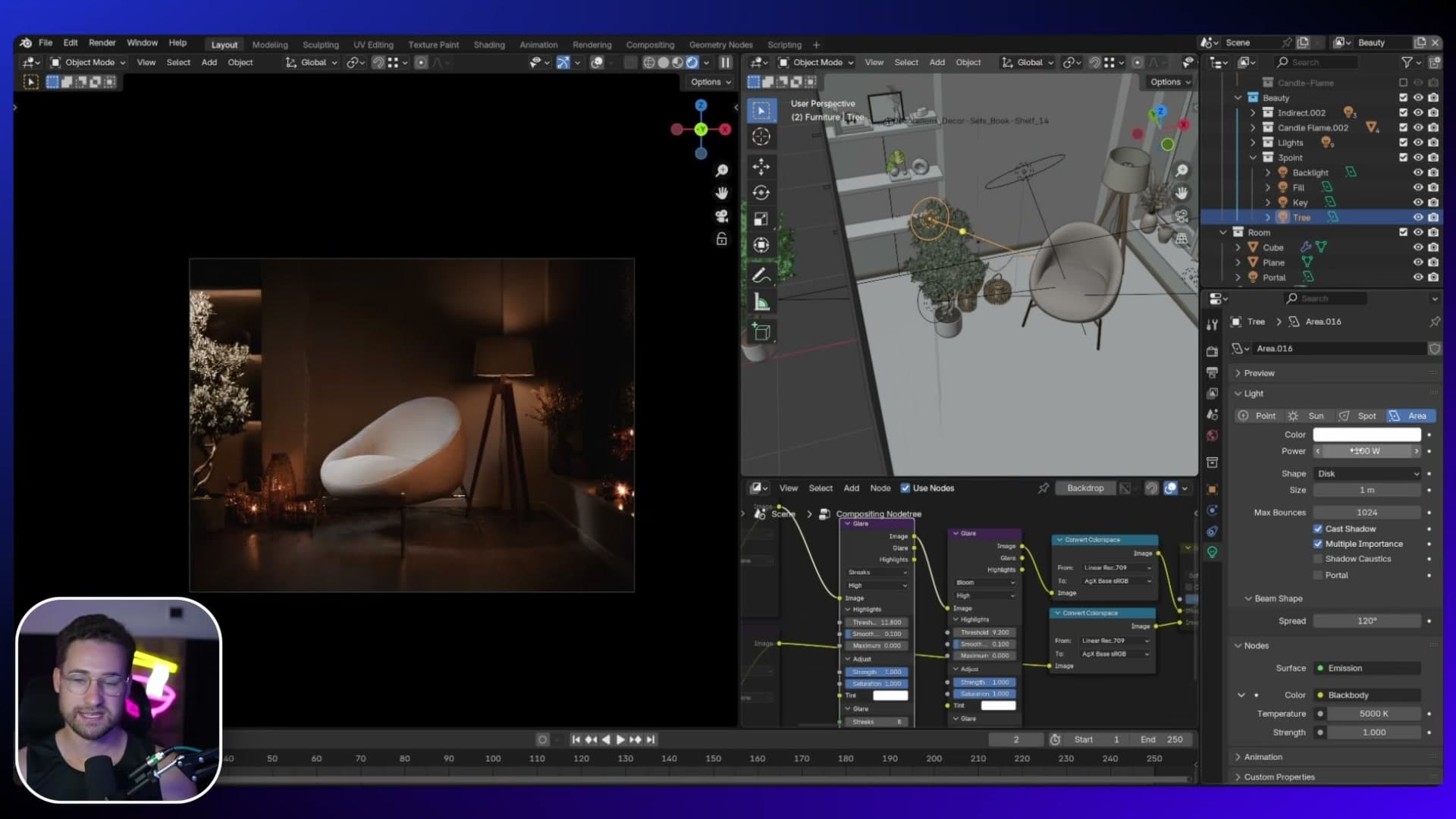
The fix is a dedicated tree light. Drop another area light near the tree and crank it up to a strength of 100 just to see where it's going. At that level it floods the chair, the wall and the floor too, which isn't what you want. You only need it to touch the tree, and that's where Light Linking comes in.
With the tree light selected, open Object Properties and scroll down to the Shading section. Set the receiving collection to the Olive tree collection. The light is now scoped, so every other object in the scene ignores it and the tree alone picks it up. Now there's leaf detail and shape where a moment ago there was a black cutout.
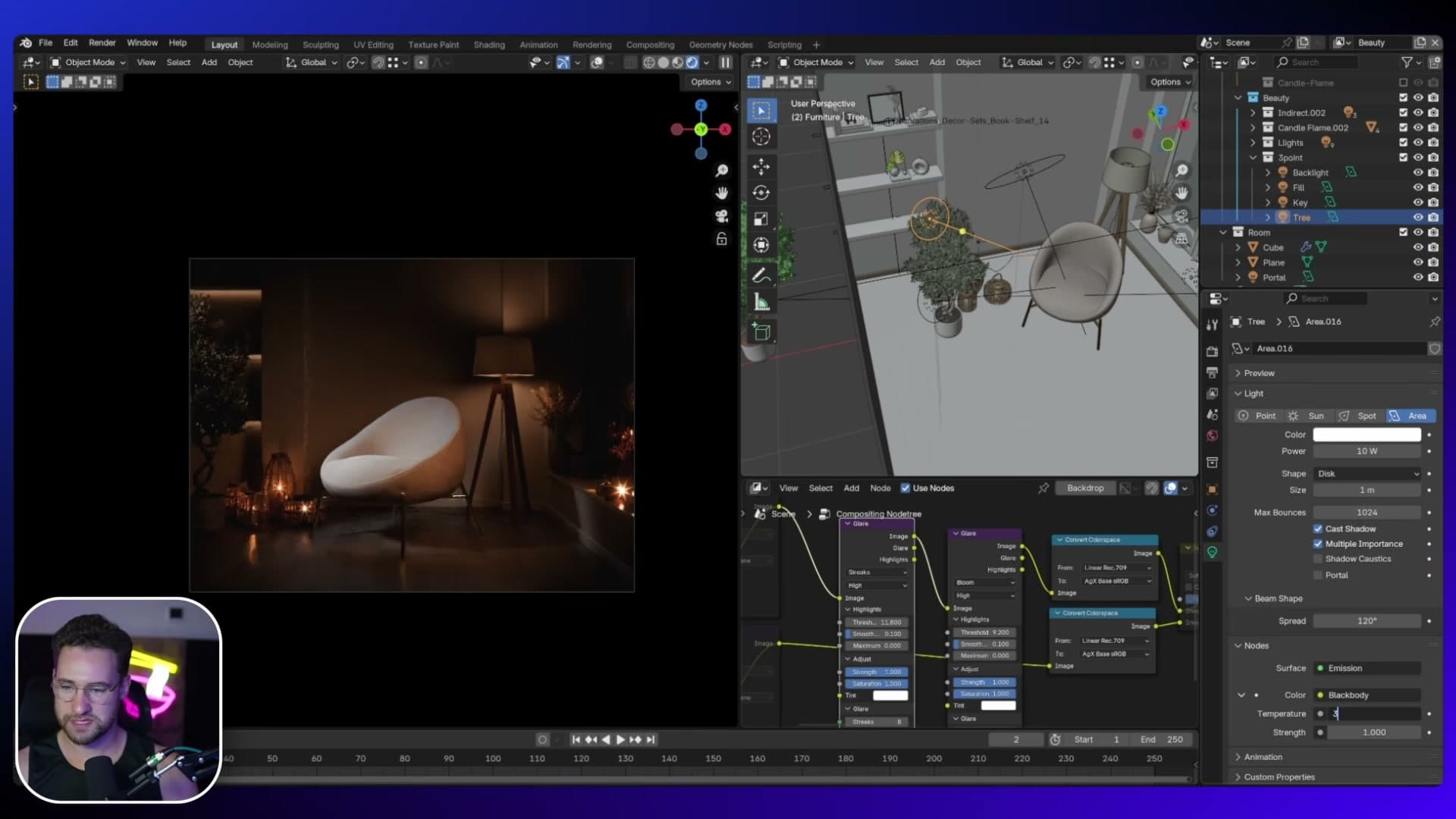
Now that the light is no longer spilling onto everything, you can pull the strength back hard. A value of 20 reads too punchy on the tree itself; 10 with a slightly warmer colour temperature ties it back into the rest of the rig and stops it from feeling like a separate, cooler render layer pasted into the shot.
Light Linking shelf lights to the decor only
The shelving along the back wall has the same silhouette issue as the tree. The ornaments are sitting in a black void with no light reaching them, so they barely register in the final frame. The answer is the same trick as the tree light, with a slightly different intent: add two simple area lights, one per shelf, aimed downward at the decor.
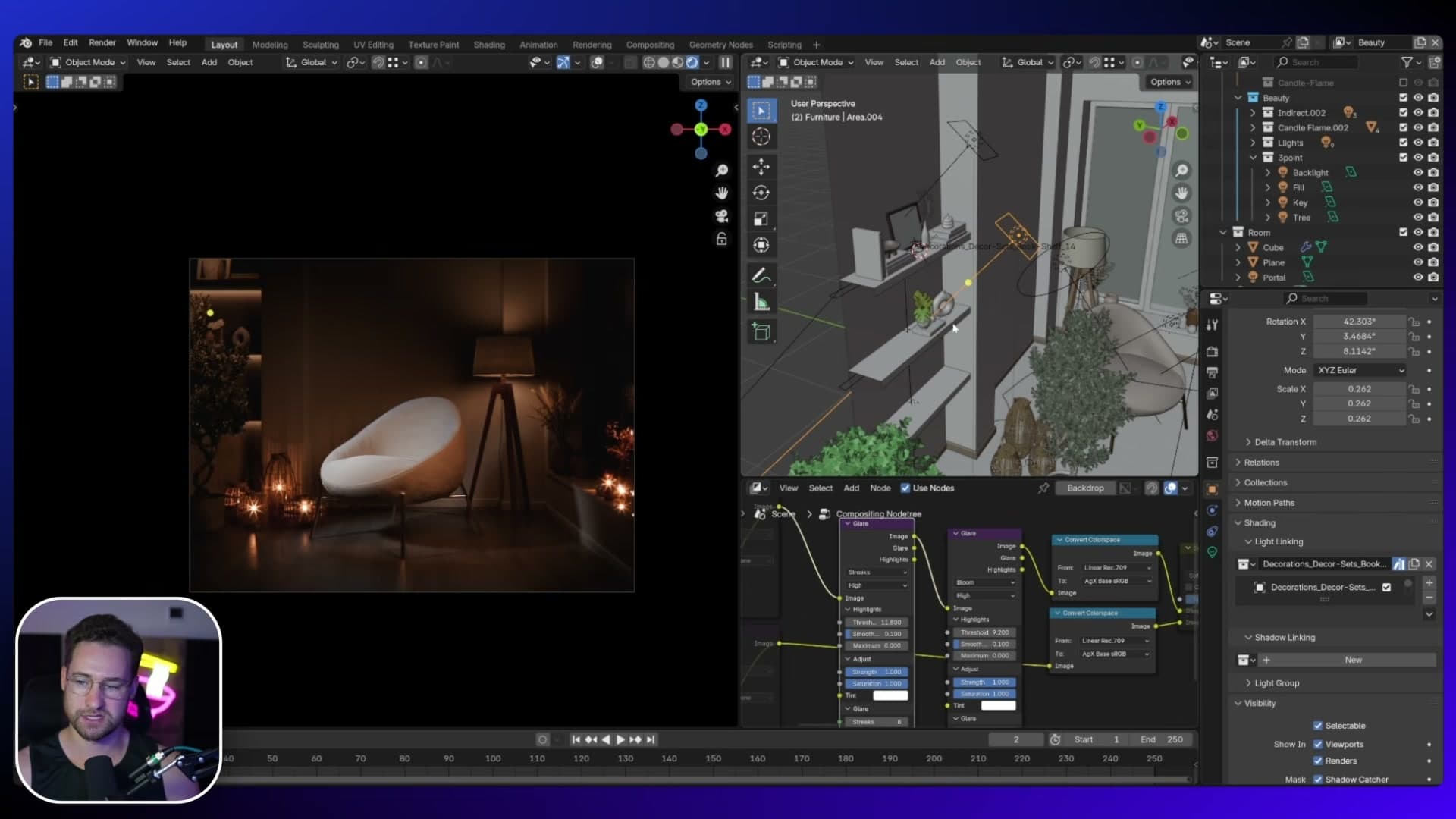
Left untouched, those two lamps would also dump illumination onto the back wall behind the shelves, which fights the deliberately dark backdrop. Select each one in turn, open Object Properties and drop down to Relations → Light Linking. Scope each lamp to the shelf-decor collection only.
Toggle Light Linking off on one of them for a second and you'll see the alternative: a soft wash of light spreading up the back wall behind the shelf. That's a perfectly valid look if you want a softer, more lived-in interior. For this beauty shot, though, the point is to feature the objects themselves, not the architecture behind them, so the scoped version wins.
That's the rig complete: a cold 6500 K key with a tight 40° spread, a warm low-strength fill into the shadow side, a cool rim from behind, plus a dedicated tree light and two shelf lights scoped through Light Linking. Drop almost any chair or furniture piece into this kind of setup and it'll pop straight out of the frame. That's exactly why this is my favourite of the three scenes.
Wrap-up and which mood wins
A final side-by-side of all three setups and why the same hero scene reads completely differently depending on the lighting choices you commit to.
Three moods, one scene
That's the same hero bedroom lit three completely different ways: a soft Scandinavian daytime, a moody evening with candle glow, and a studio three-point beauty shot. Each one ran from the same geometry and the same camera, with only the View Layer swap deciding which lights were on and which were off.
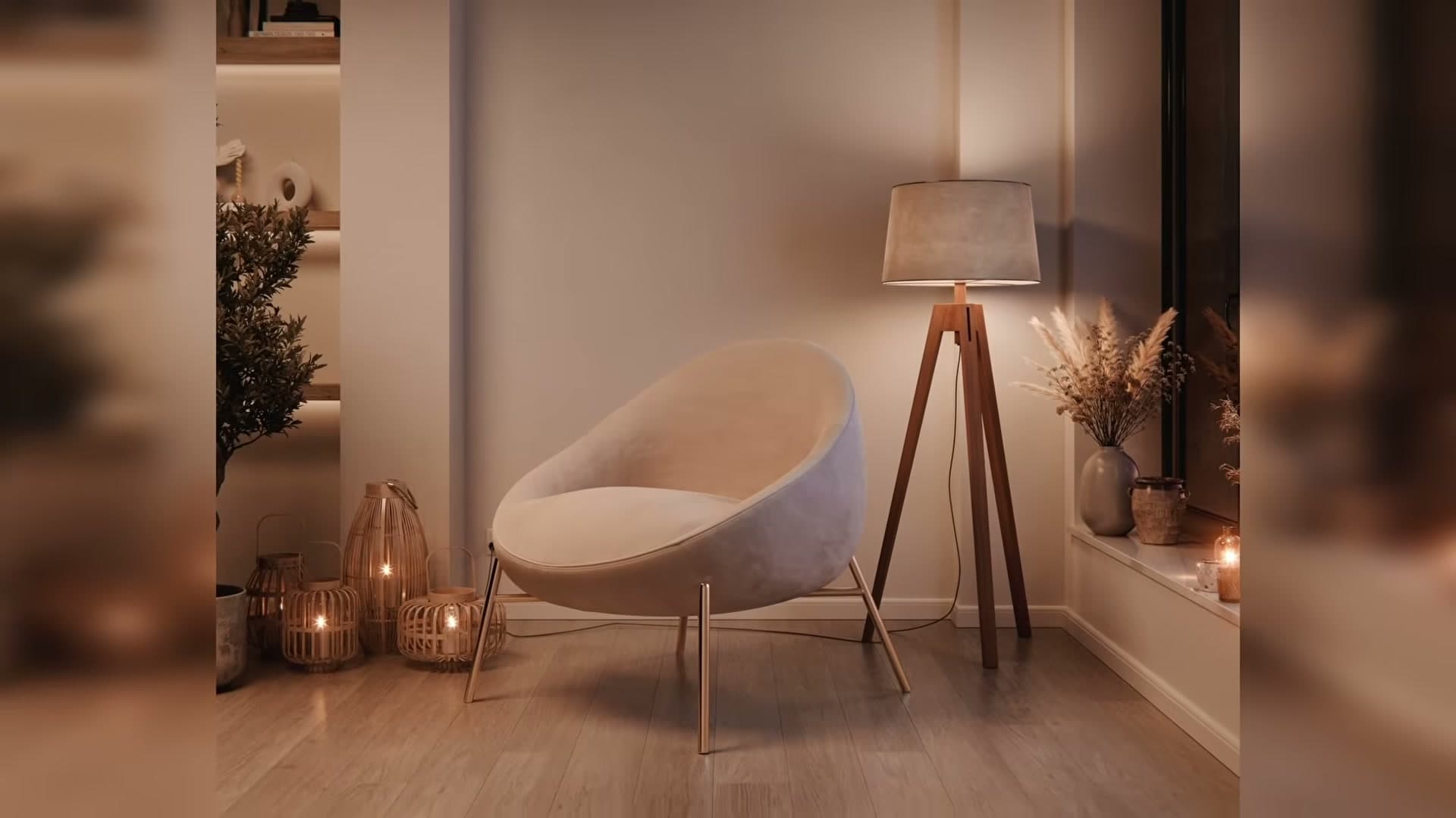
If you've followed along, the takeaway is that lighting is the single biggest mood lever you have. The daytime render reads as airy and editorial, the evening render leans cinematic and intimate, and the beauty shot pushes the room toward product-photography polish, all without touching a material or moving a piece of furniture.
If you'd like to pull the scene apart for yourself, it's part of the iMeshh library so you can open the file, toggle between the day, night and beauty View Layers, and reverse-engineer the exact light positions, strengths and Light Linking relationships used here.
And if there's another type of scene you'd like to see lit three ways, like a kitchen, a living room or an exterior, that's the format I want to keep running with, so leave a suggestion on the video itself.
Tools and credits
Everything mentioned in this tutorial, with links.
- Blender is the renderer this entire build runs in.
- iMeshh is the studio platform (project management, client review, asset library, invoicing). The asset library used in this tutorial is included with every iMeshh Pro plan.
- Poly Haven offers free CC0 textures and HDRIs.
Pillar guide: Lighting hub