Why these archviz tips matter
A quick orientation: iMeshh's masterclass tutorials are long, so here are the highest-impact tips condensed into one watch. Each tip below is something you can apply to your very next render.
The iMeshh library and what this top-tips video covers
If you have not come across iMeshh before, the short version is that we run one of the largest independent archviz asset libraries available for Blender: well over a thousand models, materials and scenes built specifically for architectural visualisation. The full platform now wraps that library together with project management, client review and the rest of the studio workflow, but the asset side is where most viewers find us first.
Our channel is built around feature-length archviz tutorials. They are deliberately long because they walk from an empty scene all the way through to post-production, and that level of detail is what some people want. The trade-off is obvious: not everyone has two or three hours to sit down with a Blender tutorial in one go.
This post is the condensed version. I've pulled the highest-impact lessons out of those long-form videos and stacked them into a single watch: the techniques that, in my experience, separate a render that looks amateur from one that looks like it came out of a studio. Each tip is small enough to apply to the very next image you make.
The first tip sets the tone for the rest. It is one of the easiest things to get right, it is one of the most common things to get wrong, and people argue about it constantly: keeping your camera locked to a true ninety degrees.
Tip 1: Keep your archviz camera locked to 90°
The fastest win in archviz: keep vertical lines vertical. Tilted walls read instantly as amateur work because the brain auto-corrects real-world verticals. There are a few exceptions (top-down and close-up product shots), but otherwise this is a rule, not a suggestion.
Why vertical lines must stay vertical
A wonky camera (one that isn't sitting at a true 90°) looks unprofessional. It's the single biggest tell of an amateur archviz render, and pretty much every professional working in the field keeps the camera locked vertical. It's an easy rule to follow, and for beginners it's a rule worth treating as non-negotiable.
Scroll through any archviz portfolio on Behance and you'll struggle to find a single image where the camera isn't at 90°. There's a reason for that. When you stand in a real room and look across to the far wall, every vertical line is straight. None of them lean. Even when you turn your head, your brain quietly rotates your eyes to keep verticals upright. That's what your visual system is trained on.
So when someone looks at a render where the walls are subtly falling inward or outward, it feels wrong in a way they often can't articulate. The image reads as if the room itself is tipping over. The viewer doesn't necessarily know why the picture looks off. They just know it does.
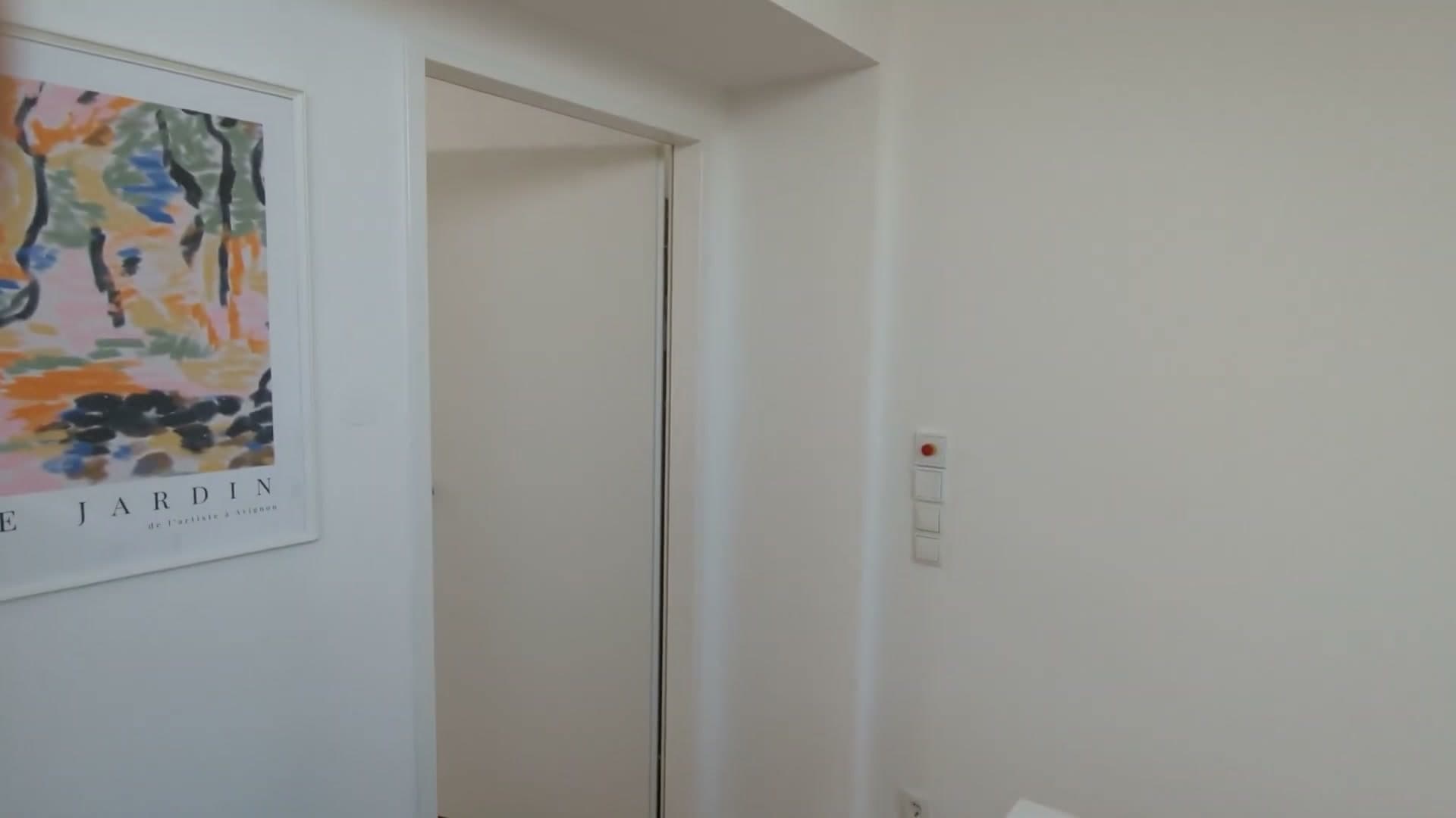
If you're starting out in archviz, the fastest single upgrade you can make is to put your camera at 90° and leave it there. Get a few years in and want to experiment with tilted styles? Fine. But until then, vertical stays vertical.
When it's okay to break the 90° rule
There are a couple of situations where breaking the 90° rule is genuinely fine, and they're worth knowing so you don't apply the rule mechanically.
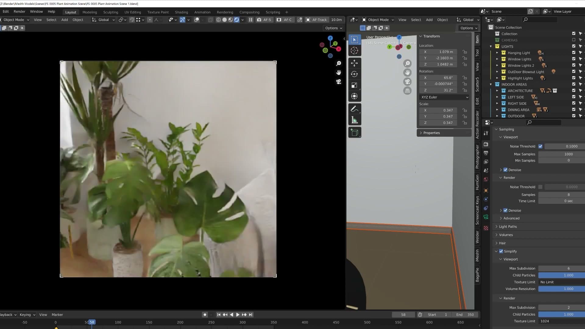
The first is a high overhead shot, with the camera lifted well above head height and angled down into the room. This works because it sits so far outside a normal human point of view that the brain stops trying to auto-correct. You don't have an instinctive memory of what a living room looks like from ten feet up, so leaning verticals don't feel wrong.
The second is a tight close-up, for example looking down onto an object sitting on a shelf. If you imagine yourself physically leaning over to inspect something, your eyes naturally see those verticals tilt, and your brain is used to that. A render that recreates the same angle reads as believable for the same reason.
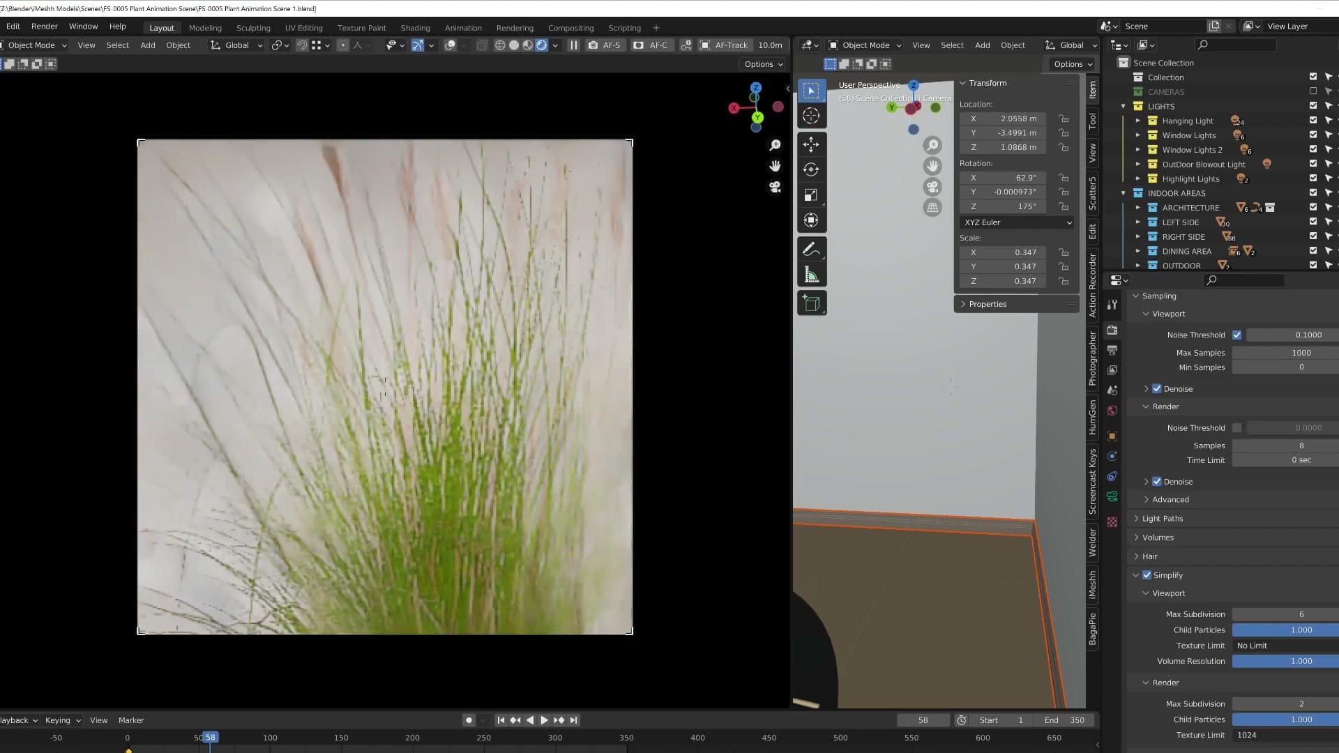
For everything else (a full interior, an exterior, anything shot at normal eye height) keep the camera at 90°. You can't go wrong with it. Tilt it, and you usually can.
Tip 2: Master post-production
Almost no render leaves Blender finished. Curves, masks, glass touch-ups and exterior brightness pushes are what separate a render from a final image. Photoshop, Affinity Photo or the Blender compositor: pick one and learn the basics.
Why renders always need a post pass
Post-production is one of the most important skills anyone working in 3D can learn, not just for archviz but for any flavour of CG. It does scare people away because it can come across as daunting, but it doesn't need to be complicated. There are huge amounts of free material online covering the very basic adjustments that lift an image, and even a handful of those will move your renders a long way forward.
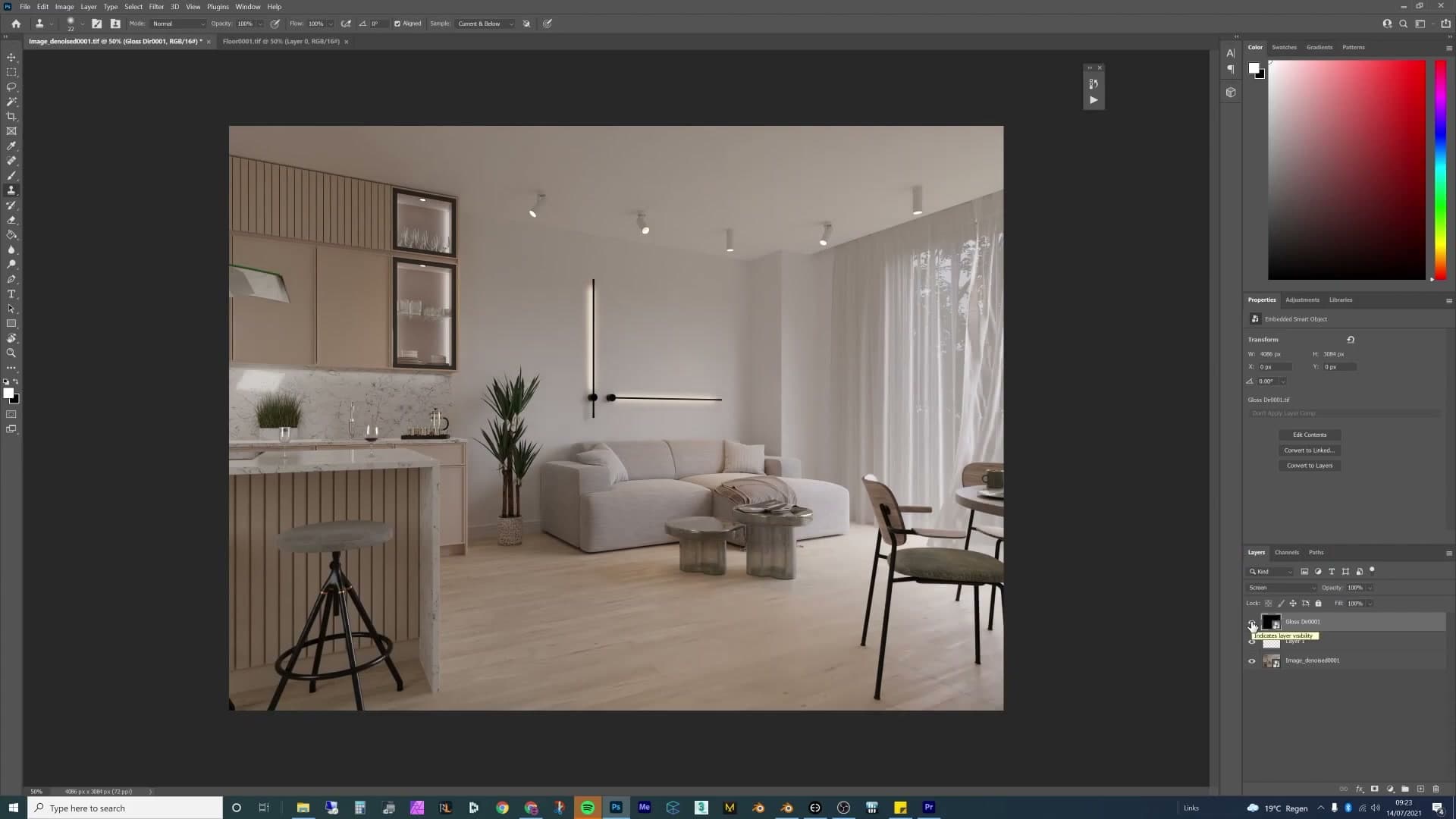
The reason it matters so much is simple: it is very, very rare (almost never) that you'll get an image straight out of Blender that's 100% finished. Whatever the render looks like when it leaves Cycles, there's almost always something you can do on top to push it. That might be masking the glass to lift it, brightening the exterior outside the windows so it reads as realistic daylight, or any number of small tonal moves. There's always a way to find something.
These techniques can get complicated at the high end, but the entry point is friendly. A handful of simple curves, masks and brightness tweaks is enough to start seeing a noticeable difference, and that's the level you want to aim for first before worrying about anything fancier.
Photoshop vs Affinity Photo vs the Blender compositor
You've got three realistic options for the post pass, and any of them will get the job done. What matters more is that you pick one and actually learn the basics.

The Blender compositor handles most of the simple adjustments you'll need, and it lives right inside your scene file so there's no extra software to install. The downside, in practice, is that it tends to be quite slow to work in, which is why a lot of archviz artists end up reaching for an external editor instead.
Photoshop is the personal preference here. By the time the image has saved out of Blender it's heading into Photoshop anyway, and it's much easier to reopen the file the next day, look at it with fresh eyes and make small adjustments. That iterative, come-back-to-it-later workflow is hard to beat. If you don't already have a subscription, grab a trial and see how you get on.

Affinity Photo is the obvious alternative if Photoshop's pricing isn't for you. It's more affordable and covers the same kind of archviz post work. Whichever of the three you land on, the actual advice is the same: go and find some good tutorials online, learn what the basic moves are, and start using them on every render that leaves your machine.
Tip 3: Build a mood board for every project
A mood board isn't one reference image you copy. It's a collection covering lighting, layout, colour and material direction. Pinterest and PureRef are the standard tools. Without one you're limited to whatever's already in your head, which is rarely enough.
Mood boards aren't cheating. They're a research library
Build a mood board for every single project. Some artists call mood boards cheating. That's a complete misconception, and one that quietly limits the work of anyone who buys into it.
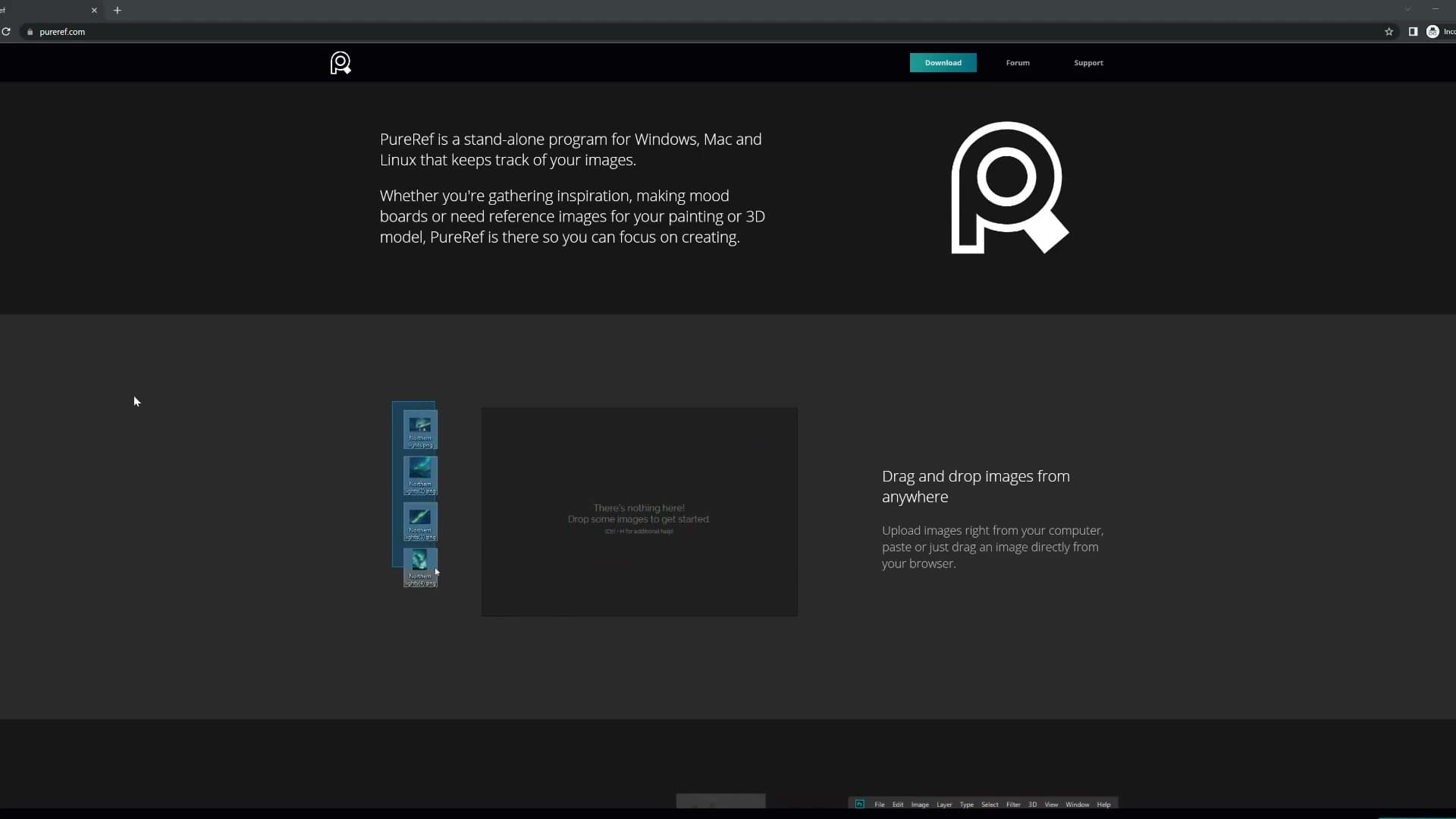
A mood board doesn't mean finding one image you like and replicating it exactly. It's a collection of references, broken down by the elements of the scene: how you want the sofa set, how you want the lighting to hit, the kind of colours you're chasing, the type of flooring you're after.
The goal is to gather enough different images that they inspire something new and unique, not feed you a single template to copy. A mood board is a research library, not a shortcut to someone else's render.
Pinterest and PureRef for archviz references
Two tools cover the workflow. Pinterest is the place to start a board and gather references in bulk: search a style, scroll, pin anything that fits the brief. PureRef is the Windows reference-board application used to pull all of those images together onto a single canvas for the look you're going for.
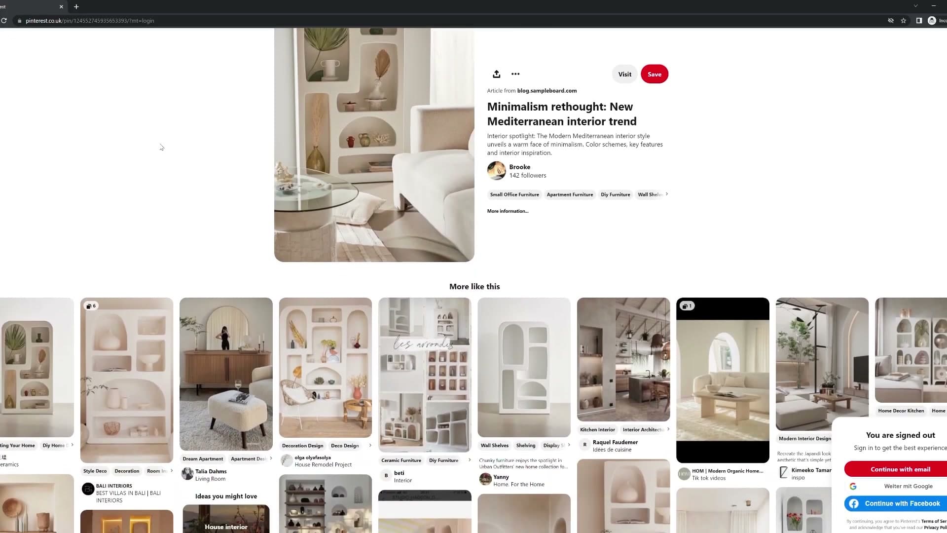
The reason this matters is depth. Say the brief is a Mediterranean image. How many Mediterranean references do you have in your head, in enough detail to really understand the types of bricks they use, the flooring they use, the colour the doors usually are? You want a library you can access easily for the kind of image you're about to make.
If you've spent your whole life making Mediterranean images, you probably have a good idea of how to do it off the top of your head. Every other artist, and especially a new one, won't have that information in their head and accessible for every single image they need to create. Skipping mood boards means capping yourself at the very limited knowledge you already have of that one particular topic.
Tip 4: Use Blender's Sun Positioner add-on
The Sun Positioner ships with Blender but almost no-one uses it. It links a sun lamp to an HDRI or sky texture and lets you choose a real-world location and time of day. Perfect when a client wants a specific sunset on their building. It also animates beautifully.
Link the sun lamp to a real location and time
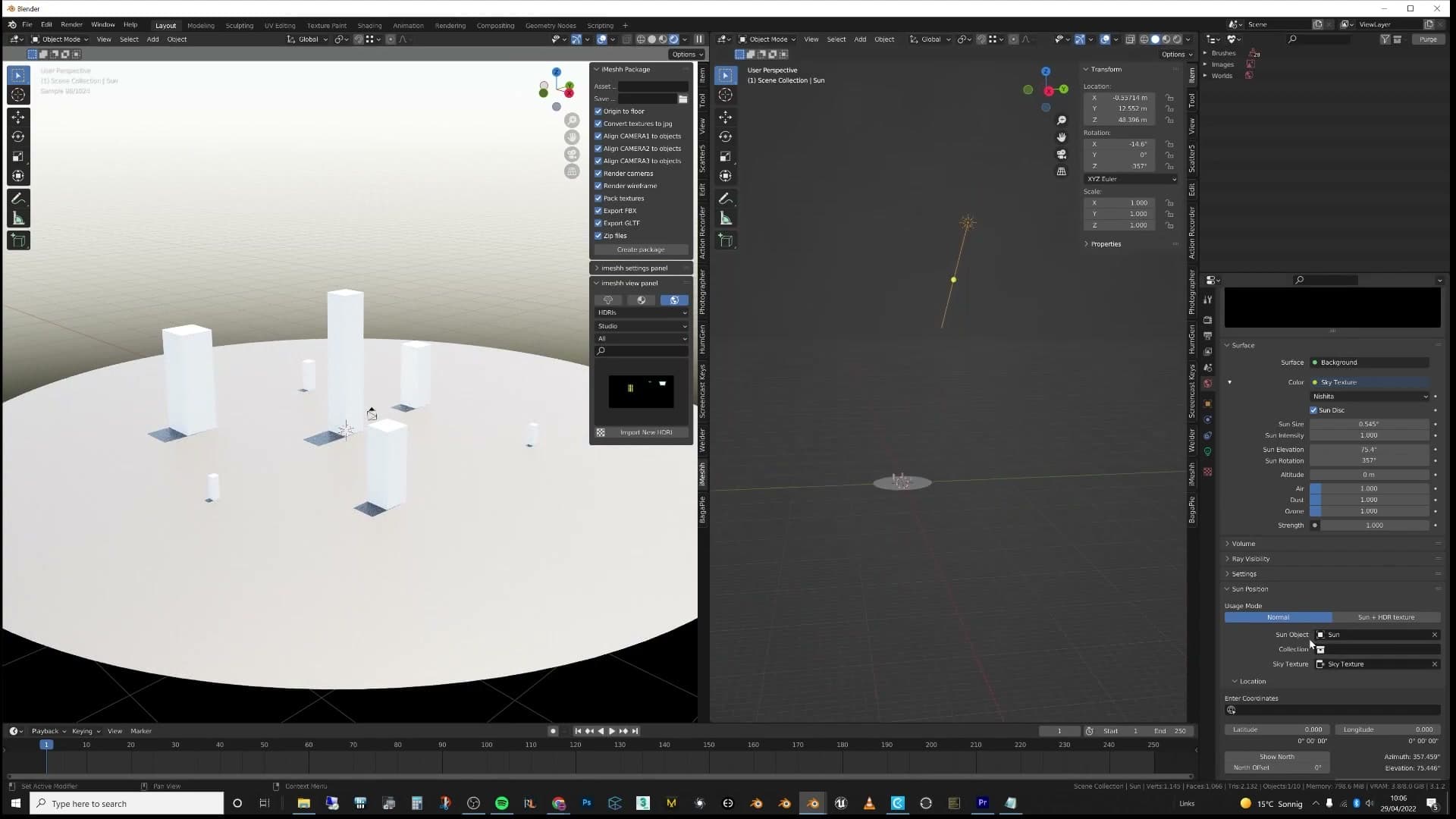
The Sun Positioner add-on ships with Blender, yet it's one of those features almost no-one seems to use. It originally came across from 3ds Max, where it's part of the daily archviz toolkit, and the Blender equivalent is every bit as capable.
At its core, the add-on links your sun lamp to a sky texture or HDRI. You tell it which direction you'd like the sun to come from, pick a specific time of day, and the sun lamp's angle in the viewport updates to match. You've got an immediate visual reference for exactly where the light is coming from.
The real value shows up the moment a client gets specific. Say a London studio approaches you with a new build and tells you they want to showcase the way the sunset hits their façade at a particular hour. Without the Sun Positioner you'd be flicking between online sun-path calculators trying to translate latitude, longitude and time of day into a believable angle in Blender. With it, you set the location, pick the moment, and the sun is already pointing the right way.
It's worth a play on the next exterior you're working on. Clients tend to appreciate it when the shadows falling across their building actually match what they'd see on site at that hour.
Animate a sunset time-lapse across the scene
The time of day isn't locked once you've set it. It can be animated. Keyframe the sun's position and you've turned the same setup into a time-lapse, with the sun arcing across the sky and dipping into sunset over the course of the shot.
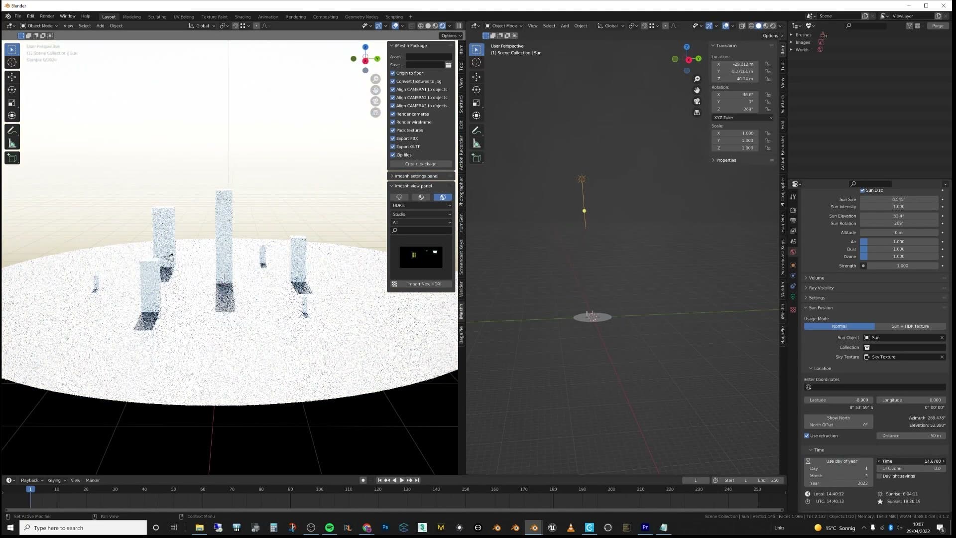
Pair that with a camera moving through the building and you've got something genuinely cinematic: a fly-through where the light shifts as the viewer travels. It's the kind of bonus deliverable clients remember, and once the sun lamp is linked it costs you very little extra work to add.
Tip 5: Make shadows tell a story
A flat sunlit rectangle on a wall is boring. Cast that same sunlight through a tree, through raindrops on the window, or through anything textured and it becomes a storytelling moment: wet boots on the floor, a passing storm, a quiet morning.
Break up light with trees, raindrops and storytelling props
A clean patch of sunlight landing on a back wall feels finished, but it's usually the dullest version of the shot. Shadows can be genuinely beautiful or completely flat, and the difference comes down to whether you've put anything between the light and the surface it lands on.
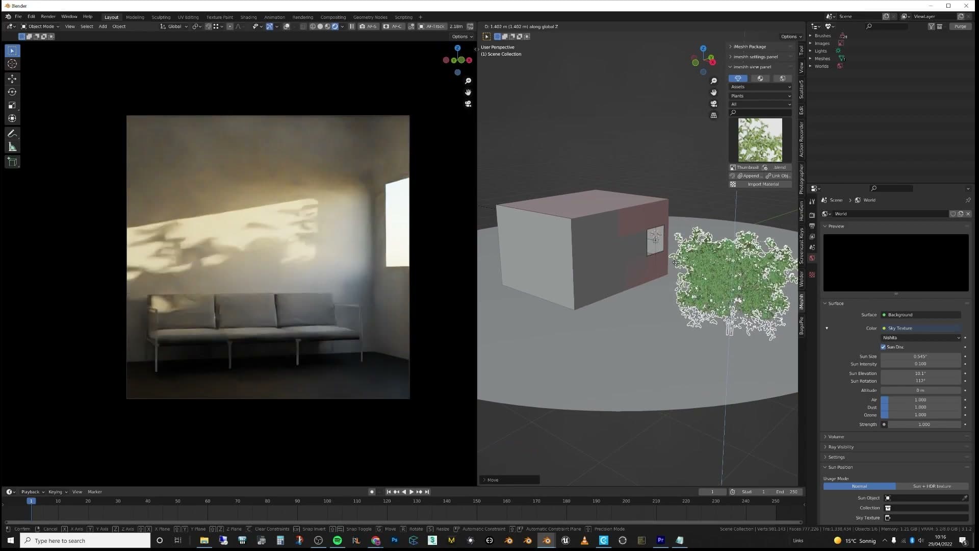
Drop a tree just outside that back window and the same sunbeam now paints dappled leaf shadows across the wall. The pattern breaks the light up, adds detail to what would otherwise be a flat panel of colour, and reads as far more interesting than a plain rectangular shadow. Once you start looking for it, you'll notice that almost every striking interior shot has something textured filtering the light.
Shadows are also one of the easiest places to slip storytelling into a render. Pair a wet pair of boots on the floor with a window streaked in raindrops, then push the sun through breaking clouds. The wobbly raindrop shadows on the wall tell the viewer there's just been a storm, and the boots tell them someone walked in moments ago. That's a much richer image than sun, window, wall.
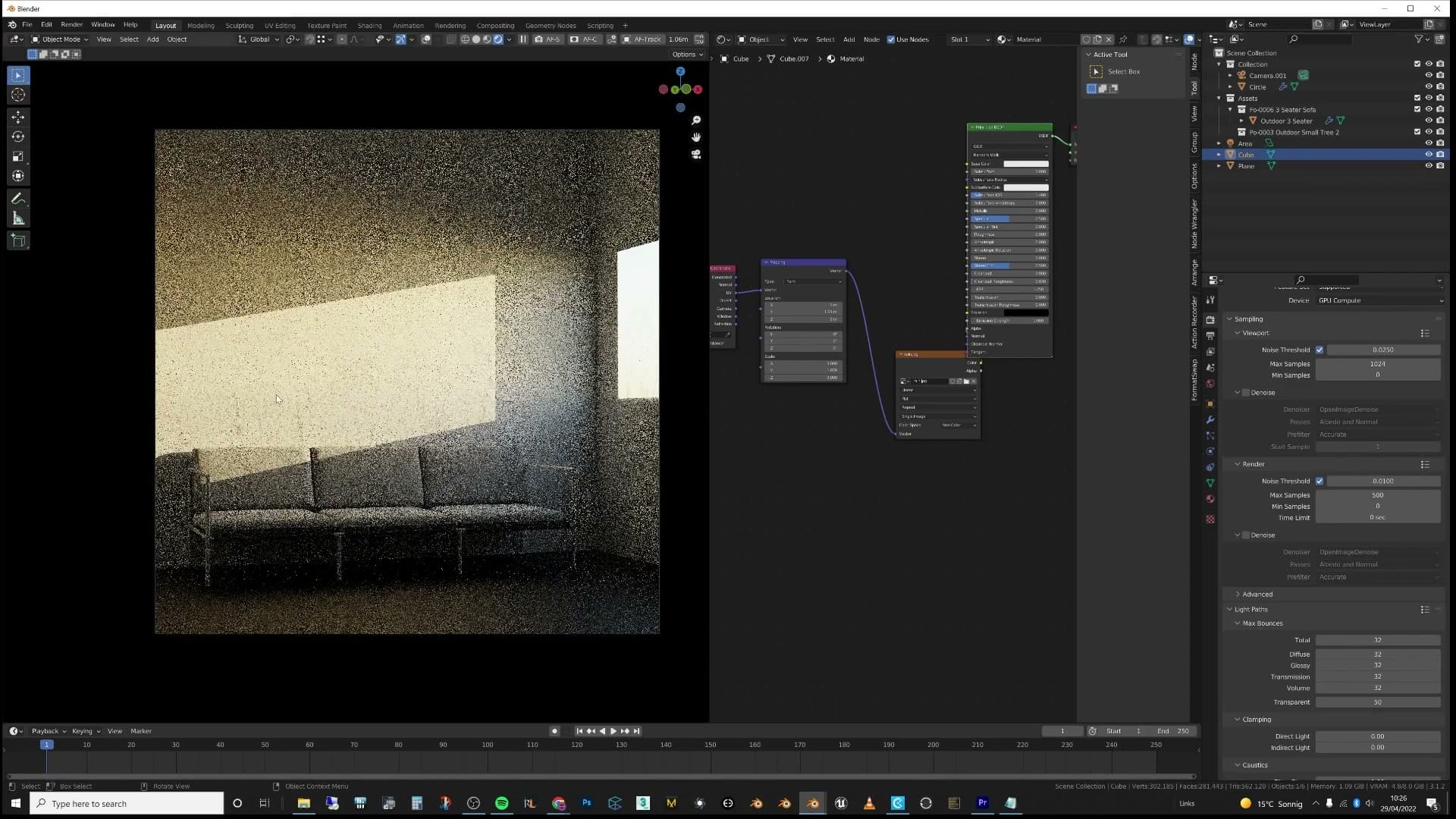
The takeaway is simple: when light is casting a shadow into your scene, treat it as a creative opportunity rather than a finished result. Shadows are your friends, and there's a lot more you can do with them than let them sit as flat rectangles.
Tip 6: Don't stagnate in one style
A portfolio of near-identical renders signals an artist who stopped growing two years ago. Even if your house style works, actively explore new lighting, modelling and post techniques. Otherwise you can't push your favourite style to the next level either.
Why portfolio variety wins new clients
It's a familiar pattern in archviz portfolios: an artist nails a beautiful render two or three years ago, falls in love with that look, and then every subsequent image is a near-clone of it. Same lighting mood, same camera energy, same materials. The portfolio ends up reading as same, same, same, same, same. One idea repeated for years.
There's nothing inherently wrong with that. If you've found a style that lands with a specific audience and you're getting enough work from that audience, doubling down on it is a perfectly valid business decision. Some clients seek out exactly that consistency.
But if you're trying to attract new clients, make strangers fall in love with your work, or land a job at a new studio, a portfolio that visibly explores different lighting situations, different modelling techniques, different rooms and the occasional out-of-the-box experiment will outperform a one-note portfolio almost every time. Reviewers can tell the difference between an artist who keeps reaching and one who stopped reaching in 2023.
Keep learning new techniques throughout your career
The trap is that stagnation isn't only bad for the variety of your portfolio. It's bad for your favourite style too. If you stop actively hunting for new techniques, you lose the ability to push the style you already love to its next level. The render you made three years ago can only become a better version of itself if you're still learning.
Treat archviz as a lifelong craft. You'll keep learning new techniques and improving for as long as you keep working in it. It is extremely rare for anyone to hit a peak and have nothing left to learn. Assume you're not that person, keep your curiosity switched on, and the work will keep getting better year after year.
Tip 7: Use Blender's add-on ecosystem
Blender is open source, so 'there's an add-on for that' is almost always true. There are also dedicated branches like E-Cycles that cut render times dramatically. Don't stay in vanilla Blender just because you're worried about the learning curve.
Find the right add-on for the job
Blender is open source, and that single fact reshapes the tooling landscape around it. Because the source is public and the community is huge, almost anyone with an itch to scratch can write a plugin, and almost everyone has. If you have ever found yourself thinking I really need a tool that does X, the saying around Blender is simple: there's an add-on for that.
The takeaway for archviz is to search before you suffer. Whatever niche problem you have hit (batching exports, lining up cameras, scattering assets, baking lighting, renaming a thousand objects) somebody has almost certainly already built and shared a tool for it. A few minutes of searching online will usually surface either a free add-on or a paid one for the price of a coffee, which is a much better trade than burning an afternoon on a manual workaround.
Don't let the sheer number of add-ons put you off either. A lot of people find the ecosystem daunting at first and stick to vanilla Blender out of caution, but once you start working with a couple of well-chosen add-ons you genuinely can't go back. They exist to speed up your workflow and make you more efficient, not to complicate it.
Branches like E-Cycles for faster rendering
Add-ons are only half of the story. Because Blender is open source, developers can also fork the entire application and ship modified branches with custom render engines, optimisations and features baked in. That means you are not locked into vanilla Blender if you have a problem that needs a deeper fix than a plugin can offer.

The example called out here is E-Cycles, a paid branch of Blender with a heavily tuned version of the Cycles renderer. The claim from people who use it for production is that it can cut Cycles render times by half (in some scenes considerably more), which is significant when you are pricing up a job by the hour or trying to hit a client deadline.
The broader point is to stay curious. Browse the available add-ons, look at the alternative branches people are shipping, and pick a handful that look like they speak to the work you are actually doing. Trial them, play with them, and see which ones earn a permanent slot in your workflow. The worst case is you learn something new; the best case is you halve your render time on the next project.
Tip 8: Block out large, medium and small details
A universal artistic principle: scene first, then medium props, then small storytelling details. Sofa and bed go in first; cushions and curtains next; coffee cups, glasses and offset UV tweaks last. Each scale adds realism the others can't.
Start with the biggest shapes: sofa, bed, kitchen
Blocking a scene out in scales (large, then medium, then small) is a general artistic principle, not an archviz-specific trick. It runs right through painting, illustration and film design, and it works because the eye reads a composition that way: shapes first, then detail, then texture. Taking it seriously is one of the fastest ways to make a Blender scene feel more realistic before you've touched a single material.
Start with the biggest pieces in the room. Drop in the sofa, work out where the bed sits, mark out where the kitchen run will go if the brief includes one. You're not styling at this point. You're committing to the footprint of the space and the silhouette every later detail will have to live alongside.
Resist the urge to skip ahead and start placing props. Until the large shapes are locked, everything you add on top is decoration without a stage. Get the room reading correctly at this scale first and the rest of the pass becomes much easier.
Layer in medium details and storytelling props
Once the big pieces are in, switch to medium-sized detail. This is the layer that tells you how a person actually uses the room: cushions on the sofa, curtains at the windows, a carpet under the coffee table, a couple of larger floor or table lamps.
Think about flow and interaction as you place them. Where would someone sit and read? Where does the light need to land in the evening? Medium props are what give the room its lived-in logic. The large furniture says this is a living room, but the cushions, drapes and lamps say somebody lives here.
Keep the placement honest. The medium pass is also where storytelling starts to creep in, so it's worth slowing down and looking at how each piece sits relative to the big shapes you blocked out in the previous step before you commit.
Small details and UV tricks for hero objects
With the large and medium passes in place, you can finally have fun with the small stuff. Cups on the coffee table, a couple of glasses, a pair of shoes kicked off to one side: these are the props that turn an arrangement into a story. Don't be afraid to be specific. A half-read book on the arm of the chair will always sell the image harder than another generic vase.

Detail isn't only geometry, though. Materials can carry small-scale interest too. Take a chair leg that sits in plain view of the camera: if the wood grain on it looks bland, you don't have to swap the texture. Select that leg's UVs in the UV editor and translate the island across the texture until a more interesting patch of grain lands on the hero side of the object. It's a thirty-second tweak that adds character to a piece the camera is already looking at.
All three scales matter for the same reason. The large shapes give the scene structure, the medium props give it function, and the small details give it personality. Pull any one of those layers out and the render feels off. Leave all three in and the image starts to read as something a person actually lives in rather than something an artist staged.
Gleb Alexandrov's Creative Shrimp channel covers this large/medium/small principle in more depth than fits in a single tip, and it's worth watching the full breakdown if it's a new idea to you.
Tip 9: Add dirt sparingly
Forum commenters love to shout 'needs dirt' on every clean render, but archviz clients almost always brief a brand-new build. The skill is subtle material variation, not visible grime. Keep it new but never sterile.
The over-dirty render trap
This last tip is a slightly controversial one, because the advice you are about to hear runs straight against a piece of feedback that gets repeated on every Blender and archviz forum on the internet. Post a render in a Facebook group or a Blender community and you can almost guarantee that someone in the comments will tell you it needs dirt.
There is a kernel of truth in that note. A surface with zero variation does read as fake, and that is worth fixing. The problem is that a lot of people take the advice literally and overdo it. They smear grime across every surface until the whole scene looks neglected, when what the image actually needed was a touch more nuance.
The real skill is making a material show just enough variation to add interest and detail you wouldn't get from a plain, flat shader, without crossing the line into physically adding dirt to the object. That distinction is where a lot of beginners go wrong, and it is worth holding in mind every time you reach for a grunge map.
Why new-build clients need clean renders
The other half of this argument is about who you are actually rendering for. If you are getting into architectural visualisation as a career, the overwhelming majority of your work will be for clients who have just built or renovated something. New kitchens, new floors, new windows, new balconies: everything in the scene was produced by the construction company and is meant to look brand new.

That changes the brief completely. The client wants the project to look perfectly clean, because in real life, on handover day, it is perfectly clean. Add too much dirt and the feedback you get back will be a polite request to make it cleaner. You will end up doing the work twice.
The right approach is to vary the materials subtly so the room doesn't look impossibly perfect (real surfaces are never completely uniform), but to stop well short of streaks, smudges and grime. Enough variation to add interest and a bit of life. Nothing more.
And please don't add dirt trailing through the scene unless the project genuinely calls for it. Use it sparingly, think about where it would actually appear, and make sure it looks appropriate to the story of the image. Don't go too crazy.
Wrap up and next steps
Try one tip per render rather than all nine at once. The camera angle and post-production passes alone will visibly raise your output. Drop tip requests in the YouTube comments and check out the iMeshh library to support future tutorials.
Final thoughts and how to support iMeshh
That's nine archviz tips, but you don't need to apply all nine to your next render. Pick one, ship the image, then layer in another on the project after that. The camera-framing rule and a short post-production pass alone will visibly lift your output, and they're the two changes you can fold into a scene you've already finished.
If there are tips you'd like covered in a future video, drop them in the YouTube comments and they'll feed into the next round. And if you haven't come across iMeshh yet, the platform brings together the asset library, project management, client review and the rest of the studio tooling that supports archviz work. Every new member helps us put more tutorials like this one together.
Tools and credits
Everything mentioned in this tutorial, with links.
- Blender (the renderer this entire build runs in).
- iMeshh (studio platform: project management, client review, asset library, invoicing). The asset library used in this tutorial is included with every iMeshh Pro plan.
- Poly Haven (free CC0 textures and HDRIs).
Pillar guide: Tips Tricks hub