Back after the RTX 3090 saga: what's free this week
A quick catch-up on the dead 3090 and the 3070 replacement, then a heads-up that there are new free wood floors on iMeshh that ship with the node group covered in this video.
The dead 3090 and the 3070 that saved this video
A quick note before the floors: iMeshh has been off-air for a bit, and the reason is hardware. The RTX 3090 that rendered the last round of tutorials gave up. It went off for repair and came back six weeks later with the worst possible answer: the card could not be fixed, and a replacement was not on the table either, because no 3090s were available to ship. The only option left was a refund.
That refund did not go very far. The original 3090 was bought right at the end of October, just before GPU prices spiked. The same card was suddenly listing at around 3,000 euros, well over double what it should have cost (somewhere in the region of 1,300 to 1,400 euros). Even with the refund in hand, spending double-MSRP on a replacement was not happening, and most retailers had no stock to sell anyway.
Three weeks of refreshing listings finally turned up an RTX 3070, snapped up the same day so videos could start going out again. It is a step down from the 3090, but according to Blender Open Data the 3070 still benchmarks ahead of the Titan. More than enough card for everything in this video, including the node group walkthrough that follows.
New free wood floors and a node group worth showing off
Alongside the return, iMeshh has just pushed a batch of new freebies, with the wood floor materials shown in this video as the headline. One or two of those floors are being released for free so anyone can pull them into a scene and try out the node group that ships on each one. A couple of other freebies have gone up in the same release.
That node group is the reason this video exists. Rather than rebuilding the shader every time a floor does not quite fit a scene, you get a small set of sliders (colour, saturation, roughness, dirt and scratches) that retune the look from one panel. The rest of this post walks through each slider in turn so you know what every control actually does before you start dragging it.
Single-texture wood floors and the 16K close-up option
How one texture is sized to fill an entire room without obvious tiling, plus when (and when not) to drop in the 16K variant for hero shots.
One texture, random planks, room-scale coverage
The wood floor ships as one whole texture, sized so it can cover most rooms in a single pass. There's no need to split the material across multiple UV islands or chop the floor mesh into tiled sections to get it to fill the space. Drop it onto the floor and it covers.
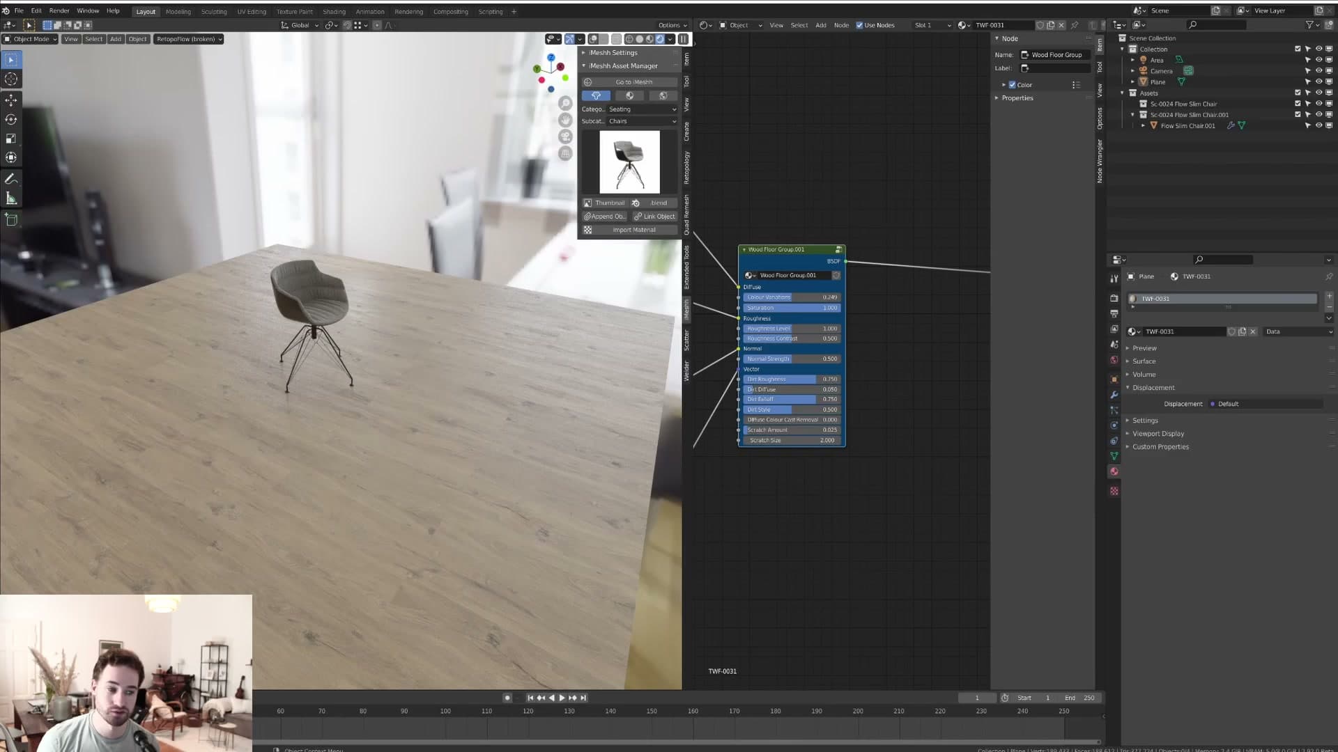
Tiling rarely becomes a problem because every plank inside the texture is randomised. When the floor does repeat across a large area, the eye doesn't latch onto an obvious pattern, since no two adjacent planks read the same. You can stretch the floor a long way before any visible repeat starts to show.
Most interiors won't go anywhere near that limit. The 16K close-up variant exists for the cases that do: when the camera is sitting on the floorboards rather than looking across the room.
The 16K option, the VRAM bill and Blender's preview freeze
Every wood floor in the pack ships with a 16K variant alongside the standard map. Swap the 16K version in when the camera is close enough that you need every grain readable, and the texture will still hold up at that distance.
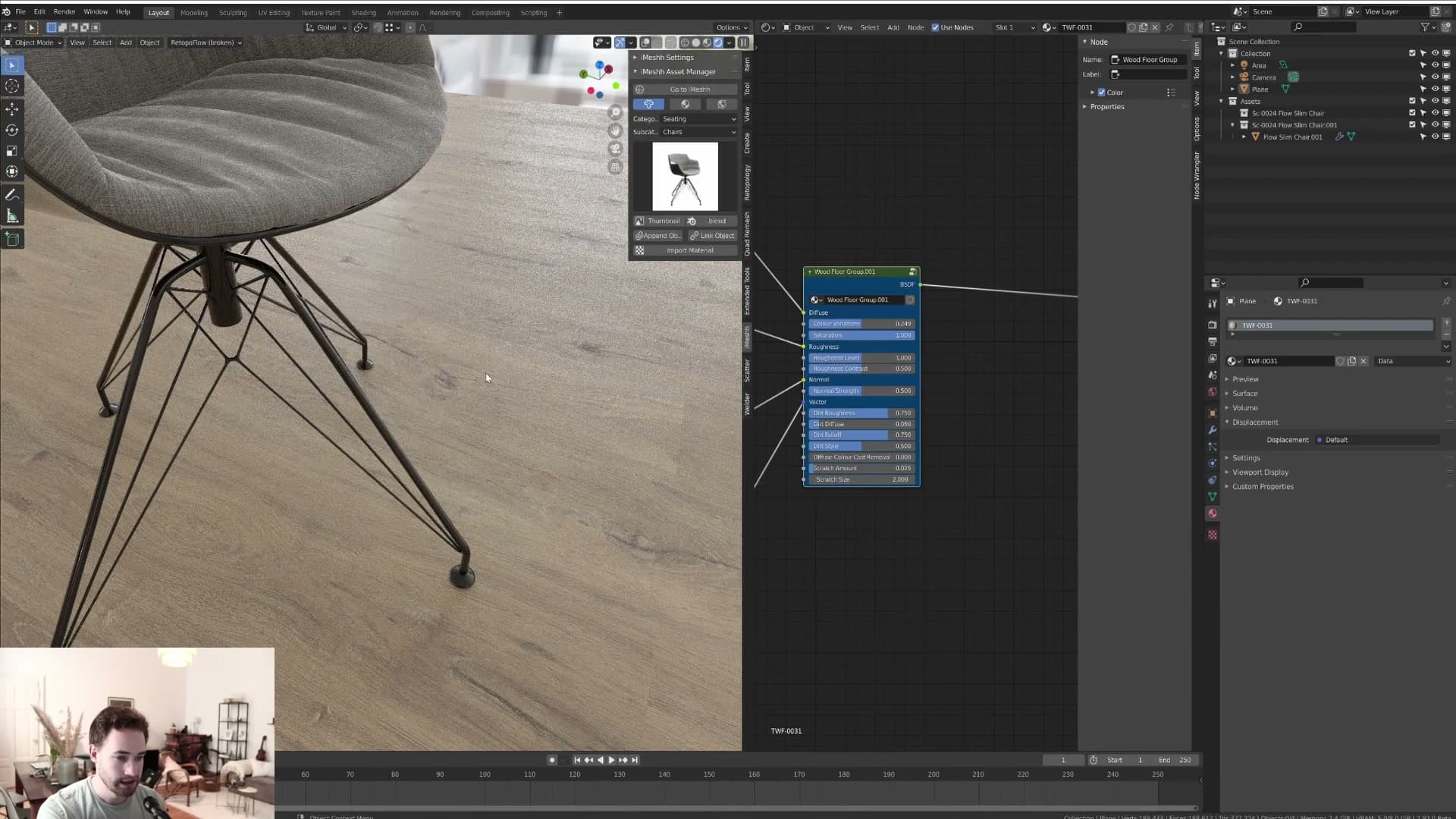
The cost is VRAM. A single 16K texture on an RTX 3070 ate roughly 5GB of the card's 8GB, well over half the budget for one map. Treat 16K as a hero-shot tool, not a default for the whole scene.
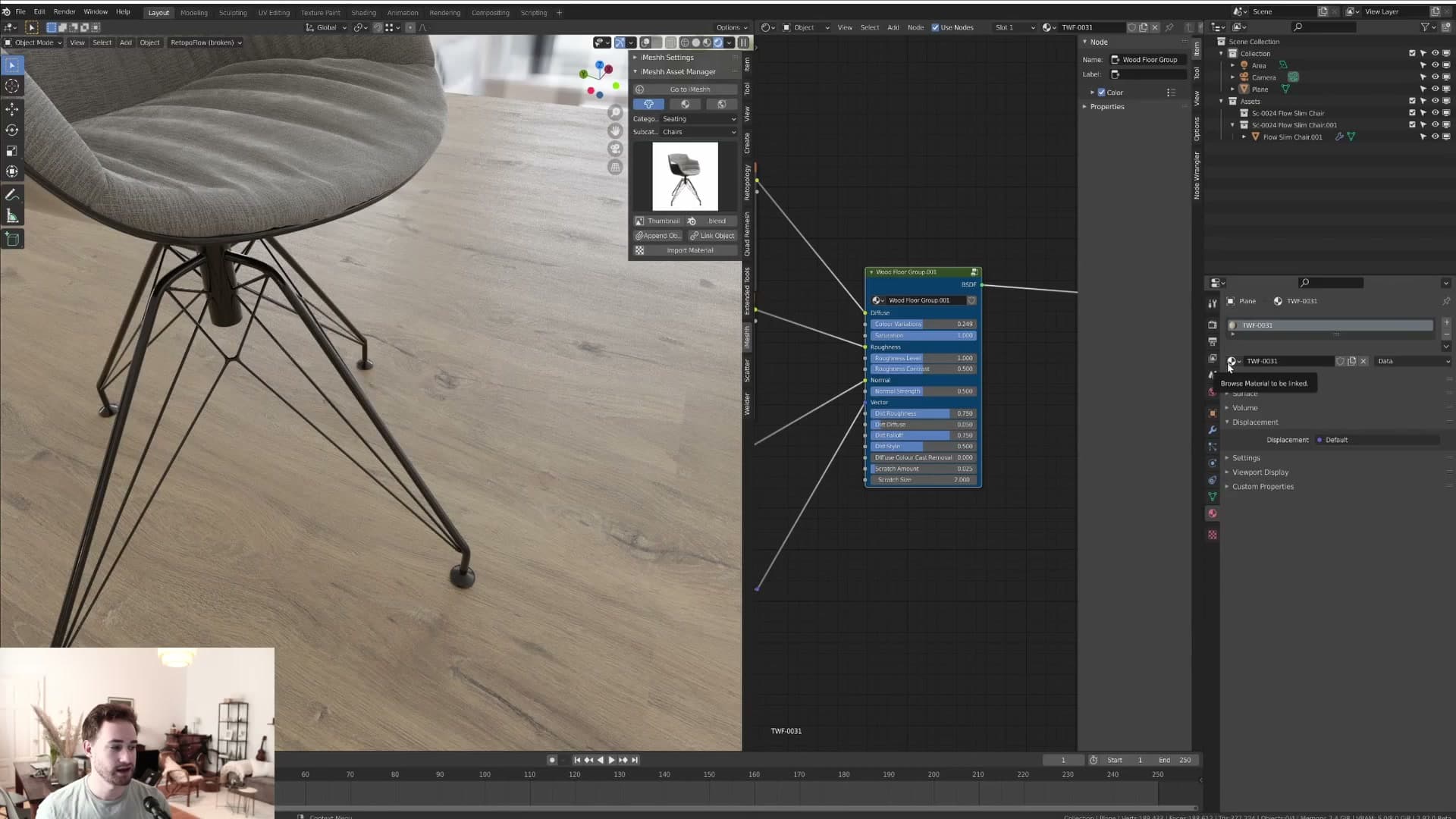
A practical workflow is to keep the standard texture on the floor for the bulk of your renders and only swap in the 16K variant for the close-up. The shader is otherwise identical, so the same floor reads consistently between the wide shot and the hero shot.
Why this node group exists in the first place
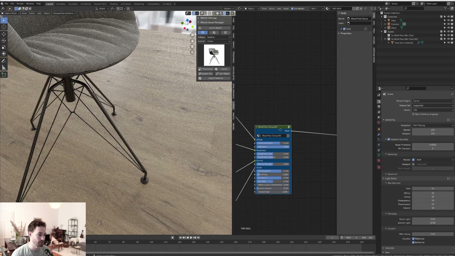
Every wood floor was getting the same fixes: desaturate, dial roughness, add dirt. The node group is that recurring fix-up baked into a reusable shader.
Turning a repeated fix-up into a 1.0 node group
This is the wood floor node group at version 1.0: a deliberate first pass rather than an everything-and-the-kitchen-sink panel. The thinking is simple. Instead of rebuilding the same handful of fixes on every floor, the recurring tweaks live inside the group and surface as sliders you can dial in from one tidy panel.
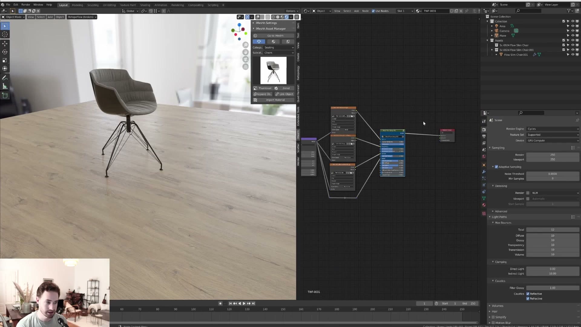
There is a lot going on behind the scenes of the node group, so 1.0 keeps the exposed controls intentionally focused. Loading the panel with every conceivable setting would make it heavy and awkward to work with, so what is surfaced is what gets reached for on real floors, and nothing more.
If a control you want is not there yet, the door is open. When future iMeshh floors ship, a 2.0 version is on the table, and a genuinely useful slider someone else would like to see has a shot at making the cut.
Colour variation, saturation and roughness controls
The four sliders that handle most of the per-floor look: per-plank colour variation, overall saturation, roughness level and roughness contrast.
Colour variation: give each plank a slightly different tone
The first slider in the node group is colour variation. Pushed to the top, every plank takes on a slightly different tone, so the floor reads as a collection of individual boards rather than one tiled image repeating itself.
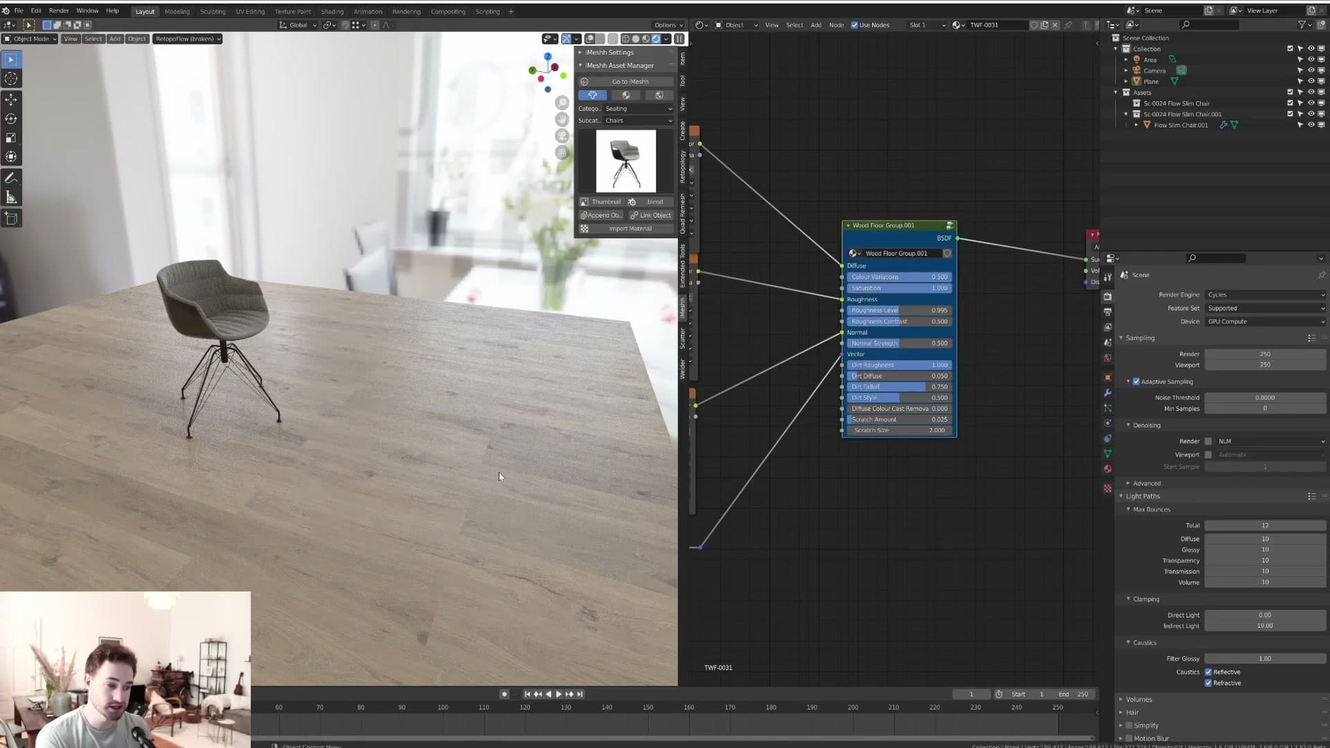
I tend to leave this one turned on by default. A small amount of plank-to-plank variation almost always looks more believable than a perfectly uniform floor, and the cost of dialling it in is a single slider.
Saturation: taking the edge off an oversaturated wood
Next is saturation. A lot of stock wood floors come out a touch oversaturated straight from the texture, and this slider is the quickest way to take the edge off without leaving the node group.
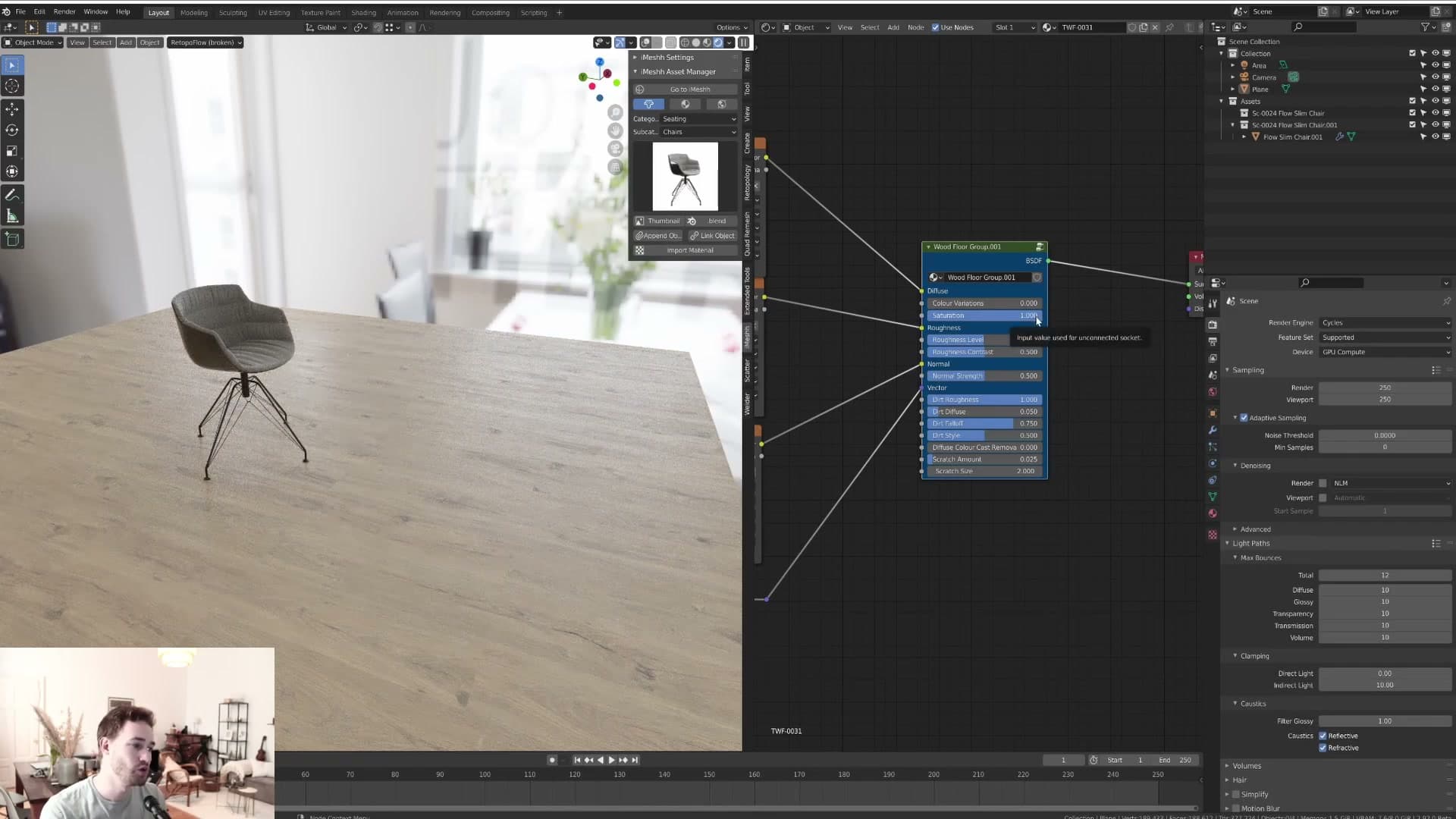
If you push the slider far enough you can fully drain the colour out, which is useful when you want a near-white, desaturated floor without sourcing a separate material. Most of the time you'll only need a small move to bring an aggressive wood tone back into something a room can sit on.
Roughness level: glossy vs matte planks
Roughness level controls how glossy or matte the planks read overall. Turn it down and the surface goes glossy, almost lacquered; turn it up and the timber looks dry and matte, the kind of finish you'd expect on an oiled or unfinished board.
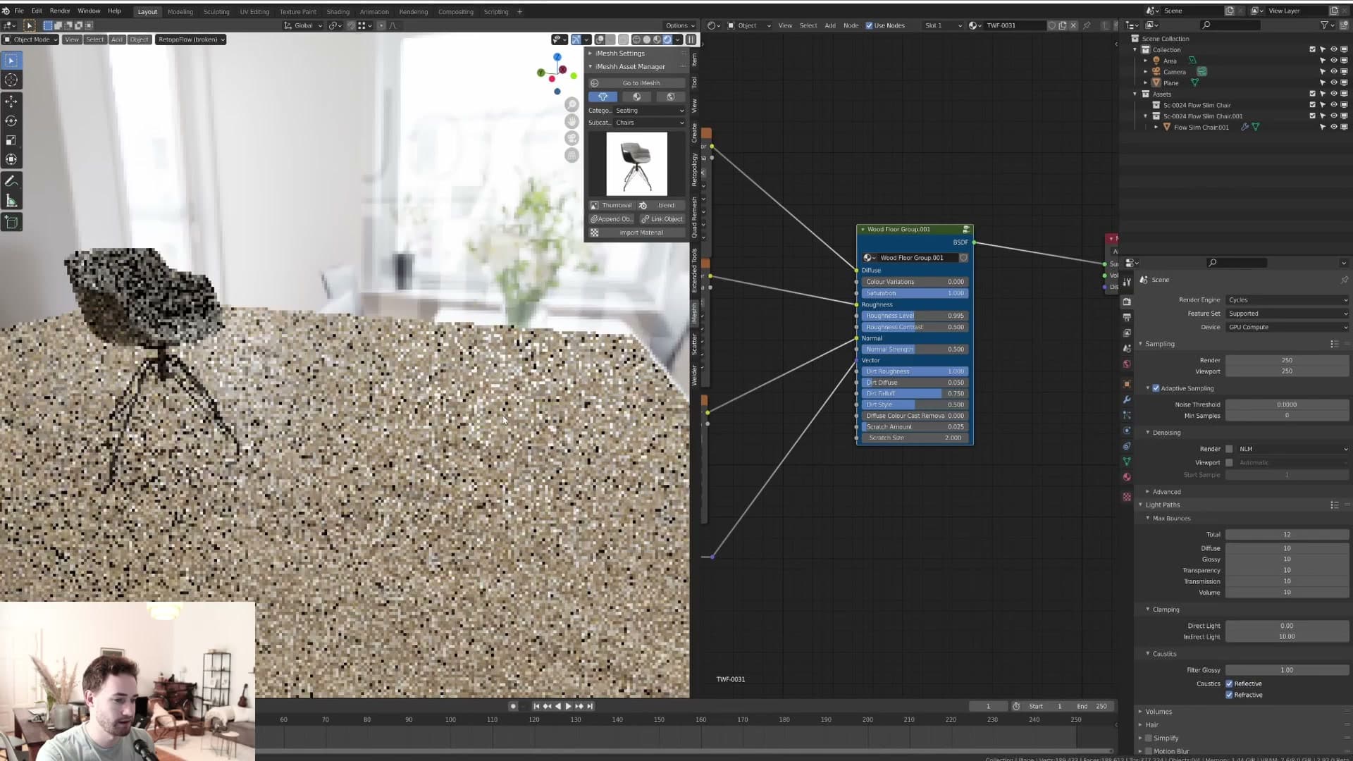
I park this around 0.5 as a sensible midpoint. From there you can nudge it in either direction depending on whether the floor in your scene is meant to be a polished finish or a raw, low-sheen timber.
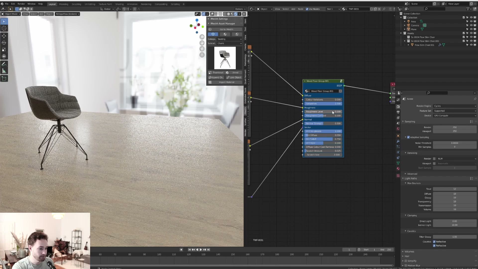
Roughness contrast: the slider that pops your render
Roughness contrast is the slider I single out as the one that really sells the floor. Rather than changing how rough the timber is overall, it changes how much the roughness varies from plank to plank.
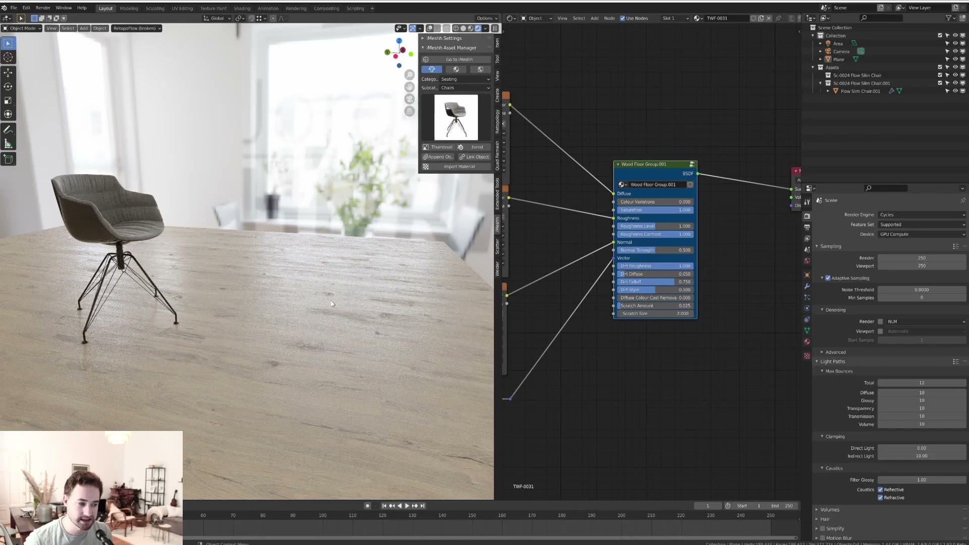
With the slider at the bottom, the roughness is effectively a single value across the whole floor: flat, uniform, and a bit lifeless under light. Push it to the top and patches of high and low roughness appear across the surface, so some planks catch the light hard while others stay soft and matte.
0.5 is described as the normal middle-of-the-road setting, but in some renders the floor really pops when you push the contrast higher and let the roughness variation do the work. Worth experimenting with on a per-scene basis rather than treating the default as final.
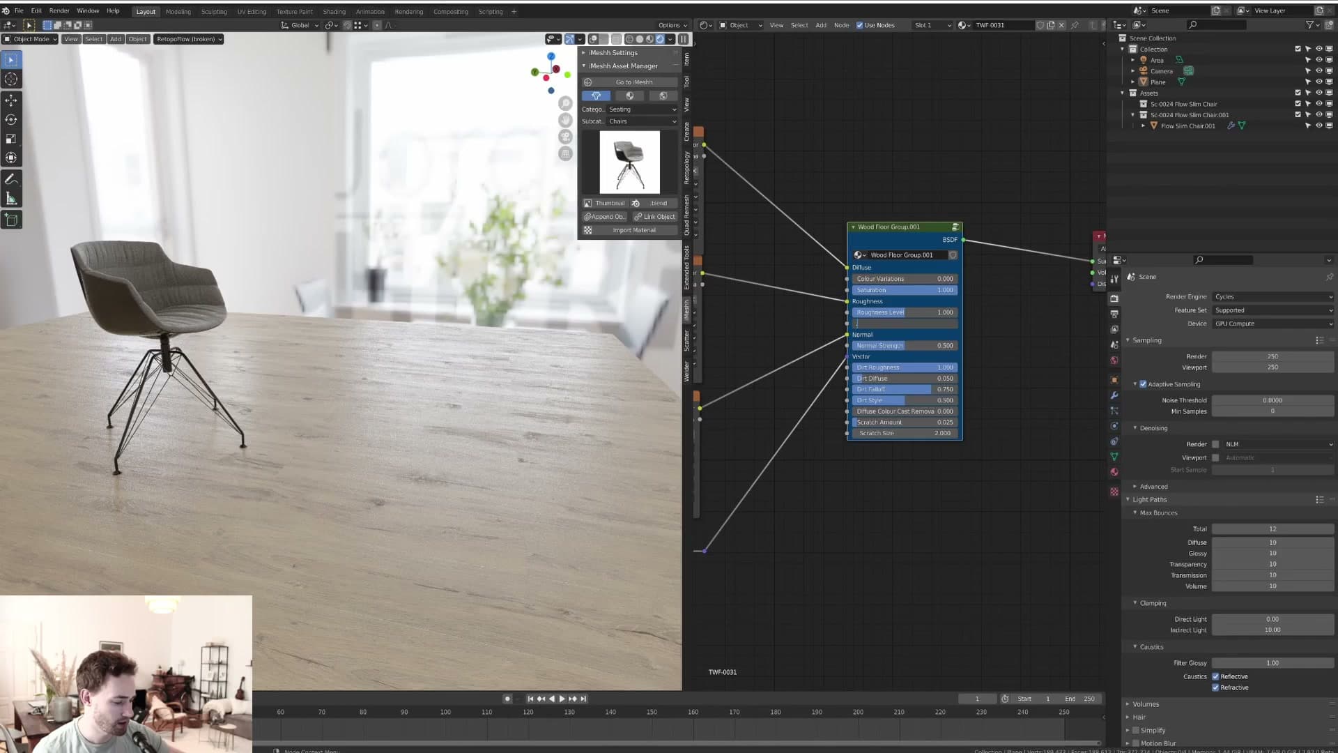
The next slider is normal map strength, which is self-explanatory and covered in the following module.
Normal map strength and the three dirt sliders
Normal map intensity for plank-edge depth, plus the dirt system: roughness contribution, fall-off so dirt sits realistically far from the camera, and a separate diffuse-dirt pass for visible dust.
Normal map strength: from vinyl-flat to deep plank gaps
The normal map controls how deep the gaps between planks read. Pushed to full strength, every seam catches the light like a real groove between boards; dropped to almost zero, the surface flattens out and the plank edges stop reading altogether.
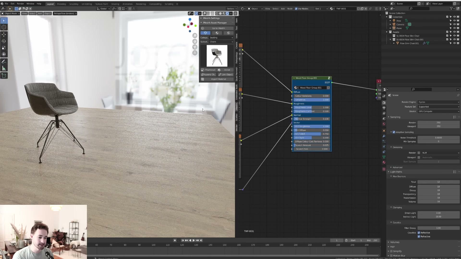
That flat end of the slider is genuinely useful. If you're after a vinyl-style finish with no plank seams, take the normal map down and the floor reads as a single continuous surface rather than separate boards.
For a normal wood floor, around 0.5 is where most rooms sit. It keeps the plank definition without overdoing the grooves.
Dirt roughness: adding residue without showing the dirt
Dirt roughness lets the dirt mask modulate how shiny the floor reads, without the dirt itself ever becoming visible as colour. To see it in isolation, turn off the roughness contrast first so the wood grain stops contributing variation, then dial the dirt roughness up.
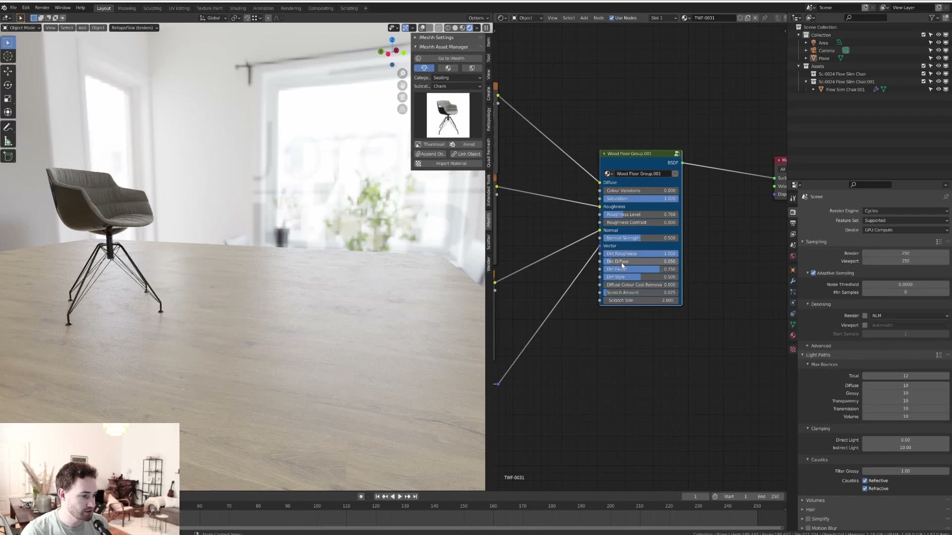
What you get is a subtle break-up of the specular: areas where dirt sits read slightly differently to the clean wood, like residue or smudges that catch the light at a different angle. The dirt itself is still invisible. Only its effect on roughness shows.
This is the dirt slider you'll reach for most often. A little variation reads as residue on the floor without ever crossing the line into a visibly dirty surface, which is almost always what you want in a client render.
Dirt fall-off: clean near the camera, grimy in the distance
Stand directly above a real floor and look down. You don't really see dirt. Drop the camera and look across the room at a lower angle, and the floor furthest from the camera reads noticeably grimier than the boards near your feet. The fall-off slider replicates that.
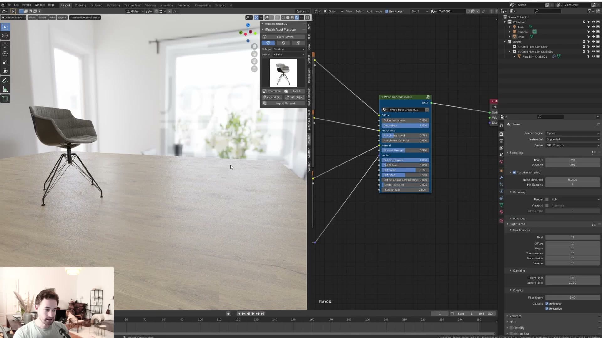
With fall-off enabled, the immediate vicinity of the camera stays clean and dirt accumulates as the floor recedes into the room. Turn fall-off off, and you'll see dirt start appearing much closer to the camera, which rarely matches how rooms actually photograph.
Push fall-off all the way up and the dirt only really shows up at the far end of the room. It's a small thing, but a floor with fall-off on looks like a photograph of a real room; without it, the dirt sits weirdly even across the whole surface.
Dirt diffuse: visible dust along the edges of the room
Where dirt roughness only nudges the specular, Dirt Diffuse is the pass where the dirt actually becomes visible. Crank it up and you start to see what reads as dust sitting on the floor.
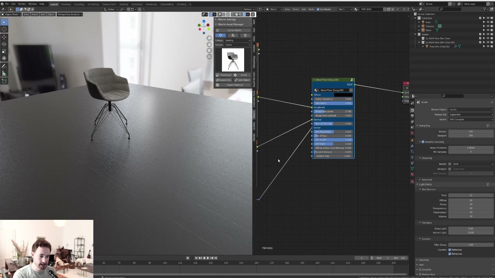
Combined with fall-off, the dust collects at the edges of the room. Close to the camera the floor stays clean, and the further you look across the boards the more visible dust gathers. Turn fall-off off and the same dust spreads evenly across the whole floor, which is the look you want for a scene that's meant to feel abandoned or unloved.
Together with dirt roughness, the diffuse pass really does add something. There's a believable sense of accumulated dust along the far edges that's hard to fake any other way.
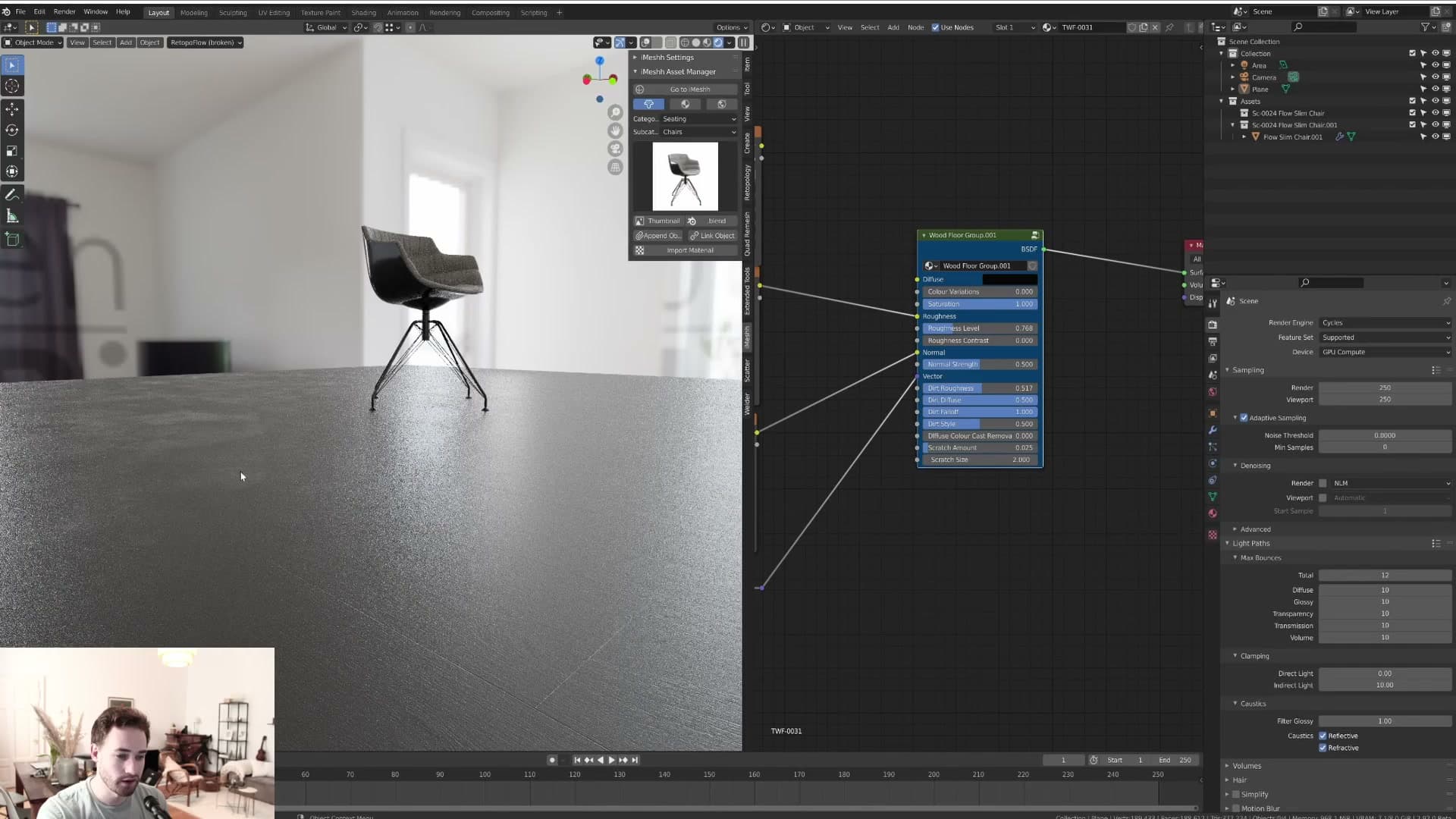
Use it sparingly, though. Most of the time, if you're delivering a render for a client, they don't want a visibly dirty floor. Keep this slider low for production work and reserve the higher end for scenes that are deliberately meant to look dusty.
Dirt style: the CC0 surface imperfection maps
A short credit to CC0 Textures for the surface imperfection maps that drive the dirt system, and a look at the two patterns the slider blends between.
Two imperfection patterns and the slider between them
Quick credit before the slider makes sense: the surface imperfection maps that drive the dirt system come from CC0 Textures. The node group wouldn't be possible without that library, so worth naming the source before touching any of the controls.
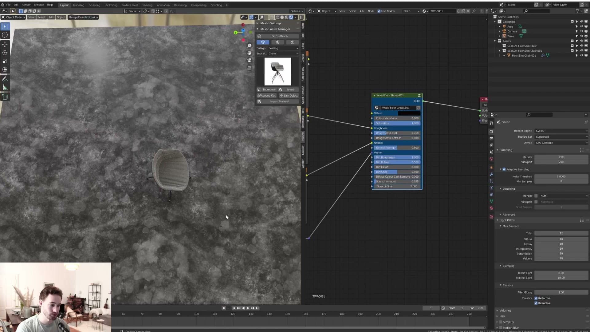
There are two patterns baked in. The first reads like a party that got out of hand: splash-shaped marks scattered across the plank, the kind of pattern you'd get from spilled drinks. The second is finer and dustier, closer to the kind of grime that settles on a floor over time rather than landing in one go.
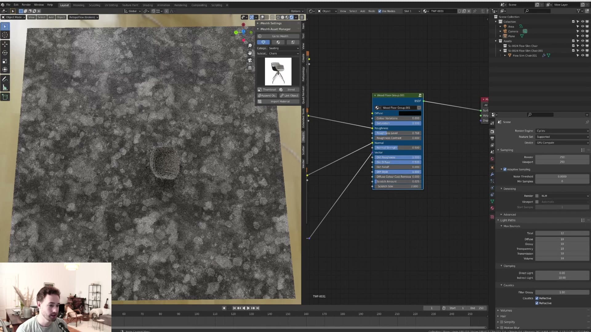
The Dirt Style slider blends between the two. Pushed one way you get pure splashes, the other way pure dust, and the default sits in the middle because the mix of both reads more naturally than either on its own. Nudge it in either direction depending on what the room you're dressing actually picks up. A kitchen or bar will lean toward the splash end, a quiet living room toward dust.
Diffuse colour cast removal: controlling floor-to-object bleed
The deliberate cheat that reduces how much the floor's colour bleeds onto nearby objects. Not physically accurate, but the right tool when one wood tone is overpowering a room.
Cutting the floor's colour bleed off a test cube
The next slider down is Diffuse Colour Cast Removal, which controls how much of the floor's diffuse colour bleeds onto nearby objects through indirect light. The test cube sitting on the floor is the easiest way to see it. Without the slider, the cube picks up the warm orange tone of the planks across its lower faces.
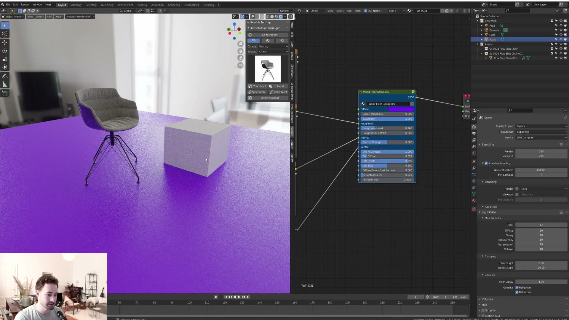
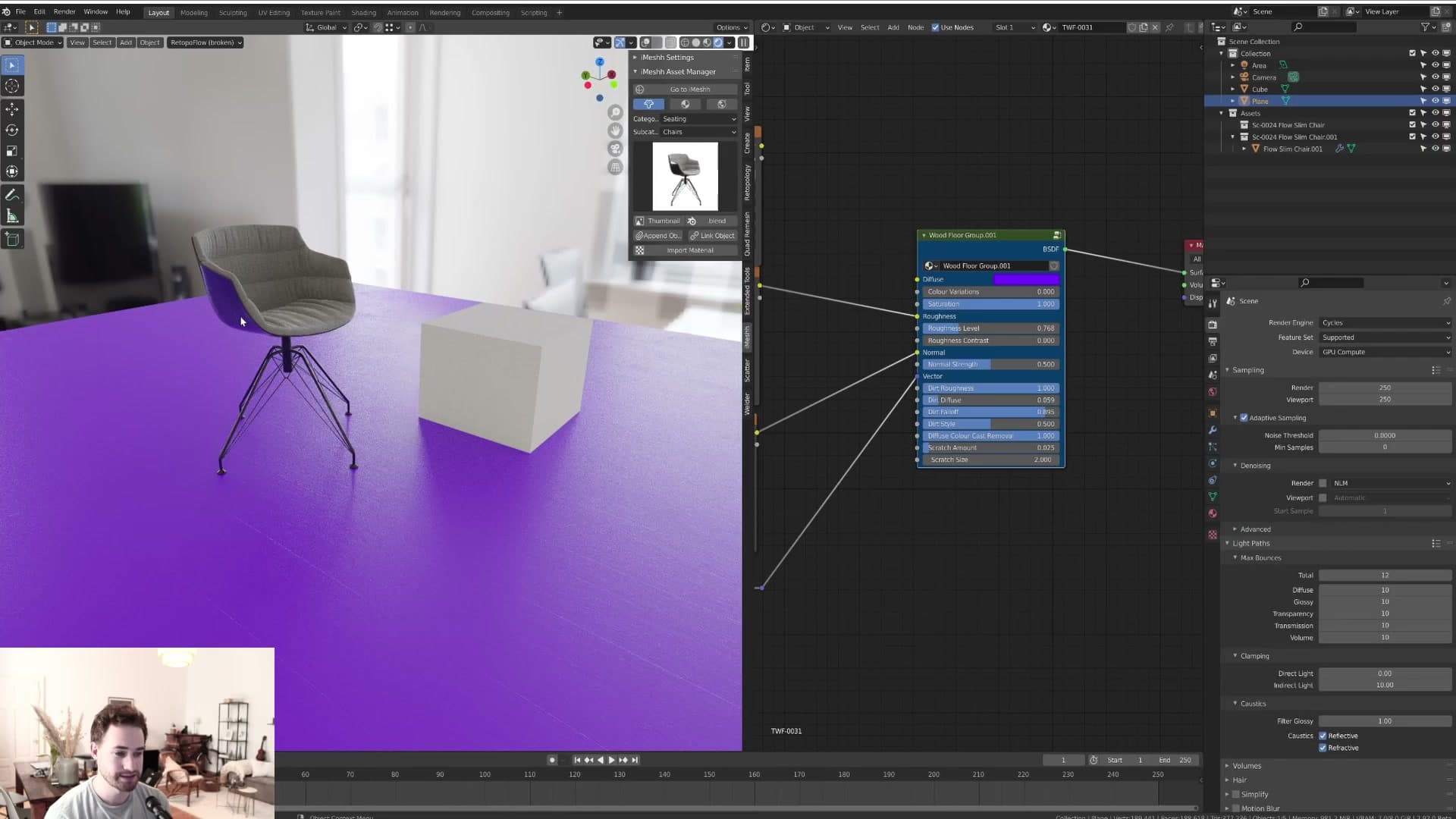
Push the slider all the way to its maximum and that diffuse bleed disappears: the cube stops carrying the floor's colour on its matte surfaces. The floor's reflection on the cube stays intact, so only the diffuse contribution is cut. Anything reflective on the object still reads the floor correctly.
When the cheat is the right answer
The reason this slider exists is for rooms where one strong floor colour is overblowing everything else. A yellow wood floor is the easy example: the whole space ends up tinted yellow through bounced light, and even in photography there's only so much colour correction can do to pull it back.
Photographers handling this in post often cut out the walls and apply extra colour correction to them on their own, lowering the cast that the floor has thrown across the rest of the room. That isn't physically accurate either, but it's how real interior shots get balanced. The Diffuse Colour Cast Removal slider is the 3D equivalent: a deliberate cheat for when temperature tweaks alone aren't getting you the feel you're after.
The recommendation is to use it sparingly. Pushing it to full is rarely the right call; nudging it up just enough to take the edge off the bleed is what makes the object look set into the scene rather than artificially clean. It still picks up some of the surrounding colour, just not so much that the whole render reads as one tone.
It's a hard slider to describe in the abstract. The effect is subtle and depends on how strong the floor's colour is to start with. If you have a room that's being overblown by a single colour bleeding off the floor, give it a try and see whether a small amount fixes it for you.
Scratches: amount and size
How the scratch sliders work and why they read best at small, subtle values, especially under furniture in close-ups.
Scratch amount: believable wear near furniture
Scratch amount controls how heavily the floor reads as scuffed. Pushed to maximum, scratches appear across the entire surface. Useful as a reference for what the slider can do, but rarely what you want in a final render.
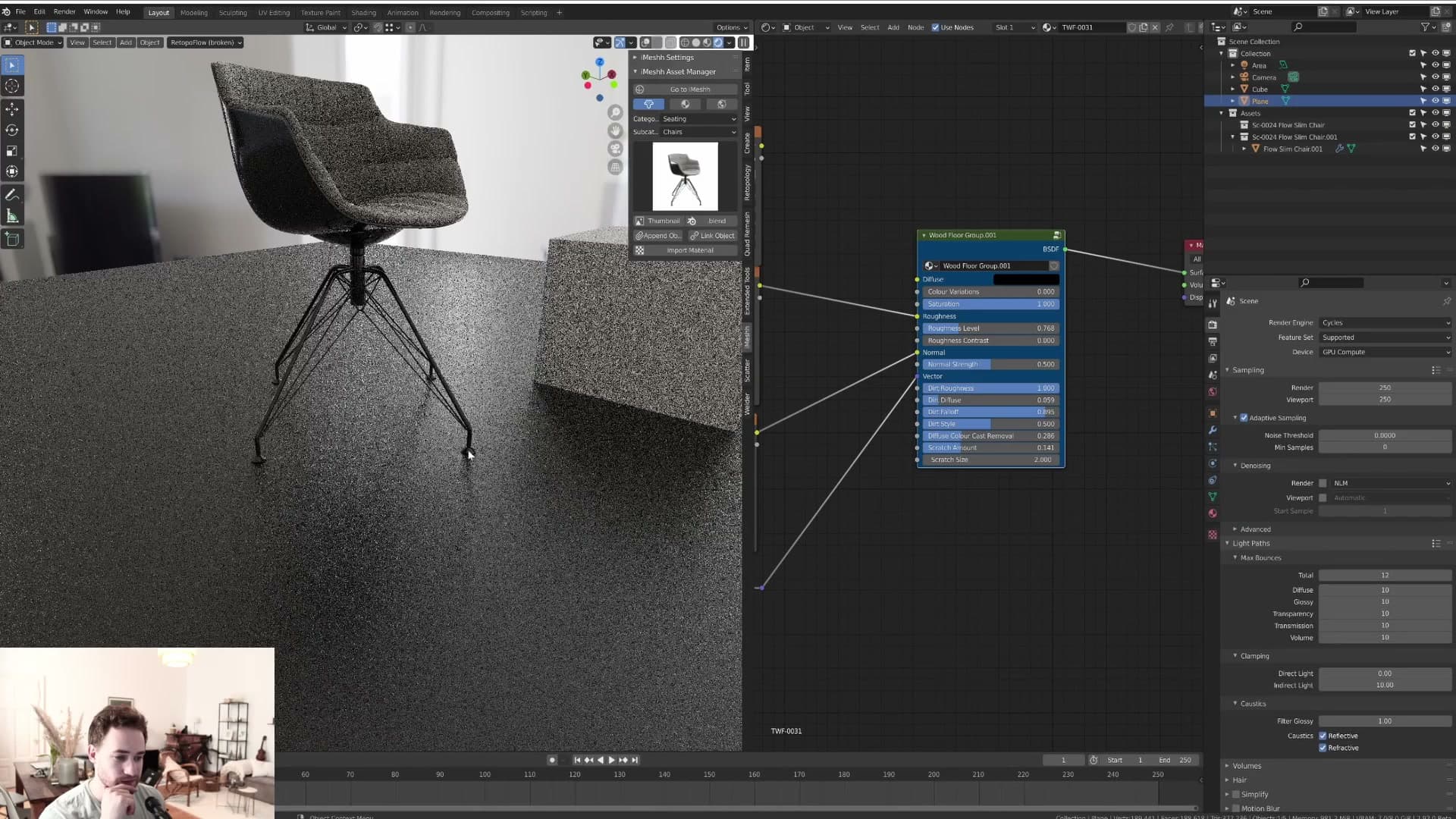
The slider earns its keep at low values, especially in close-ups around furniture. A small amount of scratching right next to a chair leg reads almost as if the chair itself has worn the floor over time. It sells the idea that the room is lived-in without making the floor look damaged.
Scratch size: adjusting the tiling of the scratch pattern
Scratch size controls the tiling of the scratch pattern. Higher values tile the texture more tightly, so you get a denser pattern of finer, smaller scratches. Lower values stretch the pattern out, leaving fewer, much larger gouges.
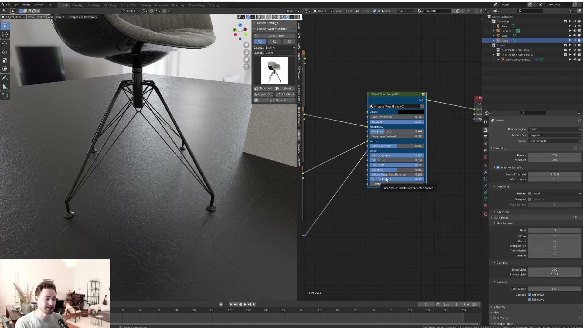
At 5, the scratches read as fine surface scuffing. At 0, you get long, dramatic marks that look more like damage than wear. A value of around 2 tends to sit in the sweet spot for an archviz floor.
Use this slider sparingly, particularly on client work. A wood floor that's visibly covered in scratches reads as damaged rather than characterful, and that's rarely the look the brief is asking for.
Floor variants and where to grab the freebies
Every iMeshh wood floor uses the same node group, so the sliders covered here transfer across the whole library. A quick look at a couple of louder variants and a reminder that one or two are free.
Same sliders, every floor in the library
Everything covered so far is not a one-off. The same node group ships on every wood floor in the iMeshh library, so once you have learned which slider does what, that muscle memory transfers across the whole pack.
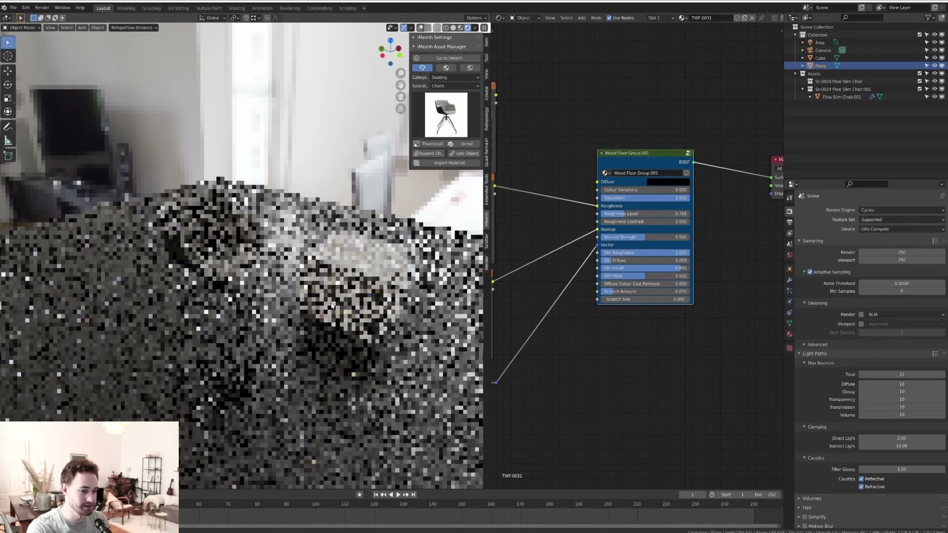
Open the wood floors category, drop in any floor you like, and the node group panel is identical. Colour, saturation, roughness contrast, diffuse colour cast removal, dirt amount, dirt style, scratch amount and scratch size: all of them sit on every variant, ready to be dialled in for the room you are lighting.
That means the workflow is the same whether you are placing a calm oak in a living room or something far more decorative in a feature space. Pick the floor, drop it on the geometry, then tune the sliders to the camera rather than rebuilding the shader from scratch.
Where to grab the free floors and what's next
Some of the variants are deliberately loud. There is a funky one that will not suit a calm interior but is great when you need a hero floor, and another that would happily sit in a child's bedroom (or an adult's bedroom, if you are feeling wild).
One or two of these wood floors are being released free on iMeshh, with the link in the YouTube description for the original video. A couple of other freebies may land alongside them, so it is worth checking the page if you want to test the node group before committing to the full pack.
That is the tour. The aim of the node group is simply to stop you remaking the same shader over and over again, and to give every floor in the library a consistent set of controls you can rely on. Drop one in, push the sliders, and move on to lighting the rest of the scene.
Tools and credits
Everything mentioned in this tutorial, with links.
- Blender: the renderer this entire build runs in.
- iMeshh: studio platform (project management, client review, asset library, invoicing). The asset library used in this tutorial is included with every iMeshh Pro plan.
- Poly Haven: free CC0 textures and HDRIs.
Pillar guide: Imeshh Tools hub