The empty apartment and the 3D challenge
Setting up the premise: an empty apartment space, a 3D artist partner, and a question: what should we actually do with this room? Five concepts modelled in Blender 4.2 to find out.
Meeting the empty space and the brief
Welcome to an iMeshh video that does things a little differently. There's a guest this time: Zoe, who shares the apartment we're about to take apart and put back together. The space in question is a big empty void in the middle of the flat, sitting between the kitchen and the office and waiting for someone to make a decision about it.
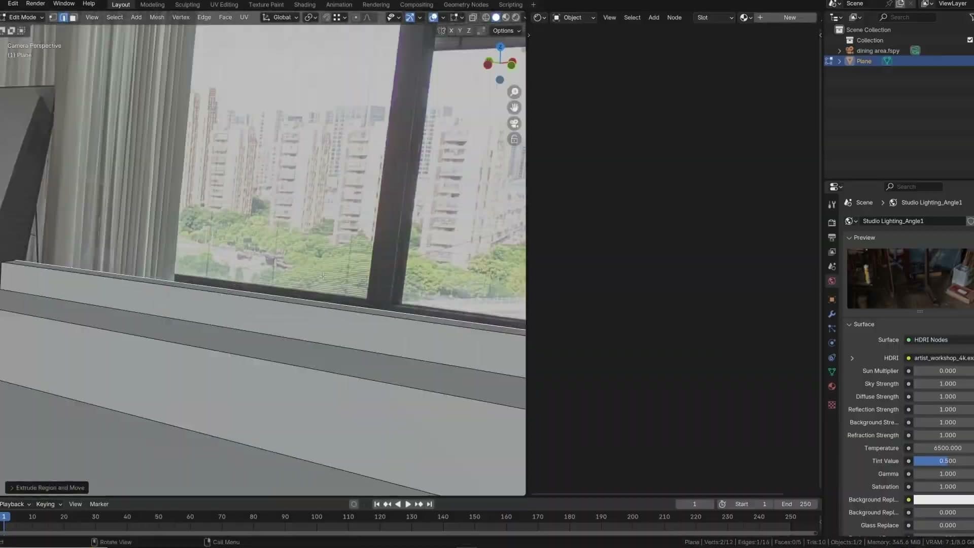
The premise is simple. As a 3D artist, the obvious move was to rebuild the room inside Blender, fill it with furniture and concepts, and find out which ideas survive contact with reality before any of them get bought, built or delivered. Zoe hasn't seen any of the mockups yet. The plan is to put each render up on screen, gauge her reaction in real time, and see which concept she'd actually want to live with.

The pitch behind doing it this way is the one every architectural visualiser already knows: if it fits in 3D, it'll fit in the room. Working the layout through Blender first means anything Zoe falls for is something both of them already know will work in the real space. The first scene she's about to see is the most conventional one (guests over, board games on the table, a fairly normal evening at home) before the rest of the video starts pushing the brief in much less conventional directions.
Concept 1: Indoor mini-golf course
The first mockup: a full miniature golf course modelled into the apartment, complete with a water hazard, a wooden retaining board, and a hard veto over chemical run-off.
The mini-golf concept reveal
The first mockup opens on a scenario most people with a small flat will recognise: friends round for board games, a few drinks in, and the slow realisation that you've run out of things to do once the cards get put away. My solution is to turn the entire living room into a miniature golf course.

The render shows a full putting green laid into the apartment's footprint, complete with a water hazard and a tiny boat floating on it. There's a moment in the video where Zoe spots water in the background of the shot and assumes it's part of the design. I'm quick to clarify that's the real waterway visible through the window behind the apartment, not the hazard. The hazard itself is the smaller blue pool inside the room.

I'd already anticipated the obvious objection. A wooden board sits behind the water hazard in the model, there specifically to keep the water in place against the back wall. It's a small touch, but it's the whole point of mocking up in 3D: you stage the problem and the fix in the same view, before either has cost anything to build.
The water hazard veto and design fix
The water hazard is meant to look properly blue in the final scene, and that's where the concept starts to wobble. I flag the issue myself: getting water that colour, and keeping it that colour indoors, probably means chemicals. Chemicals indoors aren't something you want anything living near.

His partner's veto lands cleanly. She isn't against the golf. She's against the water. The exchange in the video gets blunt: "The problem's the water. It is the water that's the problem." Drop the pond, keep the course.
This is exactly the kind of conversation 3D makes cheap. The water hazard is a single object in the scene: delete it, re-render, and the rest of the mini-golf carries on without it. The same exchange held over a half-installed pond in a real living room would cost considerably more than a few minutes of render time.
Concept 2: An adult ball pit (with reading nook)
A ball pit filling the central space, designed around the doorways so the kitchen and office stay reachable. A reading nook hidden in the corner sells the concept.
The ball pit and doorway clearances
I frame the second concept with a scenario. You've got friends over, you're playing board games and cards, you've had a couple of drinks, and somebody mutters that it would be nice to have another activity going on. My answer: an adult ball pit. No adult, asked honestly, would say they hate a ball pit. It's hours of fun, and the room is large enough to make it work.

The mockup is built around the existing circulation. The pit fills the open footprint of the living room without sealing off either doorway. You can still cross to the kitchen, and you can still reach the office. That clearance check is the entire reason for modelling it in 3D first; the moment a fun idea blocks a real door, you see it before you build it.
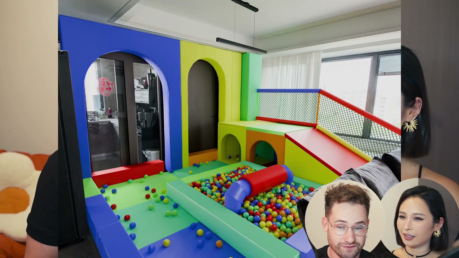
A retaining wall is added around the edge to keep the balls contained rather than spilling out into the rest of the apartment. Tucked into the back corner is a small reading nook: a quiet alcove sized for one person and a book. There's no light in the mockup yet, but I'd drop one in to make the nook properly usable.
Rating the ball pit out of ten
With the pit modelled and the doorways walkable, I put the question to Zoe: out of ten, would you actually want this in the living room? She hesitates. Her answer isn't a number. It's a request to see all of the options first before she commits to anything.

That instinct is exactly why mocking up several ideas in 3D earns its time back. A single render judged in isolation gets a gut reaction against an empty room; the same render judged against four alternatives gets weighed on its merits. The ball pit goes on the shortlist rather than collapsing into a straight yes or no, and the conversation rolls on to the next concept.
Concept 3: A walkable mirror maze
A solvable mirror maze that doubles as a circulation route to the kitchen and office. The mockup shows the wow-factor for guests, and why the apartment suddenly looks twice as big.
The mirror maze layout and routing
The third concept turns the living room into a walkable mirror maze. The twist is that the kitchen and office both sit behind it, so the layout has to stay genuinely solvable. Pure decoration would strand anyone trying to fetch a drink. As I put it, if anyone wants to get something from the kitchen we will be gone for hours. A feature, possibly, if a guest has overstayed, but a problem on a Tuesday night.

The reward is the moment a guest walks through the front door. Turn up to a new friend's flat, the door swings open, and the first thing you see is a mirror maze stretching off into the apartment. It is the kind of detail that earns instant repeat visits, and it doubles as a polite test of which guests have the patience to find the sofa.

There is a second, subtler effect worth flagging. Once the mirrored panels are placed and the scene is rendered, the reflections fold the room back on itself and the apartment suddenly reads as a sequence of connected spaces rather than a single living room. Many rooms is the phrase that comes out of the conversation. That illusion is exactly the sort of thing you can only really trust once you have seen it rendered in 3D rather than sketched on a floor plan.
Concept 4: Indoor garden and pond cafe
Bringing the outside in: a sunken pond, a real tree, ceiling grass, and a half-serious business plan to charge guests for fishing access and selfies.
The indoor garden and raised pond
Concept 4 takes the opposite approach to the previous rooms. Instead of filling the floor with a toy or a game, it fills it with planting. The mockup turns the living room into an indoor garden, with ground cover running wall to wall and a sunken pond sitting at the centre.

The pond is the part that needs a workaround. Digging into the slab is something most landlords would refuse outright, so the concept borrows a detail from contemporary bathroom builds: rather than recess the pond into the floor, the floor itself is raised around it. The pond stays at its original slab level, the surrounding floor steps up to meet the rim, and the result reads as a proper sunken water feature without any structural intervention.

It is the kind of compromise that only becomes obvious in 3D. On a floor plan, raised platform around a recessed feature reads as drawing complexity. In a render, you can see at a glance that you get the look of a garden pond with none of the landlord drama, and that a walkable route to the kitchen still survives around the edge of it.
Trees, ceiling grass and plant feasibility
The garden is anchored by a central tree, with grass modelled across the ceiling as well as the floor. The ceiling grass is the part that prompts the obvious question from Zoe the moment the render appears: would the plants be real, and if so, how do you water something growing upside down above your head?

My answer is that the tree itself is watered at the base, the same as any other indoor plant. The ceiling grass would have to be a different species entirely (something more ornamental and tolerant than the turfgrass I modelled) if it were ever going to survive in the real version. I concede that some of this is decided on aesthetic grounds rather than horticultural ones. The mockup is a vision board, not a planting schedule.
This is one of the moments where 3D earns its keep as a conversation tool. The real plant or fake plant? question surfaced the second the scene rendered, which means a real-world feasibility problem got raised and discussed before anyone had committed to ordering a single planter or drilling into a single ceiling joist.
The apartment-cafe business plan
Once the garden was on screen, the concept started to spiral into a business plan. The seating around the pond turns the apartment into a small cafe. In a hot climate, the prospect of sitting next to water with a coffee sells itself, and Zoe ran with the idea faster than I expected.

The pond gets koi. Visitors who want to fish pay 100 RMB per fish caught (roughly £10, or about $15 by my quick conversion). Anyone who comes in and fails to catch one only pays the entry ticket, pegged at 50 RMB. Coffee is another 20 RMB. Selfies are charged on top.

The pricing list started out as a joke, but it ended up half-serious by the end of the exchange. That is the quieter argument the whole video is making: once you have a render to point at, an idea that would sound ridiculous as a verbal pitch starts to feel plausible enough to cost out. Whether the indoor pond cafe ever opens is beside the point. The 3D mockup gave it a fair hearing it would never have got from a sketch.
Concept 5: The kitchen extension (the practical winner)
The mockup that earned an unconditional yes: extending the kitchen into the living room with an oven, a down-draft hob, a four-seat breakfast bar, cushioned window seating, and storage for an unthinkable amount of spices.
The extended kitchen reveal
Before unveiling anything, I ask Zoe what she would actually do with the room if she could pick any project. She lands on a gym first, then admits (when reminded she had said something else the day before) that what she would really like is a kitchen. The mockup that comes up next is exactly that.

The point of the concept is straightforward. The existing kitchen is, to put it plainly, lovely, but it is small, and the apartment came without an oven because ovens are not standard appliances in the local market. Borrowing footprint from the living room gives the cooking space room to breathe and, more importantly, a place to put an oven in the first place.
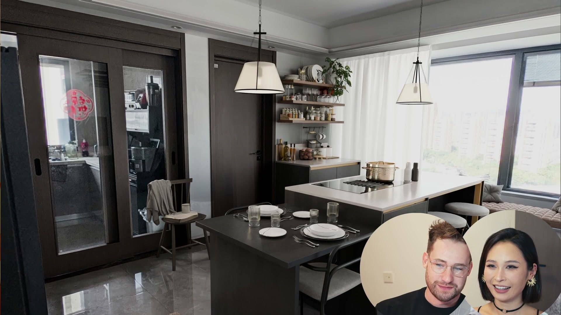
In the new layout the oven slots in under the counter. Next to it sits a second hob with extraction that pulls air downward rather than up, so the design avoids a ceiling-mounted hood entirely. That matters in a knocked-through living-and-kitchen space, where an overhead extractor would dominate the open volume the rest of the concept is trying to protect.
Two kitchens, dining bar, and window seating
Mid-walkthrough his partner brings up a detail she had recently heard about: apparently wealthier households locally tend to have two kitchens. One is a sealed kitchen for Chinese cooking, which produces a lot of smoke and is best contained behind a door; the other is an open kitchen for Western cooking, which produces far less. Applied to this apartment, the existing closed kitchen becomes the Chinese kitchen, and the new extended footprint becomes the open, Western, social one.

Crucially, the whole layout is sized against the real room. "This all fits. I measured it, everything fits" is the pitch, and that single sentence is what separates this mockup from the five wilder concepts before it.
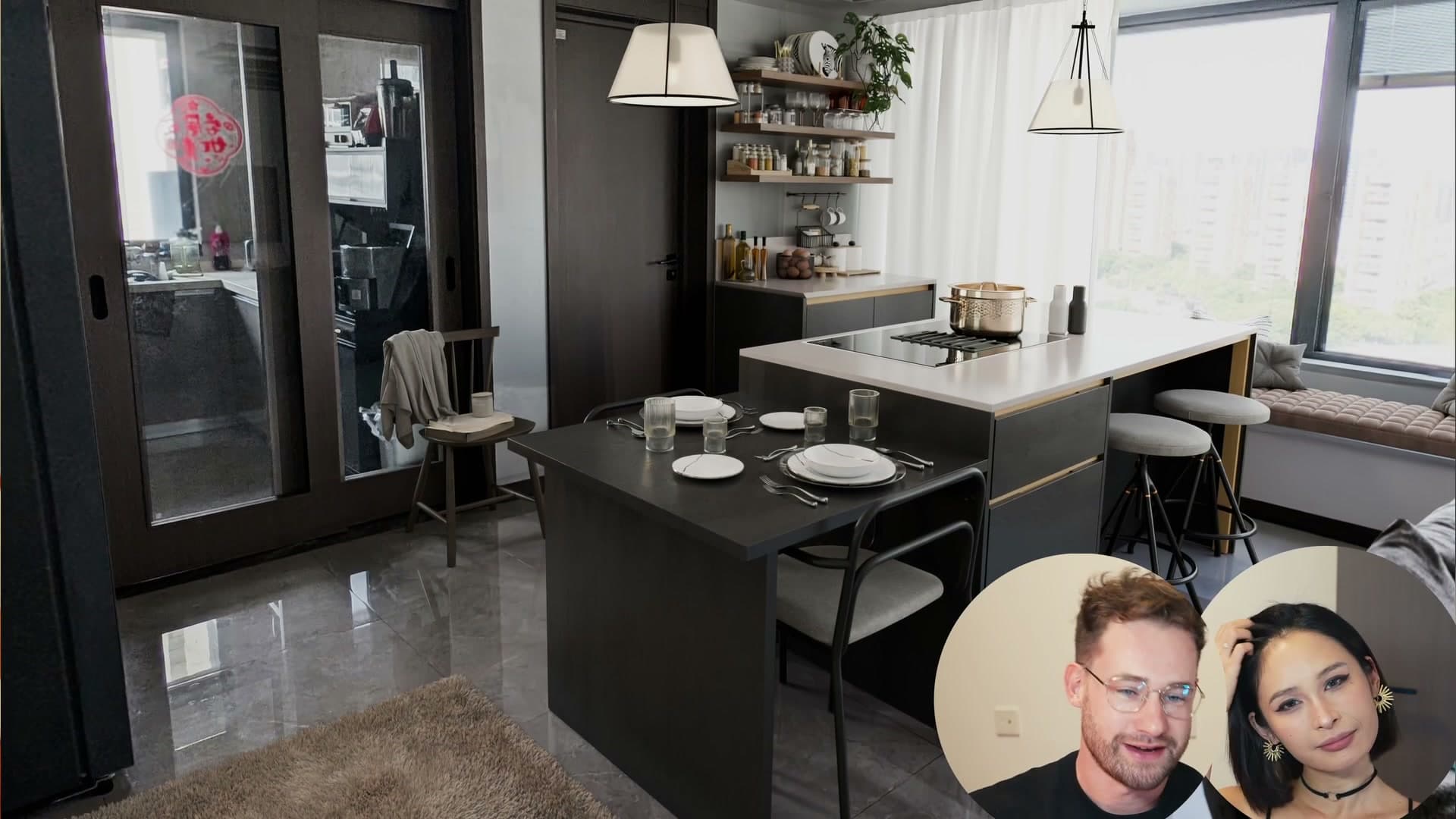
With no dining table in this version of the flat, the counter is extended outward to seat four, with enough clearance behind the stools for someone to walk past. Alongside the main run, a smaller breakfast bar gives a spot to perch for coffee or a quick meal without committing to a full sit-down setup.
The deep windowsill that runs along one wall is dressed with cushions and turned into bench seating. It is a low-effort use of architectural space the apartment already has. A guest can sit there while you cook, or you can sit there yourself between dishes. The same extension also picks up extra shelving for spices and additional storage, both built into the new footprint rather than bolted on afterwards.
The final verdict and the ball-pit compromise
The section closes on a self-deprecating beat. Zoe mentions that the cushioned window seat will be lovely for all our guests. We have so many friends, she says, before correcting herself: we have two. Without a ball pit or a golf course in the living room, neither of those two is likely to keep visiting.
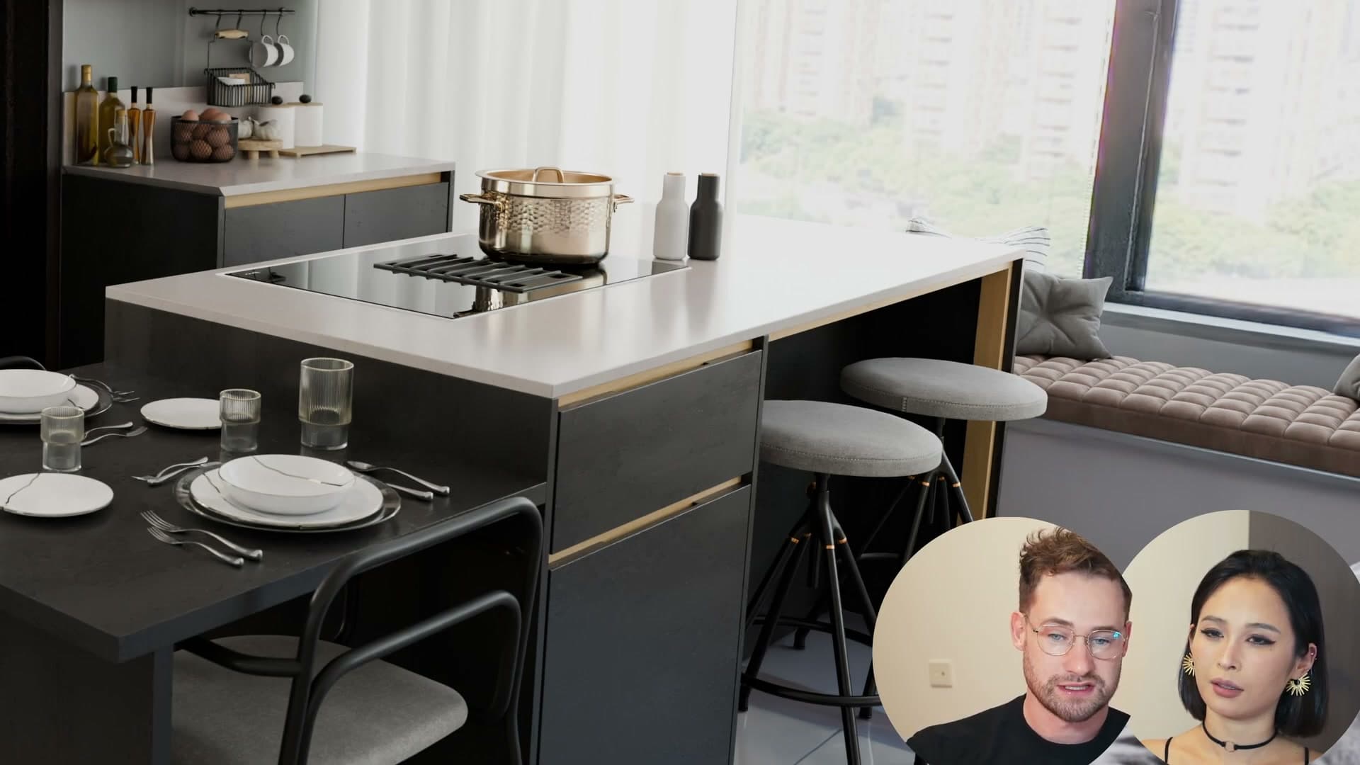
Joking aside, this is the concept that earns an unreserved yes. It solves a real problem the apartment actually has (a cramped kitchen with no oven), it is dimensioned against the real room, and it is the only one of the five mockups in this video that could be handed straight to a builder.
Why 3D mockups work for real home design
Closing thoughts on using 3D for home design: why shadows, materials, and to-scale dimensions matter, and why this workflow beats describing ideas in words for any partner or contractor conversation.
The case for learning 3D for home design
The most striking thing about these mockups is how convincingly they read as the real space. The shadows land where you'd expect, the proportions match the actual apartment, and once materials and lighting come together the renders feel less like abstract floor plans and more like photographs of a room that already exists. That's the bar a useful home-design mockup has to clear: if the 3D version doesn't feel like the real thing, it can't tell you anything reliable about whether your idea fits.

That fidelity is what makes 3D worth learning for home design. Once you've modelled the empty room to-scale, you can audition wildly different layouts (a kitchen extension, a ball pit, a mirror maze, an indoor pond) and see immediately whether each one actually works in the space you've got. You'd catch the same problems eventually with a tape measure and graph paper, but the 3D version is faster and far easier to show a partner who doesn't read floor plans for a living. Describing a breakfast bar in words is one thing. Standing them in front of a textured render of it is another.

The closing recommendation is straightforward. If you've just moved into a new place, or you're thinking about renovating one you already live in, learning enough 3D to mock the space up is an incredible option for working out whether everything fits before you commit. You don't need to be a professional archviz artist to make this work. Just enough Blender to translate measured dimensions into geometry, drop in some basic materials, and light the scene well enough to read. The first time something doesn't fit in the model, the workflow has paid for itself.
Tools and credits
Everything mentioned in this tutorial, with links.
- Blender: the renderer this entire build runs in.
- iMeshh: studio platform (project management, client review, asset library, invoicing). The asset library used in this tutorial is included with every iMeshh Pro plan.
- Poly Haven: free CC0 textures and HDRIs.
Pillar guide: Scene Builds hub