1. Introduction
What this masterclass covers
It’s been a year and a half since the last ArcViz video. Almost 300,000 views later, this is the next one. The reason for the wait is simple: a video like this takes a lot of time, and a lot has changed in Blender since the previous masterclass. Blender 4.1, 4.2, 4.3 and now 4.4 have all introduced new techniques and features worth talking about.

This is a three-hour build: three hours of free tutorial covering everything from tracing a floor plan through to compositing the final render. If you’re starting in ArcViz, or even just curious, this is a good place to give it a shot. The full scene will be uploaded to iMeshh too, alongside nine other complete scenes already in the library.

Some basic Blender knowledge is assumed. There’s a free 10-module beginner course on the iMeshh channel if you need it. Otherwise, just follow along and see where you get to. Questions go in the YouTube comments or the iMeshh Discord.
One small tip: get a tape measure
Before anything else: get a tape measure. When you’re placing items in a scene, it’s easy to doubt whether something feels the right size, and a physical tape measure to compare against real-world furniture is genuinely useful.
2. Building the room from a floor plan
Trace the architect’s floor plan, extrude the walls, deal with normals, then add floor, ceiling, an outside step and a swimming pool cutout. All the basic shell before anything fancy.
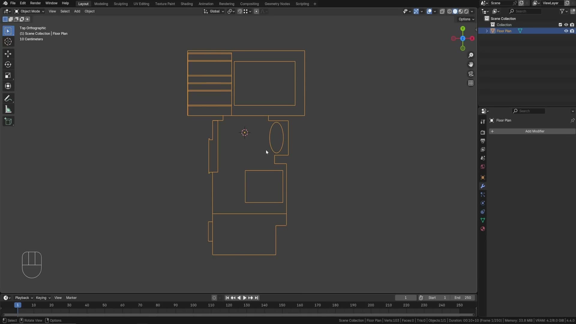
Tracing the floor plan
You’ll usually receive a floor plan from an architect as curves. You canconvert them to a mesh and extrude, but it’s better to trace your own version. Architects working in something like AutoCAD will try to snap edges to the right corner, but small misalignments creep in. If you extrude those faces directly, you end up with gaps in the walls.
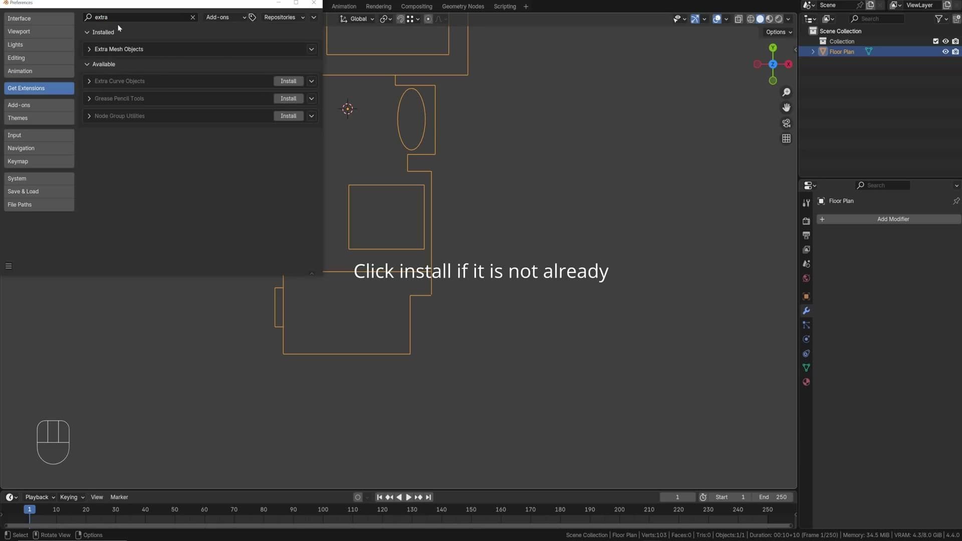
Before tracing, go to Edit → Preferences → Add-ons and enable both Extra Objects and Loop Tools. Loop Tools comes in later for the archway.
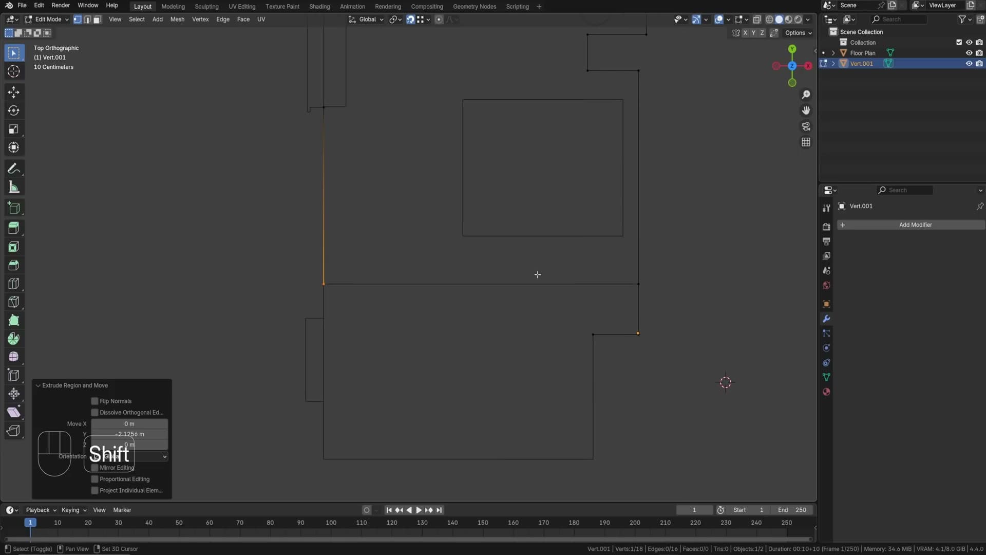
With Extra Objects on, click anywhere in the viewport, hit Shift+A → Mesh → Single Vert → Add Single Vert. You’re dropped straight into edit mode in vertex select. Press Shift+Tab to enable snapping, set the snap target to Vertex, then drag your vertex to a corner of the floor plan to start.
From there it’s just E + X or E + Y to extrude along axes, always one or the other. Locking to an axis is what keeps the trace clean, because some segments in the source may not be perfectly straight.
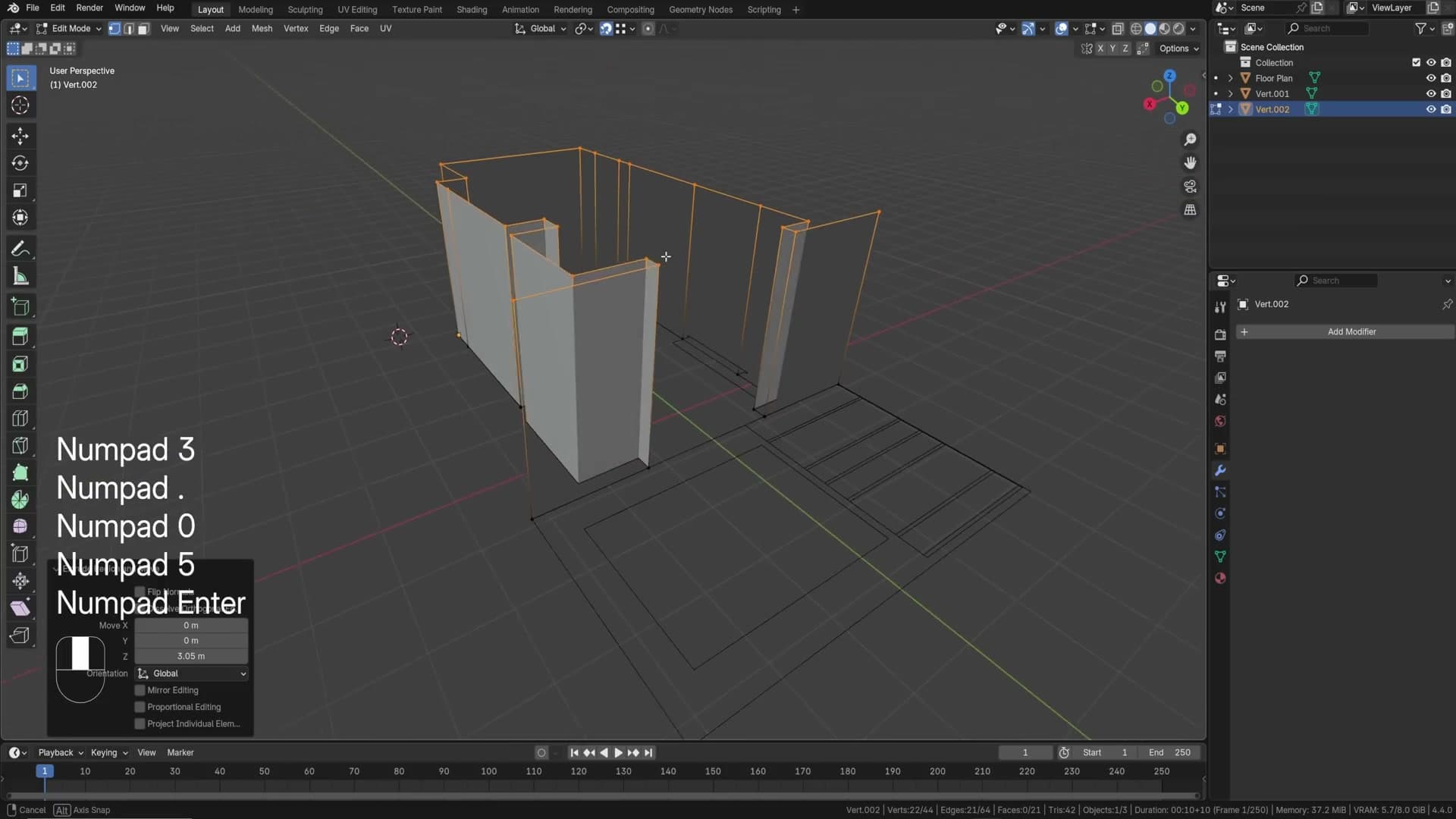
Extruding the walls and recalculating normals
Once the outline is closed and separated from the outside area (Ctrl+L to select linked, then P to separate), extrude up: E, Z, 3.05(roughly room height). If you have back-face culling on, you might be able to see straight through the wall; that’s normals pointing the wrong way for an interior view.
Select all (A), then Shift+N to recalculate normals. If they end up facing the wrong way (red on the inside with the Face Orientation overlay on), use Alt+N → Flip to invert them.
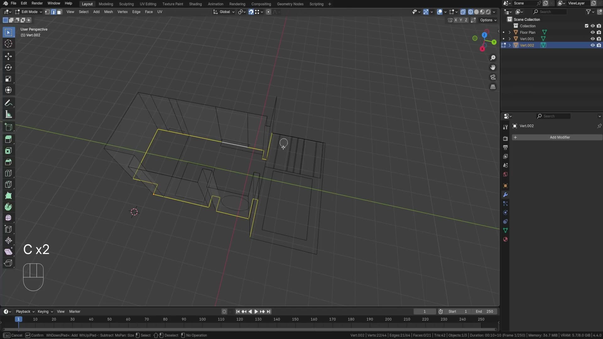
Floor, step and ceiling
Hold Alt+click on the bottom edge loop, then Shift+D → Enter → P to duplicate and separate the floor. Press F to fill it. For the step (the outline already has the vertices for it), select the relevant edge, press J to join, select the face, then E, Z, 0.15for a 15 cm rise.
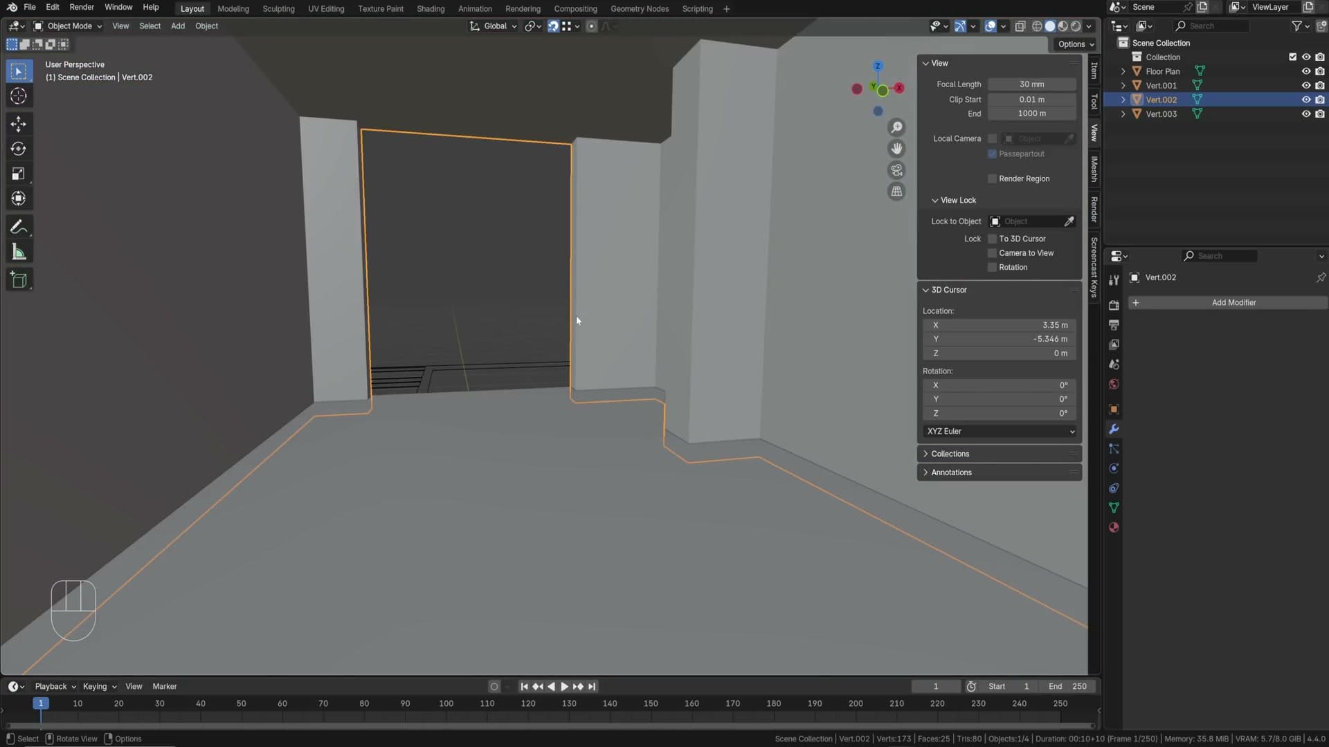
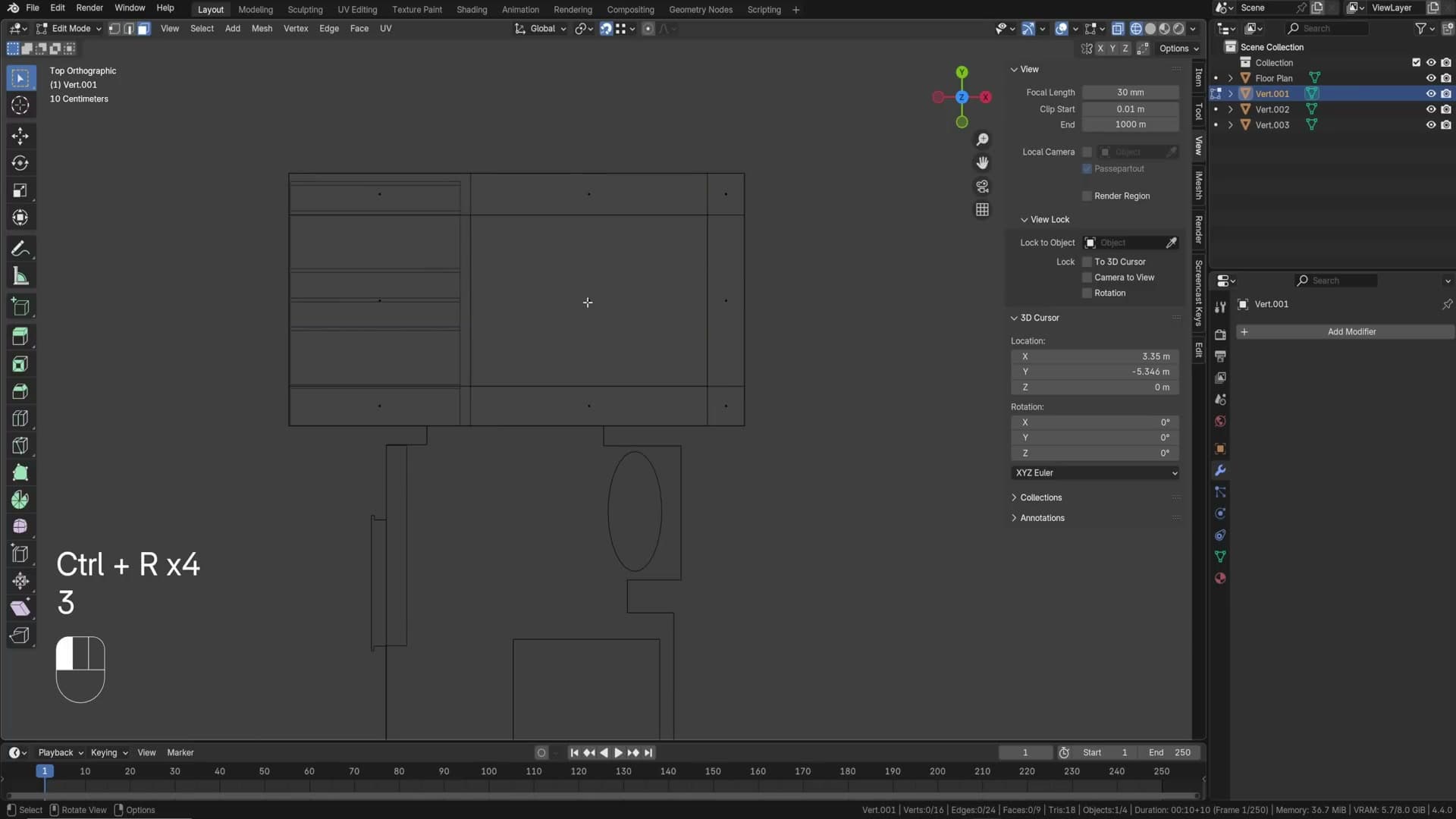
Outside walls and the swimming pool
For the pool: select the rim edge, E + 0.1 to extrude out by 10cm, I + 0.1 to inset, then E + Z + -0.65to drop the bottom 65 cm. The outside walls run at one metre high; same process: select the outside edge, duplicate, separate, then A → E → Z → 1.
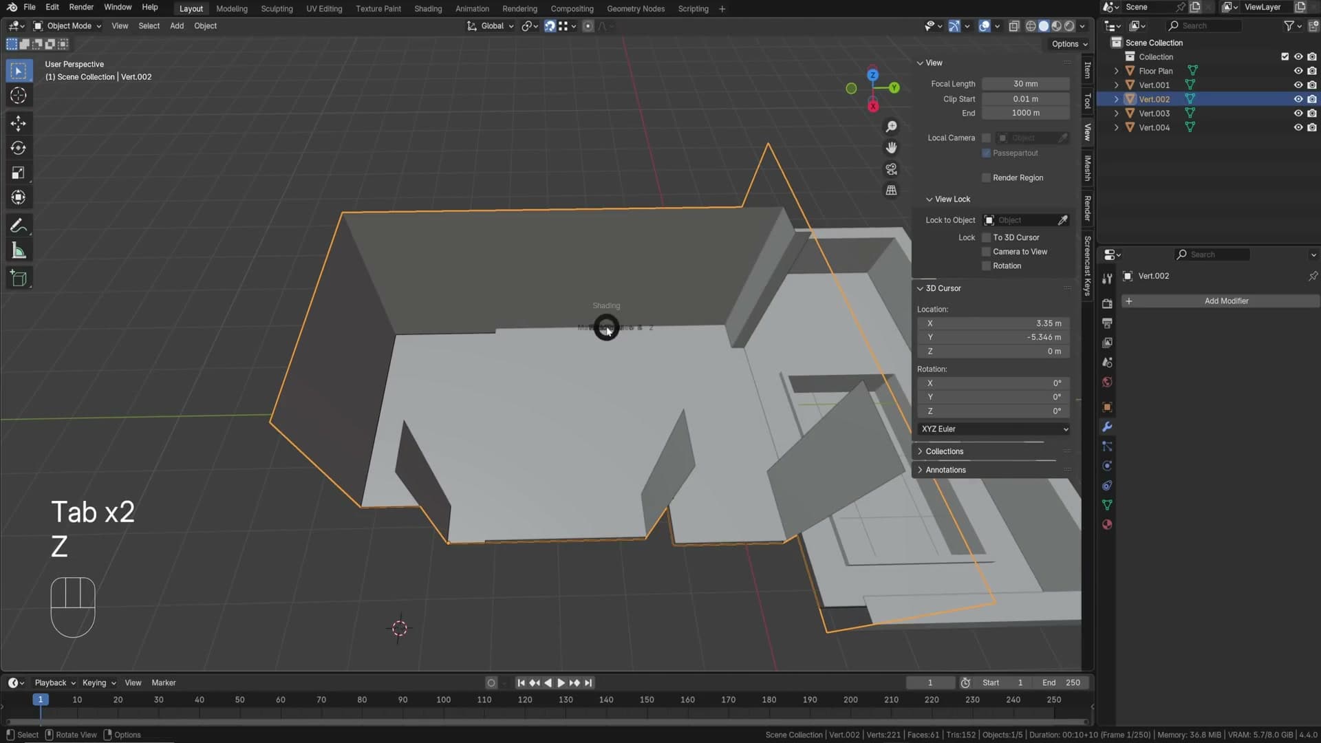
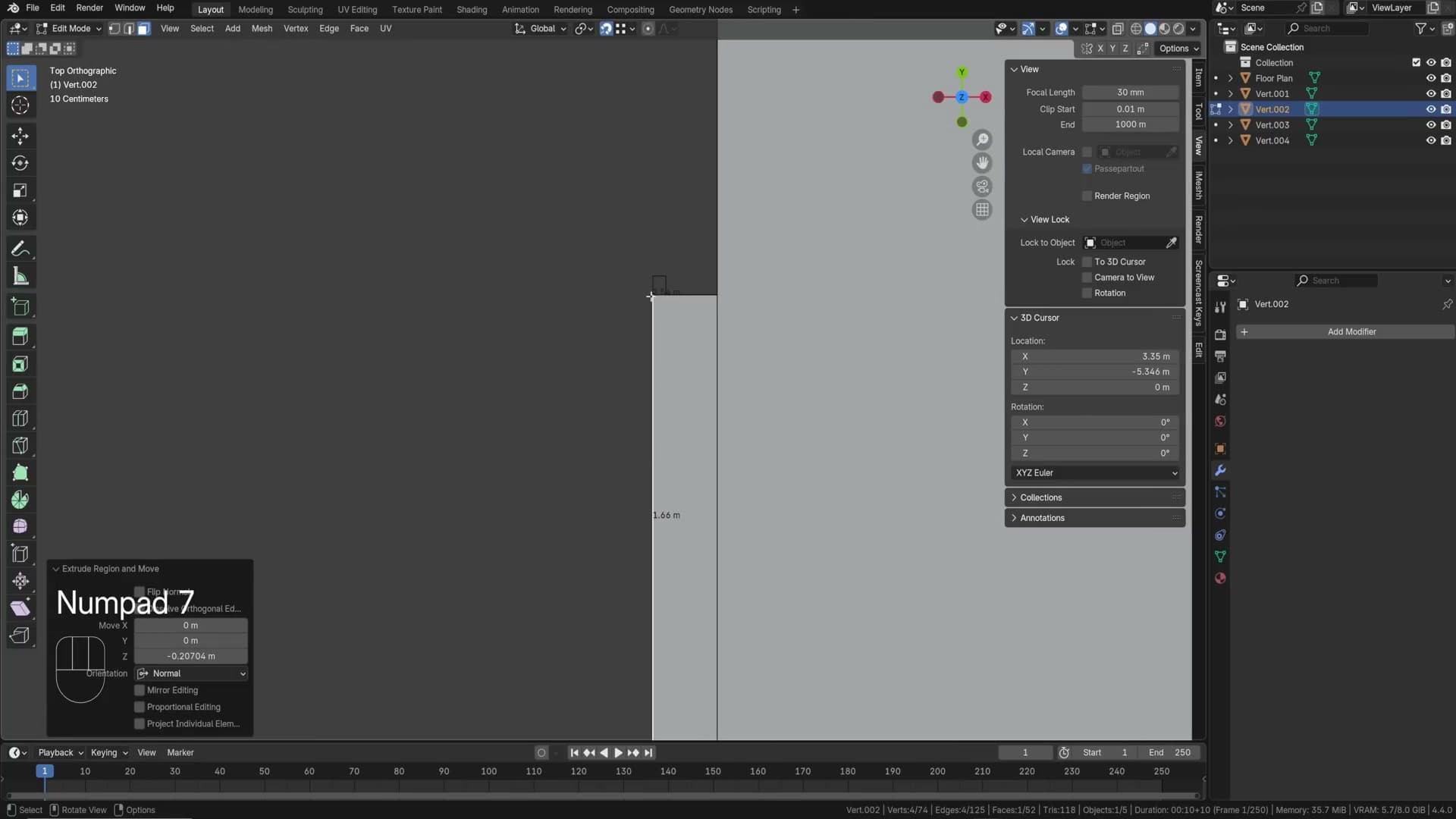
The door frame at the top of the opening is built by adding a Ctrl+R loop cut and G → Z → 2.7. For the arch opening, drop a vertex down to 2.385 m, then bridge faces to clean up the geometry around the new opening.
3. Crafting the archway for displacement
The scene is displacement-heavy, and displacement works best on quads. So the archway is built from scratch using a circle + Grid Fill + a Mirror modifier, with every face four-sided and roughly square.
Why quads matter for displacement
For a simple ArcViz scene with white walls, you can get away with rough geometry, bevel, and shade auto smooth. Even with an ngon archway, the render will look fine. But the moment you bring in displacement, ngons start to fall apart.
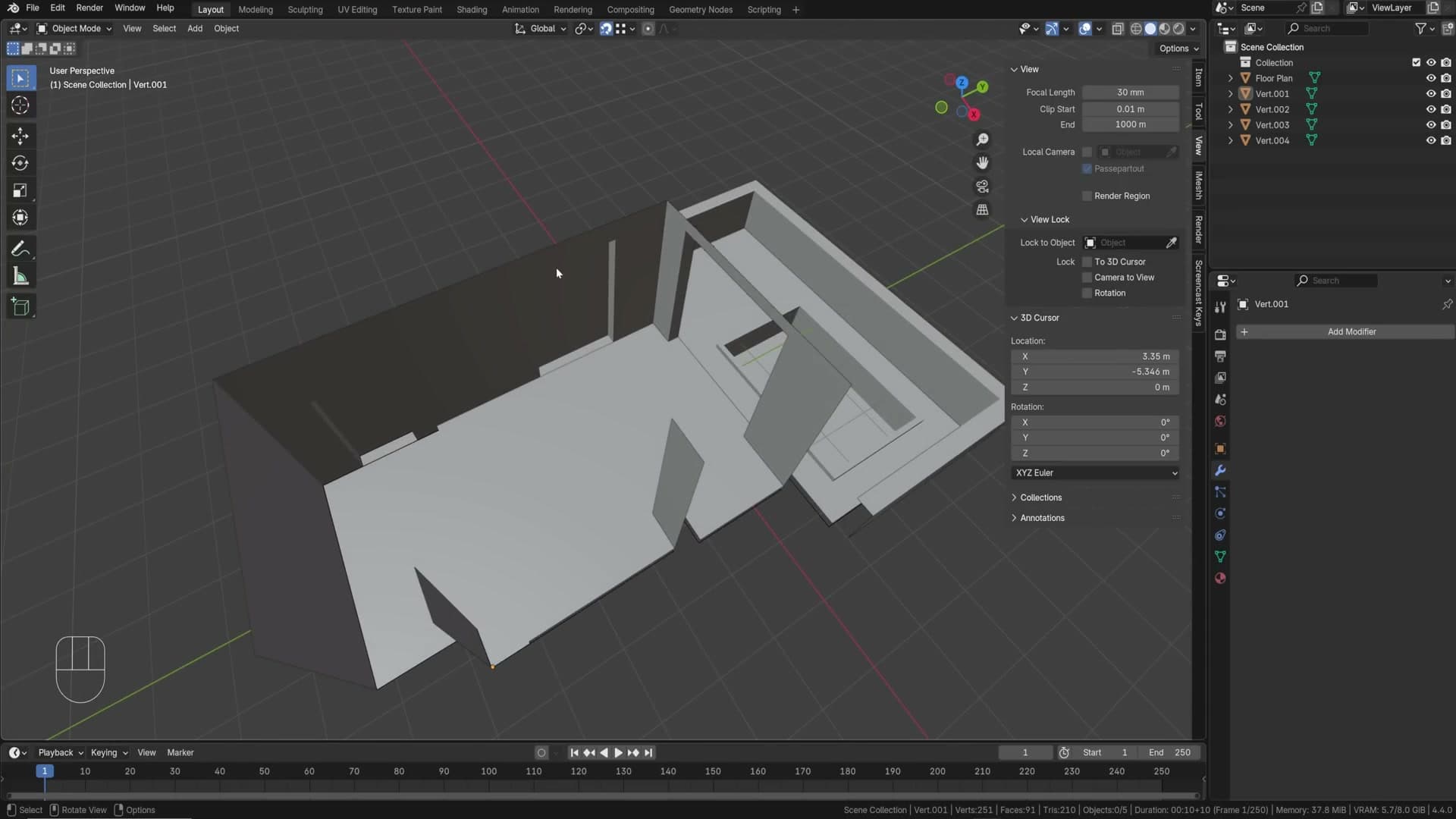
Displacement works best with quads: four-sided faces, ideally roughly square. They don’t have to be perfectly uniform, but the moment a face has 9 or 10 vertices and you start displacing it, you get shading errors. So the plan is to turn the arch into clean quads before adding any displacement modifiers.
Building the archway with a circle, Grid Fill, and mirror modifier
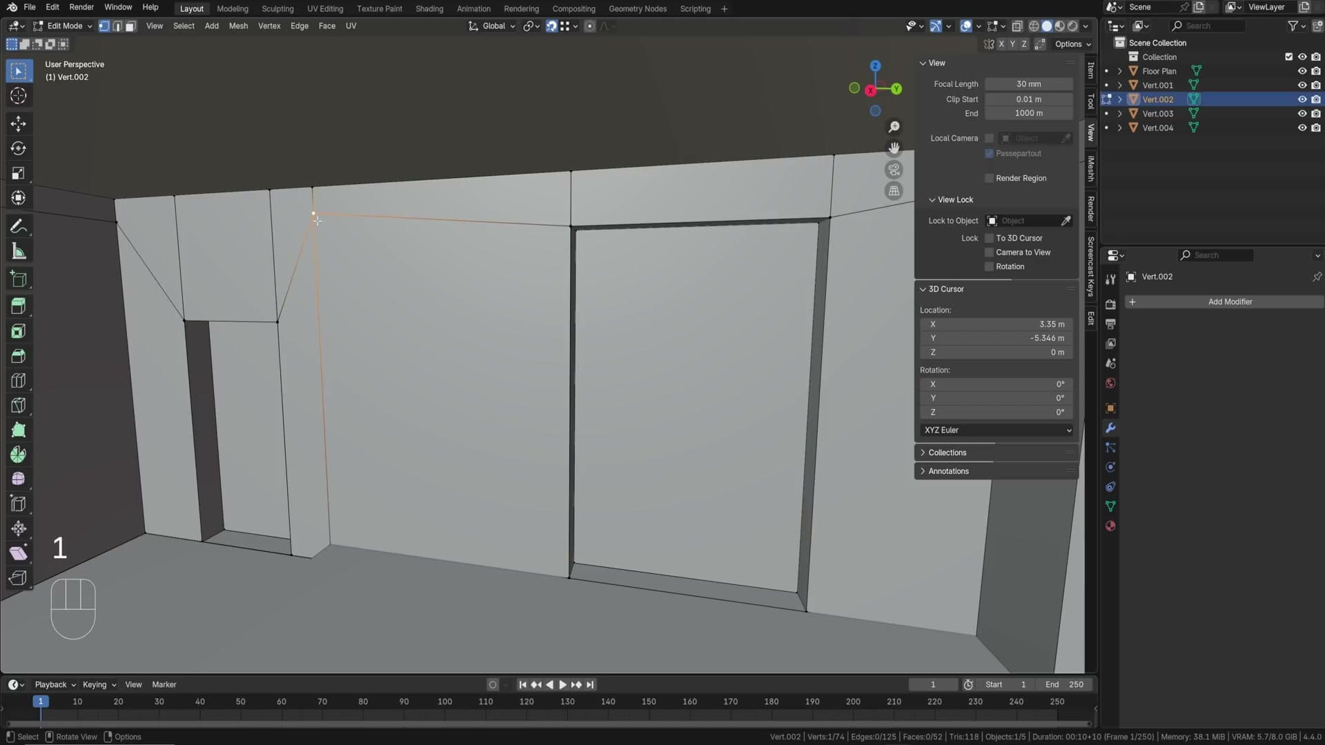
Snap the 3D cursor to the centre of the arch opening (Shift+S → Cursor to Selected), back out to Object Mode, then Shift+A → Mesh → Circle. The arch opening is 1.66 m wide, so scale the circle to match. Rotate it 90° on Y so it’s vertical, then Ctrl+A → Rotation to apply the rotation.
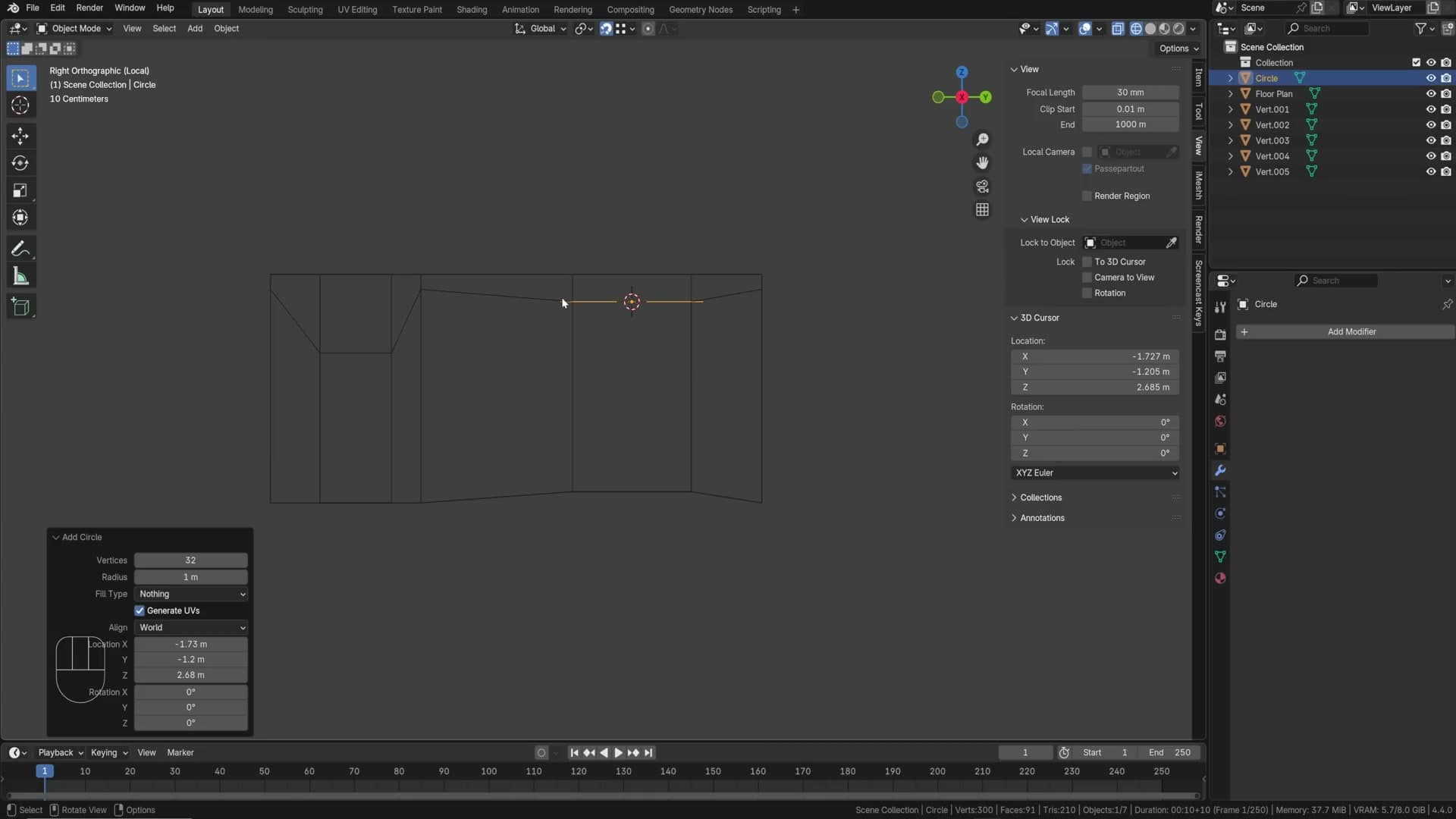
In edit mode press E then S to extrude and scale outward until the resulting faces are roughly square. Then select all the faces and press F3 → Grid Fill to fill the inside with quads.
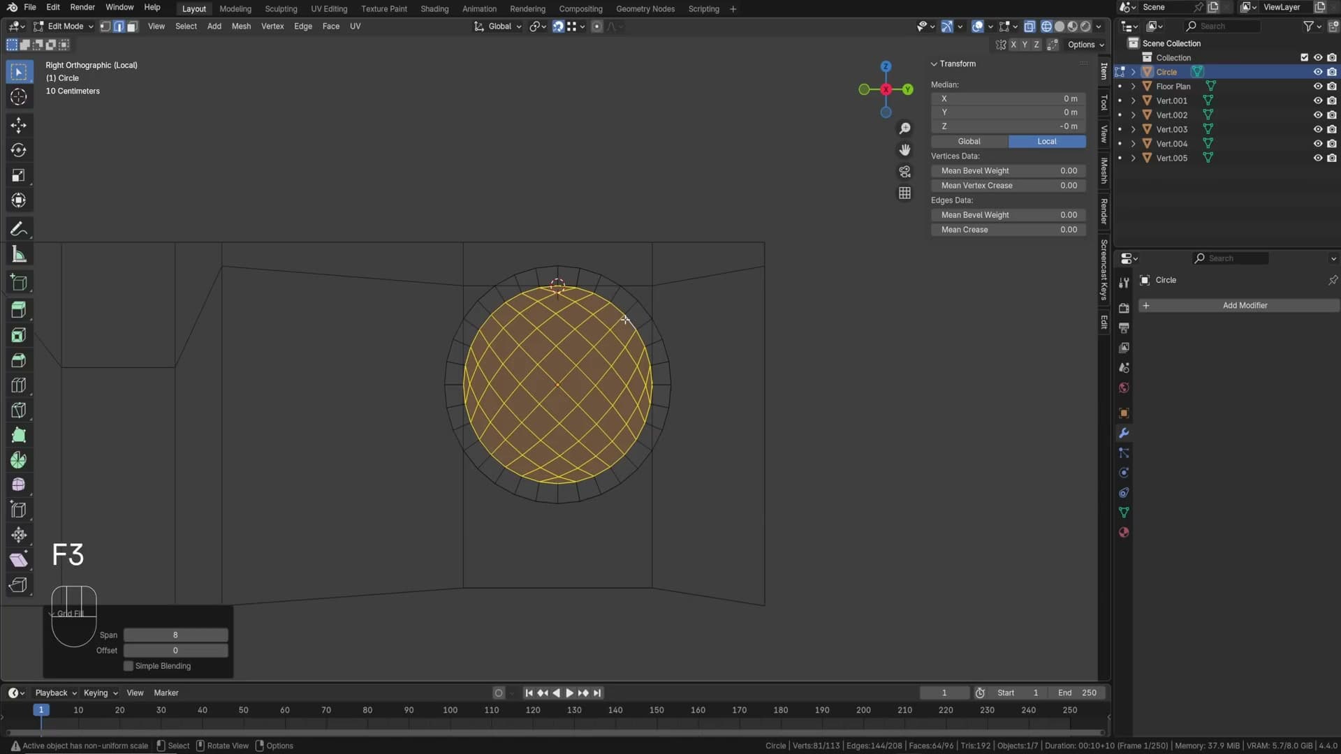
Delete the bottom half of the faces (we’ll mirror), then add a Mirror modifier on the Y axis. Now you only have to build one side.
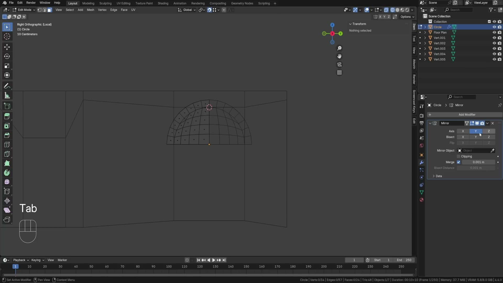
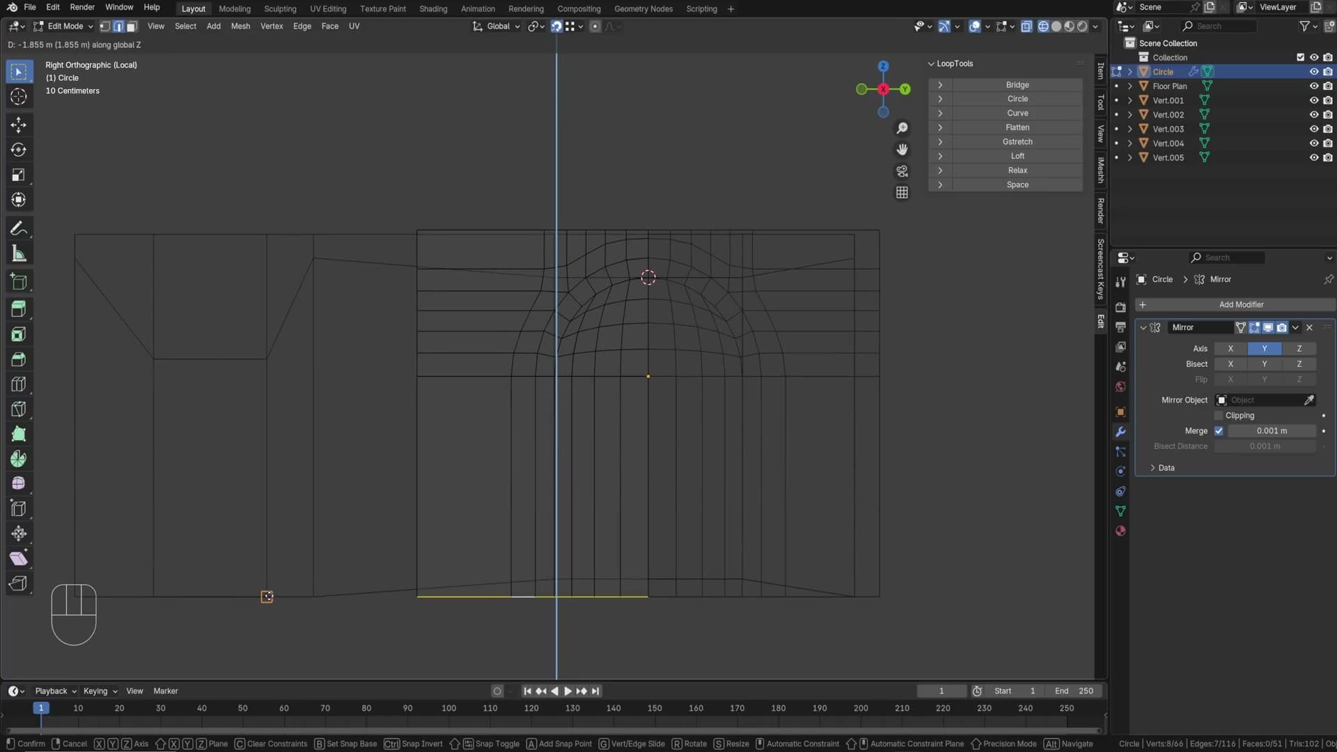
From there it’s a sequence of edge selections and axis-locked extrudes: select the top four faces, E + Z; select the side, E + Y; and so on, working out to cover the full wall area. The quads stay quads. With Loop Tools enabled you can Edge → Loop Tools → Relax on the curved edges to smooth them visually without breaking the topology.
Bevel, subdivision, and creases on hard edges
With the geometry done, smooth it out: add a Bevel modifier at width 0.007 with a couple of extra segments, then Ctrl+1 to add a Subdivision Surface on top.
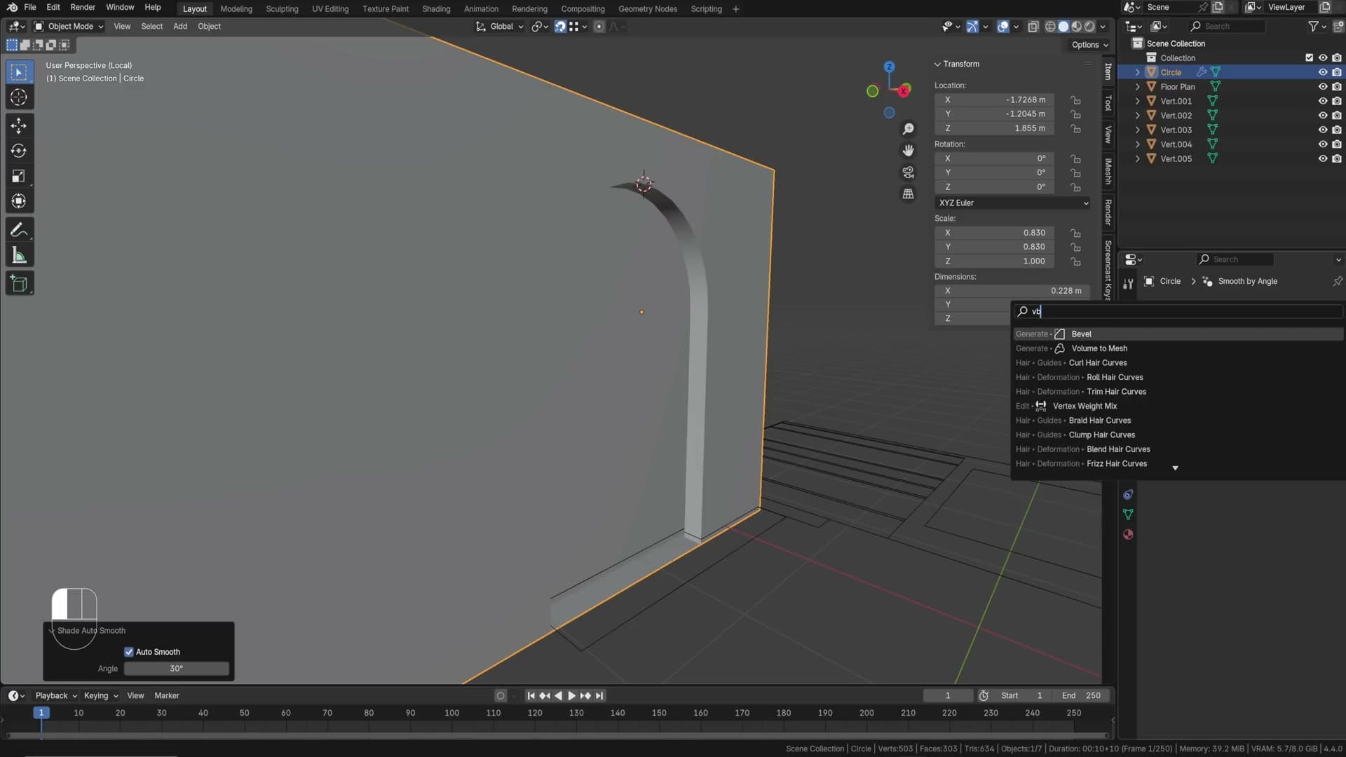
Subdivision will round the outside edge into a hump unless you crease it. Back in edit mode, select the outer edge (Alt+click twice picks the whole loop), then Shift+E + 1 to crease the entire edge to maximum.
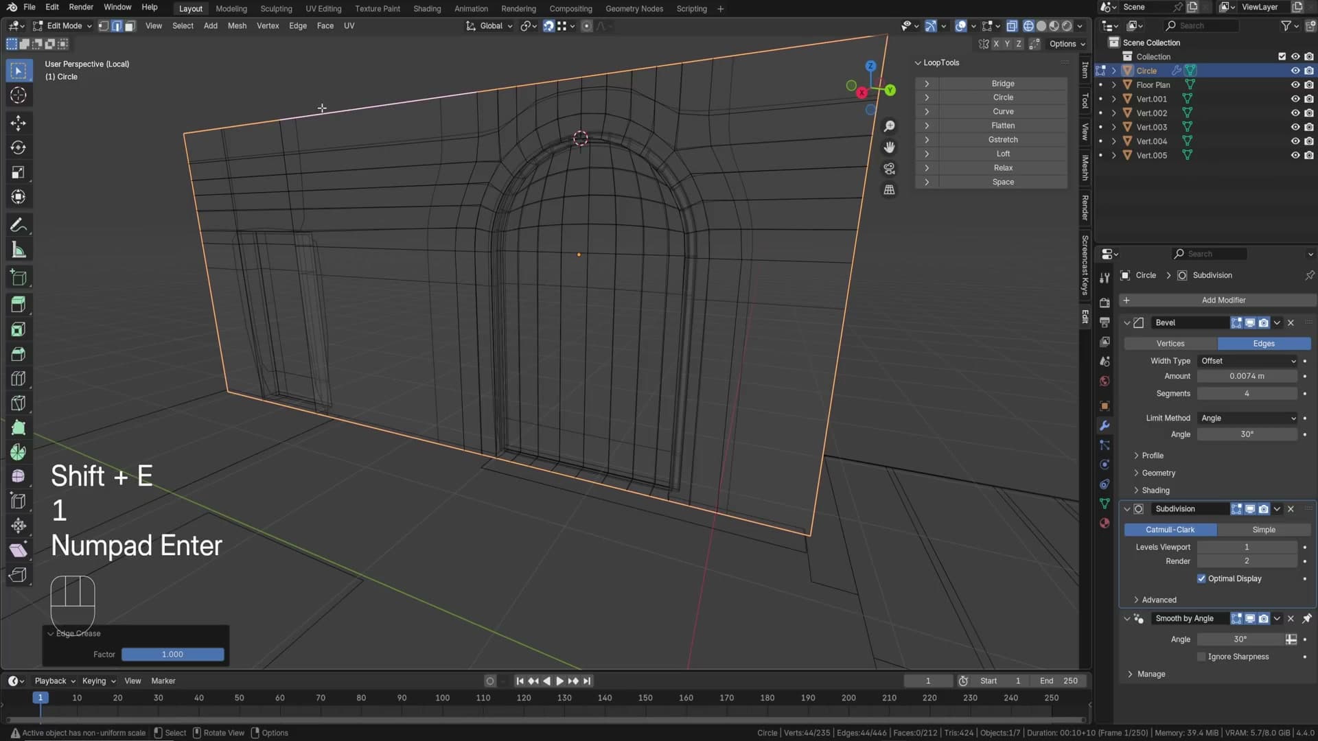
Finally, right-click → Shade Auto Smooth, then in the same menu enable Shading → Harden Normals. The arch should now look like a clean rounded form, all quads, ready for displacement later.
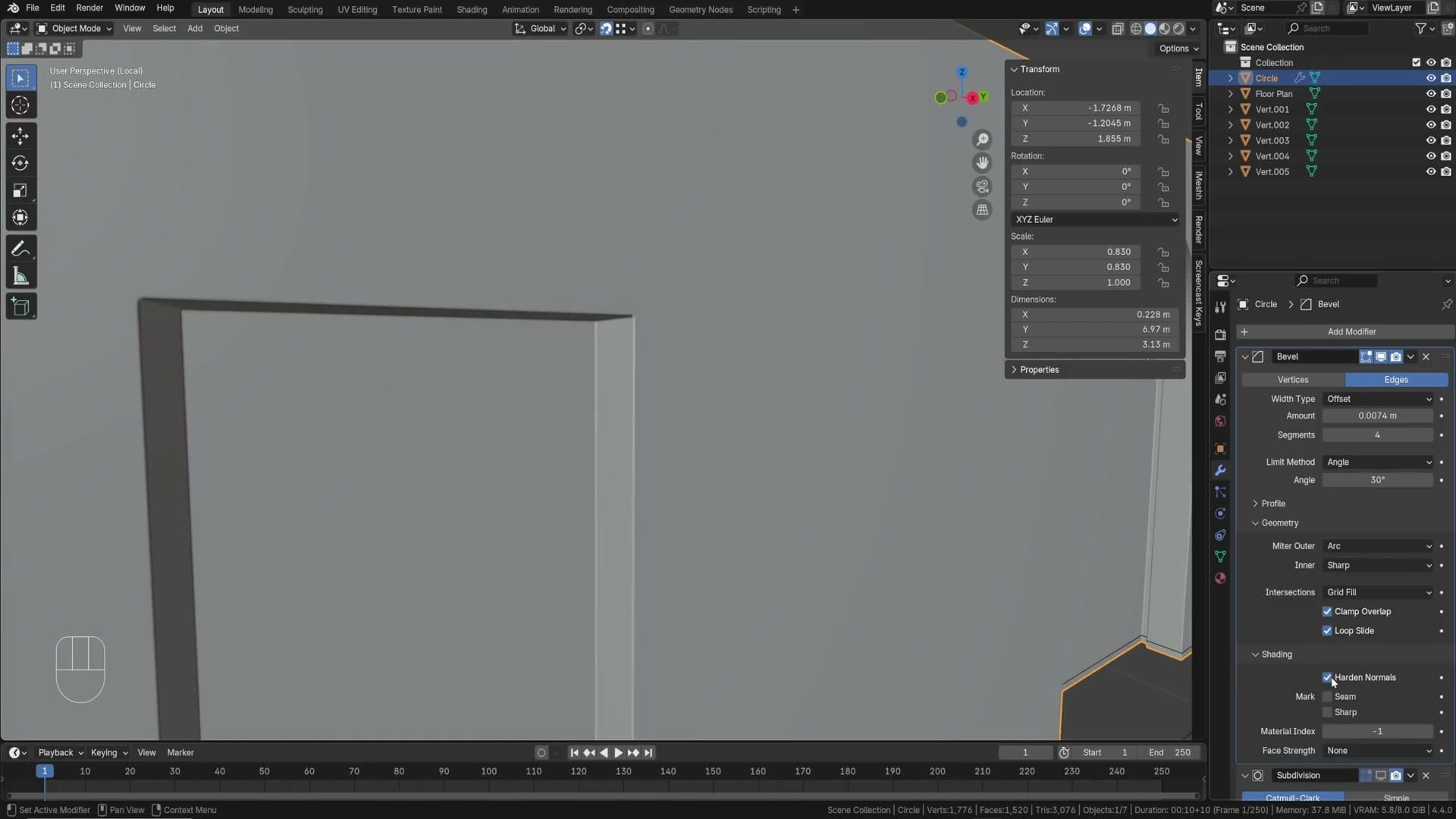
4. Wall geometry, camera and initial lighting
Before touching materials, get a rough camera angle and basic lighting in place. The reason: if you tweak materials before lighting, you’ll just have to re-tweak them once the lighting changes.
Separating the walls and copying modifiers
Each wall surface becomes its own object so it can be displaced independently. Select the wall faces, P → Selection to separate, then add a few Ctrl+R loop cuts so the subdivision has something to work with.
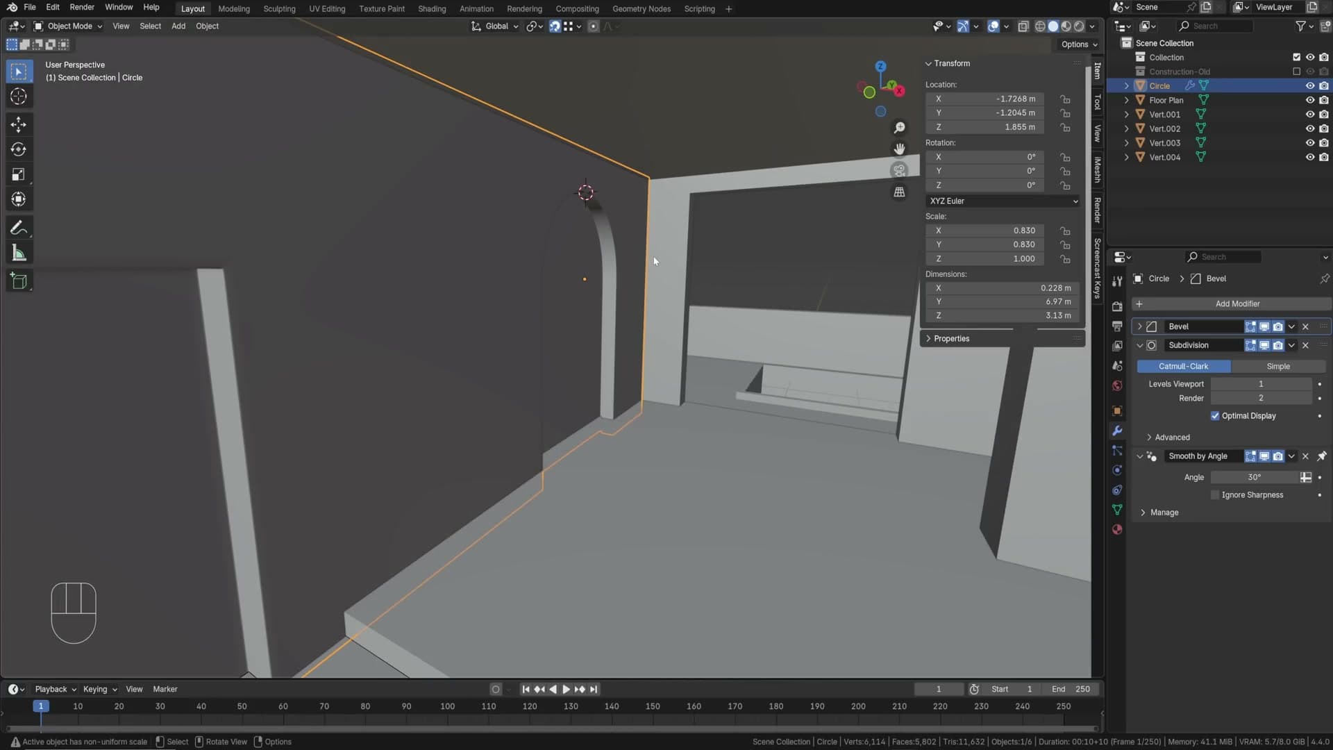
Each new wall gets the same setup: bevel modifier 0.007, shade auto smooth, harden normals. Rather than re-doing each one, click the source wall, shift-click the target wall, then Ctrl+L → Copy Modifiers.
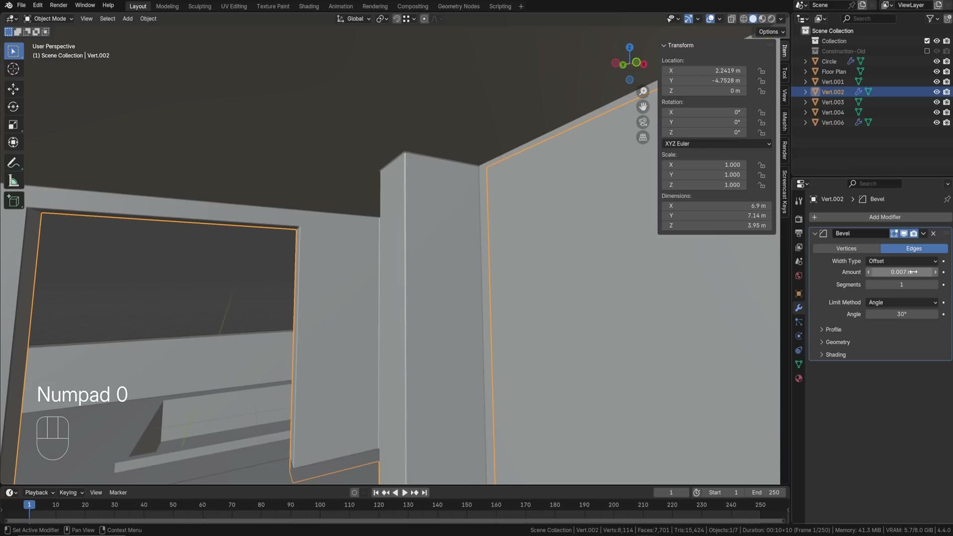
The outer edges of each wall also get a max crease (Shift+E + 1), and edges are extended slightly past the corners. Displacement can push geometry in or out, and overlapping edges prevent any visible seams in the final render. The inside view doesn’t care that the outside is a bit messy.
Camera at 35mm with walk navigation
Shift+A → Camera, then Ctrl+0 on the numpad to look through it. To fly the camera around, go to View → Navigation → Walk Navigation(or assign a shortcut to it; it’s worth one).
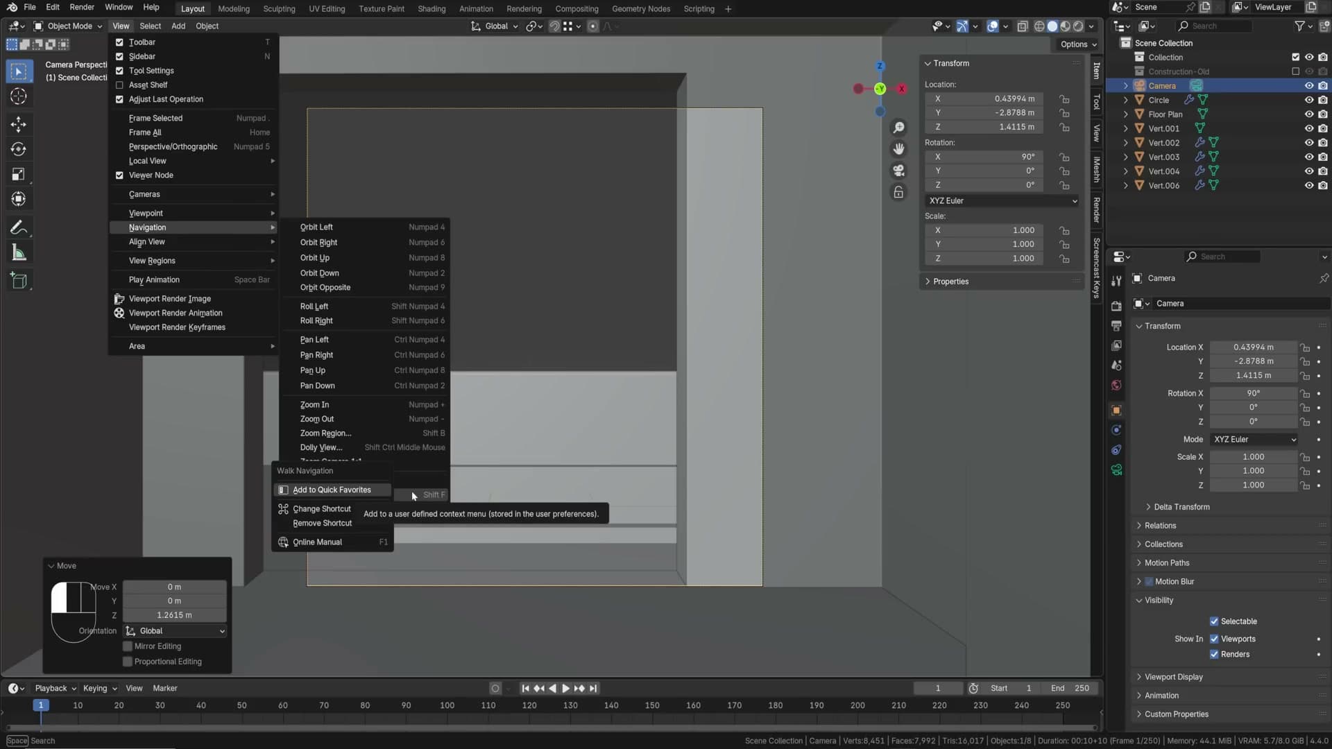
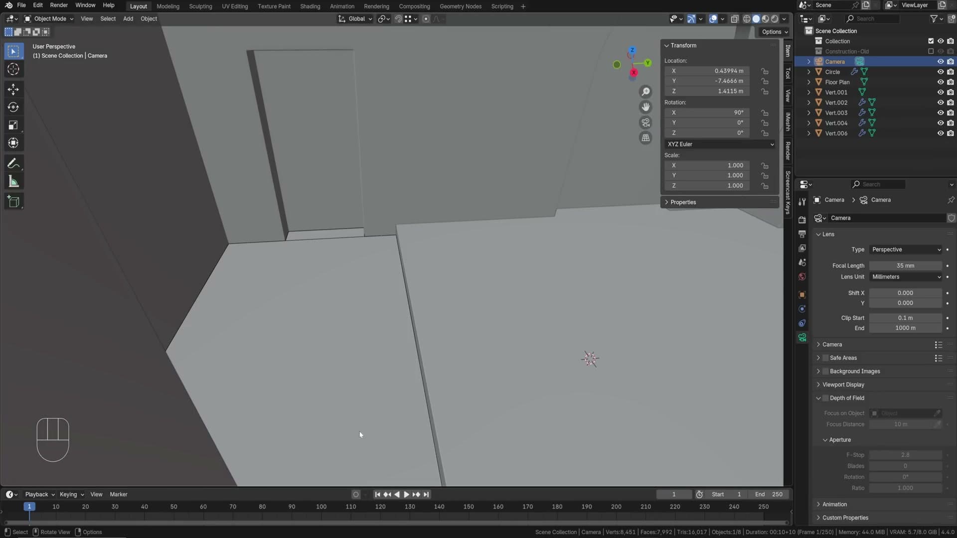
For this scene the camera works well at 35mm, wide enough to take in the room without the fish-eye effect of going too wide. The camera sits back behind the wall (clipping into it), and the Clip Startdistance is raised so it doesn’t cut off the foreground.
World shader: sky texture vs overcast HDRI
In Shader Editor → World, the simplest approach is a Sky Texture plugged into a Background node. It gives you a lot of control: rotate the sun, change strength, watch the scene shift from midday to sunset live in render preview.
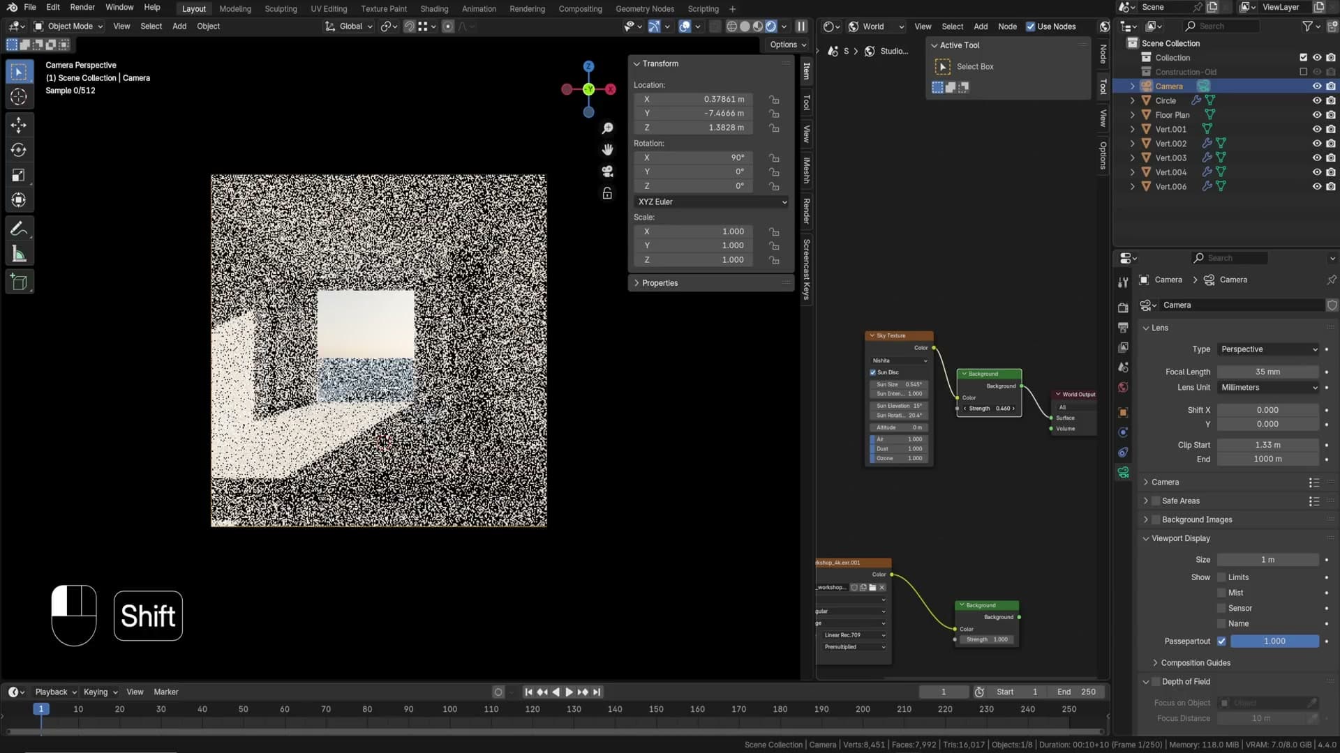
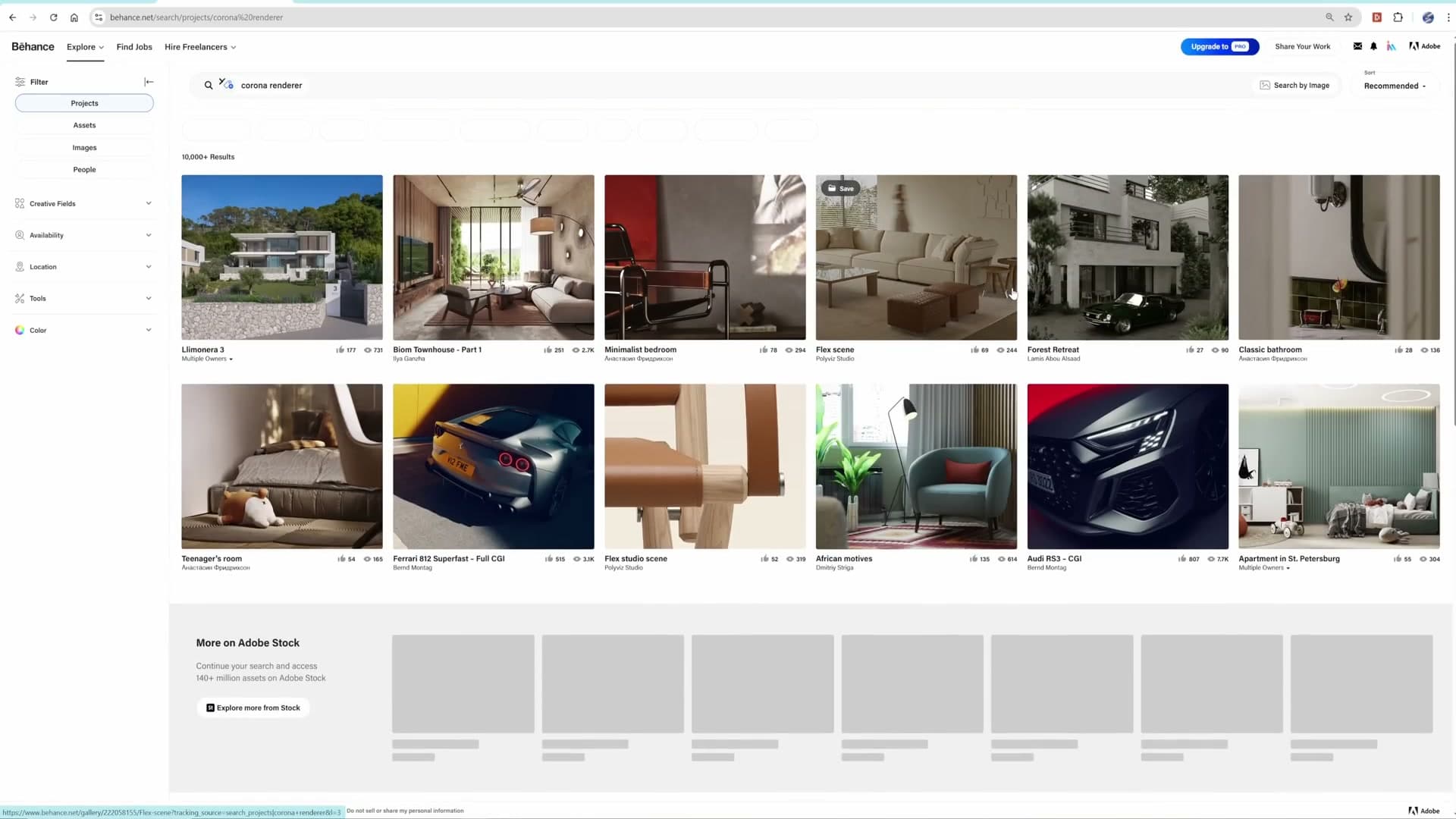
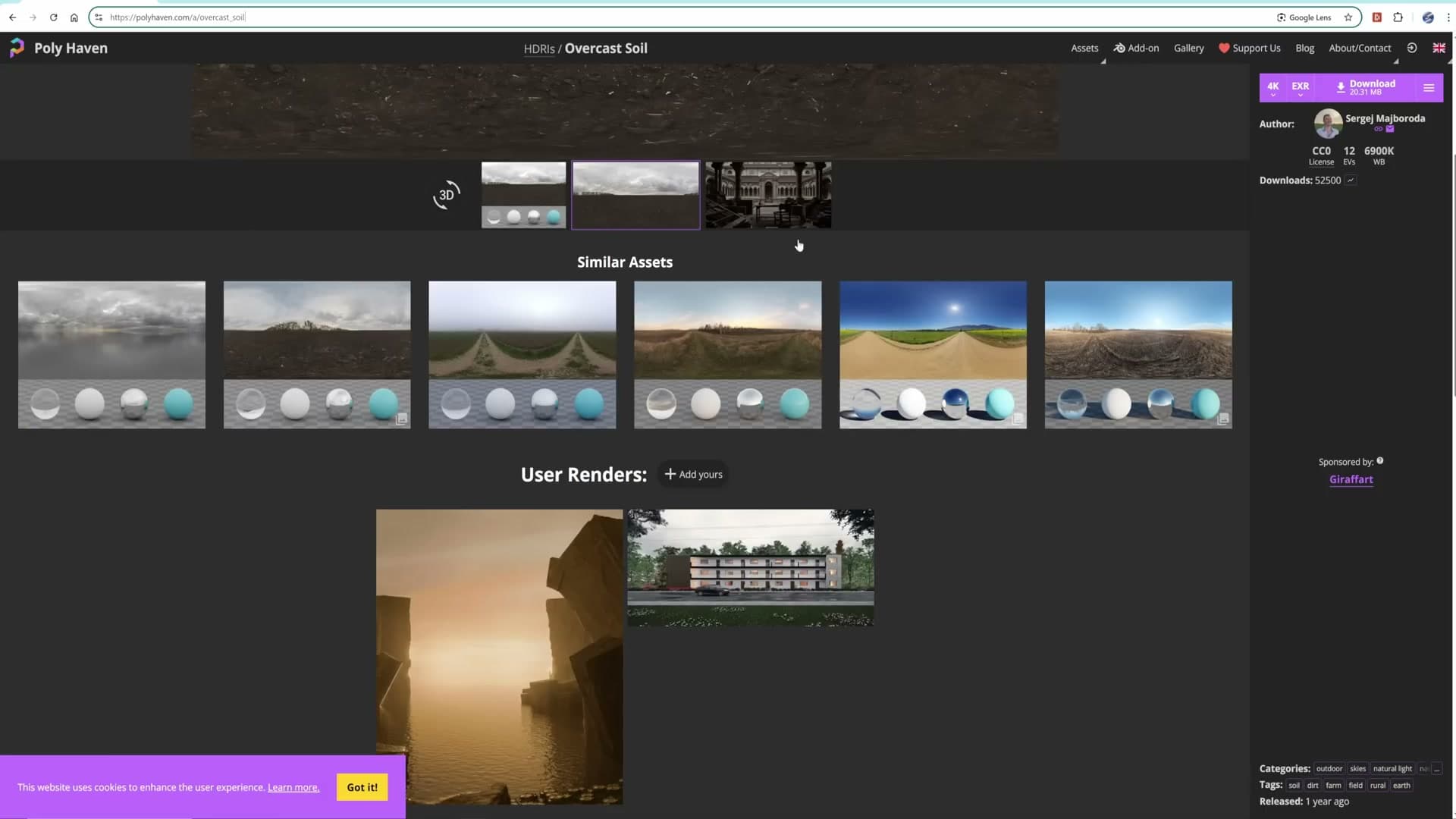
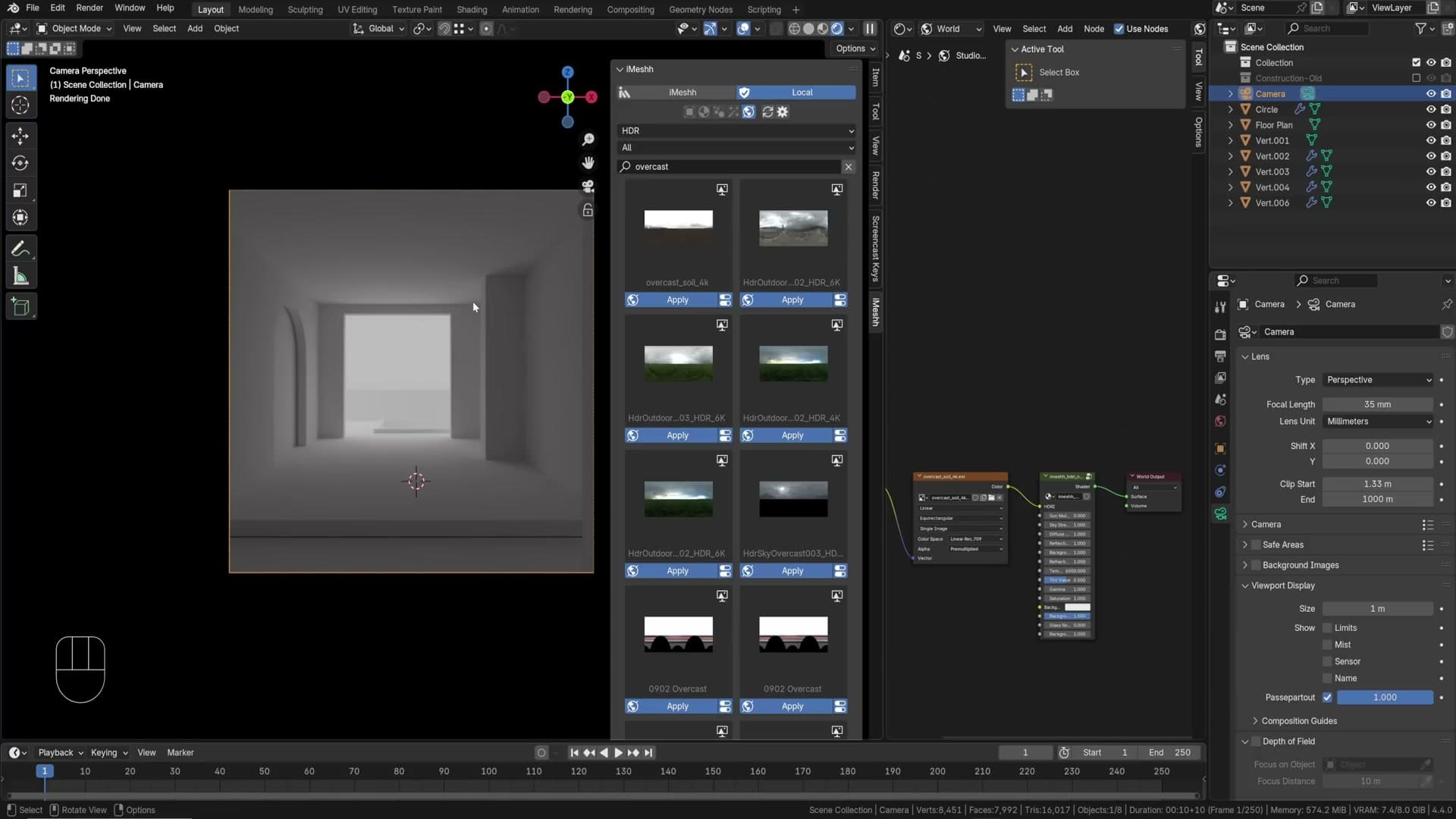
For this scene I went with an overcast HDRIinstead. Overcast lighting is flat and even, nature’s softbox. Look at almost any Corona Render interior on Behance and you’ll see the same effect: very soft, almost no direct sunlight, a familiar feel. The HDRI is the starting point; a sun light gets added on top later.
Installing the iMeshh Asset Manager
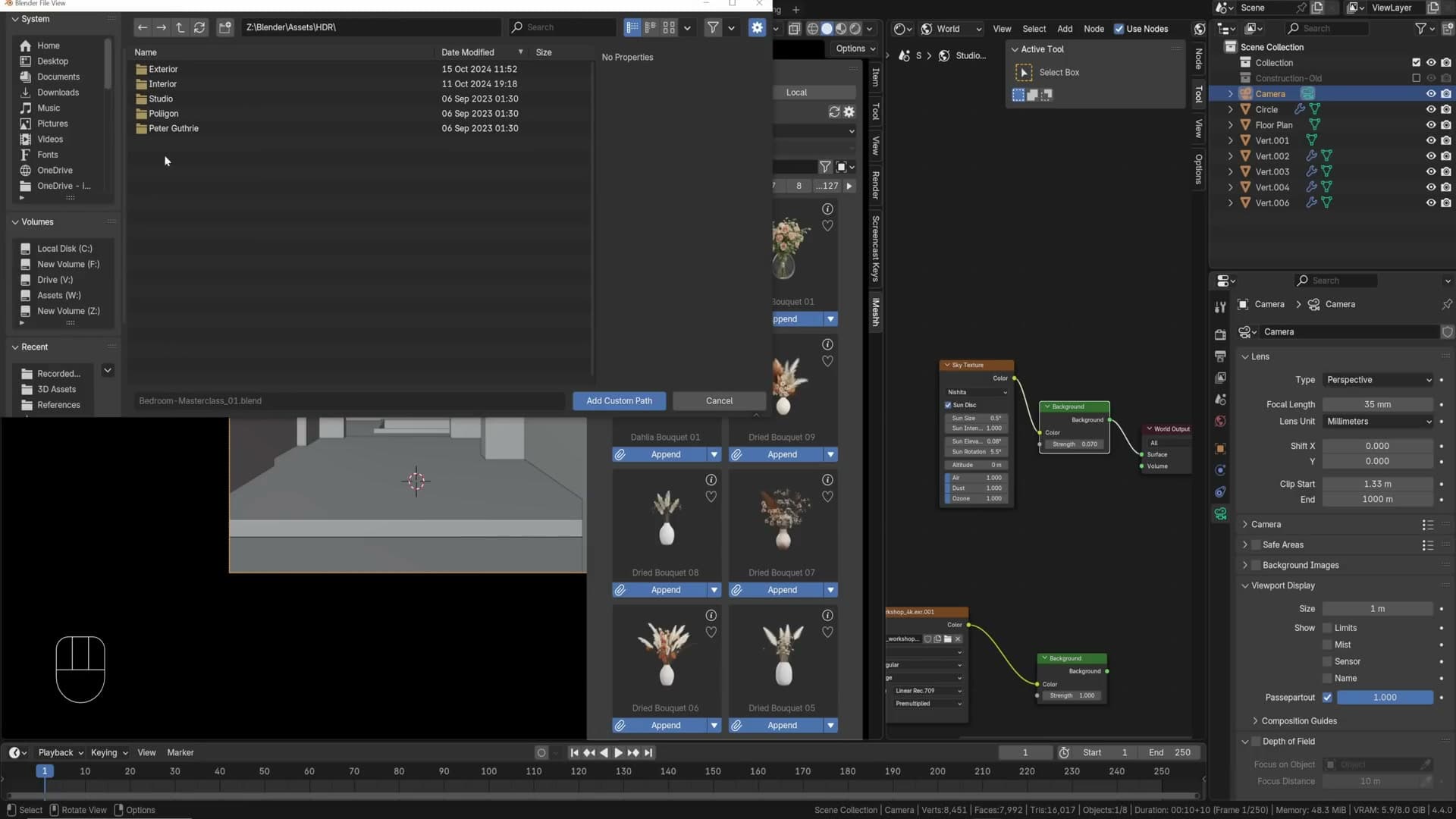
This scene uses the iMeshh add-on heavily for assets and HDRIs. To install it: go to Edit → Preferences → Extensions → Add Remote Repository, enter the iMeshh repo URL, click Check for updates, then install the add-on. Once installed, point it at a folder on your computer where you keep HDRIs, then they show up in the iMeshh sidebar with adjustable parameters.
Sun lamp at 5000K and the edge-light inset
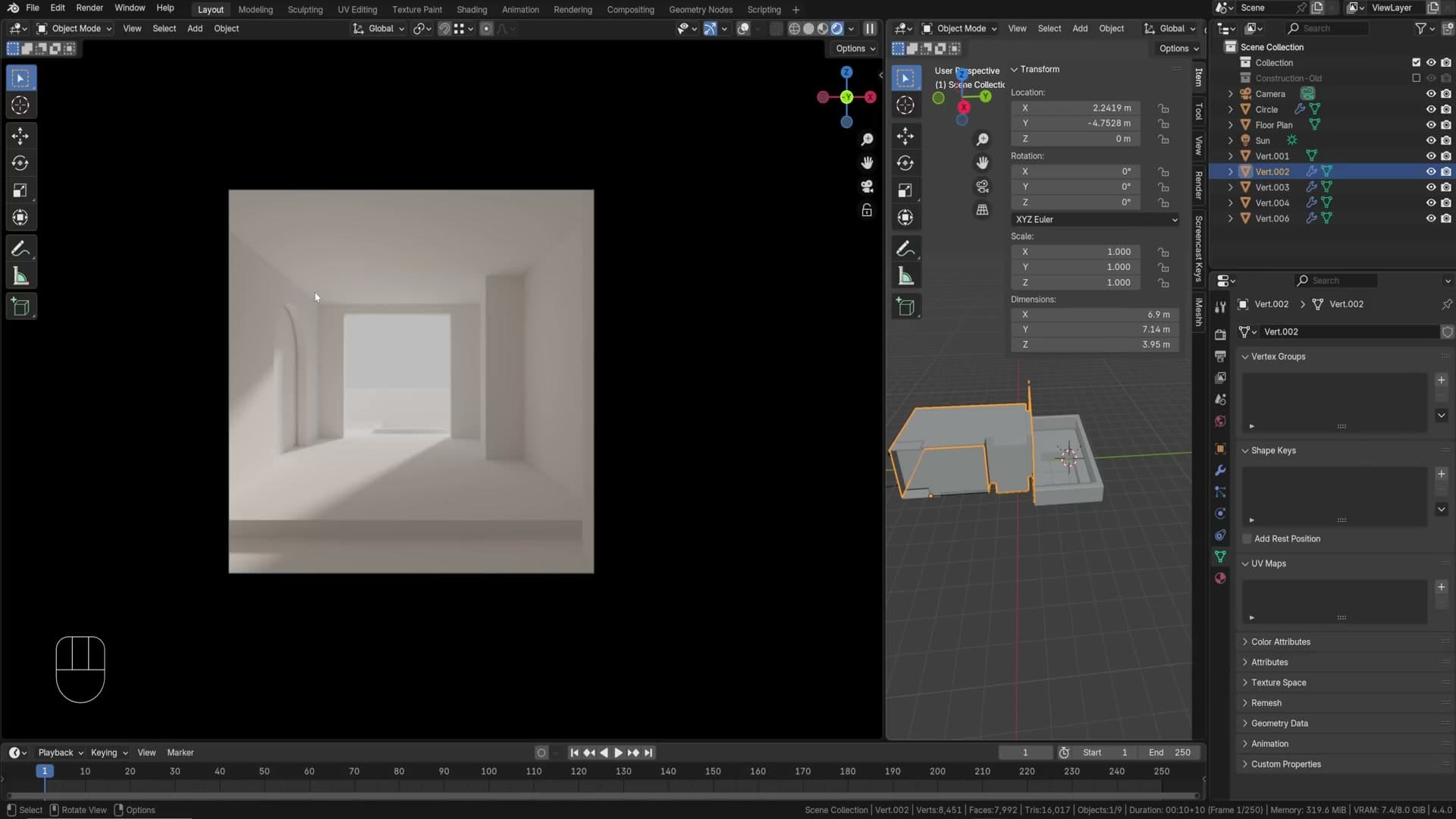
Add a sun light with Shift+A → Light → Sun. Rotate to taste, increase the angle from the default 0° to around 5° so shadow edges are soft, and set strength to roughly 5 to start. Click Use Nodes on the colour, switch to Blackbody, and set the temperature to 5000K for a slightly warm daylight feel.
Before moving on, add a recessed channel around the top of the inside walls. That’s where the hidden edge lighting goes later. Select the top edge loop on the inside, I + 0.1 to inset 10 cm, then E → Z → -0.1to push it down 10 cm. That creates a slot.
5. Floor and wall materials, with variable roughness
Painted concrete from Poly Haven for the floor; the same material on the walls and ceiling. The interesting part is the variable roughness node group, a Christopher 3D technique that makes the floor feel much more realistic at glancing angles.
Painted concrete floor from Poly Haven
On polyhaven.com/textures search for painted concrete. The one I use here is 4 m wide. For a surface taking up this much screen space, bigger is better.
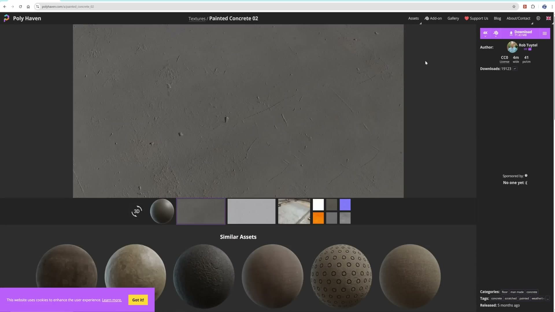
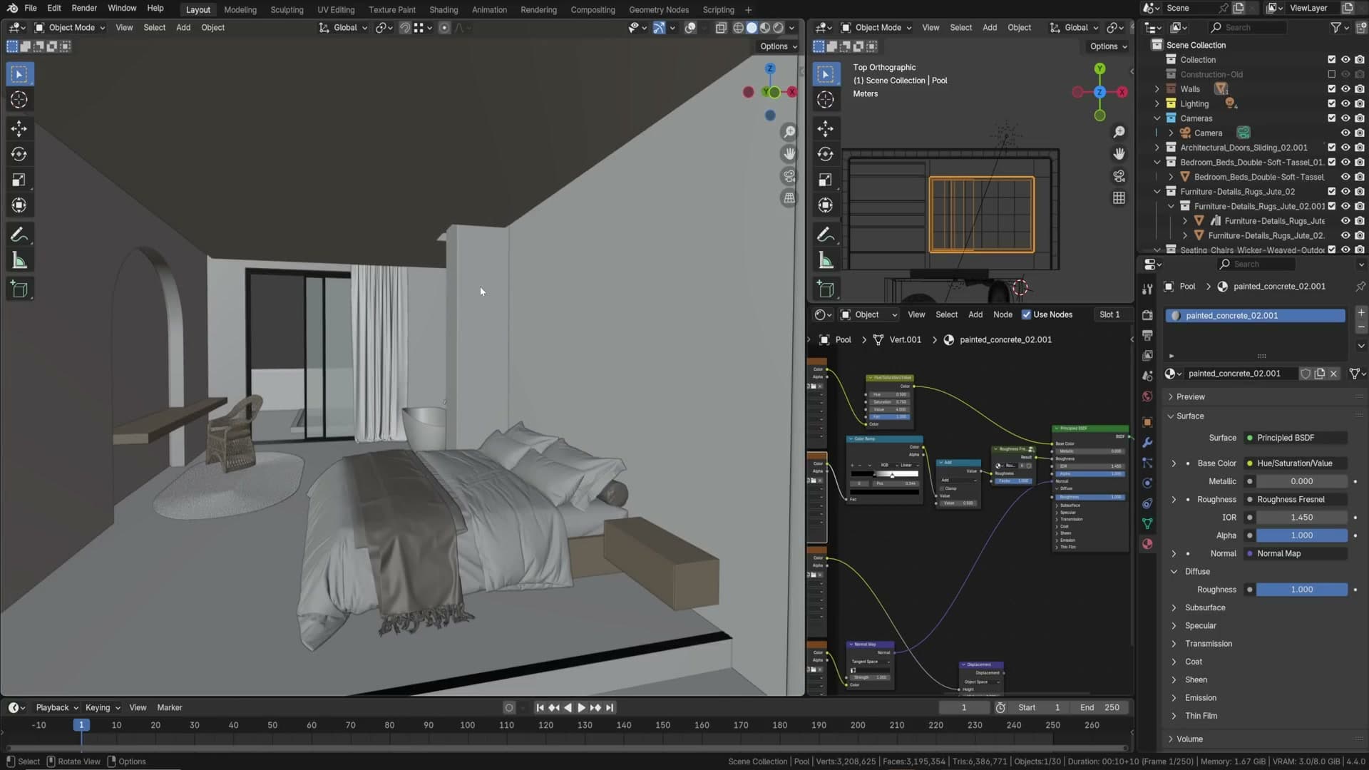
Poly Haven ships textures with a ready-wired .blend file. Instead of building the shader yourself: File → Append, navigate to the texture’s folder, double-click the .blend, choose the 4K (or 2K, usually plenty) material and append it. Apply it to the floor, unwrap (Tab → A → U → Unwrap), and you’re done.
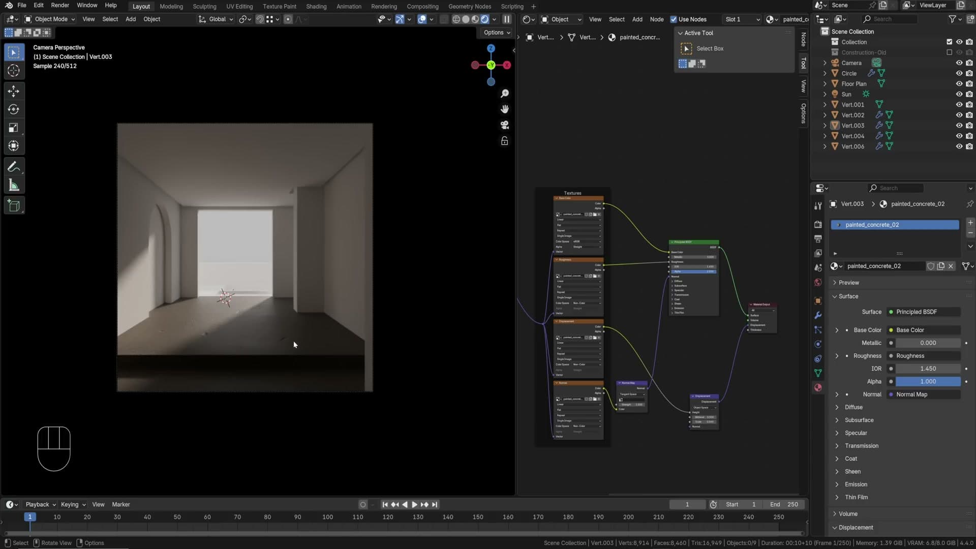
Hue, saturation, and why pure white is dangerous
Out of the box the floor is too dark, so a Hue/Saturation node before the base colour brightens it. But push that brightness too far and you create a problem: bright textures start to behave like light sources in the path tracer.
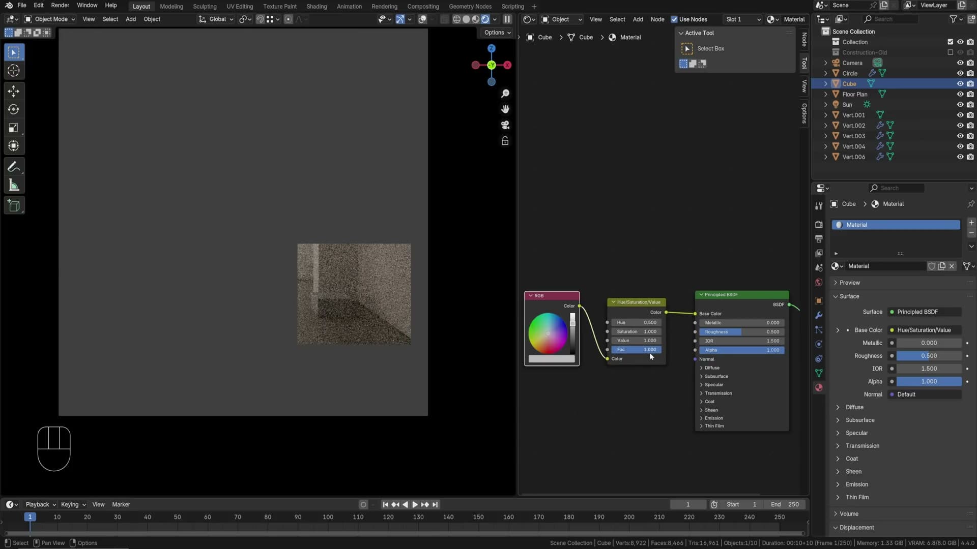
Quick demo: drop a cube in the scene, give it a pure white texture, then run that white through a Hue/Saturation with value 4. Add another cube next to it and the boosted white actually illuminates the second cube. Even at value 1 with a perfectly white texture you can get this in some scenes. So when your texture has flecks of white in it (concrete with paint chips, for example), boosting saturation can inadvertently turn those flecks into mini emitters.
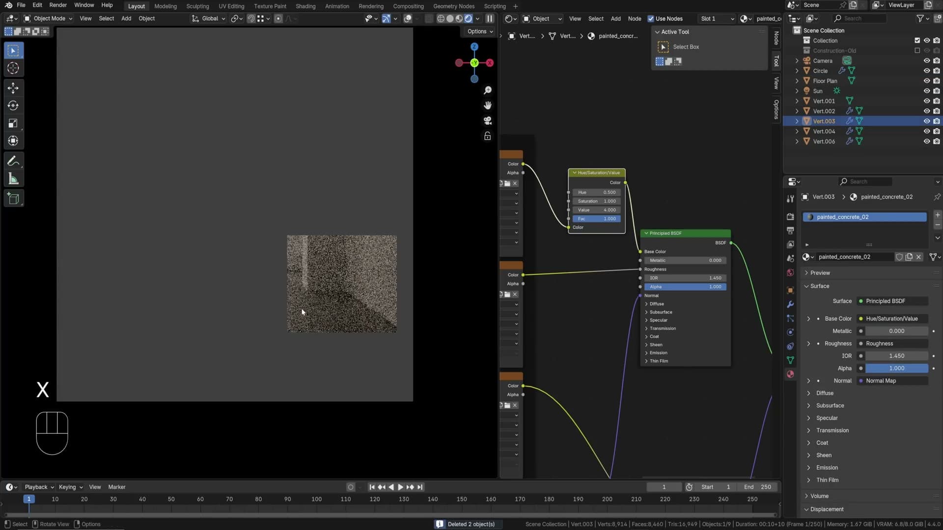
The fix in this scene: bring brightness up just enough, then drop saturation to 0.85 to take the colour edge off.
Smart UV unwrap on the walls
The walls take the same material as the floor (Ctrl+L → Link Materials). Because this is a random concrete texture, you don’t need the UVs to be perfectly connected. A Smart UV Project (Tab → A → U → Smart UV Project) is fast and good enough; the texture is busy enough that the seams disappear.
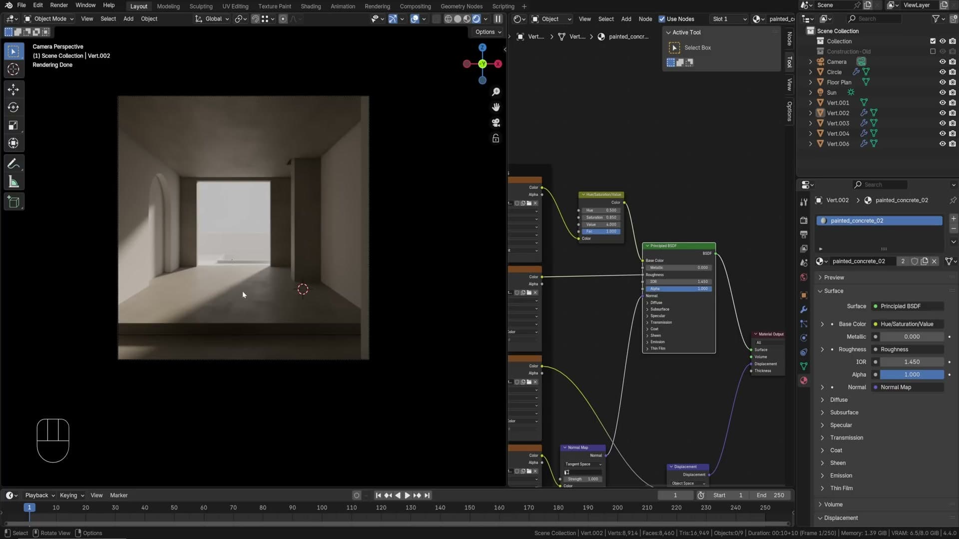
Variable roughness: a Christopher 3D node trick
When you look at a surface from a glancing angle, it appears more reflective than head-on. People often assumed that updating Blender’s Principled BSDF (around 4.0) added this behaviour automatically, but it didn’t. The update was actually about energy conservation on specularity.
Christopher 3D (YouTube) demonstrated a small node group that plugs into the Principled BSDF’s roughness input to give you proper variable roughness. The blend file from the original masterclass ships the node group, but if you’re building it yourself it’s basically a Layer Weight node modulating the existing roughness texture via a Multiply.
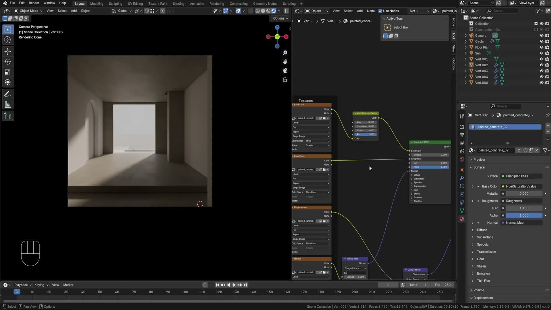
In practice: as the camera angle gets more glancing, more of the surface starts to behave like a polished surface. The closer the surface is to the viewer, the darker (and more reflective) it appears in the node trick’s mapping. Look at any rough surface in real life from close to the surface and you’ll notice it’s glossier than you expect. That’s what this is simulating.
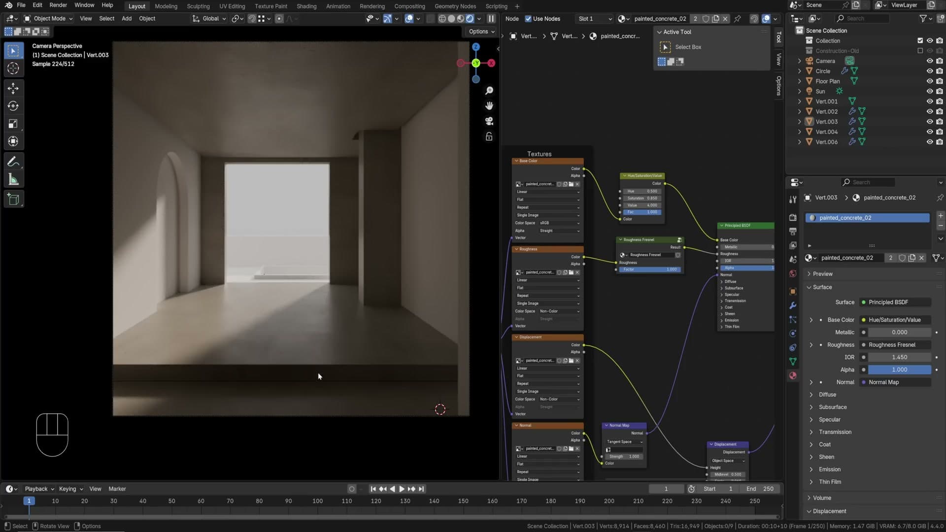
Color ramp + math node to taste
The painted concrete roughness is quite flat out of the box. Add a Color Ramp node in front of the roughness input and pull the white/black stops closer together. That cranks the contrast: the dark spots get glossier, the light spots stay rough, giving the floor visible variation under reflection.
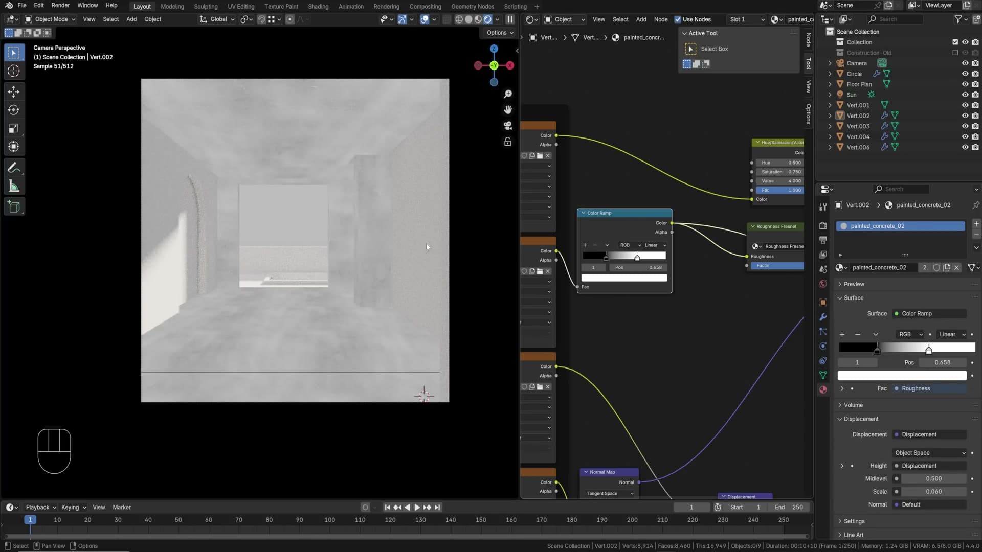
If the result is now too glossy overall, add a Math (Add) node after the ramp with a small value like 0.1 to lift all roughness back up a touch.
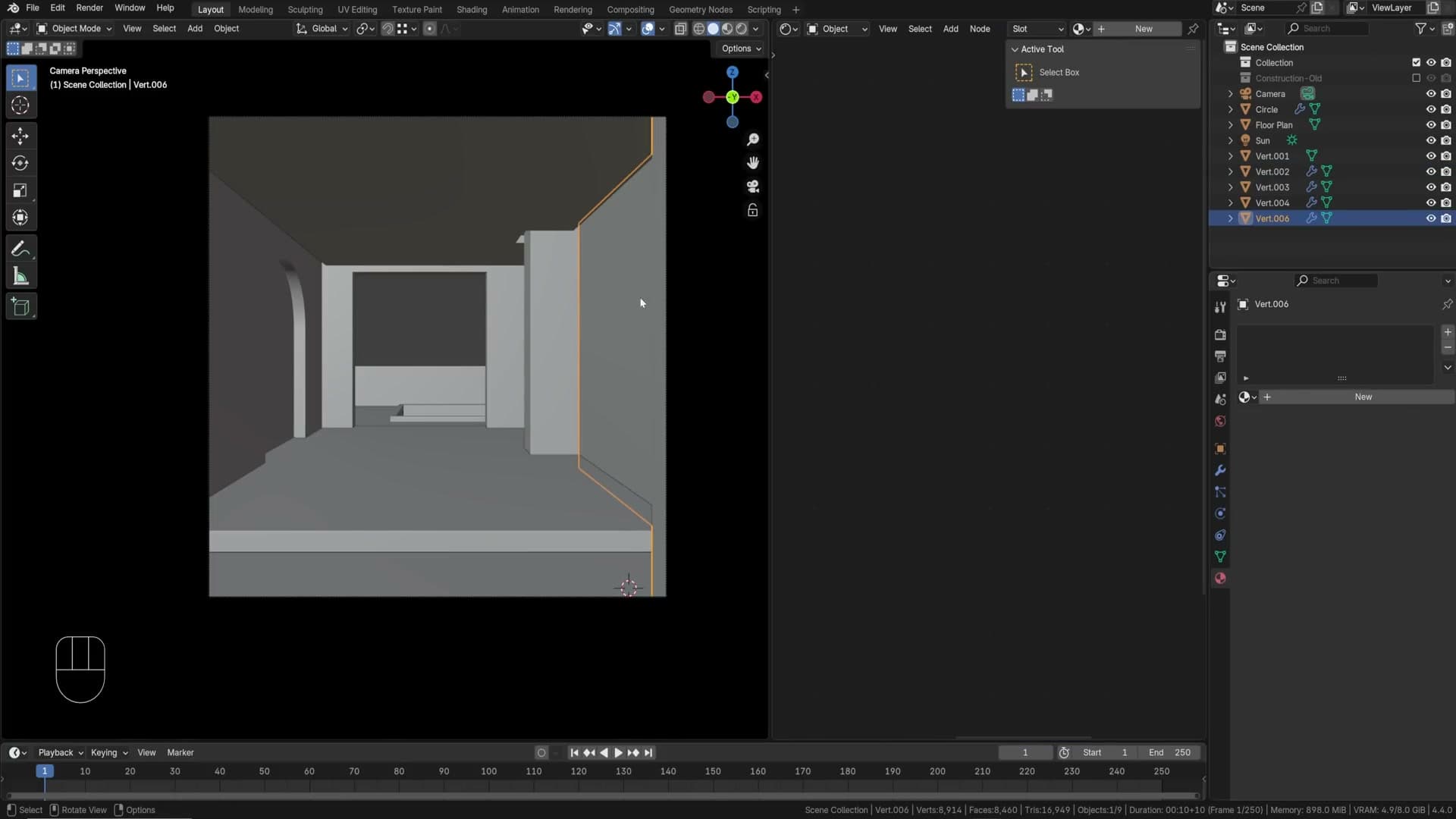
6. Stone wall displacement
The feature wall is real geometric displacement, not just a normal map. That means: experimental render feature set, adaptive subdivision, and a careful setup of displacement-vs-bump on the material.
iMeshh stone material
In the iMeshh sidebar, go to Materials → Stone and apply Stone Split Rock at 4K. Remove the normal map for this one. I rely on the displacement map alone, since the normal map would otherwise double up the detail.
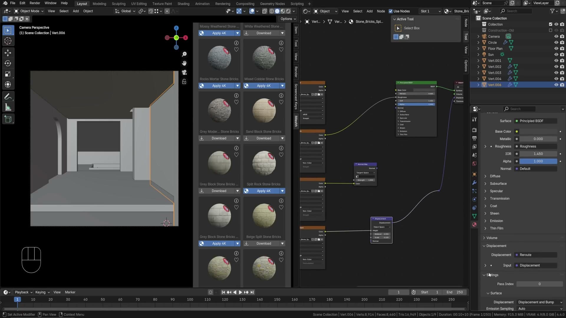
Set the base colour to a warm beige to match the rest of the scene. The hex code used is shown on screen.
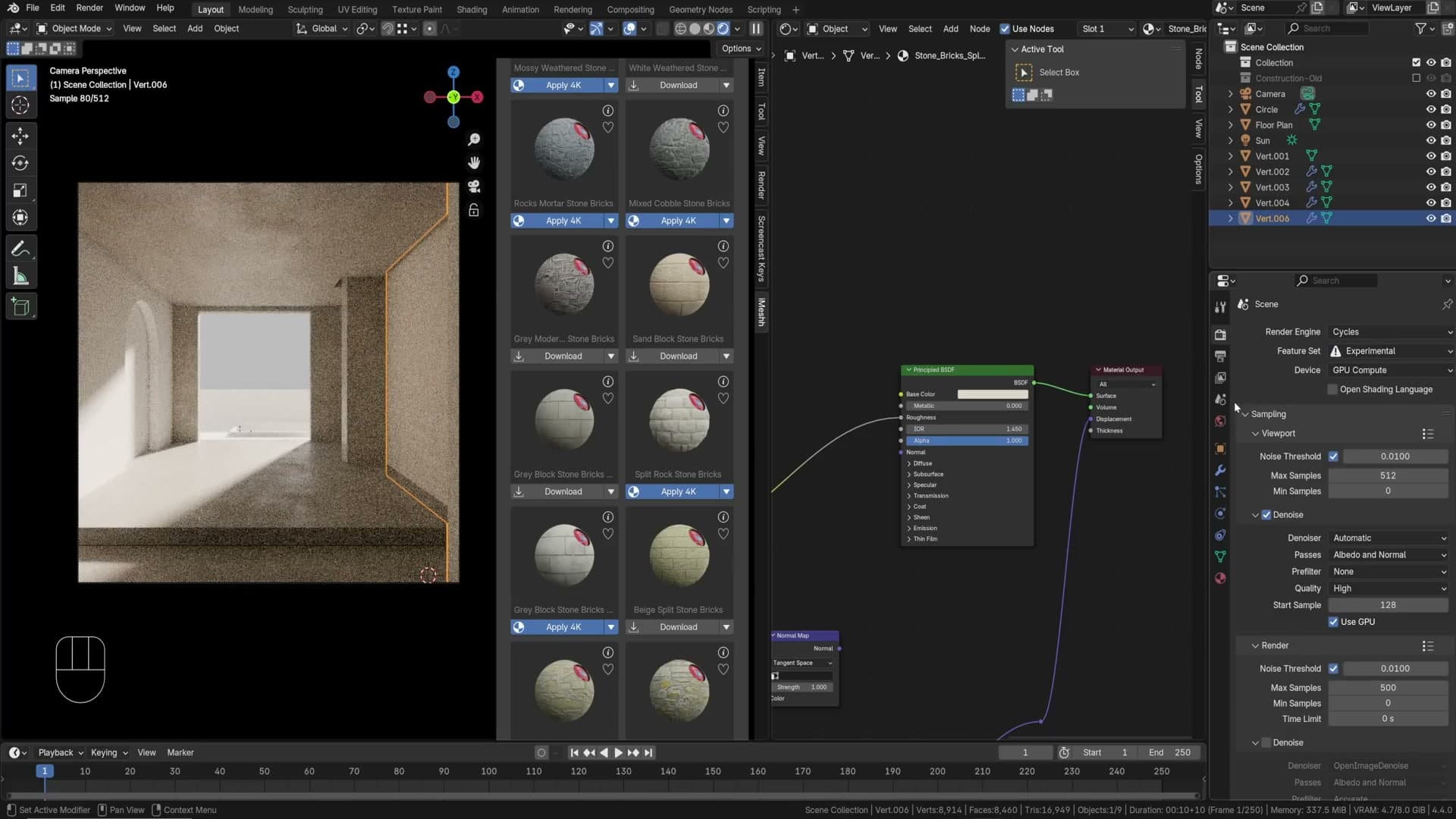
Experimental feature set + adaptive subdivision
Real displacement needs Cycles’ Experimental feature set. In Render Properties, set Feature Setto Experimental. (It’s been experimental for years; possibly always will be.)
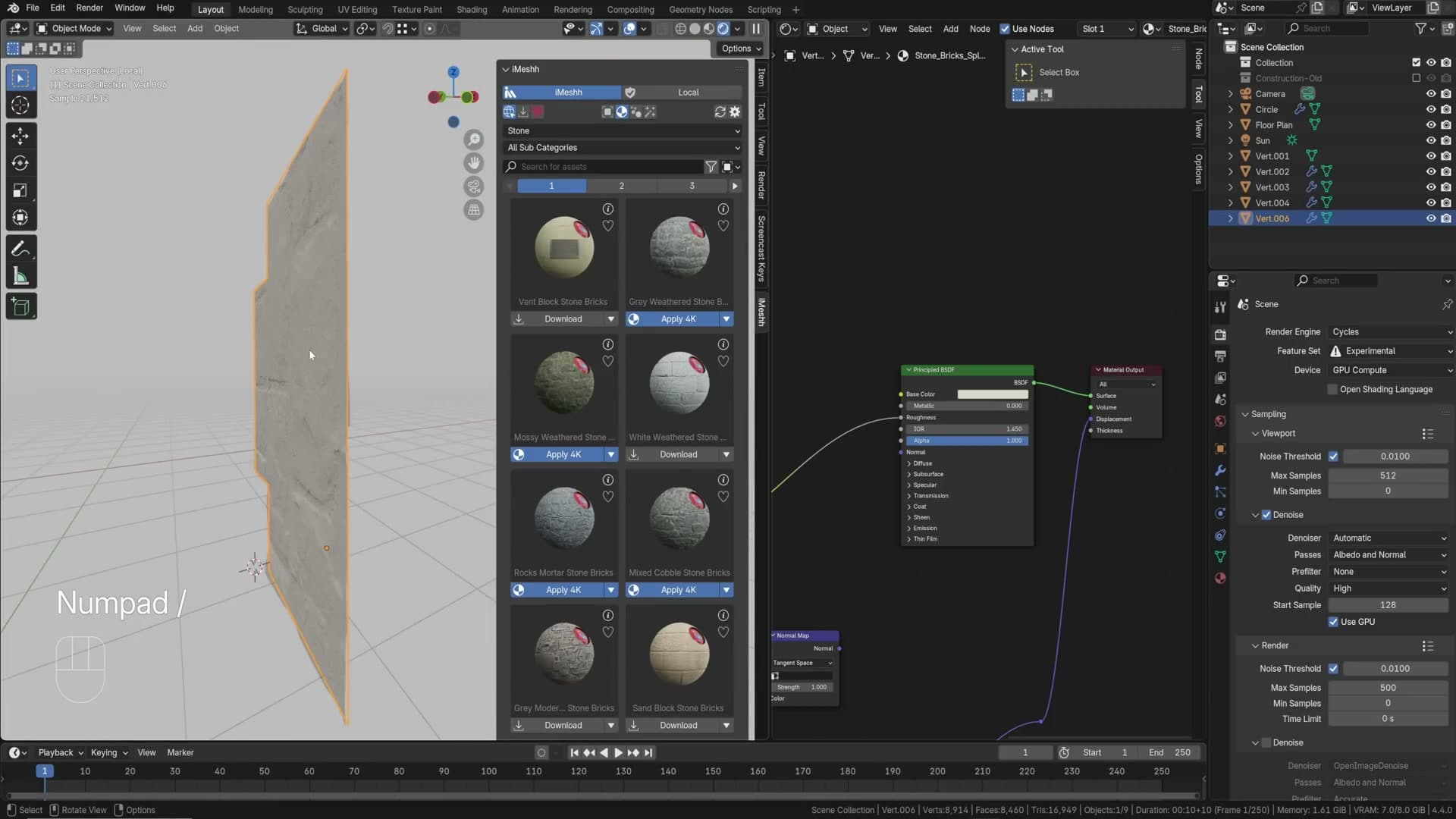
On the wall, add a Subdivision Surface modifier set to Simple as the top modifier and tick Adaptive Subdivision. Note: this only works if the subdivision modifier is at the top of the stack. If a Smooth-by-Angle modifier is up there, push it down.
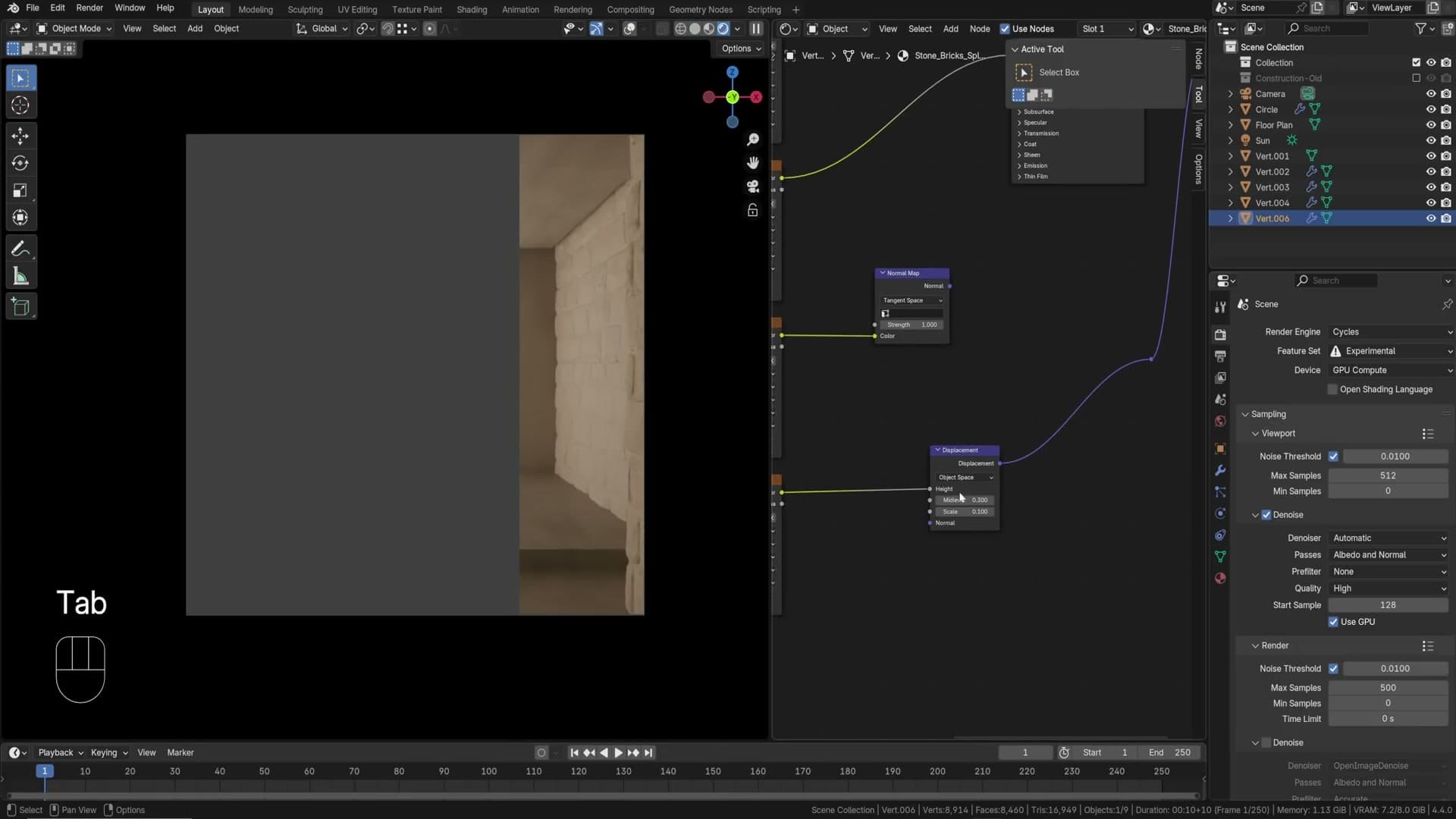
Displacement vs displacement-and-bump
In the material’s Settings → Surface → Displacement, switch from Bump Only to either Displacement Only or Displacement and Bump. With Displacement Only, the geometry actually moves and bricks poke out as real shapes. The downside is it’s purely geometric, so very fine detail relies on having enough subdivisions to resolve.
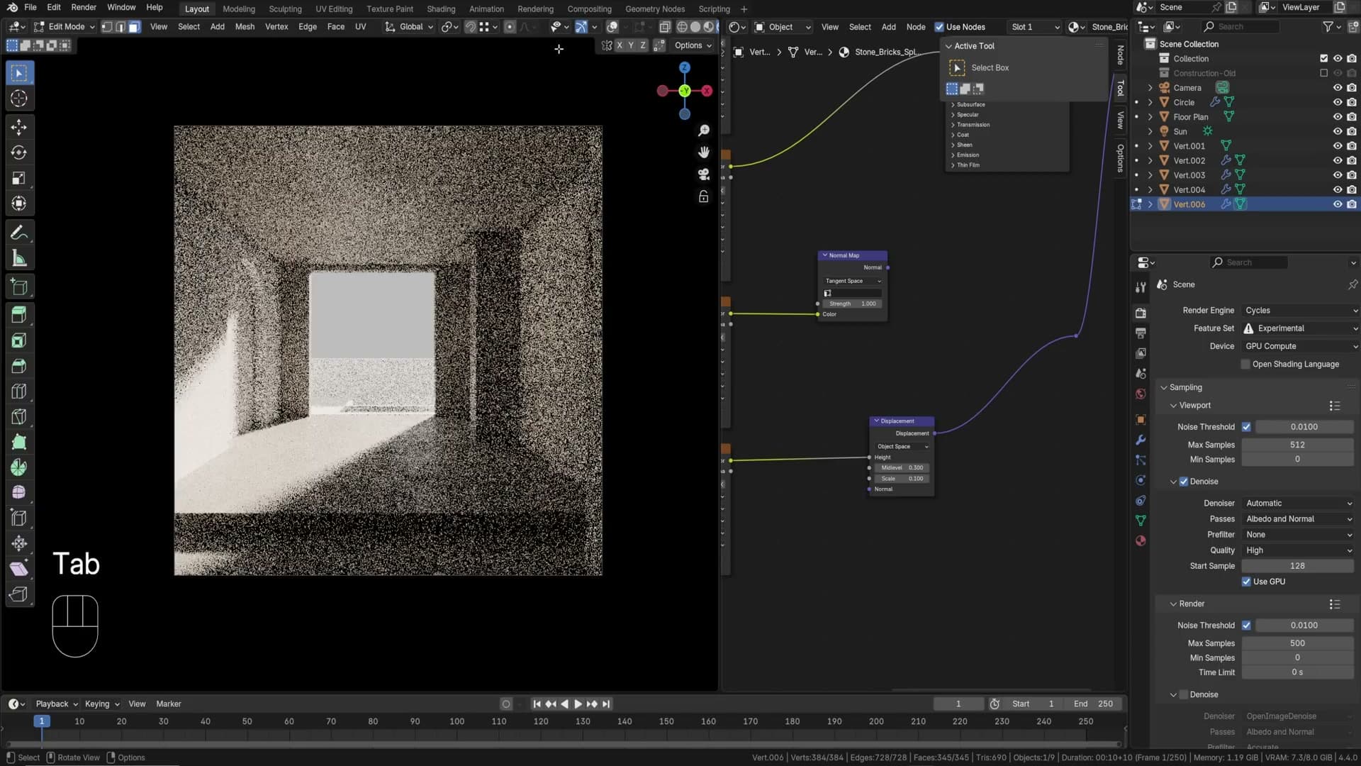
Displacement and Bump is the practical sweet spot: large shapes come out as actual geometry, and the fine grain stays as a bump map. Less subdivision needed, faster render.
Watch the corners. Displacement can create artifacts where two displaced walls meet. The fix here is to bump up the bevel on the wall’s bevel modifier from 0.15 to 0.2 so the rounded corner gives the displacement geometry more room to behave.
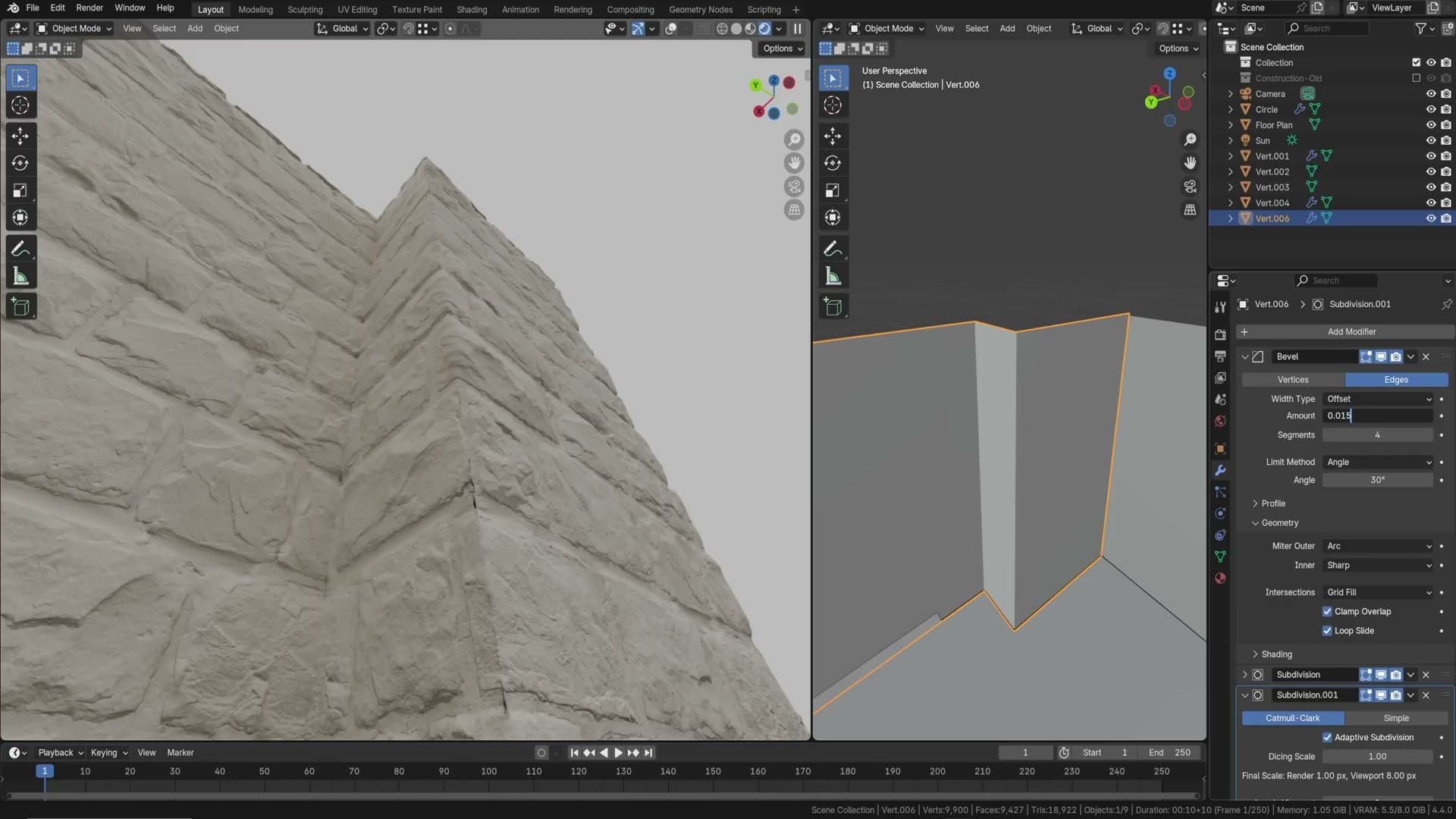
Diffuse roughness, independent from surface roughness
The Principled BSDF has a separate parameter called Diffuse Roughnessthat’s distinct from the surface roughness you’re used to. It’s most useful on genuinely rough materials: plaster, concrete, fabric, chalk. Setting it to 1 changes how light scatters off a rough surface in a way that, visually, looks more correct.
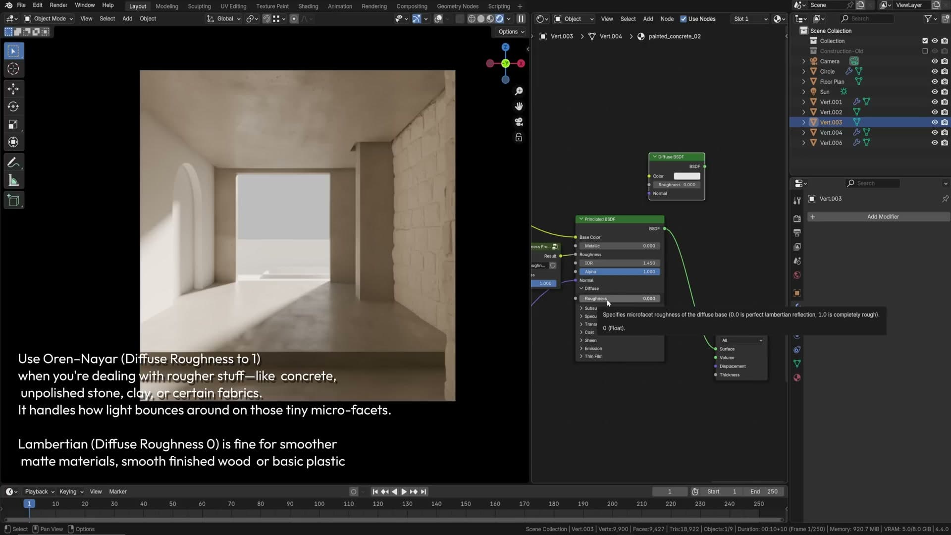
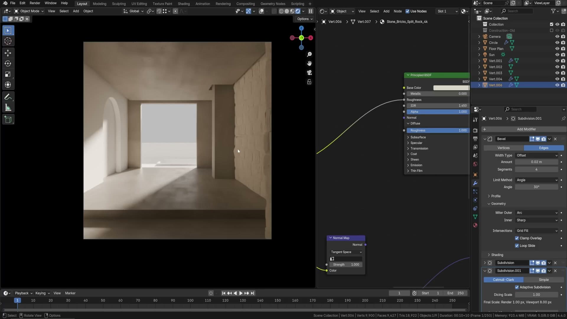
Worth noting: a lot of pre-existing assets (including many iMeshh ones) were built before this parameter existed, so they’ll have diffuse roughness at 0 by default. If they look slightly off, that’s often why.
7. Texture painting + plaster-over-stone mask
One of the most underrated tools in Blender. You hand-paint a mask onto an object, use it as the factor of a Mix Shader between two materials, and end up with a plaster wall that looks like it was applied over a stone wall, including a believable raised lip where the plaster sits on top.
Why this technique matters
Being able to paint exactly where you want, on an object, is an incredible skill. It lets you blend any two materials anywhere: moss on the ground in one corner, dirt on a wall in another, plaster over an archway. For this scene the story is: this used to be a stone room, and parts have been plastered over cleanly. The plaster covers the archway and adjacent stone fades to bare rock further out.
Setting up the paint mask
First, isolate just the part of the wall that needs the plaster mix. Mark a seam around the doorway with Edge → Mark Seam, then Ctrl+L to select linked within the seam, and P to separate it. Re-crease the new edges (Shift+E + 1) wherever they need to stay sharp.
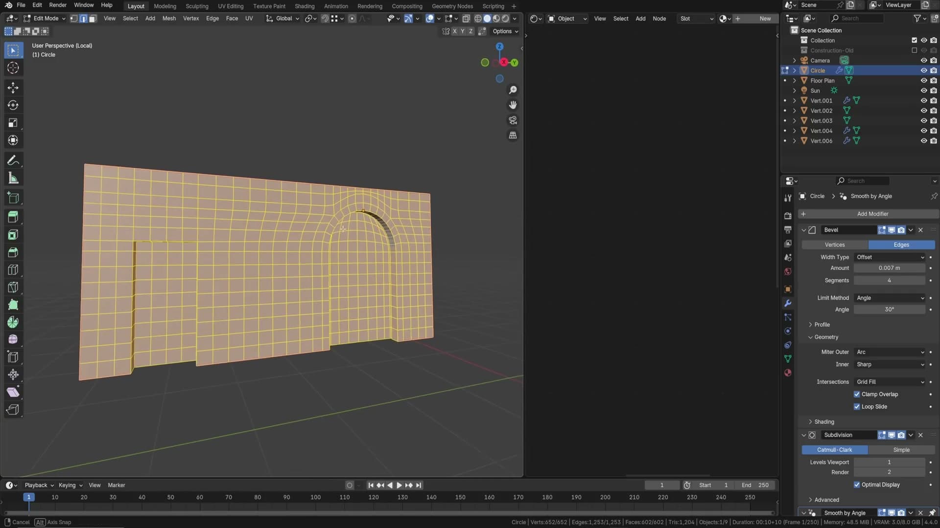
In the Shader Editor, add a new Image Texture node, click New, name it paint_plaster_maskand create it. You don’t need to plug it into anything yet; it just needs to exist on the material so Texture Paint can use it.
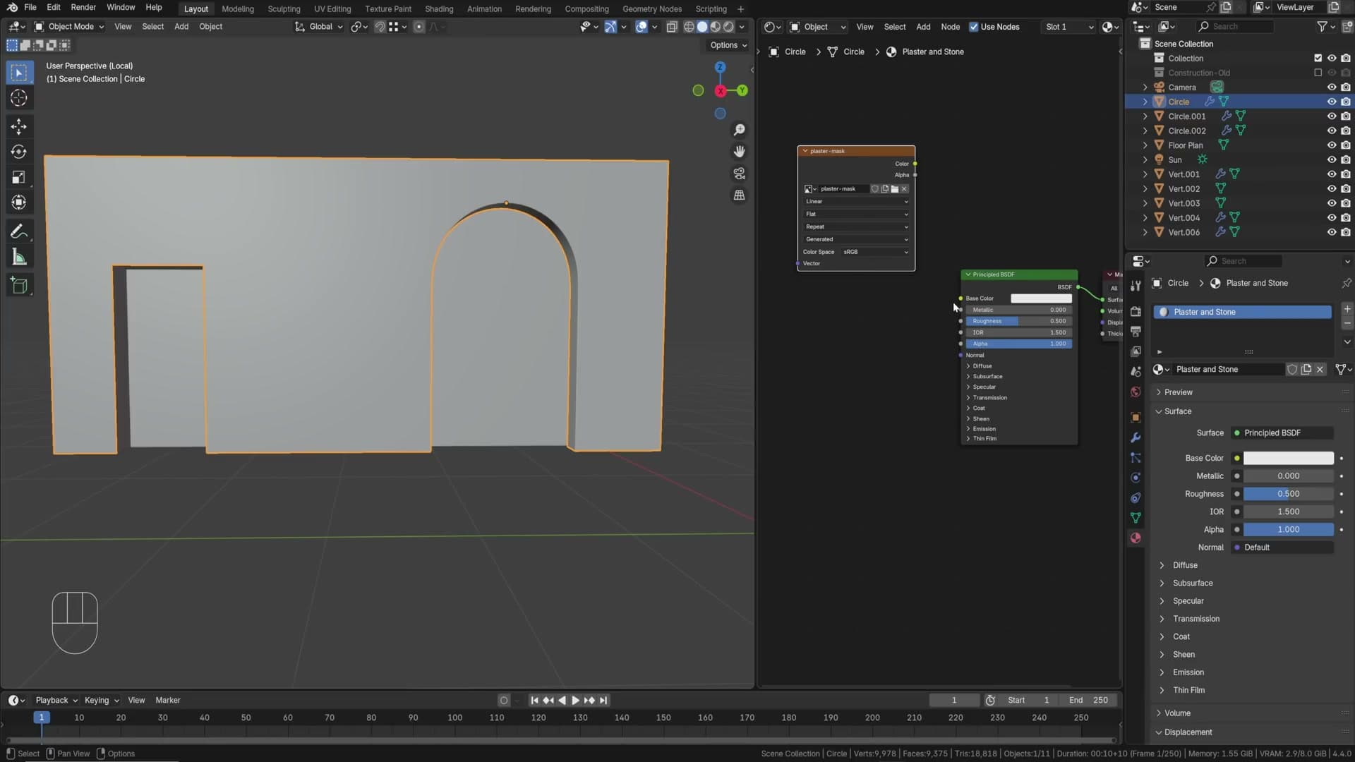
Painting with a brush texture, random angle, and screen blend
Switch to Texture Paint workspace. Set brush colour to white, paint a few strokes on the object. They appear immediately on the mask image.
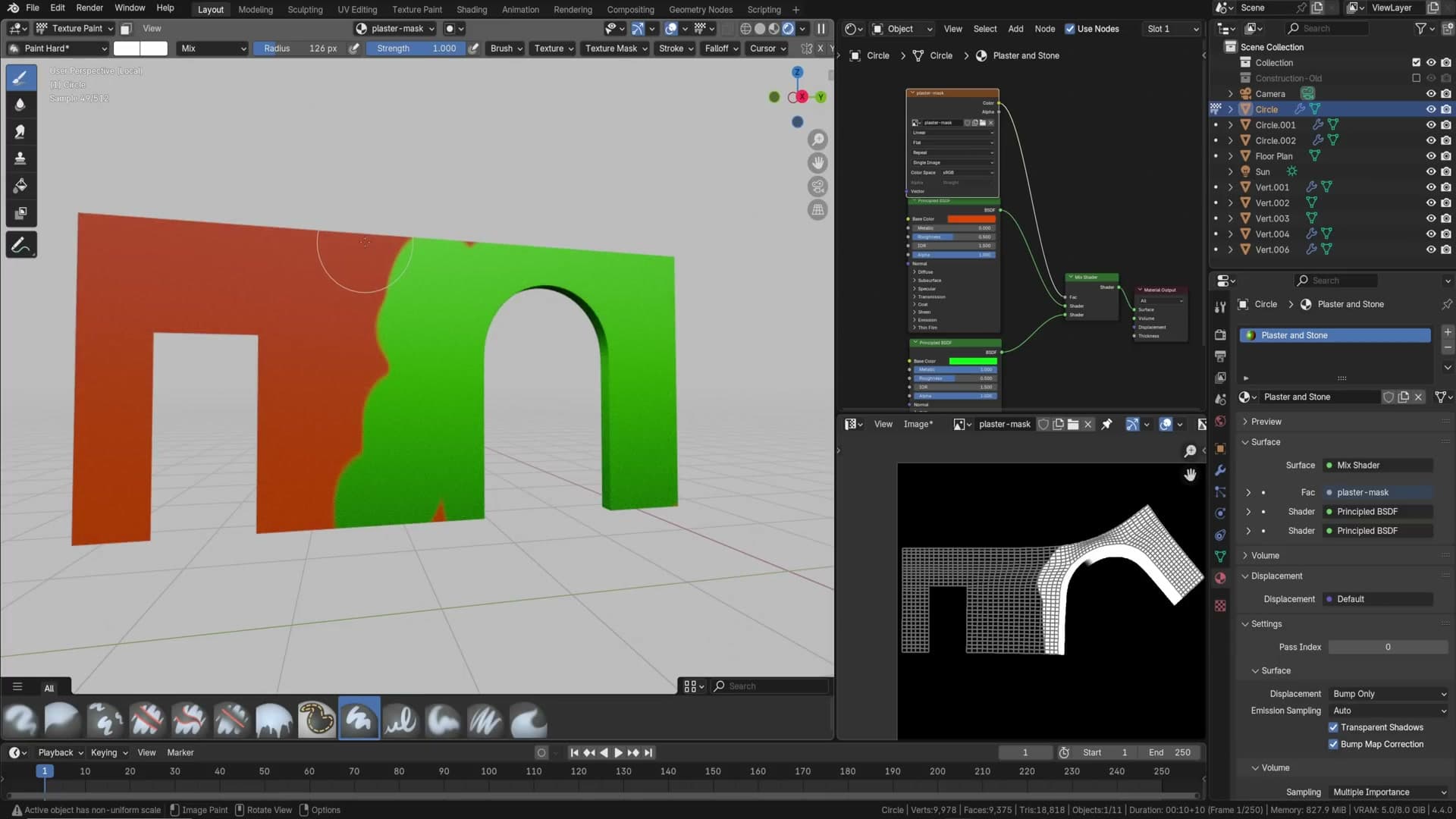
A flat brush gives you a flat-looking edge. For a natural plaster boundary, load a displacement texture as the brush texture. Get one from Poly Haven (Rock Face 3displacement PNG is what’s used here), then in the brush’s Texture panel open the displacement PNG.
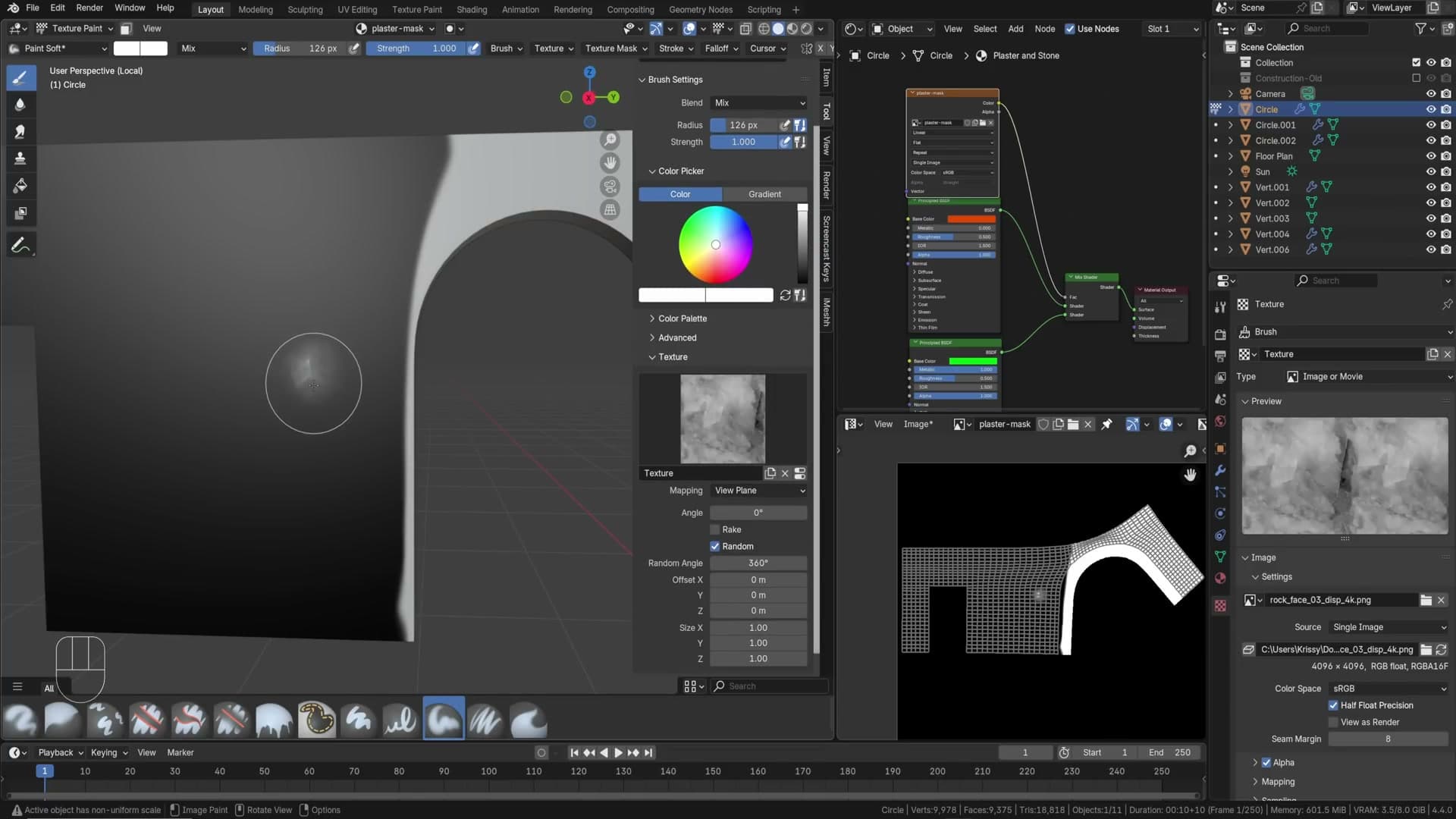
Two more brush settings make the difference: set Texture Mapping → Mapping → Random so every stroke uses a random rotation, and set Brush → Stroke → Blend to Screen so repeated strokes brighten rather than blocking out.
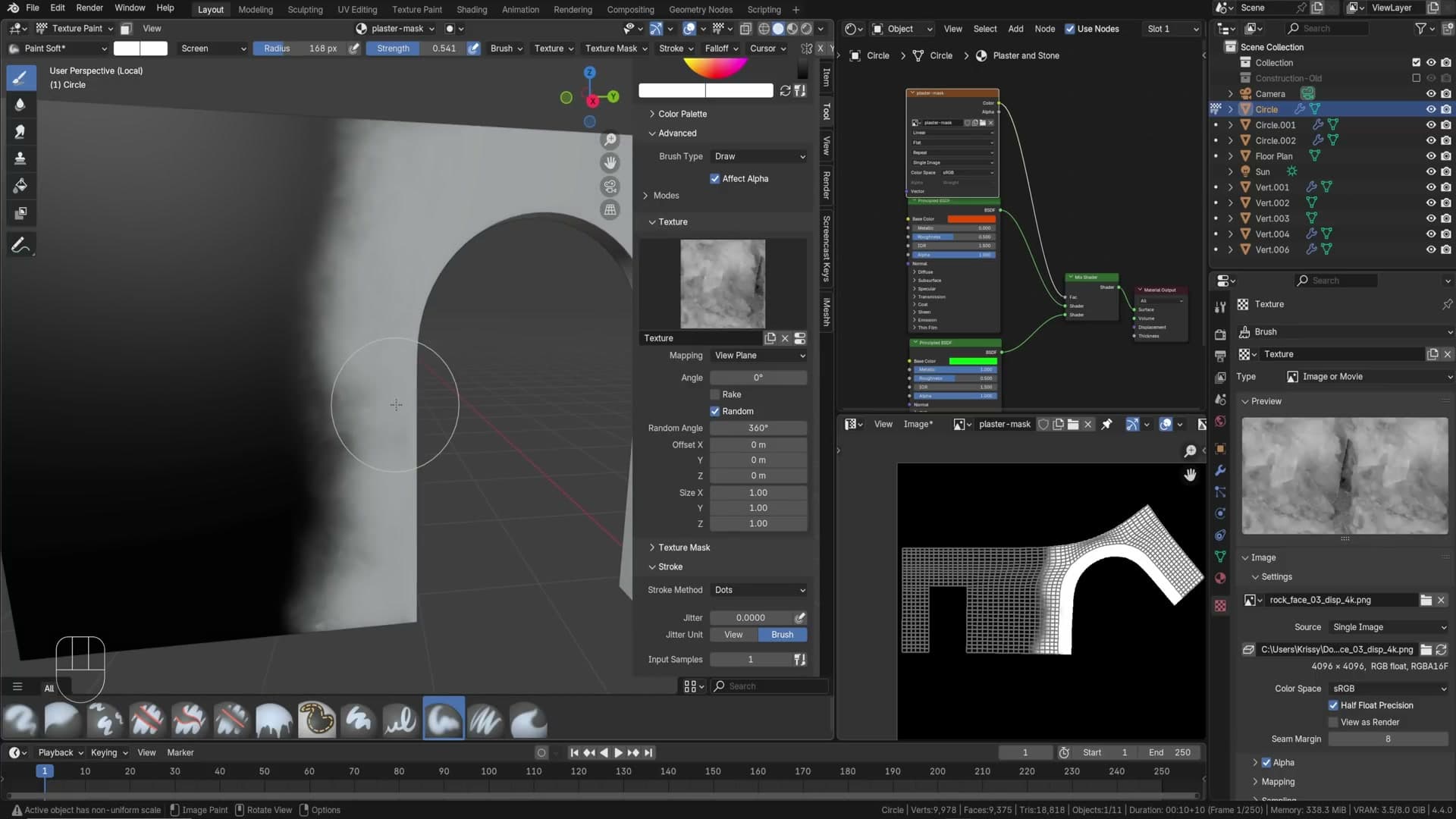
Mix shader with the mask as the factor
Add a Mix Shader. Plug the plaster material into the first input, the stone material into the second. The mask image goes into the Fac. Wherever the mask is black, you get input 1; wherever white, input 2.
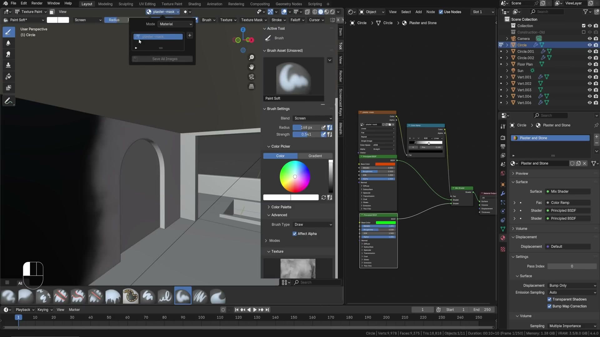
To make the transition crisper, run the mask through a Color Ramp first and pull the white and black stops closer together. That sharpens the boundary into a defined edge.
Mixing the displacement maps so plaster sits on top of stone
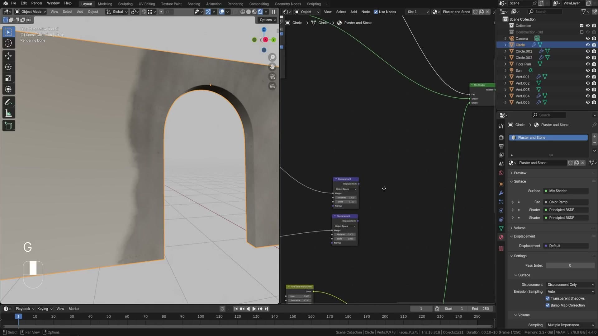
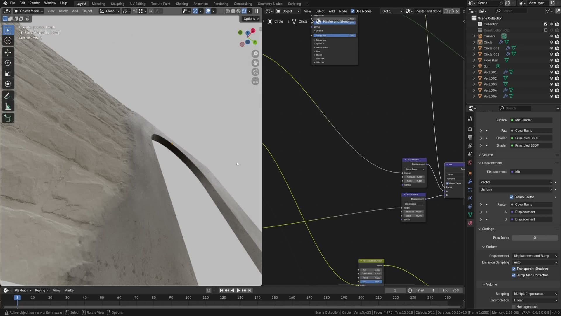
Mixing two shaders only mixes the surface; the displacement maps still need their own mix. Add a Mix Color node, switch its data type to Vector, plug each material’s displacement into the two inputs, and use the same color-ramped mask as the factor. Output goes to the Material Output’s Displacement socket.
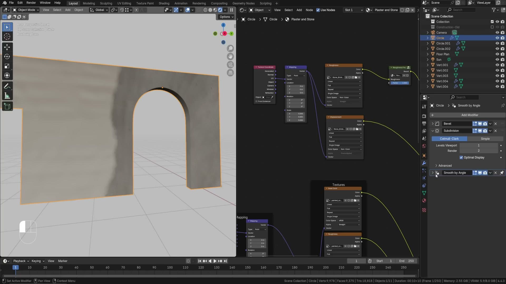
The trick to making the plaster look on top ofthe stone: shift the stone displacement’s Mid-level down. The stone surface drops slightly, and the plaster appears raised over it. A believable applied-over-the-top effect.
UV grid for texture scale consistency
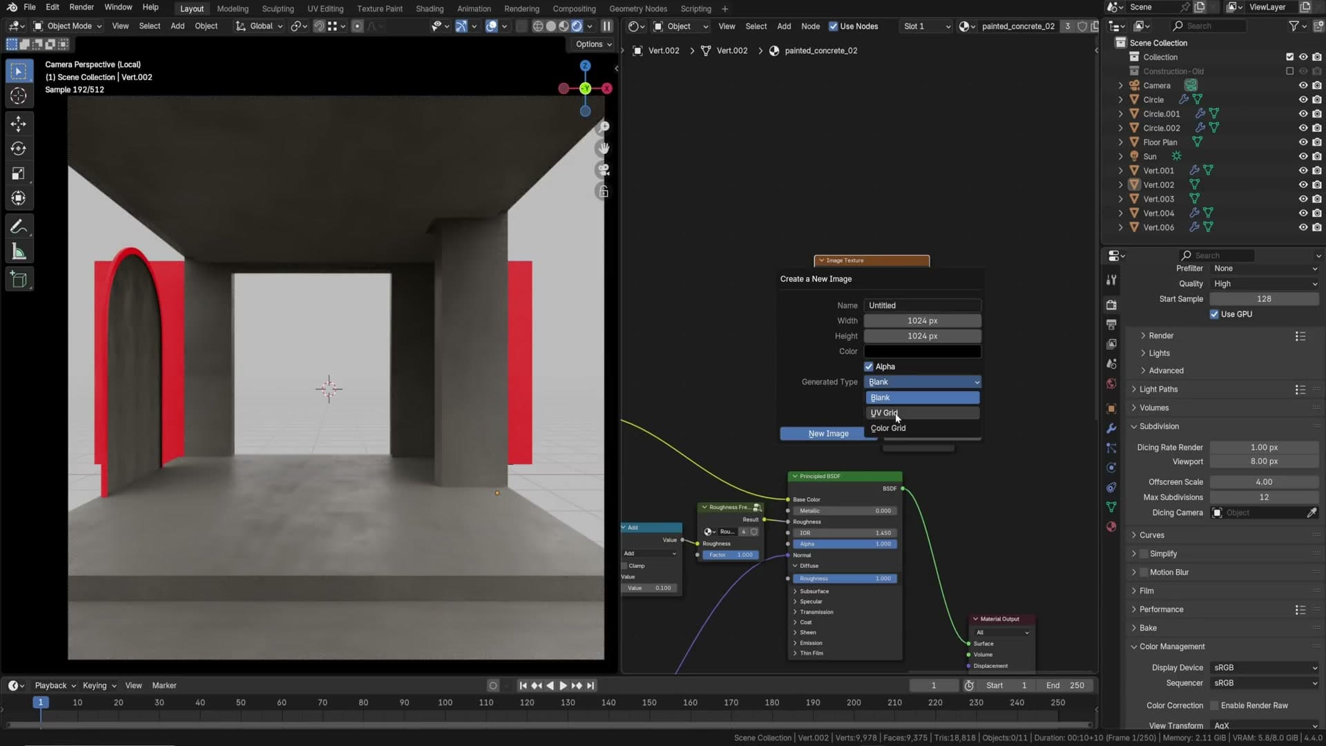
With several objects sharing a material, you want their UVs at the same scale so the texture sits consistently across all of them. Easiest check: add a temporary Image Texture with a new UV Grid generated image. Enable the Node Wrangleradd-on if you haven’t already (Preferences → Add-ons), then with the image node selected, Ctrl+T adds Texture Coordinate and Mapping nodes for it, and Ctrl+Shift+click on the image previews it as the active output.
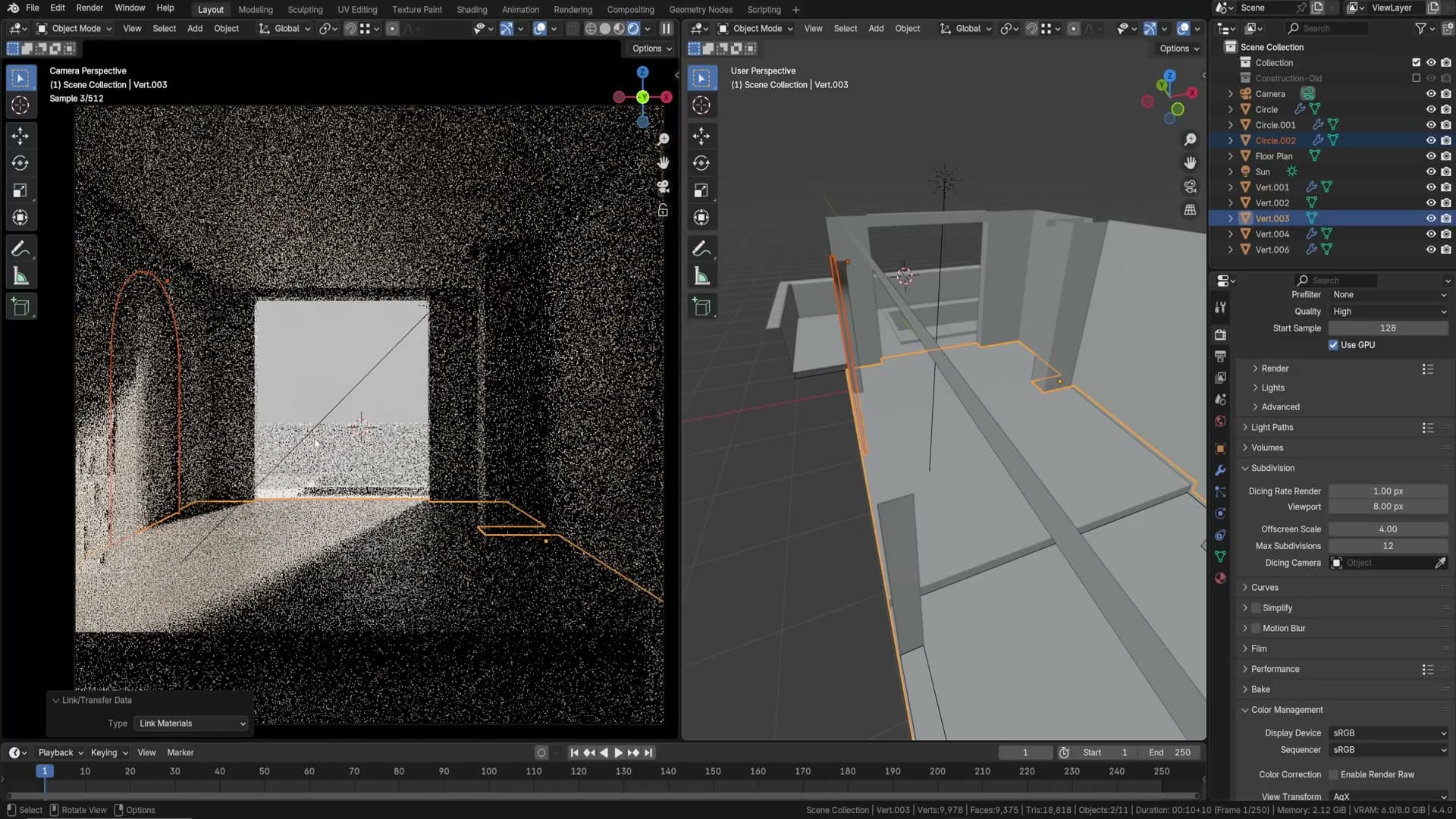
In edit mode, scale UVs on whichever objects look wrong until the grid squares match in size across all of them. Delete the UV grid node when you’re done.
8. Organising the scene and edge lighting
A quick pass to name objects and group them into collections, then add hidden area lights and an emission strip in the ceiling inset for that soft uplight glow.
Naming objects and organising into collections
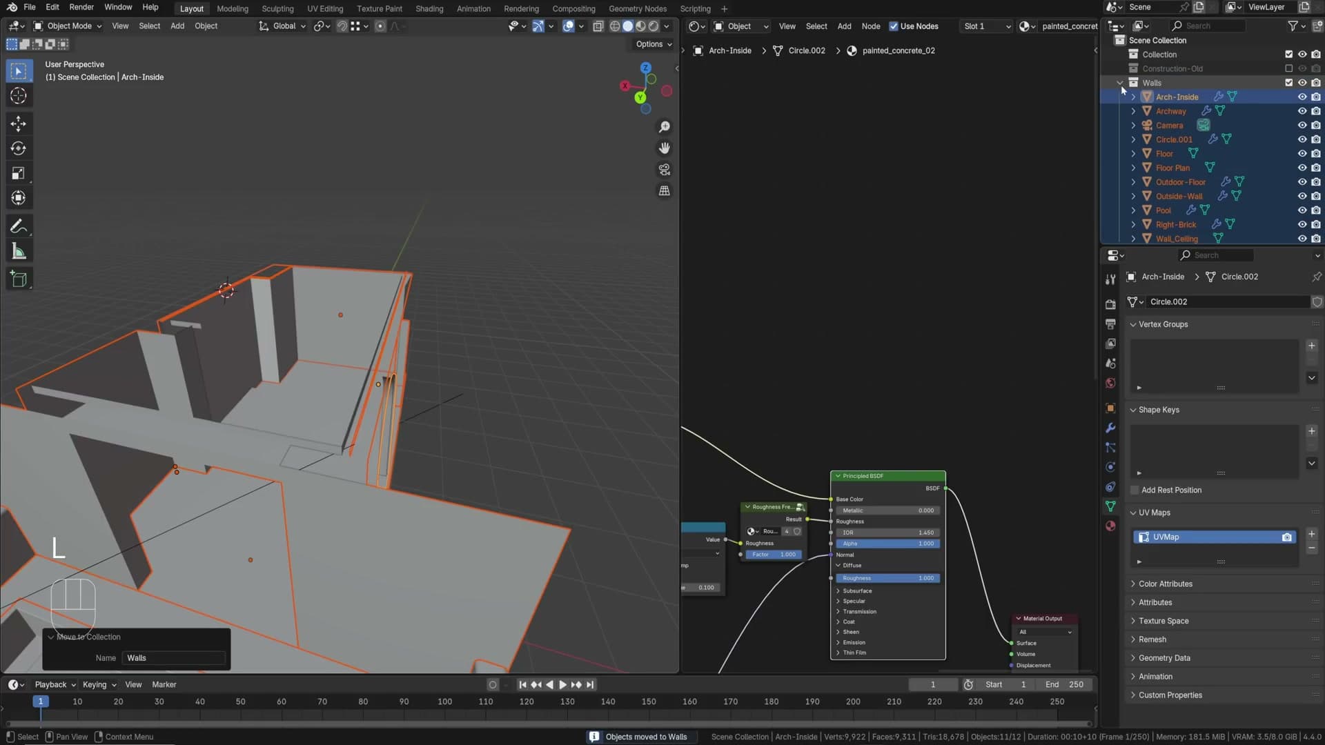
Rename objects as you go: walls, floor, archway, brick, outside_floor, pool, outside_wall. Select related objects and press M to move them into a new collection (walls, lighting, cameras). Right-click a collection to set a colour label so the outliner is scannable at a glance.
Area light tucked into the ceiling inset
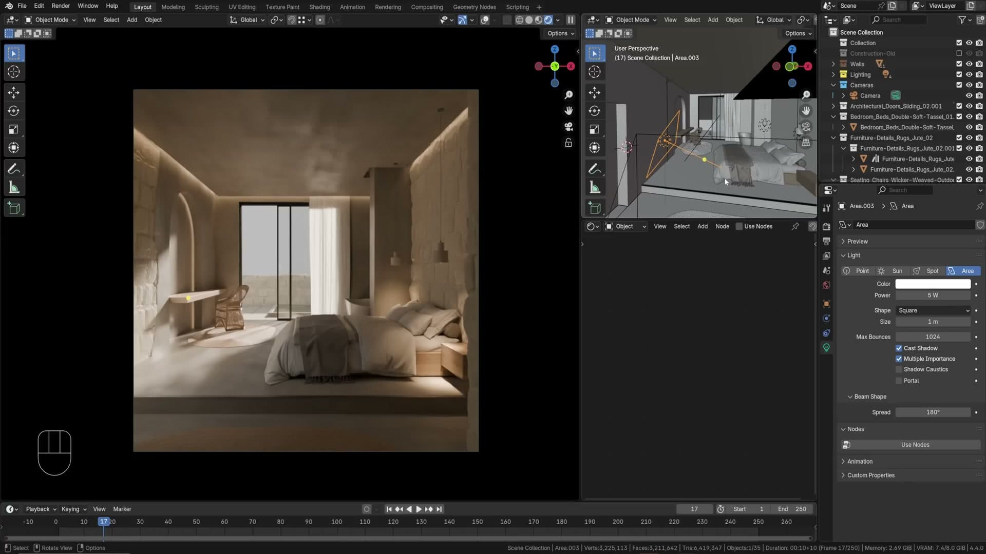
Shift+A → Light → Area, then scale and position it so it sits inside the slot you cut earlier. Click Use Nodes on the colour, set to Blackbody, temperature 3800K. Most lamps in this scene use the same temperature for colour coherence.
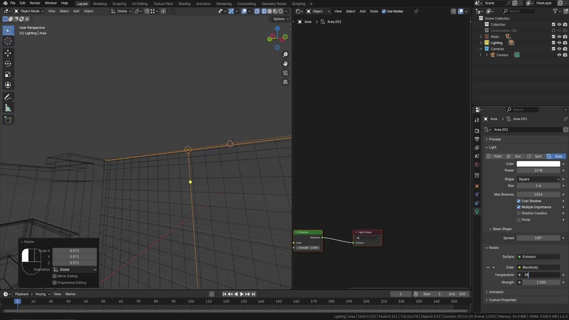
Duplicate the area light into each section of the inset. Tune brightness per-light so they all read at about the same intensity from the camera.
Emission material to glow through an edge gap
For the gap above the archway, select the inside edge faces, add a new material called emission, change the BSDF to Emission, set the colour to Blackbody 3800K, strength 2.
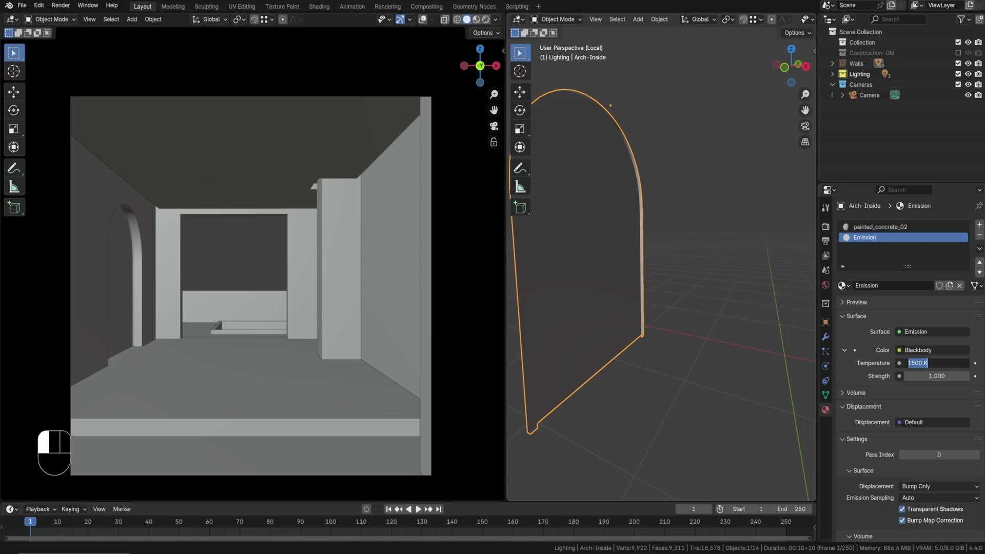
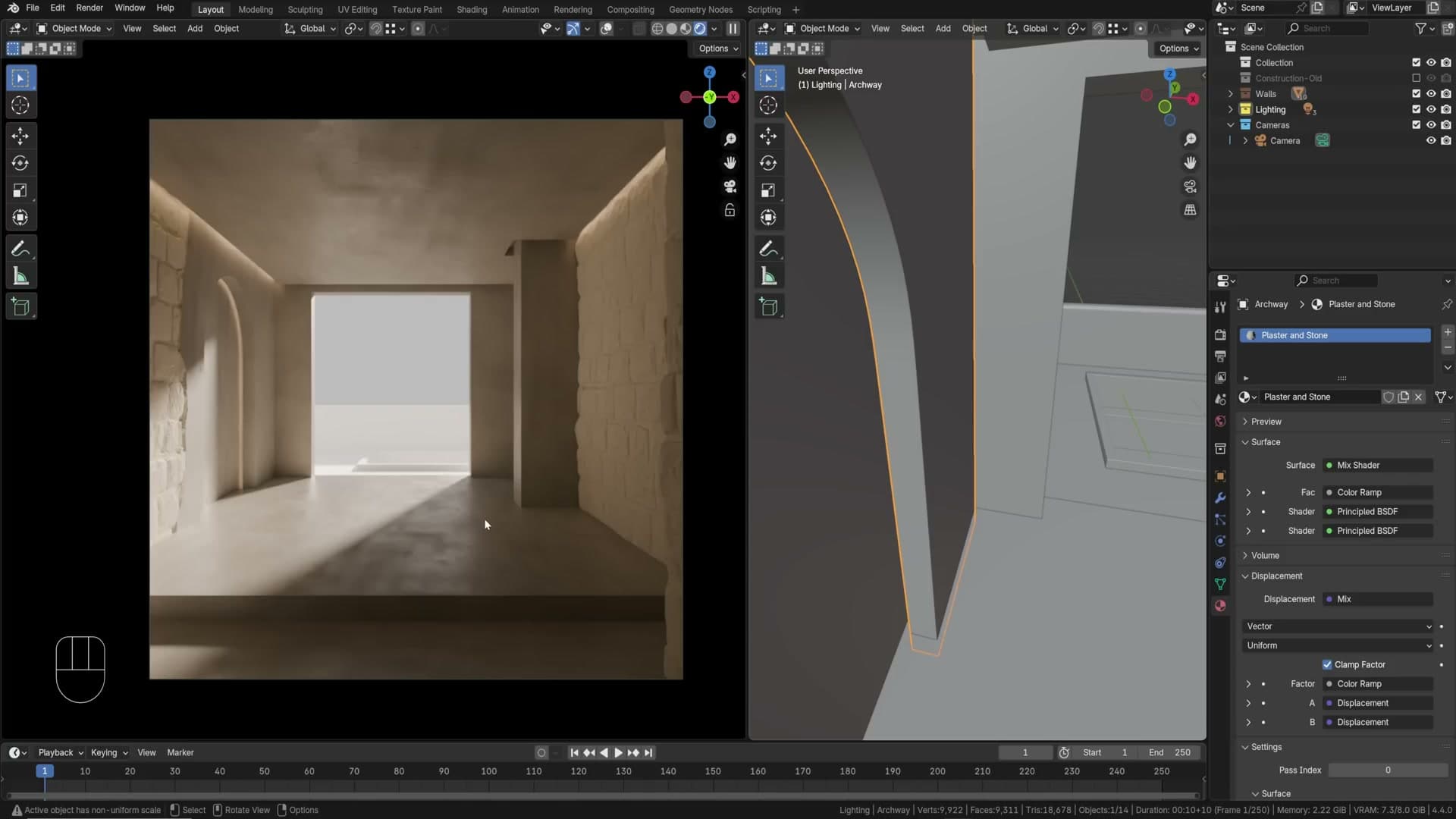
If the gap shows a visible joint, scale the inside faces of the archway up slightly (Alt+S) until the edge disappears behind the wall and it just reads as light, not as geometry.
9. Outside materials and pool with caustics
Brick walls outside, tile around the pool, and the green-edge glass pool water with absorption and proper caustics on the floor.
Brick wall UV unwrap with seams
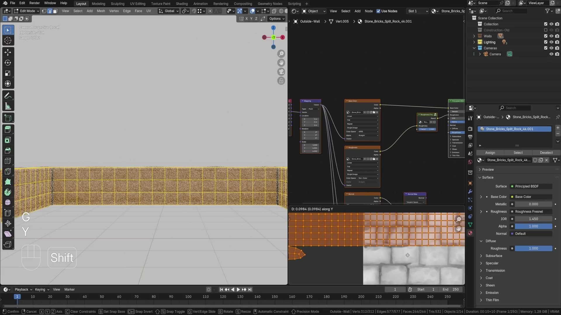
Brick textures only look right when bricks run straight. A default unwrap will warp the bricks around corners. Fix it by marking seams at every corner, then unwrap with U → Unwrap (Angle Based). In the UV editor, rotate the unwrap 90° if needed so the bricks read horizontally.
Pool surround tile material
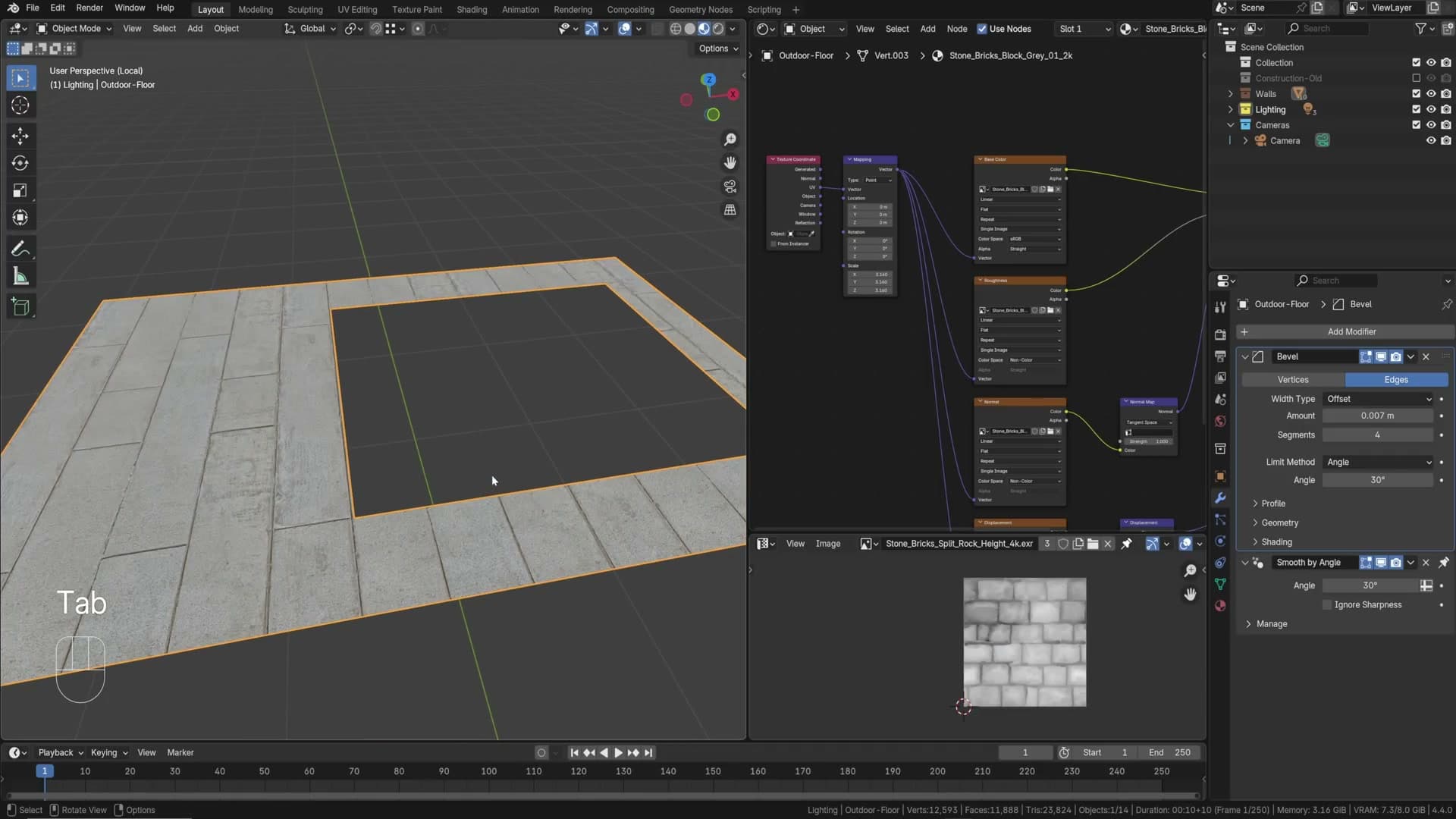
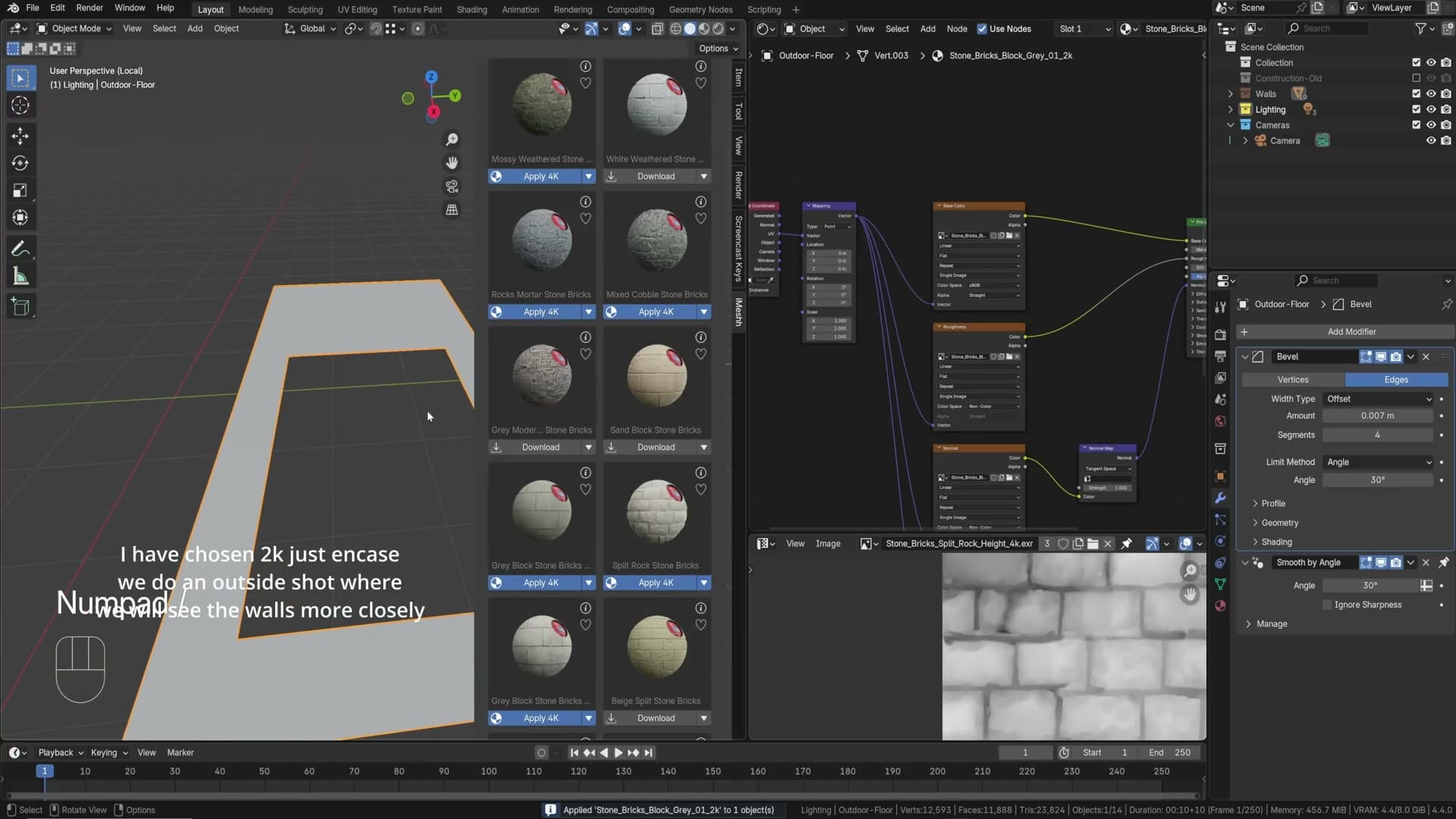
For the area around the pool, an iMeshh tile material at 2K is plenty. This section won’t fill the frame. Unwrap, scale UVs so the tile size feels right, and align so the tile edge runs along the pool rim.
Pool water: glass with absorption volume
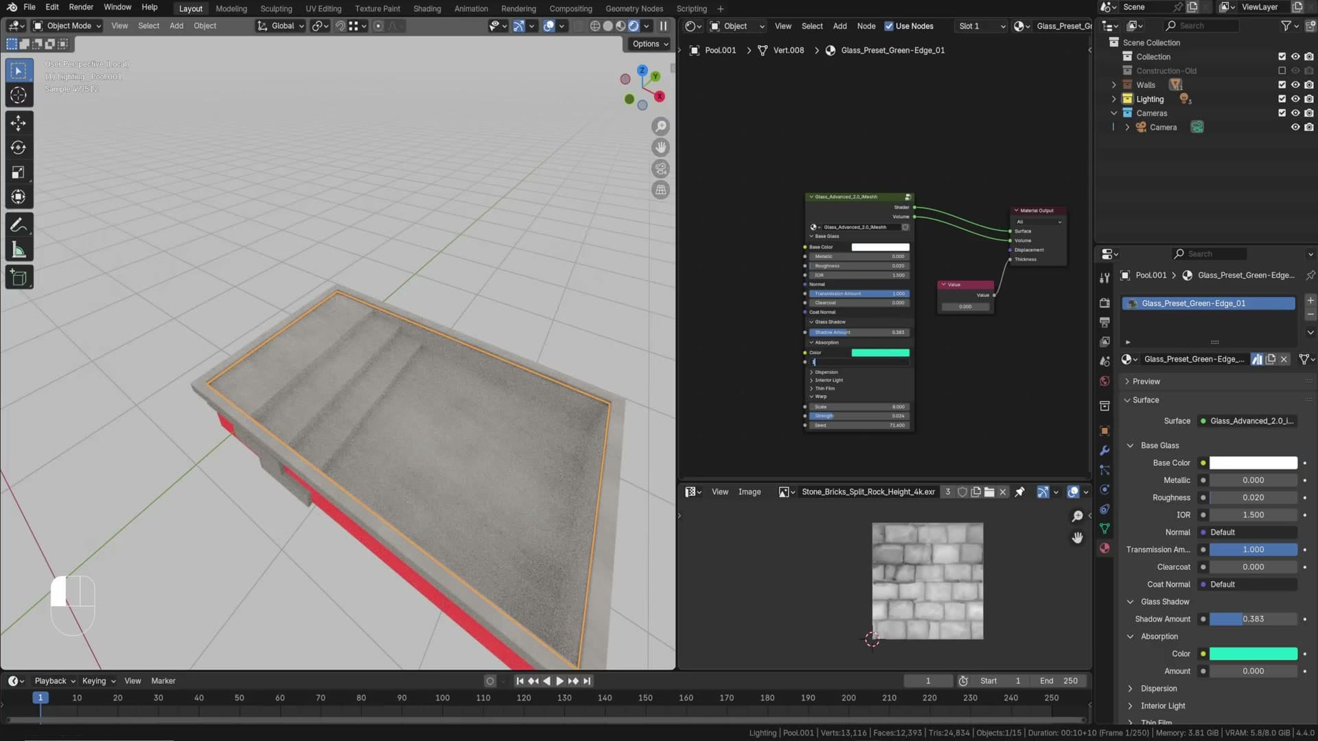
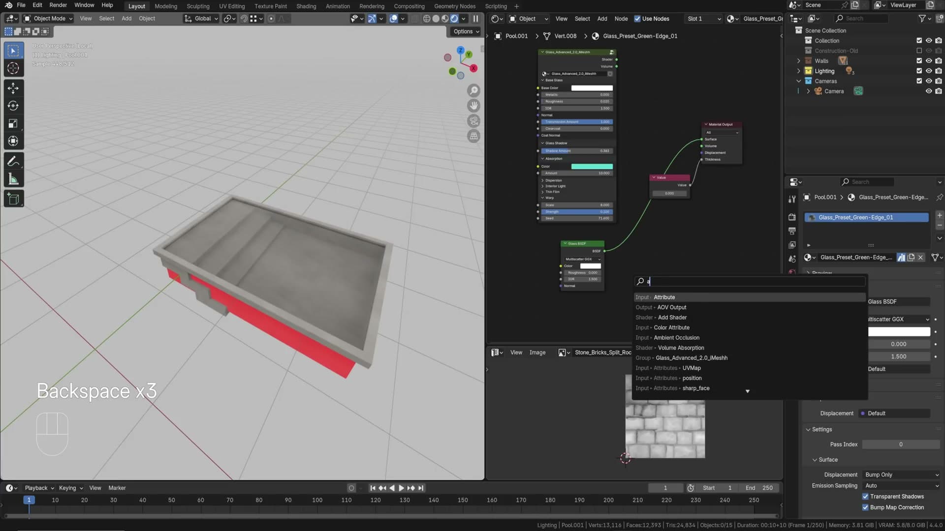
Duplicate the top of the pool geometry, separate it as a new object. That’s your water surface. Use the iMeshh Green Edge Glass preset. The key thing it does is add real absorption: light passing through water gets coloured progressively the further it has to travel.
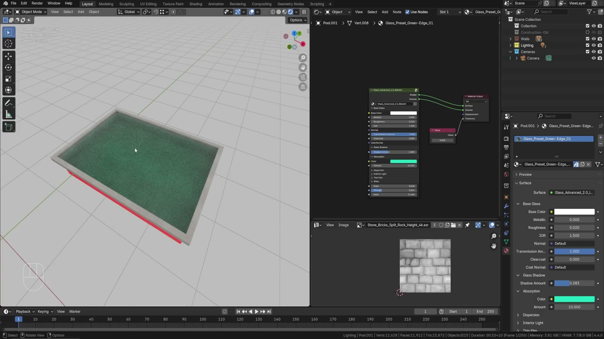
Add steps inside the pool to demonstrate the effect: the shallow top step reads lighter, each deeper step more saturated. That depth-coloured falloff is what makes pool water look like pool water rather than uniform tinted glass.
Caustics with cast/receive flags + displacement
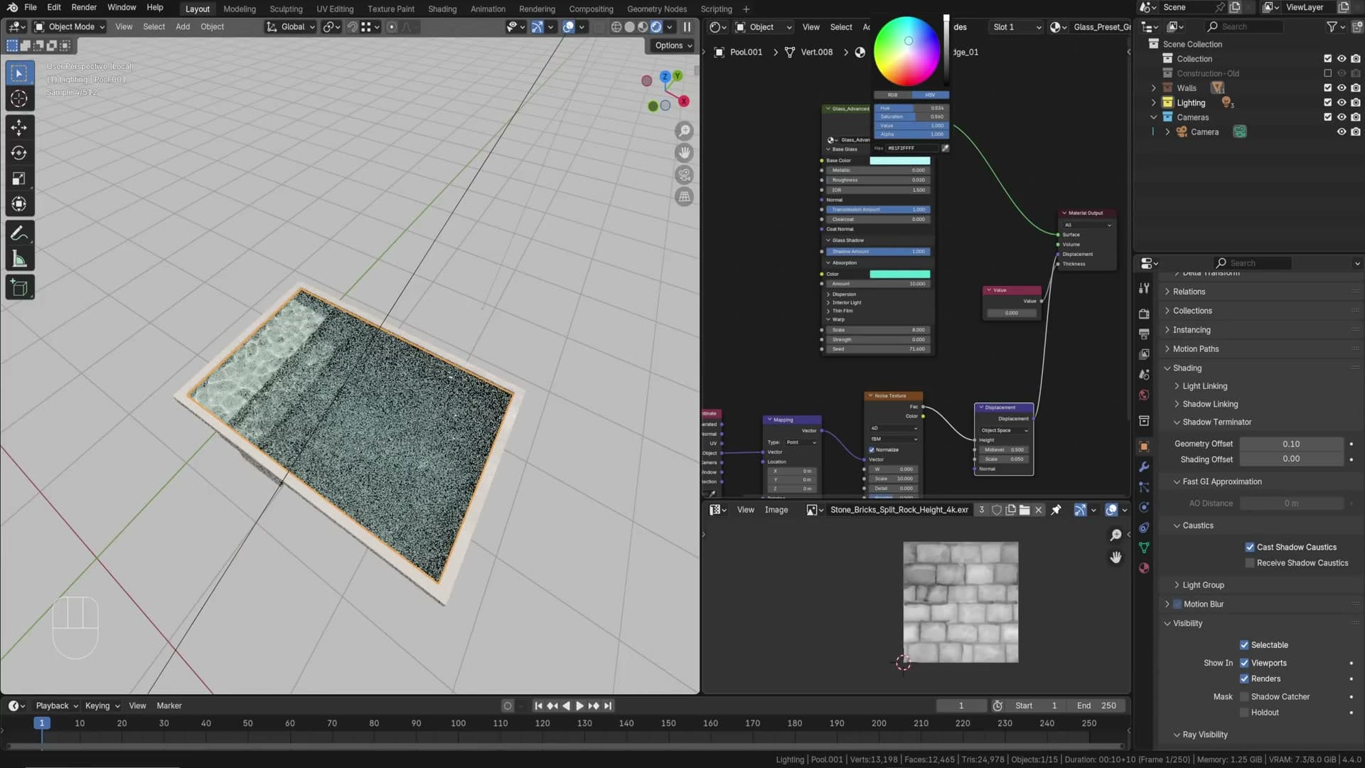
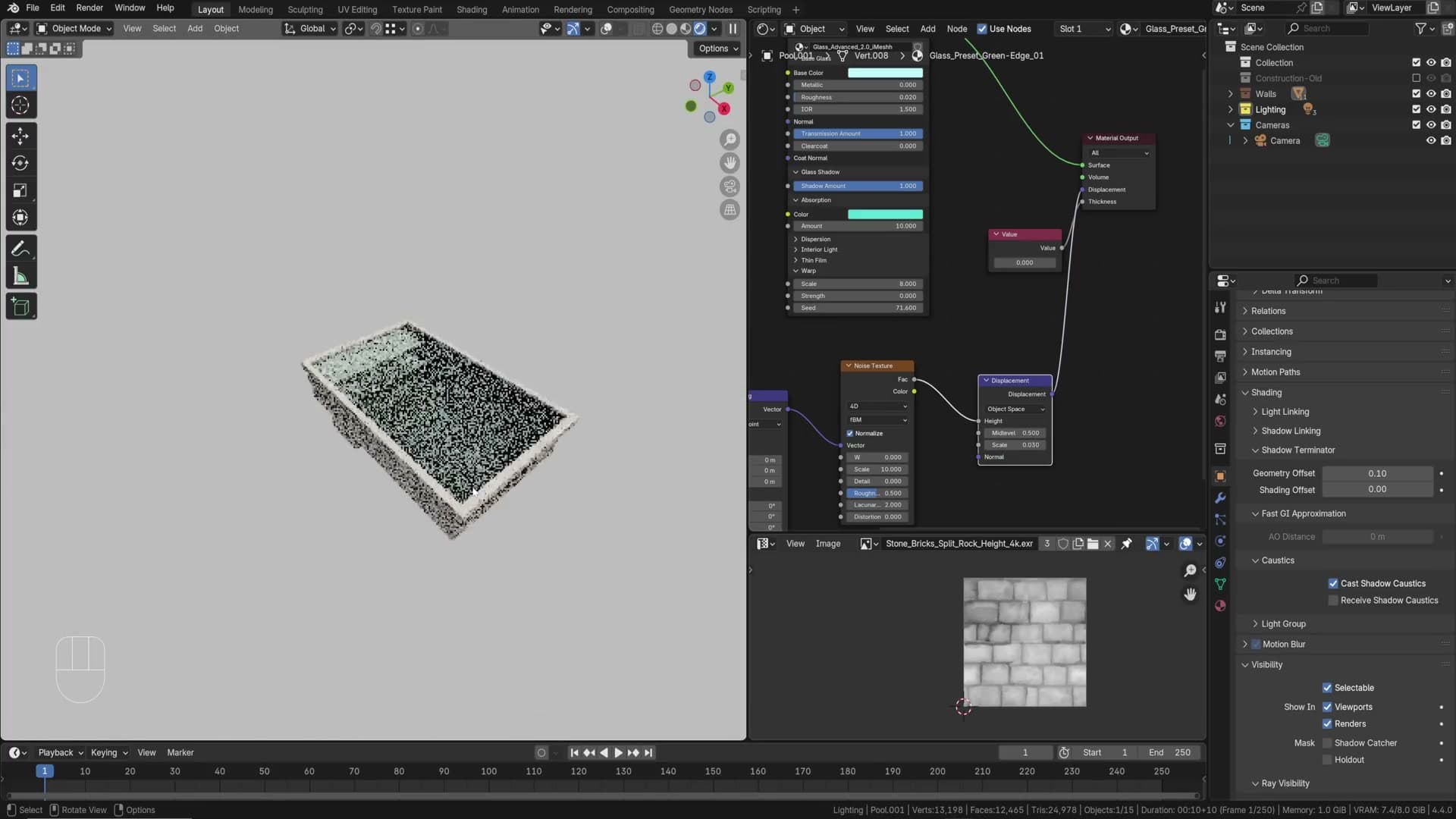
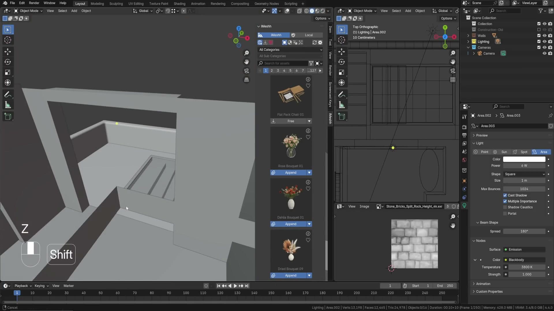
Real caustics need three flags. On the sun light: Object Properties → Shading → Cast Shadow Caustics. On the pool floor: Receive Caustics. On the water glass: Cast Shadow Caustics.
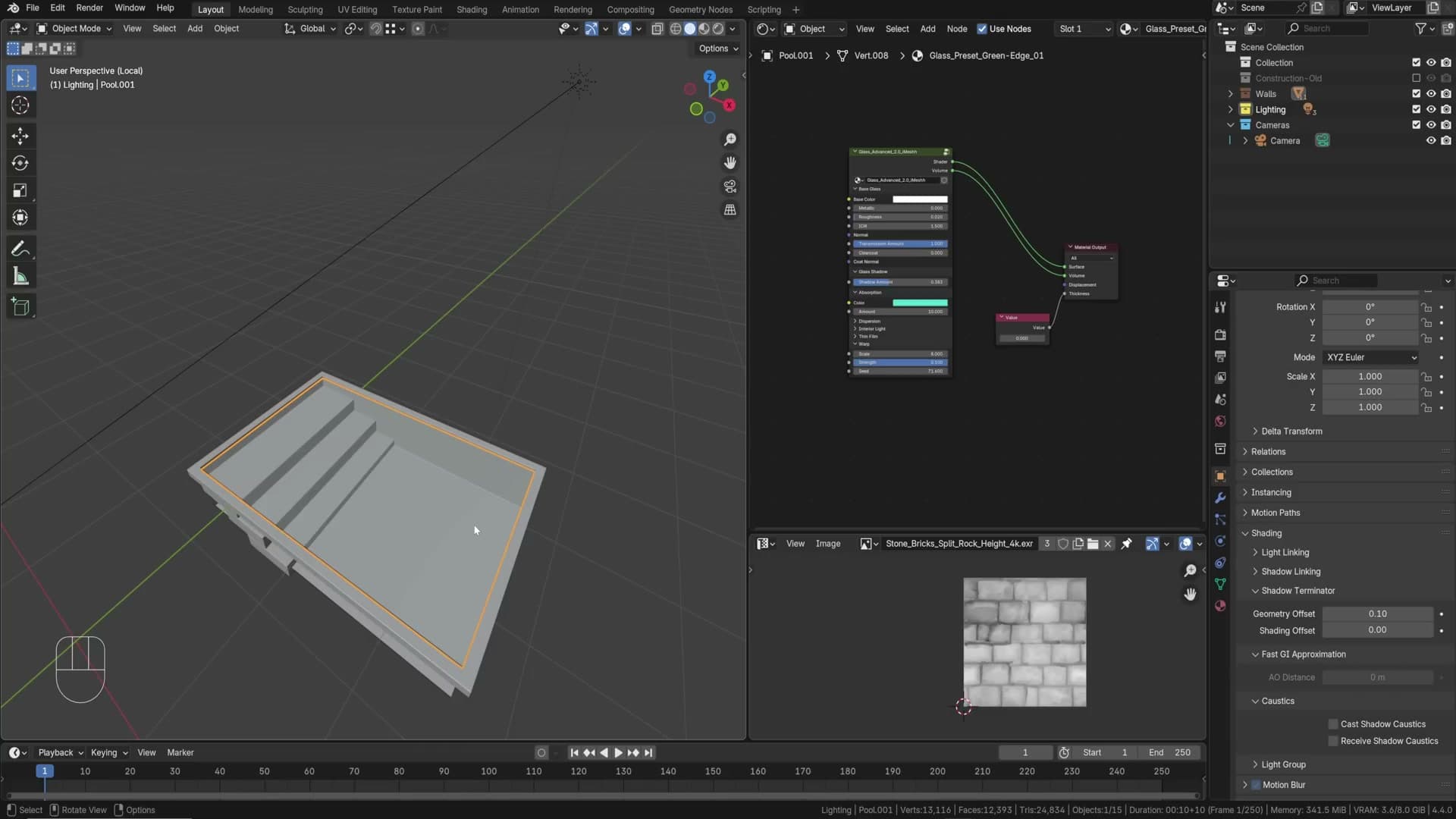
To get the rippling pattern you also need actual surface displacement on the water; bump alone won’t produce caustics. Add a Subdivision modifier with adaptive subdivision, set the material’s displacement to Simple, and feed a noise texture into the height input. With scale around 10, strength around 0.03, you start to see beautiful caustic patterns dance on the pool floor.
10. Adding assets: window, bed, bath, curtain
You don’t model every chair from scratch, and neither should you. The big architectural and furniture pieces come from iMeshh, sized roughly into place, with a few tweaks per object.
Why archviz uses asset libraries
The analogy: you never ask a photographer to build their own furniture for an interior shoot. They hire it. ArcViz artists are essentially photographers, and an asset library is the rental warehouse. Building a high-detail woven chair from scratch takes days. Buying access to one and getting on with composing the shot is the work.
Sliding door window with the updated low-noise glass shader
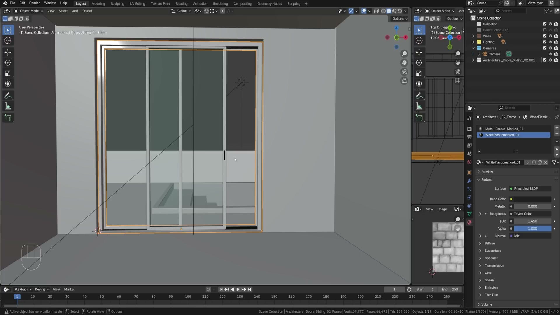
From iMeshh → Architectural → Doors, append the sliding door. Scale into the opening, edit the top/side bars in edit mode so they fit the proportions of the gap, give the frame a near-black material (never pure black in real life; something like #0c0c0c).
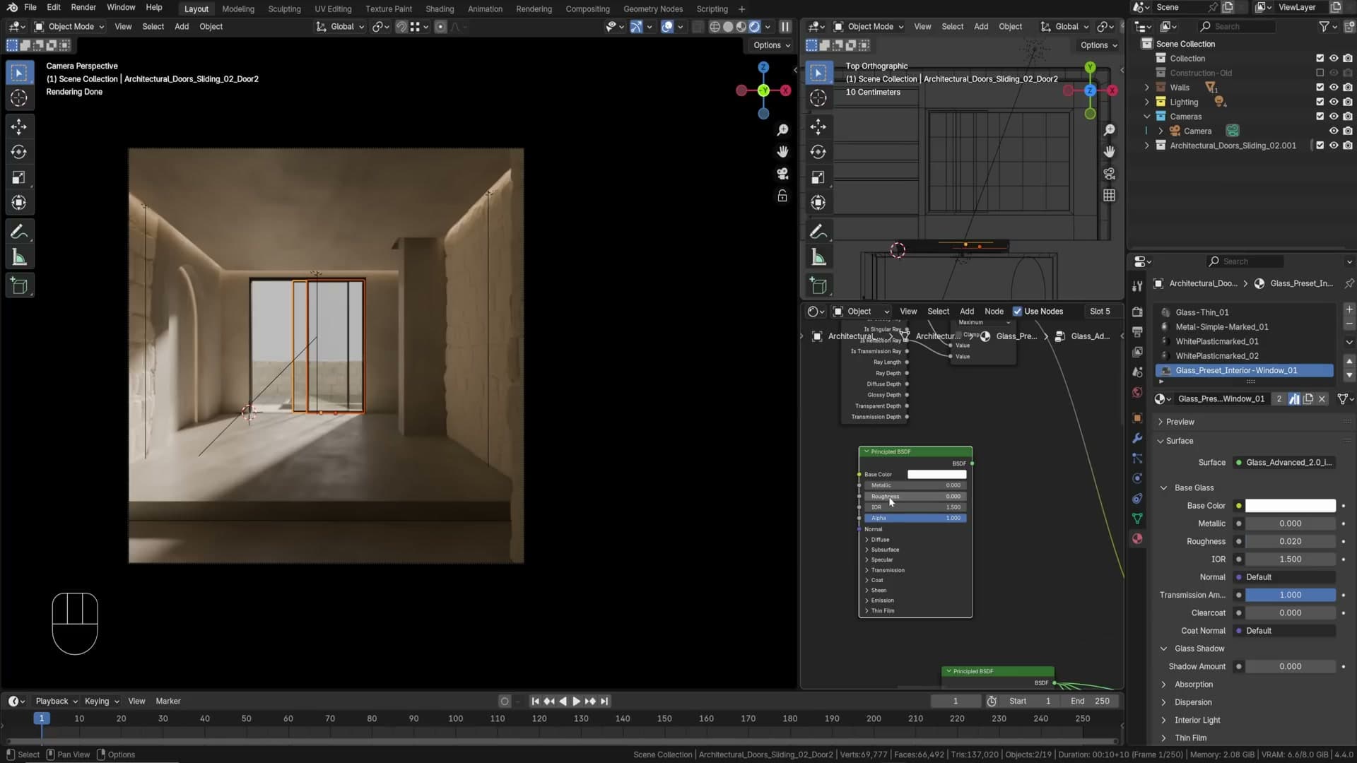
For the glass: there’s an updated interior glass shader that’s noticeably cleaner than the original. The structure is: Light Path’s Is Shadow Ray goes into one input of a Math (Maximum) node, Is Reflection Ray into the other; the output drives the Fac of a Mix Shader between a Principled BSDF (white, roughness 0.02, transmission 1) and a Transparent BSDF; mix into Material Output.
Metal step edge and a shelf/desk
A neat reuse: the existing nosing geometry on one part of the floor can become a metal step edge elsewhere. In edit mode select the relevant geometry, Shift+D → Enter → P to duplicate and separate, then move it to the step edge for a subtle metallic lip.
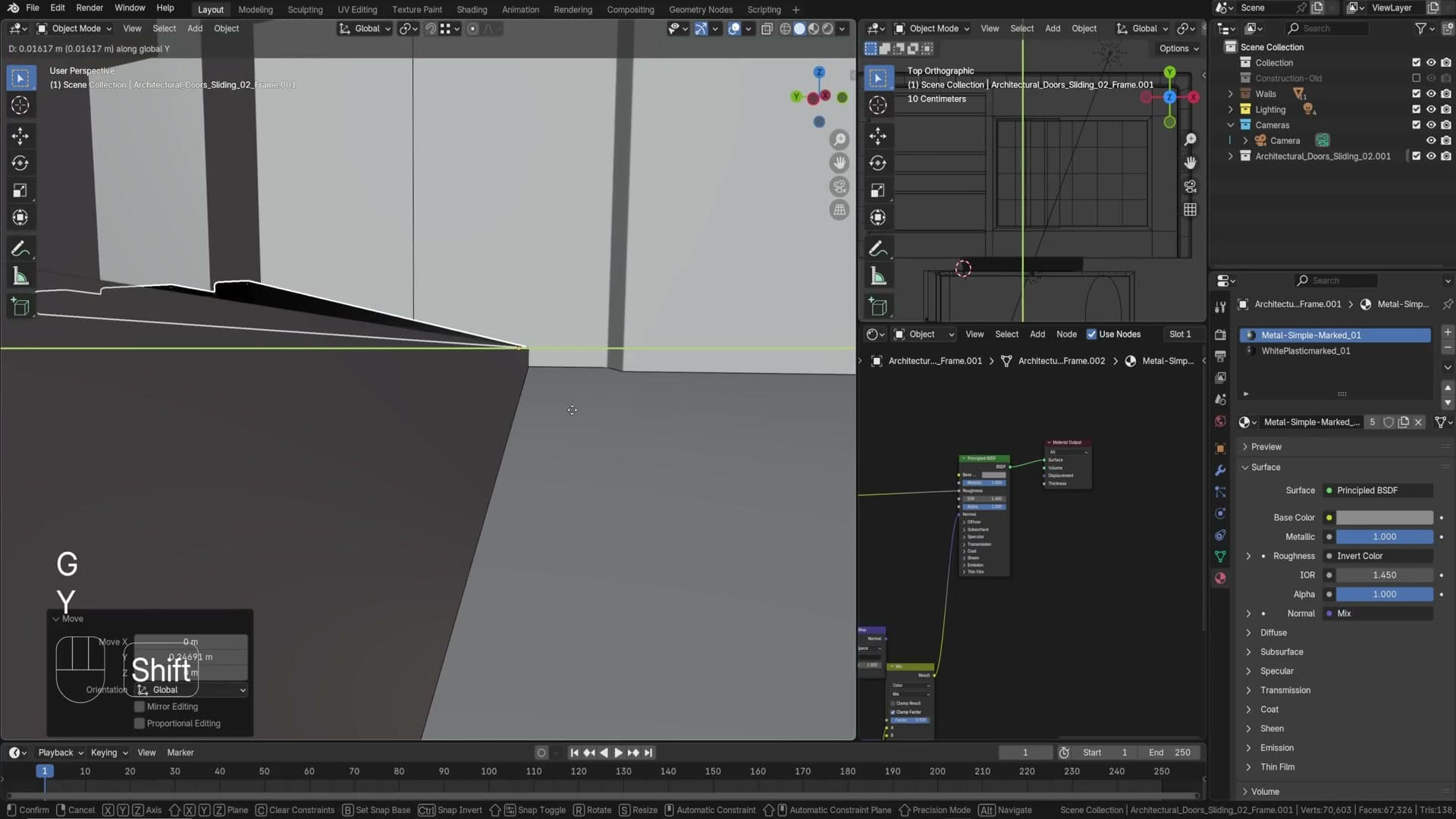
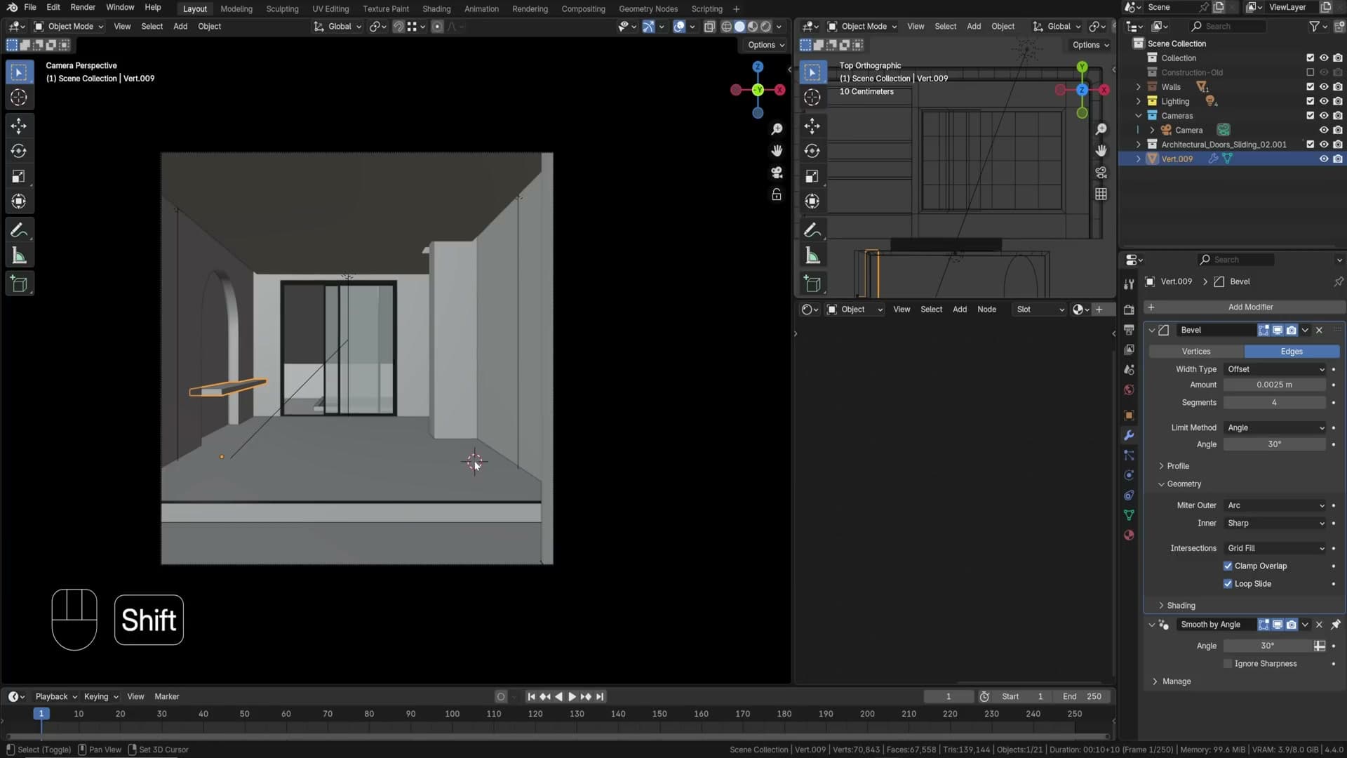
The shelf/desk is custom-built: snap cursor to the corner, drop a single vertex, trace the desk outline with E + Y / E + X, fill with F, then extrude down for the depth.
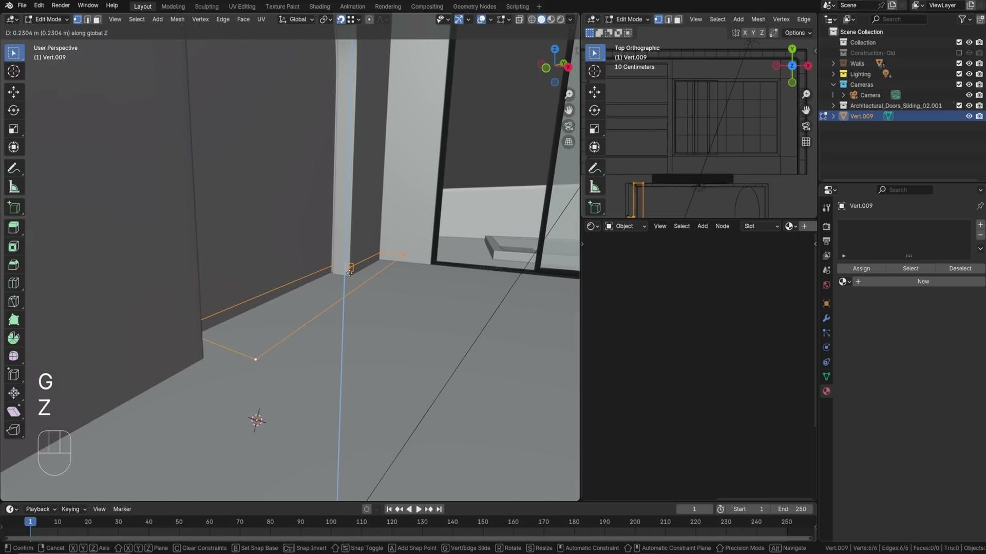
Bed from iMeshh + Gladstone Beige wood
Beds in iMeshh come from Marvelous Designer simulations, so the fabric is accurate. Append a bed asset, rotate into place, delete the supplied frame (I make a custom one here). Fabric assets scale forgivingly; it’s hard to tell you’ve resized them.
Build a quick frame from a cube. Scale it to wrap the bed, leave a small visible black gap underneath rather than letting it touch the floor (touching feels off, a small shadow gap feels natural), and inset the top with I so the bed sinks slightly into the frame.
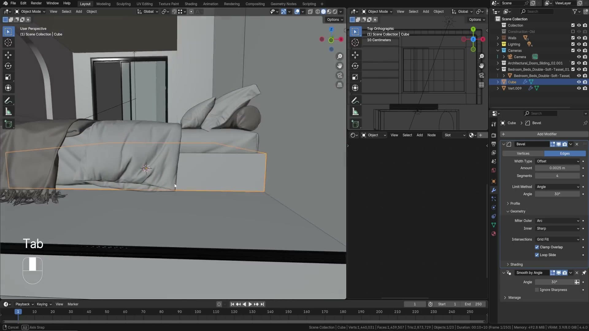
For the wood material itself, the choice is iMeshh’s Gladstone Beigeat 1K (you really can’t tell at viewing distance). Apply, unwrap with Smart UV Project, and scale the texture so the grain lines feel right.
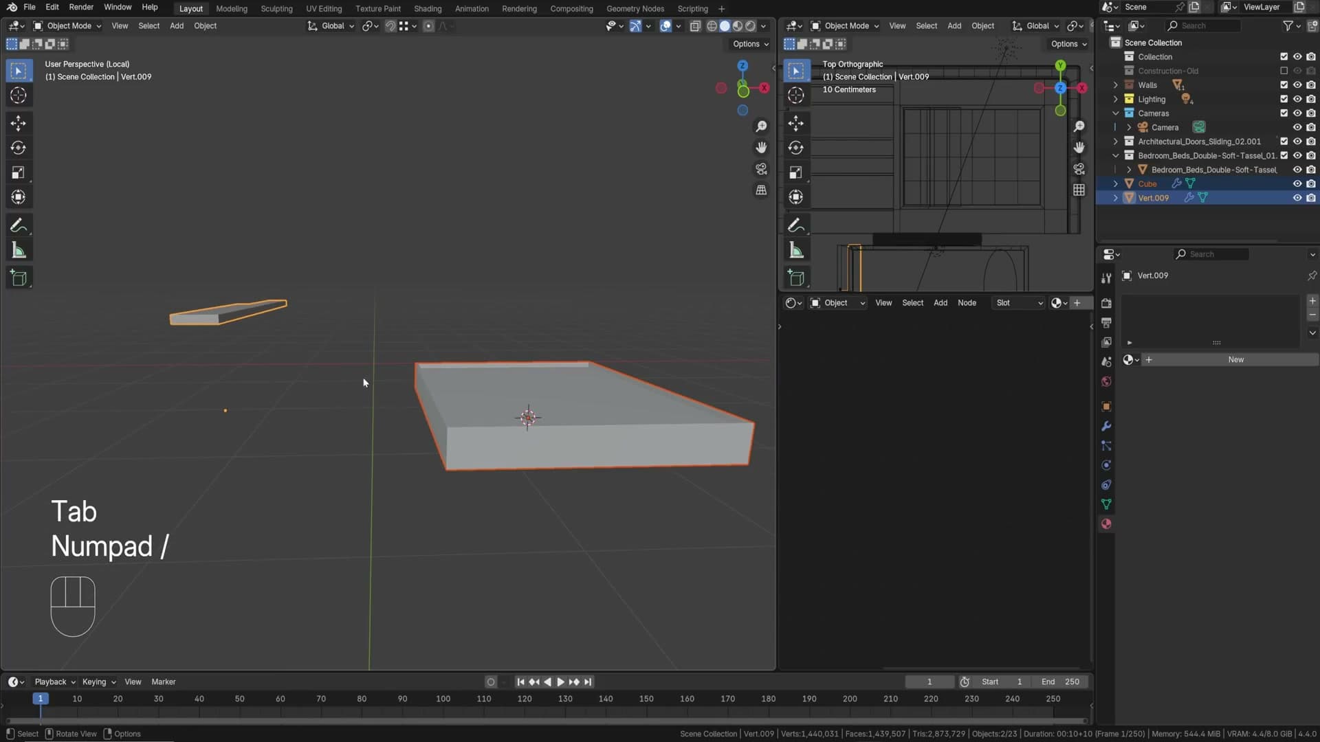
Bedside table and a rug with Alt+D linked duplicate
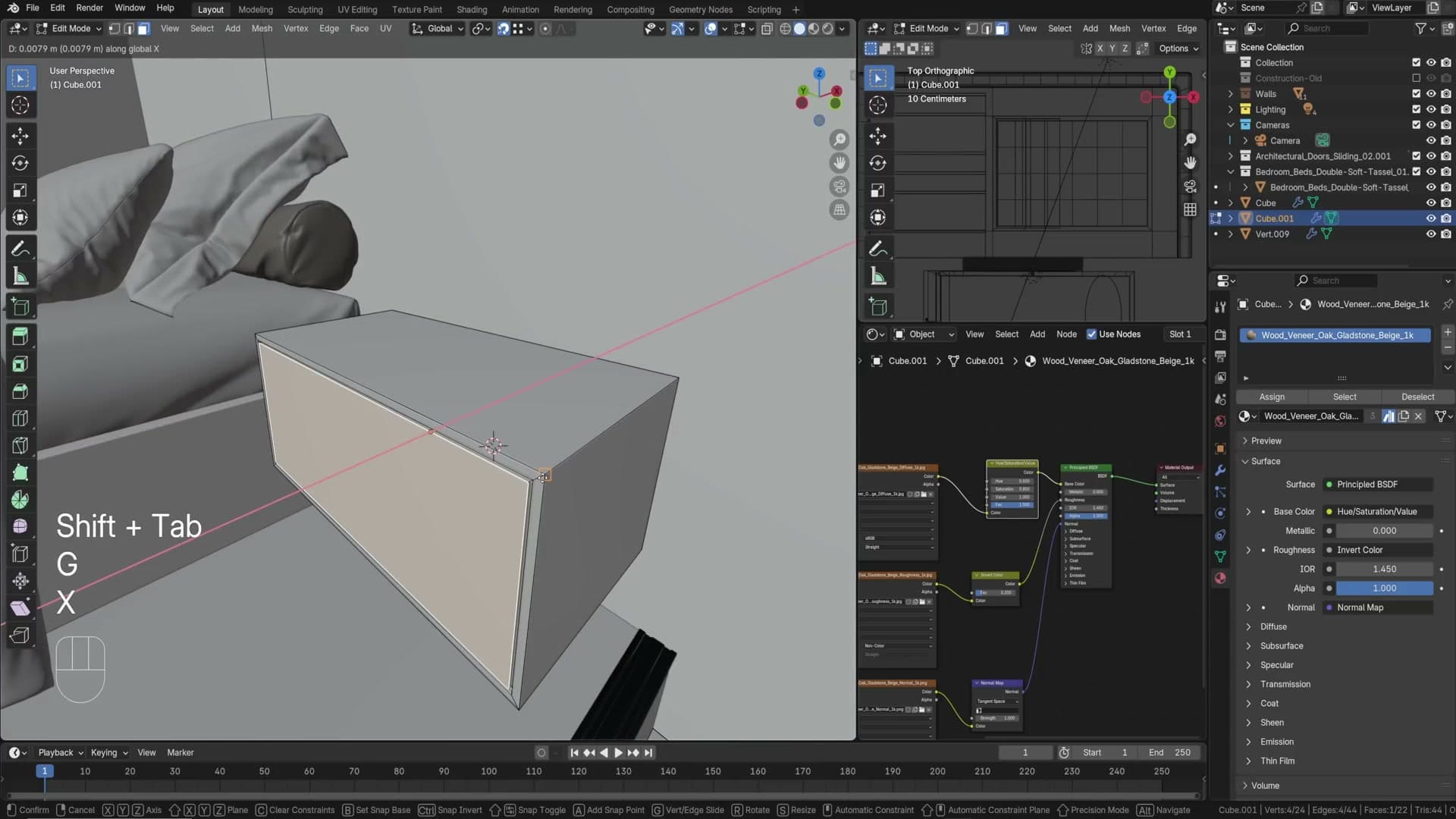
Bedside table: a cube, scaled into place, with an inset pushed back to suggest a push-cabinet handle. Same wood as the bed frame.
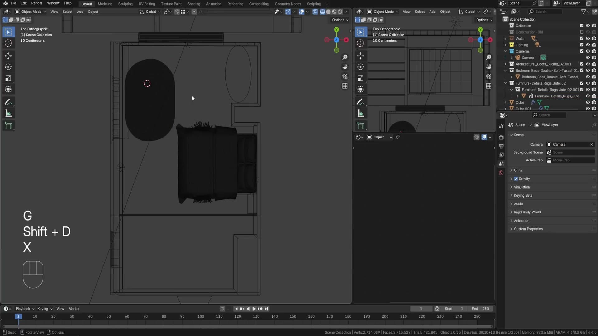
Wicker chair and bath
Append a wicker chair, snap it to the rug, rotate roughly into position. Link materials (Ctrl+L) so it shares the desk wood, keeping the palette tight.
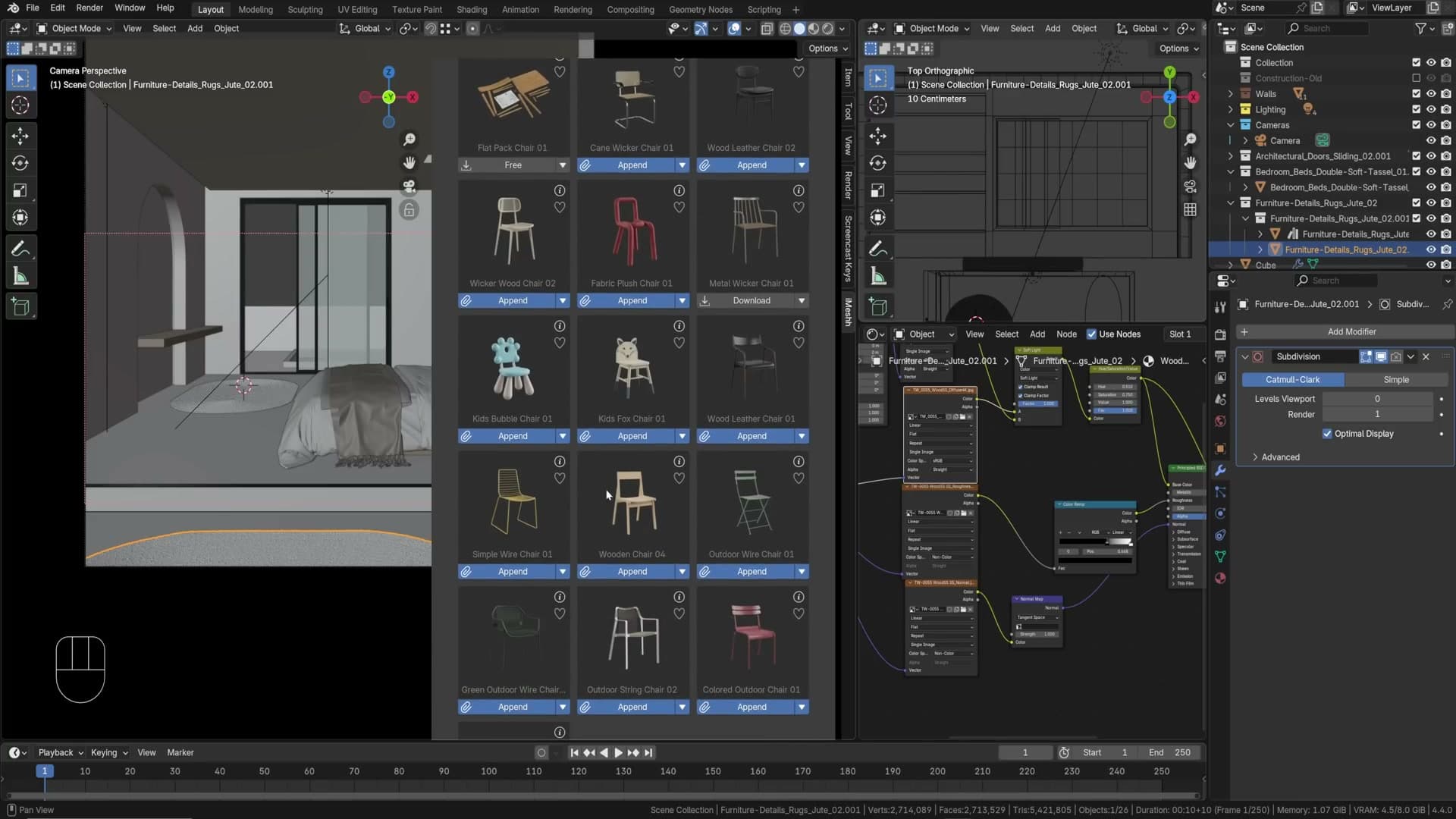
Bath: append the model, rotate 90°, position. For the outer surface, give it a clean glossy white shader. Add a Math (Multiply) node on the roughness with a low value to make it more reflective than the default.
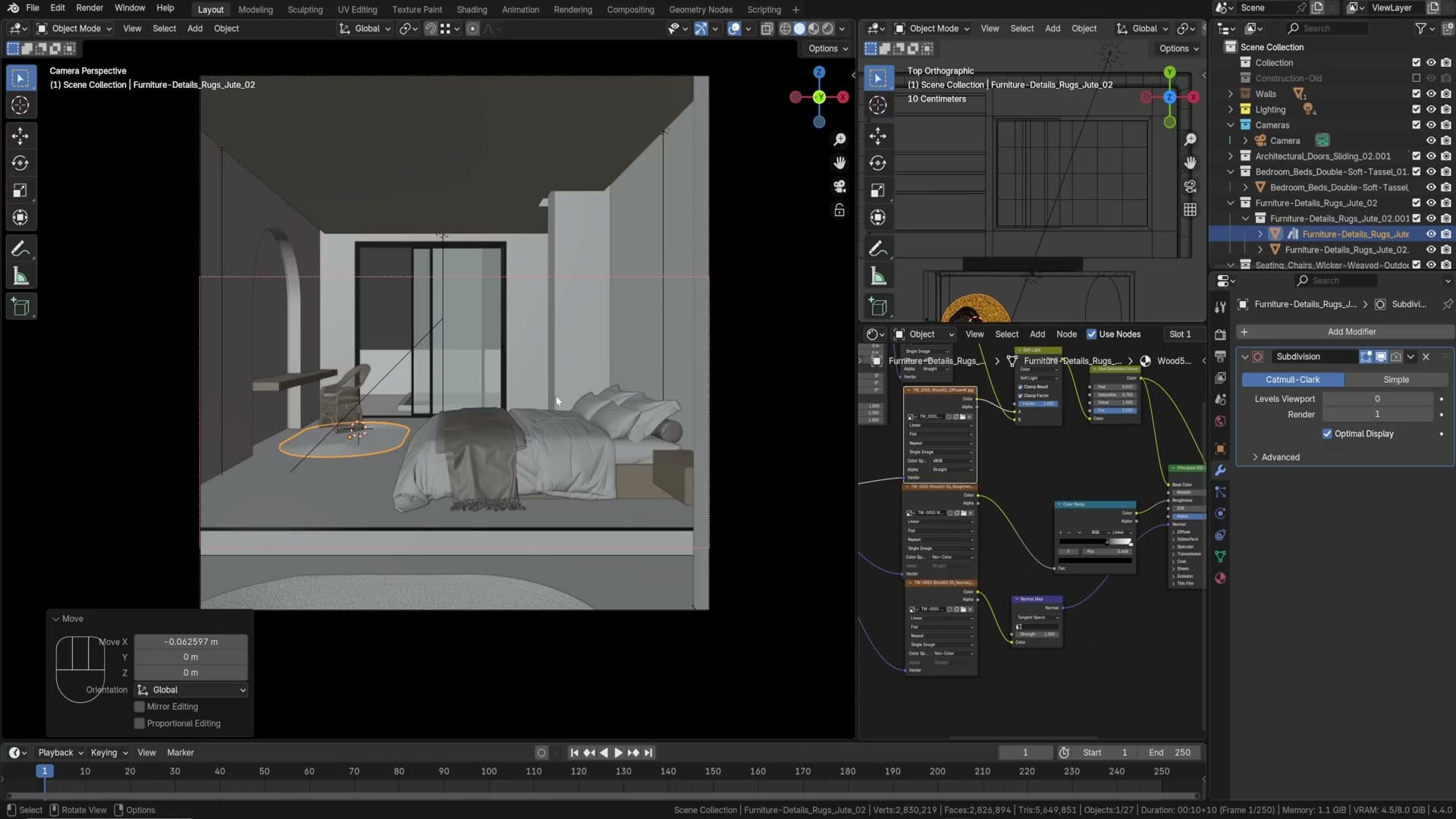
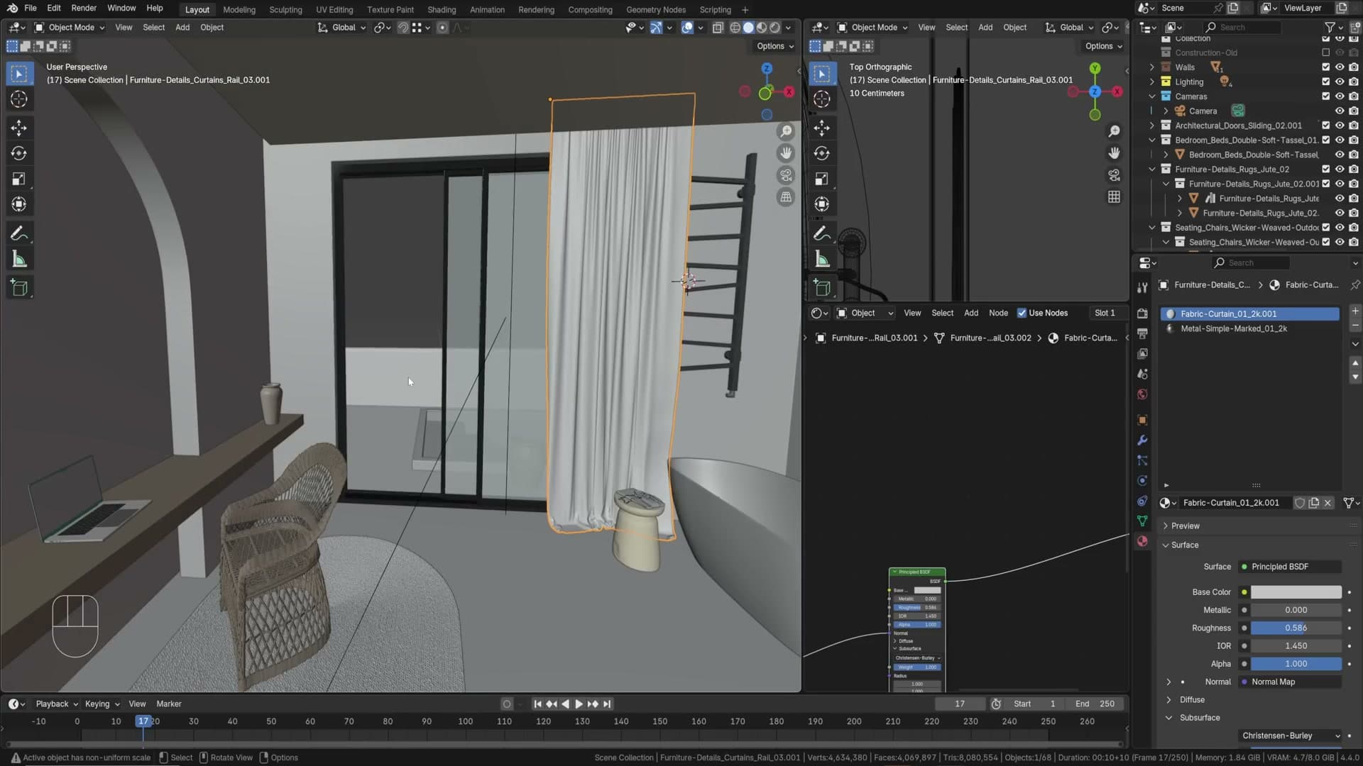
Curtain shader: subsurface vs translucent
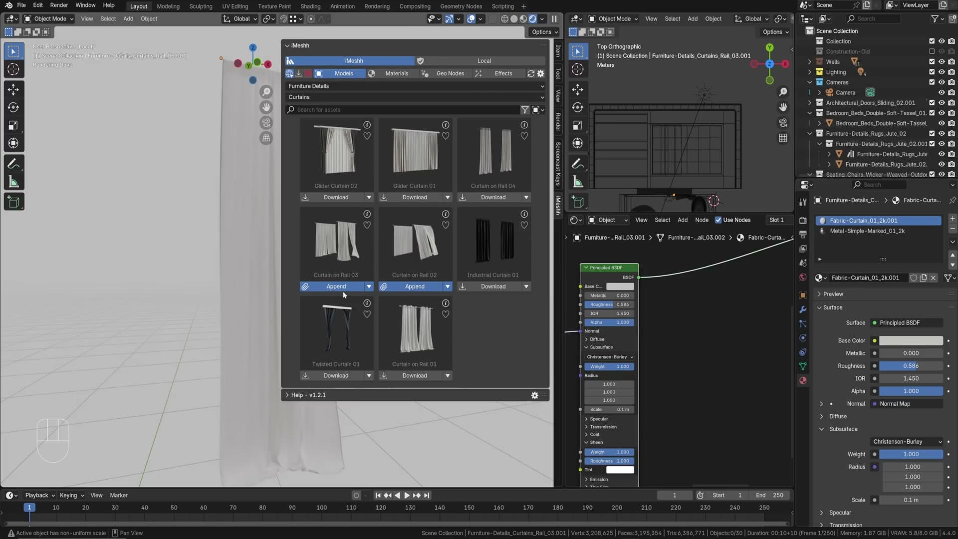
Append a curtain, scale and position into the window opening. Use proportional editing to gently pull parts of the curtain away from the bath where they clip.
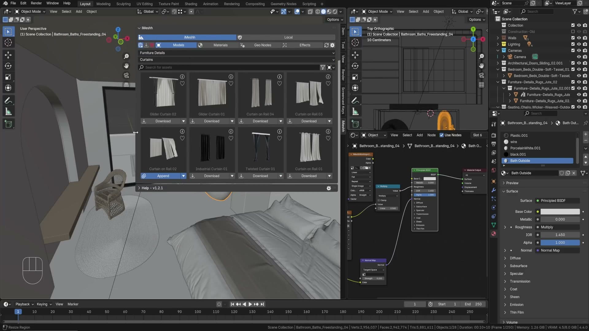
The default iMeshh curtain shader uses a Translucent BSDF, which is fine for 2D-sheet fabric. For a curtain with real thickness (Solidify modifier added) a subsurface approach feels softer and more realistic.
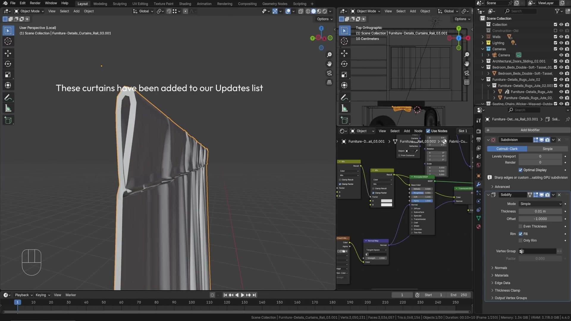
On a Principled BSDF: Sheen Weight 1, Roughness 1, base colour cleared, then turn up Subsurface(Weight or Scale; the spoken “1.1” is most likely the Subsurface Scale at 1.1 with Weight at 1, since Weight only goes to 1).
11. Pendant lights with IES profiles
Pendant bulb + IES profile
Append a pendant light. The bulb is a fake shader designed to glow without acting as an emitter. The actual illumination comes from a Point light placed inside the shade, driven by an IES texture.
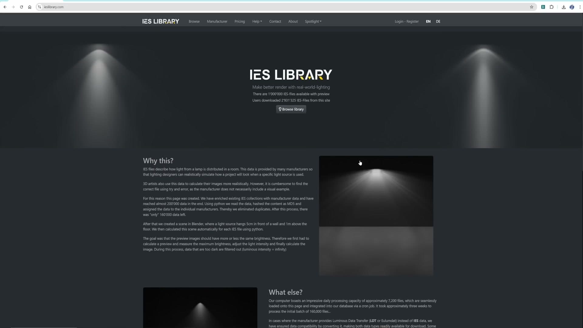
IES profiles are real photometric data for actual fixtures. They tell the renderer how the light falls off in 3D space. Download free ones from the IES Library website.
On the point light: Use Nodes, then add an IES texturenode, plug it into the light’s strength input, open the downloaded IES file. The light now projects with realistic falloff (usually a downward cone with subtle edge variation that bare point lights can’t produce).
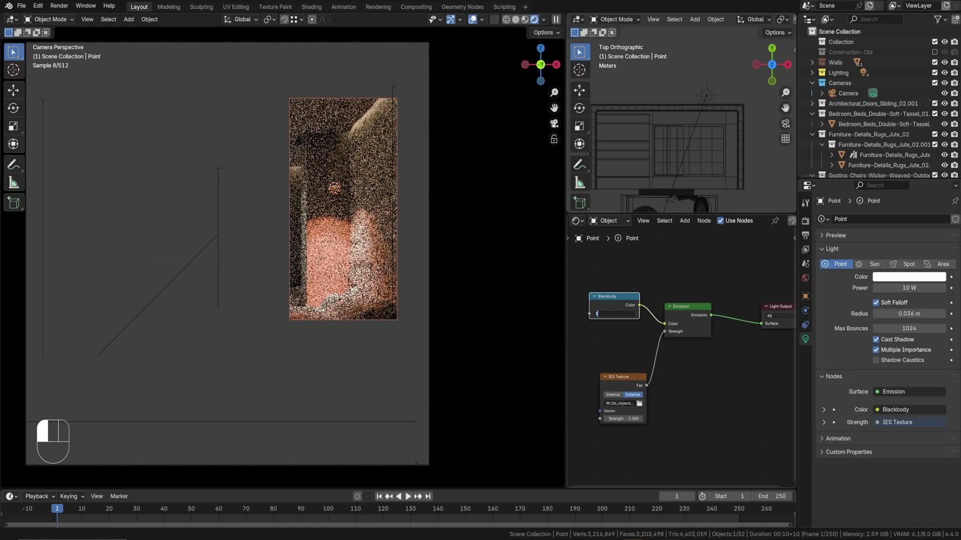
3800K consistency across the scene
Every interior lamp in this scene uses Blackbody 3800K. That single decision is what makes the room feel coherent. Warm, but not yellow. The sun is a touch warmer at 5000K for daylight contrast. Pick a colour temperature standard early and stick to it across every light you add.
Negative fill: a black backdrop for contrast
A trick borrowed from photography: place a pure-black, fully rough, zero-specular plane behind the camera. It absorbs any light that would otherwise bounce back into the scene, deepening contrast subtly. Set the plane’s viewport display to Boundsso it doesn’t clutter the editor.
12. Decorations and the outdoor area
Decorative sets + MacBook prop
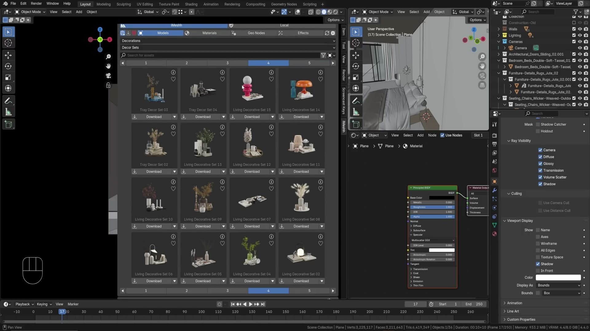
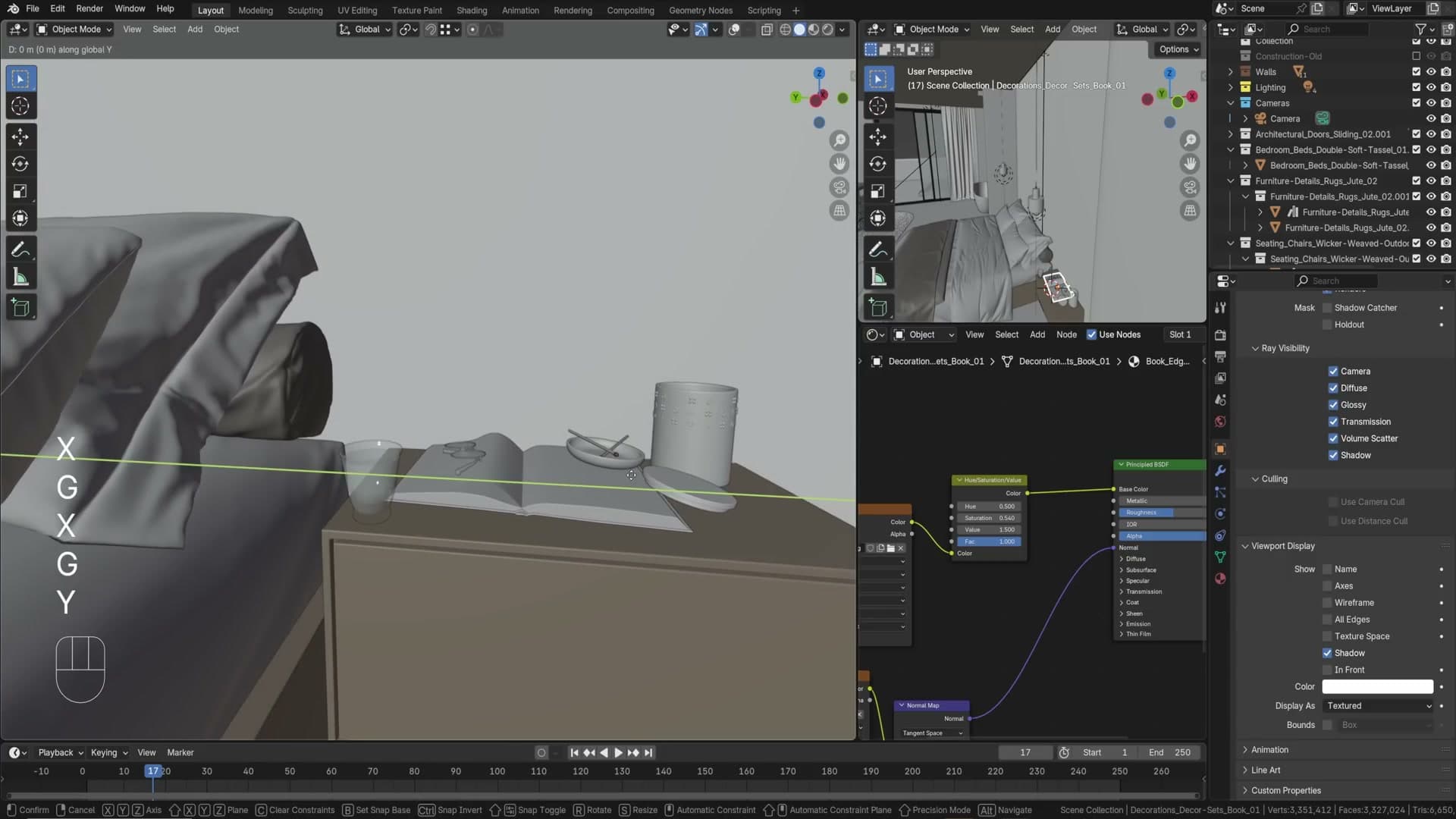
iMeshh’s Decor Setscategory drops a complete set of styled props in one append. Place the set on the bedside table, scale and rotate as needed; objects within a set scale forgivingly since most viewers can’t spot small size discrepancies.
Add a MacBook prop on the desk. The screen comes with an emissive image by default, but for this composition it’s too bright and distracting. Swap the emission off and replace the image with a dark colour so the screen reads as off.
Bouquet and vase styling
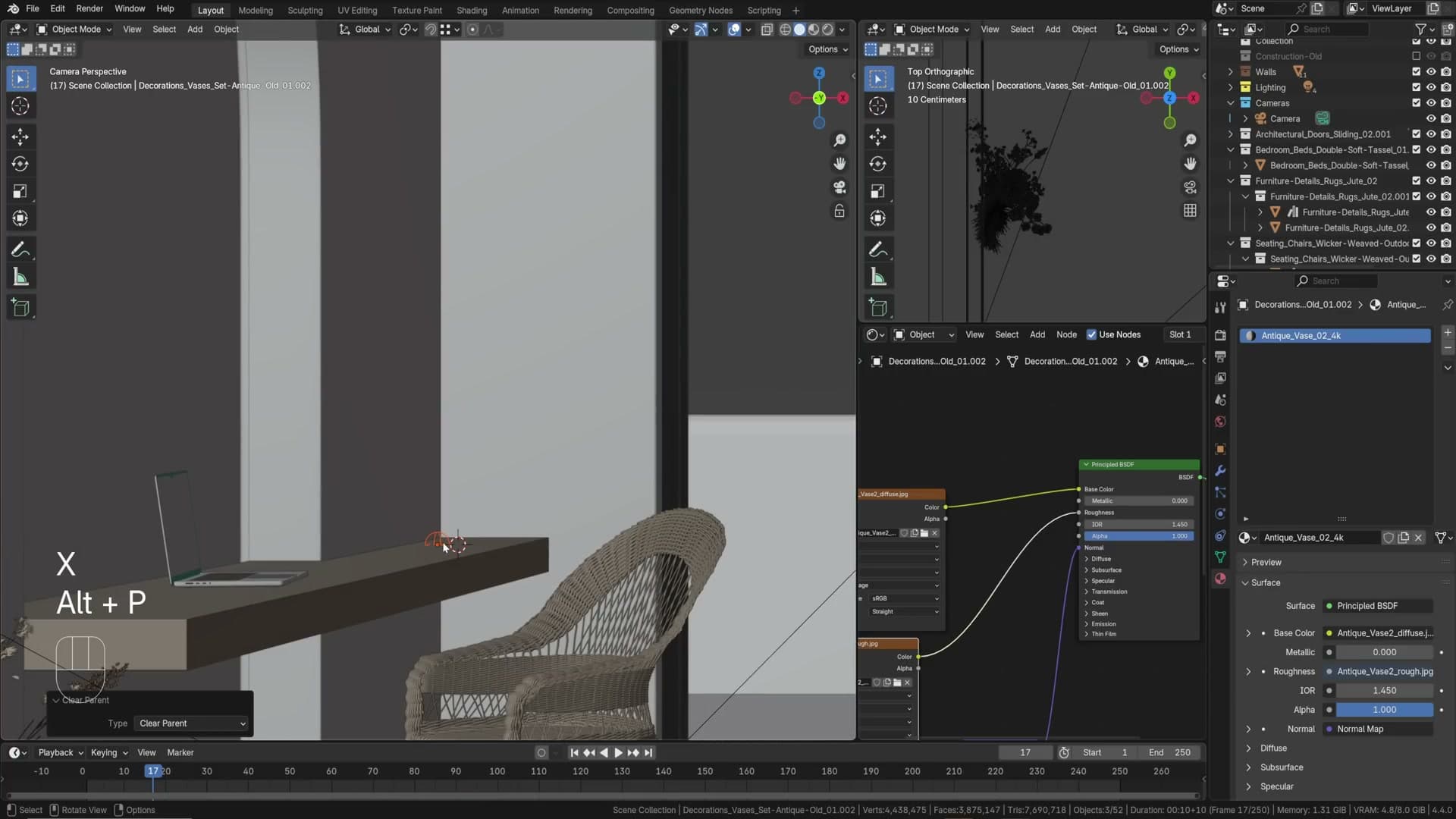
Empty corner near the bed? Drop a bouquet asset. iMeshh’s bouquet category is one of the heavier recent releases, with high detail per asset and big visual impact. A single vase on a shelf reads as “styled but minimal” without crowding the scene.
Mirror with dust + radiator
iMeshh’s mirror has subtle dust specks baked in, which adds realism without manual work. Place above the bath, scale up.
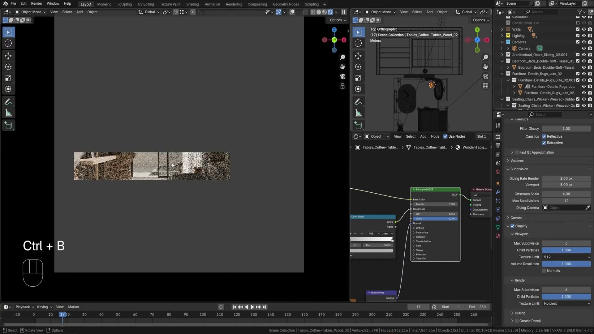
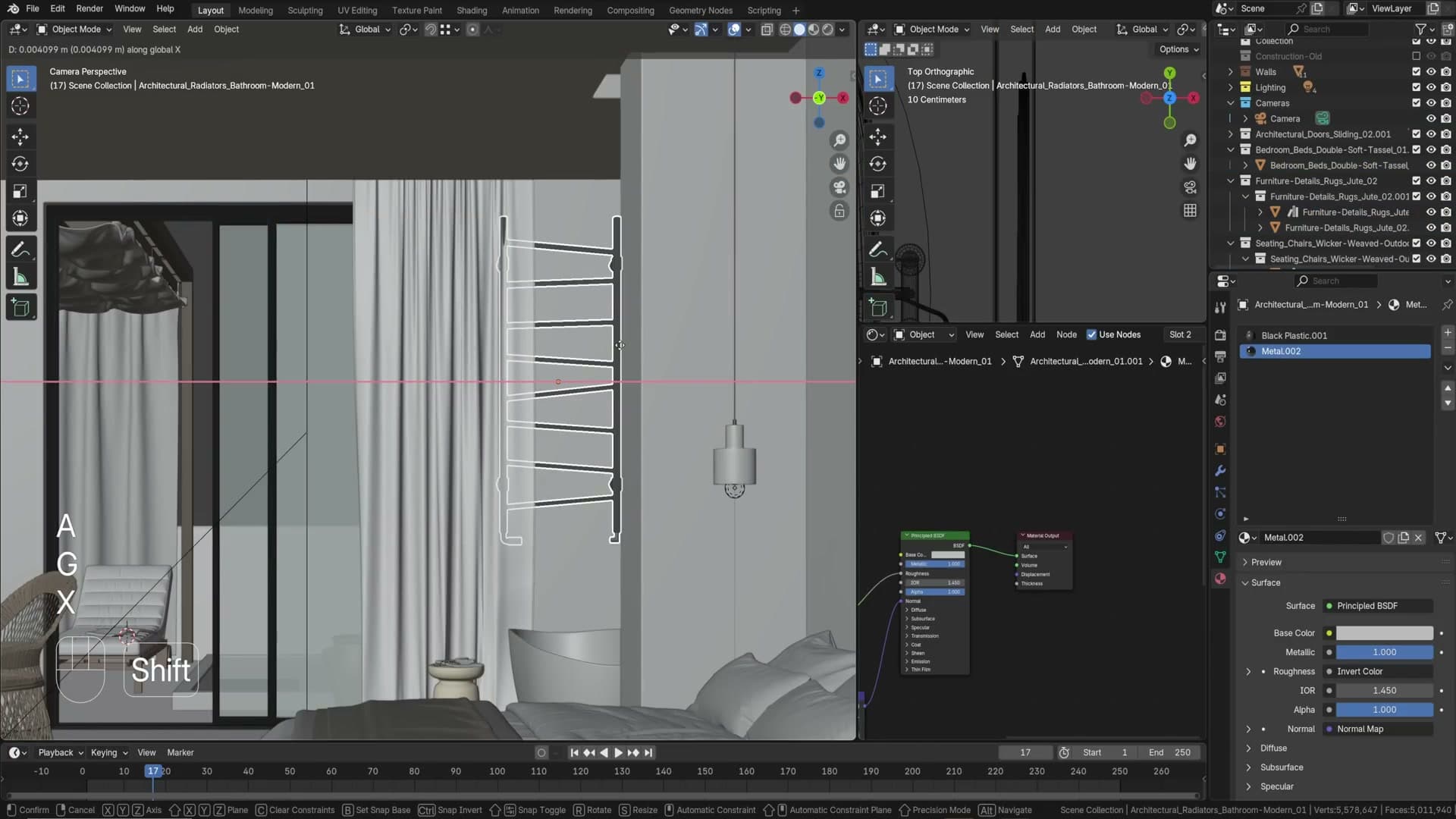
Add a radiator nearby. If the curtain clips through it, edit-mode + proportional editing pulls the curtain away locally.
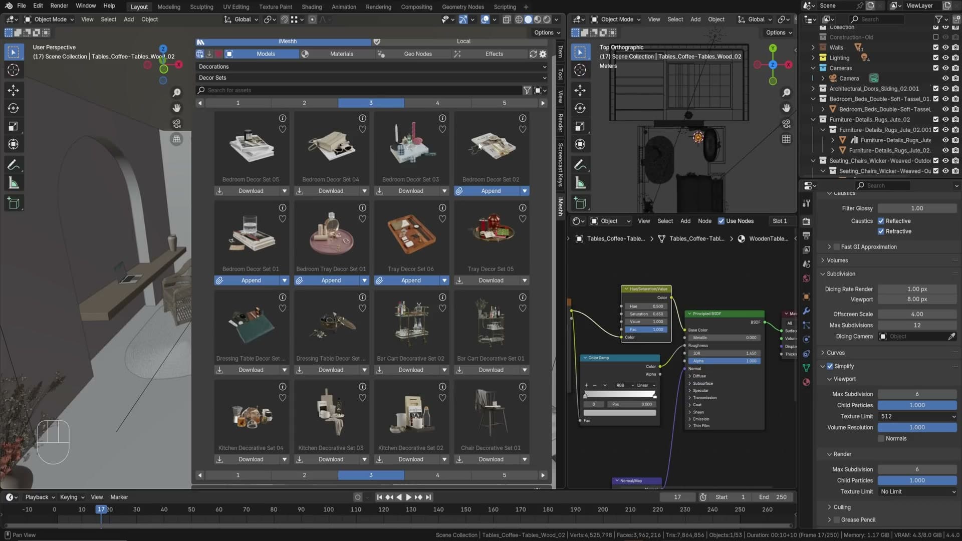
Pagoda, day beds, and a magazine
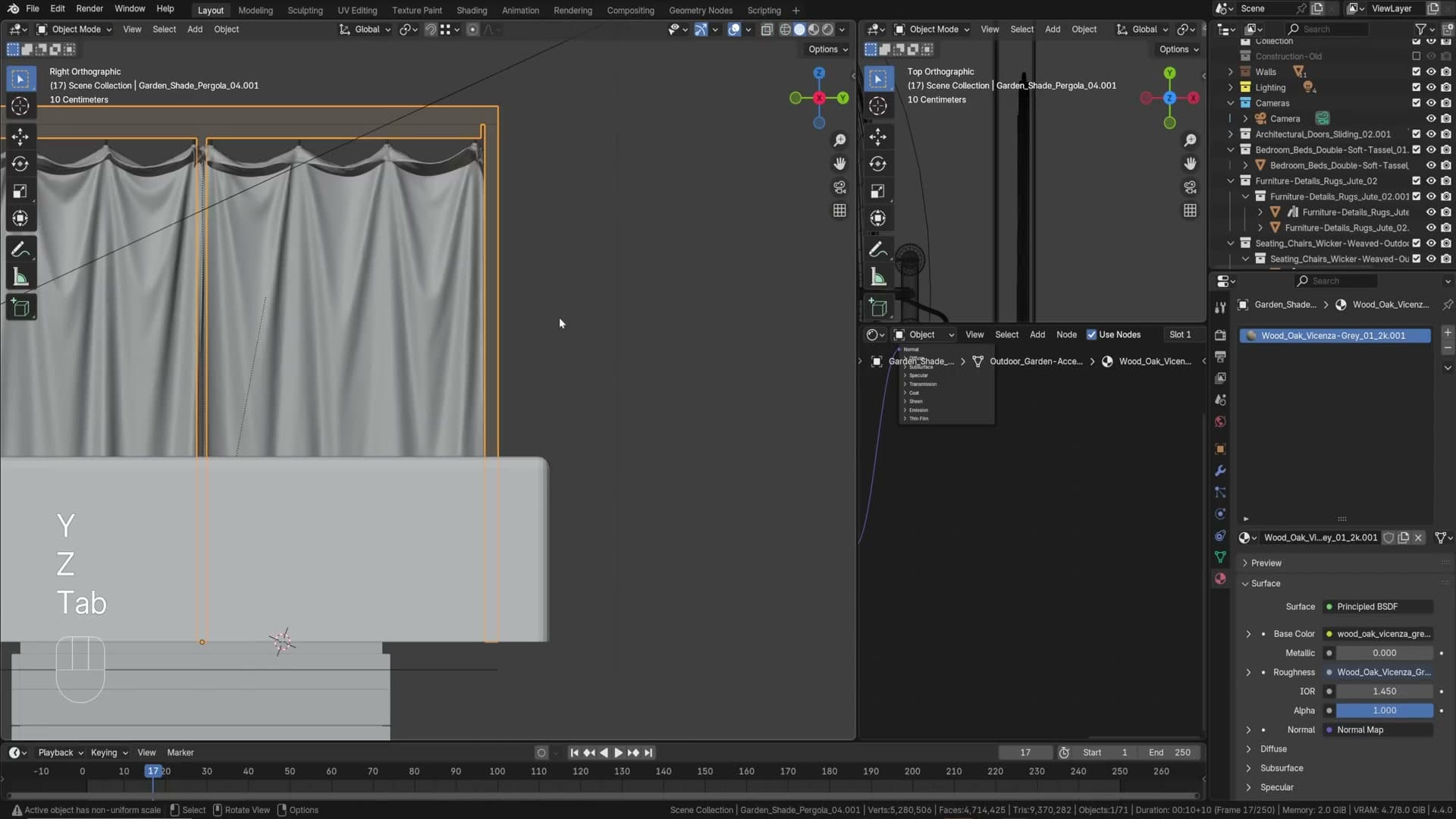
For the outside area: append a pagoda. Because it’s mostly squares and fabric, you can scale it non-uniformly without it looking obviously stretched. Match it to the back wall.
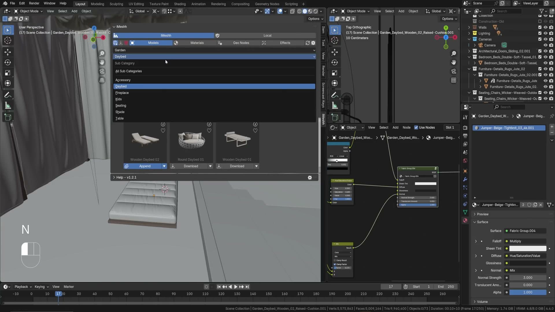
Drop a day bed underneath. Magazine prop on top: rotate, scale, then use proportional editing in edit mode to drape one corner over the edge so it looks like it’s actually been put down there.
13. Ceiling spotlights and light linking
Building the downlight rim
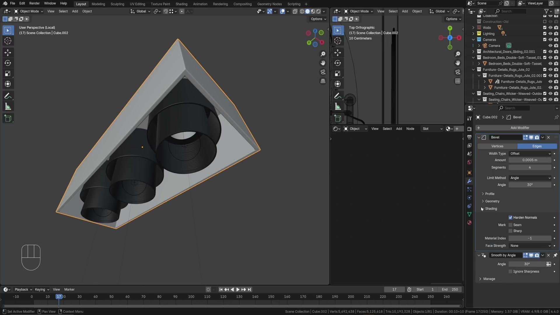
Append the iMeshh downlight model (call it a spotlight if you prefer). Duplicate three in a row. Around each one build a small rim object that the ceiling will cut into: a cube, scaled to fit, with the scale applied (Ctrl+A), insetted (I), extruded up slightly (E).
Add a Bevel modifier (width 0.0005), shade auto smooth, harden normals. Smart UV unwrap. Assign a glossy white material, same as the rest of the bright cabinet finishes.
Boolean ceiling cuts
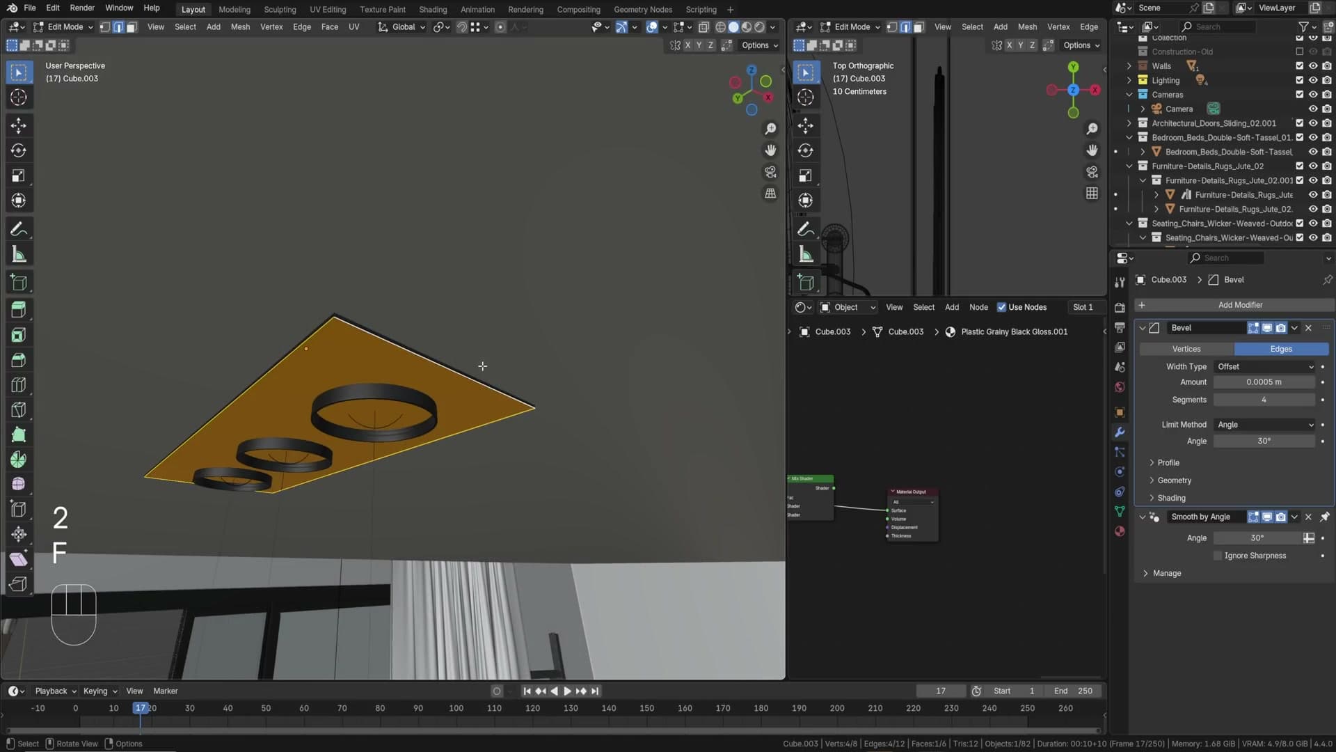
The rim object is hollow, so it won’t boolean a hole on its own. Duplicate it (Shift+D), in edit mode delete the inside faces, then select the outer rim edges and press F to cap it into a closed solid. That’s your Boolean cutter.
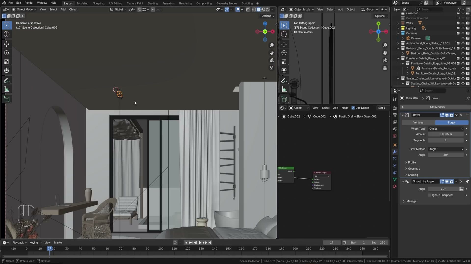
On the ceiling object, add a Boolean modifier → Difference, select the cutter object. Set the cutter’s viewport display to Boundsand disable all its ray visibility options (Object Properties → Visibility → Ray Visibility) so it doesn’t render. The ceiling now has holes exactly where the downlights sit.
Light linking: cosmetic glow without real illumination
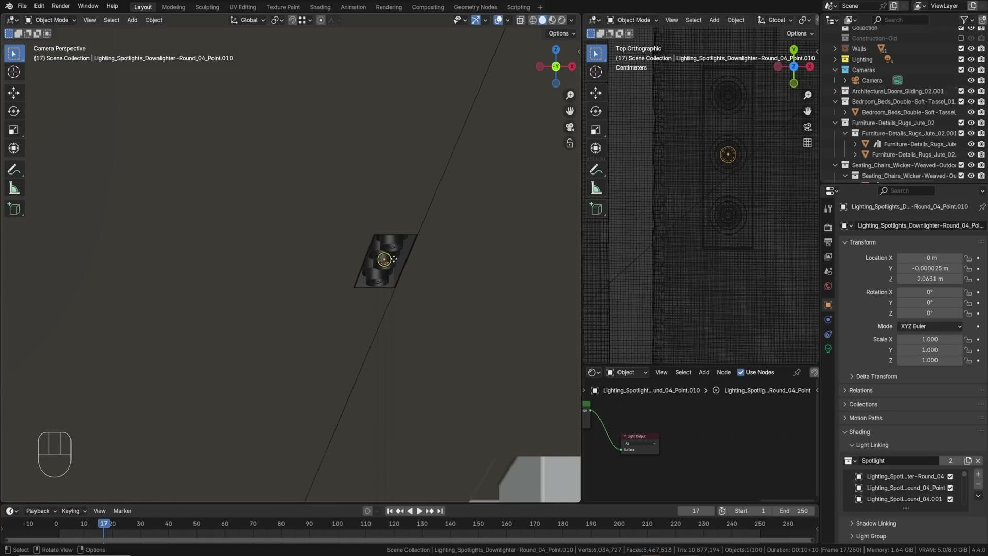
For the bulbs inside the downlights, the goal is a visible glow but nocontribution to the room’s actual illumination; the IES pendants are already doing that work. Move the bulbs into a spotlight collection. On each bulb’s light, go to Object Properties → Shading → Light Linking, set Light Linking to that spotlight collection. Now the bulb only affects objects in its own collection.
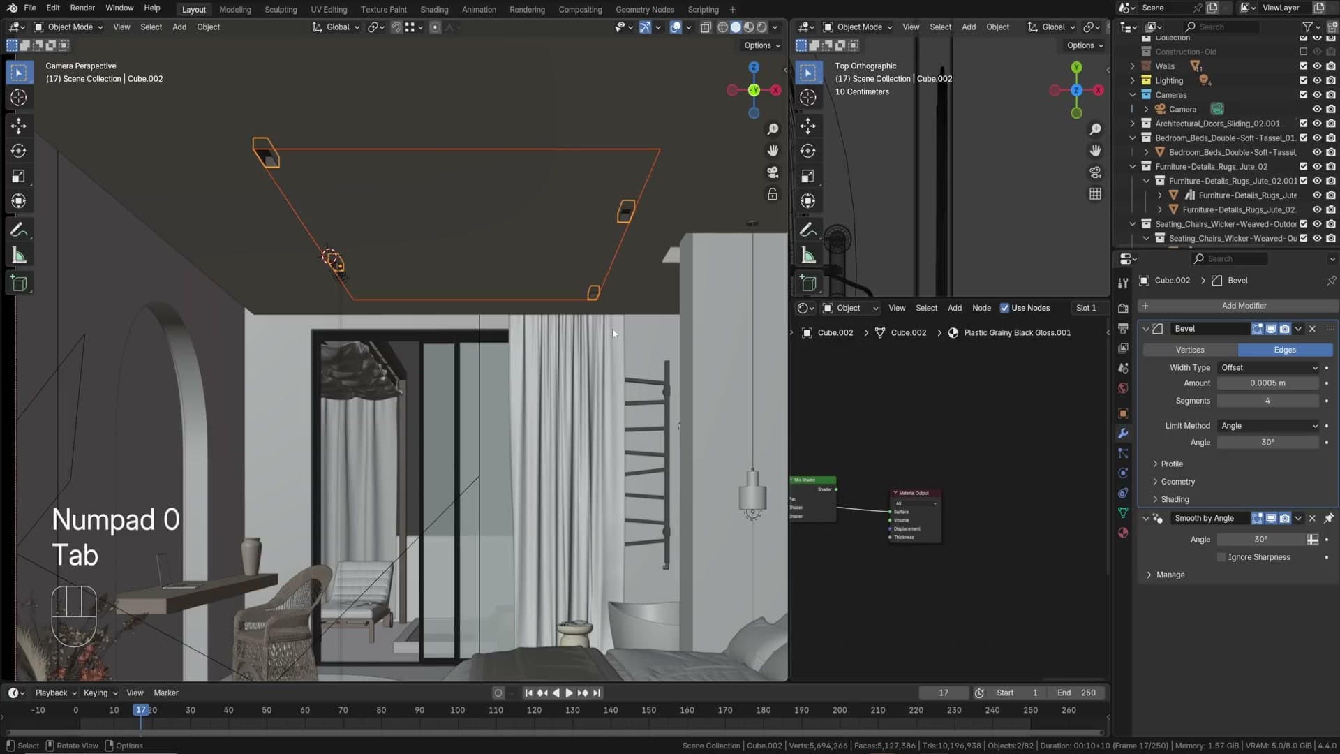
Result: switch the bulbs on and off and the room’s overall lighting doesn’t change at all, but the downlights themselves visibly glow. Not 100% physically accurate, but it looks better than either alternative (no glow, or doubled illumination).
14. Background plate, plants, and depth of field
AI back plate from ChatGPT
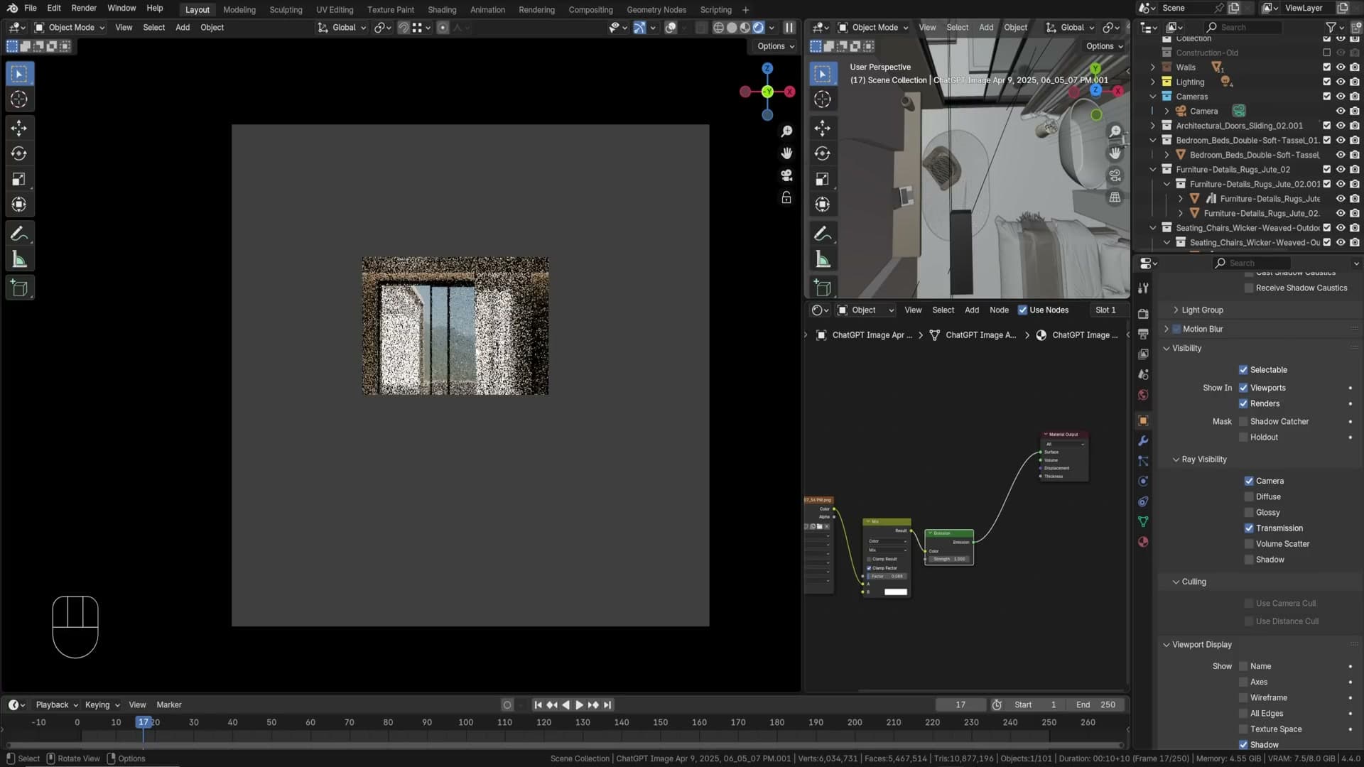
The view through the glass needs something behind it. A rough AI-generated landscape image works fine; most of it gets overexposed by the bright sky anyway. ChatGPT will produce a vague Mediterranean hillside in seconds.
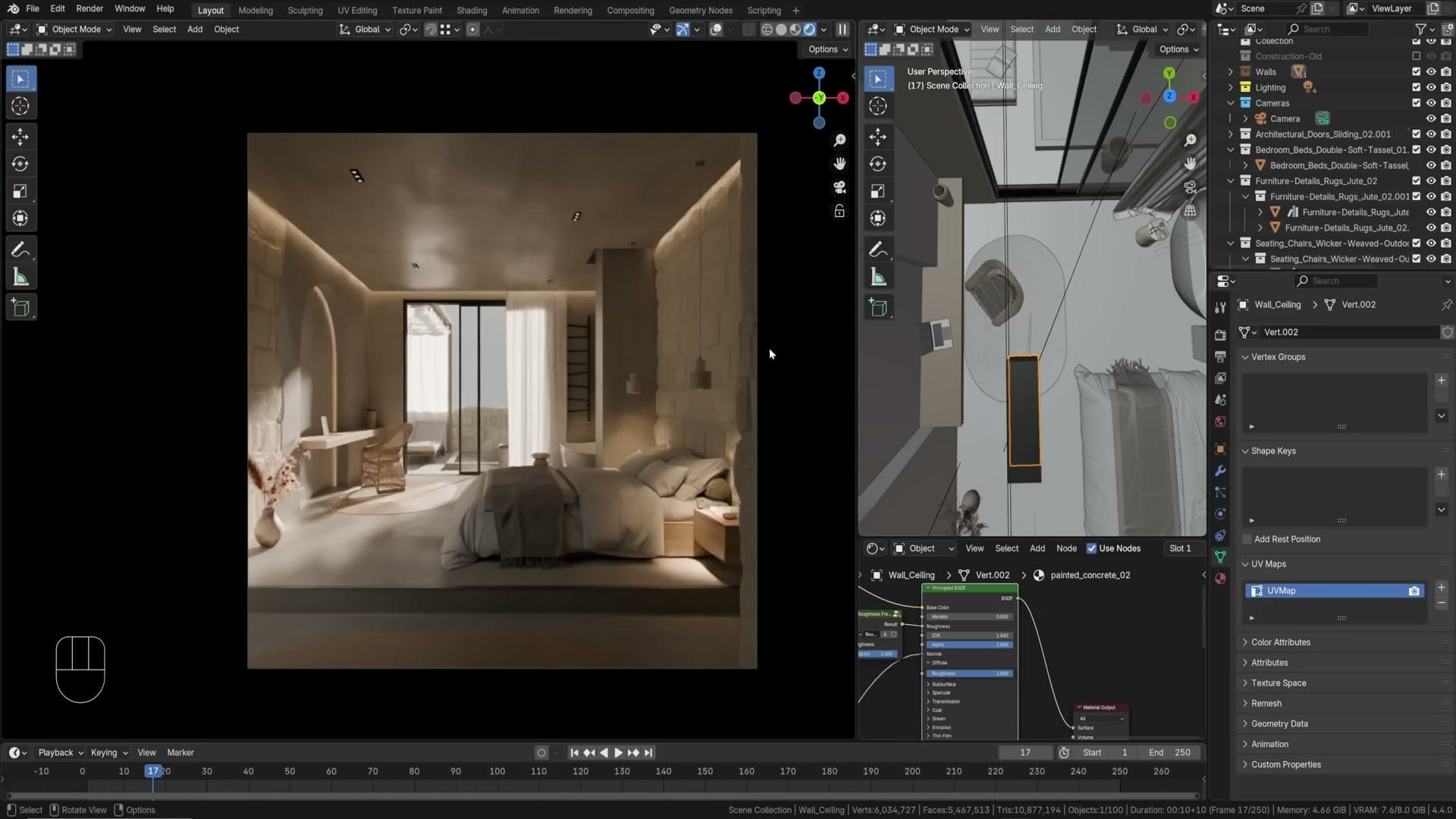
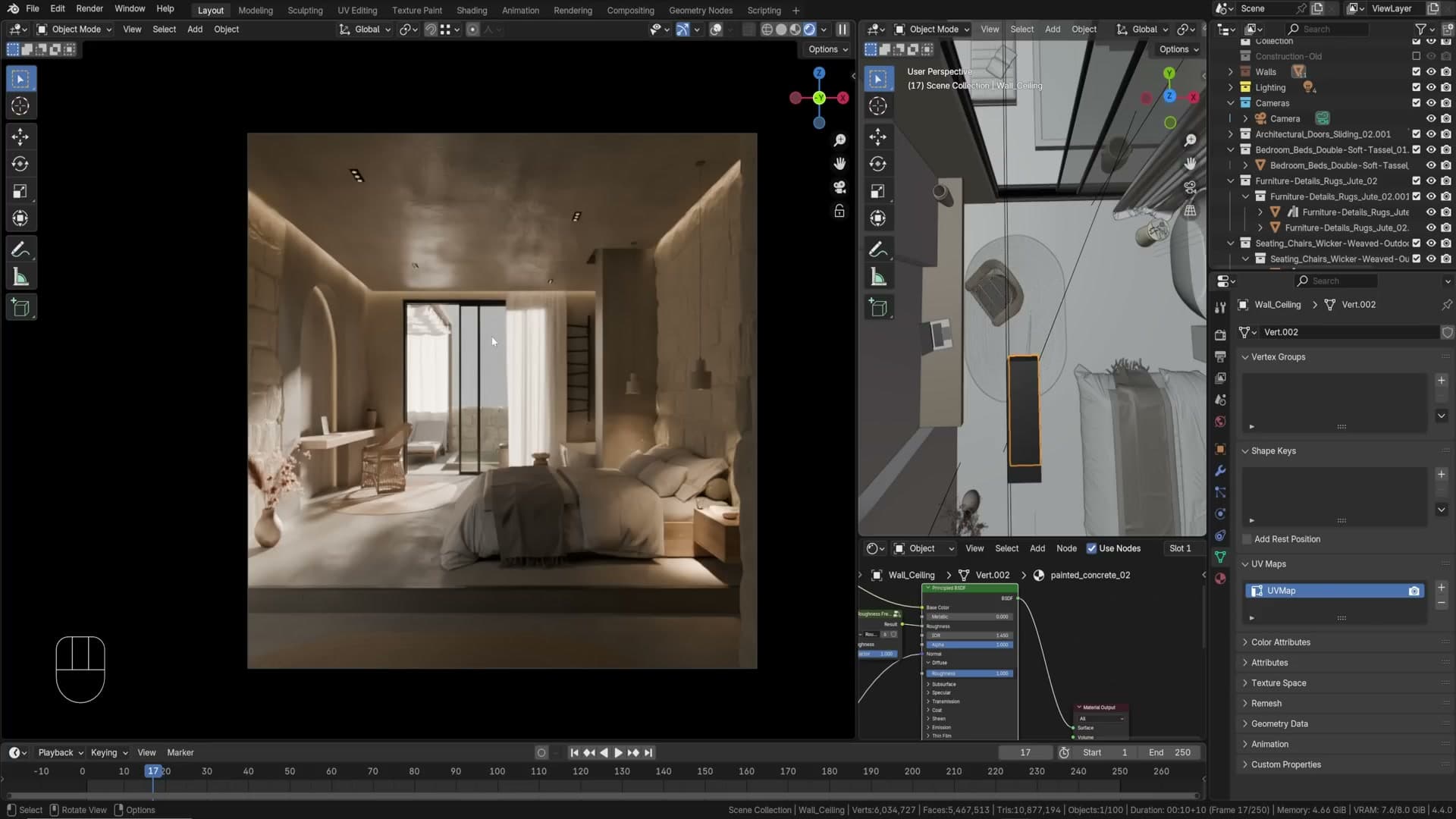
Drop the image into the scene as a plane (Shift+A → Image → Mesh Plane), position it some distance behind the glass. The shader is the image into an Emission node (so it glows with no light contribution), then in Object Properties → Visibility → Ray Visibility enable only Camera and Transmission(so it shows through glass but doesn’t cast light into the scene). Crank the emission strength so it’s slightly overexposed, around 10.
Tree + hue/saturation match
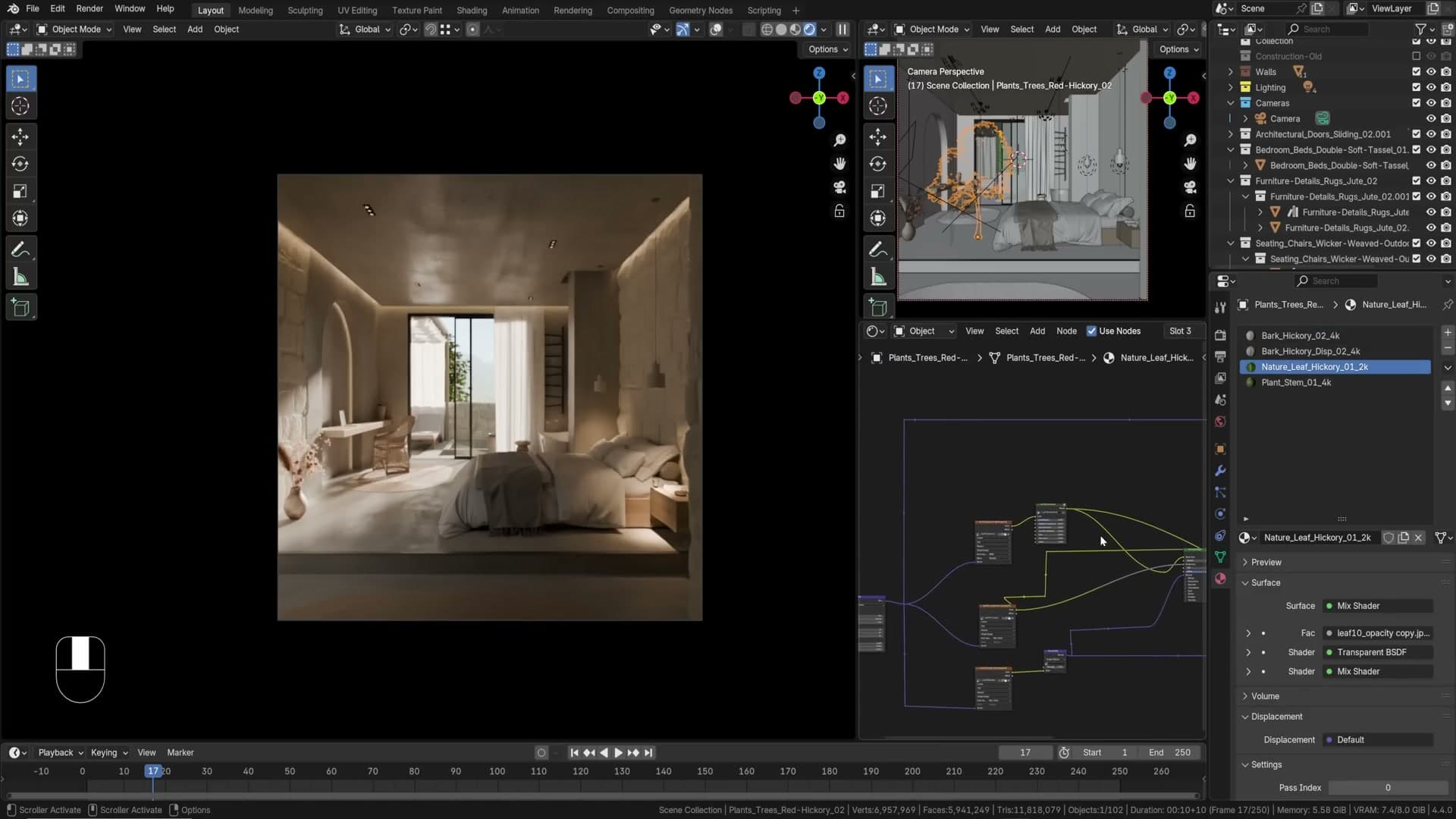
Append an iMeshh tree, position so it’s visible just outside the window. The default leaf colour is often more saturated than the scene’s warm beige palette, drawing the eye away from the interior. On the leaf material, add a Hue/Saturation node before the diffuse colour: hue around 0.48, saturation slightly down, brightness slightly up.
Quick bush scatter
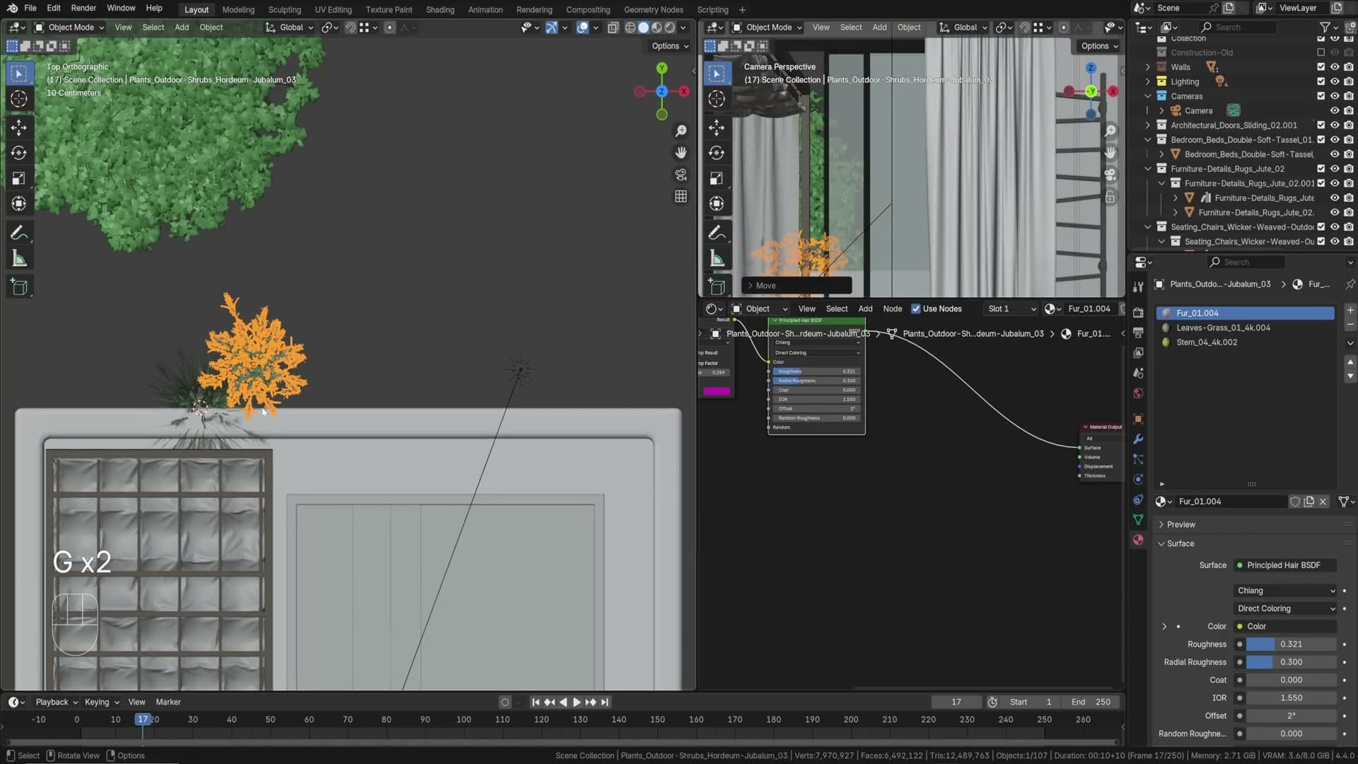
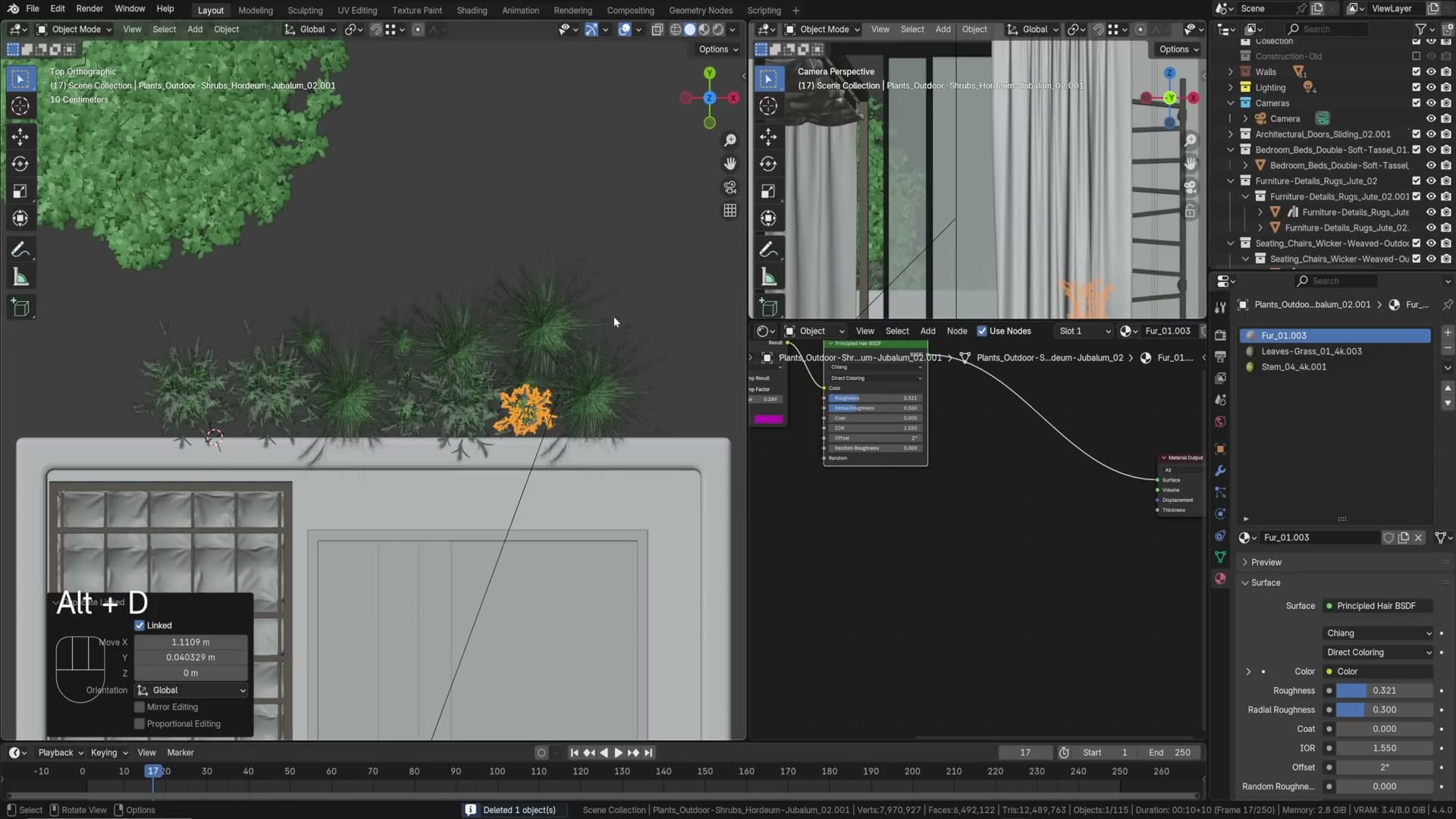
For ground cover outside, append five or six different shrubs, drop them roughly into a row. Then select all of them, F3 → Randomize Transform: 360° random rotation, an even-scale tweak so they vary in height. Instant convincing planting strip.
Gobo for soft window shadow
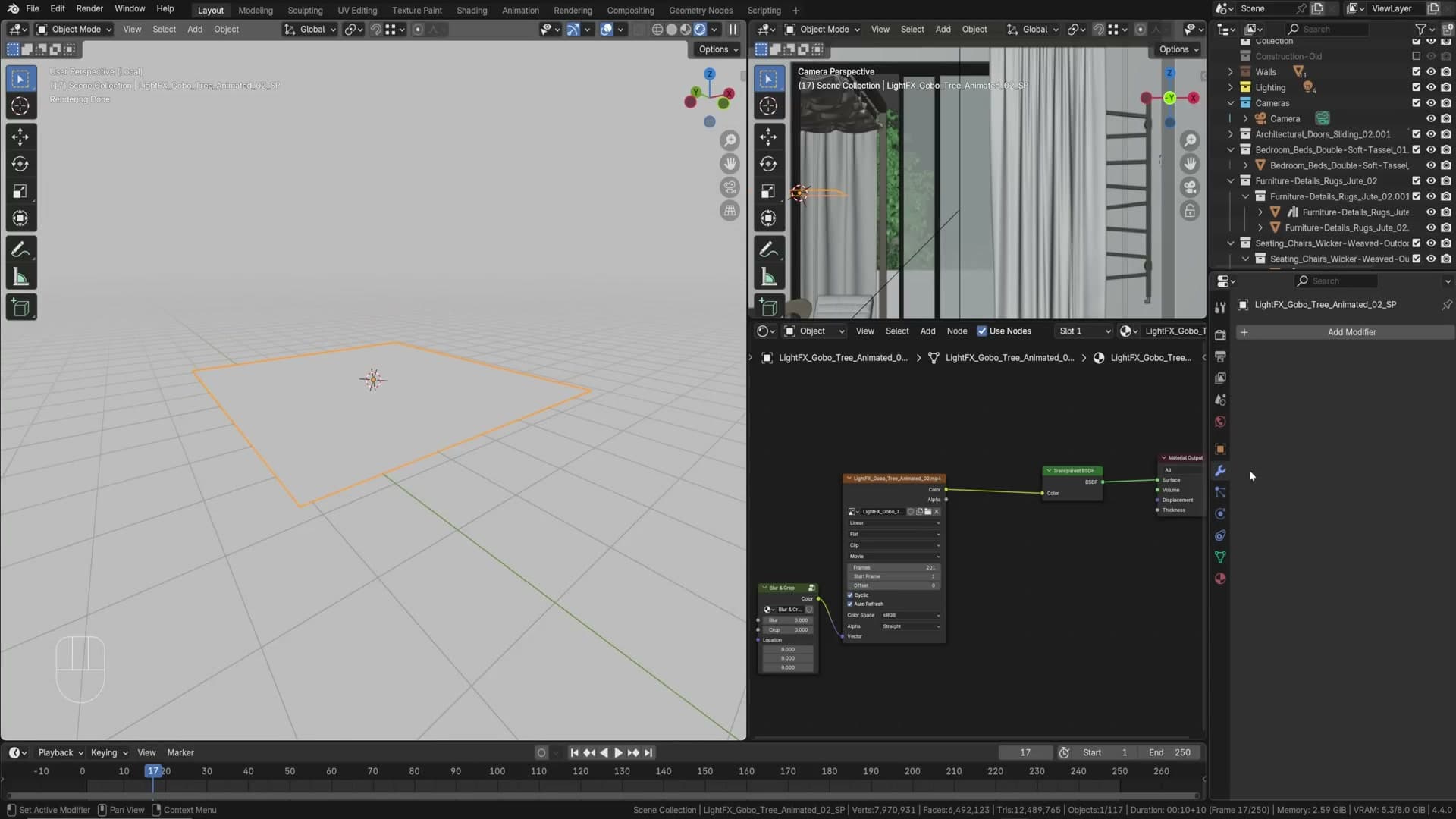
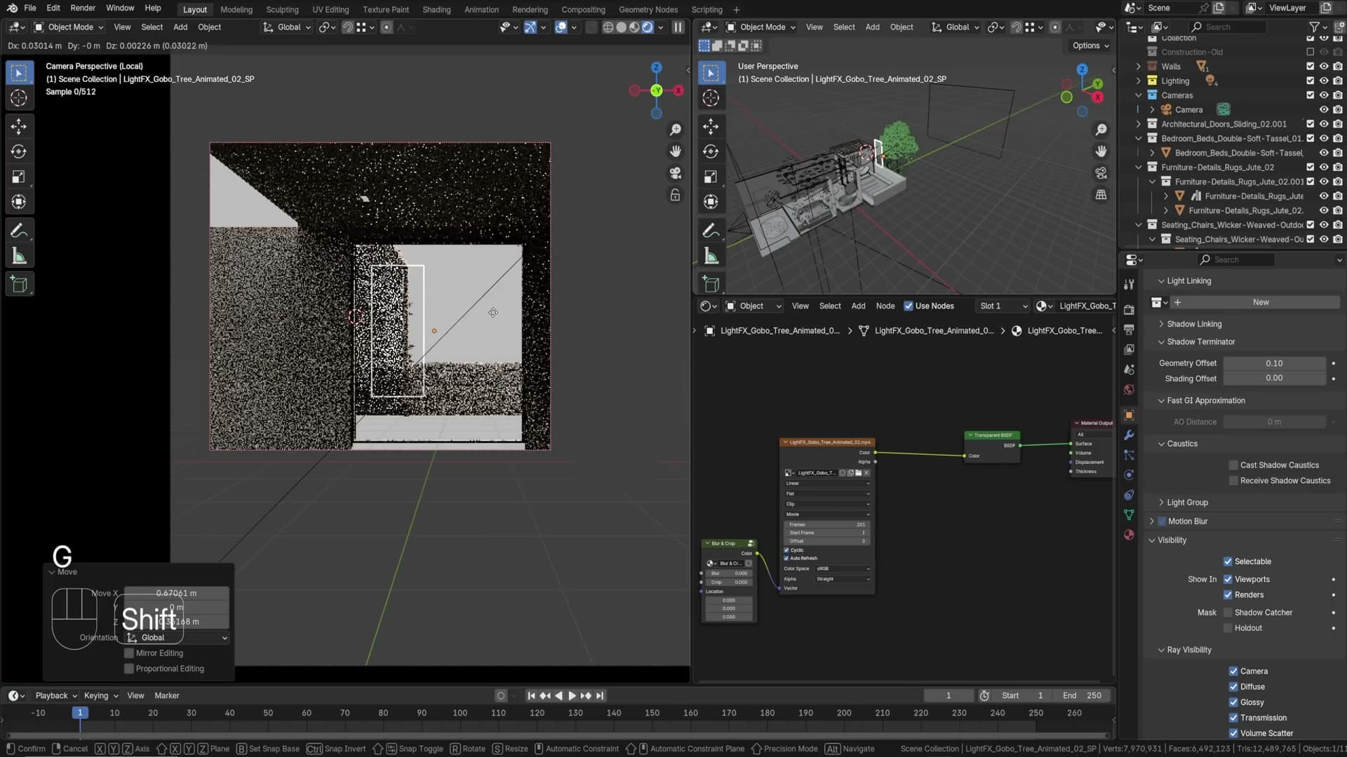
The white curtain looks flat without anything cast onto it. Use a gobo (a black/white mask plane that casts a textured shadow). iMeshh ships gobos under Effects. Append, isolate the relevant geometry, place outside the window so it casts a tree-like shadow on the curtain.
Foreground plant + depth of field at f/5.6
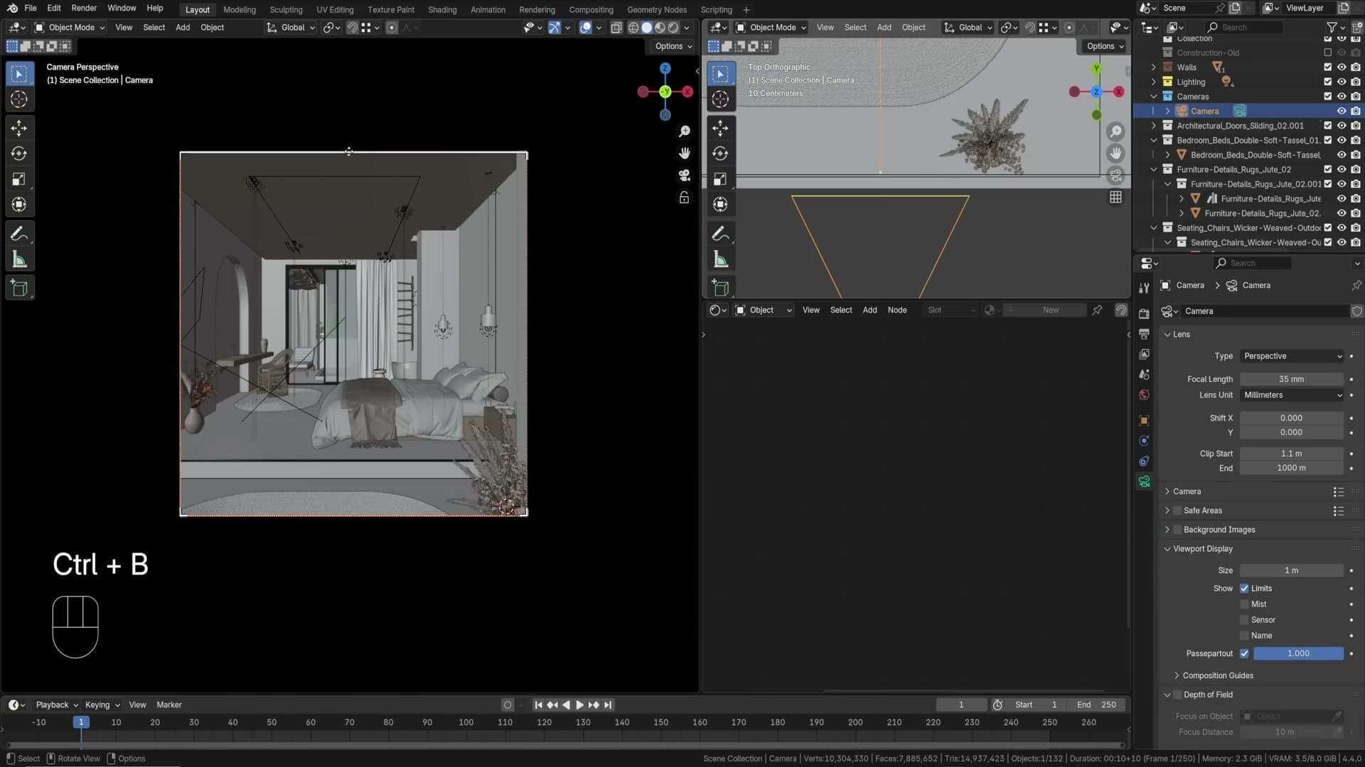
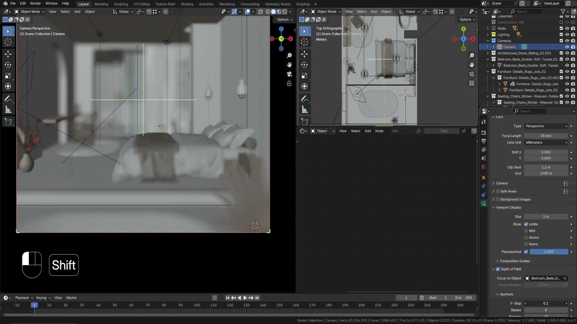
A foreground plant just inside the camera’s clip start adds depth without being legible. Then on the camera: enable Depth of Field, set the focus to the bed, aperture f/5.6. 5.6 is a common photography aperture so the result reads as familiar to the eye.
15. Render settings
GPU, samples, denoiser
Render with GPU compute. Samples: 512 to start, adjust based on the test render. Enable the denoiser with default settings.
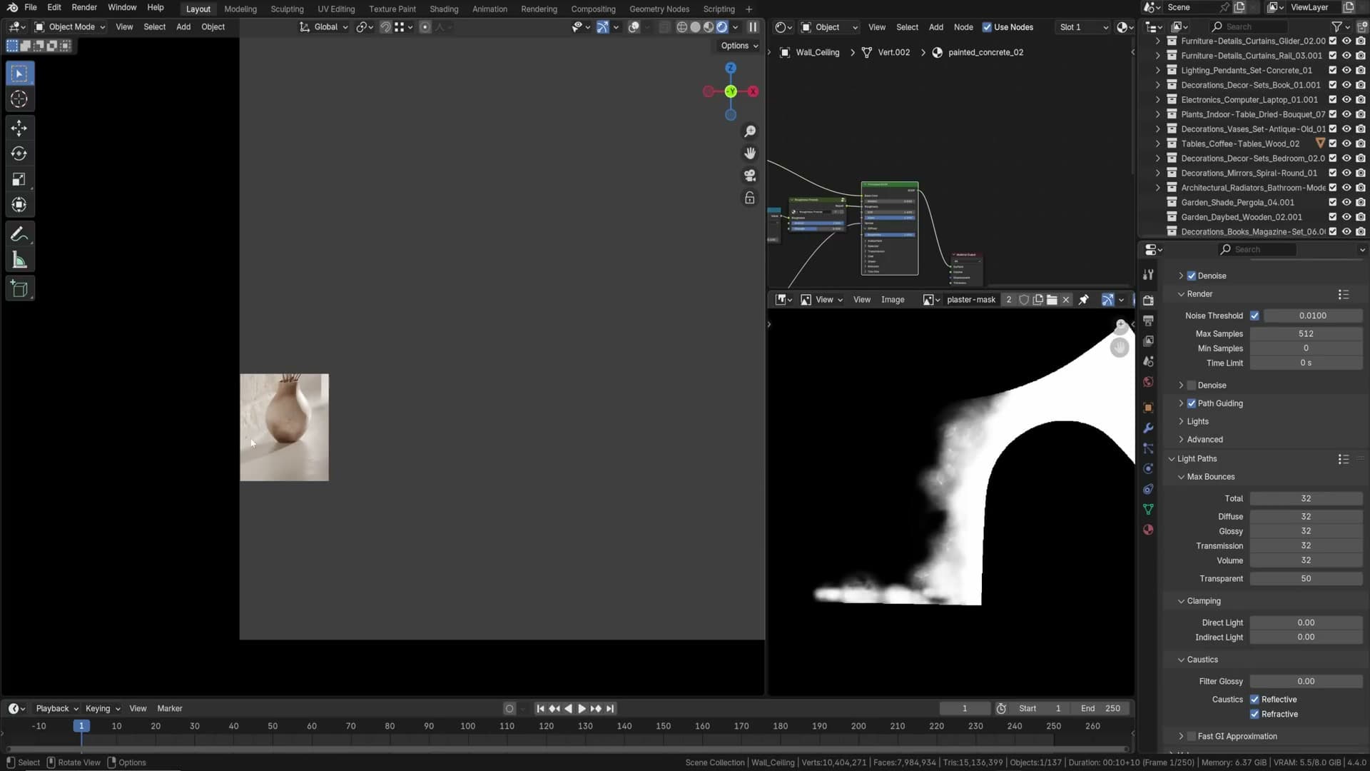
Max bounces
Light Paths → Max Bounces controls how many times light reflects/refracts before terminating. 0 = only direct lighting, no GI. 1 = a single bounce. 12-16 is usually fine; the difference between 16 and 32 is small for render time but eliminates risk of missing light, so 32 is the safe brute-force choice.
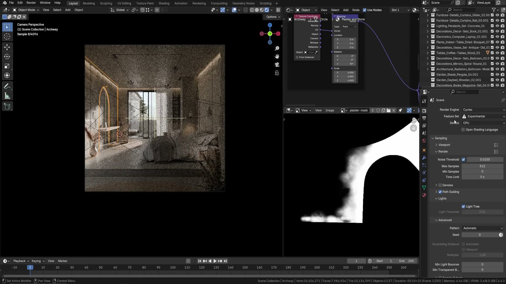
Transparent Bounces is a separate setting and matters more in scenes with stacked transparent geometry, like grass blades in a pan past a lawn. For an interior shot, the default is usually fine.
Clamping indirect/direct: the still vs animation trade-off
Cycles’ Clamping caps individual sample values. The default for indirect light is 10. Clamping reduces fireflies but also crushes legitimate highlights. For a still image, keep clamping at 0 and rely on the denoiser to clean up fireflies. For an animation, you usually need clamping because the denoiser can’t maintain temporal consistency around extreme samples.
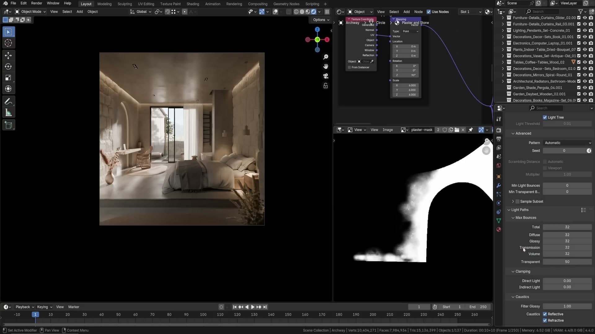
Dicing rate, Simplify, texture limits
Adaptive subdivision’s Dicing Rate is in pixels. Smaller number = more polygons. Render dicing rate 4 gives enough geometry for the displacement to read, with the bump map filling in fine detail.
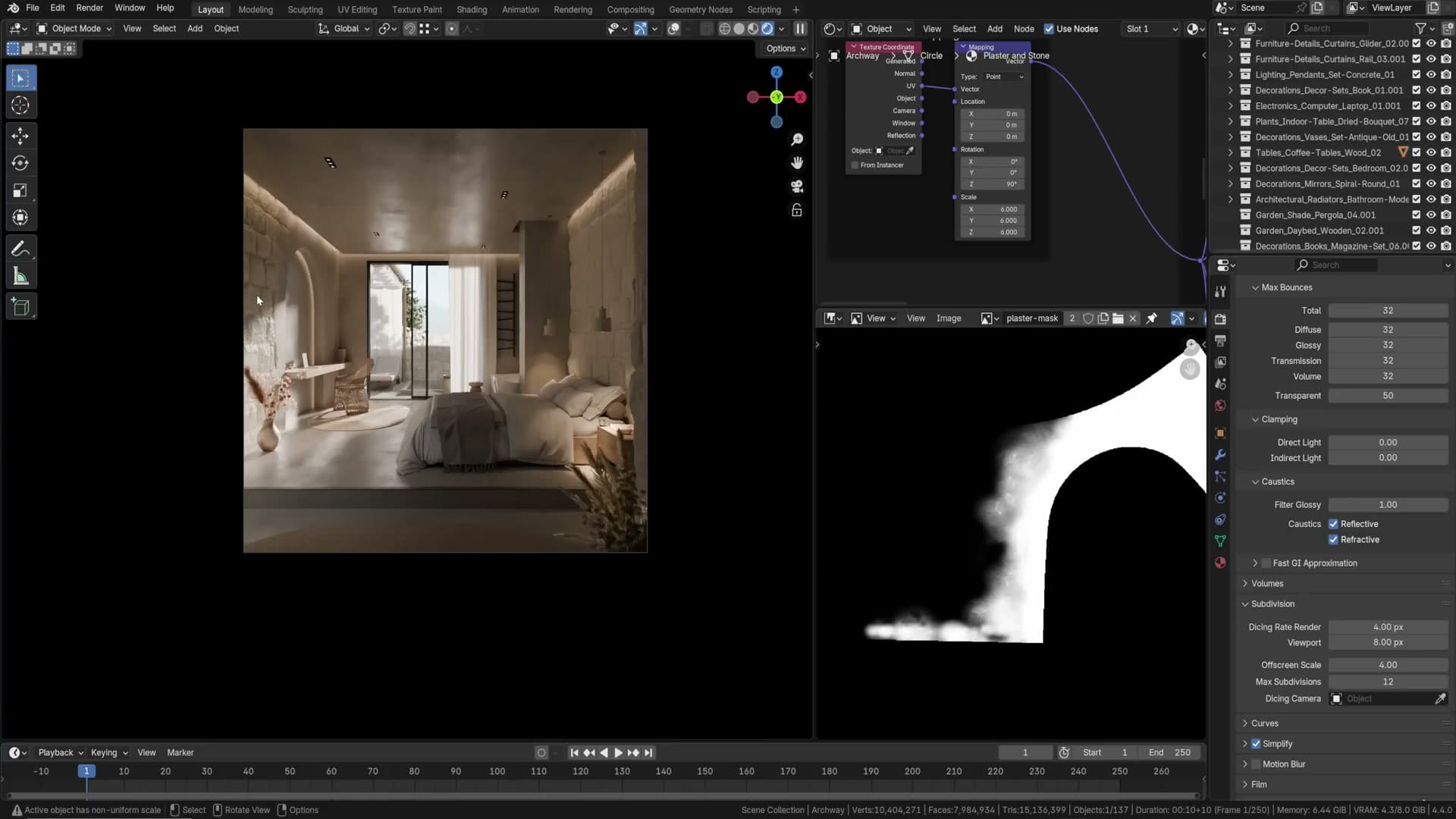
Simplify caps the resolution of all textures at render time. Setting Texture Limit to 2K (sometimes even 1K or 512) keeps VRAM under control without visible quality loss for textures far from the camera. Disable Simplify only if a particular texture is right up against the lens and you can see the resolution drop.
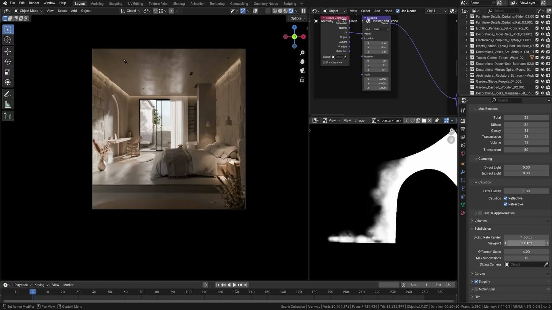
Pixel filter width 1.1 for sharper edges
Film → Pixel Filter → Width defaults to 1.5. Dropping it to 1.1 gives sharper edges. Go much lower and you risk aliasing on high-contrast borders. 1.1 hits the sweet spot.
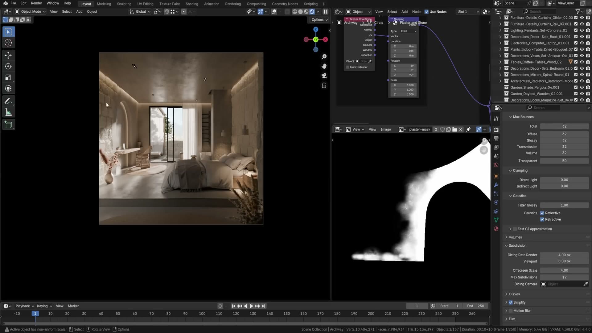
16. Compositing and view transform
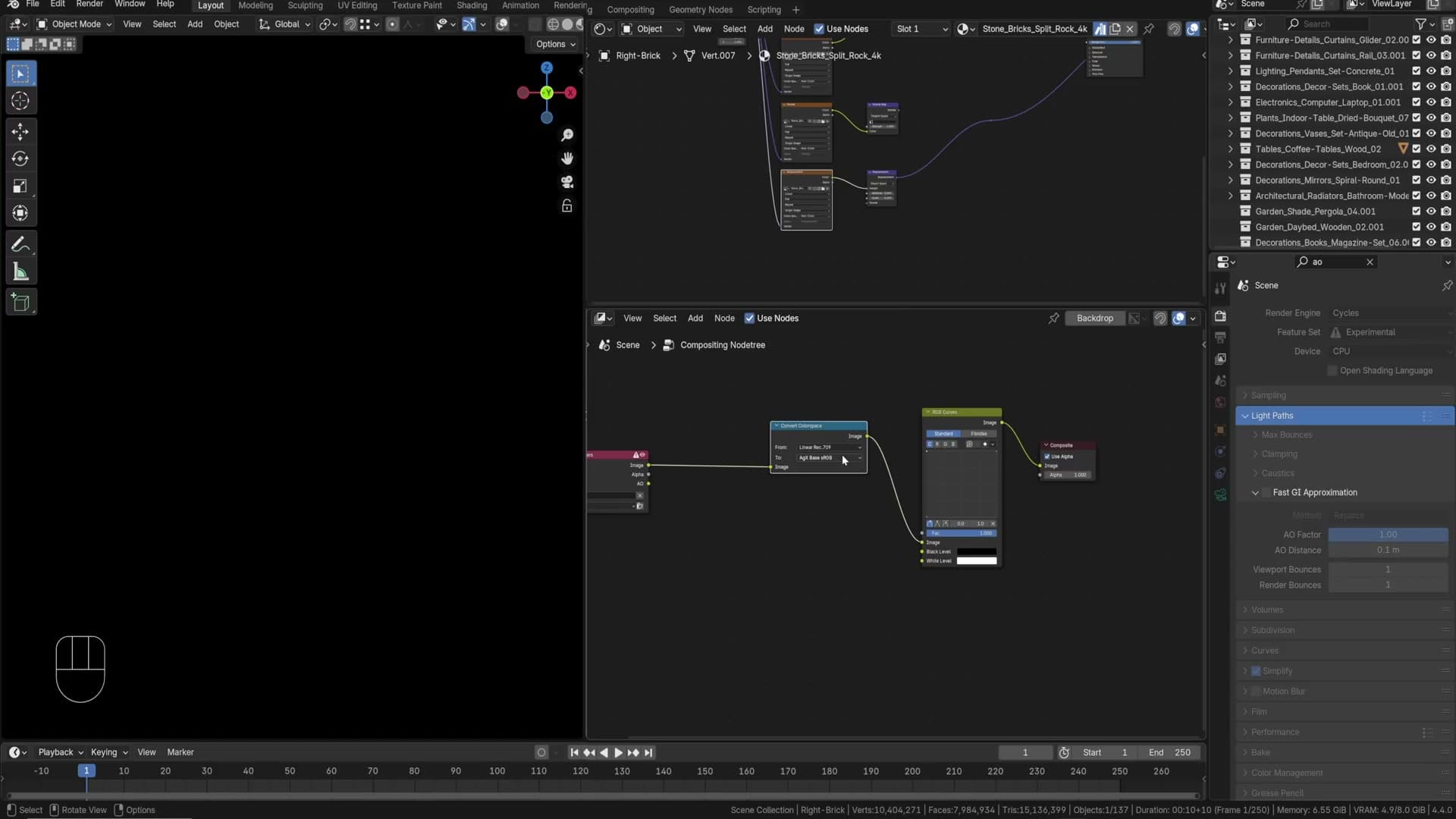
The trick here: render with the Raw view transform, then convert to AGX in the compositor. That keeps all the highlight data available for the compositor to push, rather than locking it in at the camera.
Why render with Raw view transform
Switch the View Transform from AGX to Raw. The viewport will look terrible, flat and ugly. That’s expected; Raw has the most data preserved.
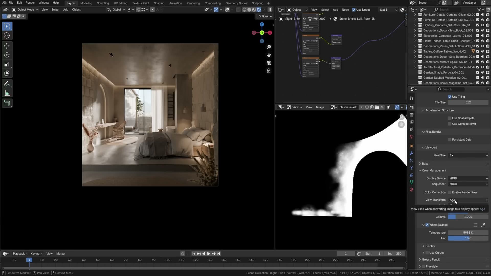
In the compositor, add a Convert Color Space node: from Linear Rec.709 to AGX Base sRGB. That restores the AGX look, same as before visually.
But now, an RGB Curves node added after the convert can push colours past pure white. With AGX applied at the camera, the value is clamped; with AGX applied in the compositor, you can override that ceiling and recover bright highlights.
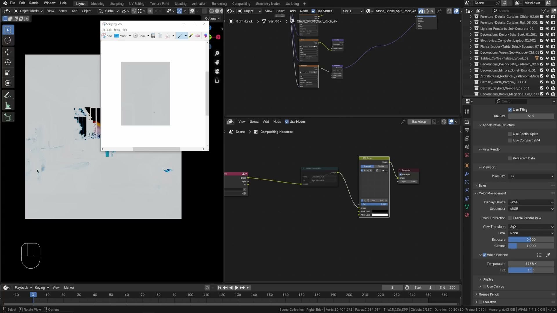
View layer passes you need
In View Layers → Passes, enable: Mist, Denoise Data, Glossy Indirect, Crypto Matte (Material + Object), Ambient Occlusion. AO distance in render settings: 0.1 (10 cm).
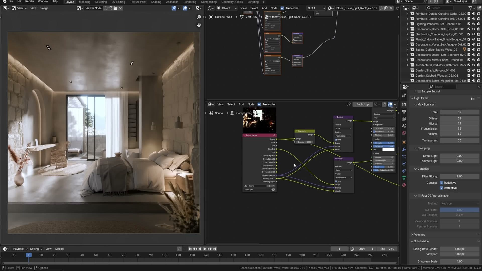
Denoise + glare (star + bloom)
Two Glare nodes stacked: first one set to the star/streak pattern for that classic photographic flare on bright spots, second one a soft bloom. Together they give highlights, particularly through the windows and on glossy surfaces, a much more photographic feel.
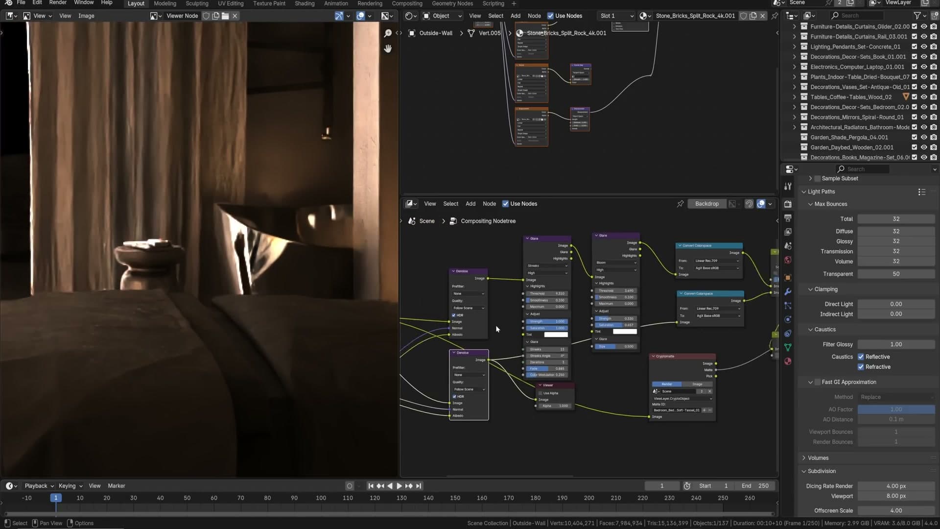
Glossy indirect as a soft-light overlay
Take the Glossy Indirect pass through a Denoise node, then convert it to the right colour space. Mix it into the main image as Soft Light. Used subtly, it adds extra punch to reflective surfaces without looking artificial.
AO pass as a multiply overlay
AO pass multiplied over the image darkens crevices. Use sparingly; too much reads as fake. Sometimes a tiny bit just helps edges in shadow read more clearly.
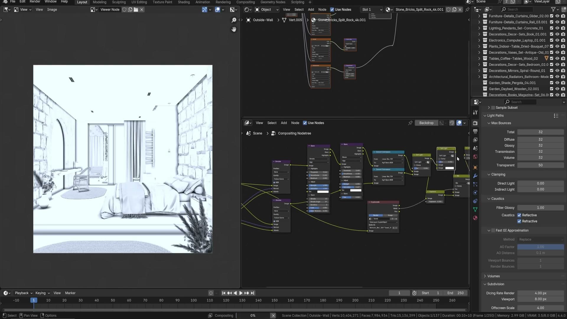
Crypto Matte for selective brightening
Crypto Matte lets you generate a perfect mask for any object in the scene. Add a Cryptomatte node, click the + to pick an object (the bed, in this case), and the matte output is a black/white mask of just that object.
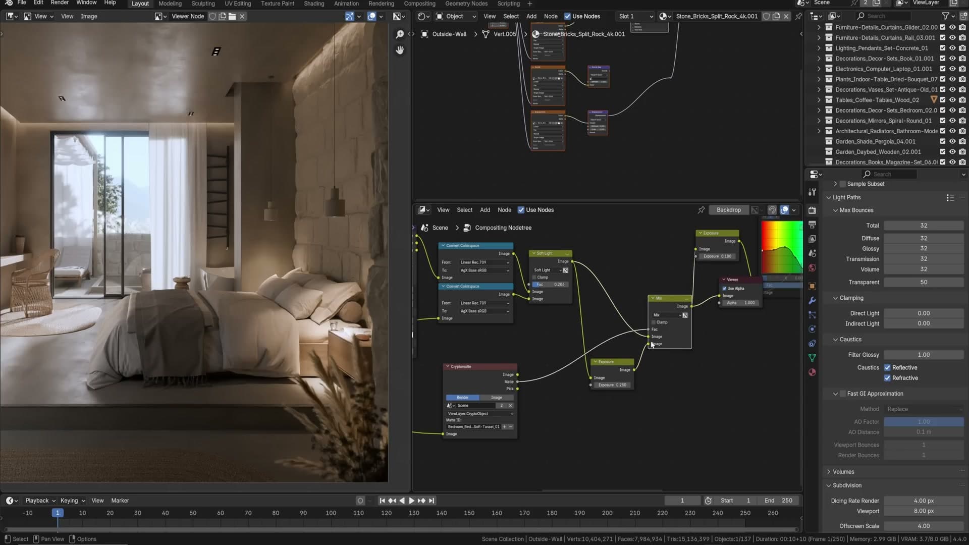
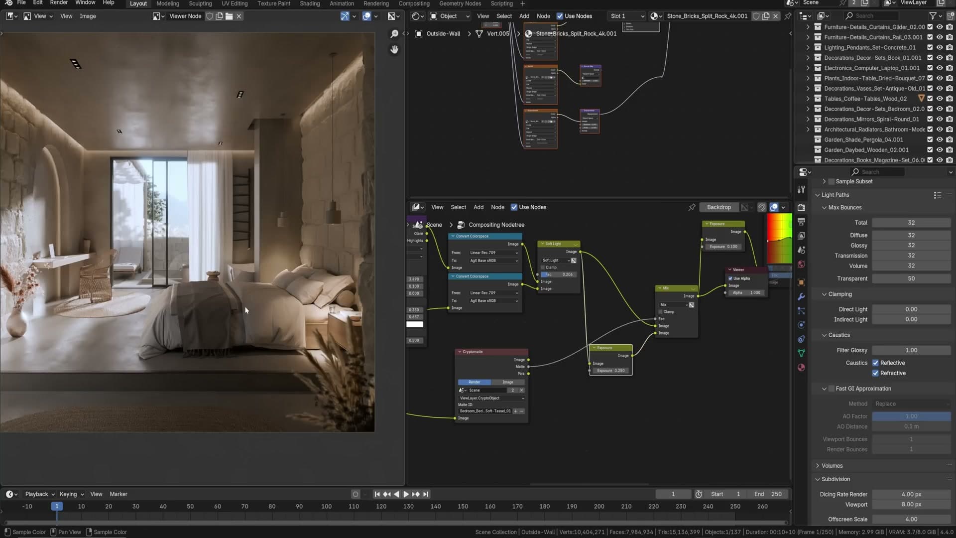
Use that matte as the factor of a Mix node, with the image going through an Exposure +0.25 on one side and untouched on the other. Result: the bed is brighter, the rest of the scene unchanged.
Final sharpen
A small Filter (Sharpen) node at the end of the chain. Adds final crispness.
Clamping side-by-side: still vs animation
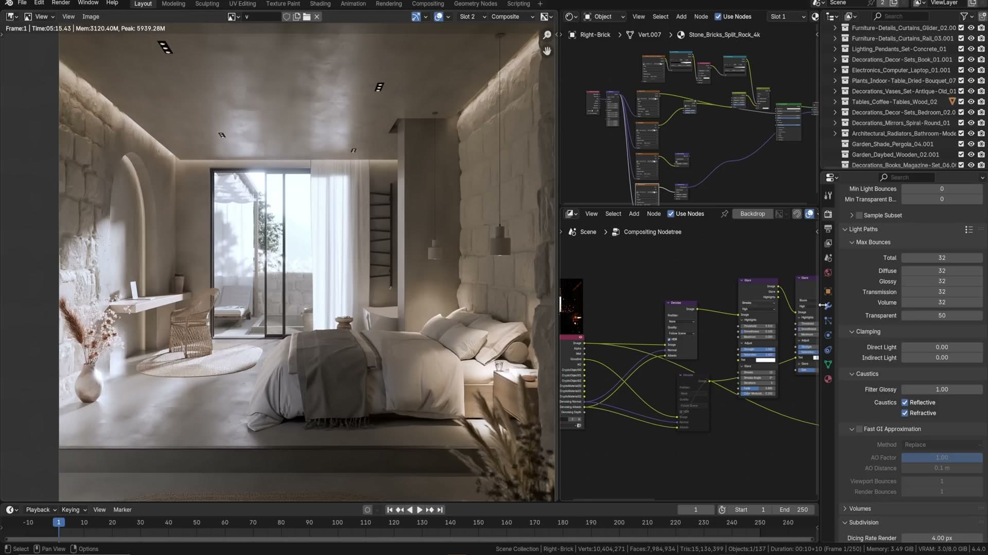
Side-by-side proof: unclamped, pre-denoise, the scene is full of fireflies. Same render post-denoise is clean enough to publish as a still; no one would know how noisy the source was.
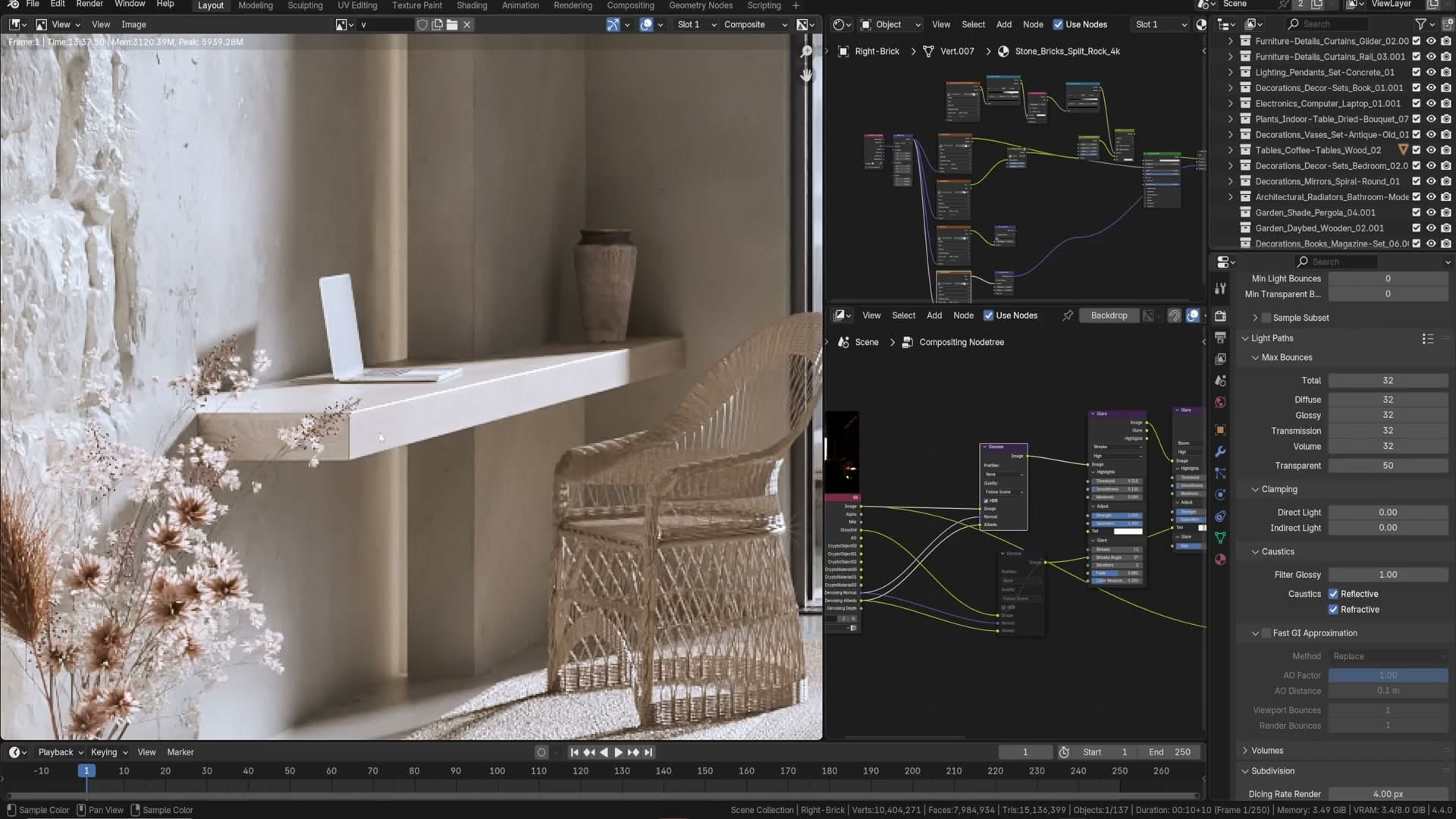
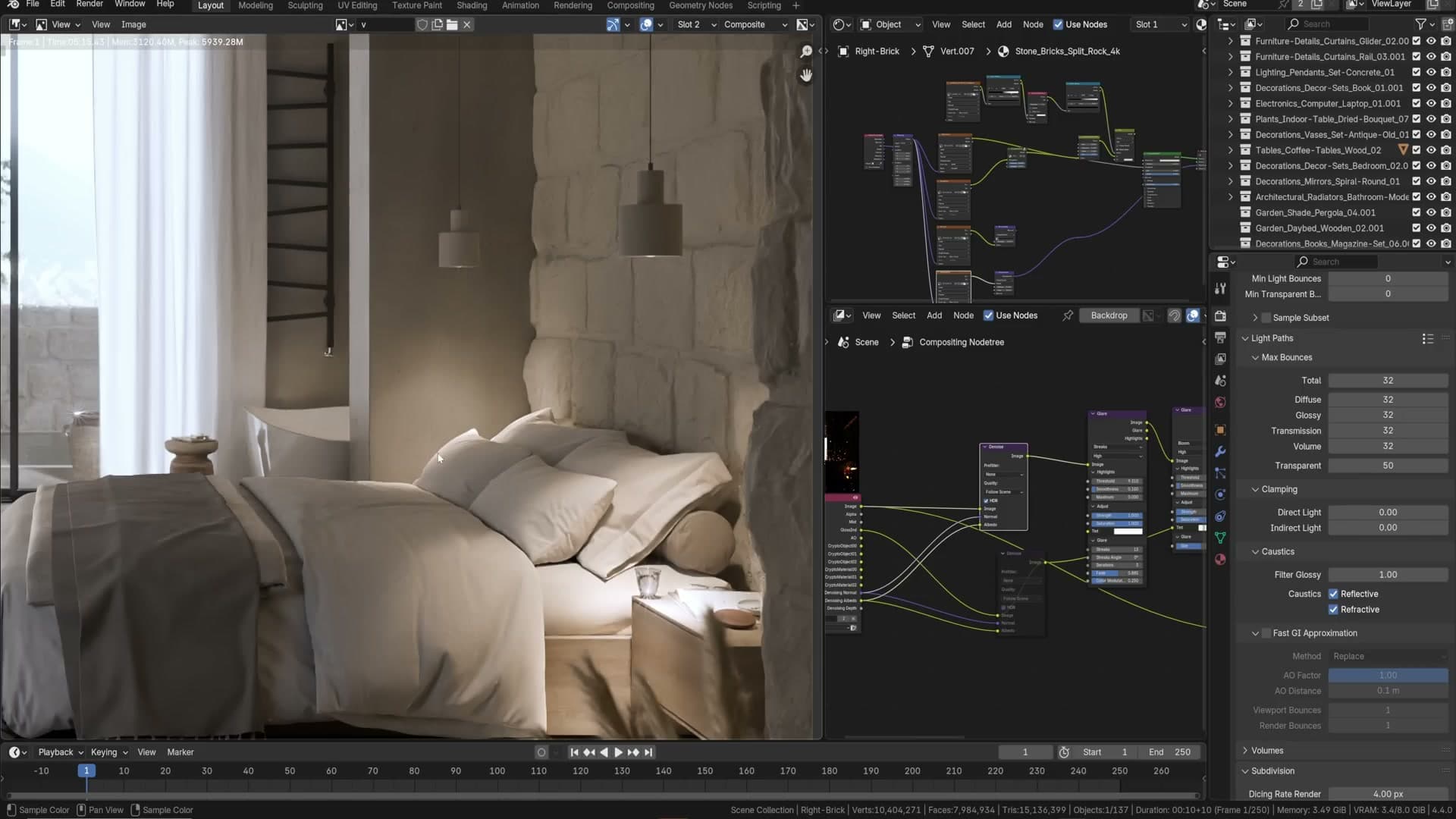
For animations, clamping is usually the right call because the denoiser can’t maintain consistency frame to frame around extreme samples; different frames invent the missing detail differently and you get visible flicker. For a still, no clamping + denoise wins almost every time.
17. CPU path guiding for true caustics
The hidden Cycles feature that produces real, beautiful caustics including through volumetric water, at the cost of being CPU-only.
Filter Glossy 0 + GPU first attempt
In Light Paths → Caustics, the Filter Glossysetting blurs caustics to make them cheaper to render. With it at 0, the GPU starts hinting at caustics on the pool floor but can’t resolve them properly; they show up as noisy streaks rather than crisp ripples.
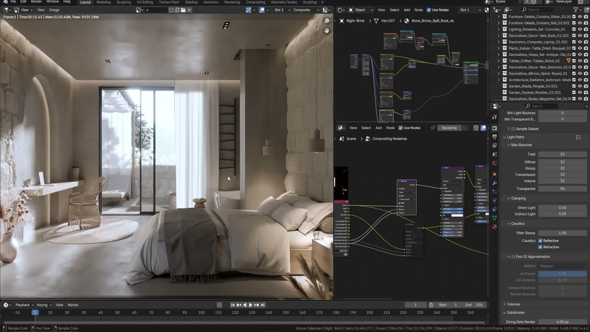
CPU + Path Guiding
Switch the render device to CPU. Enable Path Guidingin render settings (CPU-only; it’s greyed out on GPU). Let it run.
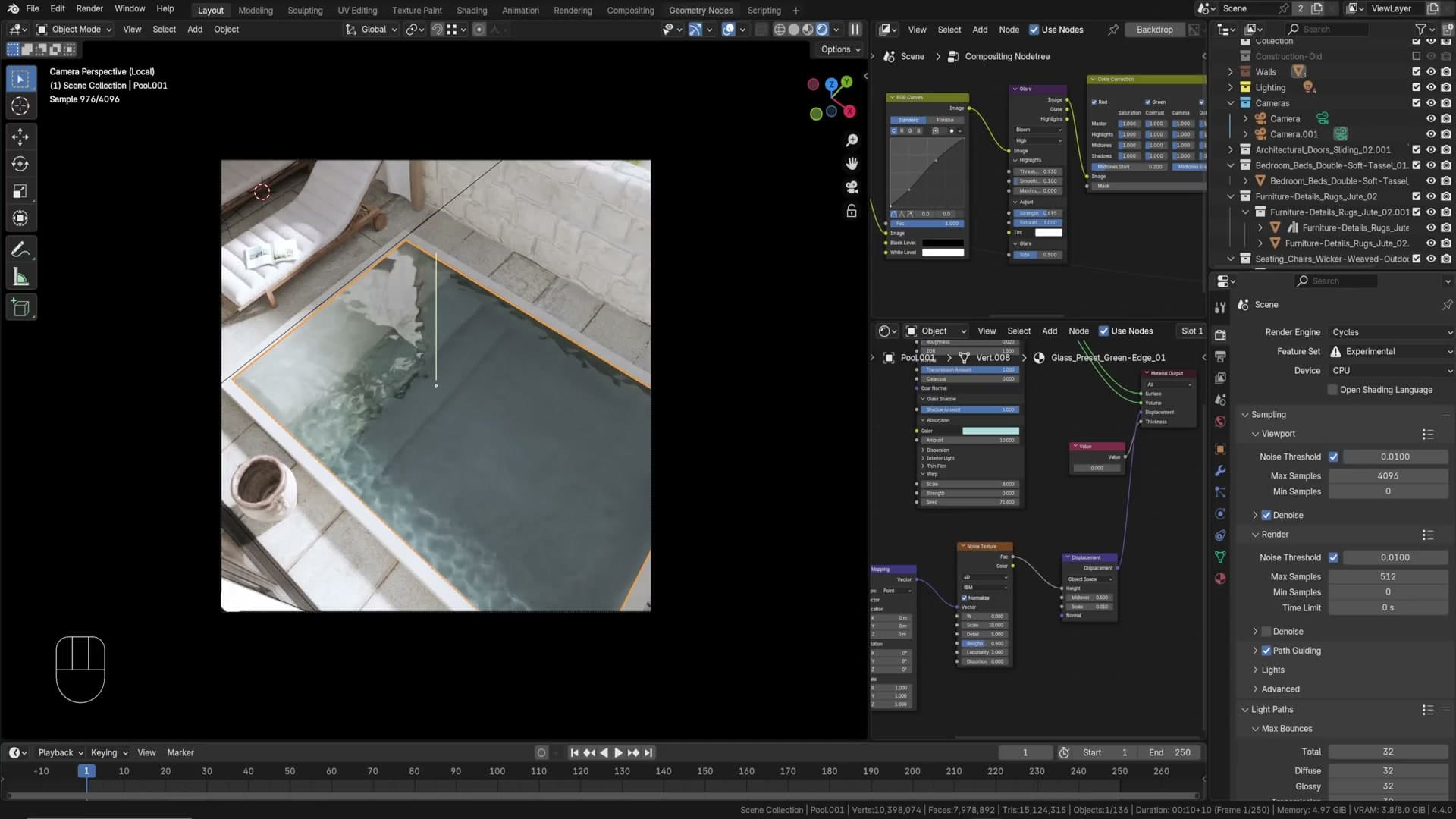
The result: real, beautiful caustics dancing across the pool floor, through the volumetric water this time. The bug that prevents GPU caustics through volumes doesn’t apply here. You don’t need any of the cast/receive caustic flags; it just works out of the box.
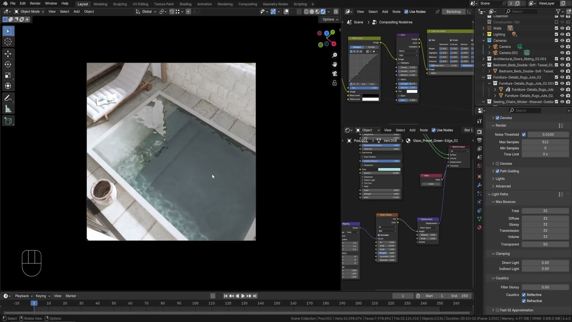
Trade-off: CPU rendering is slow. If you have a fast CPU and a still image that you want to look its absolute best, this is the trick. For animations it’s usually impractical.
Outro
If you made it this far, congratulations on completing the masterclass. Hopefully it gave you some tips and tricks to take into your own work. If you want to follow along with every asset, the full library is on iMeshh; if not, the techniques above all work with Poly Haven and free assets too.
Tools, assets and credits
Everything mentioned in this build, with links. Where the original masterclass uses an iMeshh-specific asset, a free Poly Haven alternative is noted alongside.
Software
- Blender 4.4 . The entire build is in Blender; nothing else needed.
- ChatGPT . Used to generate the AI back plate behind the window.
Asset libraries
- iMeshh : 2,500+ assets, materials, HDRIs, and the Blender Asset Manager add-on used throughout. The full finished scene from this masterclass is on iMeshh alongside nine other complete scenes.
- Poly Haven Textures : free CC0 textures. Used here for the painted concrete floor and the Rock Face 3 displacement PNG loaded as a brush texture.
- Poly Haven HDRIs : the “Overcast Soil” HDRI used for soft, even interior lighting.
- IES Library : thousands of free IES photometric profiles. One of them drives each pendant point light.
Specific iMeshh assets used
- Stone Split Rock (4K): feature wall displacement texture.
- Painted Concrete (Poly Haven): floor, walls, ceiling.
- Green Edge Glass preset: pool water shader.
- Interior Glass / Glass Thin: updated low-noise window glass shader.
- Gladstone Beige wood: bed frame, bedside table, chair, coffee table.
- Pool surround tile material: outdoor floor around the pool.
- Sliding door asset: bedroom-to-pool window.
- Bed (Marvelous Designer source), woven chair, freestanding bath, curtain, rug, mirror with dust specks, radiator.
- Pendant light, downlight, decor sets: bedside styling, ceiling spotlights.
- Pagoda, day beds, magazine, bouquet, vase, tree, outdoor shrubs: exterior styling.
- Gobo from iMeshh Effects: soft tree-shadow on the white curtain.
Credits and further reading
- Christopher 3D: the variable roughness node-group trick used on the floor and walls is based on his explanation of how the Principled BSDF actually handles glancing-angle reflection. Highly worth subscribing to his YouTube channel for deep-dive Blender shading content.
- iMeshh YouTube channel: there’s a free 10-module beginner Blender course on the channel if you need to brush up before tackling the masterclass.